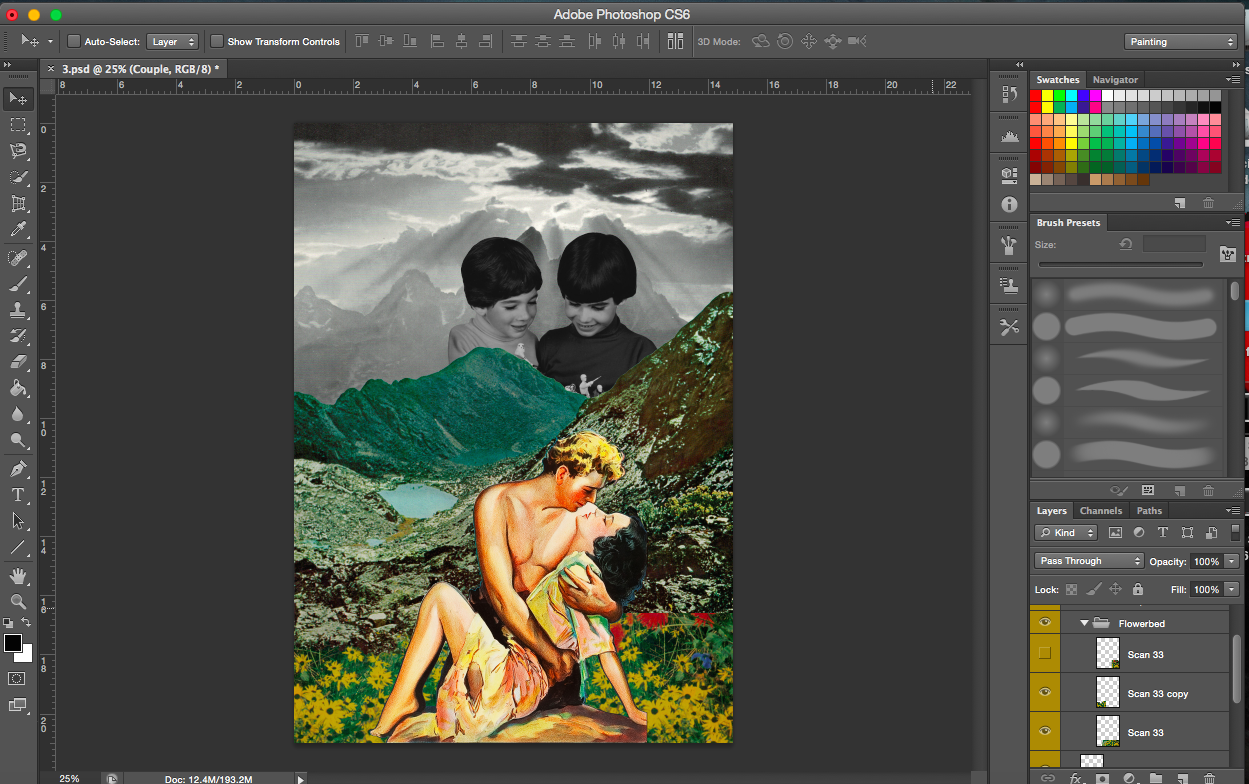
This post will include all the usual components of my previous posts (everything will be condensed into this single post).
Research
With Project 2 completed, I was fairly certain that I had fallen in love with collages, so with this new project, I decided to take the same direction and showcase my collages in my zine. However, I didn’t want to just have the images in the zine and leave it as that, I also wanted the user to experience the joy and essence of collage. What is collage? How is it done? I wanted to portray these in my zine without words.
Collage is all about layering of images to create a scene, depending on how the layering is done, a completely different image could be created, one with a different story. When I was working on the previous project, I was often faced with the dilemma of which images to layer and whether or not I should even use the layer, I guess I wanted the user to experience this as well, for them to put themselves in my shoes and try it out, though admittedly it’s not fully possible for the full experience.
I’ll just show some examples that I found while researching for zines which stood out to me.
[Image Above] Two facing pages that interact with each other.
[Image Above] Page on the left. I would consider that somewhat collage as well, I like the use of minimal colour, emphasis is placed on the coloured images.
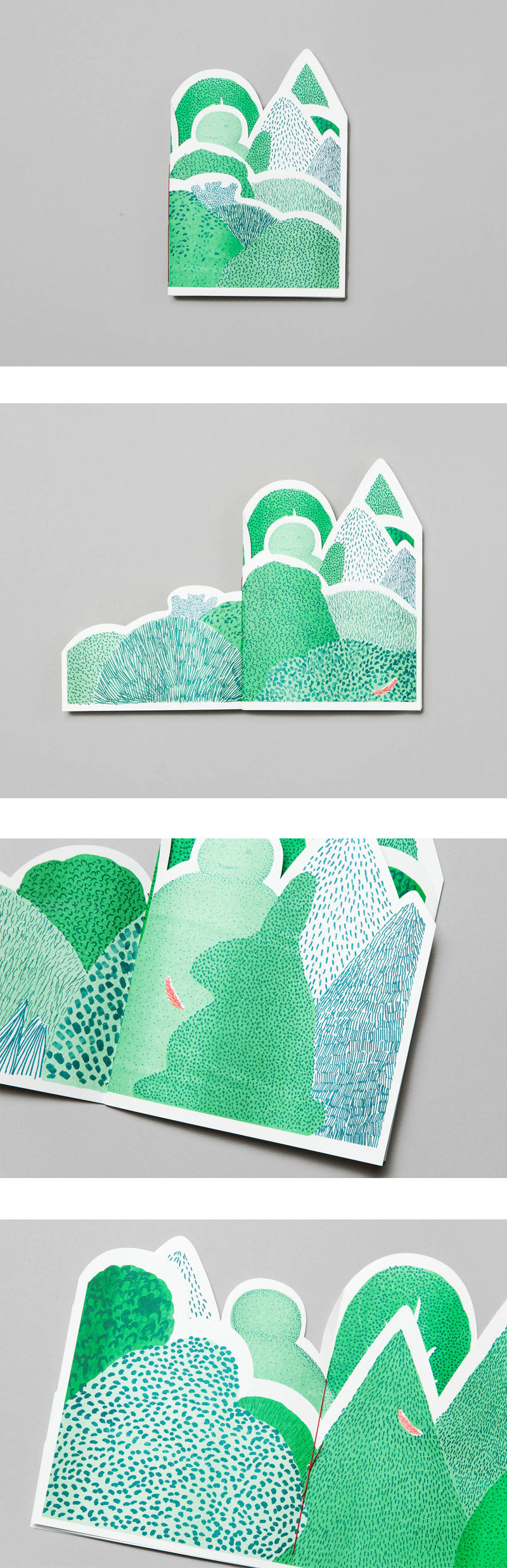
[Image Above] I believe finding this little booklet inspired me throughout this project. Each page layers on to the next page, just like how a collage works. I knew immediately that I wanted my zine to have an element like that.
[Image Above] I just like the clean look of this, no text, just images, each with a white border.
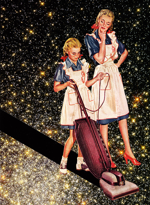
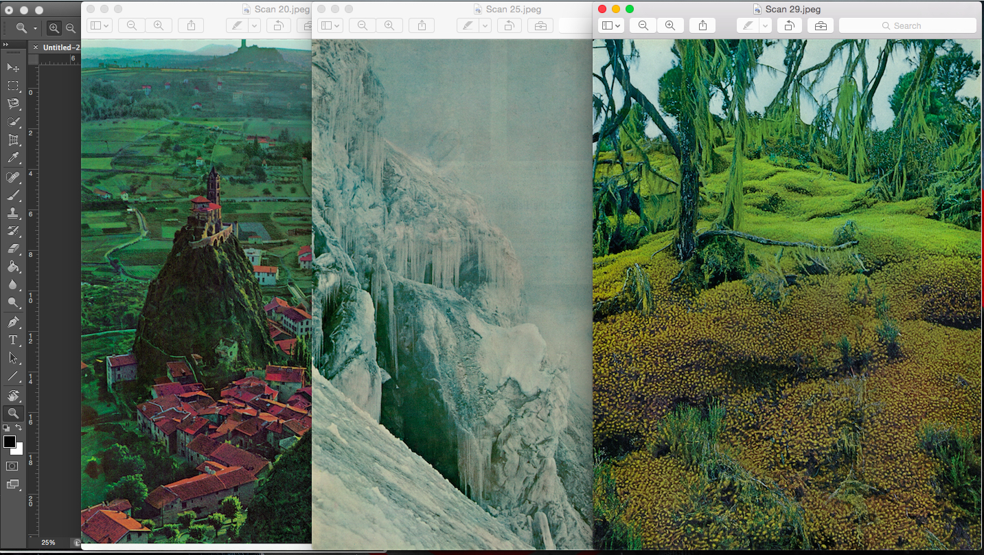
My artist reference for my collages remained the same as project 2, Eugenia Loli. I’ve added a few more of her works below because I just love looking at her work, they are absolutely brilliant.
Eugenia Loli- No More Galaxies for Today, Timmy!Eugenia Loli- Postcard from New Iceland
I did find another reference whose works also really intrigued me but his works didn’t shout out to me as much as Loli’s works did. His name is Joe Webb. Here’s a link to his website. http://www.joewebbart.com/
Joe WebbJoe Webb
—————————————-
The concept
I really enjoy looking at collages which have a space/galaxy theme. I decided to carry this theme forward in this project. Since collages allow me to tell a story of some sort, I decided my zine should be quite similar to a picture storybook.
I didn’t want to add in any text as I felt it would distract the reader. The beautiful thing about collages is that you get to interpret the scene and image on your own, there are no restrictions. Depending on whether or not a title has been given, you can pretty much come up with your own story and make it as absurd and farfetched as possible.
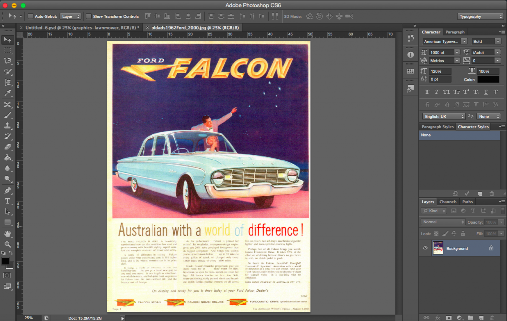
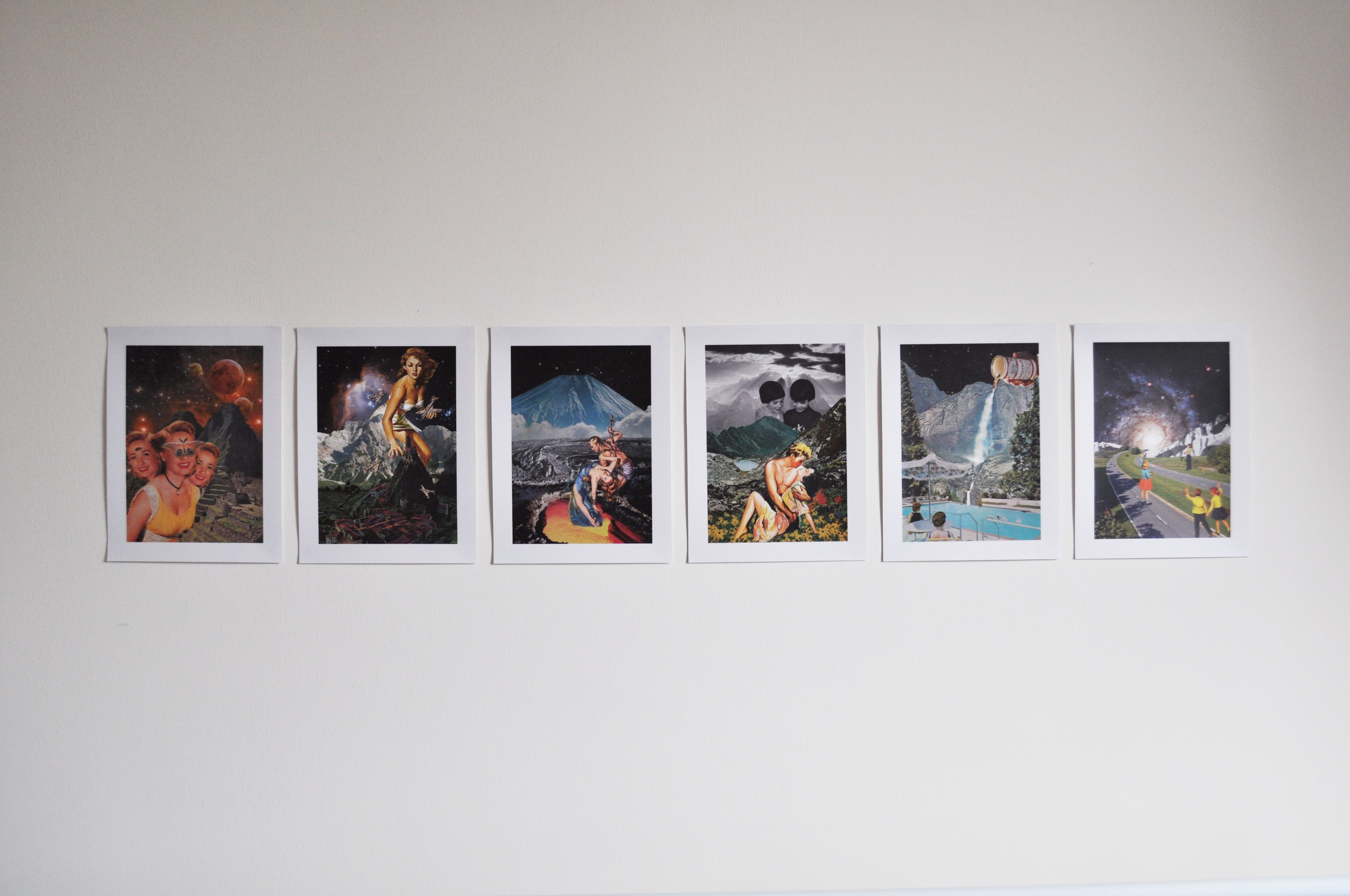
I decided to use my works from project 2 for the zine because some of them did have the space theme. I didn’t use all 6 compositions as some of them had different perspectives and wouldn’t fit in.
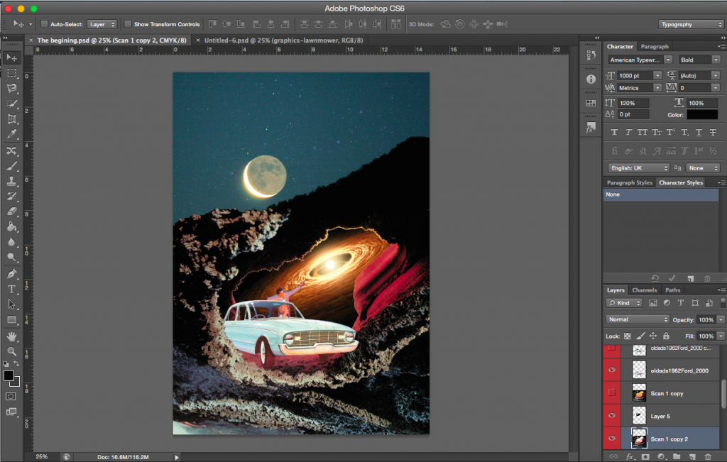
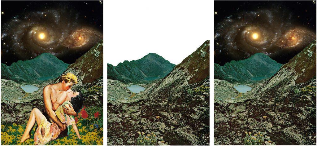
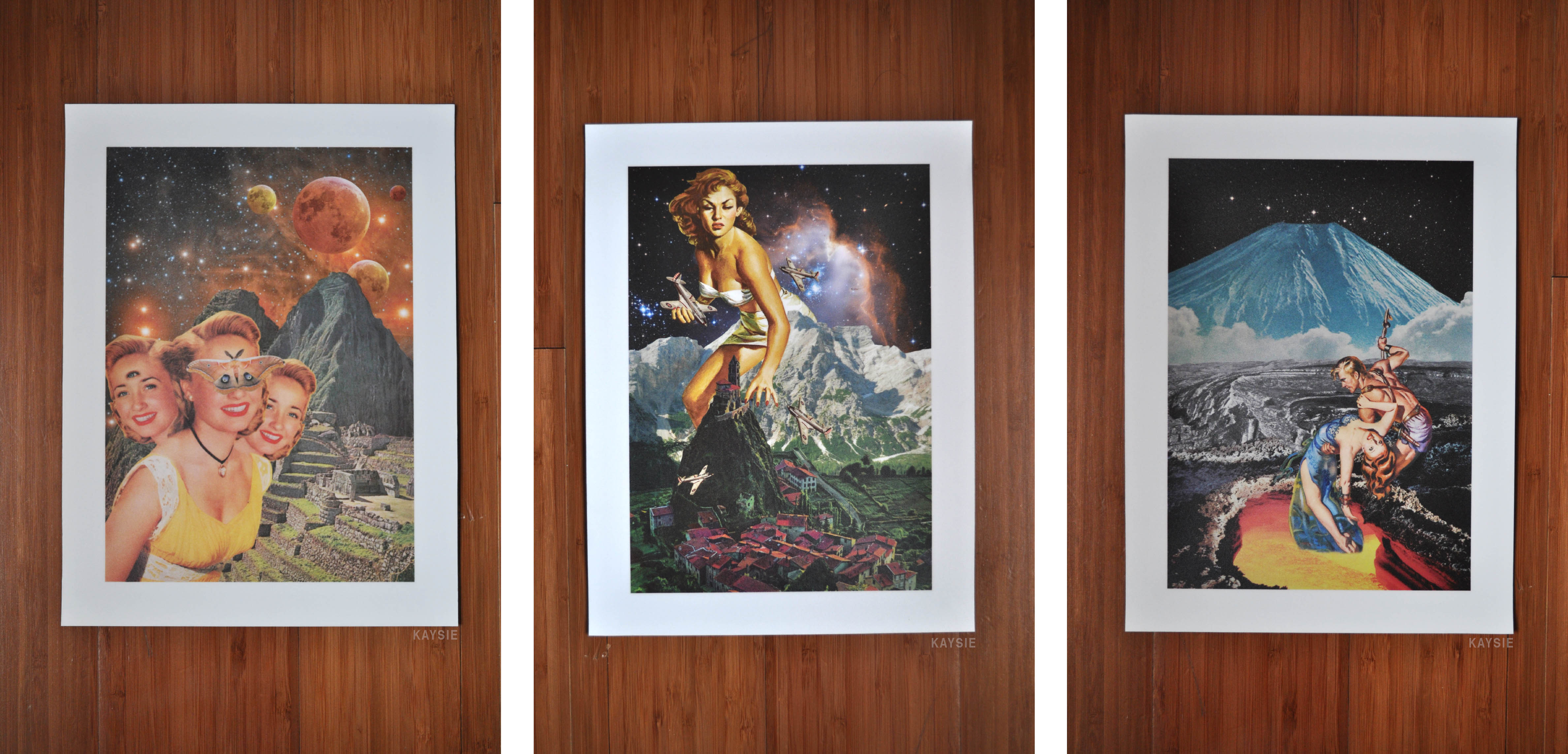
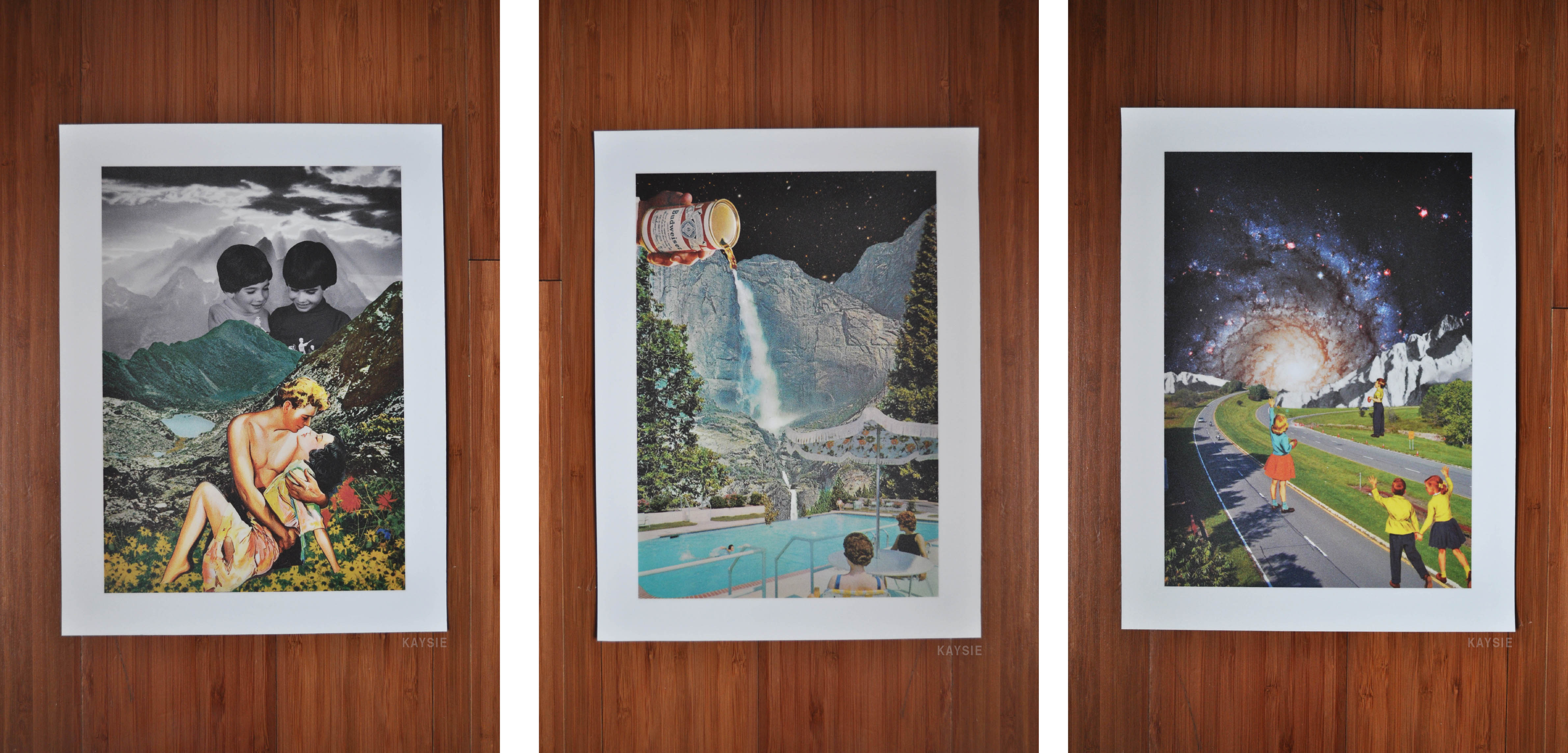
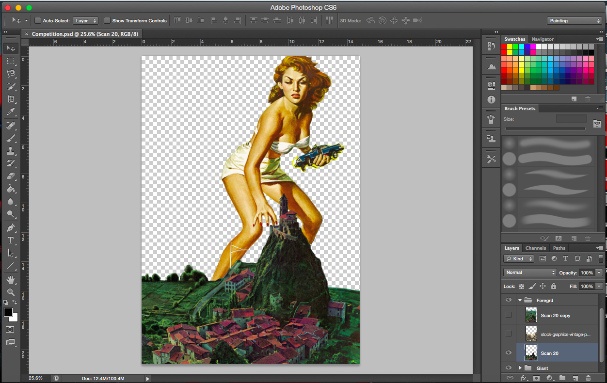
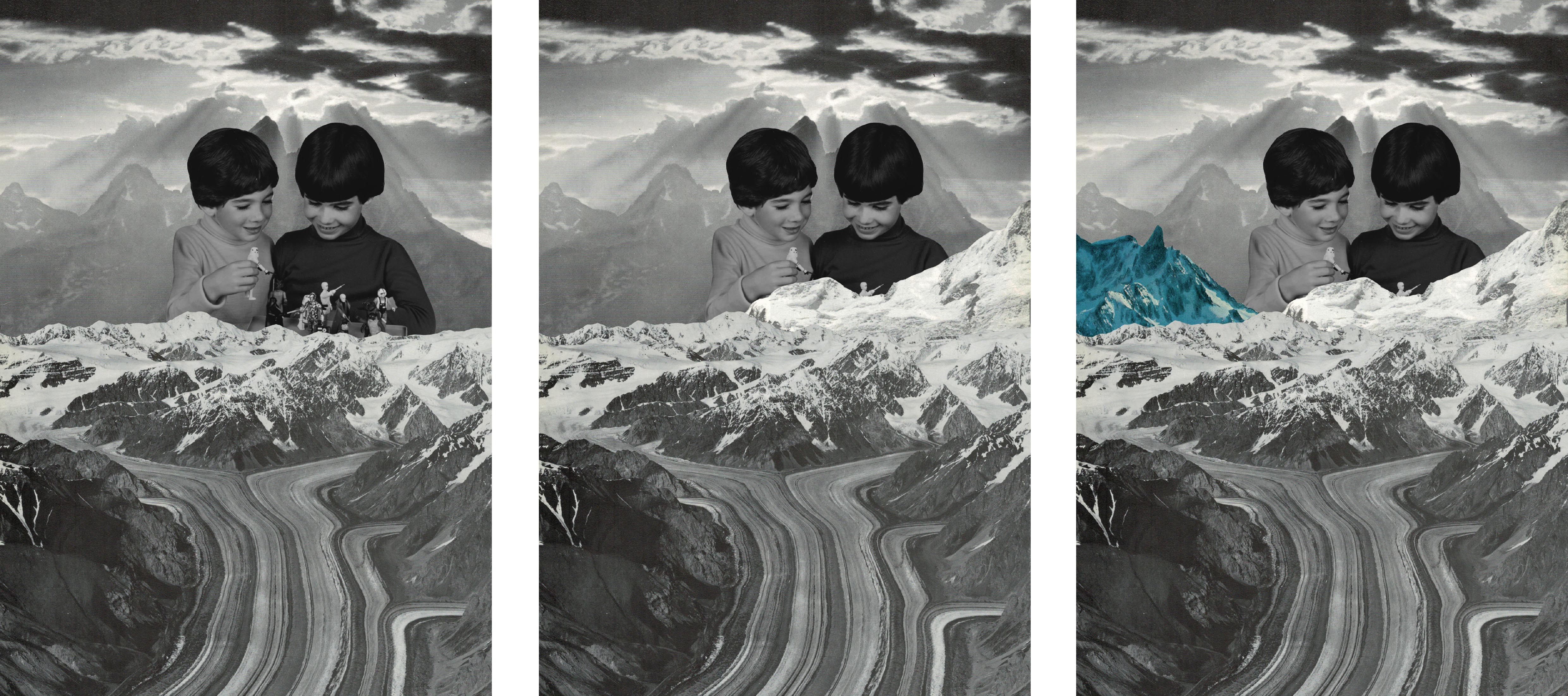
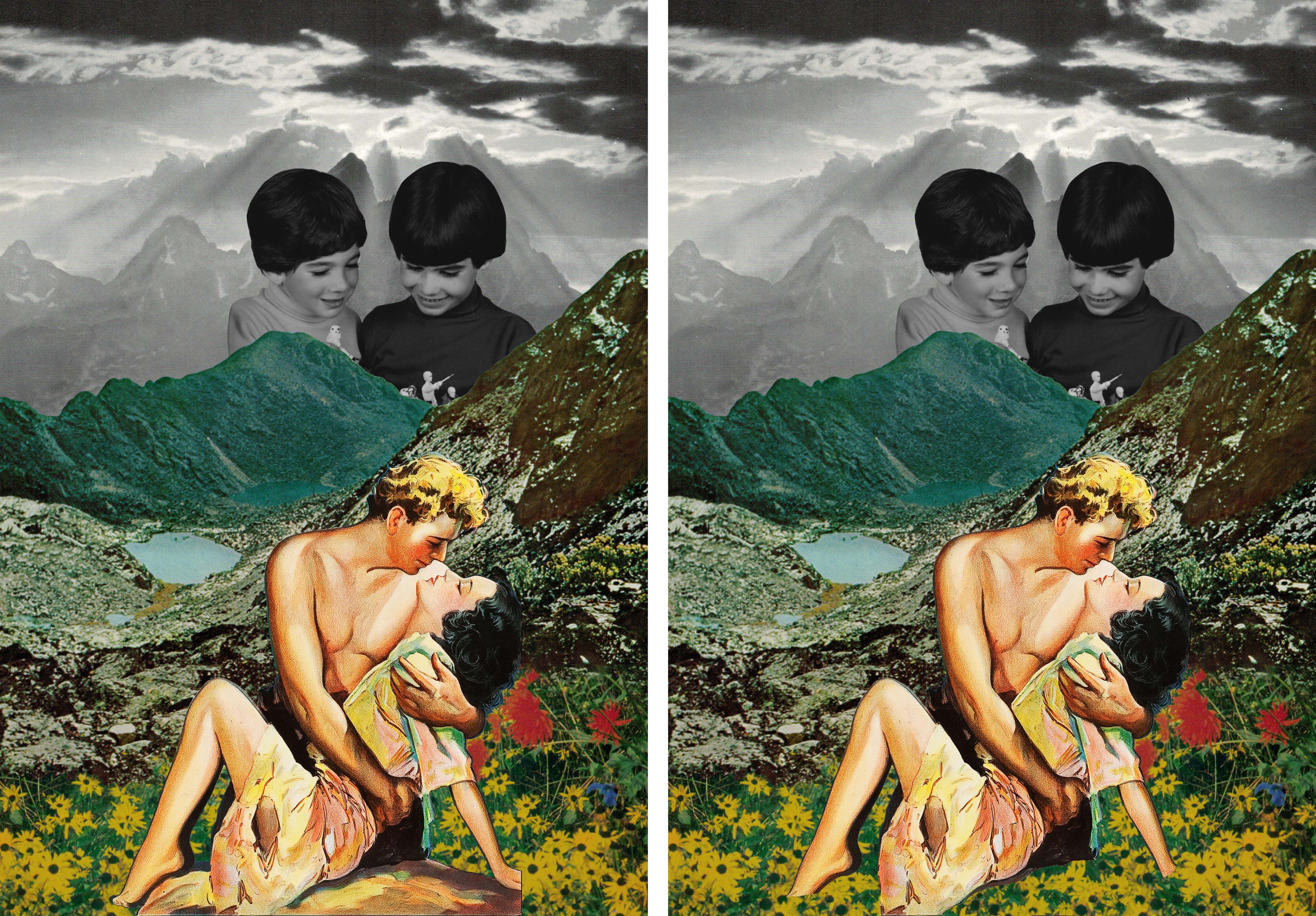
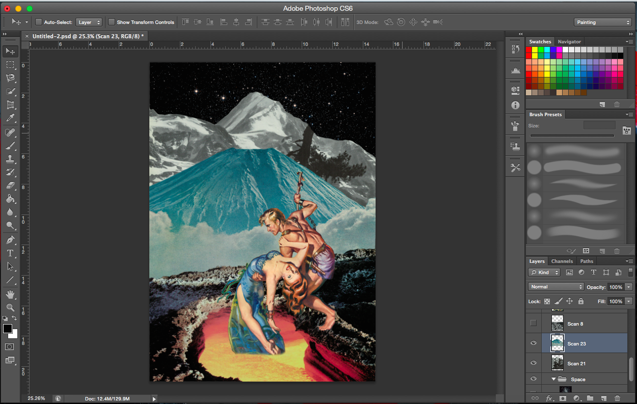
[Images Above] These are the four compositions that I brought over from project 2. The third from the right does not have a space theme so I had to change the background, making sure it still was relevant to the characters in the foreground.
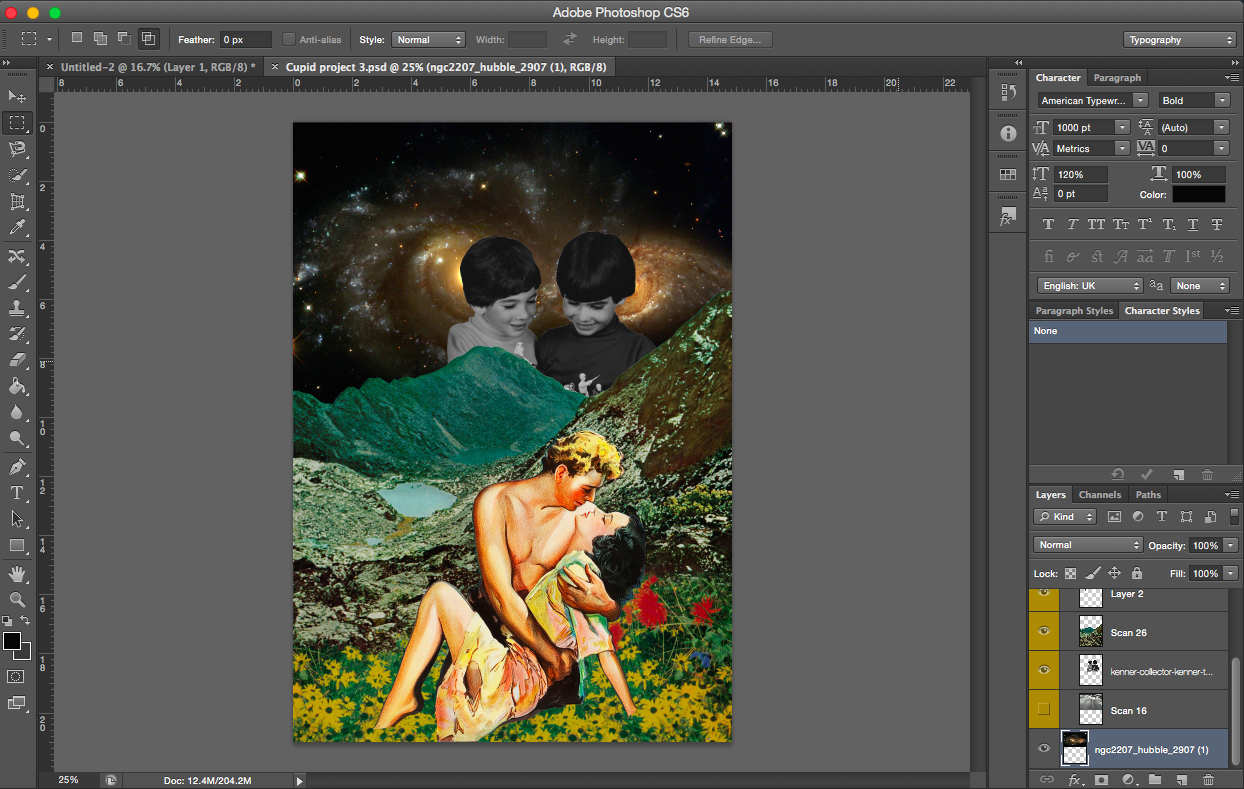
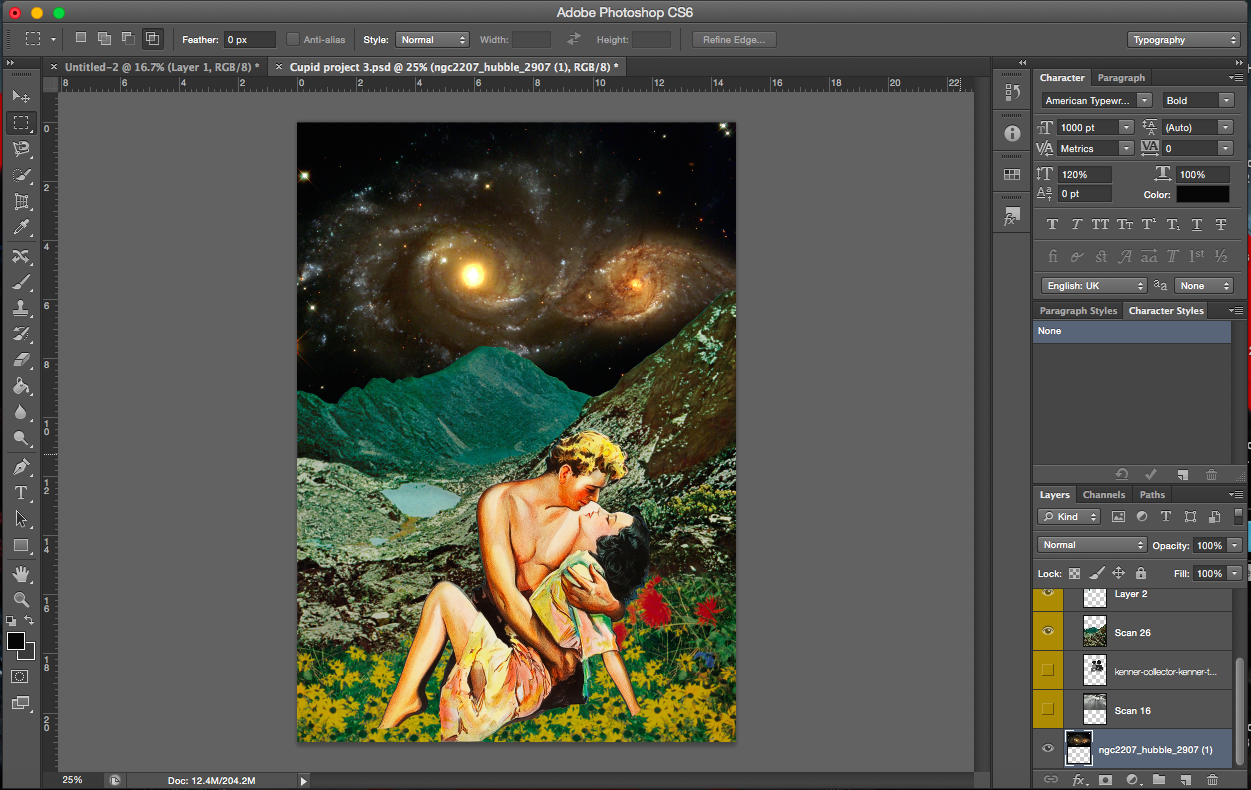
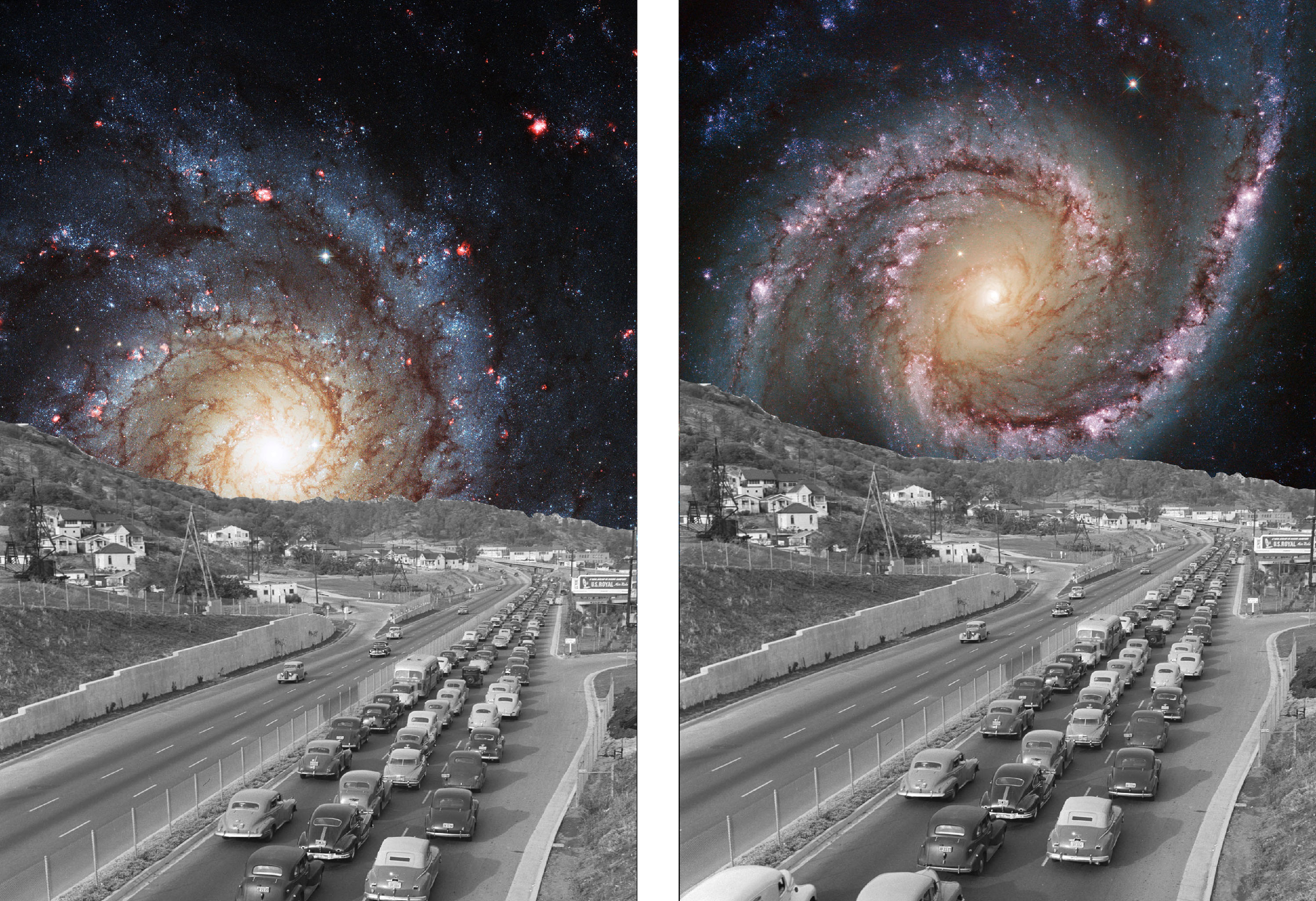
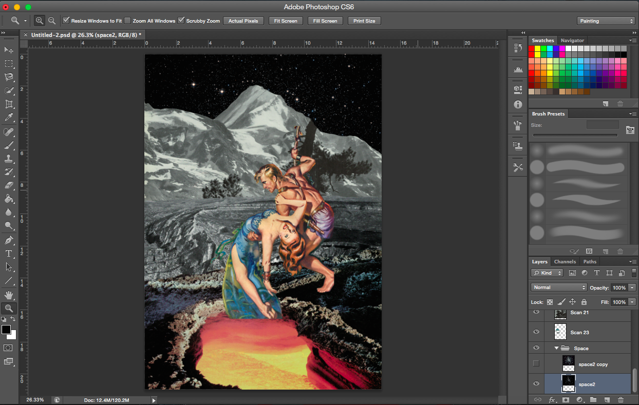
[Image Above] The two cupids in the background didn’t fit into the composition anymore because of the story I had in mind. It is also a black and white image which no longer stands out with the black galactic background, in fact they looked rather dull.
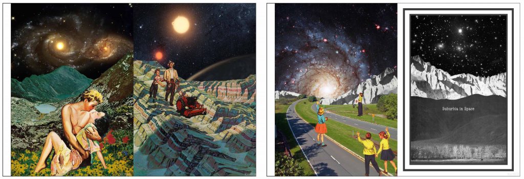
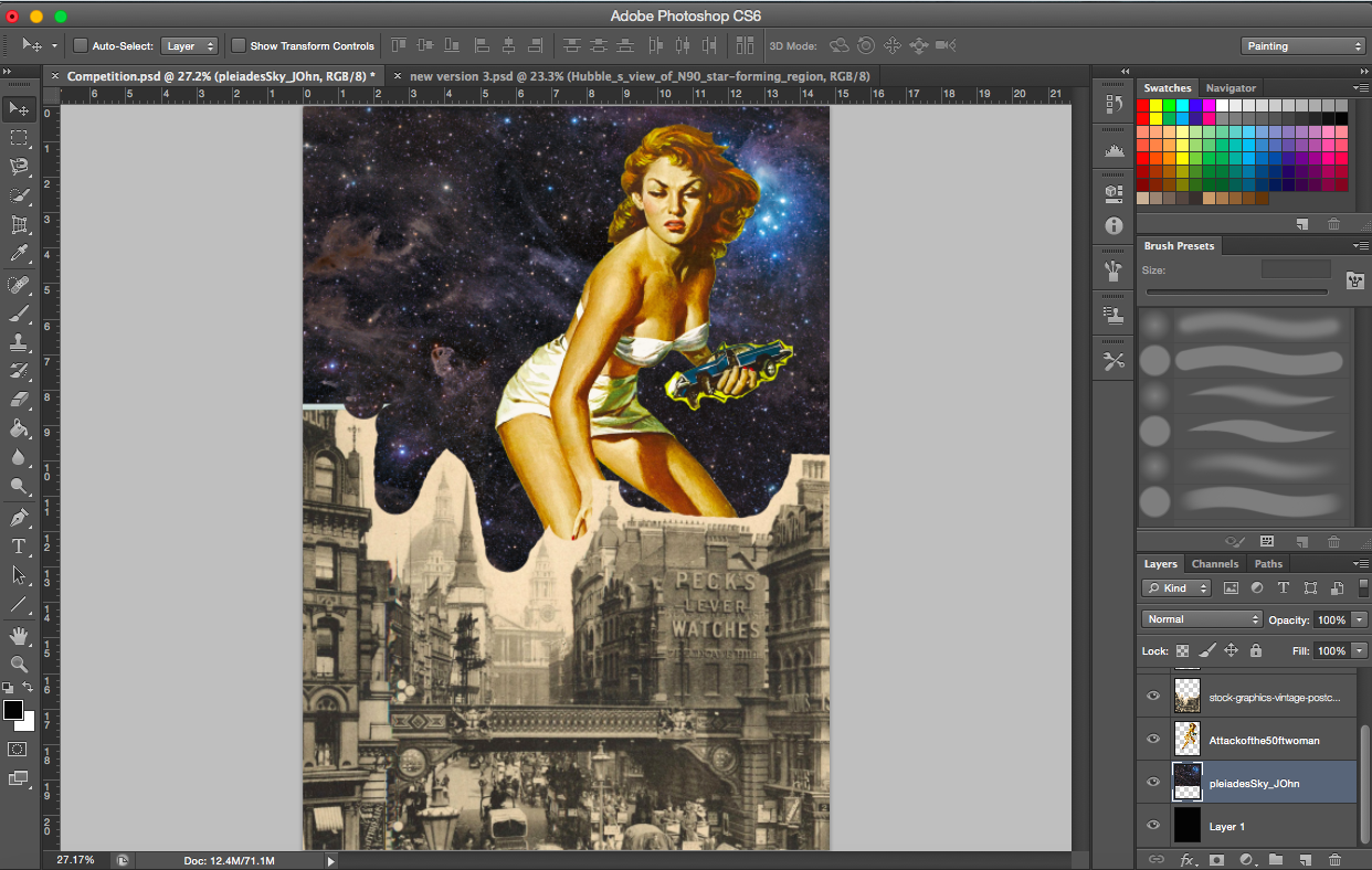
[Image Below] The space image I decided to go with has two galaxies which mimics the lovers in the foreground.
—————————————-
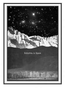
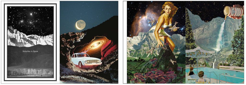
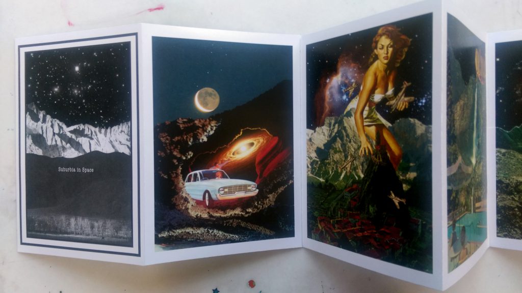
The story-Suburbia in space
The concept of my story surrounds the idea of life in space. What if the human race took over another planet? What would they do? I wanted my zine to portray the main aspects of their journey and life in outer space. Hence, I gave my zine the title ‘Suburbia in Space’. With just the title, I hope the audience would get some idea about the story, that it’s about society living in space and subsequently form their own interpretations of the compositions with the title in mind.
—————————————-
Layout
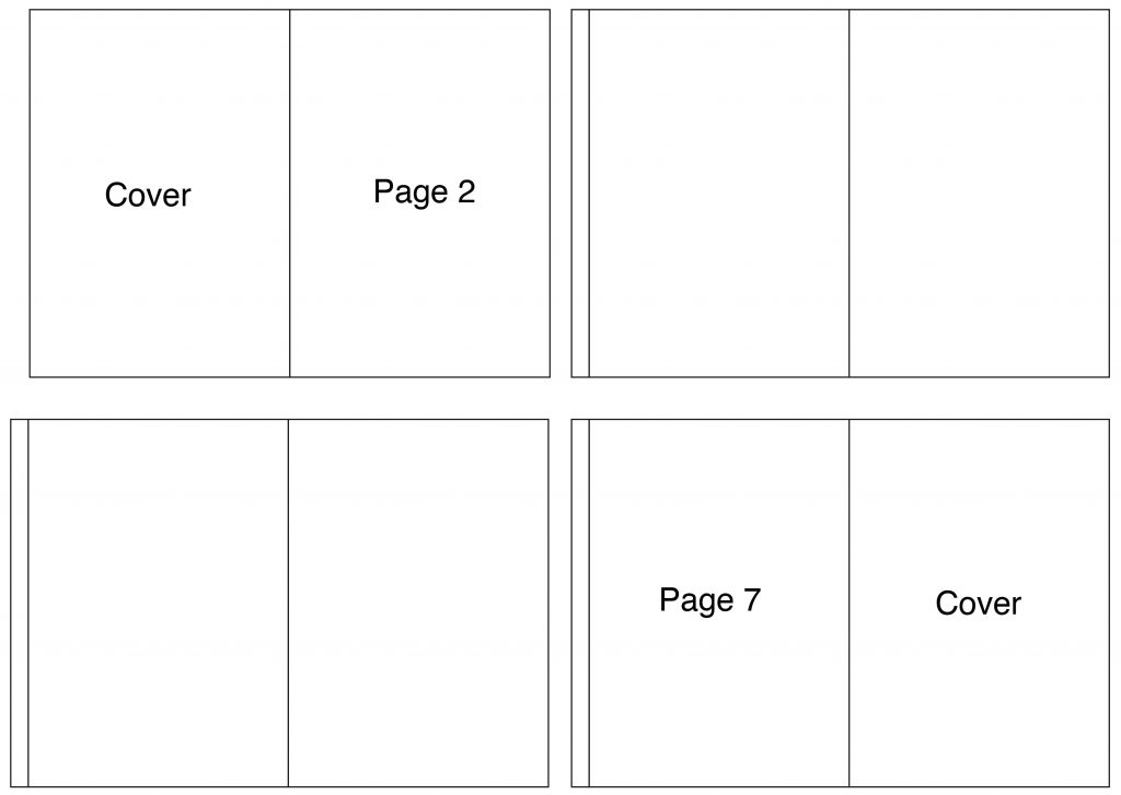
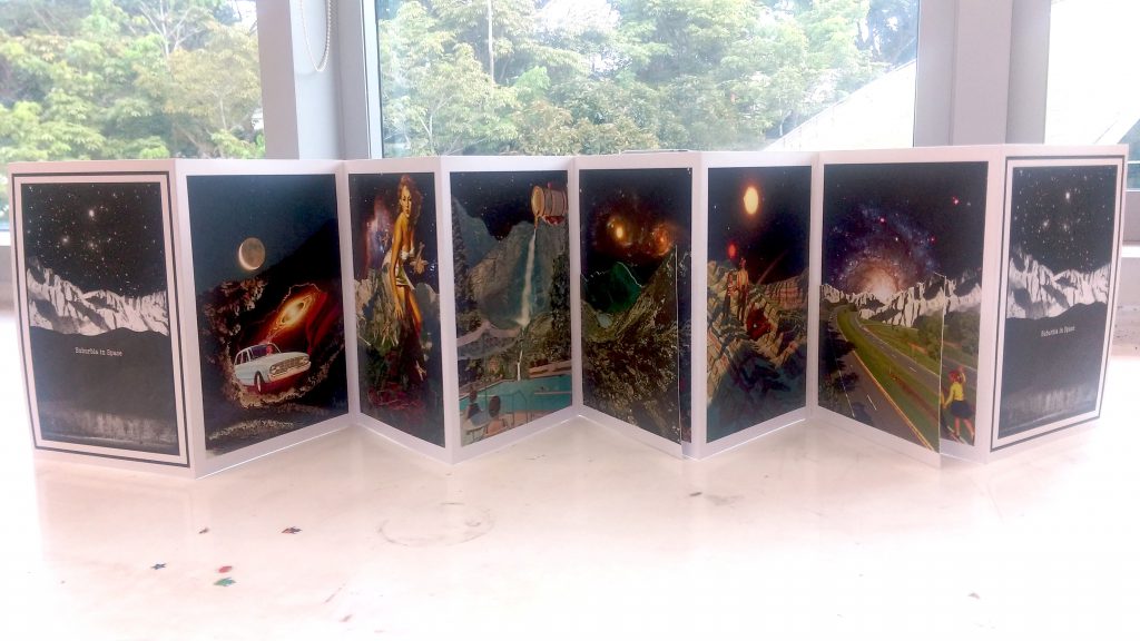
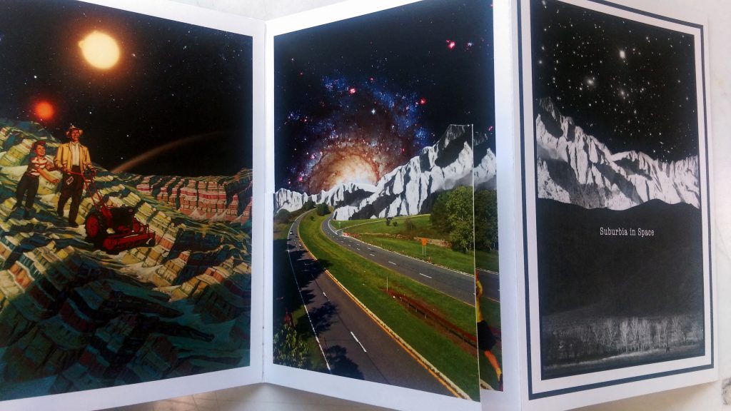
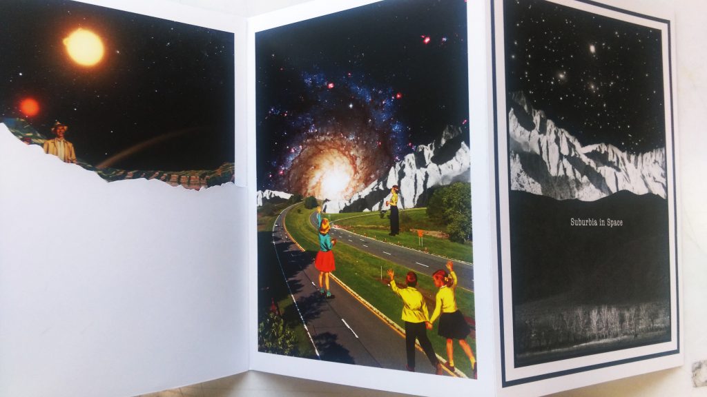
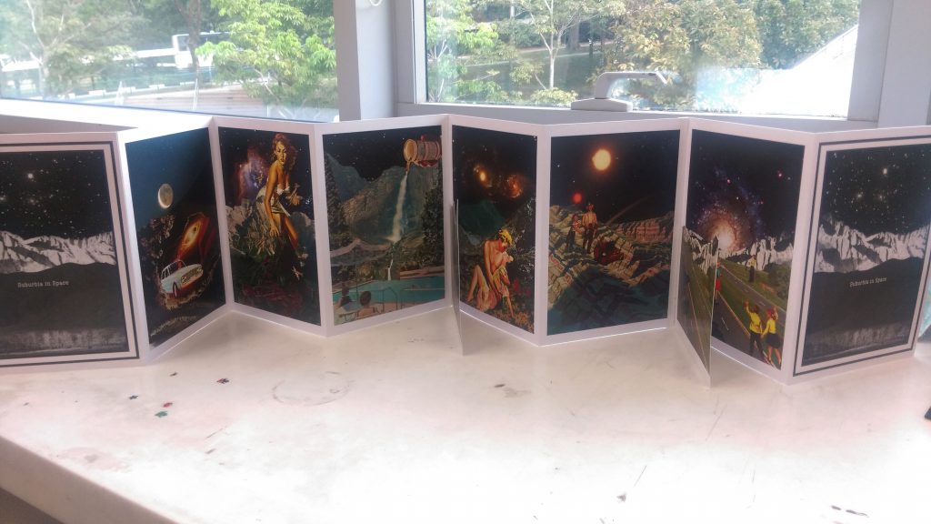
I used accordion bind for this zine, I feel like it makes viewing the images a lot easier and the viewer gets to see the story in its entirety when the zine is opened up. Planning: With 8 pages to work with and two of them being the cover pages, I was felt with 6 pages for my story.
An extra tab has to left on the left page for attachment to the previous page. After trying out many different tab widths, the tabs I finally used were 1cm in width which is large enough to hold securely but small enough so it doesn’t spoil the aesthetics of the zine. Each page is A5 in size, two pages together (297 x 210mm) with 1cm tab meant that I had to print them on A3 sheets to ensure ample space.
The video below shows how to do a very basic accordion bind which I referred to. There are more comprehensive videos that I found as well. I’ll just leave them here too.
Below: A more detailed, comprehensive way to make an accordion bind.
—————————————-
new compositions
For this zine, I needed two extra compositions and a cover page.
Below are some images of my working process.
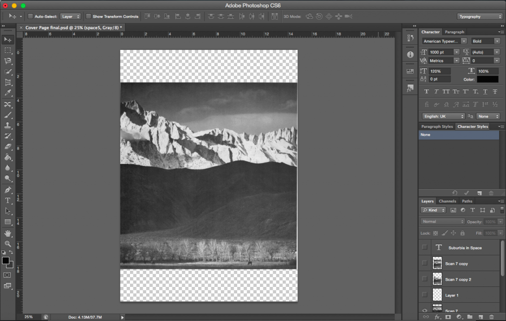
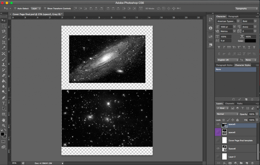
Cover Page
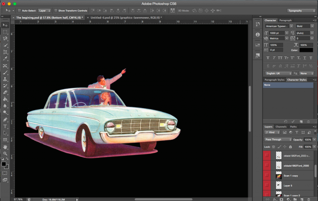
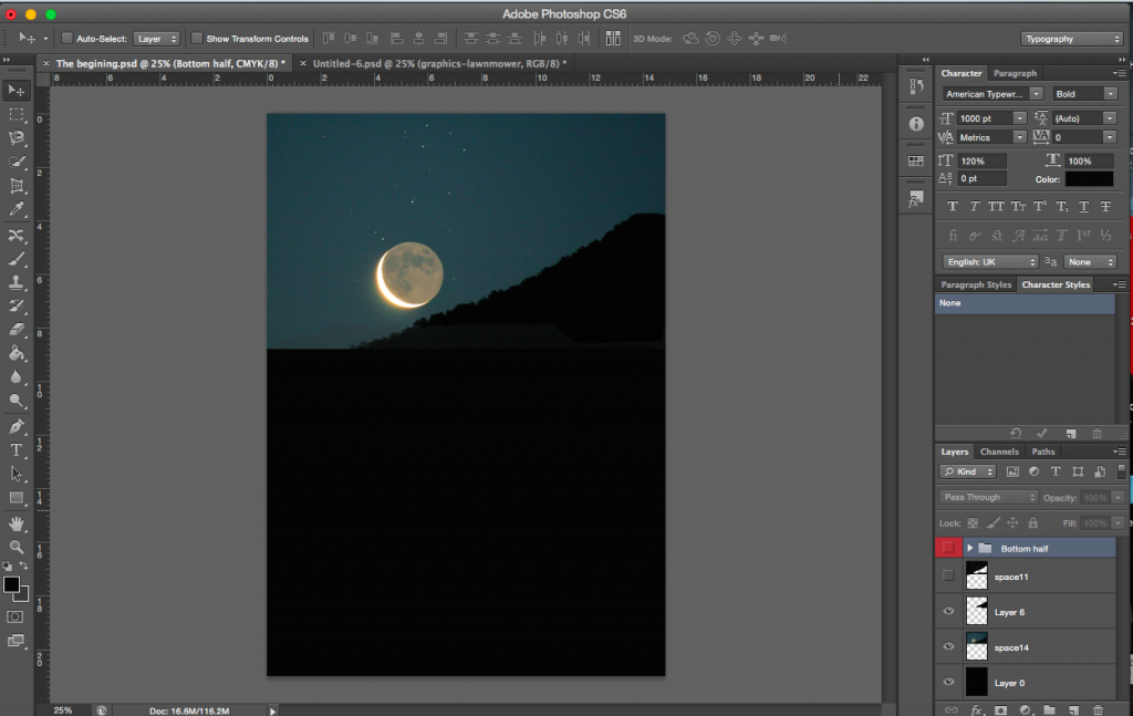
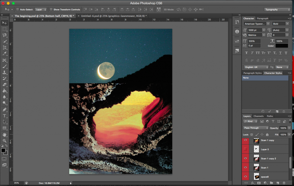
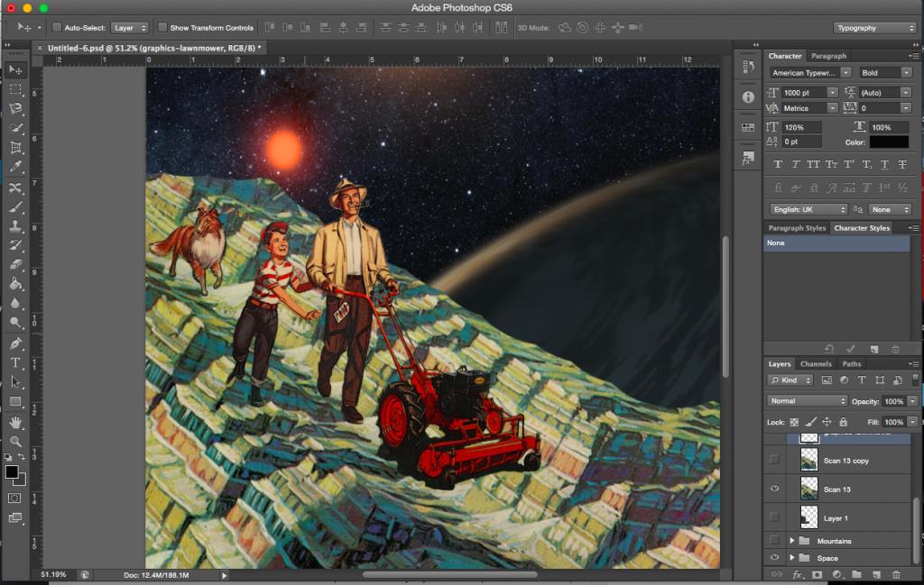
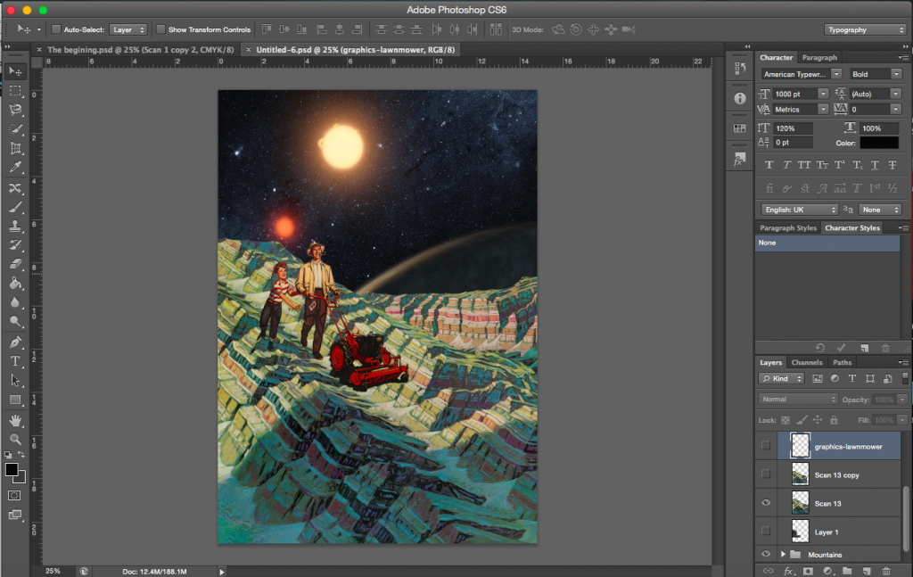
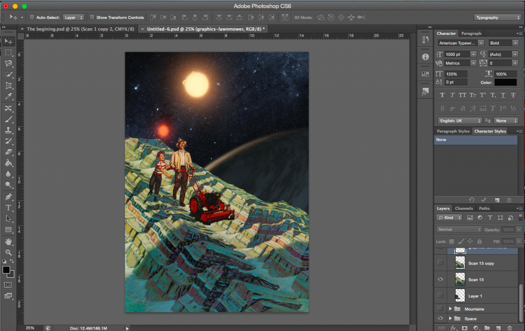
The Beginning
Moving Along
—————————————-
additional-flips
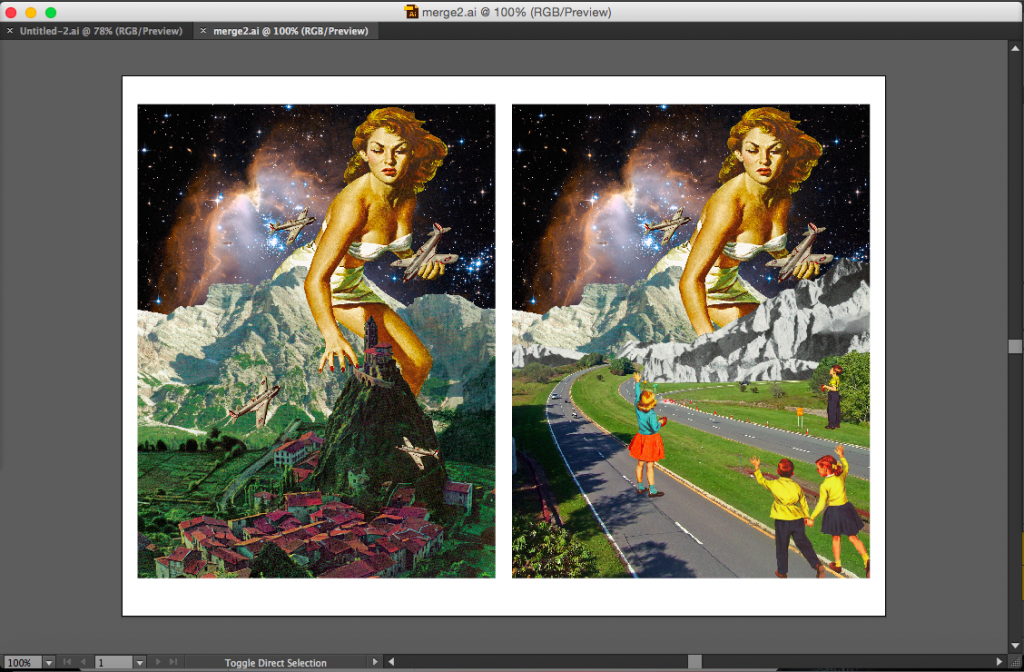
This was an initial idea. I took apart an old composition and layered it over another. The image on the left is the base image, the one on the right is the final image with the overlap of another page.
[Image Above] This image was supposed to be printed on another page, cut to the edges and overlapped on to the base image. The audience then gets to decide if they want to keep this page down over the base image or open this page and reveal the actual base image.
The meaning of the image changes depending on whether or not the top page is there or not. Without the extra page, the base image is on its own and it shows a giant attacking a city. However, with the overlap of the other page, the story changes. The giant is now attacking children.
Layering
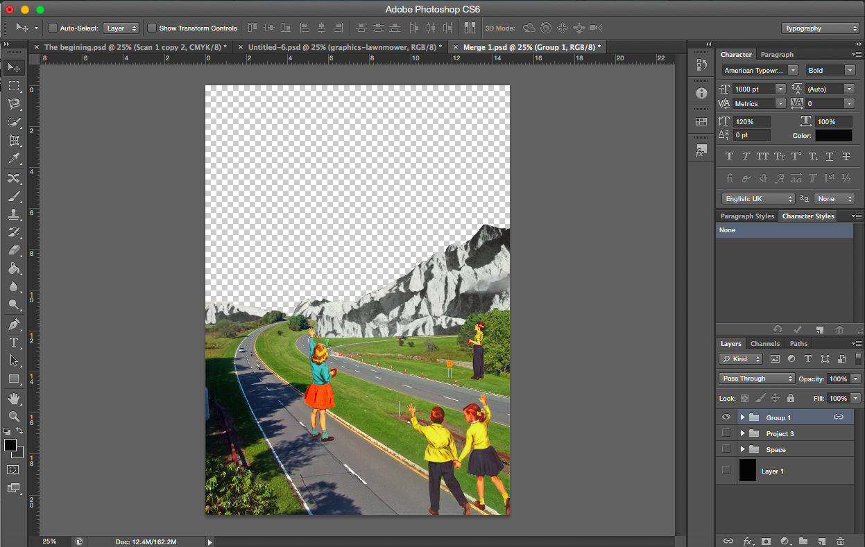
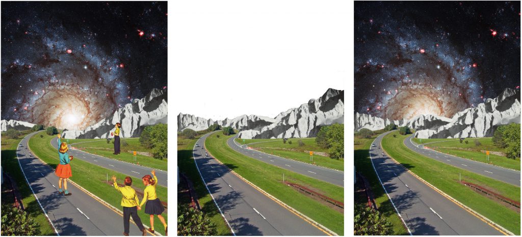
I decided that the above layering made the image too complicated, so I went with something more simple. Below are the two compositions with physical layering. A common factor with these two is the presence and absence of the human element. With the added page and layering, the human element is gone. In relation to the story, it represents the environment before and after the invasion of humans on the planet.
[Image Above] From the left: Base/main page, overlapping page, final image with overlapping page.
[Image Above] From the left: Base/main page, overlapping page, final image with overlapping page.
—————————————-
final
Final layout-pages 1-4
The Story in Sequence
The story I had in mind while making this was based around humans taking over another planet. Starting from the images above, from the left.
Page 1: Cover page. Page 2: Looking for a new planet. Page 3: Taking over the planet by force. Page 4: Changing the environment to suit their needs
Final layout- pages 5-8
Page 5: Finding love. Page 6: Starting a family. Page 7: The whole cycle repeats with the new generation finding a new planet and galaxy. Page 8: Cover page
This is just my interpretation of the images, the viewer is of course free to make up their own story especially if they decide to view it from right to left.
Double Cover Pages
I was made aware during on of my consults that the direction in which the viewer reads an accordion bind is beyond my control. The viewer could decide to read it from left to right or the reverse (unless you specifically say so and force the viewer to read it in one direction). I didn’t want to restrict the viewer, I want to keep the story open. The story thus also flows both ways especially since there are no words to govern the direction or order they are to be looked at.
Binding problems
Pages bound in an accordion bind are attached by an extra tab. Depending on the thickness of the paper, some adjustments had to be made when attaching the extra page so that the images aligned when the zine is opened. The extra page had to be shifted out for perfect alignment.
Scoring
The paper I printed on was above 170gsm, it was about 220, so scoring took quite a while. The thing about accordion bind is that every page has to be scored and that requires some time. Even with the scoring, the thickness of the paper proved to be a challenge to work with as folds did not come out as clean as I would have liked. The whole reason I chose paper of such thickness was so that the zine would hold its form and stand, which it did.
—————————————-
Epilogue
I am extremely glad that I decided to go with collages in Project 2, it not only paved the way for project 3 but also made me realise that I enjoy everything about making collages, I’ve fallen in love with it. I am pretty certain I’ll be creating more collages from here onwards.
In terms of presentation, I decided to go with a white border for each of the 6 pieces of work. I could not use black in this case as it would probably merge into the space backgrounds and you would not be able to distinguish them as easily. I felt that the white border helped to bring out the colours of the image and stand out. It brought emphasis to the image. It also helped to give a more finished look to the works.
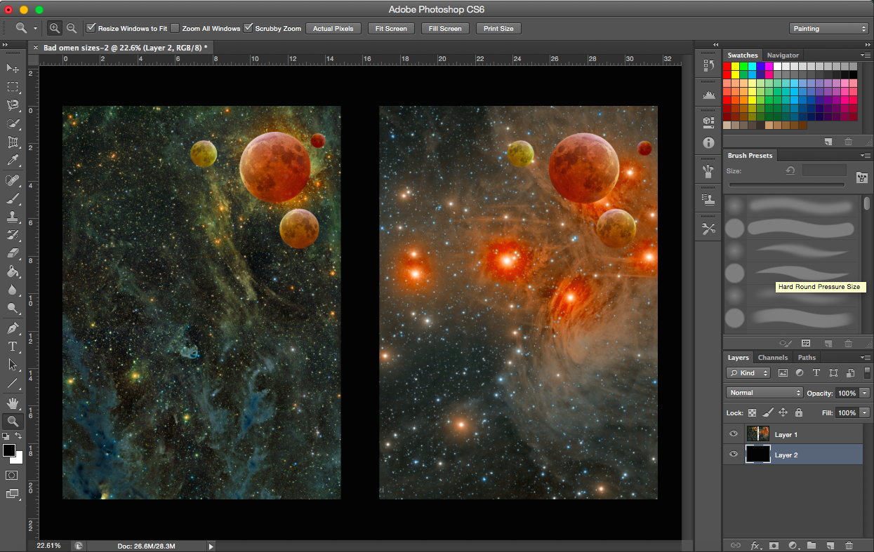
[Images Above from the left]
A butterfly from the point of view of the superstitious is a bad omen
A butterfly from the point of view of a bee is competition
A butterfly from the point of view of a child is a game of catch
[Images Above from the left]
A butterfly from the point of view of a flower is cupid
A butterfly from the point of view of a scientist is the chaos theory
A butterfly from the point of view of a caterpillar is the future
I arranged the works according to the perspective held in each work. In the first piece, the main figure is rather close to the viewer. The distance between the characters and the viewer gets progressively longer. The compositions also increase in depth (the background extends further in into distance).
Final WorksFinal Works
Challenges
The largest challenge that I faced during this project was looking for appropriate images. I mentioned a couple of difficulties in the last few posts about finding good images but with low resolutions or appropriate, high resolution images that are cut off at certain areas. I had to improvise throughout the collaging process, change my original plan to fit with the images that I had. I realised I could not have a fixed idea or plan or I would have a problem if I could not find the pictures In needed (it would have left me stuck and unable to proceed). I guess what I’m trying to say is that the project of collaging has taught me to be a lot more flexible and to improvise when necessary.
These challenges have enabled me to think of more creative solutions for the images that I have found and think about how to best use them. After doing the three compositions, the process of generating ideas became easier. I found it easier to think of ideas. Looking at an image could get me thinking about many ways I could use that image, I was no longer restricting myself to just the original plans I had in my head at the start. It made me a lot more spontaneous.
Other minor challenges would be the type of vintage images. They are not all of the same quality (depends on how old they are). The way they look also depends on which source they were from. An image from a comic cover is different from an image from a postcard (e.g. their colours are rendered differently) So I had to make sure these differences do not cause my compositions to look odd or messy. I found that I had to analyse each image and just try out different images together to see what worked. Colours needed to be adjusted here and there to fit with the other images, so that nothing stood out too much.
Comments
Comments received after critique session
It’s always really nice to receive feedback on your work. The comments were very encouraging as usual. Many liked the colours and it was interesting and wonderful to see that everyone had their own favourite composition out of the six. To me that meant that there wasn’t one particular piece that stood out and stole any attention, each piece had its uniqueness and was special.
FInal thoughts
I have really enjoyed doing collages. I have to admit it was really fun. It allowed me to come up with surreal and interesting/ varied compositions. Looking for images was a tough process but through the process of looking, I found many weird and interesting ones that were really quite funny. The sense of satisfaction gained when I do find an image that I can use is indescribable (I get so thrilled at the number of ways I could use the image in my compositions). I am really happy at the way my works came out and I would definitely continue to do collages for future projects.
“A butterfly from the point of view of a scientist is the chaos theory.”
The way I usually explain the chaos theory is: Small action–> almost unrelated effect
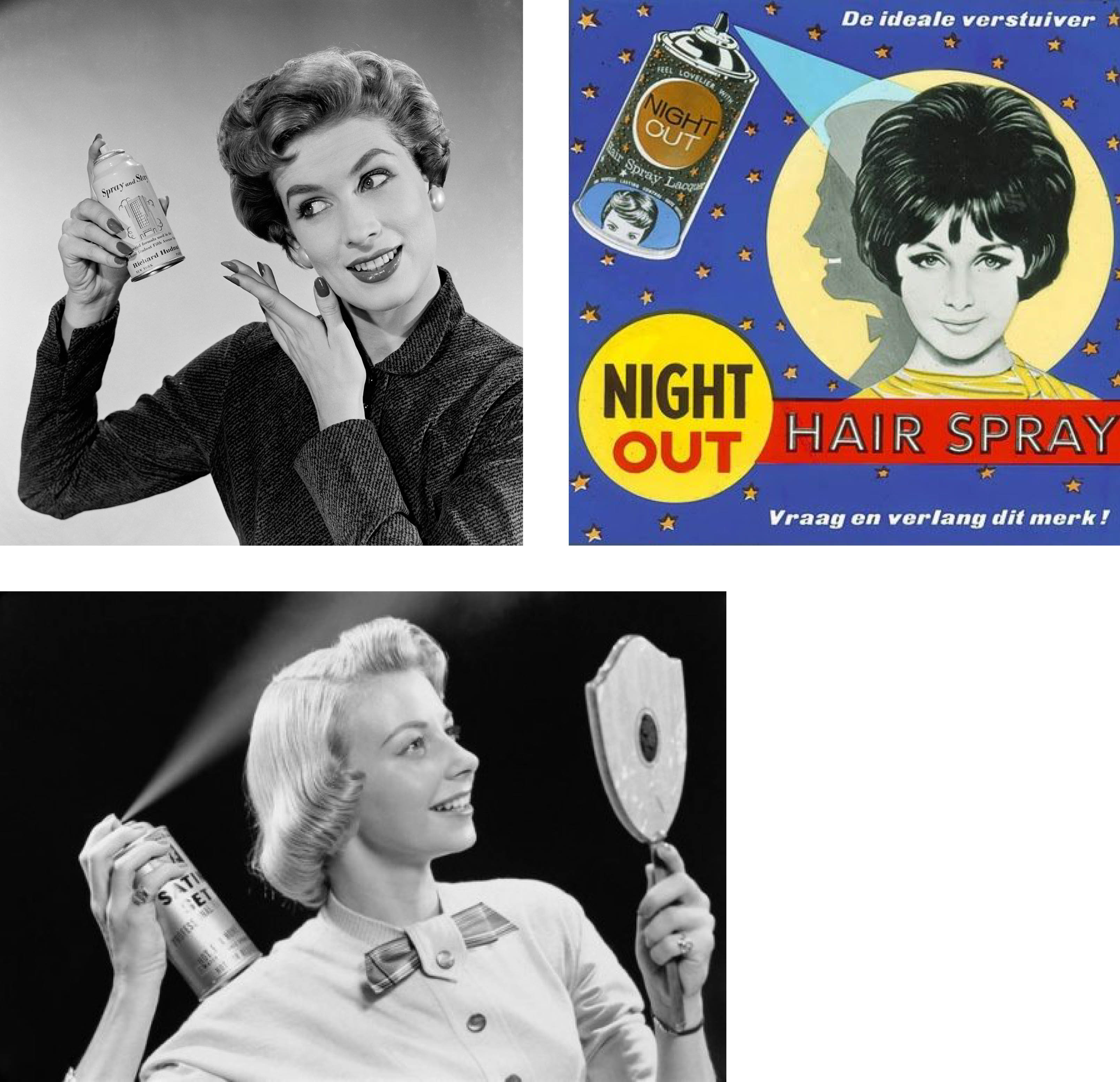
My initial plan involved using some sort of vintage image of a someone doing chores or just simple daily actions and that leading to a natural disaster or something like that. For example, using a hairdryer that leads to a hurricane, or someone watering plants leading to a flood.I found a couple of beauty advertisements of ladies using hairsprays (see below) and thought I could relate that to causing a desert storm of clouds and rain.
It was difficult trying to find high resolutions for the images and vintage images of hurricanes, floods and storms are hard to come by. So I had to tweak my idea a little bit. It still involved a simple action that would lead to something that seems totally unrelated to the initial action.
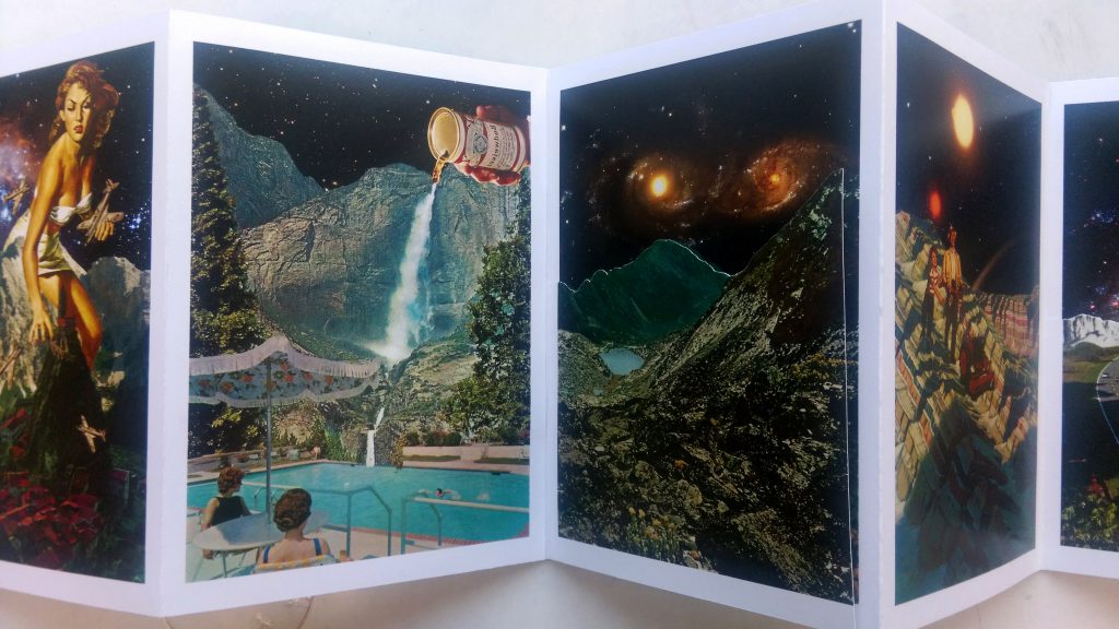
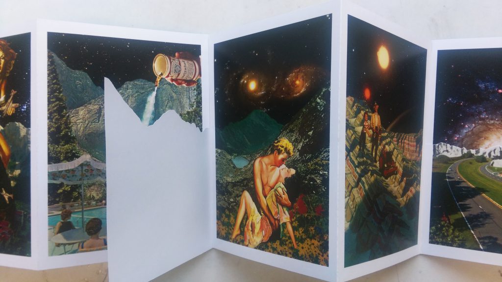
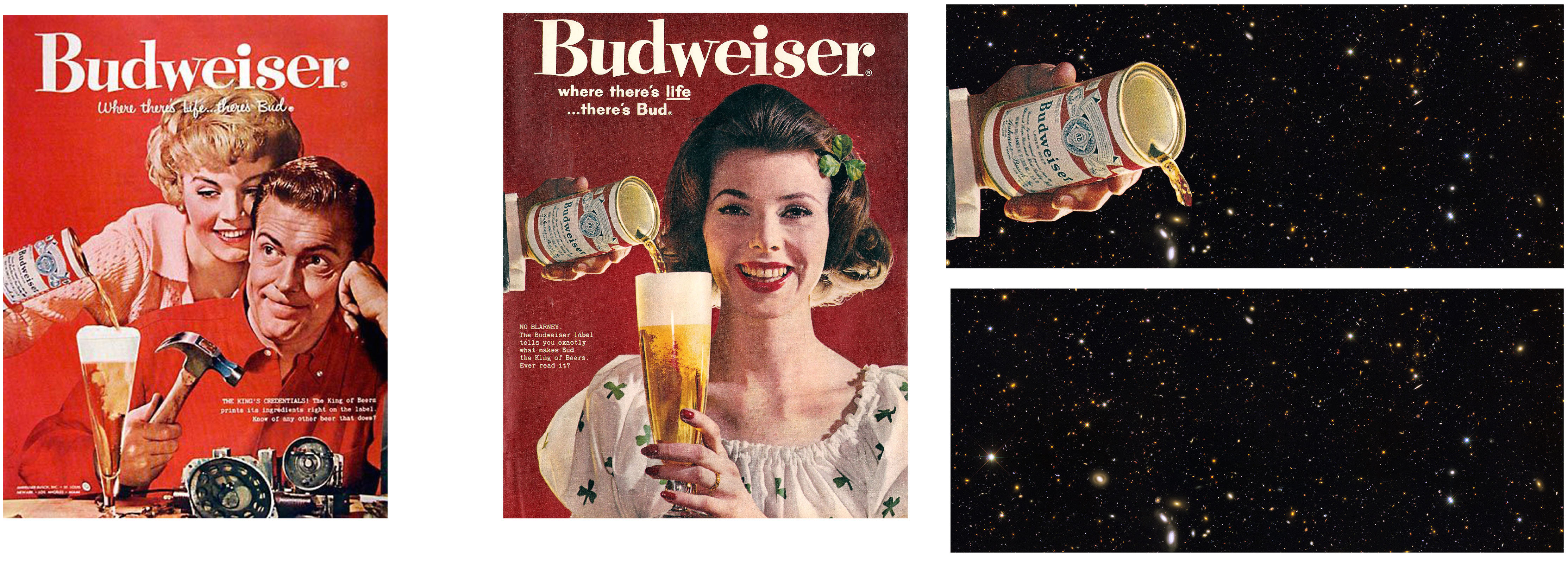
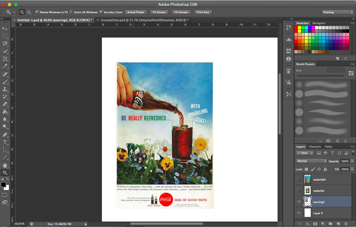
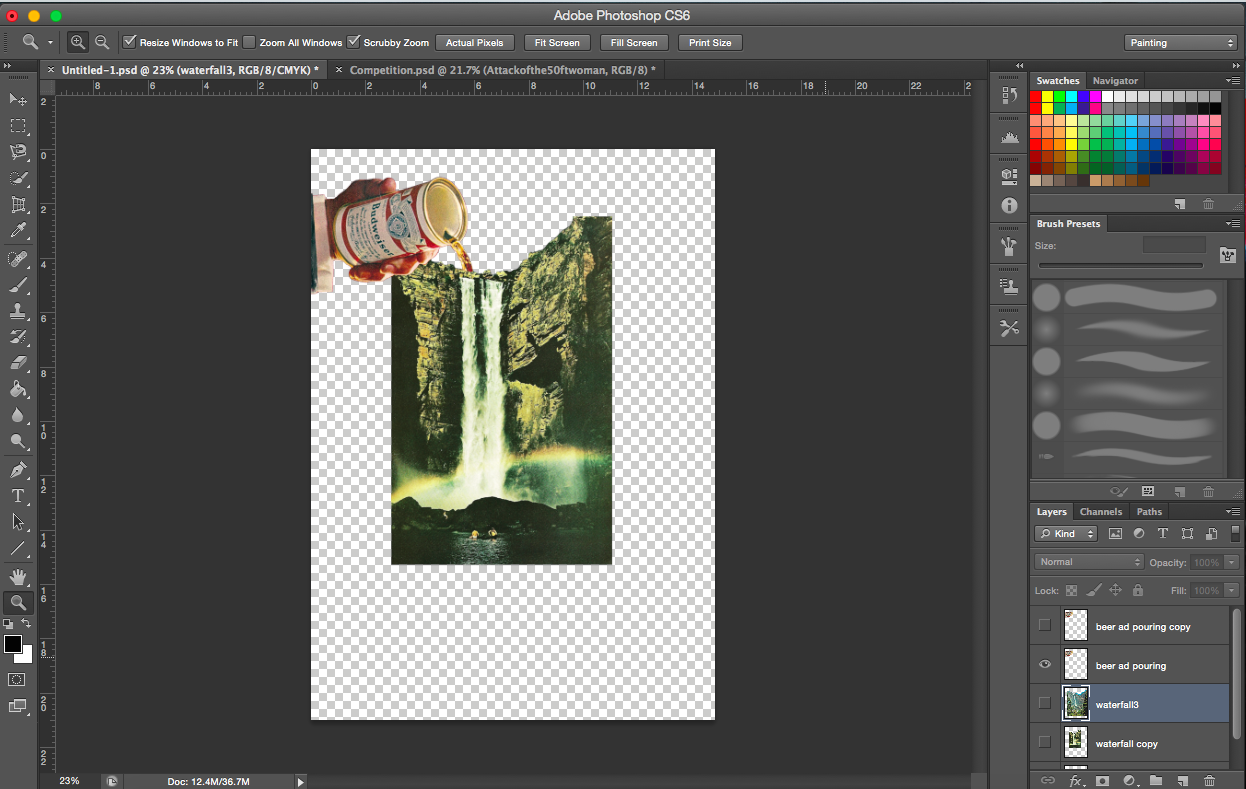
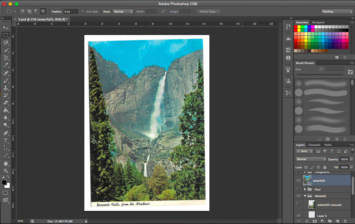
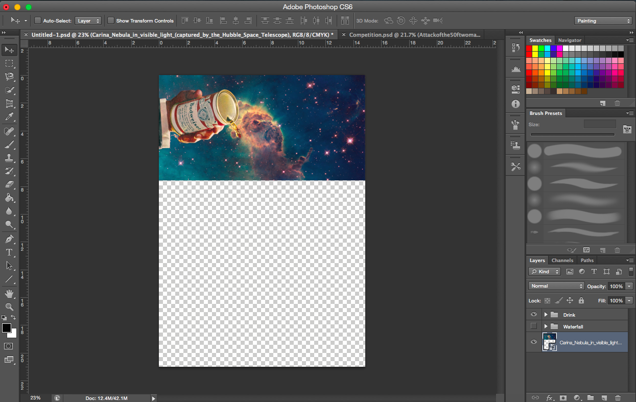
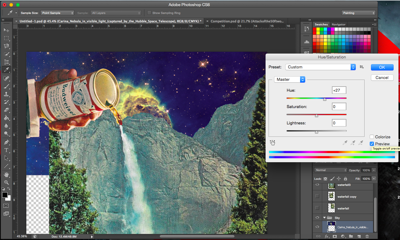
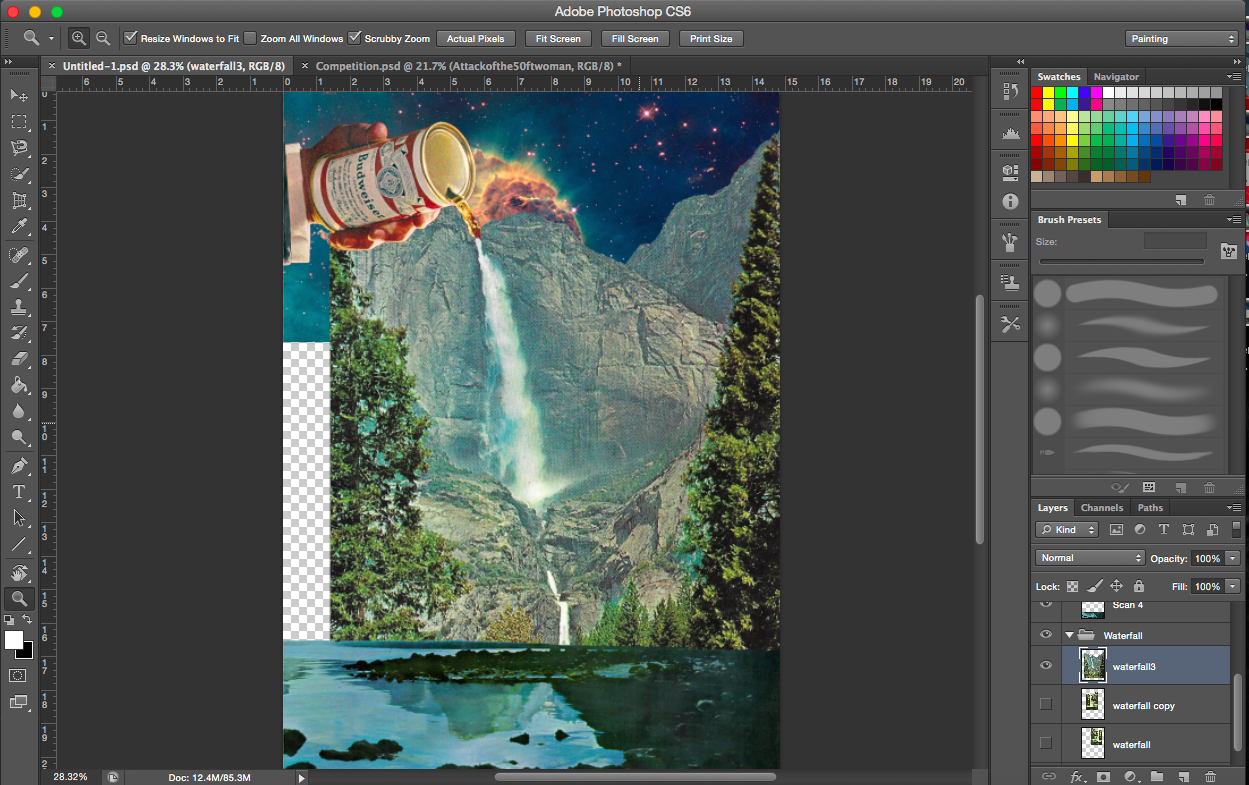
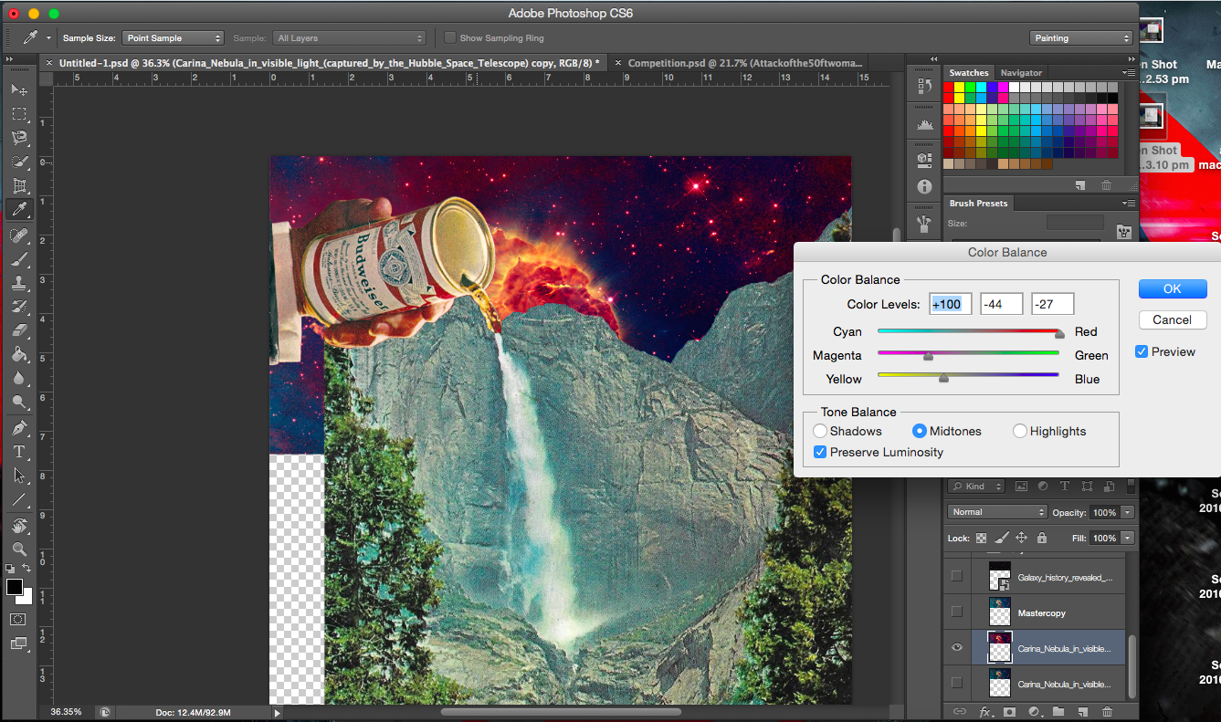
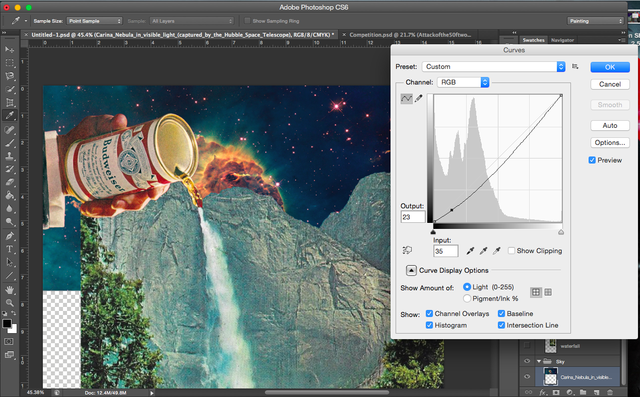
So I figured pouring of drinks is quite simple an action and decided to find images for that. And drinks got me thinking about water, floods and waterfalls.
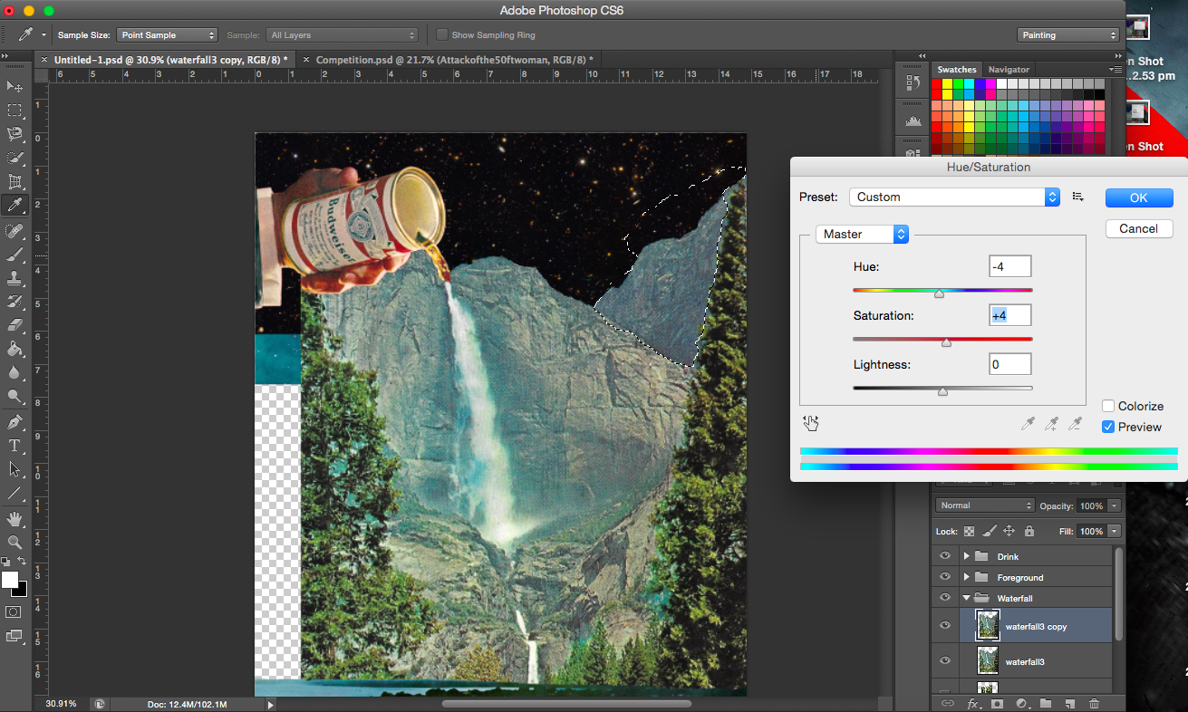
[Image Above] This, I thought was quite cool (I mean the background). Placing and positioning the nebula background in the right place, where the cloud is at the point of contact of the drink and waterfall. It is almost as though some sort of chemical reaction is taken place, like smoke rising.
[Image Below] I decided to go with a cleaner space background, it was less distracting. I’d also prefer the black to the coloured background (see the previous few images).
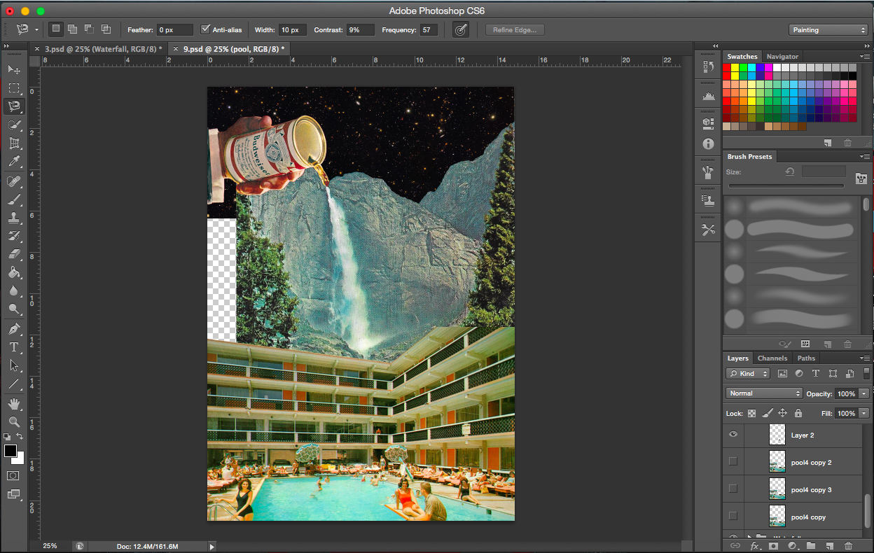
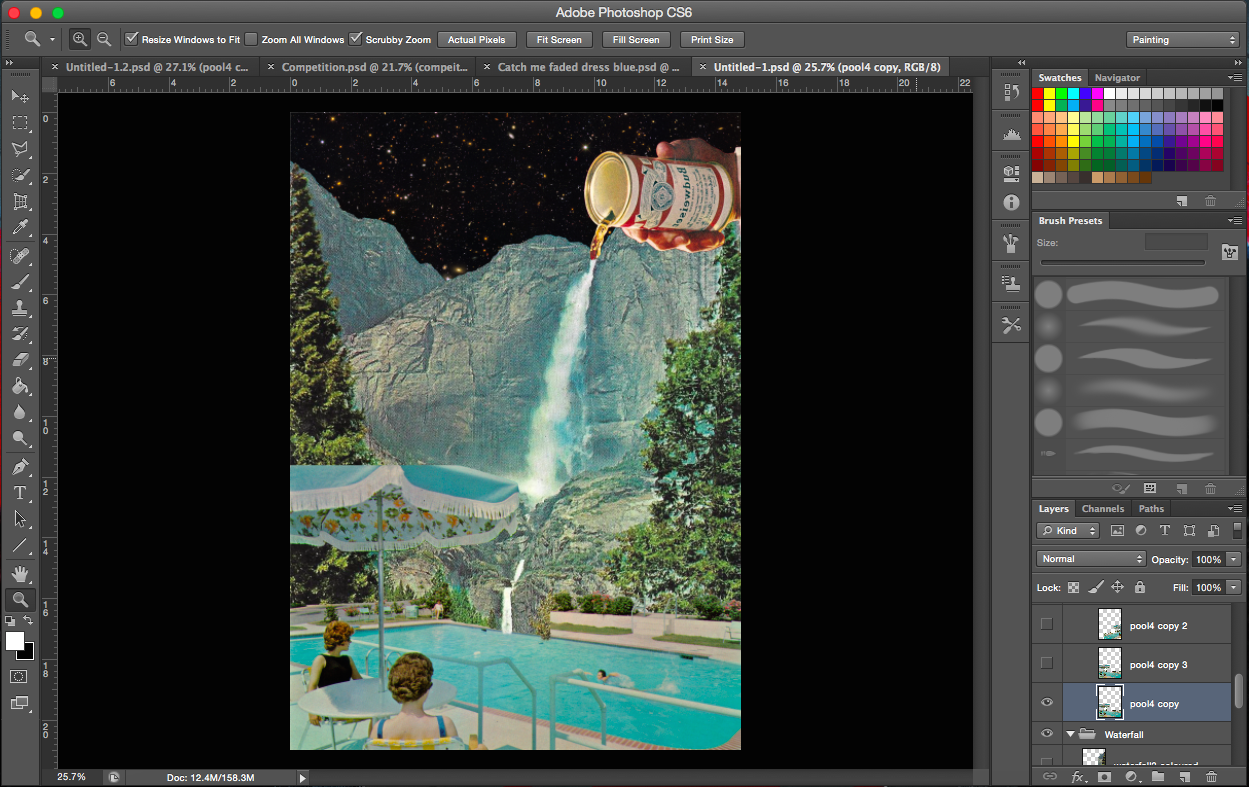
After incorporating the drink with the waterfall, I felt that the image needed more. So water. What uses water? Where do you find water? Keeping in mind that it should be something that isn’t food/drink related or natural (like a waterfall). Preferably something manmade. I thought swimming pools.
Adding swimming pool scenes to foreground
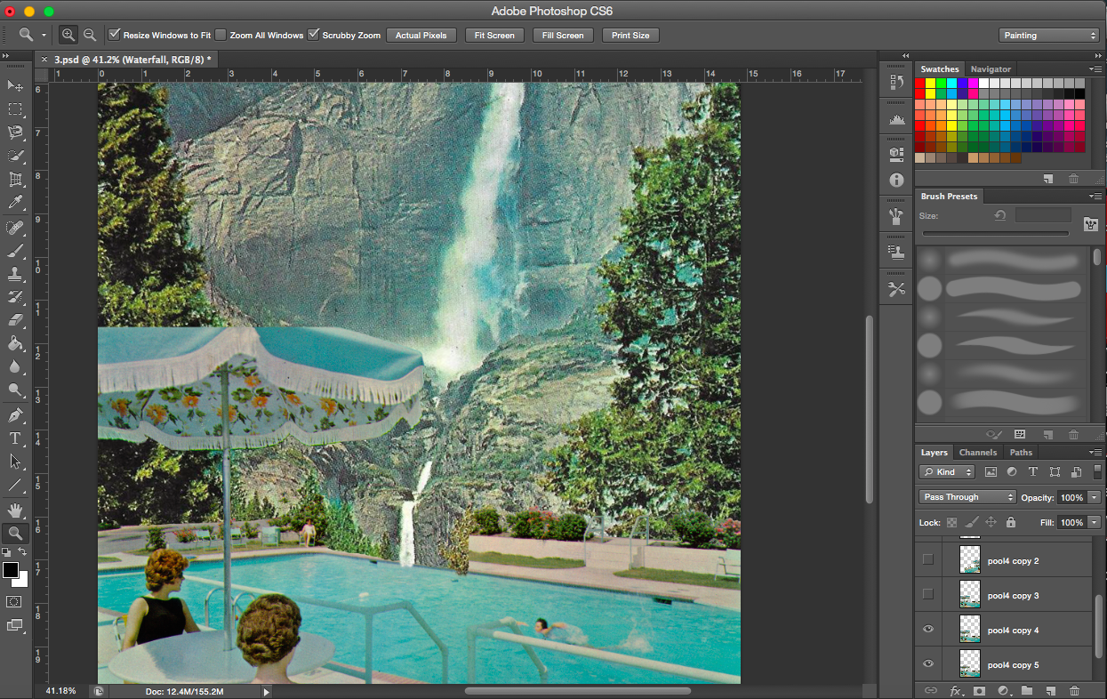
Problem: Cut off umbrella
[Flanking Images] The incomplete umbrella: I made the decision to remove all blue portions of the umbrella to make the image (of the umbrella) more complete.
——————————————————
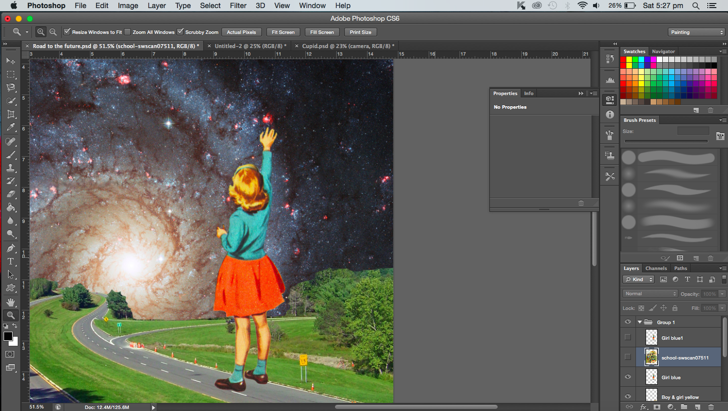
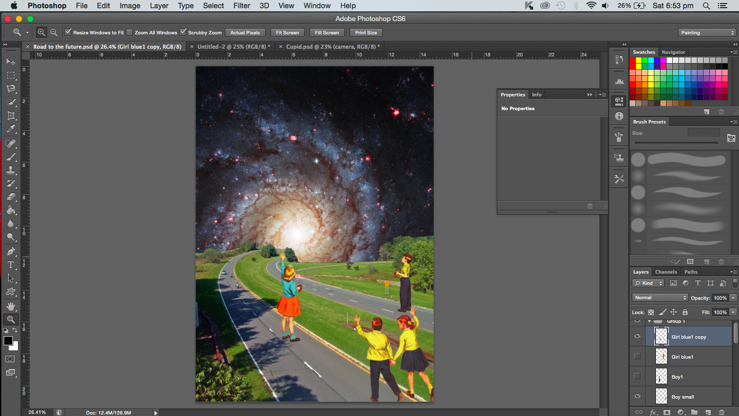
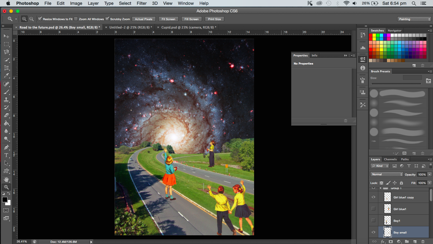
PROCESS- Looking into the future
“A butterfly from the point of view of a caterpillar is the future.”
I have saved the best for last. The whole project started with me wanting to do this particular composition. It was inspired by Eugenia Loli’s Farscapes and I was so excited to try it out myself.
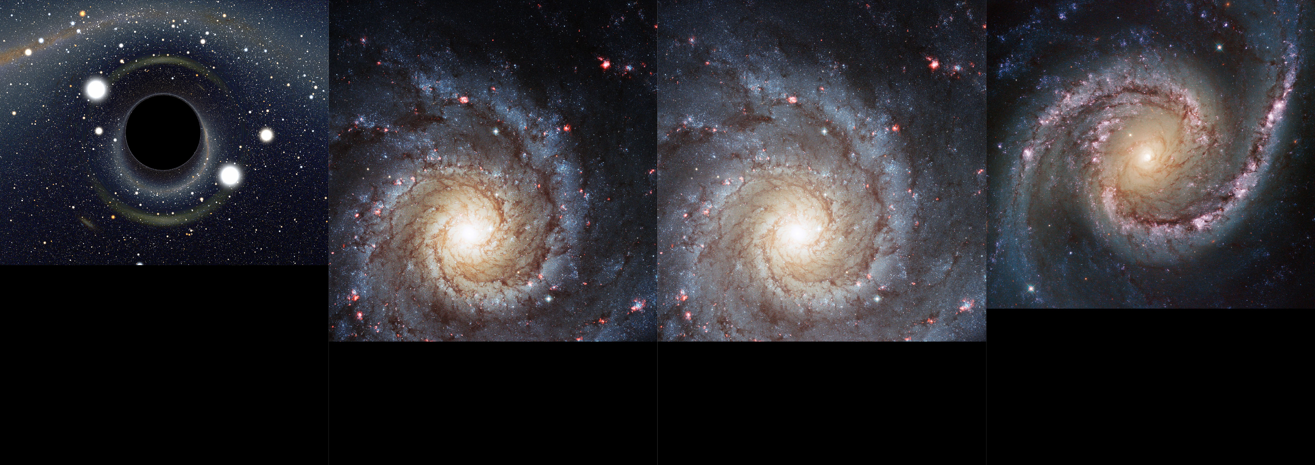
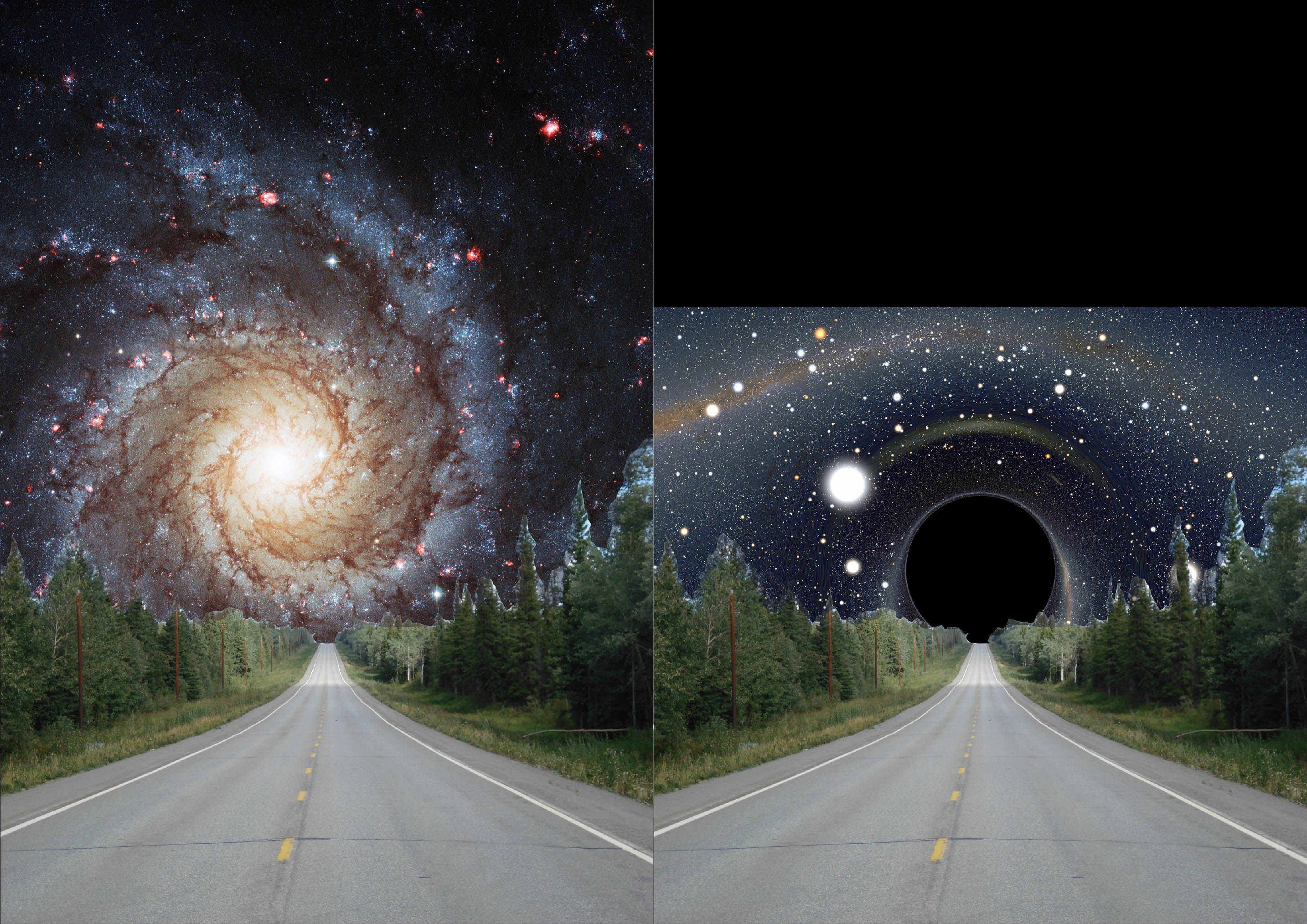
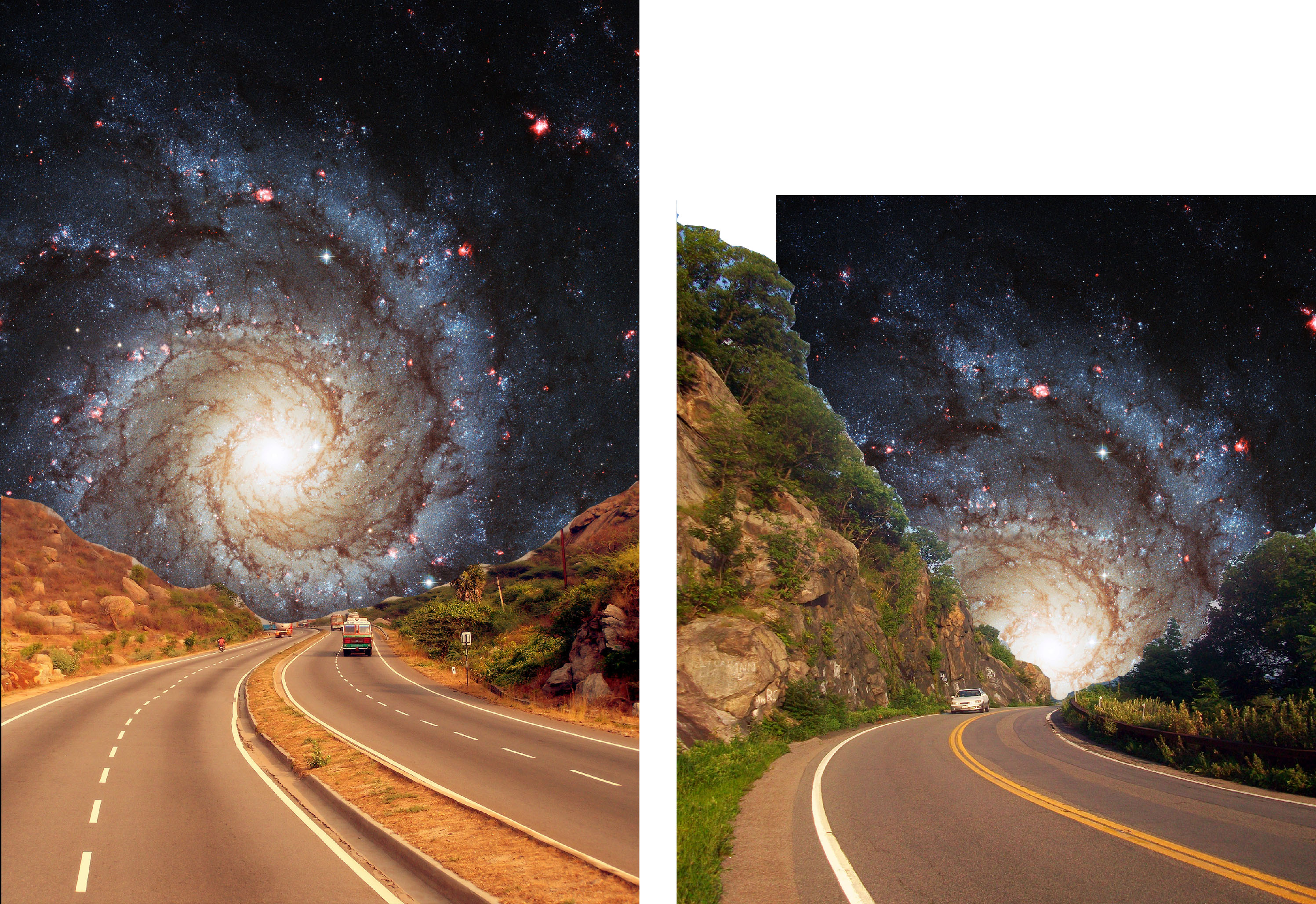
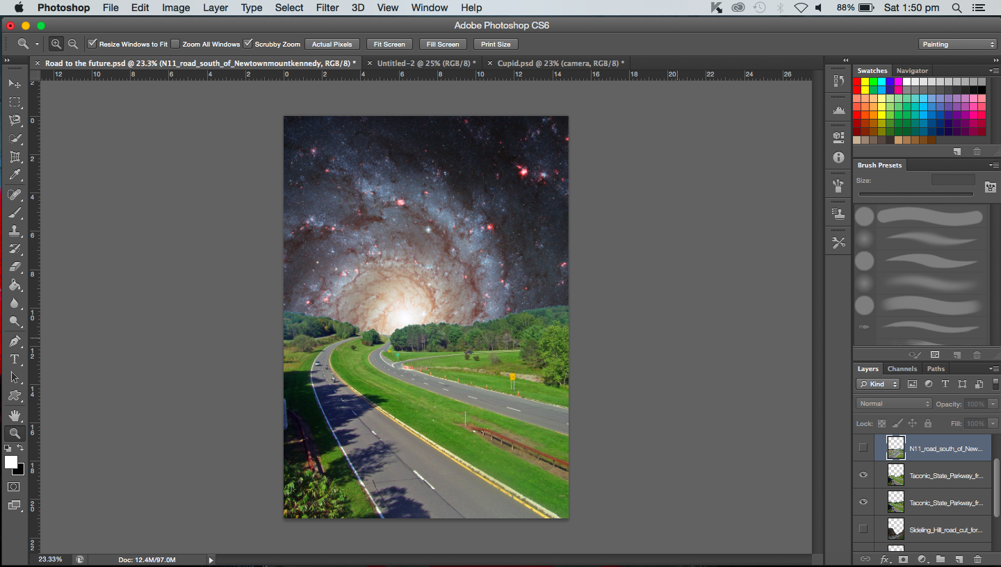
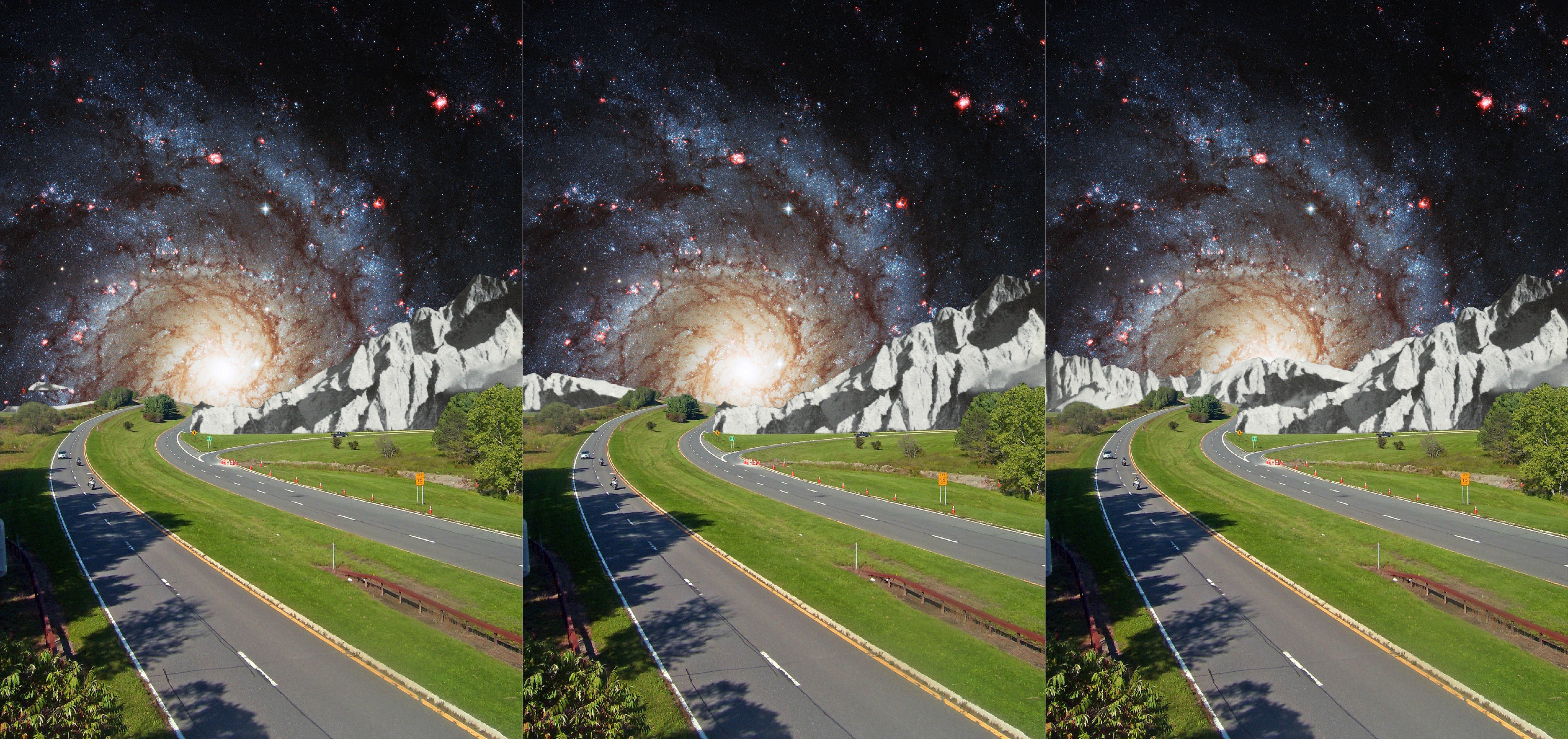
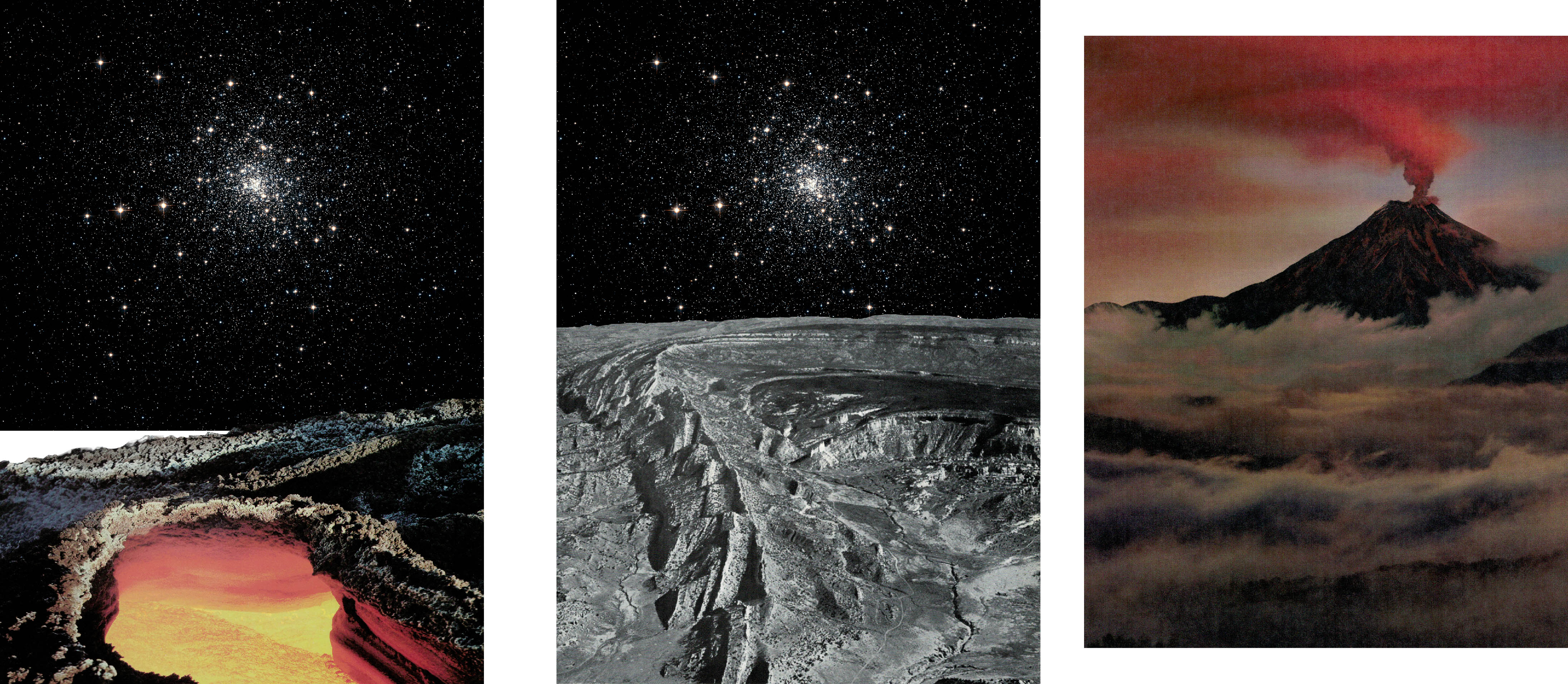
To represent the future and its unknown and mysteriousness I chose to use a galaxy image. Actually I was going to use a black hole but it just resulted in the composition looking like it was missing something. For the only black hole image that worked, it was not large enough to be used.
Different space backgrounds
I needed to add a road that leads from the foreground into the galaxy, away from the viewer. The road would represent the long journey ahead for the caterpillar as it travels towards its future.
Left: Galaxy Right: Black holeTrying out various roads for the foregroundForeground with a traffic jam imageScanned images from a bookRoad image that I decided on
‘Caterpillars’‘Reaching for a star’‘Reaching for a star’ close up
“A butterfly from the point of view of a bee is competition.”
In this post, I will be showing some of the screenshots and images created while I was working on the pieces.
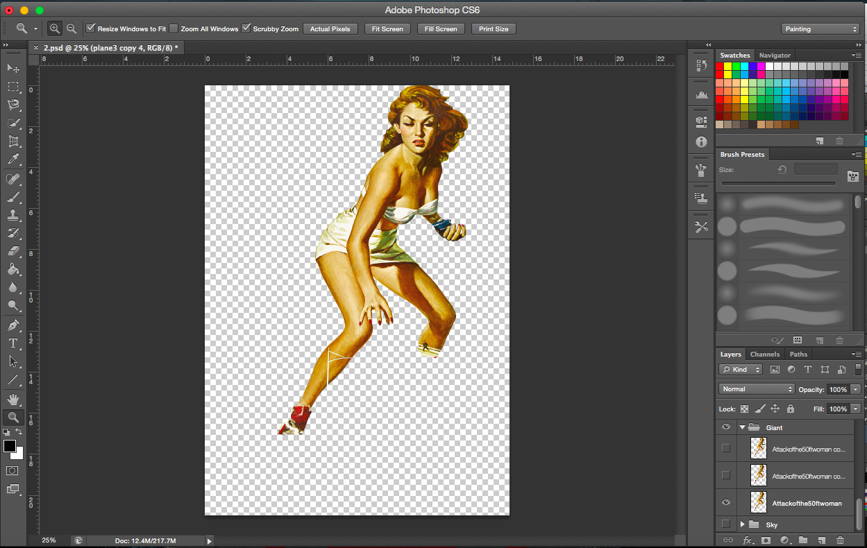
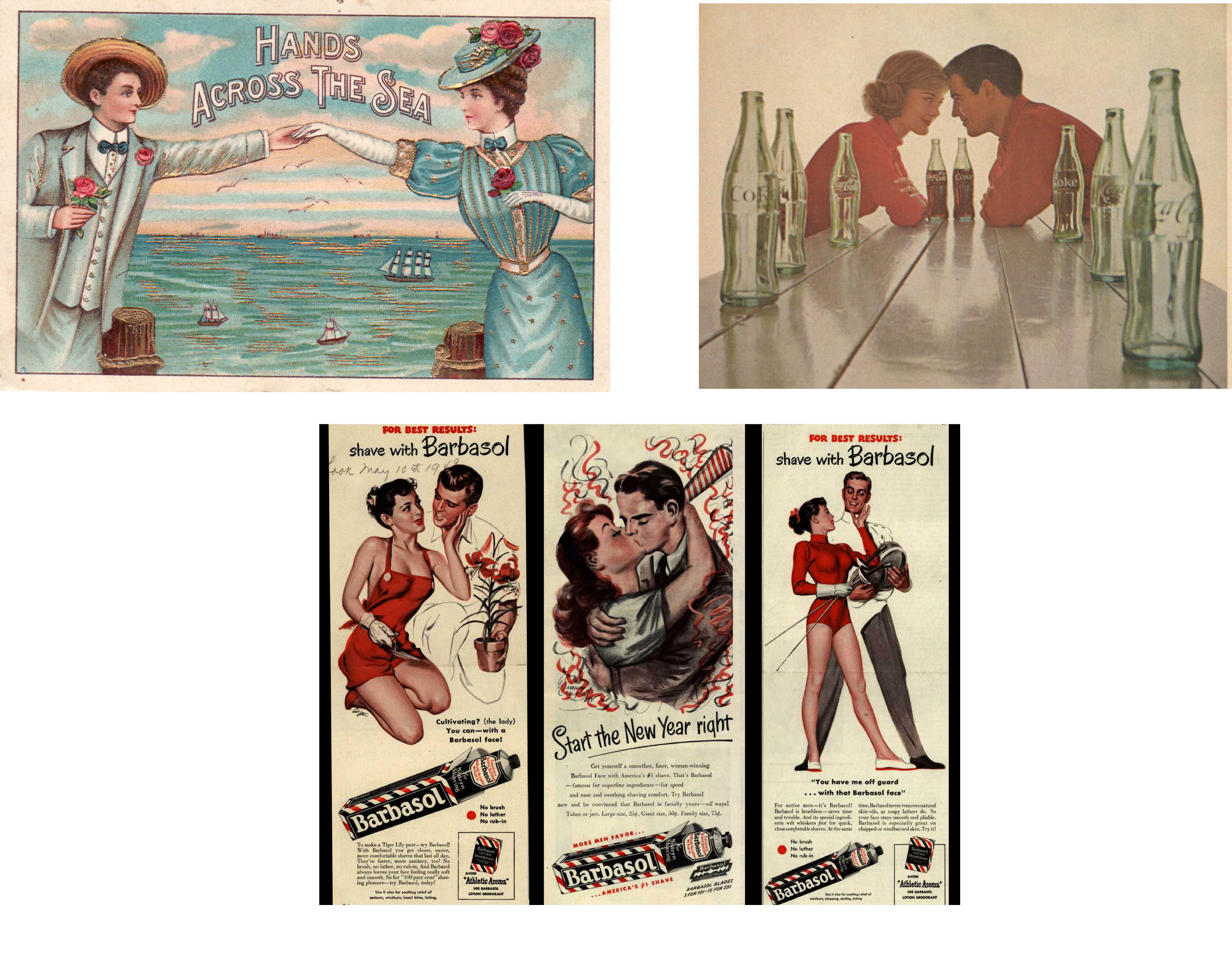
For this particular point of view, I was thinking about how butterflies and bees both collect nectar, hence I saw them as competitors. The story/scene I wanted for this, was one with tension. I chanced upon this comic cover of a giant and I thought it was really appropriate for this point of view. In terms of size, the butterfly is much bigger than a bee. Hence, the giant could be a butterfly. It also just so happens that the giant is in the pose where she is grabbing something which is good (better than a neutral pose). Such a pose results in a more interesting scene. Since she is grabbing something, I figured she would be grabbing either the competition/enemy or nectar.
[Image below] I thought this advertisement was pretty funny. One of the many interestingly quirky advertisements I saw while searching for images. I thought of competition of a lover. Two women (butterfly and the bee) fighting for the man (nectar). I didn’t use this in the end because I felt there wasn’t ample room to expand on the image. The image itself already screamed competition.
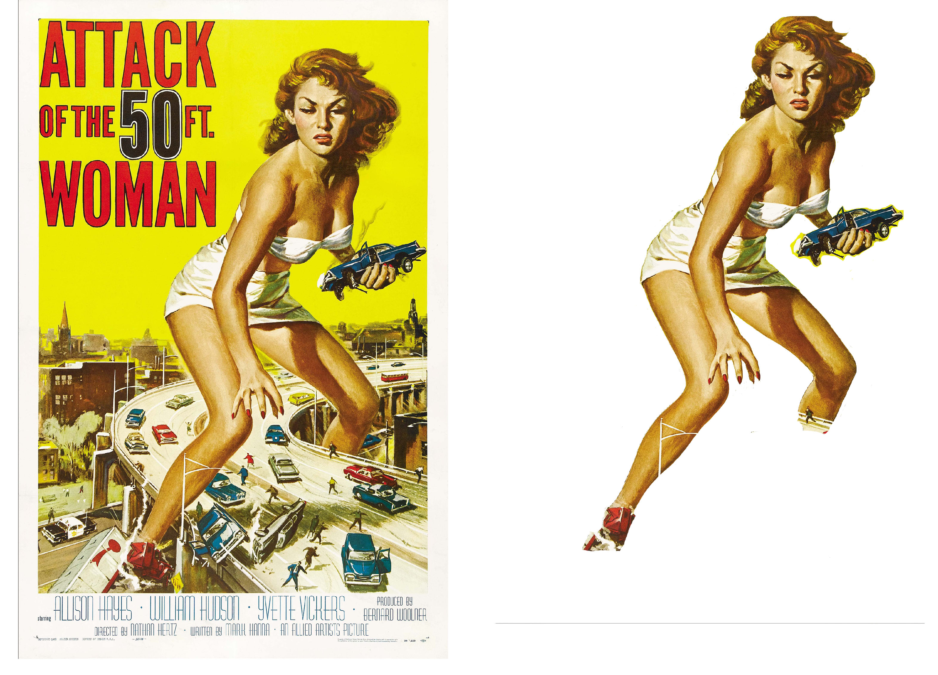
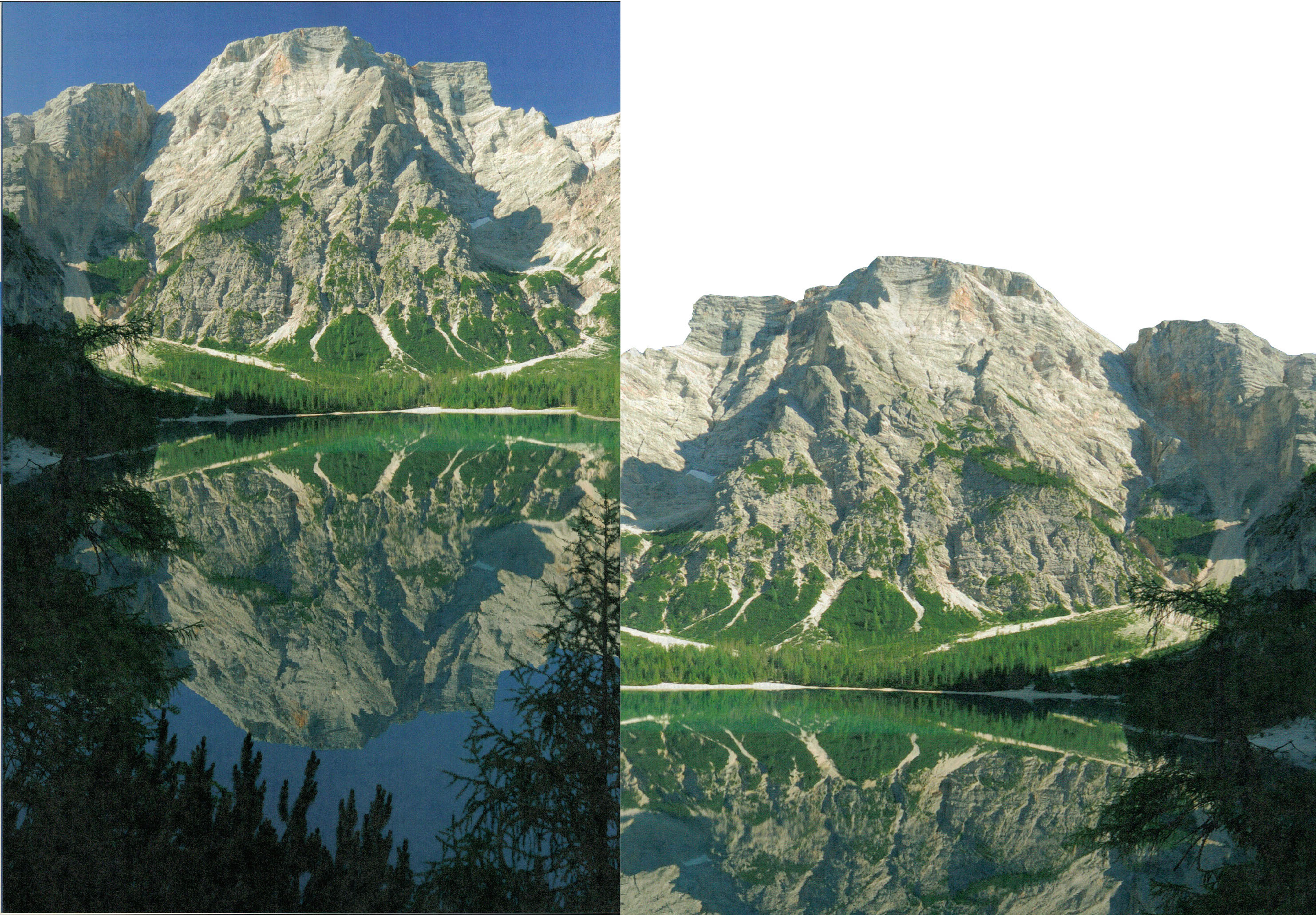
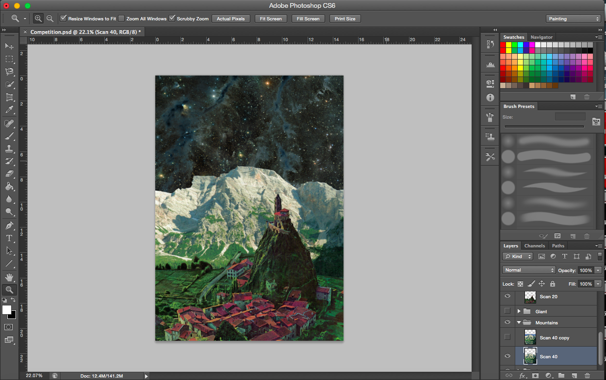
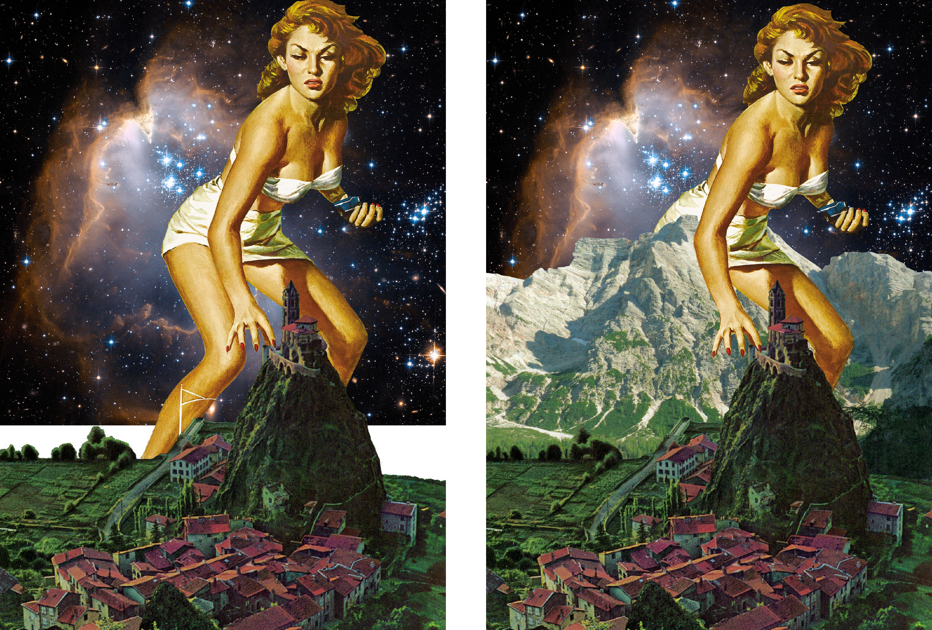
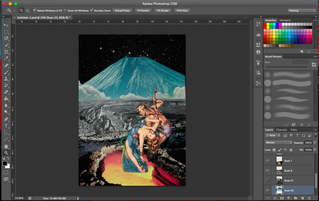
[Next 2 Image Below] These are images from a book I found (the mountain one). I knew the bottom image would go perfectly with the giant image. A scene where the giant is attacking the town or trying to take something from there (town symbolises nectar).
[Image Below] I’m sticking to the space backgrounds here too. Not only does it give the work a sci-fi look, I find that the black in the images also gives a good contrast to the coloured, vibrant images in the foreground and middle ground. In a way, it is present but does not distract or take the attention away from the immediate scene of the work. It complements the work.
Trying out other town images
Existing and emerging
[2 Images Above] These two images portray one of the challenges of working with collage and pre-existing images. The images usually aren’t in its full form (see very first image of the giant, her legs are cut off) and you also get overlap of images from the original image (e.g. the lamppost is in front of her right leg even after cropping). I am forced to think outside the box and come up with a solution to hide those areas without it looking like I hid the legs deliberately.
I actually would like to talk about the positions and importance of finding the right images. It just so happens that the existing shadow cast on the giant’s left leg now looks like it was caused by the hill in the town image. Take the mountain image as another example, the right side has a shadow cast, with the addition of the giant, it looks like it’s hers. Had the shadow been mostly on the right, I would have to flip the giant image. Light seems to be coming from the left, illuminating the left more, hence the space cloud is placed on the left.
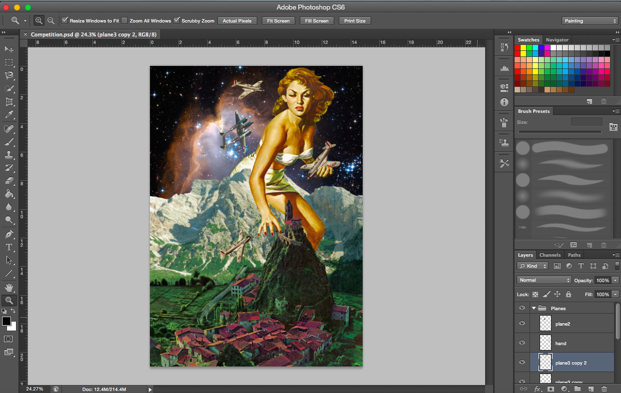
[Image below] With the symbols for the butterfly and nectar (competition) already dealt with, I then went on to search for the bees. What could compete with a giant? Fighter planes. I imagine the planes (bees) protecting what they think is theirs (the town).
[Image Above] There were two main images of planes I wanted to use. I tried to incorporate both into the composition but soon realised that the grey plane was a little distracting and having two types was too messy. I thus stuck with the beige plane due to its colour.
——————————————————
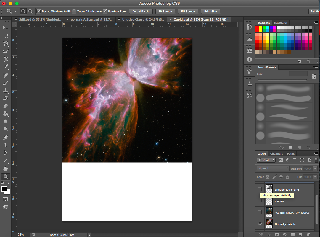
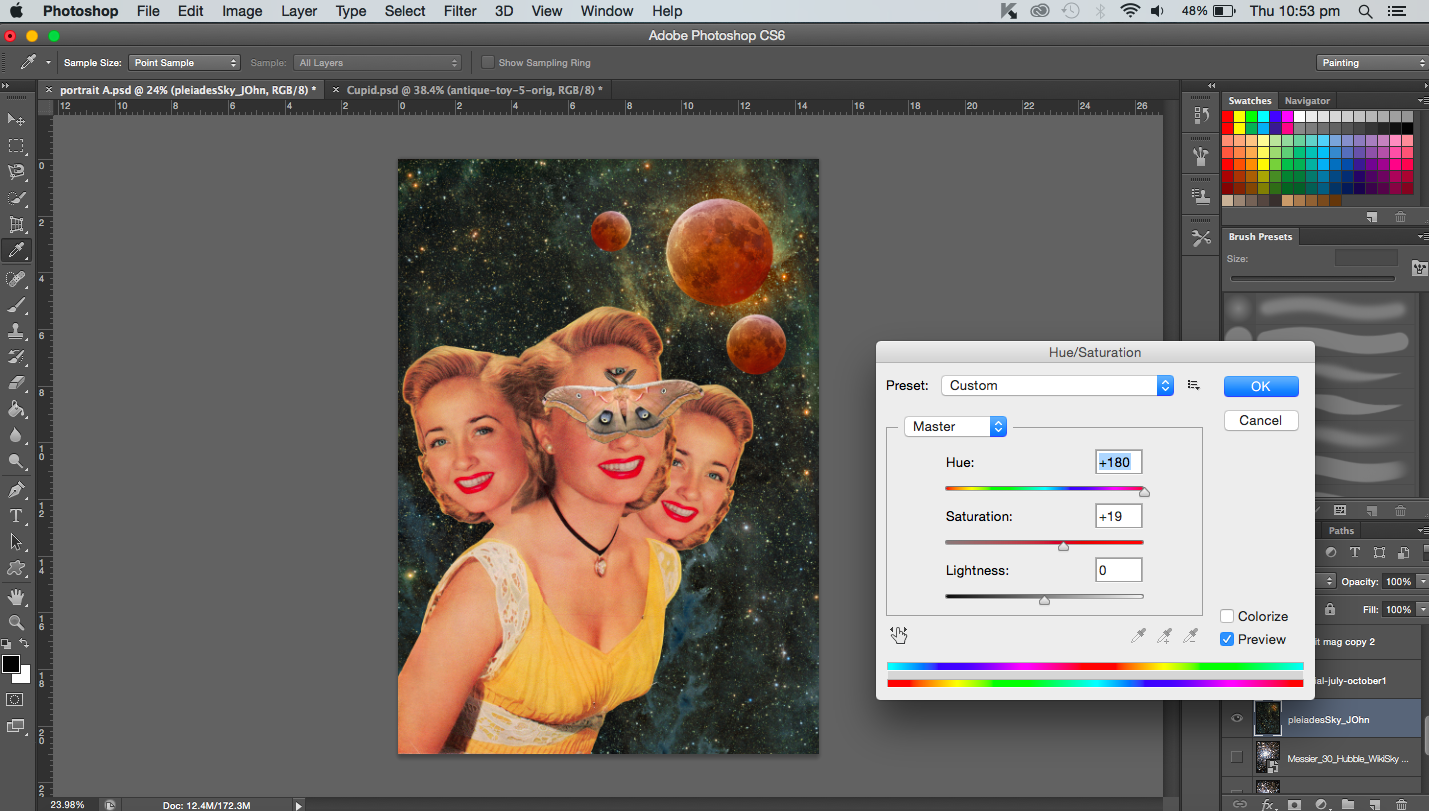
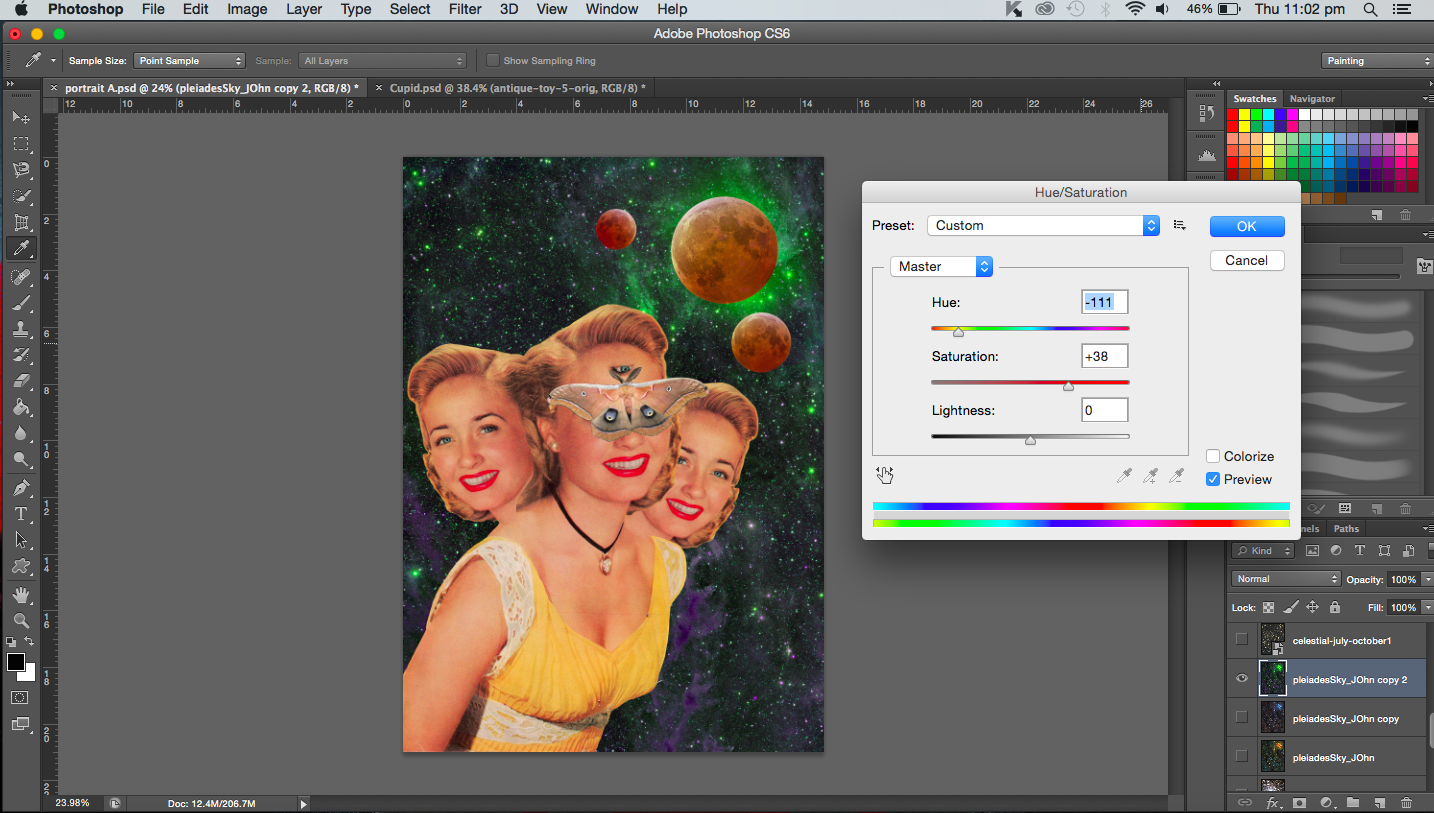
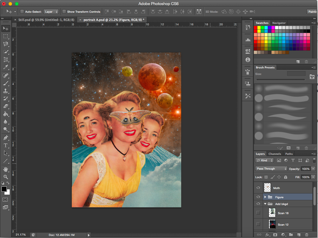
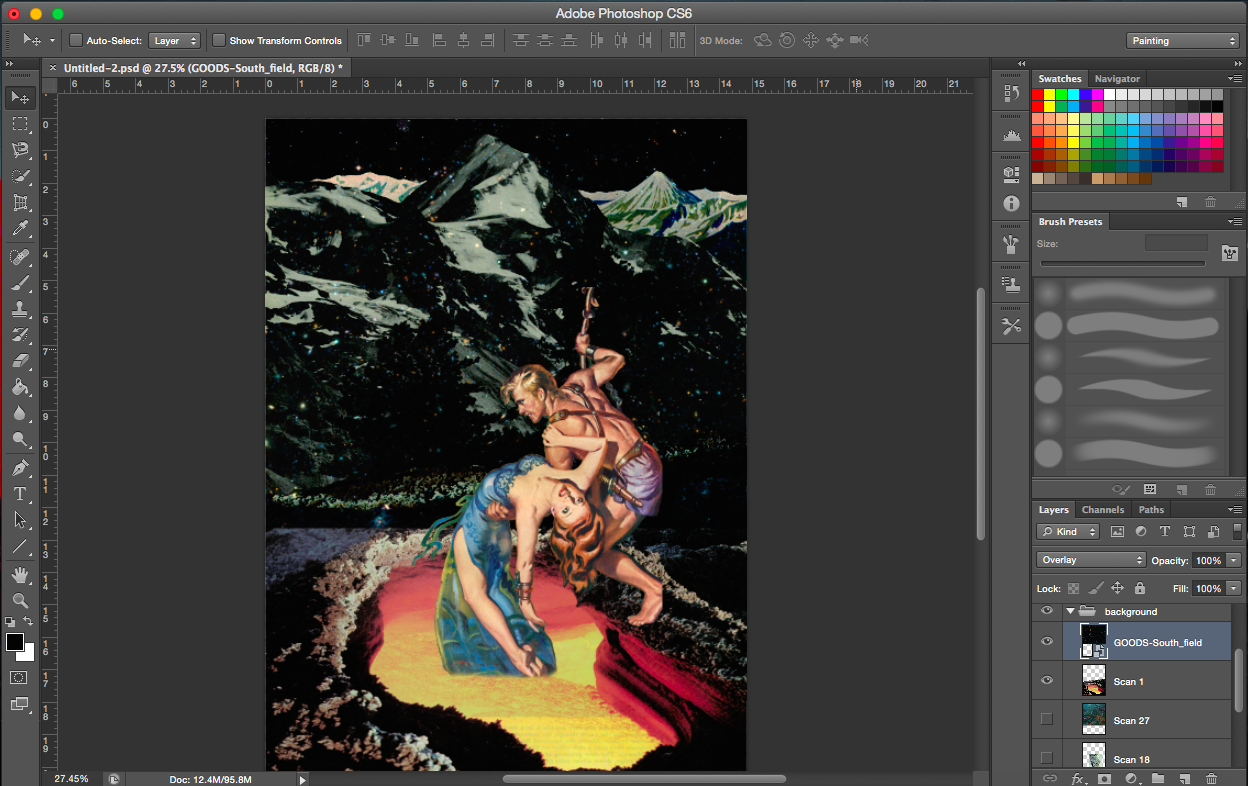
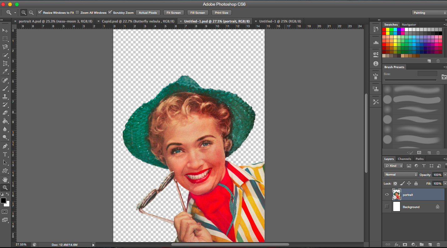
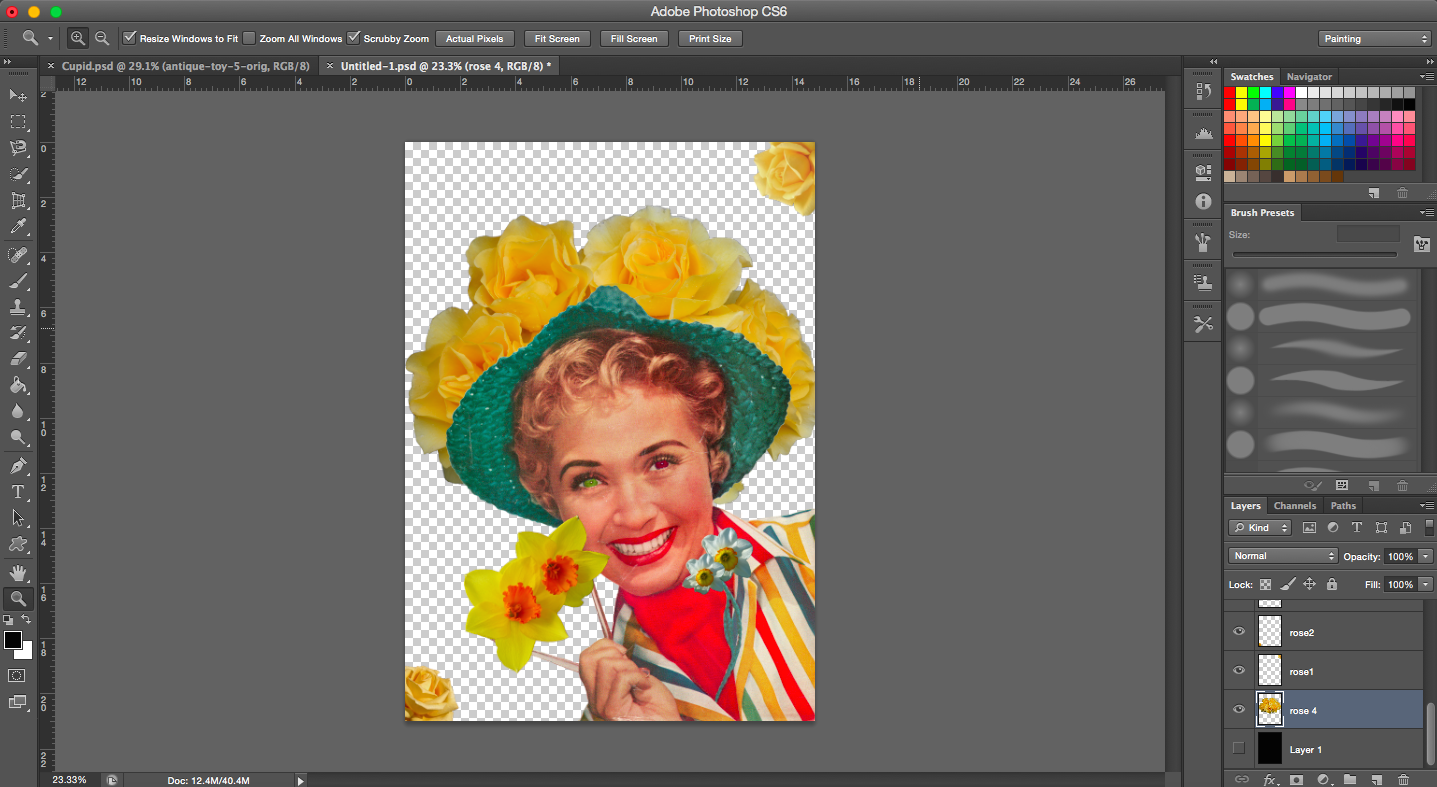
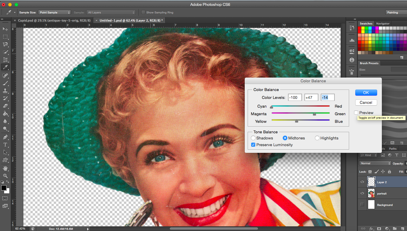
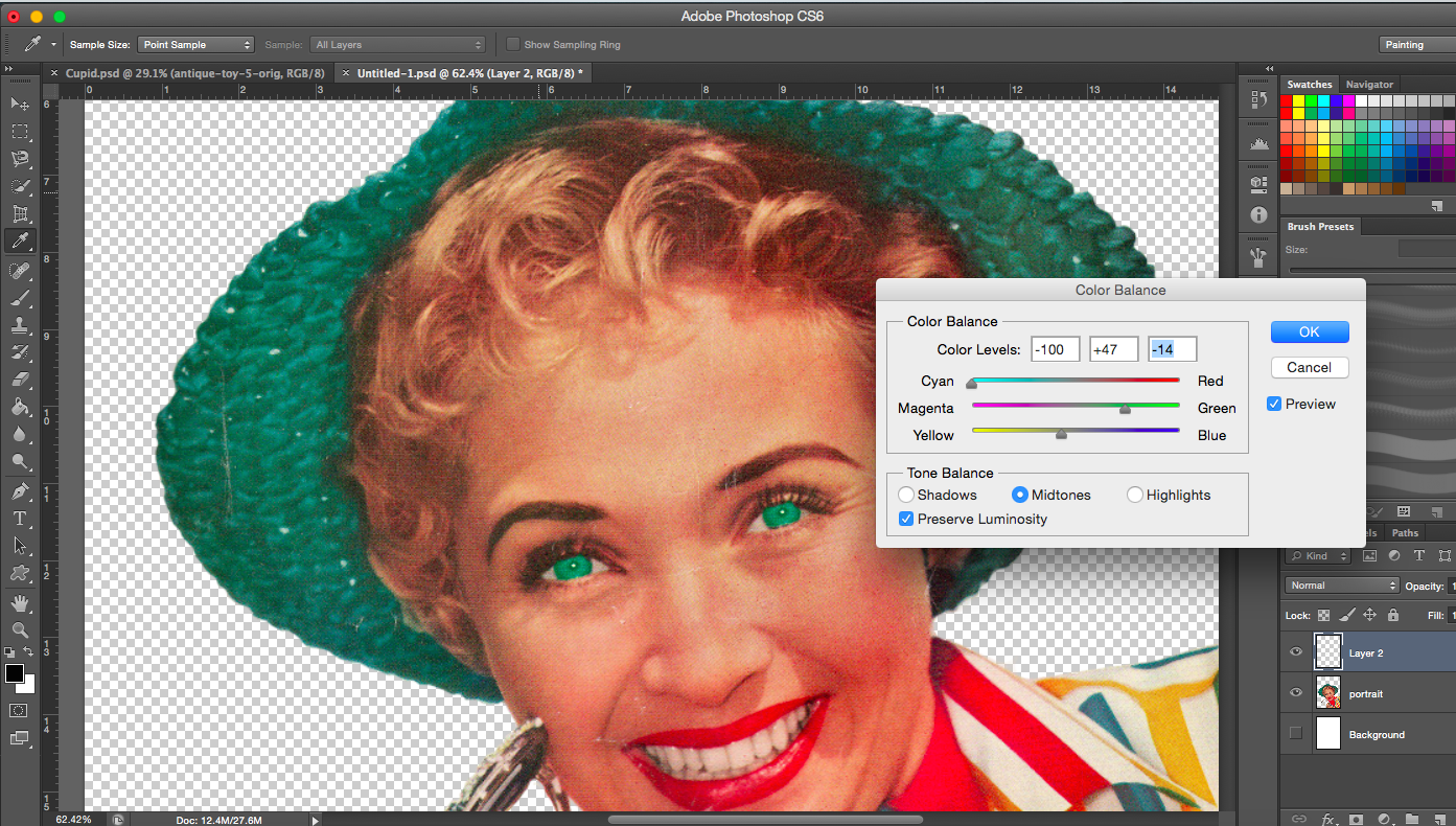
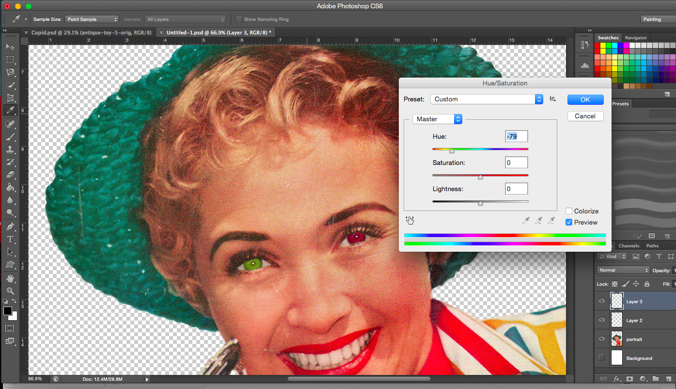
PROCESS- Cupid
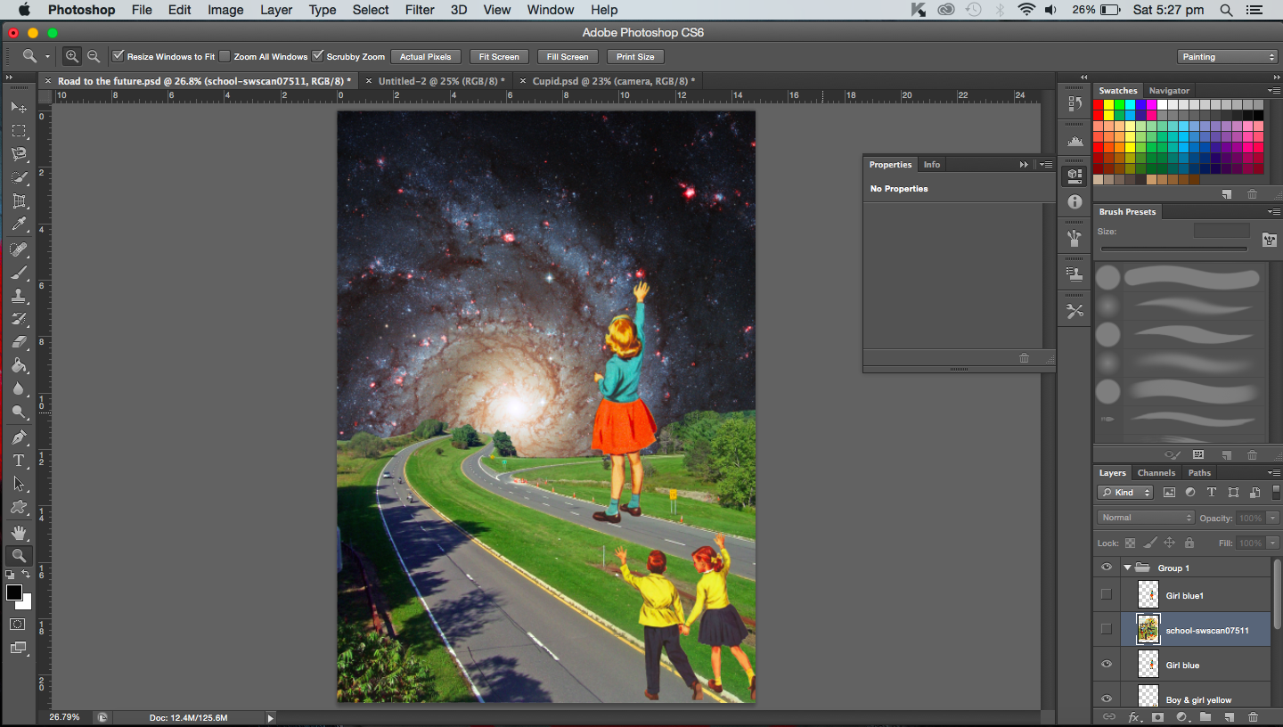
“A butterfly from the point of view of a flower is cupid.”
I wanted to represent cupid as a puppeteer, controlling and bringing two people together. But I also wanted to use the fact that cupid is usually portrayed as a child so I began my search with these in mind. The flowers would thus be represented by lovers.
Space Nebula
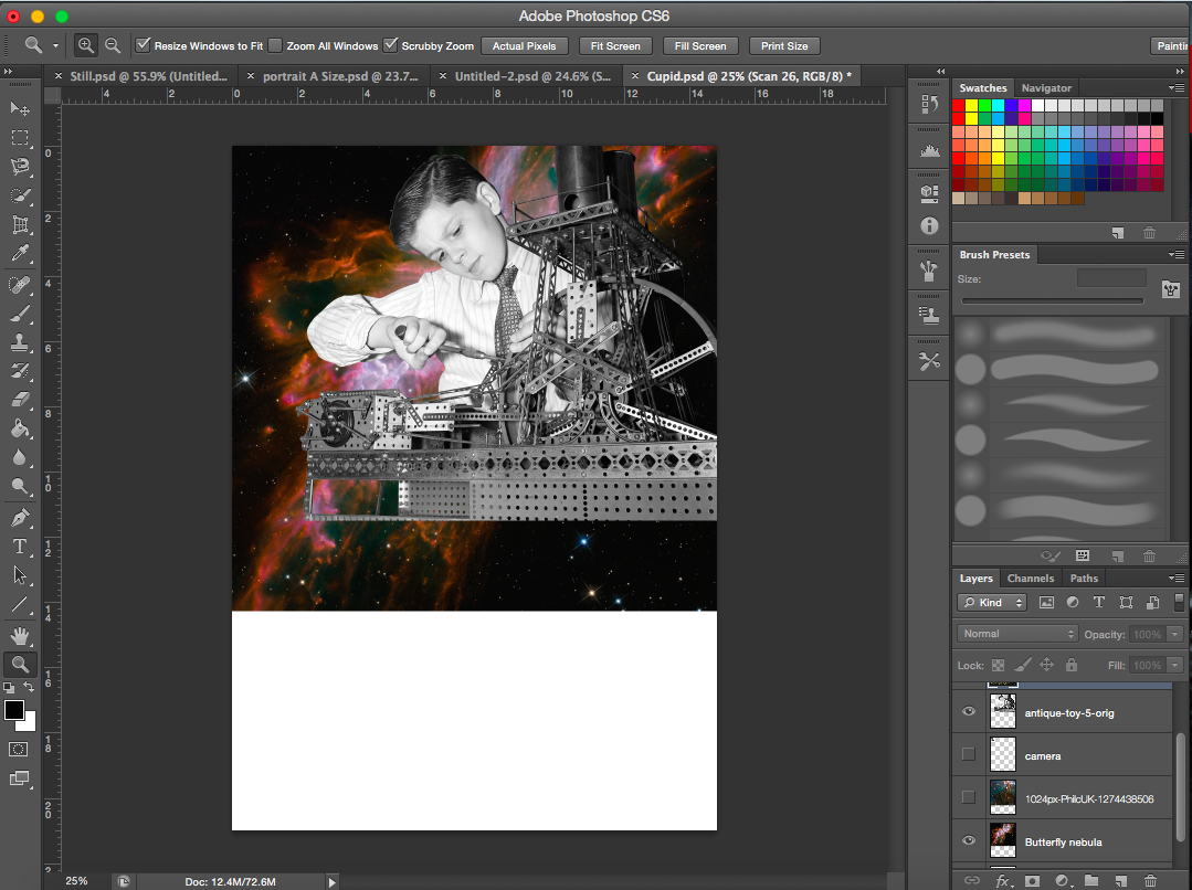
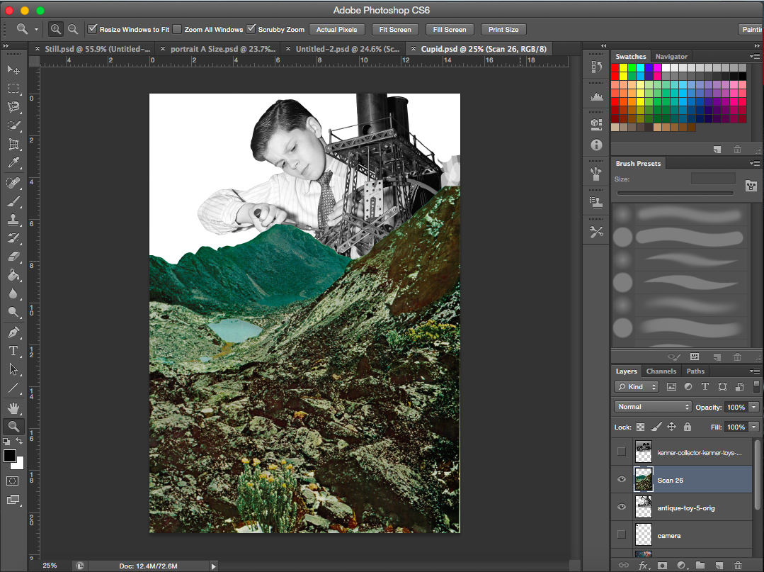
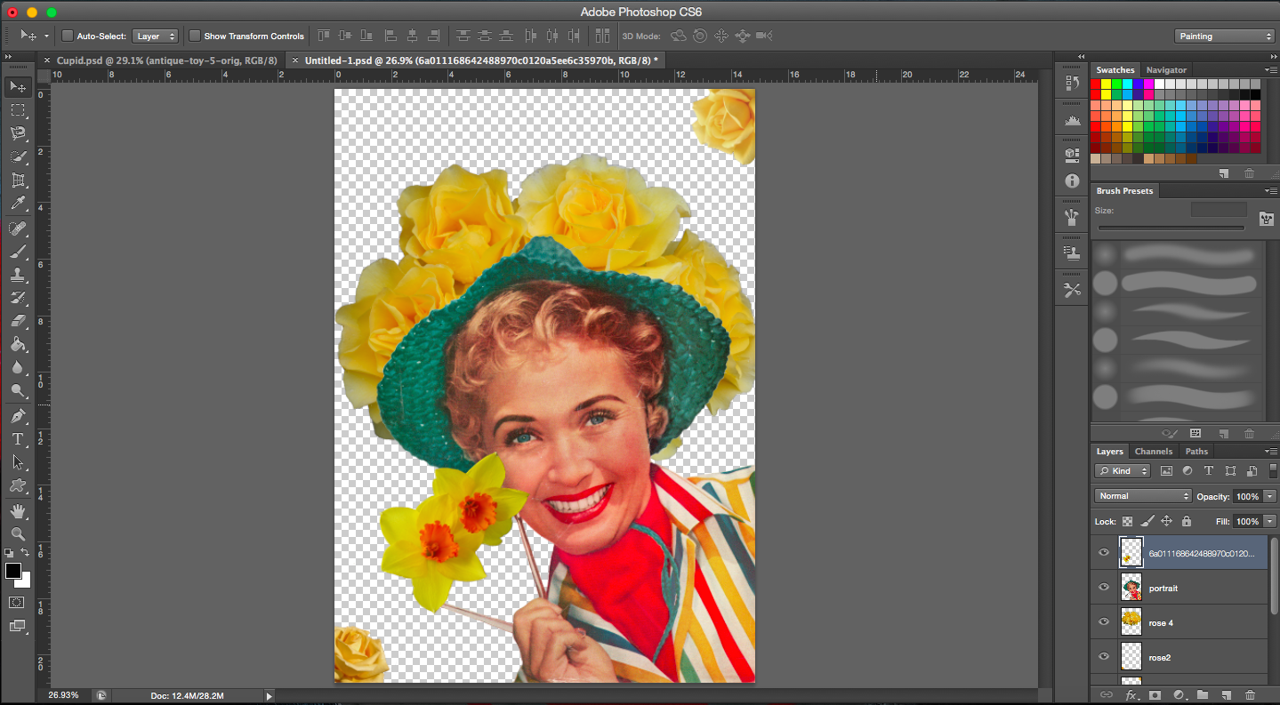
[Image Above] I wanted the nebula to be almost like a pair of wings for ‘cupid’ here. However, its form wasn’t too visible after adding the layer of the boy. In fact, at this point I realised this image of the boy with the machine was rather hard to work with. There were too many machine parts at the base of the image that would be difficult to work with and transition with. The chimney of the machine extends far up and it’s quiet dark in colour hence a space background would not work too well here.
I was looking for pictures with a child to represent cupid since he is usually depicted and known as almost a baby with a bow and arrow. I figured this image would probably fit the puppeteer scene due to his hand position.
The image of the boy proved too difficult for me to work around so I decided to look for an alternative. But in the meantime, I looked for images of lovers, couples and things like that to represent flowers. I’ve placed a few of the images I found below.
[Image Below] I came across a Tarzan comic. It was perfect. The colours were good, high resolution and dramatic enough.
[Image Below] This heavenly image of light streaming though the clods and through the mountains was perfect for this work. It goes well with the theme of angels, immortals and thus cupid as well.
Cupids to be
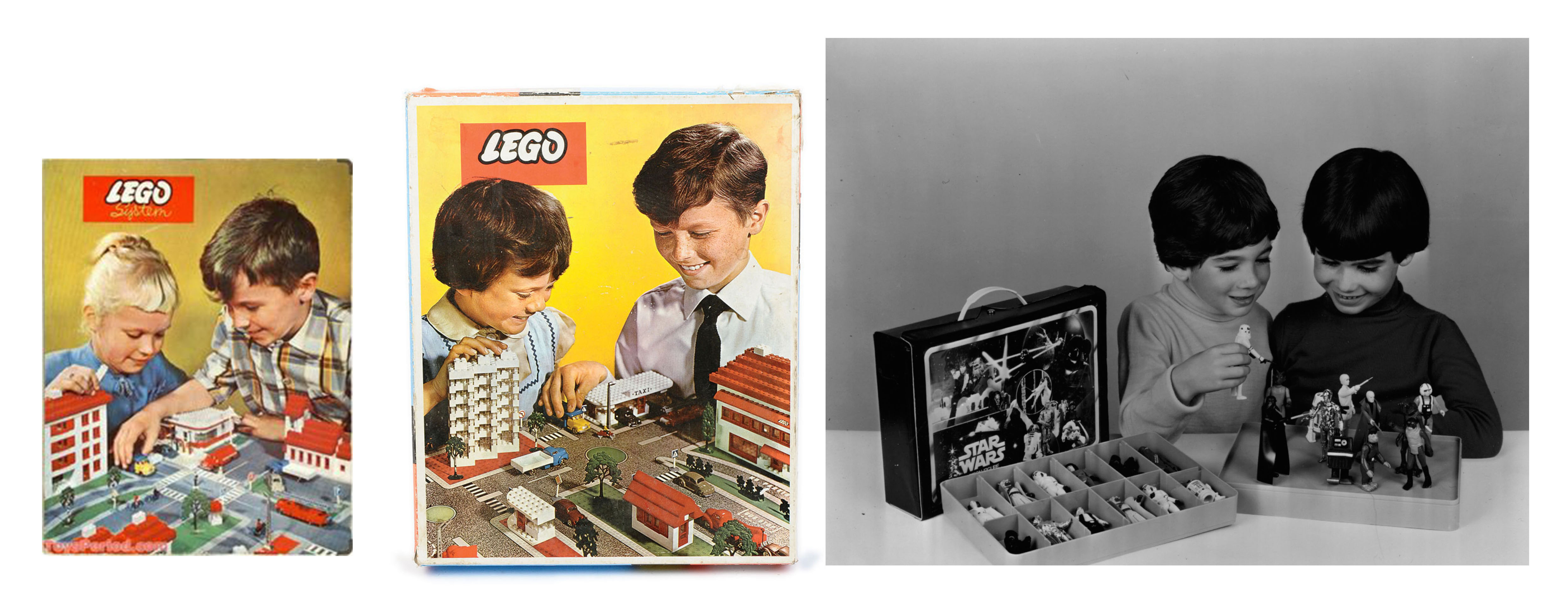
[Images Above] I was looking for people (children in particular) who were looking down (supposedly to the lovers). I found lego advertisements that had exactly what I wanted. The children even had their hands partially out (to pick the toy) as though trying to pick up something. The only problem was the resolution. So I couldn’t use them. Luckily I found a better one (extreme right). The best part of it was that the two boys looked pretty similar, which could represent Cupid(Roman) and his Greek counterpart, Eros.
Trying out different foregrounds
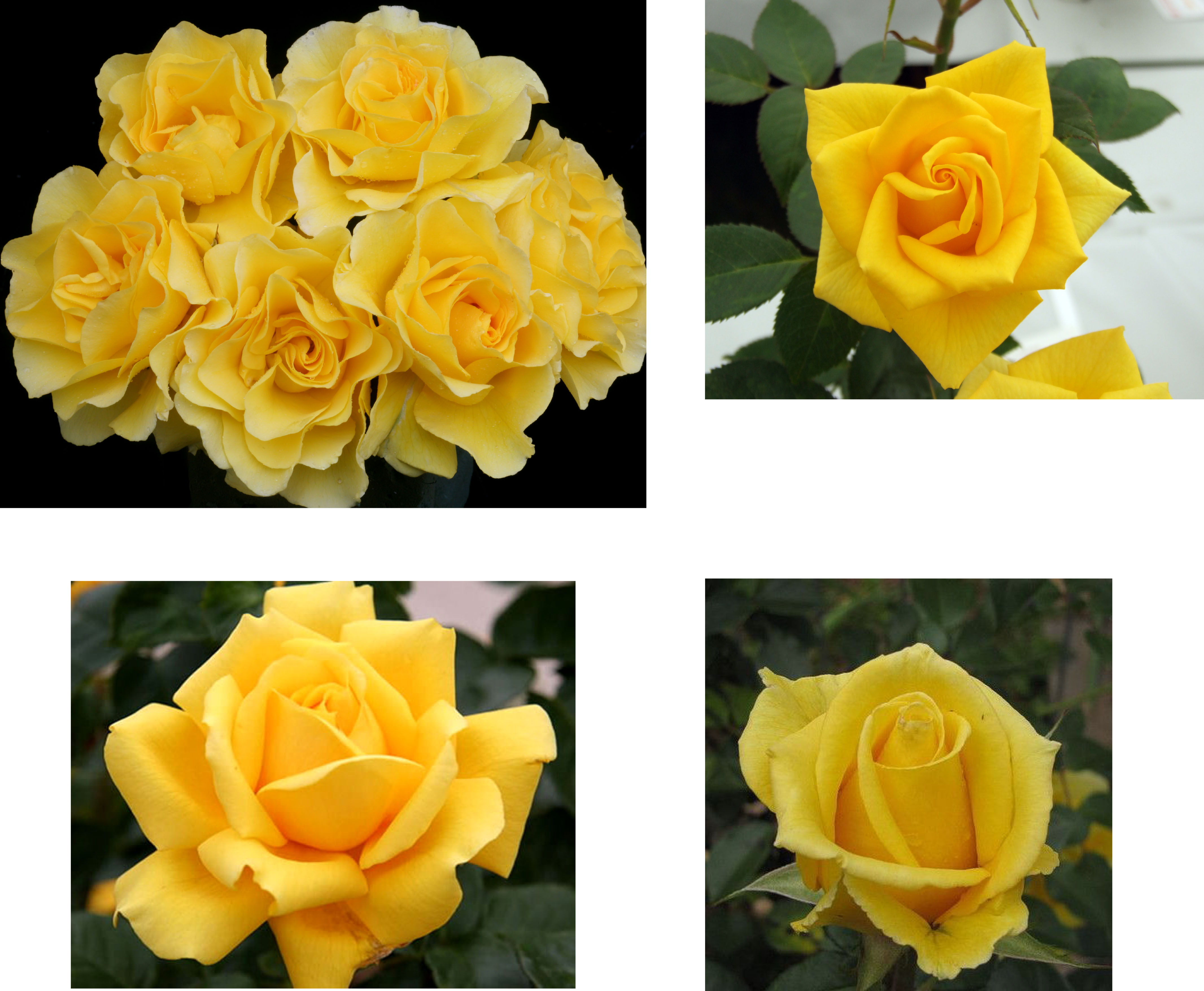
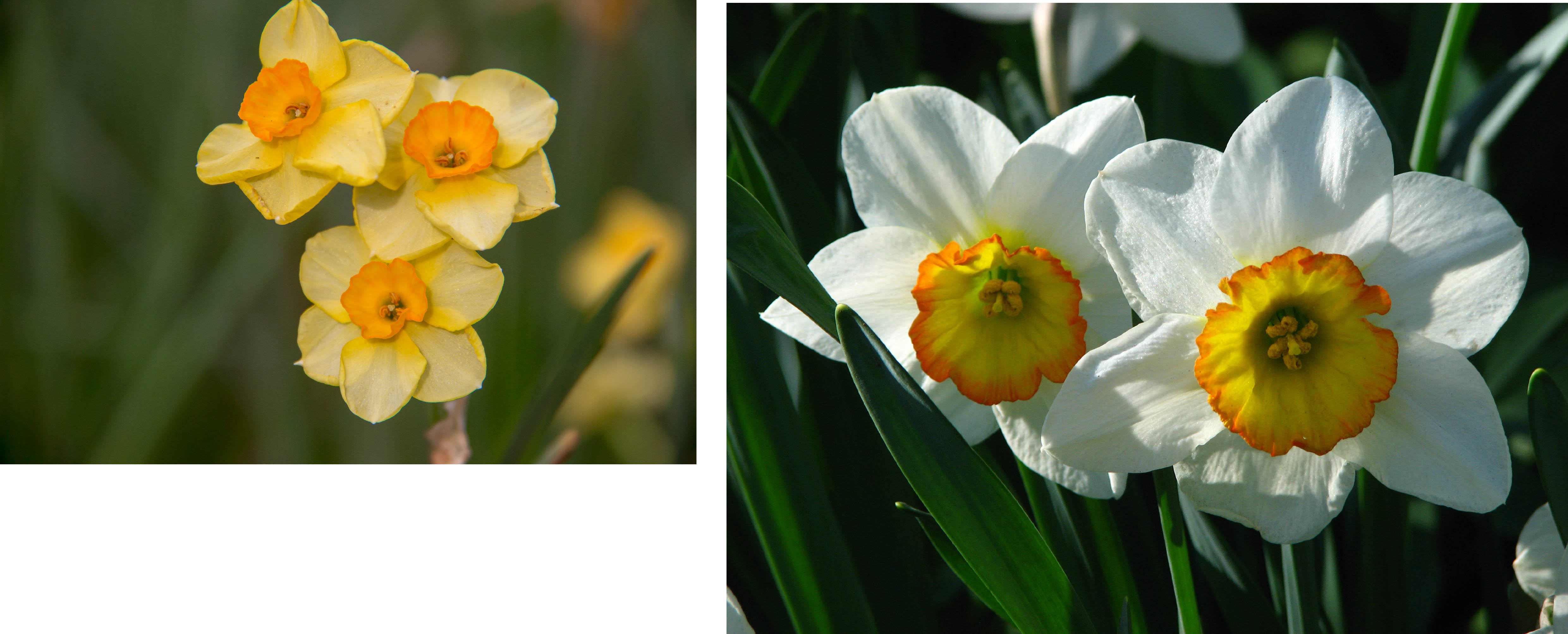
[Image Below] There was something missing in my composition. It seemed a little bleak for a scene of lovers. There was nothing magical about it. I looked through some of the old magazines that I bought and found flowers.
[Images Above] I realised the boys are holding figurines and the mountains cover the toys partially, so the question now was, should I cover the toys completely? Doing so would also cover their faces too.
I decided to just make the figurines only slightly visible, almost as though the cupids are about to add new characters to the scene. The scene then becomes a ‘playground’ for them.
[Images Above] Again, I had to work with the images. The Tarzan image was cut off at places. Jane’s hand was incomplete. To fix this, I made it seem like the flowers were a lot higher and denser and her hands were hidden within the flowers. I did the same for her feet (even though they were not cut off) for a coherent image.
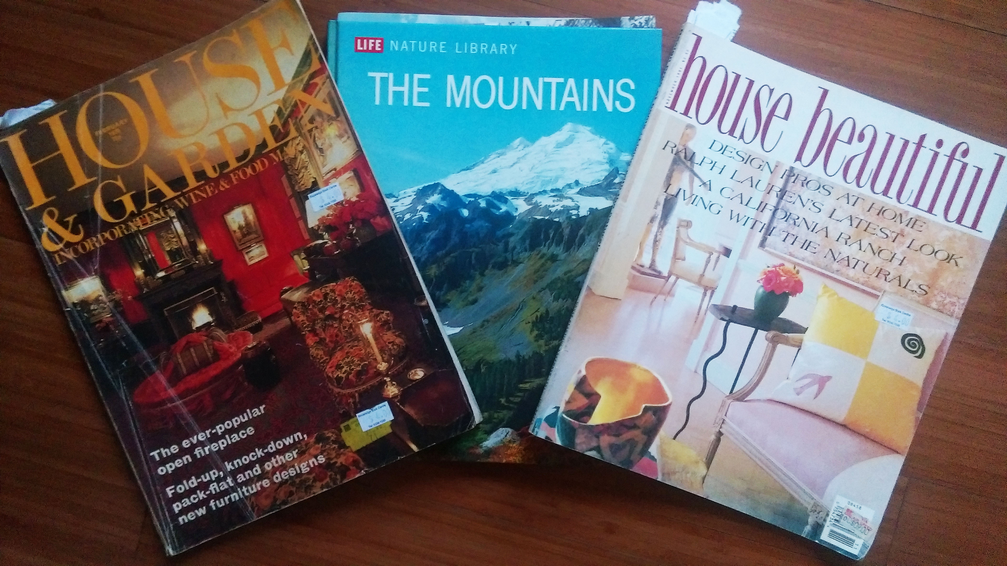
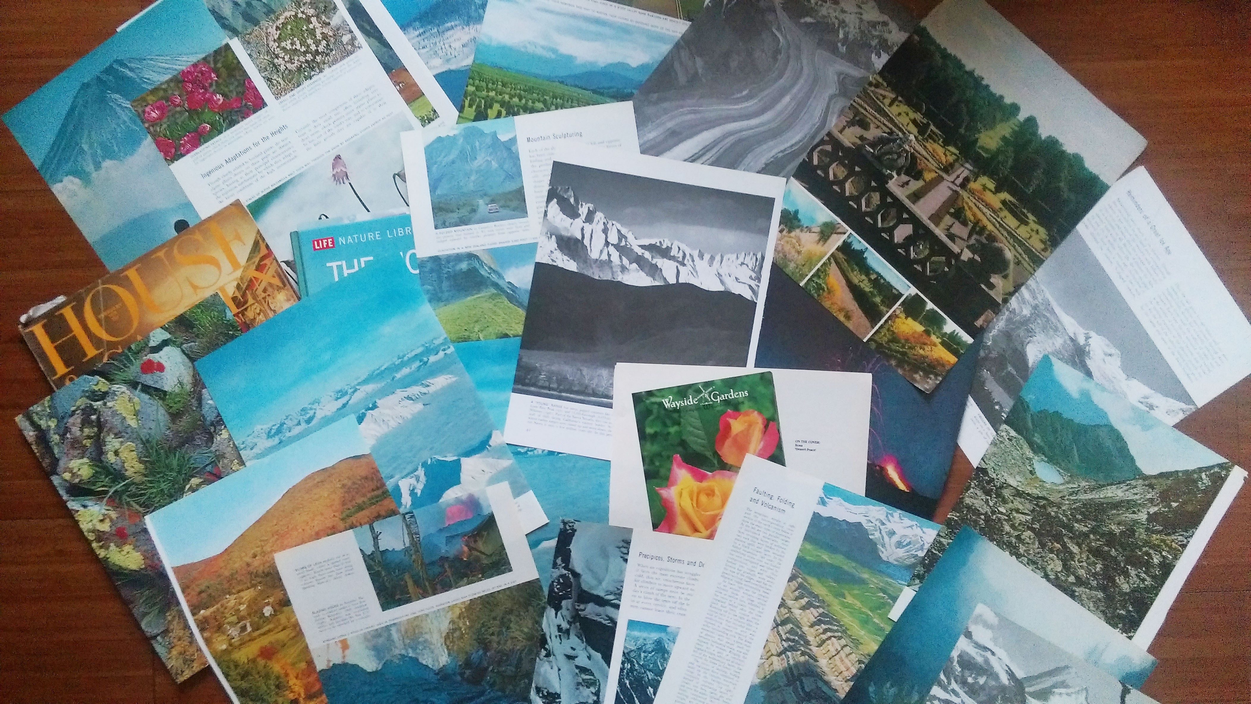
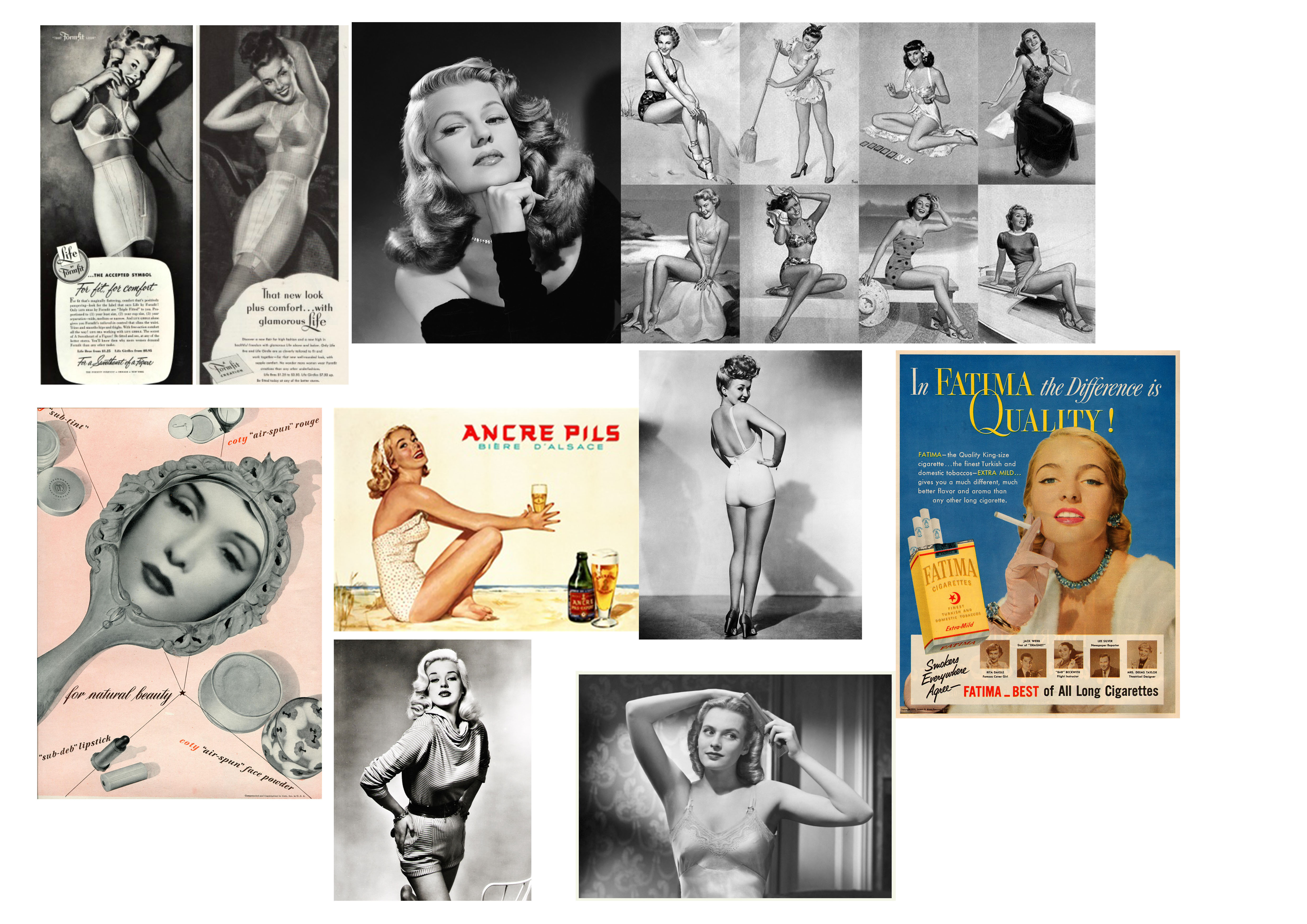
I decided to use Eugenia Loli as my artist reference because her works really made an impression on me (they are really beautiful). So I decided to create collages for each point of view. I stuck to a vintage theme similar to Loli’s work. In terms of materials, I used old, vintage images that are both printed and digital. Vintage printed images can be found from science textbooks, encyclopaedias, storybooks and magazines. For digital images, I started my search with advertisements and posters. My plan on how to use the printed material was to see what images were interesting and then scan them in for editing. The images below are just some of the books and materials that I gathered. I also used some of the textbooks that I had on hand.
Book and MagazinesTorn out images from the books & magazinesImages inside the printed material I found/bought
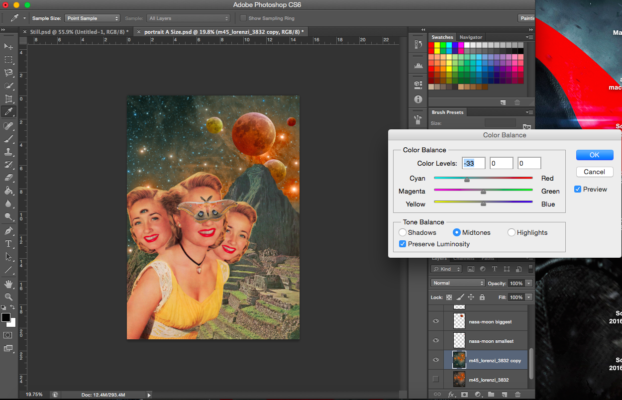
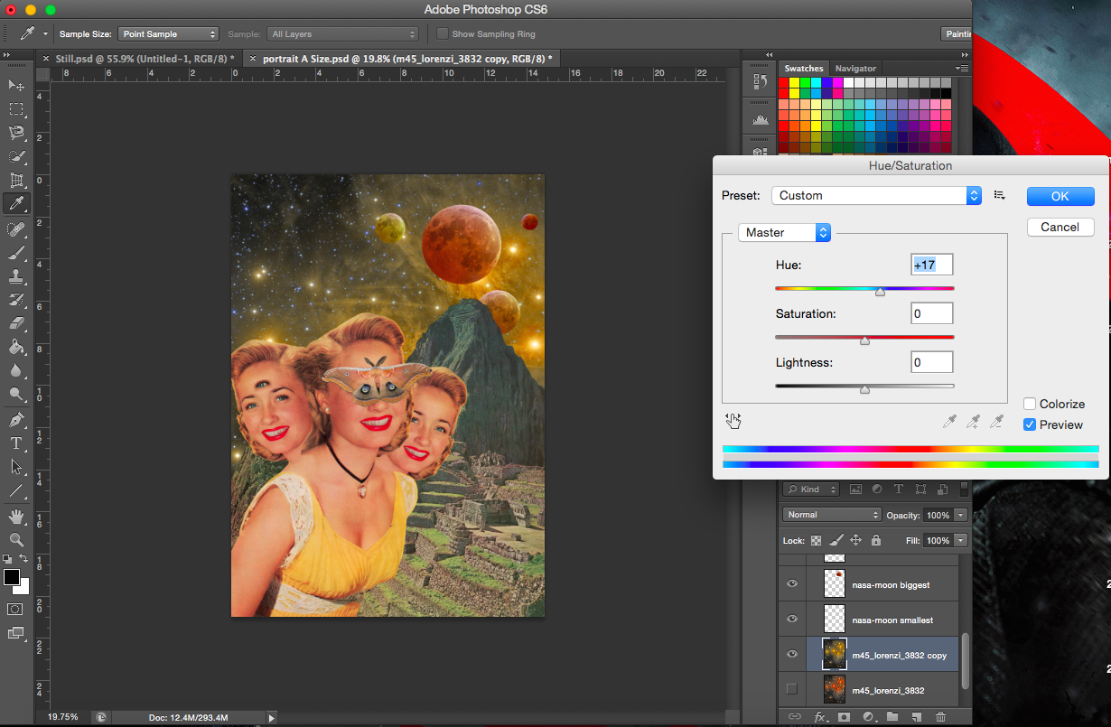
From the webpage, the artists talk about the factors that they take into account when making a collage. Things like colour adjustment (colour balance, hue/saturation) and use of backgrounds are all important. They never do stick down the separate pieces immediately, instead they move the pieces about until the composition looks right.
My direction for this project was to try and use personification in all my works. To use other objects and subjects (various other ways) to represent butterflies and the other matters that are mentioned in the sentence. The way I decided to achieve this was by creating a narrative or a story for each point of view. I figured that collage would allow me to create a scene using a variety of images and it would be fun and interesting to create story. Even in Loli’s works, I see that majority of them aren’t literal, you have to look at the title and then you realise that there’s more to the image than what you actually see. Some of them are metaphorical, others just use the combination of images to tell some sort a story. It was a perfect opportunity to create works that were absurd, witty and surreal.
As mentioned in my previous post, in the last sharing, the idea that butterflies are more feminine was brought up, and I agree with that. Hence, I decided to use women to represent the butterfly.
(I will be showing my processes for two works in each ‘Process’ post. This will thus be the first of three.)
——————————————————
Process- Bad Omen
“A butterfly from the point of view of the superstitious is a bad omen.”
I will be describing the way I created my first collage below. The statement for this piece is “A butterfly from the point of view of the superstitious is a bad omen”. This was my very first attempt for this project so it did take a considerably long time to find images to use. But as I progressed I did get the hang of things.
So, bad omens. What are bad omens? I listed down all the things that I’d associate with bad omens and bad luck. I am aware that bad omens aren’t the same as that of luck but I assumed superstitious people would believe in both, hence I included bad luck.
List of some things associated with bad luck, omens and the superstitious: astrology, having twins/triplets, eclipses, Evil eye, black cats, walking under a ladder, opening an umbrella indoors, four-leaf clover, rabbits foot, horoscopes.
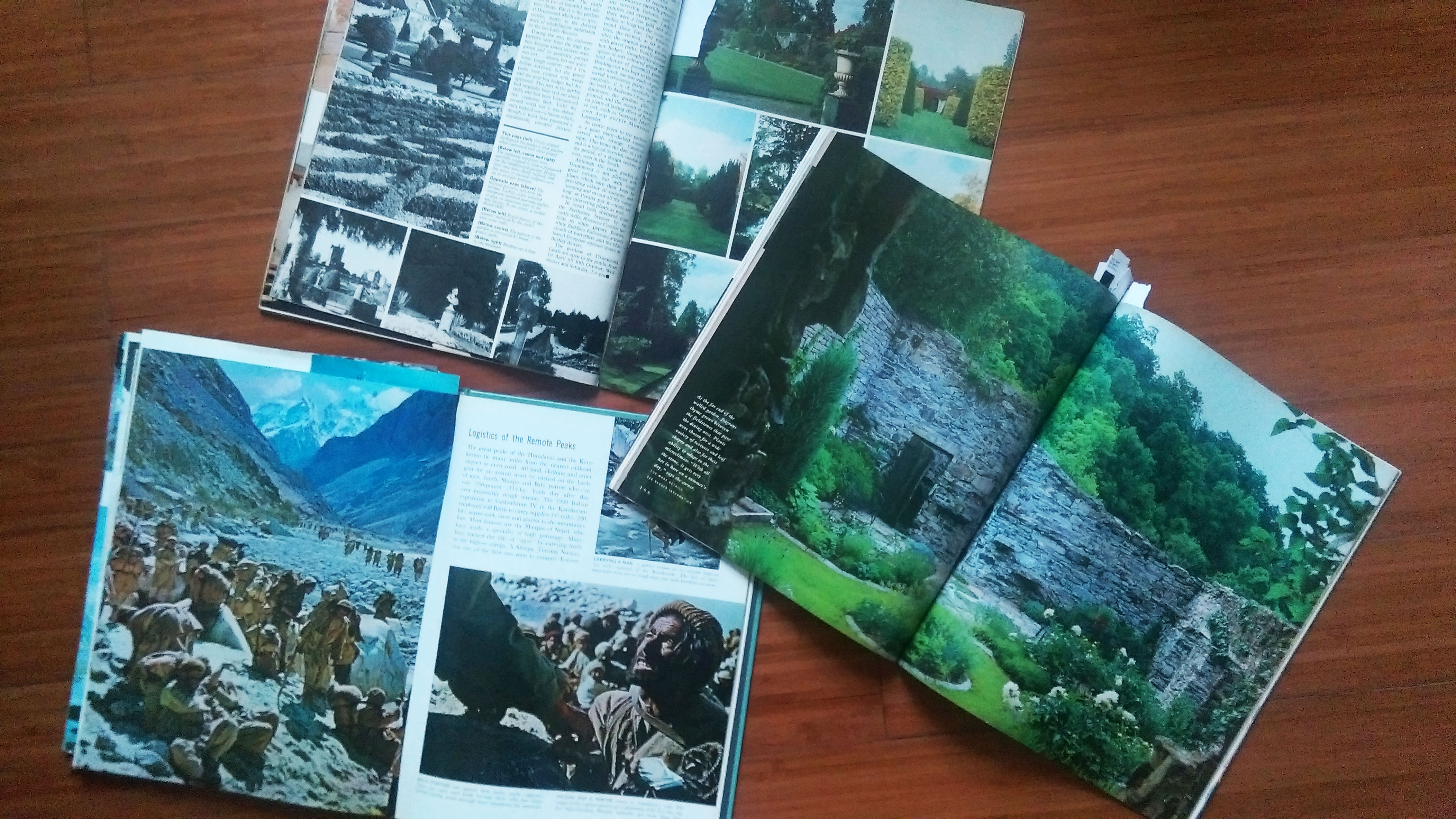
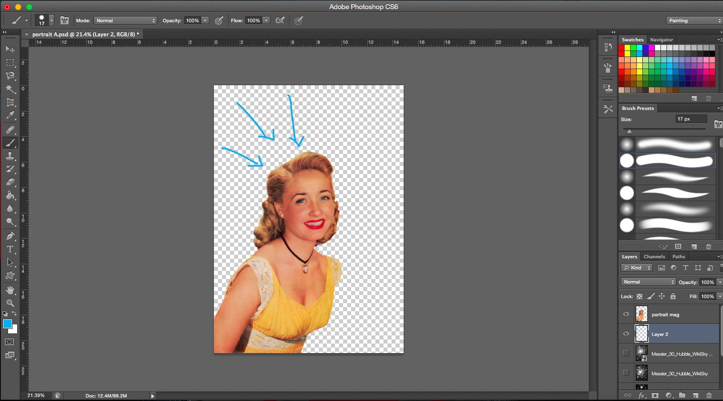
My starting image is an image of a vintage magazine cover. I was really excited to find an image that was big enough with relatively high resolution. Most of the images that I wanted to use were usually too small. So this was really golden.
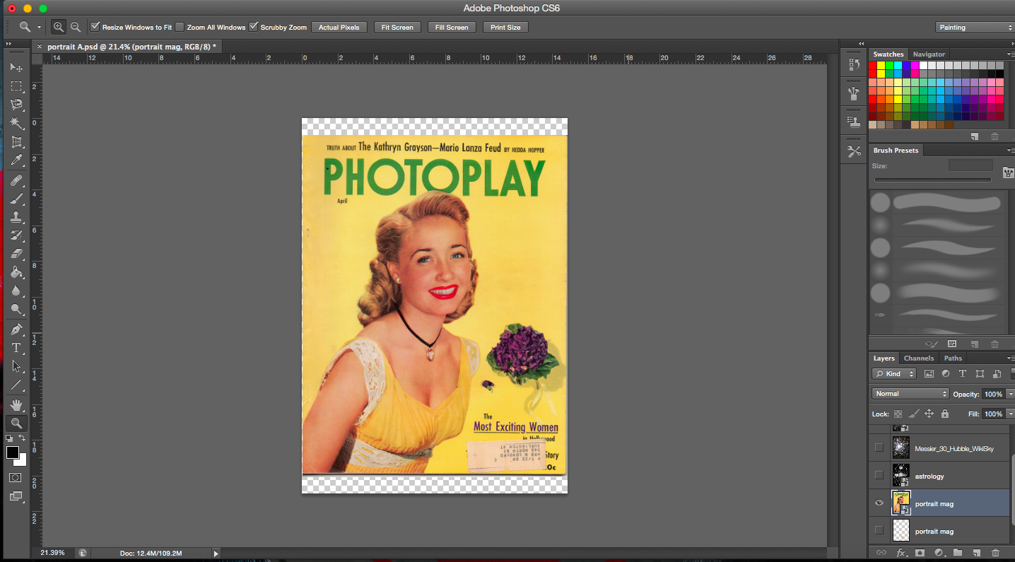
Starting imageCropping imageCelestial map as background
[Image Above] Lines of the celestial map radiate towards the subject matter thus drawing emphasis on her.
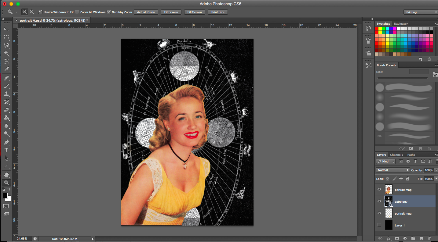
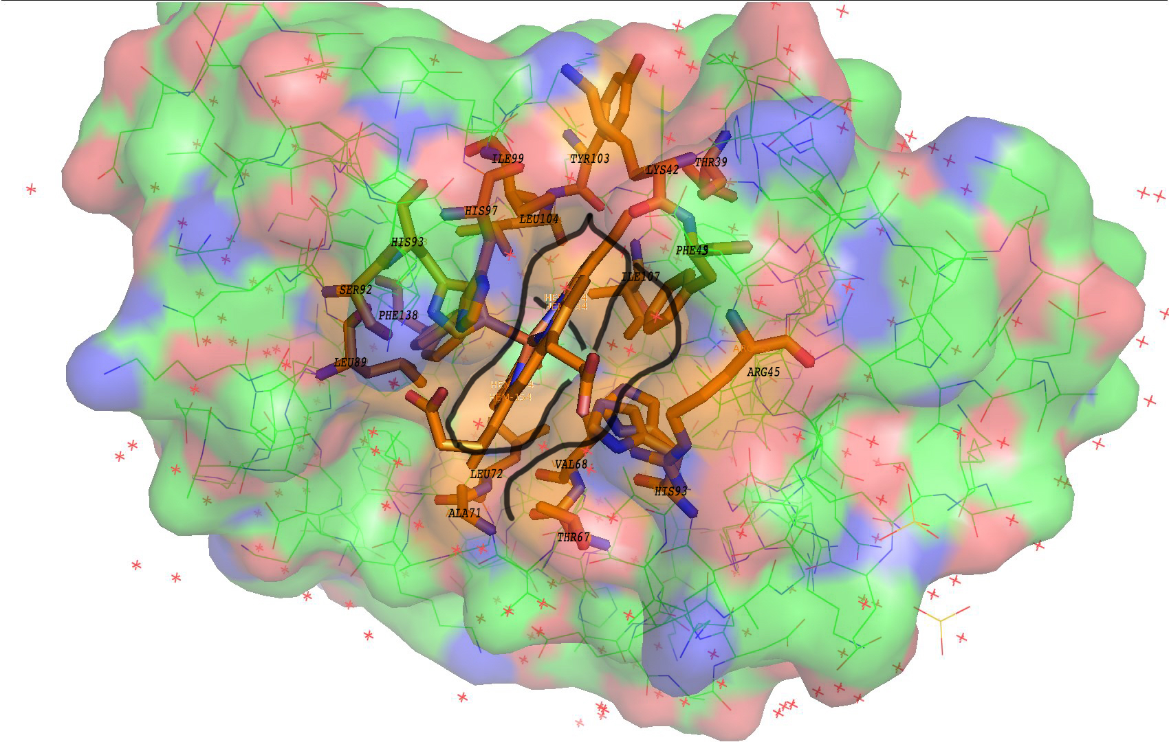
Messier 30- Globular cluster of stars from constellation of Capricornus (astrology)
Image of space background is a constellation which links back to astrology and horoscopes. I’d associate horoscopes and astrology with luck and omens too.
I wanted the brightest portion of the image (greatest number of stars) to be on the right side of the head, away from the face. Emphasis is drawn from the outer edges of the whole picture inwards (from the darkest areas to the brightest center where the main subject is).
[Next 2 Images Below] I was trying out different sizes of the main subject matter.
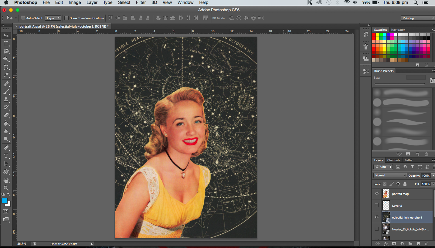
[Image Below] Trying out a different background. It’s a celestial map. I didn’t use it in the end because the resolution was too low. But had it been high enough I might have used it. I really liked the colour of it, has a real vintage tone to it. It also echoes the yellow in her dress.
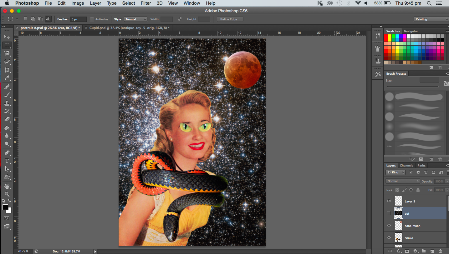
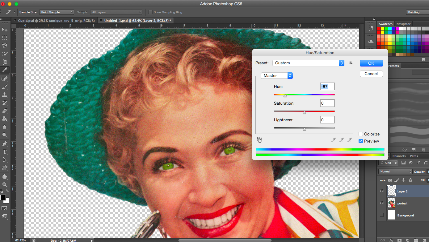
[Image Below] Addition of black cat eyes, a coiled snake and lunar eclipse/blood moon. This was definitely experimental. I was just playing around with the images. I guess that’s the beauty of collage, you can really create quite absurd images such as the one I made below. A couple of things didn’t work here, the snake image was actually not a vintage image so it stood out (the colours and resolution did not match the others). In fact, the cat eyes were also not vintage but the main problem with that was that it was just too distracting and after cropping it, I couldn’t identify it as a cat anymore. It just looked like a pair of green eyes from some animal that didn’t fit in. Overall, the image was pretty messy to me, so I didn’t pursue the cat or the snake any further.
Most of the images from here onwards invovle colour adjustments. Since the images are obtained from different sources, they may not necessarily go together, thus they have to be adjusted here and there.
Changing the colour of the background (constellation)Adjusting background coloursAdjusting background colours
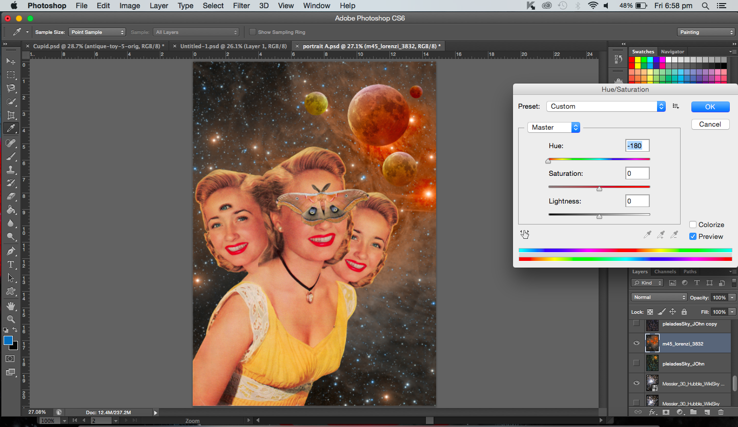
[Images Above] I added a couple of new elements here. I duplicated the heads, flipped one horizontally and ‘attached’ (layered) them to the main body. I had to make sure the hair or heads did not start abruptly either. So I erased portions with reduced opacity. They represent the triples that are considered a bad omen in certain cultures. Seeing a moth is considered a bad omen too thus I added one on the main figure. The extra eye on the face on the left represents the evil eye.
The three moons, which are all supposed to be lunar eclipses. I made of various sizes to create variety and balance. But it’s also to show the different distances. I have also taken into account the shadows and highlights of the moons and how they relate to the space background. Placing the moons at the right hand side where there are bright stars, the moons then seem to be illuminated by the the lit background.
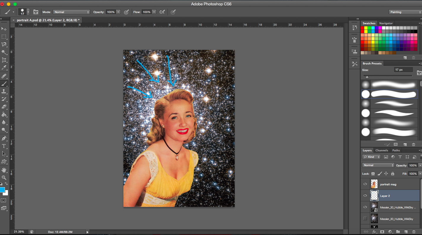
[Image Above] I decided on another space themed background (digital image found online). It’s a constellation with bright stars on the right. It is darker on the upper left and lower corners. The stars on the right balance the left which is heavier due to the presence of the subject matter. I suppose the eye is also drawn from the woman vertically up to the bright stars on the right.
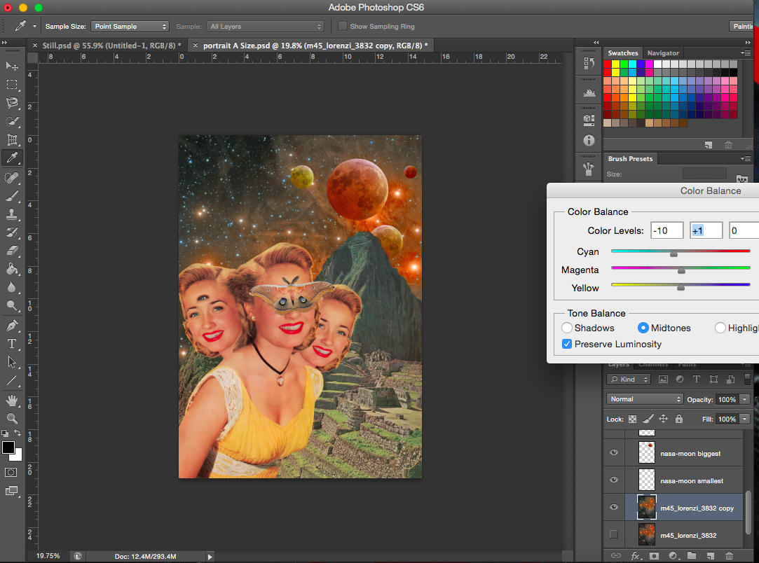
[Image Above] I added a scanned image from a old book about mountains. It is an image of the Inca empire, it reminds me of the Aztecs as well. It just so happened that the mountain had a peak that was towards the side, so the heads would not block them. Also, I positioned the moons in line with the heads and the mountain so that they flow together. It is also as though the moons are interacting with the mountains. Hence, the different backgrounds are interacting and existing together. I also added another moon, a small one in the corner to balance the image.
Addition of mountain layer (old space background)
[Image Below] I was toggling between the two different space layers. With a different background, the colours of the moons were adjusted accordingly. But I gravitated towards the one on the right.
Two space backgroundsTrying out a different mountain (also from a vintage book)Adjusting background coloursAdjusting colour of mountain layerAdjusting colour of space layer-increasing cyanAdjusting colour of space layer-increasing cyan levels (higher)Adjusting colour of space layerAdjusting the size of the figure
[Image Above] I decreased the size of the figures and included another mountain layer to add a focal point to the image (where the mountains intersect). (Note. the topic of the focal point was raised during consultation when my other three works which I presented all have a focal point in the middle)
——————————————————
PROCESS- CATCH ME
“A butterfly from the point of view of a child is a game of catch.”
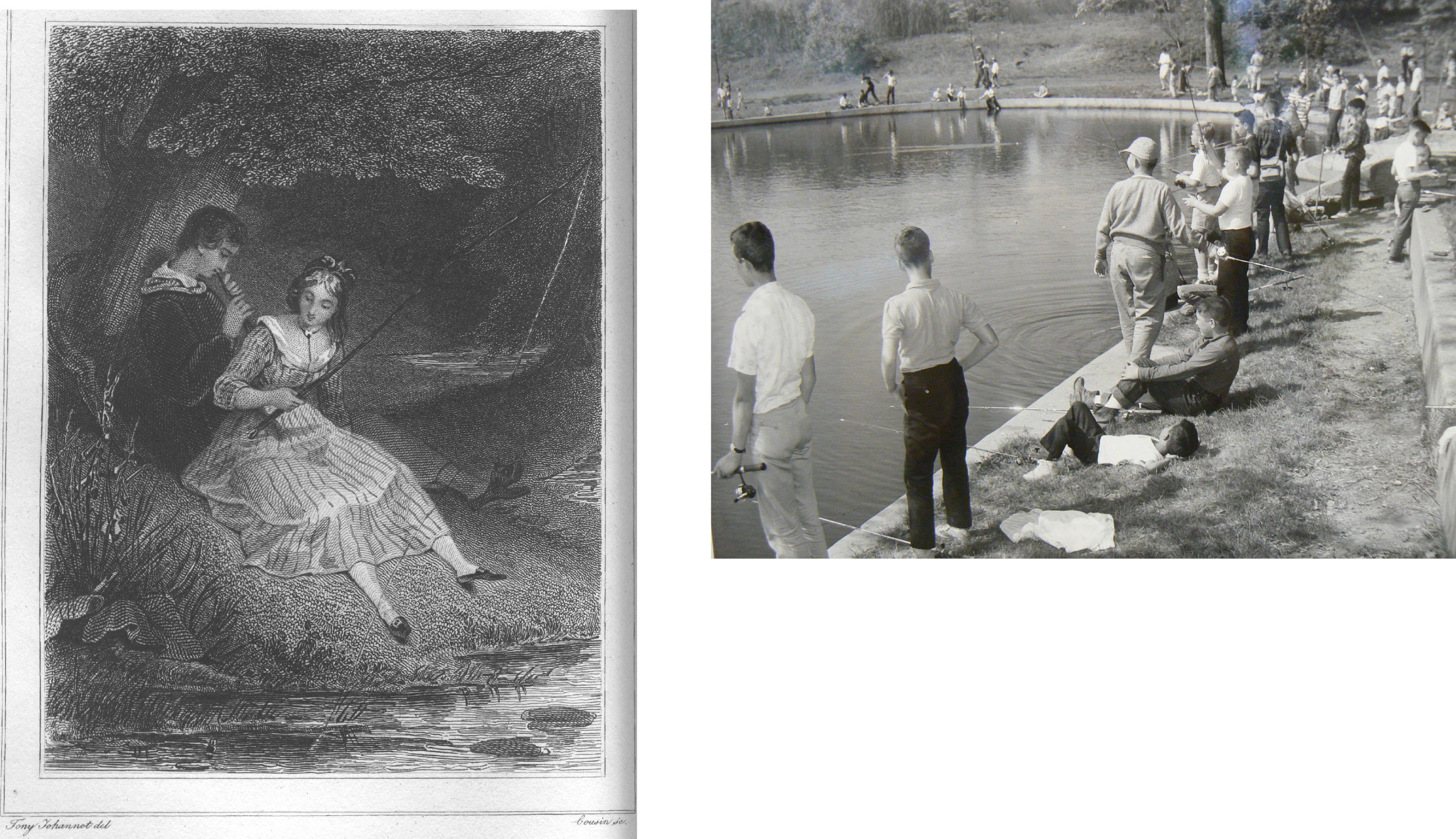
When I think of a child running around with a net trying to catch a butterfly, I think of a hero or a knight trying to save a damsel in distress. No doubt catching a butterfly is actually not saving it but I’d imagine to a child that’s exactly how they see it. Like they are trying to catch it to save it. Similarly, I will use a female (damsel in distress) to represent the butterfly. The child would be the hero. Other associations I had were more on the play of words, ‘catch of the day’, so fishing. Or sports, like cricket of baseball.
I started my search by looking for movie posters and comic covers.
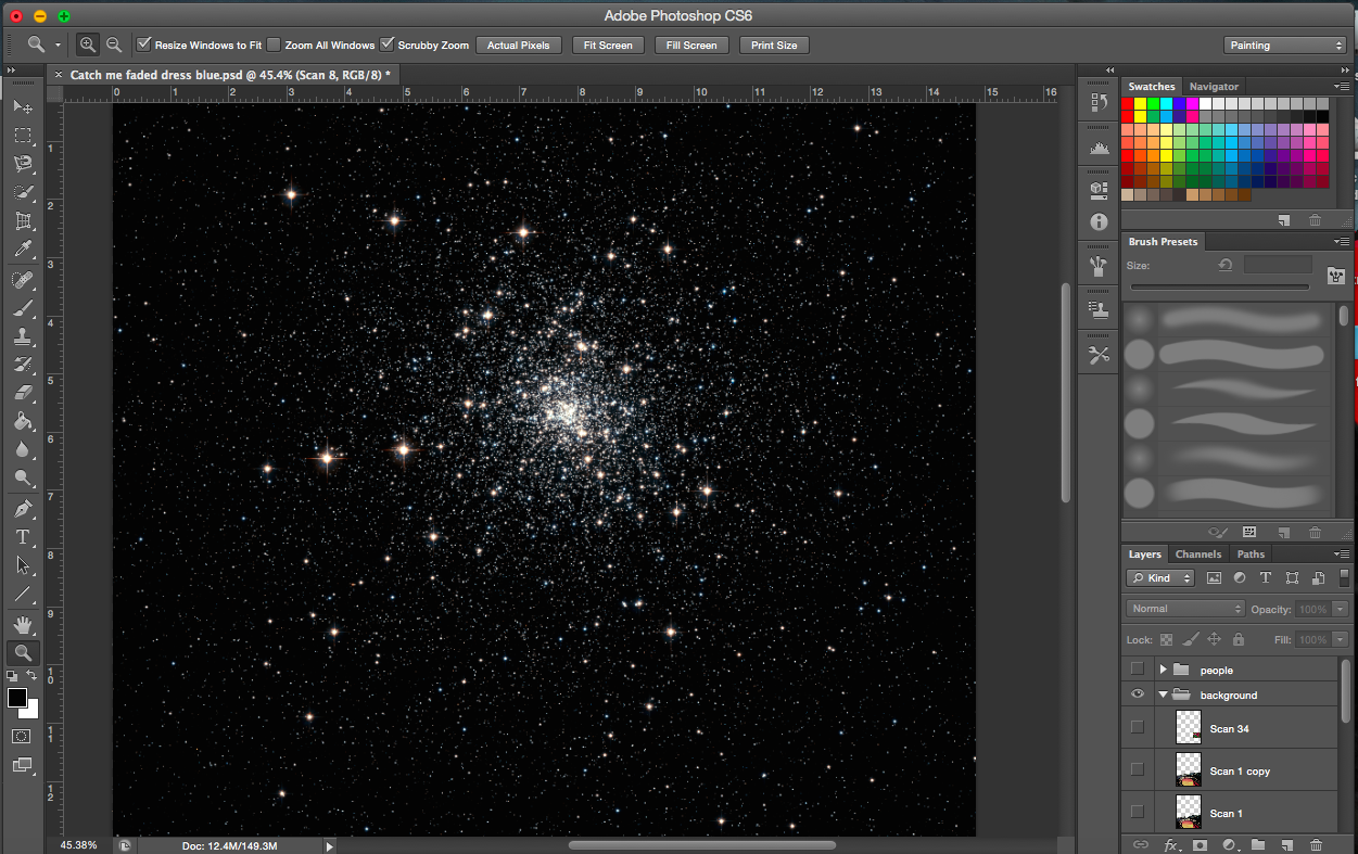
Comic cover and movie posterCatch of the DaySomeone’s catching somethingSimple space backroundPossible backgrounds-scanned imagesOne image, two meanings-scanned image
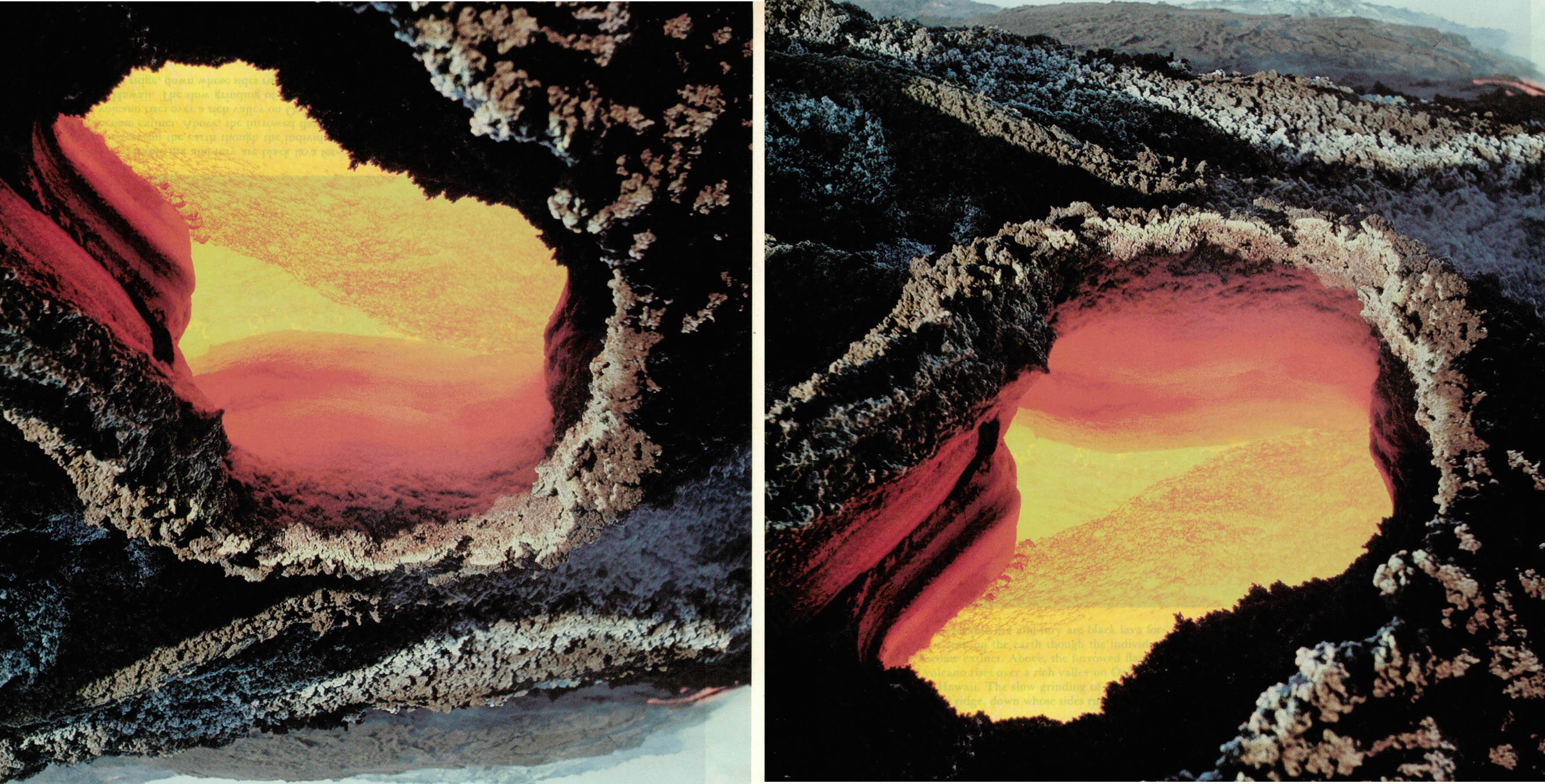
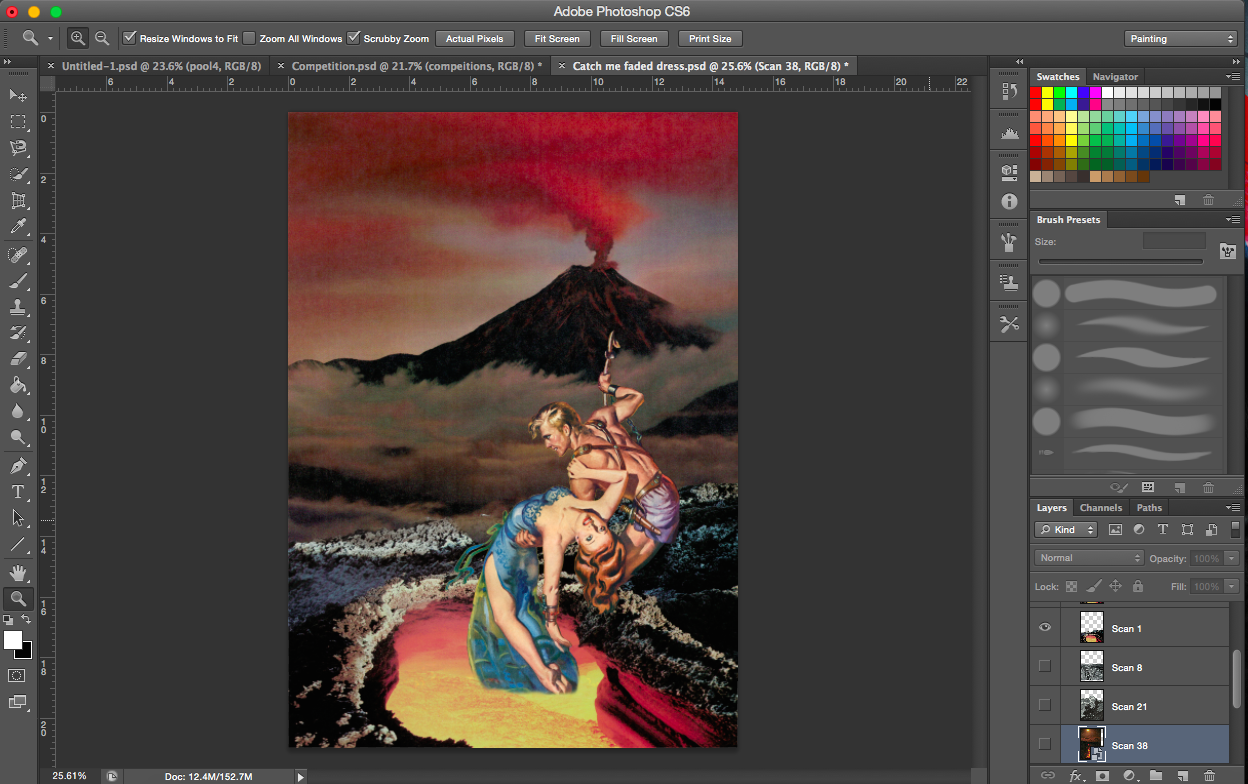
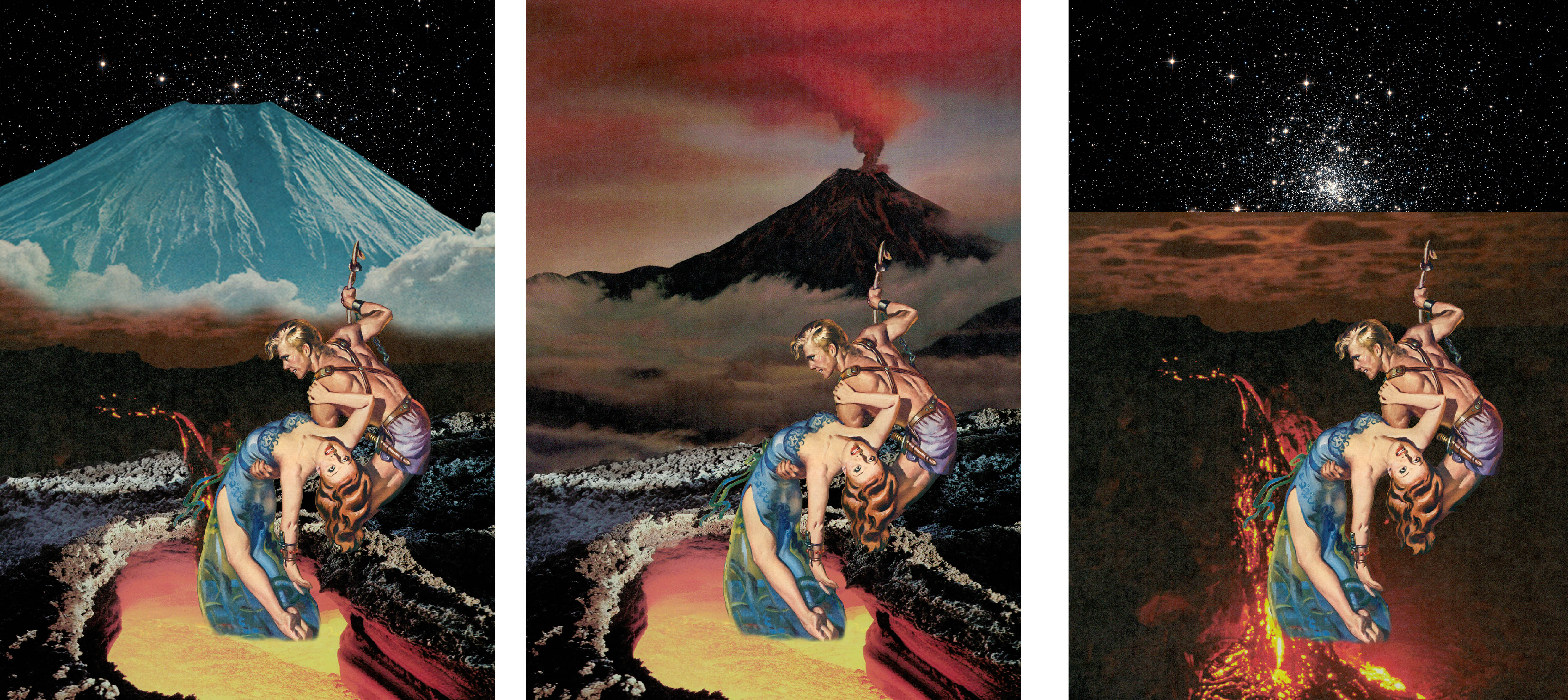
[Images Above] This is a good example of how versatile collage can be. This image of a volcano crater works well both the right way up (right image) and inverted (left). The version on the left looks like a cave opening and you’re looking out into the sunset. The one on the right looks like a pit of lava, as it should.
Experimenting with the background
[Image Above] I encountered a problem where because the paper, on which the volcano was printed on, was quiet thin, the words on the next page were visible. The text is visible in the bottom orange section of the lava. To solve this problem, I just cropped it out, I believed it was the best option (see image below).
[Image Above & Below] The above image didn’t look dangerous enough for me. I felt there was also insufficient interactivity between the crater layer and the figure layer, so I shifted the figure layer down (see below).
With added mountains & volcanoAdjusting volcano (no clouds)Adjusting volcano (clouds)Flipping volcano image
[Image Above] I definitely wanted a volcano of some sort in this composition to add an element of the danger to the environment, but I thought this particular background was too heavy(might have been the colours). I was not able to create a smooth transition between the crater layer and the smoke from the volcano layer.
[Images Above] I was trying out alternative images of volcanoes and lava.
——————————————————
PROCESS- Envy
“A butterfly from the point of view of a moth is envy.” (Not used)
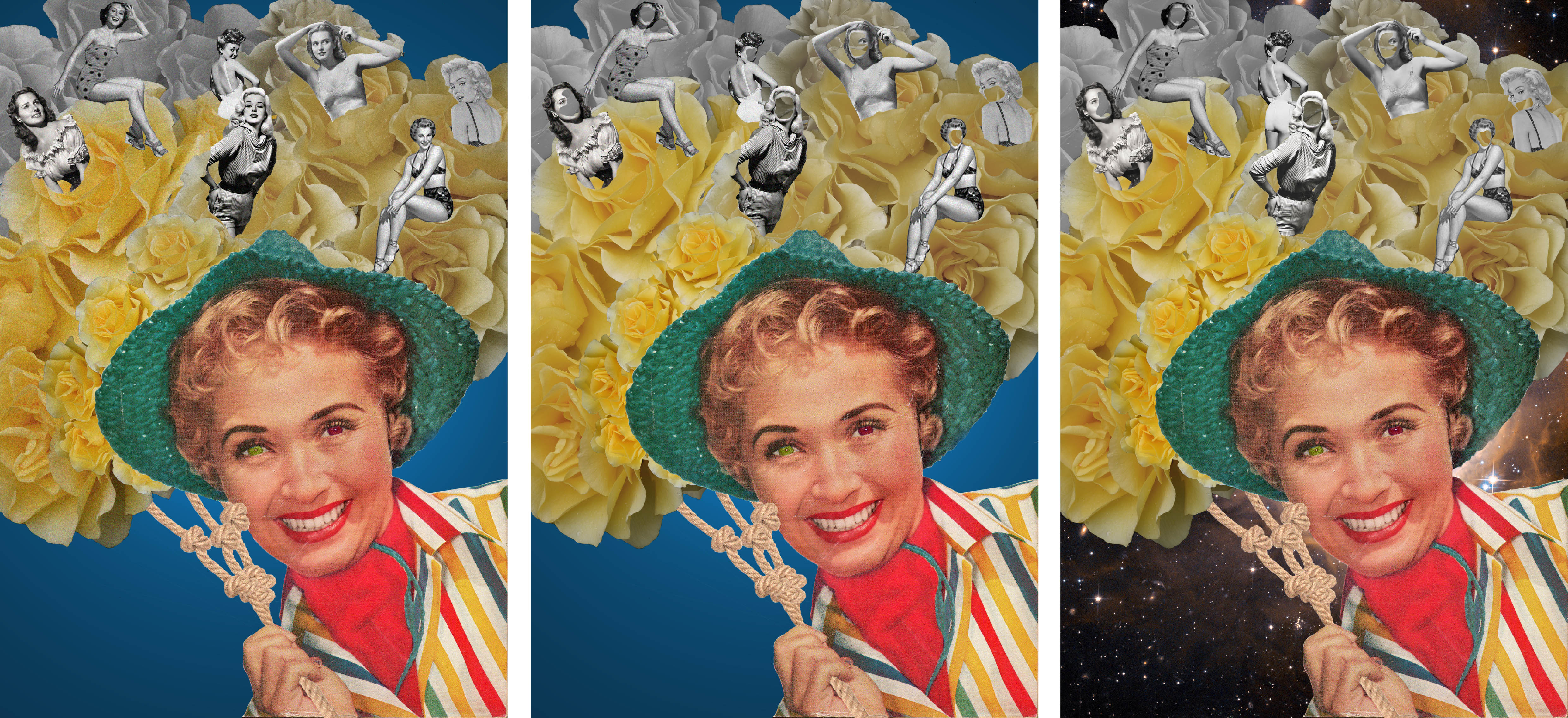
The associations I had with envy were green and after some research, yellow roses and daffodils (to represent narcissism).
[Images Below] I started playing with the eye colour and tried to incorporate the phrase ‘green with envy’ into the image. I tried several different shades of green too.
Dark Green eyesGreen eyes
[Image Above] I made one eye green and the other red. The red represents the anger that comes from being jealous and envious of something or someone.
Lime green eyes
[Image Above] I created a plain, simple background for this composition. But I did feel it was a bit flat so I added a spotlight to create depth.
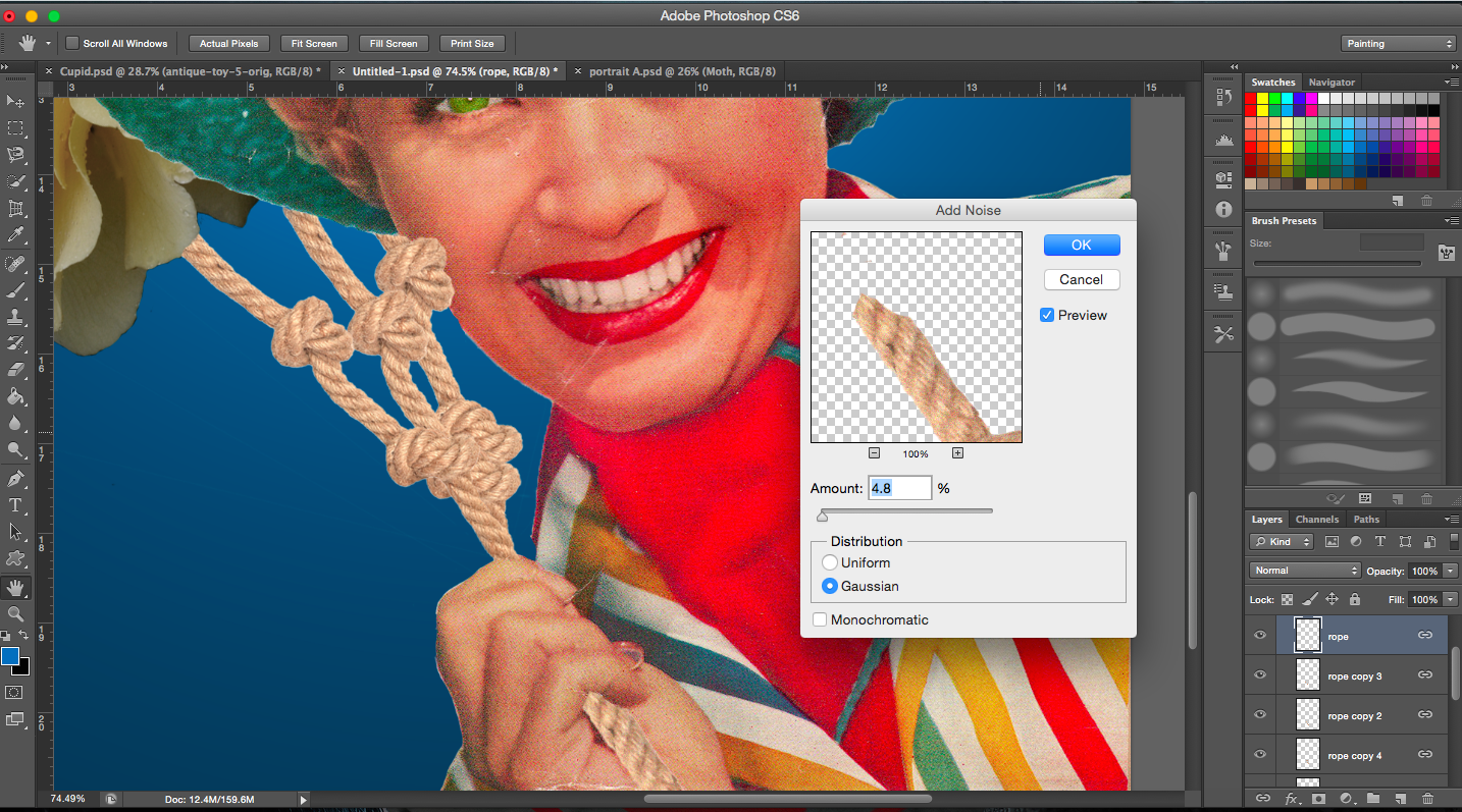
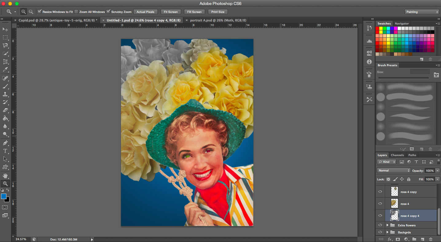
[Image Above] In the original magazine cover, the lady was holding a pair of sunglasses but I didn’t need the glasses in this case, so I had to replace it with something else. I thought of rope. The reason for this is due to the fact that she is enslaved and tied down by her own envy.
[Image Above] I reduced the saturation of the roses in the back and slowly increased saturation towards the front. I guess I wanted to show envy building up which is represented by the colour yellow.
[Images Above] These are some of the images I found that could be used to show that a moth is envious of a butterfly’s looks. I focused on images from beauty advertisements and pin-ups. I added them in to show that her envy is fuelled by the images of these beauties.
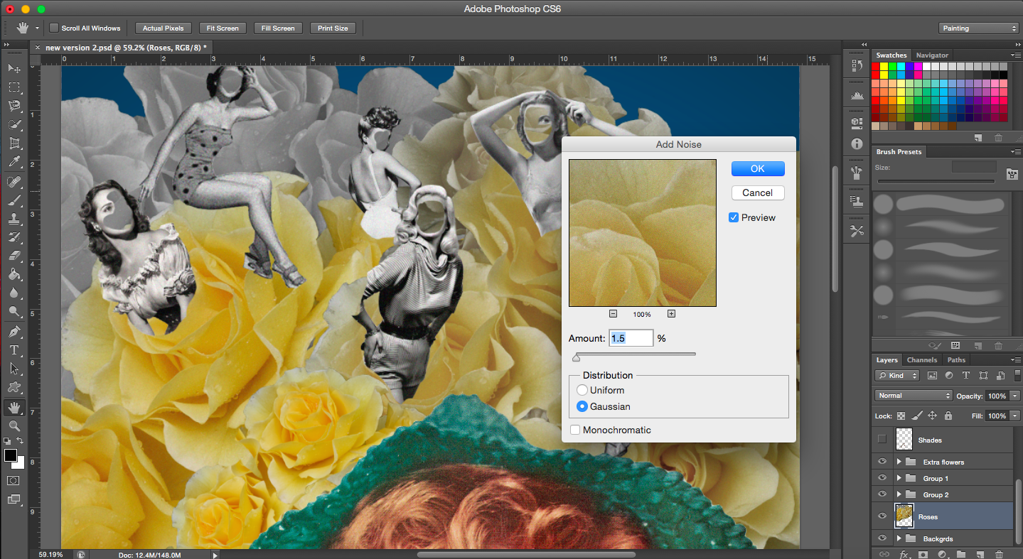
[Images Below] In the middle image, I removed certain areas of the faces of the beauties.
Editing faces and trying out different backgrounds
[Image Below] The image of the roses admittedly was not vintage so to give it that same look as vintage images do, I added a noise filter.
When I did finish this piece, it looked quite different from the rest because the style was slightly different and it also had a plain background. I think if I did use it, it would have stuck out. It did not get as good a reaction as my other compositions did during our group consultations so I decided to not use this composition and do something else.
I figured I would start out this project by looking at the aim of the project. I thought it would help me to understand the purpose a little better and hopefully allow me to make the best out of this experience and learn more. I’ve also highlighted the points which I think are important to this project.
Aim of this project (from brief):
“The Point of View project gives one the opportunity to approach visual problem solving in a more methodical,conceptual, thought-provoking way. Making the effort to see subjects from different vantage points opens one to the process of self-generating ideas.”
The term ‘methodical’ does stand out to me at this point. Throughout this entire project, I’m going to make sure I do so, working step by step. And hopefully this will help me to have a clearer idea of what my next step would be and also how to apply what I’ve learnt to my work.
The first task:
Select a subject matter and express it from eighteen different view points, using the phrase ‘A ____ from the point of view of ____ is ____’.
I’d like to talk a bit about why I’ve actually chosen butterflies as my main subject out of the many other things, concepts and animals. It was not a random choice for me. There are several reasons for this and I’ll go through them briefly.
Butterflies have a very special place in my life. I grew up in a house with a garden that was and still is filled with all kinds of butterflies, from the small lilac ones to the big orange ones. I was the child who wanted to catch these butterflies (and I did once, but I let them go eventually) and keep them, because they were so beautiful but they were also so fragile. I’d examine, chase them and admire them. I am extremely comfortable with them. So in a way, they were part of my childhood.
When I was studying art in secondary school, butterflies was also my chosen subject matter for my ‘O’ Level coursework. I don’t recall there being much debate about my subject matter, I guess I just gravitated towards them unknowingly. And of course, throughout the process, I got to study them a lot more, the details on their wings and their form at every stage of their lifecycle. My appreciation for this tiny creature grew. Even some of my works which I have done in university revolved around butterflies. It is definitely something I’m attracted to.
As I grew older, I met more people who were afraid of butterflies (especially when they fly too close). So I realised butterflies were like any other insect to people and they frighten others (and I can understand why). I still like them though.
What I think I’m trying to get at is that butterflies aren’t just another six-legged creature to me, they’ve been with me remind me of my past, my childhood and they are really special to me.
The Thought process:
Now that I have chosen my subject matter, what next? How do I move on to come up with the different view points? I thinking about things I’d associate with butterflies, both facts and the fictional (films etc), basically anything that involves or is associated with the insect.
Here are some of the point of views that I thought of:
A BUTTERFLY FROM THE POINT OF VIEW OF A CHILD IS A GAME OF CATCH.
A NET FROM THE POINT OF VIEW OF A BUTTERFLY IS DANGER.
The presence of a net just means someone is about to catch it and rid it of its freedom.
A BUTTERFLY FROM THE POINT OF VIEW OF A BEE IS COMPETITION/SELFISH.
http://topnews.net.nz/category/general/science
Bees work for the good of the hive while butterflies live for their own.
A BUTTERFLY FROM THE POINT OF VIEW OF A MOTH IS ENVY.
Moths! The close relatives of the butterflies.
There are definitely more people who would prefer butterflies over moths just because they are more visually appealing. (It’s really quite sad). The wings of a butterfly are more colourful and vivid as compared to a moth. The ‘eyes’ you see on the wings of a moth make them look rather intimidating (creepy as well). I thought maybe a moth may be envious of the attention butterflies get because of their wings as well as the of just the fact that butterflies may be more pleasing to the eye. (That is if appearance matters at all.)
Intimidating is what I would call a moth. It’s generally a lot bigger than butterflies and its patterns are lot more distinct and bold. It’s not just their appearance that sets them apart from butterflies, it’s also how they affect mankind. They are termed as pests. Remember mothballs and the toxic smell of naphthalene that comes with it? Well, you’re actually trying to prevent the webbing clothes moth from destroying your possessions. Their larvae feed on clothes, upholstery, carpets, etc. They are rather destructive.
Here are some extra things about butterflies and moths:
The differences between a moth and a butterfly
In general, we would assume that moths are more dull in colour and the patterns on their wings aren’t so appealing either. However, I actually found what it called a lily moth.
A lily mothAnother lily moth
I thought it was a fake moth at first because even I assumed that moths were all just brown in colour (how stereotypical of me). But it is really quite beautiful. (It’s interesting how we judge insects by their appearance as well, I wonder if it’s really necessary.)
You can take a look at a whole range of really cool moths on this website: https://blogs.extension.org/mastergardener/tag/citizen-science/
They have really cool patterns and sometimes it even forms a face. See image below.
Idalus Herois
I found an article that argues about how we should embrace moths because they’re not all that bad. Website: http://www.theguardian.com/commentisfree/2014/dec/22/moths-loved-not-loathed-only-few-after-clothes
Something from my childhood…
A film that I often think about is Disney’s Alice in Wonderland. It is one of my favourite Disney films (it’s really nostalgic) and the Caterpillar has always been one of the most interesting and iconic characters of the film.
I’m not able to embed this particular video but you can watch the scene here: https://www.youtube.com/watch?v=PBjExwMtoaw
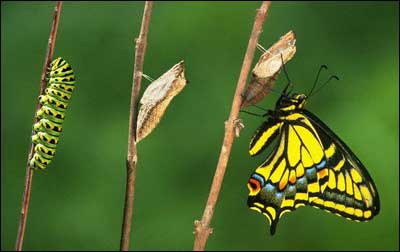
This whole scene was really bizarre and yet intriguing. From the film itself, I derived several things: the caterpillar and metamorphosis. The lifecycle of a butterfly and its various stages then comes to mind.
A BUTTERFLY FROM THE POINT OF VIEW OF A CATERPILLAR IS HOPE/ OPTIMISM/ THE FUTURE/ ANTICIPATION.
Caterpillars also remind me of the book The Very Hungry Caterpillar. It’s really quite iconic. It was even made into the Google logo!
The Very Hungry Caterpillar By Eric Carle
Another scene where butterflies appear would be in the flowerbed. Actual butter flies are seen, more specifically, bread-and-butter-flies. I think it is a hilarious pun. You can see it at 0.15 onwards.
Something extra: A video was brought to my attention by a friend the other day about butterflies. It is really quite cool. Butterflies meet technology.
I then started researching and looking for interesting facts about butterflies. I came across an image a few years ago regarding a ‘metallic’ butterfly chrysalis.
Mechanitis butterfly chrysalis
I also found out that butterflies have a pretty short lifespan. When in the butterfly stage, some live for a few weeks or even days. They are affected by rain and wind as well. So they are very fragile creatures as are the many other insects.
A BUTTERFLY FROM THE POINT OF VIEW OF A GRIM REAPER IS WITHIN REACH.
Since they have such a short lifespan, death is always on the sidelines and fast approaching.
A DOWNPOUR FROM THE POINT OF VIEW OF A BUTTERFLY IS DEATH.
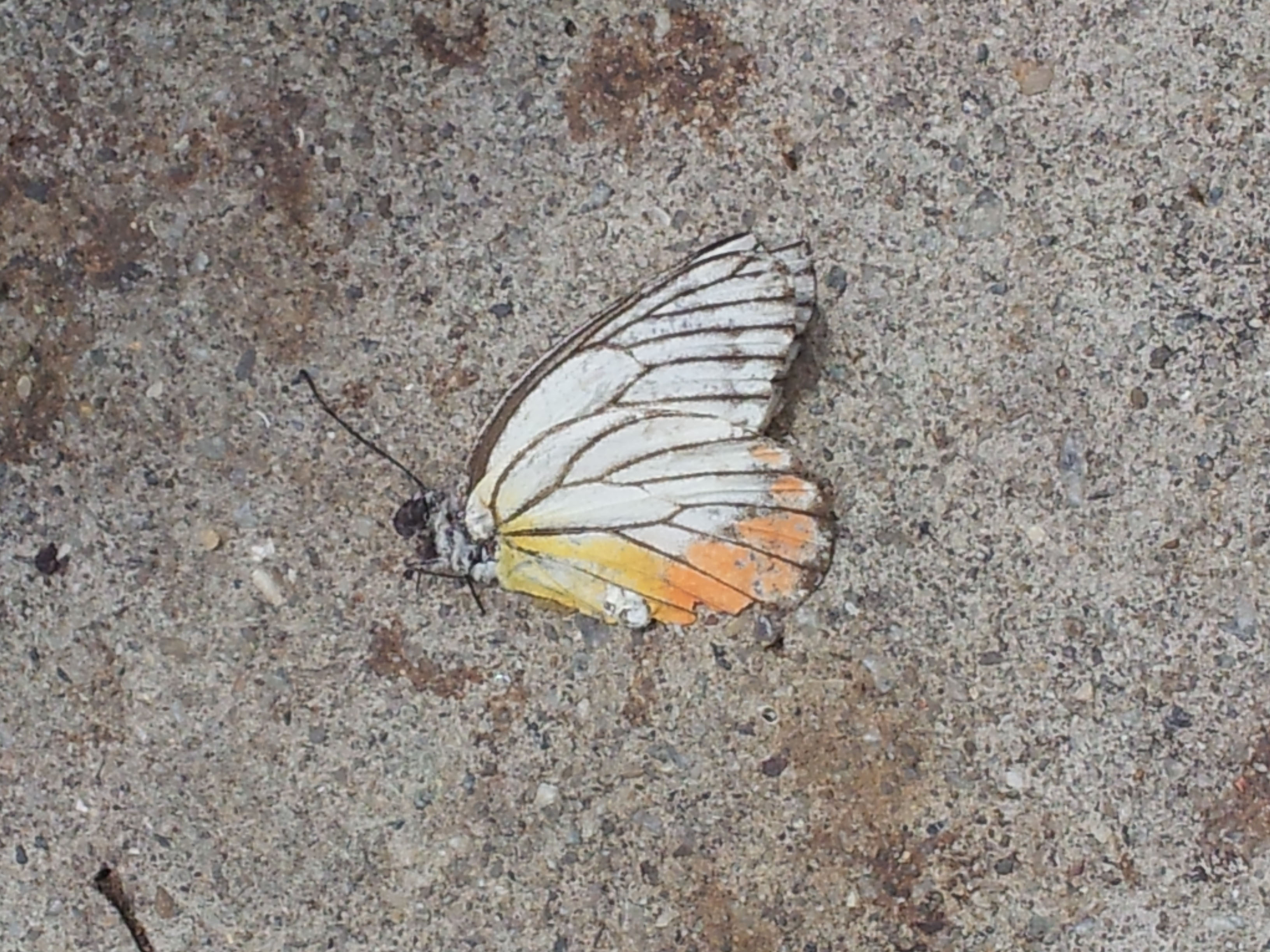
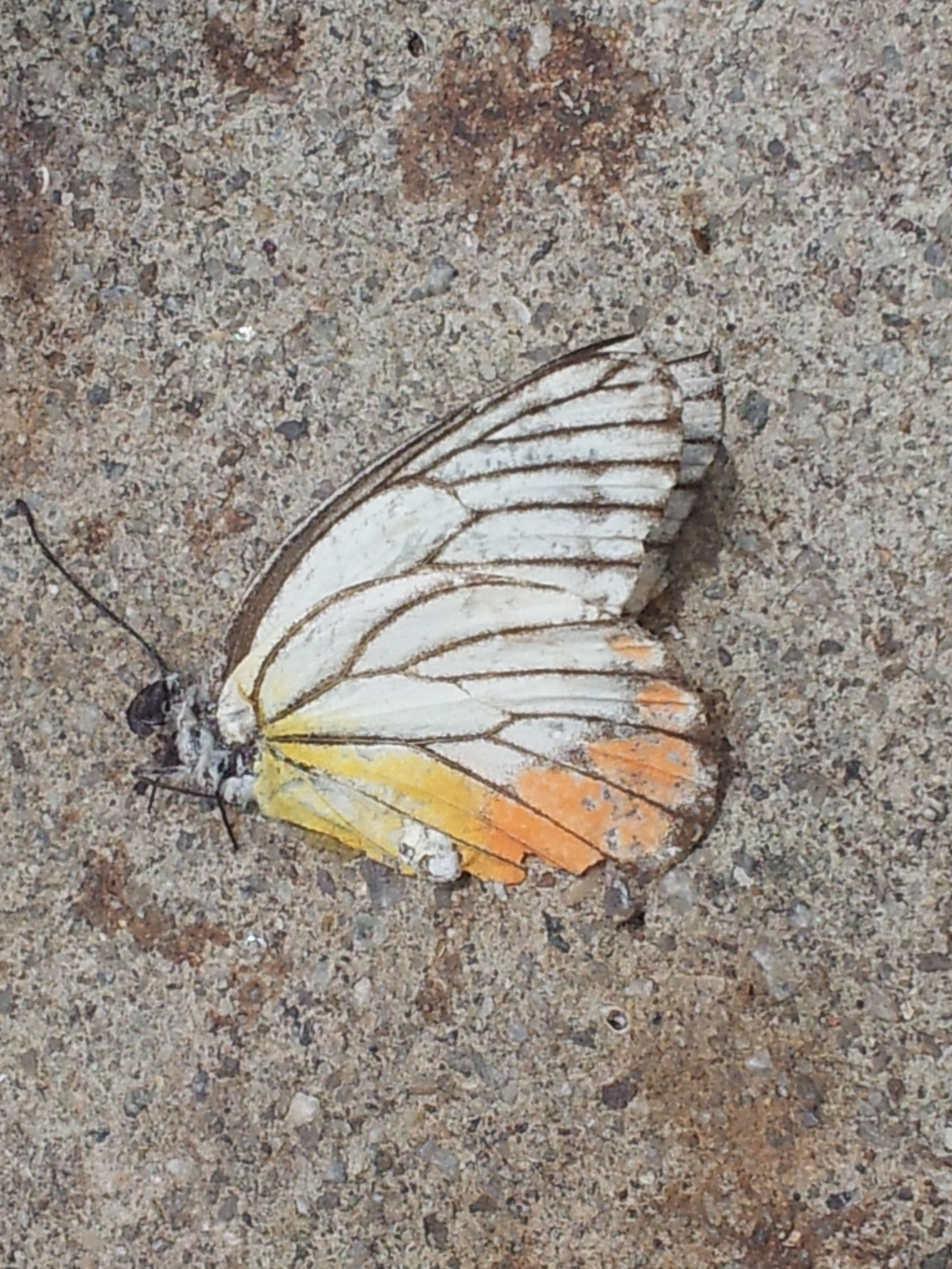
Above are photos I took a few years back of a dead butterfly.
My science is showing….
This project would not be my project if I didn’t include science into this (I like to make good use of what I have studied). But this time, it’s more of an easter egg, the project isn’t based on that.
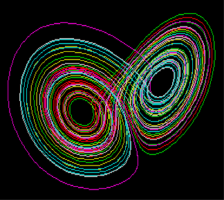
A BUTTERFLY FROM THE POINT OF VIEW OF A SCIENTIST IS THE CHAO THEORY.
The Lorenz Attractor http://plato.stanford.edu/entries/chaos/
The chaos theory is also known as the butterfly effect. In explaining the chaos theory, it is said the wind from the motion of a butterfly’s wings can cause changes in initial conditions that could then start a chain of reactions eventually causing a large event.
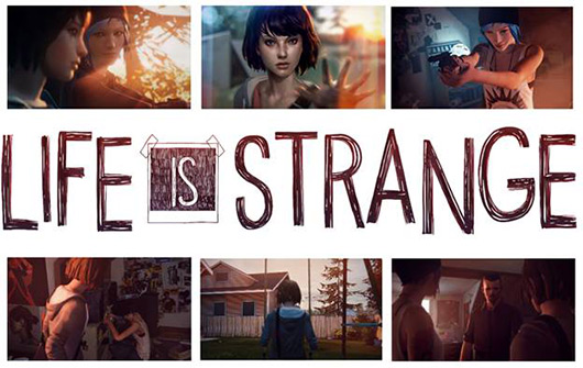
It’s a very interesting concept, the main idea is that a small event could result in large impact later on. There are actually many games that are based off the chaos theory such as Life is Strange and Until Dawn, both of which have an amazing storyline.
LIfe is StrangeUntil Dawn
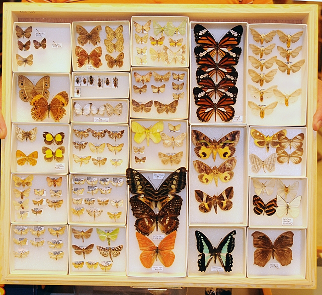
A BUTTERFLY FROM THE POINT OF VIEW OF AN ENTOMOLOGIST IS A SPECIMEN.
An entomologist is one who studies insects so I think this sentence speaks for itself.
Specimens from the Bohart Museum of Entomology
A BUTTERFLY FROM THE POINT OF VIEW OF AN ENTOMOPHOBIC IS FEAR.
I know that this is definitely true. I know of people who can’t even stand the sight/ image of a butterfly. It is like any other phobia.
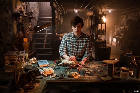
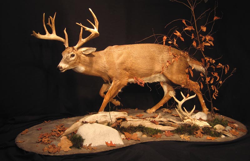
A TAXIDERMIST FROM THE POINT OF VIEW OF A BUTTERFLY IS A MURDERER.
Framed butterflies (www.bugsdirect.com)
The job of a taxidermist is pretty cool, I’m referring to those who do so for museums, professionals basically. It takes a lot of skill to successfully create a specimen. But in this case, I have referred to it in a negative way. I am referring to possible taxidermist and hobbyists who would purposely catch and stuff butterflies just for their collection. Butterflies are living things so to do so on purpose is inhumane. My curiosity in taxidermy peaked after watching a show called Bates Motel (it’s the modern day Psycho spin-off).
Bates Motel
It was not portrayed in the brightest of light, there was something rather sinister and dark about the whole trade (the non-professional one) and so I guess that’s what influenced me to view it in a negative way here.
www.taylorstudio-taxidermy-art.com
But while looking at images involving taxidermy, I have to say it does make me feel rather uncomfortable to see inanimate animals who were actually once alive.
A BUTTERFLY FROM THE POINT OF VIEW OF MYTHOLOGY IS THE SOUL. / A BUTTERFLY FROM THE POINT OF VIEW OF PSYCHE IS HER SOUL.
It’s Greek mythology time. Psyche in Greek means soul, hence the first variation of the sentence.
Antoine-Denis CHAUDET, Cupid, Marble (presented at the Salon of 1817), Plaster model (presented at the Salon of 1802) H. 0.77 m; W. 0.64 m; D. 0.44 m. The Louvre
For the second portion, it is based off the love story between Cupid and Psyche where Psyche’s soul being represented by a butterfly. See image of painting below. Note the butterfly flying above Psyche’s head.
François GÉRARD, Psyche and Cupid, Salon of 1798, H. 1.86 m; W. 1.32 m. The Louvre
A BUTTERFLY FROM THE POINT OF VIEW OF THE SUPERSTITIOUS A BAD OMEN.
Butterflies being seen as bad luck defers culture to culture. It is not the case everywhere.
A BUTTERFLY FROM THE POINT OF VIEW OF A STOMACH IS ANXIETY.
I think we’ve all experienced this at least once in our lives, ‘butterflies in the stomach’. Nervousness is unavoidable.
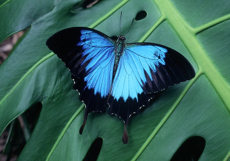
A BUTTERFLY FROM THE POINT OF VIEW OF THE EVERYDAY PERSON IS JUST AN INSECT.
Ulysses Butterfly Photograph by Peter Jarver
After all this thinking and research of butterflies, I decided on this as my final point of view. I had thought of 17 different point of views about what a butterfly could be.
Can you tell us apart?
But then I realised, I wrote those with the mindset that butterflies are special when in fact to many other people, a butterfly is a butterfly, it’s an insect, so what? Nothing special about it. So to the everyday person, I’d imagine that’s exactly how they feel towards these creatures.
The full list:
A BUTTERFLY FROM THE POINT OF VIEW OF A CATERPILLAR IS HOPE/ OPTIMISM/ THE FUTURE/ ANTICIPATION.
A BUTTERFLY FROM THE POINT OF VIEW OF A MOTH IS
A BUTTERFLY FROM THE POINT OF VIEW OF AN ENTOMOPHOBIC IS FEAR.
A TAXIDERMIST FROM THE POINT OF VIEW OF A BUTTERFLY IS A MURDERER.
A BUTTERFLY FROM THE POINT OF VIEW OF A BEE IS COMPETITION/SELFISH.
A BUTTERFLY FROM THE POINT OF VIEW OF A BIRD IS A MEAL.
A BUTTERFLY FROM THE POINT OF VIEW OF A CHILD IS A GAME OF CATCH.
A BUTTERFLY FROM THE POINT OF VIEW OF A FLOWER IS HELP / SALVATION/ MATCHMAKER/ CUPID.
A BUTTERFLY FROM THE POINT OF VIEW OF AN ENTOMOLOGIST IS A SPECIMEN.
A NET FROM THE POINT OF VIEW OF A BUTTERFLY IS DANGER.
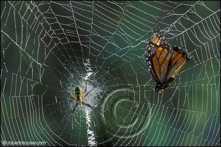
A BUTTERFLY FROM THE POINT OF VIEW OF A SPIDER’S WEB IS A NEW VICTIM.
A BUTTERFLY FROM THE POINT OF VIEW OF A SCIENTIST IS THE CHAO THEORY.
A BUTTERFLY FROM THE POINT OF VIEW OF MYTHOLOGY IS THE SOUL. / A BUTTERFLY FROM THE POINT OF VIEW OF PSYCHE IS HER SOUL.
A DOWNPOUR FROM THE POINT OF VIEW OF A BUTTERFLY IS DEATH.
A BUTTERFLY FROM THE POINT OF VIEW OF THE SUPERSTITIOUS A BAD OMEN.
A BUTTERFLY FROM THE POINT OF VIEW OF A STOMACH IS ANXIETY.
A BUTTERFLY FROM THE POINT OF VIEW OF A GRIM REAPER IS WITHIN REACH.
A BUTTERFLY FROM THE POINT OF VIEW OF THE EVERYDAY PERSON IS JUST AN INSECT.
——————————————————-
Artist References
Aim of this project (from brief):
“The Point of View project gives one the opportunity to approach visual problem solving in a more methodical, conceptual, thought-provoking way. Making the effort to see subjects from different vantage points opens one to the process of self-generating ideas.”
Taking into account the given aim of the project and what was covered during the class sharing this week, I can conclude that with this project, it would be good to represent the point of views about butterflies without explicitly using butterflies in the compositions. Personification would be a good way of putting it; to use something else to represent butterflies.
I was not looking for anything in particular when searching for artist references so I just listed out some of the artists whose works I really admire. The selection started off pretty random but as I continued searching, I more or less found a style and concept that I liked by an artist which I will cover later on in this post. But as a starting point, I looked at artists who incorporated a lot of details into their work because when I think about butterflies, I’m reminded of their intricate patterns on their wings.
Artist #1- Laura Laine
Laura Laine is an illustrator and most of her works can be seen in advertisements and magazines (fashion, etc). I’ve been a fan of her work for over five years now and her works still amaze me till this day.
OEIL DE LA MODE
What attracted me to her works is her attention to detail. The hair of her figures in particular is incredible. Every strand is taken into account and drawn out carefully.
SCARF
As most of her illustrations are used in fashion magazines, the clothes worn by the figures become crucial. Laine has rendered each fabric beautifully, to the point where you could almost feel the actual texture of the clothes. The softness, sheen and folds of the various fabrics are all taken into account.
Besides the intricate details that come with her work, I also like the way she incorporates her figures with the products she is helping to advertise.
LOUIS QUATORZE PARIS
The figures interact with the product and are not independent from it. From her works, it is evident that she takes into account the products of her clients and works with the product rather than against it. As a result, her illustration do not take away any attention from the product but rather has helped to bring attention to it. The merge is also usually done in a quirky way as well so it’s never boring.
VOGUE GERMANYMUSE MAGAZINEVOGUE JAPAN
I go on forever about Laine’s works but I think I’ll move on. You can check out more of her works at her website: http://www.lauralaine.net/
Artist #2- Maude White
This research would not be complete without a reference to paper cut. It is an art form that requires a lot of time, patience and skill. One wrong cut and the whole piece is ruined. So a steady hand and keen eye for detail is definitely necessary. White definitely has all of these qualities considering the amazing work that she has done. All her works are done by hand.
Paper cut by Maude WhiteUnder the ‘Floral’ collectionFrom ‘You Were Wild Here’ collection
With reference to the work above, we can see that even the display of works is taken into consideration. The shadows cast onto the wall create the image. And again look at the hair on that piece of work! I can appreciate the amount of effort that went into that.
The selected birds section of her works is where the paper cuts get pretty detailed.
By Maude White
The repetition of lines as seen by the almost parallel lines of paper gives texture to the feathers of the eagle. The direction of the lines (in an outward direction) all help to give a little bit of movement and rhythm. It also makes the bird look a lot bigger since it draws the eye from the head to the outer areas and vice versa.
Artist #3-Eugenia Loli
Loli’s works are collage based. She makes use of images from vintage magazines and science textbooks for her collages so it’s not surprising that the final pieces have a vintage feel to them (which I really like). Quite a few of the works involve the universe, planets, galaxy landscapes, just astronomy in general (which I also really like).
Maker by Eugenia Loli
Her works are really quirky and humorous. She makes use of different images to create thought provoking works. What’s interesting is that the individual images have their own meaning but when put together with another image, the whole concept and meaning changes. If you look at the image above, ‘Maker’. It is most likely referring to the maker of the universe as the girl is creating the planets. Instead of blowing bubbles, she is blowing out planets and the whole image works. It’s a beautiful image.
The image itself is good but together with the given title, the work gets lifted to a whole new level. Each piece seems to tell a story and is hinted by the title.
Reptilian Snack
I had a really hard time selecting which works of hers to show because their all so good and funny. The vintage look really is working for me, very classic. Composition is paid attention to as is the use of colour, which I assume can be challenge since the colours of these images are fixed.
Weeeeee!
The addition of Ironman into this painting changes the meaning of the original work. It is also a juxtaposition of the old and the new (pop culture).
Some of Loli’s other works:
Light it up!Gem RoastCome On Darling, Make Their WishEvery Act of Creation is First an Act of Destruction“Minute Two” Nirvana series.Freud vs Jung
Eugenia Loli’s work- vintage and surreal
Emerald City
Please do check out more of her works: http://cargocollective.com/eugenialoli
Artist #4- Xavier Casalta
Time and patience. Qualities required for paper cut and stippling. But we’re not talking about paper cut for this reference. We’re talking about stippling, which is a technique of using purely dots to draw. Stippling may also be referred to pointillism, of which Georges Seurat was famous for using (see image below).
A Sunday on La Grande Jatte—1884, Georges Seurat, 1884–86, Oil on canvas 81 3/4 x 121 1/4 in. (207.5 x 308.1 cm), The Art Institute of Chicago.
Xavier Casalta is an artist that makes use of this technique.
Flowers and Fruits by Xavier CasaltaFruits and Flowers
Using stippling allows you to have a lot more control over your drawing because you’re drawing to a much finer degree, almost like painting by pixels. I have used this technique a couple of times and I do enjoy it, I like the control I get with it although I have to admit it is very time consuming (but really worth it).
Hither & VonHither & Von
Depending on how close the dots are and the density of dots in an area, varying shades can be obtained. Stippling gives a rather soft look unlike hatching which can look quite harsh.
Into the WildInto the Wild
Look at the amount of detail that you can get into a drawing with stippling! In the above image, even the veins and texture of the leaves can be drawn in.
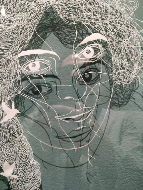
Artist #5- Marco Mazzoni
Marco Mazzoni is an artist that uses coloured pencils to create his works. I found out about his works a year ago and his works really made quite an impression on me.
His subject matters include women (their faces especially, but without their eyes), morphed animals, plants, flowers and butterflies. He seems to make use of blues and pinks more often in his works.
The compositions are always balanced and each work is filled with texture, movement. Contrast can be seen in the blank spaces (where the eyes are supposed to be), bringing emphasis to the lack of the eyes before the viewer sees the piece in its entirety.
“I Could Have Lost You” series
Each work has a sinister or rather haunting feel to it. They all whole a sense of mystery. The use of colours translates very well here. Warm colours such as red orange are used sparingly and when they are used, they are accompanied by a larger amount of black. There seems to be a tension and yet a harmonious existence between the various subject matters in the drawing.
More of Mazzoni’s works here: http://marcomazzoni.tumblr.com/
http://www.galleribenoni.dk/artists/marcomazzoni
Other Artists References
Butterflies by Sarah EstejeTiger by Sarah Esteje
Sarah Esteje creates these amazing drawings with just a Bic pen. With this example and the ones seen by Xavier Casalta, using pens to draw allows for a more detailed drawing since you can get a really fine nib to draw with. Ink has its own aesthetic quality as well. Such drawings are usually in a single colour (and it’s a colour that isn’t too vibrant either).
Thoughts & Reflections
Earlier on I mentioned that there was an artist whose style and concept that I liked and it was actually Marco Mazzonis’. I really liked the tension that exists in his work, there is something dark and mysterious about them. His use of colours and compositions is something I could learn from.
I feel that I could apply these to some of my point of views that involve topics that are a little more melancholy or depressing in a way (topics involving death, envy, etc). After the sharing this week, I was advised to maybe look into using humans to represent my point of views. I guess I can then bring across this same tension and sombre mood into my works. Also mentioned was that butterflies are often associated to femininity rather than masculinity, and I do find that to be the case too. So maybe I could use women, as Mazzoni does in his works, to represent the butterflies.
After writing this artist reference section of this post, I have found myself to be attracted to the works of another artist besides Mazzonis’. I have fallen in love with the collages done by Eugenia Loli. Before the sharing, I only had the opportunity to view some of her works but after researching and looking through most of her works, I can say that I really love them. I love how each piece is quirky and yet has a message (sometimes sarcastic, sometimes of mockery, things like that). I would actually like to try out collages as well.
So to end off, I think for now, the artist references that I will be following will be Marco Mazzoni and Eugenia Loli. Between now and my next post, I will be selecting my six points of view and seeing which style of illustration works best for which. (My apologies for the lengthy post).
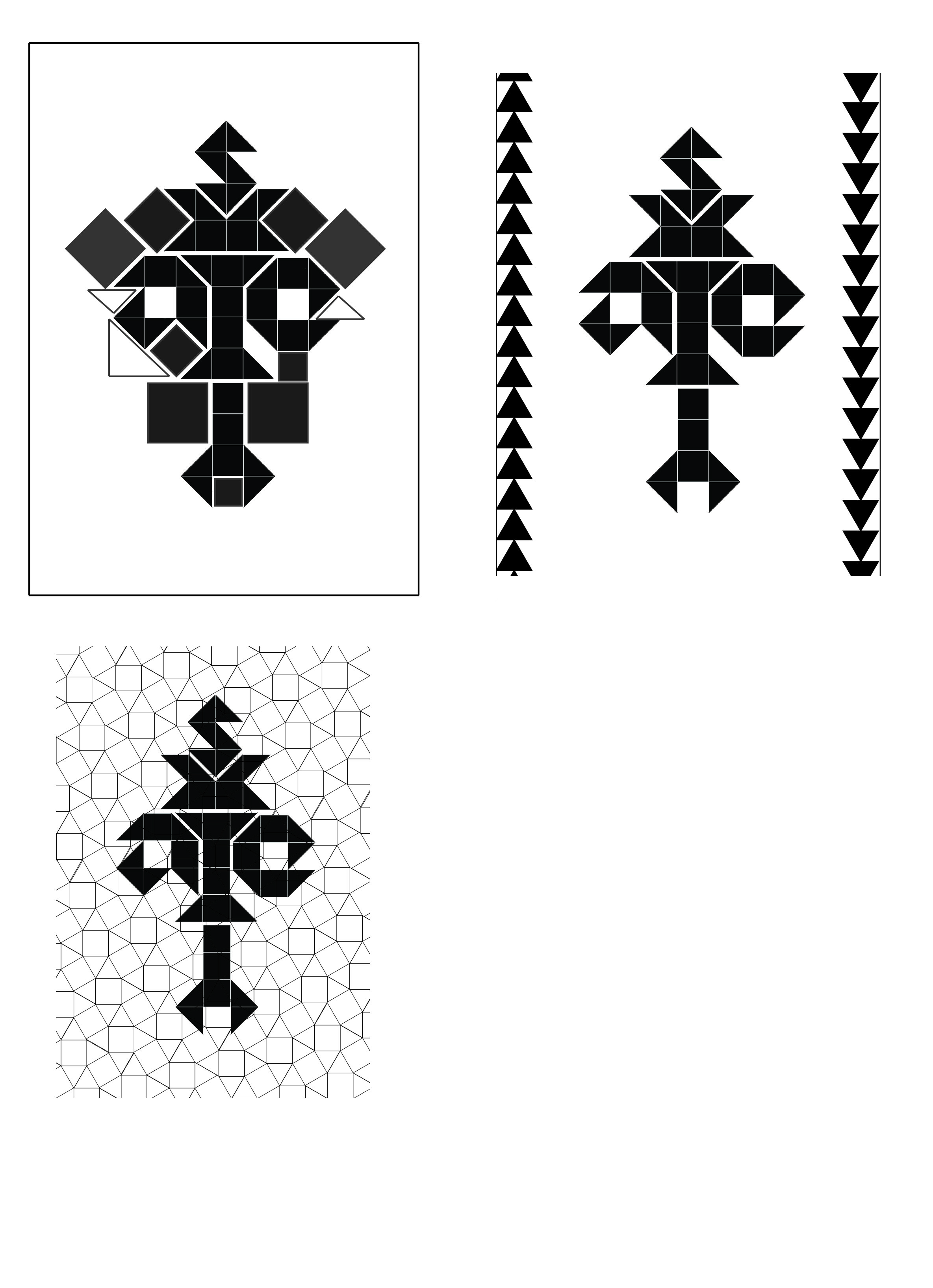
The main theme surrounding this project was science and I covered four branches of science: mathematics, chemistry, biology and physics. The route I decided to take with this project has resulted in me looking at how science is portrayed and scientific information conveyed. With that said, I decided to make all my works under the same principle of keeping it clean, simple and with no excess details, nothing too elaborate. In things like research papers, it is important to relay the information in a clear manner, the more unnecessary details are placed inside, the more confusing it gets. So, minimalistic and simple. I had to constantly remind myself ‘don’t over do it’.
Final work
Here are the images of my final work.
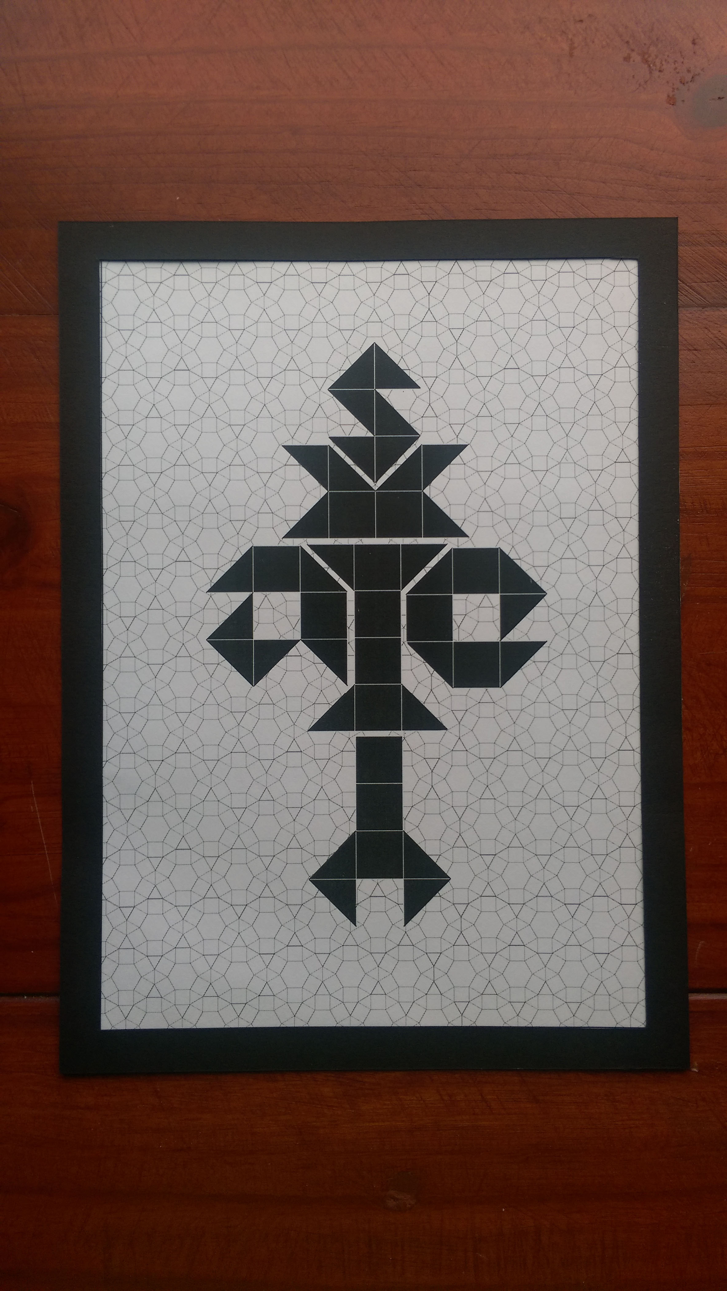
Mathematics
Mathematics
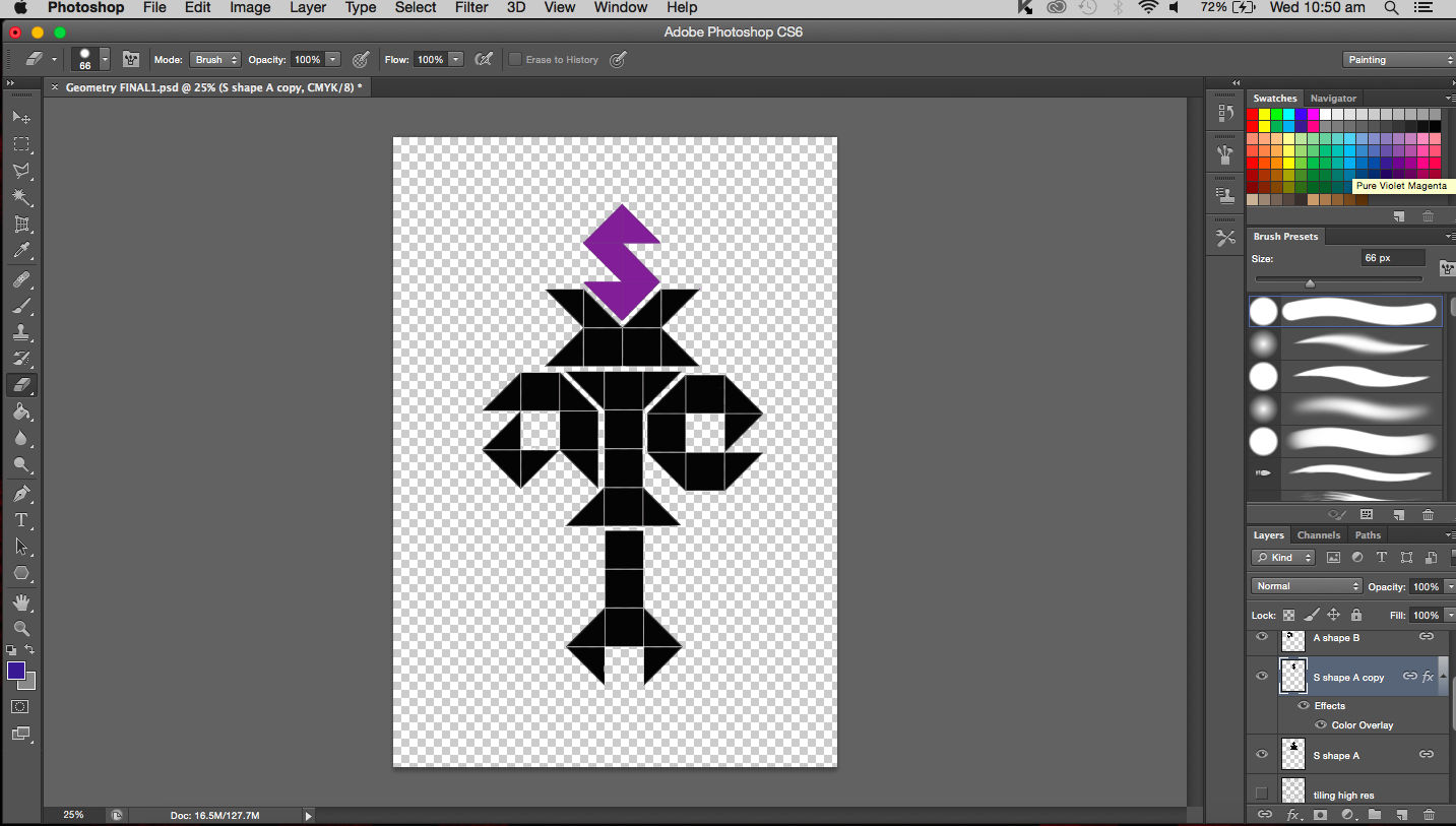
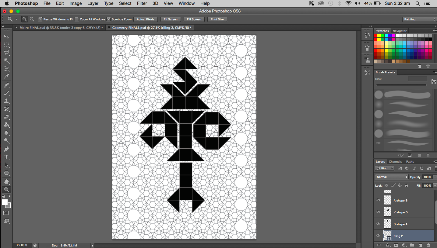
Mathematics: Logical (Geometric)
Medium: Digital
Artist reference: Hexagontica typeface (starting with a shape and working the shape to form the alphabet)
Biology
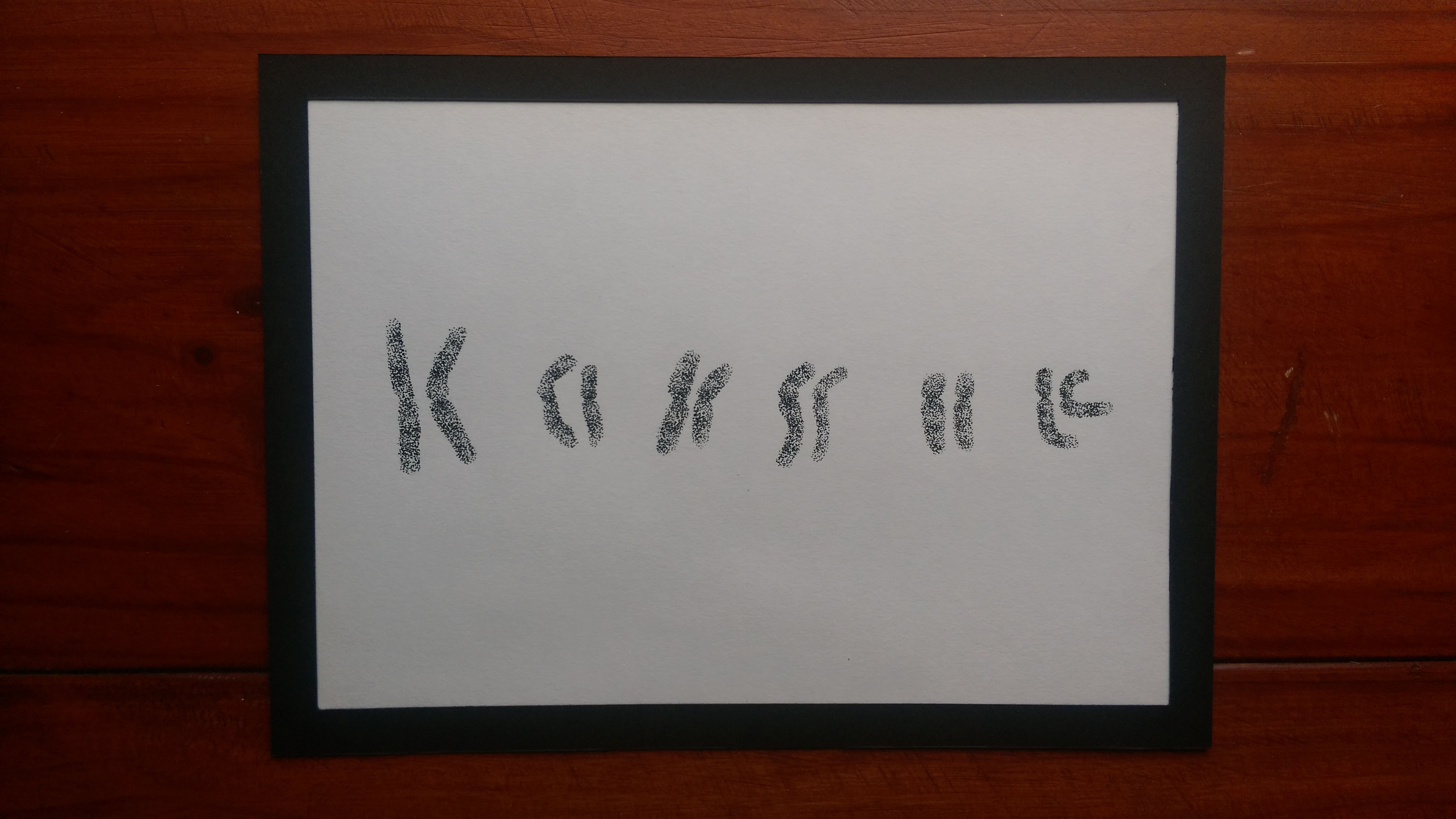
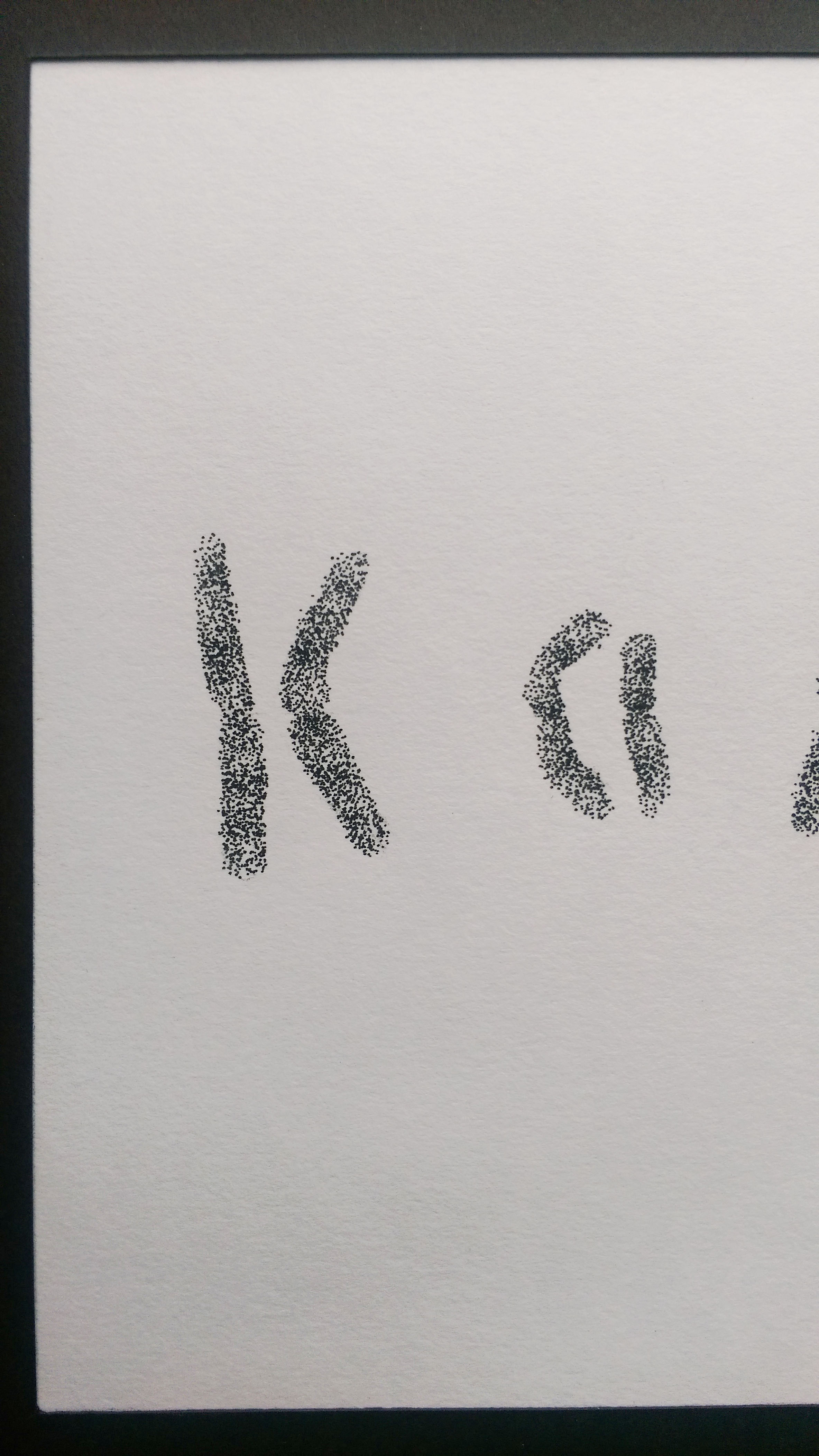
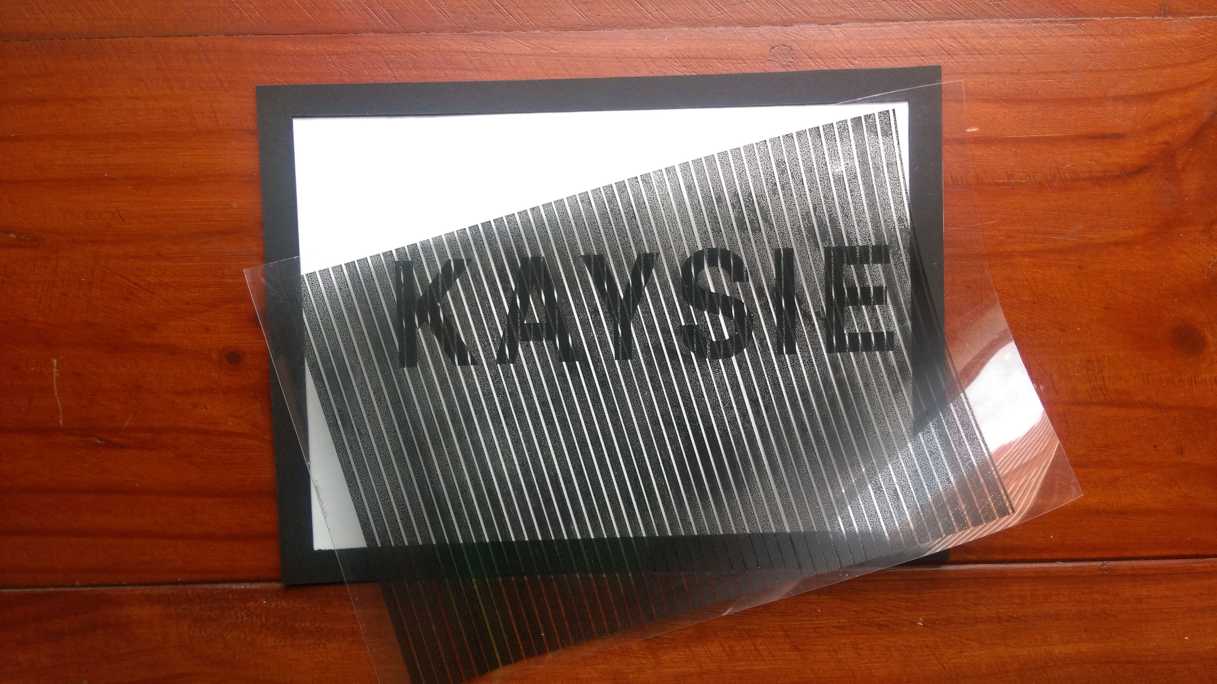
BiologyBiology (close-up)
Biology: Detail-orientated (stippling)
Medium: Ink on paper
Artist reference: A range of artists
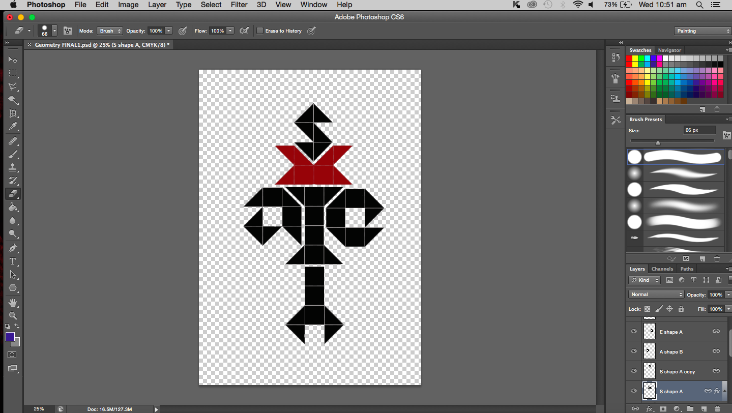
Final thoughts: I want to talk about the ‘rules’ that I mentioned in the post before and how I have applied it here to my final work. All the midpoints of chromosome letters are the same, the length within each pair is also the same as is the banding patterns. The banding patterns(horizontal stripes) were to be rather subtle. From the first letter ‘K’ to the last letter ‘e’, the overall length decreases. I talked about compromise of logical the last time and I did compromise to a small extent as seen in the letter ‘a’. The arms bend towards the other chromosome instead of away. My lack of compromise here has resulted in a double ‘s’ and ‘i’. If I had to do this again, I would have done the same thing, I would like to remain true to myself and remain as scientific as possible. In fact, the double letters pushes the viewer to look at the negative space or the space between the duplicates to find the single letter.
I didn’t really specify the artist reference for this work because I feel like I have applied bits and pieces of what I have gathered from the many artists that I came across throughout this project. Information not just about their final work but also the process by which they worked with.
Chemistry
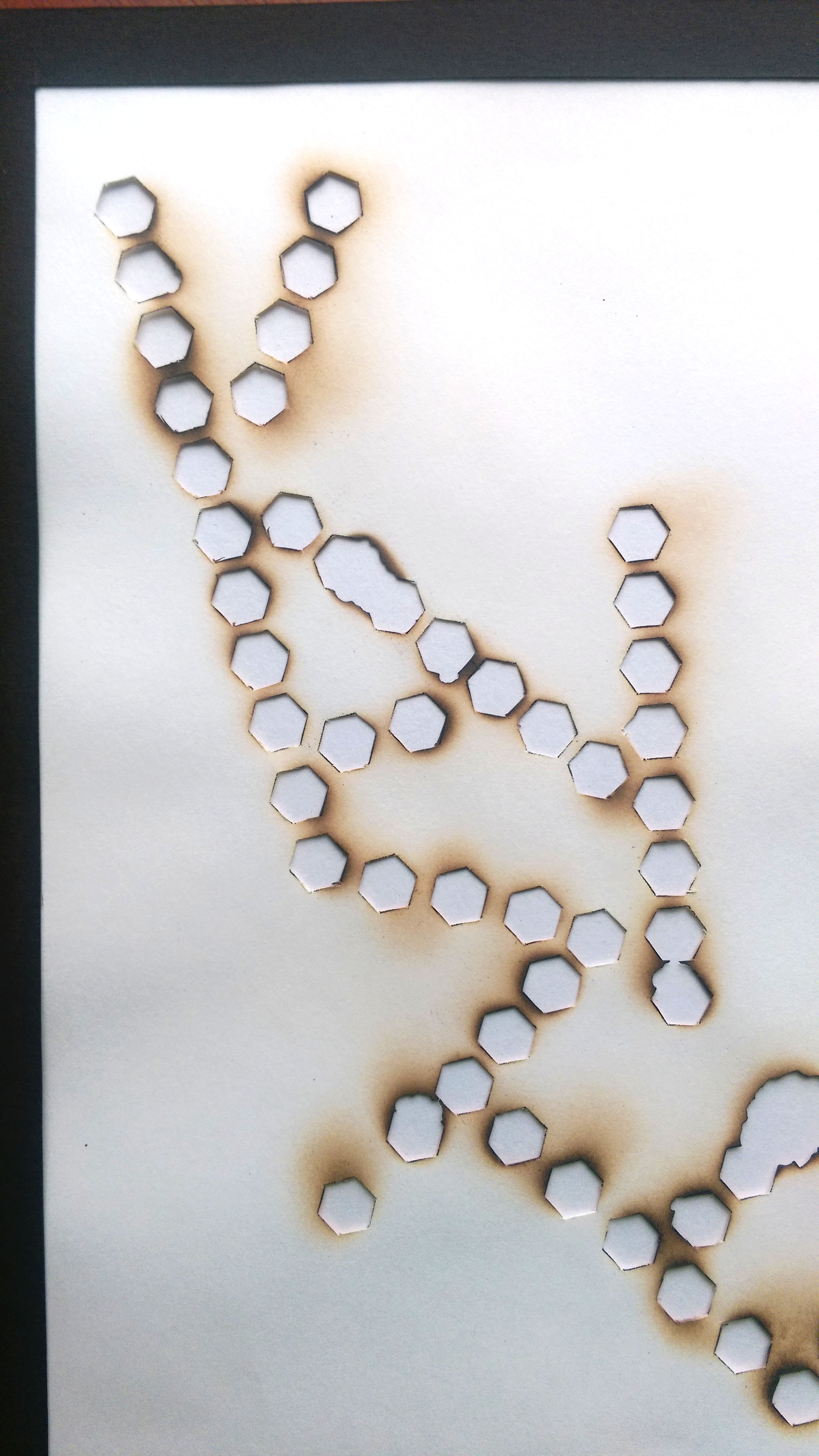
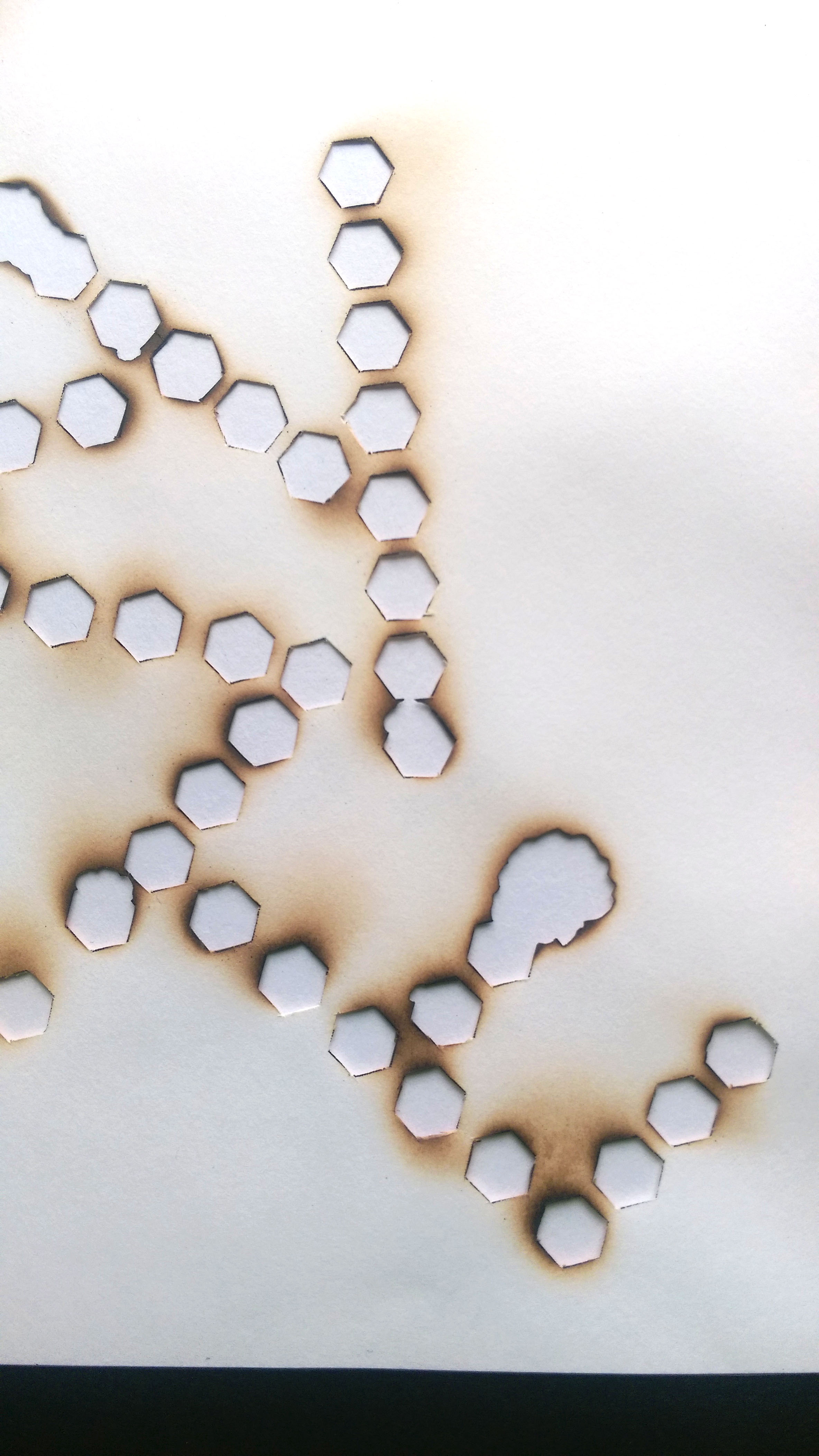
Chemistry
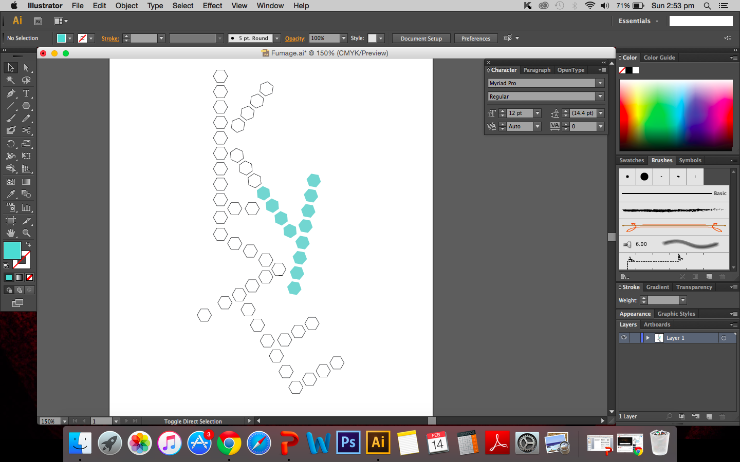
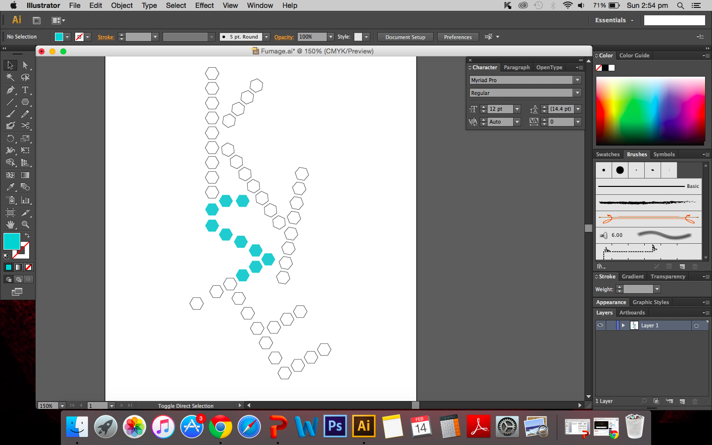
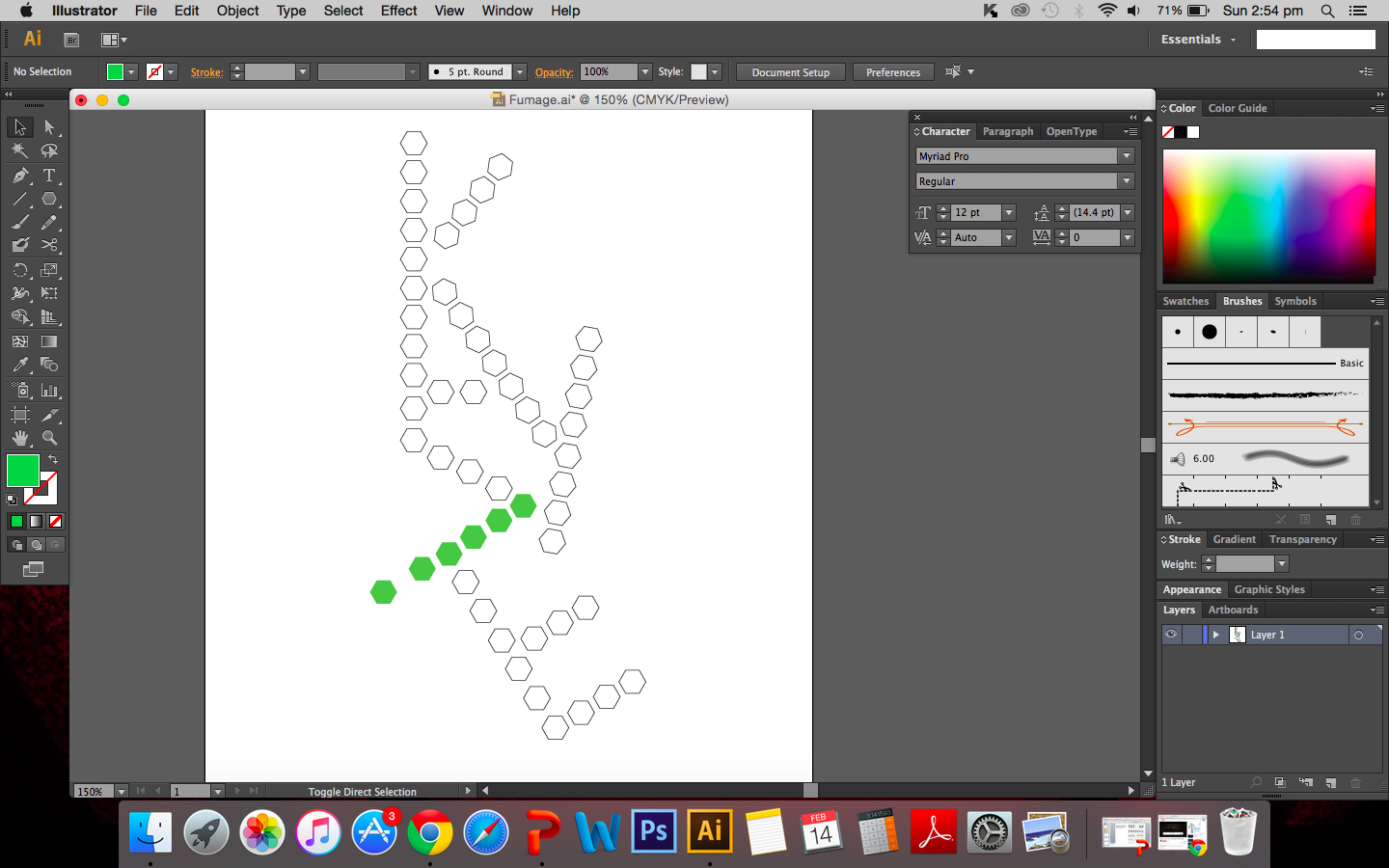
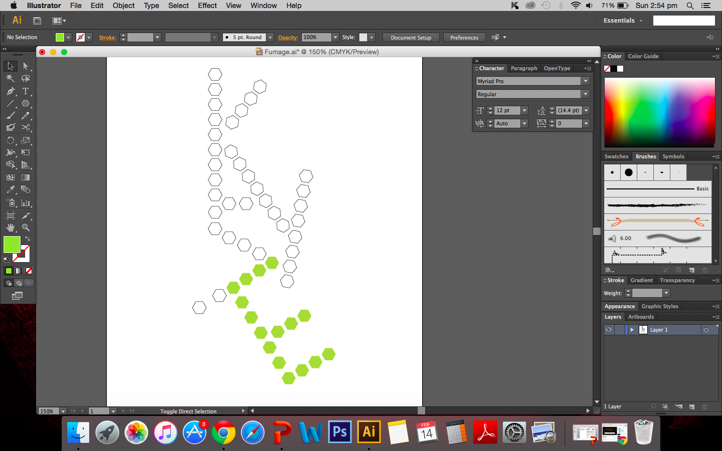
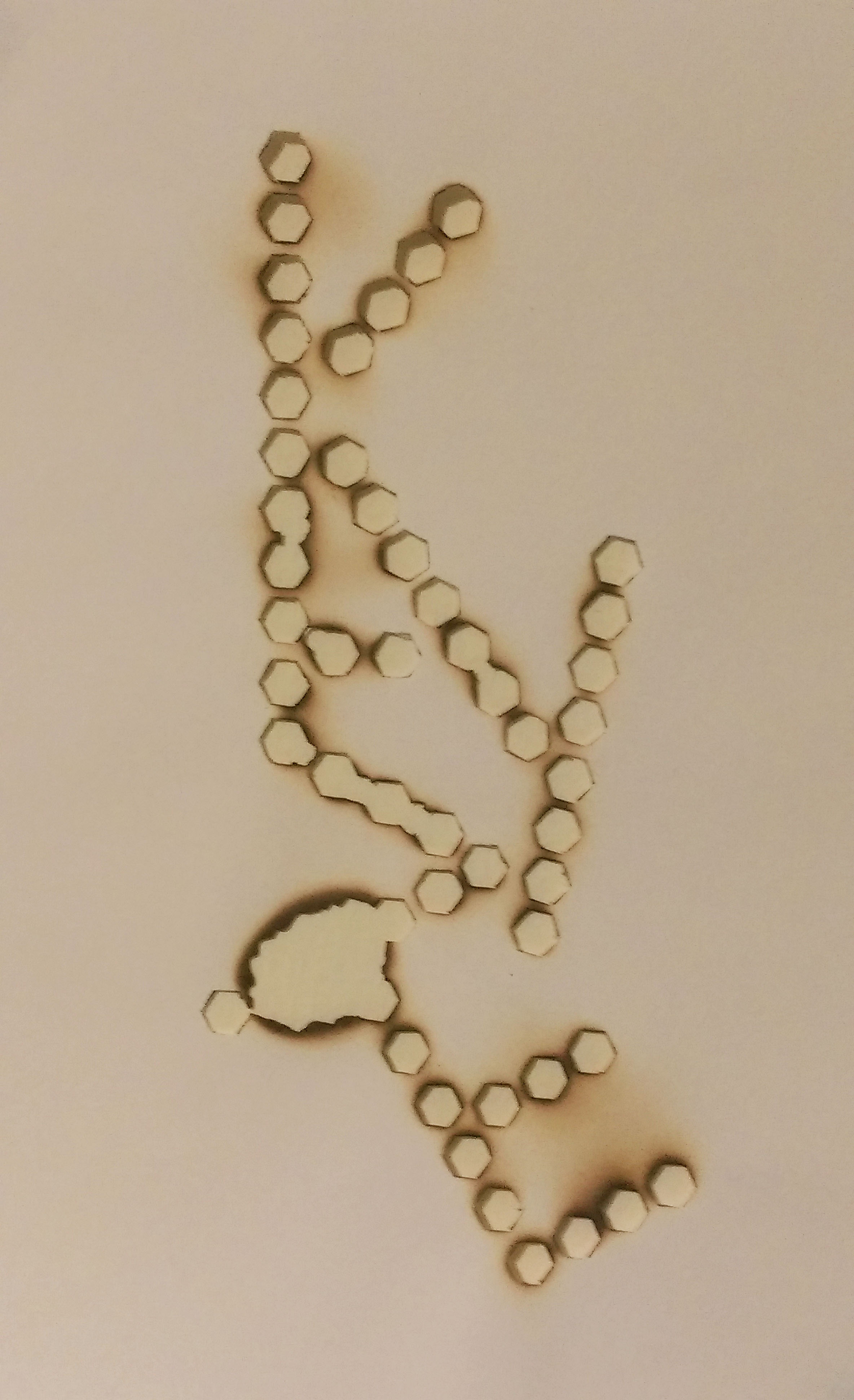
Chemistry: Risk-taking (fumage)
Medium: Fire & smoke on paper
Artist reference: Dada movement. Wolfgan Paalen
Final thoughts: After attempting the fumage again, I can say I am pretty pleased with this outcome. There are holes that went beyond the original shape of the hexagons but they are really growing on me. You can see them in the letter E in the image above, where two hexagons have merged. Again, I would link this back to success and failure and the unpredictability of risk-taking. The outcome is not something you can always predict and you just need to make the best of the situation and use it as a learning experience.
Physics
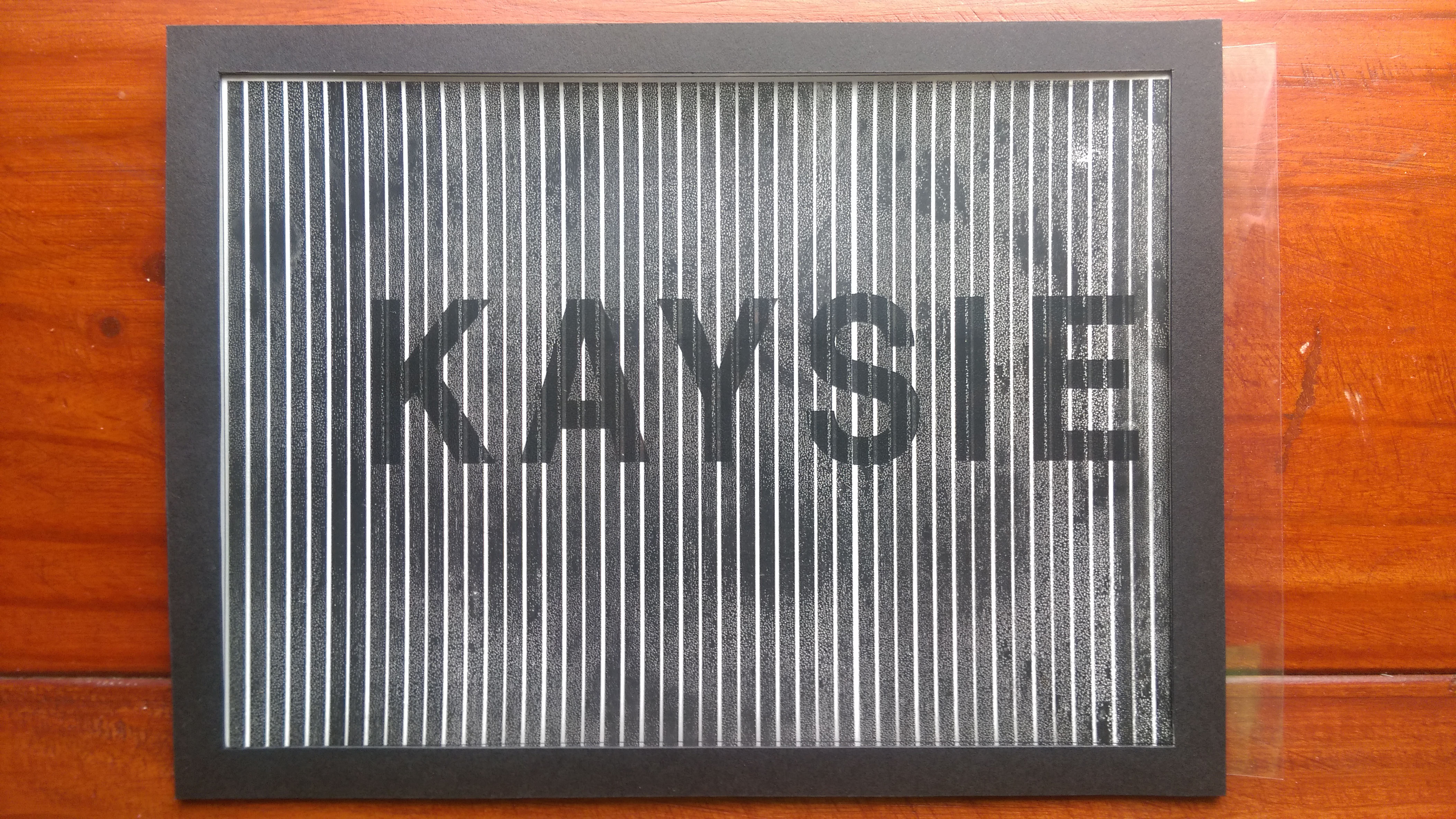
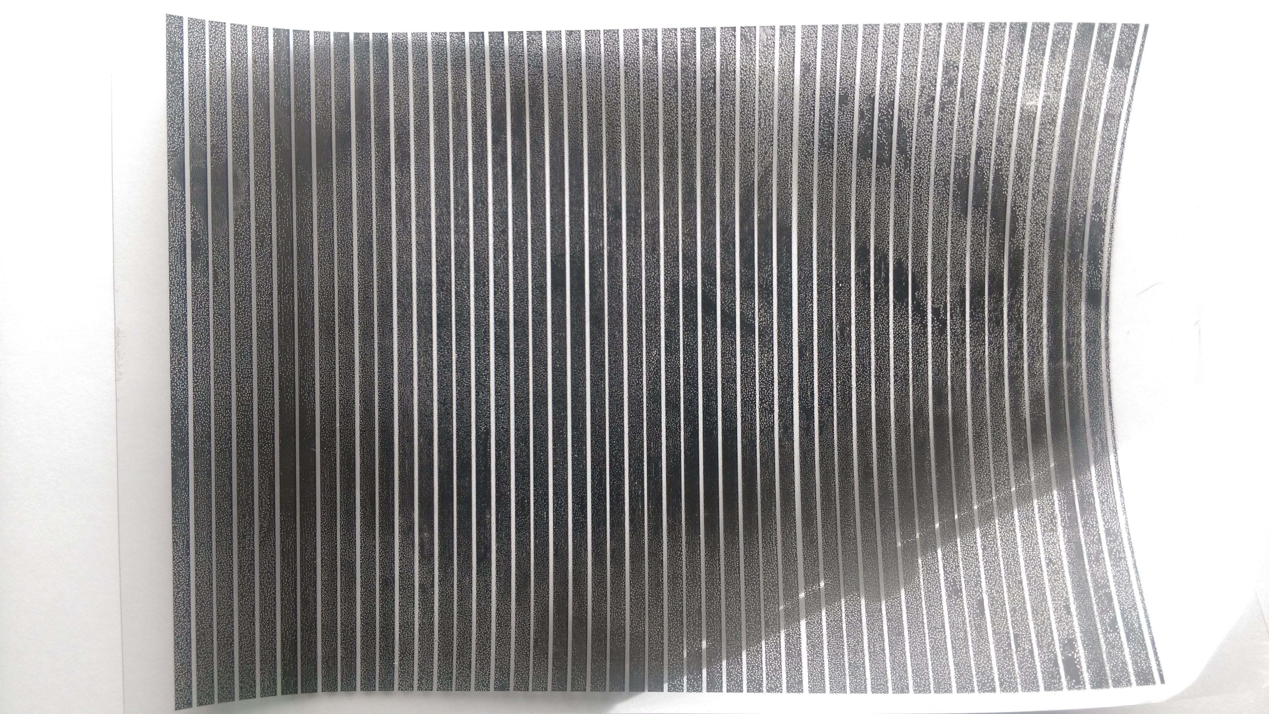
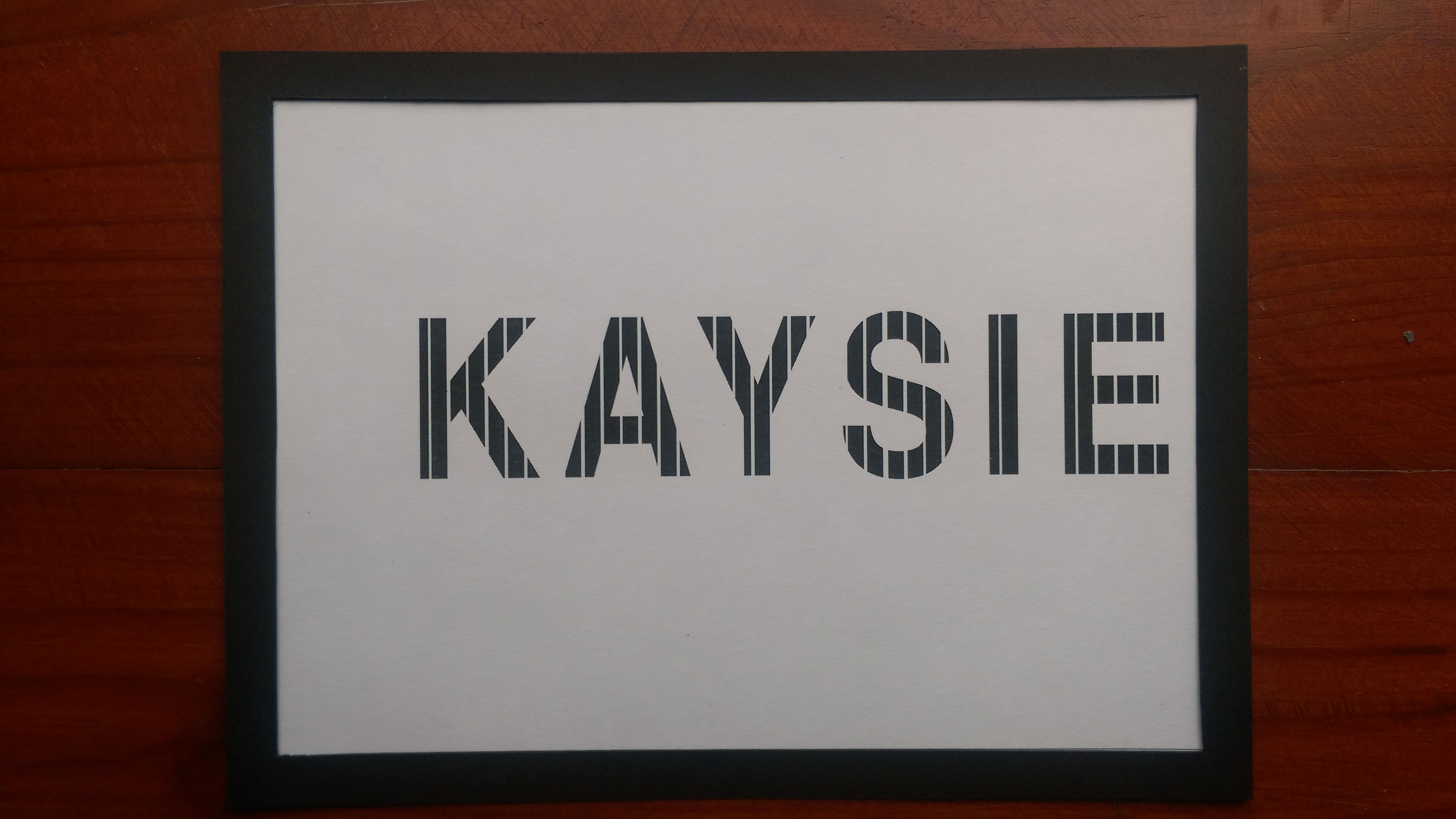
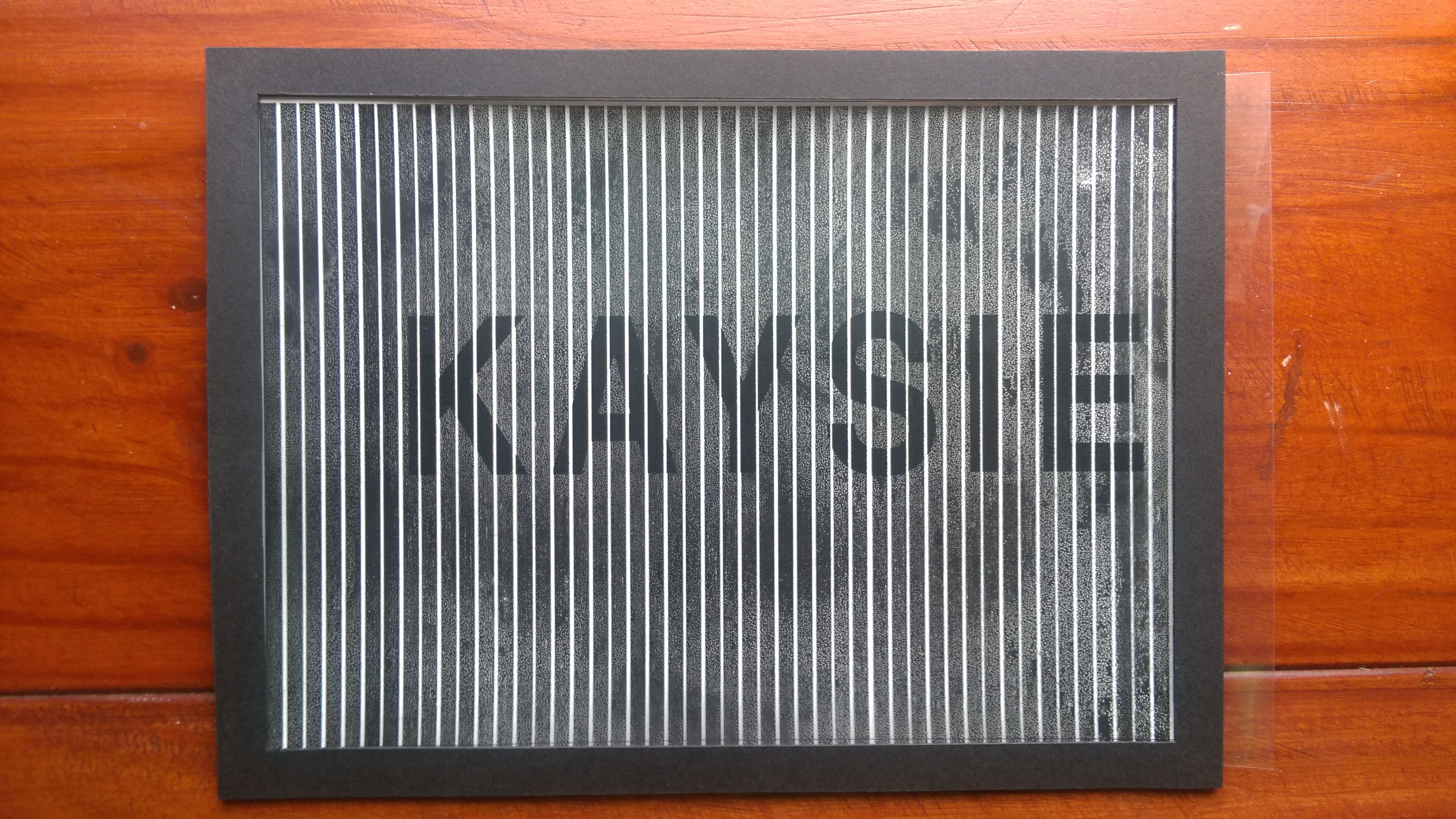
PhysicsTransparencyBase
Physics/Mathematics: Inquisitive (Moiré patterns)
Medium: Digital (printed on paper and transparency)
Artist reference: Andrea Minini
Final thoughts: I mentioned in class that this didn’t really turn out as good as I would have wanted it too. However, I am growing to like it. Not to say it doesn’t work entirely but it is just not to its full effect. The ink did not hold on well to the transparency film resulting in splotchy stripes that were not opaque so the name behind was not fully hidden. The fading in and out can still be seen though and I’m not too disappointed with what I have made. It is a learning point for me and I don’t regret trying out something new like moiré patterns. It was really interesting to make and that further emphasises on the inquisitive nature. There is also an element of unpredictability seen here, the fact that the results were unknown until the final outcome. I’m pretty that I likened this to my physics results, saying that I like it but the results don’t always show my love for it. I still think it to be mostly true.
I would kept my works in black and white, with the execption of the fumage. The reason for this is that when you talk about scientific information, it is black and white, they are facts, not much grey area. That is something I really like about the sciences, it either is or it isn’t.
Moving forward
I received a lot of lovely comments from the others and it was really encouraging.
What I can take back from the critique session is that I should further explore my relationship with science and deal with the fact that I actually have a love-hate relationship with it. Also, back to the good old petri dish. I talked a lot of safety hazards and was told that now I should maybe look into hazards as a designer if i’m not wrong and merge the two together. So that’s what I’ll be looking into.
In this short post, I will be covering how I will be doing the biology themed piece of work. After much internal debate, I have decided to go with the chromosomes as a base to start with.
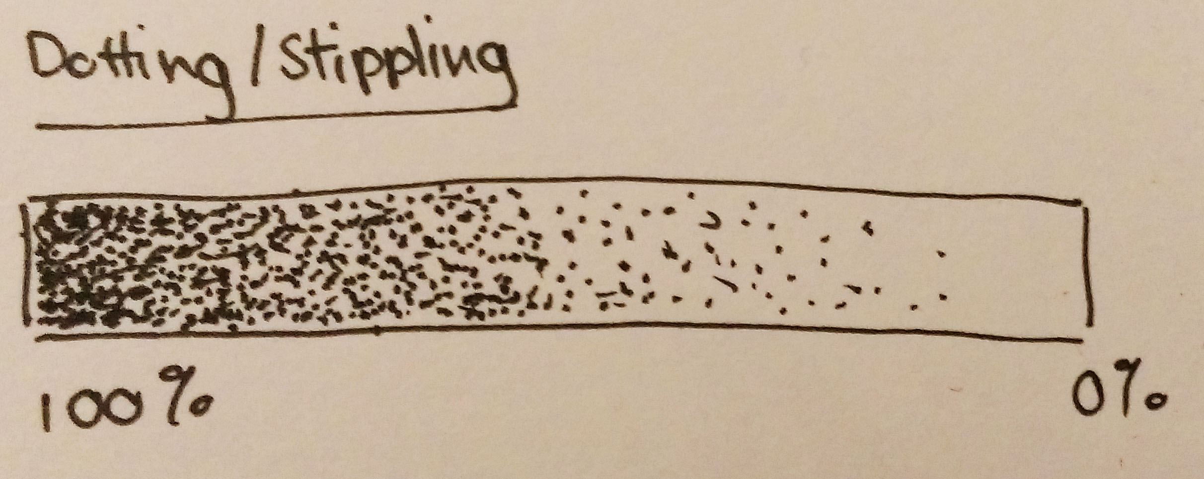
The medium would be in pen (0.05, black). I will be stippling the entire piece. I enjoy stippling as much as some would consider it time consuming. I like the control I get with it, you get to decide where each dot goes, it’s like drawing at a micro level. I really like that level detail that comes with it. The process just involves dotting basically. Areas that are to be darker just require a higher density of dots, lighter areas involve dots.
Dots
If you think about, the dots seem to represent the numerous genes present on DNA and chromosomes, so it is appropriate to have dots/genes make up the chromosomes. I really hope I am making sense.
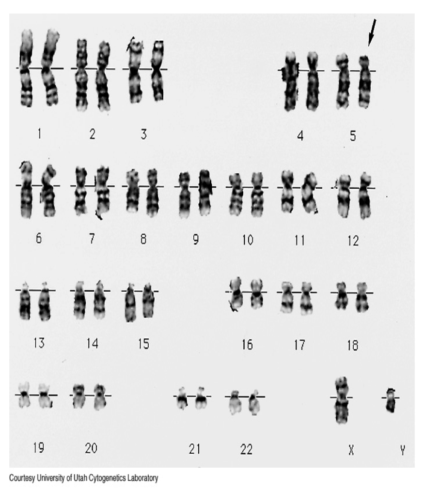
I am as much a science student as I am an art student. I like to be as scientifically correct as possible. In this case, I decided to stick with the ‘rules’ that come with the chromosomes. And I will be sticking to these rules while drawing this work. Here is an image that I showed in a previous post. I will be referring to it to illustrate the rules.
Chromosomes
The first thing to note is that the midpoint of every chromosome pair is the same. See the reference line that runs through the middle of each pair? That’s the common point (it’s called a centromere). Next, the length of chromosomes in each pair are the same length. If you look close enough, you will find that the chromosomes aren’t uniform in colour, there are bands of different opacities. That’s the staining pattern and is usually the same within each pair. The last rule is the direction in which each chromosome arm bends in. Sometimes they are vertical but they can be bent. They usually only bend away from the centromere.
I understand that following these rules to create my work might be limiting what I can do but I find it hard to make such a compromise, I want the work to look good but also be logical to me. I mean, I am willing to give in a little but overall I would like to make something that is still scientifically sound.
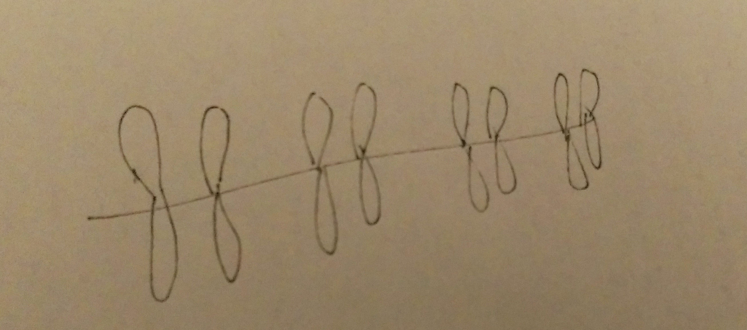
The process for this piece is pretty straightforward. First I draw a horizontal line across the middle of the paper. Sketch out where I want the chromosome pairs, making sure that the distance between each pair is roughly equal. Then the dotting begins. The darker bands created just require more dots and lighter bands less dots.
Length of chromosomes also decrease left to rightMore dots
With so many dots involved, I’d like to think about this work as me being detail-orientated. Every detail is taken in account. It is also an attribute that is crucial for any scientist. To never overlook any detail and record their process and hypothesis in a detailed manner. A lack of detail of result in very different outcomes.
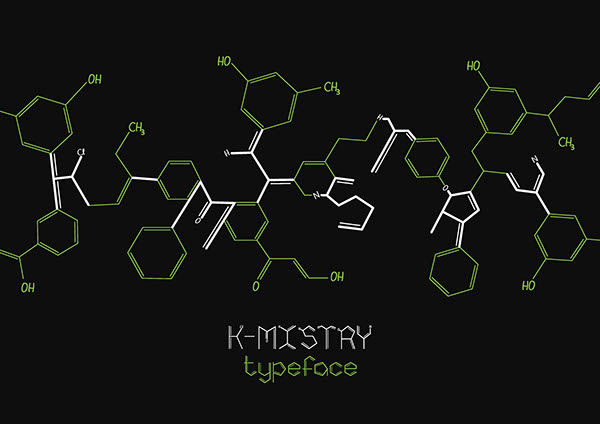
The most obvious route to take with chemistry would be to work with structural formulae and skeletal structural formulae of molecules. However, that has already been done, see K-mistry Typeface by Ranmalee Jayaratne, where the skeletal structure of molecules are used as letters.
I think the idea is a brilliant one, the letters look clean and simple but scream out chemistry. Straightforward and to the point, which is what I like about it.
I tried my hand at it nonetheless but took my own take on things.
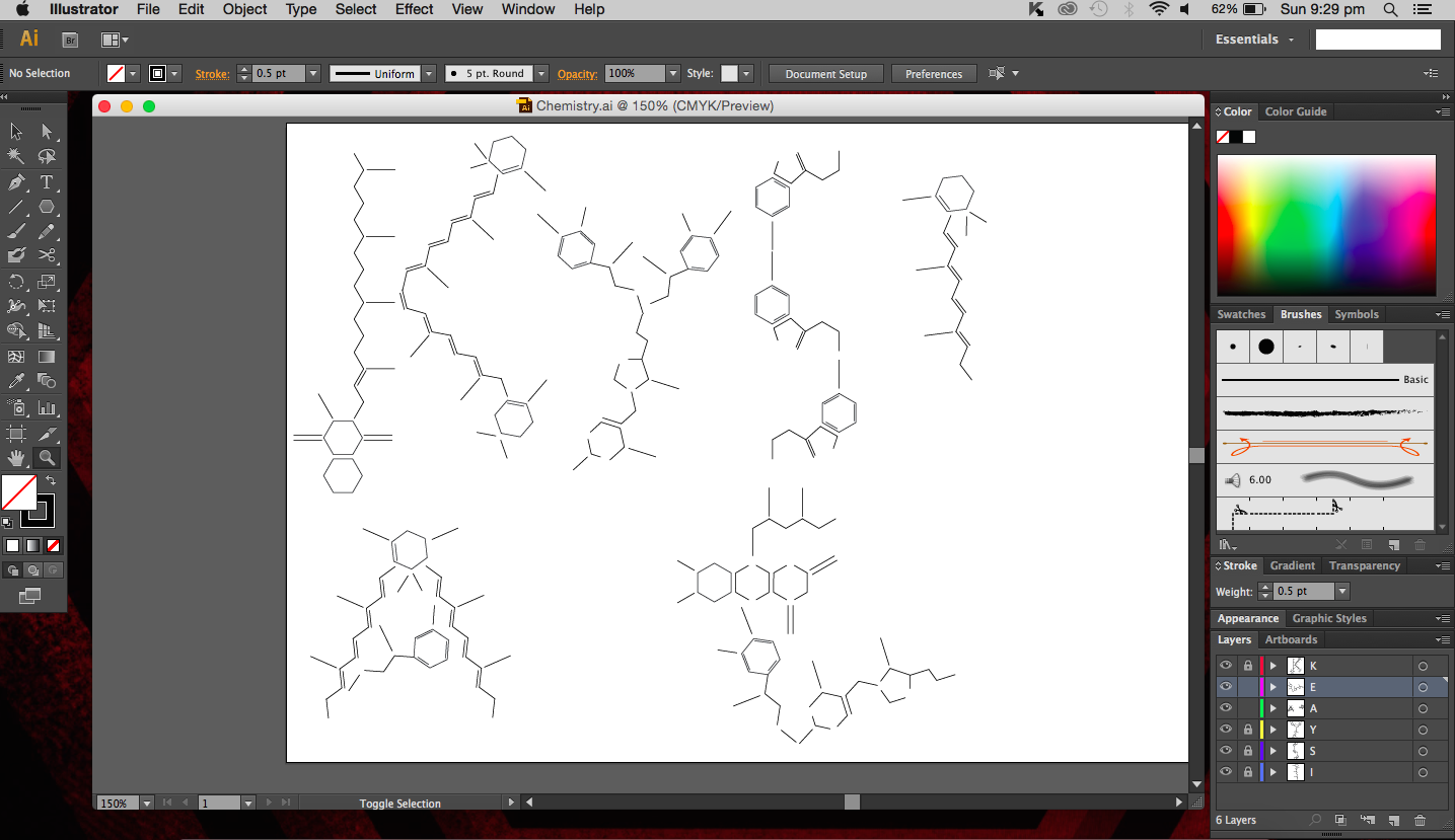
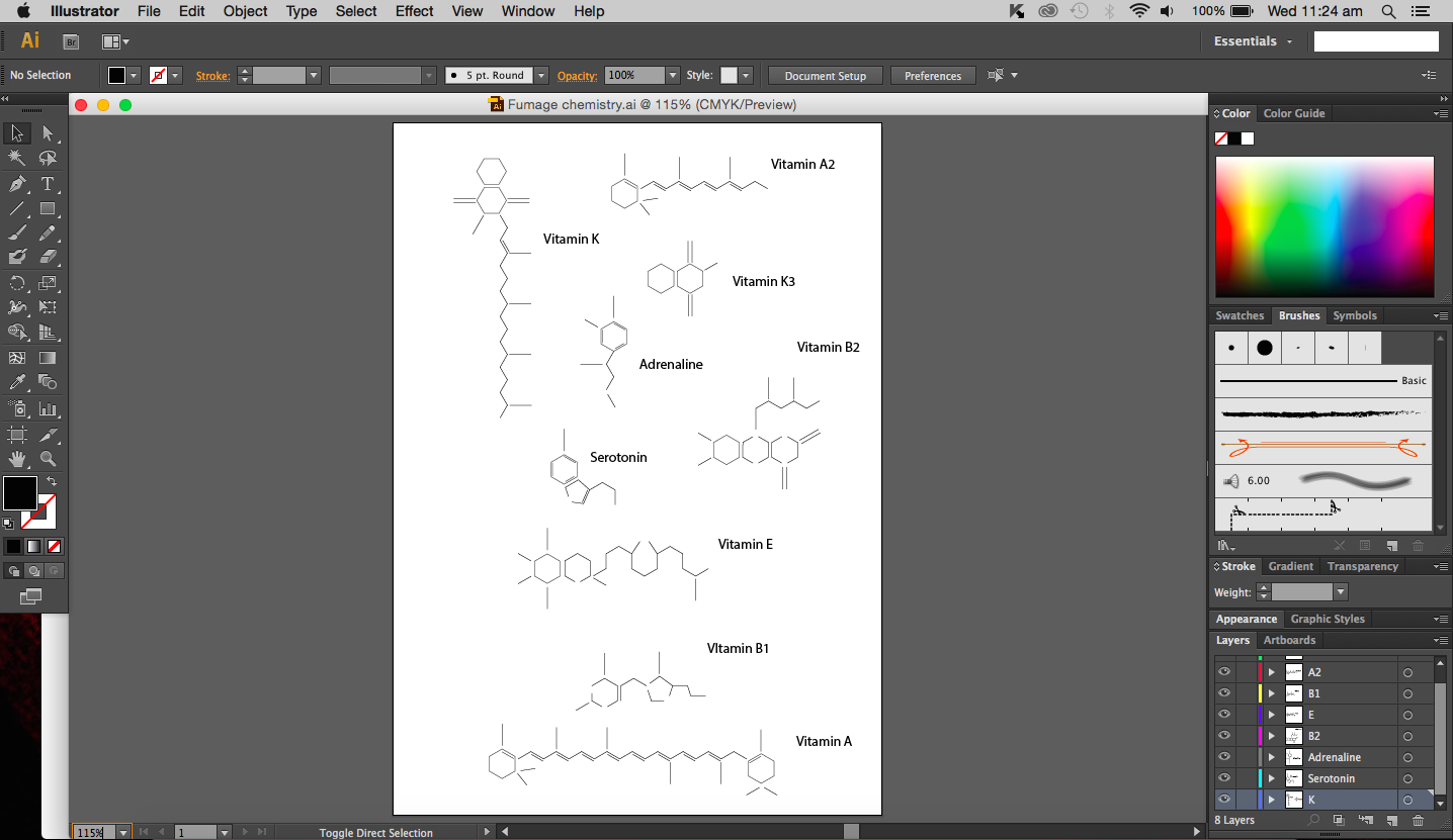
Name in skeletal structure form
I used the real skeletal structures of certain chemicals found in the body or needed by the body. They include vitamin K (and its variants), vitamin B and its subsets, vitamin E, vitamin A, adrenaline and serotonin. Instinctively, the letter K was made up of vitamin K and the letter A was made up of vitamin A. The letter S made of Serotonin.
Above are images of structures that I have created using illustrator of real structures. However, I have removed any letters (meaning the ‘O’, ‘N’ or ‘CH3’ for oxygen, nitrogen and methyl groups respectively) which is why you will see gaps in some of the structures. Take for example the image below of Vitamin K3 in its full form and compare it with the structure above.
W
I didn’t want to add them in as I thought they were too distracting and would have deviated from the simple clean look I was going for.
So what are we then left with, the periodic table? I find that equally common. I could do something related to organic chemistry that includes benzene (hexagon in shape). Similar to the Hexagonetica mentioned in an earlier post, I could create a three dimensional shape (not a cube though) and derive the letters from resulting shape.
Other ideas of mine included paper chromatography, which is really fun to do. Chromatography in this case basically separates ink into its different component (every ink colour usually made up of several other colours) with a solvent (e.g. alcohol). Each colour ‘travels’ at a different speed on the paper so the result is a gradient of colours, which is really quite beautiful if the right amount of solvent is used.
Chemistry reminds me of copper(II) sulfate crystals, maybe its because the blue crystals we actual got to create years ago just looked really beautiful and I will always remember what they looked like. So, crystals, many compounds can form crystals and I feel that that is one of the reasons that makes chemistry so cool. Your starting solution (aqueous) is slowly evaporated and a shiny jiggered edge crystal is formed, almost like magic. I could create a crystal typeface. But the issue I’m having now is that the typeface may not give people the impression of it being of chemical origins.
After much thought and reminding myself that I should keep designs clean and simple without excess details, I have decided to use fumage, which I believe is part of automatism. I didn’t really do much of fumage art in semester one simply because I was terrified of burning the paper and setting fire to everything else (the paper did actually catch fire). But you know what, risk-taking, that’s what it’ll show (done more carefully this time though). And indeed, risk-taking is important in the realm of science. If you are willing to take that risk to experiment, you could discover great things. I guess that’s an attribute that I would be portraying with this chemistry themed piece of work. The attribute would be portrayed more strongly in the process of the work rather than in the final.
Furthermore, the use of fire is quite common in chemistry. Bunsen burners should ring a bell for most students. They were a staple in lab sessions. I think it is only appropriate to use something we have frequently used in the lab in my work, just makes it more relevant.
Process
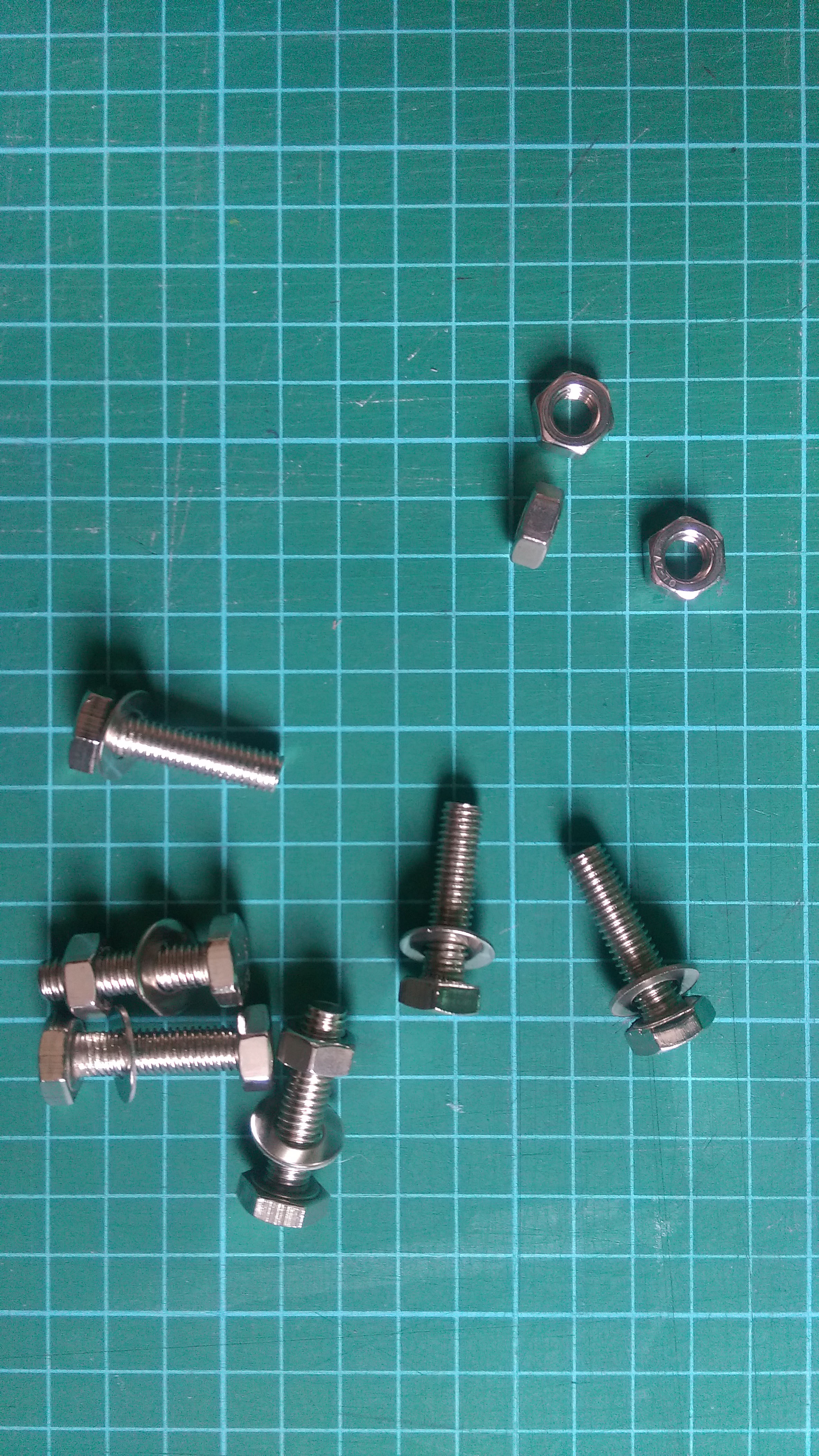
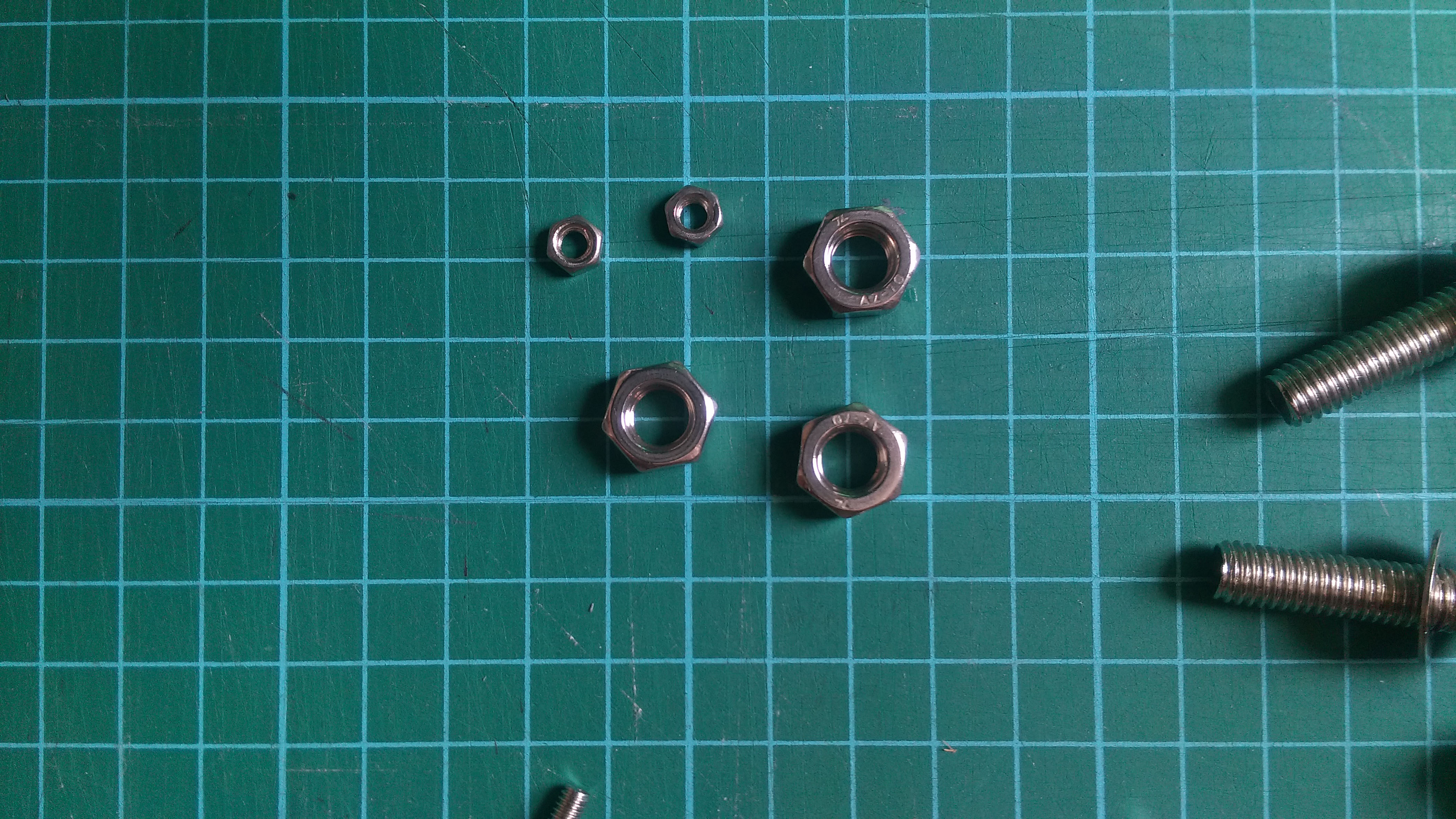
So to begin this piece of work, I have decided to create a design that I would follow to burn. I choose a hexagonal shape because it is rather iconic in organic chemistry (benzene rings). Initially I tried to use nuts to create the image of hexagons however, it was not too successful since the nut itself is not fully flat so it is not in full contact with the paper.
Nuts and boltsNuts and bolts
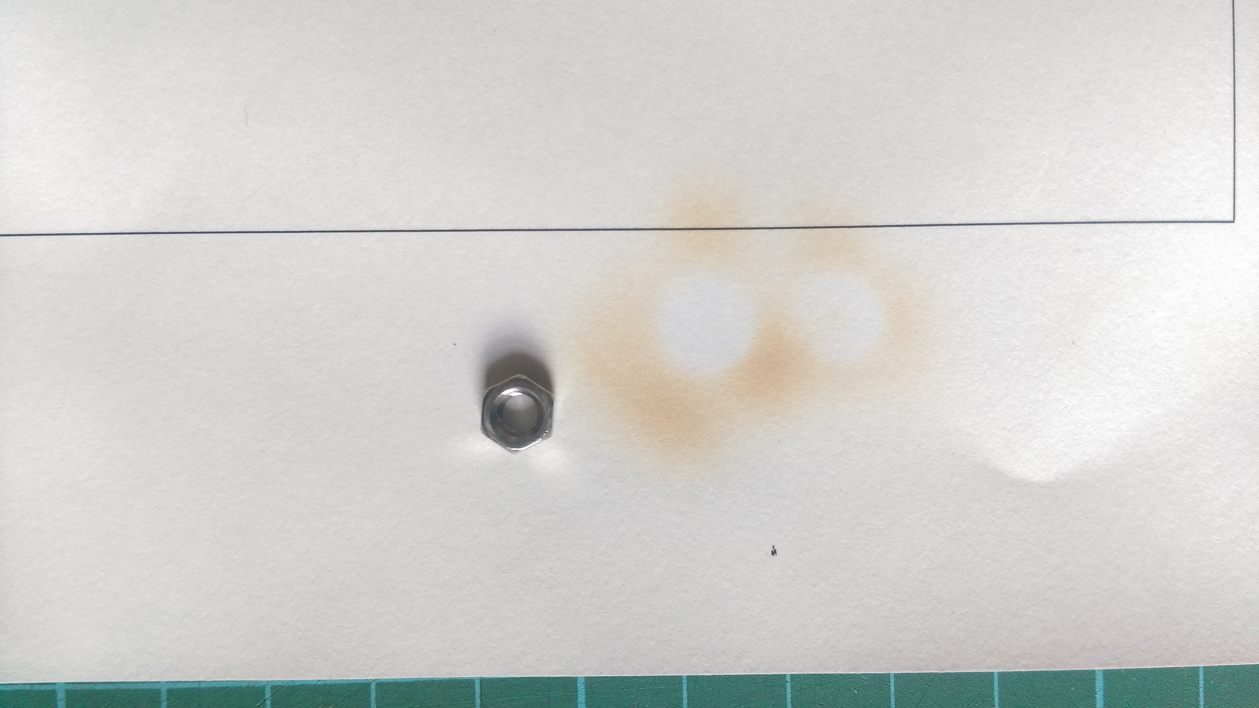
I experimented with two different sizes with the same result. The area around the nut turns brown and burns because the heat is absorbed by the metal (good conductor of heat) and the place where the nut was remains white. It is almost like drawing in the negative. Now because the full hexagonal shape of the nuts were not in full contact with the paper, only circles were formed.
Circles formed after heating
That aside, the way I went about this was to place the nut on the paper and hover the paper above a lit candle until the paper turned brown, almost black. The tricky thing about this is that I had to decide when to lift the paper off the heat. From experience, leaving the paper on for too long will cause the paper to burn a lot quicker and uncontrollably (and there is a lot of smoke and ash that comes with it). So there is a fine line between getting the paper brown just nicely and burning it. Besides the time taken to burn the paper, another factor would be the distance from the flame, the closer to the flame, the faster it burns. It is a double edged sword because on one hand, it is faster to have it closer and I can actually have a more direct flame at a specific spot, which is brilliant, but on the other hand, I risk burning a larger hole in the paper than expected.
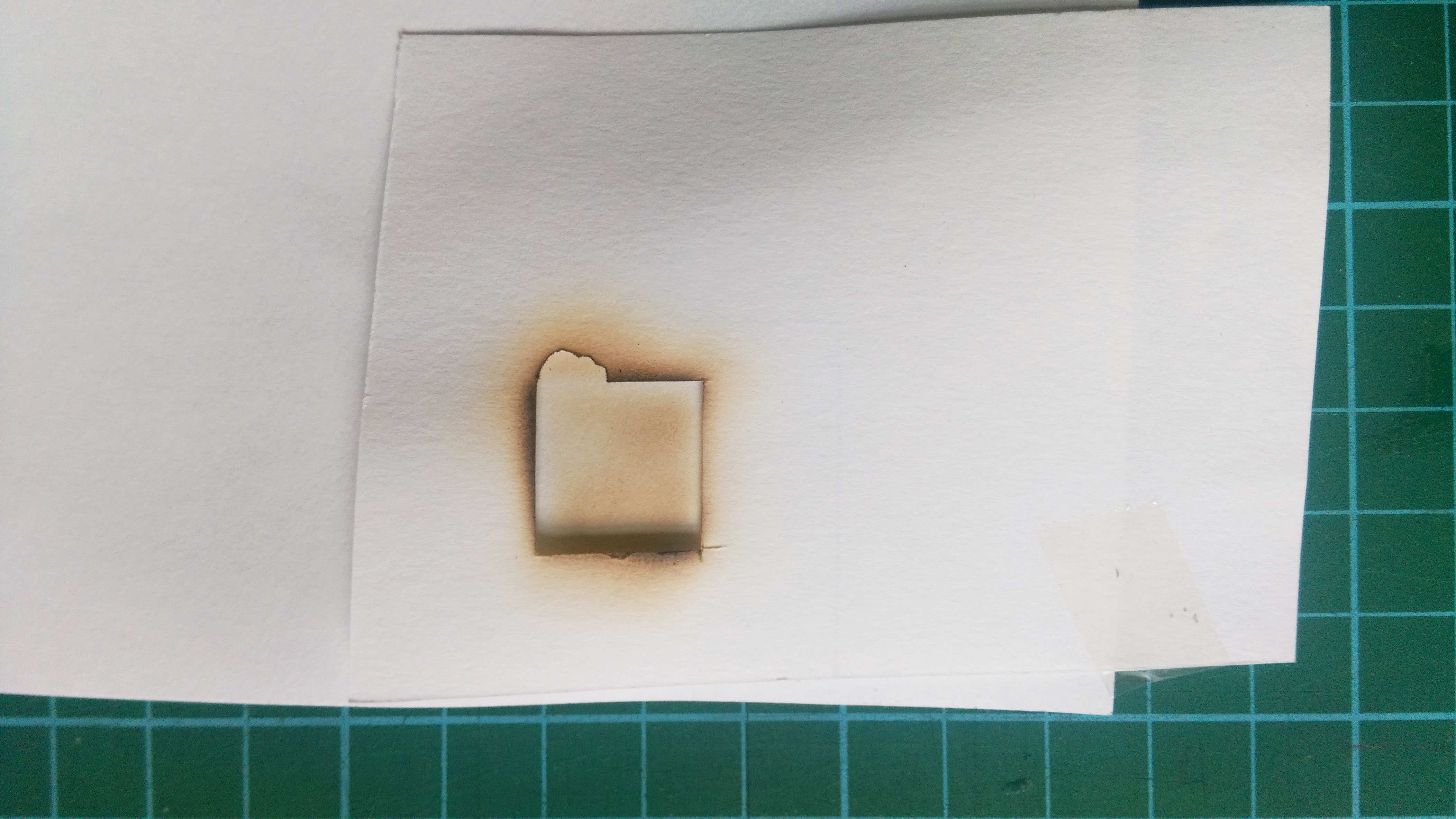
I decided to use a stencil instead of the nuts to see if I could get a clear hexagonal shape. I cut out a square using an exactoknife just to test things out. I placed the stencil below the paper I wanted to burn and placed it over the flame (so stencil is nearest to flame).
Burning with stencil
The results I got were better than expected, not because the image that came out was good but because the stencil itself looked really interesting and good. The edges of the stencil were burnt well; the edges had a hint of black, which gave it an interesting texture.
Stencil after burning
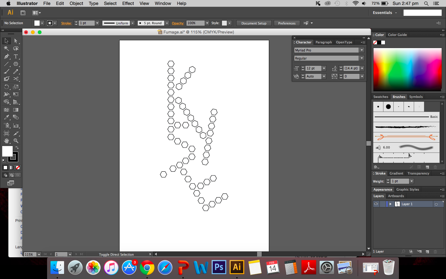
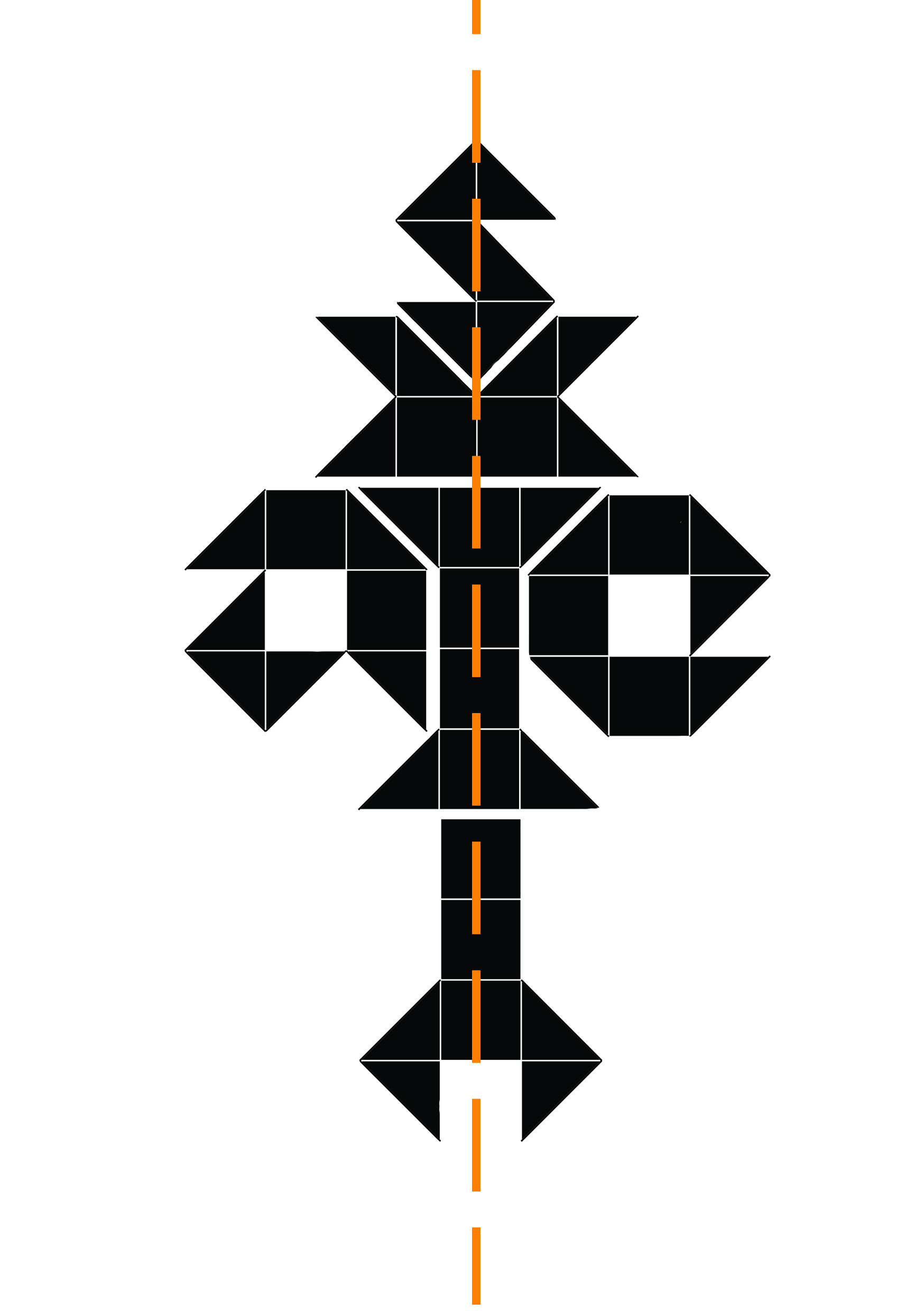
So I decided to cut out hexagonal shapes and burn the edges instead. I created a design using the polygon. It may look rather rigid (no curves or bents), the polygons are arranged in straight lines but that is exactly what I’m looking for.
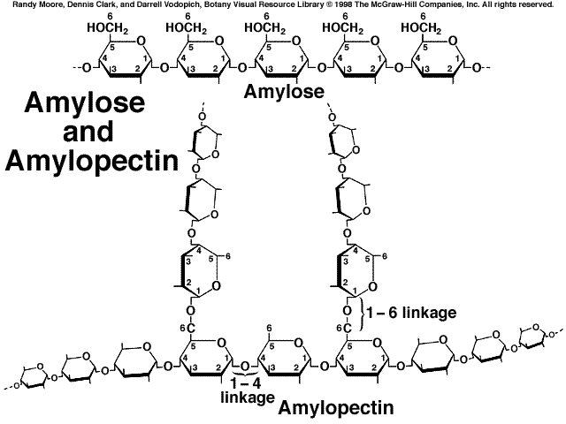
In a way, the rigid arrangement is similar to how structures are drawn and presented in chemistry and since it is chemistry based I thought it would be apt to leave components of chemistry in the work. It also reminds me of the structure of amylopectin and amylose.
I cut out the individual hexagons on drawing A5 paper and began to burn the edges of each shape. How appropriate it is that I am calling this a risk taking attribute because my fear of excessively burning the paper definitely came true. I had failed my first attempt.
First attempt at fumage final
Maybe it wouldn’t be fair to call it a downright failure but I certainly did not intend for there to be quite so large a hole between the letters I and E. I think I was getting a little impatient and went too close to the flame. But the whole point of this is that I was willing to take that risk and risk the whole piece. I guess it was a learning curve for me. I have since decided to redo piece.
Additional
Some extra information about fumage. According to Oxford art online, it was created by Wolfgang Paalen.[1] The smoke of the flame is used to create images on paper or canvas.
The special thing about fumage is that you are never really fully in control, the flame burns the way it wants to and external environment plays a part in the process as well. Wind and drafts causes the flame to shift and move away from the area I want to burn and I realised how important it is to work with the flame rather than to control the candle. The outcome of the burning is soft brown marks on the paper that contrasts with the black rough edges of burnt paper.
[1] Celia Rabinovitch, “Paalen, Wolfgang.” Grove Art Online,Oxford Art Online. Oxford University Press, accessed February 17, 2016,http://www.oxfordartonline.com.ezlibproxy1.ntu.edu.sg/subscriber/article/grove/art/T064397.
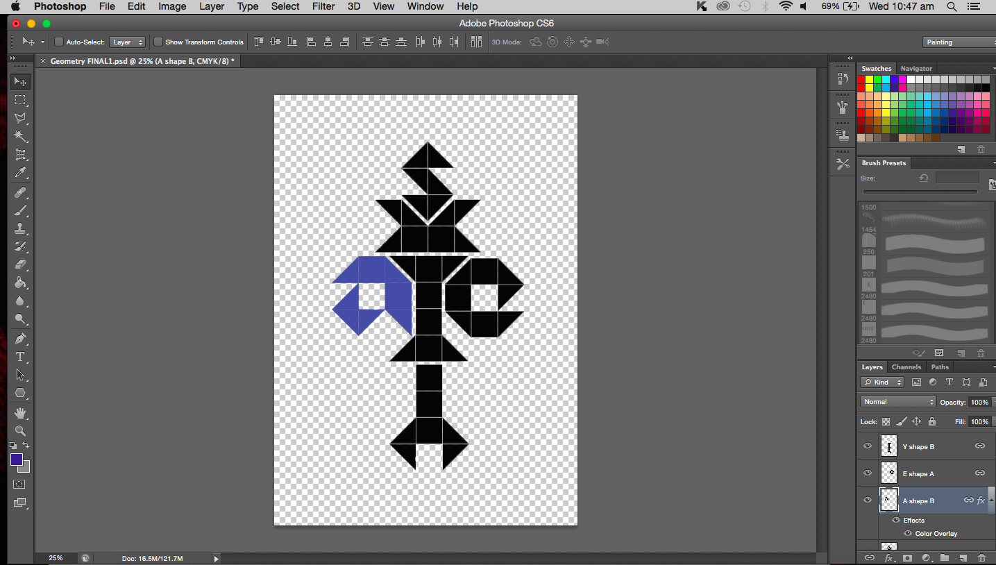
Update on the geometric work. After playing around with the arrangements of the letters I have decided to settle with something fairly symmetrical because I do like symmetry. Things that are symmetrical always seem to make more sense and are easier on the eyes. It also reminds me of mathematics because we usually aim to equate and balance. Think the equal sign, something is the equivalent of something else, they are then of equal weightage. Similarly in my work, I aim for the same thing. If you divide the image in half lengthwise and count the number of triangles (taking each square as two triangles) on each half, they are the same. Or you could see it as the total surface area covered by the shapes on each side is the same. Both sides are balanced and equal.
Line of symmetry
Here’s where each letter is positioned:
Letter K-uppercaseLetter A – lowercaseLetter Y- invertedLetter S- uppercaseLetter I-uppercaseLetter E-lowercase
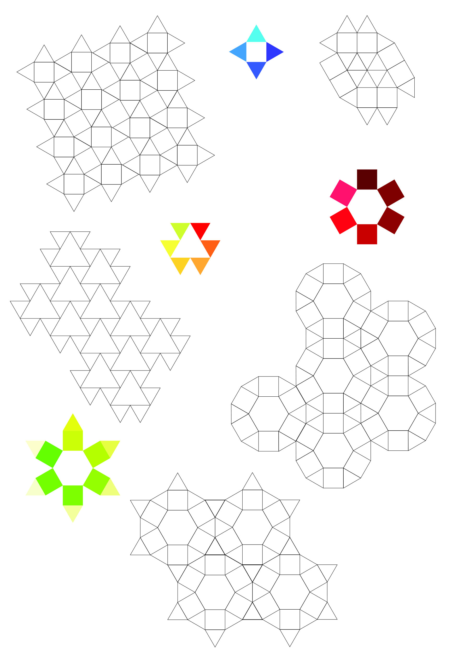
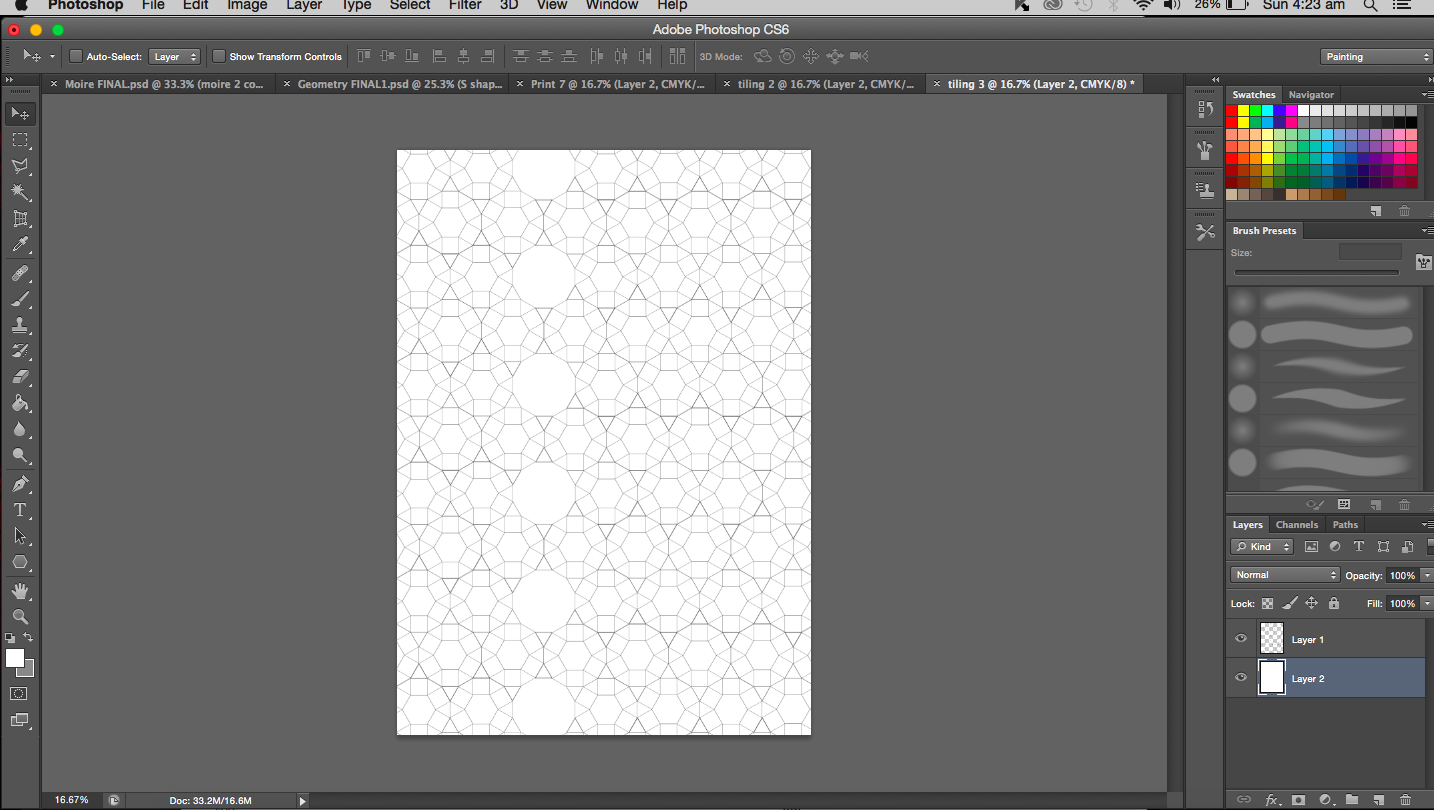
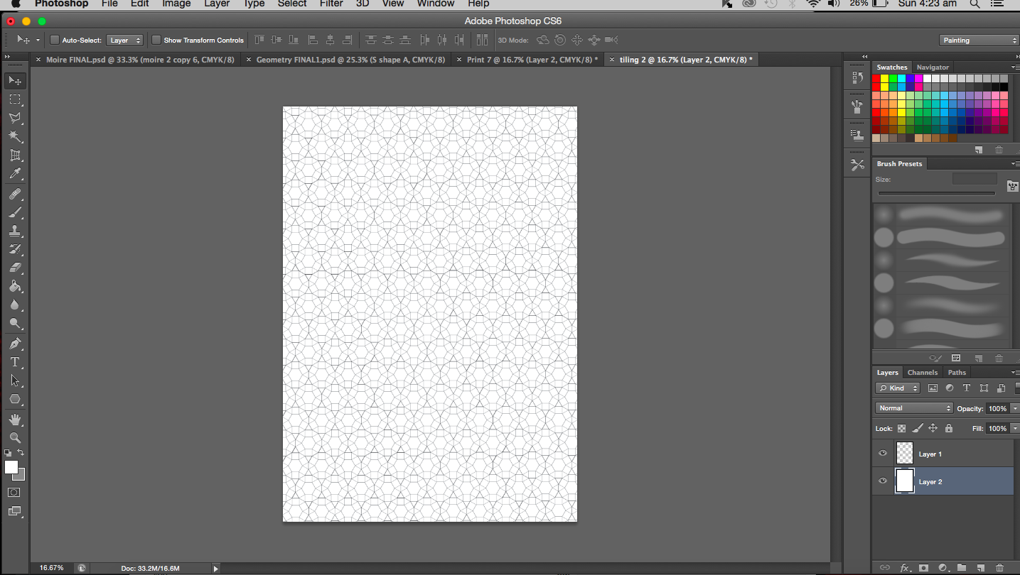
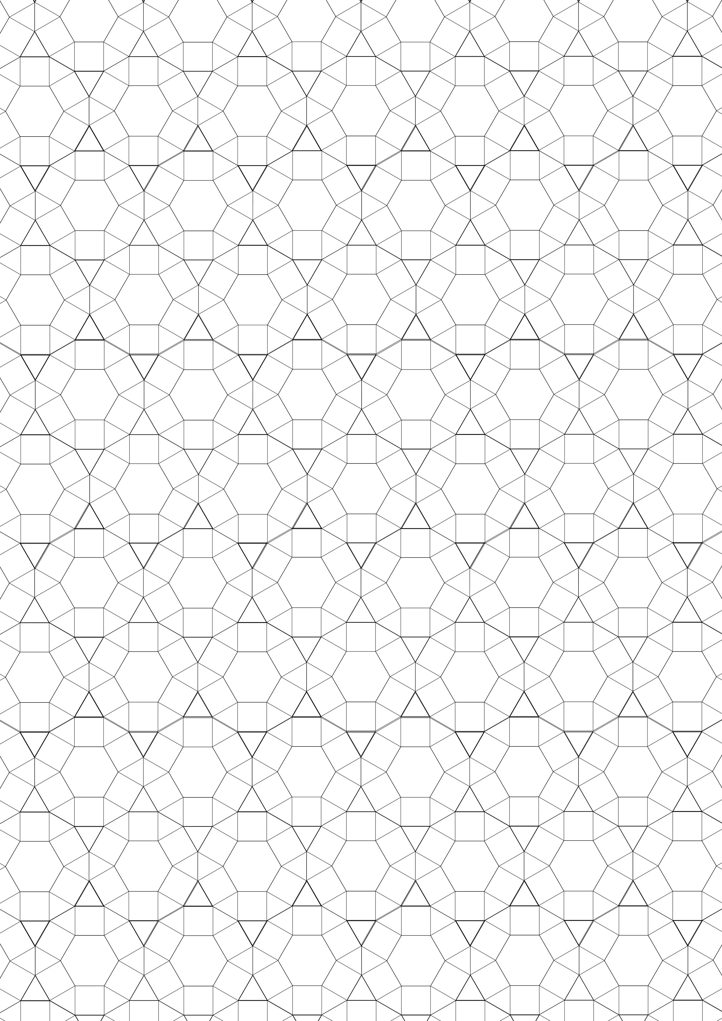
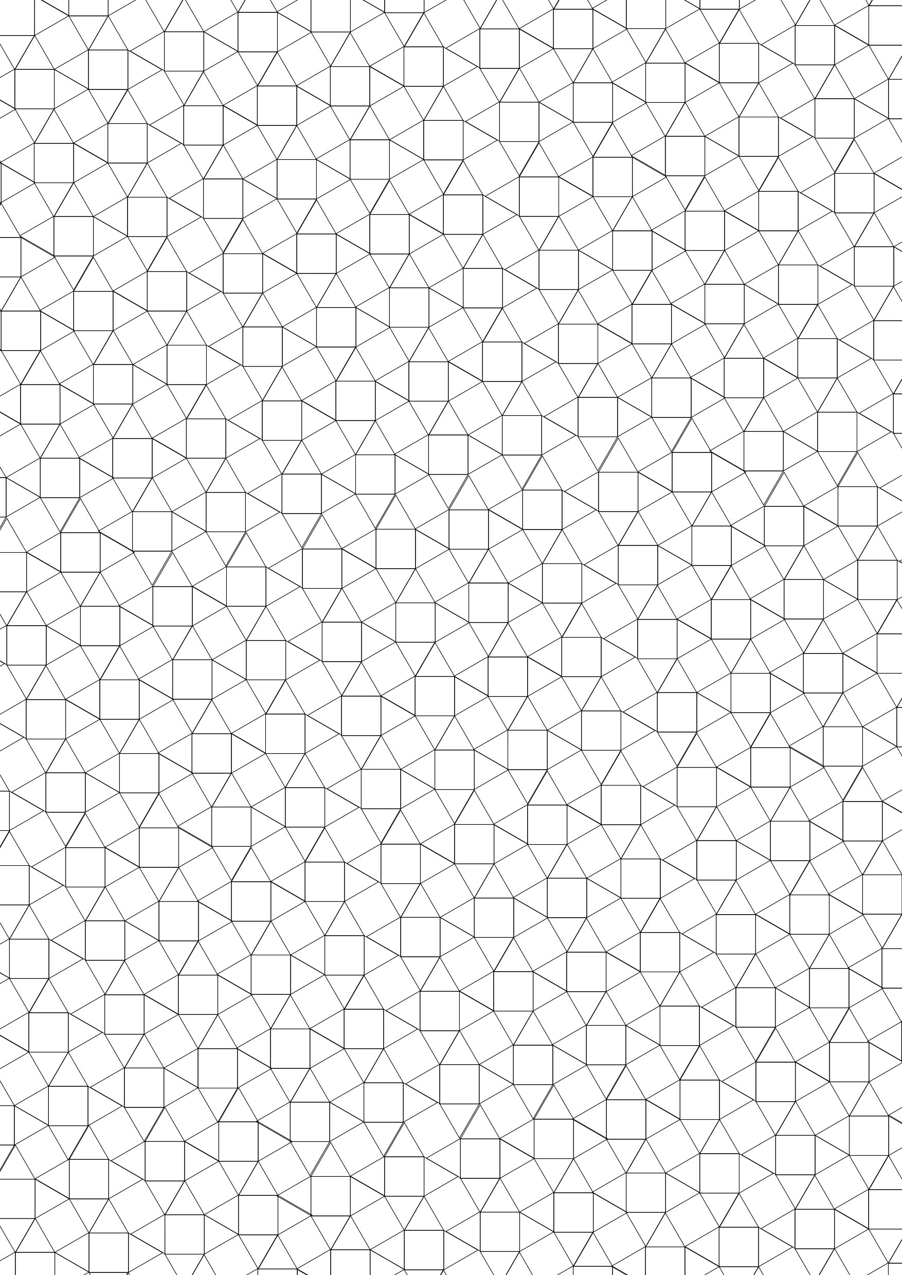
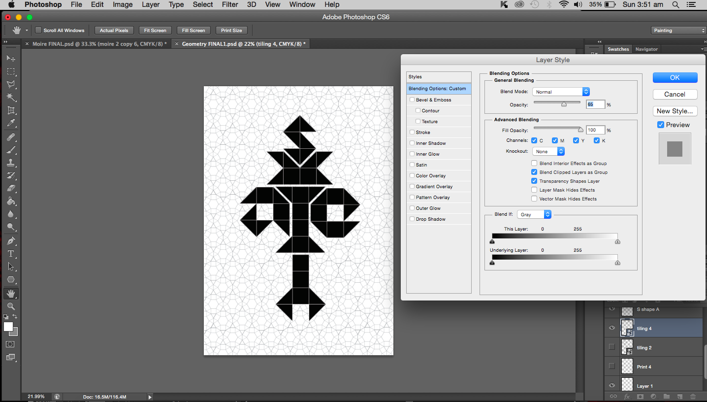
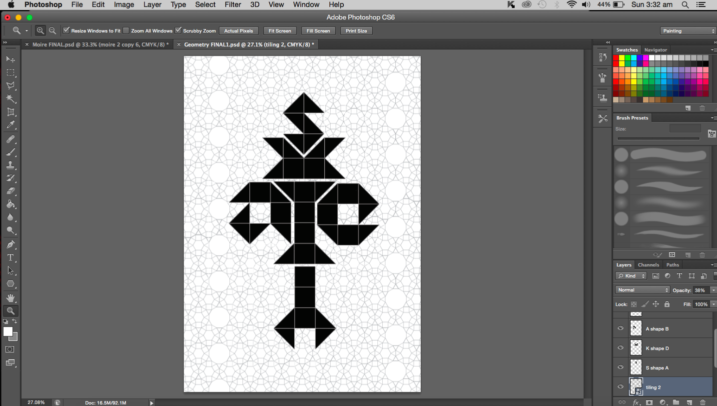
The whole idea of geometry and symmetry got me thinking about truncated hexagonal tiling and basically Euclidean tiling. I did feel that my work was lacking something and maybe this is it. A background that involves tiling that supports the main work.
Experimenting with tiling
Possible layoutsTrying out different backgrounds
Moving on to other things…
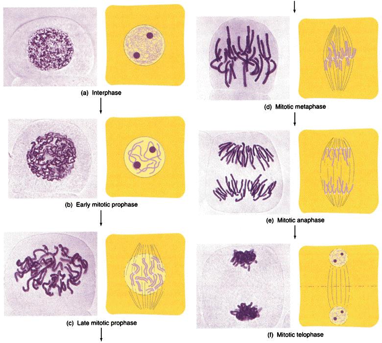
It is now time I talked about the work focused around biology. I turned to all of my old notes that I have accumulated over the years for inspiration. I think the most obvious object associated with biology would be DNA so I turned my focus to just that. My initial thought was to analyze the DNA molecules’ structure and then deconstruct it. I really hope I don’t get too technical with this; I’ll try to reduce jargon as much as possible. Sticking to the theme of genetics, I looked into chromosomes as well (the condensed form of DNA during replication). From replication, I thought of meiosis and mitosis (division of nucleus in somatic cells) paying special attention to the anaphase and metaphase. Metaphase and anaphase are phases in the division process where the chromosomes are aligned and pulled apart respectively. You may choose to refer to image I found here:
Phases of mitosis
So DNA, the condensed form is known as chromosome or chromatin (depending on which part of the structure you are referring). Chromosomes come in pairs (one from each parent). I might actually work with this and create each letter from a pair of chromosomes.
Other Ideas
Besides DNA, I also thought about proteins and molecular sturcutres. When I was studying biological sciences a year ago, we used a software called PyMOL that enabled us to visualize molecules in its three dimensional form. I think I might use this software to create my letters if possible. To give a better understanding of how good and amazing this software is, I have dug up some of my old screenshots from my dry lab sessions. (This probably doesn’t excite the everyday art student as much as it does to me.)