“A butterfly from the point of view of a scientist is the chaos theory.”
The way I usually explain the chaos theory is: Small action–> almost unrelated effect
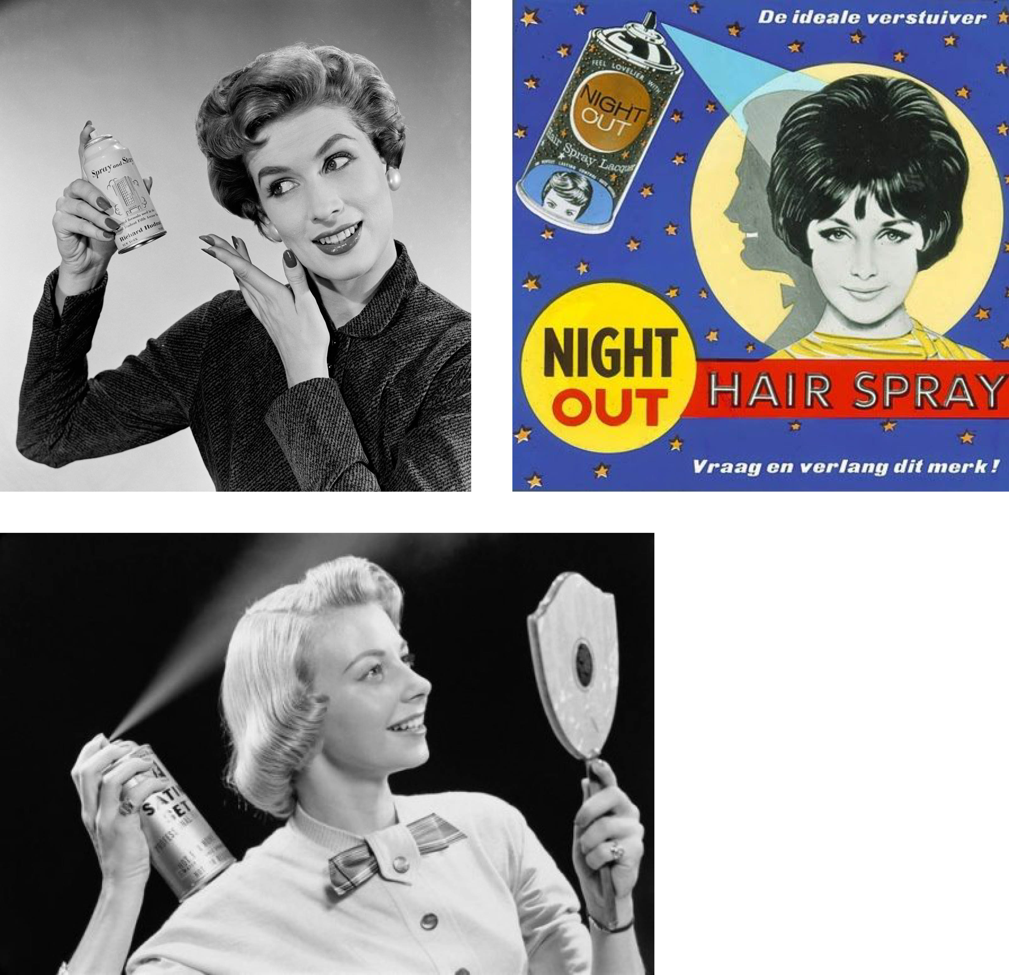
My initial plan involved using some sort of vintage image of a someone doing chores or just simple daily actions and that leading to a natural disaster or something like that. For example, using a hairdryer that leads to a hurricane, or someone watering plants leading to a flood.I found a couple of beauty advertisements of ladies using hairsprays (see below) and thought I could relate that to causing a desert storm of clouds and rain.
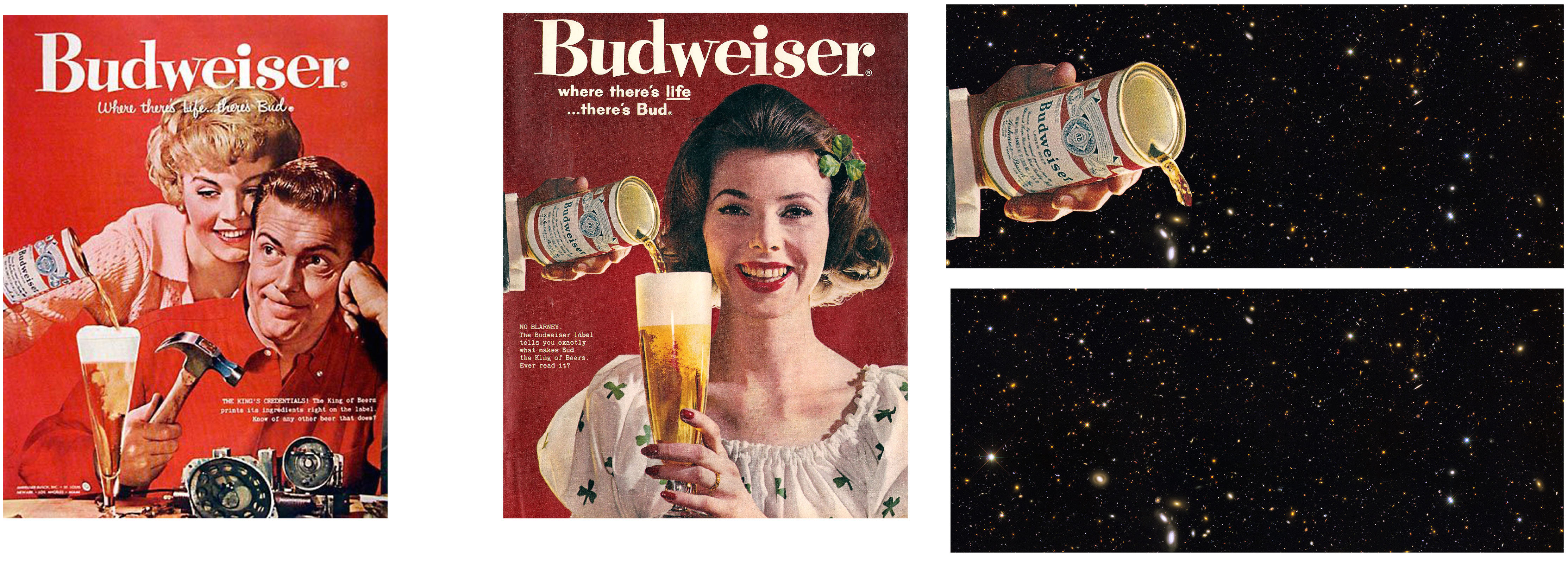
It was difficult trying to find high resolutions for the images and vintage images of hurricanes, floods and storms are hard to come by. So I had to tweak my idea a little bit. It still involved a simple action that would lead to something that seems totally unrelated to the initial action.
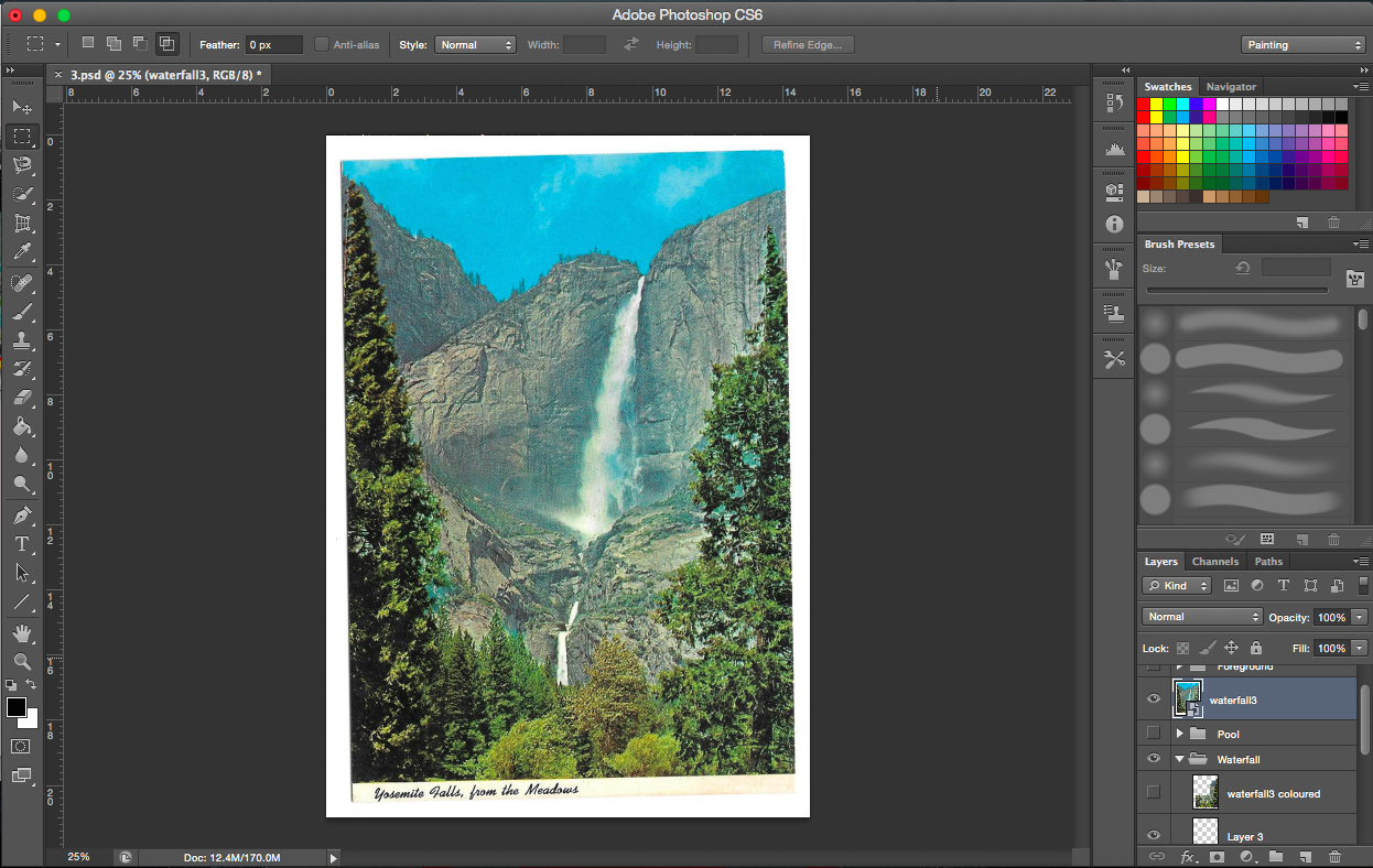
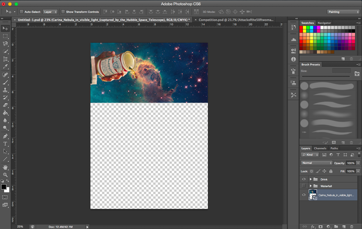
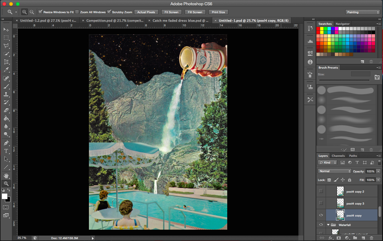
So I figured pouring of drinks is quite simple an action and decided to find images for that. And drinks got me thinking about water, floods and waterfalls.
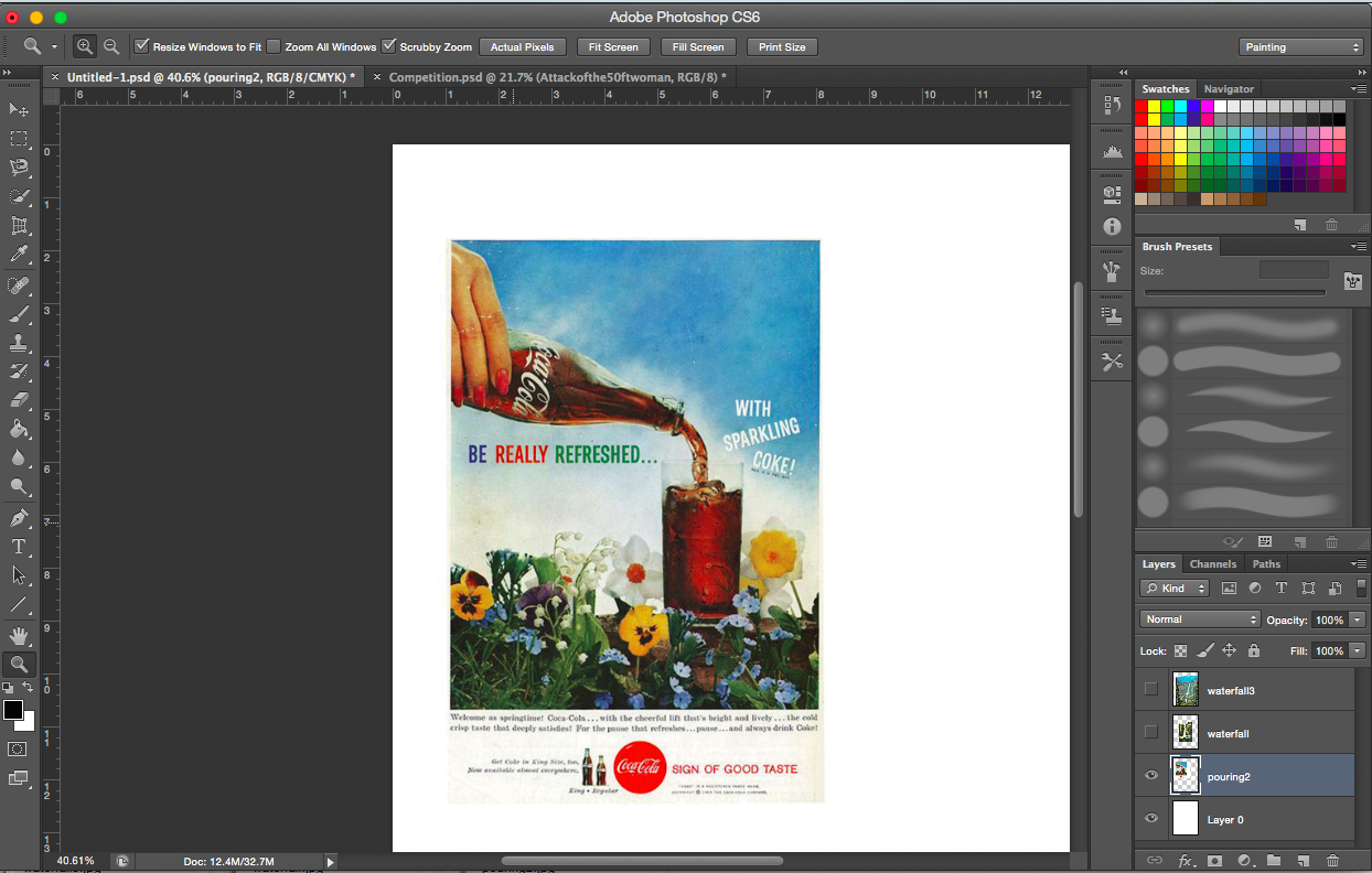
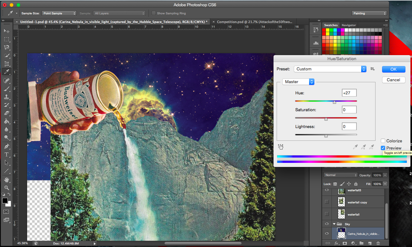
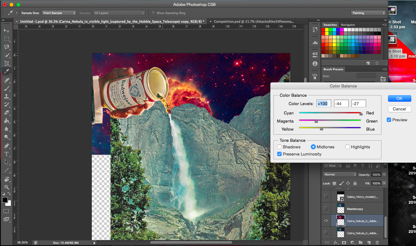
[Image Above] This, I thought was quite cool (I mean the background). Placing and positioning the nebula background in the right place, where the cloud is at the point of contact of the drink and waterfall. It is almost as though some sort of chemical reaction is taken place, like smoke rising.
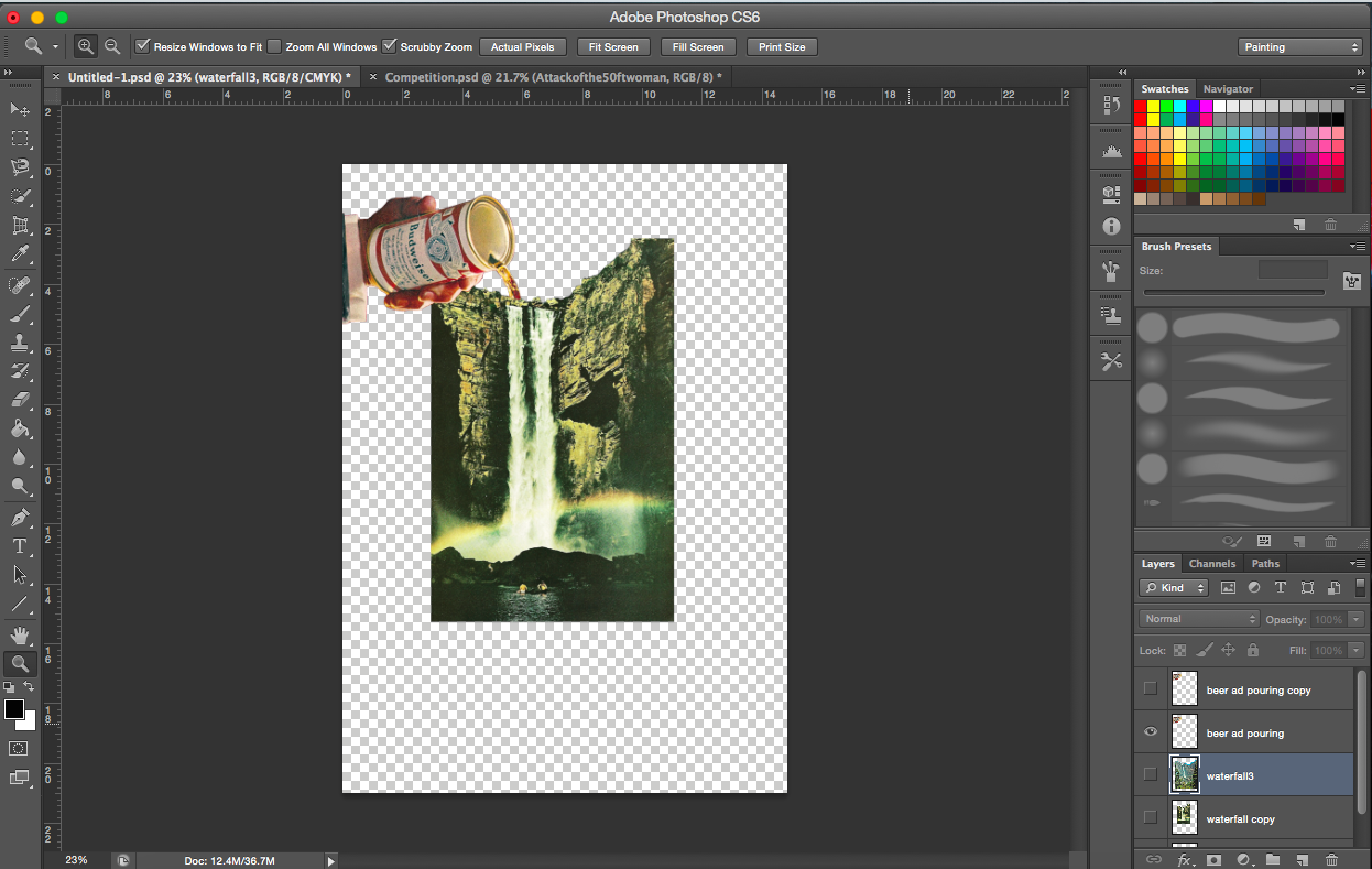
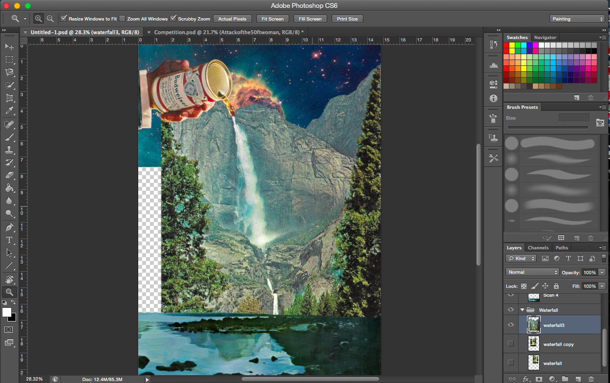
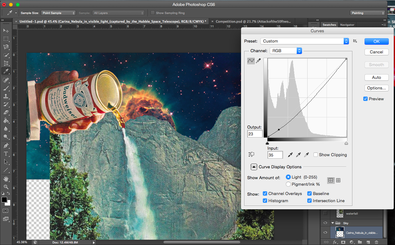
[Image Below] I decided to go with a cleaner space background, it was less distracting. I’d also prefer the black to the coloured background (see the previous few images).
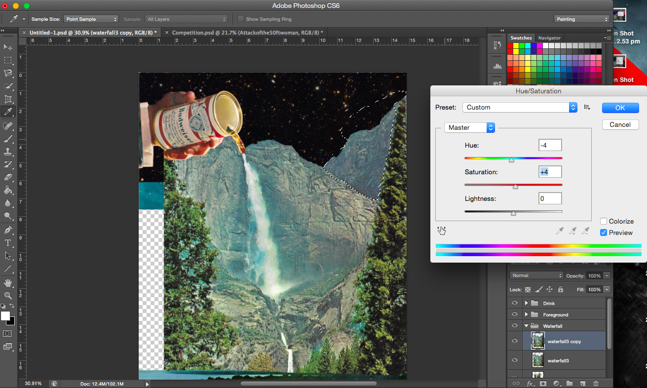
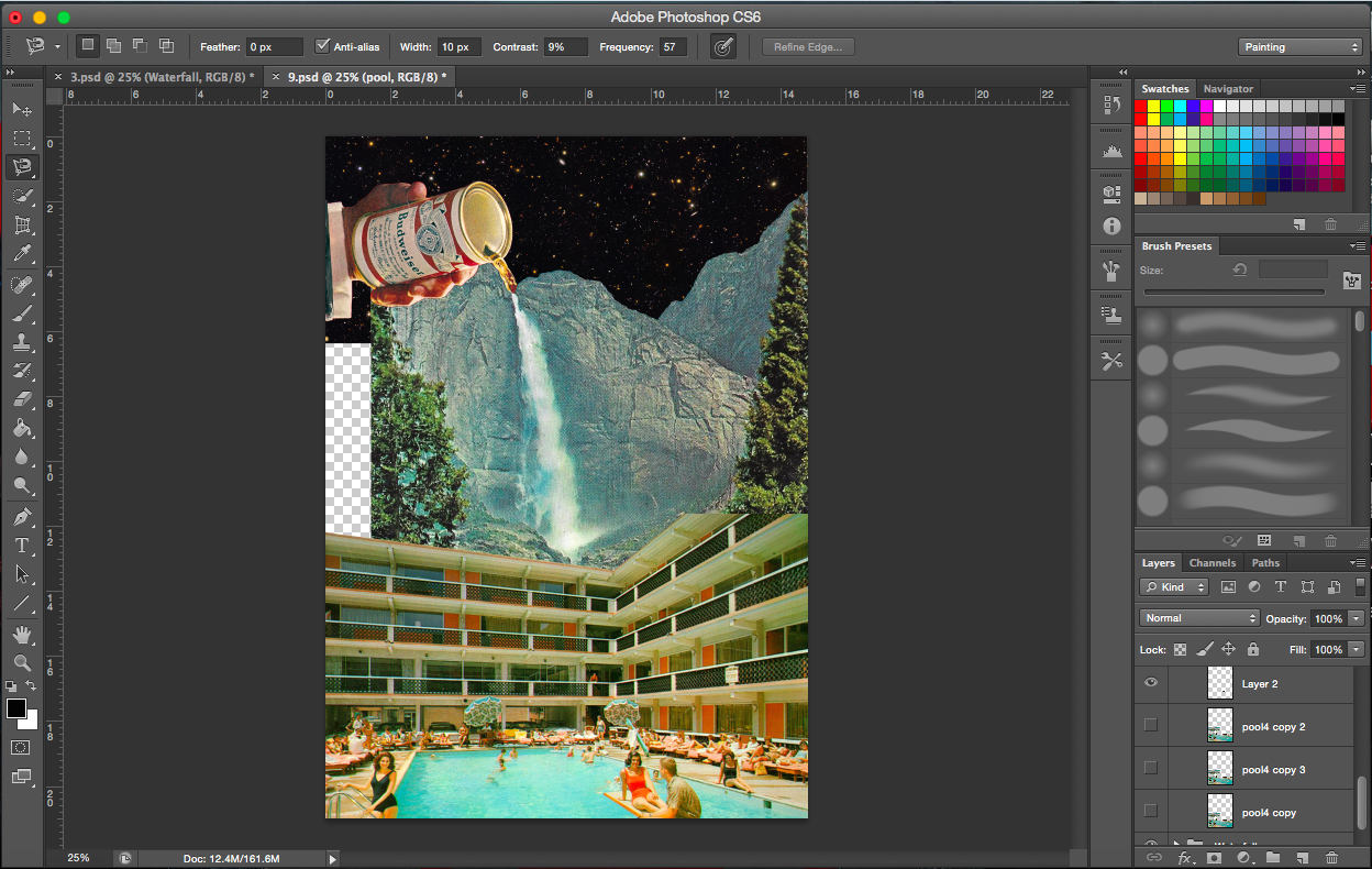
After incorporating the drink with the waterfall, I felt that the image needed more. So water. What uses water? Where do you find water? Keeping in mind that it should be something that isn’t food/drink related or natural (like a waterfall). Preferably something manmade. I thought swimming pools.
Adding swimming pool scenes to foreground
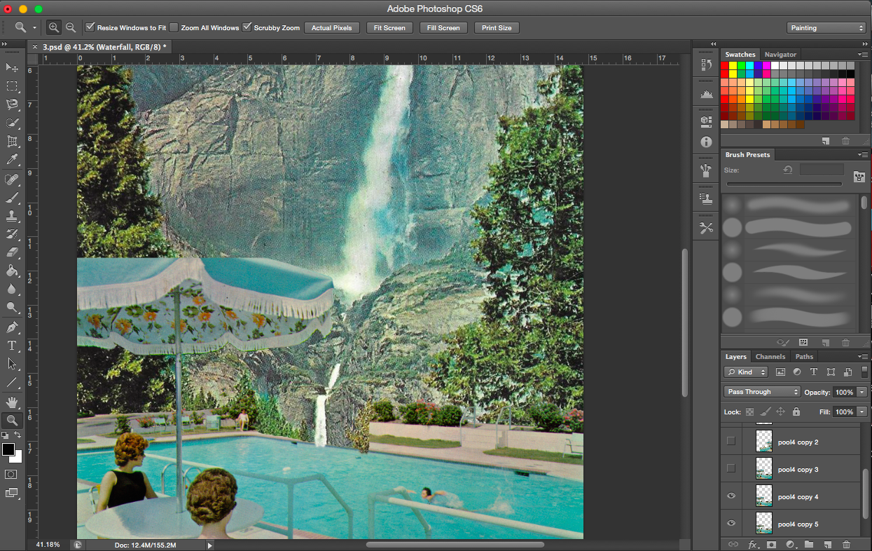
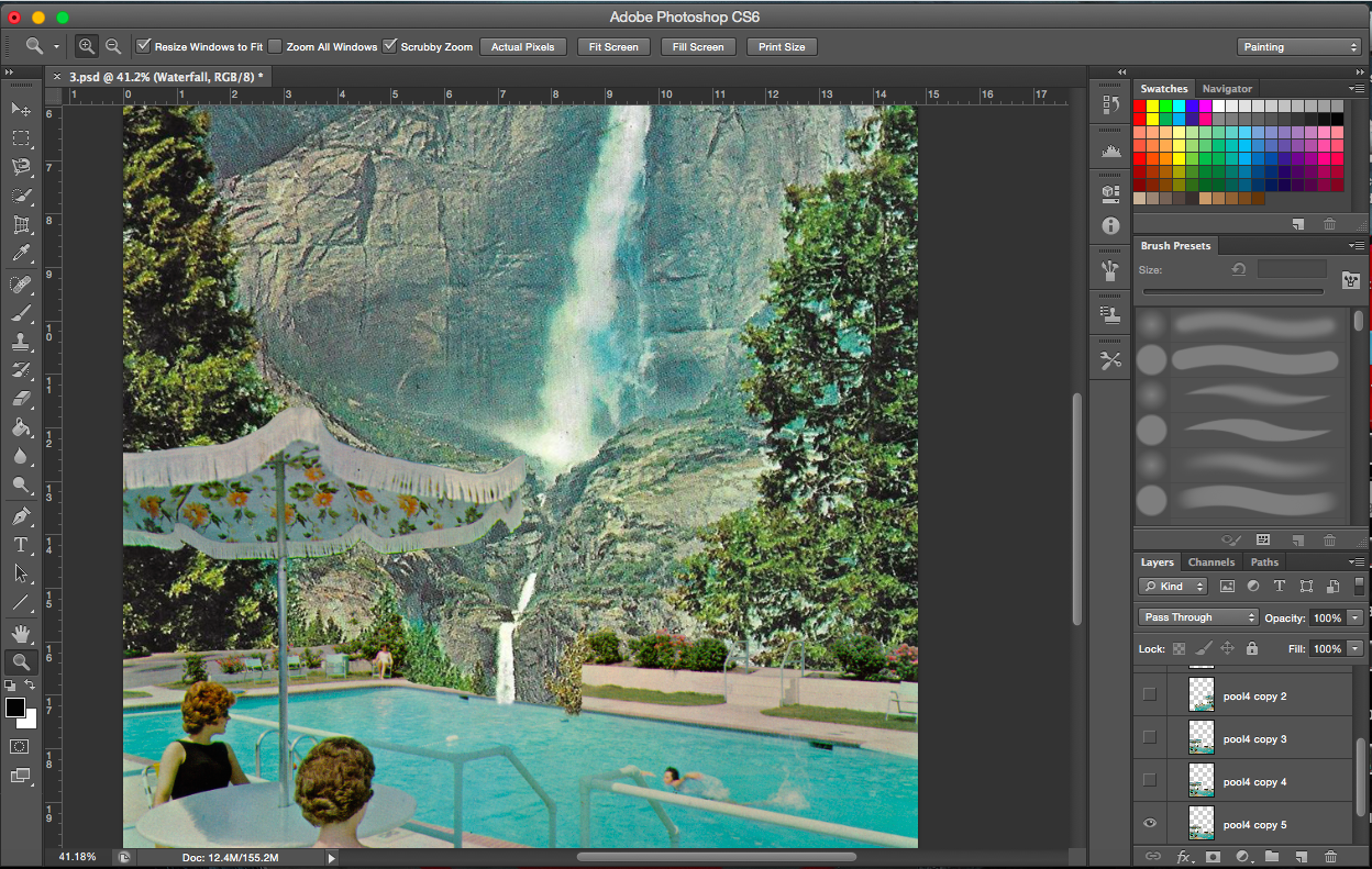
Problem: Cut off umbrella
[Flanking Images] The incomplete umbrella: I made the decision to remove all blue portions of the umbrella to make the image (of the umbrella) more complete.
——————————————————
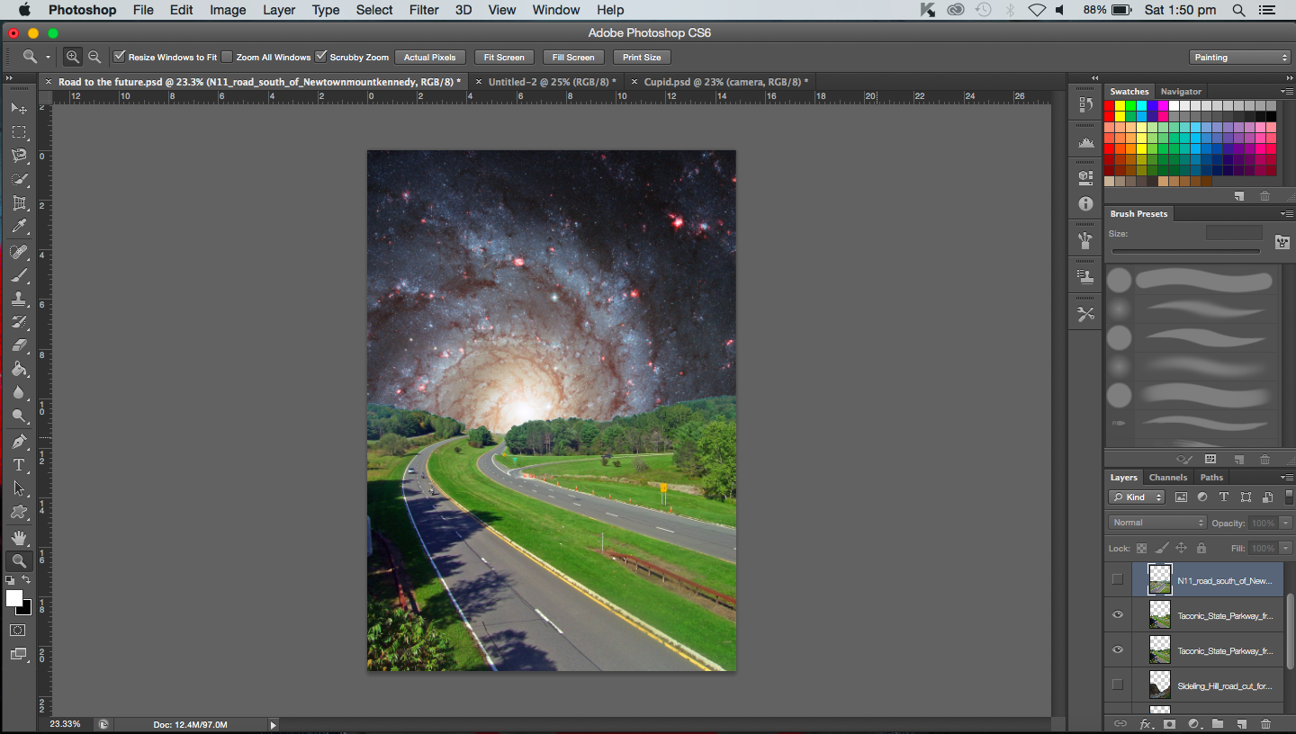
PROCESS- Looking into the future
“A butterfly from the point of view of a caterpillar is the future.”
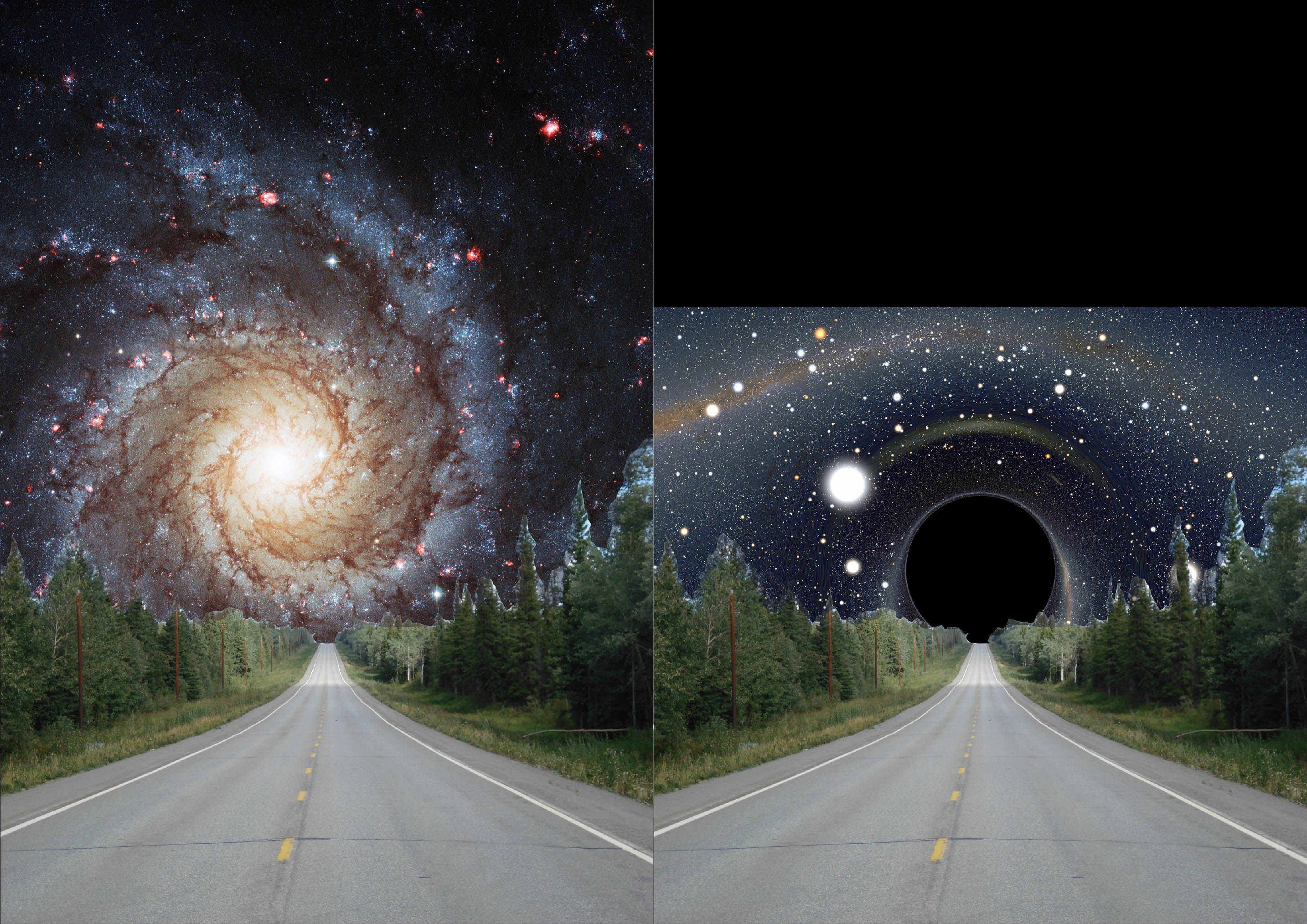
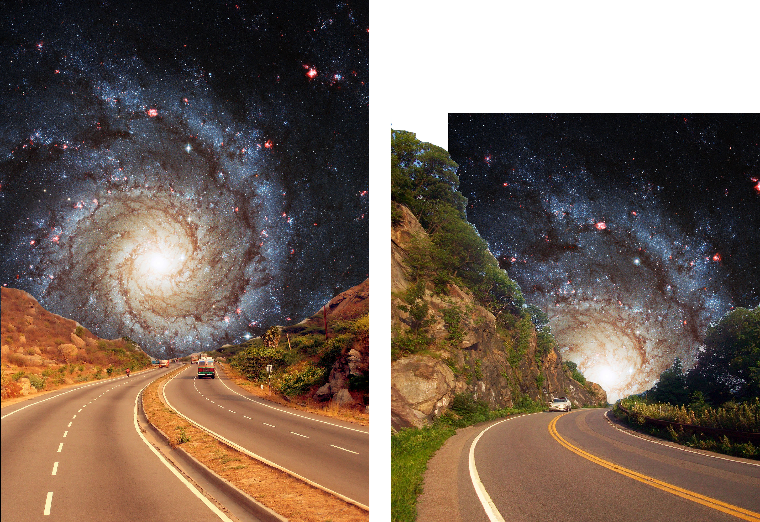
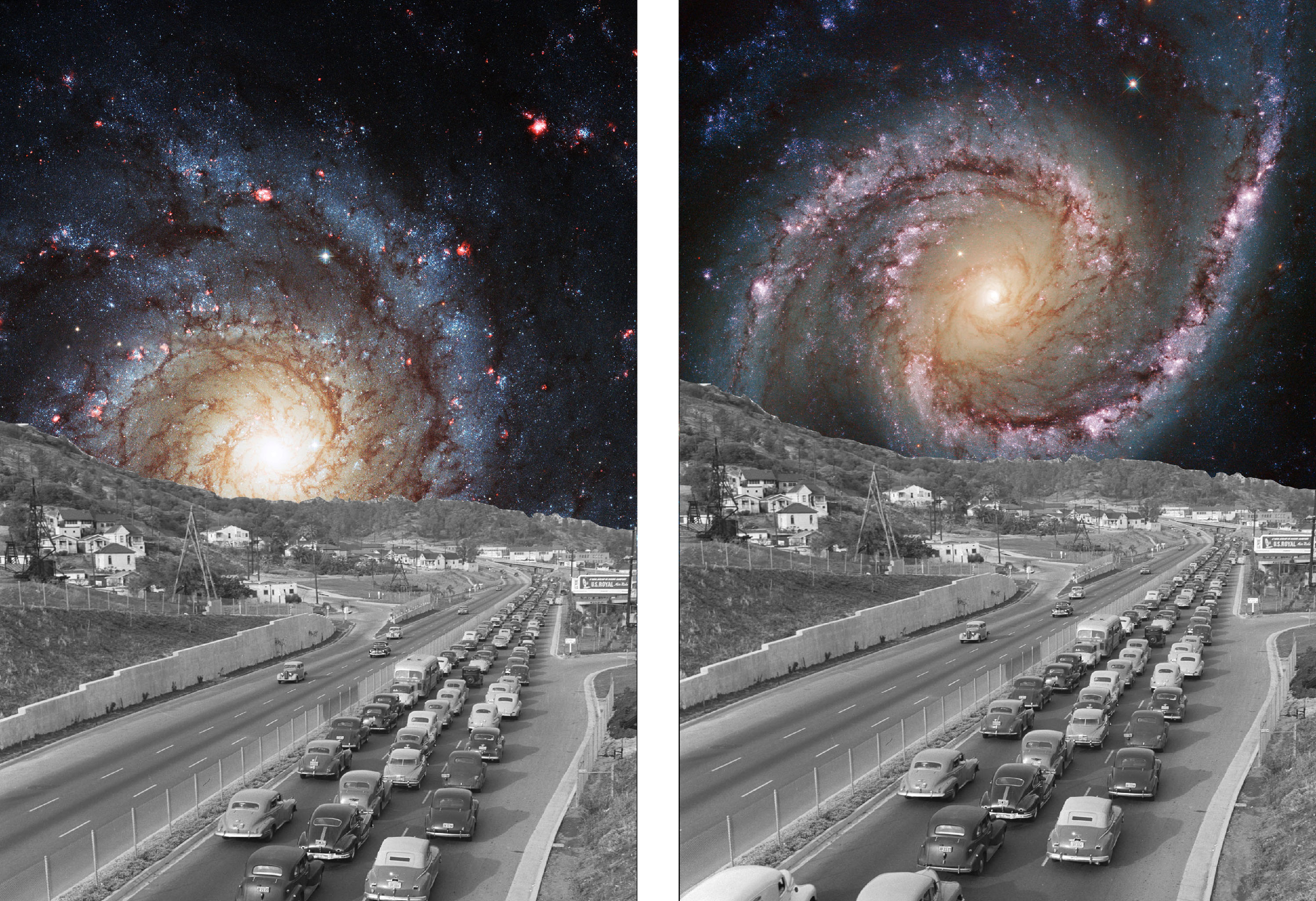
I have saved the best for last. The whole project started with me wanting to do this particular composition. It was inspired by Eugenia Loli’s Farscapes and I was so excited to try it out myself.
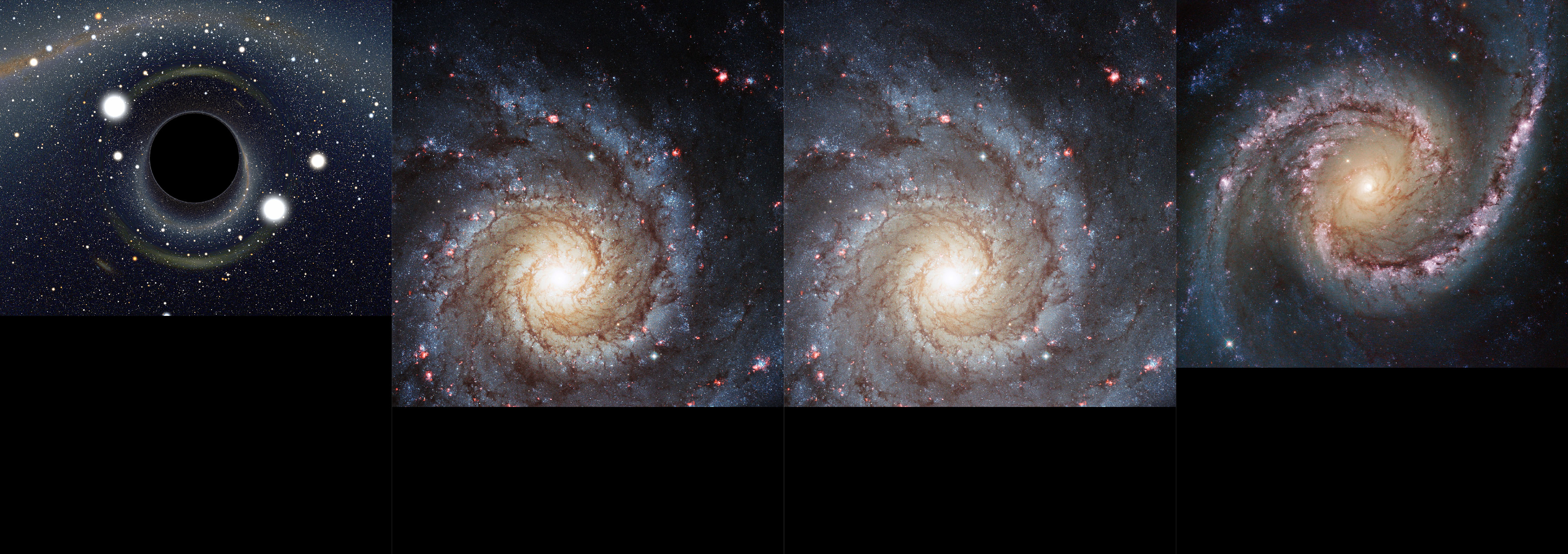
To represent the future and its unknown and mysteriousness I chose to use a galaxy image. Actually I was going to use a black hole but it just resulted in the composition looking like it was missing something. For the only black hole image that worked, it was not large enough to be used.
Different space backgrounds
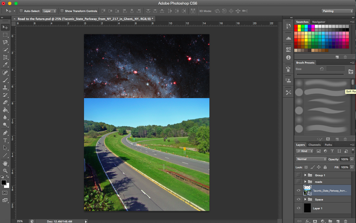
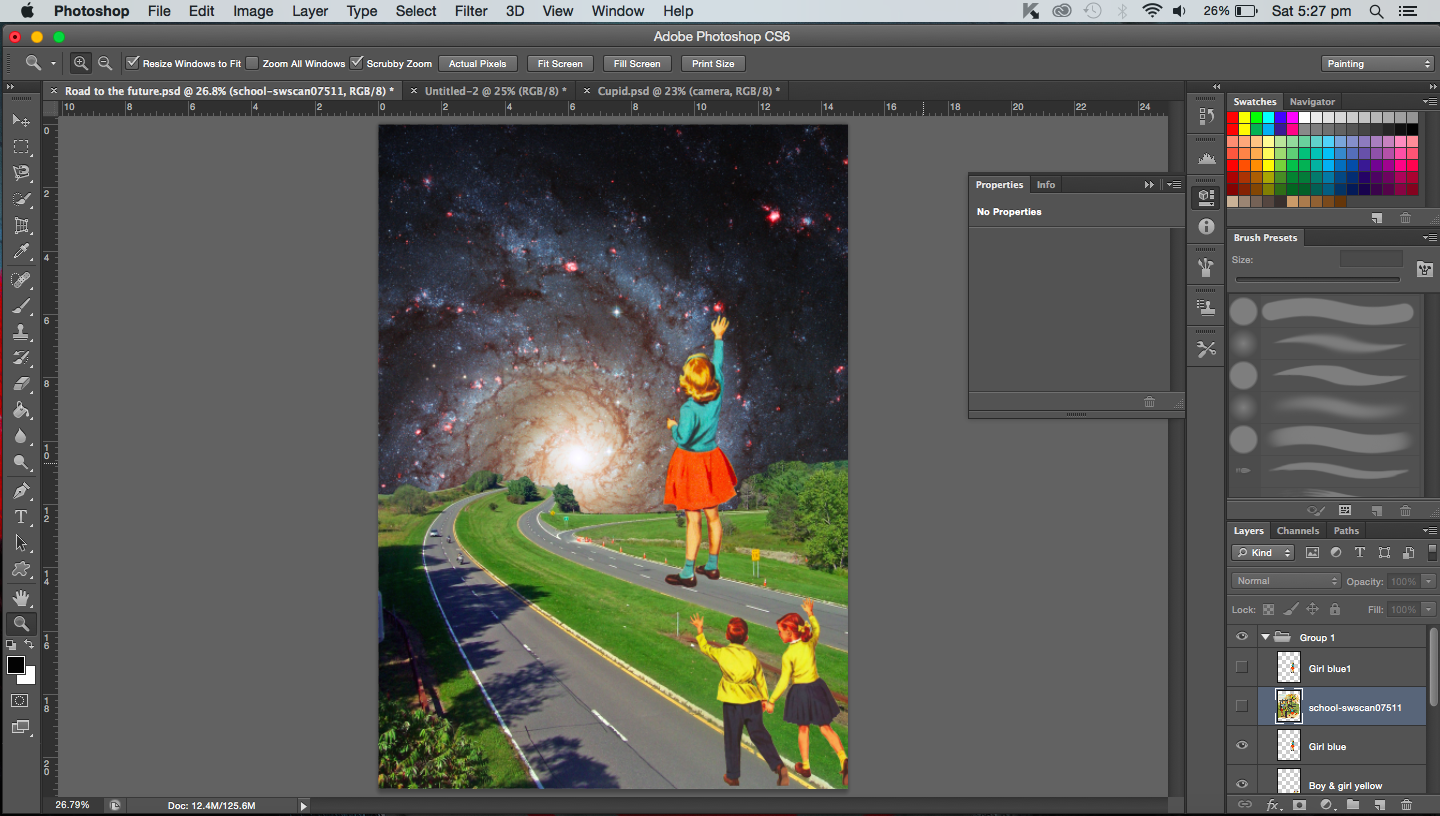
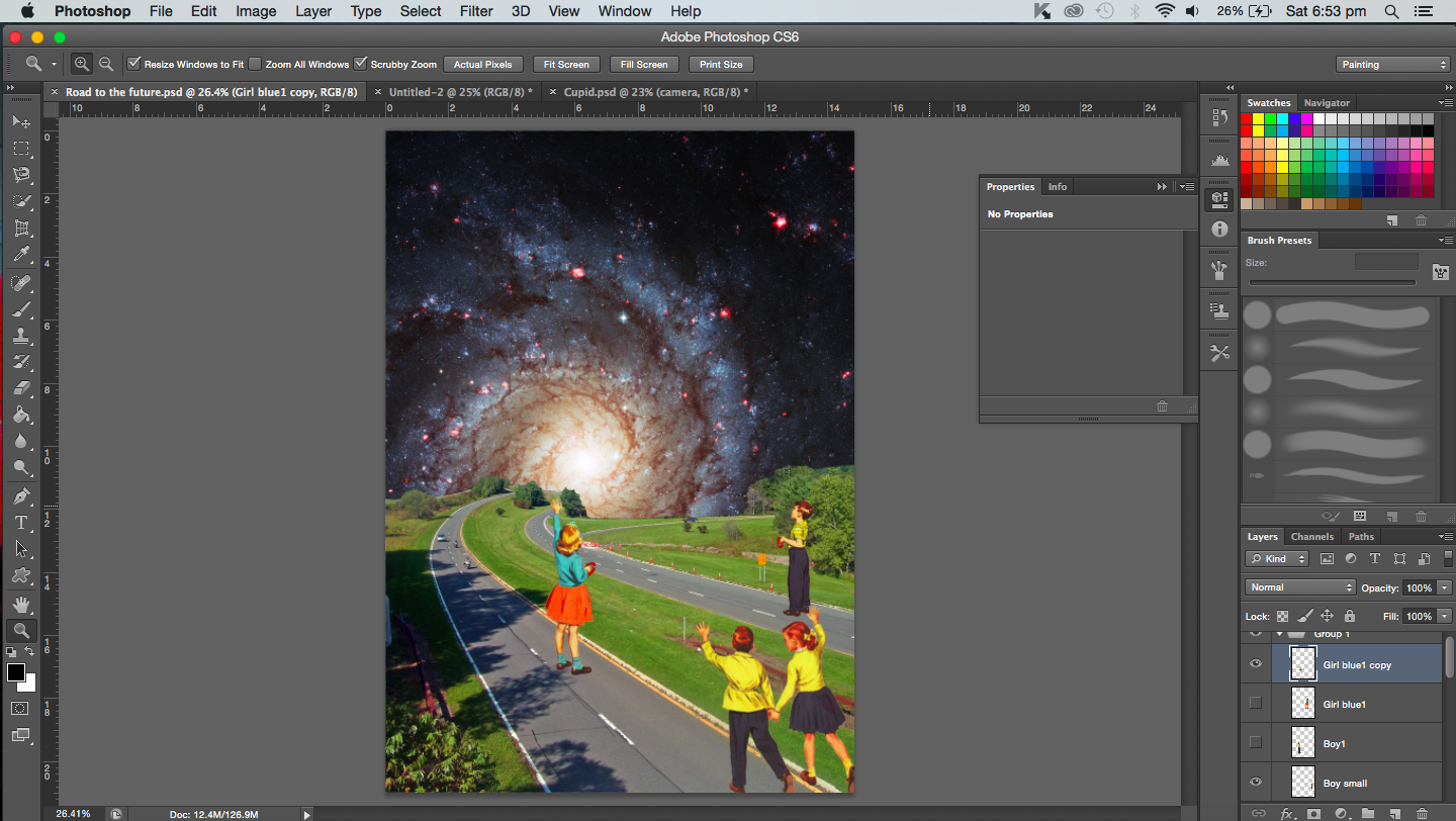
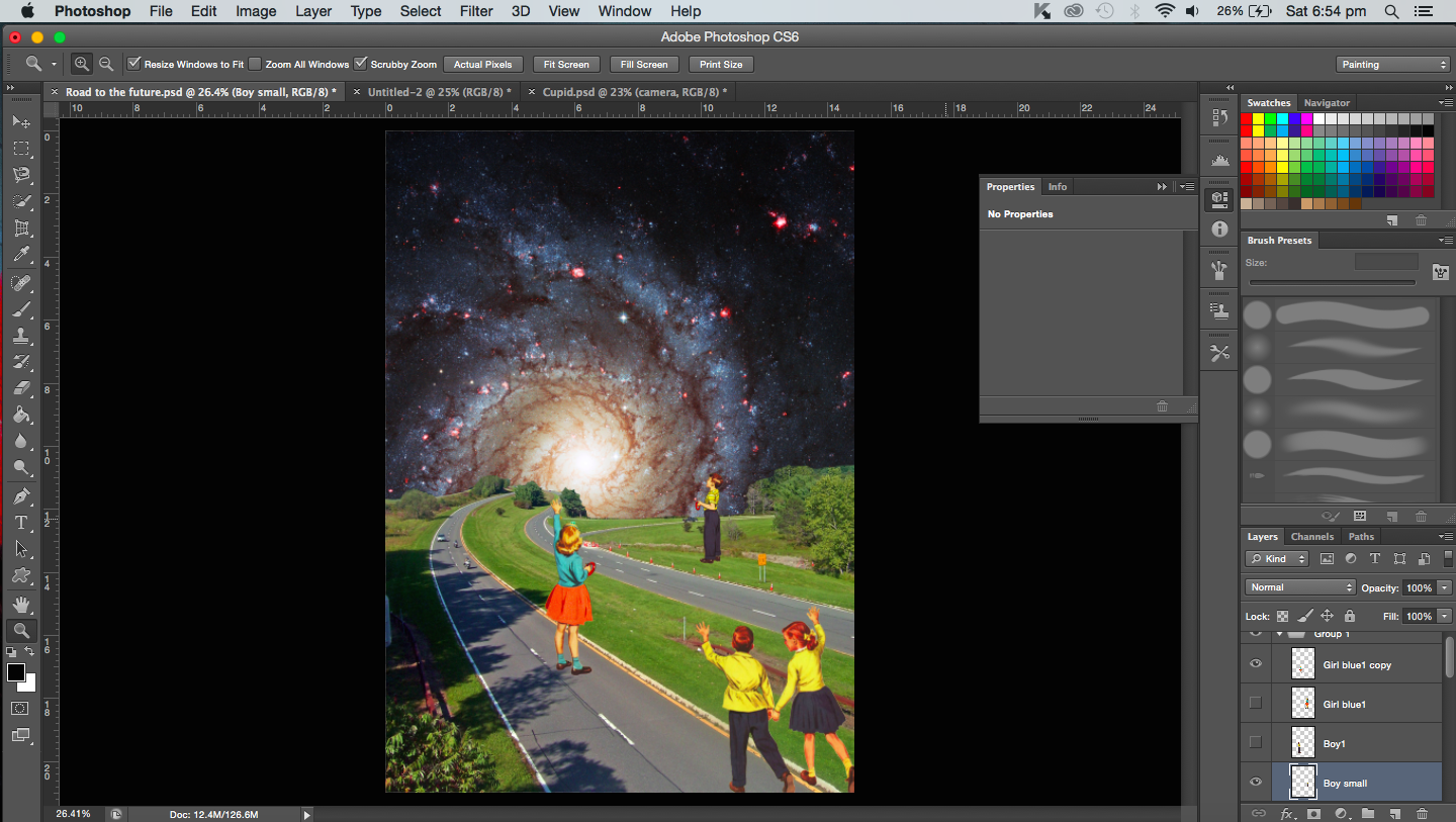
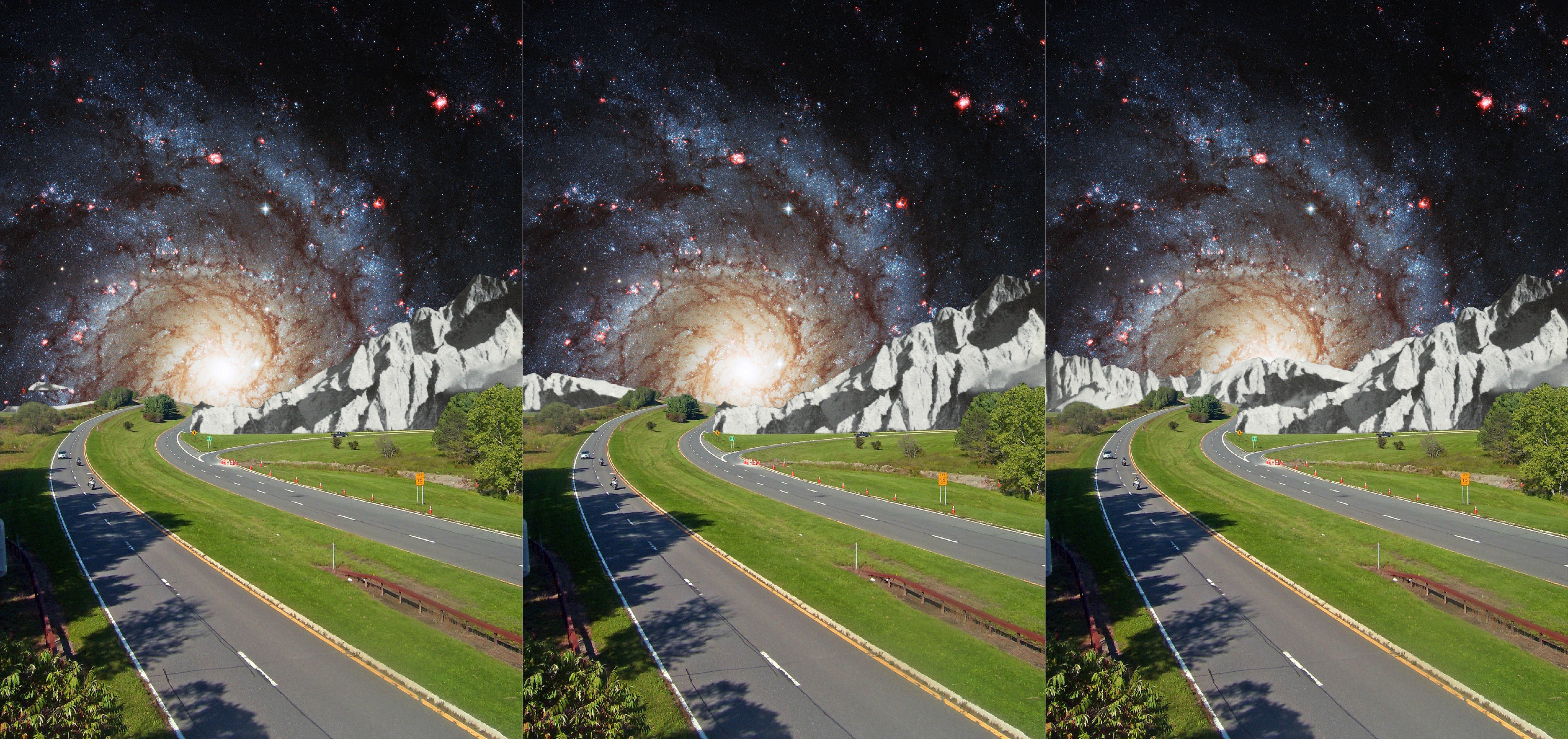
I needed to add a road that leads from the foreground into the galaxy, away from the viewer. The road would represent the long journey ahead for the caterpillar as it travels towards its future.
Left: Galaxy Right: Black holeTrying out various roads for the foregroundForeground with a traffic jam imageScanned images from a bookRoad image that I decided on
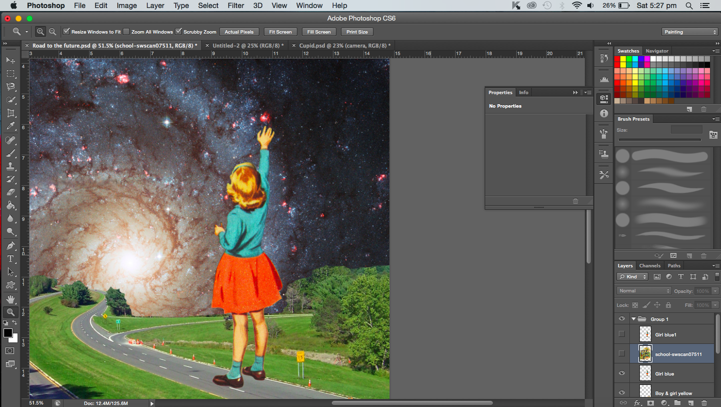
‘Caterpillars’‘Reaching for a star’‘Reaching for a star’ close up
“A butterfly from the point of view of a bee is competition.”
In this post, I will be showing some of the screenshots and images created while I was working on the pieces.
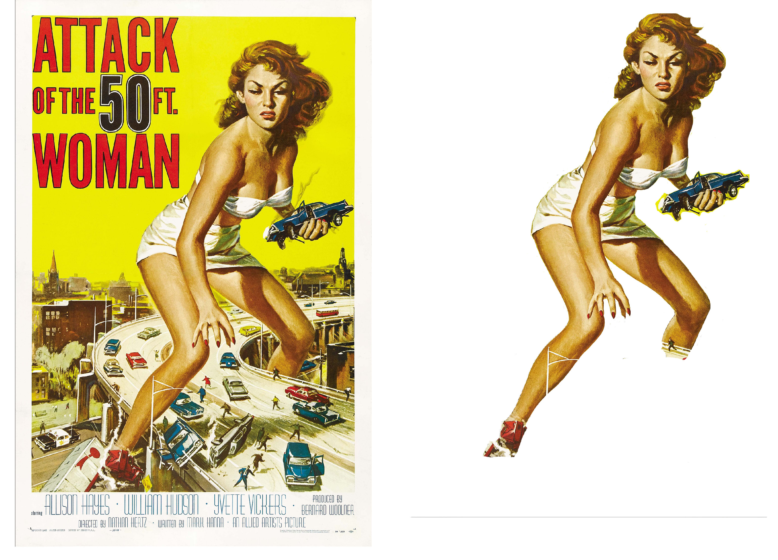
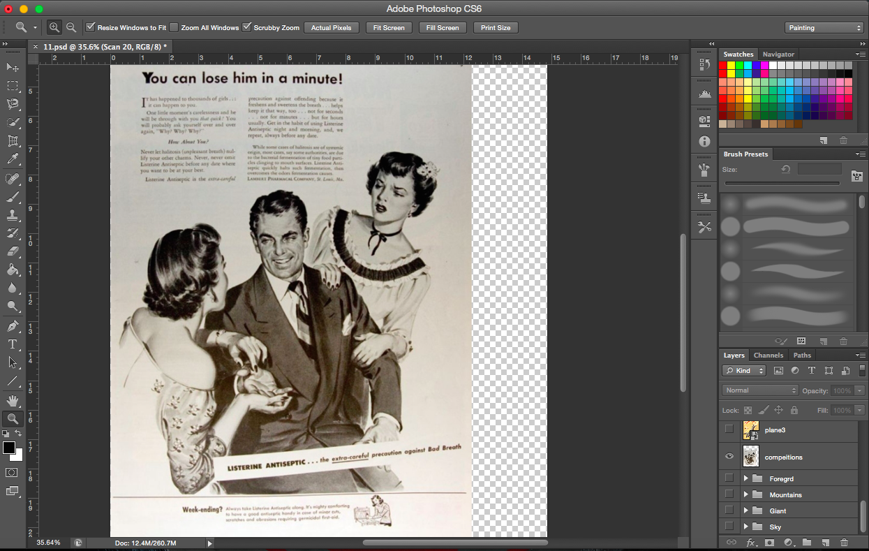
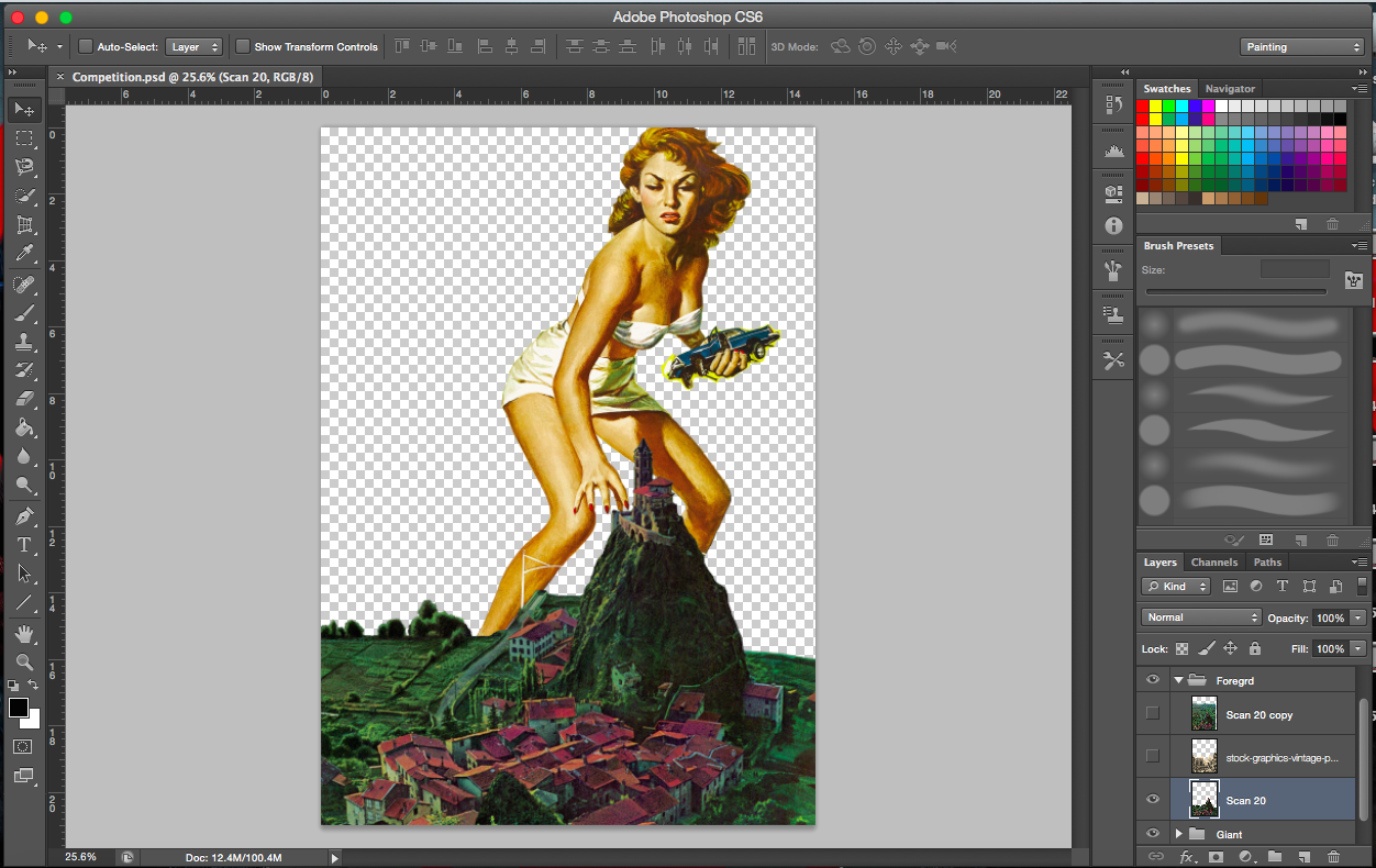
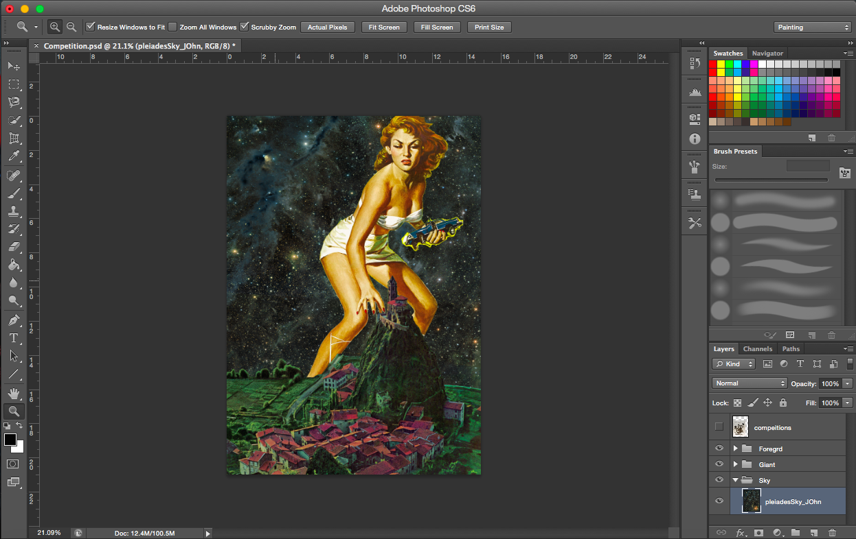
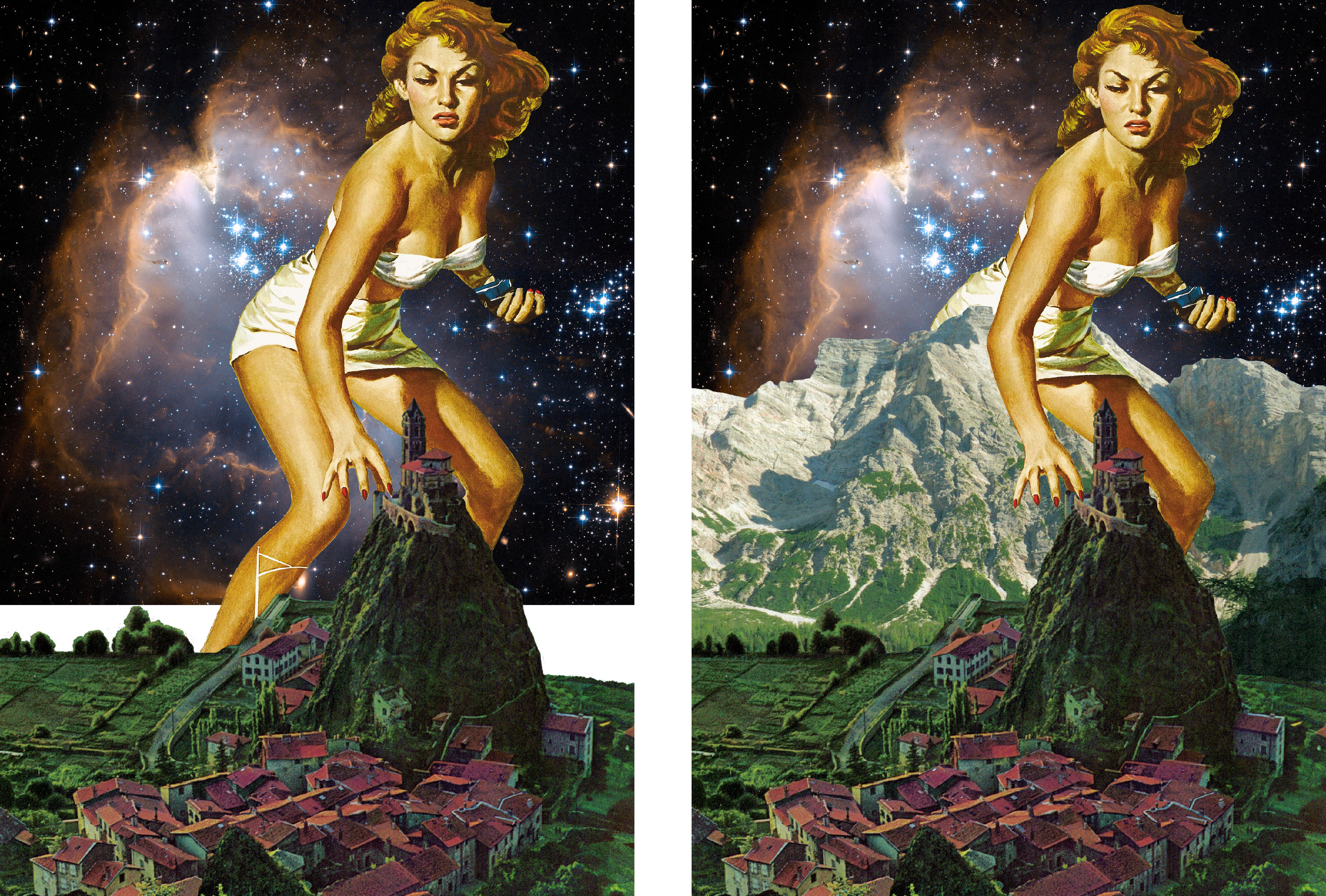
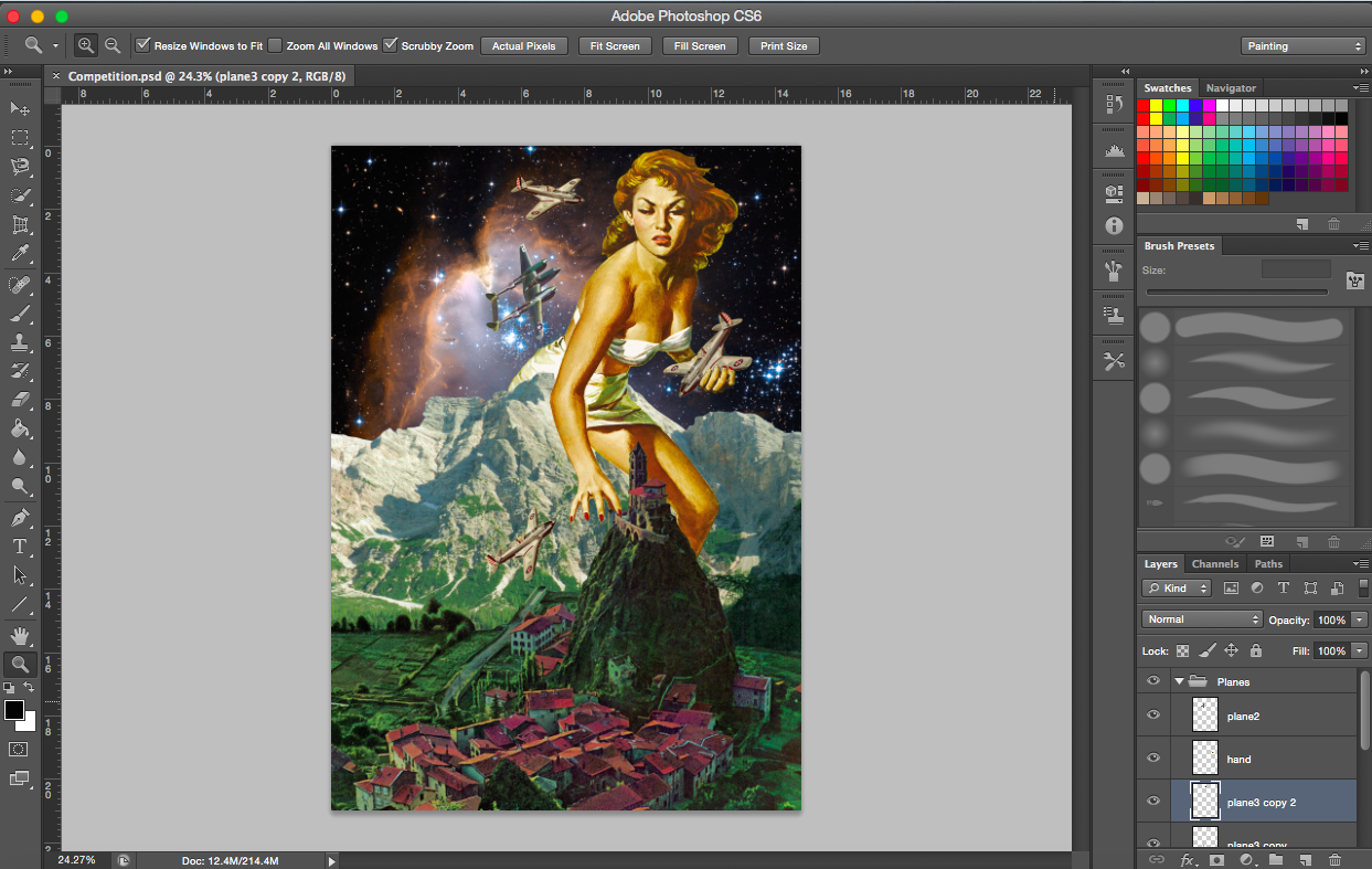
For this particular point of view, I was thinking about how butterflies and bees both collect nectar, hence I saw them as competitors. The story/scene I wanted for this, was one with tension. I chanced upon this comic cover of a giant and I thought it was really appropriate for this point of view. In terms of size, the butterfly is much bigger than a bee. Hence, the giant could be a butterfly. It also just so happens that the giant is in the pose where she is grabbing something which is good (better than a neutral pose). Such a pose results in a more interesting scene. Since she is grabbing something, I figured she would be grabbing either the competition/enemy or nectar.
[Image below] I thought this advertisement was pretty funny. One of the many interestingly quirky advertisements I saw while searching for images. I thought of competition of a lover. Two women (butterfly and the bee) fighting for the man (nectar). I didn’t use this in the end because I felt there wasn’t ample room to expand on the image. The image itself already screamed competition.
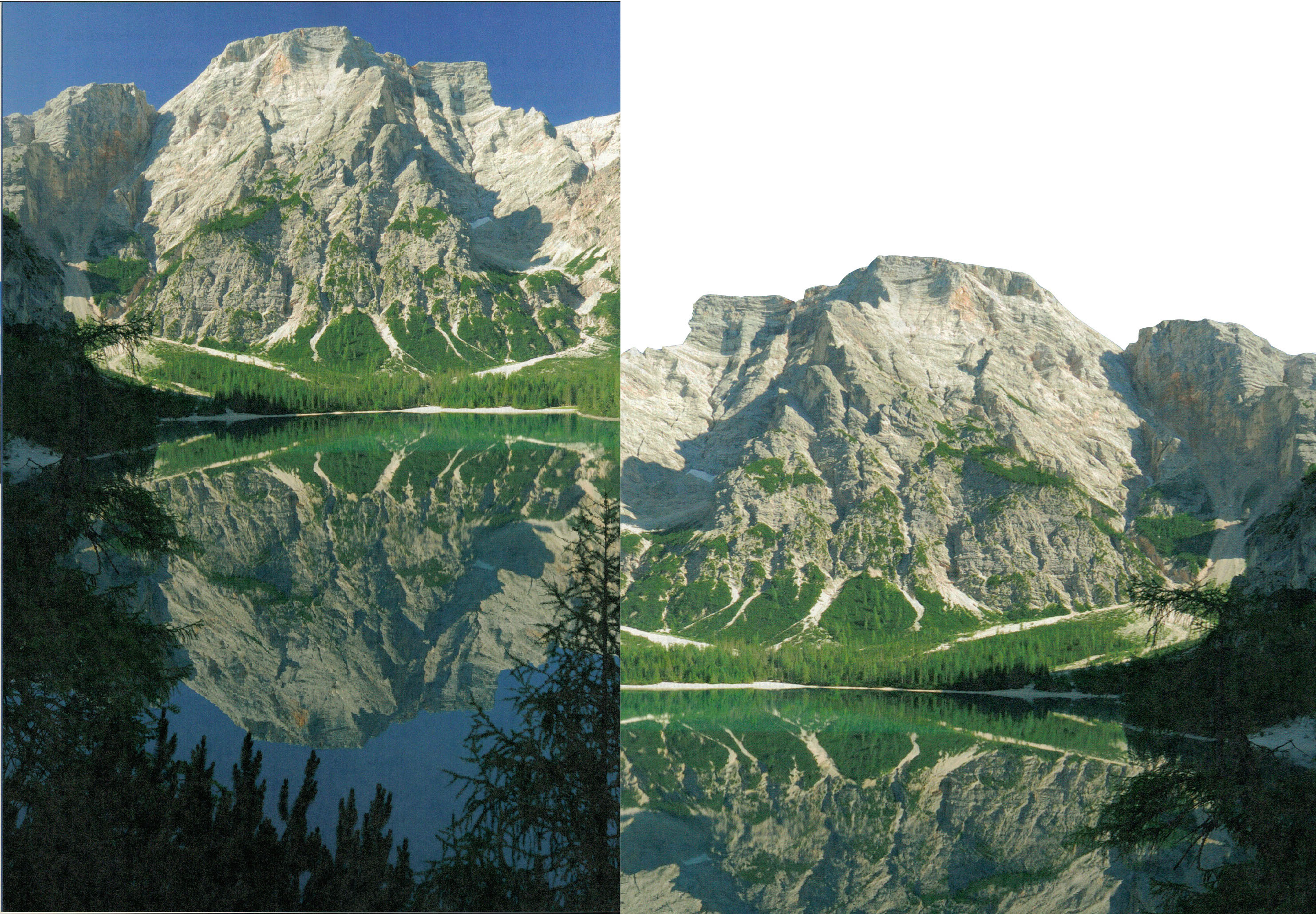
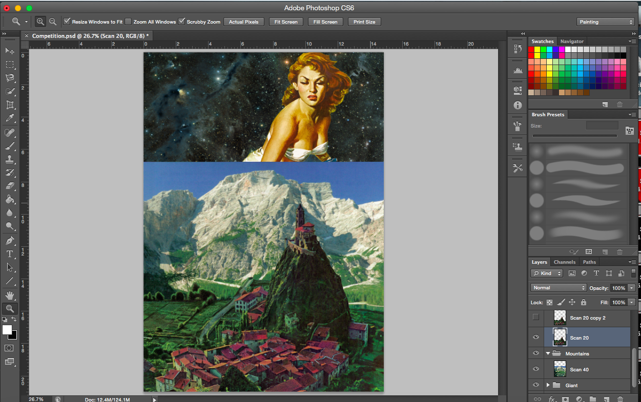
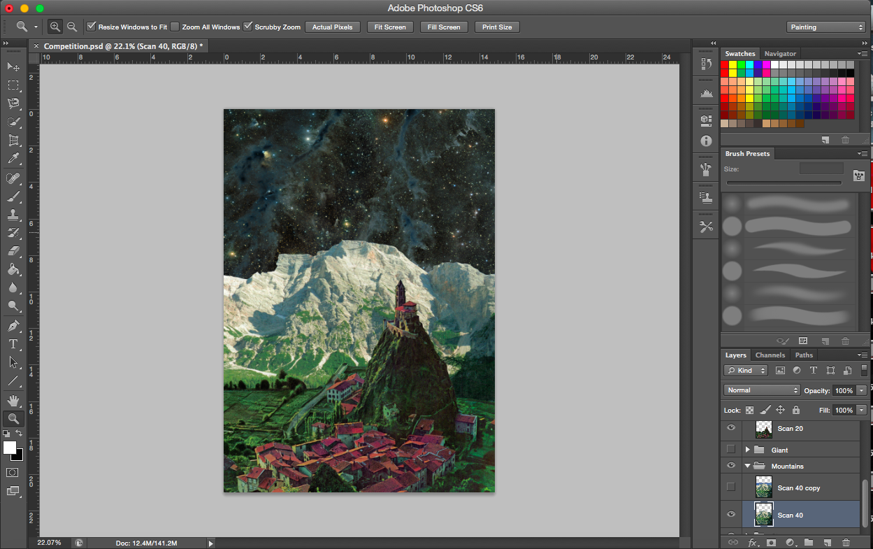
[Next 2 Image Below] These are images from a book I found (the mountain one). I knew the bottom image would go perfectly with the giant image. A scene where the giant is attacking the town or trying to take something from there (town symbolises nectar).
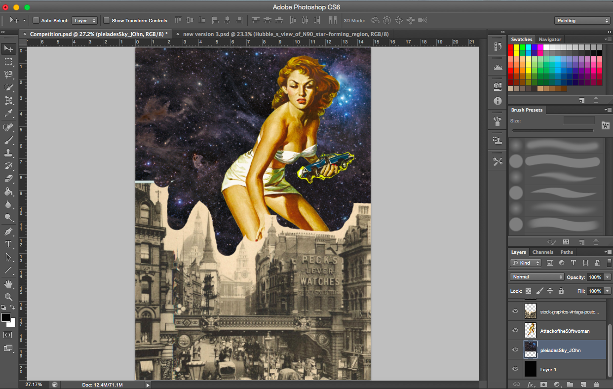
[Image Below] I’m sticking to the space backgrounds here too. Not only does it give the work a sci-fi look, I find that the black in the images also gives a good contrast to the coloured, vibrant images in the foreground and middle ground. In a way, it is present but does not distract or take the attention away from the immediate scene of the work. It complements the work.
Trying out other town images
Existing and emerging
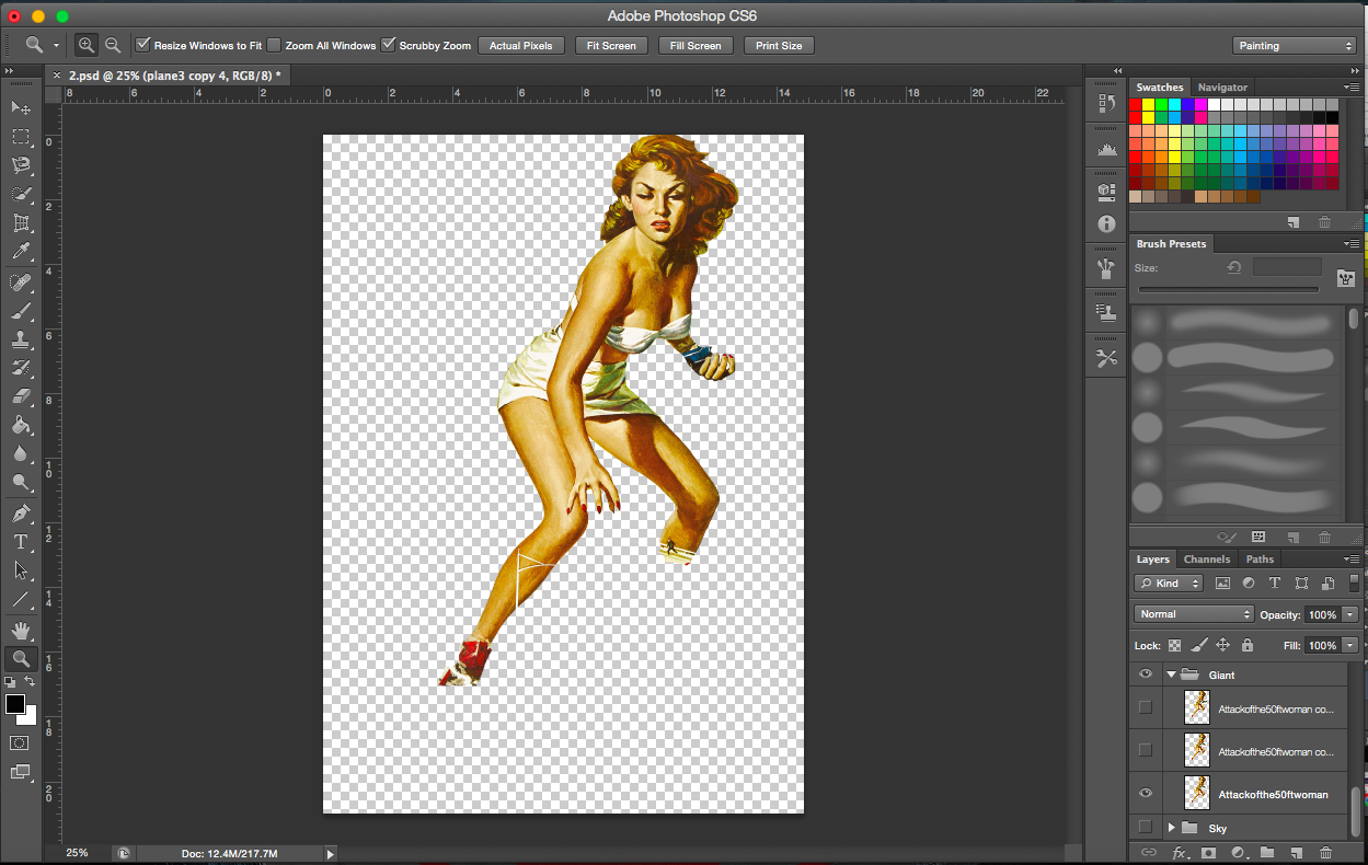
[2 Images Above] These two images portray one of the challenges of working with collage and pre-existing images. The images usually aren’t in its full form (see very first image of the giant, her legs are cut off) and you also get overlap of images from the original image (e.g. the lamppost is in front of her right leg even after cropping). I am forced to think outside the box and come up with a solution to hide those areas without it looking like I hid the legs deliberately.
I actually would like to talk about the positions and importance of finding the right images. It just so happens that the existing shadow cast on the giant’s left leg now looks like it was caused by the hill in the town image. Take the mountain image as another example, the right side has a shadow cast, with the addition of the giant, it looks like it’s hers. Had the shadow been mostly on the right, I would have to flip the giant image. Light seems to be coming from the left, illuminating the left more, hence the space cloud is placed on the left.
[Image below] With the symbols for the butterfly and nectar (competition) already dealt with, I then went on to search for the bees. What could compete with a giant? Fighter planes. I imagine the planes (bees) protecting what they think is theirs (the town).
[Image Above] There were two main images of planes I wanted to use. I tried to incorporate both into the composition but soon realised that the grey plane was a little distracting and having two types was too messy. I thus stuck with the beige plane due to its colour.
——————————————————
PROCESS- Cupid
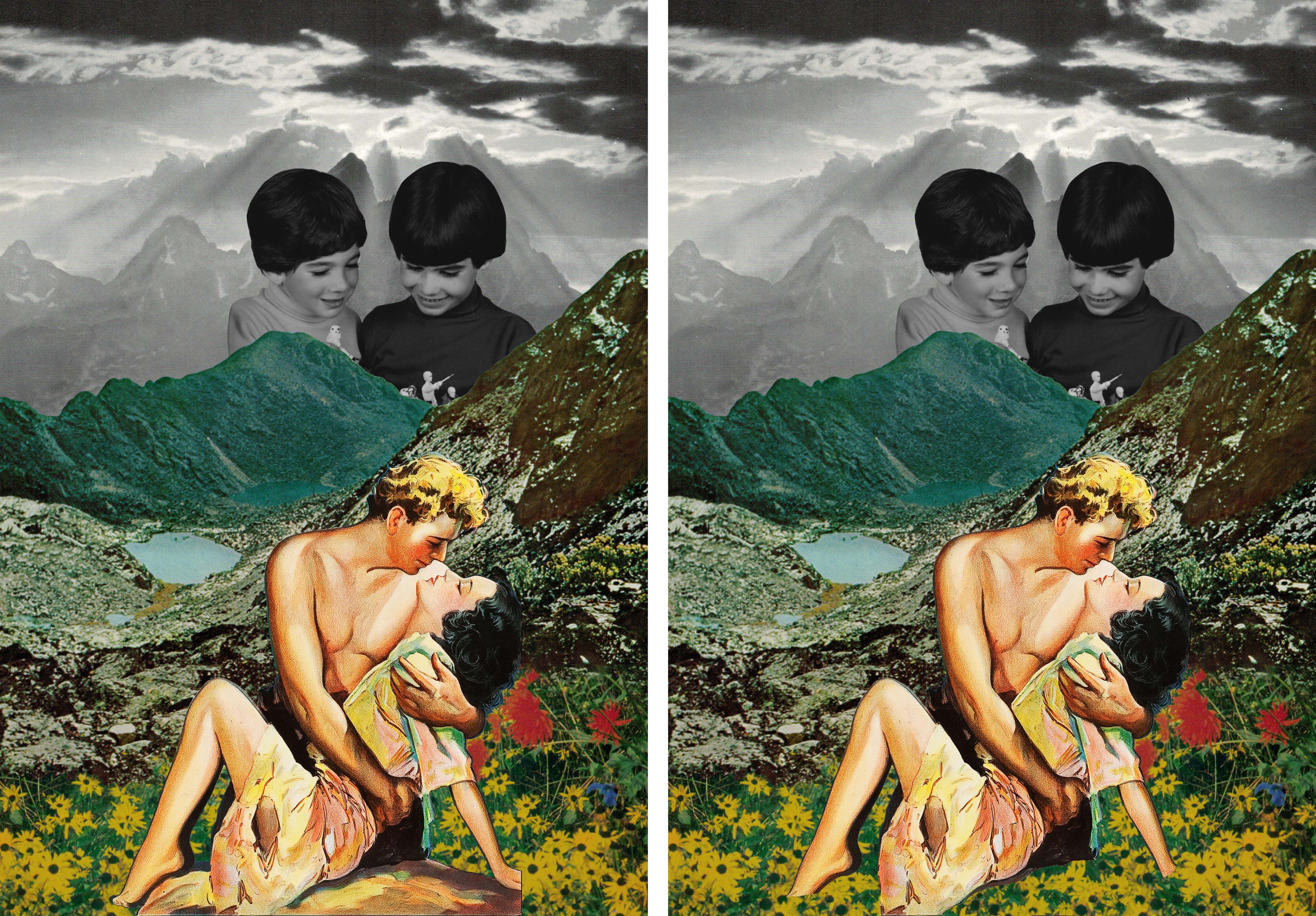
“A butterfly from the point of view of a flower is cupid.”
I wanted to represent cupid as a puppeteer, controlling and bringing two people together. But I also wanted to use the fact that cupid is usually portrayed as a child so I began my search with these in mind. The flowers would thus be represented by lovers.
Space Nebula
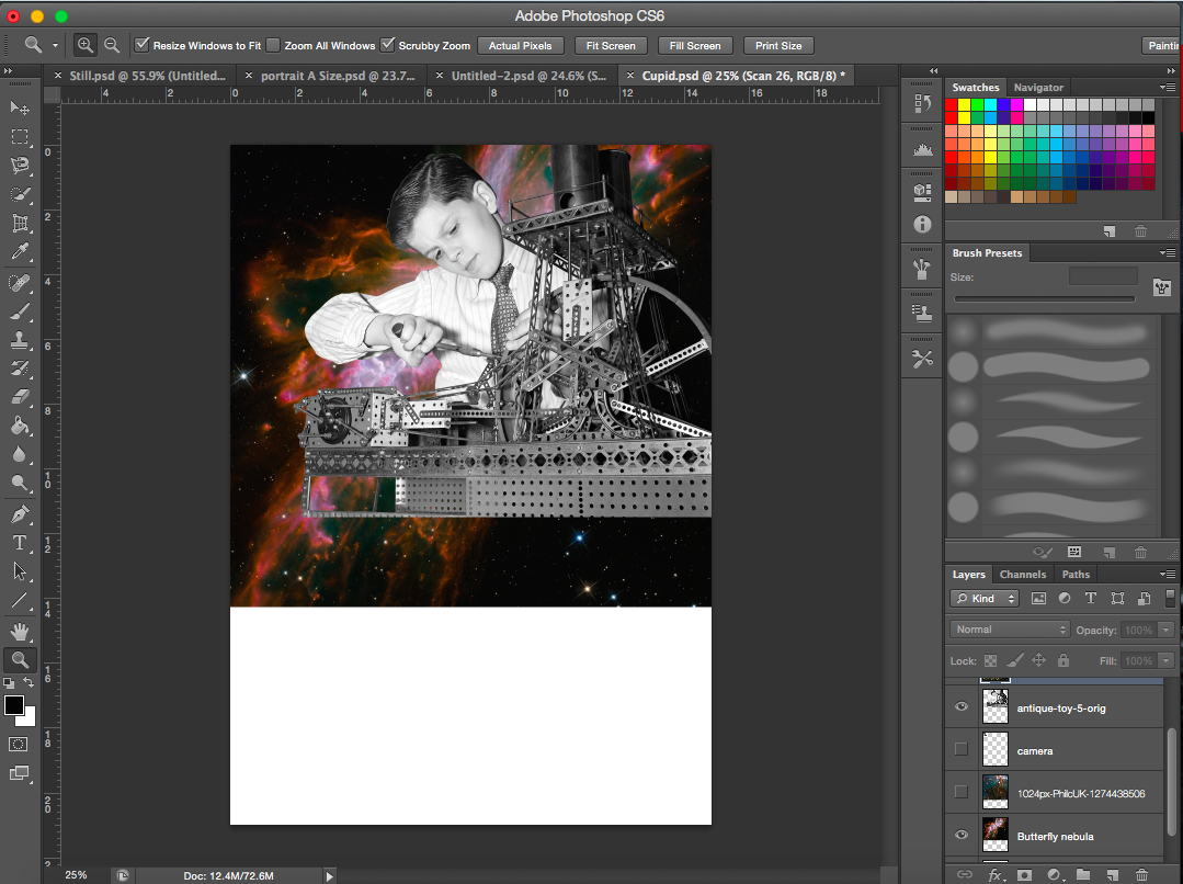
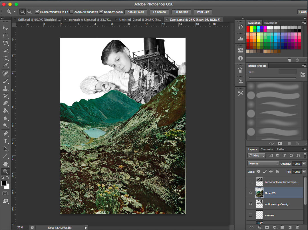
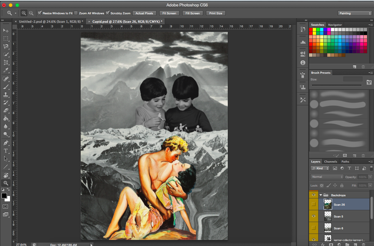
[Image Above] I wanted the nebula to be almost like a pair of wings for ‘cupid’ here. However, its form wasn’t too visible after adding the layer of the boy. In fact, at this point I realised this image of the boy with the machine was rather hard to work with. There were too many machine parts at the base of the image that would be difficult to work with and transition with. The chimney of the machine extends far up and it’s quiet dark in colour hence a space background would not work too well here.
I was looking for pictures with a child to represent cupid since he is usually depicted and known as almost a baby with a bow and arrow. I figured this image would probably fit the puppeteer scene due to his hand position.
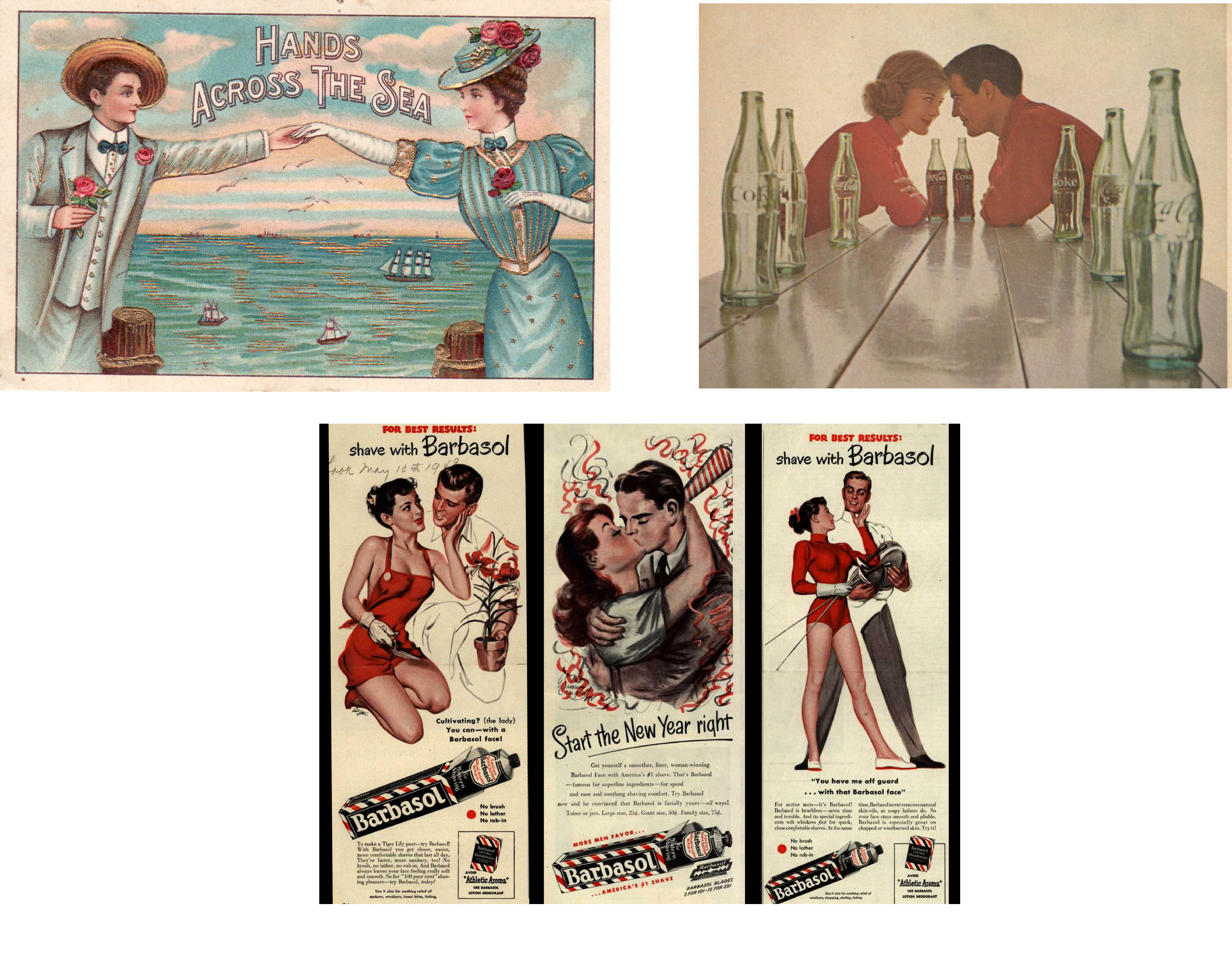
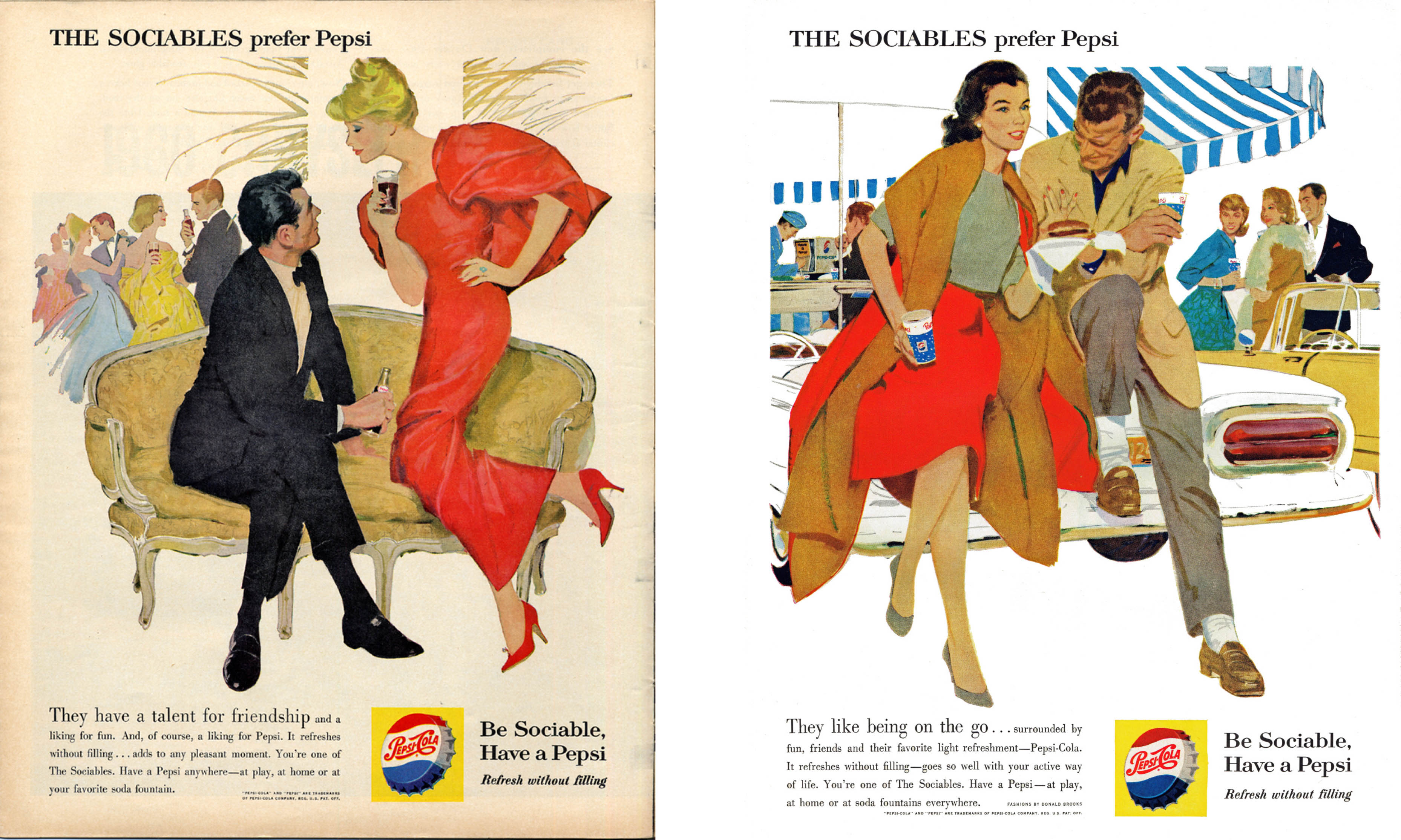
The image of the boy proved too difficult for me to work around so I decided to look for an alternative. But in the meantime, I looked for images of lovers, couples and things like that to represent flowers. I’ve placed a few of the images I found below.
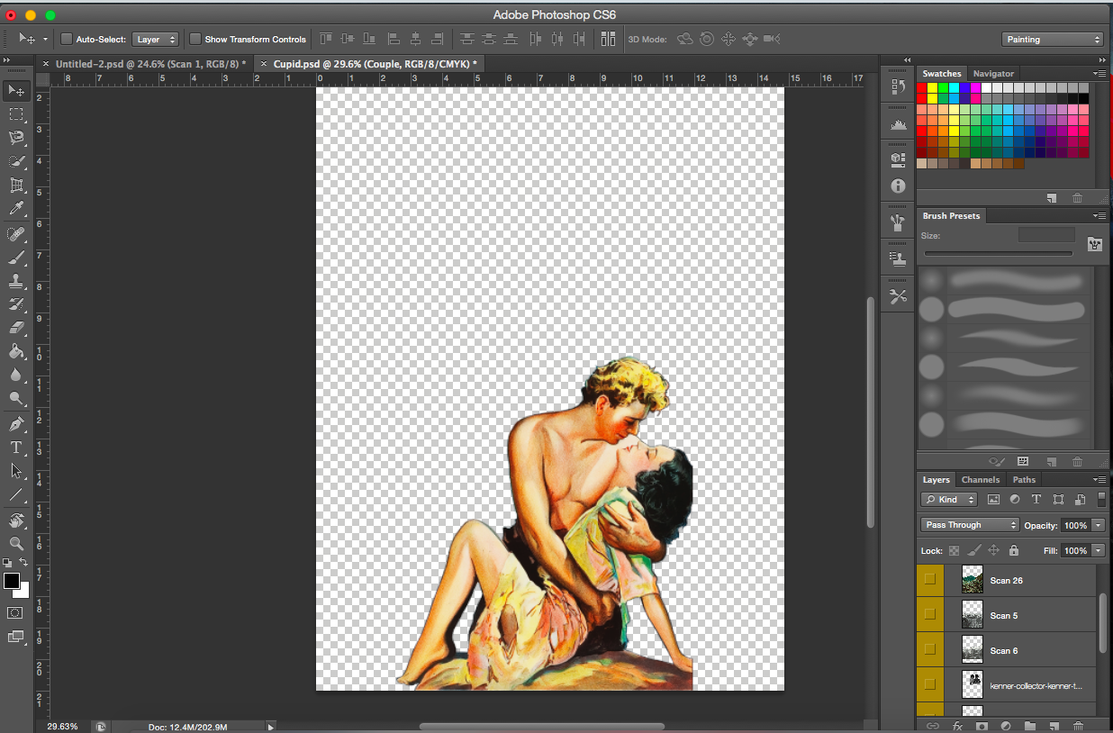
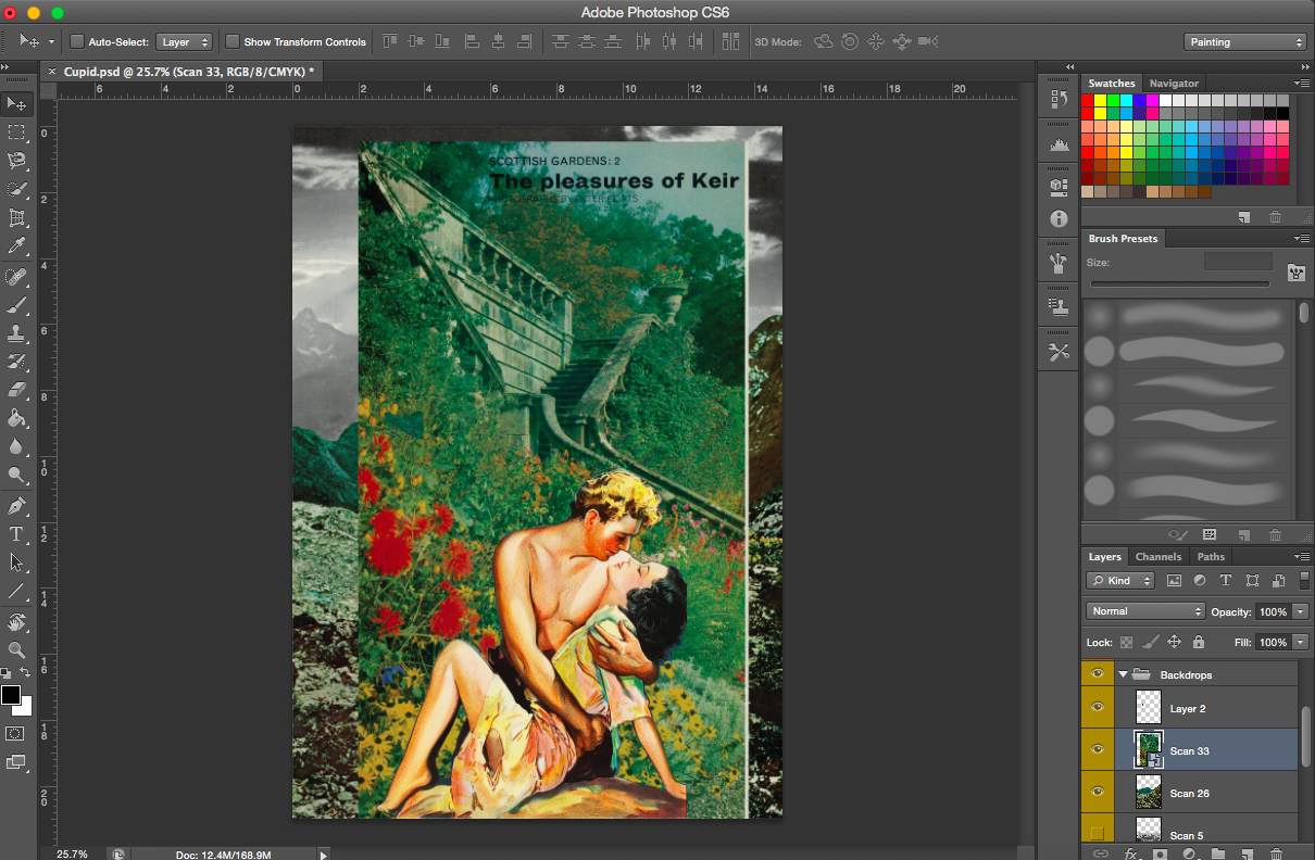
[Image Below] I came across a Tarzan comic. It was perfect. The colours were good, high resolution and dramatic enough.
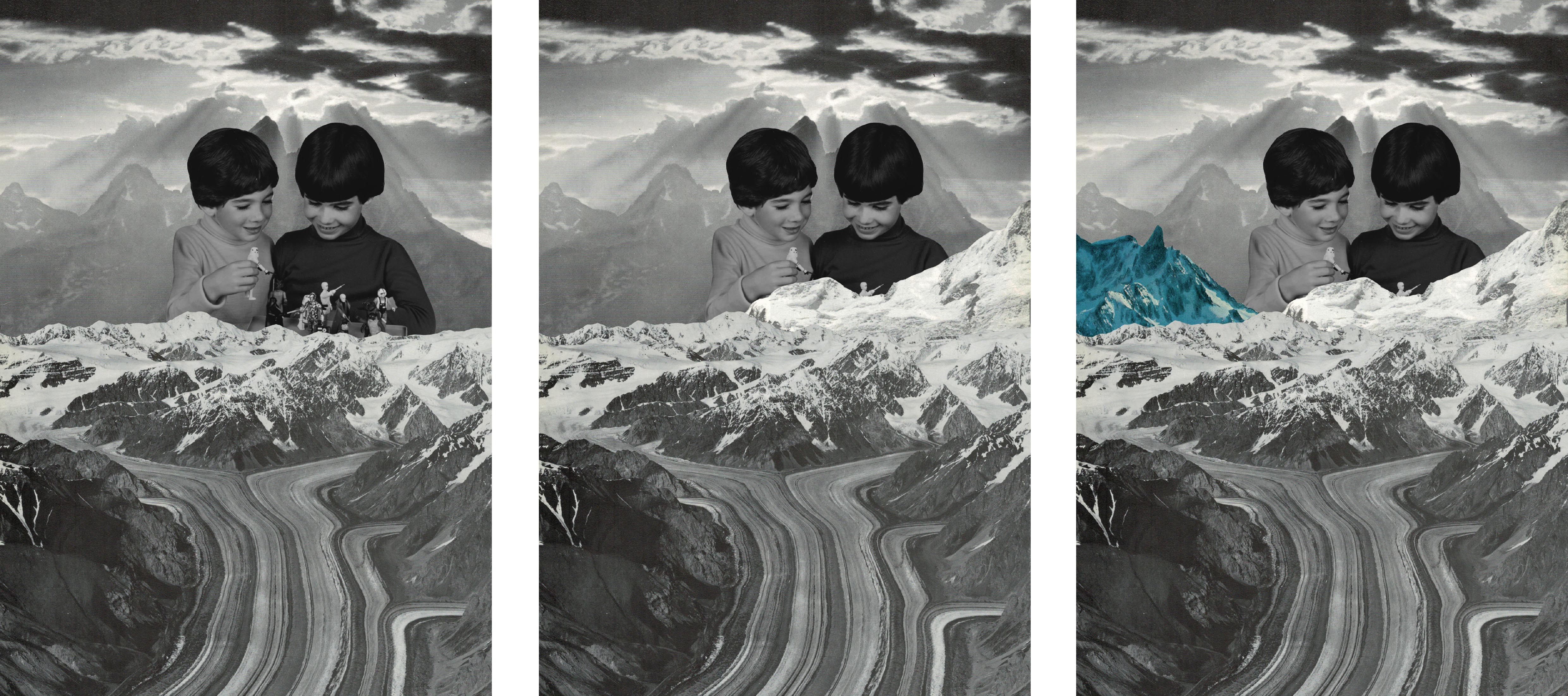
[Image Below] This heavenly image of light streaming though the clods and through the mountains was perfect for this work. It goes well with the theme of angels, immortals and thus cupid as well.
Cupids to be
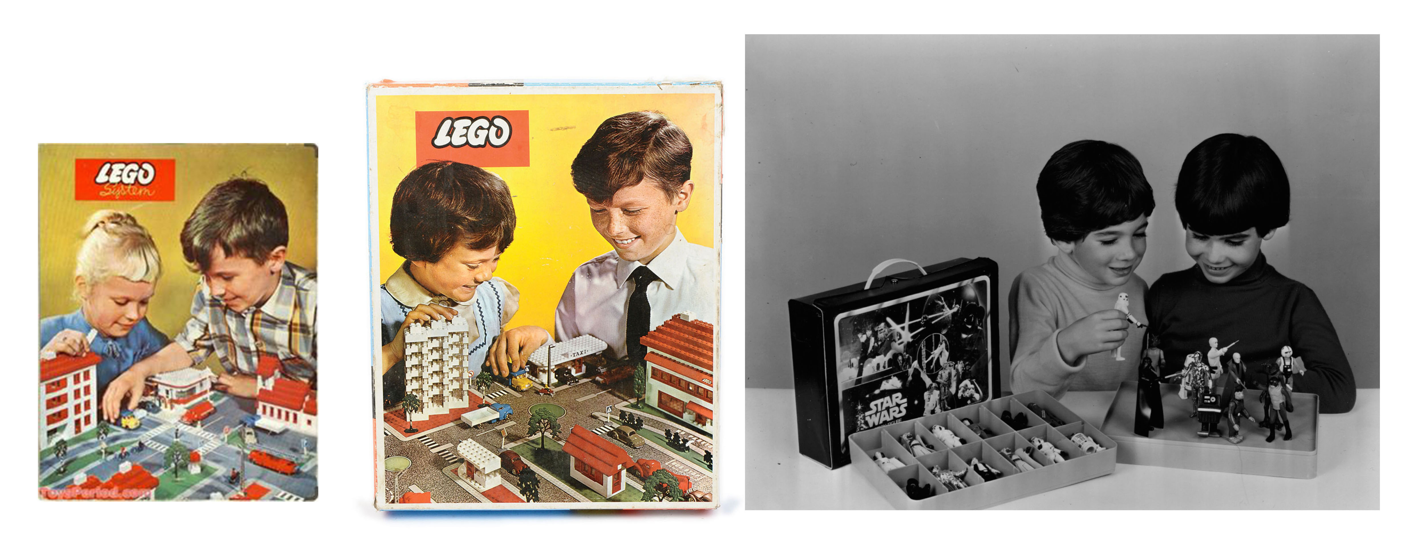
[Images Above] I was looking for people (children in particular) who were looking down (supposedly to the lovers). I found lego advertisements that had exactly what I wanted. The children even had their hands partially out (to pick the toy) as though trying to pick up something. The only problem was the resolution. So I couldn’t use them. Luckily I found a better one (extreme right). The best part of it was that the two boys looked pretty similar, which could represent Cupid(Roman) and his Greek counterpart, Eros.
Trying out different foregrounds
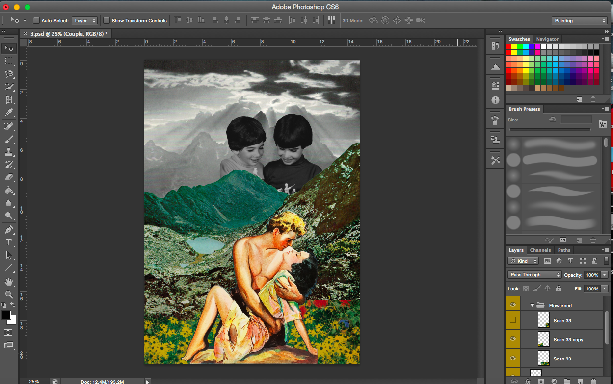
[Image Below] There was something missing in my composition. It seemed a little bleak for a scene of lovers. There was nothing magical about it. I looked through some of the old magazines that I bought and found flowers.
[Images Above] I realised the boys are holding figurines and the mountains cover the toys partially, so the question now was, should I cover the toys completely? Doing so would also cover their faces too.
I decided to just make the figurines only slightly visible, almost as though the cupids are about to add new characters to the scene. The scene then becomes a ‘playground’ for them.
[Images Above] Again, I had to work with the images. The Tarzan image was cut off at places. Jane’s hand was incomplete. To fix this, I made it seem like the flowers were a lot higher and denser and her hands were hidden within the flowers. I did the same for her feet (even though they were not cut off) for a coherent image.
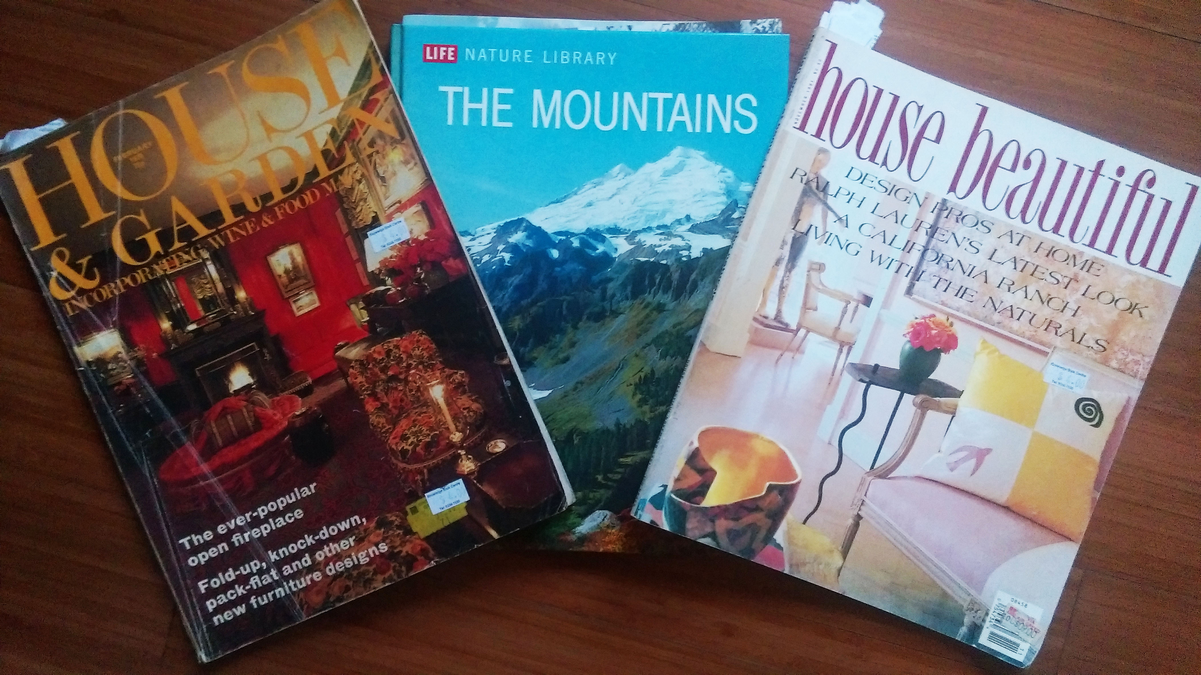
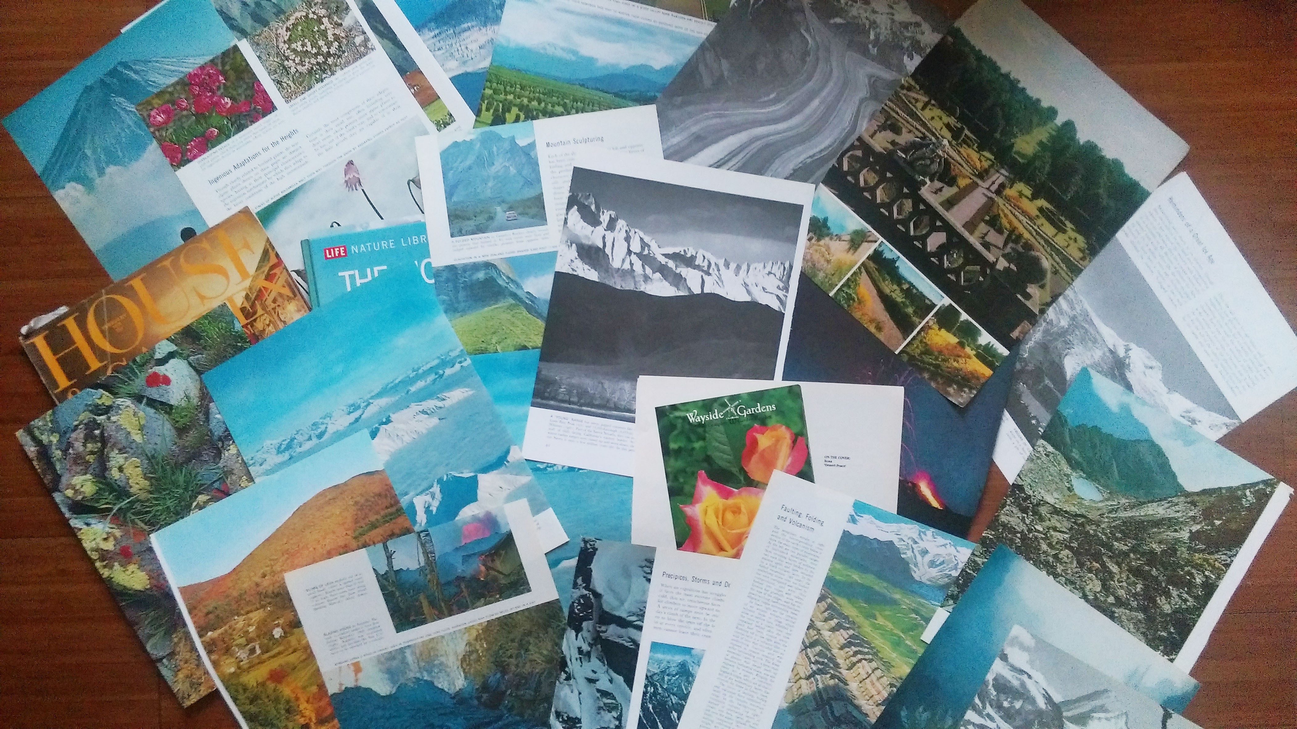
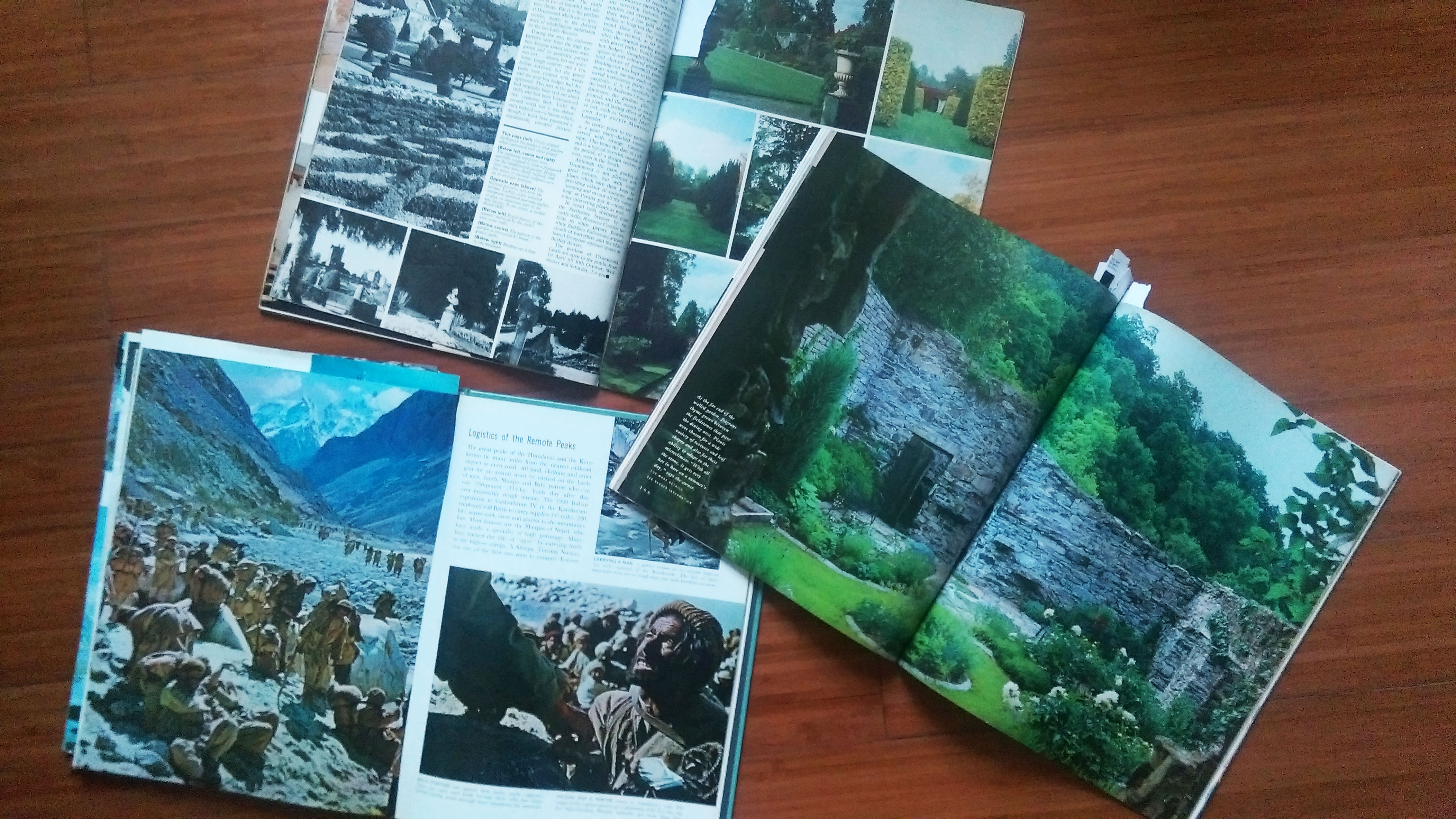
I decided to use Eugenia Loli as my artist reference because her works really made an impression on me (they are really beautiful). So I decided to create collages for each point of view. I stuck to a vintage theme similar to Loli’s work. In terms of materials, I used old, vintage images that are both printed and digital. Vintage printed images can be found from science textbooks, encyclopaedias, storybooks and magazines. For digital images, I started my search with advertisements and posters. My plan on how to use the printed material was to see what images were interesting and then scan them in for editing. The images below are just some of the books and materials that I gathered. I also used some of the textbooks that I had on hand.
Book and MagazinesTorn out images from the books & magazinesImages inside the printed material I found/bought
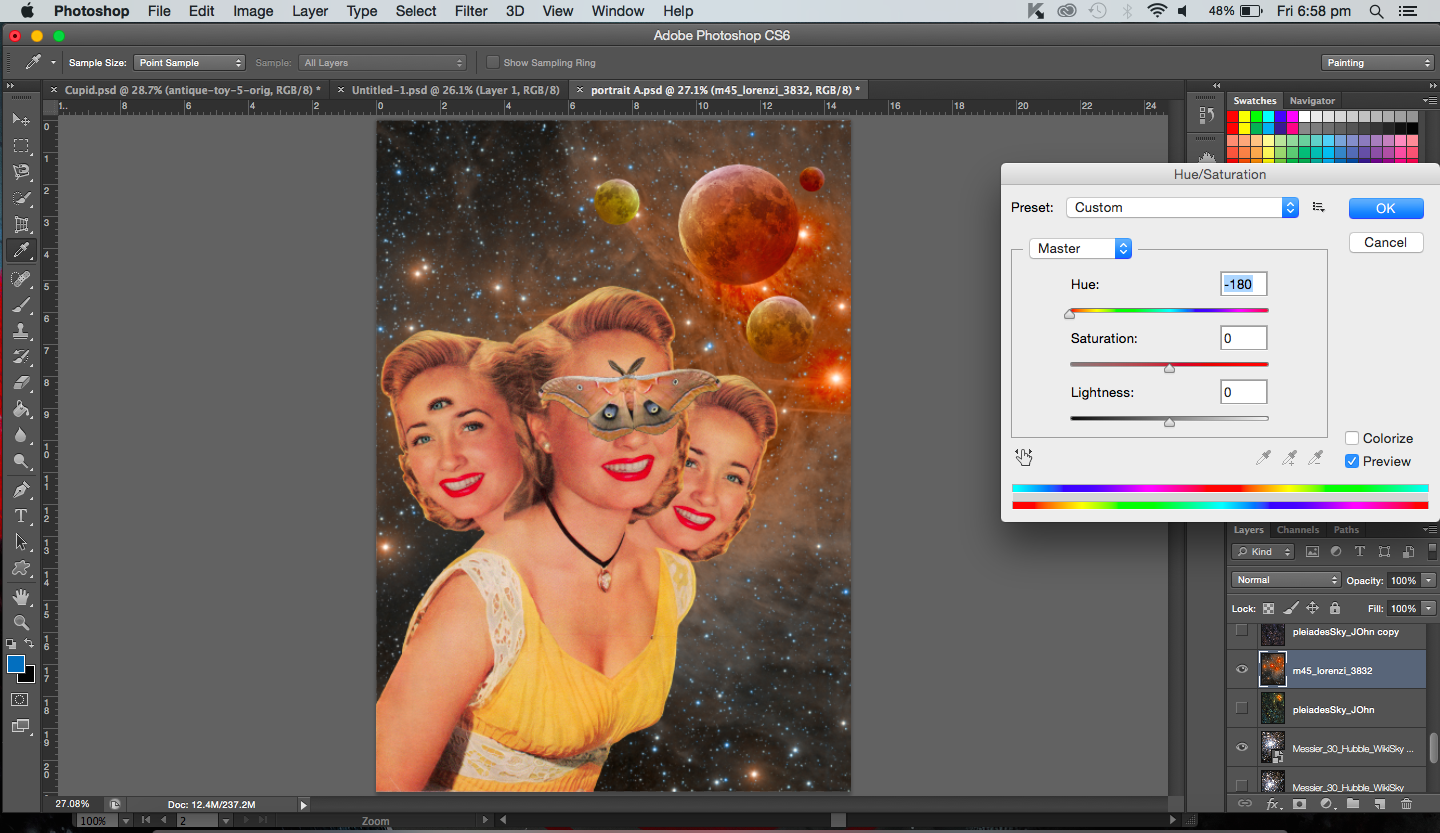
From the webpage, the artists talk about the factors that they take into account when making a collage. Things like colour adjustment (colour balance, hue/saturation) and use of backgrounds are all important. They never do stick down the separate pieces immediately, instead they move the pieces about until the composition looks right.
My direction for this project was to try and use personification in all my works. To use other objects and subjects (various other ways) to represent butterflies and the other matters that are mentioned in the sentence. The way I decided to achieve this was by creating a narrative or a story for each point of view. I figured that collage would allow me to create a scene using a variety of images and it would be fun and interesting to create story. Even in Loli’s works, I see that majority of them aren’t literal, you have to look at the title and then you realise that there’s more to the image than what you actually see. Some of them are metaphorical, others just use the combination of images to tell some sort a story. It was a perfect opportunity to create works that were absurd, witty and surreal.
As mentioned in my previous post, in the last sharing, the idea that butterflies are more feminine was brought up, and I agree with that. Hence, I decided to use women to represent the butterfly.
(I will be showing my processes for two works in each ‘Process’ post. This will thus be the first of three.)
——————————————————
Process- Bad Omen
“A butterfly from the point of view of the superstitious is a bad omen.”
I will be describing the way I created my first collage below. The statement for this piece is “A butterfly from the point of view of the superstitious is a bad omen”. This was my very first attempt for this project so it did take a considerably long time to find images to use. But as I progressed I did get the hang of things.
So, bad omens. What are bad omens? I listed down all the things that I’d associate with bad omens and bad luck. I am aware that bad omens aren’t the same as that of luck but I assumed superstitious people would believe in both, hence I included bad luck.
List of some things associated with bad luck, omens and the superstitious: astrology, having twins/triplets, eclipses, Evil eye, black cats, walking under a ladder, opening an umbrella indoors, four-leaf clover, rabbits foot, horoscopes.
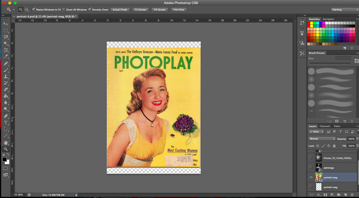
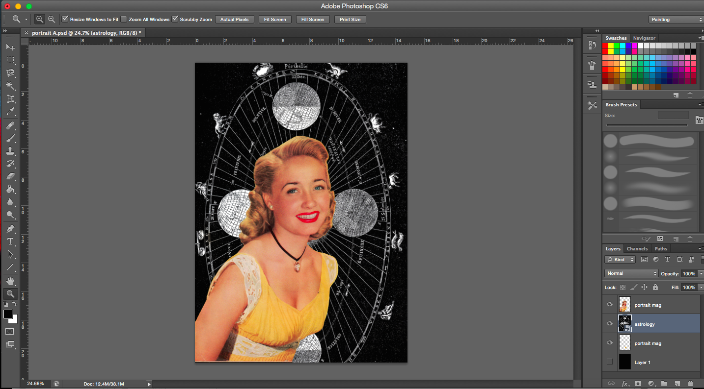
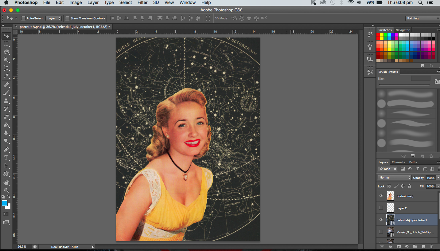
My starting image is an image of a vintage magazine cover. I was really excited to find an image that was big enough with relatively high resolution. Most of the images that I wanted to use were usually too small. So this was really golden.
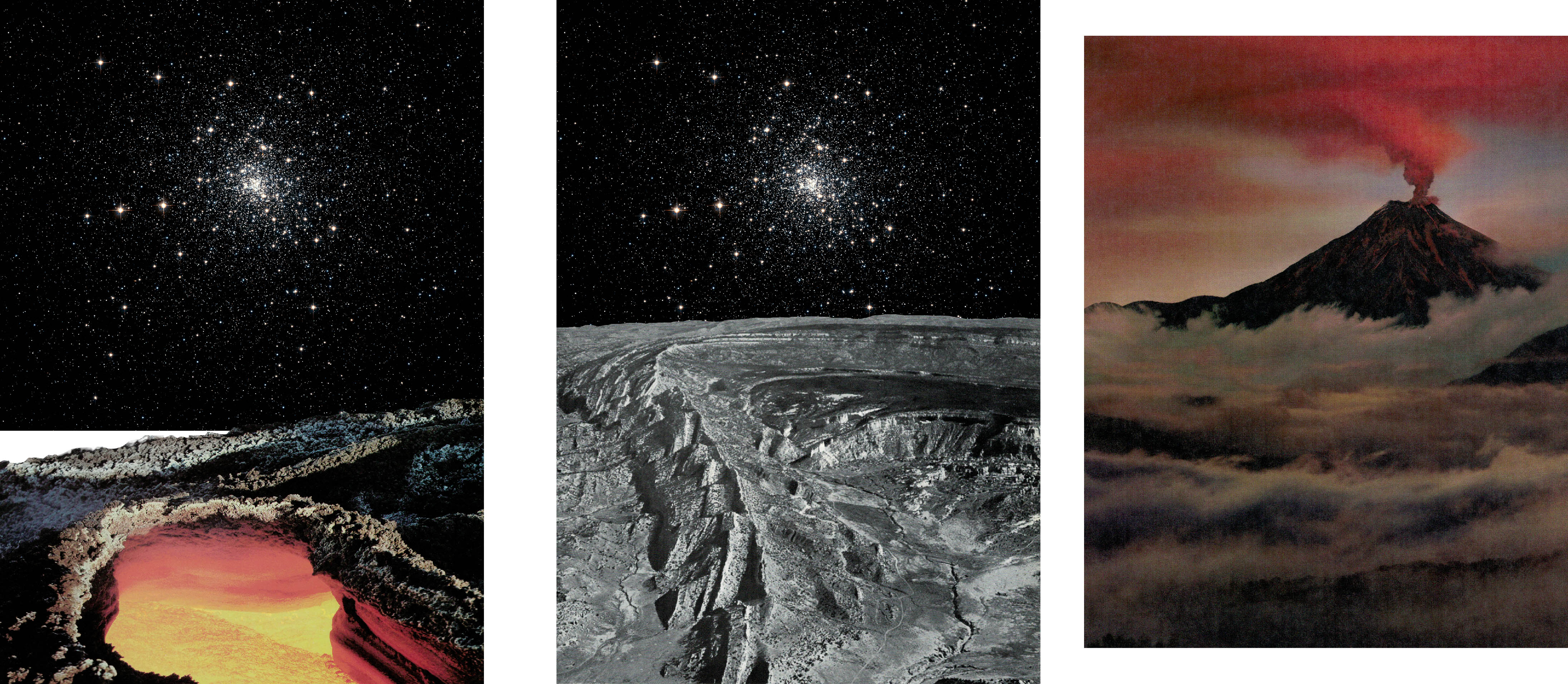
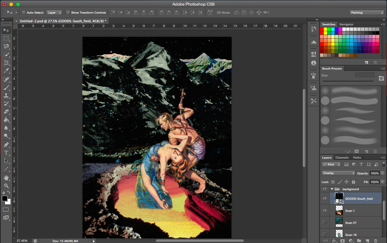
Starting imageCropping imageCelestial map as background
[Image Above] Lines of the celestial map radiate towards the subject matter thus drawing emphasis on her.
Messier 30- Globular cluster of stars from constellation of Capricornus (astrology)
Image of space background is a constellation which links back to astrology and horoscopes. I’d associate horoscopes and astrology with luck and omens too.
I wanted the brightest portion of the image (greatest number of stars) to be on the right side of the head, away from the face. Emphasis is drawn from the outer edges of the whole picture inwards (from the darkest areas to the brightest center where the main subject is).
[Next 2 Images Below] I was trying out different sizes of the main subject matter.
[Image Below] Trying out a different background. It’s a celestial map. I didn’t use it in the end because the resolution was too low. But had it been high enough I might have used it. I really liked the colour of it, has a real vintage tone to it. It also echoes the yellow in her dress.
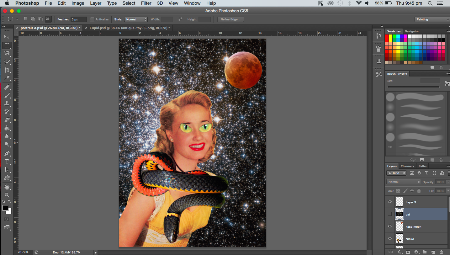
[Image Below] Addition of black cat eyes, a coiled snake and lunar eclipse/blood moon. This was definitely experimental. I was just playing around with the images. I guess that’s the beauty of collage, you can really create quite absurd images such as the one I made below. A couple of things didn’t work here, the snake image was actually not a vintage image so it stood out (the colours and resolution did not match the others). In fact, the cat eyes were also not vintage but the main problem with that was that it was just too distracting and after cropping it, I couldn’t identify it as a cat anymore. It just looked like a pair of green eyes from some animal that didn’t fit in. Overall, the image was pretty messy to me, so I didn’t pursue the cat or the snake any further.
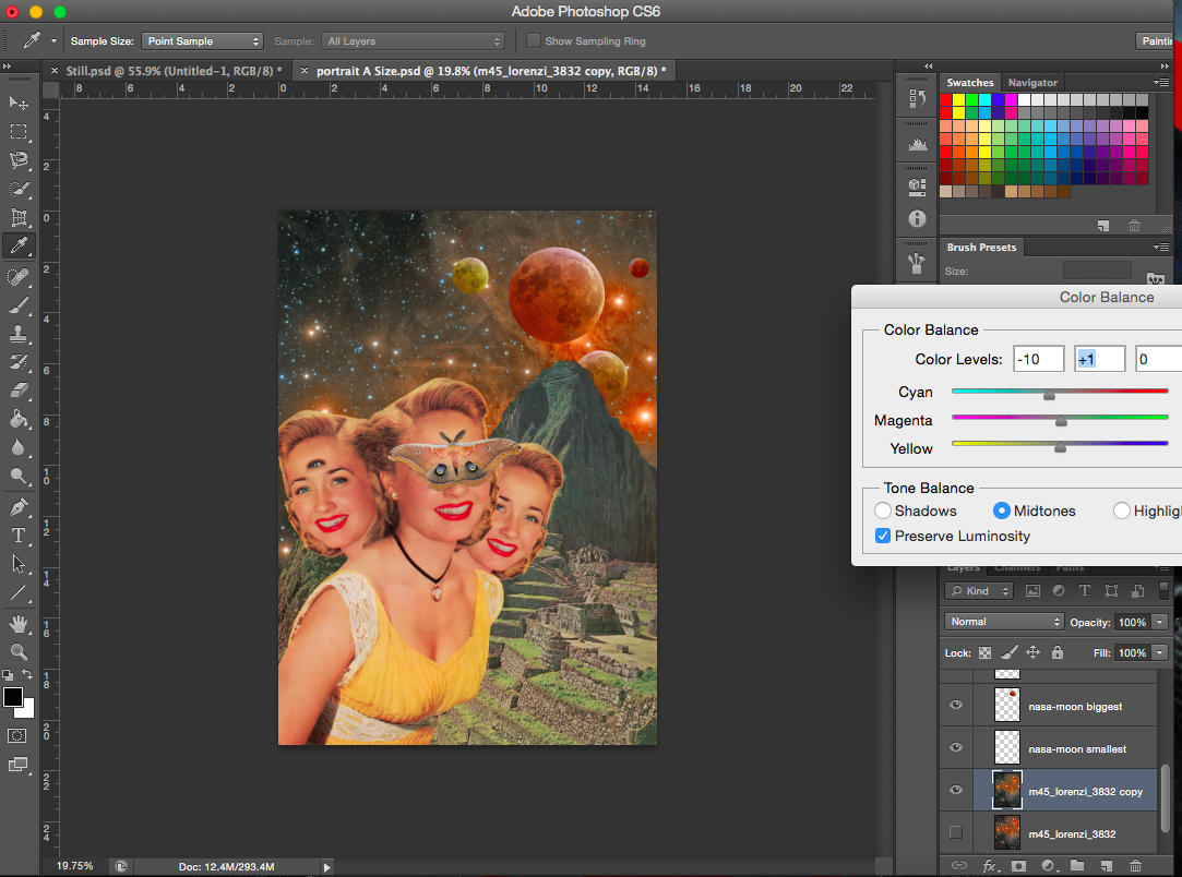
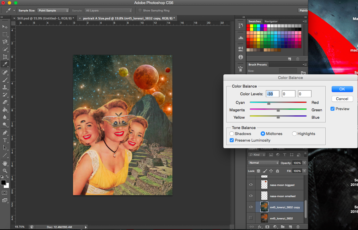
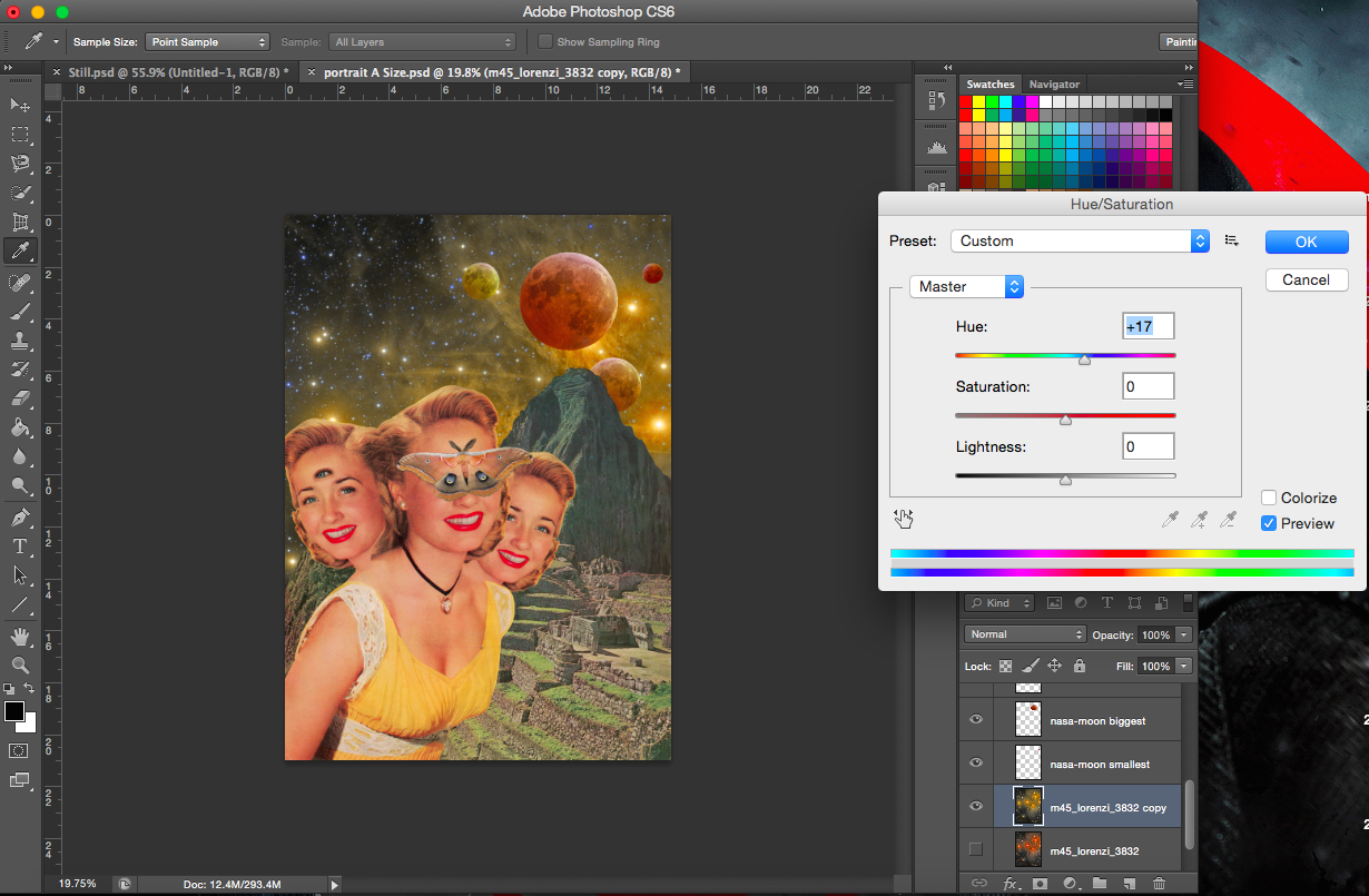
Most of the images from here onwards invovle colour adjustments. Since the images are obtained from different sources, they may not necessarily go together, thus they have to be adjusted here and there.
Changing the colour of the background (constellation)Adjusting background coloursAdjusting background colours
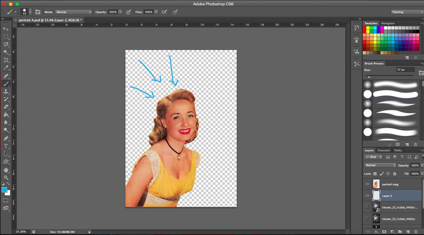
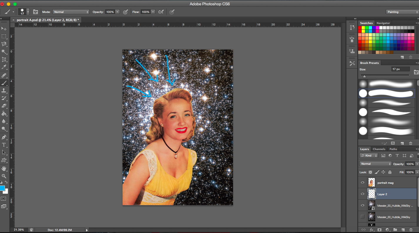
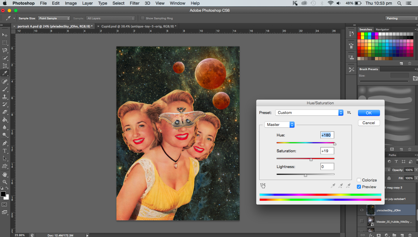
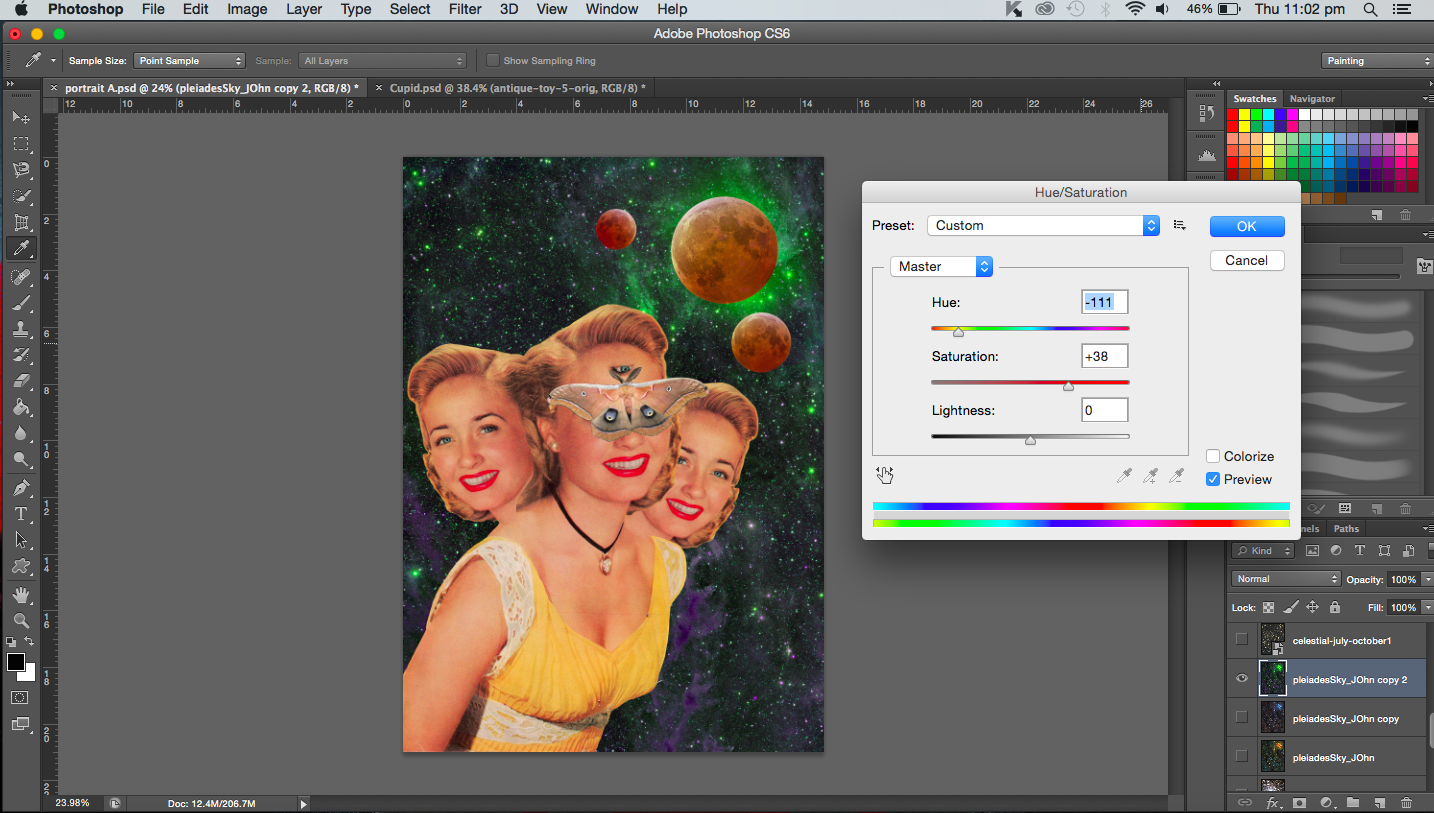
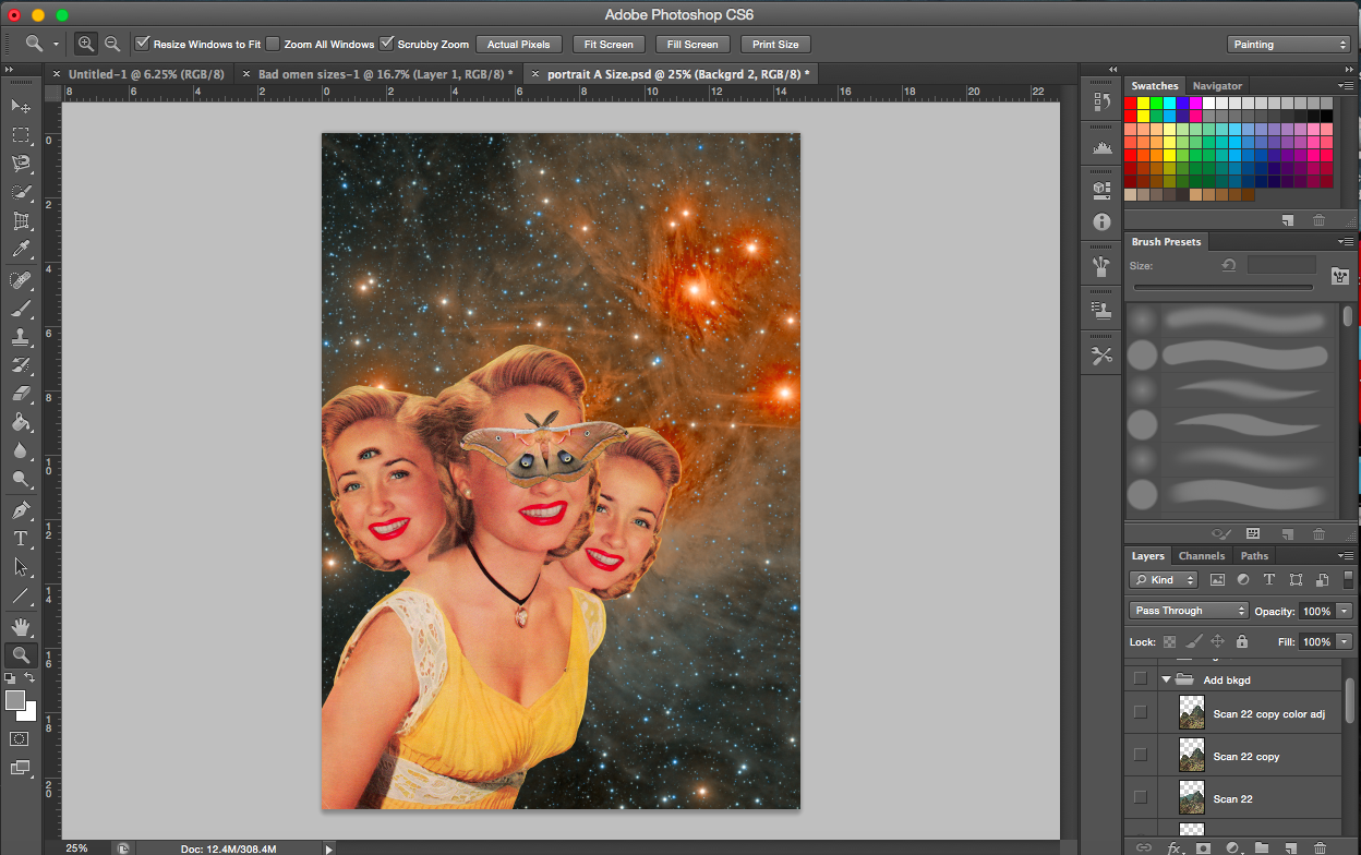
[Images Above] I added a couple of new elements here. I duplicated the heads, flipped one horizontally and ‘attached’ (layered) them to the main body. I had to make sure the hair or heads did not start abruptly either. So I erased portions with reduced opacity. They represent the triples that are considered a bad omen in certain cultures. Seeing a moth is considered a bad omen too thus I added one on the main figure. The extra eye on the face on the left represents the evil eye.
The three moons, which are all supposed to be lunar eclipses. I made of various sizes to create variety and balance. But it’s also to show the different distances. I have also taken into account the shadows and highlights of the moons and how they relate to the space background. Placing the moons at the right hand side where there are bright stars, the moons then seem to be illuminated by the the lit background.
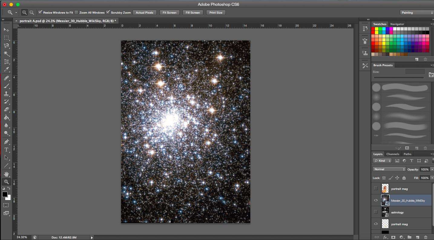
[Image Above] I decided on another space themed background (digital image found online). It’s a constellation with bright stars on the right. It is darker on the upper left and lower corners. The stars on the right balance the left which is heavier due to the presence of the subject matter. I suppose the eye is also drawn from the woman vertically up to the bright stars on the right.
[Image Above] I added a scanned image from a old book about mountains. It is an image of the Inca empire, it reminds me of the Aztecs as well. It just so happened that the mountain had a peak that was towards the side, so the heads would not block them. Also, I positioned the moons in line with the heads and the mountain so that they flow together. It is also as though the moons are interacting with the mountains. Hence, the different backgrounds are interacting and existing together. I also added another moon, a small one in the corner to balance the image.
Addition of mountain layer (old space background)
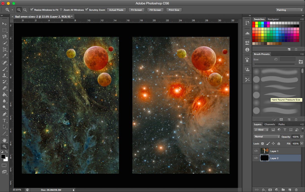
[Image Below] I was toggling between the two different space layers. With a different background, the colours of the moons were adjusted accordingly. But I gravitated towards the one on the right.
Two space backgroundsTrying out a different mountain (also from a vintage book)Adjusting background coloursAdjusting colour of mountain layerAdjusting colour of space layer-increasing cyanAdjusting colour of space layer-increasing cyan levels (higher)Adjusting colour of space layerAdjusting the size of the figure
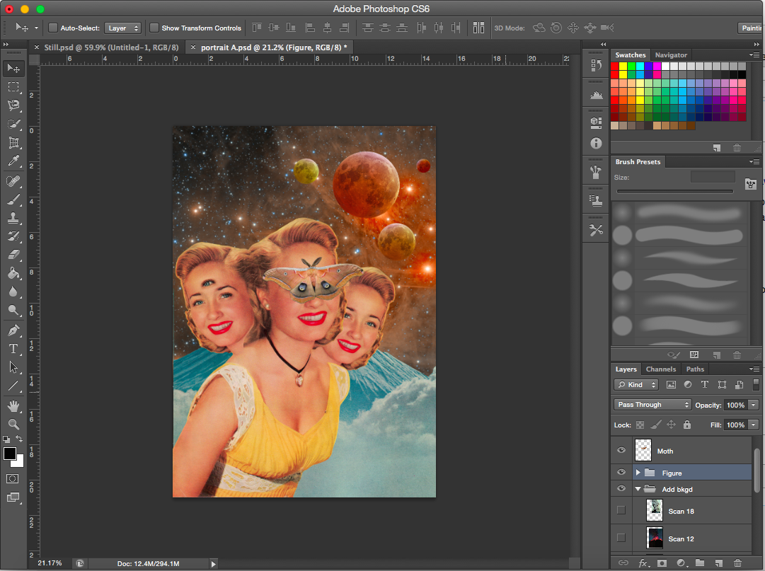
[Image Above] I decreased the size of the figures and included another mountain layer to add a focal point to the image (where the mountains intersect). (Note. the topic of the focal point was raised during consultation when my other three works which I presented all have a focal point in the middle)
——————————————————
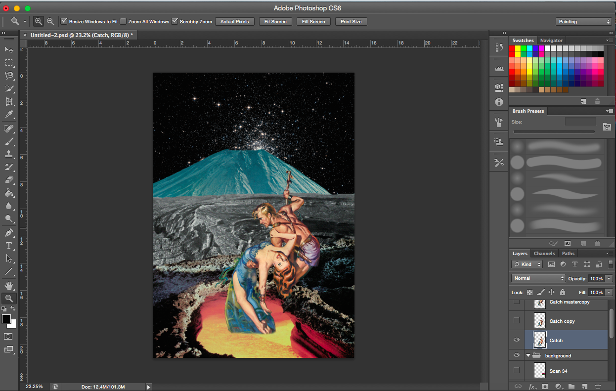
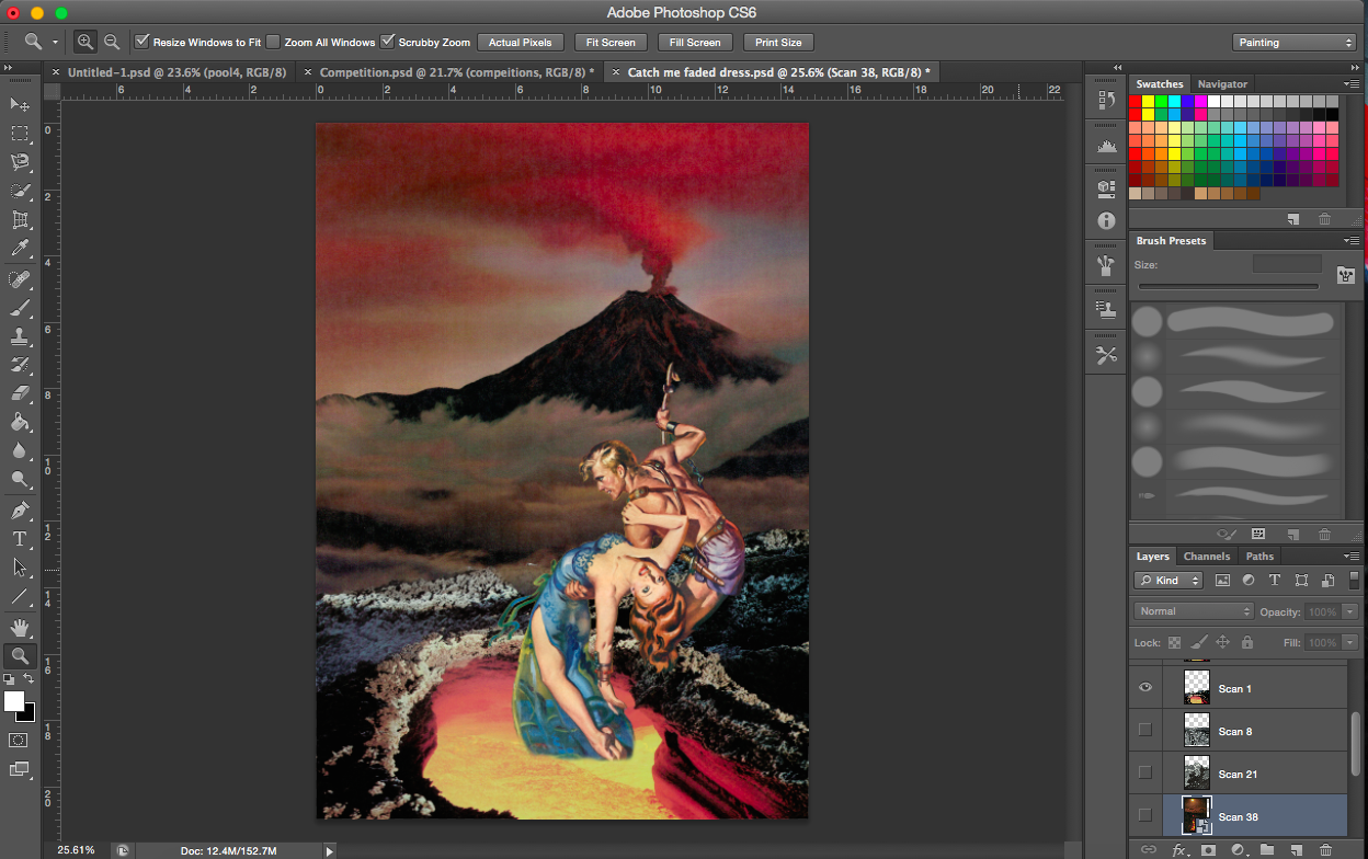
PROCESS- CATCH ME
“A butterfly from the point of view of a child is a game of catch.”
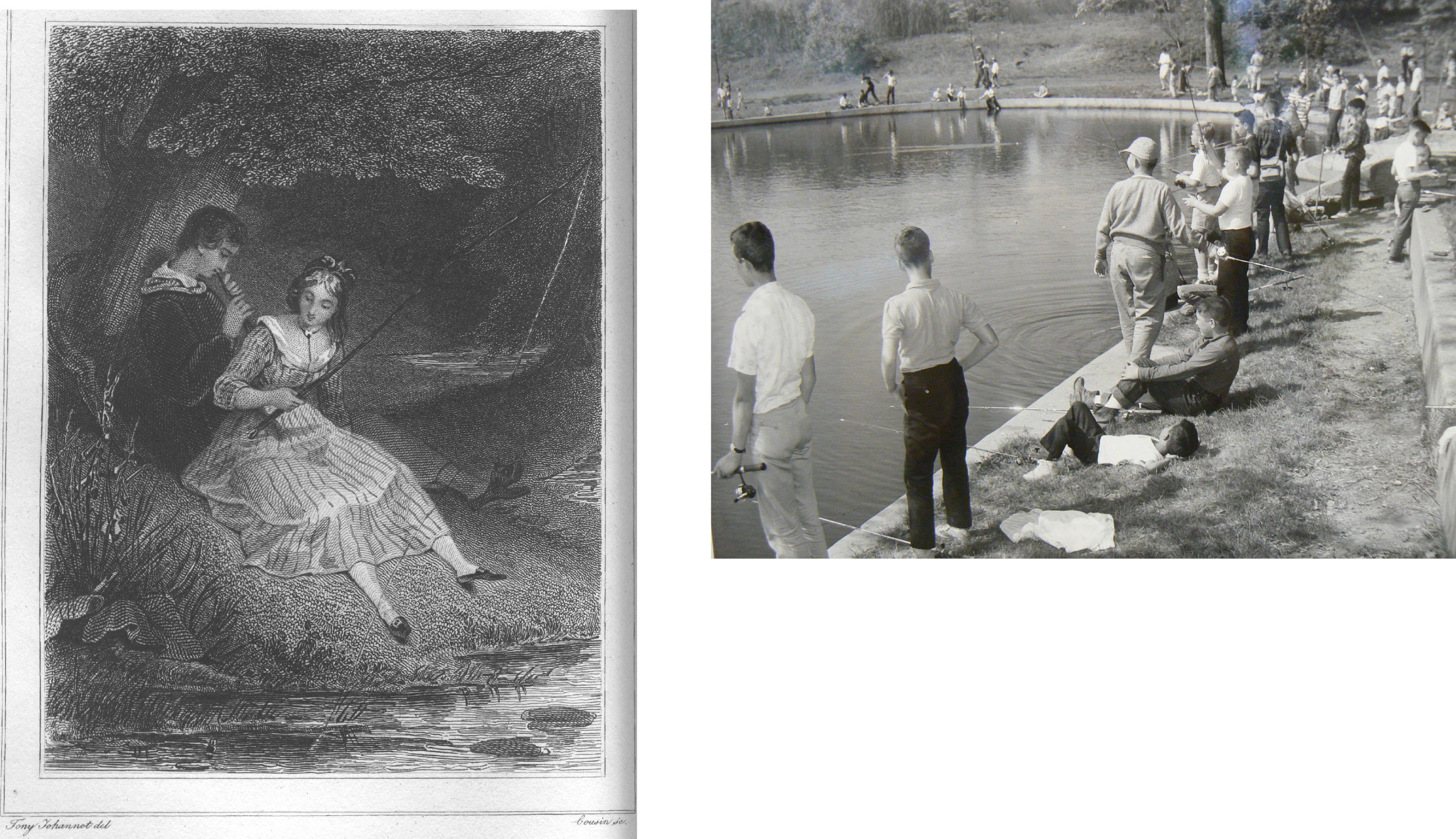
When I think of a child running around with a net trying to catch a butterfly, I think of a hero or a knight trying to save a damsel in distress. No doubt catching a butterfly is actually not saving it but I’d imagine to a child that’s exactly how they see it. Like they are trying to catch it to save it. Similarly, I will use a female (damsel in distress) to represent the butterfly. The child would be the hero. Other associations I had were more on the play of words, ‘catch of the day’, so fishing. Or sports, like cricket of baseball.
I started my search by looking for movie posters and comic covers.
Comic cover and movie posterCatch of the DaySomeone’s catching somethingSimple space backroundPossible backgrounds-scanned imagesOne image, two meanings-scanned image
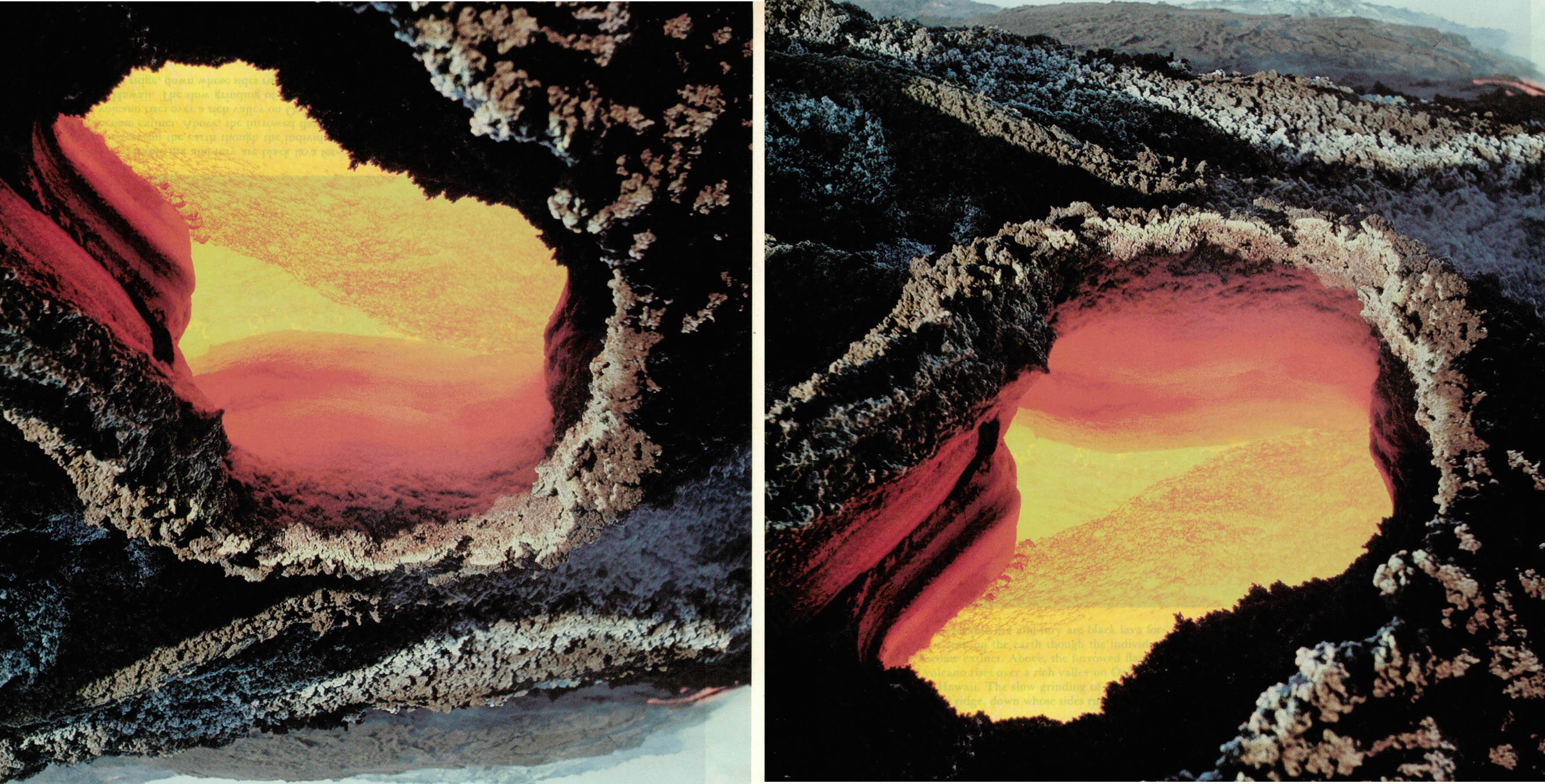
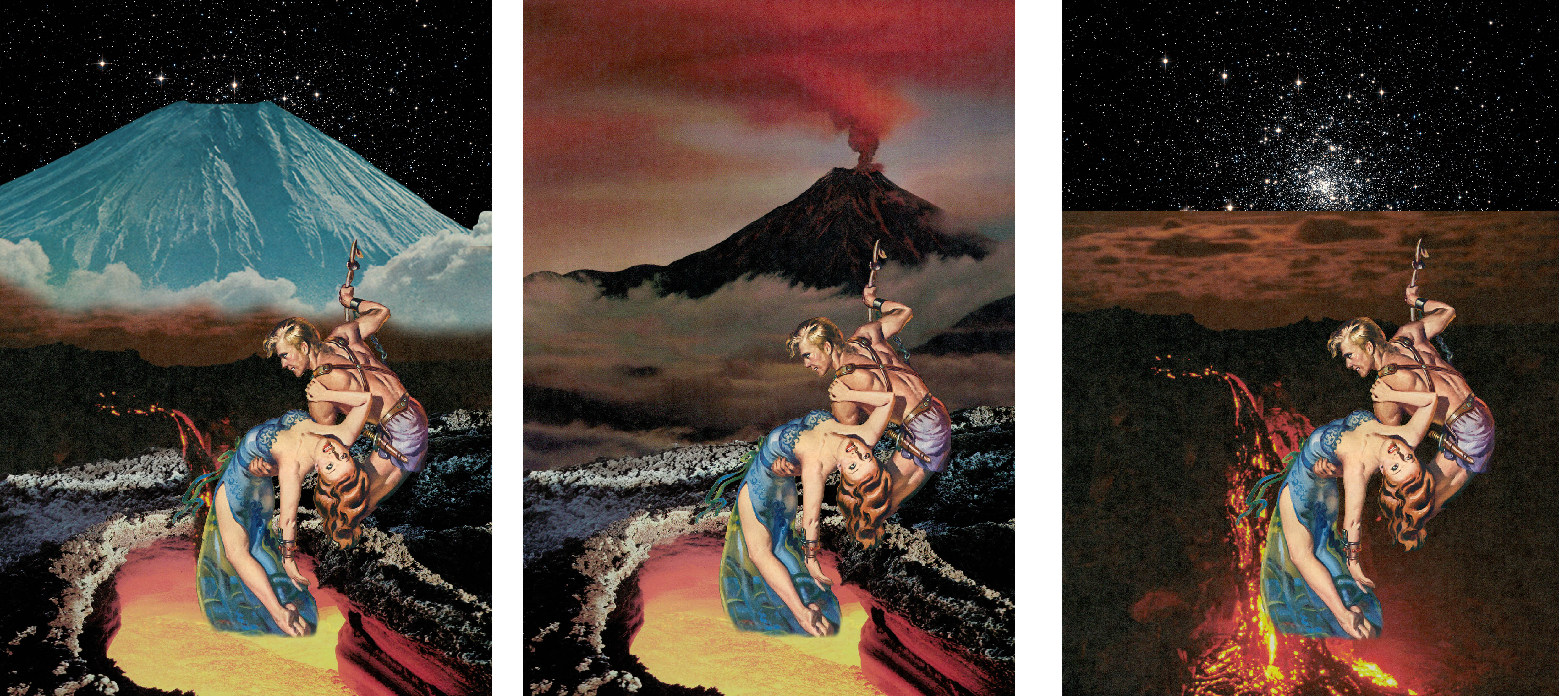
[Images Above] This is a good example of how versatile collage can be. This image of a volcano crater works well both the right way up (right image) and inverted (left). The version on the left looks like a cave opening and you’re looking out into the sunset. The one on the right looks like a pit of lava, as it should.
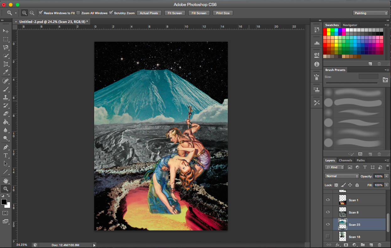
Experimenting with the background
[Image Above] I encountered a problem where because the paper, on which the volcano was printed on, was quiet thin, the words on the next page were visible. The text is visible in the bottom orange section of the lava. To solve this problem, I just cropped it out, I believed it was the best option (see image below).
[Image Above & Below] The above image didn’t look dangerous enough for me. I felt there was also insufficient interactivity between the crater layer and the figure layer, so I shifted the figure layer down (see below).
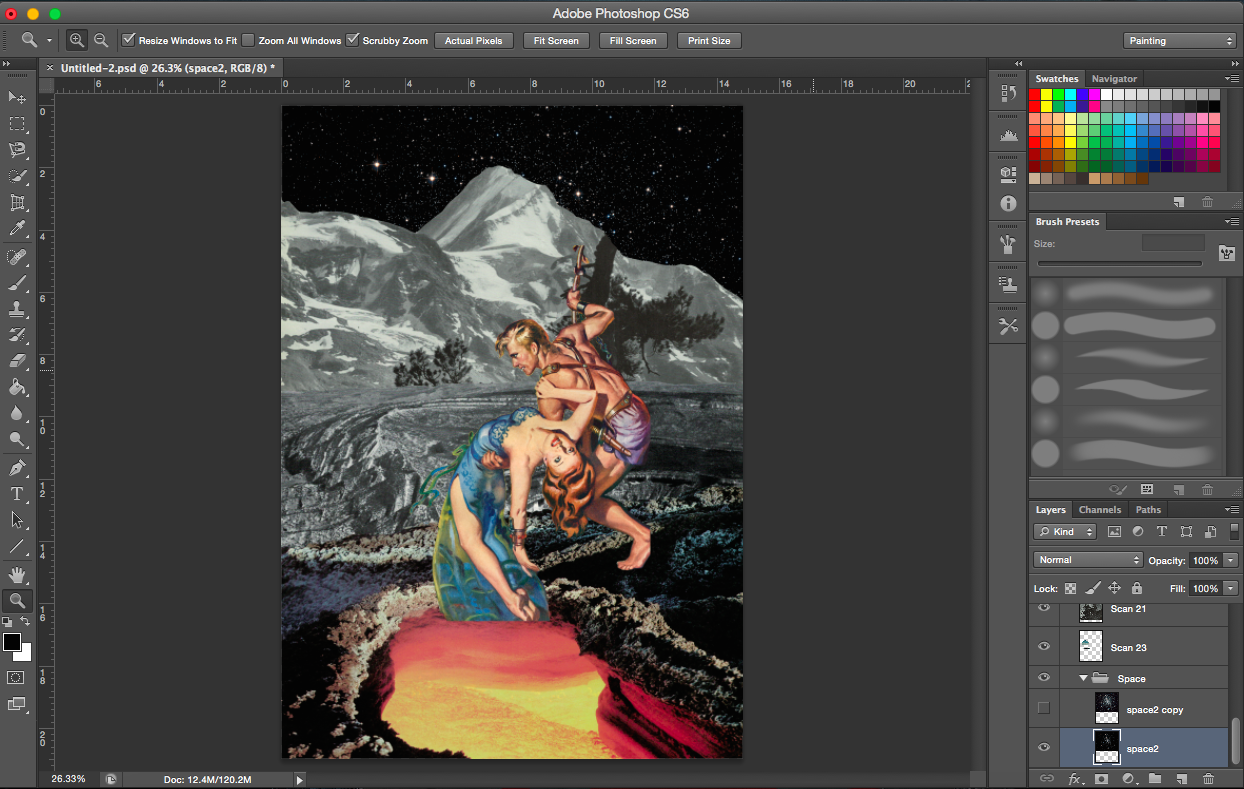
With added mountains & volcanoAdjusting volcano (no clouds)Adjusting volcano (clouds)Flipping volcano image
[Image Above] I definitely wanted a volcano of some sort in this composition to add an element of the danger to the environment, but I thought this particular background was too heavy(might have been the colours). I was not able to create a smooth transition between the crater layer and the smoke from the volcano layer.
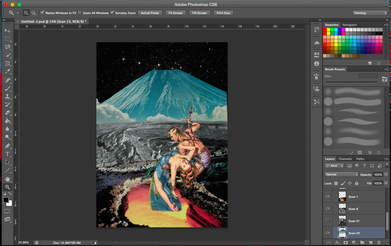
[Images Above] I was trying out alternative images of volcanoes and lava.
——————————————————
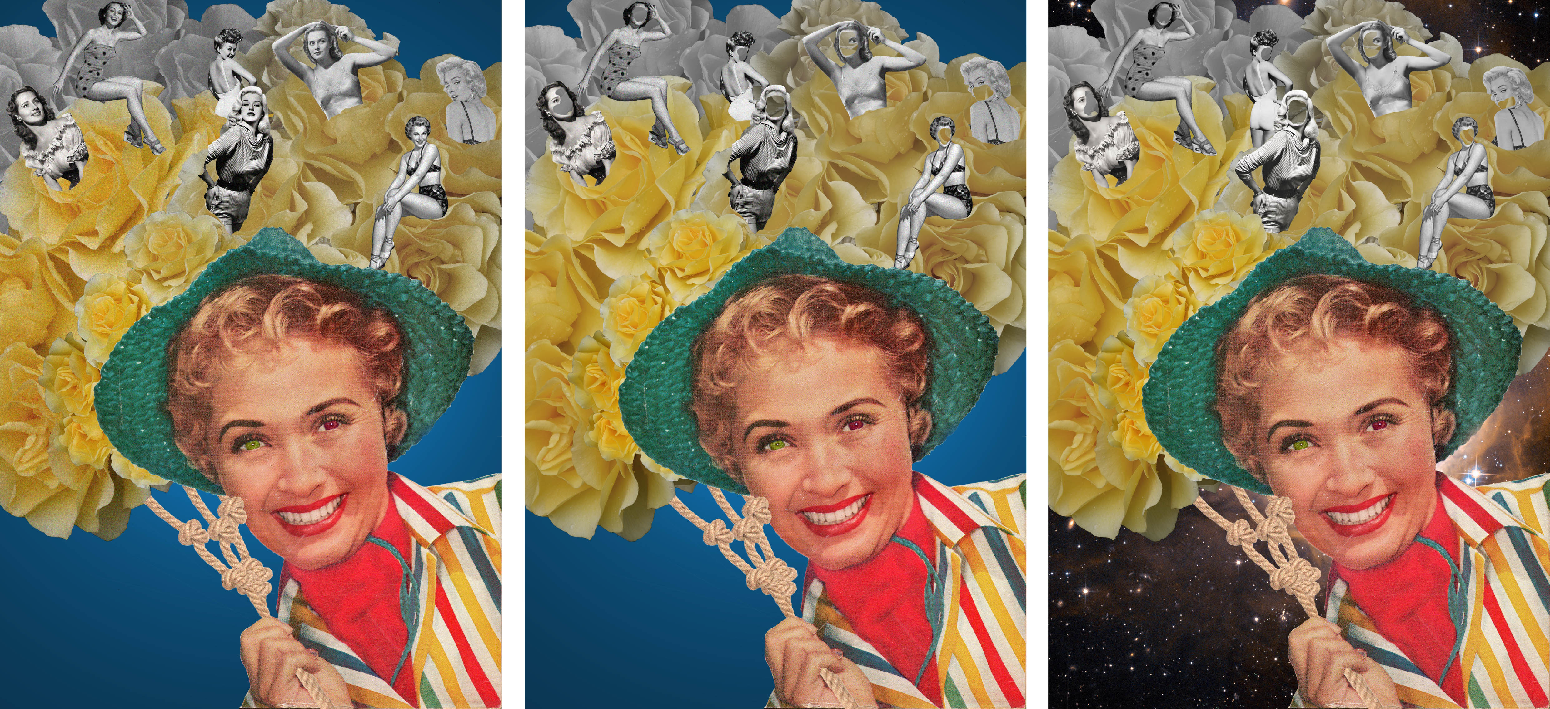
PROCESS- Envy
“A butterfly from the point of view of a moth is envy.” (Not used)
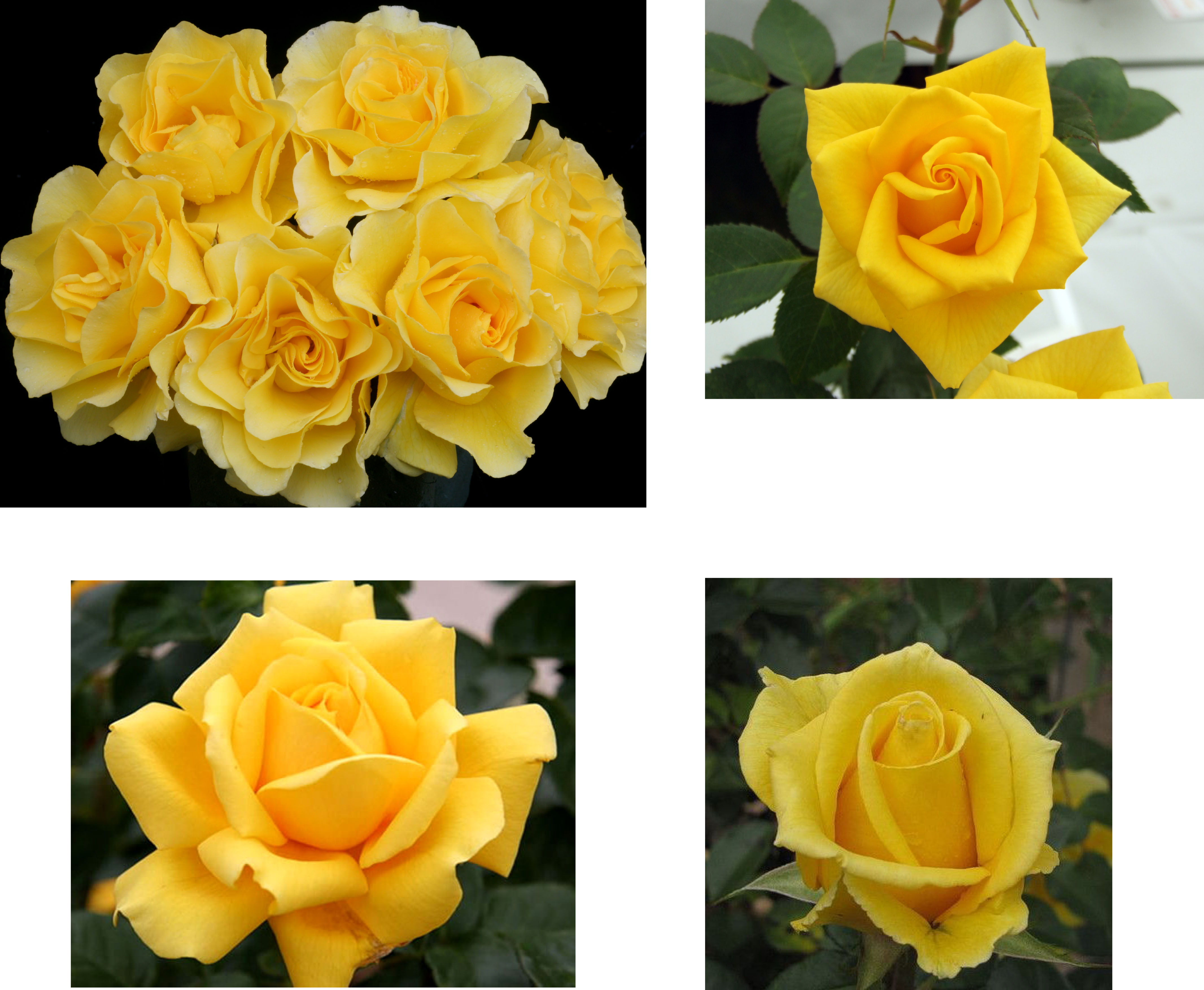
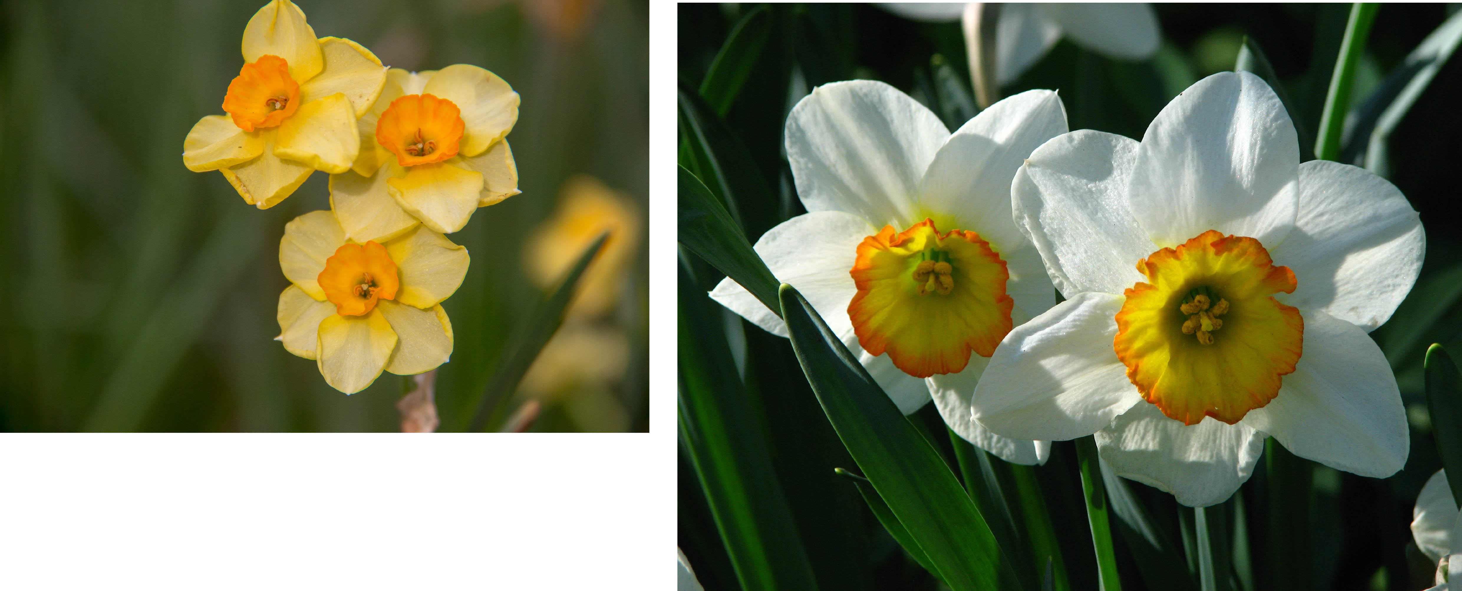
The associations I had with envy were green and after some research, yellow roses and daffodils (to represent narcissism).
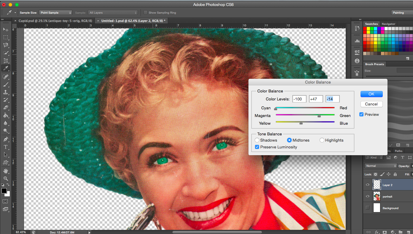
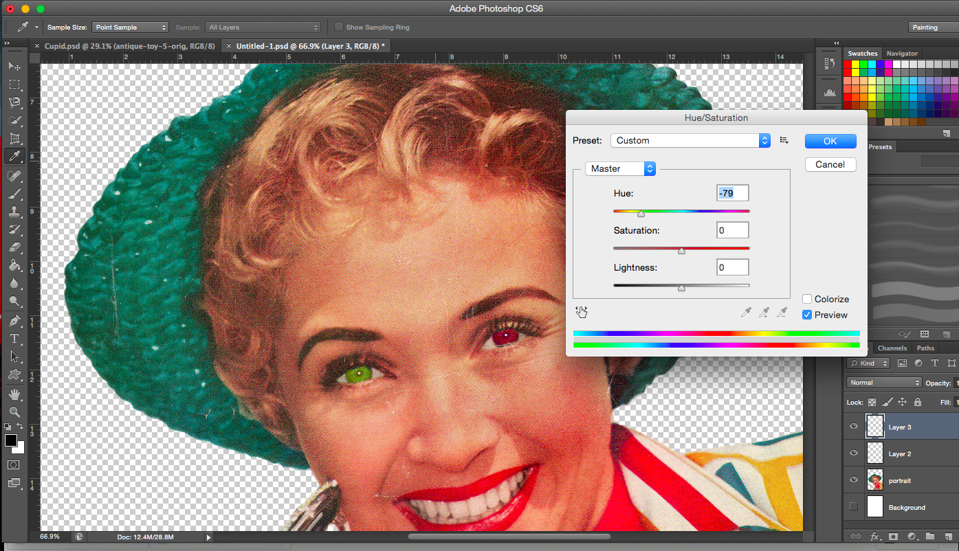
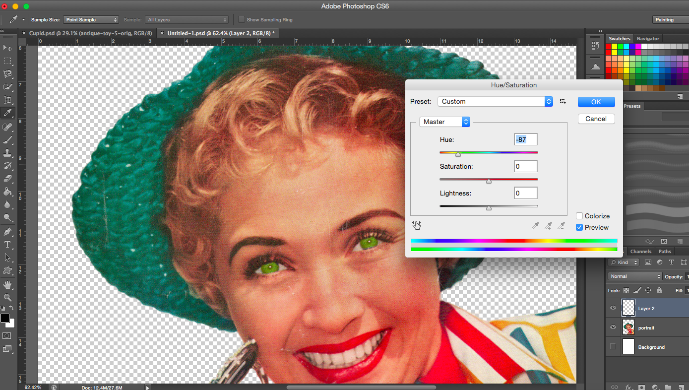
[Images Below] I started playing with the eye colour and tried to incorporate the phrase ‘green with envy’ into the image. I tried several different shades of green too.
Dark Green eyesGreen eyes
[Image Above] I made one eye green and the other red. The red represents the anger that comes from being jealous and envious of something or someone.
Lime green eyes
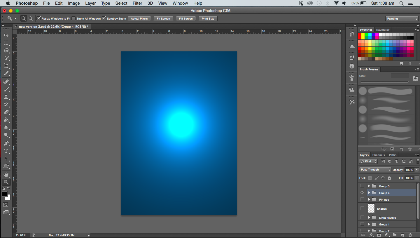
[Image Above] I created a plain, simple background for this composition. But I did feel it was a bit flat so I added a spotlight to create depth.
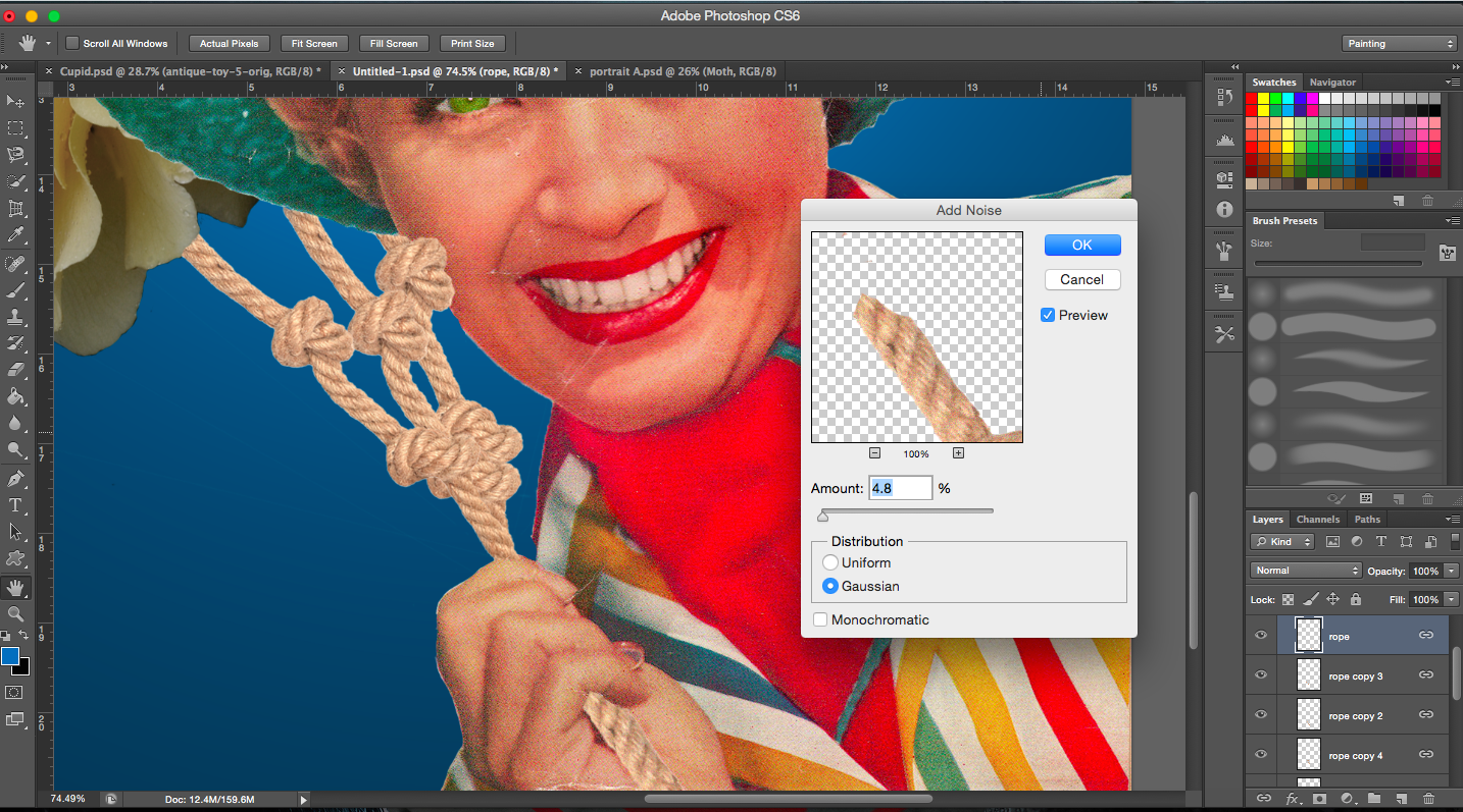
[Image Above] In the original magazine cover, the lady was holding a pair of sunglasses but I didn’t need the glasses in this case, so I had to replace it with something else. I thought of rope. The reason for this is due to the fact that she is enslaved and tied down by her own envy.
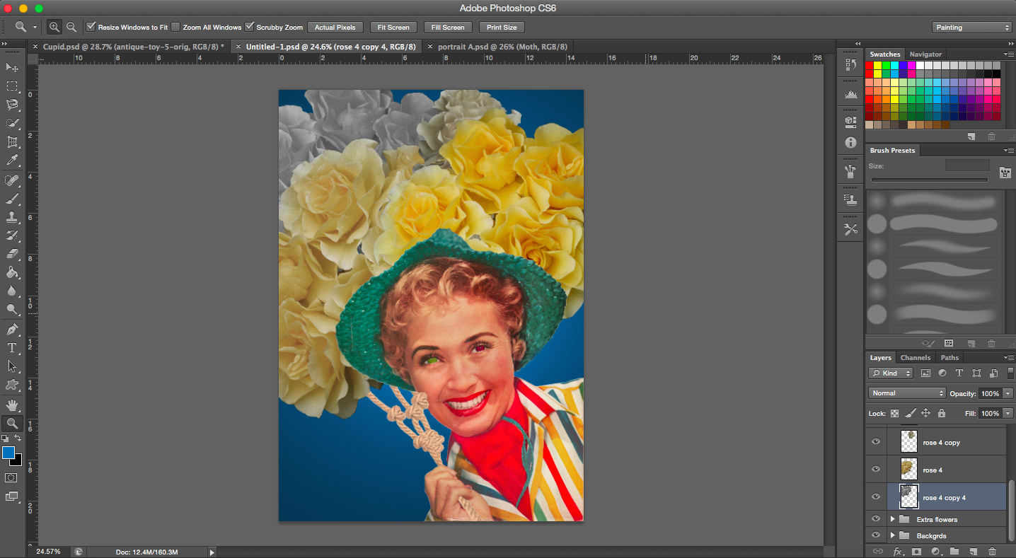
[Image Above] I reduced the saturation of the roses in the back and slowly increased saturation towards the front. I guess I wanted to show envy building up which is represented by the colour yellow.
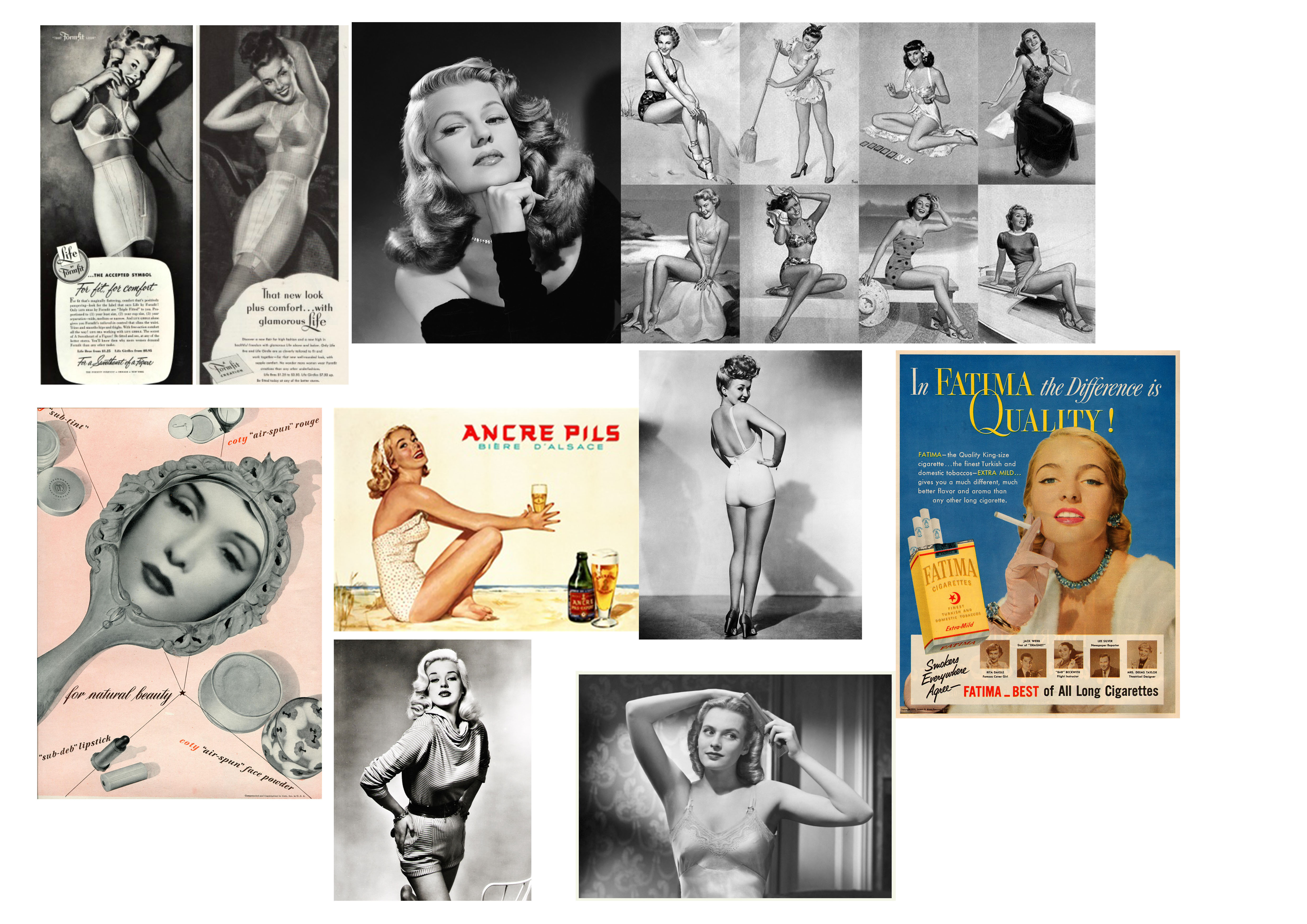
[Images Above] These are some of the images I found that could be used to show that a moth is envious of a butterfly’s looks. I focused on images from beauty advertisements and pin-ups. I added them in to show that her envy is fuelled by the images of these beauties.
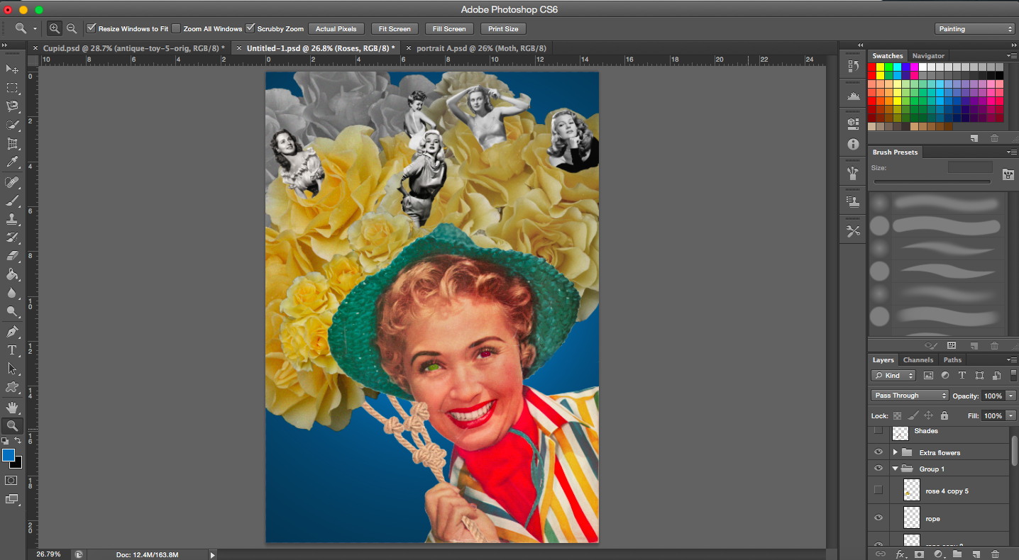
[Images Below] In the middle image, I removed certain areas of the faces of the beauties.
Editing faces and trying out different backgrounds
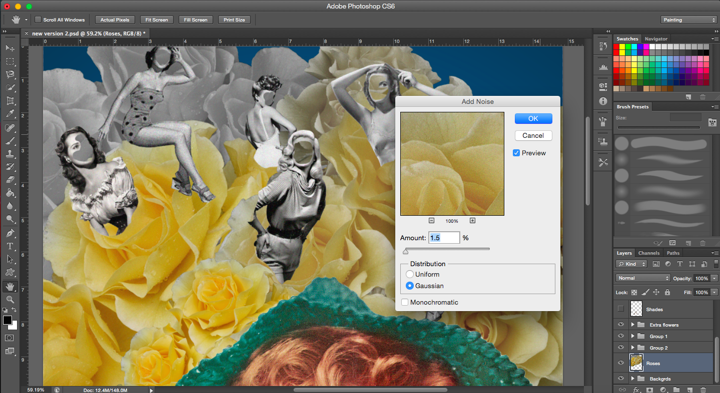
[Image Below] The image of the roses admittedly was not vintage so to give it that same look as vintage images do, I added a noise filter.
When I did finish this piece, it looked quite different from the rest because the style was slightly different and it also had a plain background. I think if I did use it, it would have stuck out. It did not get as good a reaction as my other compositions did during our group consultations so I decided to not use this composition and do something else.