Final work and thoughts
The main theme surrounding this project was science and I covered four branches of science: mathematics, chemistry, biology and physics. The route I decided to take with this project has resulted in me looking at how science is portrayed and scientific information conveyed. With that said, I decided to make all my works under the same principle of keeping it clean, simple and with no excess details, nothing too elaborate. In things like research papers, it is important to relay the information in a clear manner, the more unnecessary details are placed inside, the more confusing it gets. So, minimalistic and simple. I had to constantly remind myself ‘don’t over do it’.
Final work
Here are the images of my final work.
Mathematics
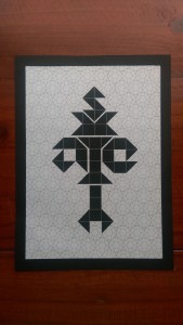
Mathematics: Logical (Geometric)
Medium: Digital
Artist reference: Hexagontica typeface (starting with a shape and working the shape to form the alphabet)
Biology
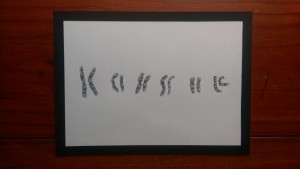
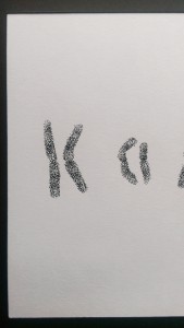
Biology: Detail-orientated (stippling)
Medium: Ink on paper
Artist reference: A range of artists
Final thoughts: I want to talk about the ‘rules’ that I mentioned in the post before and how I have applied it here to my final work. All the midpoints of chromosome letters are the same, the length within each pair is also the same as is the banding patterns. The banding patterns(horizontal stripes) were to be rather subtle. From the first letter ‘K’ to the last letter ‘e’, the overall length decreases. I talked about compromise of logical the last time and I did compromise to a small extent as seen in the letter ‘a’. The arms bend towards the other chromosome instead of away. My lack of compromise here has resulted in a double ‘s’ and ‘i’. If I had to do this again, I would have done the same thing, I would like to remain true to myself and remain as scientific as possible. In fact, the double letters pushes the viewer to look at the negative space or the space between the duplicates to find the single letter.
I didn’t really specify the artist reference for this work because I feel like I have applied bits and pieces of what I have gathered from the many artists that I came across throughout this project. Information not just about their final work but also the process by which they worked with.
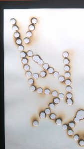
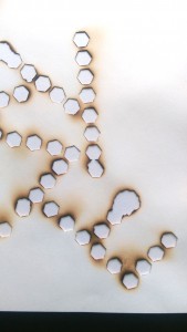
Chemistry
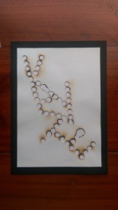
Chemistry: Risk-taking (fumage)
Medium: Fire & smoke on paper
Artist reference: Dada movement. Wolfgan Paalen
Final thoughts: After attempting the fumage again, I can say I am pretty pleased with this outcome. There are holes that went beyond the original shape of the hexagons but they are really growing on me. You can see them in the letter E in the image above, where two hexagons have merged. Again, I would link this back to success and failure and the unpredictability of risk-taking. The outcome is not something you can always predict and you just need to make the best of the situation and use it as a learning experience.
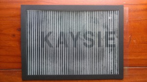
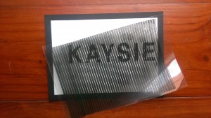
Physics
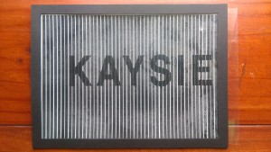
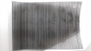
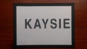
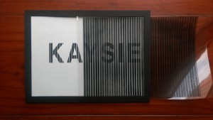
Physics/Mathematics: Inquisitive (Moiré patterns)
Medium: Digital (printed on paper and transparency)
Artist reference: Andrea Minini
Final thoughts: I mentioned in class that this didn’t really turn out as good as I would have wanted it too. However, I am growing to like it. Not to say it doesn’t work entirely but it is just not to its full effect. The ink did not hold on well to the transparency film resulting in splotchy stripes that were not opaque so the name behind was not fully hidden. The fading in and out can still be seen though and I’m not too disappointed with what I have made. It is a learning point for me and I don’t regret trying out something new like moiré patterns. It was really interesting to make and that further emphasises on the inquisitive nature. There is also an element of unpredictability seen here, the fact that the results were unknown until the final outcome. I’m pretty that I likened this to my physics results, saying that I like it but the results don’t always show my love for it. I still think it to be mostly true.
I would kept my works in black and white, with the execption of the fumage. The reason for this is that when you talk about scientific information, it is black and white, they are facts, not much grey area. That is something I really like about the sciences, it either is or it isn’t.
Moving forward
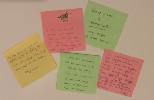
I received a lot of lovely comments from the others and it was really encouraging.
What I can take back from the critique session is that I should further explore my relationship with science and deal with the fact that I actually have a love-hate relationship with it. Also, back to the good old petri dish. I talked a lot of safety hazards and was told that now I should maybe look into hazards as a designer if i’m not wrong and merge the two together. So that’s what I’ll be looking into.
