A new perspective

The plan for now…


After consultation and sharing on Monday, I have decided to leave the petri dish idea and put it on hold for another time. I was concerned that the idea was too three-dimensional for this assignment and it was deviating from the assignment brief a little more than I would have liked too. I did consider (and was told) that I could take photographs of the petri dishes instead to make more of a two-dimensional piece of work, however I felt that it would not be as impactful to have photos instead of the actual dish itself. It would have been more visually interesting to have the item there for others to view. Perhaps I might still give this idea a go for the sake of my curiosity, I am quite curious to if I would have any success with it.

I was told to look into how science is communicated to others. My understanding of this would include what the components are in say a laboratory report (what font is used, the layout, etc.). What makes science, science? I will talk more about this later on in this post.

Besides that I now want to look into the things that are associated with science. Why not put to good use what I’ve learnt in the last few years and incorporate that into my artworks. This was the same thought process I had when I decided with the petri dish idea, however, I have realized I have been unknowingly limiting and restricting myself to just biology, more specifically the study of bacteria. It somehow slipped my mind that science also includes other branches, chemistry, physics and even mathematics. So, why not use all of them? Even though I was a biology student for the most part, I have no prejudices against any of the others, I enjoy all of them the same and you can’t study one science and ignore the rest because they interlink, that’s just the beauty of it all. No one subject stands alone.

A new plan

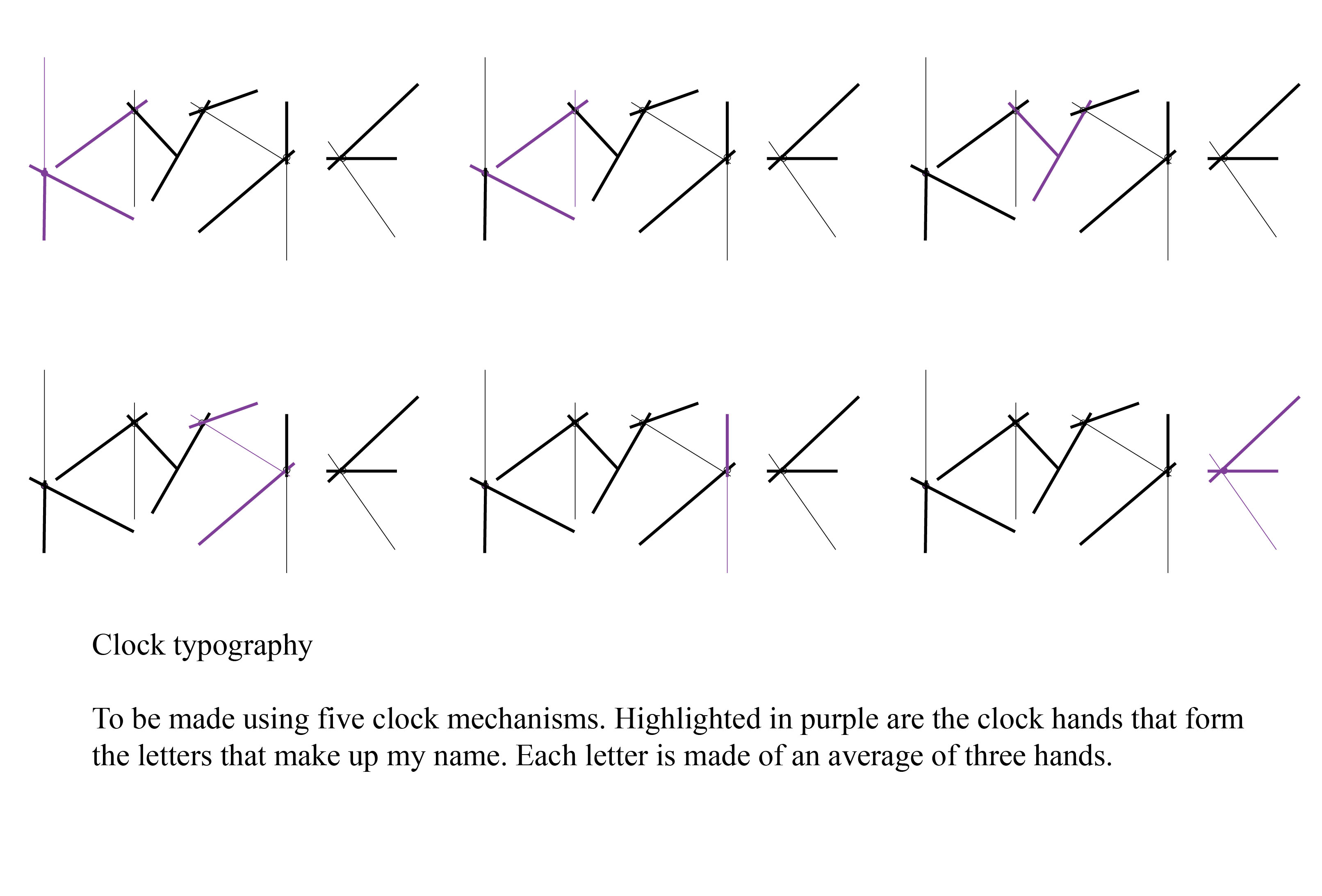
As of now I have the plan of using one of the sciences for each piece of work, so four works in total, each inspired by one of the sciences to represent an attribute. I have also made the decision to pick a new set of attributes. Each attribute will be related to the science, it will most likely be an attribute that I have found to be useful and necessary to mastering that science.

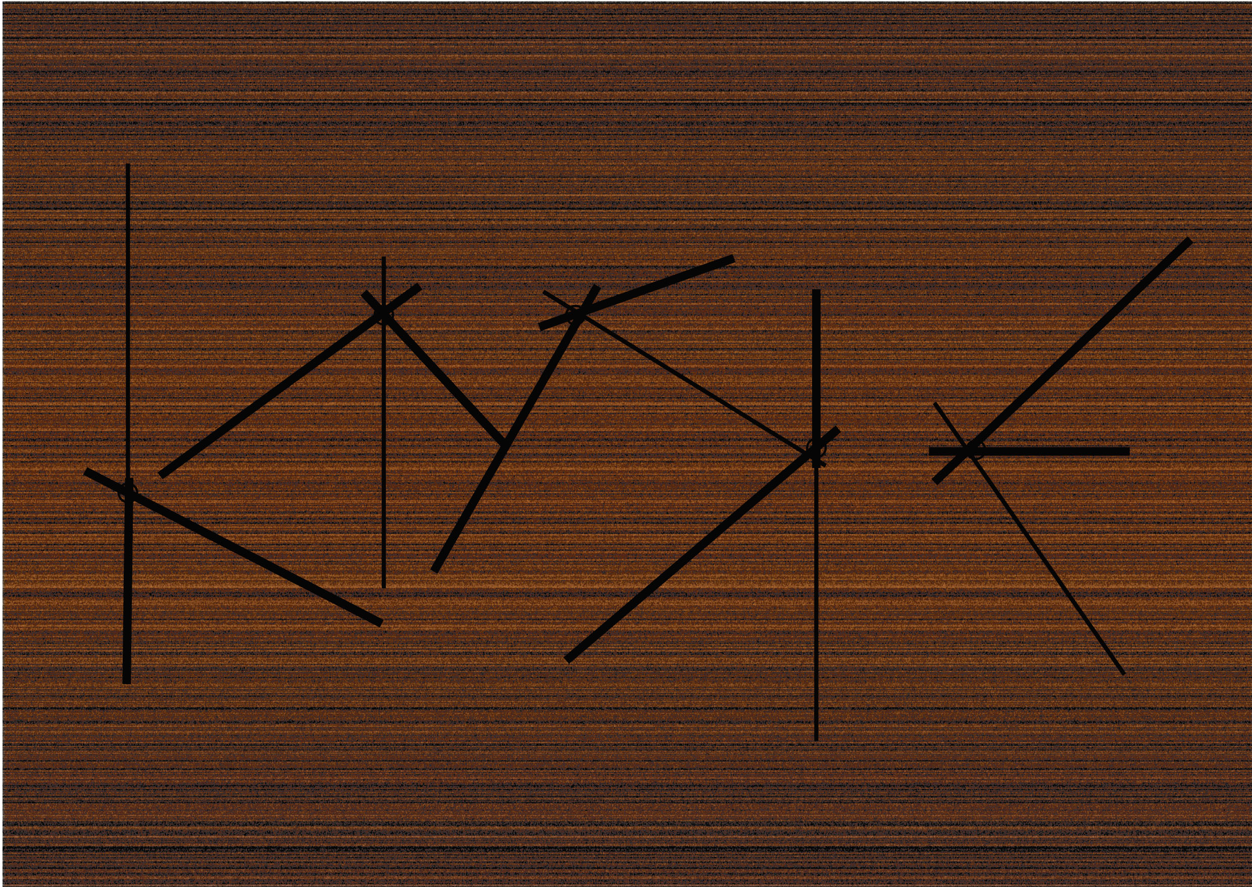
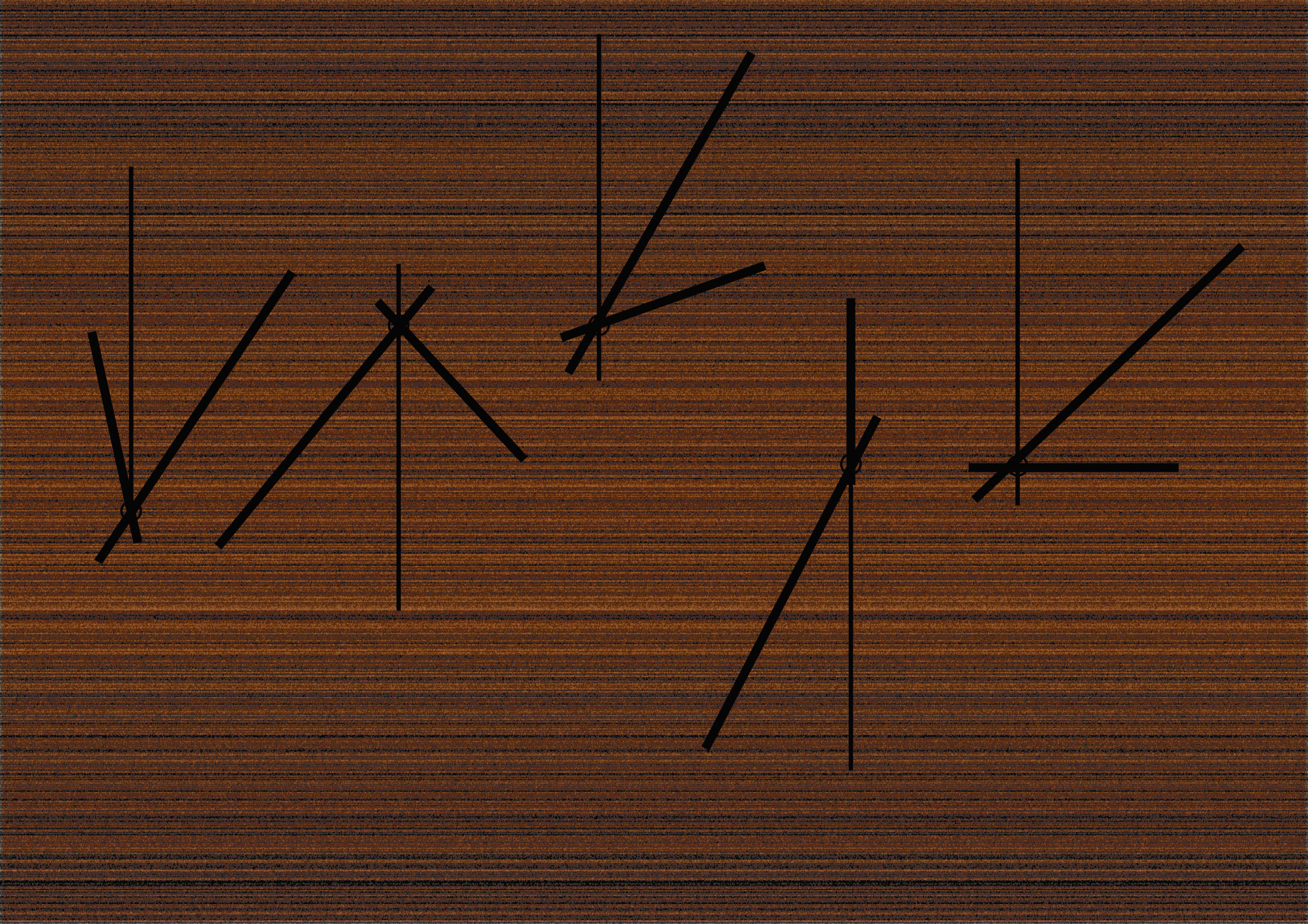
My plan for now involves researching for components that are iconic and special to that particular science. For example, if I think biology, I associate it with DNA and its structure (e.g. the double helix, base-pairing) and enzymes. If it was mathematics, I think the Fibonacci sequence, geometry, vectors, ratios. In the next half of this post, I will be exploring what makes up the sciences.

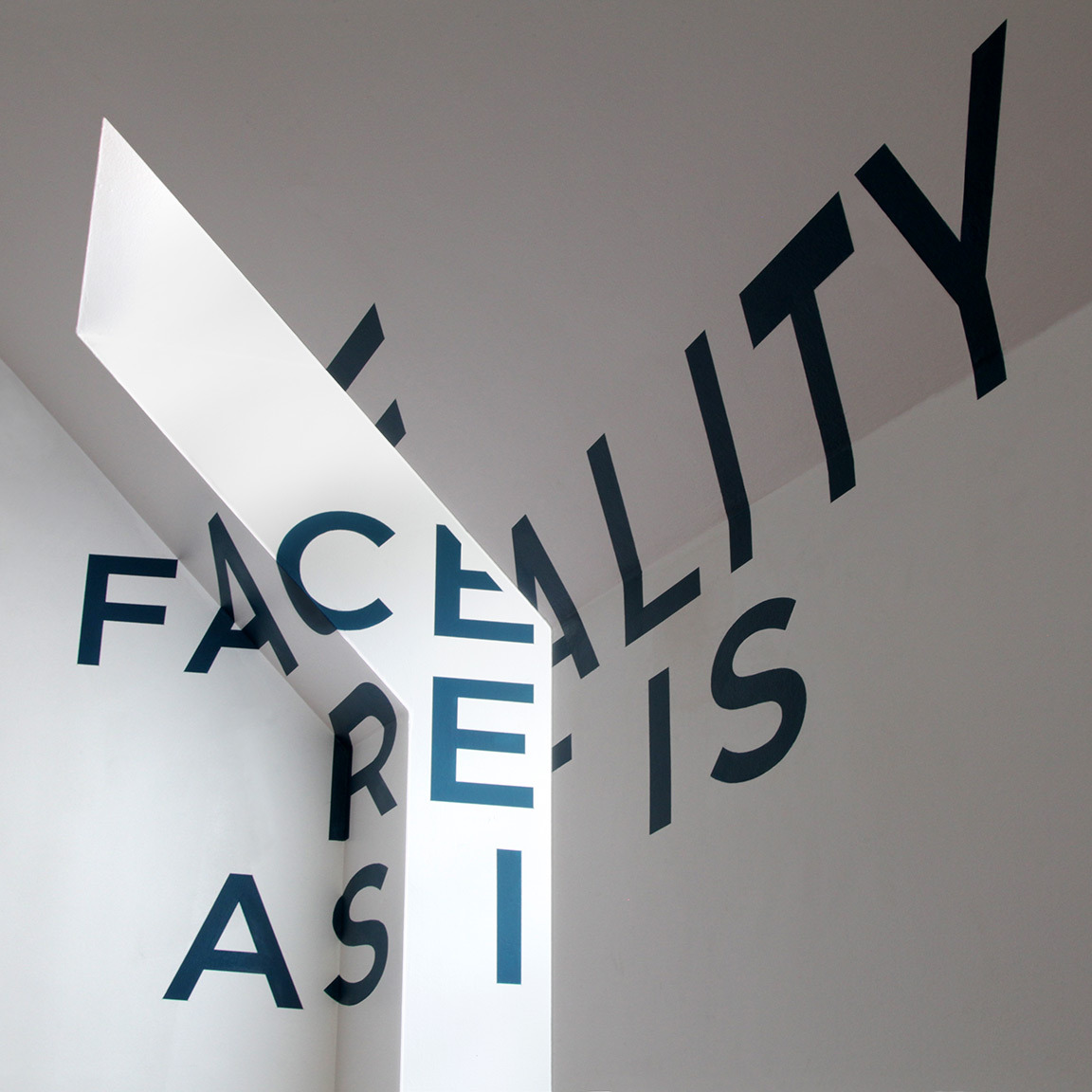
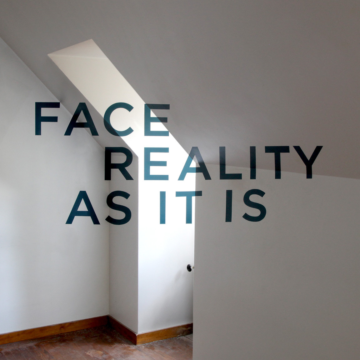
Earlier on I wrote something about finding out what makes science the way it is or what makes it different from say art. For starters, from my experience, the information that is presented is detailed but always presented in a simple way (nothing fancy) because the main objective is to relay information accurately and in a way that makes sense to other parties. Ease of reading is crucial, a fancy, elaborate font would never be used because it just makes reading difficult and distracts the reader from what is really important-the content. To aid the reader, graphs and charts are also used for illustration purposes. I might actually do some exploring with respect to graphs and charts. To sum up how science is communicated, I would say that it is simplicity in presentation.

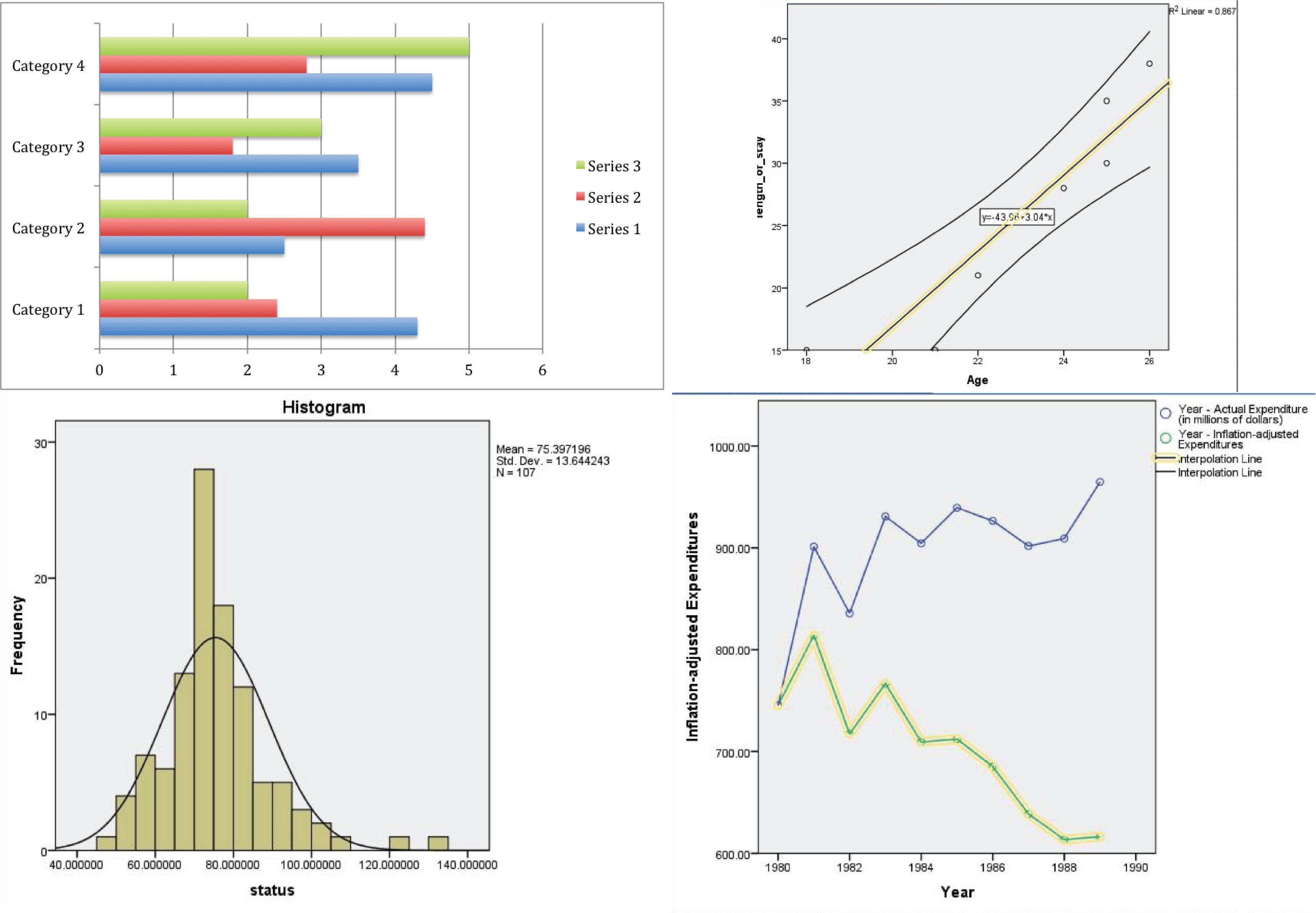
The image below includes some examples of graphs and what not, of the four graphs, three are actual graphs that were plotted as part of my lab sessions while I was still studying biology about a year ago. Graphs aren’t just limited to the common pie chart, others such as bar graphs, histograms, scatter plots and regression lines are also included. There is definitely quite a variety to choose from, each with its own unique look and presentation.

graphs
Graphs

Artist Reference

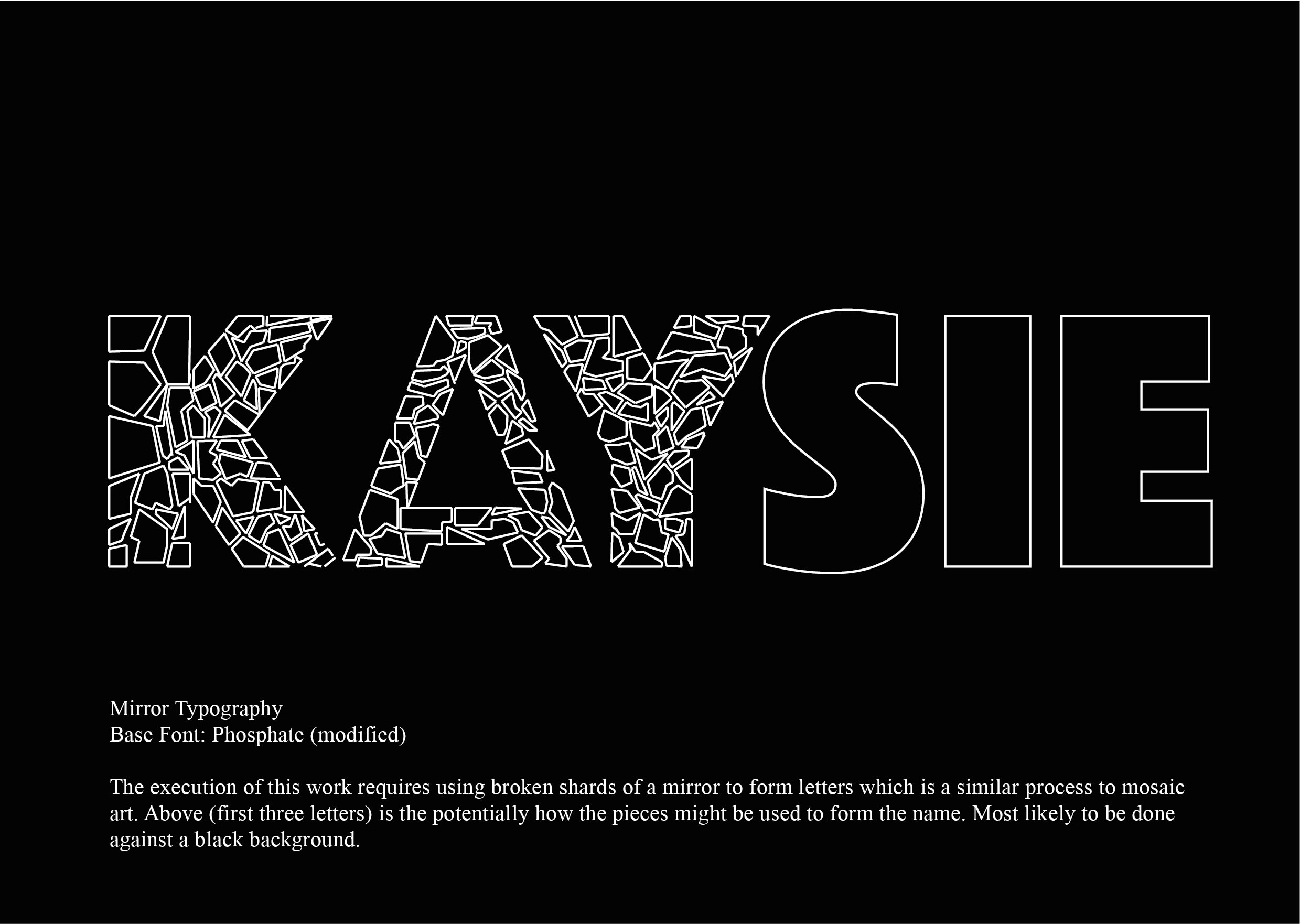
Since I have decided to take a new approach and plan for this project, I figured it would be appropriate to present a new artist reference. While looking for interesting typography examples the other day, I came across something that really made a deep impression on me. It was called Hexagonetica typeface by KAIWA (see image below).

Hexagonetica typface

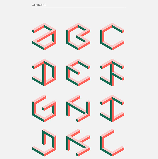
The entire post showed the breakdown and progression of how the typeface was created from one simple shape that was then given a sense of perspective through the addition of a few lines. A hexagon became a cube and then finally into a cube with squares cut out from it. A grid was obtained from the overlapping lines of the cube and the alphabet was derived from that. I really like this process, a step-by-step approach of creating the alphabet from the basic hexagon. I’d also like to talk about the use of colour. Only three colours were used for this typeface and yet a strong sense of depth is created for each letter. It is really nothing too elaborate or fancy but the outcome is more than impressive in my eyes. It brings me back to my point about simplicity, there is nothing in this typeface that I would consider excessive, everything is in the right amount and it delivers.

HEXAGONETICA

Link: https://www.behance.net/gallery/12400337/HEXAGONETICA-Typeface


MOving on

I thought it would be appropriate for me to list out some of the ideas that i have for now. I may not use some of them but I guess it will help me to see what options I have as of now. They might seem a little random but they were the first things that popped into my head.


List out attributes required for the sciences (general)

Methodical

Attention to detail

Curious

Logical

Clearheaded

Conscientious


Identifiable components

Biology: DNA, RNA, skeletons, organs, structure of vitamin, carbohydrates, fatty acids, proteins

Chemistry: transition metals, periodic table, organic chemistry (benzene, structural), atoms

Physics: Quantum physics (Schrödinger’s cat), gravity, three laws of motion, force

Mathematics: Geometry, graphs, Fibonacci (-golden ratio), binary, vectors

Typographic Portrait- Research & Ideas

Preliminary Ideas


In this post, I will be discussing some of the ideas that I had with regard to this project. They are by no means the final ideas that I will be working on but they will serve as a stepping stone to better ideas. The first few attributes that I thought of offhand were procrastinator, clumsy, narcissist and mysophobic.


The Procrastinator

For the attribute of ‘procrastinator’ I wanted to play with the idea of time and how often a procrastinator wastes time. There are twenty-four hours in day and I have to admit majority of that time is spent planning what to do for the rest of the day but never really getting to any of the work. Time passes quickly and no work is ever done.

My idea involves the use of diy clock mechanisms attached to a board. The clocks will be allowed to run as per usual and at a specific time, the hands of the clocks will the letters of my name.

Print
Name appears at specific time


Print

The starting time for each clock would be different to represent the different things that I had planned to do. This will only occur once every twenty-four hours at a specific time when hands are at right position.

Clock typography 3
Arrangement of clock mechanisms

If you ever want to know what it would be like to let time pass quickly and have nothing be accomplished, you can quite literally watch the clocks hands go through several rotations until they finally form the name. The fact that my name only appears once every day shows that procrastination lasts the whole day except for maybe a short period of time where I would actually get something done.

Print

Using just clock hands to make up letters poses a problem because there are a limited number of them and the length as well as the point where they are pivoted is fixed (assuming no modification is done to them). Hence, the letters need to be simplified down to made of not more than three strokes. See image above. Additional: transforming work into a two-dimensional piece.


The Narcissist

Print

Like every other self absorbed person, I like to look at my own reflection, more specifically in the mirror (after all it gives the clearest and sharpest reflection). If I do go ahead with this idea, I will most likely be working with broken shards of mirror to form my name. The mirror will be broken instead of complete pieces because I do not find it an entirely good attribute to have and I am trying to break and rid myself of it. With smaller pieces, less reflection can be seen (not a full image). Additional: Other reflective surfaces to emphasise the need and desire to see one’s reflection even in the most unusual places.


The Clumsy

The idiom ‘a bull in a china shop’ creates the best imagery for the attribute of clumsy. It has a tinge of humor in it which I really like. I would like to illustrate this idiom using my name. I did a brief analysis of Dan Fleming’s animal typography andI might use that very technique to create this work. I will modifiy the six letters of my name into a shape of a bull. This would most likely be done digitally. As for the ‘china shop’, the background of the work will carry it. Using watercolours to paint the designs commonly seen on Chinese ceramics and porcelain.


The Mysophobic

In my last post, I mentioned that I wanted to try using various unconventional mediums for this project. For ‘Mysophobic’, I may be working with indeed unconventional materials, petri dishes and bacteria. Working with bacteria colonies outside of a lab is admitedly a health harzard so precaution will be a prority for me. Mysophobia is he abnormal fear of dirt and germs. I have listed some details:

  • Name will be the negative space
  • Bacteria to be grown around the name itself
  • Inoculate dish. Streak petri dish with swab from somewhere(hands, handphone, etc)
  • Place paper (cut out letters) soaked in alcohol or antiseptic liquid onto dish. / use several small disks (punched holes) instead of full letters
  • Bacteria will not be able to form colony where the disks are. Thus creating a ‘free’ (almost germ free) and clean zone on the dish.
  • Petri dishes can be substituted with rectangular containers
  • Several small dishes (one for each letter) or one single dish for entire name

The beauty of working with bacteria is that one will never really know what the outcome will be. There will be different kinds of bacteria depending on the sources. The result would be petri dishes stained with various patterns and colours.

Bacteria (Petri dish) art

More examples : http://www.livescience.com/52547-microbiology-agar-art-photos.html


References: Zachary Copfer . ‘Bacteriography’

http://www.dailymail.co.uk/news/article-2204850/Portraits-famous-faces-created-petri-dishes-artist-using-bacteria.html

  • Cultivation of E.coli colonies on petri dishes to form portraits of people such as Charles Dawin.
  • Images in the positive


References: Natalie Nadeau

http://incubatorartlab.com/home/bioart-osc/natalie-nadeau-2/

  • Bacteria colonies grow and cover dollies (second hand) placed in agar plate.
  • Image in the positive


A Biological Aspect: The petri dish is the canvas

Biology plays a rather important part in my life. I studied it for many years and it is something I enjoy. I do like all the sciences but I had the most affinity with biology if I may phrase it that way. Since this assignment is supposed to be about me, it would be apt to use biology as a start point or base. Instead of using paper, all works could be done on the petri dishes. With different attributes, bacteria can be obtained from the relevant objects associated with the attributes and cultured. The entire work would be three-dimensional. To tackle this problem, photographs of the work can be taken and as advised, edited (change of colour, etc.) to create a set of works (see Andy Warhol’s Campbell’s soup cans).

Typographic Portrait- Research

Research on TYpography

What makes for effective typography? It certainly is not just the font that make for good typography. There are many other elements that go into a design such as the font, spacing and font size.[1]

With that being said, the nature of the text also makes a difference. It would not make much sense to use a typeace rendered with feathers and animal fur used for the phrase say ‘Save water’. There are definitely much better ways to illustrate water. There is relation between animals and water no doubt but it would be harder for viewers to comprehen since the relationship is not direct as it could be. This may then result in a misinterpretation from what was originally intended.

In this post, I will be exploring the typographic work of several artists and hopefully find out what makes for a good piece of typographic work, but first, an overview of the anatomy of typography. I recently found out how important it was to know the names and the parts of each letter while I was doing the previous project names “Hello”. I decided to use a minimalistic approach with regard to the letters and knowing what makes up a particular letter made the process much easier. Each letter of the alphabet has its own special features that allow one to identify them, keep those portions and strokes in and removing the rest would thus still allow one to identify the letters even if it is not drawn in completion. The image below is a guide to the anatomy of typography.

Website: https://thelogocompany.net/blog/typography-2/typography-font-deconstruction/

font-deconstruction-the-logo-company
Anatomy of Typography
Artist References

Marc Böttler

His works include a set of photographs of carefully positioned wooden blocks to form letters of the alphabet. This is not exactly an example of typography but rather one of a typeface and indeed the reason for choosing this work is of the typeface. The focus of this piece not so much on the font type or size but rather the issue of perspective. A play on perspective, letters only visible when viewed from the correct angle and position. In this case however, Böttler has already fixed the angle for the viewer through the photographs. It would be interesting to apply the same concept but with the actual objects so that the viewer has to change his/her perspective and challenge how they view things. Such a typeface, which plays on perspective, could and would make for an interesting element in typography.

Klotz Type Experiment by Marc Böttler

Marc Böttler: http://cargocollective.com/marcboettler/Klotz-Type-Experiment


While we are on the subject of perspectives, let us talk about anamorphosis. Anamorphic art relies heavily on the concept of perspectives and can be considered a form of optical illusion. This form of art comes in various forms such as mirror anamorphosis, sculptures (e.g. Jonty Hurwitz) and typography just to name a few. An example of anamorphic typography can be seen in the work of designer Thomas Quinn. The text is painted in a skewed manner onto several areas of a wall and as a result, it looks like a distorted group of letters. However, by changing the position one is standing at, one will be able to finally see the undistorted text in full. It is thus an interactive piece of work, it is only with interacting with the work that one will get to see the intended text.

It would be challenge to try out anamorphic typography but I would like to try it out regardless. I do feel it makes quite an impact. It gets people involved in the art thus hopefully bringing across the message (whatever it may be) much more easily.

Anamorphic Typography by Thomas Quinn

Thomas Quinn: http://www.tqvinn.com/post/24799863149/face-reality-as-it-is


José Ernesto Rodriguez

Handschrift by José Ernesto Rodriguez

Rodriguez created the “Handschrift” typeface where letters of the alphabet were created by photocopying and scanning his own hands to create organic letters. This typeface involves the use of the body and it almost becomes a piece of performance art. The special aspect of using body parts is that one can create forms that one probably could not create otherwise (not easily anyway) and yet there are limitations as to how much one can bend and contort to form the letters.

José Ernesto Rodriguez: https://www.behance.net/gallery/Handschrift/1271211

http://jerhandschrift.tumblr.com/


Anna Garforth

Wild at Heart by Anna Garforth

This is a 9m long installation made from masking tape stuck onto a wire fence spelling out the phrase ‘wild at heart’. Masking tape is taped in a diagonal manner from top left to bottom right. The left to right direction similar to how words are read in the English language, eye is thus also drawn and directed from left to right which in a way facilitates the reading process and urges the viewer to read the full phrase.

There seems to be a system and some sort of order with regard to the way the tape is stuck. The fence ensures the strips of tape are equally spaced apart and are parallel to each other (angle of each tape is consistent throughout).

This is one of the few typography examples that I would consider to be really interesting simply because it is a 3-dimensional piece and it requires the use of the surrounding environment. It proves that typography does not have to be limited to just the traditional pen and paper or digital means but can be so much bigger. But of course aesthetically pleasing typography really serves little purpose unless the words and design are related and complement each other. The overall design should place emphasis and support the text as best possible. In Garforth’s case, the environment complements the phrase ‘wild at heart’. The text is placed outdoors, amongst (‘at the heart’ of) the flora and fauna thus giving meaning to the word ‘wild’.

Anna Garforth: http://www.annagarforth.co.uk/about.html


Other references

Another example of text and design going hand-in hand would be one where the words are arranged and manipulated to form the shape of whatever it represents. For example in animal typography by Dan Fleming, the word ‘rabbit’ is shaped into the form of a rabbit. They are direct and simple.

Animal Typography by Dan Fleming

Dan Fleming: https://www.behance.net/gallery/6769383/Word-Animals

Food typography has also recently become quite popular. Using food, ingredients to spell out words, for example, using flour to spell out the word flour. The examples that I have seen online are indeed beautiful and straightforward. They also prove that there are few boundaries when it comes to use of medium. There is no reason why anyone should limit themselves to just pen and paper. But of course food typography is also done using digital means.

See Fast Food typography by Thomas Cheng: http://thomascheng.com/academic-work


I have taken a particular interest in typography made using interesting and non-conventional items. I might not use the same items to create my typography but they give me ample reason to break boundaries and not limit myself in terms of medium. An example would be bubblewrap typography by Lo Siento. Coloured water is injected using a syringe into each bubble. One can create their own typeface but one can also choose to find these typefaces in everyday life. To put it simply, finding ‘hidden’ letters in the environment. For example, finding alphabets in the wings of butterflies, ‘Butterfly Alphabet’ by Kjell Bloch Sandved.

Lo Siento: http://www.losiento.net/entry/wired-magazine-lettering

http://www.losiento.net/


[1] “typography.” The Concise Oxford Dictionary of Art TermsOxford Art Online. Oxford University Press, accessed January 20, 2016,http://www.oxfordartonline.com.ezlibproxy1.ntu.edu.sg/subscriber/article/opr/t4/e1720.