Before I started creating my poster I looked at images of vintage posters as well as of tarot cards for inspiration on layout and colour. I chose to use more than just tarot cards as inspiration. The posters of moons caught my attention as with the virus structure, it too is round.
References from the internetTaking inspiration from vintage posters(left)Playing with colour
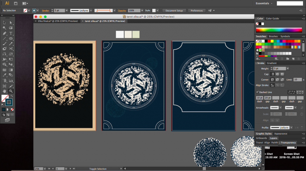
The screenshots below were taken whilst creating the poster. I started with a layout that was symmetrical but slowly branched out to create a poster that was asymmetrical but still balanced.
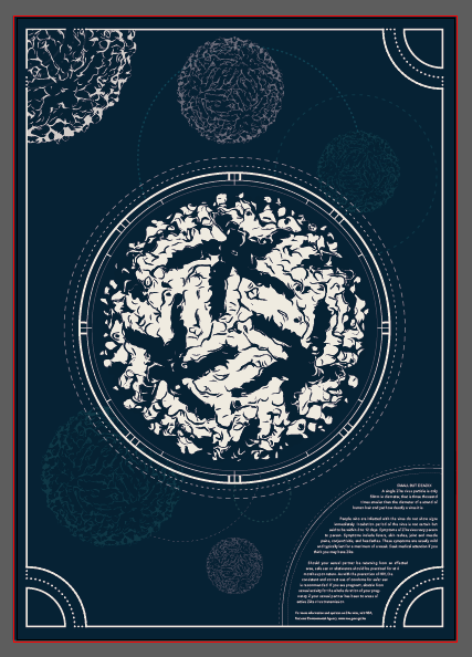
I was quite interested in the vintage posters and maps of constellations and the moon. There was a particular poster where there were coordinates around the circumference of the central image and I really liked it (image just below). I tired to incorporate that into my poster as well as I felt it was similar to mapping out the radius of the virus structure, giving it a vintage yet scientific feel.
I decided to go ahead with a border for the poster as with a tarot card (image below). The task now was to make sure the border had a purpose and was not just a simple line border.
Vintage tarot card
I tried to repeat and resonate the circular form throughout the poster using lines of various opacities, weights and colours. The different opacities would hopefully create depth and create hierarchy by not stealing the attention away from the main virus structure itself.
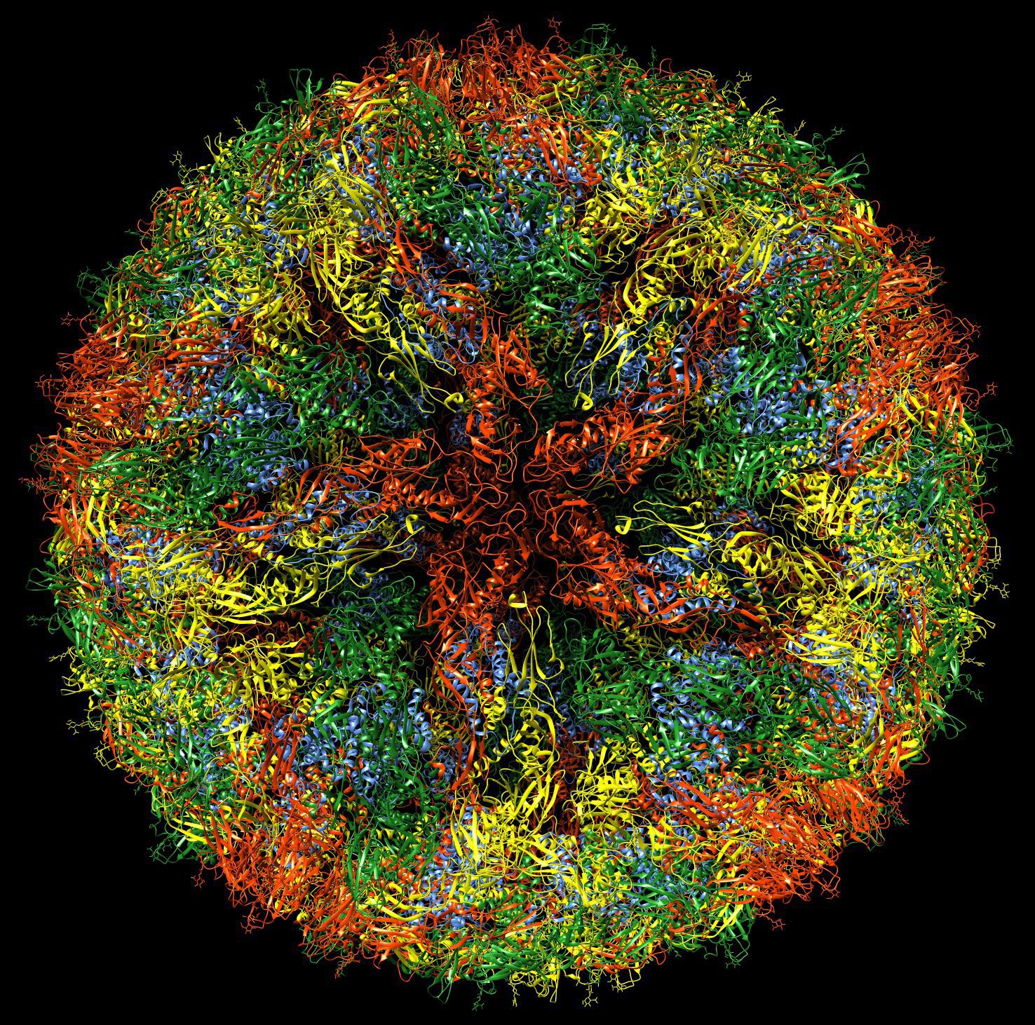
I decided to start this project by selecting which prevention or measurement I wanted to portray in my poster and I settled on the ‘safe sex’ portion as I found it to be an interesting of Zika, as opposed to Dengue. It was worth mentioning and creating awareness about. Being a science student, I am usually quite curious about what a virus looks like since it was part of my syllabus to study the structures of viruses. A quite Google left with me stunned with the images of a rather lovely virus structure. I was definite that I was to use the structure of Zika into my poster and base my design on it.
Zika virus structureZika virus structure
Idea 1 (rejected)
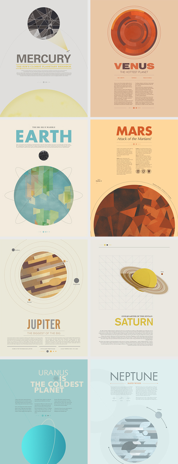
My initial idea was based off astronomy posters by Stephen Di Donato, where each poster depicted a different planet. I liked the clean simple layout of the posters and the ample breathing space within each design.
Beyond Earth Posters by Stephen Di Donato
Other inspirations (referenced for both ideas 1 & 2) that make sure of circular forms:
International Year of Astronomy 2010 by Simon C. PageInternational Year of Astronomy by Simon C. Page
I had planned to place the Zika virus on the poster similar to the planet and place a graphic of a condom somewhere to link back to the preventional measure (see below). My design was too conservative (especially the text in columns) and I myself found it hard to come up with variations of the idea. People raised an issue with the slogan whereby the word ‘size’ would lead to an association being made with microcephaly. This concept was thus not good enough.
‘Size does not matter’
Other compositions
Work in progressWork in progress
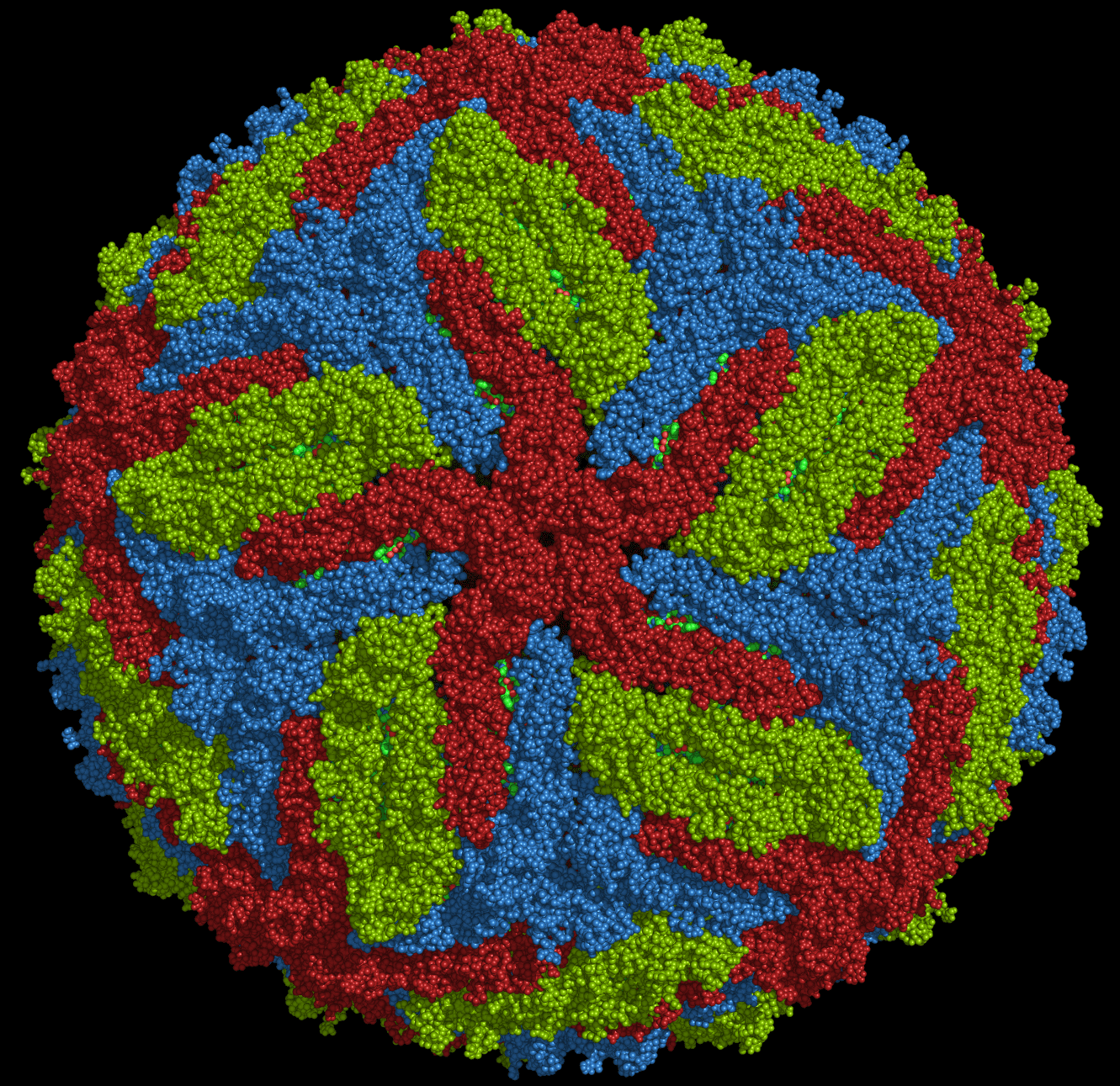
After the group sharing, I was now sure that the Zika virus structure was the right way to go. It was indeed a different way to show Zika as compared to showing an image of a mosquito. It was suggested I play with the circular form of the virus.
Particular emphasis was placed on the composition below where the circular shape of the virus was rather prominent. I was told to play on the circular shapes.
Idea 2
I referred back to the poster which I has used for my analysis for some inspiration and realized the use of a tarot card was ingenious, it was something novel, that’s for sure. I decided to go use vintage tarot cards as inspiration and also stumbled upon vintage astronomy posters which I also used for colour reference.
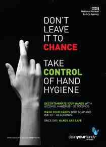
The mention of tarot cards gives rise to the topic of luck, fate and chance. Hence, I settled on the slogan ‘Don’t Leave it to Chance’, meaning one should not take for granted that they would never be infected by Zika and instead take charge to prevent its spread whatever way they can. I placed a small portion of text in the poster, it was initially over 200 words but I was told by many people whom I showed my work-in-progress to, that that was too much. I had to thus cut the number of words to a mere 50 words. I guess posters are one of those things way the easier it is to read and digest the better, to send across a message as quickly as possible since not everything has the time to stand there and read every word.
Coming up with slogans was a challenge, to have something that was catchy and still short enough to fit into the 6 words.
Slogans should not be a phrase that is too straightforward, it should be succinct, catchy and leave the reader curious and earn to continue reading. Something too obvious would probably result in the reader reading the slogan, understanding it and moving on, leaving the rest of the poster unread. A slogan should intrigue a reader.
Below are the three slogans that I settled on after coming up with quite a few.
beat it before it bites
When size doesn’t matter
Zika don’t host a free lunch (preventive measure: insect repellant, prevention from being bitten)
Style of the poster(potential)
Movie poster (vintage, pop culture, famous movie posters)
Some examples:
Minimalistic (use of shapes etc.)
Some examples:
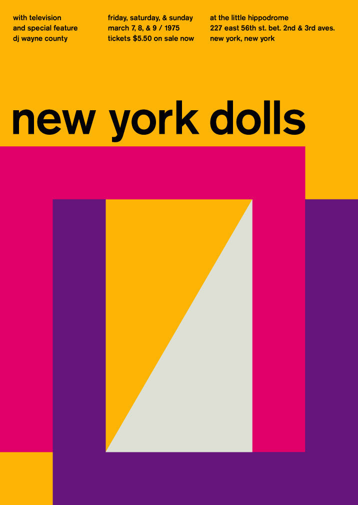
new york dolls at the little hippodrome, 1975, Swissted
[Above] The Swissted project by Mike Joyce has many minimalistic posters made of geometric shapes, colour and type.
Poster designs by Ross GunterPoster by Ross Gunter
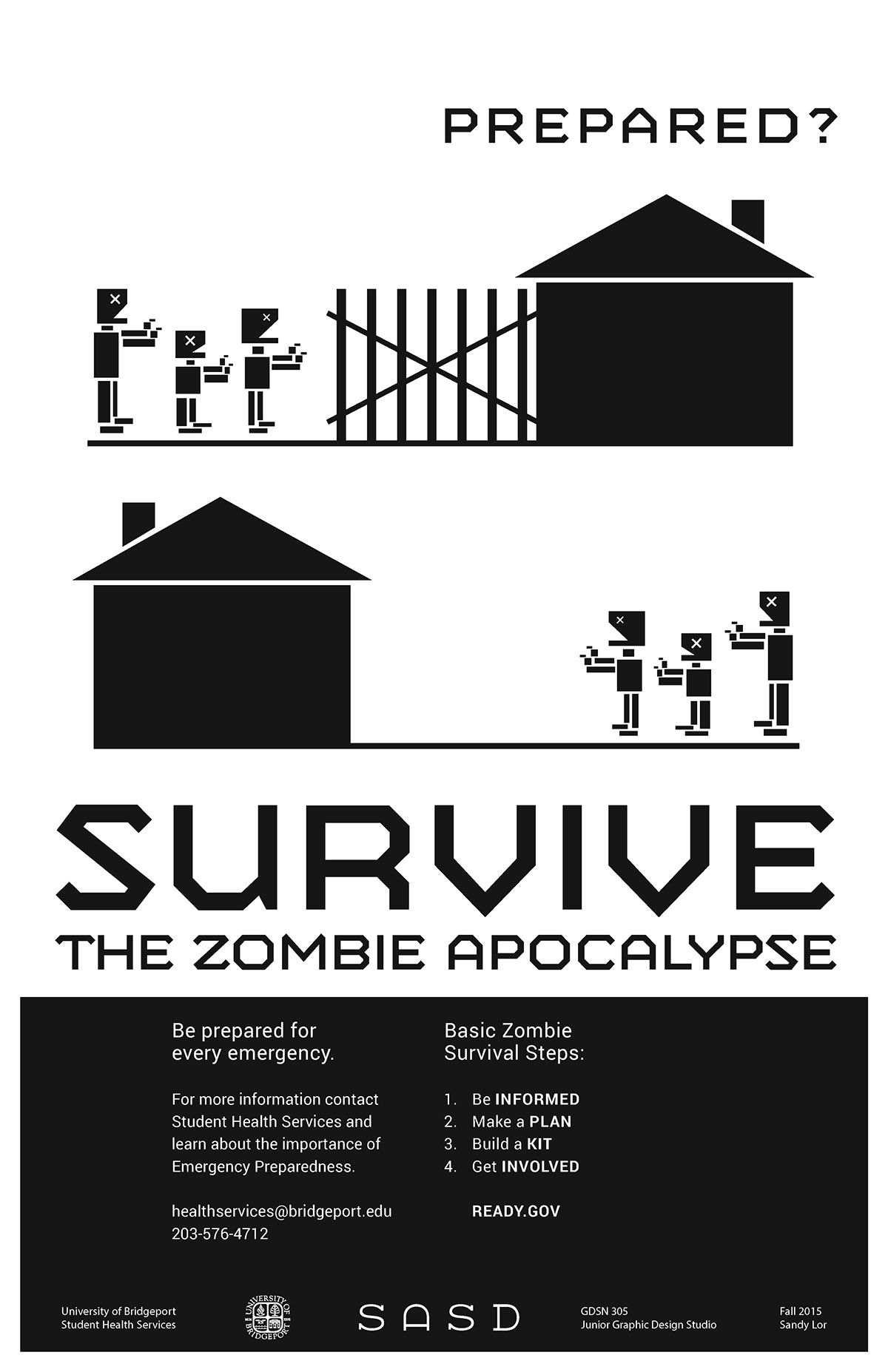
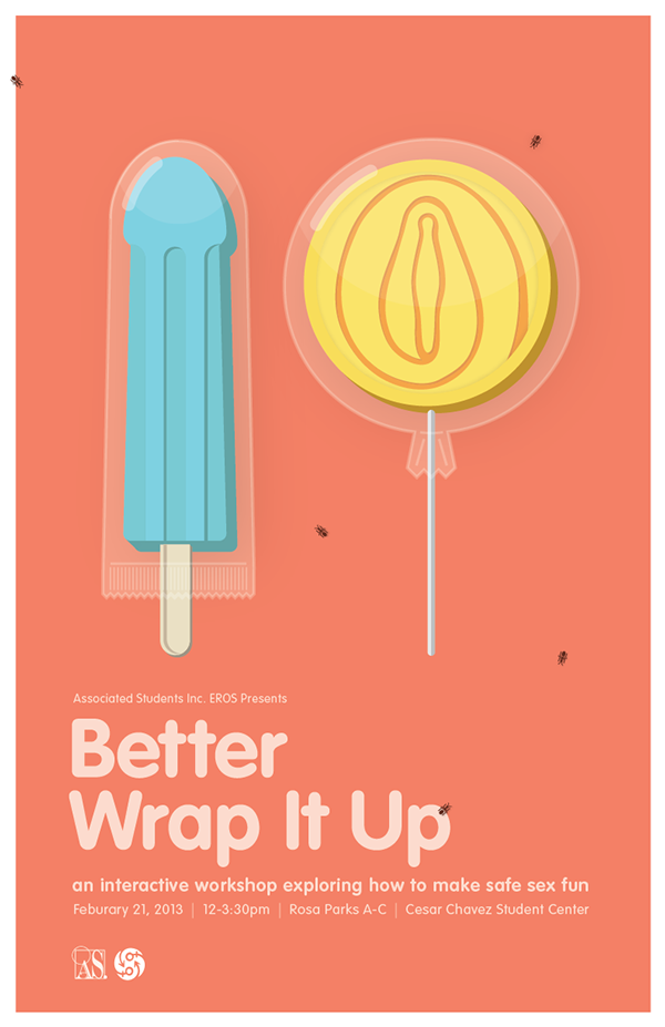
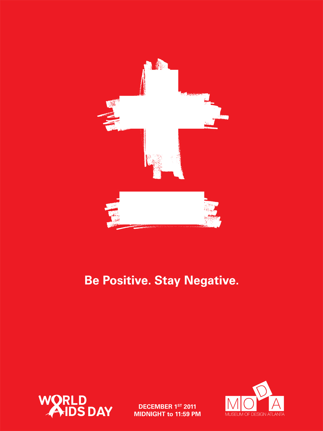
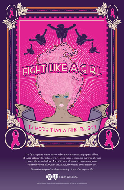
Poster by Kristin Gissendanner (noteworthy slogan)Poster by Kristin Gissendanner (noteworthy slogan)Poster by Kristin Gissendanner (noteworthy slogan)Poster by Sandy LorPoster by Sandy LorPoster by Sandy LorPoster by Dan ZhouPoster by Christine Rivera (noteworthy slogan)
Analysis
Poster by Kristin Gissendanner. https://www.behance.net/krisgiss
This poster really sets itself apart from others. It in itself does not look like a conventional poster but resembles a tarot card with a psychedelic feel to it.
Visual interest was created by the use of colours, shades of pink, purple gradient, orange and hints of white, and detailed ornamental borders. There are a myriad of textures and different types of lines and line variation. The poster is filled with many elements, the most prominent figure would be the woman in the middle where attention is then drawn to the center of the page. Radial lines radiating from the middle then draws the eye up to the superhero figures on the top. The use of only women and superheroes does evoke a sense of empowerment which is apt since this poster is targeted towards women.
Information here is easy to locate with a symmetrical poster. The amount of text increases gradually from top to bottom with the bulk of information at the bottom 1/3. Main information has high readability, white on purple without any additional elements surrounding it. Slogans are of bigger point sizes and seen first, main information in smaller point sizes, followed by the hospital name.