Project 2- Development I

Starting out

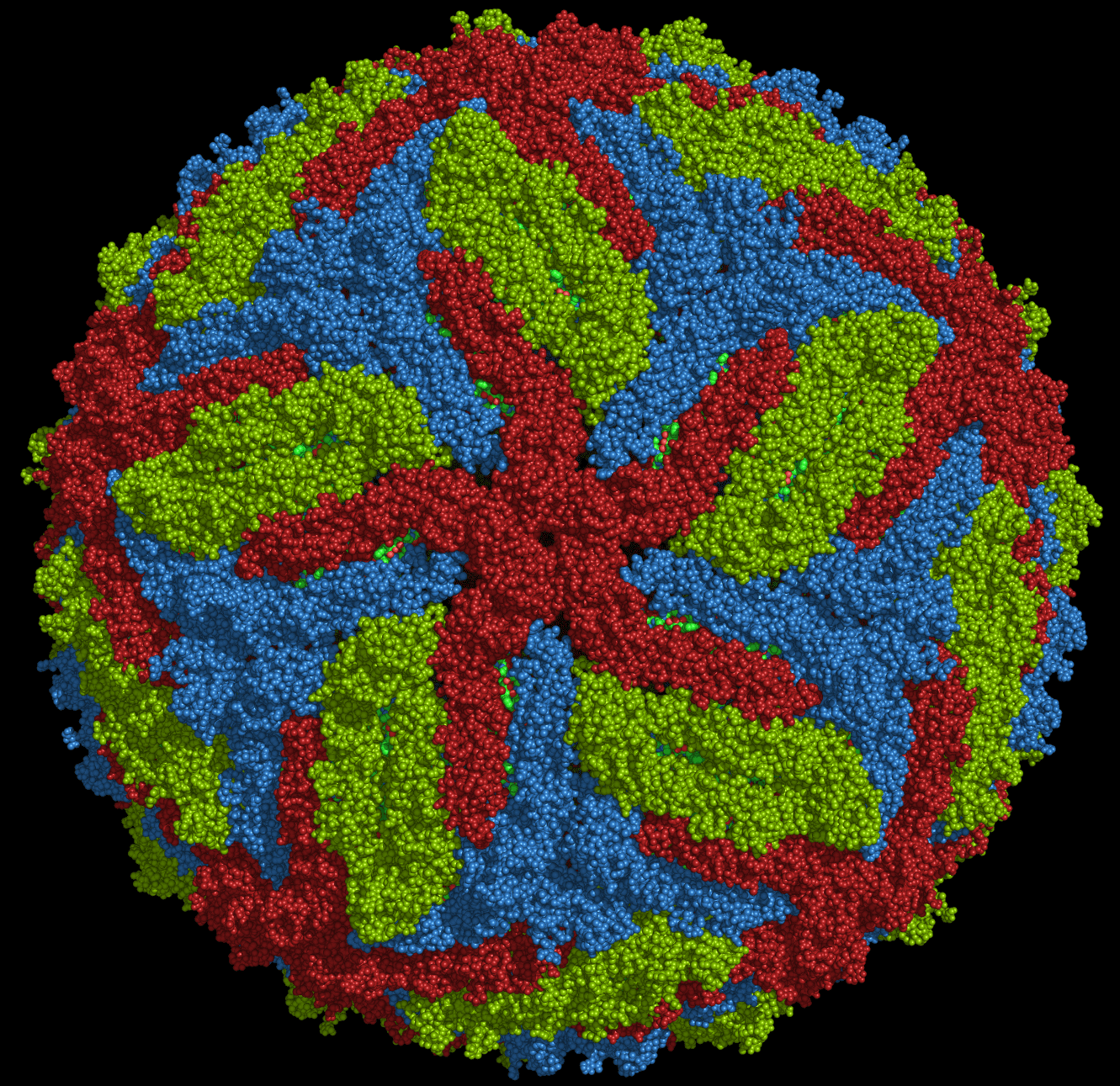
I decided to start this project by selecting which prevention or measurement I wanted to portray in my poster and I settled on the ‘safe sex’ portion as I found it to be an interesting of Zika, as opposed to Dengue. It was worth mentioning and creating awareness about. Being a science student, I am usually quite curious about what a virus looks like since it was part of my syllabus to study the structures of viruses. A quite Google left with me stunned with the images of a rather lovely virus structure. I was definite that I was to use the structure of Zika into my poster and base my design on it.

Zika virus structure

screen-shot-2016-11-07-at-3-11-58-pm

Idea 1 (rejected)

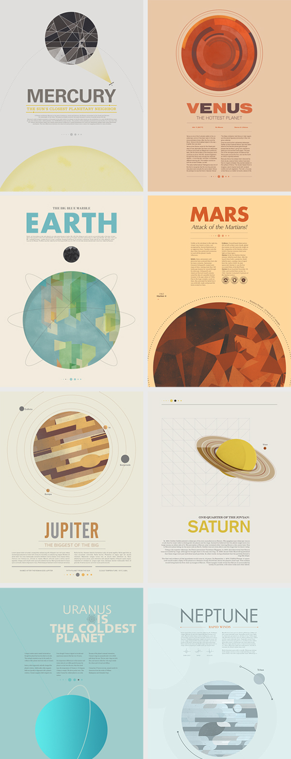
My initial idea was based off astronomy posters by Stephen Di Donato, where each poster depicted a different planet. I liked the clean simple layout of the posters and the ample breathing space within each design.

Beyond Earth Posters by Stephen Di Donato

Other inspirations (referenced for both ideas 1 & 2) that make sure of circular forms:

International Year of Astronomy 2010 by Simon C. Page
International Year of Astronomy by Simon C. Page

I had planned to place the Zika virus on the poster similar to the planet and place a graphic of a condom somewhere to link back to the preventional measure (see below). My design was too conservative (especially the text in columns) and I myself found it hard to come up with variations of the idea. People raised an issue with the slogan whereby the word ‘size’ would lead to an association being made with microcephaly. This concept was thus not good enough.

'Size does not matter'
‘Size does not matter’


Other compositions
Other compositions


screen-shot-2016-11-07-at-1-42-09-pm

Work in progress
Work in progress
Work in progress
Work in progress

After the group sharing, I was now sure that the Zika virus structure was the right way to go. It was indeed a different way to show Zika as compared to showing an image of a mosquito. It was suggested I play with the circular form of the virus.

Particular emphasis was placed on the composition below where the circular shape of the virus was rather prominent. I was told to play on the circular shapes.

Idea 2

I referred back to the poster which I has used for my analysis for some inspiration and realized the use of a tarot card was ingenious, it was something novel, that’s for sure. I decided to go use vintage tarot cards as inspiration and also stumbled upon vintage astronomy posters which I also used for colour reference.

The mention of tarot cards gives rise to the topic of luck, fate and chance. Hence, I settled on the slogan ‘Don’t Leave it to Chance’, meaning one should not take for granted that they would never be infected by Zika and instead take charge to prevent its spread whatever way they can. I placed a small portion of text in the poster, it was initially over 200 words but I was told by many people whom I showed my work-in-progress to, that that was too much. I had to thus cut the number of words to a mere 50 words. I guess posters are one of those things way the easier it is to read and digest the better, to send across a message as quickly as possible since not everything has the time to stand there and read every word.


Project 3: Research

Card and Brochure Designs

Design 1

The design that intrigued me the most was one made by Origata Design Institute called the Fold IN Fold OUT. The folds are very unique, where the overlapping regions can be interchanged creating different compositions.

Fold IN Fold OUT

The blocks of colour stood out the most to me. Vibrant without looking gaudy. Geometric shapes used, the design is fairly simple and yet there is visual interest. Each shape is a particular colour. It is rather reminiscent of the De Stijl movement. Primary colours are used here together with green and white. The colours work really well together to create a clean simple design.

There is also a book to “Fold IN Fold OUT” that illustrates how the folds work.

Origata Design Institute

Design 2

Simple fold (angled roll fold), diagonal line on the last page mimics the diagonal cuts of the brochure. Colour of each overlapping side also gives a sense of flow by using colours that get increasingly darker, e.g. white for the front page, light yellow for the middle page and for the last page, almost creates a gradient.

What stood out: choice of colour, mostly yellow with a hint of turquoise. When card is closed, the white cover becomes very prominent due to the difference in scale and contrasts the two small yellow triangles at the corner. The eye is drawn to the perpendicular line where the yellow meets white.

Design 3

Hilton Worldwide VIP Invitation for the London Olympics.  Die cuts usually capture ones’ attention quite a bit; anything that is not of a conventional shape would draw attention. In this case, the card is extremely detailed as well. Accordion.

Hilton Worldwide VIP Invitation for the London Olympics

The cityscape of London, which includes its iconic buildings and structures, has been cut out. The folding method here has been cleverly adopted to create depth. Opening up the card reveals the city layer by layer, encouraging the user to continue opening the card until the last page is reached thereby giving a sense of flow.

Design 4


Other Folds and resources

London: Panorama Pops by Sarah McMenemy
Open gate fold