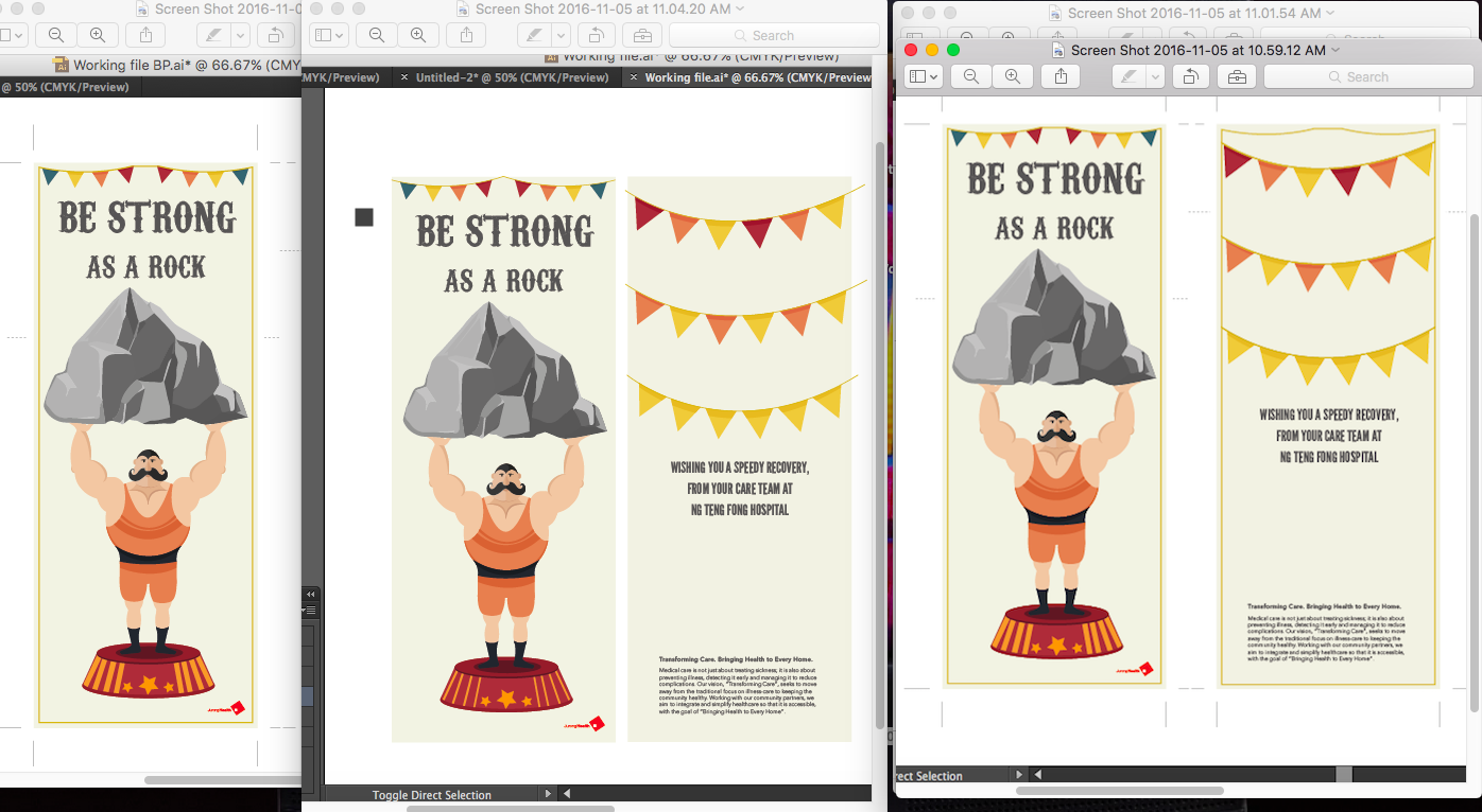
‘be strong as a rock’-Strongman
Images of my final work

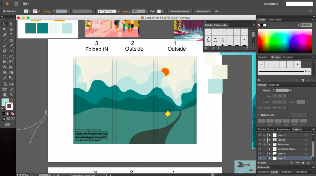
Get well soon card done using Illustrator.
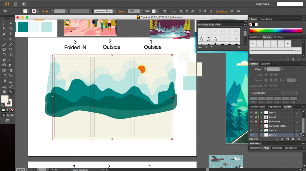
Size of card (pulled open): 28.2 cm x 11.15 cm
Printed on 260gsm card

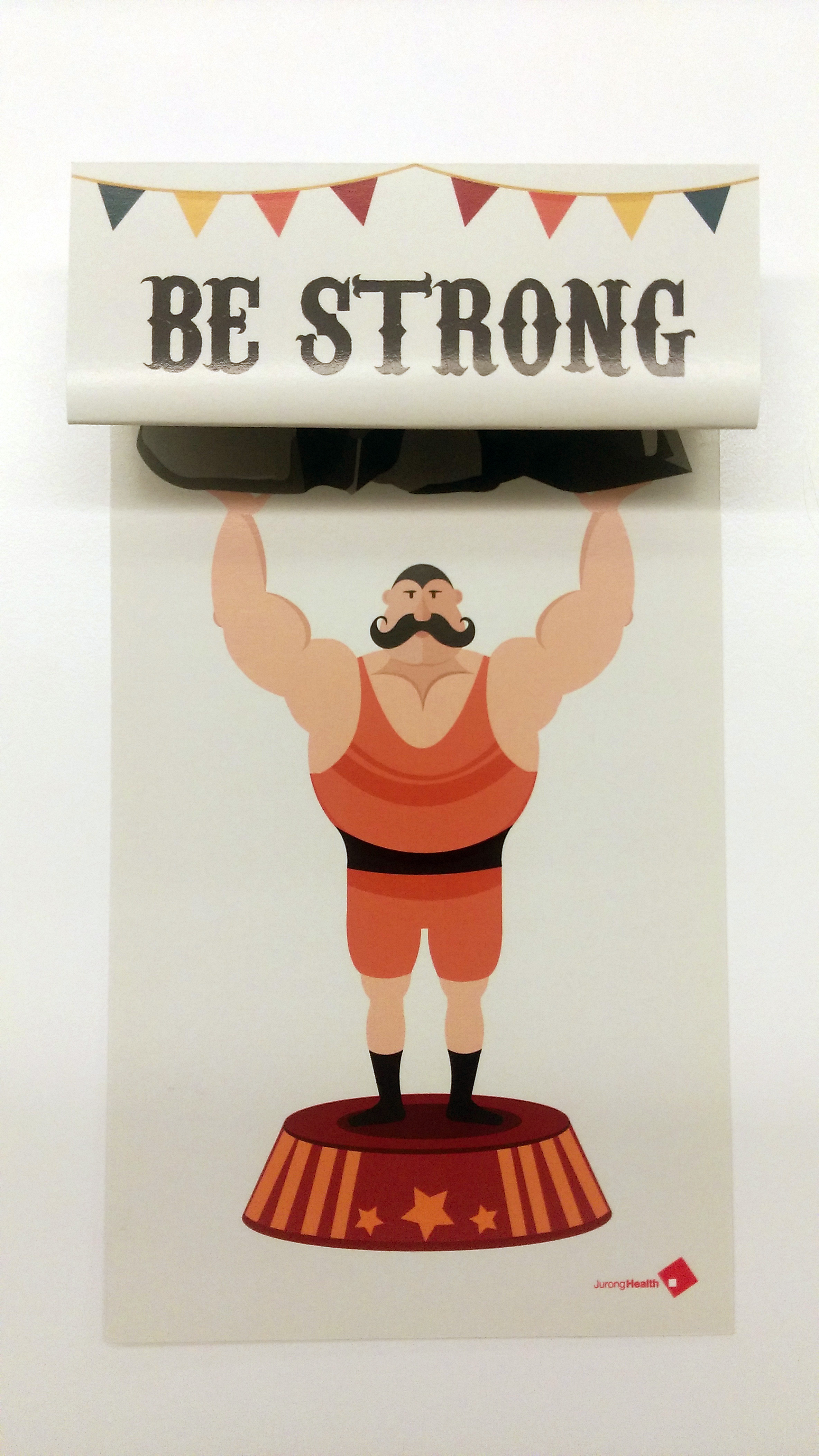
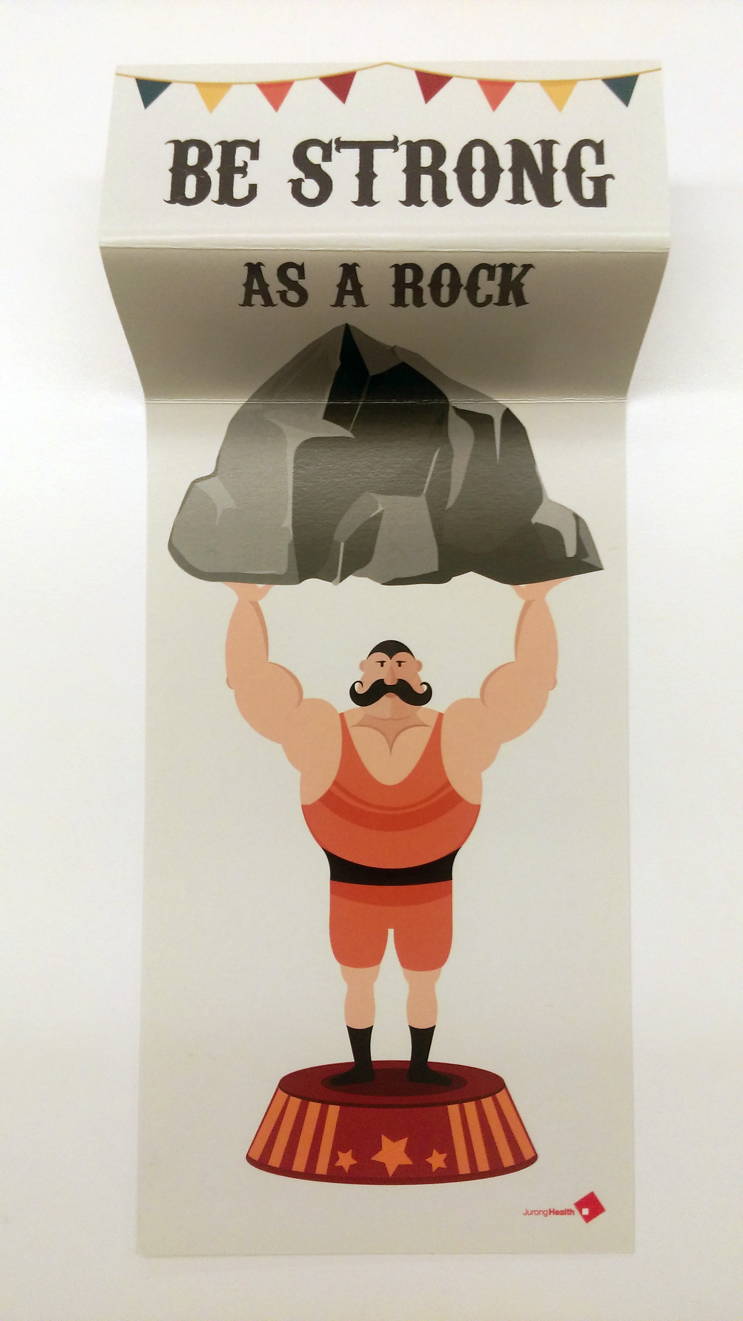


Further Comments by class: To make card stand, like a standee.
Just another Open Source Studio site
Images of my final work
Get well soon card done using Illustrator.
Size of card (pulled open): 28.2 cm x 11.15 cm
Printed on 260gsm card
Further Comments by class: To make card stand, like a standee.
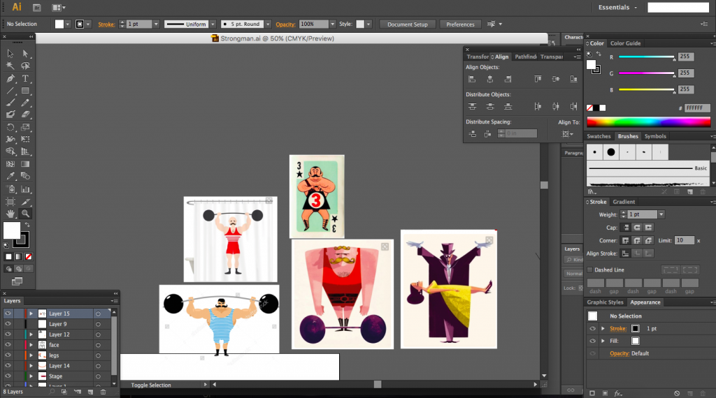
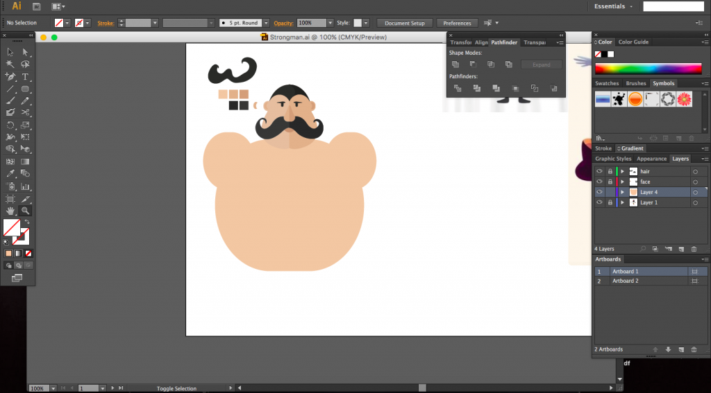
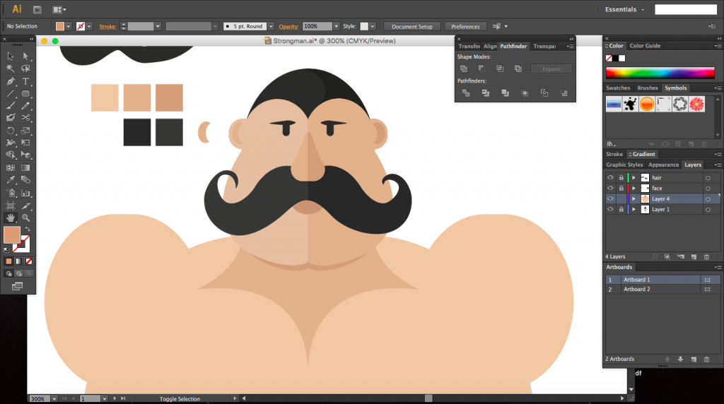
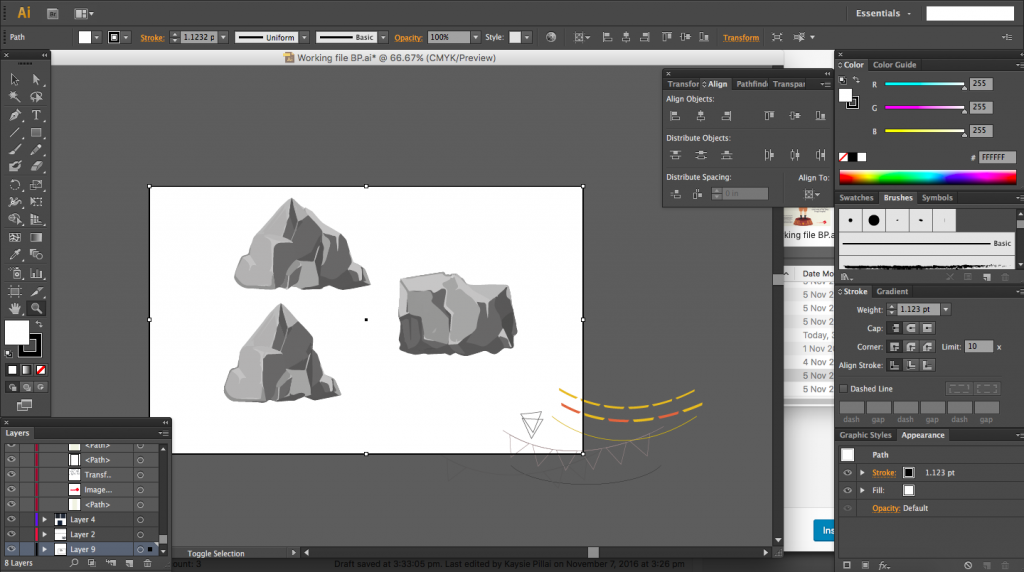
A documention of the creation of the strongman. Created using Illustrator.
I started off once again by looking for reference images of strongmen and placed by my artboard for inspiration.


I initially decided on a much better card but felt there would not be ample content to fill the space, it would thus have been uneconomical to make such a big card.
The fold of the card is inspired from the invitation card by Renee Griffin which I mentioned in a previous post. The card folds at two places, one just under the caption and another across the rock. Only when the card is opened is the rock revealed. The inital top fold was after the full caption, however it was suggested to increase the factor of surprise and so I split the caption between folds which would hide the word ‘rock’ within the fold.


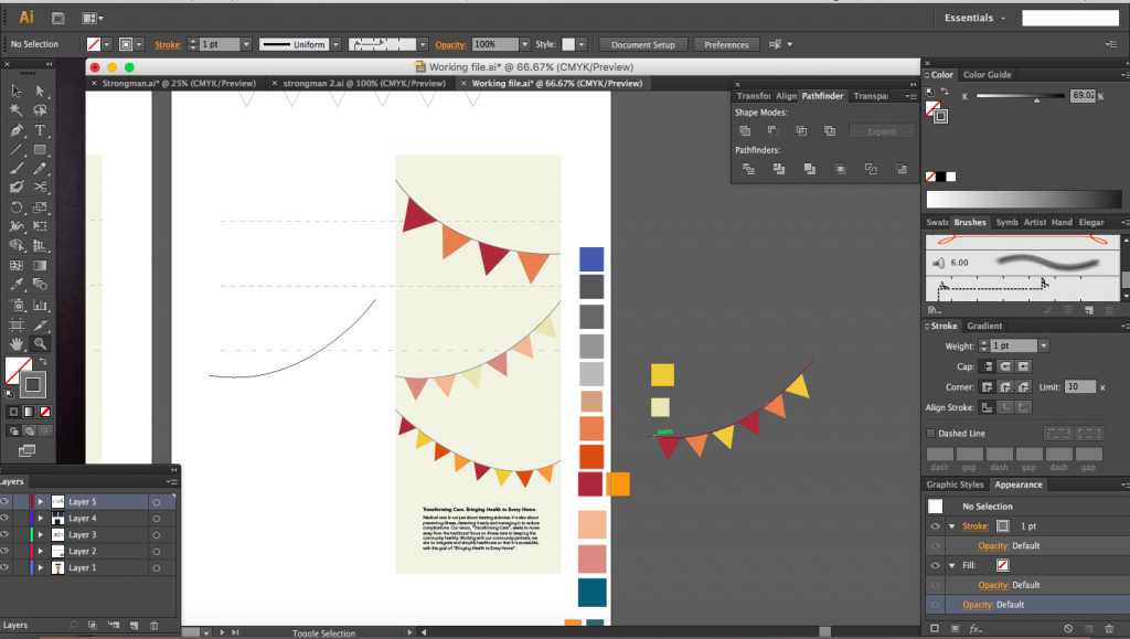
I had reduced the width of the card by half to a size that was much more comforatble. I then proceded to create circus bunting on the back of the card. I first experimented with diagonally hanging bunting but found it too messy and complicated. I settled with something more simple.
I used the same colours that were used in the front for the strongman, for the bunting, keeping colour palette small with bright warm colours. I knew I needed a cool colour of somesort and settled with a teal which I used for the flag just to create contrast.


Choosing typefaces. I had three typefaces that I was looking at for the caption in the front page, the first was CabbagetownStd, the second was Ewert and the third (which I eventually used) was Carnivalee Freakshow. All three typefaces were circs themed and Carnivalee Freakshow was the best to me as it was bold enough and not too complicated. It also had small details like lines running through, giving a vintage feel to it.

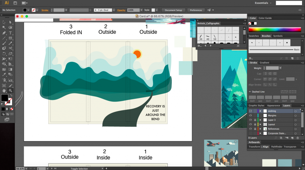
I placed the wishing at the back of the card and used the typeface called League Gothic, although I initially wanted to use a typeface called Press Style.
Two images below: Press Style

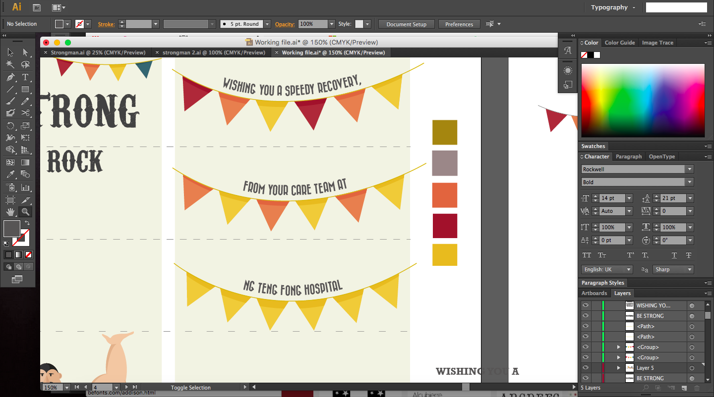
Image below: League Gothic

As for the corporate text, I stuck to Avenir, playing with different weights, using Avenir Light and Avenir Heavy.

I wanted to add borders into the composition but scrapped the idea as it made the card too congested.
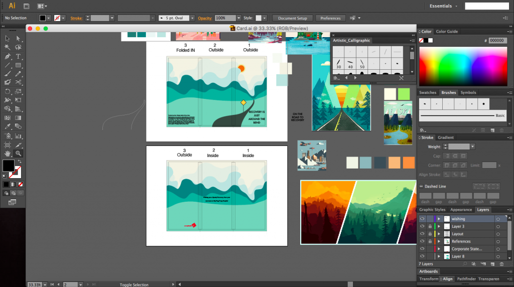
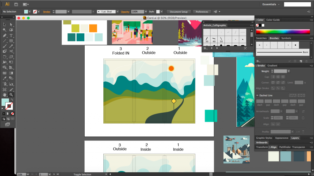
I had initially settled on an accordion fold for my card with graphics centred around the caption ‘Recovery is just around the corner’ which would be a play on the use of folds for this project. Another caption that I was thinking about was ‘On the road to recovery’ which would play in quite well with an accordion fold of an extending, winding road towards HDB estate symbolising home.
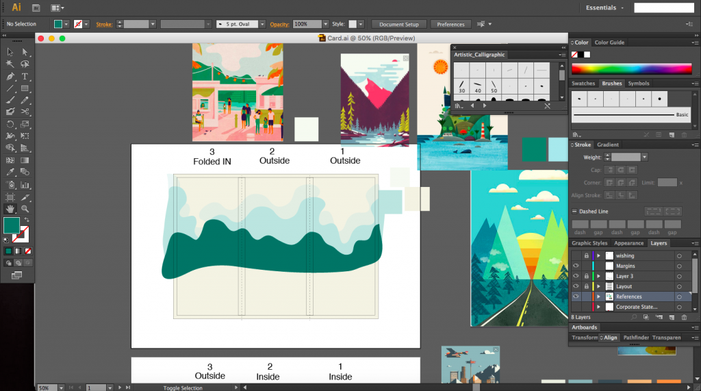
Below are some screenshots of my work in progress. The images surrounding the artboards are just some images I found that I liked and decided to use as inspiration one of which is from the game called Firewatch by Campo Santo. Most of my inspirations were landscaped based, so images like mountains, roads into a vanishing point.
After the class sharing, I decided to scrap this idea and do something else. The relationship between the graphics and fold was not strong enough. I also didn’t feel for the graphics enough. I was not quite sure how to make the landscape amply interesting. The main comment I received for this design was that that it was too lonely, which I definitely agree with. An accordion fold might not have been the best fold as well as this. Overall I didn’t like the direction my design was taking.
Whilst looking for more material and inspiration, I happen to chance upon this design for an invitation card on Pinterest. The fold of the card and the graphics go hand in hand and compliment each other. Griffin has very cleverly chosen a fold that works for an object such as a grill. The card invites people to lift open the fold and the lid of the grill thereby revealing the contents in the grill as well as extra information on the event.
There is an element of surprise and fun with this invite since the user does not know what is inside and it’s a pleasant surprise of simple and yet elegant graphics of food arranged in an orderly manner that fit the overall composition.
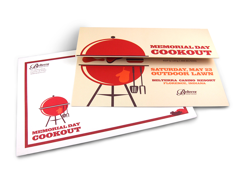


The colour palette here is simple with warm colours used, yet it does not seem like nothing is lacking. I think a colour scheme as such is just perfect and does not over complicate the design.
With this design in mind and knowing now how important the interaction between graphics and the fold is, I knew that this was the direction I wanted to take with my new idea.
Design 1
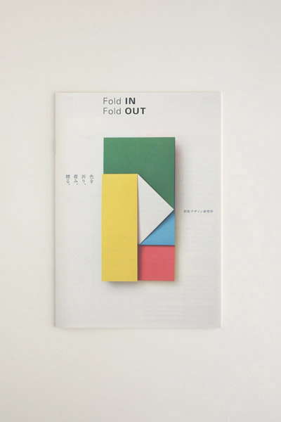
The design that intrigued me the most was one made by Origata Design Institute called the Fold IN Fold OUT. The folds are very unique, where the overlapping regions can be interchanged creating different compositions.
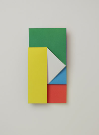
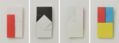
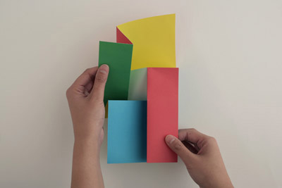
The blocks of colour stood out the most to me. Vibrant without looking gaudy. Geometric shapes used, the design is fairly simple and yet there is visual interest. Each shape is a particular colour. It is rather reminiscent of the De Stijl movement. Primary colours are used here together with green and white. The colours work really well together to create a clean simple design.
There is also a book to “Fold IN Fold OUT” that illustrates how the folds work.
Design 2
Simple fold (angled roll fold), diagonal line on the last page mimics the diagonal cuts of the brochure. Colour of each overlapping side also gives a sense of flow by using colours that get increasingly darker, e.g. white for the front page, light yellow for the middle page and for the last page, almost creates a gradient.

What stood out: choice of colour, mostly yellow with a hint of turquoise. When card is closed, the white cover becomes very prominent due to the difference in scale and contrasts the two small yellow triangles at the corner. The eye is drawn to the perpendicular line where the yellow meets white.
Design 3
Hilton Worldwide VIP Invitation for the London Olympics. Die cuts usually capture ones’ attention quite a bit; anything that is not of a conventional shape would draw attention. In this case, the card is extremely detailed as well. Accordion.


The cityscape of London, which includes its iconic buildings and structures, has been cut out. The folding method here has been cleverly adopted to create depth. Opening up the card reveals the city layer by layer, encouraging the user to continue opening the card until the last page is reached thereby giving a sense of flow.
Design 4