Therapeutic Graphics- Observations & Explorations

Task 1

Site Visit and Key Observations

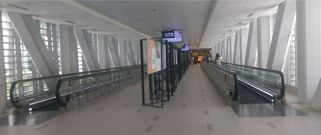
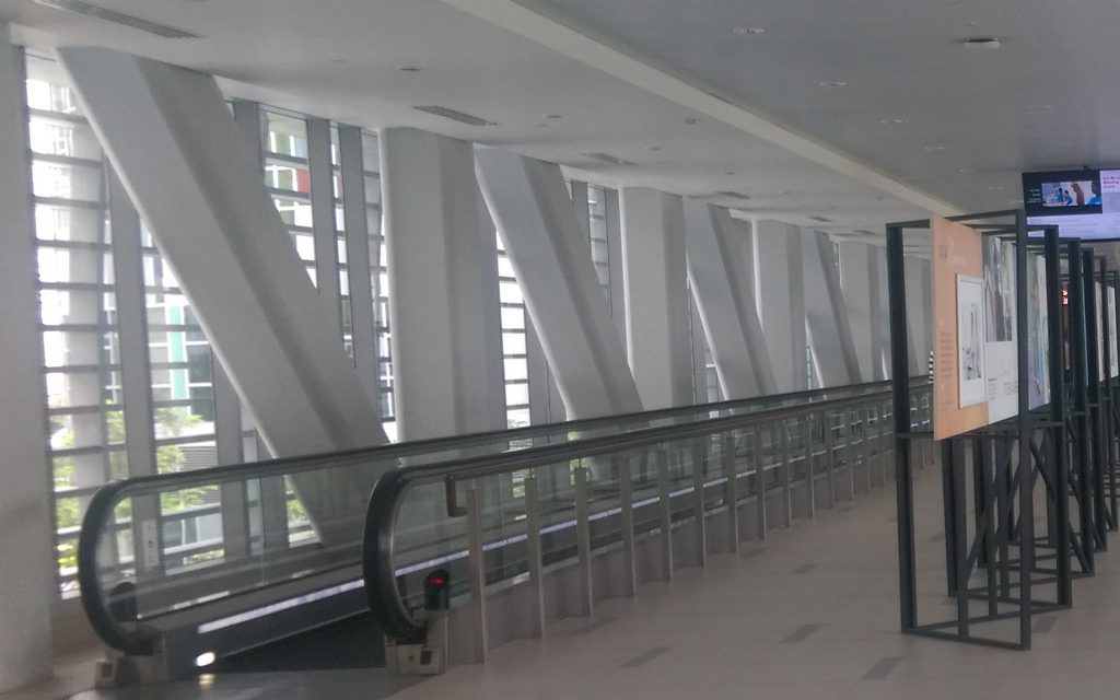
Location: Link Bridge connecting Tower A and B of Ng Teng Fong Hospital

Demographic: Patients (i.e. wheelchair bound), staff (doctors, nurses, etc), the elderly (high percentage) and children

Traffic flow: Differs with time. Increases during times such as lunch hour. Generally, the walking speed of those who take the travelator is much slower than those who choose to walk. Speed also differs between different groups of people (i.e. the elderly tend to walk at a more leisurely and slow pace whereas the staff would walk at a quicker pace).

People who did take the travelator would tend to look out of the windows whilst travelling. On the hand, there was a much lower chance of observing someone looking out when they chose to walk instead, more often than not they would be using their phones.

Physical Features

The area is neutral and muted in colour, the link bridge itself is not that big but with the two sides serving as large continuous windows, there is an illusion of a larger space. White walls, ceiling and floor tiles. White floor tiles are speckled with small grey rectangular tiles.

IMAG1658 copy

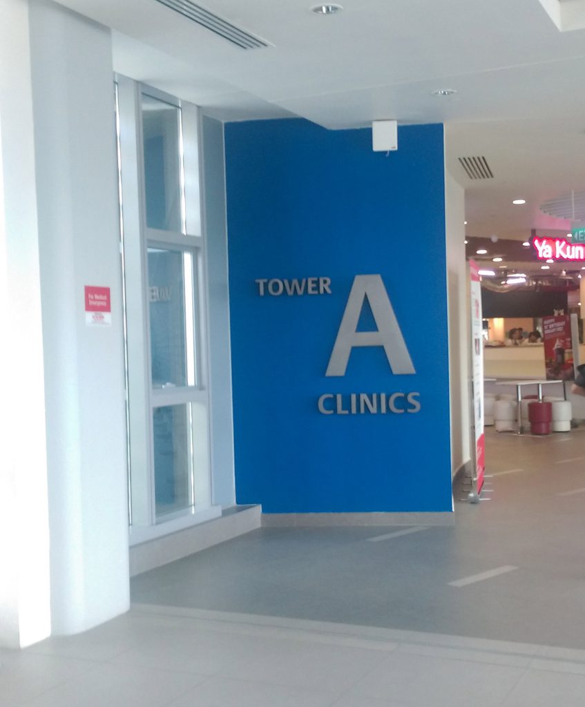
Tower B has green signage while A has blue signage, both of which are only visible when walking towards the towers.IMAG1665

IMAG1662 copy

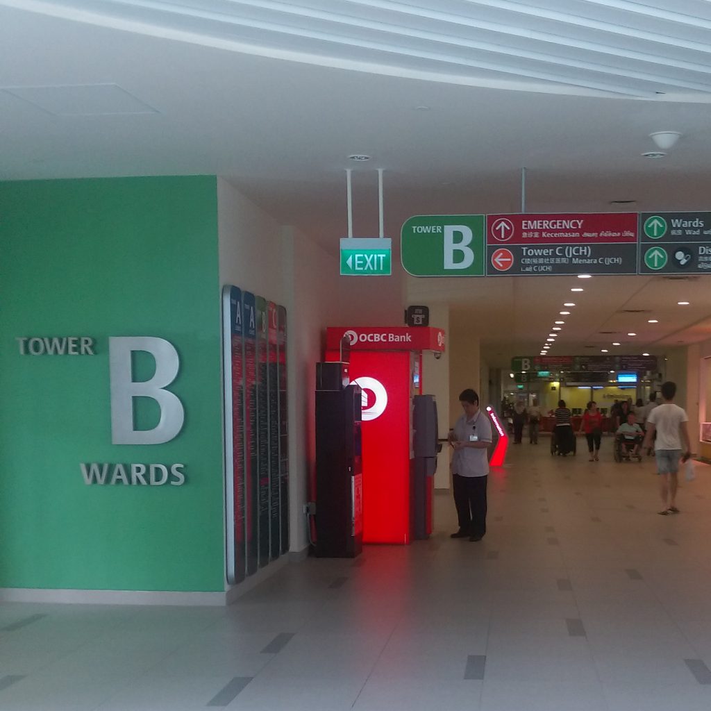
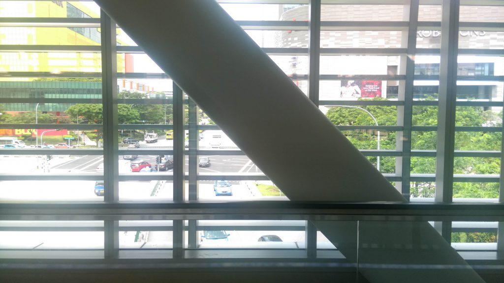
Two parallel travelators flanking each side of the link bridge. The space between the two travelators does seem to take up a large proportion of the bridge. There are large windows with horizontal dividers at regular intervals that disrupt the view and light flow.

IMAG1661

Alternating grey pillars of perpendicular (to ground) and diagonal positions can be found at both sides of the bridge. The pillars give the illusion of a zigzagging pattern.

IMAG1658

Use of the Space

The space is being used minimally, there are no shops along the bridge. The large space between the travelators is currently being used for display purposes. However this also means that space will be left vacant. Space probably left to accommodate high traffic flow. The link bridge as its name suggests, allows people to travel from Tower A to B and vice versa. The majority of people use the bridge as a way to tower A where the eateries are, but also to get to the MRT.

Tower A Clinics: Eateries, MRT, Westgate

Tower B Wards: ATM, florist, cafe

Exterior of the Space

Relatively busy roads, shopping centers(i.e. JEM), a couple of trees. Relatively more trees visible nearer towards Tower B on the right (standing facing towards A). IMM building sign is visible. At a glance, there are hints of green as one walks from one end of bridge to the other.

The Public’s View

With regard to how the public feels about the space, there is a general consensus that the selected area is quite plain as with most parts of the hospital.

My View

The décor area is generally quite plain and simply. I do like the extensive use of windows, lets in a lot light. Brightens the area, gives the illusion of a larger space. I also enjoy having the option to look out, to have something to do while on the travelator.

As compared to the other areas of the hospital, this portion seems a lot friendlier (which is a given since there are shops and amenities that we normally see outside of a hospital) common sight in most hospitals. But with that being said, it does seem quite cold an area, not much going on, that coupled with the fact that there isn’t much colour in the area (i.e. white walls, neutral tones throughout without much variation in shades, even floor tiles) as compared to other hospitals (NUH).

The one thing that I immediately do notice is the smell of coffee and bread of the cafes of both A and B, and that does make the place feel a lot my homey. If one were to momentarily ignore the fact that that is a hospital and take in the sights, smell and sounds, it could very well come across as a portion of a shopping center as far fetched as that sounds.

Key points from the visit

  • Two travelators on each side, proportionally large space in between travelators
  • Neutral colour scheme of whites and greys
  • Large windows with dividers, well lit but view is disrupted
  • Limited greenery outside building
  • Space is plain and could use more colour
  • Bridge used by people of all ages, different walking speeds

theme

Nature

Scan

(Flora and Fauna)

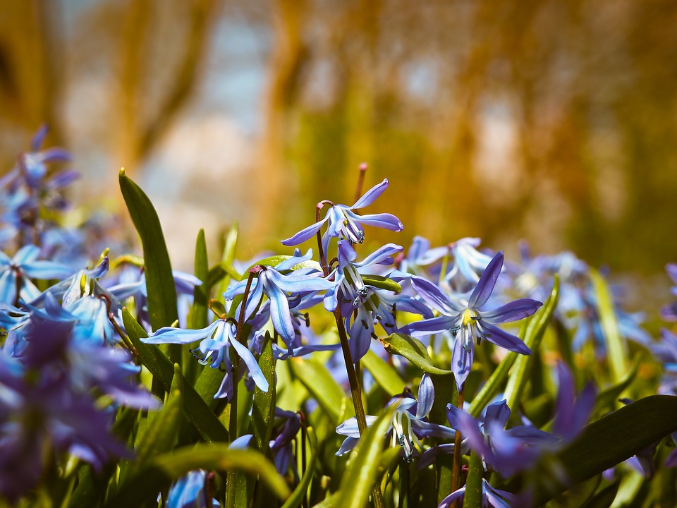
Flora and fauna with an emphasis on local species of plants (orchids, heliconia) and butterflies (common tiger, courtesan))

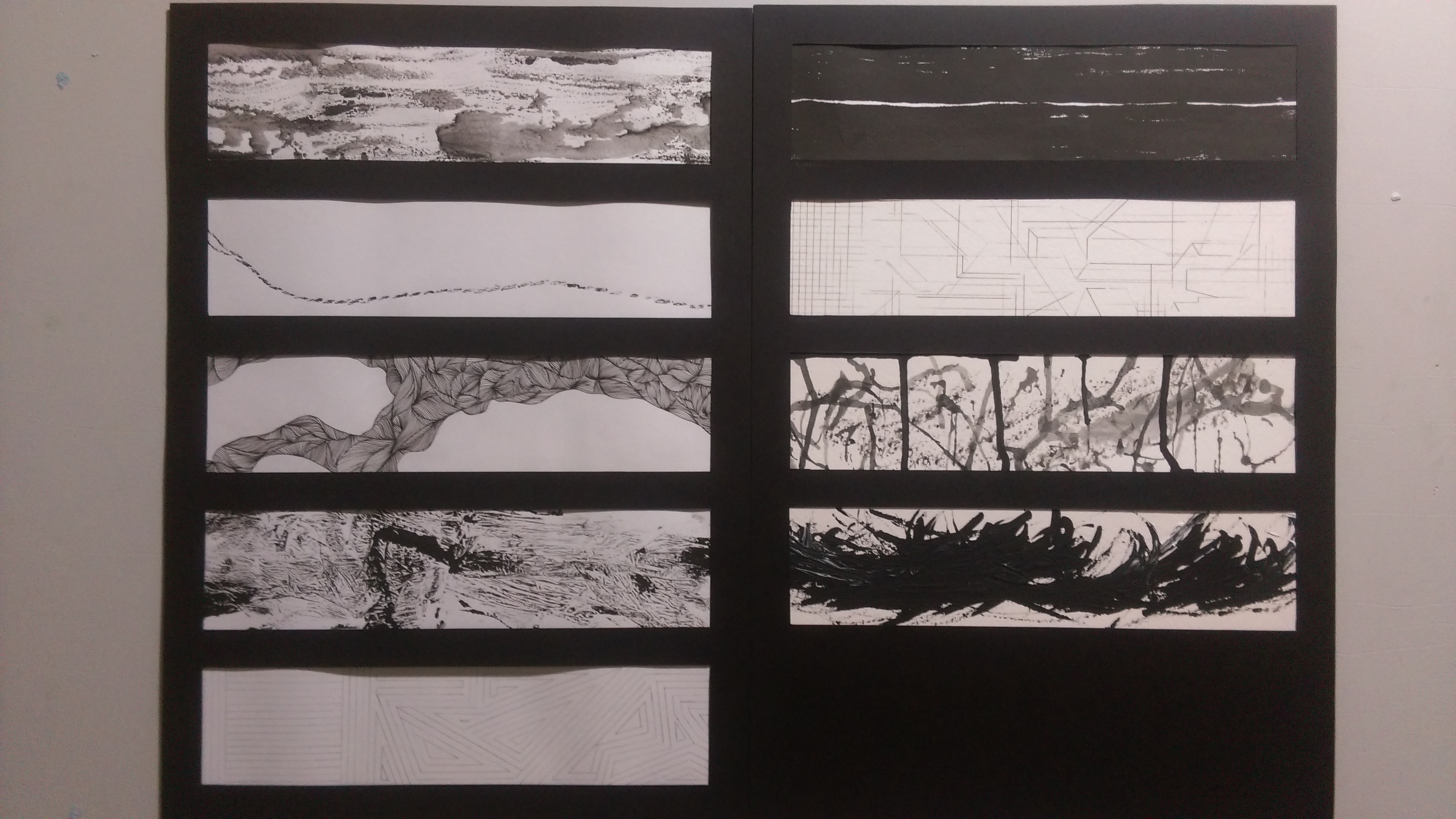
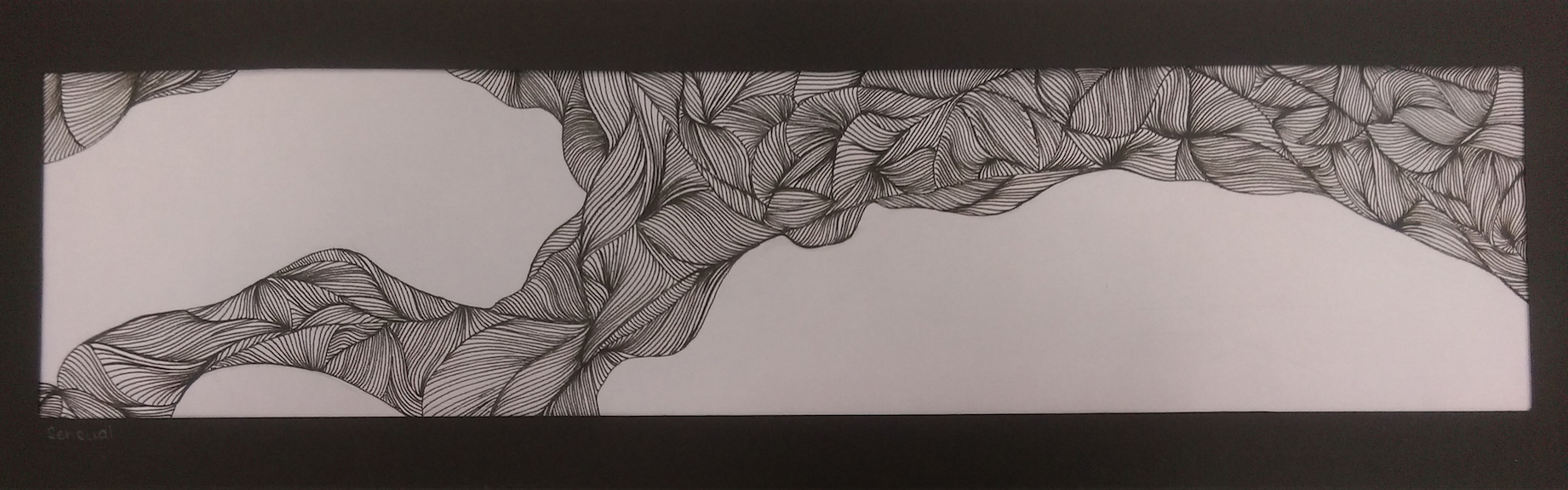
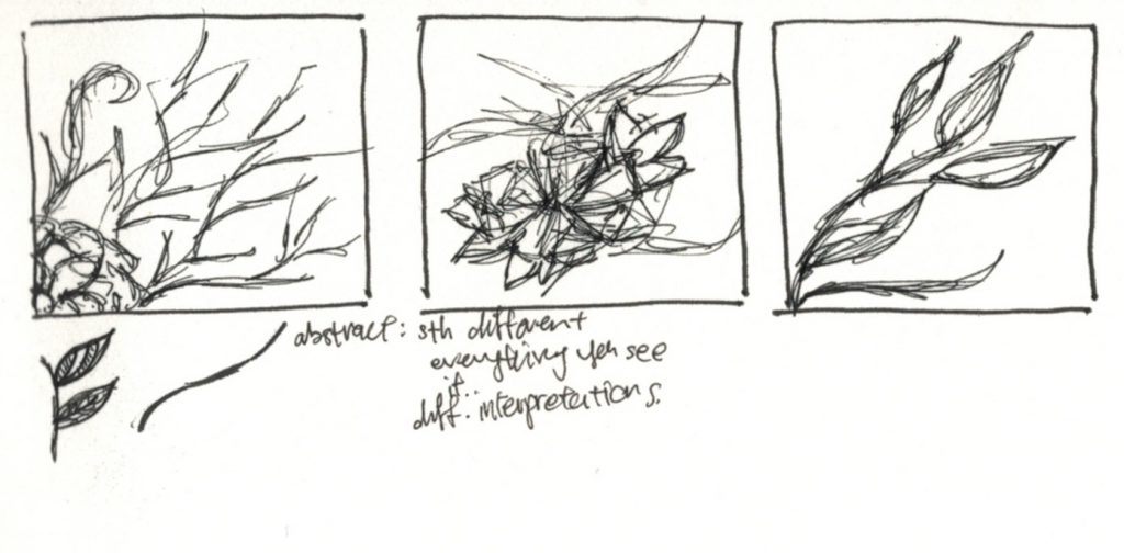
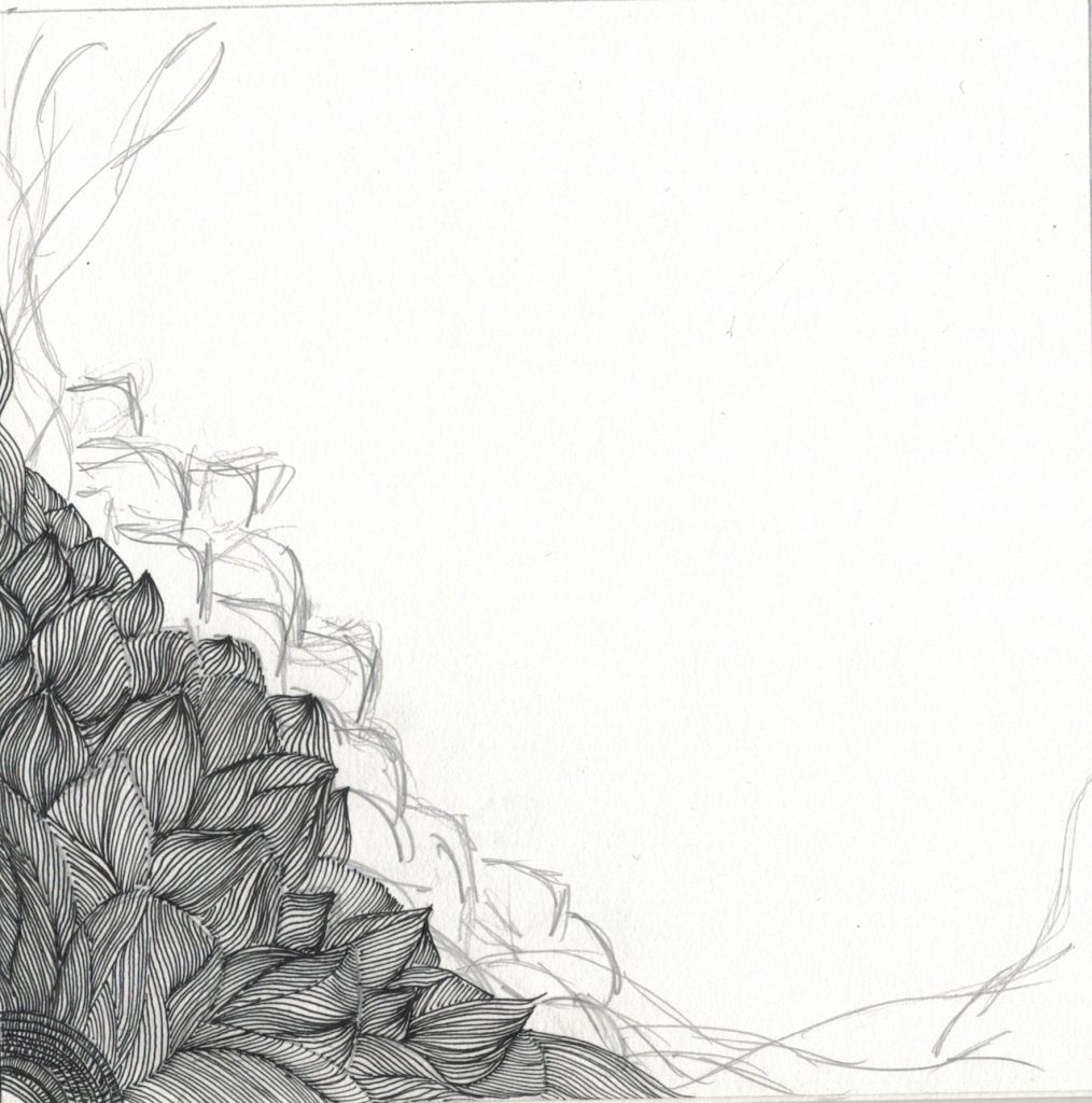
I often associate nature, and in particular plants with serenity and relaxation thus it was a given that I would want to create a design pertaining to that. Organic shapes and forms, curved lines and nothing too angular were guidelines that I set for myself. I feel to many sharp angles make a design look too harsh. Organic forms are easier on the eyes.

There have been studies that have showed the importance and benefits of being close to and surrounded nature especially for patients and the elderly.[1] In Singapore alone, the presence of The Therapeutic Garden @ HortPark is proof of the benefits of nature and greenery. With that in mind, I know this theme would probably be a more effective base for the creation of therapeutic graphics. Most of the people who would benefit from the nature theme are in the majority who visit the hospital. I also found another article talking about the benefits of nature in the healing process. Link to article: https://musedialogue.org/articles-by-genre/artsandlife/arts-and-healing-vol-1/healing-art-one-part-imitation-one-part-imagination/

These elements will also complement the existing exterior of the building (the trees and greenery present outside). There are trees outside but there does not seem to be plants, flowering or not, of equal quantities. The elements of this theme will help emphasise the greenery and hopefully bring the it closer to the people who use the bridge.

Having a work that involves plants, flowers etc, elements that people are already familiar with, would hopefully make the work more inclusive since it can be appreciated by all ages. The sense of familiarity from looking at something may also help to relax one and thus serve as a therapeutic purpose. I want elements that are easily accepted by all if not the majority. I decided to focus on local species of plants and butterflies because that will again help to bring a sense of familiarity.

Mood Board 1
Mood Board 1

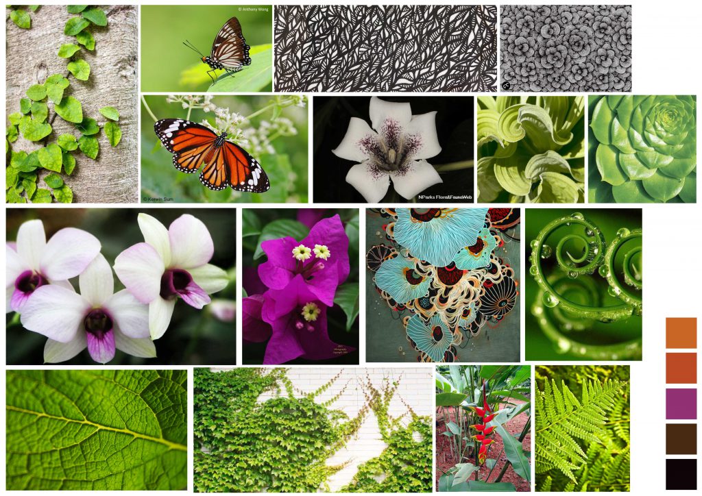
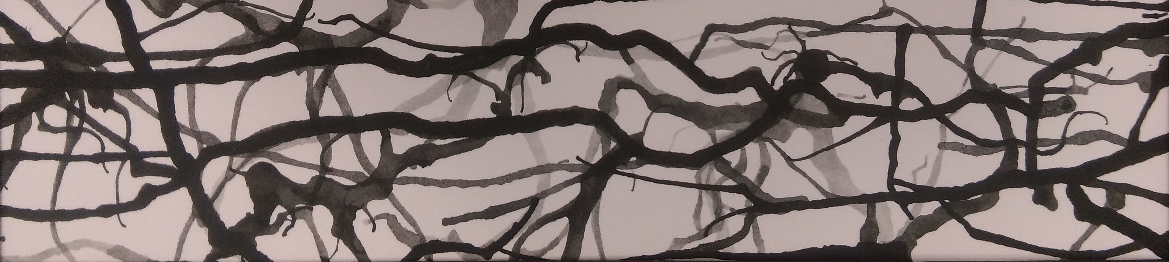
I was inspired by Russian artist Vasilj Godzh’s works which employs lines and intricate details. The manipulation of lines by Godzh is incredible, creating monotone works with depth and texture.

Scan 2
Various sketches
Scan 5
A sketch relating to flowers


[1] Talbot, JF, and R. Kaplan. “The benefits of nearby nature for elderly apartment residents.” Search Results The International Journal of Aging and Human Development 33, no. 2 (1991): 119-130.

Nature

(Waves and Seashells)

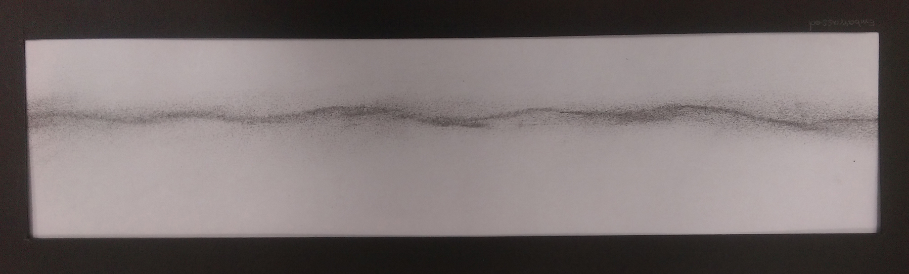
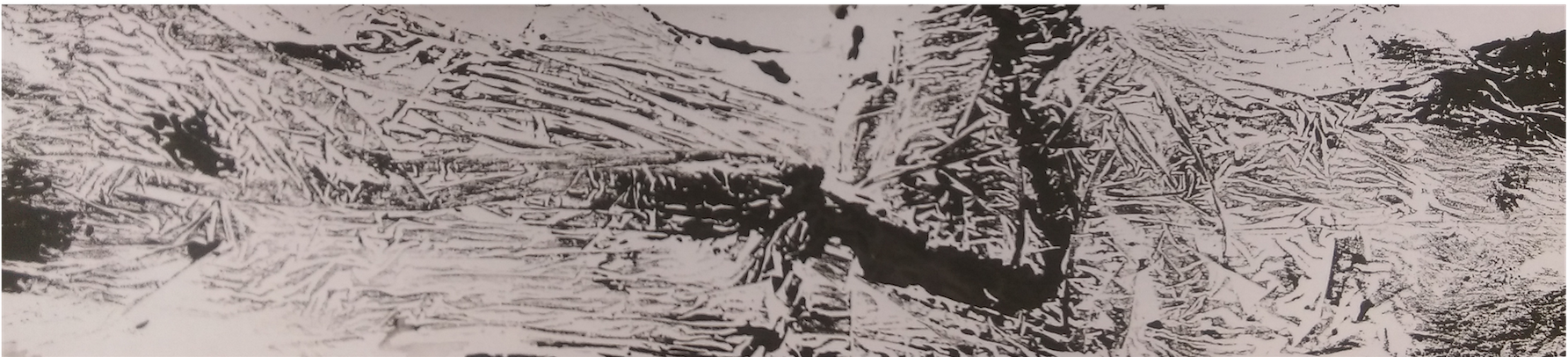
The theme of nature is extremely broad and I don’t want to limit my options as of yet so I have included another possible sub-theme. I decided to create a design based on elements from the beach, namely the the ocean waves and seashells. The elements would bring something new to the existing environment since the beach is not within sight of the hospital. The repetitive sound of waves lapping and its constant movement becomes very relaxing and calming. I intend to bring this repetition of sound and movement into the design via a repetition of lines.

I decided to gain more inspiration from Japanese fabrics, particularly those of the ocean theme. I fancy their use of lines to represent waves in a simple yet sophisticated manner. The works of Tracie Cheng were also of great inspiration as she uses lines to create movement and form.

Mood Board 2
Mood Board 2
Scan 1
Various sketches for the ‘wave’ element
Scan 4
Composition for ‘wave’

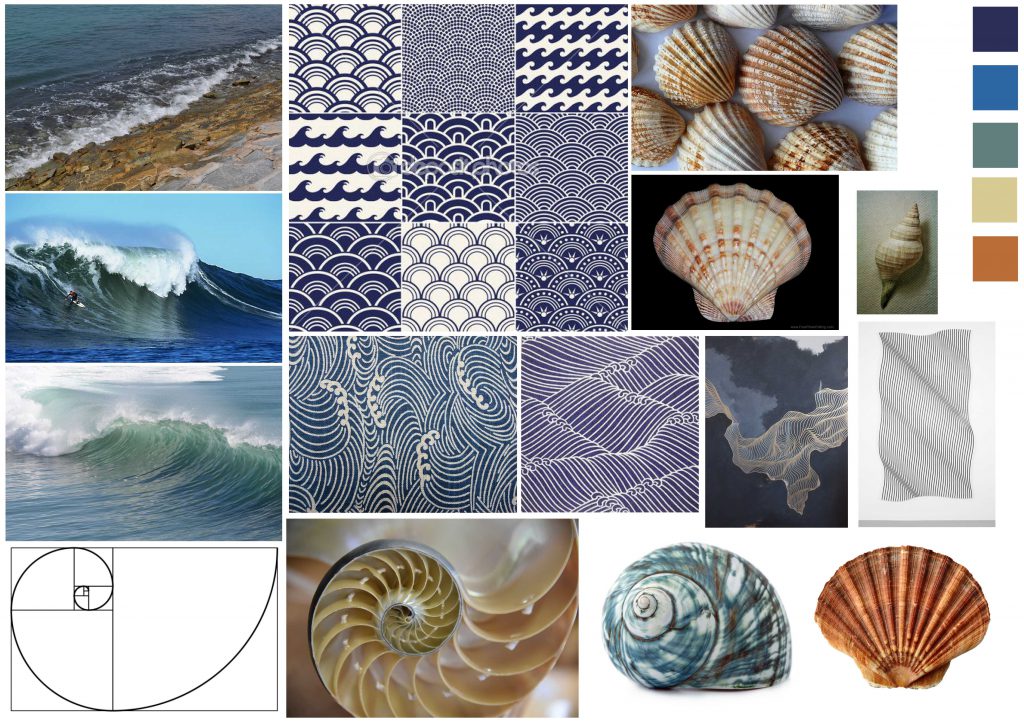
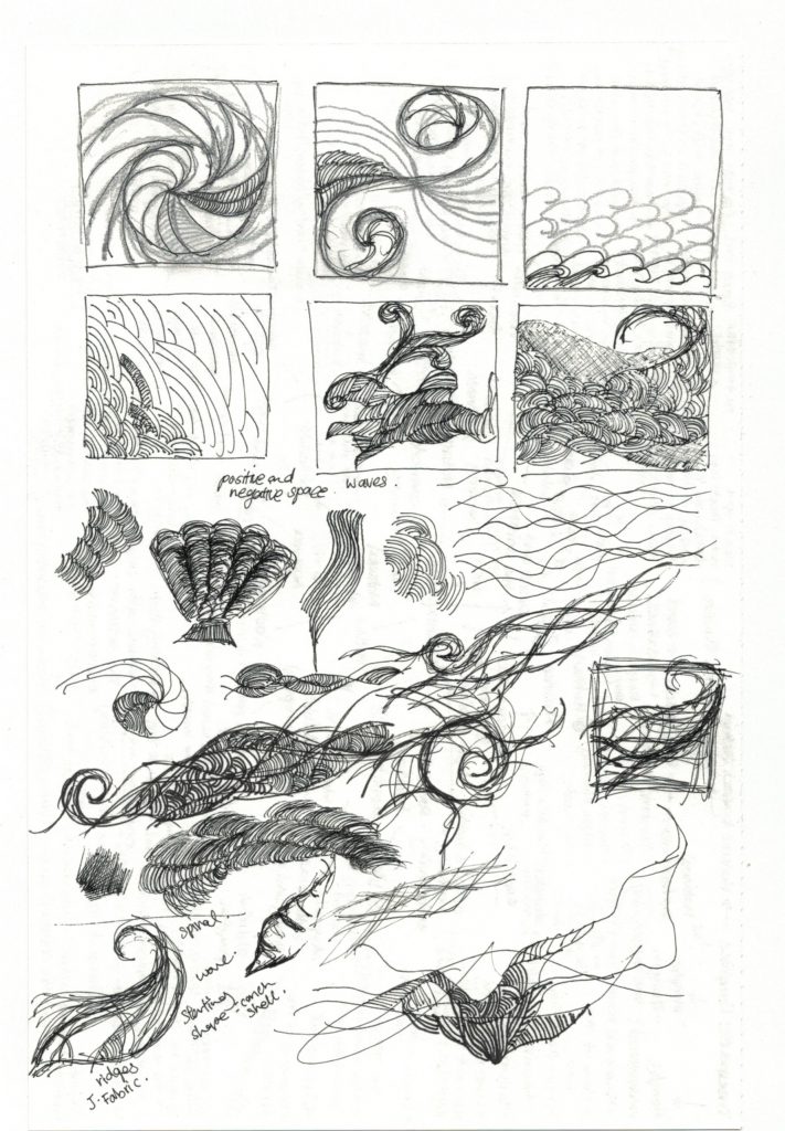
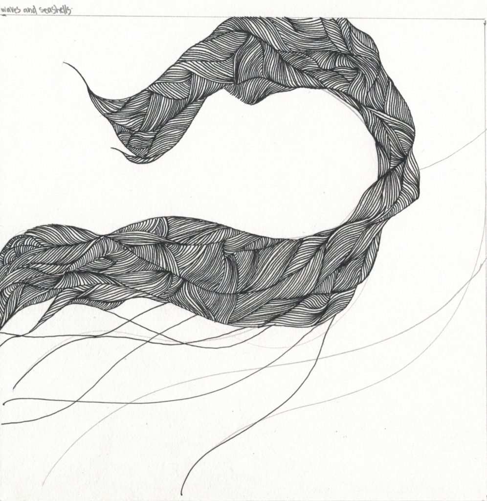
The reason for the inclusion of seashells started from the thought of the Golden ratio; the correct proportions to create something aesthetically pleasing might actually be therapeutic, because it somehow looks correct to the human eye. So, the Golden ratio Fibonacci sequence it was and the Fibonacci spiral which is often seen in shells. Shells themselves have such interesting textures and ridges that can be used in my design. As a side note, picking seashells seems to be an activity that many have done for fun, hopefully the sight of shells might trigger the child in all of us.

Typographic portrait- Process

Work-in-progress

Mathematics- All about Geometry

In post, I’ll be focusing on just one of the pieces that I will be doing for the project. I have decided to use mathematics as my inspiration, more specifically geometry and maybe incorporating the attribute of logical.

I started off by identifying certain geometric shapes including triangles, squares and polygons.

ShapesPrecision and uniformity was what I was going for so I created a 6×6 square grid and used that as my guide to form the letters to my name. Each letter would then be made of the squares and triangles of the exact measurements. I only added diagonal lines within the appropriate squares to create the triangles. The relevant shapes are then filled in and the grids removed (see images below).

K shape 4.1

PrintShape AShape YShape SShape E I


I did like the outcome when I removed the grid, what was left were only the diagonal lines. Somehow, it became a minimalistic form of the letter, which I thought was quite interesting to note.

K shape
Progression of ‘K’

But of course, to just leave the letters as they are would be too mundane so I’m going to tessellate the letters as best as I can.

Name shape 1Should my calculations be correct, there are a total of 14 complete squares and 32 triangles (converts to 16 squares) to work with. In a 6×6 grid, there should be six squares remaining (left blank) if all 6 letters are arranged properly. Taking into account that the letters ‘e’ and ‘a’ already have a blank square incorporated into itself, there will then be four squares outside the tessellations.

Name shape 3
Tessellation in progress

For a matter of convenience, I decided to print out the letters to try and tessellate them. But of course, I am also considering working the pieces like a tangram.

Some possible arrangements:

IMAG1232 IMAG1233 IMAG1229 IMAG1231 IMAG1230

In terms of execution, I will either be leaving it digital, I might also try my hand at linocut or paper cut (still keeping options open). And maybe a splash of colour should be added into the work, I think it would make the work more exciting and visually appealing. It would also show how I actually feel about maths as a subject, that I don’t think it’s boring in the least.

A new perspective

The plan for now…


After consultation and sharing on Monday, I have decided to leave the petri dish idea and put it on hold for another time. I was concerned that the idea was too three-dimensional for this assignment and it was deviating from the assignment brief a little more than I would have liked too. I did consider (and was told) that I could take photographs of the petri dishes instead to make more of a two-dimensional piece of work, however I felt that it would not be as impactful to have photos instead of the actual dish itself. It would have been more visually interesting to have the item there for others to view. Perhaps I might still give this idea a go for the sake of my curiosity, I am quite curious to if I would have any success with it.

I was told to look into how science is communicated to others. My understanding of this would include what the components are in say a laboratory report (what font is used, the layout, etc.). What makes science, science? I will talk more about this later on in this post.

Besides that I now want to look into the things that are associated with science. Why not put to good use what I’ve learnt in the last few years and incorporate that into my artworks. This was the same thought process I had when I decided with the petri dish idea, however, I have realized I have been unknowingly limiting and restricting myself to just biology, more specifically the study of bacteria. It somehow slipped my mind that science also includes other branches, chemistry, physics and even mathematics. So, why not use all of them? Even though I was a biology student for the most part, I have no prejudices against any of the others, I enjoy all of them the same and you can’t study one science and ignore the rest because they interlink, that’s just the beauty of it all. No one subject stands alone.

A new plan

As of now I have the plan of using one of the sciences for each piece of work, so four works in total, each inspired by one of the sciences to represent an attribute. I have also made the decision to pick a new set of attributes. Each attribute will be related to the science, it will most likely be an attribute that I have found to be useful and necessary to mastering that science.

My plan for now involves researching for components that are iconic and special to that particular science. For example, if I think biology, I associate it with DNA and its structure (e.g. the double helix, base-pairing) and enzymes. If it was mathematics, I think the Fibonacci sequence, geometry, vectors, ratios. In the next half of this post, I will be exploring what makes up the sciences.

Earlier on I wrote something about finding out what makes science the way it is or what makes it different from say art. For starters, from my experience, the information that is presented is detailed but always presented in a simple way (nothing fancy) because the main objective is to relay information accurately and in a way that makes sense to other parties. Ease of reading is crucial, a fancy, elaborate font would never be used because it just makes reading difficult and distracts the reader from what is really important-the content. To aid the reader, graphs and charts are also used for illustration purposes. I might actually do some exploring with respect to graphs and charts. To sum up how science is communicated, I would say that it is simplicity in presentation.

The image below includes some examples of graphs and what not, of the four graphs, three are actual graphs that were plotted as part of my lab sessions while I was still studying biology about a year ago. Graphs aren’t just limited to the common pie chart, others such as bar graphs, histograms, scatter plots and regression lines are also included. There is definitely quite a variety to choose from, each with its own unique look and presentation.

graphs
Graphs

Artist Reference

Since I have decided to take a new approach and plan for this project, I figured it would be appropriate to present a new artist reference. While looking for interesting typography examples the other day, I came across something that really made a deep impression on me. It was called Hexagonetica typeface by KAIWA (see image below).

Hexagonetica typface

The entire post showed the breakdown and progression of how the typeface was created from one simple shape that was then given a sense of perspective through the addition of a few lines. A hexagon became a cube and then finally into a cube with squares cut out from it. A grid was obtained from the overlapping lines of the cube and the alphabet was derived from that. I really like this process, a step-by-step approach of creating the alphabet from the basic hexagon. I’d also like to talk about the use of colour. Only three colours were used for this typeface and yet a strong sense of depth is created for each letter. It is really nothing too elaborate or fancy but the outcome is more than impressive in my eyes. It brings me back to my point about simplicity, there is nothing in this typeface that I would consider excessive, everything is in the right amount and it delivers.

HEXAGONETICA

Link: https://www.behance.net/gallery/12400337/HEXAGONETICA-Typeface


MOving on

I thought it would be appropriate for me to list out some of the ideas that i have for now. I may not use some of them but I guess it will help me to see what options I have as of now. They might seem a little random but they were the first things that popped into my head.


List out attributes required for the sciences (general)

Methodical

Attention to detail

Curious

Logical

Clearheaded

Conscientious


Identifiable components

Biology: DNA, RNA, skeletons, organs, structure of vitamin, carbohydrates, fatty acids, proteins

Chemistry: transition metals, periodic table, organic chemistry (benzene, structural), atoms

Physics: Quantum physics (Schrödinger’s cat), gravity, three laws of motion, force

Mathematics: Geometry, graphs, Fibonacci (-golden ratio), binary, vectors

Typographic Portrait- Research & Ideas

Preliminary Ideas


In this post, I will be discussing some of the ideas that I had with regard to this project. They are by no means the final ideas that I will be working on but they will serve as a stepping stone to better ideas. The first few attributes that I thought of offhand were procrastinator, clumsy, narcissist and mysophobic.


The Procrastinator

For the attribute of ‘procrastinator’ I wanted to play with the idea of time and how often a procrastinator wastes time. There are twenty-four hours in day and I have to admit majority of that time is spent planning what to do for the rest of the day but never really getting to any of the work. Time passes quickly and no work is ever done.

My idea involves the use of diy clock mechanisms attached to a board. The clocks will be allowed to run as per usual and at a specific time, the hands of the clocks will the letters of my name.

Print
Name appears at specific time


Print

The starting time for each clock would be different to represent the different things that I had planned to do. This will only occur once every twenty-four hours at a specific time when hands are at right position.

Clock typography 3
Arrangement of clock mechanisms

If you ever want to know what it would be like to let time pass quickly and have nothing be accomplished, you can quite literally watch the clocks hands go through several rotations until they finally form the name. The fact that my name only appears once every day shows that procrastination lasts the whole day except for maybe a short period of time where I would actually get something done.

Print

Using just clock hands to make up letters poses a problem because there are a limited number of them and the length as well as the point where they are pivoted is fixed (assuming no modification is done to them). Hence, the letters need to be simplified down to made of not more than three strokes. See image above. Additional: transforming work into a two-dimensional piece.


The Narcissist

Print

Like every other self absorbed person, I like to look at my own reflection, more specifically in the mirror (after all it gives the clearest and sharpest reflection). If I do go ahead with this idea, I will most likely be working with broken shards of mirror to form my name. The mirror will be broken instead of complete pieces because I do not find it an entirely good attribute to have and I am trying to break and rid myself of it. With smaller pieces, less reflection can be seen (not a full image). Additional: Other reflective surfaces to emphasise the need and desire to see one’s reflection even in the most unusual places.


The Clumsy

The idiom ‘a bull in a china shop’ creates the best imagery for the attribute of clumsy. It has a tinge of humor in it which I really like. I would like to illustrate this idiom using my name. I did a brief analysis of Dan Fleming’s animal typography andI might use that very technique to create this work. I will modifiy the six letters of my name into a shape of a bull. This would most likely be done digitally. As for the ‘china shop’, the background of the work will carry it. Using watercolours to paint the designs commonly seen on Chinese ceramics and porcelain.


The Mysophobic

In my last post, I mentioned that I wanted to try using various unconventional mediums for this project. For ‘Mysophobic’, I may be working with indeed unconventional materials, petri dishes and bacteria. Working with bacteria colonies outside of a lab is admitedly a health harzard so precaution will be a prority for me. Mysophobia is he abnormal fear of dirt and germs. I have listed some details:

  • Name will be the negative space
  • Bacteria to be grown around the name itself
  • Inoculate dish. Streak petri dish with swab from somewhere(hands, handphone, etc)
  • Place paper (cut out letters) soaked in alcohol or antiseptic liquid onto dish. / use several small disks (punched holes) instead of full letters
  • Bacteria will not be able to form colony where the disks are. Thus creating a ‘free’ (almost germ free) and clean zone on the dish.
  • Petri dishes can be substituted with rectangular containers
  • Several small dishes (one for each letter) or one single dish for entire name

The beauty of working with bacteria is that one will never really know what the outcome will be. There will be different kinds of bacteria depending on the sources. The result would be petri dishes stained with various patterns and colours.

Bacteria (Petri dish) art

More examples : http://www.livescience.com/52547-microbiology-agar-art-photos.html


References: Zachary Copfer . ‘Bacteriography’

http://www.dailymail.co.uk/news/article-2204850/Portraits-famous-faces-created-petri-dishes-artist-using-bacteria.html

  • Cultivation of E.coli colonies on petri dishes to form portraits of people such as Charles Dawin.
  • Images in the positive


References: Natalie Nadeau

http://incubatorartlab.com/home/bioart-osc/natalie-nadeau-2/

  • Bacteria colonies grow and cover dollies (second hand) placed in agar plate.
  • Image in the positive


A Biological Aspect: The petri dish is the canvas

Biology plays a rather important part in my life. I studied it for many years and it is something I enjoy. I do like all the sciences but I had the most affinity with biology if I may phrase it that way. Since this assignment is supposed to be about me, it would be apt to use biology as a start point or base. Instead of using paper, all works could be done on the petri dishes. With different attributes, bacteria can be obtained from the relevant objects associated with the attributes and cultured. The entire work would be three-dimensional. To tackle this problem, photographs of the work can be taken and as advised, edited (change of colour, etc.) to create a set of works (see Andy Warhol’s Campbell’s soup cans).