Anatomy of typography

Just another Open Source Studio site
The main theme surrounding this project was science and I covered four branches of science: mathematics, chemistry, biology and physics. The route I decided to take with this project has resulted in me looking at how science is portrayed and scientific information conveyed. With that said, I decided to make all my works under the same principle of keeping it clean, simple and with no excess details, nothing too elaborate. In things like research papers, it is important to relay the information in a clear manner, the more unnecessary details are placed inside, the more confusing it gets. So, minimalistic and simple. I had to constantly remind myself ‘don’t over do it’.
Here are the images of my final work.
Mathematics: Logical (Geometric)
Medium: Digital
Artist reference: Hexagontica typeface (starting with a shape and working the shape to form the alphabet)
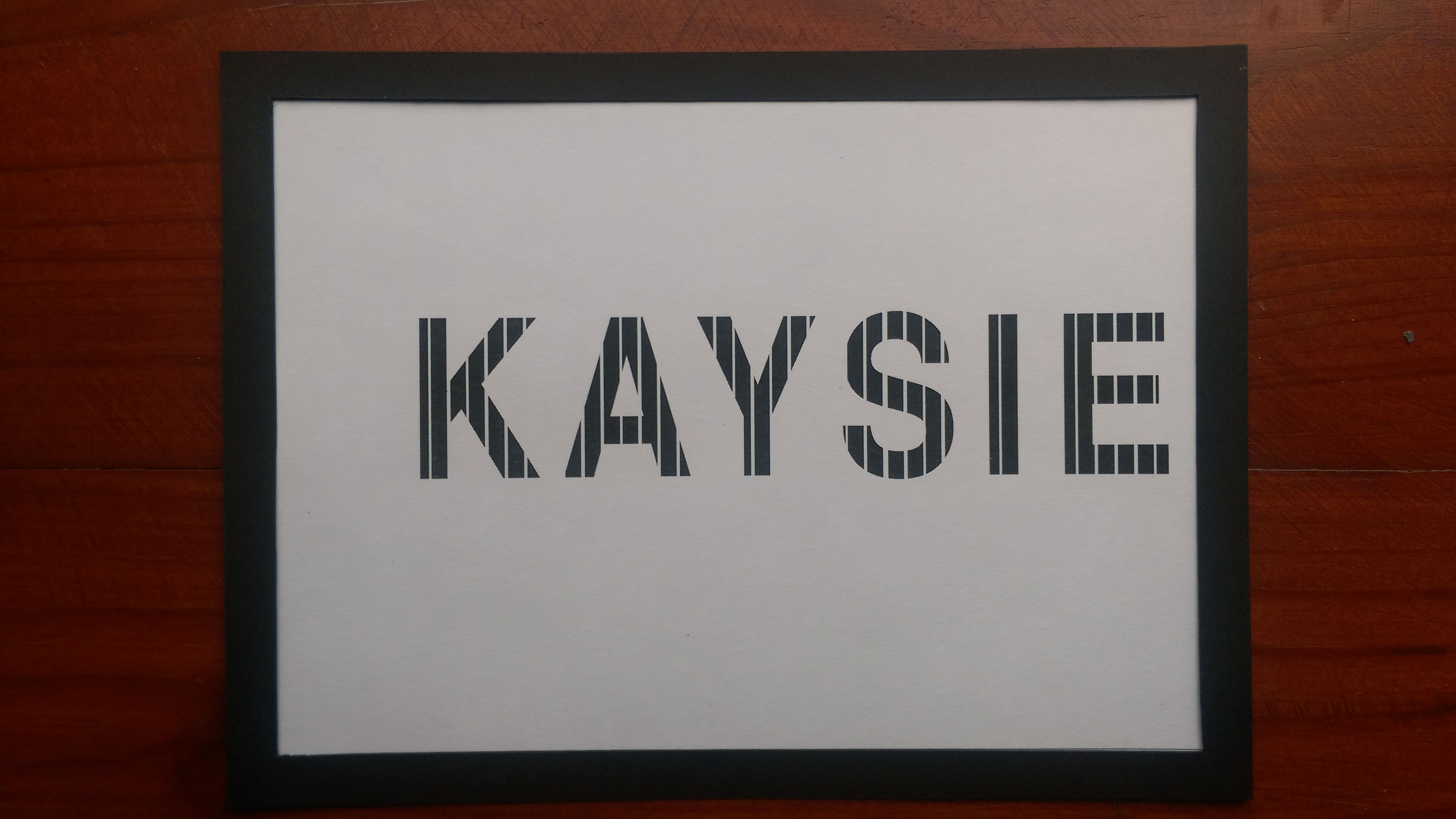
Biology: Detail-orientated (stippling)
Medium: Ink on paper
Artist reference: A range of artists
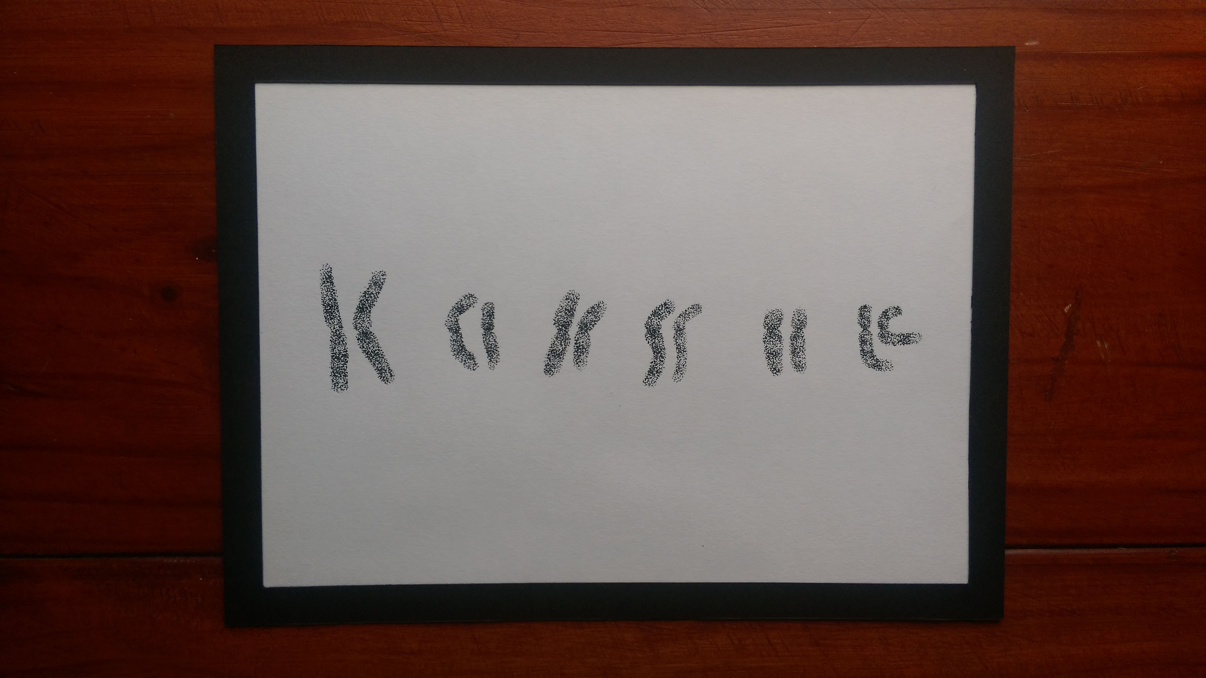
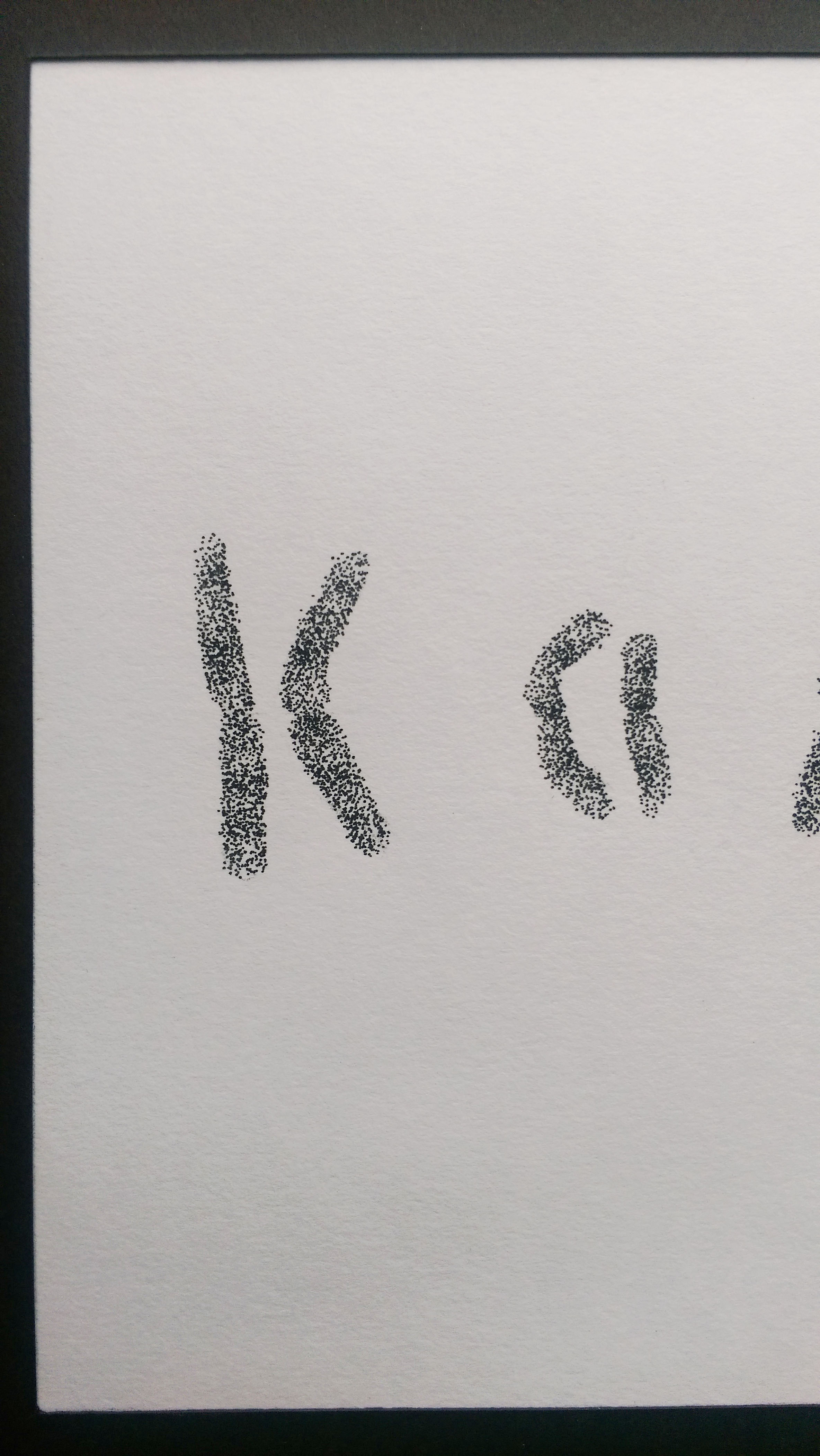
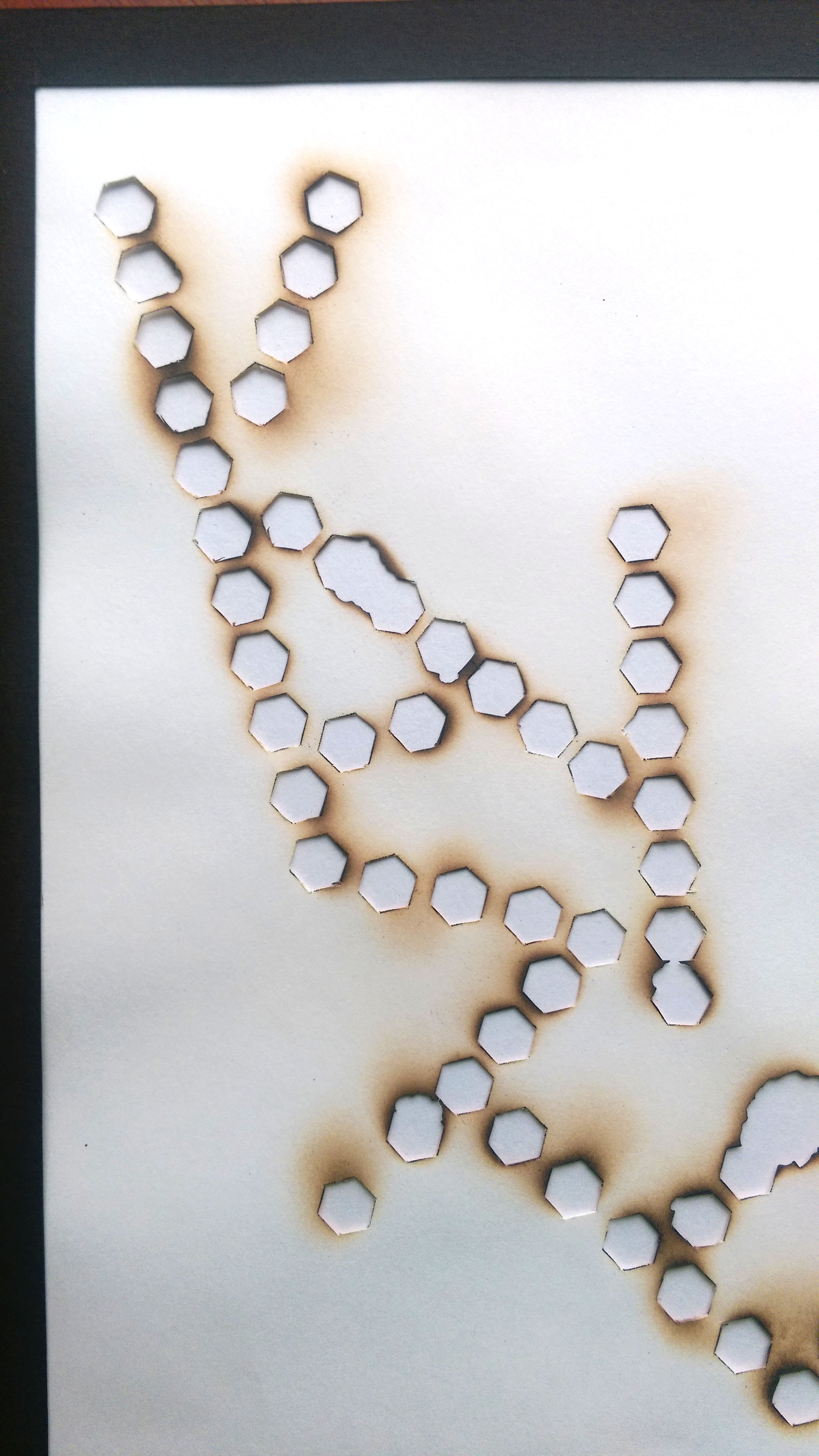
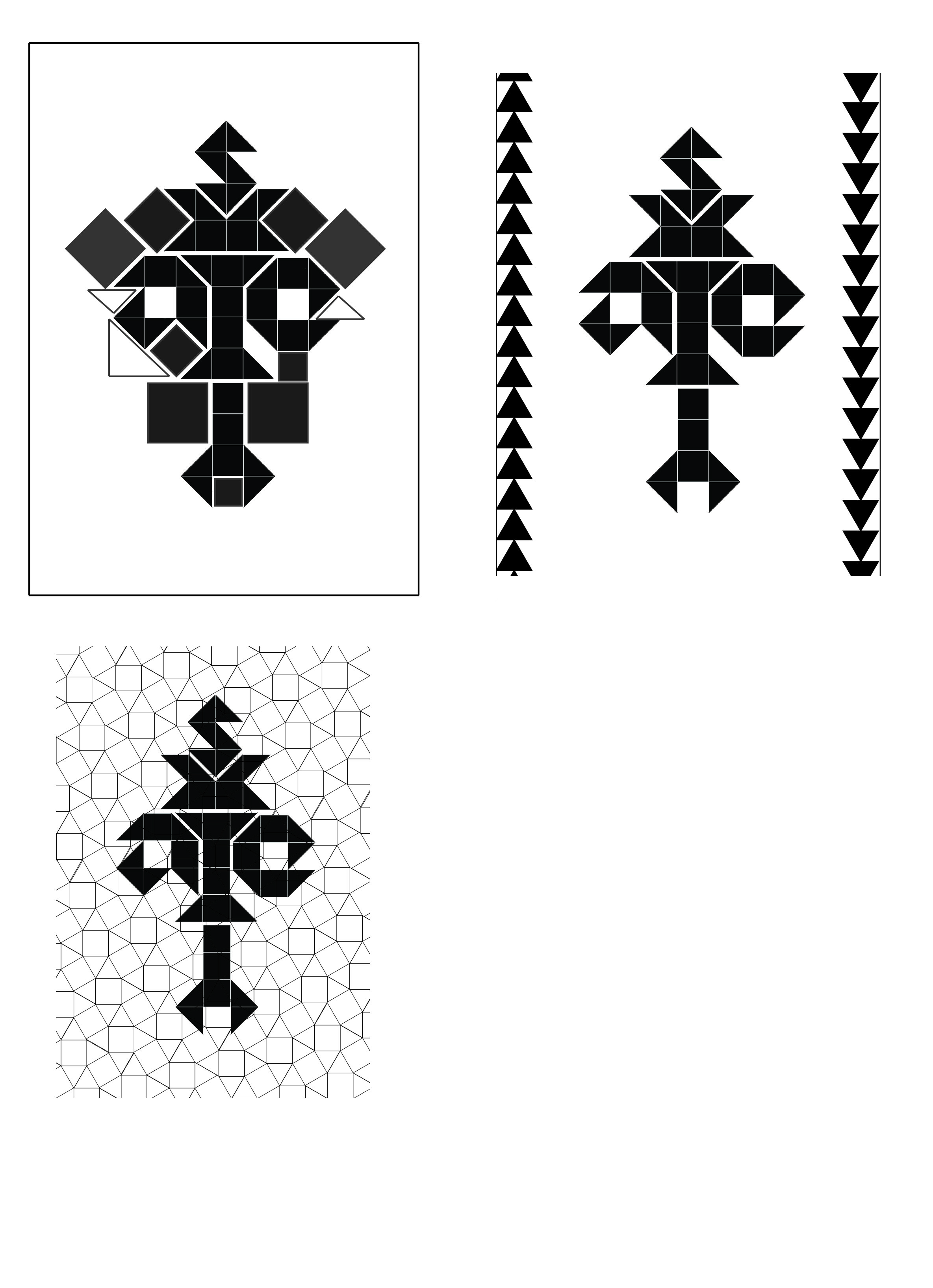
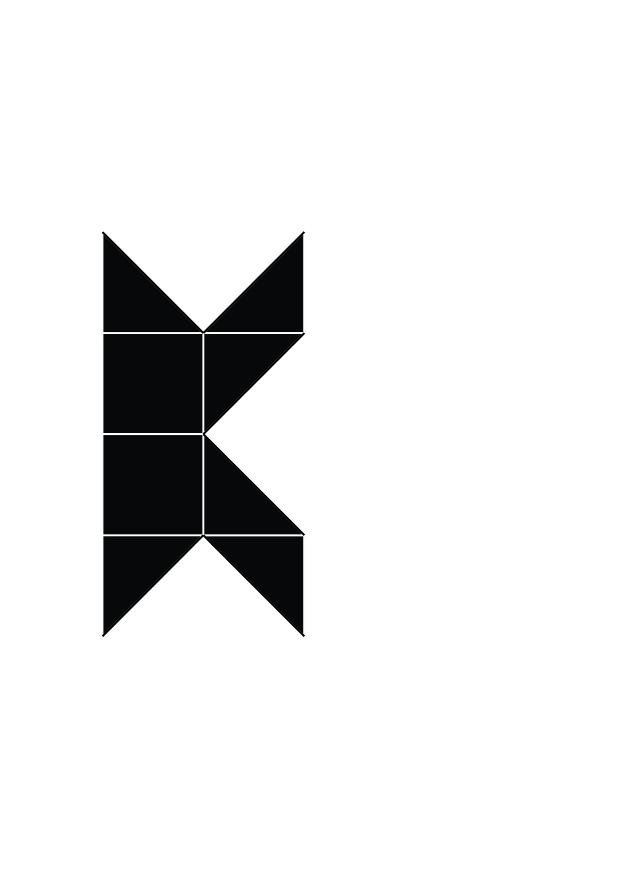
Final thoughts: I want to talk about the ‘rules’ that I mentioned in the post before and how I have applied it here to my final work. All the midpoints of chromosome letters are the same, the length within each pair is also the same as is the banding patterns. The banding patterns(horizontal stripes) were to be rather subtle. From the first letter ‘K’ to the last letter ‘e’, the overall length decreases. I talked about compromise of logical the last time and I did compromise to a small extent as seen in the letter ‘a’. The arms bend towards the other chromosome instead of away. My lack of compromise here has resulted in a double ‘s’ and ‘i’. If I had to do this again, I would have done the same thing, I would like to remain true to myself and remain as scientific as possible. In fact, the double letters pushes the viewer to look at the negative space or the space between the duplicates to find the single letter.
I didn’t really specify the artist reference for this work because I feel like I have applied bits and pieces of what I have gathered from the many artists that I came across throughout this project. Information not just about their final work but also the process by which they worked with.

Chemistry: Risk-taking (fumage)
Medium: Fire & smoke on paper
Artist reference: Dada movement. Wolfgan Paalen
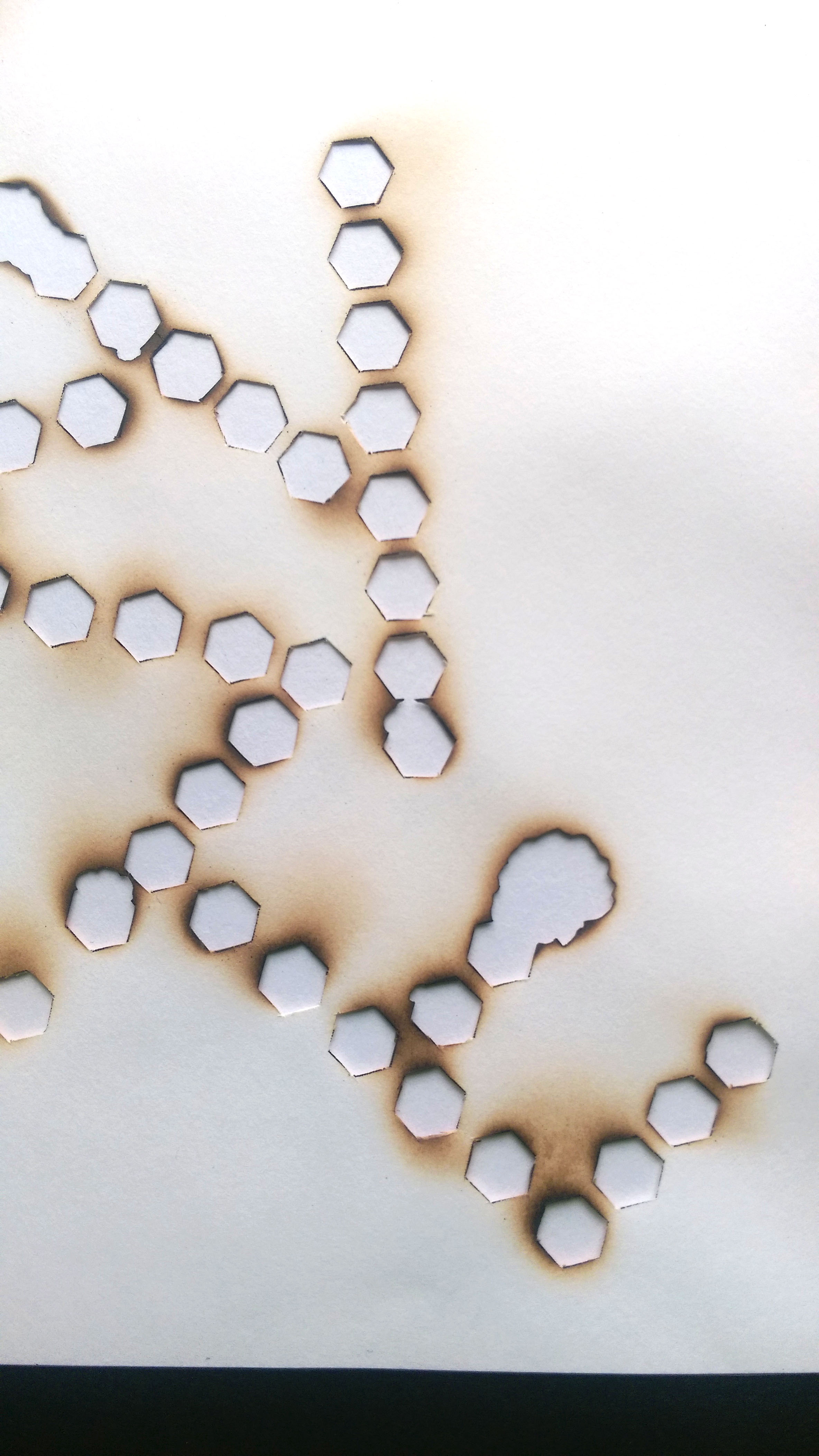
Final thoughts: After attempting the fumage again, I can say I am pretty pleased with this outcome. There are holes that went beyond the original shape of the hexagons but they are really growing on me. You can see them in the letter E in the image above, where two hexagons have merged. Again, I would link this back to success and failure and the unpredictability of risk-taking. The outcome is not something you can always predict and you just need to make the best of the situation and use it as a learning experience.
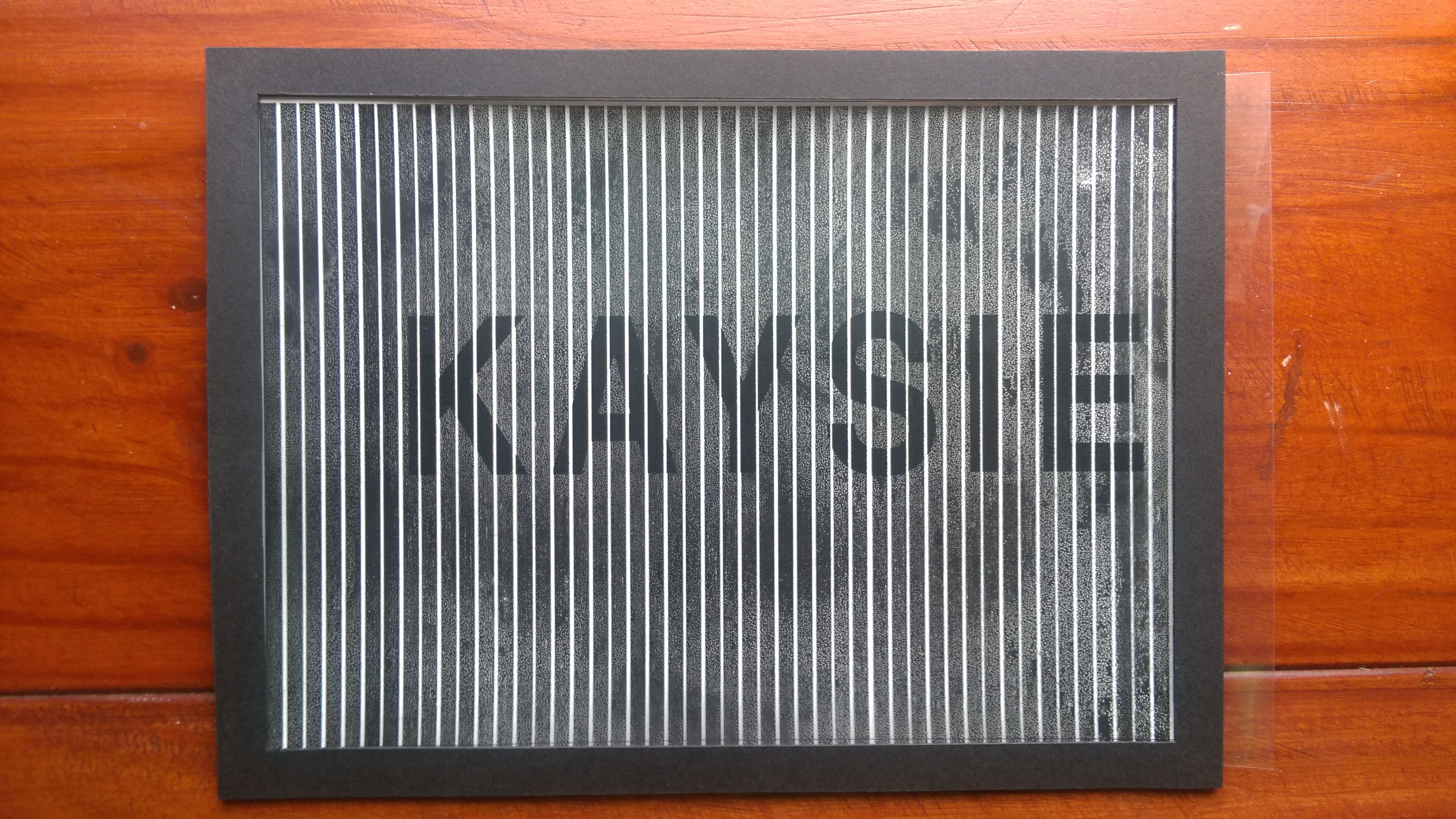
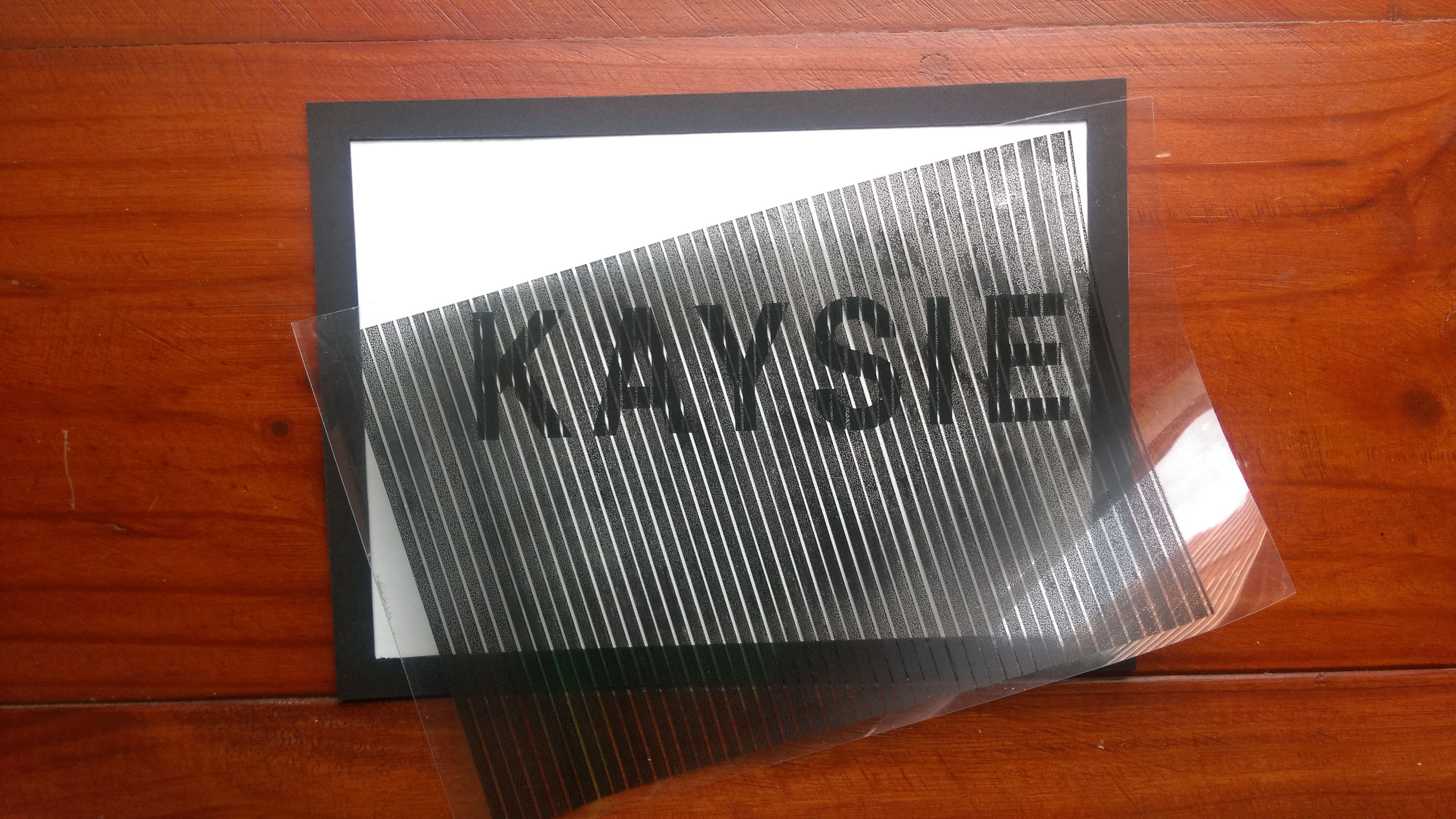

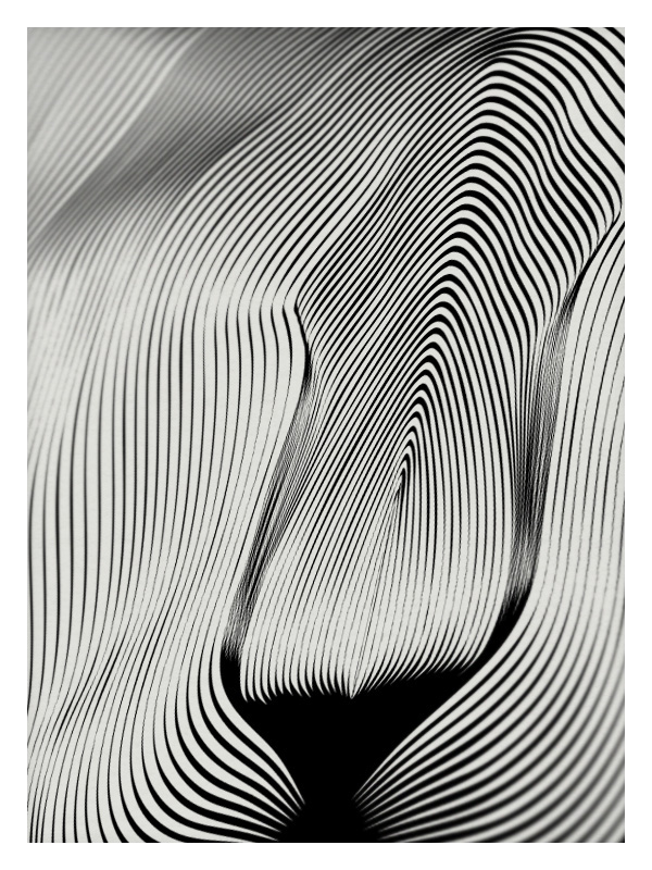
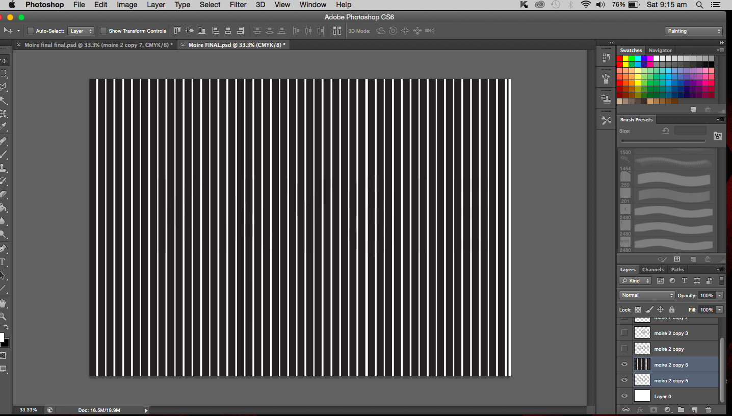
Physics/Mathematics: Inquisitive (Moiré patterns)
Medium: Digital (printed on paper and transparency)
Artist reference: Andrea Minini
Final thoughts: I mentioned in class that this didn’t really turn out as good as I would have wanted it too. However, I am growing to like it. Not to say it doesn’t work entirely but it is just not to its full effect. The ink did not hold on well to the transparency film resulting in splotchy stripes that were not opaque so the name behind was not fully hidden. The fading in and out can still be seen though and I’m not too disappointed with what I have made. It is a learning point for me and I don’t regret trying out something new like moiré patterns. It was really interesting to make and that further emphasises on the inquisitive nature. There is also an element of unpredictability seen here, the fact that the results were unknown until the final outcome. I’m pretty that I likened this to my physics results, saying that I like it but the results don’t always show my love for it. I still think it to be mostly true.
I would kept my works in black and white, with the execption of the fumage. The reason for this is that when you talk about scientific information, it is black and white, they are facts, not much grey area. That is something I really like about the sciences, it either is or it isn’t.
I received a lot of lovely comments from the others and it was really encouraging.

What I can take back from the critique session is that I should further explore my relationship with science and deal with the fact that I actually have a love-hate relationship with it. Also, back to the good old petri dish. I talked a lot of safety hazards and was told that now I should maybe look into hazards as a designer if i’m not wrong and merge the two together. So that’s what I’ll be looking into.
In this short post, I will be covering how I will be doing the biology themed piece of work. After much internal debate, I have decided to go with the chromosomes as a base to start with.
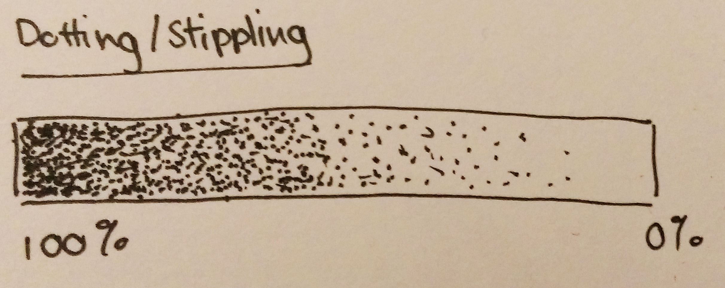
The medium would be in pen (0.05, black). I will be stippling the entire piece. I enjoy stippling as much as some would consider it time consuming. I like the control I get with it, you get to decide where each dot goes, it’s like drawing at a micro level. I really like that level detail that comes with it. The process just involves dotting basically. Areas that are to be darker just require a higher density of dots, lighter areas involve dots.
If you think about, the dots seem to represent the numerous genes present on DNA and chromosomes, so it is appropriate to have dots/genes make up the chromosomes. I really hope I am making sense.
I am as much a science student as I am an art student. I like to be as scientifically correct as possible. In this case, I decided to stick with the ‘rules’ that come with the chromosomes. And I will be sticking to these rules while drawing this work. Here is an image that I showed in a previous post. I will be referring to it to illustrate the rules.
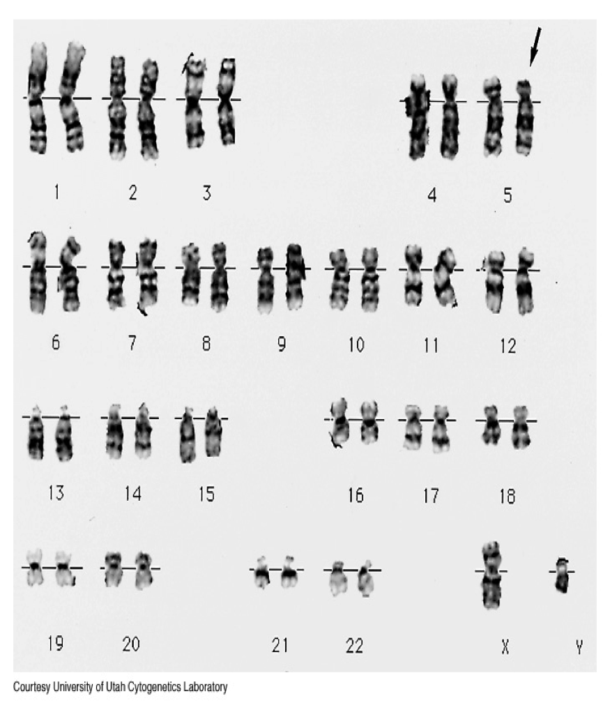
The first thing to note is that the midpoint of every chromosome pair is the same. See the reference line that runs through the middle of each pair? That’s the common point (it’s called a centromere). Next, the length of chromosomes in each pair are the same length. If you look close enough, you will find that the chromosomes aren’t uniform in colour, there are bands of different opacities. That’s the staining pattern and is usually the same within each pair. The last rule is the direction in which each chromosome arm bends in. Sometimes they are vertical but they can be bent. They usually only bend away from the centromere.
I understand that following these rules to create my work might be limiting what I can do but I find it hard to make such a compromise, I want the work to look good but also be logical to me. I mean, I am willing to give in a little but overall I would like to make something that is still scientifically sound.
The process for this piece is pretty straightforward. First I draw a horizontal line across the middle of the paper. Sketch out where I want the chromosome pairs, making sure that the distance between each pair is roughly equal. Then the dotting begins. The darker bands created just require more dots and lighter bands less dots.
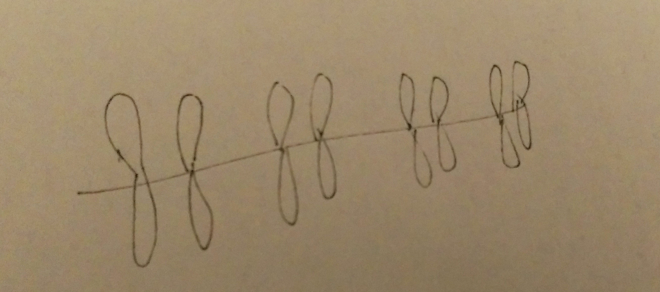

With so many dots involved, I’d like to think about this work as me being detail-orientated. Every detail is taken in account. It is also an attribute that is crucial for any scientist. To never overlook any detail and record their process and hypothesis in a detailed manner. A lack of detail of result in very different outcomes.
The most obvious route to take with chemistry would be to work with structural formulae and skeletal structural formulae of molecules. However, that has already been done, see K-mistry Typeface by Ranmalee Jayaratne, where the skeletal structure of molecules are used as letters.
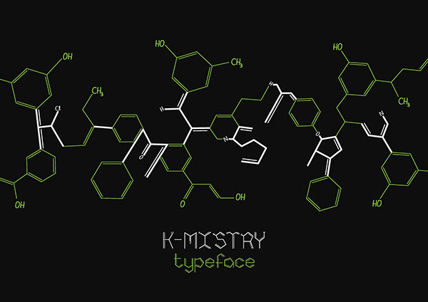
Website: http://betype.co/post/102095978657/k-mistry-typeface-by-ranmalee-jayaratne
I think the idea is a brilliant one, the letters look clean and simple but scream out chemistry. Straightforward and to the point, which is what I like about it.
I tried my hand at it nonetheless but took my own take on things.
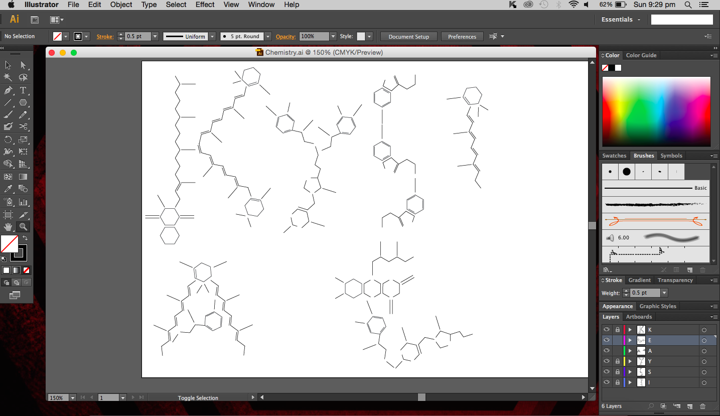
I used the real skeletal structures of certain chemicals found in the body or needed by the body. They include vitamin K (and its variants), vitamin B and its subsets, vitamin E, vitamin A, adrenaline and serotonin. Instinctively, the letter K was made up of vitamin K and the letter A was made up of vitamin A. The letter S made of Serotonin.
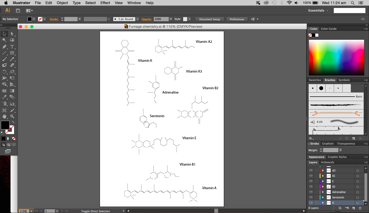

Above are images of structures that I have created using illustrator of real structures. However, I have removed any letters (meaning the ‘O’, ‘N’ or ‘CH3’ for oxygen, nitrogen and methyl groups respectively) which is why you will see gaps in some of the structures. Take for example the image below of Vitamin K3 in its full form and compare it with the structure above.

I didn’t want to add them in as I thought they were too distracting and would have deviated from the simple clean look I was going for.
So what are we then left with, the periodic table? I find that equally common. I could do something related to organic chemistry that includes benzene (hexagon in shape). Similar to the Hexagonetica mentioned in an earlier post, I could create a three dimensional shape (not a cube though) and derive the letters from resulting shape.
Other ideas of mine included paper chromatography, which is really fun to do. Chromatography in this case basically separates ink into its different component (every ink colour usually made up of several other colours) with a solvent (e.g. alcohol). Each colour ‘travels’ at a different speed on the paper so the result is a gradient of colours, which is really quite beautiful if the right amount of solvent is used.
Chemistry reminds me of copper(II) sulfate crystals, maybe its because the blue crystals we actual got to create years ago just looked really beautiful and I will always remember what they looked like. So, crystals, many compounds can form crystals and I feel that that is one of the reasons that makes chemistry so cool. Your starting solution (aqueous) is slowly evaporated and a shiny jiggered edge crystal is formed, almost like magic. I could create a crystal typeface. But the issue I’m having now is that the typeface may not give people the impression of it being of chemical origins.
After much thought and reminding myself that I should keep designs clean and simple without excess details, I have decided to use fumage, which I believe is part of automatism. I didn’t really do much of fumage art in semester one simply because I was terrified of burning the paper and setting fire to everything else (the paper did actually catch fire). But you know what, risk-taking, that’s what it’ll show (done more carefully this time though). And indeed, risk-taking is important in the realm of science. If you are willing to take that risk to experiment, you could discover great things. I guess that’s an attribute that I would be portraying with this chemistry themed piece of work. The attribute would be portrayed more strongly in the process of the work rather than in the final.
Furthermore, the use of fire is quite common in chemistry. Bunsen burners should ring a bell for most students. They were a staple in lab sessions. I think it is only appropriate to use something we have frequently used in the lab in my work, just makes it more relevant.
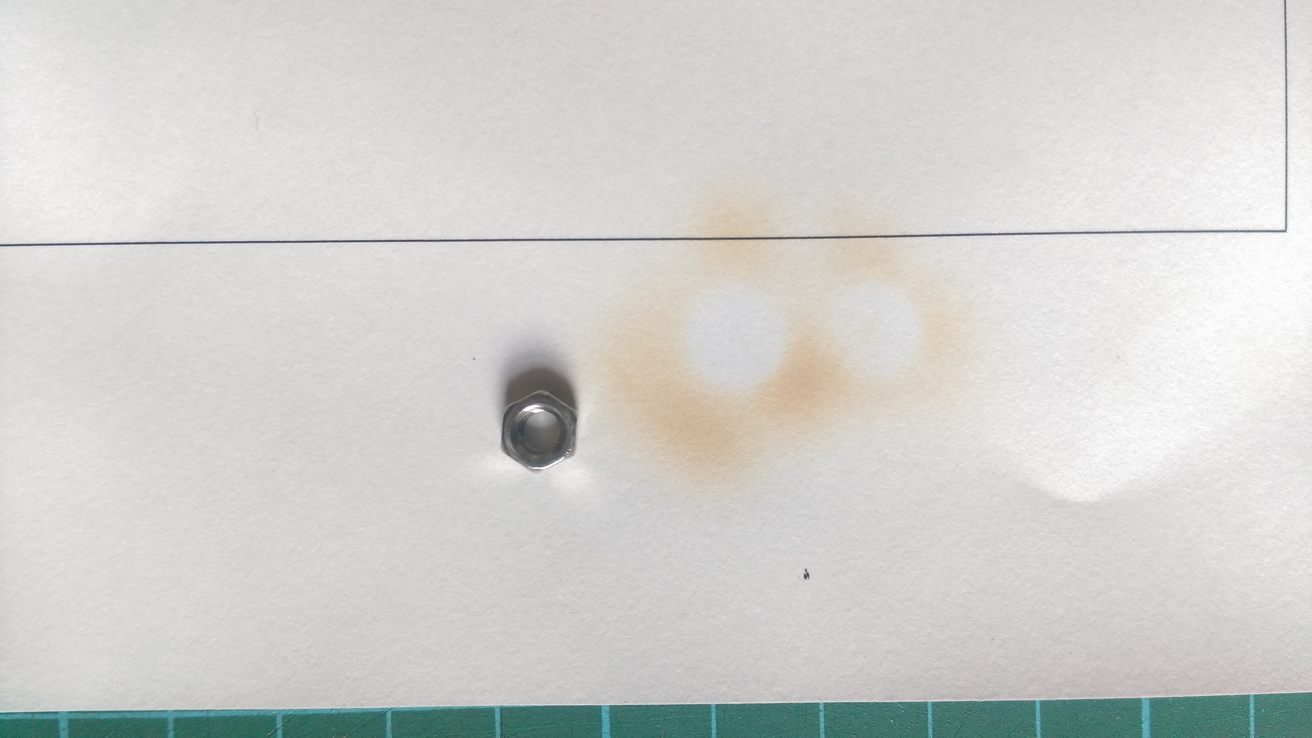
So to begin this piece of work, I have decided to create a design that I would follow to burn. I choose a hexagonal shape because it is rather iconic in organic chemistry (benzene rings). Initially I tried to use nuts to create the image of hexagons however, it was not too successful since the nut itself is not fully flat so it is not in full contact with the paper.
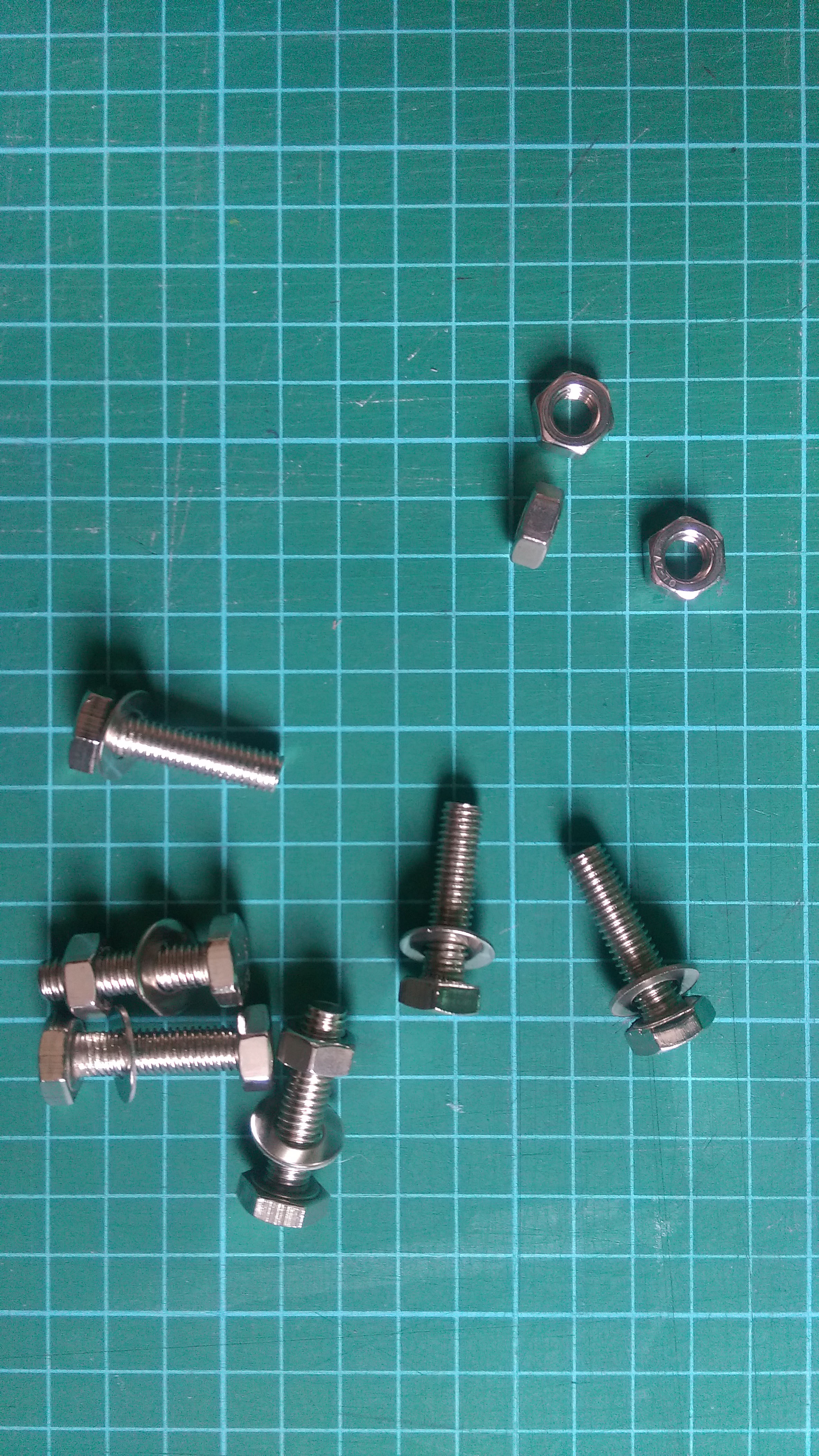
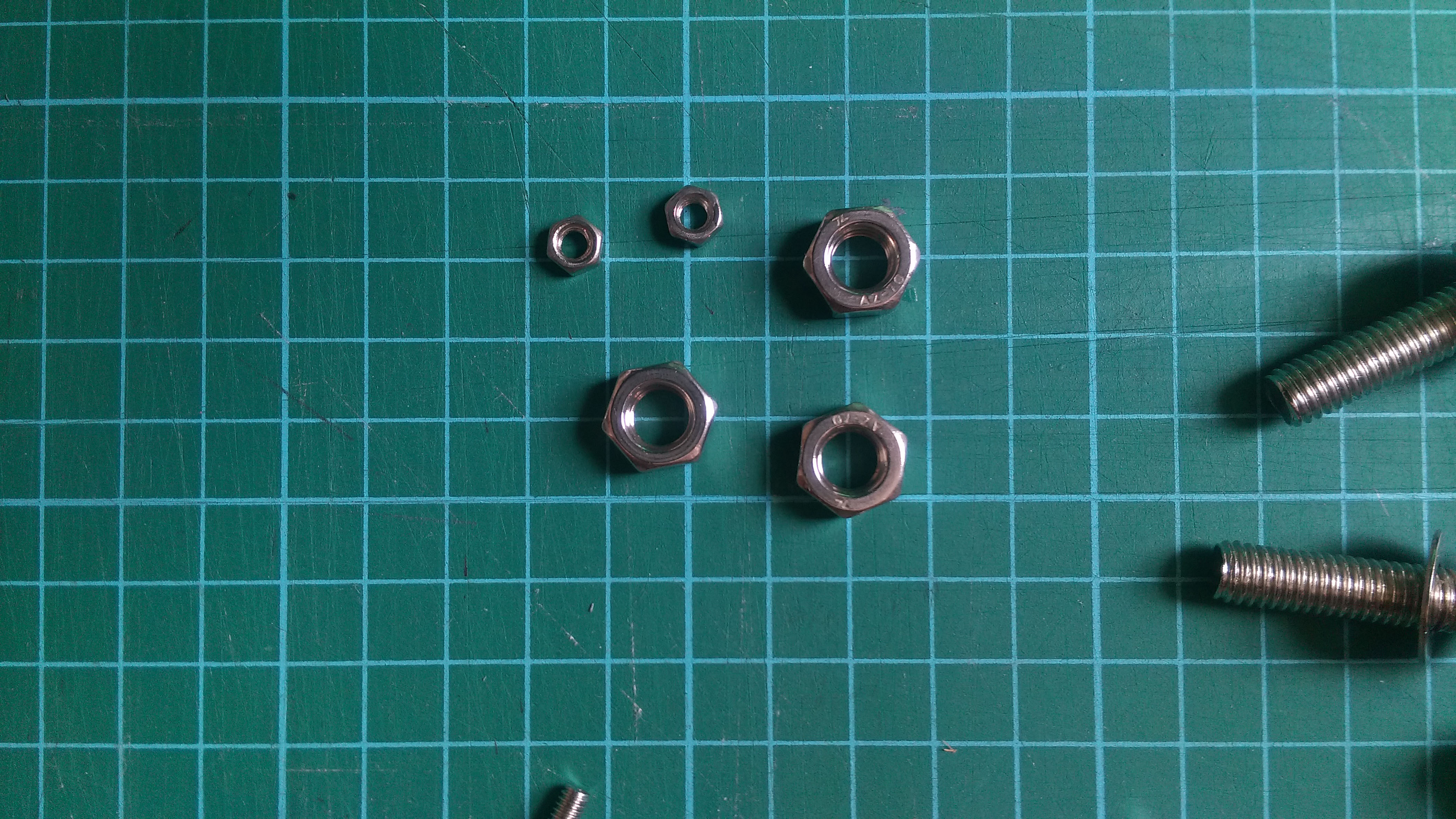
I experimented with two different sizes with the same result. The area around the nut turns brown and burns because the heat is absorbed by the metal (good conductor of heat) and the place where the nut was remains white. It is almost like drawing in the negative. Now because the full hexagonal shape of the nuts were not in full contact with the paper, only circles were formed.
That aside, the way I went about this was to place the nut on the paper and hover the paper above a lit candle until the paper turned brown, almost black. The tricky thing about this is that I had to decide when to lift the paper off the heat. From experience, leaving the paper on for too long will cause the paper to burn a lot quicker and uncontrollably (and there is a lot of smoke and ash that comes with it). So there is a fine line between getting the paper brown just nicely and burning it. Besides the time taken to burn the paper, another factor would be the distance from the flame, the closer to the flame, the faster it burns. It is a double edged sword because on one hand, it is faster to have it closer and I can actually have a more direct flame at a specific spot, which is brilliant, but on the other hand, I risk burning a larger hole in the paper than expected.
I decided to use a stencil instead of the nuts to see if I could get a clear hexagonal shape. I cut out a square using an exactoknife just to test things out. I placed the stencil below the paper I wanted to burn and placed it over the flame (so stencil is nearest to flame).

The results I got were better than expected, not because the image that came out was good but because the stencil itself looked really interesting and good. The edges of the stencil were burnt well; the edges had a hint of black, which gave it an interesting texture.
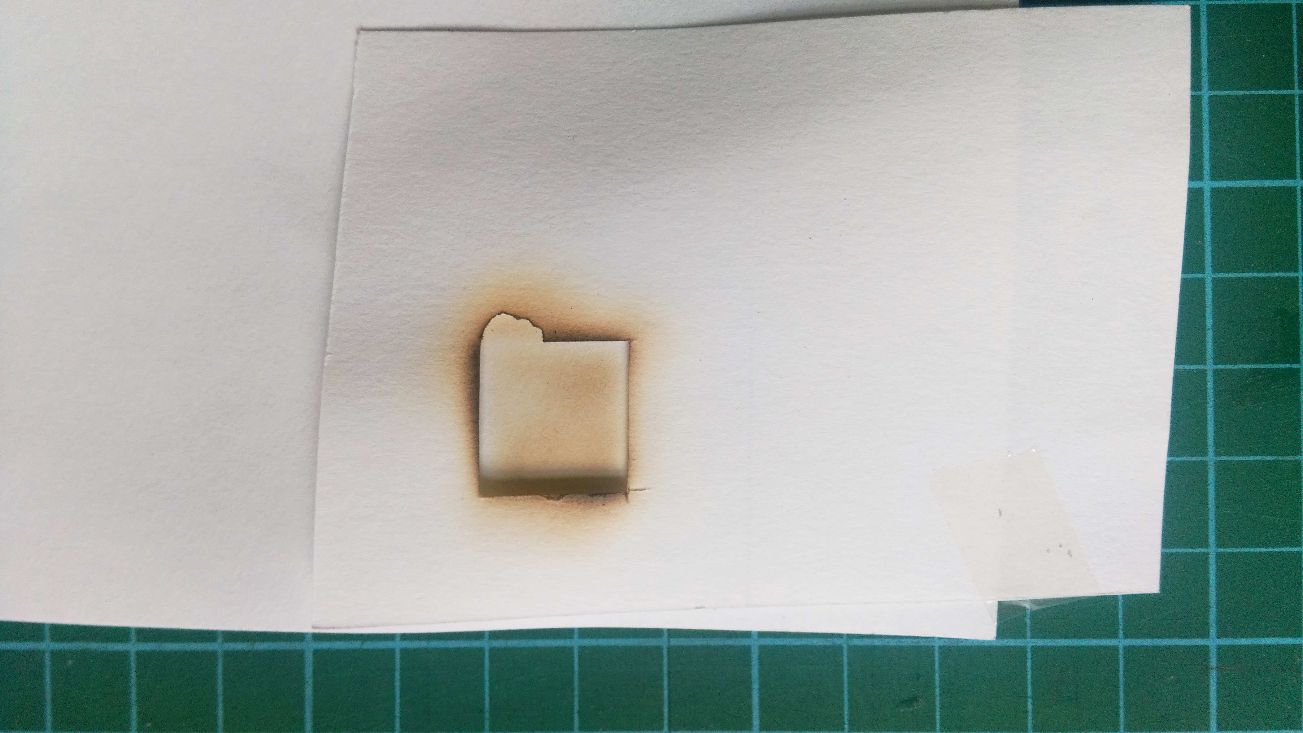
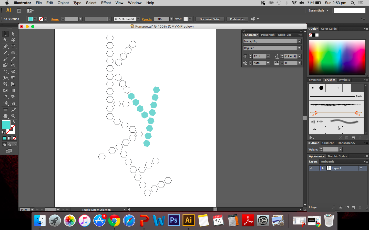
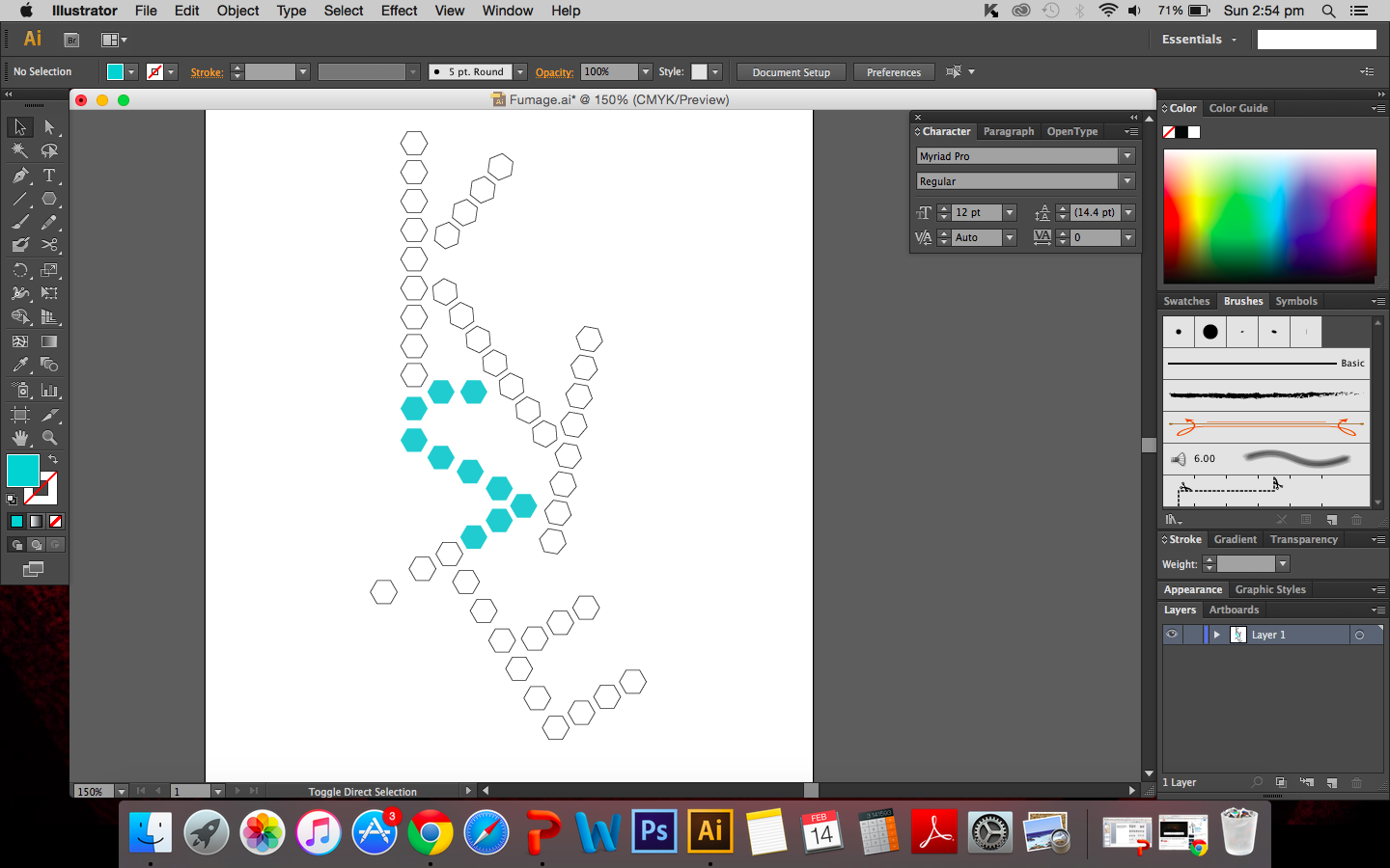
So I decided to cut out hexagonal shapes and burn the edges instead. I created a design using the polygon. It may look rather rigid (no curves or bents), the polygons are arranged in straight lines but that is exactly what I’m looking for.
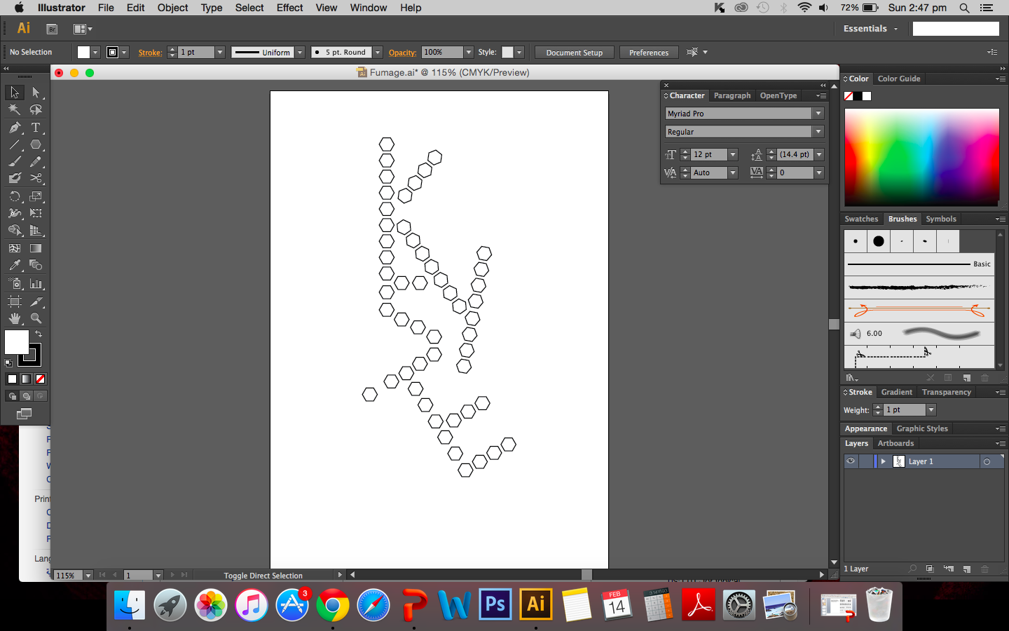


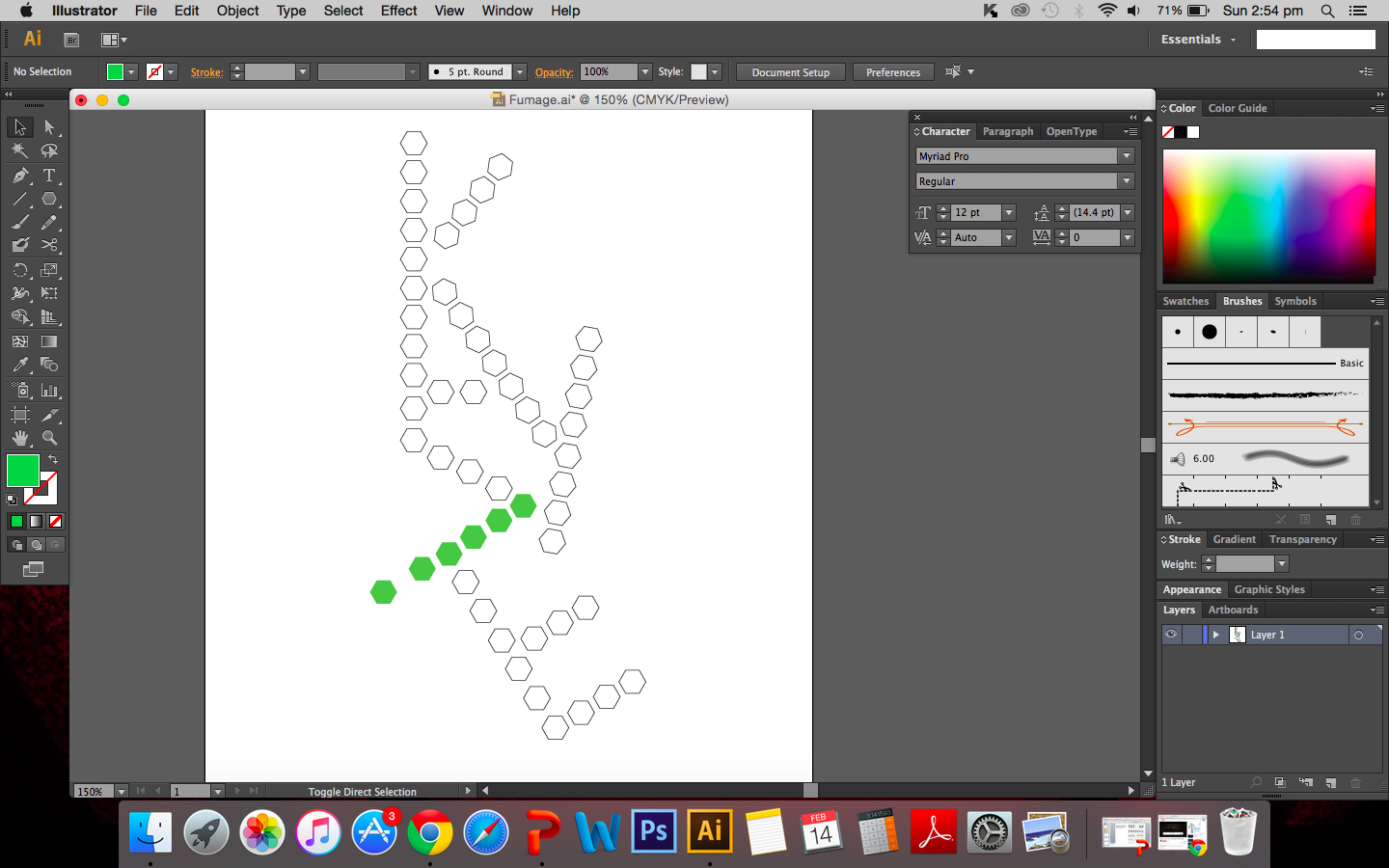
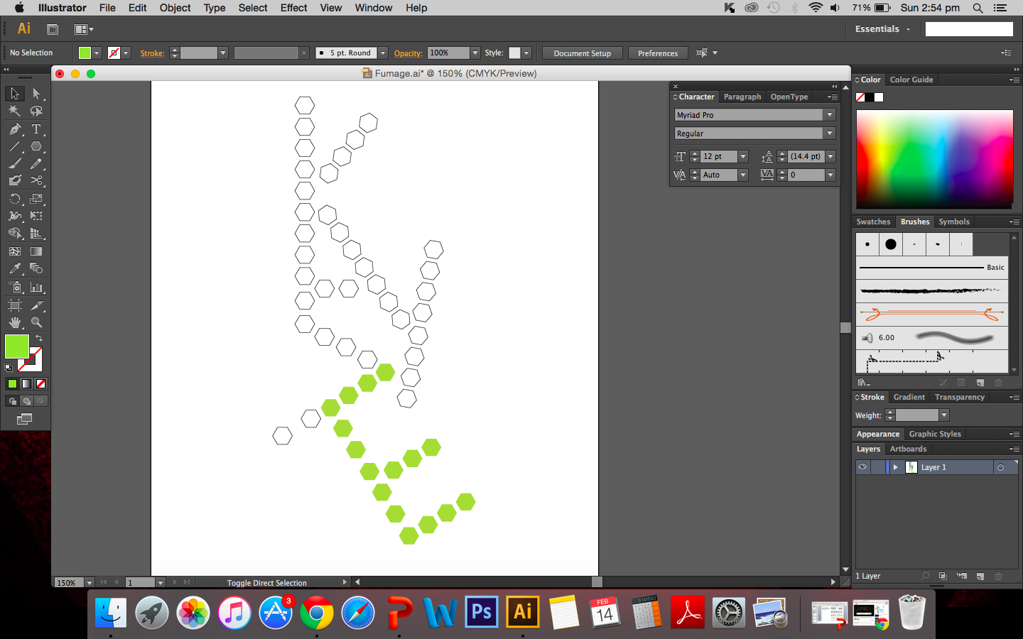
In a way, the rigid arrangement is similar to how structures are drawn and presented in chemistry and since it is chemistry based I thought it would be apt to leave components of chemistry in the work. It also reminds me of the structure of amylopectin and amylose.
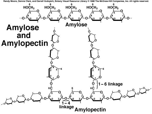
Image:http://www.mhhe.com/biosci/pae/botany/uno/graphics/uno01pob/vrl/images/0026.gif
I cut out the individual hexagons on drawing A5 paper and began to burn the edges of each shape. How appropriate it is that I am calling this a risk taking attribute because my fear of excessively burning the paper definitely came true. I had failed my first attempt.
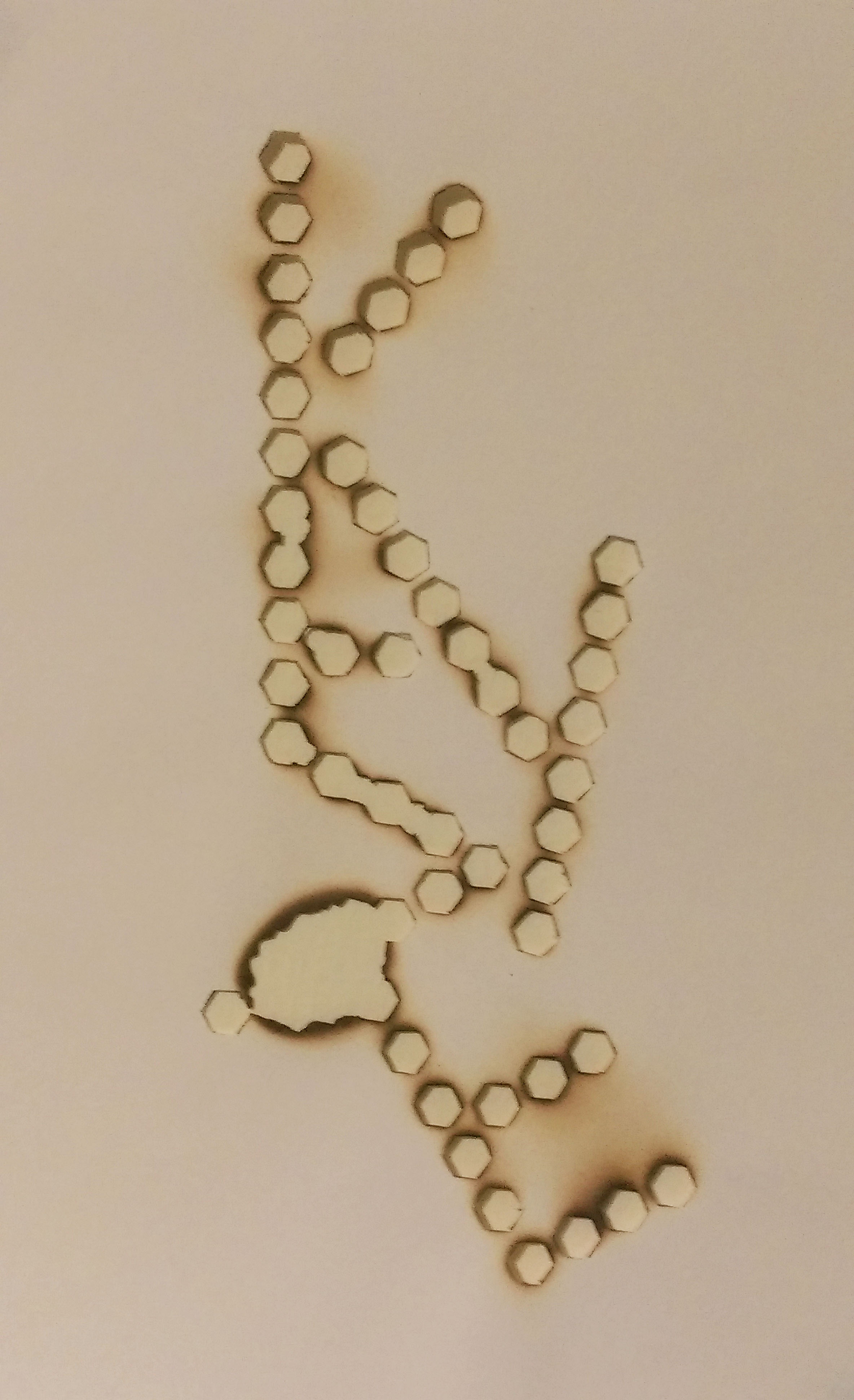
Maybe it wouldn’t be fair to call it a downright failure but I certainly did not intend for there to be quite so large a hole between the letters I and E. I think I was getting a little impatient and went too close to the flame. But the whole point of this is that I was willing to take that risk and risk the whole piece. I guess it was a learning curve for me. I have since decided to redo piece.
Some extra information about fumage. According to Oxford art online, it was created by Wolfgang Paalen.[1] The smoke of the flame is used to create images on paper or canvas.
The special thing about fumage is that you are never really fully in control, the flame burns the way it wants to and external environment plays a part in the process as well. Wind and drafts causes the flame to shift and move away from the area I want to burn and I realised how important it is to work with the flame rather than to control the candle. The outcome of the burning is soft brown marks on the paper that contrasts with the black rough edges of burnt paper.
[1] Celia Rabinovitch, “Paalen, Wolfgang.” Grove Art Online, Oxford Art Online. Oxford University Press, accessed February 17, 2016,http://www.oxfordartonline.com.ezlibproxy1.ntu.edu.sg/subscriber/article/grove/art/T064397.
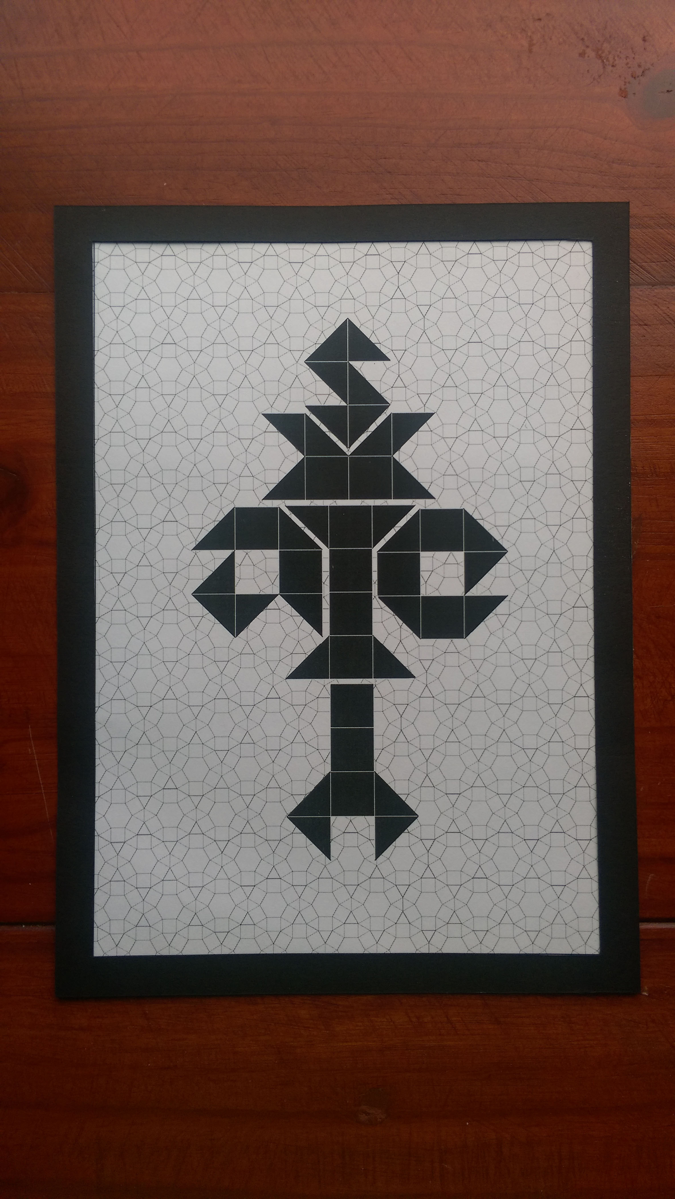
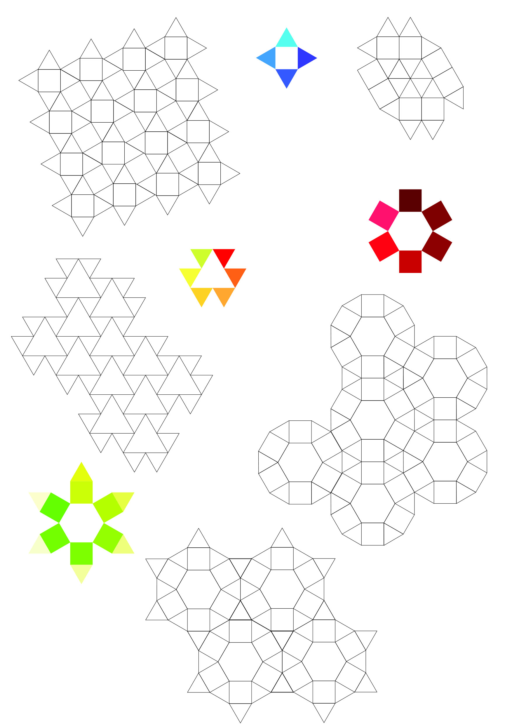
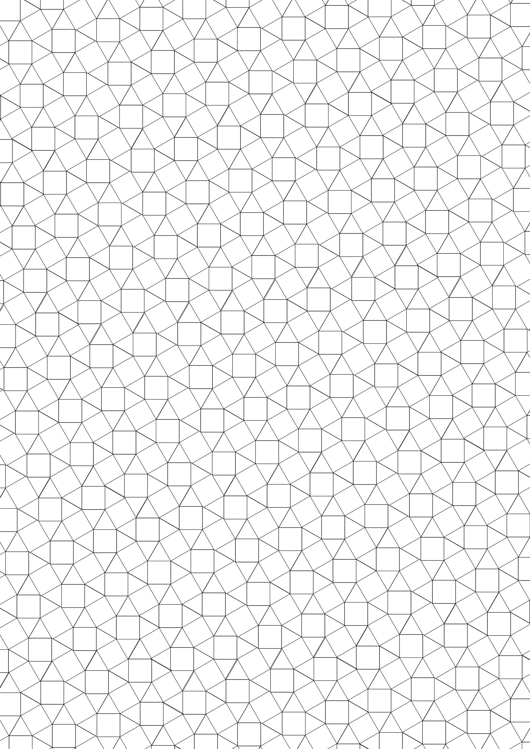
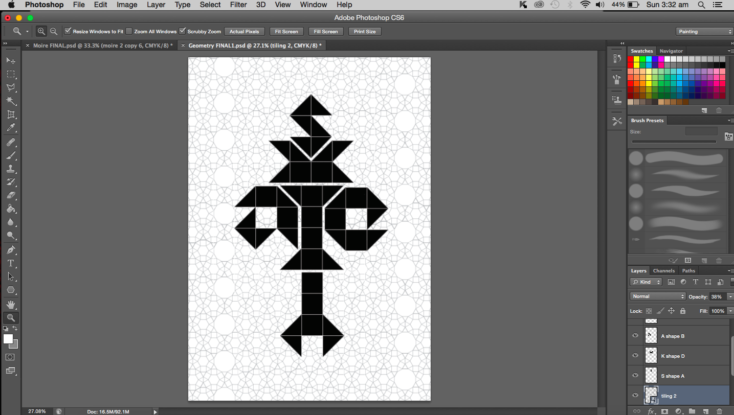
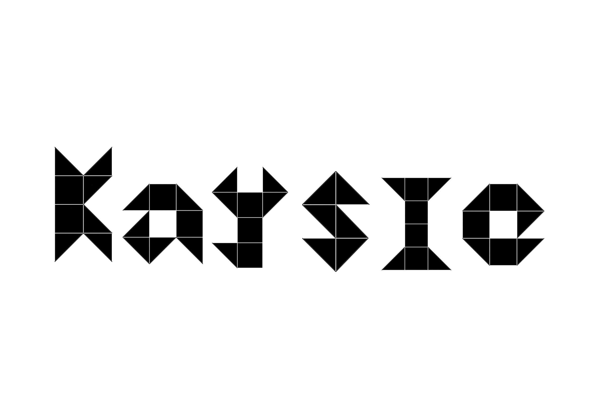
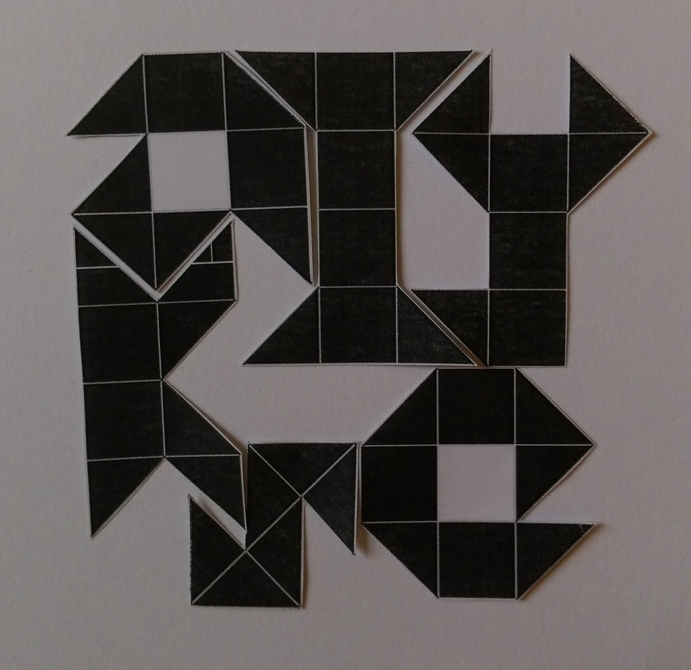
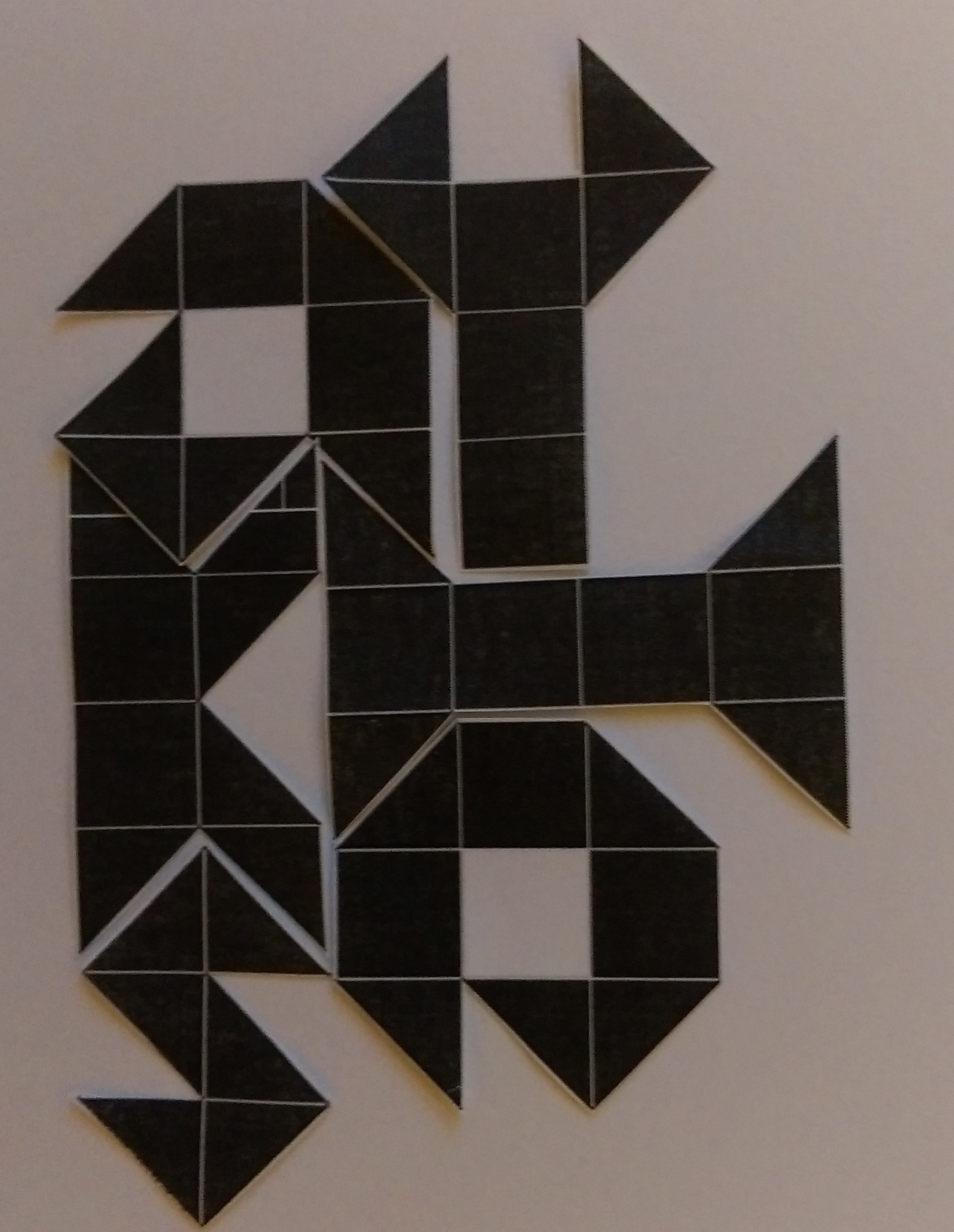
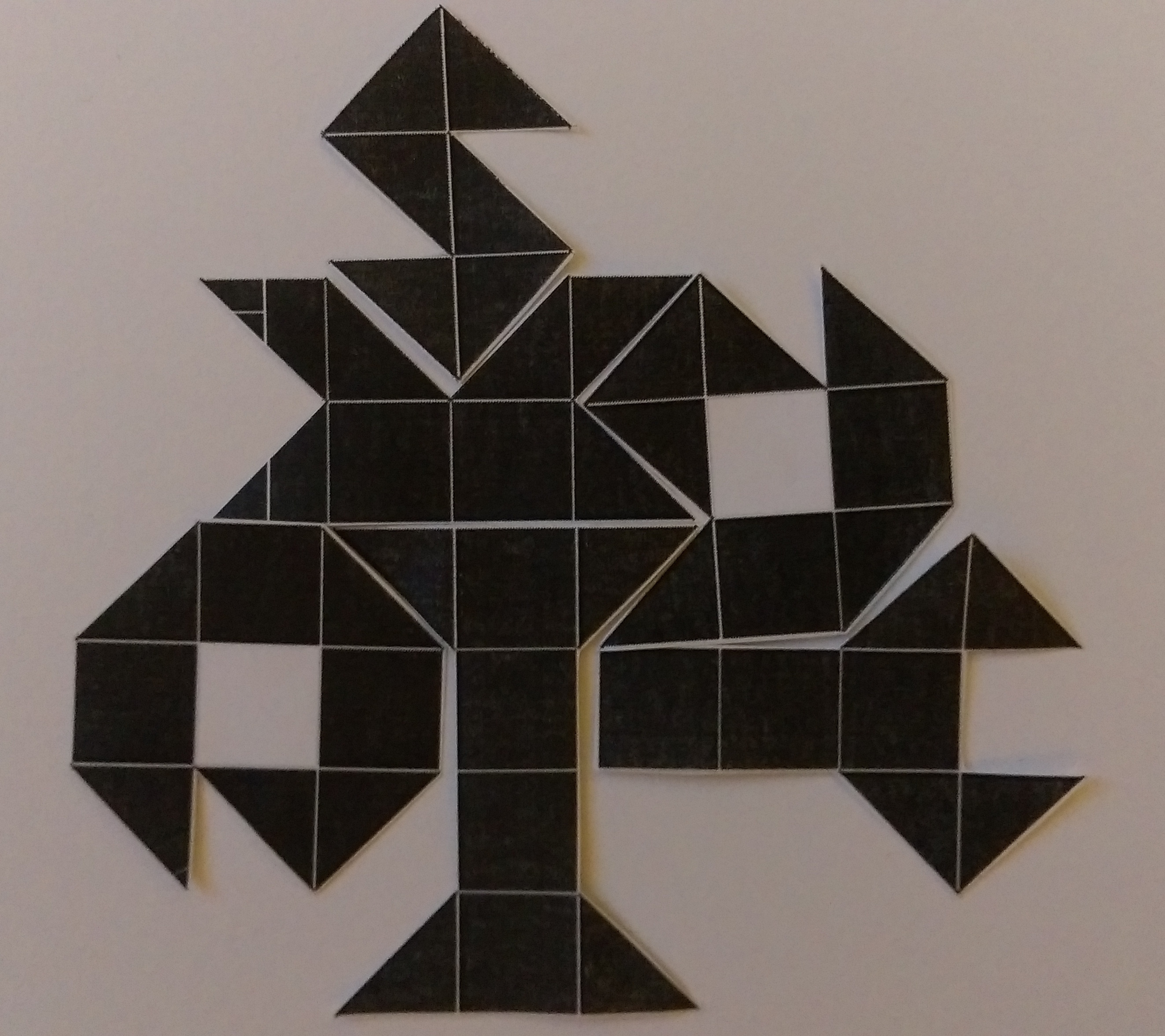
Update on the geometric work. After playing around with the arrangements of the letters I have decided to settle with something fairly symmetrical because I do like symmetry. Things that are symmetrical always seem to make more sense and are easier on the eyes. It also reminds me of mathematics because we usually aim to equate and balance. Think the equal sign, something is the equivalent of something else, they are then of equal weightage. Similarly in my work, I aim for the same thing. If you divide the image in half lengthwise and count the number of triangles (taking each square as two triangles) on each half, they are the same. Or you could see it as the total surface area covered by the shapes on each side is the same. Both sides are balanced and equal.
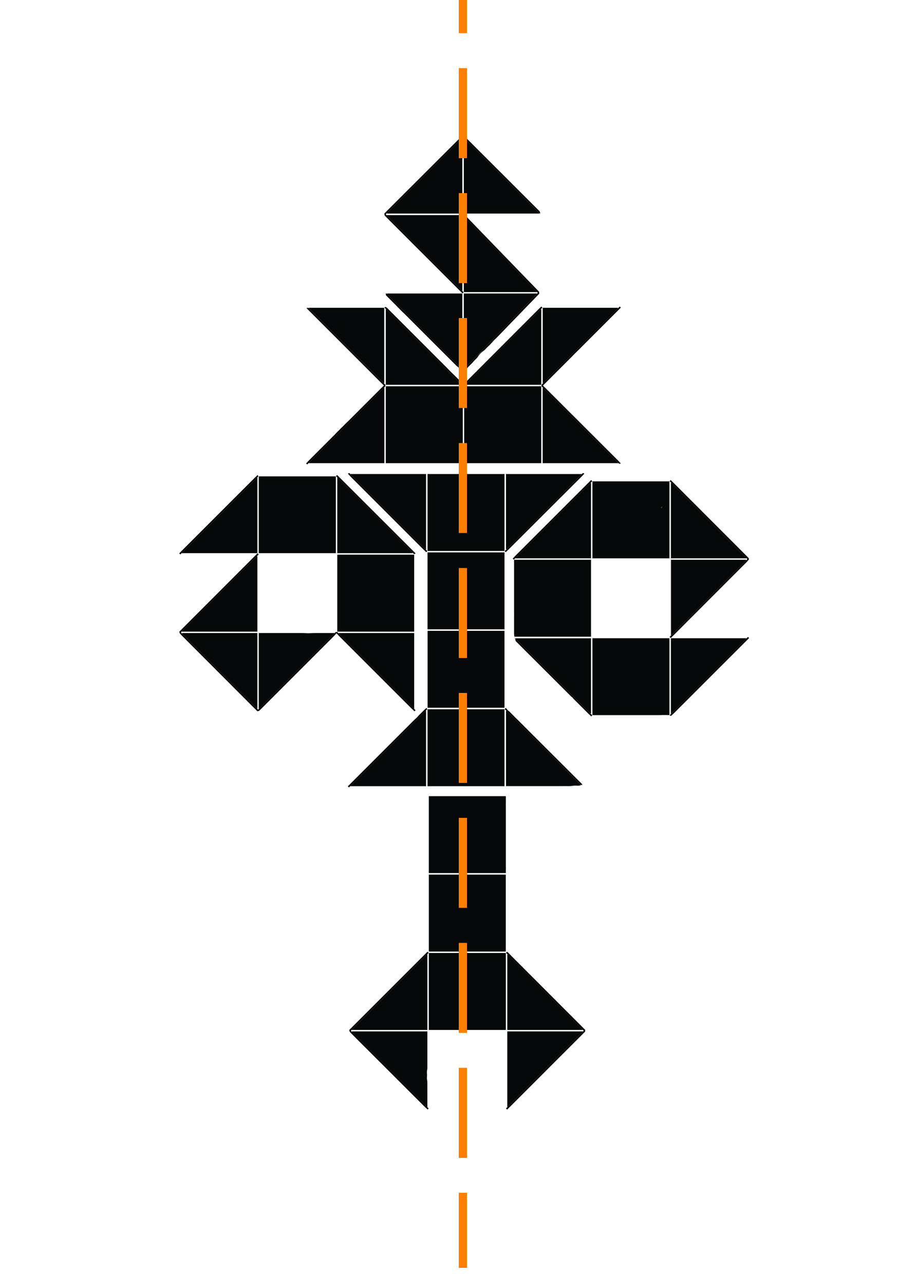
Here’s where each letter is positioned:


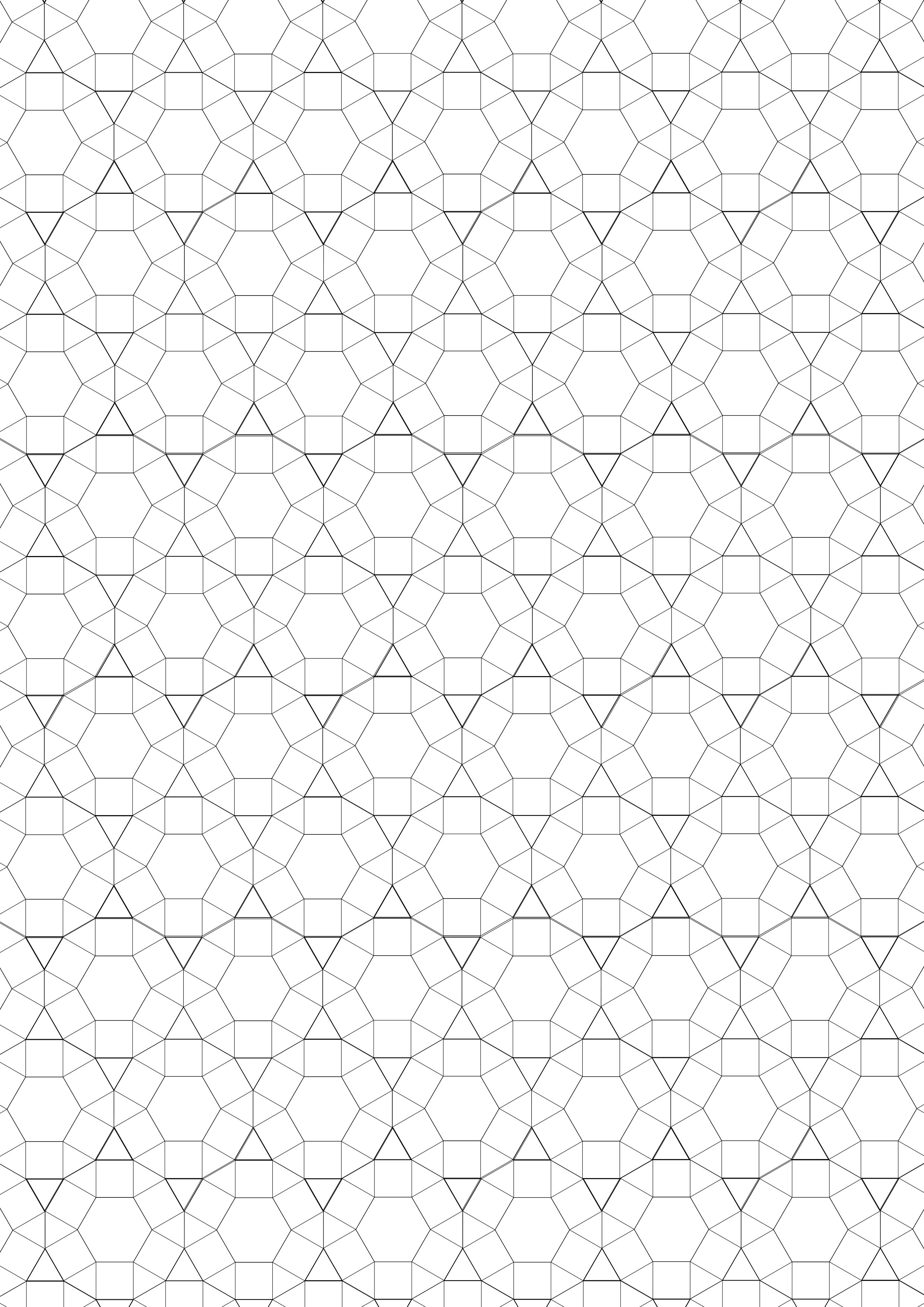
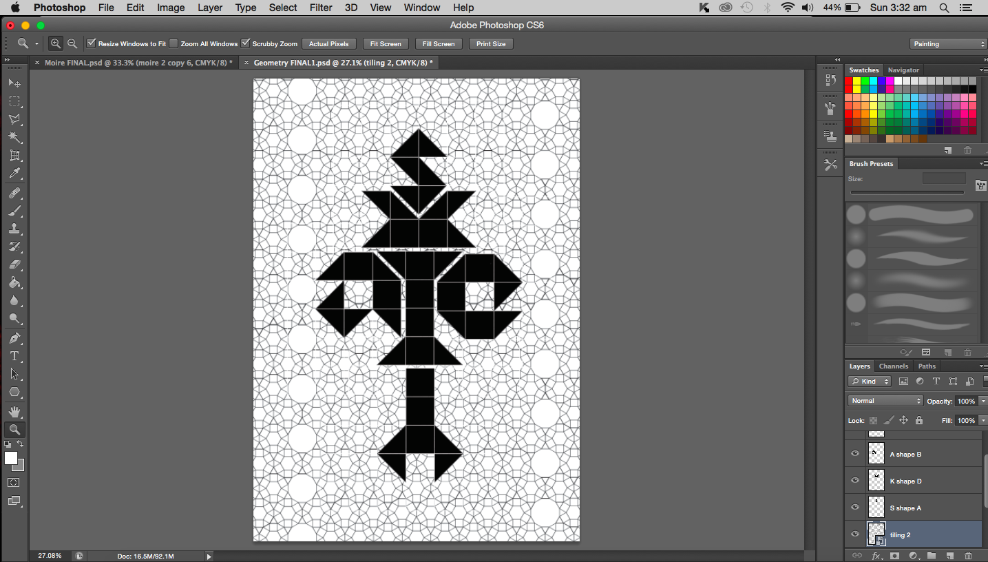
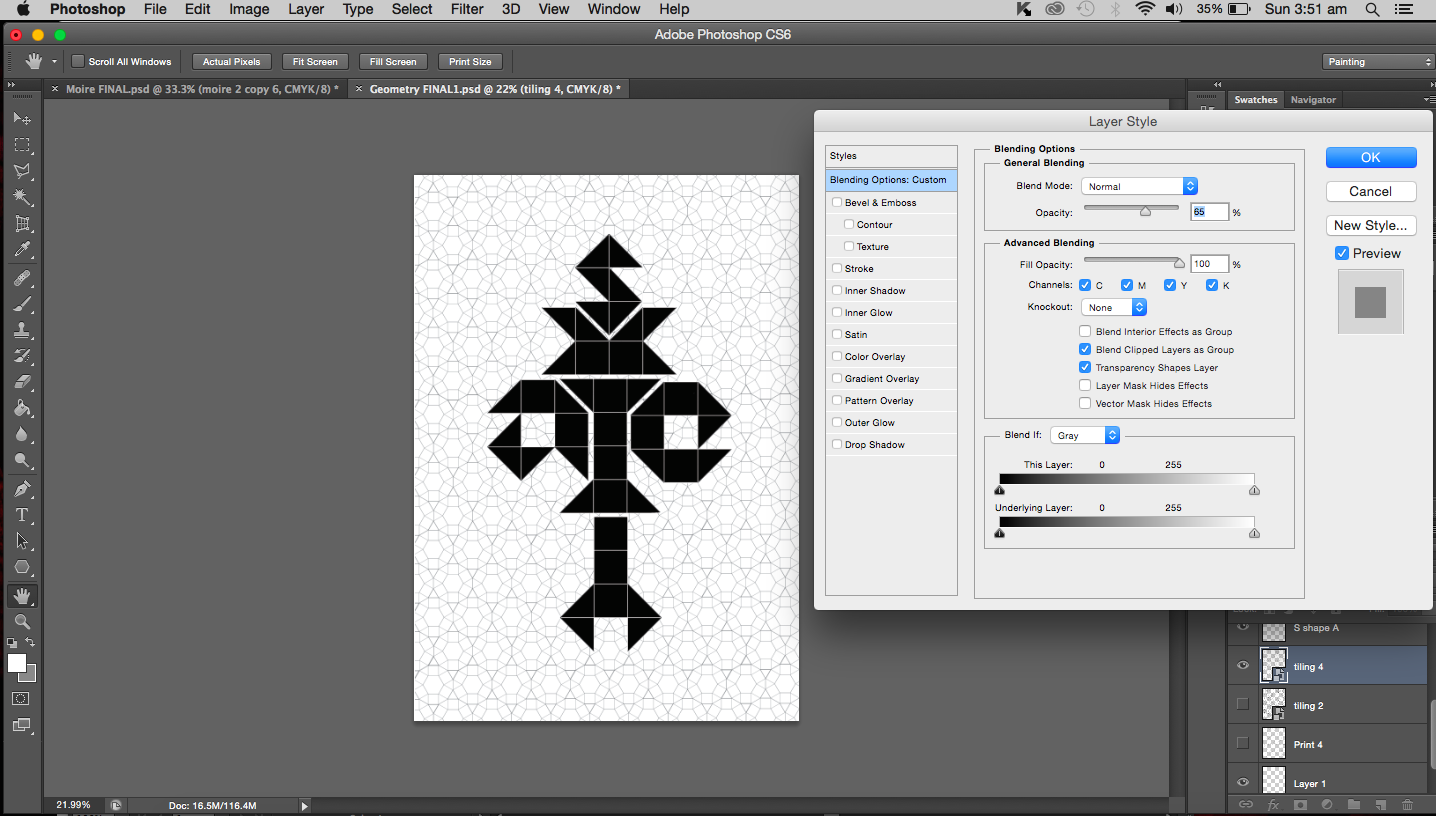
The whole idea of geometry and symmetry got me thinking about truncated hexagonal tiling and basically Euclidean tiling. I did feel that my work was lacking something and maybe this is it. A background that involves tiling that supports the main work.
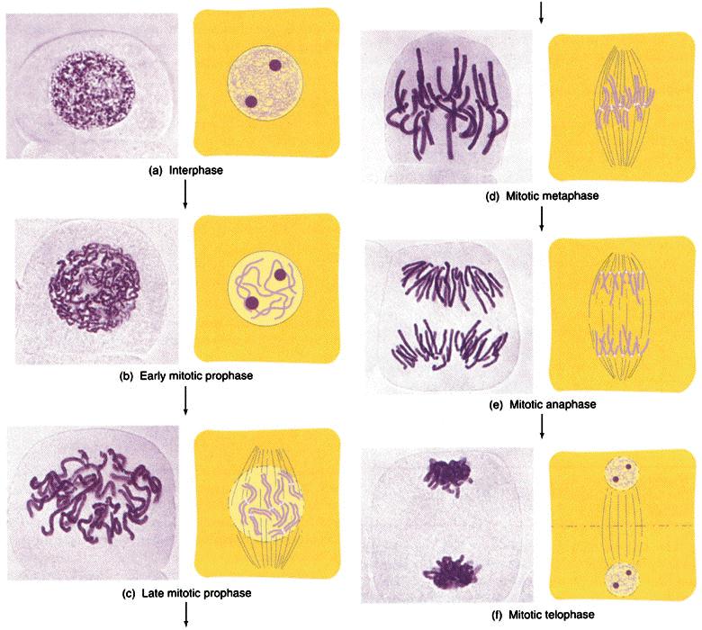
It is now time I talked about the work focused around biology. I turned to all of my old notes that I have accumulated over the years for inspiration. I think the most obvious object associated with biology would be DNA so I turned my focus to just that. My initial thought was to analyze the DNA molecules’ structure and then deconstruct it. I really hope I don’t get too technical with this; I’ll try to reduce jargon as much as possible. Sticking to the theme of genetics, I looked into chromosomes as well (the condensed form of DNA during replication). From replication, I thought of meiosis and mitosis (division of nucleus in somatic cells) paying special attention to the anaphase and metaphase. Metaphase and anaphase are phases in the division process where the chromosomes are aligned and pulled apart respectively. You may choose to refer to image I found here:
So DNA, the condensed form is known as chromosome or chromatin (depending on which part of the structure you are referring). Chromosomes come in pairs (one from each parent). I might actually work with this and create each letter from a pair of chromosomes.
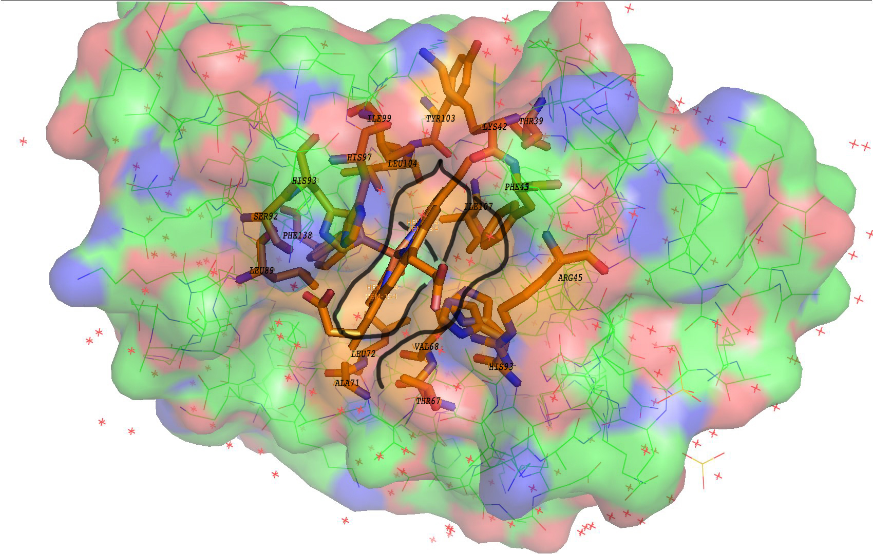
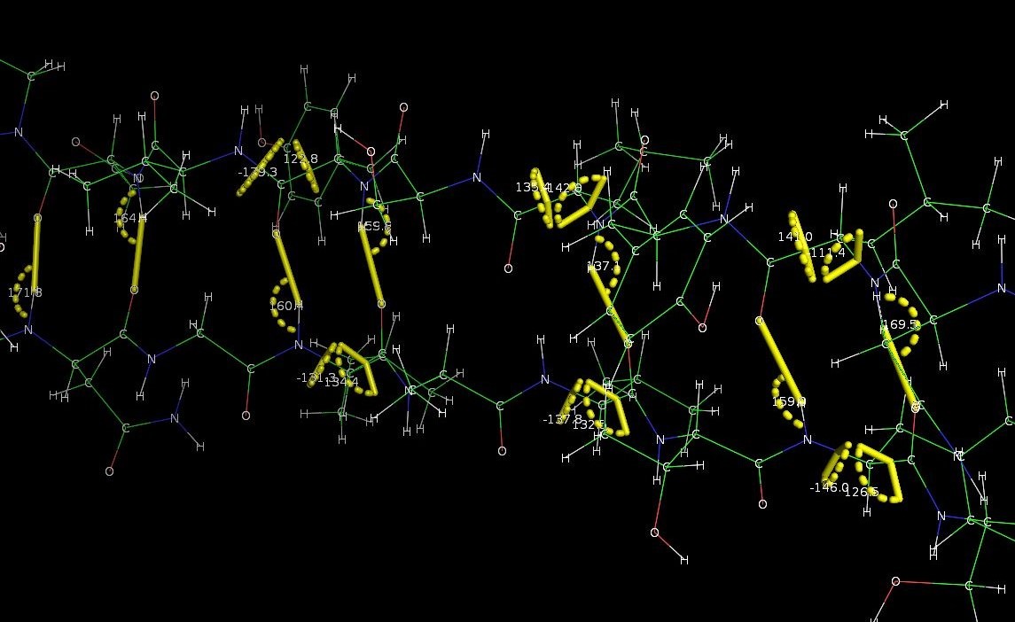
Besides DNA, I also thought about proteins and molecular sturcutres. When I was studying biological sciences a year ago, we used a software called PyMOL that enabled us to visualize molecules in its three dimensional form. I think I might use this software to create my letters if possible. To give a better understanding of how good and amazing this software is, I have dug up some of my old screenshots from my dry lab sessions. (This probably doesn’t excite the everyday art student as much as it does to me.)


A little something on another piece of work.
I realised that I am relatively out of touch with physics; it’s been a while since I’ve actually studied a topic in full detail. This is in comparison to the math, biology and chemistry that I have studied in much more detail. Thus, for the next work I have decided to merge math and physics into one. I will be attempting something called moiré patterns which involves as you can guess maths. An artist who has done this quite successfully is Andrea Minini.


You can check out more of her works here: https://www.behance.net/andreaminini
From my understanding, moiré patterns actually work by use of lines. Patterns of lines that are almost similar and are then overlapped to produce a pattern. I’ll admit I’ll not very good at explaining the science or how exactly this works (a little bit difficult to put it in words) so I found a video that illustrates this point:
If you take a look at Minini’s work you will find that it is made up entirely of lines and nothing else. I really like the simplicity of her works and moiré patterns. It is almost like an optical illusion because you will never see the full image unless every line is in its right place. There is a strong sense of depth from just the use of lines placed at varying proximities and angles. Every line is placed differently but in a rather subtle manner.
With moiré patterns, you can also create ‘moving’ images (much like an animation) depending on how you manipulate the lines as seen in the video here:
For lack of a better more formal term, I would say moiré patterns are just really cool. Moiré patterns can also be seen on television. I realised that I have actually been seeing these patterns on the T.V. and never knew they were moiré patterns. It occurs when actors wear for example stripped shirt. It is quite funny how while researching moiré patterns I found many websites that were teaching how to remove moiré patterns from things like photographs and there I was trying to create that very thing that people were trying to get rid off.
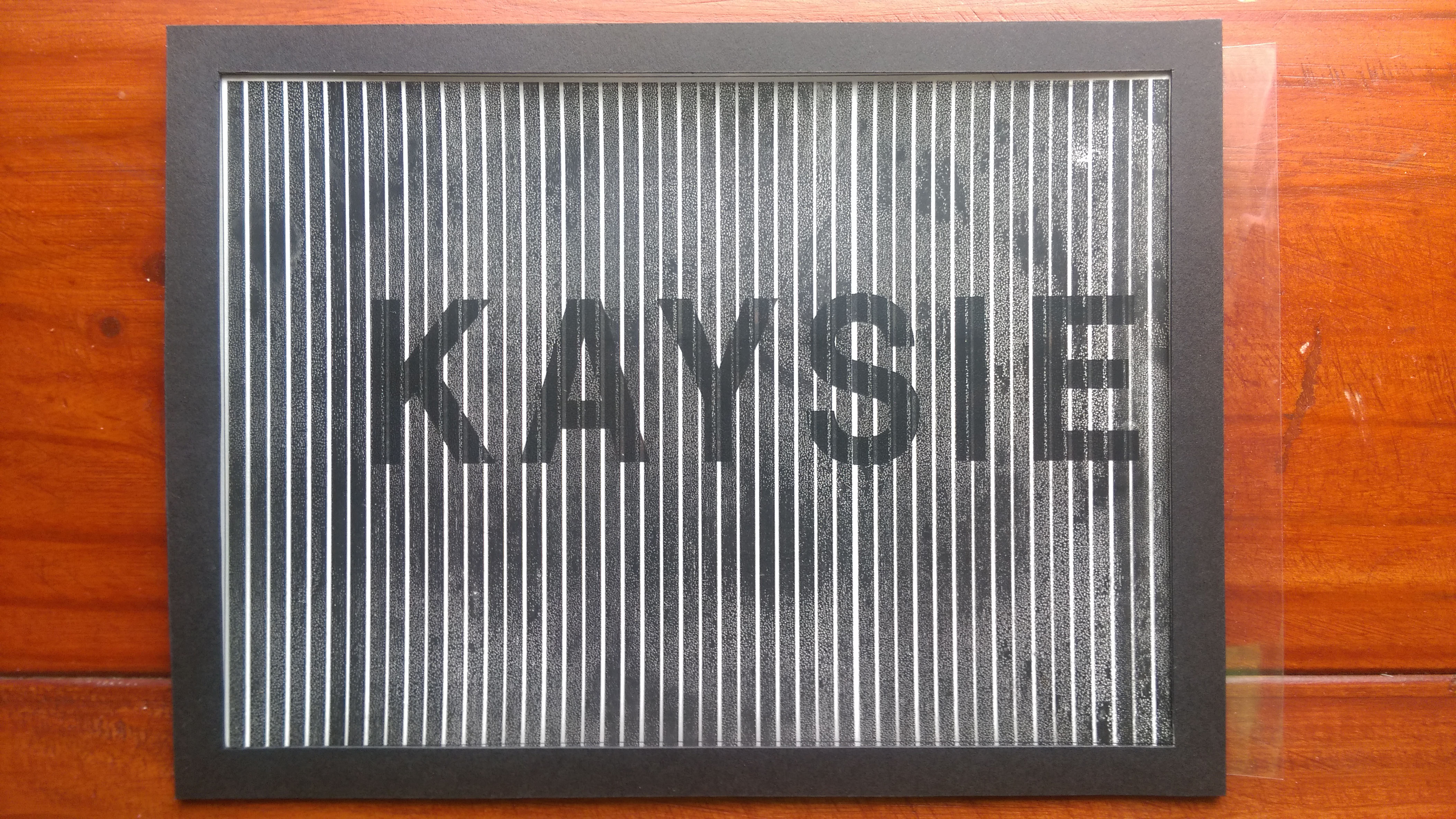
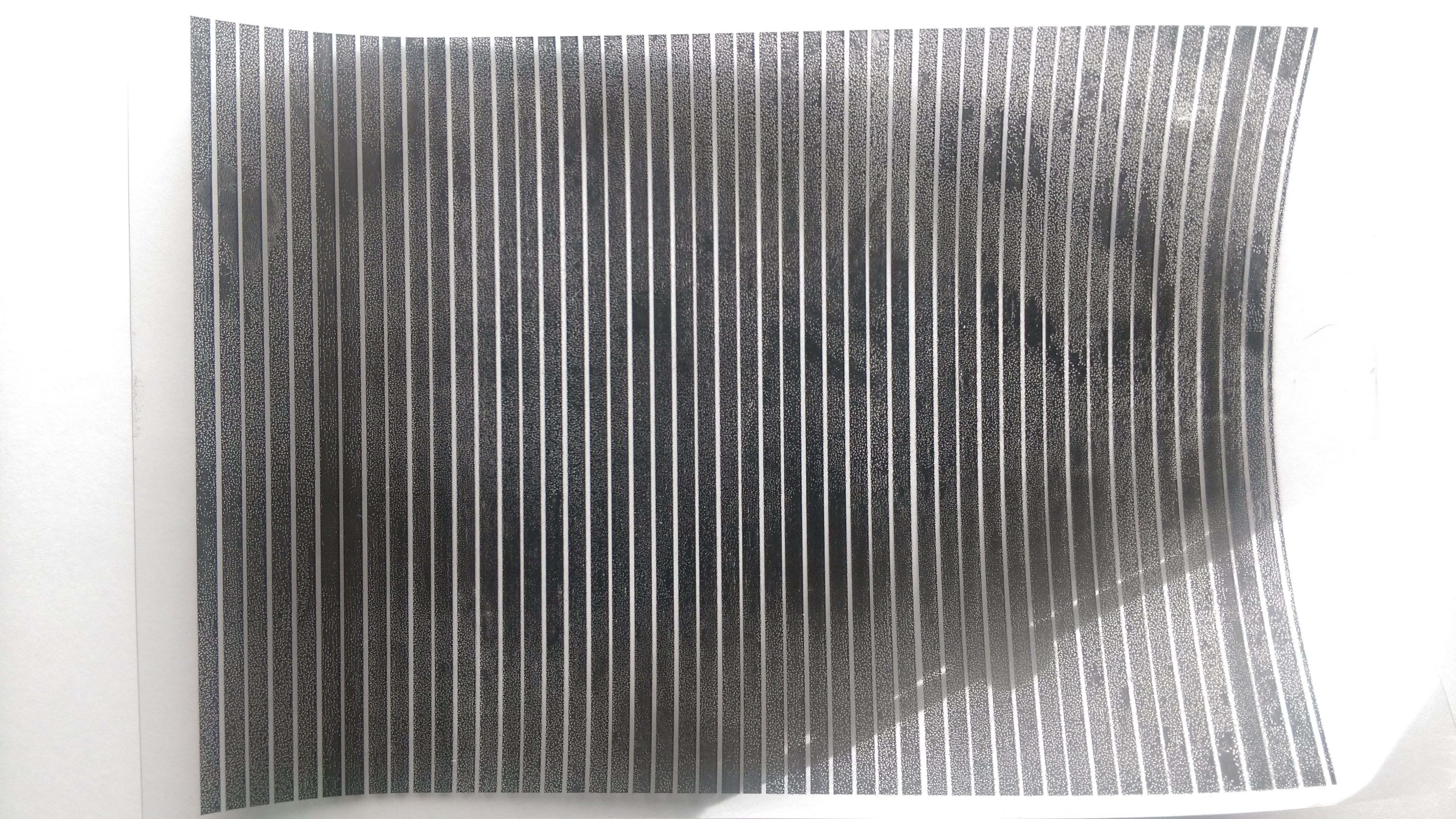
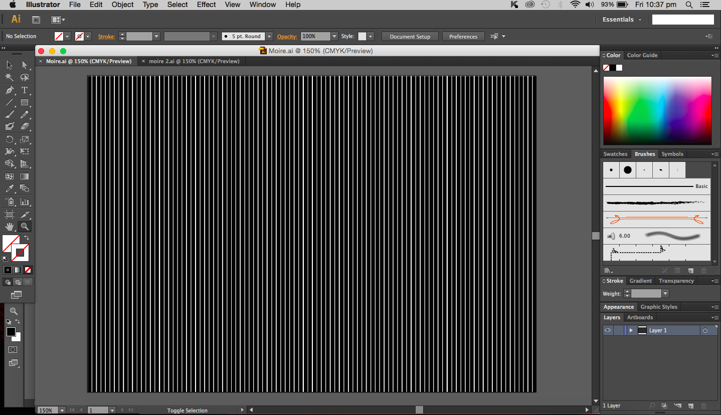
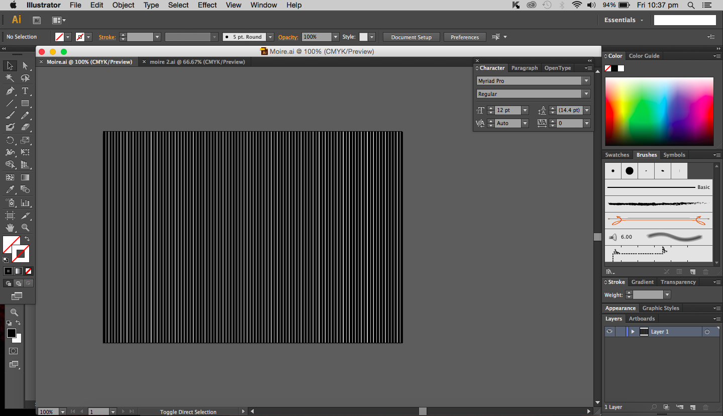
I decided to try my hand at this. I can admit it was rather challenging. The positions of each line are really important to the overall work. I started by making a ‘top’ layer of the work. This will be the piece that will be moved side to side to create the illusion of movement. This layer is done by creating a regular pattern of lines each equidistant. I experimented with lines of different weights and settled with one of a heavier weight (10pt instead of 5pt).
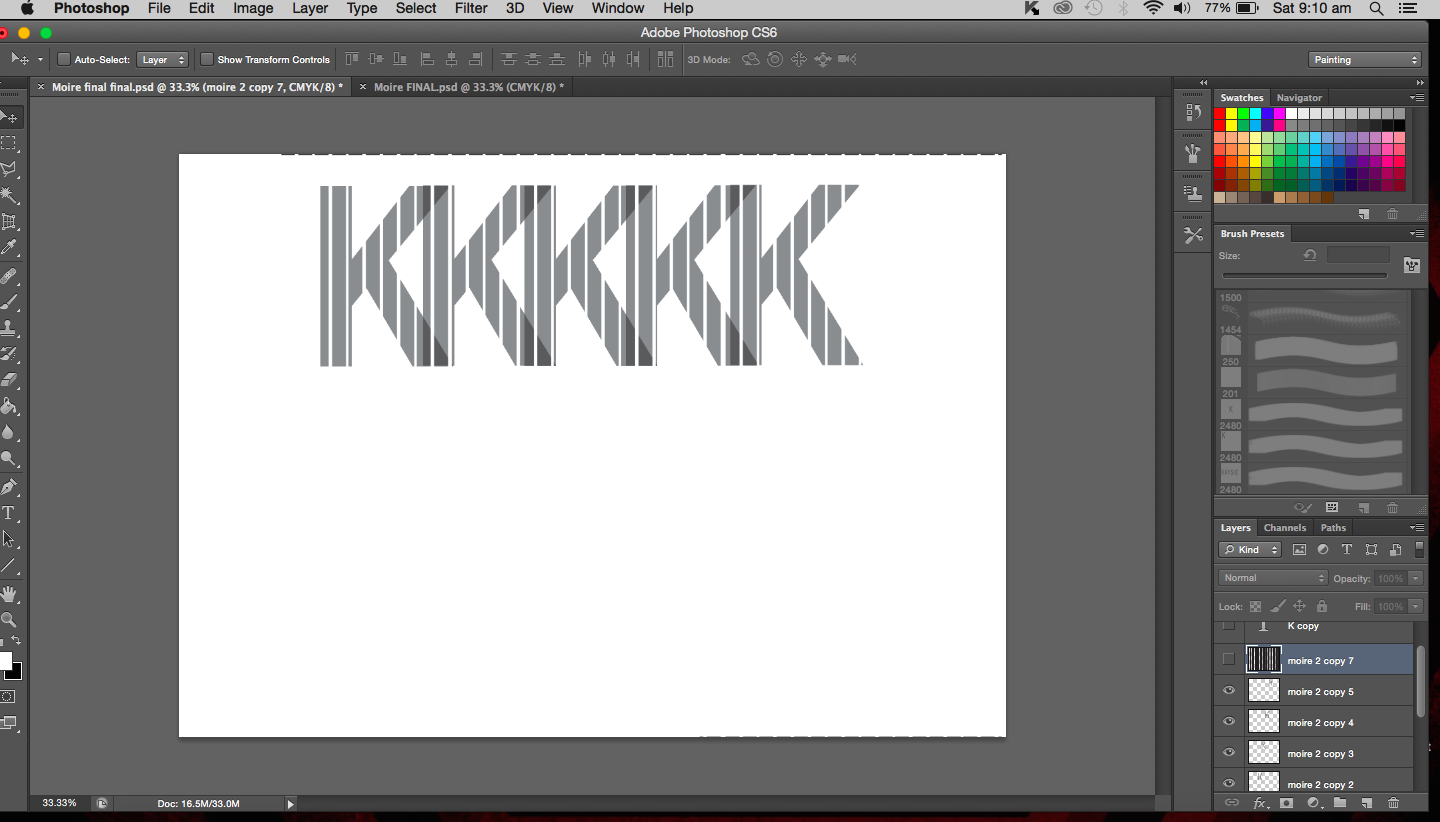
The next step was to create the image below which in this case will be my name. I first created my name, keeping the font fairly simple and straightforward (as they do in science papers and articles). I used Helvetica which isn’t what we use for research papers but I feel like it works best here as it is even more simple and clean than Times New Roman. I inverted the text and made the entire text into a brush and used it as an eraser in the next step.


The image above is what the brush looks like. The entire rectangle (A5 sized) will be the eraser. Only the portions filled in black will be erased.
This next step involves the appearance of the first layer (striped layer). I duplicated this layer first, keeping on untouched and worked on the other layer. The process now is fairly simple, taking the new brush that I made, I erased all of the lines, leaving just my name in stripes.

When I place back the unedited striped layer over my name layer, the name is no longer visible.
But as I move this striped layer to the right the name slowly becomes visible.
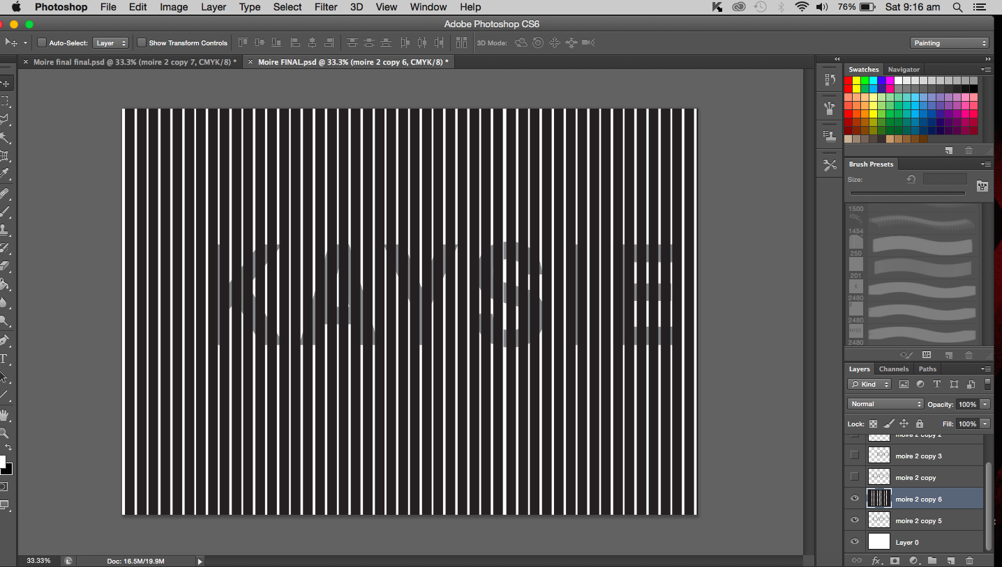
 As the layer moves, the name will disappear again. The name will fade in and out as the top layer moves. For this to work, the striped layer has to be printed or drawn on a piece of transparency, while the name can just be on any piece of ordinary paper really. The transparency will then be placed over the name and can be slid around (side to side) to reveal my name. When pulled in one continuous motion, the name will appear to be flashing, fading in and out and regular intervals.
Moiré patterns work on a mathematical basis and can be applied to physics as well. But i would suppose it gravitates more towards maths. I didn’t want to make physics my main focus because I am really out of touch and it wouldn’t be fair to do something entirely on that based on my measly knowledge of physics. This piece is an interacting piece and it shows my inquisitive side, trying out new techniques and taking that risk to try something completely new.
The fading in and out of my name represents my relationship with science. Sometimes I really love, sometimes, not so much. A love-hate relationship. There are times when I want to learn so much and be involved, other times, I want to have nothing to do with it. Sciences aren’t easy to grasp all the time and there are occasions when it just frustrates and confuses me, and it’s times like those that make me withdraw (fade out) from it all. Then something about it will interest me and draw me back in (fade in).
Mathematics- All about Geometry
In post, I’ll be focusing on just one of the pieces that I will be doing for the project. I have decided to use mathematics as my inspiration, more specifically geometry and maybe incorporating the attribute of logical.
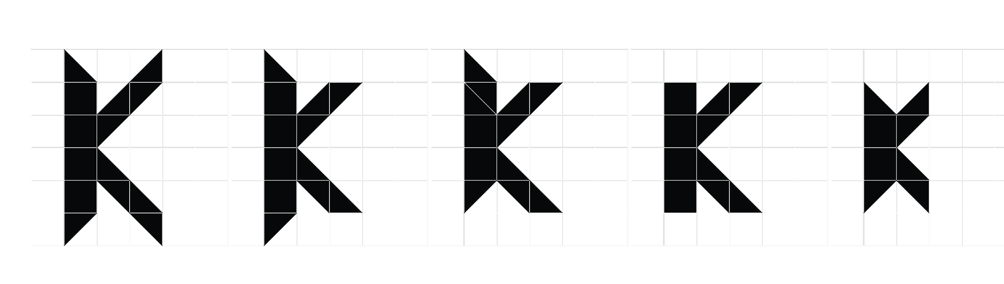
I started off by identifying certain geometric shapes including triangles, squares and polygons.
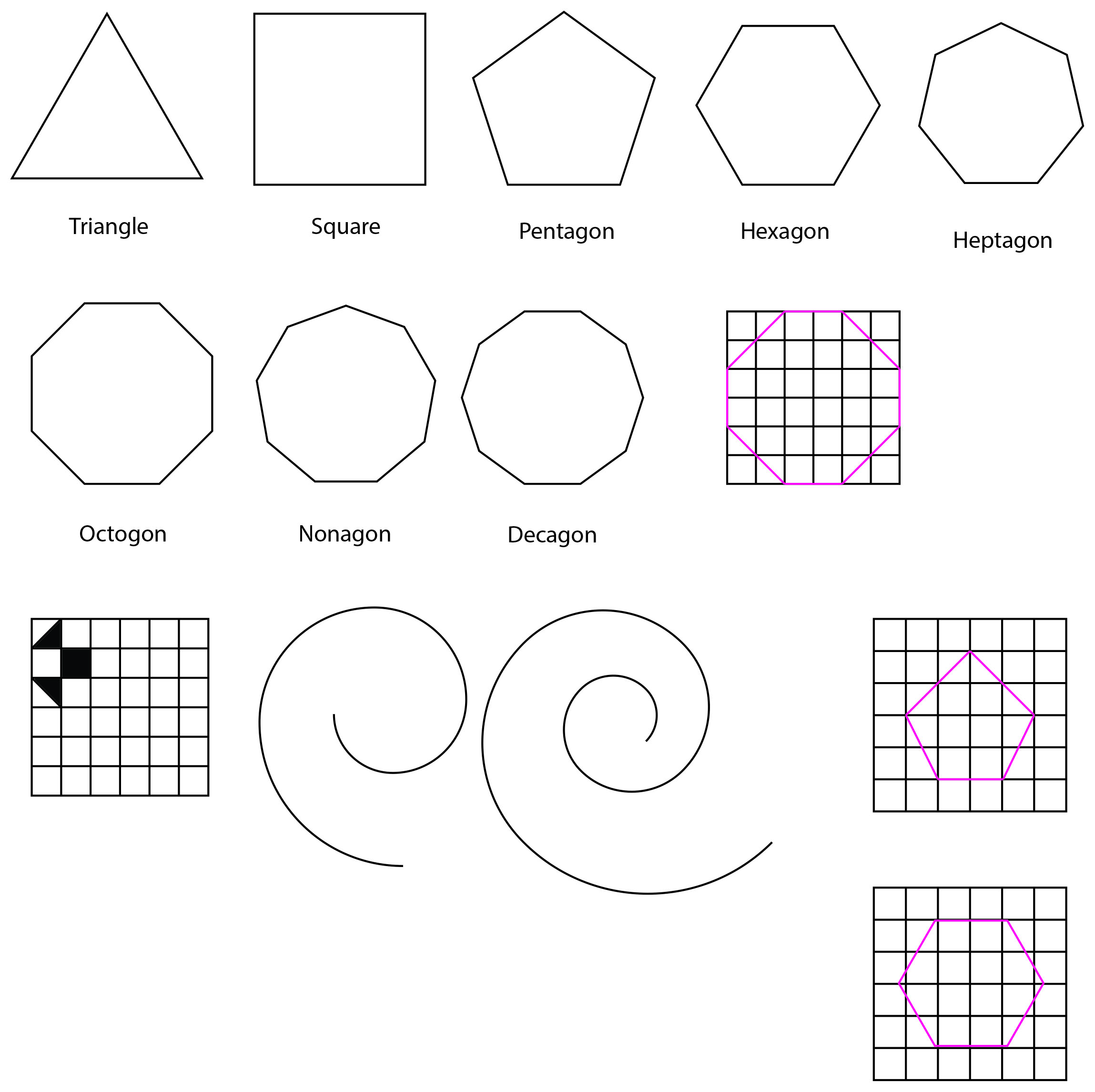 Precision and uniformity was what I was going for so I created a 6×6 square grid and used that as my guide to form the letters to my name. Each letter would then be made of the squares and triangles of the exact measurements. I only added diagonal lines within the appropriate squares to create the triangles. The relevant shapes are then filled in and the grids removed (see images below).
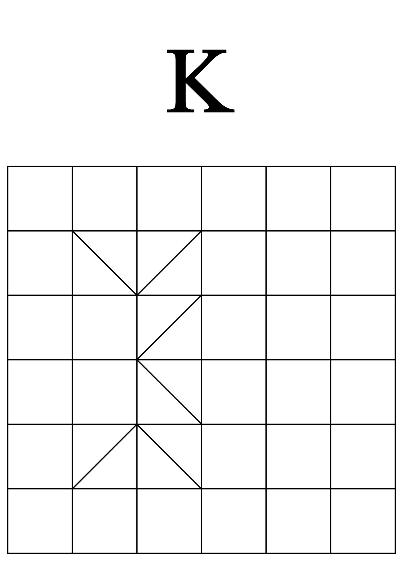
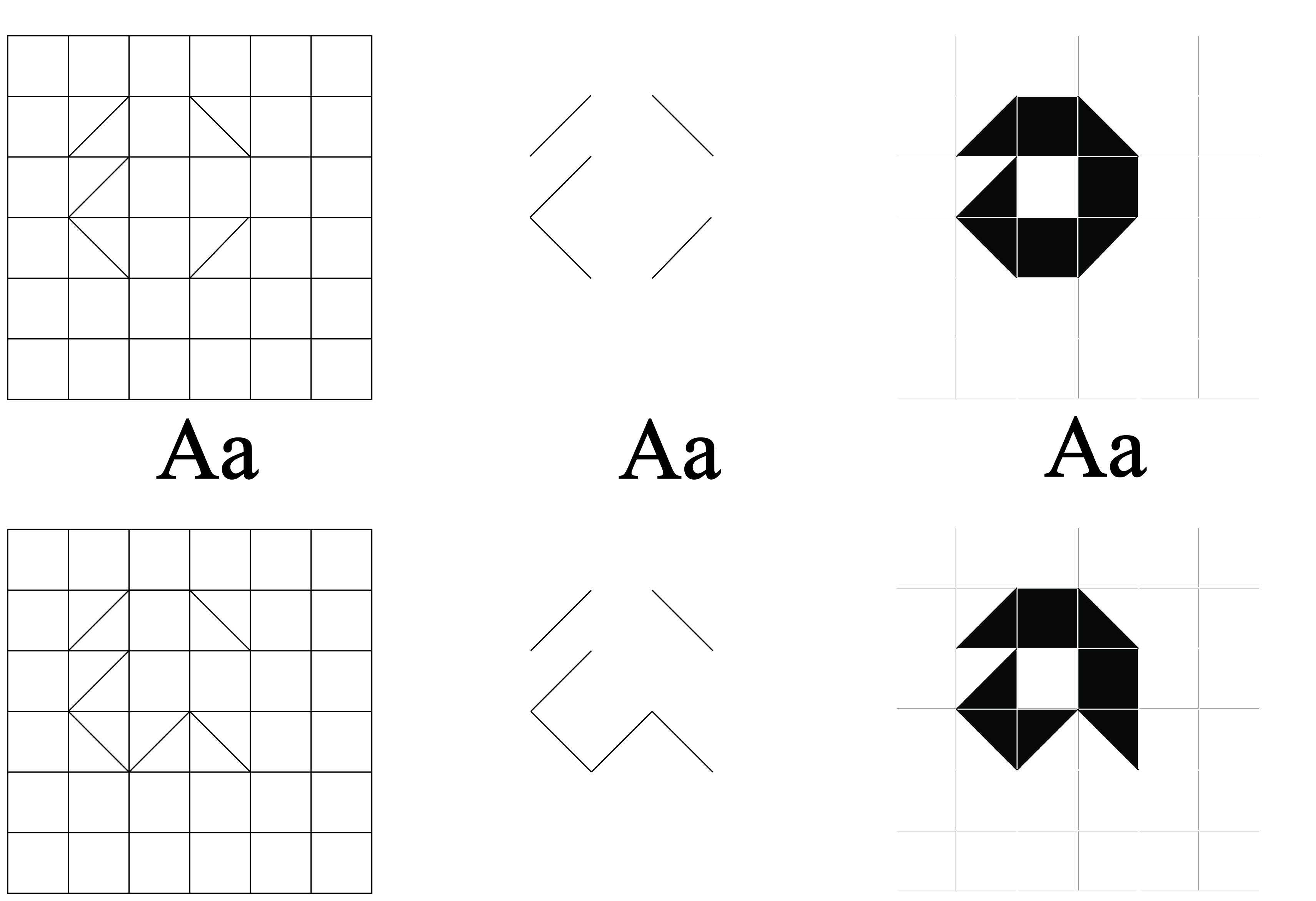

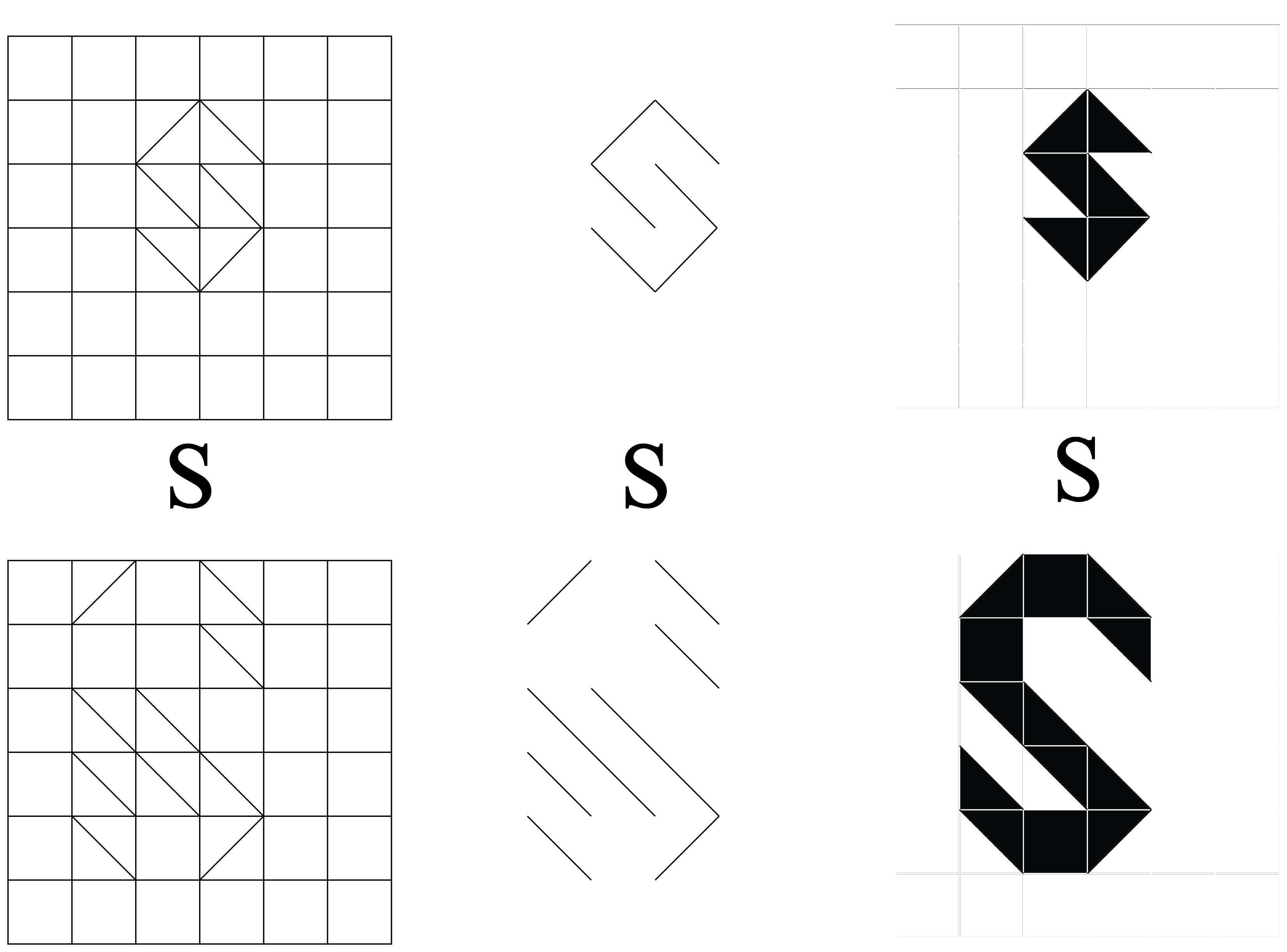
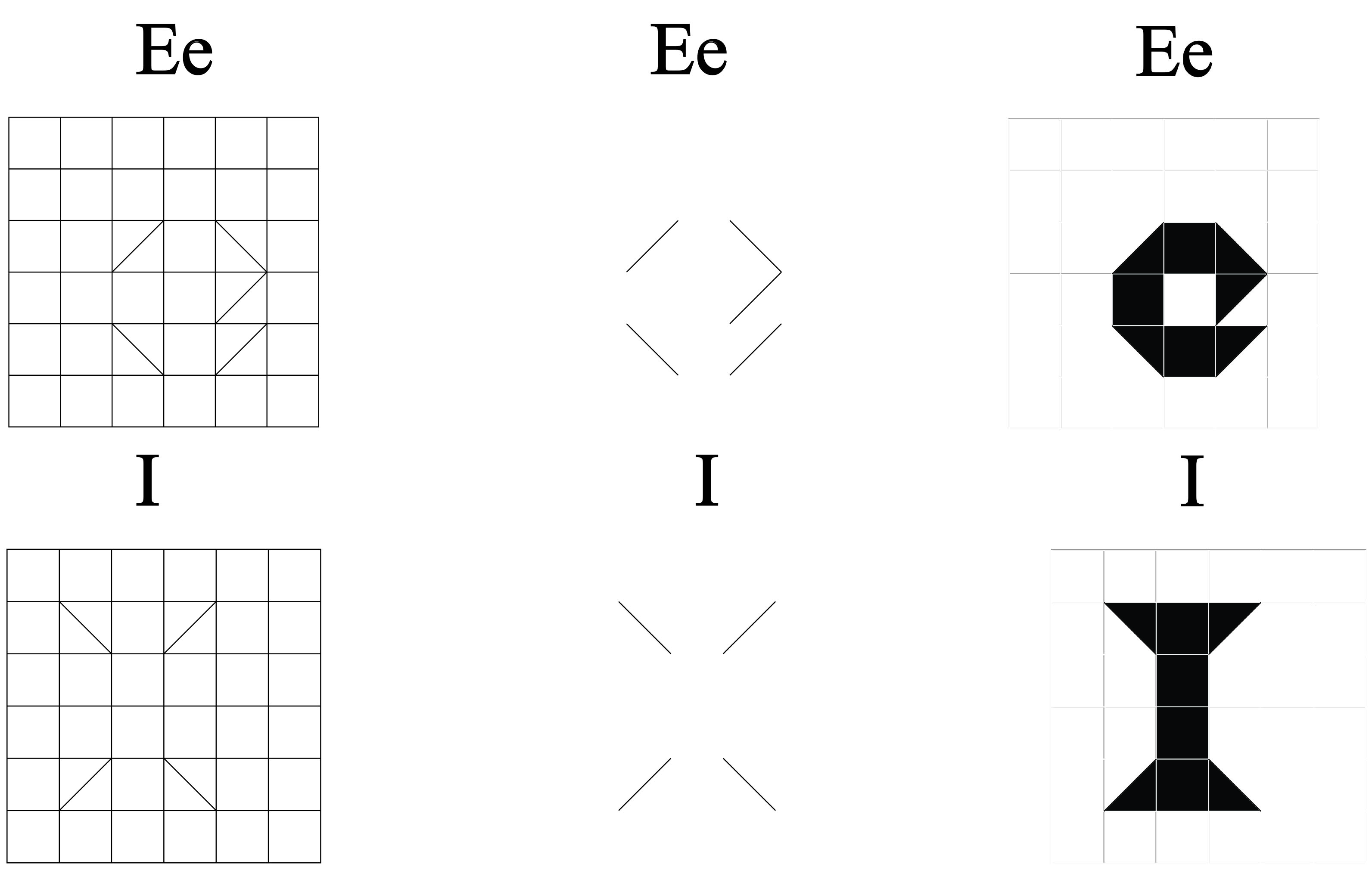
I did like the outcome when I removed the grid, what was left were only the diagonal lines. Somehow, it became a minimalistic form of the letter, which I thought was quite interesting to note.
But of course, to just leave the letters as they are would be too mundane so I’m going to tessellate the letters as best as I can.
 Should my calculations be correct, there are a total of 14 complete squares and 32 triangles (converts to 16 squares) to work with. In a 6×6 grid, there should be six squares remaining (left blank) if all 6 letters are arranged properly. Taking into account that the letters ‘e’ and ‘a’ already have a blank square incorporated into itself, there will then be four squares outside the tessellations.
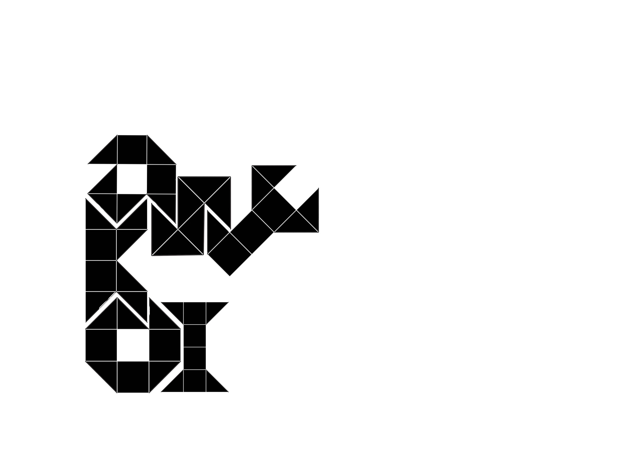
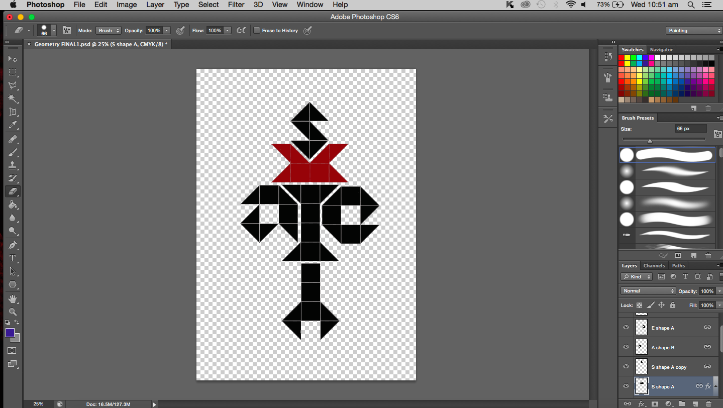
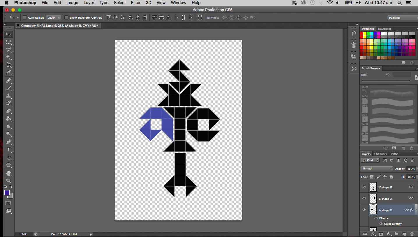
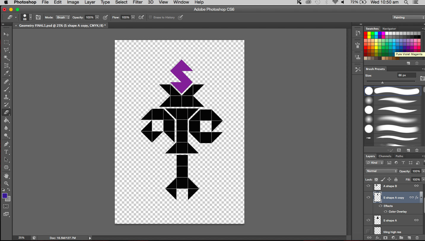
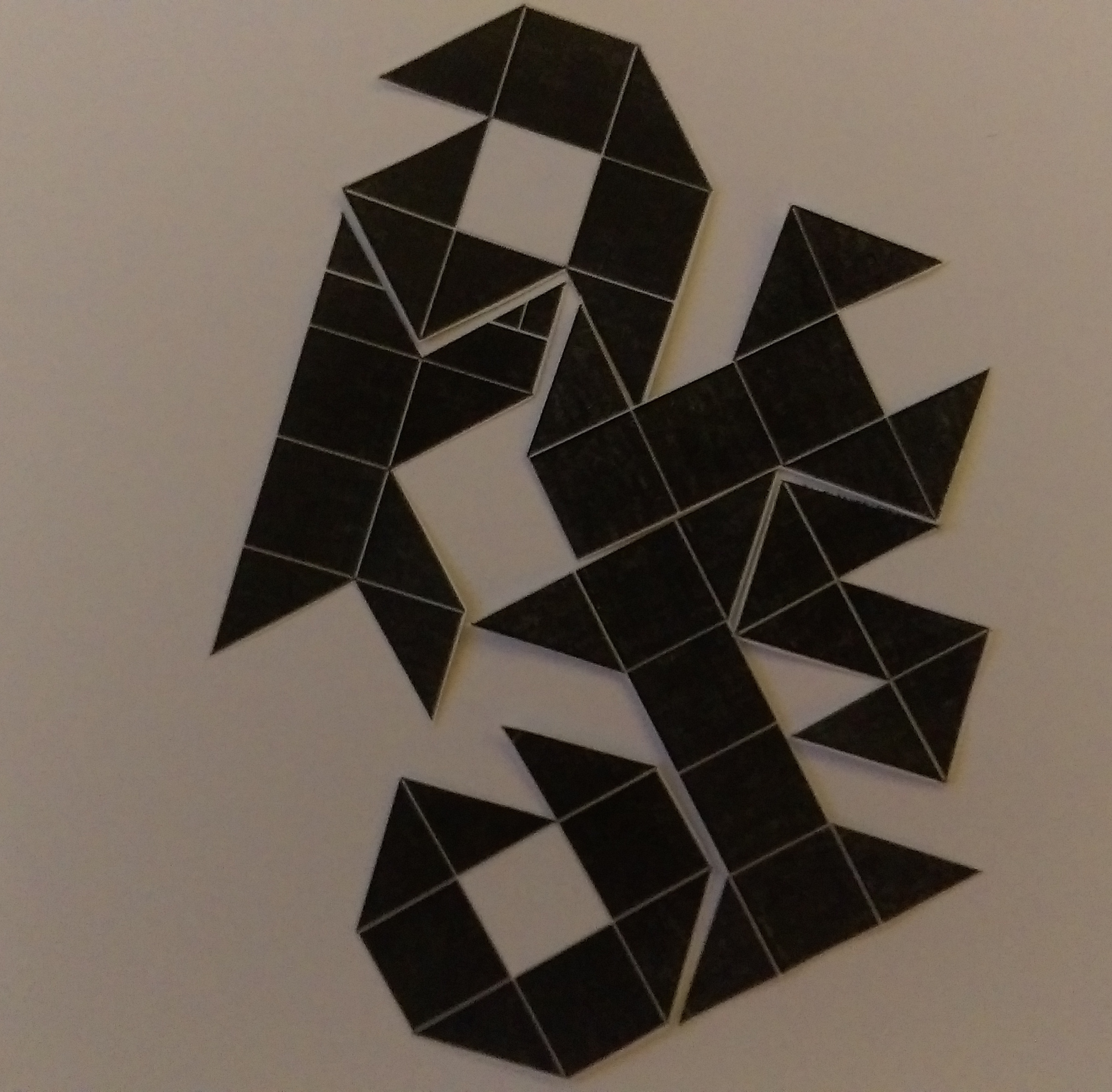
For a matter of convenience, I decided to print out the letters to try and tessellate them. But of course, I am also considering working the pieces like a tangram.
Some possible arrangements:

In terms of execution, I will either be leaving it digital, I might also try my hand at linocut or paper cut (still keeping options open). And maybe a splash of colour should be added into the work, I think it would make the work more exciting and visually appealing. It would also show how I actually feel about maths as a subject, that I don’t think it’s boring in the least.