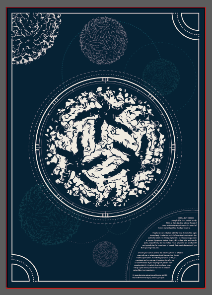
Before I started creating my poster I looked at images of vintage posters as well as of tarot cards for inspiration on layout and colour. I chose to use more than just tarot cards as inspiration. The posters of moons caught my attention as with the virus structure, it too is round.
References from the internetTaking inspiration from vintage posters(left)Playing with colour
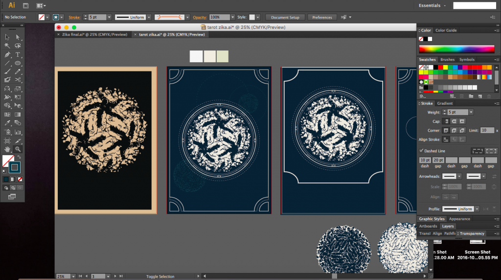
The screenshots below were taken whilst creating the poster. I started with a layout that was symmetrical but slowly branched out to create a poster that was asymmetrical but still balanced.
I was quite interested in the vintage posters and maps of constellations and the moon. There was a particular poster where there were coordinates around the circumference of the central image and I really liked it (image just below). I tired to incorporate that into my poster as well as I felt it was similar to mapping out the radius of the virus structure, giving it a vintage yet scientific feel.
I decided to go ahead with a border for the poster as with a tarot card (image below). The task now was to make sure the border had a purpose and was not just a simple line border.
Vintage tarot card
I tried to repeat and resonate the circular form throughout the poster using lines of various opacities, weights and colours. The different opacities would hopefully create depth and create hierarchy by not stealing the attention away from the main virus structure itself.
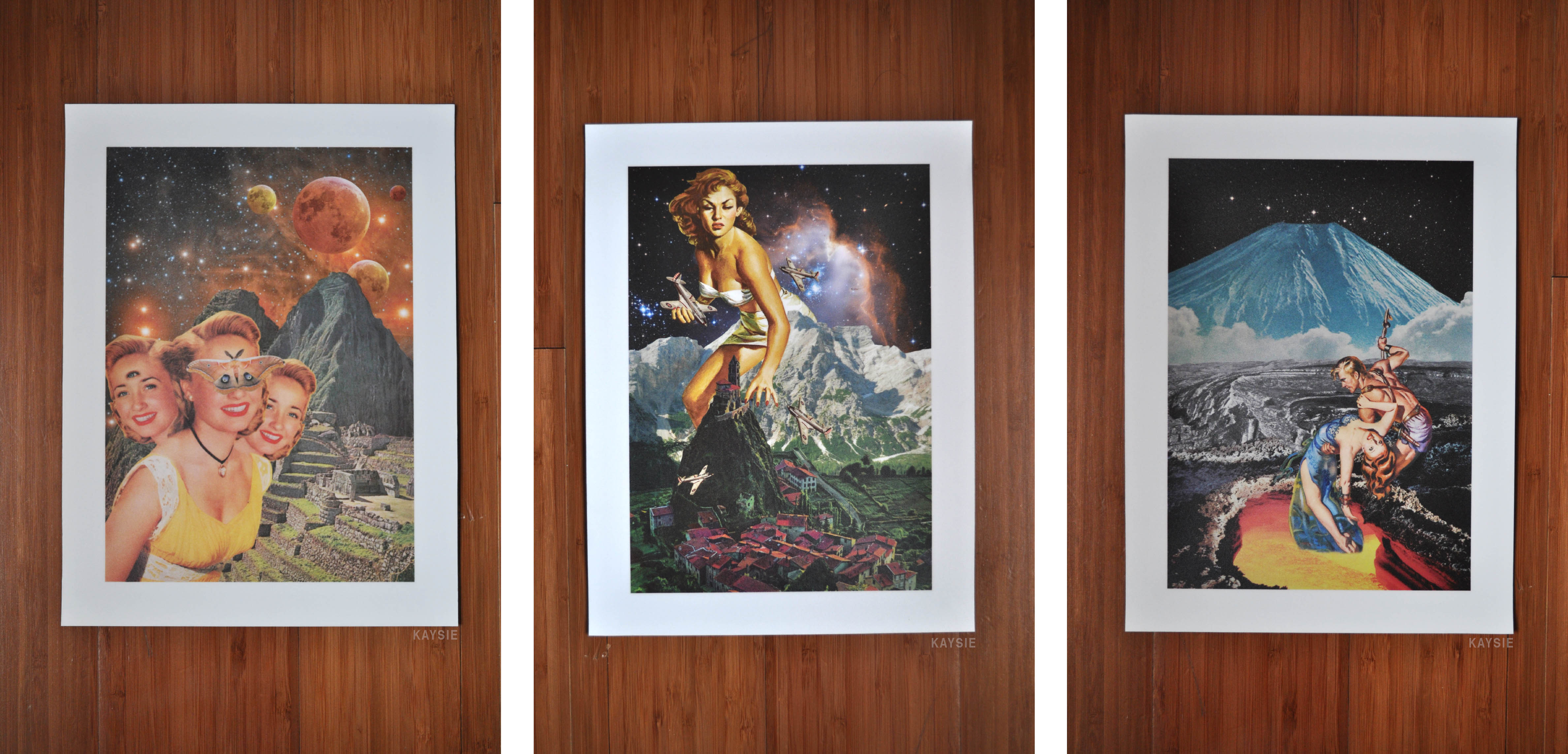
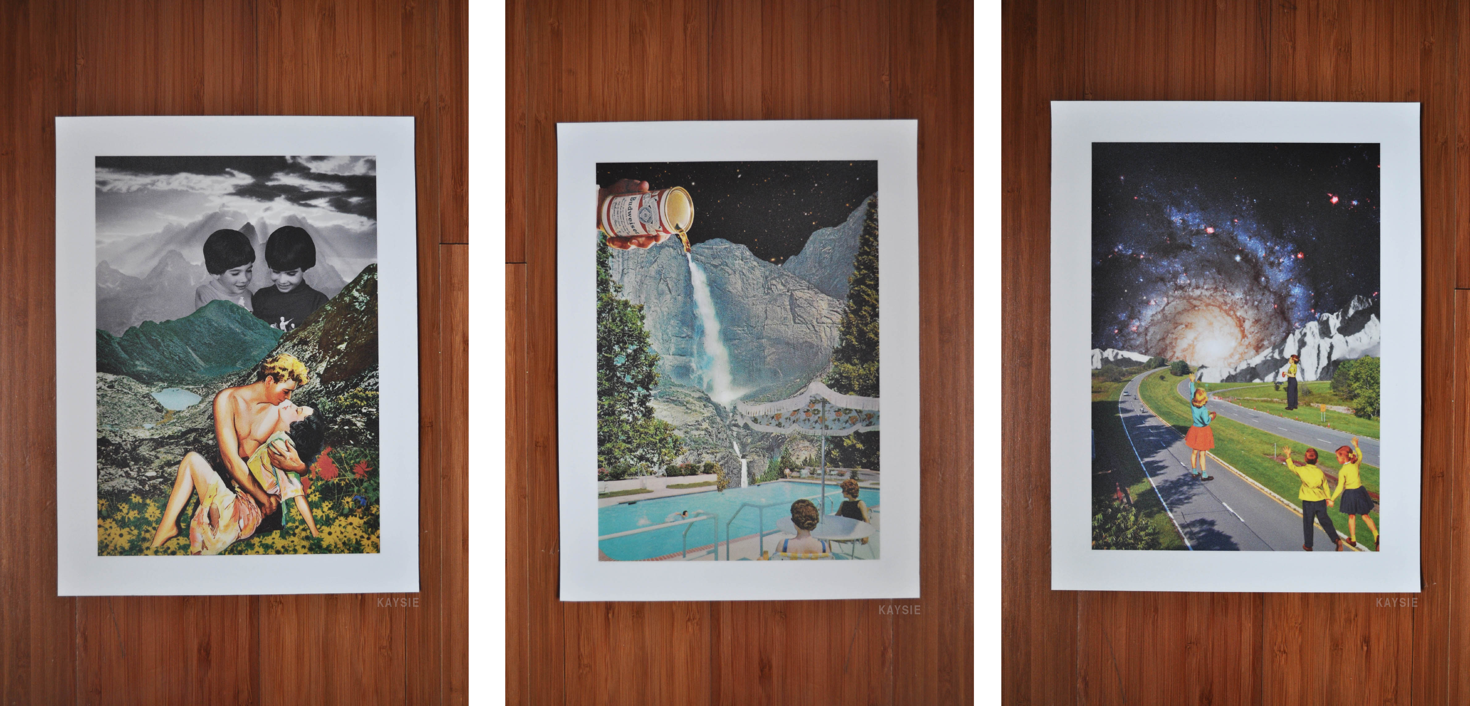
In terms of presentation, I decided to go with a white border for each of the 6 pieces of work. I could not use black in this case as it would probably merge into the space backgrounds and you would not be able to distinguish them as easily. I felt that the white border helped to bring out the colours of the image and stand out. It brought emphasis to the image. It also helped to give a more finished look to the works.
[Images Above from the left]
A butterfly from the point of view of the superstitious is a bad omen
A butterfly from the point of view of a bee is competition
A butterfly from the point of view of a child is a game of catch
[Images Above from the left]
A butterfly from the point of view of a flower is cupid
A butterfly from the point of view of a scientist is the chaos theory
A butterfly from the point of view of a caterpillar is the future
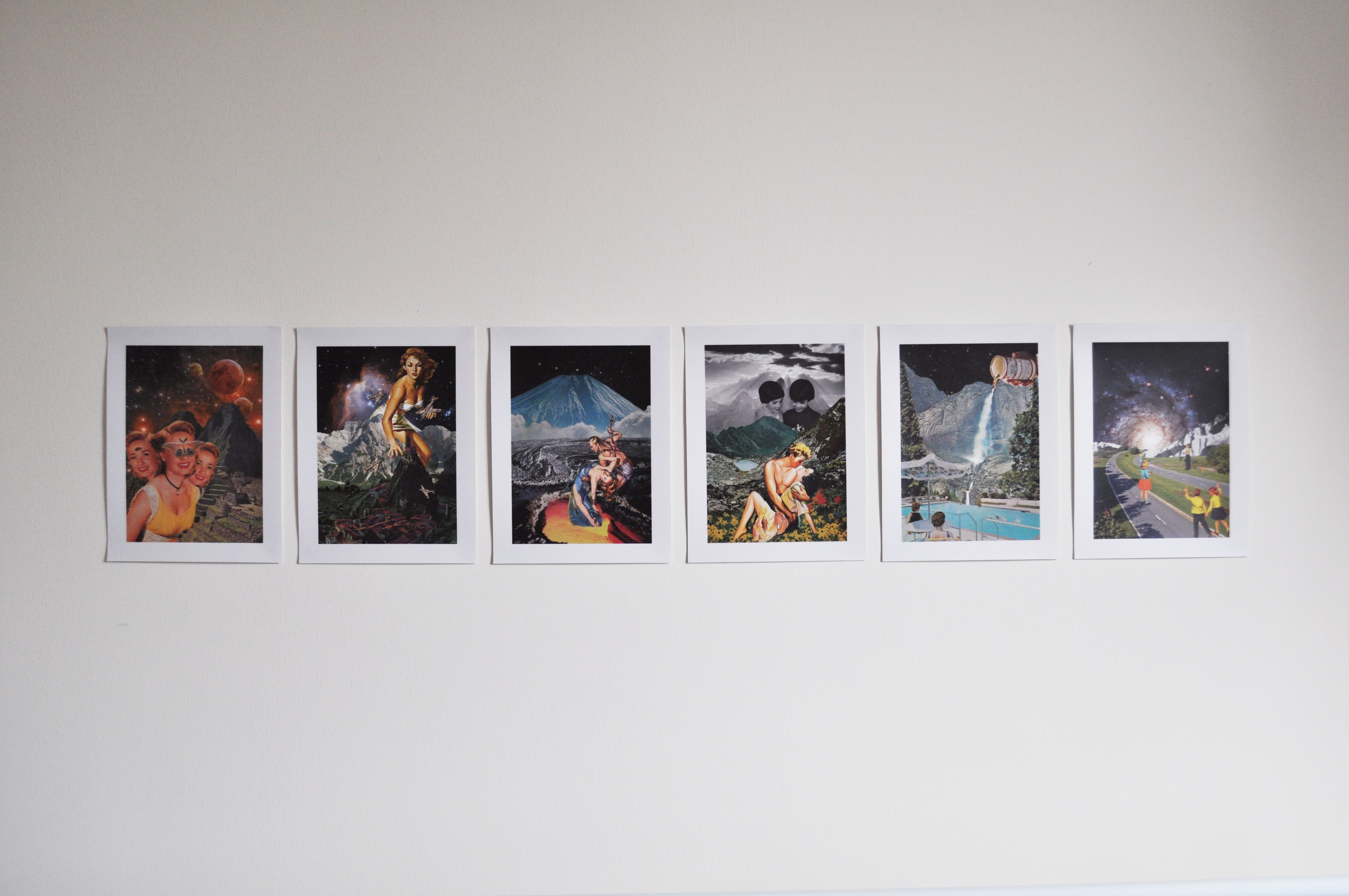
I arranged the works according to the perspective held in each work. In the first piece, the main figure is rather close to the viewer. The distance between the characters and the viewer gets progressively longer. The compositions also increase in depth (the background extends further in into distance).
Final WorksFinal Works
Challenges
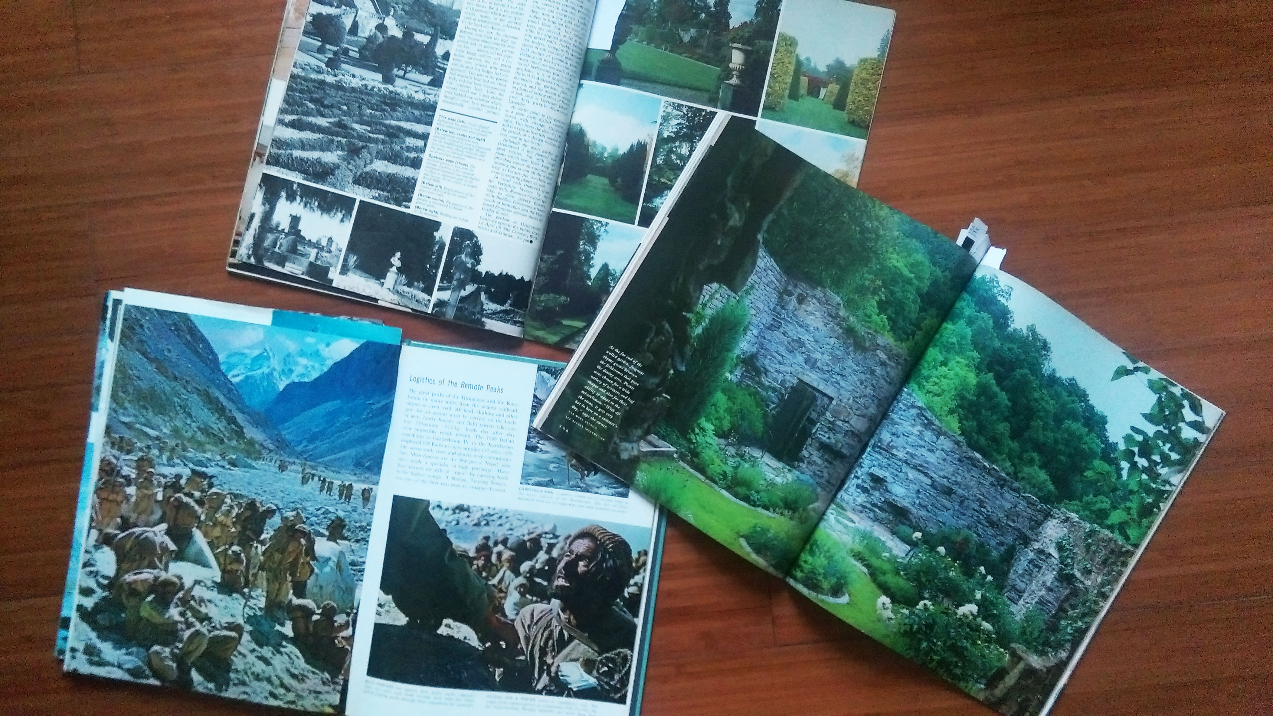
The largest challenge that I faced during this project was looking for appropriate images. I mentioned a couple of difficulties in the last few posts about finding good images but with low resolutions or appropriate, high resolution images that are cut off at certain areas. I had to improvise throughout the collaging process, change my original plan to fit with the images that I had. I realised I could not have a fixed idea or plan or I would have a problem if I could not find the pictures In needed (it would have left me stuck and unable to proceed). I guess what I’m trying to say is that the project of collaging has taught me to be a lot more flexible and to improvise when necessary.
These challenges have enabled me to think of more creative solutions for the images that I have found and think about how to best use them. After doing the three compositions, the process of generating ideas became easier. I found it easier to think of ideas. Looking at an image could get me thinking about many ways I could use that image, I was no longer restricting myself to just the original plans I had in my head at the start. It made me a lot more spontaneous.
Other minor challenges would be the type of vintage images. They are not all of the same quality (depends on how old they are). The way they look also depends on which source they were from. An image from a comic cover is different from an image from a postcard (e.g. their colours are rendered differently) So I had to make sure these differences do not cause my compositions to look odd or messy. I found that I had to analyse each image and just try out different images together to see what worked. Colours needed to be adjusted here and there to fit with the other images, so that nothing stood out too much.
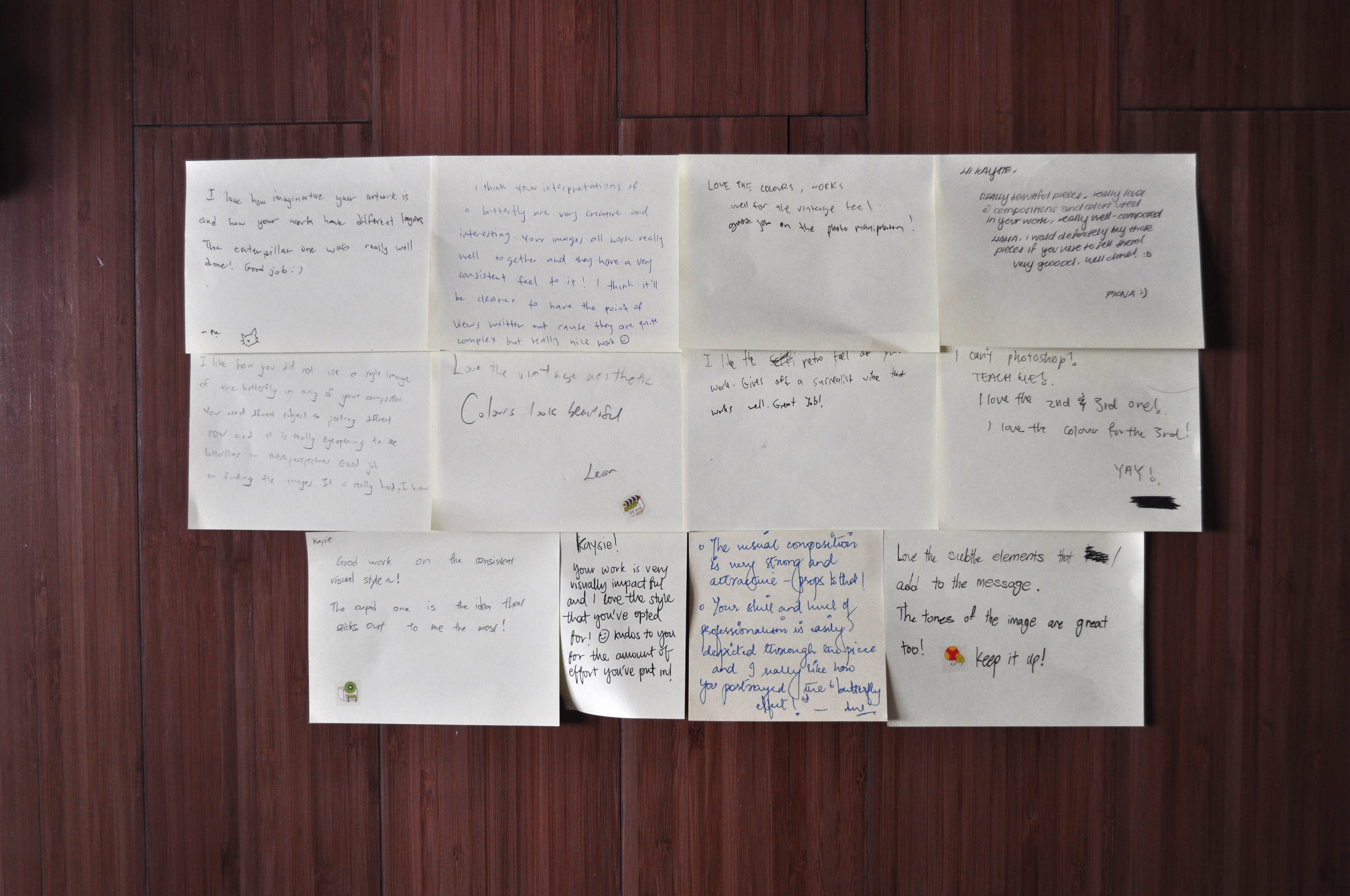
Comments
Comments received after critique session
It’s always really nice to receive feedback on your work. The comments were very encouraging as usual. Many liked the colours and it was interesting and wonderful to see that everyone had their own favourite composition out of the six. To me that meant that there wasn’t one particular piece that stood out and stole any attention, each piece had its uniqueness and was special.
FInal thoughts
I have really enjoyed doing collages. I have to admit it was really fun. It allowed me to come up with surreal and interesting/ varied compositions. Looking for images was a tough process but through the process of looking, I found many weird and interesting ones that were really quite funny. The sense of satisfaction gained when I do find an image that I can use is indescribable (I get so thrilled at the number of ways I could use the image in my compositions). I am really happy at the way my works came out and I would definitely continue to do collages for future projects.
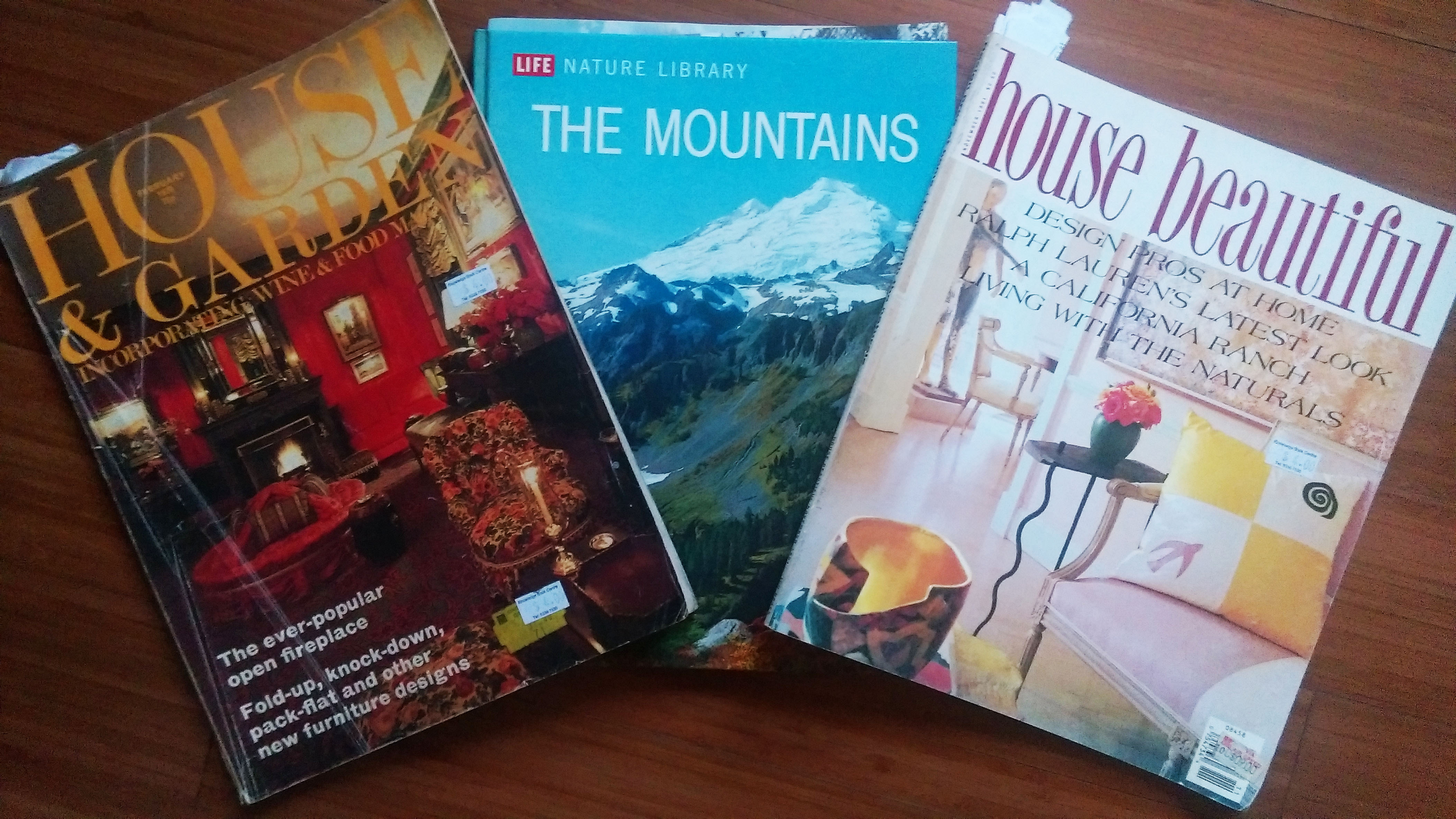
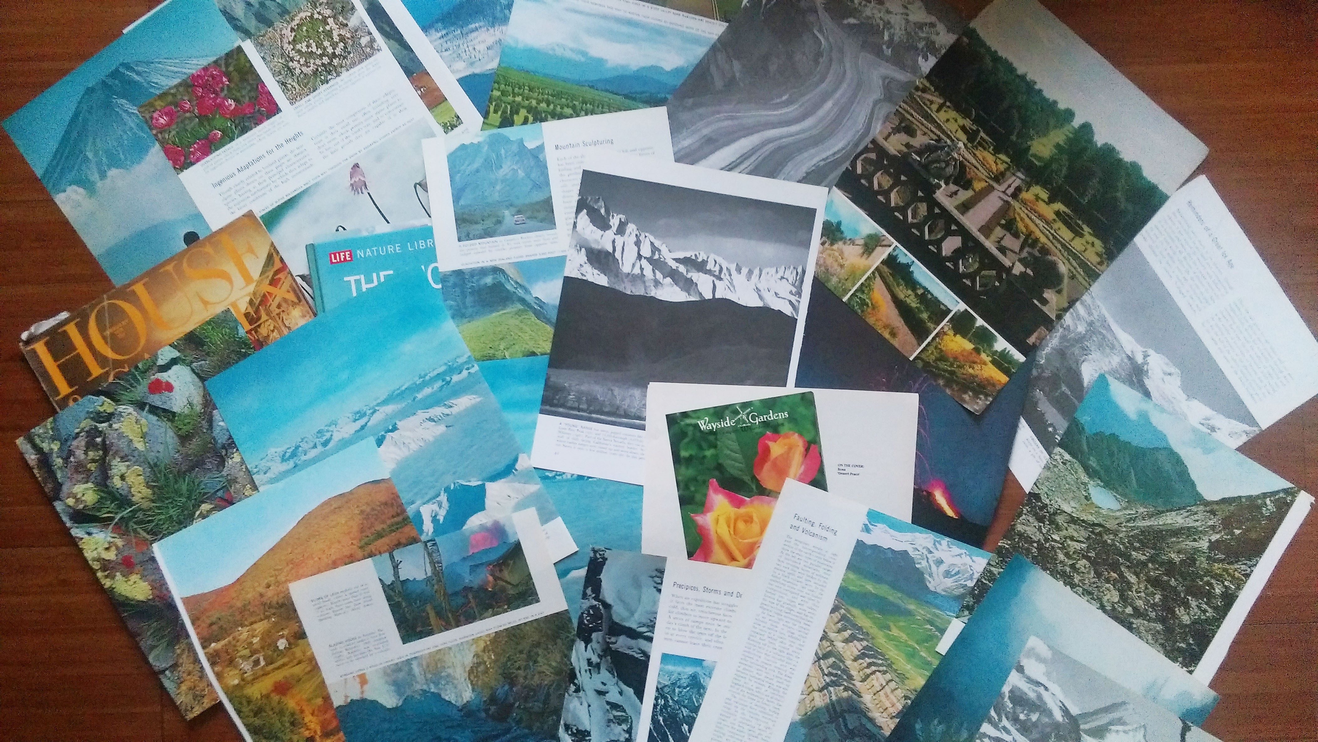
I decided to use Eugenia Loli as my artist reference because her works really made an impression on me (they are really beautiful). So I decided to create collages for each point of view. I stuck to a vintage theme similar to Loli’s work. In terms of materials, I used old, vintage images that are both printed and digital. Vintage printed images can be found from science textbooks, encyclopaedias, storybooks and magazines. For digital images, I started my search with advertisements and posters. My plan on how to use the printed material was to see what images were interesting and then scan them in for editing. The images below are just some of the books and materials that I gathered. I also used some of the textbooks that I had on hand.
Book and MagazinesTorn out images from the books & magazinesImages inside the printed material I found/bought
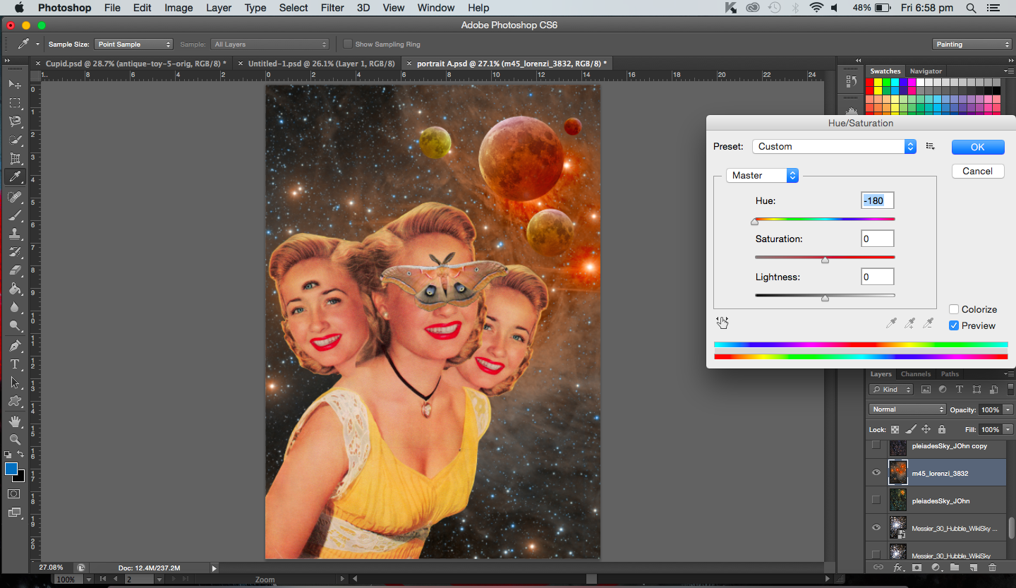
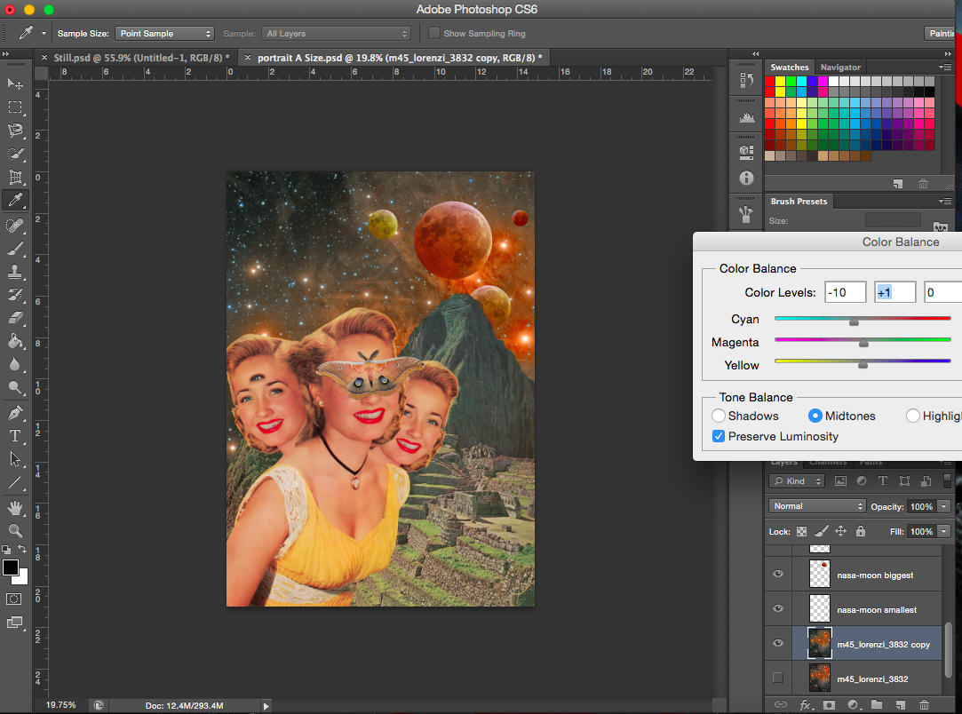
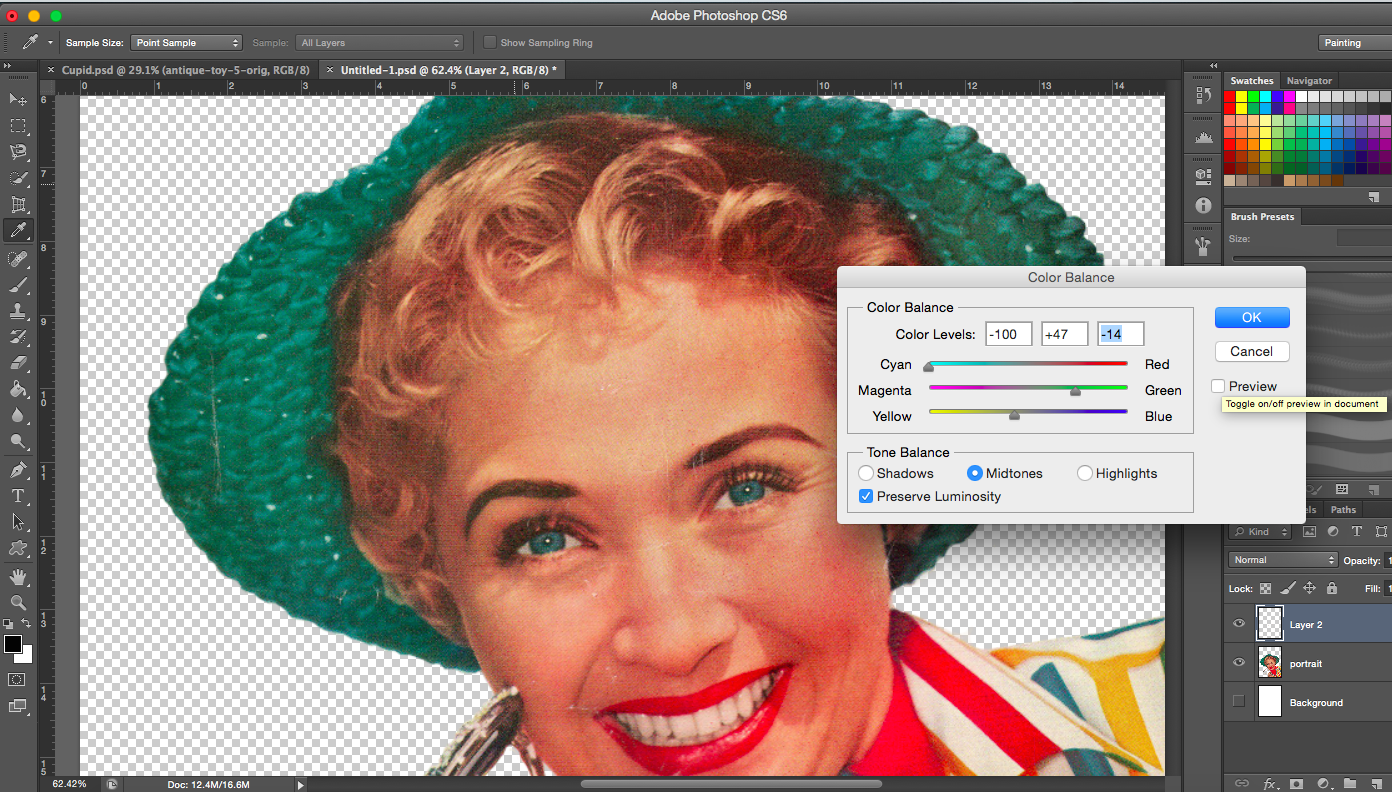
From the webpage, the artists talk about the factors that they take into account when making a collage. Things like colour adjustment (colour balance, hue/saturation) and use of backgrounds are all important. They never do stick down the separate pieces immediately, instead they move the pieces about until the composition looks right.
My direction for this project was to try and use personification in all my works. To use other objects and subjects (various other ways) to represent butterflies and the other matters that are mentioned in the sentence. The way I decided to achieve this was by creating a narrative or a story for each point of view. I figured that collage would allow me to create a scene using a variety of images and it would be fun and interesting to create story. Even in Loli’s works, I see that majority of them aren’t literal, you have to look at the title and then you realise that there’s more to the image than what you actually see. Some of them are metaphorical, others just use the combination of images to tell some sort a story. It was a perfect opportunity to create works that were absurd, witty and surreal.
As mentioned in my previous post, in the last sharing, the idea that butterflies are more feminine was brought up, and I agree with that. Hence, I decided to use women to represent the butterfly.
(I will be showing my processes for two works in each ‘Process’ post. This will thus be the first of three.)
——————————————————
Process- Bad Omen
“A butterfly from the point of view of the superstitious is a bad omen.”
I will be describing the way I created my first collage below. The statement for this piece is “A butterfly from the point of view of the superstitious is a bad omen”. This was my very first attempt for this project so it did take a considerably long time to find images to use. But as I progressed I did get the hang of things.
So, bad omens. What are bad omens? I listed down all the things that I’d associate with bad omens and bad luck. I am aware that bad omens aren’t the same as that of luck but I assumed superstitious people would believe in both, hence I included bad luck.
List of some things associated with bad luck, omens and the superstitious: astrology, having twins/triplets, eclipses, Evil eye, black cats, walking under a ladder, opening an umbrella indoors, four-leaf clover, rabbits foot, horoscopes.
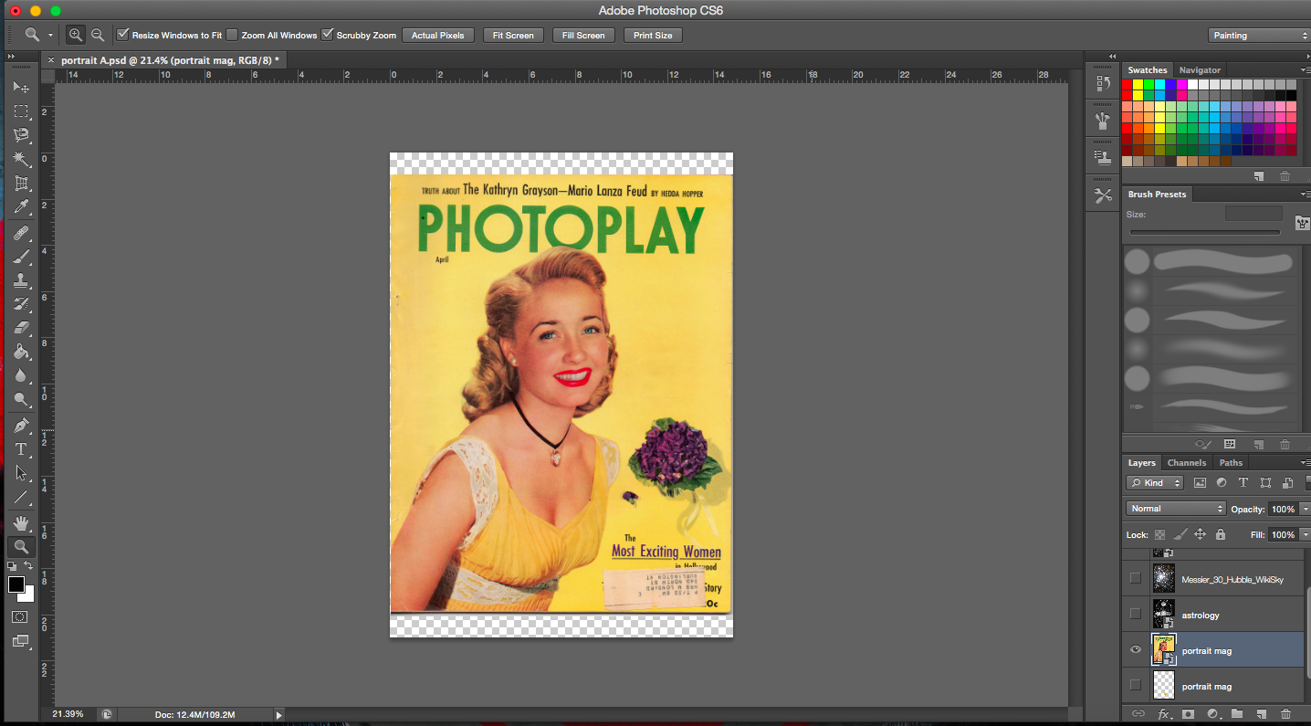
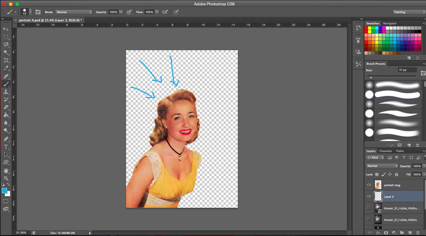
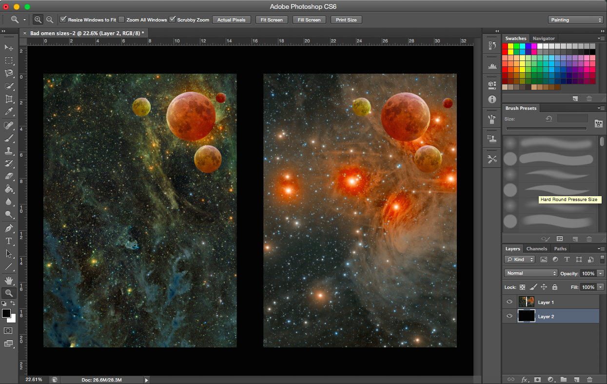
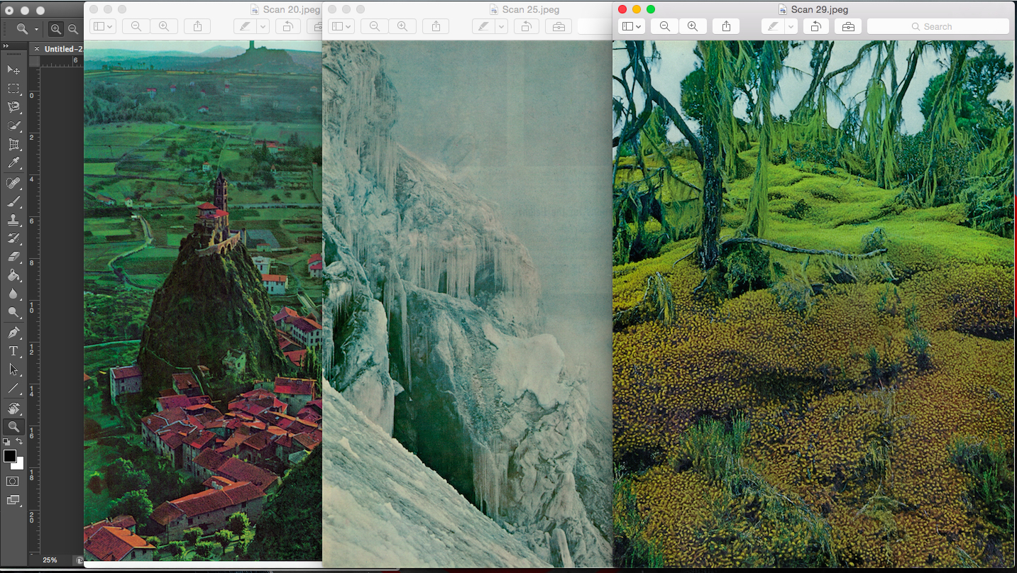
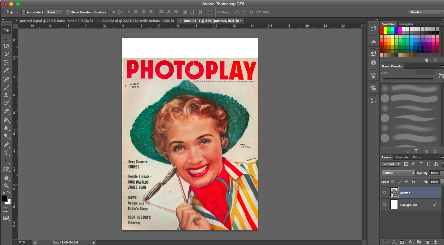
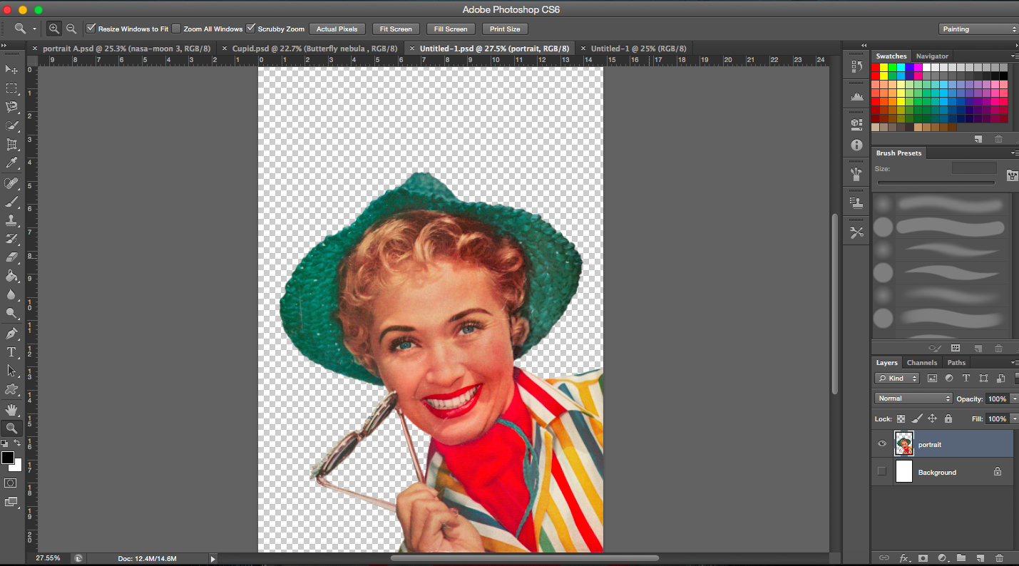
My starting image is an image of a vintage magazine cover. I was really excited to find an image that was big enough with relatively high resolution. Most of the images that I wanted to use were usually too small. So this was really golden.
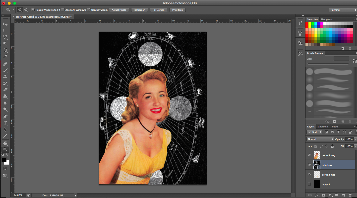
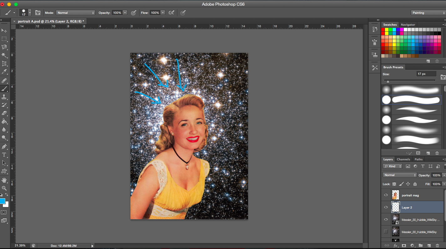
Starting imageCropping imageCelestial map as background
[Image Above] Lines of the celestial map radiate towards the subject matter thus drawing emphasis on her.
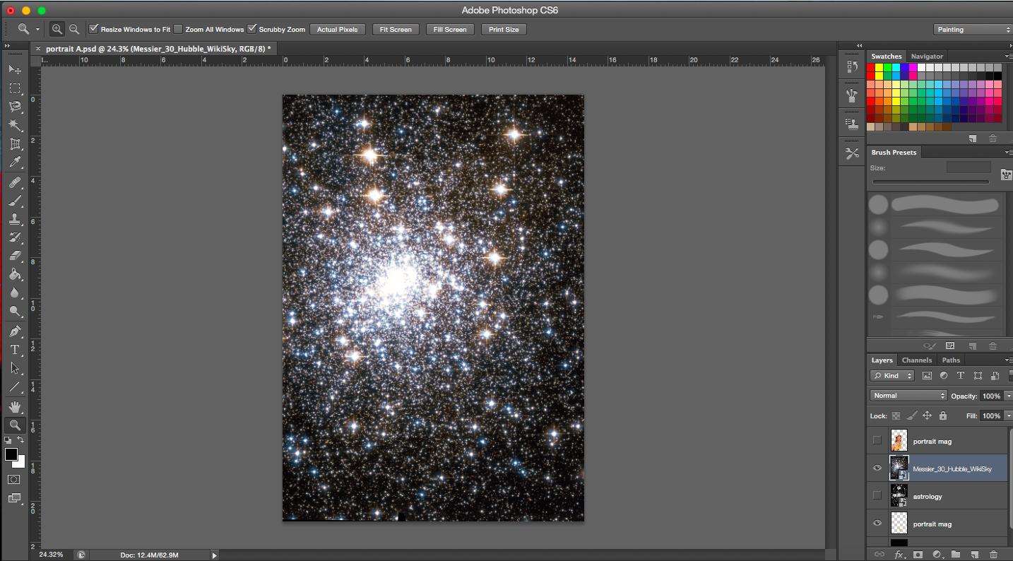
Messier 30- Globular cluster of stars from constellation of Capricornus (astrology)
Image of space background is a constellation which links back to astrology and horoscopes. I’d associate horoscopes and astrology with luck and omens too.
I wanted the brightest portion of the image (greatest number of stars) to be on the right side of the head, away from the face. Emphasis is drawn from the outer edges of the whole picture inwards (from the darkest areas to the brightest center where the main subject is).
[Next 2 Images Below] I was trying out different sizes of the main subject matter.
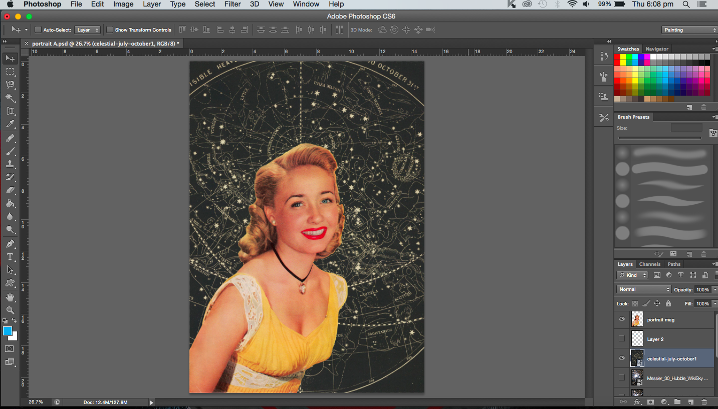
[Image Below] Trying out a different background. It’s a celestial map. I didn’t use it in the end because the resolution was too low. But had it been high enough I might have used it. I really liked the colour of it, has a real vintage tone to it. It also echoes the yellow in her dress.
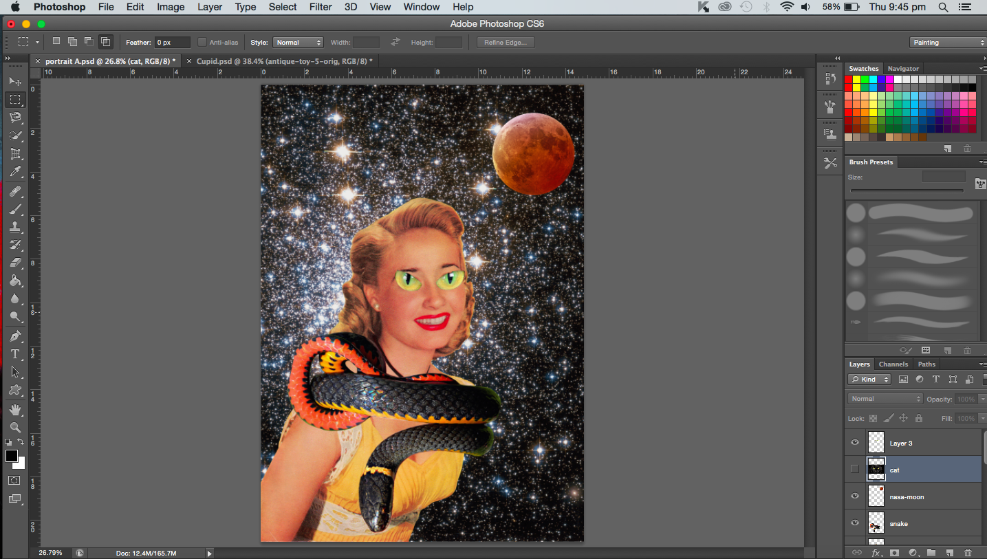
[Image Below] Addition of black cat eyes, a coiled snake and lunar eclipse/blood moon. This was definitely experimental. I was just playing around with the images. I guess that’s the beauty of collage, you can really create quite absurd images such as the one I made below. A couple of things didn’t work here, the snake image was actually not a vintage image so it stood out (the colours and resolution did not match the others). In fact, the cat eyes were also not vintage but the main problem with that was that it was just too distracting and after cropping it, I couldn’t identify it as a cat anymore. It just looked like a pair of green eyes from some animal that didn’t fit in. Overall, the image was pretty messy to me, so I didn’t pursue the cat or the snake any further.
Most of the images from here onwards invovle colour adjustments. Since the images are obtained from different sources, they may not necessarily go together, thus they have to be adjusted here and there.
Changing the colour of the background (constellation)Adjusting background coloursAdjusting background colours
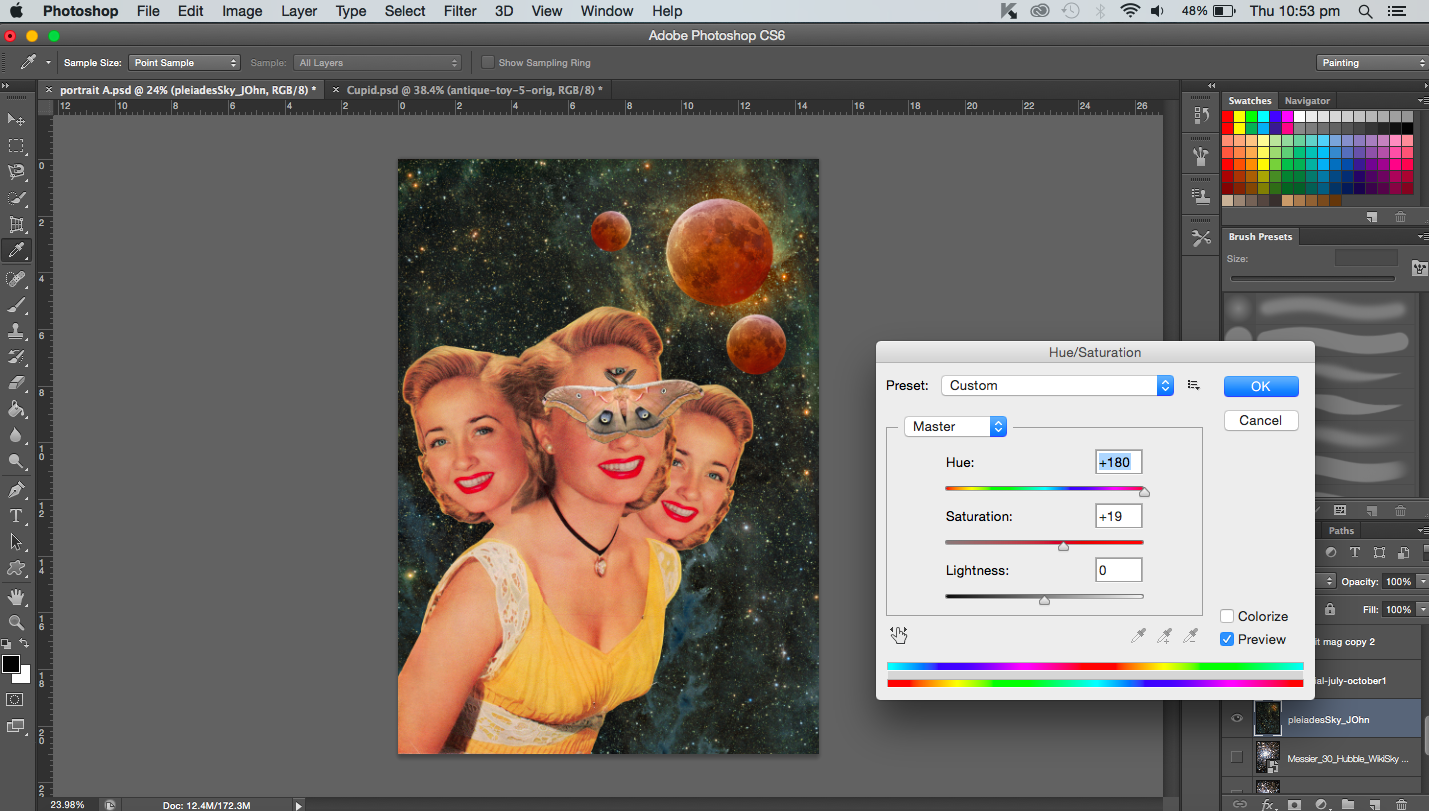
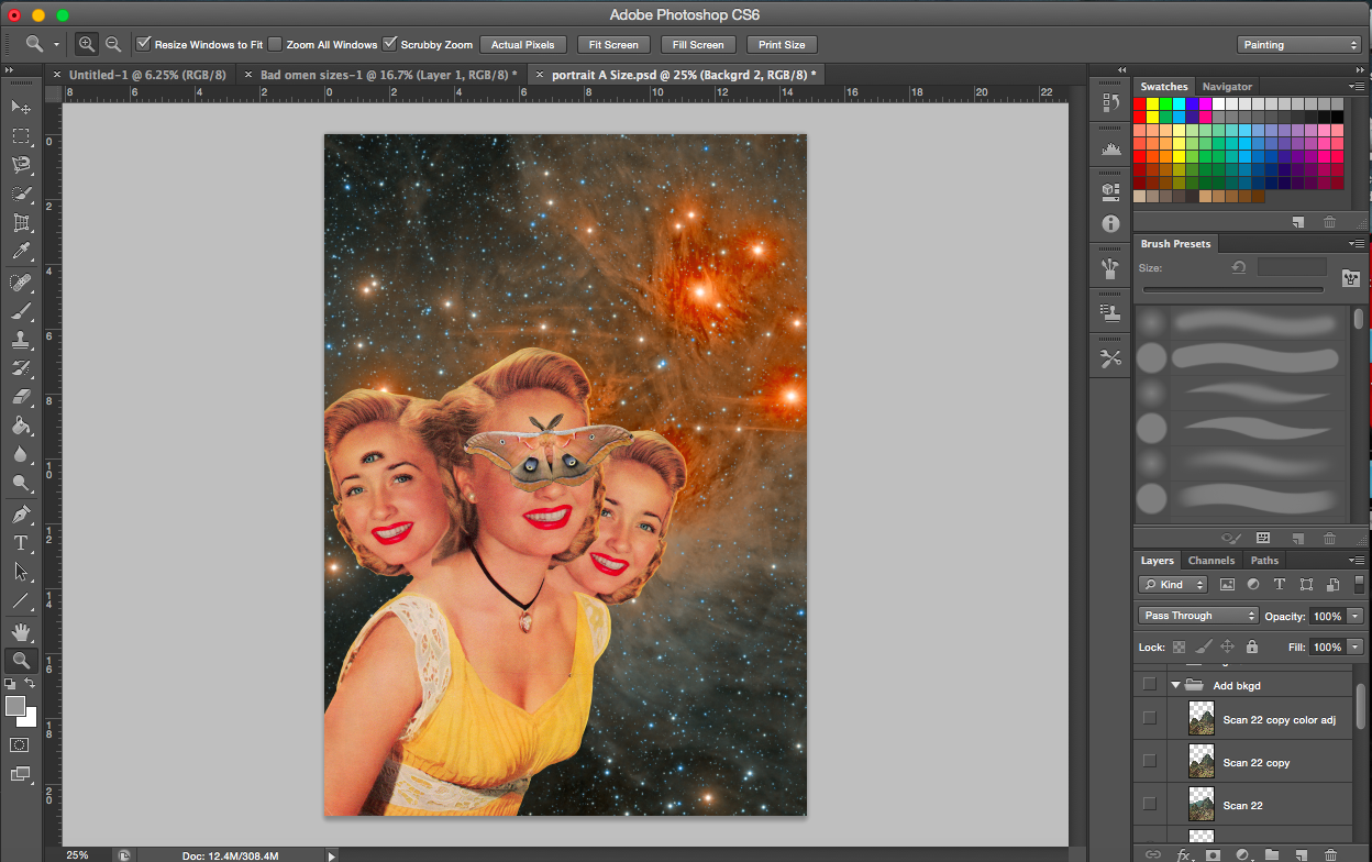
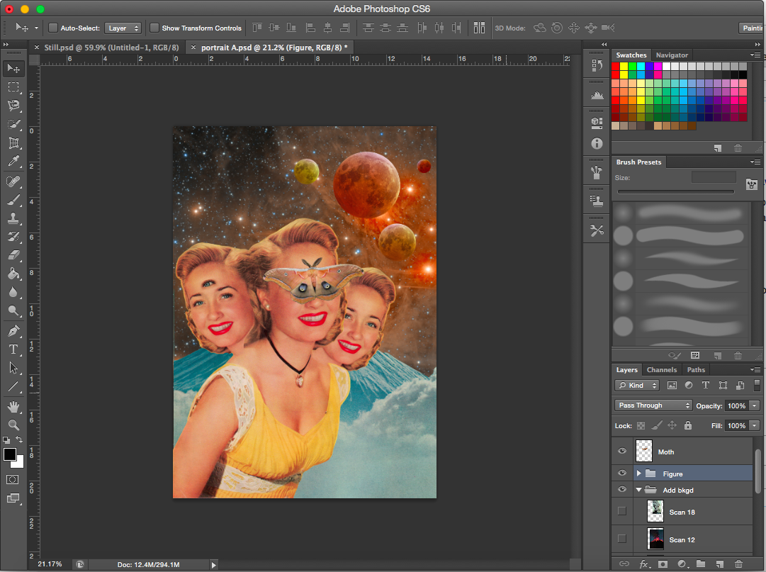
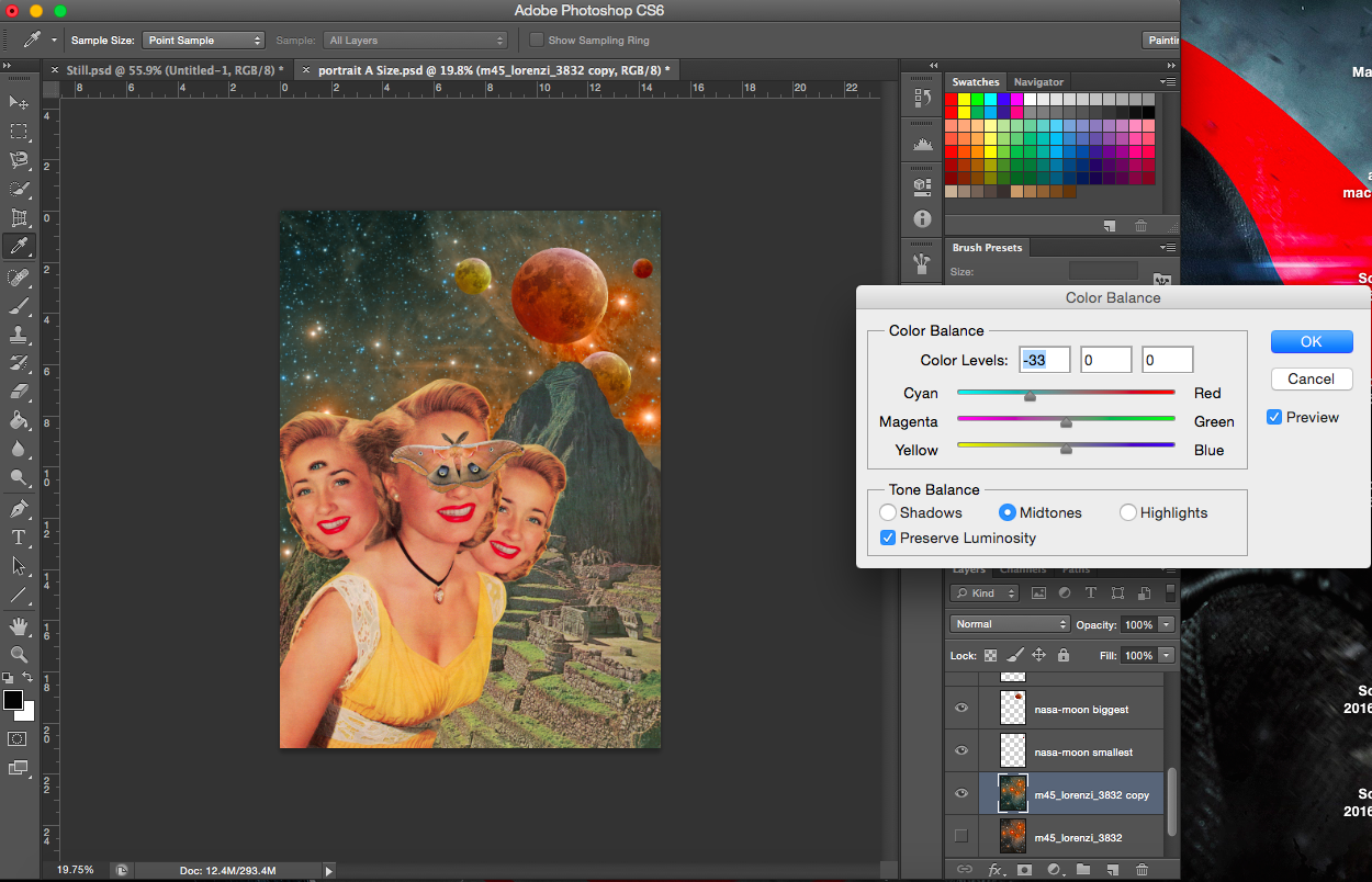
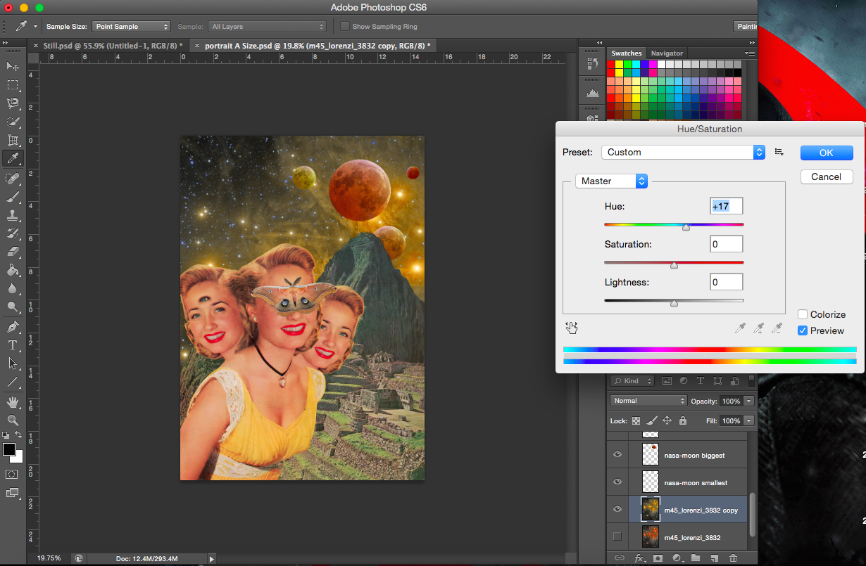
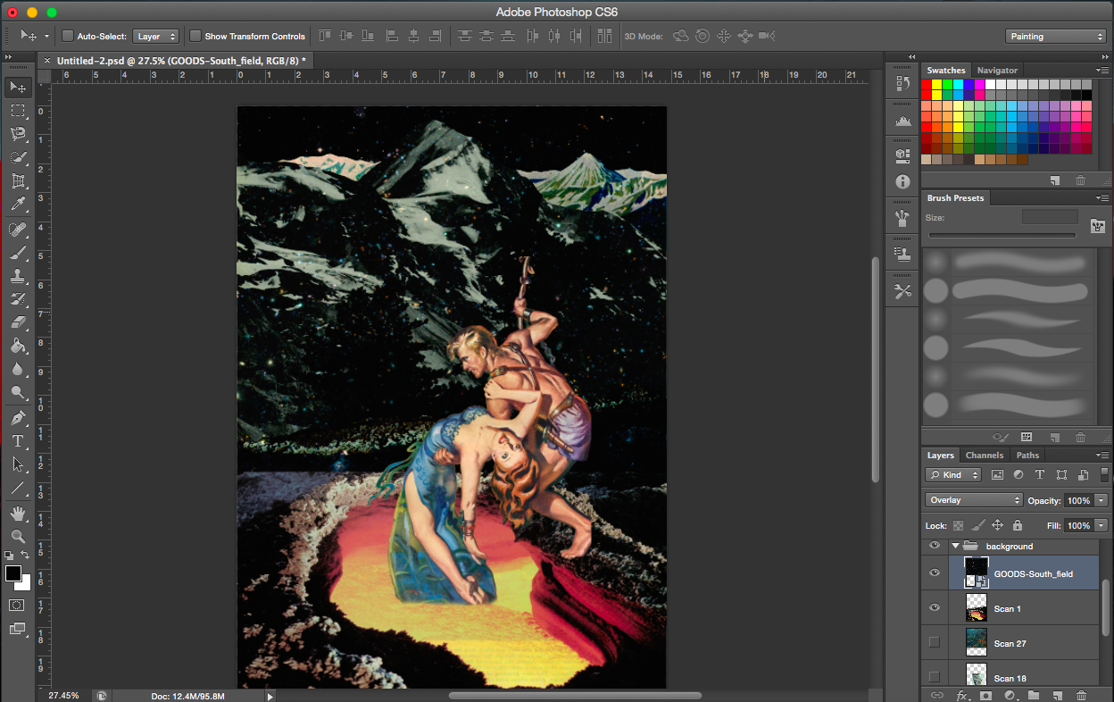
[Images Above] I added a couple of new elements here. I duplicated the heads, flipped one horizontally and ‘attached’ (layered) them to the main body. I had to make sure the hair or heads did not start abruptly either. So I erased portions with reduced opacity. They represent the triples that are considered a bad omen in certain cultures. Seeing a moth is considered a bad omen too thus I added one on the main figure. The extra eye on the face on the left represents the evil eye.
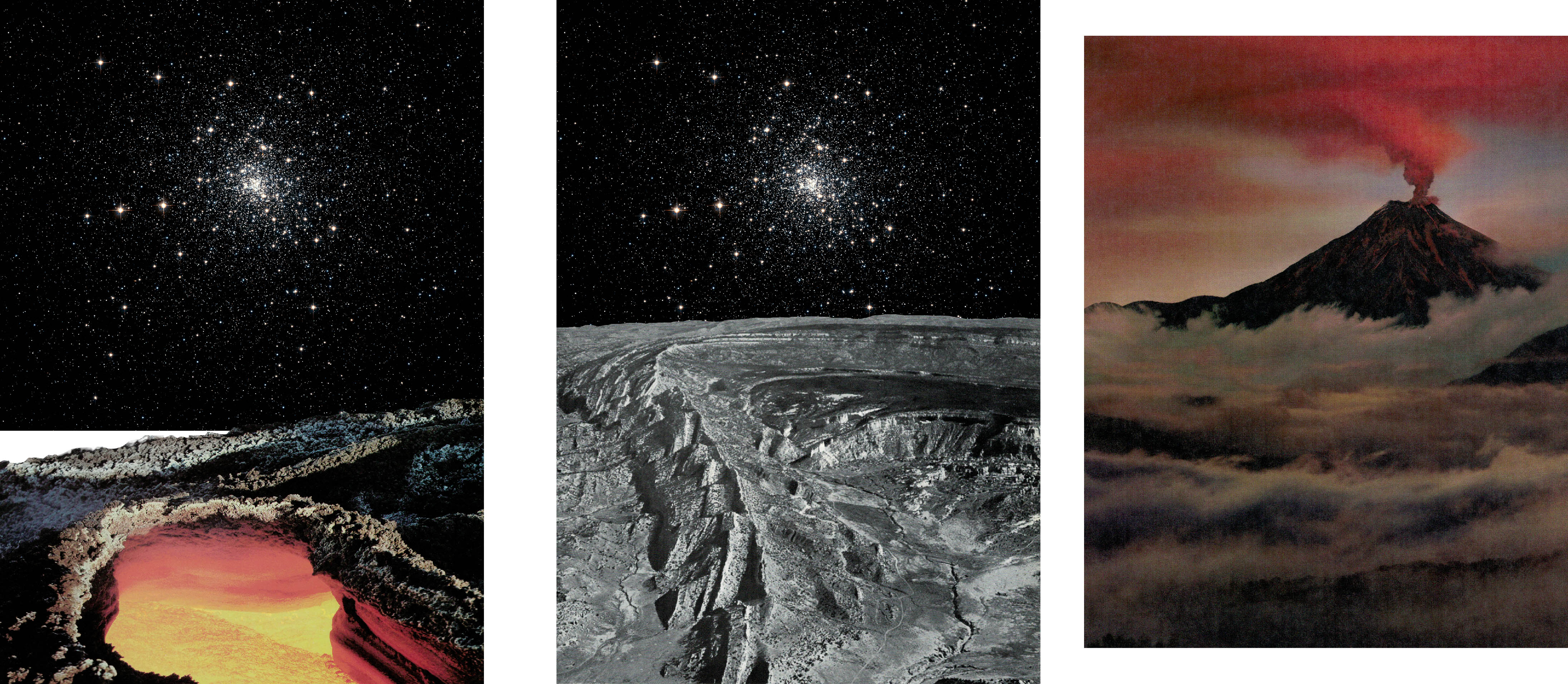
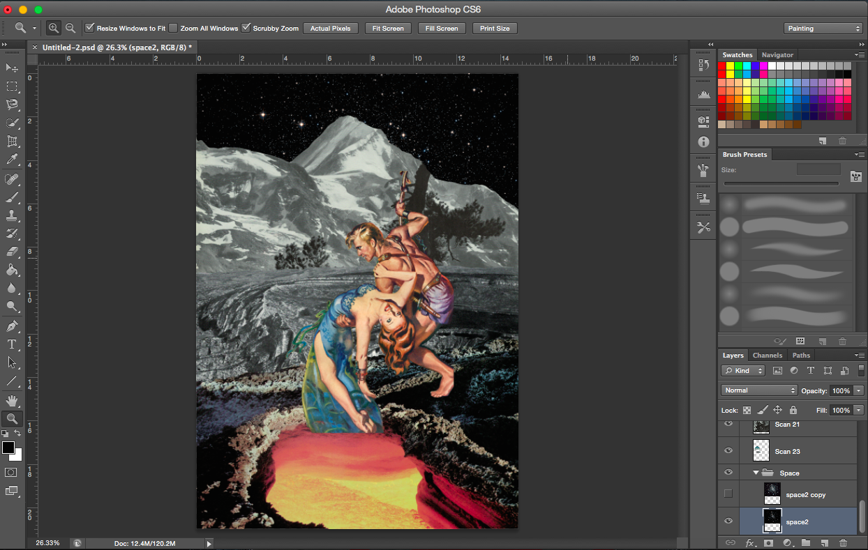
The three moons, which are all supposed to be lunar eclipses. I made of various sizes to create variety and balance. But it’s also to show the different distances. I have also taken into account the shadows and highlights of the moons and how they relate to the space background. Placing the moons at the right hand side where there are bright stars, the moons then seem to be illuminated by the the lit background.
[Image Above] I decided on another space themed background (digital image found online). It’s a constellation with bright stars on the right. It is darker on the upper left and lower corners. The stars on the right balance the left which is heavier due to the presence of the subject matter. I suppose the eye is also drawn from the woman vertically up to the bright stars on the right.
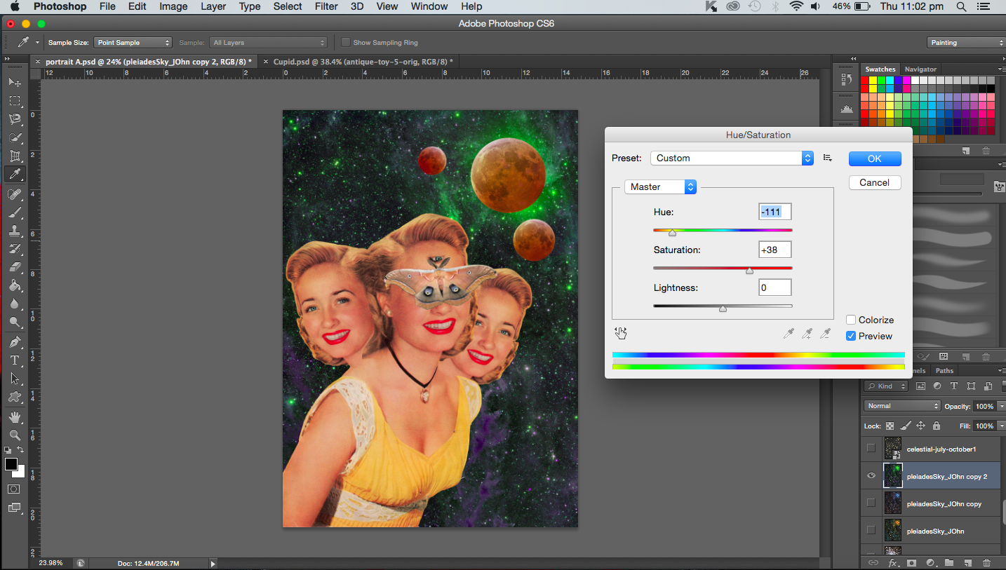
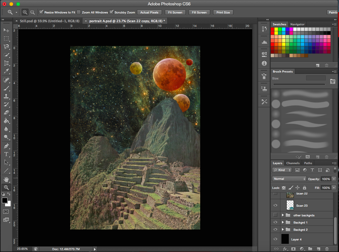
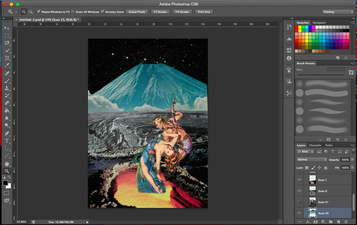
[Image Above] I added a scanned image from a old book about mountains. It is an image of the Inca empire, it reminds me of the Aztecs as well. It just so happened that the mountain had a peak that was towards the side, so the heads would not block them. Also, I positioned the moons in line with the heads and the mountain so that they flow together. It is also as though the moons are interacting with the mountains. Hence, the different backgrounds are interacting and existing together. I also added another moon, a small one in the corner to balance the image.
Addition of mountain layer (old space background)
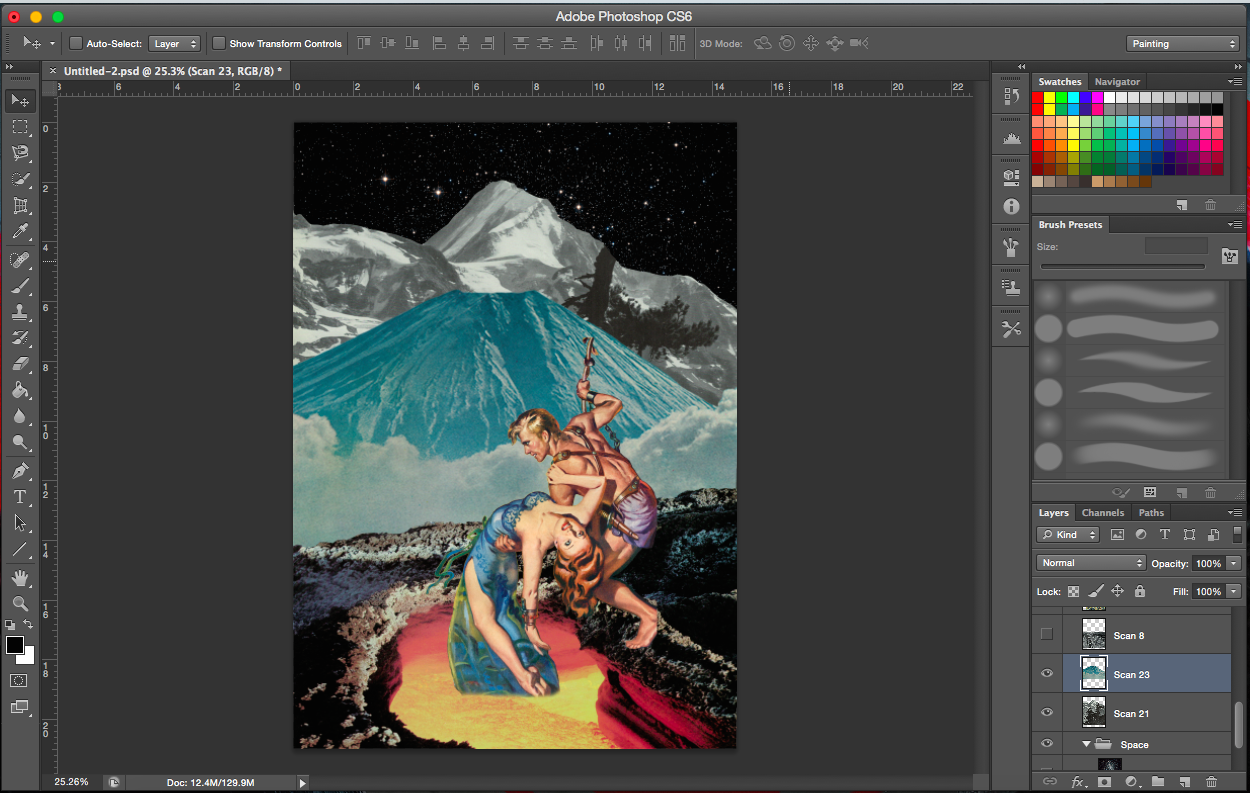
[Image Below] I was toggling between the two different space layers. With a different background, the colours of the moons were adjusted accordingly. But I gravitated towards the one on the right.
Two space backgroundsTrying out a different mountain (also from a vintage book)Adjusting background coloursAdjusting colour of mountain layerAdjusting colour of space layer-increasing cyanAdjusting colour of space layer-increasing cyan levels (higher)Adjusting colour of space layerAdjusting the size of the figure
[Image Above] I decreased the size of the figures and included another mountain layer to add a focal point to the image (where the mountains intersect). (Note. the topic of the focal point was raised during consultation when my other three works which I presented all have a focal point in the middle)
——————————————————
PROCESS- CATCH ME
“A butterfly from the point of view of a child is a game of catch.”
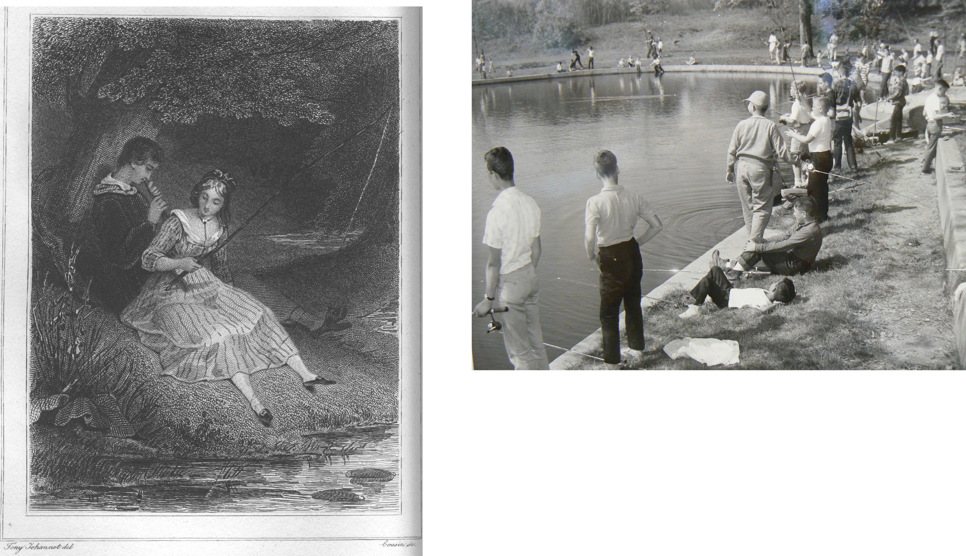
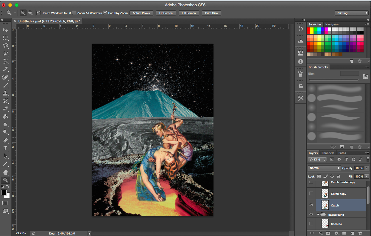
When I think of a child running around with a net trying to catch a butterfly, I think of a hero or a knight trying to save a damsel in distress. No doubt catching a butterfly is actually not saving it but I’d imagine to a child that’s exactly how they see it. Like they are trying to catch it to save it. Similarly, I will use a female (damsel in distress) to represent the butterfly. The child would be the hero. Other associations I had were more on the play of words, ‘catch of the day’, so fishing. Or sports, like cricket of baseball.
I started my search by looking for movie posters and comic covers.
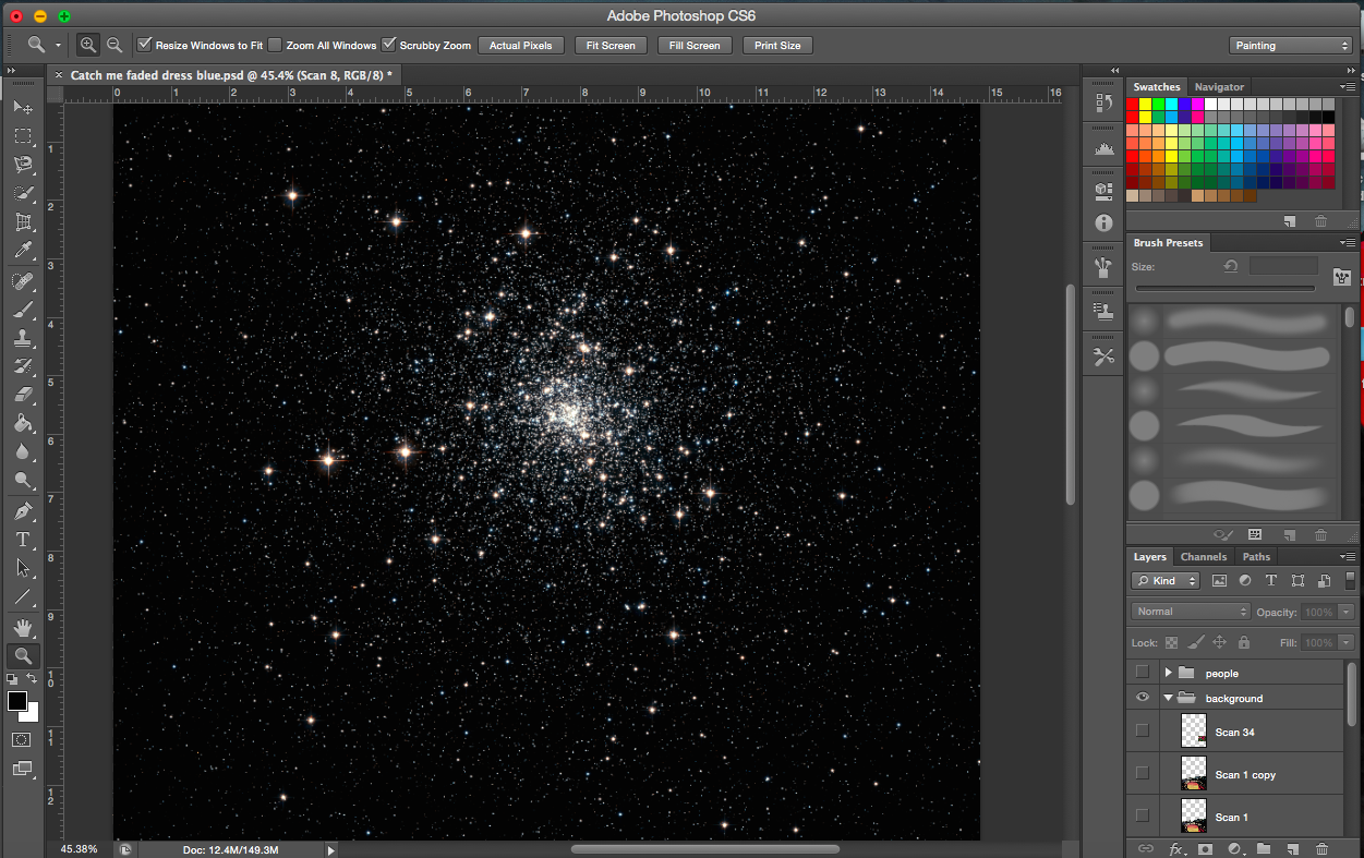
Comic cover and movie posterCatch of the DaySomeone’s catching somethingSimple space backroundPossible backgrounds-scanned imagesOne image, two meanings-scanned image
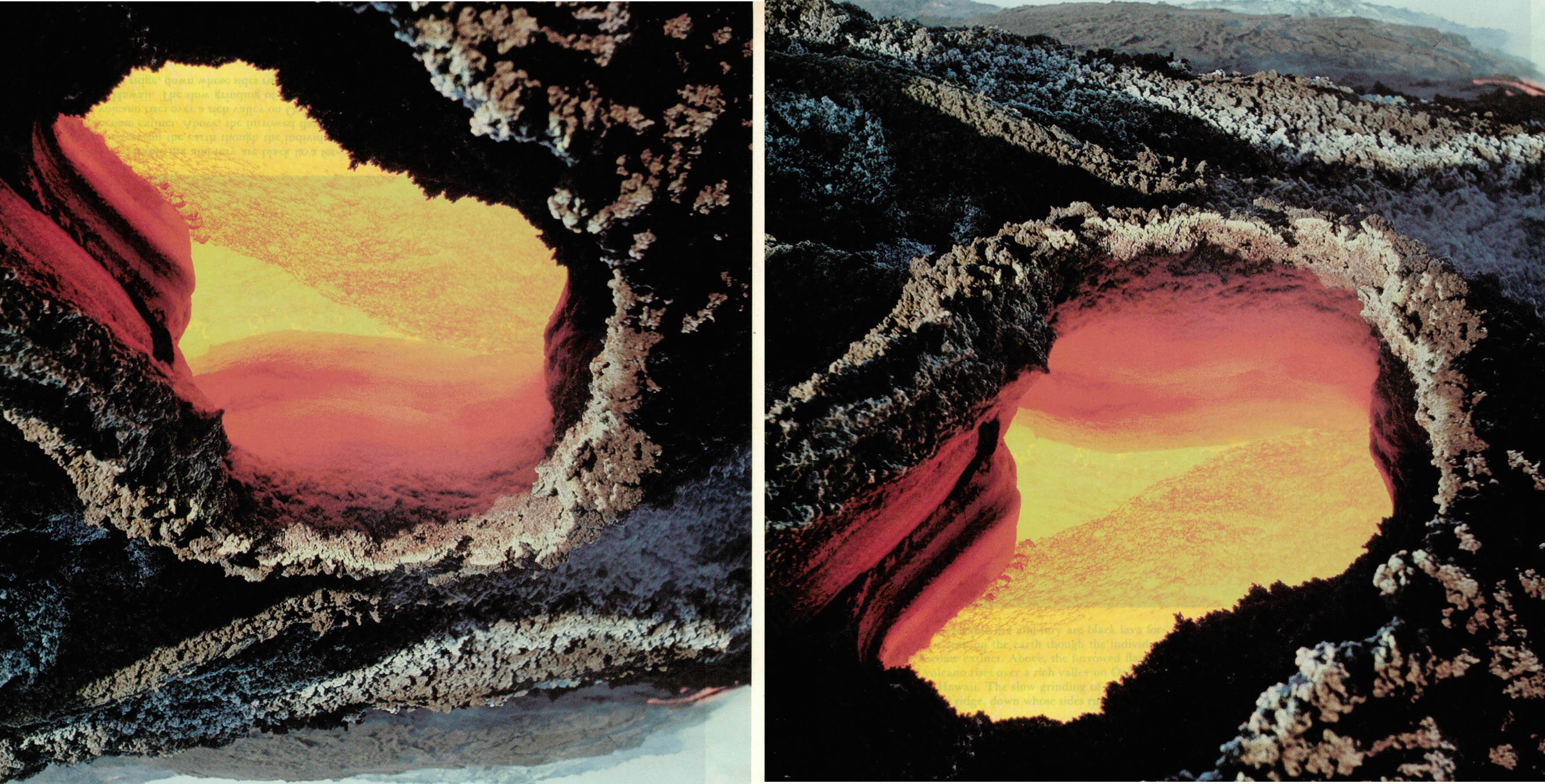
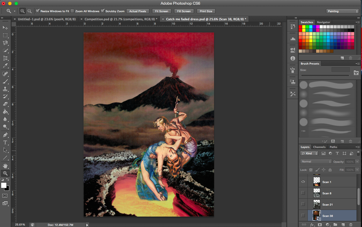
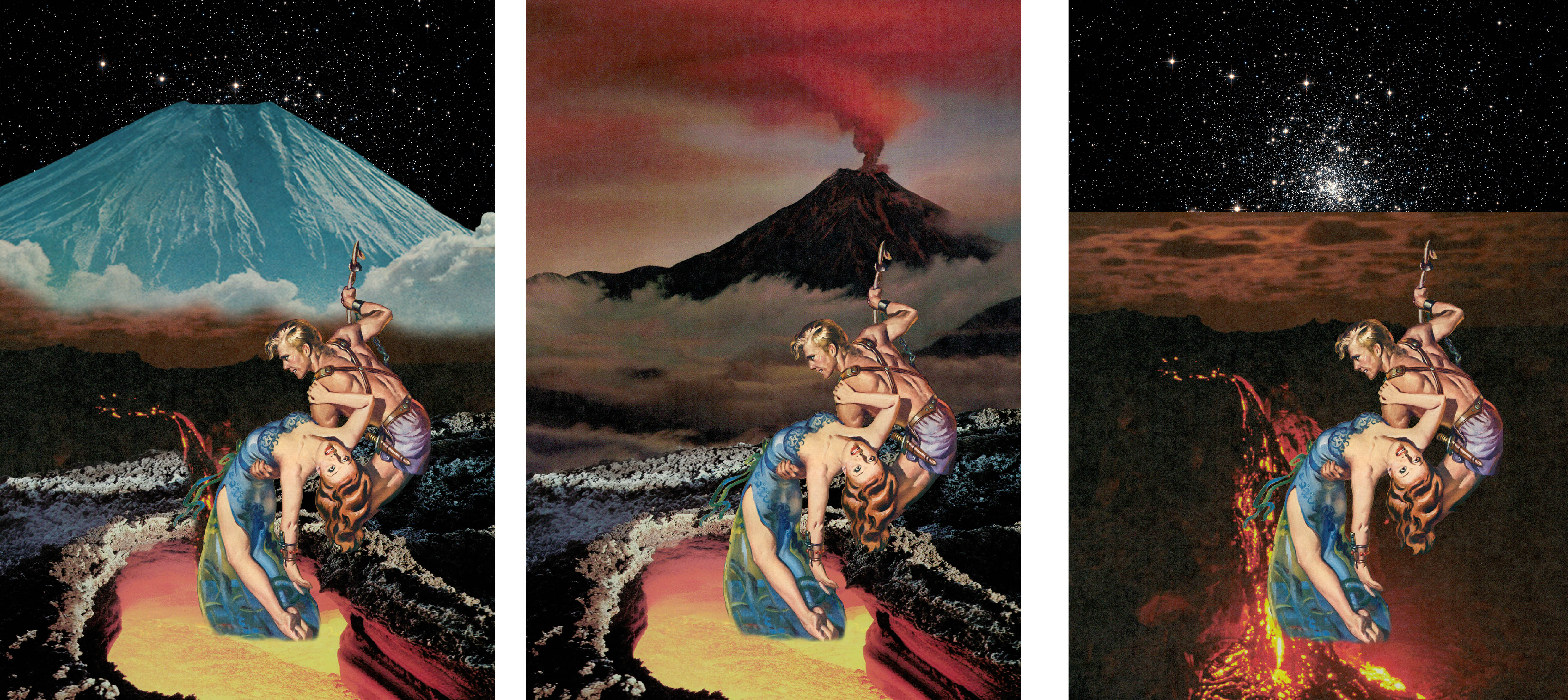
[Images Above] This is a good example of how versatile collage can be. This image of a volcano crater works well both the right way up (right image) and inverted (left). The version on the left looks like a cave opening and you’re looking out into the sunset. The one on the right looks like a pit of lava, as it should.
Experimenting with the background
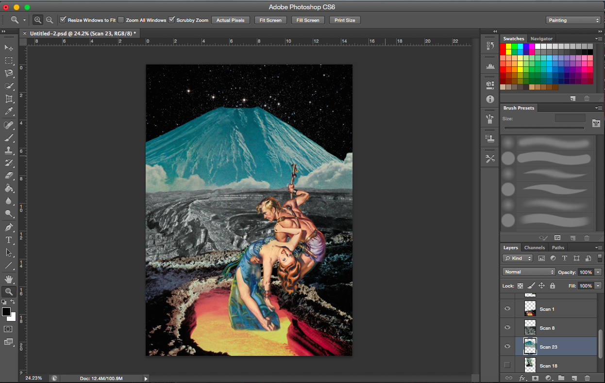
[Image Above] I encountered a problem where because the paper, on which the volcano was printed on, was quiet thin, the words on the next page were visible. The text is visible in the bottom orange section of the lava. To solve this problem, I just cropped it out, I believed it was the best option (see image below).
[Image Above & Below] The above image didn’t look dangerous enough for me. I felt there was also insufficient interactivity between the crater layer and the figure layer, so I shifted the figure layer down (see below).
With added mountains & volcanoAdjusting volcano (no clouds)Adjusting volcano (clouds)Flipping volcano image
[Image Above] I definitely wanted a volcano of some sort in this composition to add an element of the danger to the environment, but I thought this particular background was too heavy(might have been the colours). I was not able to create a smooth transition between the crater layer and the smoke from the volcano layer.
[Images Above] I was trying out alternative images of volcanoes and lava.
——————————————————
PROCESS- Envy
“A butterfly from the point of view of a moth is envy.” (Not used)
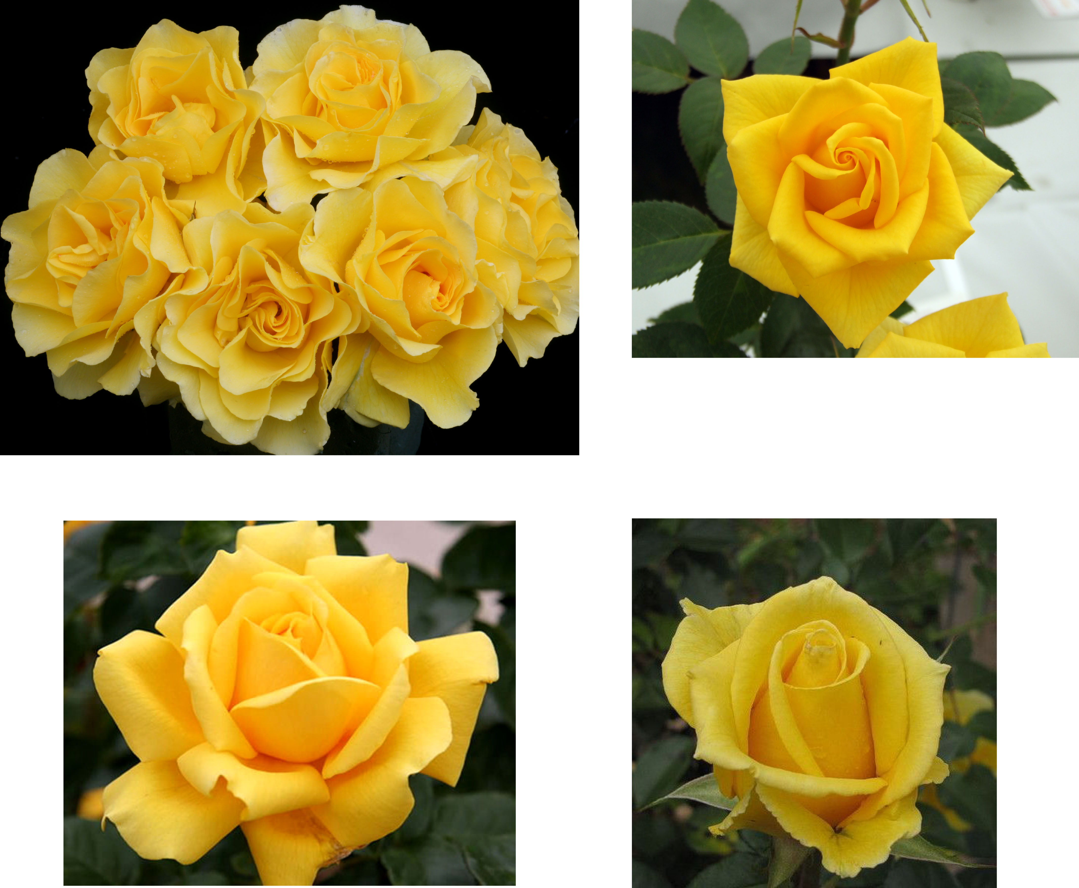
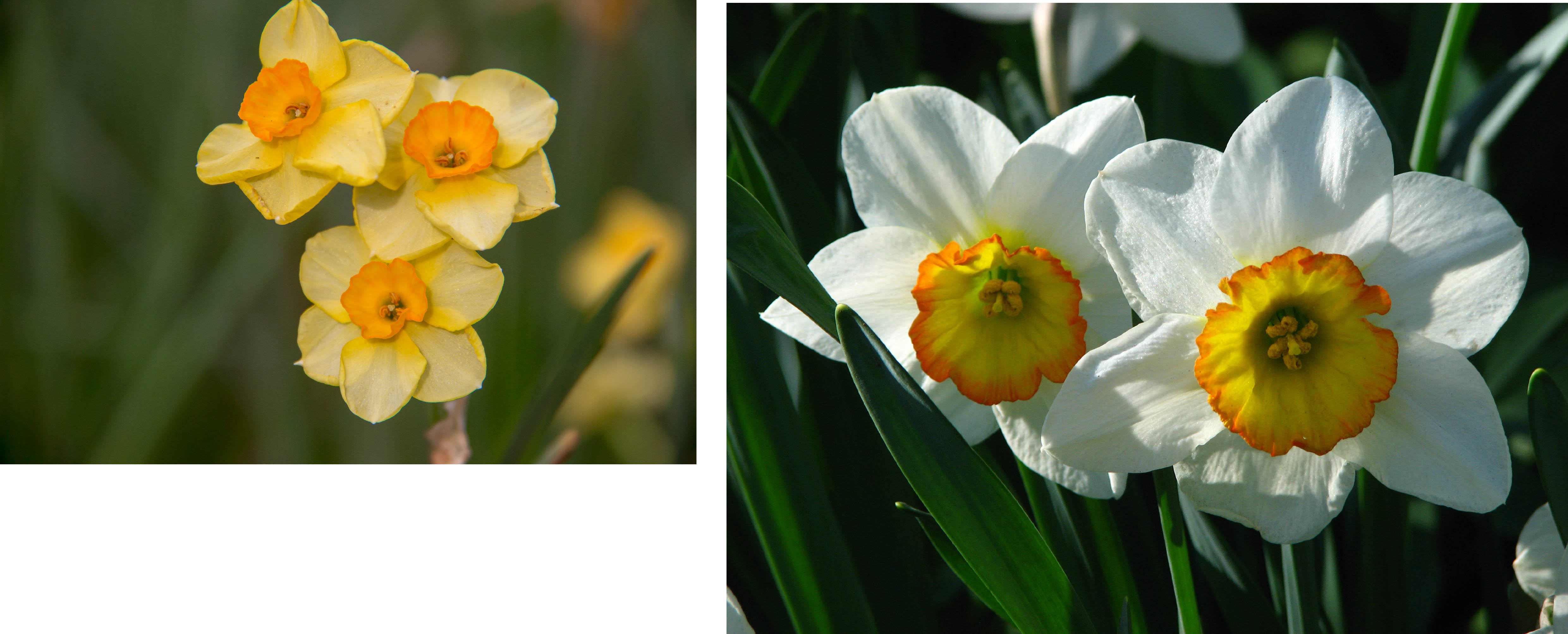
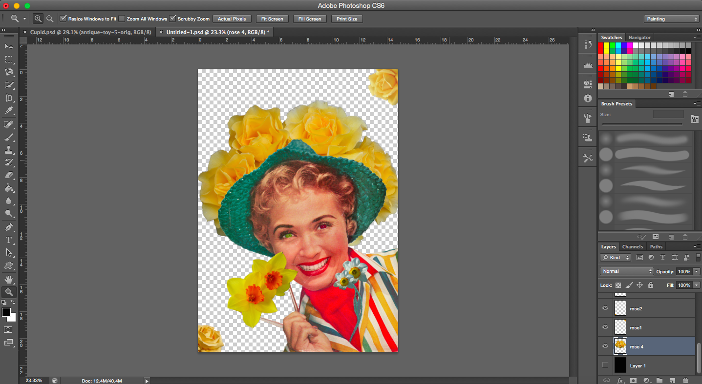
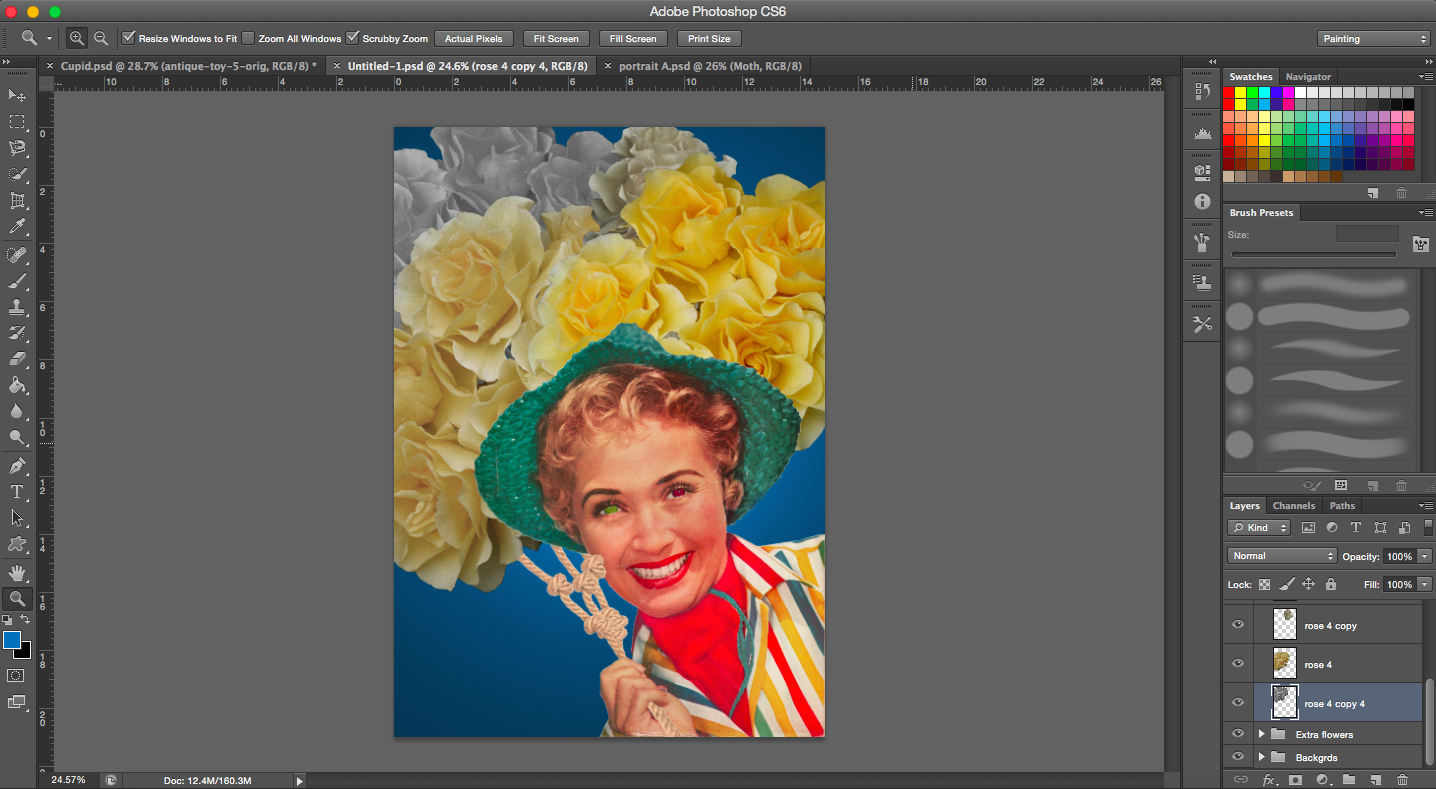
The associations I had with envy were green and after some research, yellow roses and daffodils (to represent narcissism).
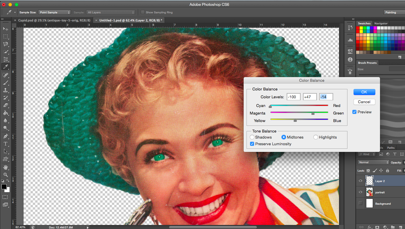
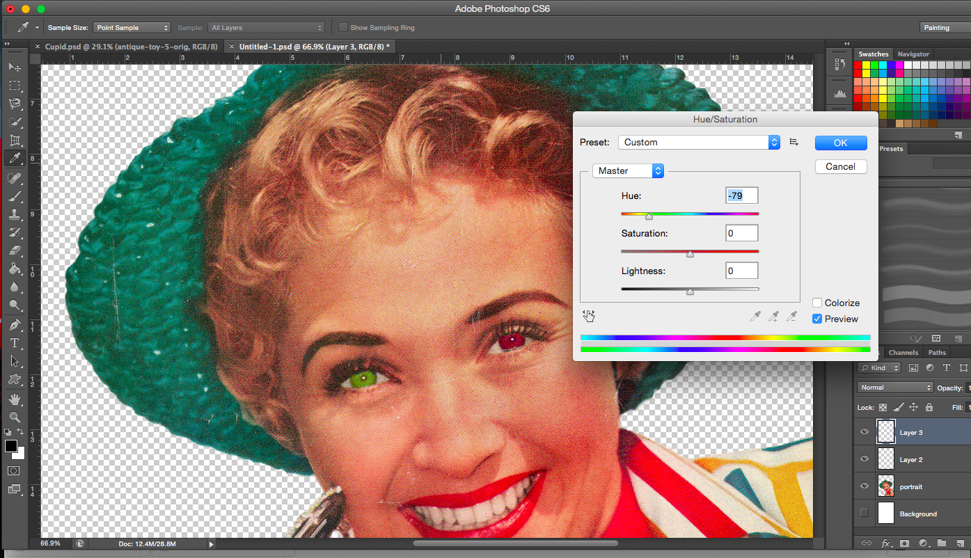
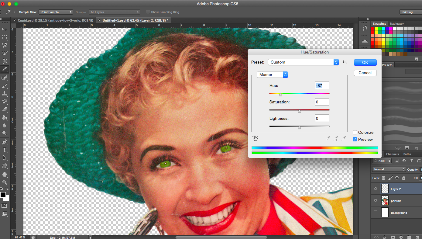
[Images Below] I started playing with the eye colour and tried to incorporate the phrase ‘green with envy’ into the image. I tried several different shades of green too.
Dark Green eyesGreen eyes
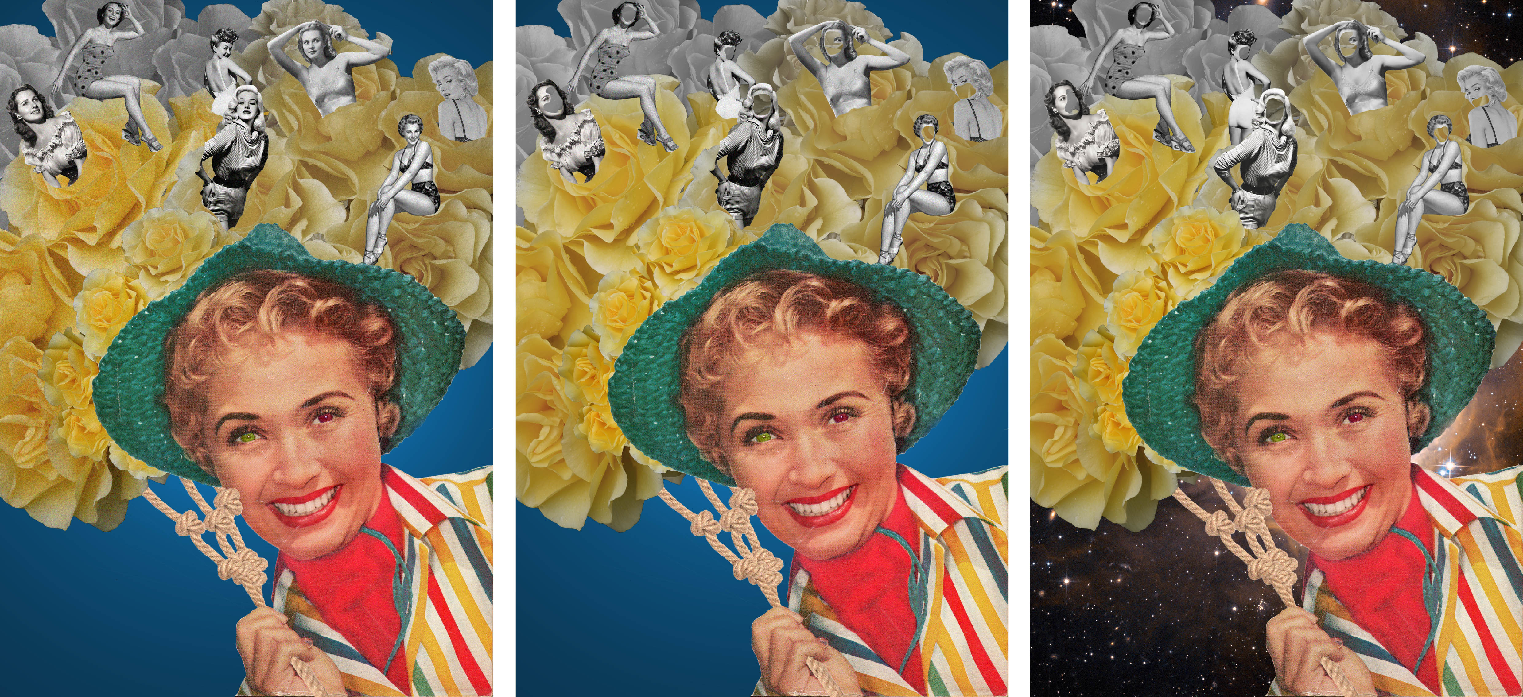
[Image Above] I made one eye green and the other red. The red represents the anger that comes from being jealous and envious of something or someone.
Lime green eyes
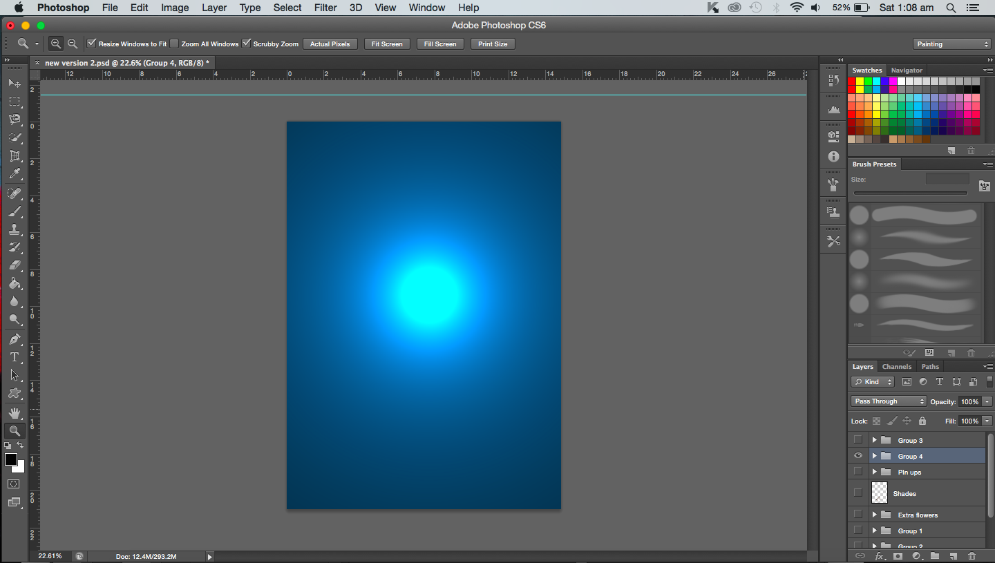
[Image Above] I created a plain, simple background for this composition. But I did feel it was a bit flat so I added a spotlight to create depth.
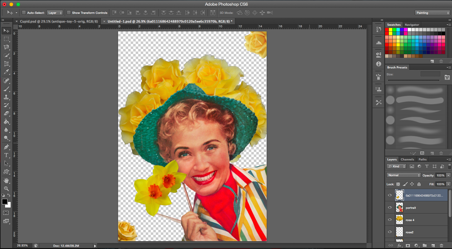
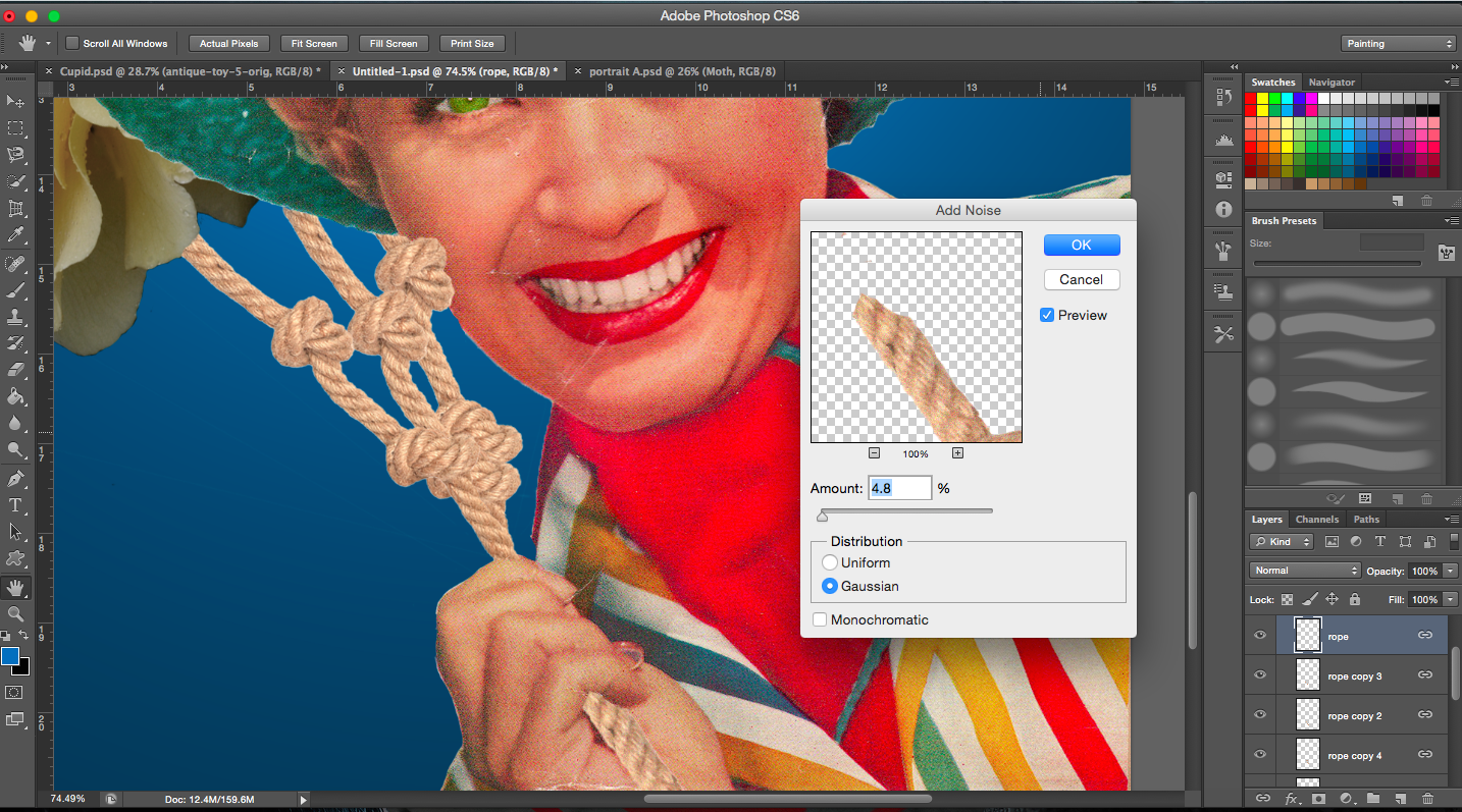
[Image Above] In the original magazine cover, the lady was holding a pair of sunglasses but I didn’t need the glasses in this case, so I had to replace it with something else. I thought of rope. The reason for this is due to the fact that she is enslaved and tied down by her own envy.
[Image Above] I reduced the saturation of the roses in the back and slowly increased saturation towards the front. I guess I wanted to show envy building up which is represented by the colour yellow.
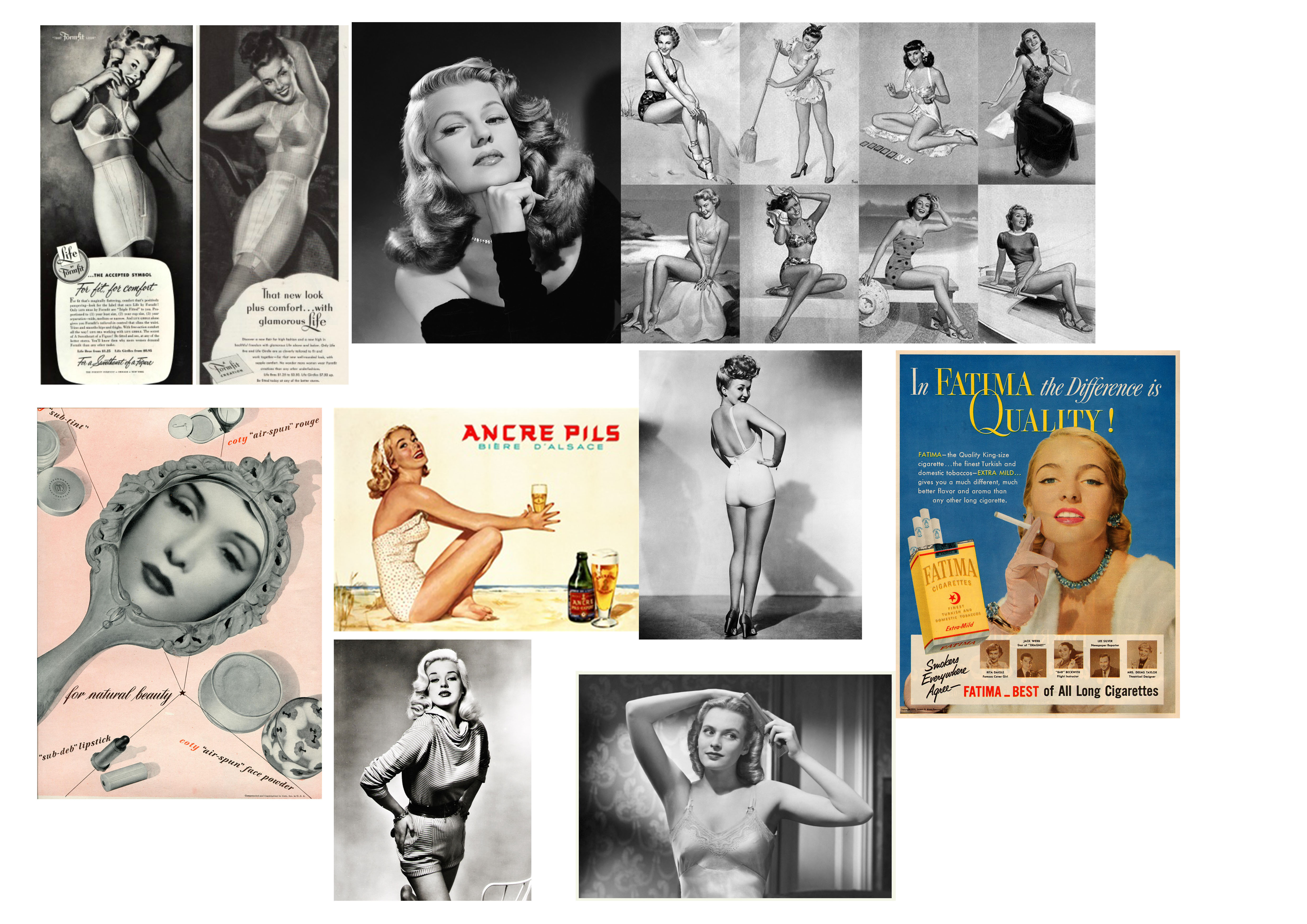
[Images Above] These are some of the images I found that could be used to show that a moth is envious of a butterfly’s looks. I focused on images from beauty advertisements and pin-ups. I added them in to show that her envy is fuelled by the images of these beauties.
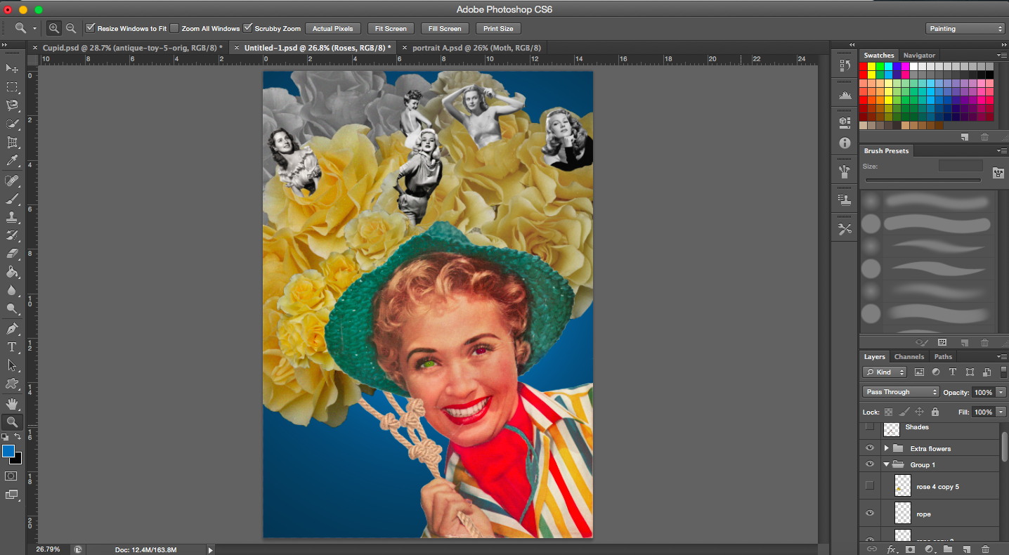
[Images Below] In the middle image, I removed certain areas of the faces of the beauties.
Editing faces and trying out different backgrounds
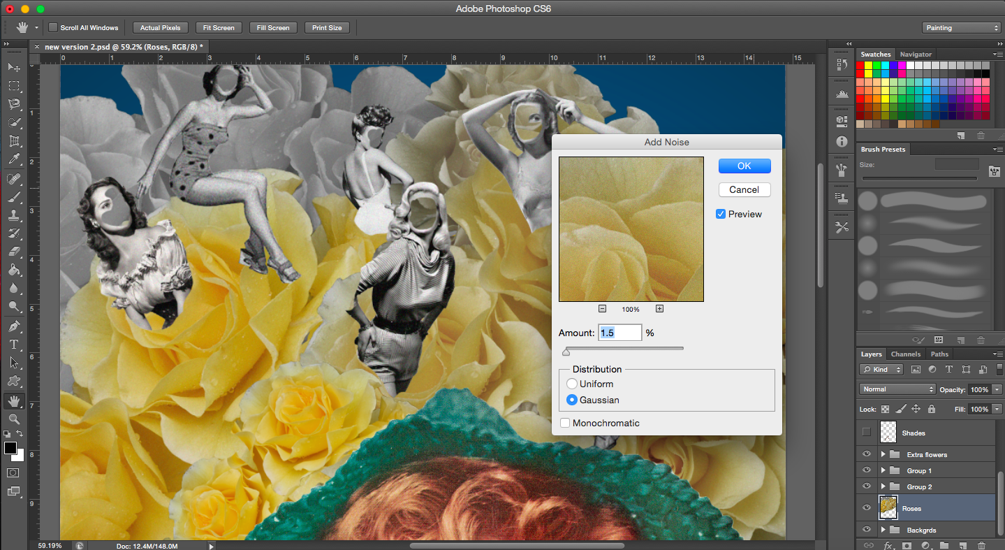
[Image Below] The image of the roses admittedly was not vintage so to give it that same look as vintage images do, I added a noise filter.
When I did finish this piece, it looked quite different from the rest because the style was slightly different and it also had a plain background. I think if I did use it, it would have stuck out. It did not get as good a reaction as my other compositions did during our group consultations so I decided to not use this composition and do something else.