You mean Photoshop is not a shop?

Okay then.

Had a lot of fun experimenting with the tools in Photoshop.

Below are the pictures related to my Rhyme, Humpty Dumpty:


Website that I got the pictures from:

Riddle: http://fire-monitoring.com/wp-content/uploads/2015/01/Question-MArk.jpg

Egg: http://www.branappetit.com/wp-content/uploads/2013/05/spiced-beef-and-leek-fried-rice-2.jpg

Egg: http://www.branappetit.com/wp-content/uploads/2013/05/spiced-beef-and-leek-fried-rice-2.jpg

Wall: http://hdwallpaperbook.com/wp-content/gallery/white-brick-effect-wallpaper/5050192623049-623004.jpg

Humpty Dumpty: http://img.freeauctiondesigns.com/eve1yn/IMG_0300.jpg

Wine: http://cdn.scankart.com.s3.amazonaws.com/metadata/wine/assets/sandman-vintage-porto-2011.jpg

Cannon: http://blog.modernmechanix.com/mags/ModernMechanix/6-1932/rail_gun.jpg

Horse: https://s-media-cache-ak0.pinimg.com/originals/c5/02/03/c50203c81e6174412ed4f182d1ea8b47.jpg

Bird Nest: http://3.bp.blogspot.com/-qBt-qiXMsAM/T3Dd_7FtZAI/AAAAAAAAEVU/J4nqvekLkBo/s1600/free%2Bdigital%2Bstamp_egg%2Bnest.png

Angel: http://thegraphicsfairy.com/wp-content/uploads/blogger/_CarNcodpCMA/Suj8XTydxgI/AAAAAAAAE54/offzoPHqU30/s1600/1aaaangelflying006b.jpg

Icarus: http://blog.artbma.org/wp-content/uploads/2014/12/1983.11_cut.jpg

Soldier: http://www.spiritedprophire.co.uk/wp-content/uploads/2013/02/Christmas-Prop-Hire-Soldier-Nutcracker-2ft-Prop.jpg

I think its important to mention that the picture of falling Icarus is from the The Baltimore Museum.

That’s what I have so far. Still finding more pictures and experimenting with Photoshop.

Have a great day.

KJ

Work in progress.

This is my journey of all the different angles to look at NTU. Tried to explore the semiotics linking one clip to another. Main connections are:

  1. Location’s time of day.
  2. Sounds
  3. Object of similar elements

Developing another idea. Will have to do many more shoots. Hopefully i make it in time.

Do advise on the ways in which I can do better connections. Probably which transitions were smoother and which were not.

Anyways here is the video:

Thank you for your time.

Have a nice day.

KJ


Good Day,

Our class (G6) is currently trying to arrange the categories so that it’ll be easier to browse through the progress of our work.

As such, we have created sub-categories for the sub-categories.

However, when these categories were created we are only able to see a page of that particular category instead of everything.

Screenshots below to elaborate:

1. Created the sub-categories as such.

1

2. Clicked onto one of the sub-categories

2D Foundation - 6 Ina Conradi Chavez - Google Chrome_3

3. Scrolled down to check on another page

2D Foundation - 6 Ina Conradi Chavez - Google Chrome_4

4. The page does not show anything!


2D Foundation - 6 Ina Conradi Chavez - Google Chrome_5

This is the same for all the other sub-categories.

It is fine for the category ‘All’. Able to see the posts.

Is it possible for us to arrange the categories in such a way? It will help facilitate the Professor to keep track of the class’ progress in the various components of the different projects. Will really appreciate it if you are able to allow the pages to appear without us having to make new categories.

Also, Prof Ina wants to point out that the time for each account is not synchronized to Singapore’s timing. Please advise accordingly.

Look forward to your reply in regards to this matter.

Thank you very much and have a great day.

Kuang Jun

G6.

Just copy and paste the names and slug accordingly. I copied them exactly from the ‘quick edit’ option. 🙂


Remember to choose the correct parent group! 🙂


There are some issues now so will check with the help desk. In the meantime just update the categories accordingly!

2D foundation categories hierarchy:

2015-dn1002-g6 (Parent Category)

– 1. Lines [slug:lines]

– Lines (Artist Research) [slug: lines-artist-research]
– Lines (Final) [slug: lines-final]
– Lines (Journal) [slug: lines-journal]

– 2. Rhymes [slug:rhymes]

– Rhymes (Final) [slug: rhymes-final]
– Rhymes (Journal) [slug:rhymes-journal]
– Rhymes (Research) [slug: rhymes-research]

– 3. Ego [slug:ego]

– Ego (Final) [slug: ego-final]
– Ego (Journal) [slug: ego-journal]
– Ego (Research) [slug: ego-research]

And yep, it is Lines (ARTIST Research) not ‘research’ only.

Have a great day. 🙂

KJ


And so it ends

Journey was incredibly tough.

But here it is

Final composition

 My first 2D project

Concept

18 lines

18 emotions

9 Active

9 Passive

Active’s on the left and Passive’s on the right

Active:

Anxious

Bizzare

Psychotic

Nonsensical

Turbulent

Spontaneous

Distracted

Sloven

Aggressive

Passive:

Sensual

Indecisive

Awkward

Exhausted

Fragile

Ambiguous

Systematic

Embarrassed

Lyrical

Active:

SONY DSC


Passive:

right

Line-by-Line:

Anxious

Able to relate to this emotion through this project. The immense pressure to get the lines done right. Depicted through the dark tones pressurizing the light. Little scratches are present in the light to signify anxious clawing.

Bizzare

Bizzare

Mono-printing gone weird. Happened to chance by this mono-print. The white circles looked strangely like huge eyes. The blots flowing down in the lighter parts makes the entire shape look somewhat like an infant. The distorted character formed by chance makes the composition somewhat scary. Definitely Bizzare.

Psychotic

Psychotic

Inside the mind of a crazy person. All the blots and lines. The somewhat cluttered and organic composition makes one stare uncomfortably at the tortured mind of a psychopath.

Nonsensical

Nonsensical

Words falling, unstable and holding no meaning. Nonsense.

turbulent

Turbulent

Paint going in all random direction. Black and White, Good and Evil, Ying and Yang. Hold on because it’s going to be one crazy ride!

spontaneous

Spontaneous

From a little flame to layers and layers of raging inferno. The sheer power of the growth shows the spontaneity of the combustion.

distracted

Distracted

Why is there a line in the middle? The more I want to ignore it the more I stare at it.

Sloven

Sloven

The mess of the rejected pieces put together. Where is the line? Too lazy and messy to make one, so used the glue as the line instead. Look closely.

Aggresive

Aggressive

The aftermath of an earthquake. The most powerful man can never match up to the pure strength and destruction of nature. Fall through the cracks. Let everything fall.

sensual

Sensual

Floating. Floating. Float for eternity. Comfortable and smooth.

Indecisive

Indecisive

Left? Middle? Right? Decisions, decisions.

Awkward

Awkward

Poor little dirty circle. Caught in the angle parade.

exhausted

Exhausted

All the vitality slowly fading away. Fading into a dream.

Fragile

Fragile

The thread of life. Ever so fragile and weak. Love and hold on while you can.

Ambiguous

Ambiguous

Snoopy and 2 Woodstocks looking at a board? Bushes and Tree Bark? Lines are confusing. What do you think?

Systematic

Systematic

To and Fro. In and Out. Loops and Cycles. Systematic

Embarassed

Embarassed

Hi there! Come on out! Don’t be shy!

Lyrical

Lyrical

Flowing white cloth in smoke. Dance and Sing. Follow the beautiful melody.

Annd. Done.

Some reflections:

Really tough but eye-opening experience.

18 emotions. 18 entirely different ideas.

As a person that likes to spend time with his ideas. 18 might be too many for me.

But it is because of the sheer amount of ideas needed that it forced me to try so many different techniques.

Really hoped had more time to explore this project then.

Had nothing from the start. Had to gather resources and experiments.

Really enjoyed the process.

From this I gained experience and skills.

Grateful for this experience and opportunity for growth.

However, the biggest question:

Am I a good enough to be called an artist yet?

Anyways,

Have a great day.

KJ

I NEED SLEEP

But I am just too slow. 🙁

Regardless of process, final works and even the journal entries, I’m always taking a long time.

Starting with 0 resources.

Giving birth to ideas and materials.

But even giving birth takes 9 months.

So begins part 2 – The painfully slow process

Unburden-yourself-stop-worrying

Before I start, just some honest confessions:

I am doing my visual journal in the reverse process- my final composition is already complete and I am recording my process with all my cut up pieces and little pictures I have to showcase the things that I’ve experimented on for this project.

Still, I will still try to make a journal that is clear enough in regards to my entire process in making the lines.

Okay, back to the journal:

 Process 1 – Monoprinting

Everybody’s favorite medium. Period.

Monoprinting is the process of making an ink painting by pressing a piece of paper over several textures to produce a final image.

Monoprinting works best as a way to capture the texture of objects on a piece of paper in black and white.

SONY DSC

Fun Images

SONY DSC

SONY DSC

SONY DSC

SONY DSC

SONY DSC

SONY DSC

SONY DSC

SONY DSC

SONY DSC

SONY DSC

SONY DSC

SONY DSC

SONY DSC

SONY DSC

SONY DSC

SONY DSC

SONY DSC

SONY DSC

SONY DSC

SONY DSC

SONY DSC

SONY DSC

SONY DSC

SONY DSC

SONY DSC

Stacking Monoprints because I can

SONY DSC

More Stacking

Process 2 – Experimenting with lecture notes

Prof Ina provided us with a set of lecture notes in Automatic Techniques. Many of them were really fun to play with.

SONY DSC

Decalcomania

SONY DSC

Decalcomania

SONY DSC

Automatic drawing (Chinese Ink)

SONY DSC

Fumage

SONY DSC

Fumage

SONY DSC

Automatic drawing (Chinese Ink)

SONY DSC

Sand Painting

SONY DSC

Sand Painting

SONY DSC

Grattage

SONY DSC

Torn Paper Collage

SONY DSC

Torn Paper Collage

SONY DSC

Automatic Drawing

SONY DSC

SONY DSC

Froissage

Process 3 – Marbling

Marbling. The hardest process that guarantees failure most of the time.

Tools required:

Chinese Ink

Brushes

Paper

Container big enough for your paper size

Water

Process:

Fill the container up with water

Using the brush, dip some of the Chinese Ink onto the surface of the water. The oil-base will the ink to spread across the surface of the water.

IMG_20150827_203906026_HDR

IMG_20150827_203909317

Once sufficient ink is used, use the end of the brush to swirl the water to create random wave shapes in the water.

IMG_20150827_203911264

IMG_20150827_203913347

Once done, quickly lower the paper onto the surface of the water.

IMG_20150827_203917246_HDR

IMG_20150827_203920249_HDR

Lift the paper up to produce a finished marbling work.

IMG_20150827_203926062_HDR

IMG_20150827_203928275_HDR

Except that it always appears not so ‘finished’.

There are some other good ones

And luckily a very very good one.

IMG_20150911_062021810

Decided to use this particular piece for my final work.

Just by the sheer amount of experiments needed to be able to achieve the texture.

Since I had the container and paper, I did the froissage technique with the ink after its fully mixed with the water. The end result came out with a nice crumpled inked paper.

SONY DSC

Process 4 – Crackling

Crackling: The most frustrating and time consuming automatic technique to work with.

The part of me without experience and knowledge of tools really suffered here.

Spent many many hours that ends up in failure due to poor quality in tools used.

Crackling is a fairly simple process.

Tools:

Paper

Brush

White Glue

Acrylic Paint

Blow-Dryer

First, apply a layer of glue on top of the paper, ensure that the layer is thick enough.

IMG_20150908_192821063_HDR IMG_20150908_192810831_HDR

Next, apply a thin layer of acrylic paint over the glue once it turns tacky

Blow dry the paint and achieve the crackle effect.

IMG_20150908_193012134_HDR

Except that it doesn’t.

SONY DSC

What came out was a more wavy effect than a crackling effect.

So many failures

So many different techniques tried

So many attempts

SONY DSC

Then, I changed the glue and acrylic paint.

It worked like magic.

SONY DSC


SONY DSC

SONY DSC

All the time. All the effort. All it took was the right tools.

Incredibly huge lesson learnt here.

Process 5 – Burning paper

I tried 3 different things with flames when preparing for the project.

The first was fumage, producing a very smokey effect by passing paper over a smoking candle.

SONY DSC

The second was burning the sides of a piece of paper, giving a ‘torn’ feeling but with a more dark and intense edge. Produces a very organic feeling to the paper.

SONY DSC

Finally, the third technique I used was burning holes into the pieces of paper.

I bought mosquito coils for this particular technique.

I broke off a piece of the mosquito coil and light it up.

 IMG_20150910_190930393

Once the tip has an orange glow to it, I lower it onto the surface of the paper.

IMG_20150910_190941770

After a few seconds, it produces a burnt hole on the piece of paper.

IMG_20150910_191016304

By burning more holes onto the paper surface, it produces and very nice texture and even lines in between the holes.

SONY DSC

Process 6 – Threads

This was a technique to convey a specific emotion, fragile.

Not much sewing but a lot of tying/ pasting.

In order to ensure that the strings stay, I have to stick both ends of the strings to the back of the piece of paper.

To create the ‘fraying’ effect, I attached multiple strings to each side of the paper.

Finally, to make the strings stay together, I tie the length of the string using the same thread and cut off the ends. This managed to give the illusion of the string being on the surface of the paper without any obvious adhesives or threading being done.

I managed to achieve the ‘fragile’ effect that I wanted.

thread

Process 7 – Rubber stamping

Simple process of stamping words onto a piece of paper.

Tools:

Stamping tool

Ink pad

Paper

An incredibly tedious process. Mainly because of the marks made by the borders of the stamping tool after pressing it on the ink pad.

SONY DSC

Ugly straight lines made by stamp at the right of the picture

To ensure that the marks stay away, had to clean the edges away every time I used the ink pad.

Process 8 – Patterns

My weakest area. Honestly. Even geniuses like Emma Kunz had graph paper with them. I did not. Many attempts to draw grids and shapes, all ended in failure or some disturbing faults on the surface of the paper. Had to retry some of the compositions a few times.

Cubes!

Cubes!

Grid that failed

Grid that failed

Sol Lewitt

Sol Lewitt

Wavy lines

Wavy lines

Its so hard to align without a grid

Its so hard to align without a grid

2nd try

2nd try

Entopic Graphomina

Entopic Graphomina

Process 9 – Finger printing

The most fun but incredibly tedious process.

Basically all I did was dip my hand on my ink pad and drew lines on the surface of the paper.

Had to experiment the different feelings conveyed by using different kind of strokes and also the distances between the marks.

SONY DSC

SONY DSC

SONY DSC

SONY DSC

SONY DSC

Process 10 – Burnt paper stacking

Remember the burnt paper previously, to enhance the aesthetics and make it applicable for the lines, I cut out the different strips and stack them on top of one another. This gives a very layered and organic line, giving it a powerful texture.

SONY DSC

IMG_20150910_140538346_HDR

Process 11 – Optical illusion

Experimented with white illusions.

It is where stripes of white and black gratings is partially replaced by a grey rectangle.

Despite the grey being the same, it appears to be different colours due to their interaction with the lines.

Illusion worked but aesthetics failed.

Used a charcoal pencil to draw two similar gradients and used a small line of one of them to create a distraction to the big line. Came out very well. Decided to use the line as one of my final pieces.

distracted

Basically most of the significant techniques that I’ve experimented on over the course of the project.

Well, this part is finally done.

It took so long to achieve all the results that we have above.

At least I’ll be faster when trying to get the same effects.

Improvement

That’s what really matters right?

Now to the final process.

Once again, thanks for sticking around.

Have a great day

KJ

So there was a fire drill in hall

Then there was me burning things in my room.

Good thing there are no smoke detectors installed in hall.

My favorite processes are those involving fire.

Below are some of the techniques that I’ve used:

FUMAGE! Pretty smokes

SONY DSC

Fumage

Burning holes. So holey.

SONY DSC

Burnt holes

Burning the sides of paper.

SONY DSC

Burnt sides

Thankfully, my hall is still intact. 🙂

Have a happy day!

KJ


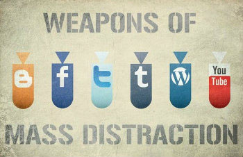
Technology distracts me.

There is this intense pull towards procrastination whenever I am on my laptop or computer.

While typing this I have currently 7 active tabs performing their own features to help in my ‘focusing’ and ‘work efficiency.

Not to mention my phone. Social media notifications. So many of them.

Point is, I cannot have technology around when I am doing work.

Not especially when I’m trying to focus on assignments.

weapons-of-mass-distraction

However, I shall attempt to finish my 3 part virtual journal in the ‘shortest time’ possible. Right after replying the Whatsapp message that just came in.

The first part of my virtual journal – Artist Inspirations lightbulb4_0140

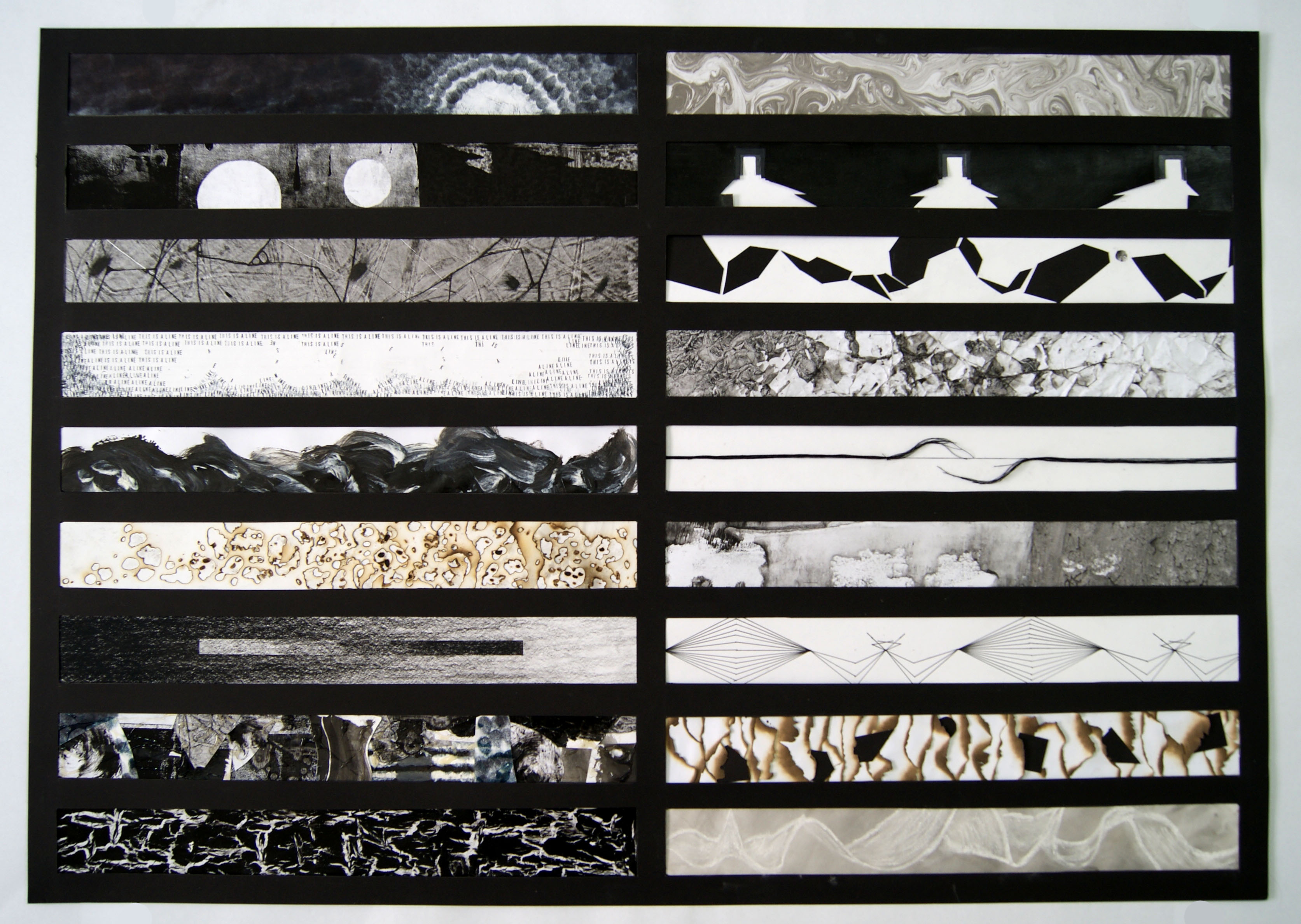
18 Abstract Lines to convey 18 emotions.

Abstract Lines.

Emotions.

THIS IS THE FIRST ASSIGNMENT?!?!?!?!

Really had no idea how to go about this task at the start. I did not know how to create abstract things and do not know how to evoke emotions indirectly through pictures (lines).

My lack of Art lessons in my whole life did not help me either.

Thankfully, we were allowed to look into Artists works and imitate their wor… I mean draw inspiration from them.

New term was then introduced to us: Automatic Techniques.

After trying some of the methods mentioned in the lecture notes (I tried the techniques first before I had some direction on how to go about doing this assignment) I noticed the most relevant things about Automatic Techniques:

TEXTURE

Automatic Techniques gives texture.

They allow the hand made work to come to life, giving it some radical pattern or design that simulates a certain texture, even emotion.

Emotion!

Texture giving emotions!

Preview image

Hope that dear reader you’re not bored yet. It took me wayyyy longer to notice this relation. (Did I mention my lack of art lessons my whole life?)

You’re still here? I’m so grateful. 🙂

My process is simple. Figure out the texture that best describes the emotion and find out ways to create that visual image.

Point is: I want to use techniques which can best relate to the emotions that I want to create.

Okay. Now that we’ve got that established we shall look at the artists that inspired my 18 lines:
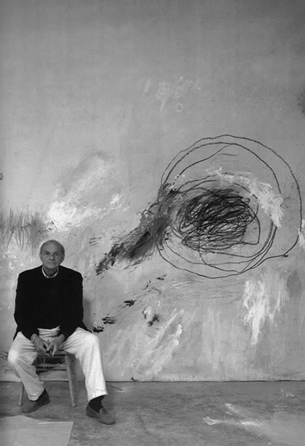
Ward Jackson

Ward Jackson is an abstract painter and is one of important developers in minimalism.

The works I want to focus on were made by him in the early 60s, where he creates a series of square or diamond shaped canvases with hard edged geometric compositions.

24_Ward_Jackson1

photo-114 tall


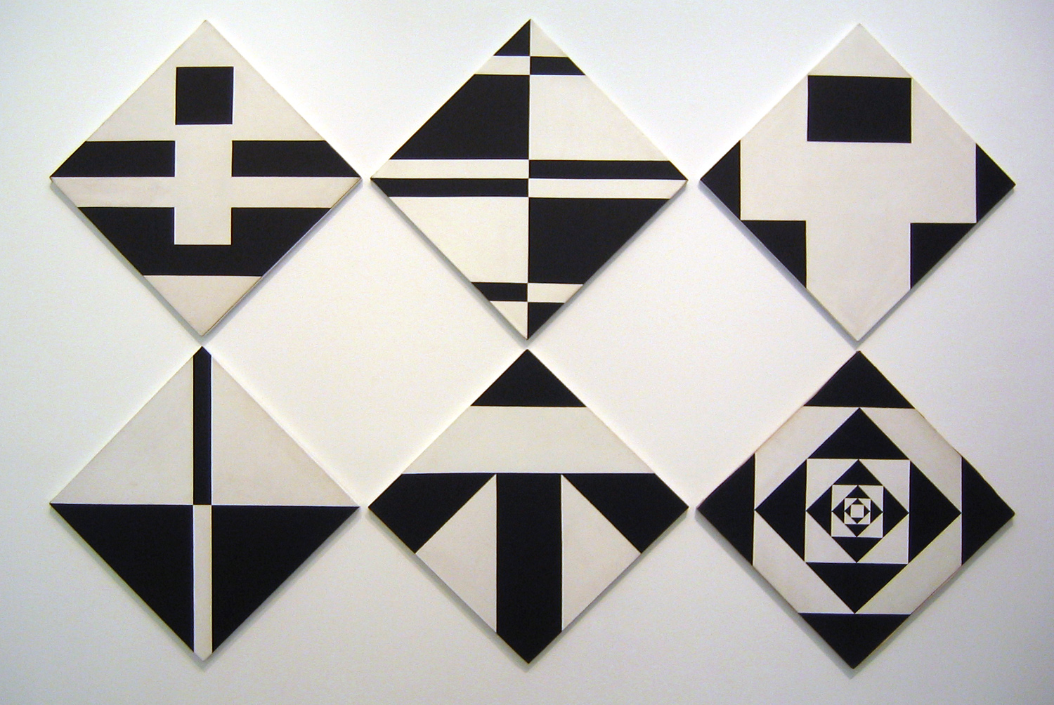
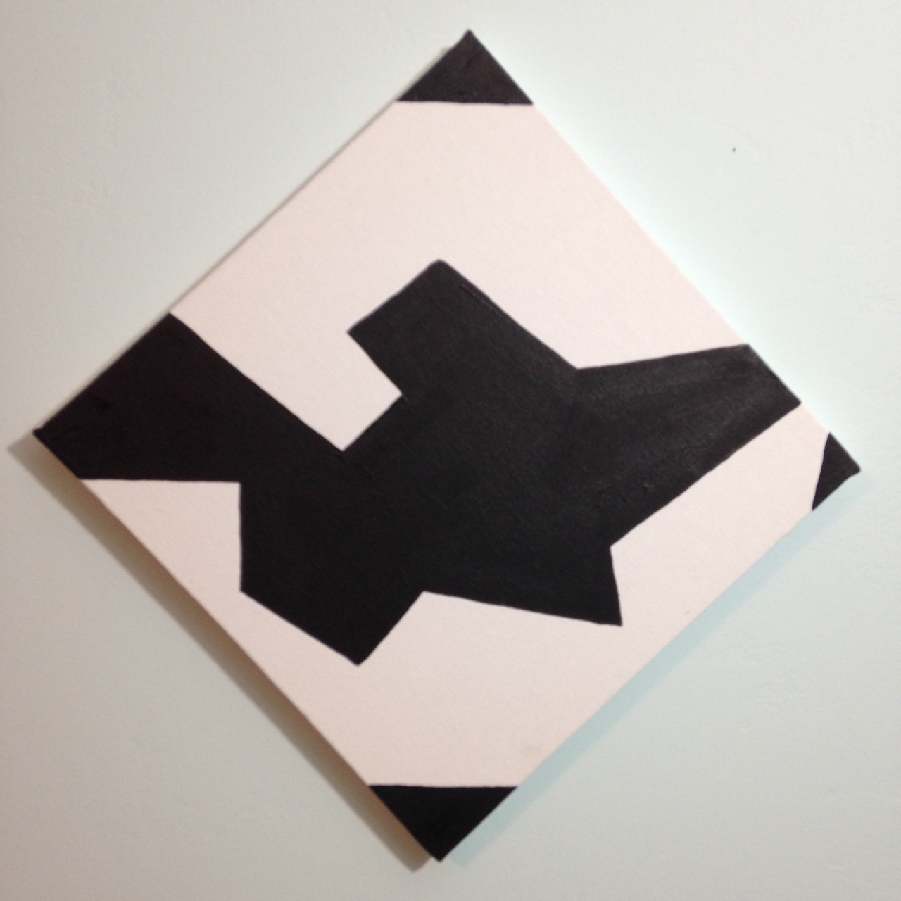
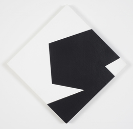
The hard geometric shapes appears to be interact with one another in each geometric shape, giving them somewhat a ‘character’. The interaction of the shapes provides action and events, causing the works to appear to be telling a story, thus conveying a particular emotion.

By organizing the shapes around, it will be an interesting way to tell stories in the most abstract way possible.

Possible emotions to be used: Awkward, Indecisive, Embarassed, Anxious

delegetjackson-kaymar


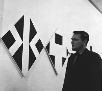
Why he squinting at his work?

Resources on Ward Jackson:

http://www.metaphorcontemporaryart.com/AP_WarJac.html

https://www.artsy.net/artist/ward-jackson


Cy Twombly

Honestly the hardest artist to research on. He was the artist allocated to me to research on during the first class.

By combining abstract art and Greek Mythologies, he creates controversial works of arts that appears to be doodles or scribbles.

leda-and-the-swanTwomblypaint_1939302i

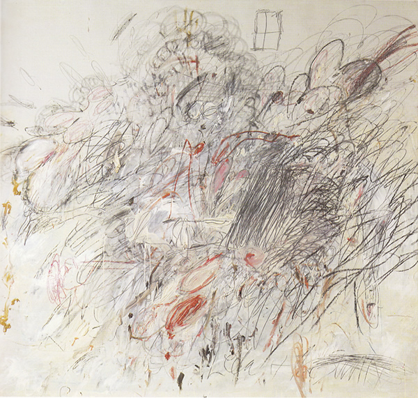
He creates his works by sketching unidentifiable doodles splotches or words directly onto the canvas.

His works are often criticized to be childlike messy and that it can be done by everyone.

As someone unfamiliar with the art scene, I can totally relate. But hey, its a controversial topic after all. Let everyone say what they want.

I love the scribbles though. There is so much energy coming from them.

Possible emotions to be used: Nonsensical, Turbulent, Psychotic, Spontaneous

cy_twombly_36e

Not sure sitting beside doodle or work of art

Resources on Cy Twombly:

http://www.theartstory.org/artist-twombly-cy.htm

https://en.wikipedia.org/wiki/Cy_Twombly

Max Ernst

For this artist, the biggest focus is in his technique of Grattage.

He places objects with rough surfaces under a piece of paper and rubs his tool over the paper to produce a texture on the paper. He utilizes different objects to build his paintings, combining different textures to produce different shapes.

Forest and Dove 1927 Max Ernst 1891-1976 Presented by the Friends of the Tate Gallery 1962 http://www.tate.org.uk/art/work/T00548

the-embalmed-forest-1933

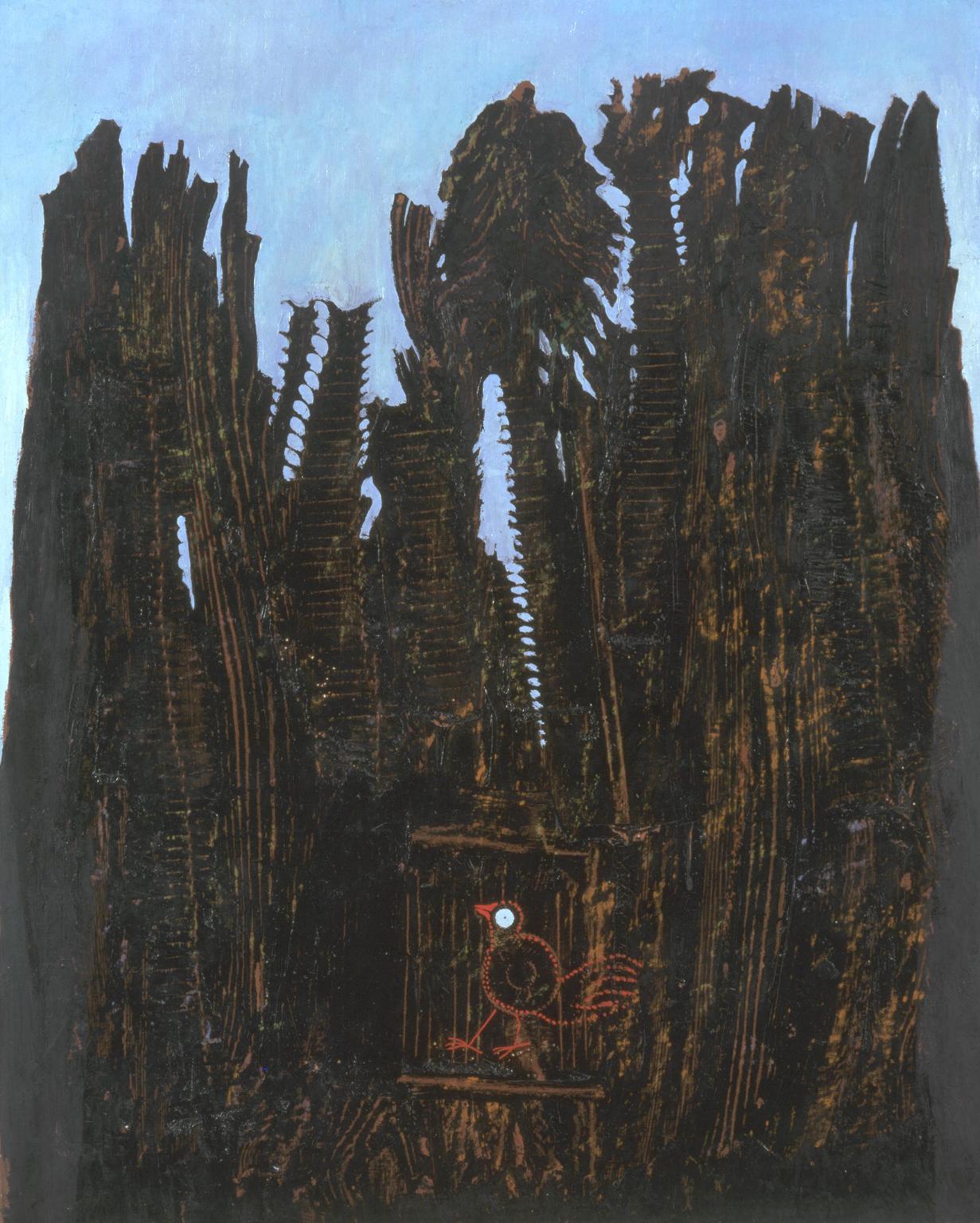
In this work Forest and the Dove, it is said that he drew the trees using fishbones.

This work is used to illustrate his traumatic childhood encounter with a dark forest.

The sharp edges produced by the fishbones allows the art to appear more convincing and somewhat menacing.

Possible emotions to be used: anxious, distracted, bizzare

Max_Ernst_1976

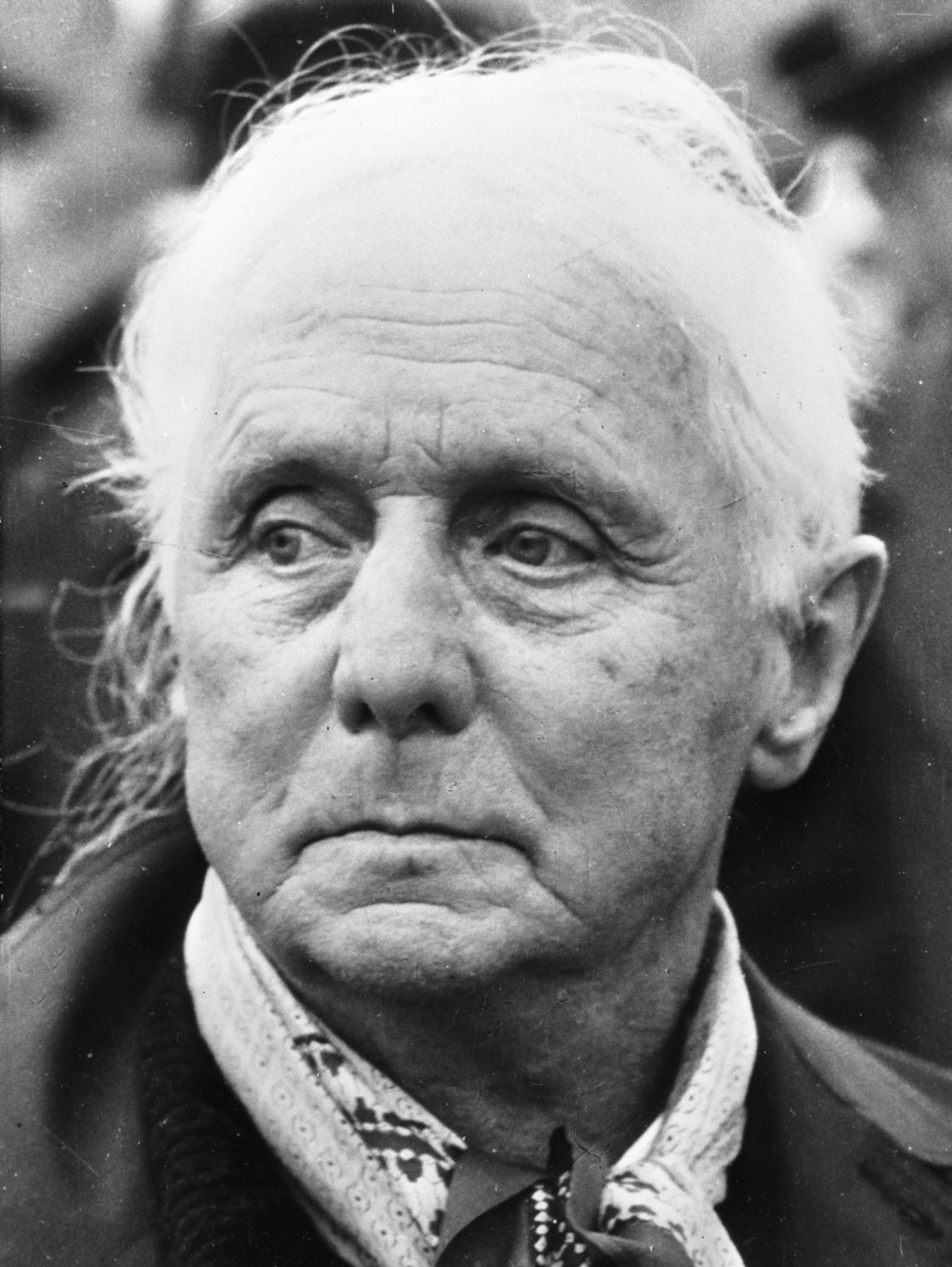
He looks like he’s still in trauma.

Resources on Max Ernst:

http://www.theartstory.org/artist-ernst-max.htm

https://en.wikipedia.org/wiki/Max_Ernst
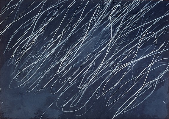
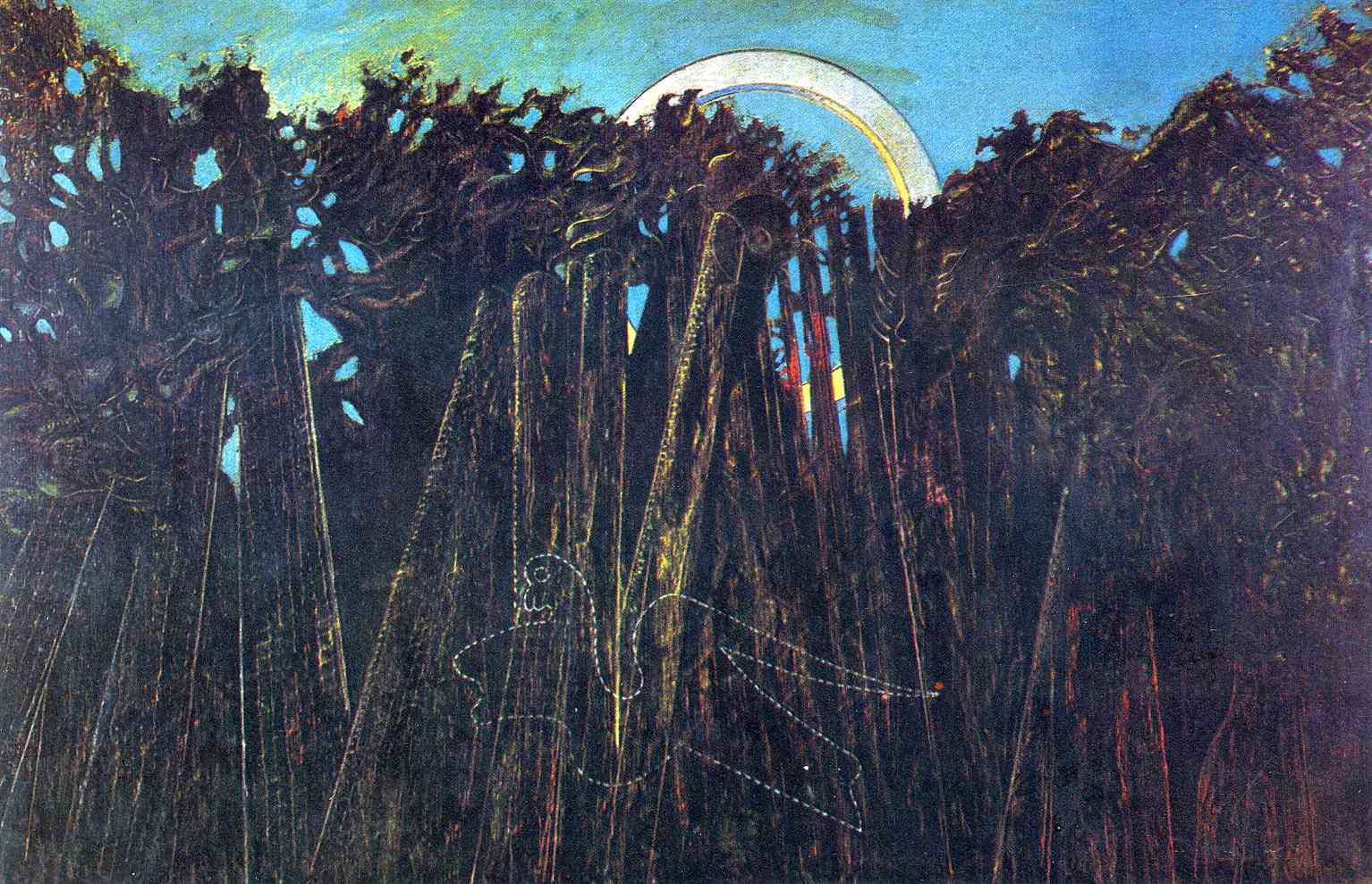
 

Ed Moses

One of the pioneer abstract artists. Probably one of the most used artist in the class.

One of the main reasons is his lack of a fixed style and constant exploration of ways to paint.

One of his series that spoke to me most is that of his crackle paintings.

2012-12-05-edmoses_redblack_156 archive_14763_PATRICKPAINTERINC-1 GreenOverBlack-l(1)

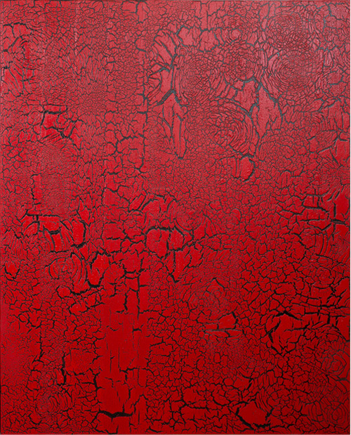
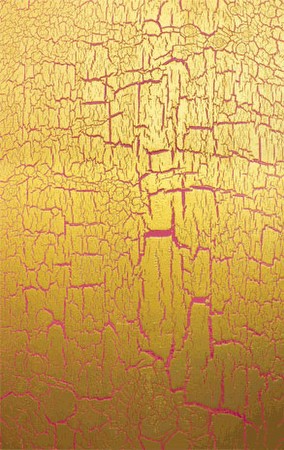
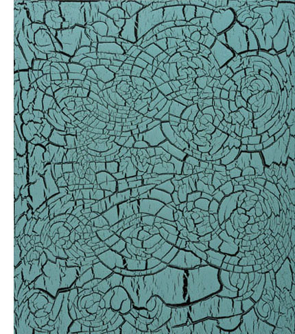
When doing work on his Van Doesburg paintings, he was noticed Van Doesburg’s works crackle due to age, thus inspiring to find a way to produce the crackling effect on his paintings. By using a coloured base, paint and his ‘secret sauce’, he creates crackles on his paints.

The crackle produces and very worn out and broken feeling. The lines feels like they were caused by wear and tear, thus evoking a sense of wear and tear and destruction.

Possible emotions to be used: Exhausted, Aggressive, Fragile

firstth110843

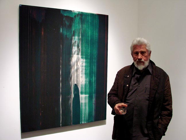
Chilling with the cup.

Resources on Ed Moses:

http://articles.latimes.com/2012/mar/11/entertainment/la-ca-conversation-20120311

https://en.wikipedia.org/wiki/Ed_Moses_(artist)

http://www.blouinartinfo.com/news/story/821974/i-just-wait-until-it-goes-pow-abstract-painter-ed-moses-on-his

Jizemon Hiroba

One of the first known people to utilize the japanese marbling technique called ‘suminagashi’.

I’ve come to know of the technique before searchinng for the artist. This particular section focuses more on the ancient technique and processes.

By dipping oil-based paint onto the surface of the water, ‘wavy’ images starts to surface. The waves provides a feeling of flow and uncertainty. It appears to be both turbulent and sensual.

It is usually used as ‘decorative papers’ where art is further added on to the paper.

hyperlink1

LL_C0017694

Senmen-kosyakyou

Possible emotions to be used: Turbulent, Sensual

Resources to Suminagashi:
https://en.wikipedia.org/wiki/Paper_marbling

http://artbyoju.com/sumi.html
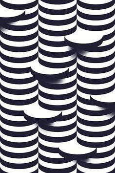
 

Victor Vasarely

Also known as the ‘father of op-art’, Victor Vasarely combines both science and art to produce what is known today as op-art, which is more commonly known as optical illusions.

The series that I want to zoom in on is ‘Victor Vasarely in Black and White’.

He worked with geometric shapes and began to paint predominantly in black and white.

His most prominent work is ‘Vega (1957)’

vega49d5bb0f7ca1c899eeb547eb2c3223ea

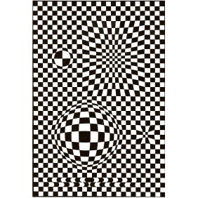
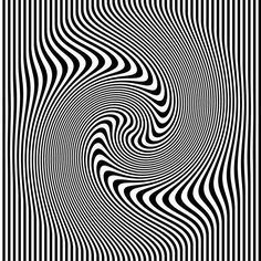
The distortion in the painting forces us to move towards and away from the painting, which then the painting appears to move – expanding contracting and undulating.

The paper then appears to be folding and twisting, providing a bizzare experience to the viewer.

Optical illusion is always interesting and beautiful to look at. Most importantly, it distracts the viewer, making them go ‘what?’.

Sometimes they appear to ‘pop up’, providing a sensual texture to the work.

Possible emotions to be used: Bizzare, Distracted, Sensual, Nonsensical

victor-vasarely-portrait-600x378

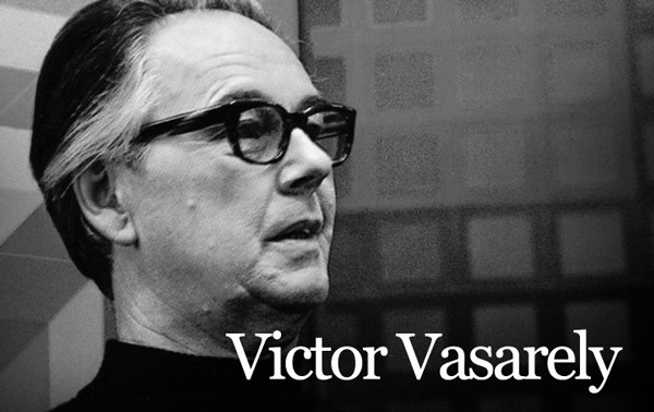
What a pleasant looking gentleman. 🙂

Resources on Victor Vasarely:

http://www.vasarely.com/site/site.htm

http://www.op-art.co.uk/victor-vasarely/

http://www.masterworksfineart.com/inventory/vasarely/vasarely.php

https://en.wikipedia.org/wiki/Victor_Vasarely
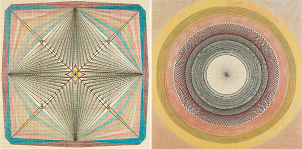
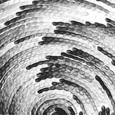
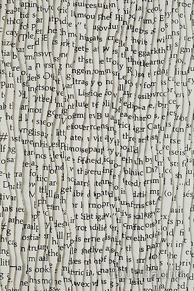
 

Emma Kunz

“Healing is a pervasive force”

emmakunz3-200x2004576596744_d535313a94_o


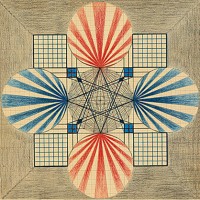
Emma Kunz is not a visual artist but rather a healer in profession.

Her works were placed beside her patients as a form of therapeutic process.

Art as a form of healing process. Its something I’ve always enjoyed. Creating works that makes others feel better at the end of the day.

She uses graph papers, graphite, colour pencils and wax crayons for her works.

Doing her works on 1 meter square graph papers, her drawings mainly consists of straight lines creating intricate patterns.

Many of her works are symmetrical and often her skillful manipulation of the lines gives a sense of depth and texture.

The lines makes her works feel neat and tidy.

I’ve always wanted to draw geometric patterns, but could never get them right.


Possible emotions to be used:  Systematic, Lyrical, Sensual

6628609179_0738f7b8e5_o

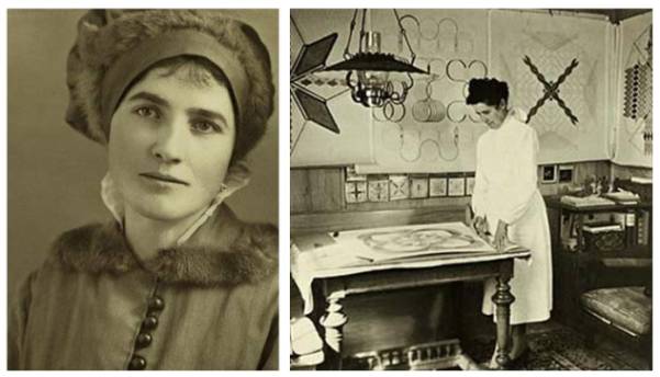
Emma Kunz and her hard at work!

Resources on Emma Kunz:

http://goldenhaze.blogspot.sg/2012/01/emma-kunz-healing-visions-sacred.html

http://www.theoaktreereview.com/emma_kunz.html

https://en.wikipedia.org/wiki/Emma_Kunz
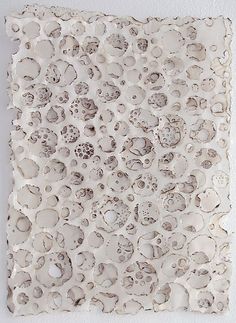
 

Cai Guo Qiang

Crazy person that blows things up. How great is that.

While living in Japan from 1986 to 1995, he researched the properties of explosives in his paintings, which eventually led to him even doing performance arts involving explosives.

He completes his works by arranging gunpowder on his special canvas and lighting up the gunpowder.

CaiGuoqiang_html_27b85786 cai-guo-qiang-guggenheim-museum7 gunpowder-drawings

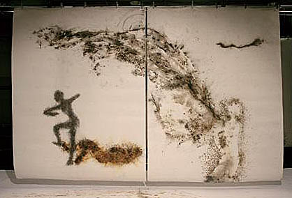
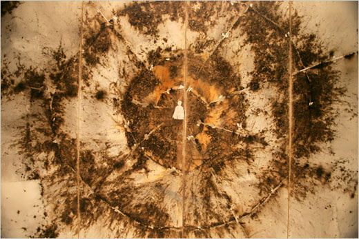
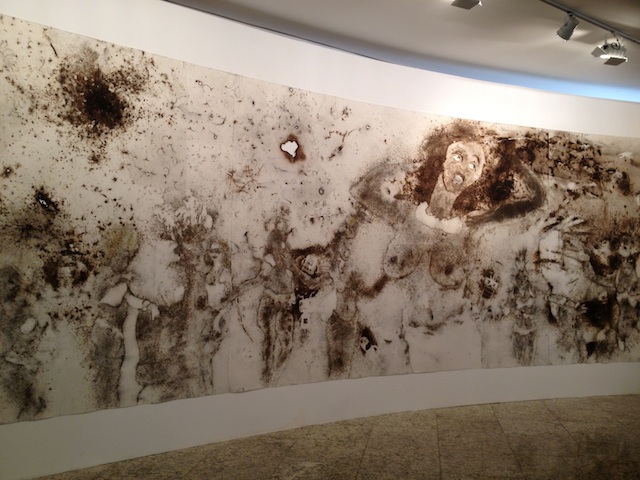
By utilizing pyrotechnics into his art, it produces a more dynamic picture and provides a very appealing smokey feeling to the art work. The burnt marks surrounding the holes on the paper also produces a sense of power due to the stark contrast between the dark burnt colours and the white background.

Personally, I feel that the color left behind after the burning also gives a sort of sensual effect. Perfect for a base for the lines.

Possible emotions to be used: Sensual, Spontatneous, Aggressive, Lyrical

2010_Odyssey_Final_A2204_017ltr

Him looking super cool in front of all his works.

Resources on Cai Guo Qiang:

http://www.caiguoqiang.com/artists-bio

https://en.wikipedia.org/wiki/Cai_Guo-Qiang
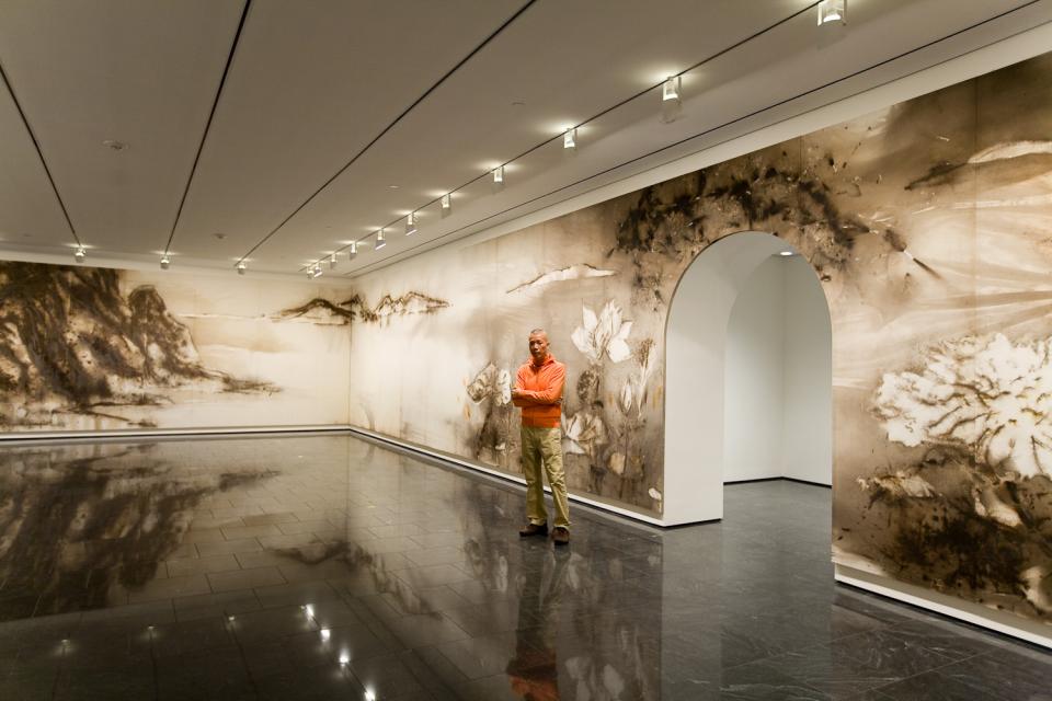
 

Judith Braun

Judith Braun is a diversified modern artist that transits from realistic figure drawings to producing abstract works with sexual innuendos to works that involves symmetries and finger art.

I plan to focus on her series of finger art works which depicts beautiful patterns and landscapes.

d4df1036a83ead9a8757e5217492e36a finger-paintings-judith-ann-braun-8 judith-ann-braun-diamond-dust

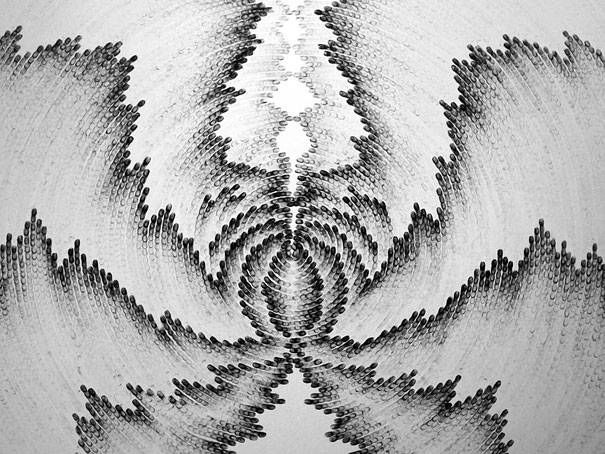
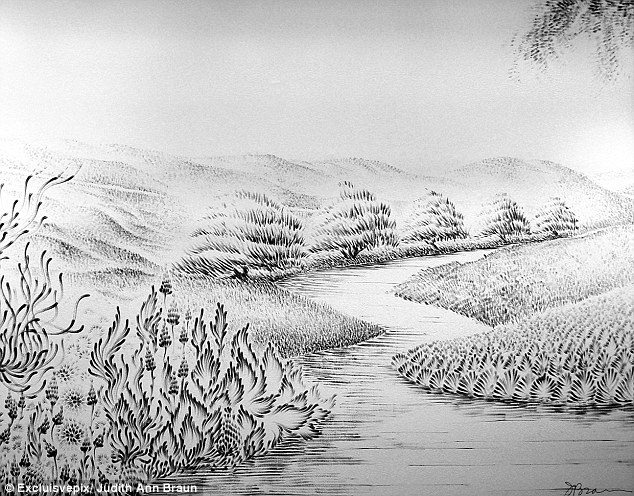
By using charcoal dust, she uses her fingers to produce all the different marks on the walls of art galleries, varying the tones of the mark to produce all beautiful patterns and landscapes.

It is interesting to see how a simple thing such as finger art can evolve into such nice and intricate art. The control available from this techniques allows the artist to produce beautiful and somewhat sensual gradients to the art that was being created.

Possible emotions to be used: Sensual, Systematic, Exhausted, Anxious.

judith-ann-braun

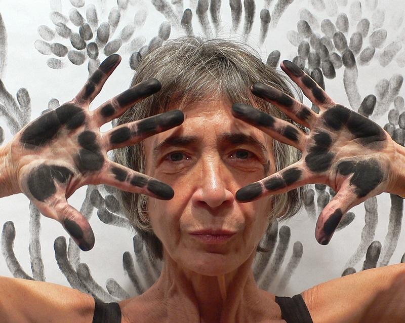
Fabulous pose for fabulous artist

Resources on Judith Braun:

http://judithannbraun.com/

http://www.boredpanda.com/finger-paintings-judith-braun/

http://all-that-is-interesting.com/judith-ann-braun
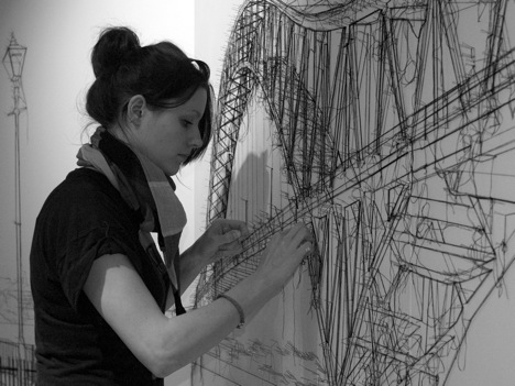
Debbie Smyth

Debbie Smyth is a textile artist famous for her thread drawings.

She sketches and plots the drawings on the walls to give a ‘rough sketch’ to the final product, following which she uses threads and pins to exaggerate the lines.

124d smyth-6

squ-talent-zone-debbie-smyth

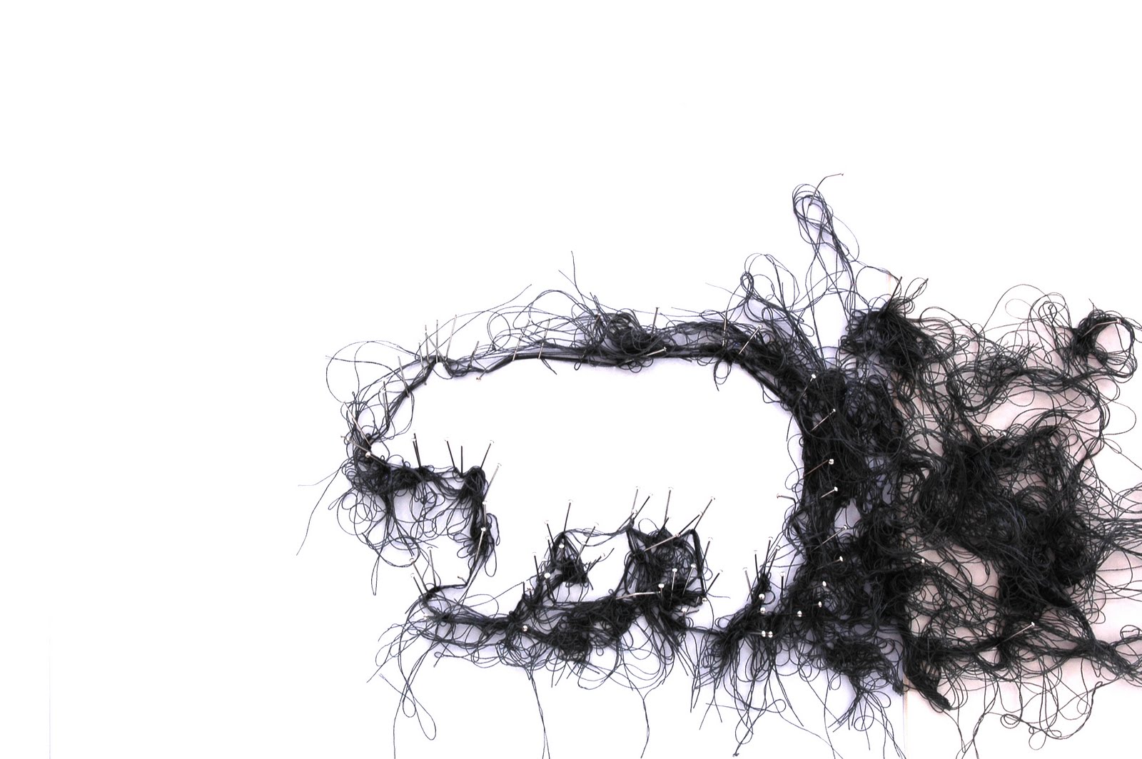
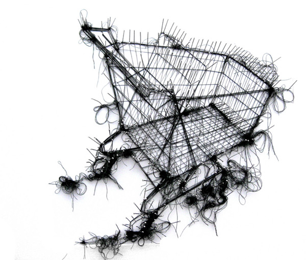
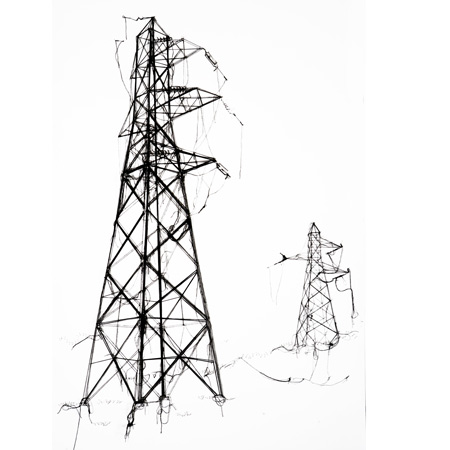
The soft and flexible threads allows her to produce all kinds of line work for her installations. By skillfully manipulating the threads, it is able to produce powerful images.

However, the installations always feel fragile to me due to the soft and bare threads that are sticking out of the depicted object.

Makes me want to be careful when viewing the work.

Possible emotions to be used: fragile, sensual, sloven

Installing-Jubilee-Bridge

Beautiful art by beautiful artist. <3

Resources on Debbie Smyth:

http://debbie-smyth.com/about/

http://www.textileartist.org/debbie-smyth-inspired-memories-3/

Pinterest

Not really an Artist but the most important source of inspiration for me.

Did not know about this channel to search for artworks and when I did, oh boy was it useful.

Had 184 pins that contributed to the final work. Really could not have done it without this wonderful application.

Some of the images that sparked some inspiration for this project:

48c3242986f9bacd2b1ceed98f56f2d3 d1fbc2b532c7588a645527ceabfa1636 f6156b4a761546d0449def2fe292259d

Pinterest, oh pinterest, what am I to do without you.

Wow! You’ve managed to reach so far into the post? Thanks for sticking around!

Generally, these are the artists that provided me a direction into conveying the different emotions in the most accurate aspect that I can. Application of the techniques will be further elaborated on the other parts.

Took me so long to complete this post. T.T Hoped its worth something. Technology really is a pain and distracting.

On to part 2 then….

… after this funny cat video on Youtube.

Many thanks for sticking around! See you in part 2! 🙂

KJ

Constants

‘The only  constant in life is change’ ~Anonymous.

People always change. Sometimes for the better, sometimes for the worse.

Who I am 1 year ago is no longer the person I am now.

That being said, taking pictures of ‘objects of significance’ then can only tell the story of a certain phase of our lives.

But is the above statement necessarily true?

After thinking deep into this matter, I’ve managed to find things that are ‘constants’ in my life.

They’ve never changed since birth and never will.

Things that are timeless:

SONY DSC

Time trapped in a jar. Time is being contained. Stopped.

SONY DSC

Birth. The moment that I enter into this world. 30/10/1993, Male.

SONY DSC


Aging. Little souvenir that quite accurately depicts the close relationship that my parents share. In recent years, my parents are experiencing a decline in their vision. But this is just the process of aging. Glasses represents the poor vision that is shared among my family. Which is a sign of aging.


SONY DSC


Sickness. Blood type can never be changed. If I am B(+), then I am B(+) for life. Some say B(+) is the sweetest blood type. But those are not sweets. They are lozenges. This candy with medicinal properties depicts the idea of sickness, where we can never escape from no matter how healthy we live our lives.


SONY DSC


Death/Loss. The most hated constant in life. This was the clay model that I ‘sculptured’ during the first ever lesson in ADM. I liked it. It broke. Many things in life, we lose them for good. Negative emotions arise. The more we lose the more these emotions overwhelm us.

Aging, Sickness and Death are constants in our lives. It brings us endless pain and suffering. However much we try we can never escape from it.

So then, do we fall into despair?

No.

We acknowledge the presence of this pain and understand the urgency of spreading love.

Love. Compassion. Wisdom.


SONY DSC


Love that illuminate the lives of others.

Love that spreads warmth and comfort.

Love that makes us see that there is hope in this world after all.

The gift of life is the most precious of all, treasure not only yours, but of others as well.

Below is a picture of the display that was to be put up in the ADM corridor. Rather new to the concept of photography so the picture arrangements came out bad. Nonetheless its still something.

IMG_20150902_160704148

Timelessness is depicted as being ‘above all that is constant’. The constants are supposed to be arranged in a wave-like shape to promote the idea of a ‘cycle’. And above it all, the idea of love. Love coming on top of things that are important in life.

I hope this explanation makes it better.

Thanks for reading! Managed to learn a lot from my peers. So much gratitude goes out to them. Will try harder next time! Go easy on me!

~KJ