The final post for my 2D foundation course.
Let’s start with a story:
Page 1:
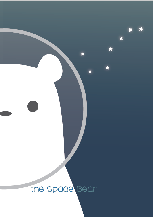
This is SPACE BEAR. The main character of the story. Had this little guy appear in my ego project. Decided to explore more of this character’s story since we were told to describe our ‘Journey’ through this 2D course. Placed him as the largest object in the cover page to place emphasis on this character. Had a silly way of placing the title to make the Zine evoke a more playful feeling.
Spread 1:
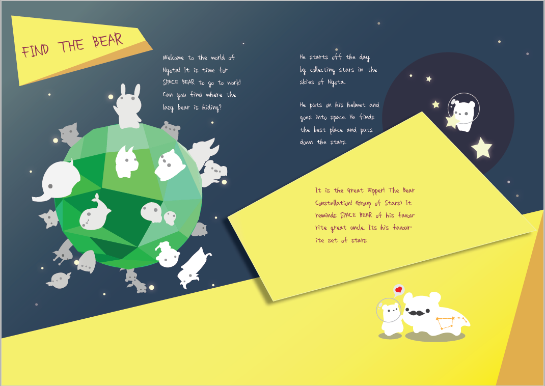
SPACE BEAR lives in the world of Nyota, where little cosmic animals live. In their country they harvest stars from the skies to ensure that the constellations shines brightly. That day was SPACE BEAR’s turn. He wears his space helmet and goes on to space, placing the stars carefully. His first constellation is his favourite! Can you guess what constellation it is?
It is the great dipper! The bear constellation! It reminds SPACE BEAR of his great uncle.
In order for the story to flow in this spread, i utilized type hierarchy to allow the reader to follow the activities. The funny yellow boxes indicate the different task and the largest font will be the first activity.
Also, for aesthetics, I used a diagonal dividing line to give a sense of energy and playfulness to the overall composition. The contrast of warm and cold colours makes the composition interesting to look at.
Spread 2:
There are times when SPACE BEAR makes mistakes. Then the poor thing has to redo everything all over again. Can you spot the differences?
Finally, after a long day of work, SPACE BEAR likes to climb to the moon to view his work:
Used the same style of text boxes to emphasize the activity moments.
As mentioned during the presentation, I used an ‘object’ to play spot the difference so that the design still looks appealing despite the repetition. Placing it in a vertical position with the central text box also breaks up any sense of repetition, thus keeping the design appealing.
Used the interactive element to bring the attention of the reader to the top right hand corner of the spread, which consists of the moon and an aurora connecting the colour of this spread and the next. This is to ensure a sense of flow towards the final spread.
Spread 3:
And there we have it. A job well done.
Wanted a spread with a composition consisting of a ‘wide shot’. Had ambitious ideas but decided to put horoscope constellations at the end. Named them so that the readers will be able to learn about their names and how they look like. With the bear as the brightest and centralised object in the composition, we naturally bring our eyes to our character. That was where I ended my final line, aligned with the eye level of the eye so that the reader will be able to get to the words comfortably. For the constellations, had them in varying sizes and opacity to give a sense of depth. I also adjusted the font sizes to place further emphasis on the relative sizes of the constellations.
Really liked the peaceful feeling given off by this final spread.
Final Page:
… and we close off to our last page.
The back page has the same treatment as the front page to achieve a spread when the entire book is opened. It also serves to remind us of the character within the book. Treated my social contacts in the same way as the title on the cover page.
And that is it. My final 2D project.
Now for some overall sentimental reflections:
Looking back on my previous projects, have come a long way from barely struggling with my designing tools to be able to producing something more properly rendered.
In fact, the story of the bear was actually supposed to describe my creative process:
Spread one: Collecting the stars is the same as gathering ideas, and placing the ideas down and joining them together is the way I go about doing my work.
I always have the tendency to place emphasis on the ideation before I start my executions, placing all of them together and piecing them towards my desired piece.
I remember the first quote of the course: ‘ a line is a dot that went for a walk’. From there was probably how my inspiration for constellations come about.
Spread two: Like the silly bear, I make many mistakes too. However, the mistakes are the most valuable lessons I can ever have. By working on them and rectifying my mistakes, I eventually get the desired work I want.
Then, at the end of the day, I like to look back at my work, to have a simple reflection on the things I’ve learnt during this process.
Spread three: Whether the work turns out good or bad, I always know I’ve poured my heart into it, thus I am always have an emotional connection with my works. All of them tell a story of my growth as an artist so far.
So grateful for patient mentors and professors that are willing to guide me through an entire design process. Like placing the constellations in the night sky, I hope my art will be able to be seen by a lot of other people. And my art is a testimony of the mentor-ship that I have received.
So many things I’ve learnt, so many more I have to learn. I guess I have to do it one star at a time.
Until then,
Have a great day,
KJ


