When the project brief was first given, my first thought was: ‘I don’t do colors’.

Never did a full art work with a coloring medium. Never had a proper color pencil set, crayons, water colors nor paint. Using a coloring medium was out of the question.

So i decided to turn to digital painting.

Always had a thing for cute and fluffy things. So that will be my theme for this entire project.

General approach for project: Cute stuff + Digital art.

Decided to use my cute-sy style to approach this project. Took a long time to conceptualize the different compositions. Everything was designed from scratch. References were from all over the place, but mainly my imagination. Below are the sketches used for the final composition:

Me:

IMG_20151101_120136328_HDR IMG_20151101_120152861 IMG_20151101_120159802

A better me :IMG_20151105_174556595 IMG_20151108_130902718 IMG_20151108_130942108 IMG_20151118_113456593 IMG_20151118_113508223

An ideal me:

IMG_20151101_120030493 IMG_20151101_120041329 IMG_20151101_120048333

Me in 5 years:

IMG_20151101_120109943 IMG_20151102_074554843 IMG_20151108_132247360_HDR IMG_20151119_085037219 IMG_20151119_153430413

Sketches were then converted to digital art form. More on ‘Ego (Journal)’

Have a great day.

KJ

Bezold effect:

Started with the triangular color harmony:

bezold effect 2

Changed the red into purple, the complementary of the color yellow:

bezold effect

The purple appears warmer on the yellow side and colder on the blue side. Complementary colors tend to appear in greater contrast and according to the lecture should minimize placing them together in a design. Prof taught me the usage of complementary is to blend to produce a nice gray, especially for shadows. This knowledge benefited me greatly for the ‘Ego’ project. The strong saturation of the yellow and blue was also a factor in the dramatic difference in the interaction of the purple with the background color.

Color Harmonies:

Monochrome:

Colour ways monochrome

comfortable to look at as a whole. Does not have anything interesting within the composition itself.

Analogous:

Colour ways analogous

Coherent composition. Comfortable to look at as a whole.

Complementary:

Colour ways complementary

Red and green is uncomfortable to look at because of their stark contrast. Saturated colors makes the effect even worse.

Split complementary:

Colour ways split complementary

Saturated colors makes the colors hard to look at. Different colors conflict with one another for the attention of the viewer.

Lesson:

Different harmonies are used to create different kinds of moods.

On top of harmonies, it is important to take note of the values and saturation used to produce a more visually appealing composition. For this exercise my colors are far too saturated. This made the compositions visually uncomfortable, especially for the complementary harmonies.

Witnessed the idea that colors do not exist independently but rather is viewed as a whole with its interaction with other colors.

With the knowledge I’ve acquired I aim to apply all these principles into the project ‘Ego’.

Have a nice day.

KJ

Most difficulty in the first panel. The overcrowding of the first panel makes it hard to synchronize with the other 2 panels:

Dreams

Owls fell in love. :))
Practicality
Constants

Reluctantly removed the first row of animals. Increased the saturation of the background. Images appear more coherent but the inconsistent color harmonies still causes a huge disparity between the first box from the other 2:Dreams1.2 Practicality2 Constants2

Changed the first box to analogous harmony instead of split complementary. All 3 compositions managed to gel properly together. Lesson learnt:

Consistent color harmonies helps to group compositions together. Having a consistent color scheme allows a more coherent conveying of narrative.

Another cool lesson:

Nice grays for the shadows are made by blending the complementary color of the object. For example, I blended blue onto the orange of the fox of the second box. The result was the gray that is present in the image.  From this I learnt how to produce nice grays on objects. Applied throughout all other objects in this project.

Managed to have a much better grasp of the usage of colors through the project.

The trials and errors allowed me to understand how colors interact with each other better.

The designs for all 4 rows are done. What was left was to figure out how to present and convey the meaning and concept behind this project. Which will be elaborated on ‘Ego – Final’.

Have a great day.

KJ

Simple improvements from the previous post:

Included blue-violet into the background, wider range in this analogous harmony caused the composition to appear to recede more and thus improve the sense of depth.

Changed the color of the stars to a slight yellow

Polished up the details

Wisdom1 Calm Mind 1 Ideal me 1

Changes made the compositions more visually appealing. Quite glad of the outcome.

Have a great day.

KJ

The hardest line to complete. Started with a cold color scheme but it threw the away the mood of the supposed narrative in the line:

Anxiety_Depression Delusions A Gentler Reality

The scale of the object in the second box is too big, it overwhelms the adjacent boxes.

The last box’s color scheme uses split harmony instead of analogous harmony in the first 2. The objects feels fairly distant from one another. This is especially so for the octopus. Its cold color conflicts with all the warm colors of the other creatures.

Changed the composition of the second box and the overall color scheme into warm colors and a consistent analogous harmony. Significant change in the coherence of the overall composition:

Anxiety_Depression1 Delusions1A Gentler Reality1

Polishing and refinement of details to finish up the composition:

Anxiety_Depression2 Delusions2 A Gentler Reality2

Lessons learnt:

The usage of warm and cold colors to portray different moods.

The manipulation of scales to maintain harmonies within compositions.

Analogous harmony groups objects together to provide a more uniform harmony in a composition.

Have a great day

KJ

Fairly consistent growth in the completion of this row. Simple colors to the specific details of the compositions.

First phase:

Curiosity Imagination Me

2nd phase:

More details

Curiosity1 Imagination1 Me1

3rd phase:

Polishing of details. Finalising.

Curiosity2 Imagination2 Me3

One of the most straightforward processes. Mainly just rendering involved.

Have a great day.

KJ

Ending with the beginning. This project ‘Ego’ served as a reminder for my hopes and aspirations as an artist. It reminds me why I decided to take the creative path in the first place. It is a highly personal work that seeks to entertain.

Concept:

Religion repackaged.

Religion has always received a bad light in this day and age. In the news we see corruption and terrorism. In practice we see it as boring and unnecessary. Without sufficient emphasis and proper education, the wisdom of sages seemed to be misunderstood and on the verge of being lost.

I hope that my art can allow others to see spirituality as something relatable and beneficial to our lives.

In this project I tried to use cute graphic illustrations to narrate a story about my experiences with spirituality and the theme of ‘gratitude’.

This is the first time I am exploring colors and I aimed to use a consistent palette and harmony in each row to convey a clear narrative behind each equation.

1st row:

1st row frame 8 bit

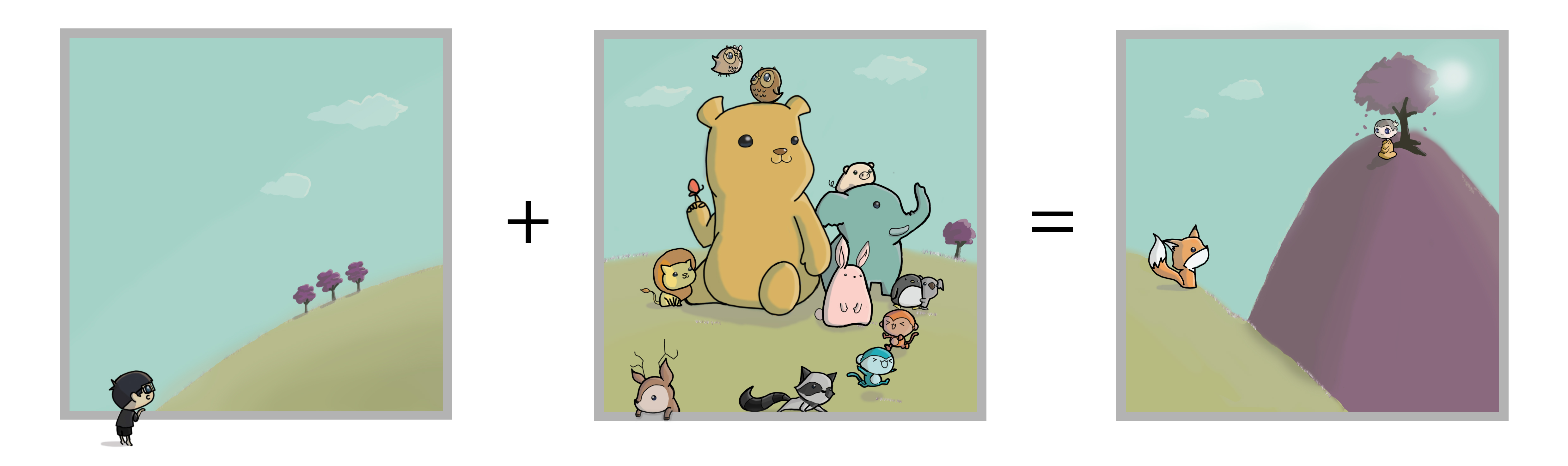
Curiosity + Imagination = Me

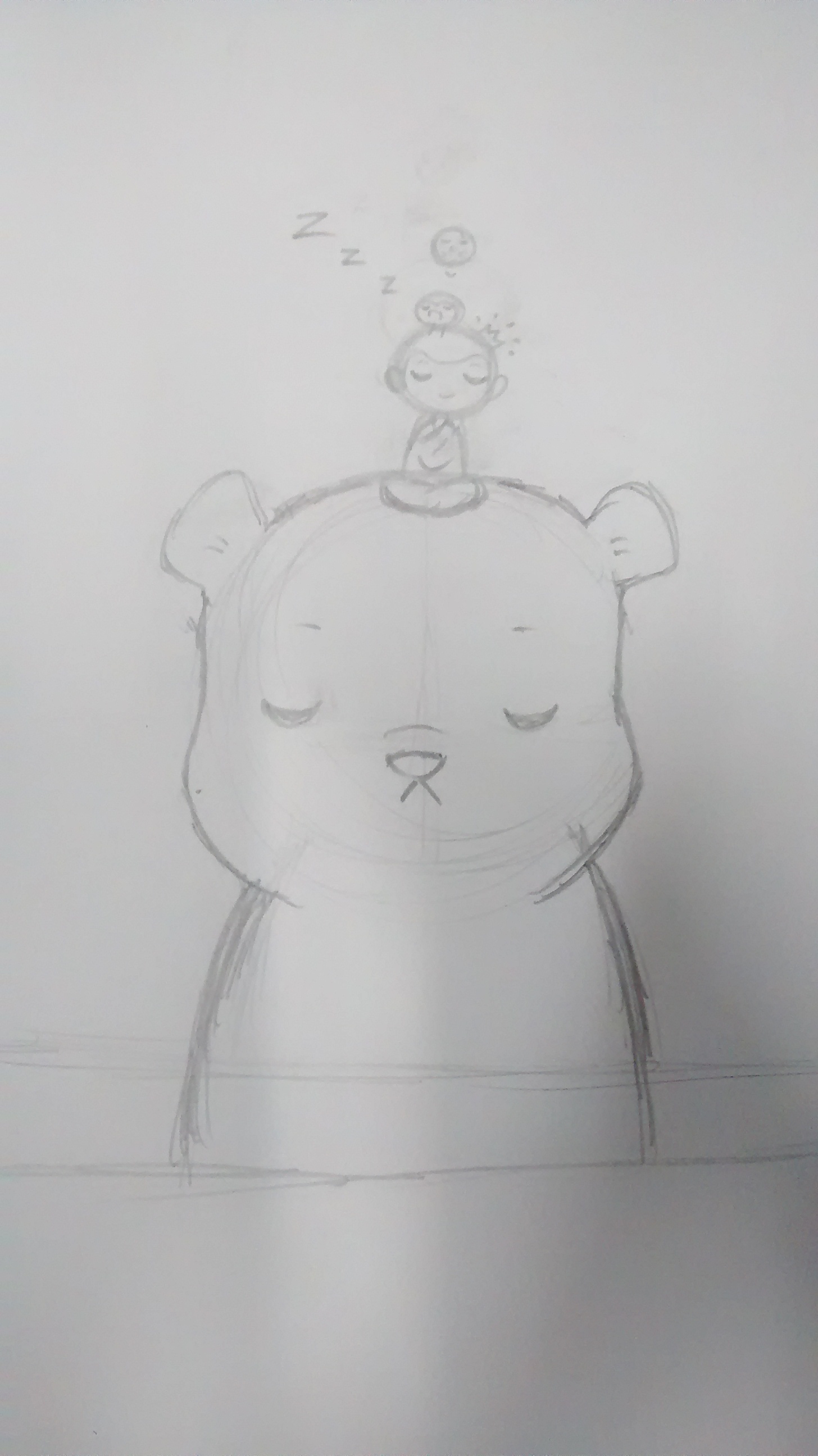
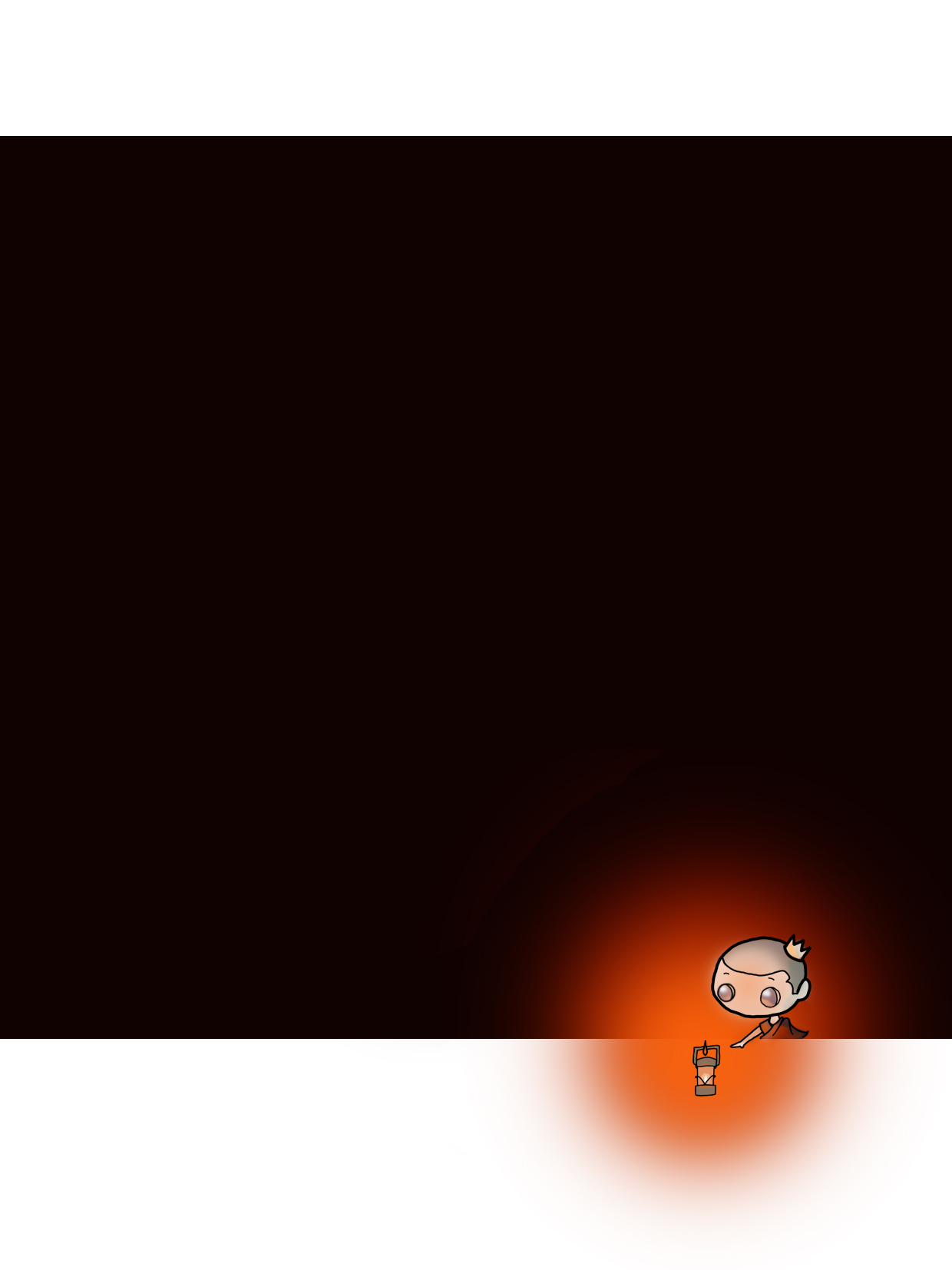
Welcome to my mind. Always seeking to find out new things and loving all that is cute and fluffy. Despite having the body and age of a full grown adult, there is still this large part of me that is child-like and naive. However, there is a special character in my life that helped me to mature and grow. I like to call him the ‘Monk-Prince’.

Using split complementary colors, I attempt to make my compositions colorful and playful.

2nd row:

2nd row frame 8 bit

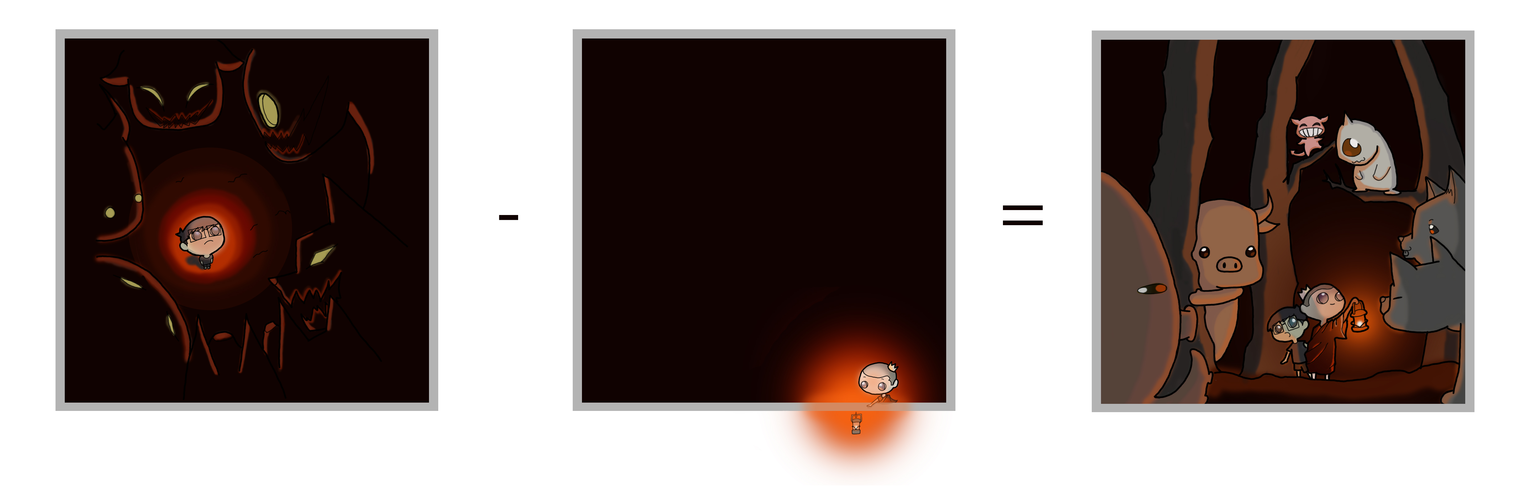
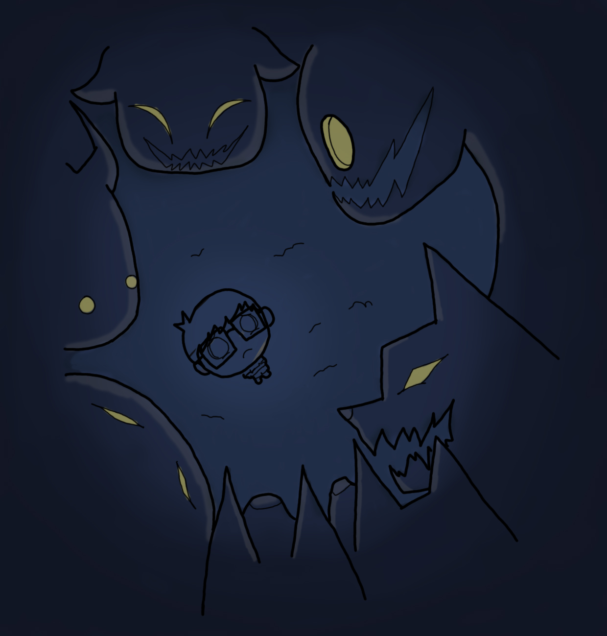
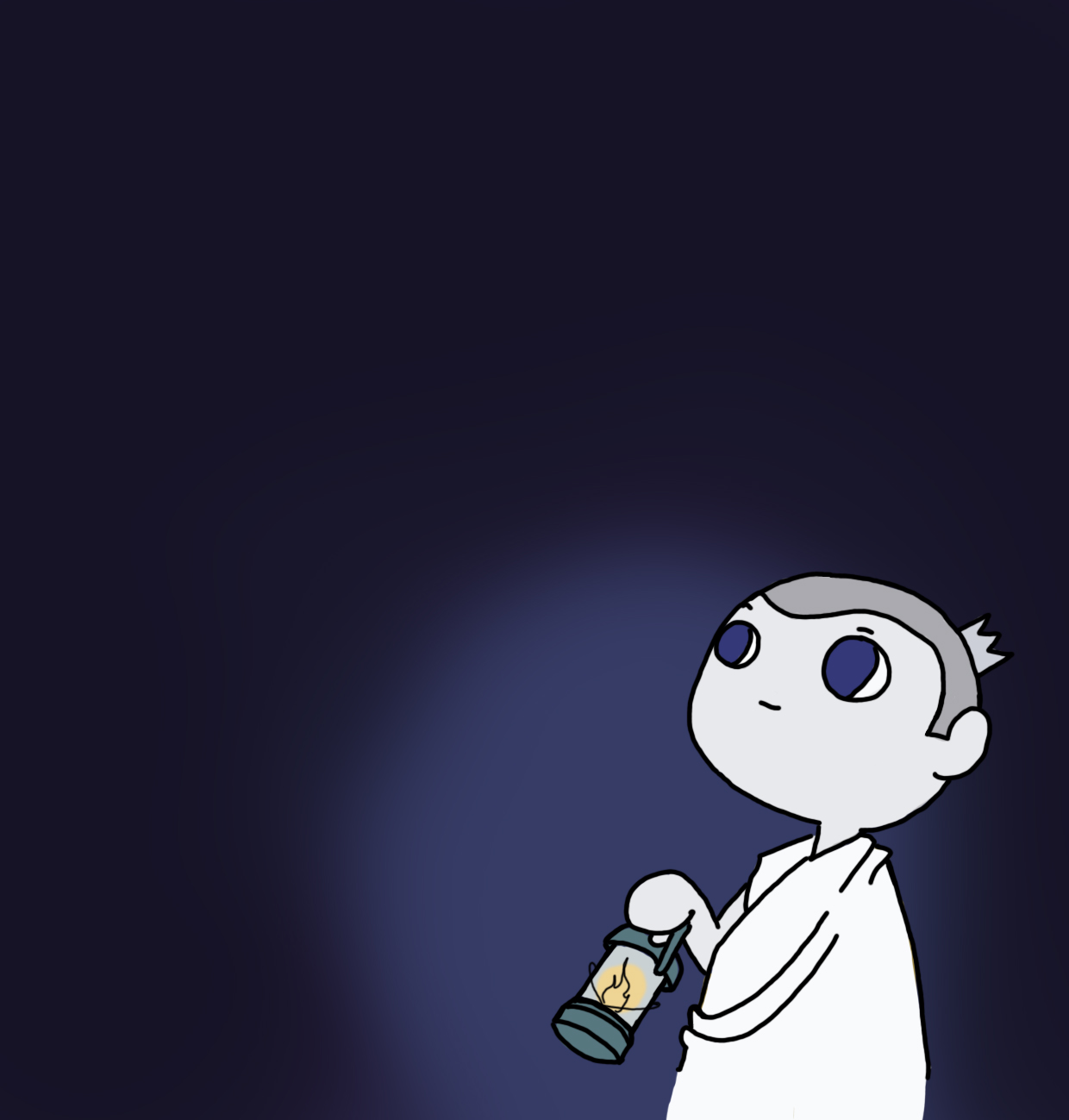
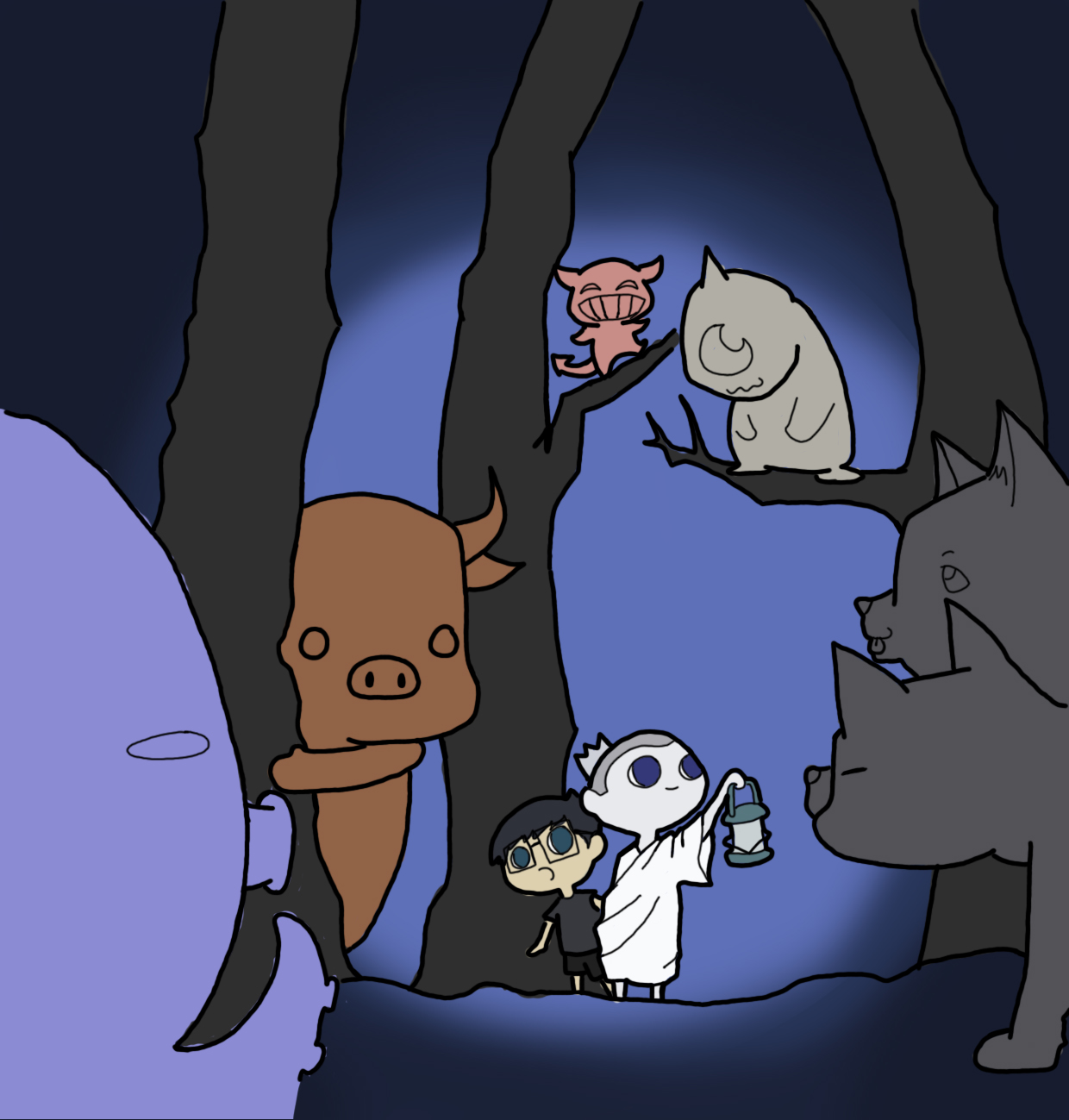
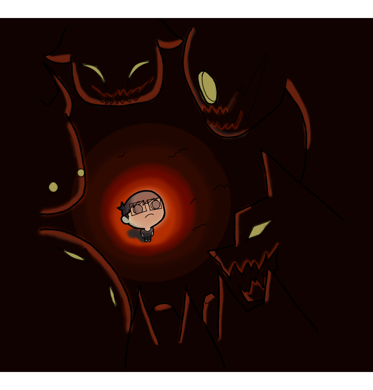
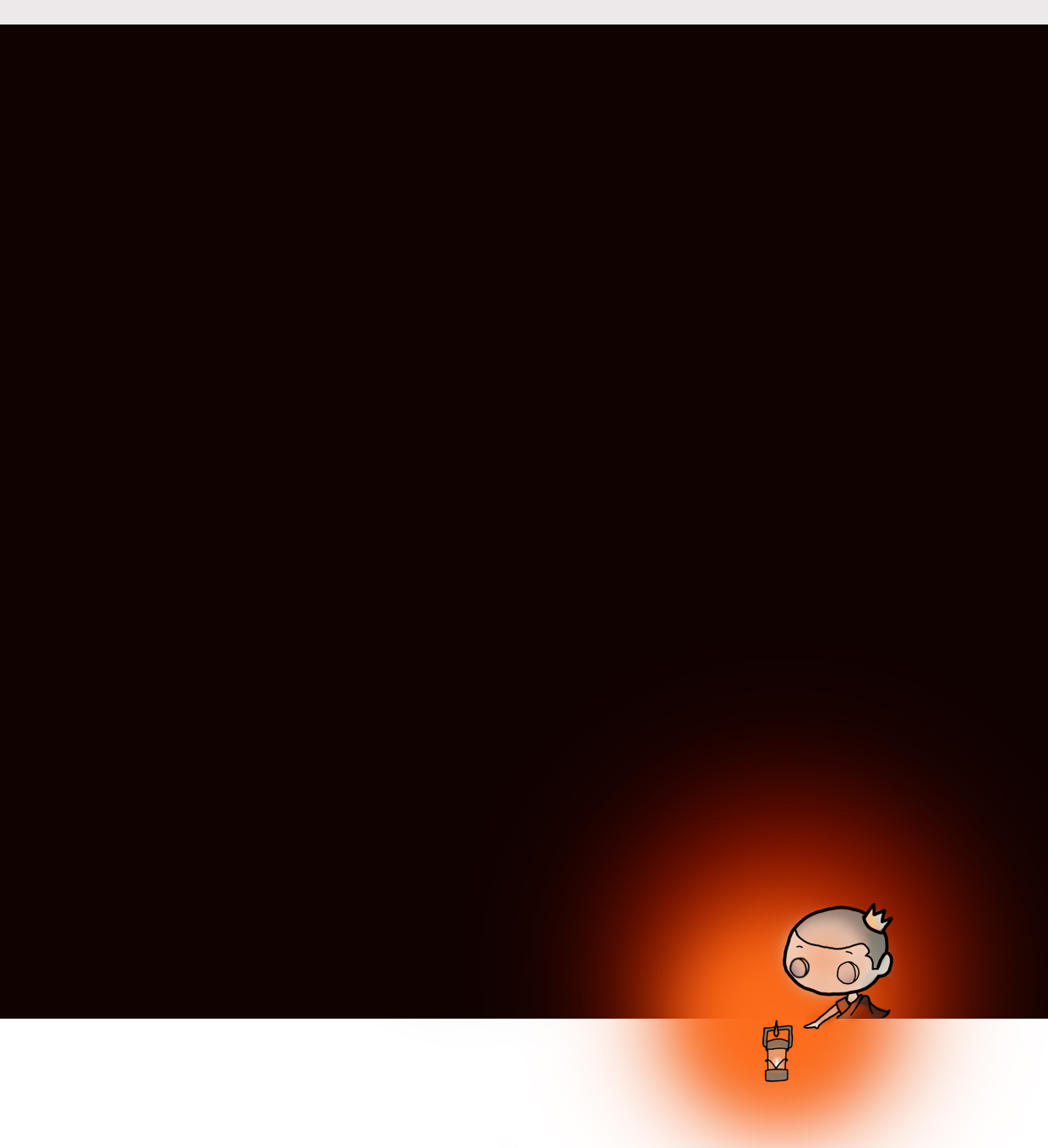
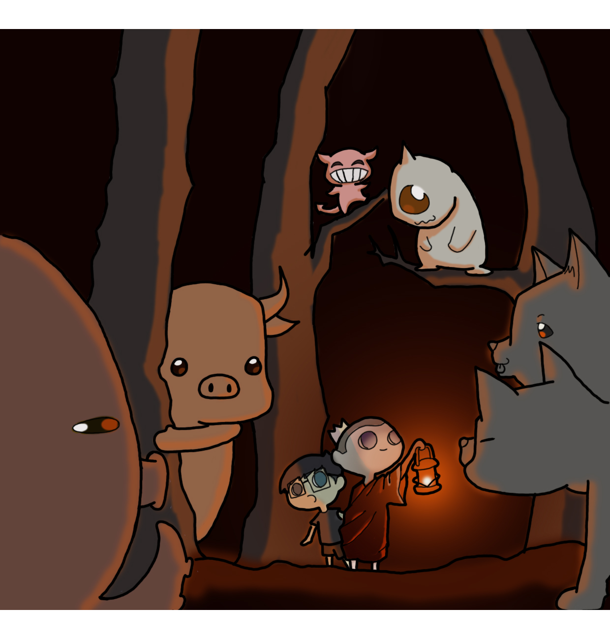
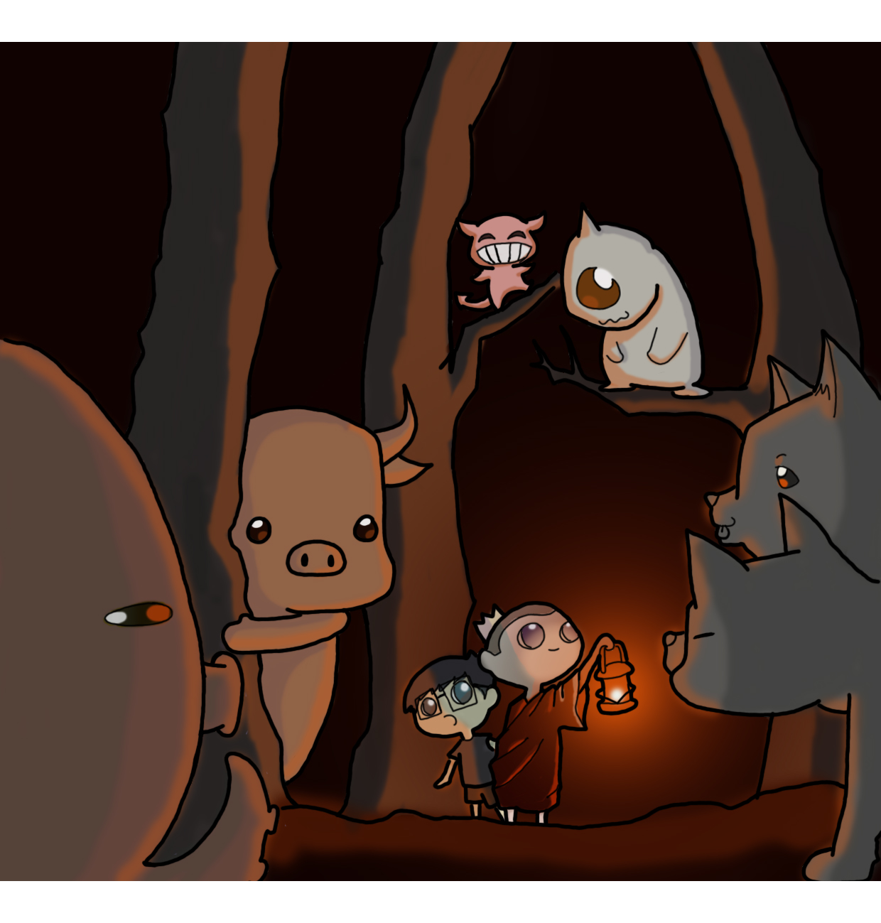
Anxiety/Depression – Delusions = A gentler reality

In my religion, light is the metaphor for wisdom as we illuminate the darkness to see the realities in life. Having faced many anxieties due to the uncertainties in life, Monk-Prince’s wisdom have allowed me to see the world in a more gentle light. Instead of ‘killing’ off my demons, he ‘illuminates’ and allow us to see that the demons are not that scary after all. With this knowledge, it allows me to approach conflicts more gently. He shows me that through recognizing the inherent good in others, it is possible to resolve conflicts without hurting one another.

The usage of analogous harmonies allowed me to group the objects in the compositions more successfully. Warm colors are used to convey the idea of light and illumination.
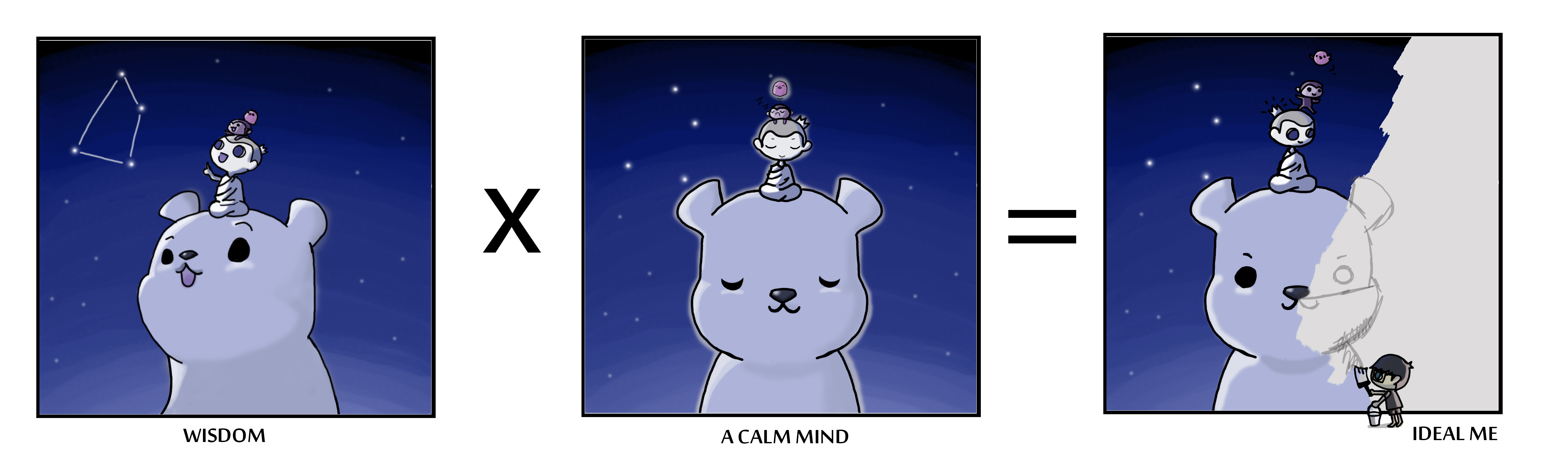
3rd row:

 3rd row framed 8 bit

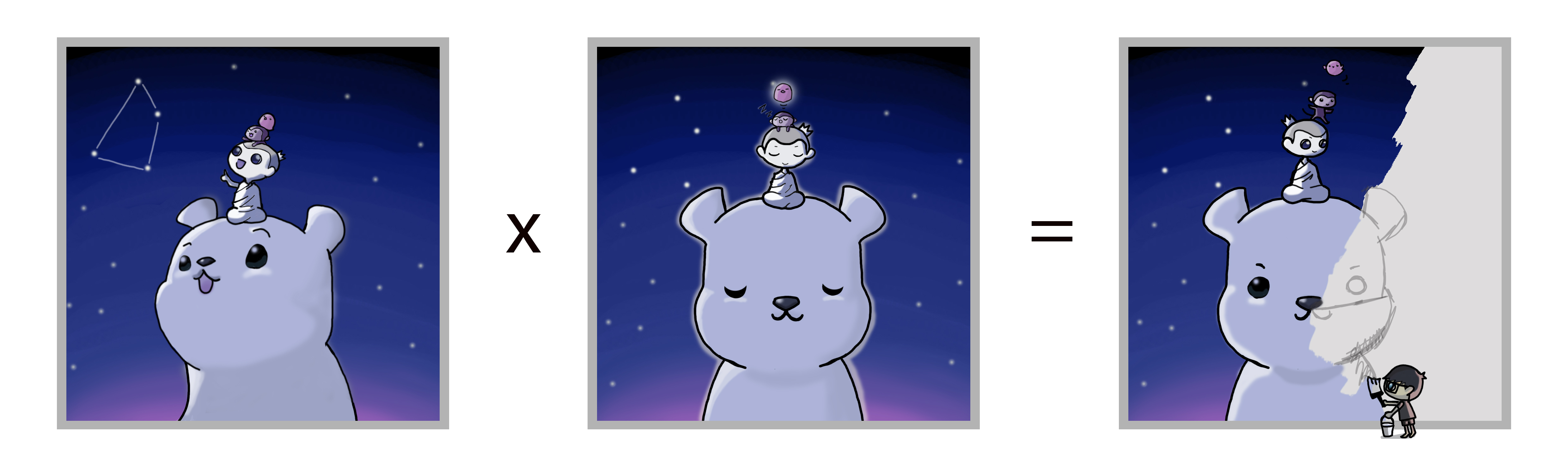
Wisdom x A Calm Mind = An ideal me

An incredibly profound and difficult field of study, only the truly wise and diligent can begin to comprehend the teachings of the Monk-Prince. I’m neither wise nor diligent, so I hope that by accumulating more wisdom and constantly reminding myself to keep a calm mind, it will help me understand his teachings on a much deeper level. The ideal me is to be able to translate these accumulated wisdom into art in the most accurate and interesting way.

Once again, analogous harmony was used to group the composition as one cohesive subject matter. The usage of cold colors is to produce a calmer and peaceful mood to match the titles of each panel.

4th row:

4th row framed 8 bit

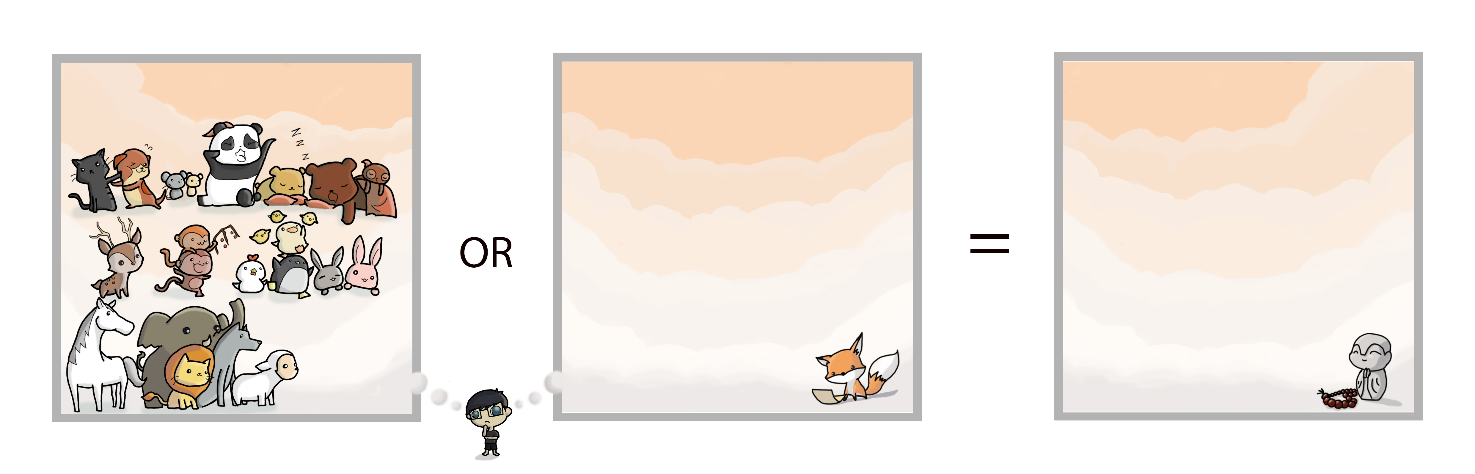
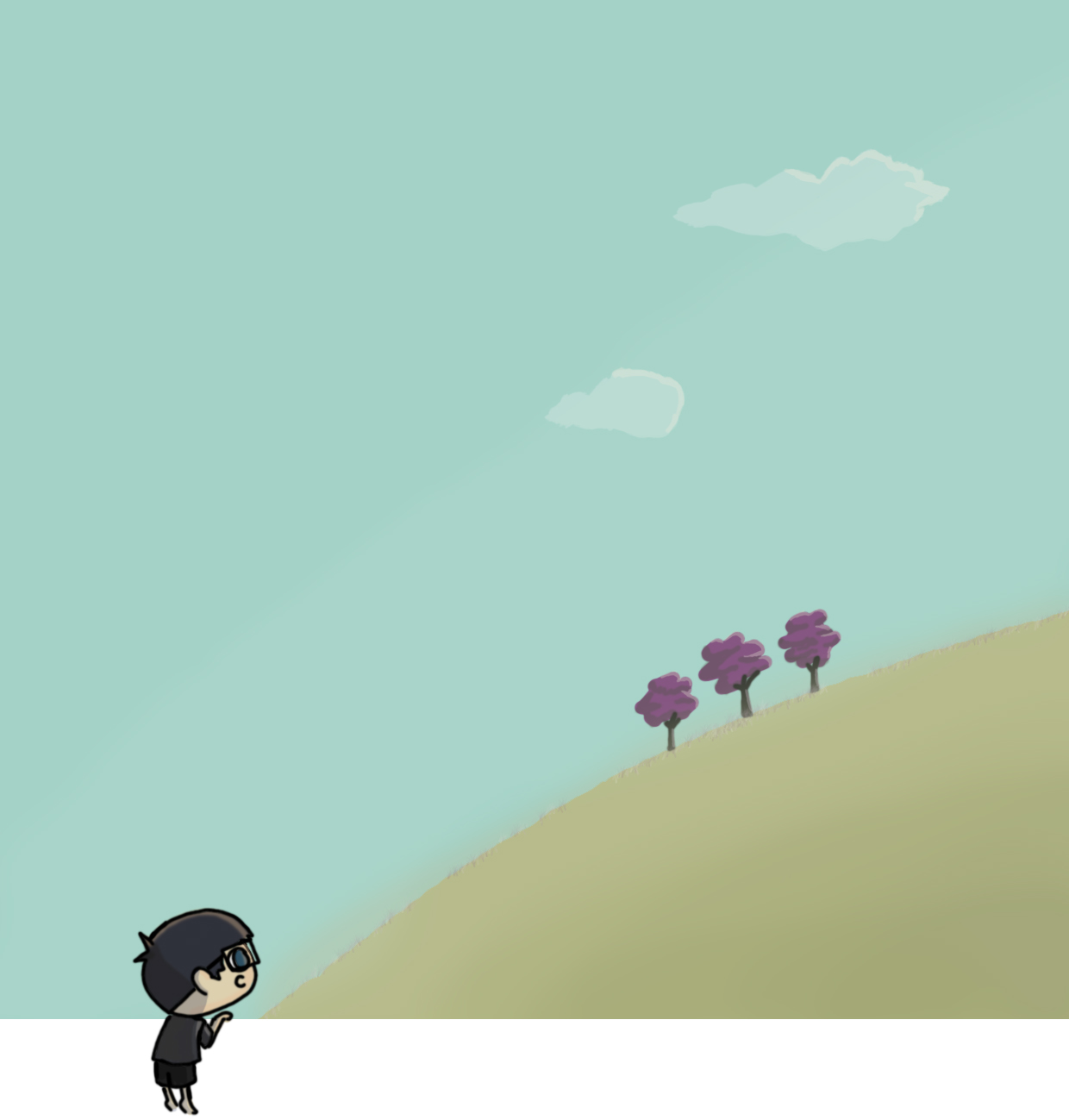
Dreams or Practicality = Constants (Me in 5 years)

At the end of Year 1 Semester 1 as an Art student in college, I am at a cross road in determining the rest of my time spent in this college. Having fully experienced the full pressure faced by an art student pursuing an university degree, I see 2 endings for this journey: Either I am able to take a step closer to my dreams or I simply receive a validation of going through an university course. ‘Me in 5 years’ is an uncertainty that only time can tell.

In the meantime, I sincerely hope that I am able to stay true to my initial motivation through these 5 years and even more to come.

Analogous harmony was especially crucial in keeping this row consistent. It allowed the row to appear coherent despite the numerous objects present in the composition. I aim to use warm colors to have a more intimate and nostalgic feeling to the composition.

 Overall reflection:

Having taken a risk and enrolling myself into art school despite having no experience, constant negativity and stress occupied my entire mind throughout this entire semester. Seeing the huge gap between the skills of my peers and I, many times the idea of giving up seemed to entice me. Fear of poor grades seemed to be the main worry going through my head the entire time.

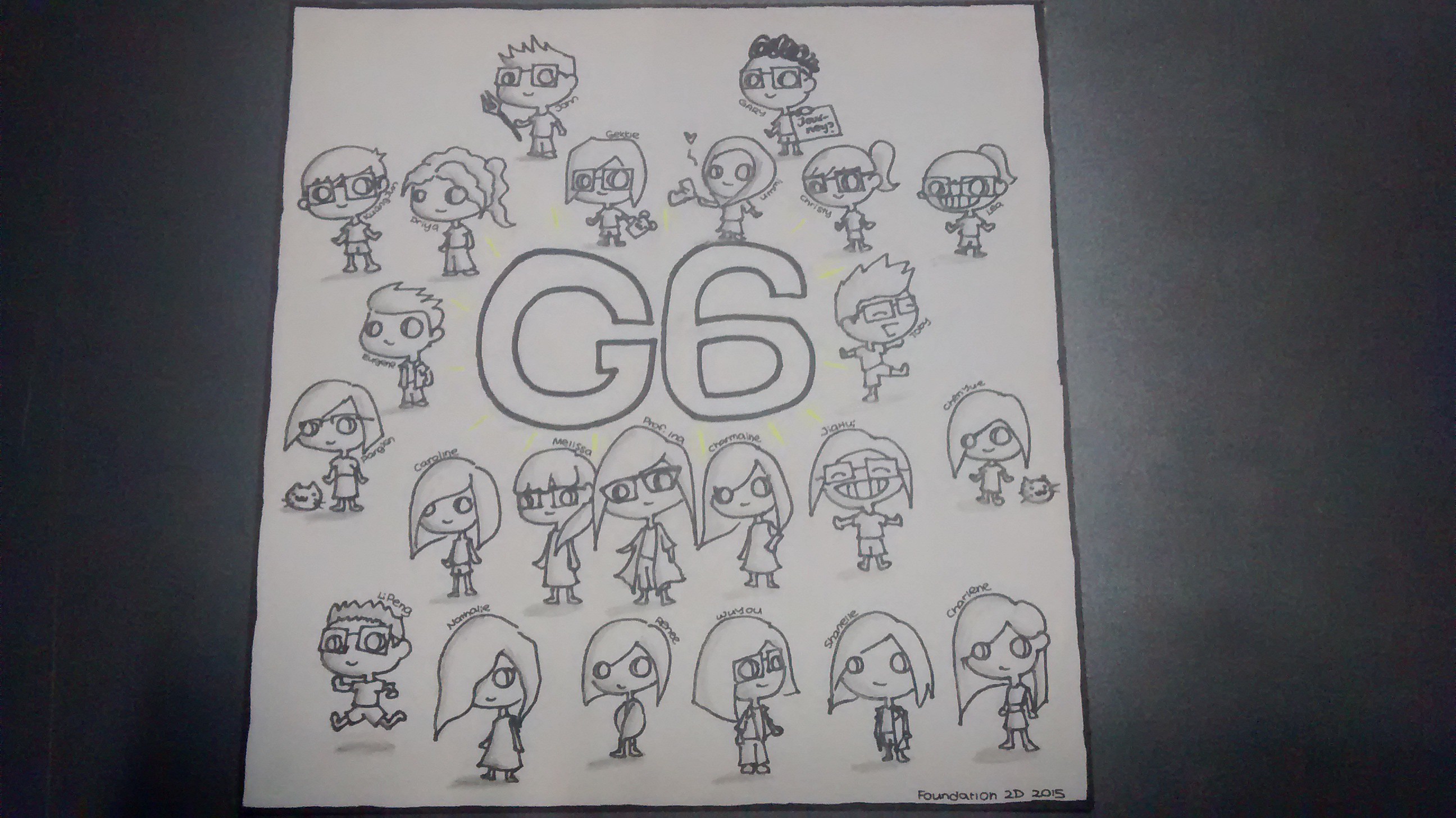
However, the generous support given by the professors and my classmates allowed me to overcome the huge hurdles and somehow allowed me to get through projects decently. Having benefited from so many people, I hope to use this project to portray my gratitude for all the help I have received.

At a point, I’ve gone beyond working for the grade. Honest time and effort was spent to make this work entertaining and meaningful.

I think that made all the difference.

Seeing the smiles during the presentation was more than enough for me.

All the best G6. May everyone be constantly well and happy.

Hopefully I ended this short but meaningful journey in a good note.

Have a great day.

KJ

 IMG_20151122_033521353

? x ?  = An ideal me

First Week:

‘The major I want to go in is animation’

Even more true now.

Decided if I’m even going to animation I want to use digital art as a medium and have a literal narrative to convey this project.

Tested on one of the ‘easiest’ line.

Will elaborate the concept on some other post.

Took very long but I think I’m onto something:

3rd Row

Comments?

Please be nice though.

Have a great day

KJ