Project 1: Threads and Planes; Process and Final

Standard

The first project was about creating planes by sewing threads onto paper (draft)/ Acrylic plastic (final). The final structure had to look presentable 360 degrees, and minimal support for sticking threads in place could be used.

I aimed to create a wave-light structure at first, because not only is it elegant, but it is also smooth.

However, I realized that it became a problem because while one panel may appear smooth, the other side is neglected. If I tried to apply the same waves on the other side of the panel, the threads would come loose on the first side.

It was annoying, but I had to prioritize the criteria set for the project over the beauty of smooth curves.

First Draft

Afterwards, I experimented with more colour combinations and perspectives. I made use of bright and light coloured threads with black paper, because I was unaware that the final material was going to be a transparent Acrylic. Oh well, when life throws you lemonade you have to throw lemonades back.

So more experiments underway… I had a terrible time securing the back ends of the thread.

Draft 2; smooth gradient plane (Horizontal POV)

Tried to make another perspective…

2nd Perspective Frontal POV

First perspective Vertical POV

I tried to combine different patterns, but apparently it was not 3D-esque. It looked more like embroidery. I had to try again…

I’m crying

At last I explored different options and decided that I did not want to do a spiral curve structure like other people mainly do. I wanted to go for something special. In the end, I decided that I wanted to sew planes together- so that they ended up like a cube. It was going to difficult because each plane had different angles when the thread gets pulled together to form a 3D plane, but I was going to try or die trying.

The final product, to me, was quite improvised. Acrylic plastic and paper worked really differently; acrylic was harder and less flexible, hence creating higher tension when I pulled at the thread. In the end, I had to force-fit the four planes together to form a cube because the Acrylic was too hard to be bent in other ways. I secured the planes together with more thread. I would really employ darker threads against such a light background in future, but my fingers would commit suicide should I have decided to redo my structure. Bless my tiny soul.

FRONTAL POV

EASTWAY FRONTAL POV

FRONTAL POV 2


I am so glad this project is done.

I should have tightened the threads better though.

Dammit.

My Line is Emo: Final

Standard

Final Piece by Joey Chan


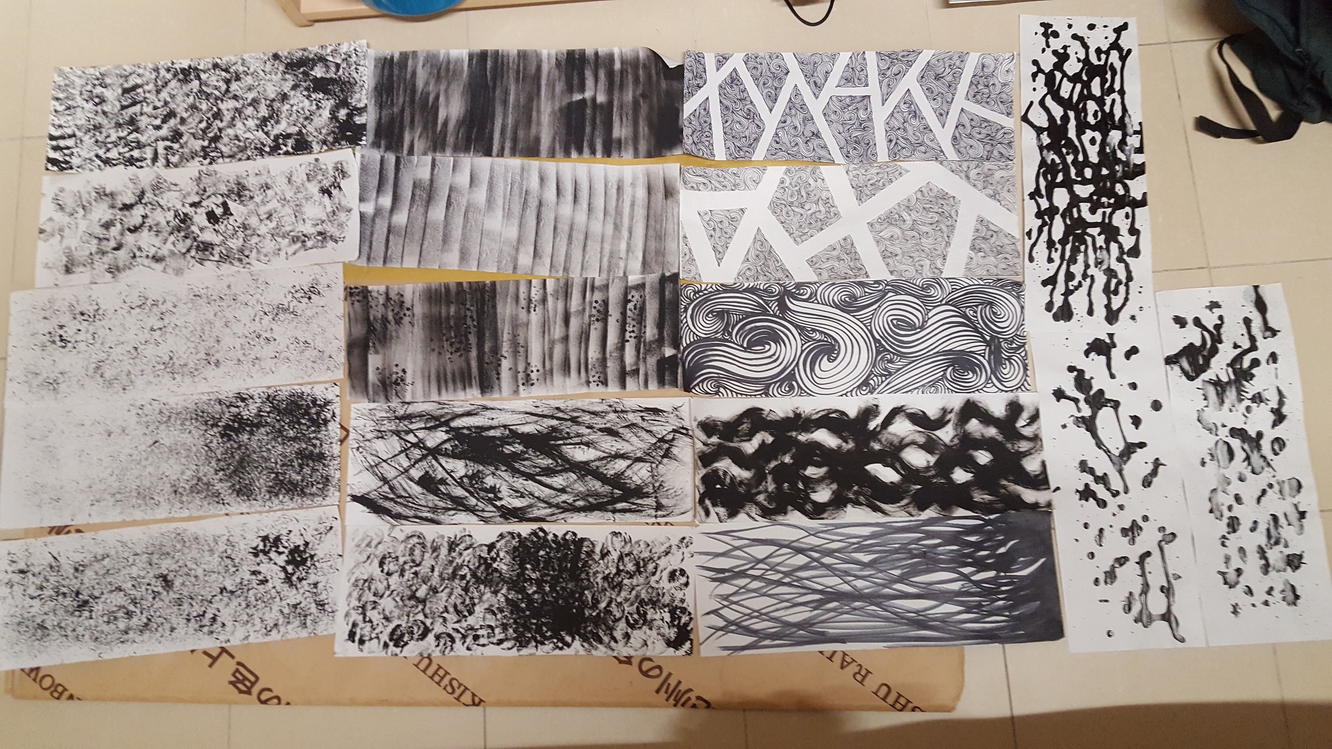
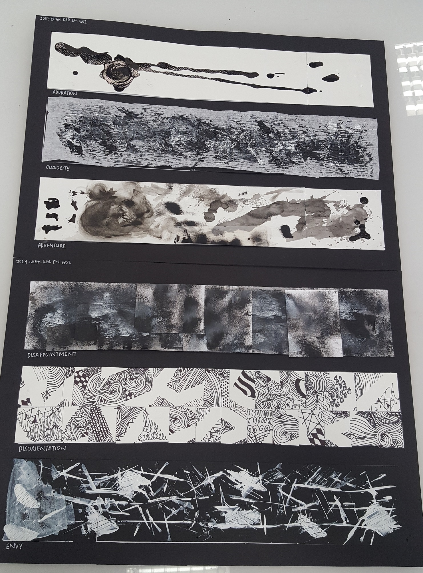
My final piece consisted of 6 emotions from each category; Adoration (Love), Curiosity (Surprise), Adventure (Joy), Disappointment (Sadness), Disorientation (Fear) and Envy (Anger).

  1. Adoration

Materials used: Droppers (Experimentation), Chinese Ink, Water Coloured Paper

Method: Dripping one heavy drop of Chinese ink vertically on my canvas.

Adoration stems from a tiny love, which will eventually spark into a bigger love. It is stronger than fondness. One usually starts to like a person by slowly finding him or herself adoring the little or big parts of what makes up their partner. Some parts are bigger [larger adoration, hence larger sploshes], for example when they smile a certain way. That is where the splosh is greater than the other inked areas. Adoration levels are also uneven and there is no same single time where the level of adoration is at the exact same level. Ultimately, most adoration are intertwined with each other, forming the love one has for another.

2. Curiosity

Materials used: Crepe Paper (Childhood, Adolescence; Kids’ Handicraft material), Black and White Acrylic Paint

Method: Using a paint spatula to apply paint haphazardly onto the white crepe paper with a black background.

Curiosity comes in many layers. The first map, the basis of the feeling, lies in a mind-scape where it is crinkled. The crinkled effect is representative of what we already know or feel from past experiences. Adding on to this information, with the help of curiosity, are the things we want to find out and know about. Knowing human nature, there are a lot of things that we may be interested to find out about, and the rate of information we receive may not be constant. Hence, this produces the different, haphazard layers of black, white and grey.
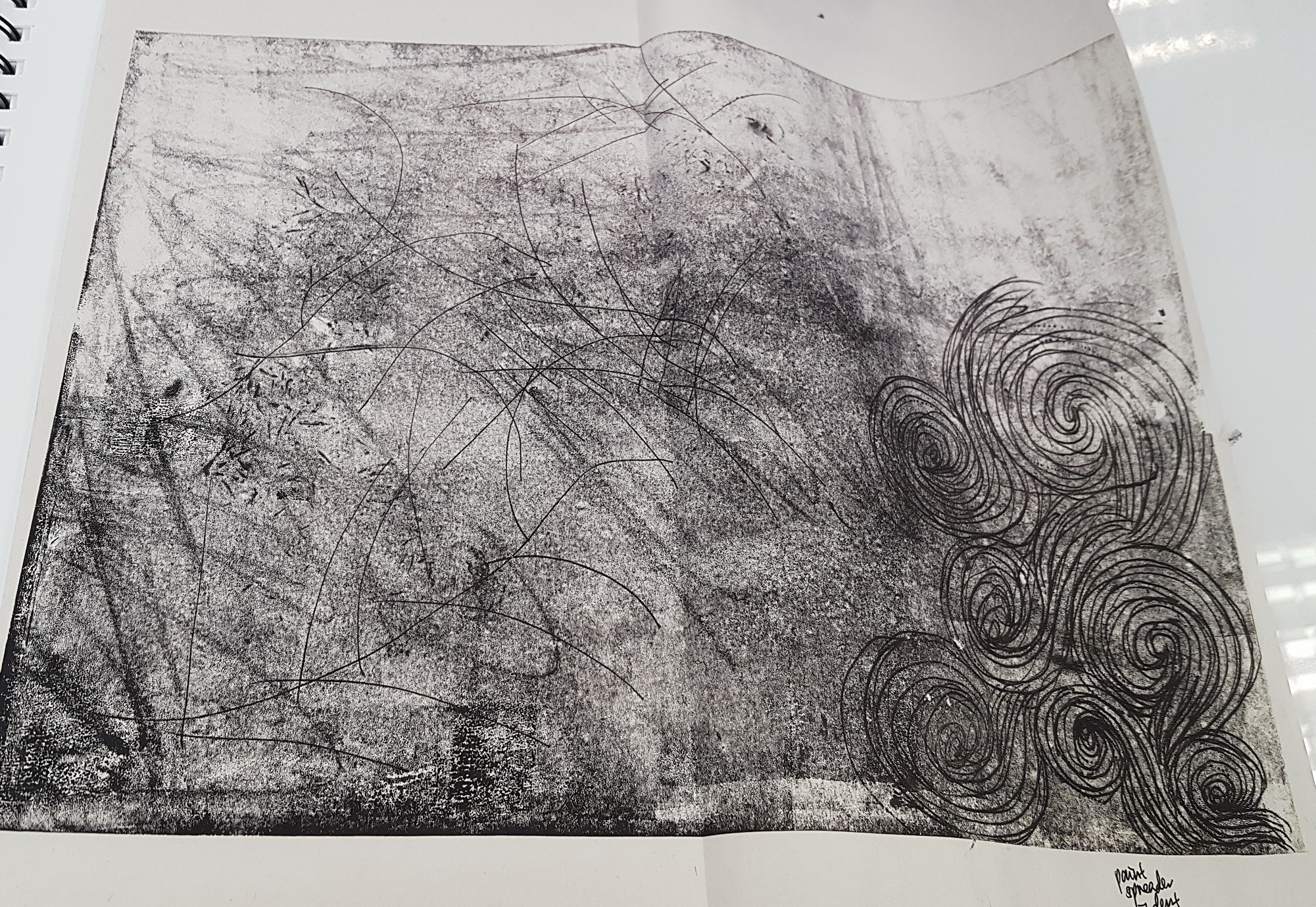
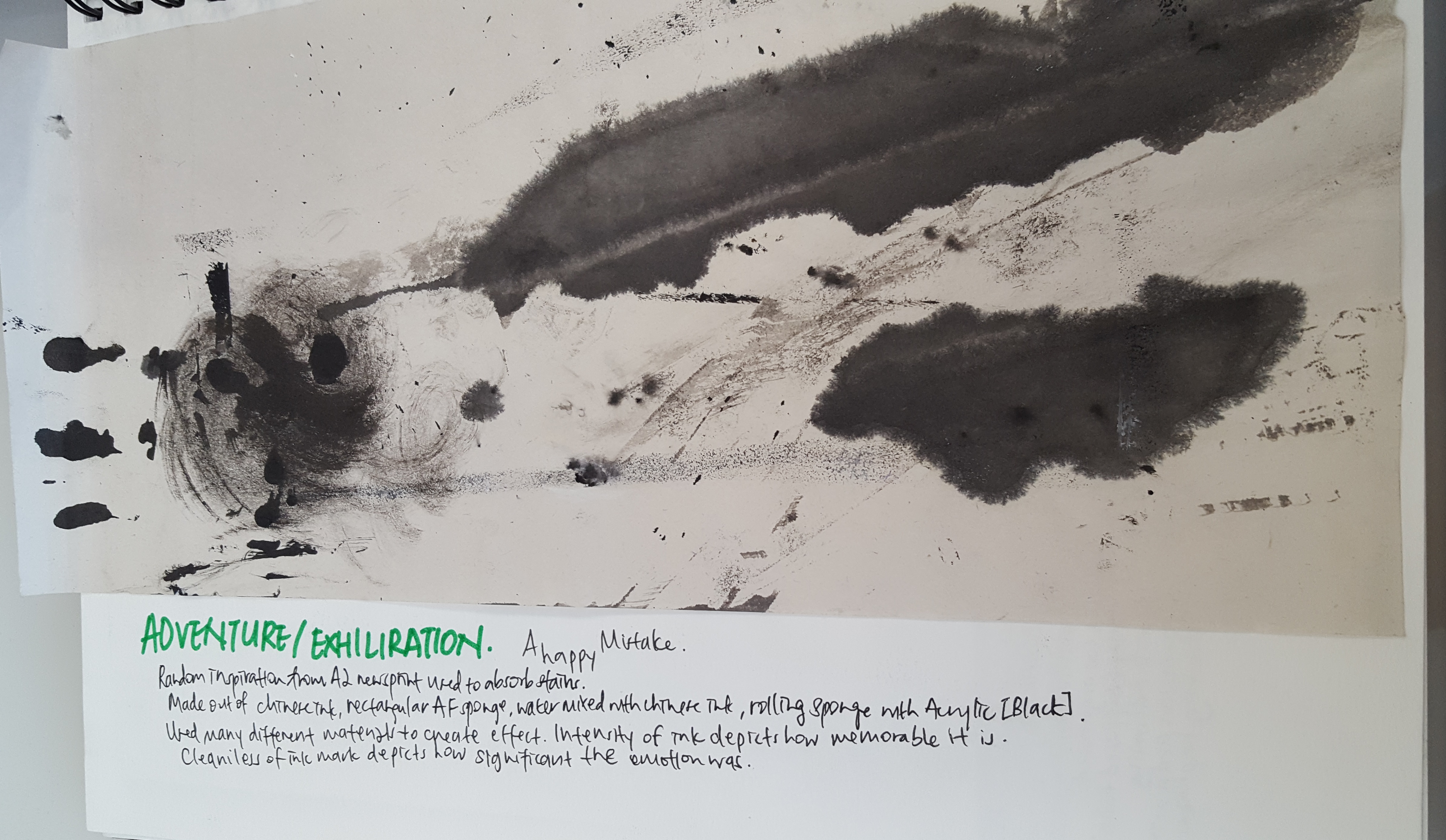
3. Adventure

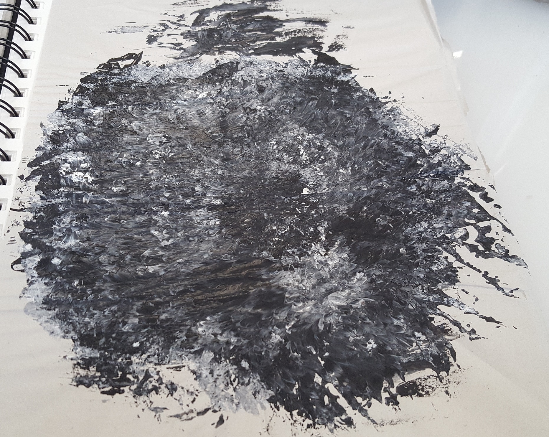
Materials used: All sorts of materials, especially Chinese ink and sponge.

Method: All sorts of application with Chinese ink and Black Acrylic paint.

Adventure brings us many facets of feelings. We can feel euphoria at what excites us, happiness and excitement at what we discover, sadness when a tragedy strikes, or a sense of trepidation. Hence, the patterns in this emotions has no regularity at all, and are made out of all sorts of textures and splatter jobs. There are also layers created by the depth of colour. The lighter colours represent the lighter/less serious memories. These are memorable but may not be as significant. The darker colours are those that are more memorable and significant. The more faded the colours are, the hazier the memories about them are. The darkest and cleanest would represent the most vivid memories- and there are only few.
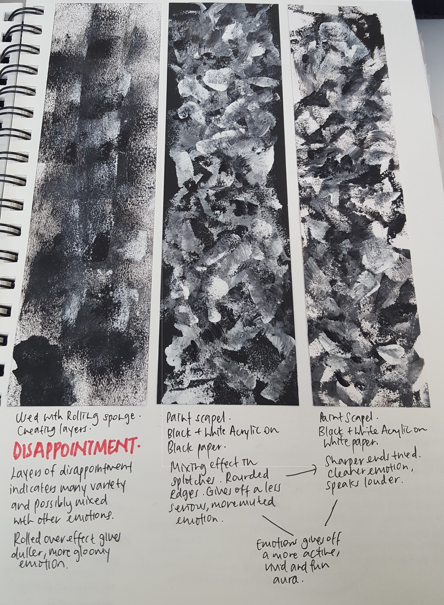
4. Disappointment

Materials used: Rolling sponge, tracing paper, cartridge paper, Black and White Acrylic paint

Method: Rolling black and white paint on the canvas, and then adding layers of catridge papers and tracing papers and rolling over it again.

Disappointment comes in many facets of emotions due to the many causes of disappointment we may feel. Some are severe, while some are light. There may also be emotions mixed inside like anger, frustration, betrayal and sadness. The different layers, some overlapping, are representative of the weight/significance of the event over others. The ones that are more prominent are those that seem the most “recent”. The mix of black, white and grey signify how the emotions have blurred lines, and there is no one clear-cut disappointment. The darker colours are used to exemplify the stronger feelings of disappointment, in contrast to the lighter tones.
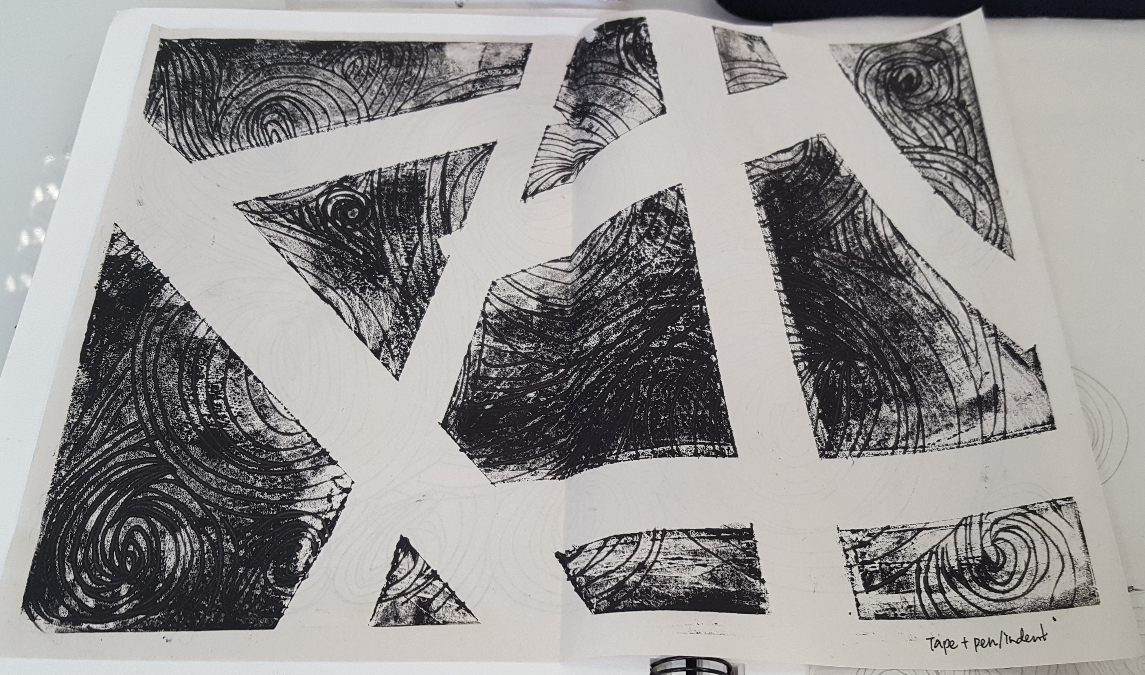
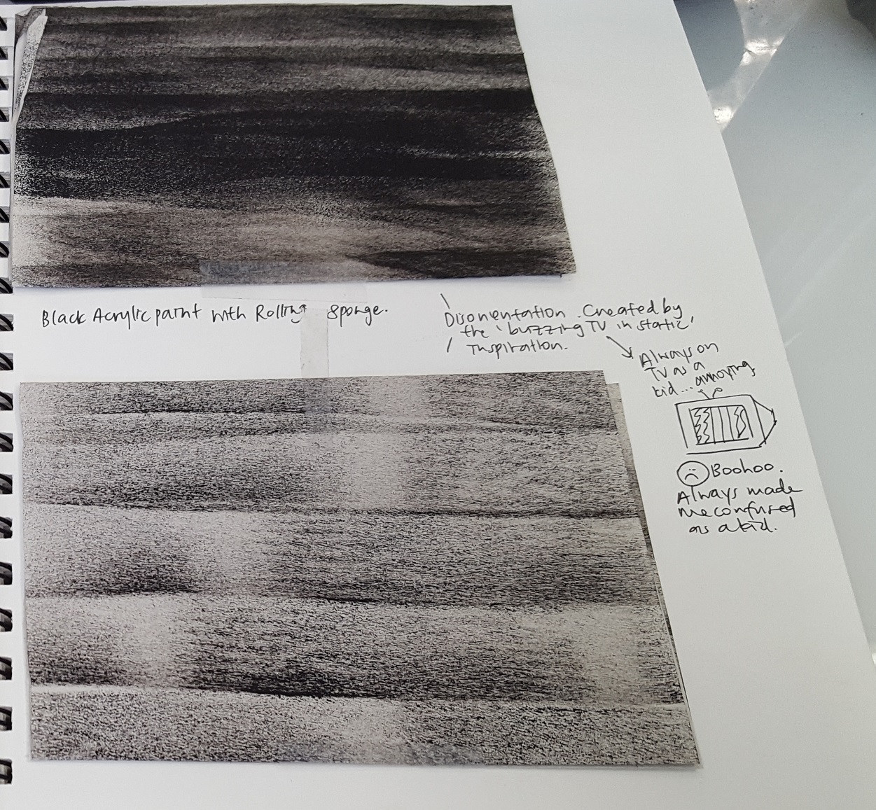
5. Disorientation

Materials used: Sharpie Marker, Tape (Signifying boundaries)

Method: Pasting tape over the paper and drawing on the white spaces. After the line art is done, remove the tape. Afterwards, cut the paper into small squares and rearrange them accordingly onto another piece of canvas before sticking it down.

Disorientation is a feeling of confusion, which makes little sense. Even though it is classified under sadness, I chose to represent the emotion with vivid images and patterns to sieve in further confusion and in a way that nothing would make sense. The lack of continuous straight white paths add to this feeling. The cleanliness of the art is representative of the creepiness we feel when we are being disoriented. It is a world we cannot comprehend. There is also a neatness such that the top row scrambled stays in order, and same goes for the bottom row. This orderliness is representative of how one still has enough sense to try to figure out what is causing their confusion, while feeling disoriented.
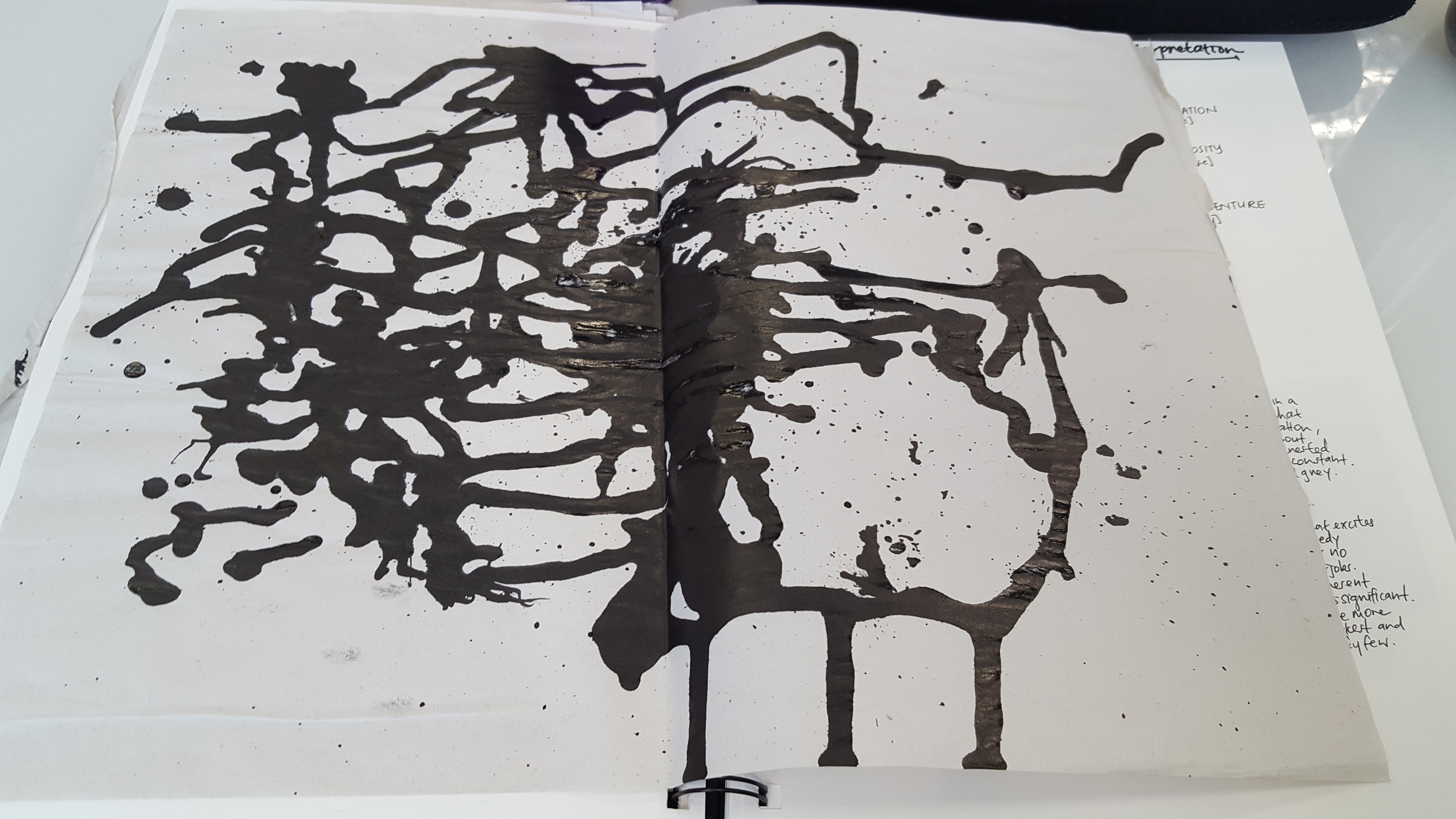
6. Envy

Materials used: White Acrylic Paint (Stark White paint), black paper

Method: Using a paint spatula to create sharp edges of white on the black paper. For the large white shade, I used the flat part of the spatula instead of the shark edge.

To me, envy is sharp and piercing. It is also haphazard, because it is an emotion which comes when we are least expecting it to. The larger, white spots are the feelings which are overwhelming, while the sharper lines are the thorns we feel. At the left side, there is a murky haze of white, which represents a lack of coherence we may feel when we do not understand why we feel envy. I chose to represent this feeling with white on black because while the black symbolizes how our mind blanks out upon envy, we also feel the pain and jealousy which may come sharp, and as painful as the stark, vivid white.

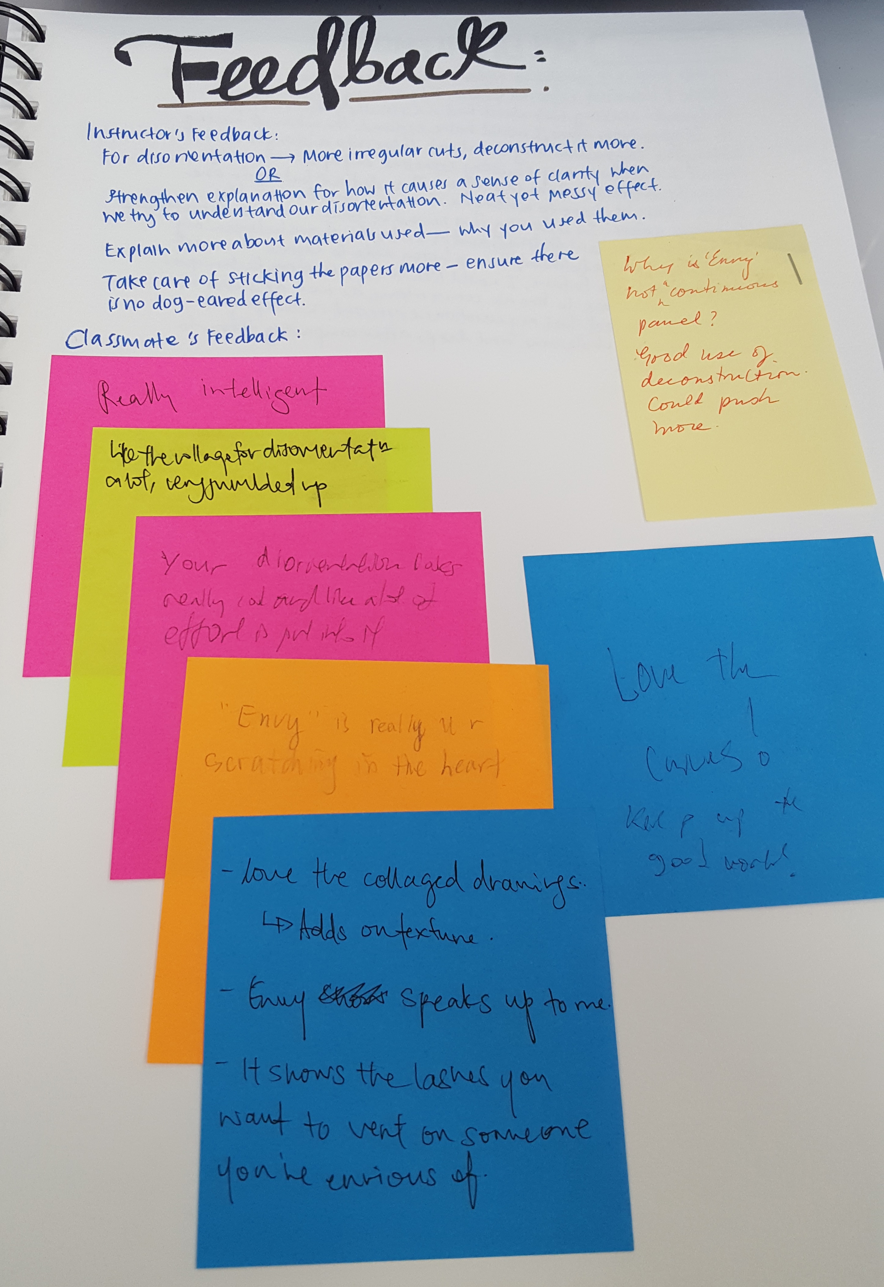
Feedback from Professor and Peers

My Reflection for this Project.

My Line is Emo: Process

Standard

My Line is Emo:

When I first started this project, I made use of many objects to create textures, hoping that I would have the option of choosing from a variety of textures. I made use of corks, feathers, sponges, twigs, moss and even dried sugar cane. However, things did not go my way; it turns out that many different materials made the same effects when I applied them on newsprint with bloc ink.

I spent the first lesson merely testing out the different materials with bloc ink. I made use of Acrylic for the mass effect, but not the acrylic carving- because everyone seemed to be using them, and I did not want to be ‘the same’.

Cork, sponge, twigs, and various other materials.

Paint spatula and pen with Acrylic inking.

Pen. paint spatula, twigs, and more on acrylic.

Cork, flat sponge, rolling sponge and moss.

Rolling sponge, cotton bud, flat sponge, rectangular sponge, feather, and cork.

White tape across pen markings on acrylic. The pen markings were indented before I used something to flatten the ink further, to create darker lines.

Likewise, I used tape and pen to indent the markings. This time, I tried to flatten the ink before making the indents. Bad decision- indents cannot be seen anymore.


During out-lesson times, I experimented with more options. This time, I made use of Chinese ink and black and white acrylic paint to help me create further textures. I also made used of drawn line-art to create patterns.

Different variations of Rolling Sponge with Chinese Ink; Dense vs Less Dense.

A Happy Incident. The newsprint was originally used to protect the table from staining, but it turned out as a potential pattern highlighting ‘Adventure’- also because of the various methods and tools used to create this unintended pattern.

1) White Acrylic paint with cork on black paper 2) White Acrylic paint with paint spatula on black paper 3) Black and White paint with paint spatula on crepe paper 4) Line Art Swirls with Sharpie Marker

1) Rolling sponge with Black and White Acrylic paint 2) Black and White Acrylic paint with paint spatula on black paper 3) Black and White Acrylic paint with paint spatula on white paper

Chinese Ink Splatters and trying to keep it within the paper. Turned out creepy.

Black and White Acrylic paint on both sides using paint spatula, and folding it into half and reopening it for lumpy texture.

1) Sharpie Marker Line Art Swirls 2) Tips of the Feather with Black Acrylic Paint 3) Black Acrylic Paint with Sponge

1 and 2) Moss and Black Acrylic Paint with different gradients and density 3 and 4) Sharpie Line Art with Taped boundaries. Comparing density of lines.

1 and 2) Cork sides with Black Acrylic Paint. Comparing Density. 3) Cork Top with Black Acrylic Paint. 4) Moss with Black Acrylic Paint, ascending density (Gradient).

1) Black Acrylic Paint with Rolling sponge with cotton bud on paint 2) Chinese Ink splatters (Low Density) 3) Chinese Ink splatters (High Density) 4) Chinese ink splatters (Mid Density)

Second Drafts

However, these were barely used in my final product. My designs were too organized, predictable and mainstream. Many people had similar textures, and they had a small variety; most of them were categorized under negative emotions. With a lack of variety and originality, I had to source for more options to explore.