Little Snippets of Joey
Little Snippets of Joey by Joey Chan- EGO Project
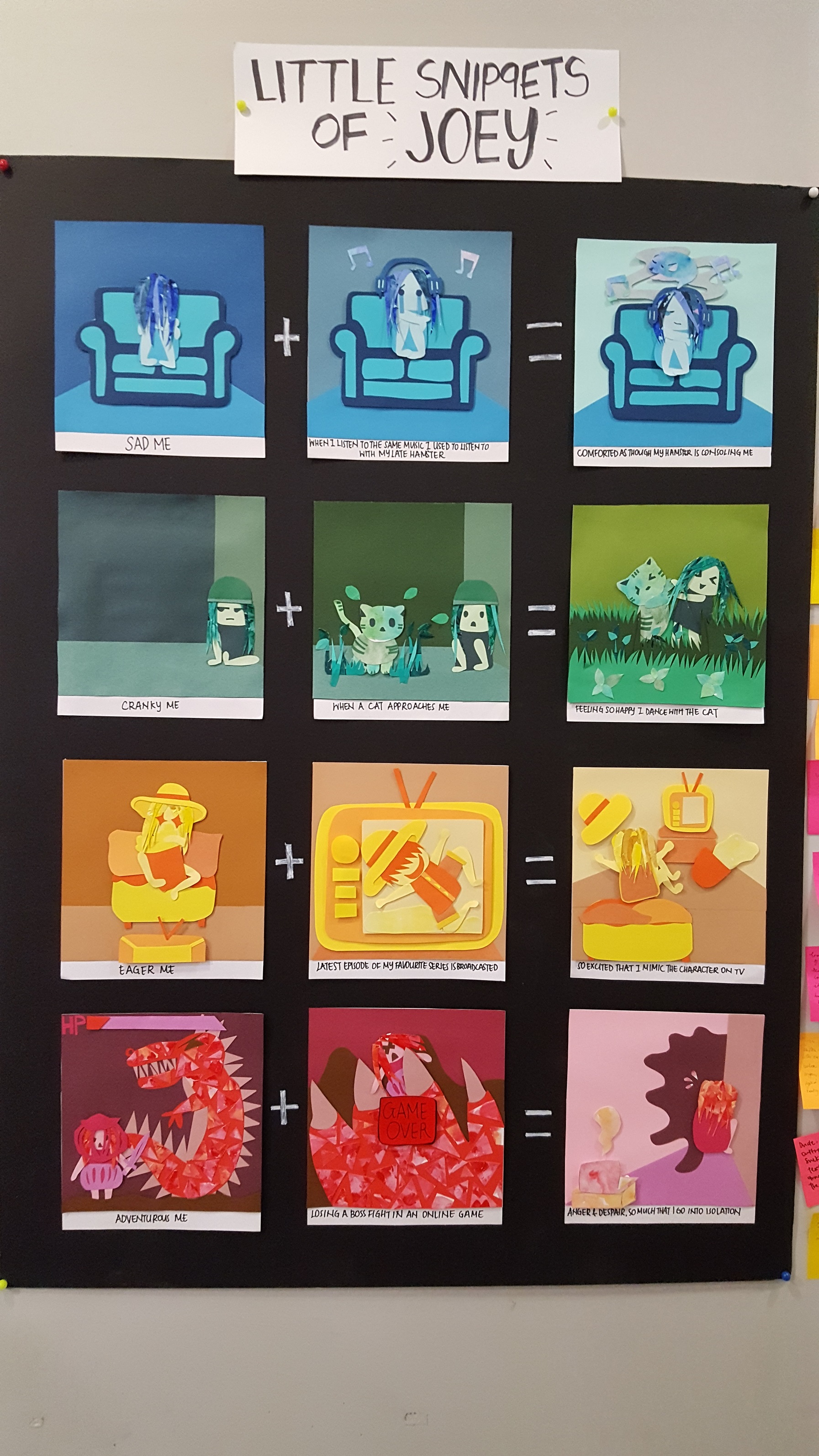
My Project, Little Snippets of Joey, is modeled after the small but significant parts of my childhood memories. Hence, I decided to use 1) Paper Cuttings 2) Monochromatic Colours 3) Children Picture Book Style to emulate the idea of childhood. Paper cuttings are things that we do when we are children during Art and Craft as a form of play and entertainment. Monochromatic colours are easy for young children to identify (Blue = Sadness, Green = Nature, Yellow = Cheerfulness, Red = Something fiery) compared to other colour harmonies.

1st Panel: Blue Hues
My first panel consist of blue hues. Blue is a colour identified with tranquility, peace and comfort. It is also identified with sadness. Hence, I chose to use this colour to represent how thinking about my late hamster through memorabilia music comforts me when I am being sad.
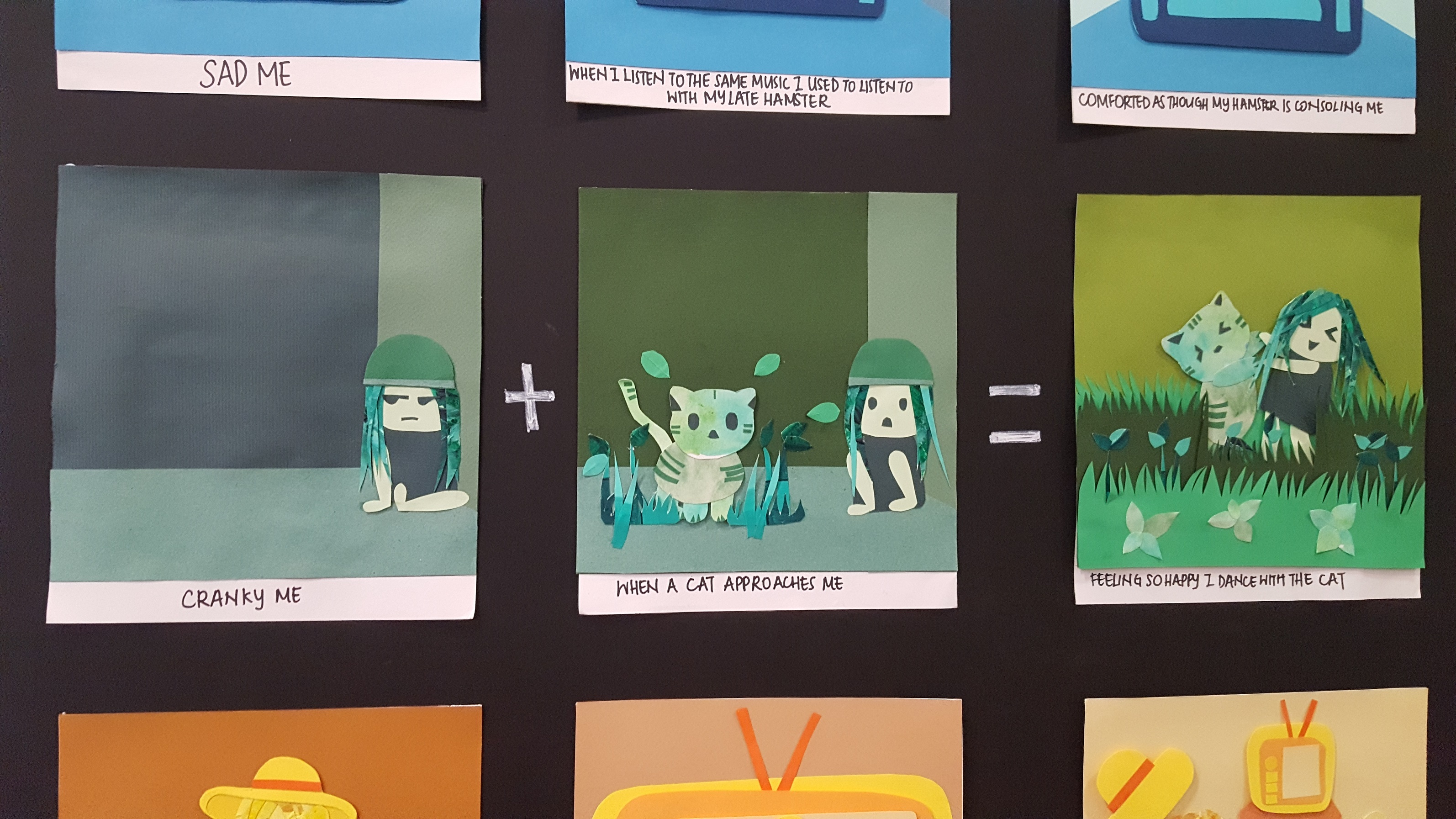
2nd Panel- Green Hues
Green is identified with revival, nature and relaxation. Hence, I used it for this panel since I take comfort in the cat lifting my spirits.

3rd Panel: Yellow Hues
Ah, yellow hues. This was a particular challenge for me since yellow seems to blend in so much with each other. Yellow is a colour for cheerfulness, energy and vitality. It can also be used for excitement. Hence, I used it to express the eagerness I have in watching my favourite series (One Piece :D).
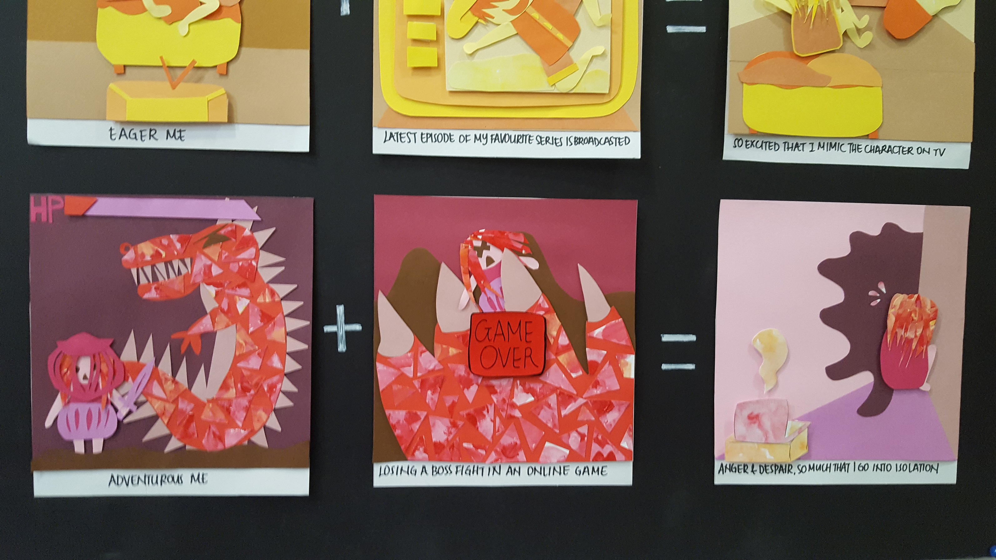
4th Panel: Red Hues
My final panel is the red panel. It is a colour for extremities; violence, adventure, anger, passion, etc. I used it to express both the adventurous spirit I have when I play action games, and my anger and despair when I lose in that game. It is to note that the first and last panel are meant to look chunkier in paper cutting, because they represent the in-game screen (to differentiate the reality and in game).
And these, lady and gentlemen, are my EGO Project representations. 🙂