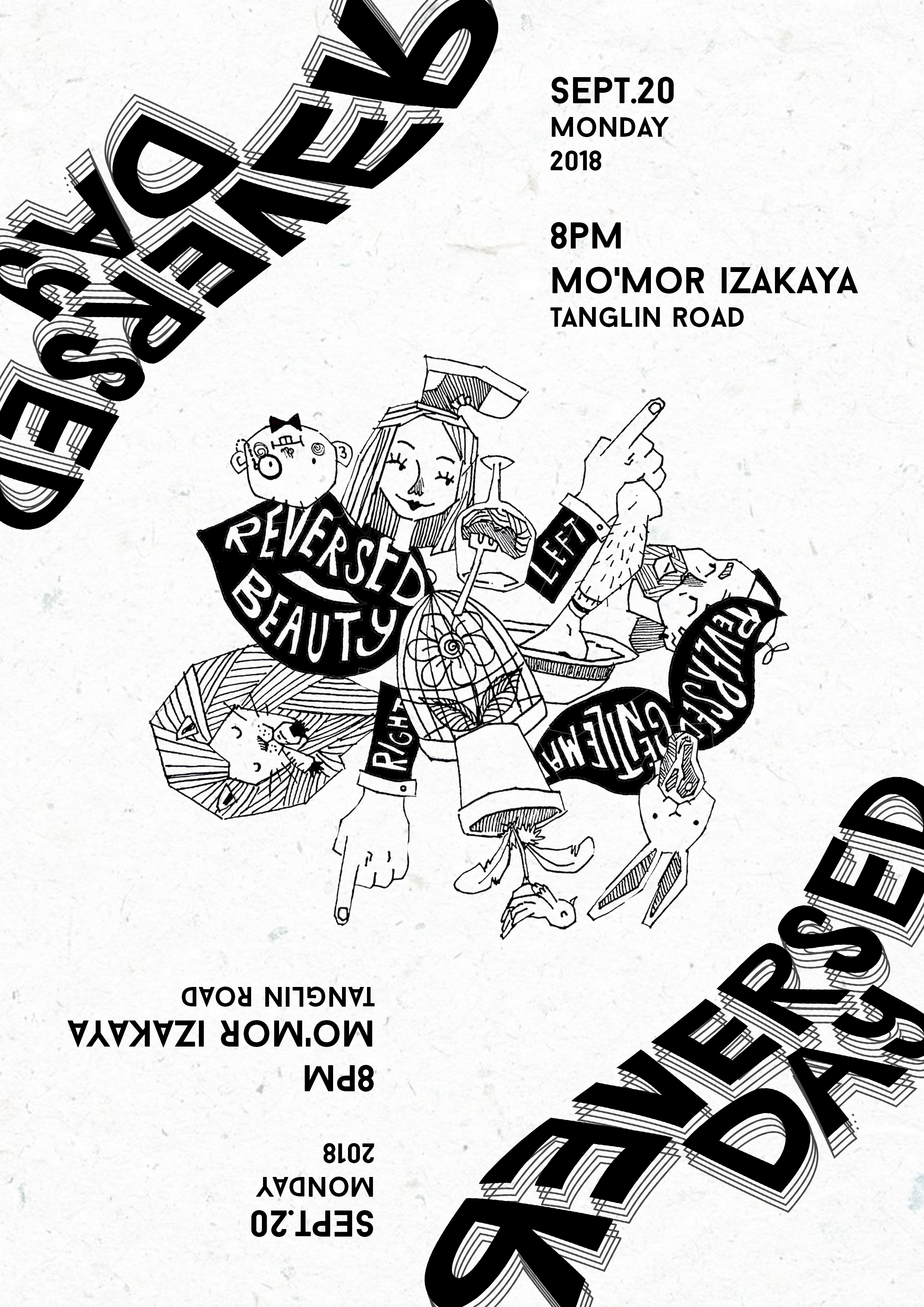
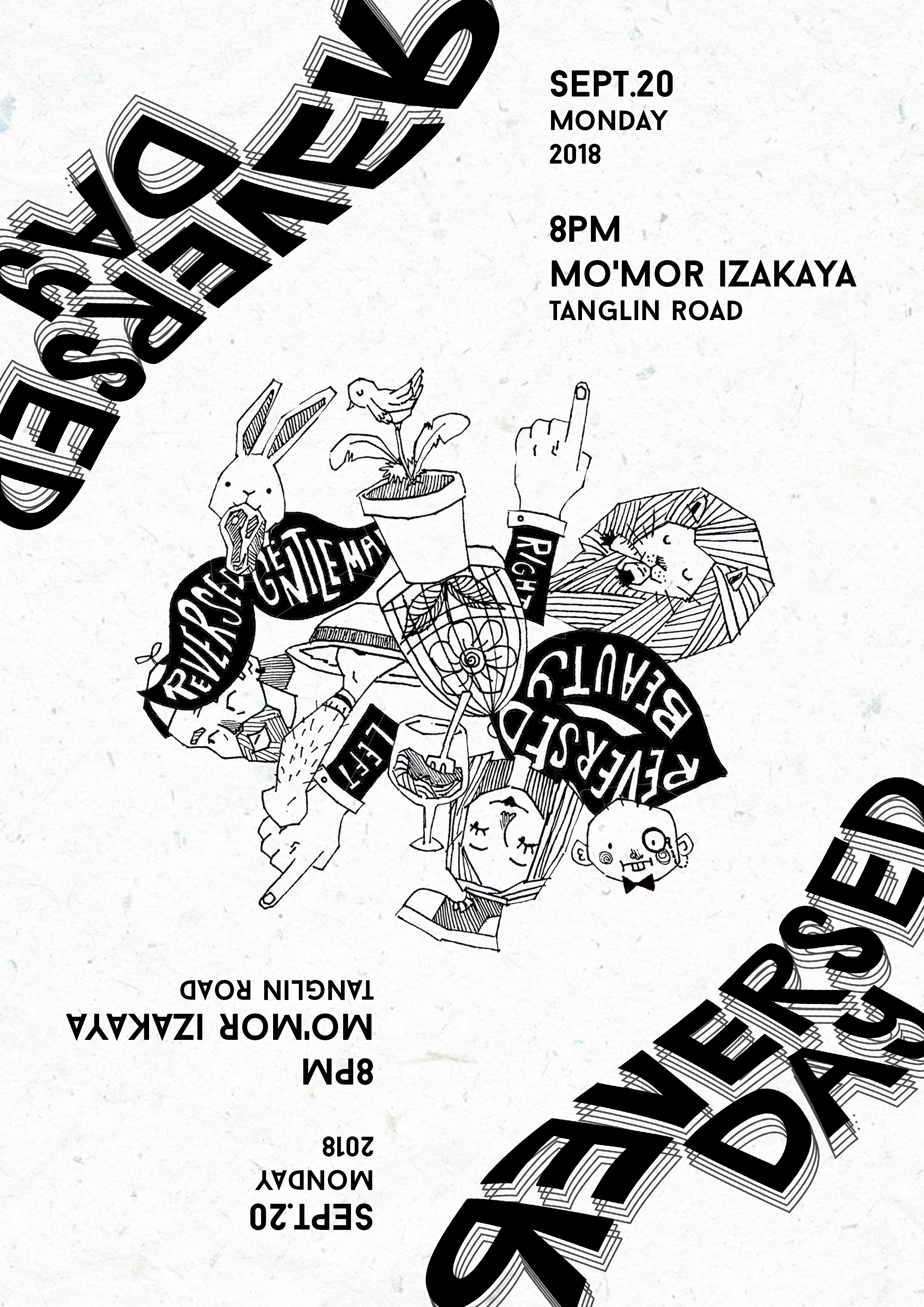
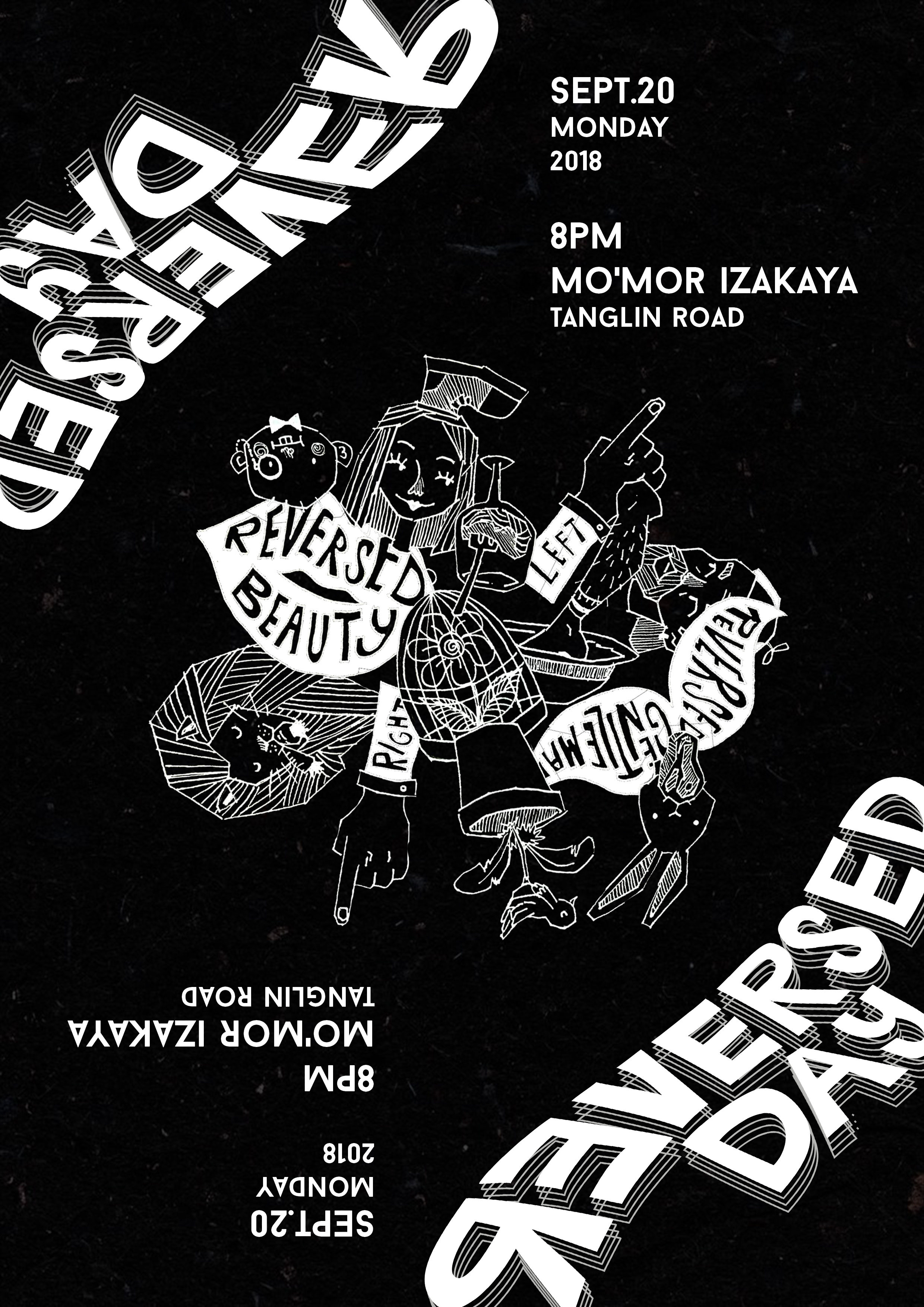
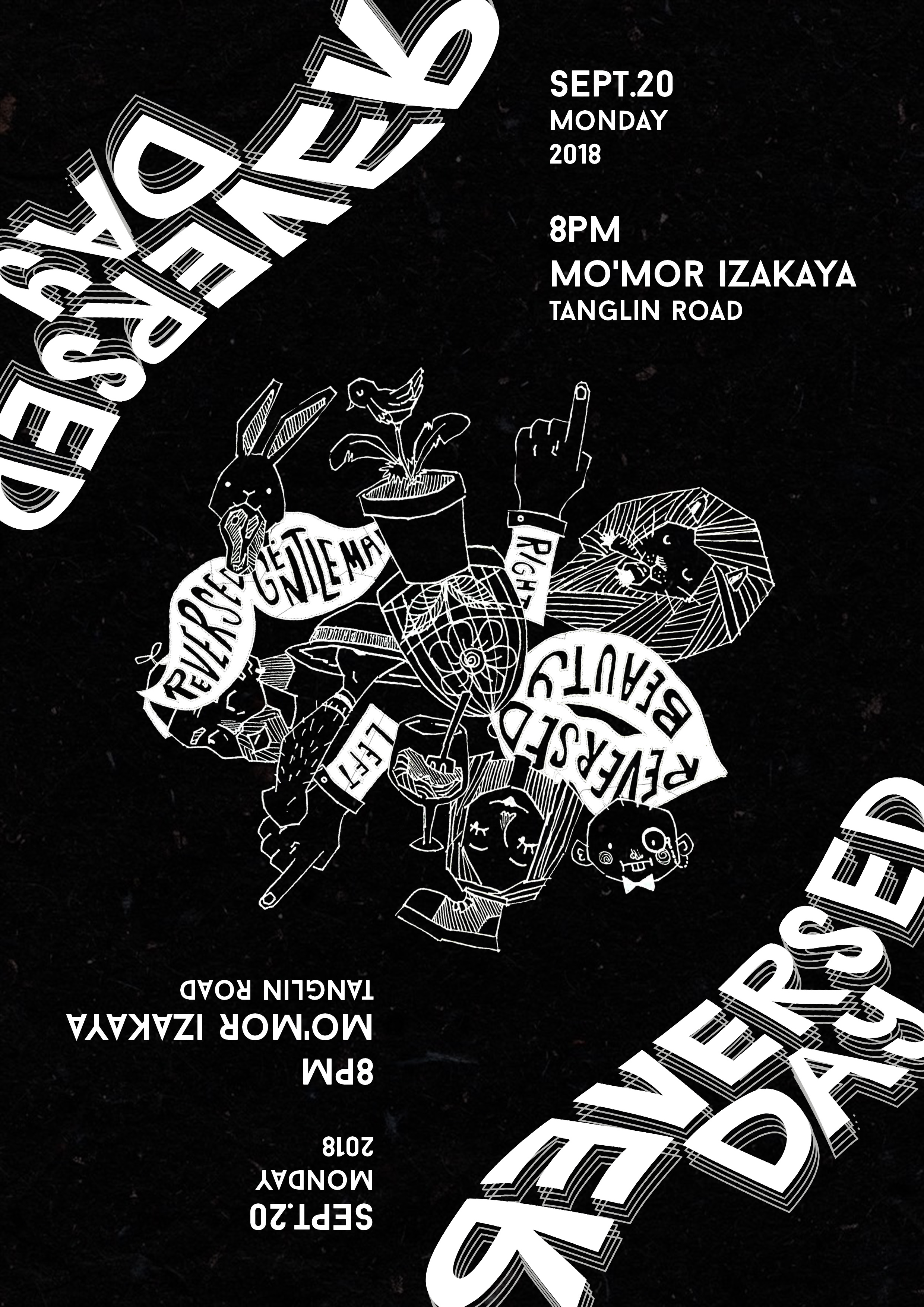
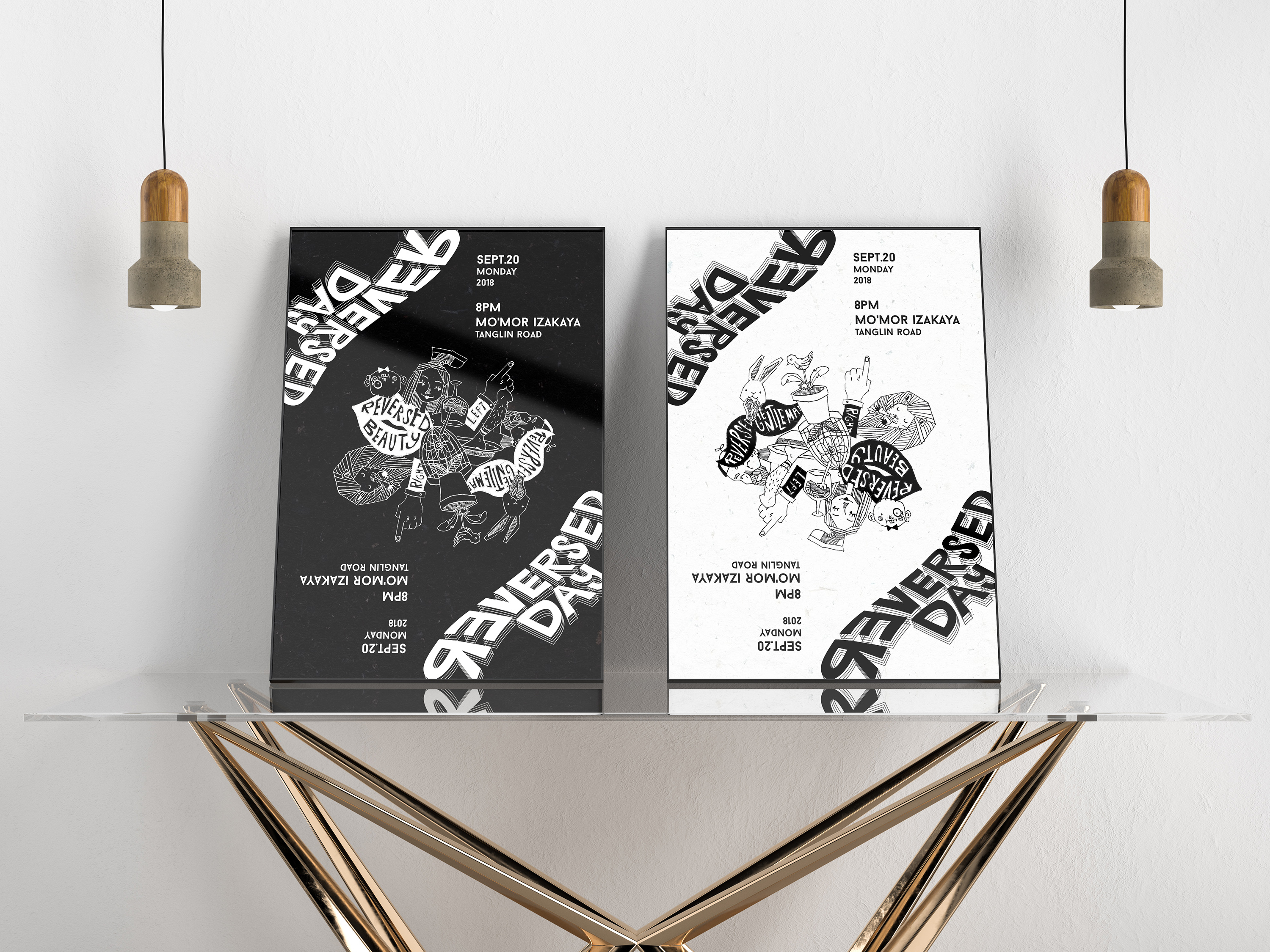
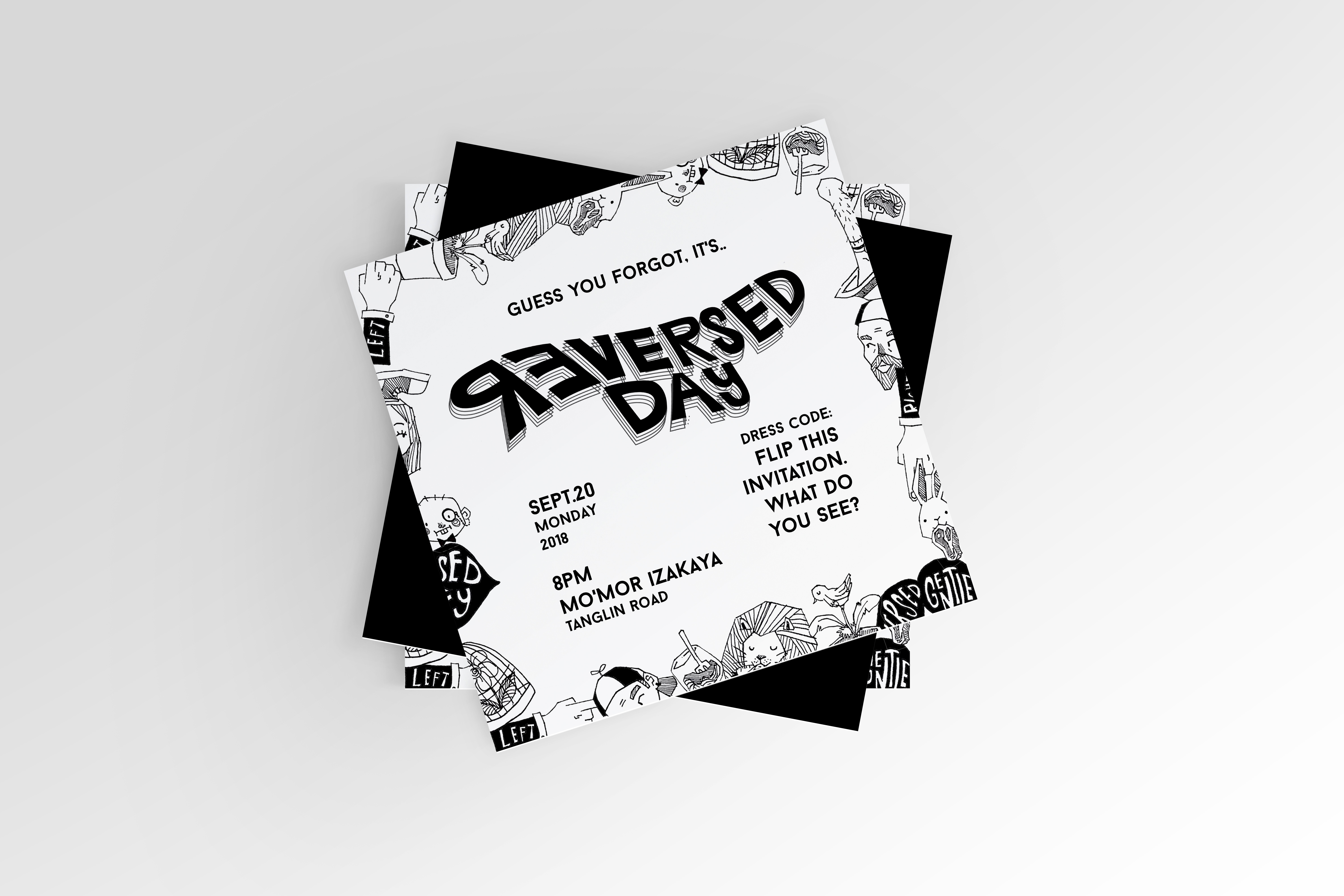
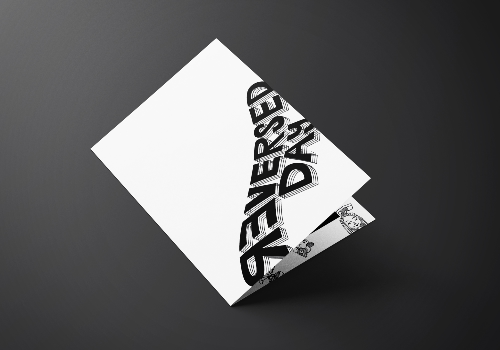
Poster
So basically what people will see first is the poster of the event. I made it reversible, so you can put up the poster upside down and will still make sense. To vary it even more, I use two version which is black and white. So, in total there are 4 types of poster.
White ver.
Black ver.
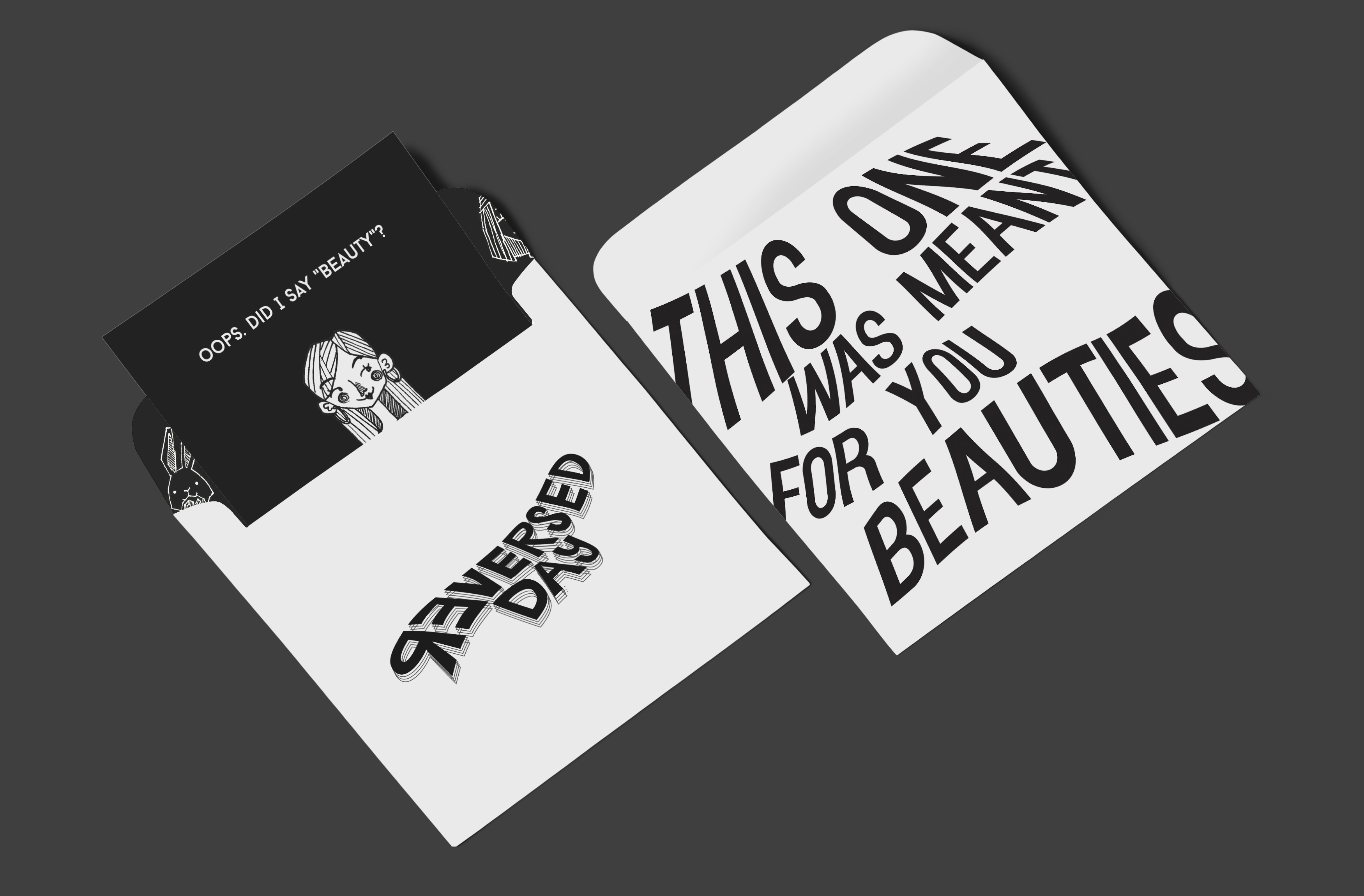
Invitation
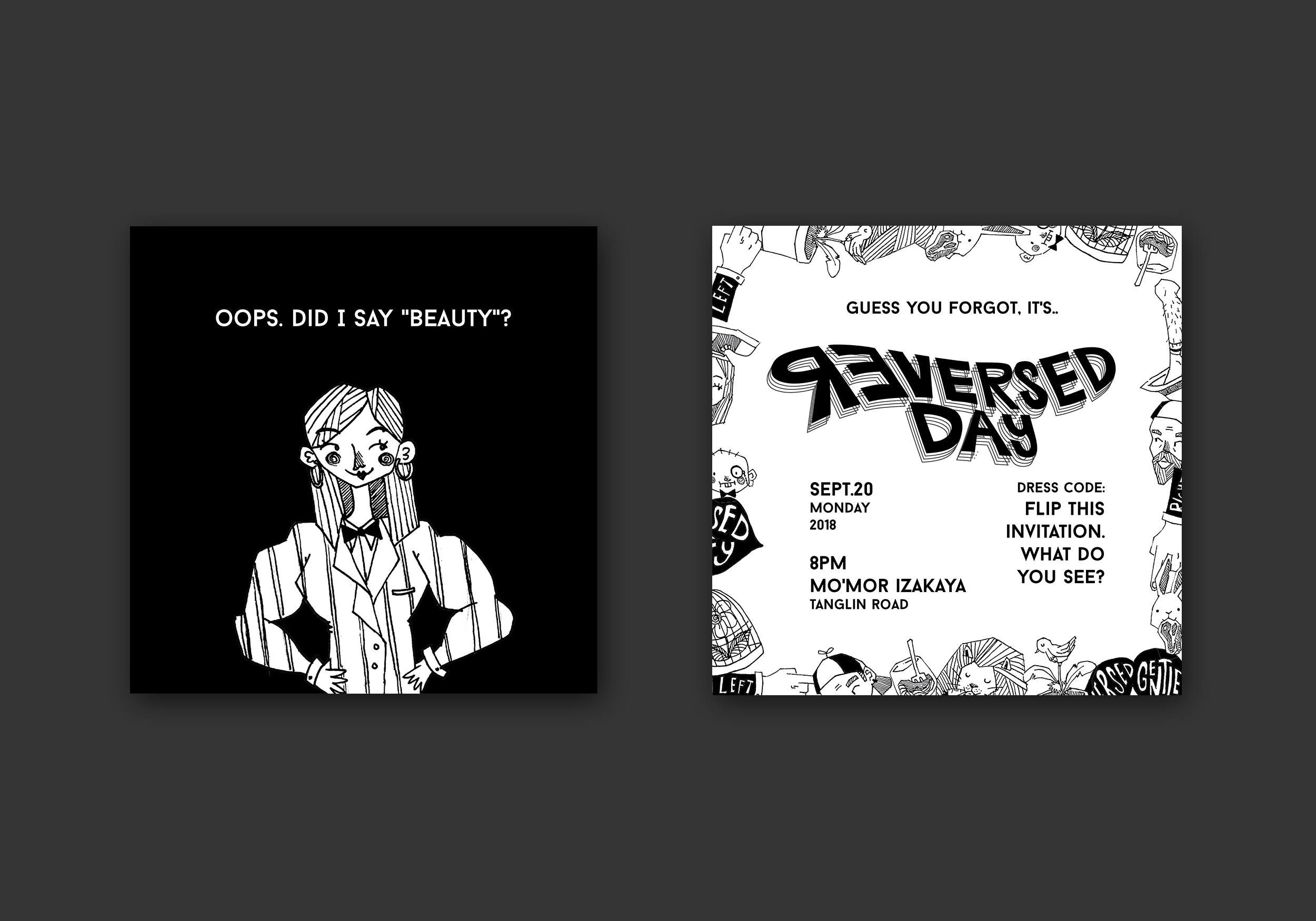
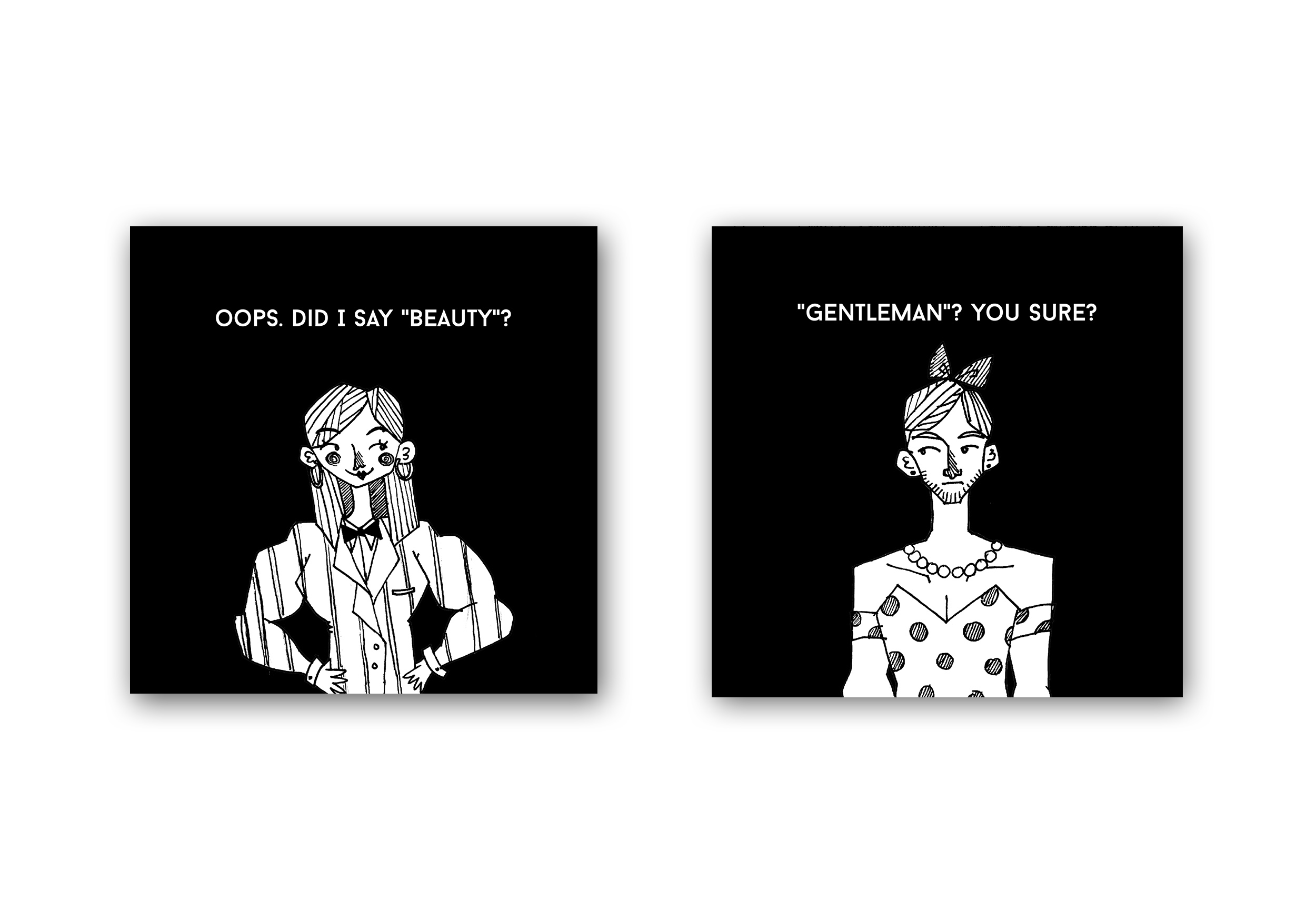
Then you will get an invitation. There are also 2 version for this one; beauties and gentlemen. Obviously, it was meant for their respective genders. But then, the content will show the respective genders in opposite’s gender attire. This illustration is to tell the participant’s dress code for the event itself. So ladies will wear tuxes while guys will wear dresses.
Invitation for Gentleman
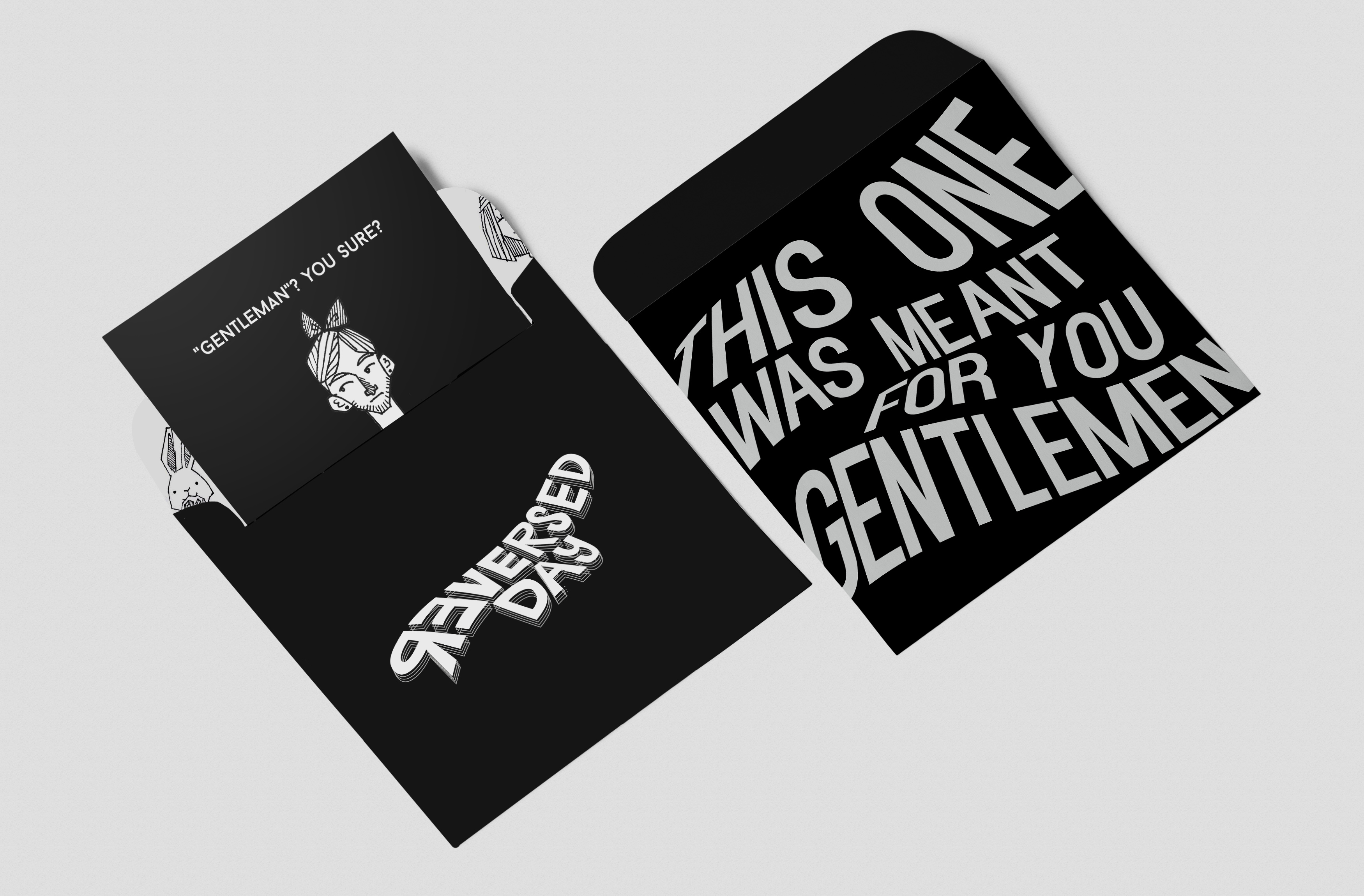
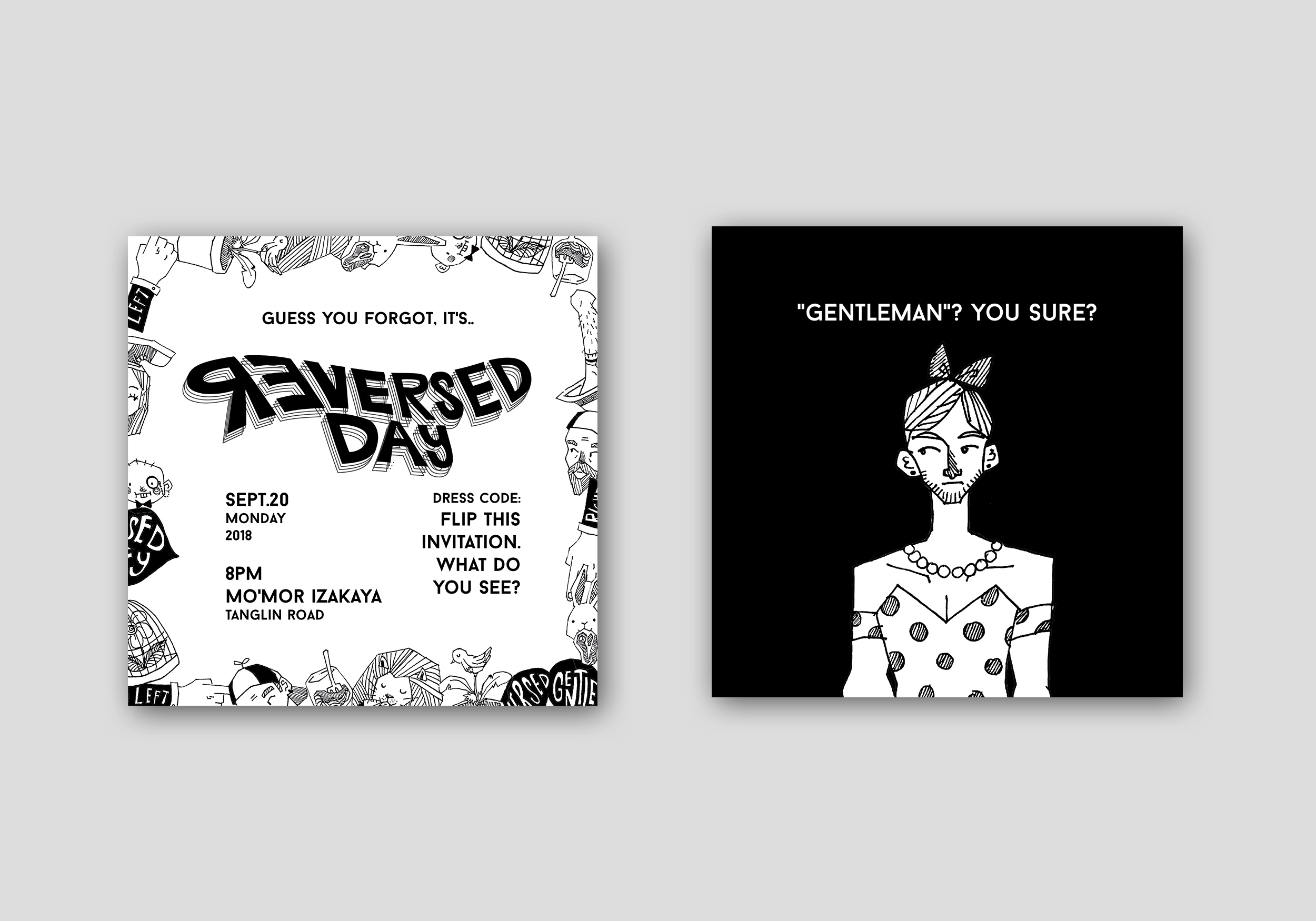
Invitation for Beauties
Some more mockups of the content:
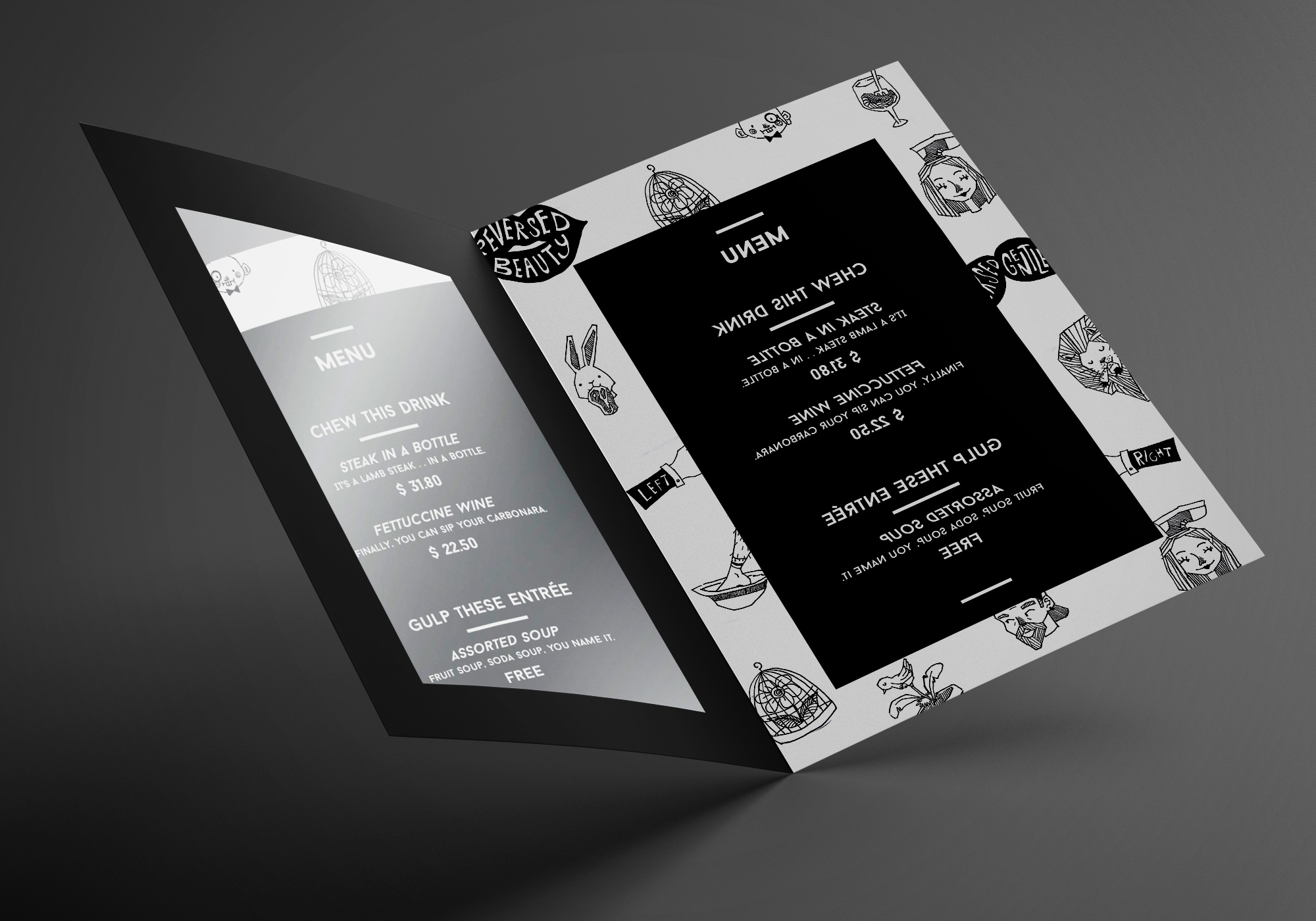
Menu
Then, at the event, there would be table menus in size of A5 in each table. They offer 2 only menus, which is steak and pasta…. in drink tableware. And also, free drinks are provided. But it is served as if they are soups, which means in a bowl with spoon and everything.
The menu itself would be in reverse, with a silver mirror foil paper at the opposite to replace mirror. In order for the attendees to be able to read it, they will need to read them through the silver foil. It’s a bit of a hassle but that’s the thing about reversed day – everything is simply quirky and weird!

Merchandise
Tbh, I wanted to make a lots of merchandises. There are lot’s of things that I can do with the illustrations etc. However, since I got no time and got Japanese exam (currently panicking while typing this) on the same day for this submission, I only managed to make an extra design for a t-shirt. It’s a simple unisex t-shirt. It says “I’m not gay, it’s Reversed Day.” Why? Because in reversed day guys wear makeup, girls looked masculine, which people usually stereotype them as gay. But it’s not like there’s something wrong with gay #panicking.
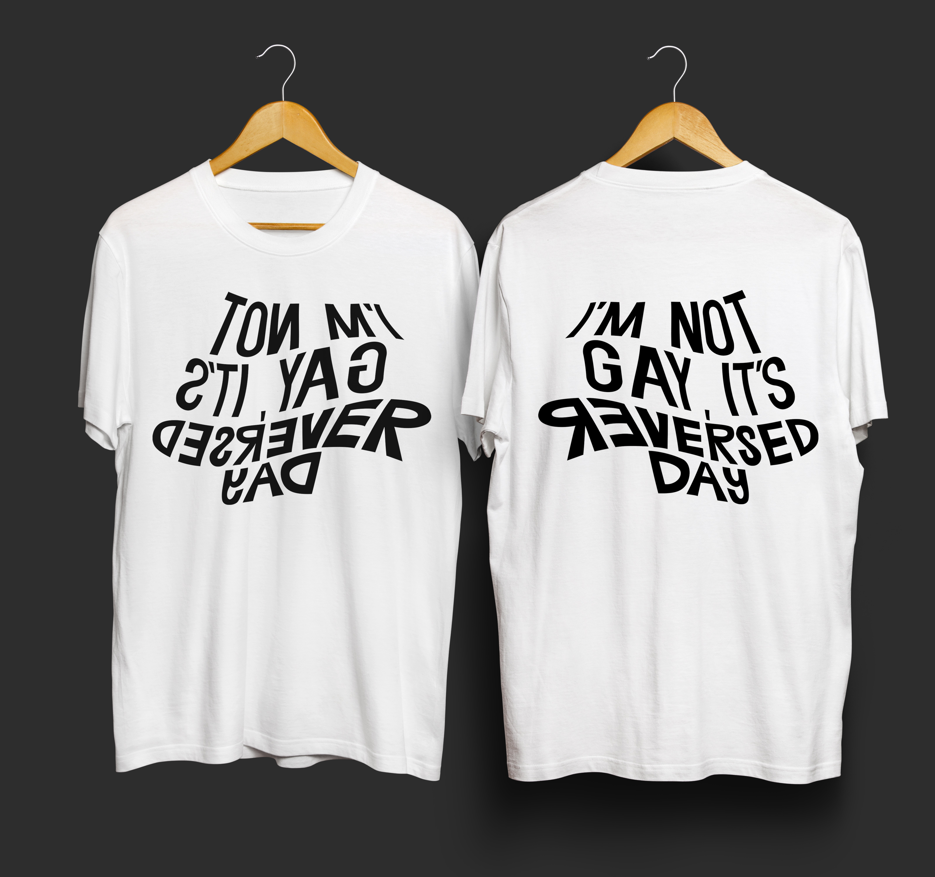
“Then what if they really are gays?”
No problem, I got the perfect thing for them.
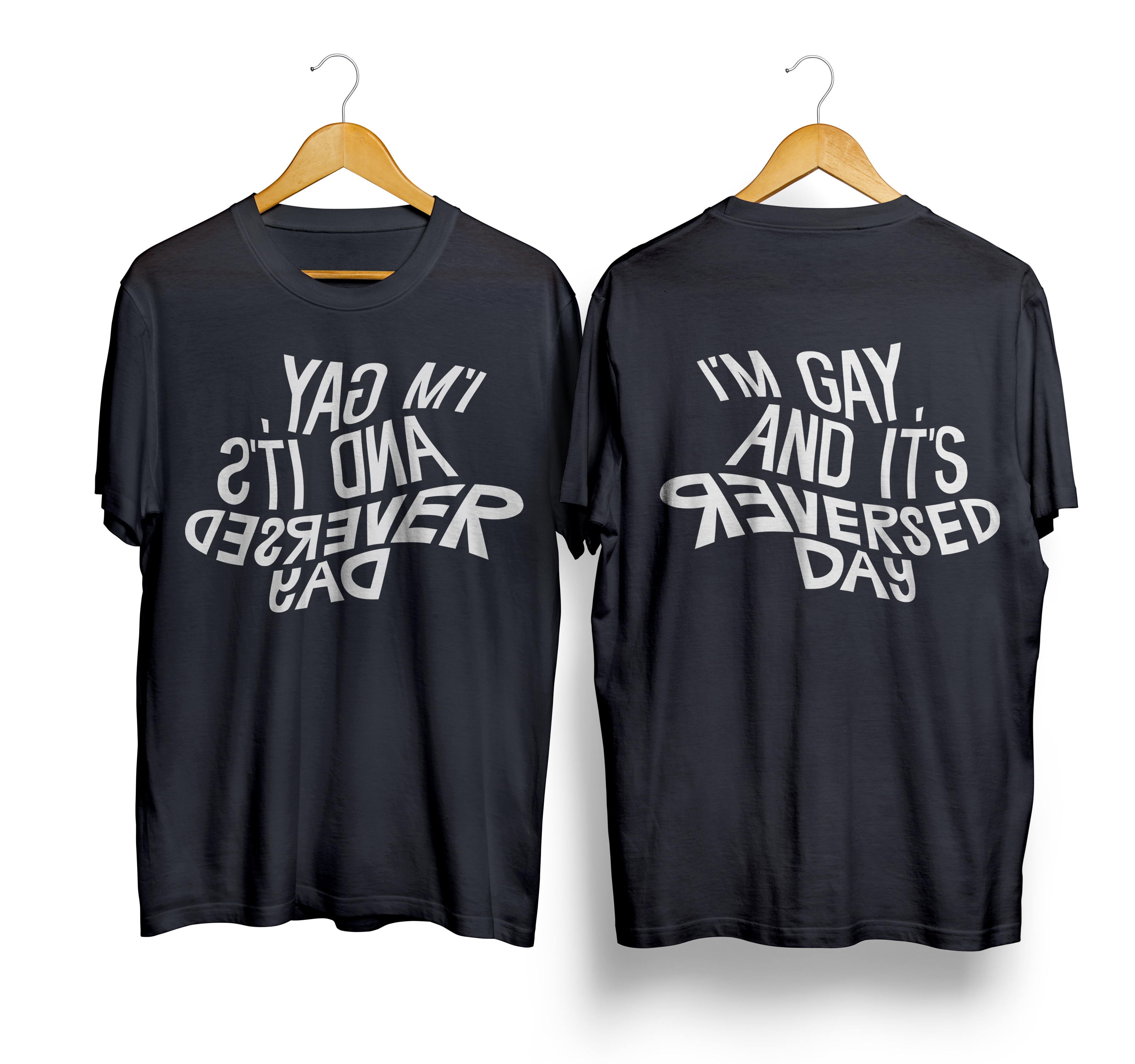
And yes, both of the t-shirt designs have white and black version of them.
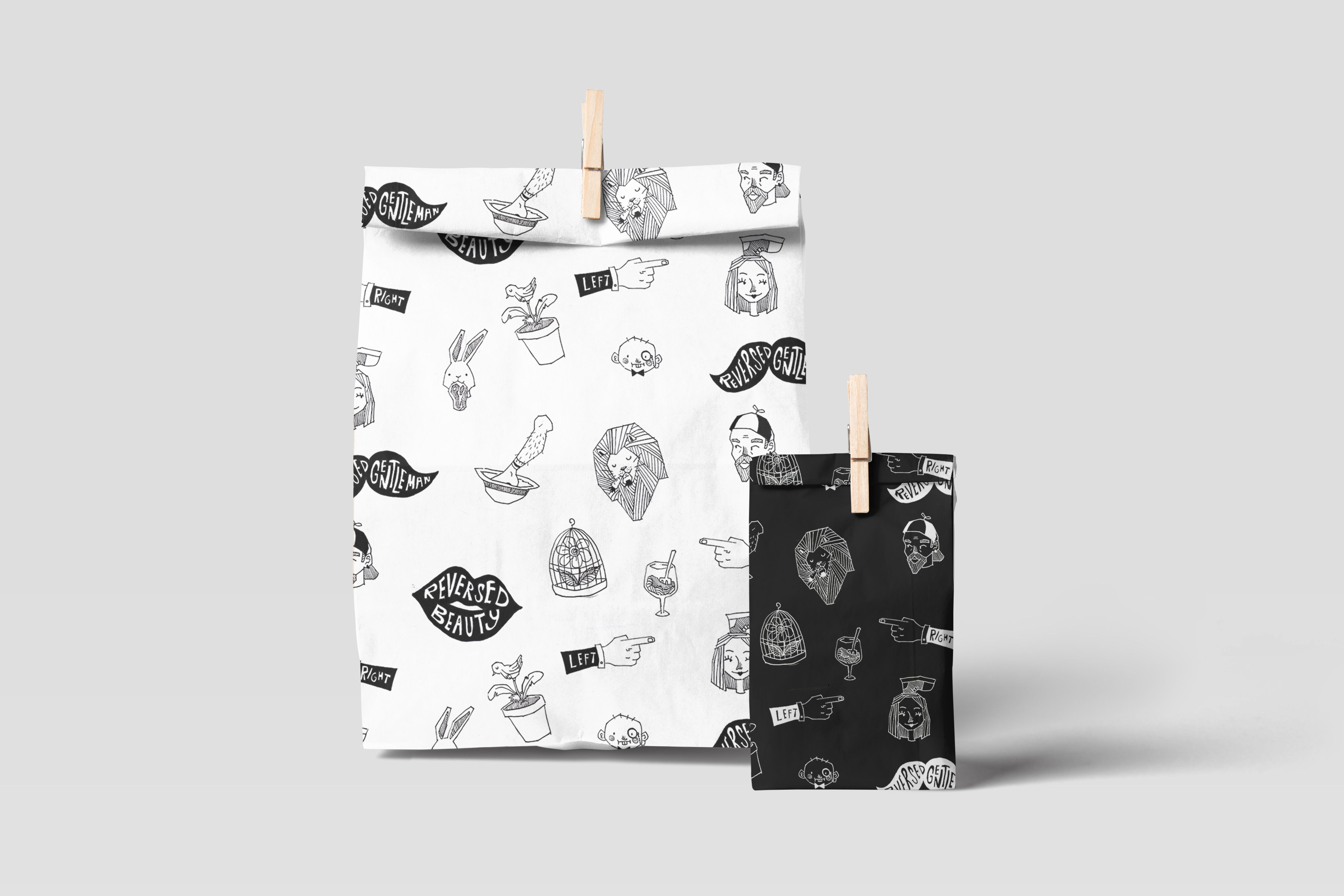
The main thing is the paper bag. It is the paper bag for buying the merchandises. It is random whether you get the black one or the white one. I love that I could finally use these repetitive patterns for one of my items. I really love how it came out to look like in the digital mockup.
Overall I had so much fun, although pressured at the same time because I was in dilemma in enjoying and giving my all for this project, or focusing on other projects instead. I felt that I gave my best for this one and very proud of what I came up with! It’s a bit hard because I never had experience in designing for items, but I overcame it ( I guess?). Also, its a bit difficult since my color pallette was only black and white. Then again, its a bit easier since I don’t have to think too much about the colors.
And hence, that’s all for my third assignment! Now onto the Japanese Exam lol.