Here are all my attempts for this assignment.
For poster, as you know from the previous post, I already came up with the final one. But before reaching that point, I got lot’s of trials and errors.
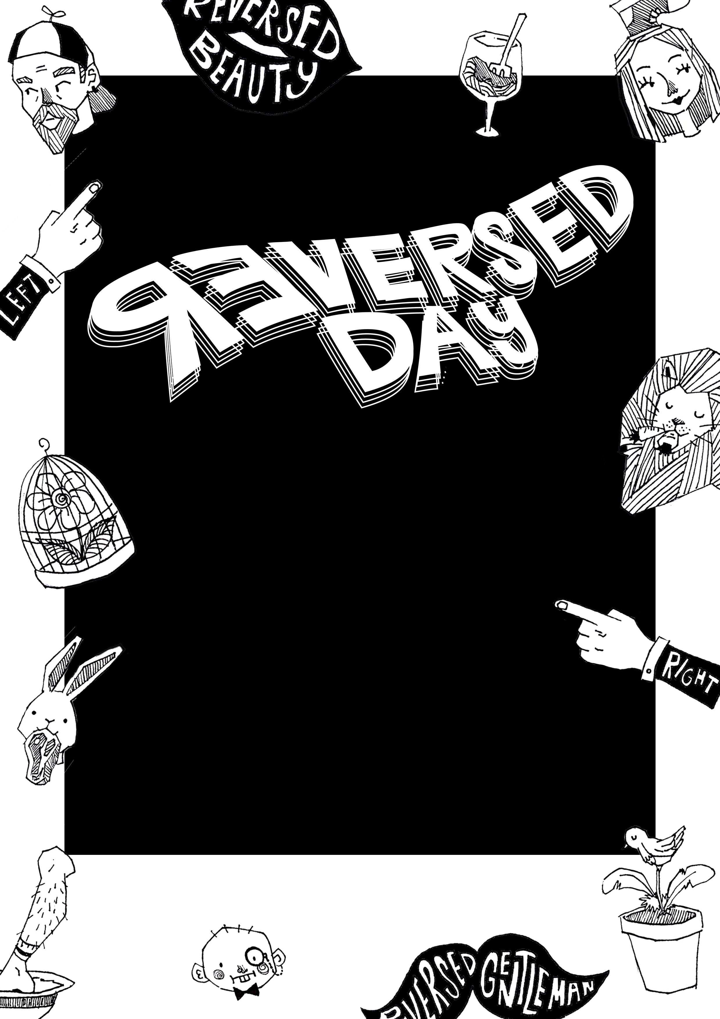
Yep, that’s a lot. I didn’t pick them because they lack the idea of ‘reverse’. The only thing reversed is the ‘Reversed Day’ logo. Then I came up with my final. It’s on my next post!
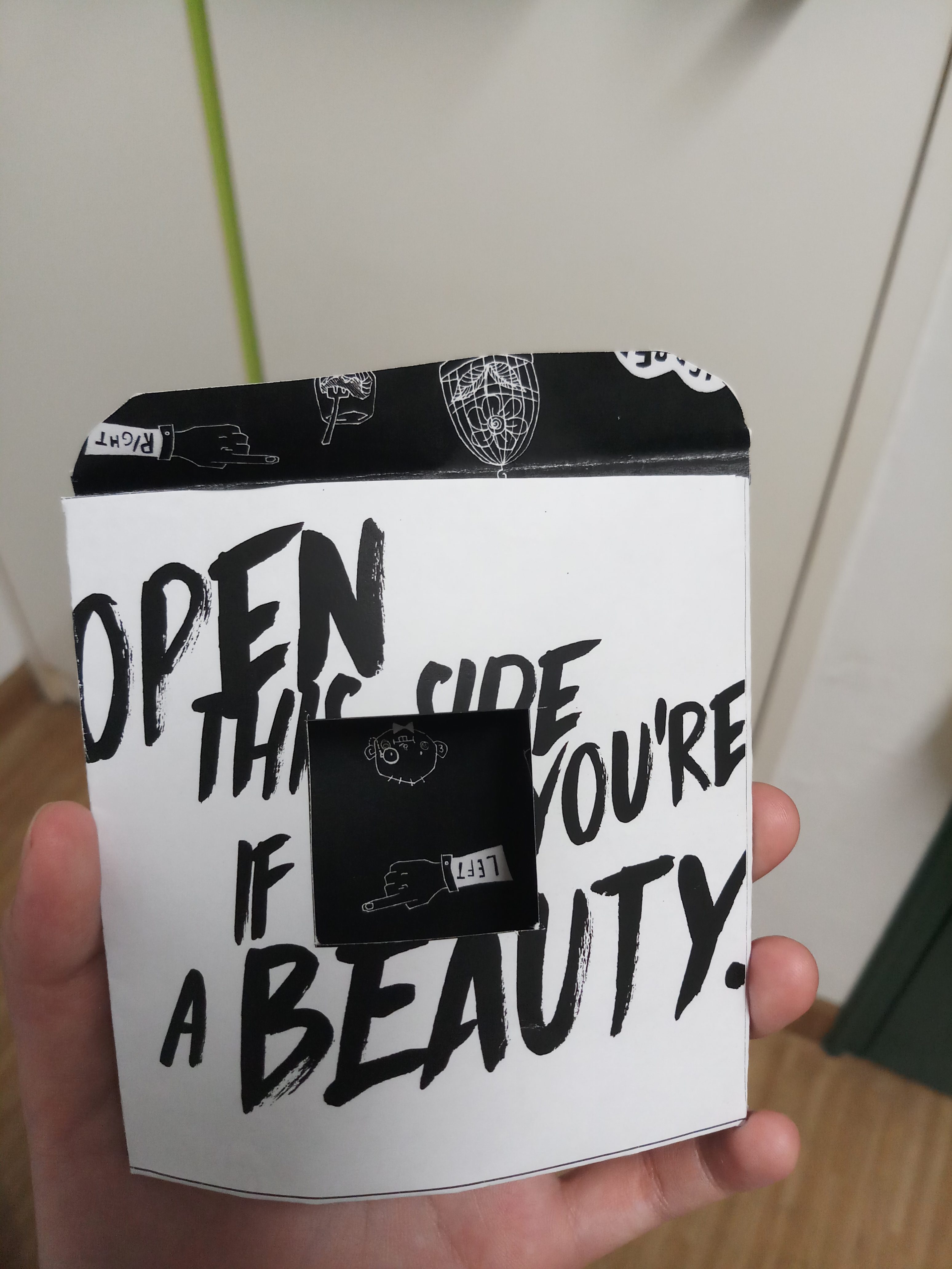
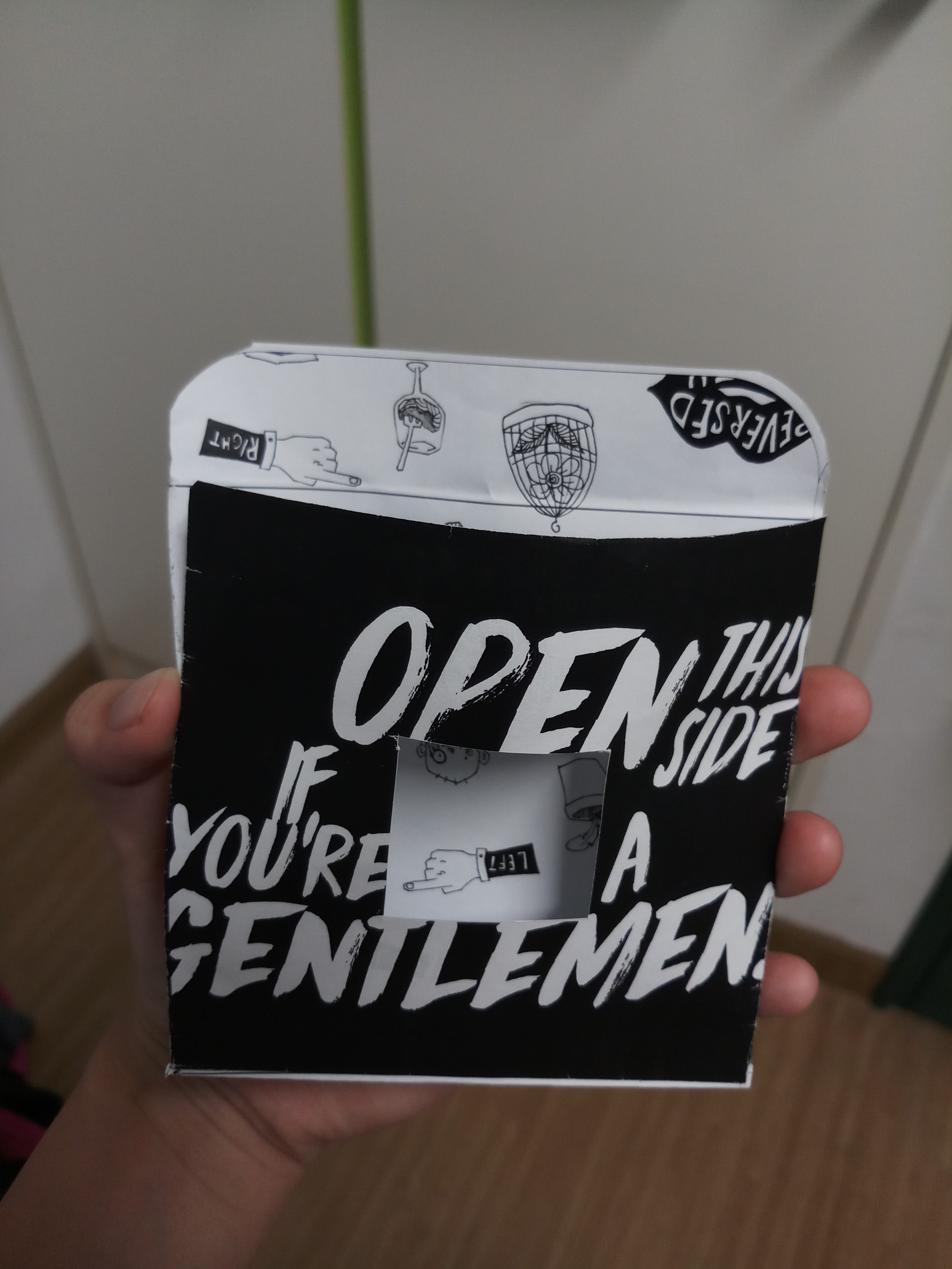
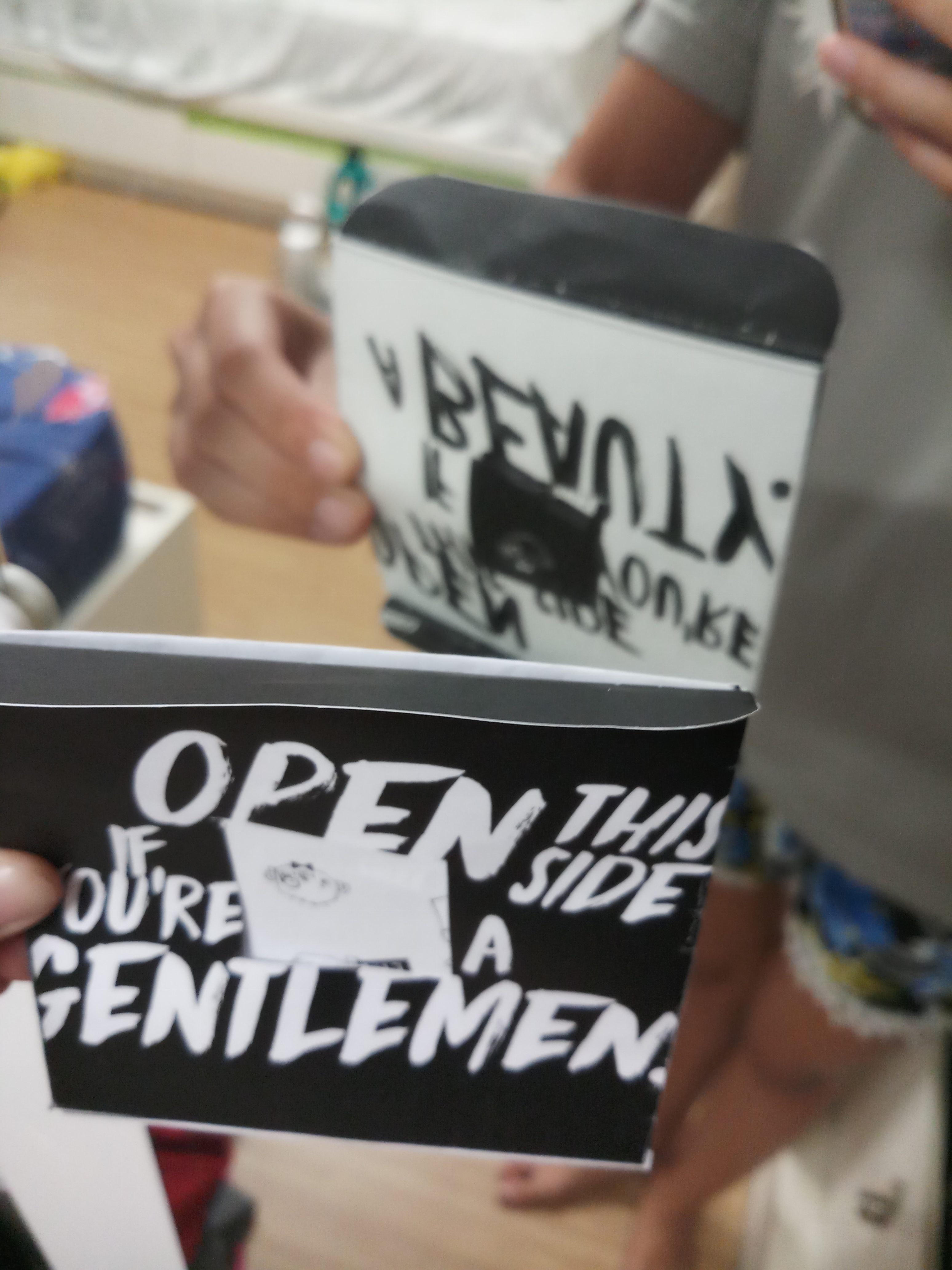
For the invitation, I tried to test print my previous design to see how the cut out will work. Honestly, it’s a bit too much? The envelope is not working so well. I thought by inserting the flappy part (?) into the envelope would solve my problem regarding it. But it became diffcult to open and also, it’s hard for the person to find out which part is meant to be open. Especially the hole in the middle gives the ambiguity to rip off the envelope through the hole lmao.
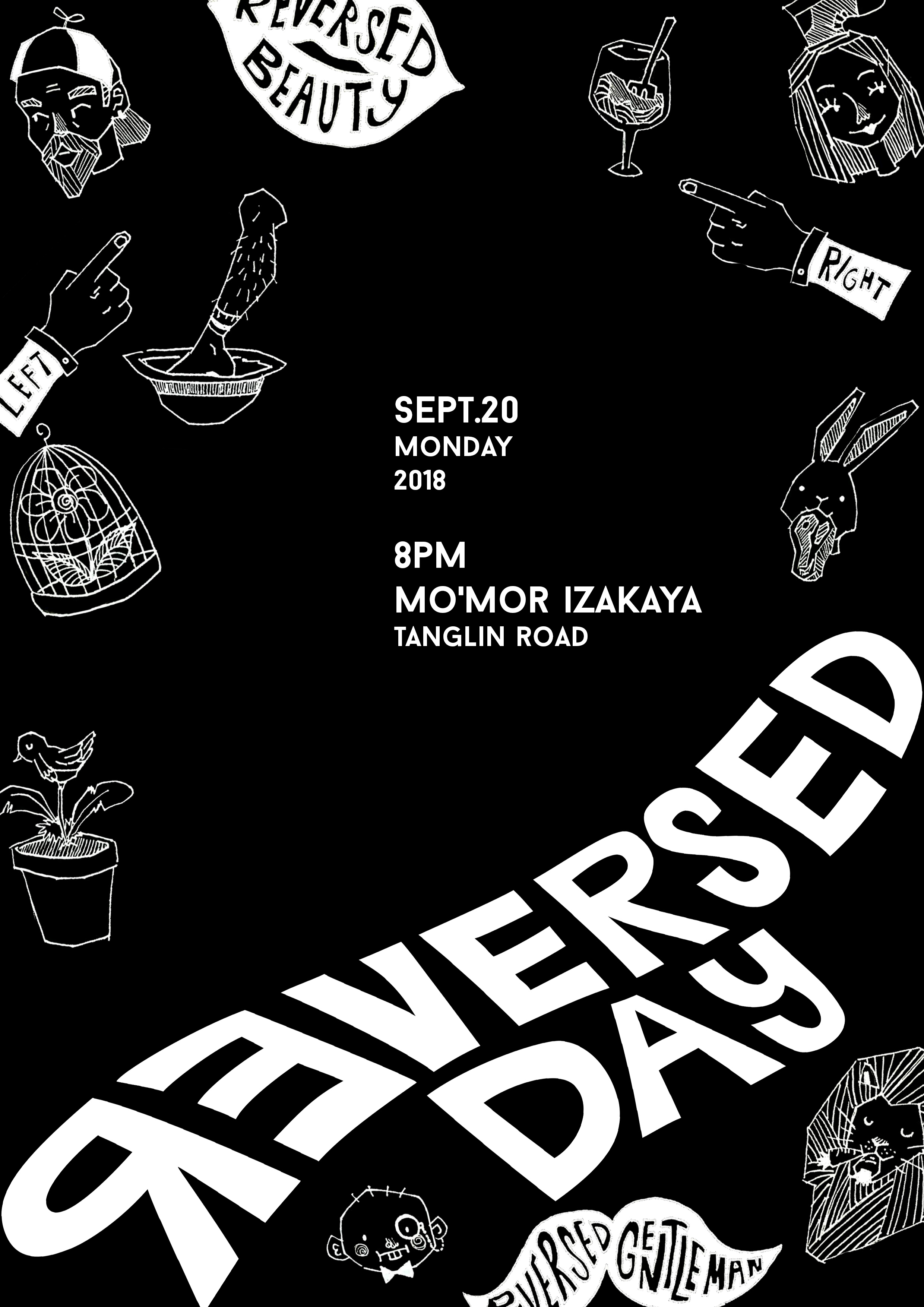
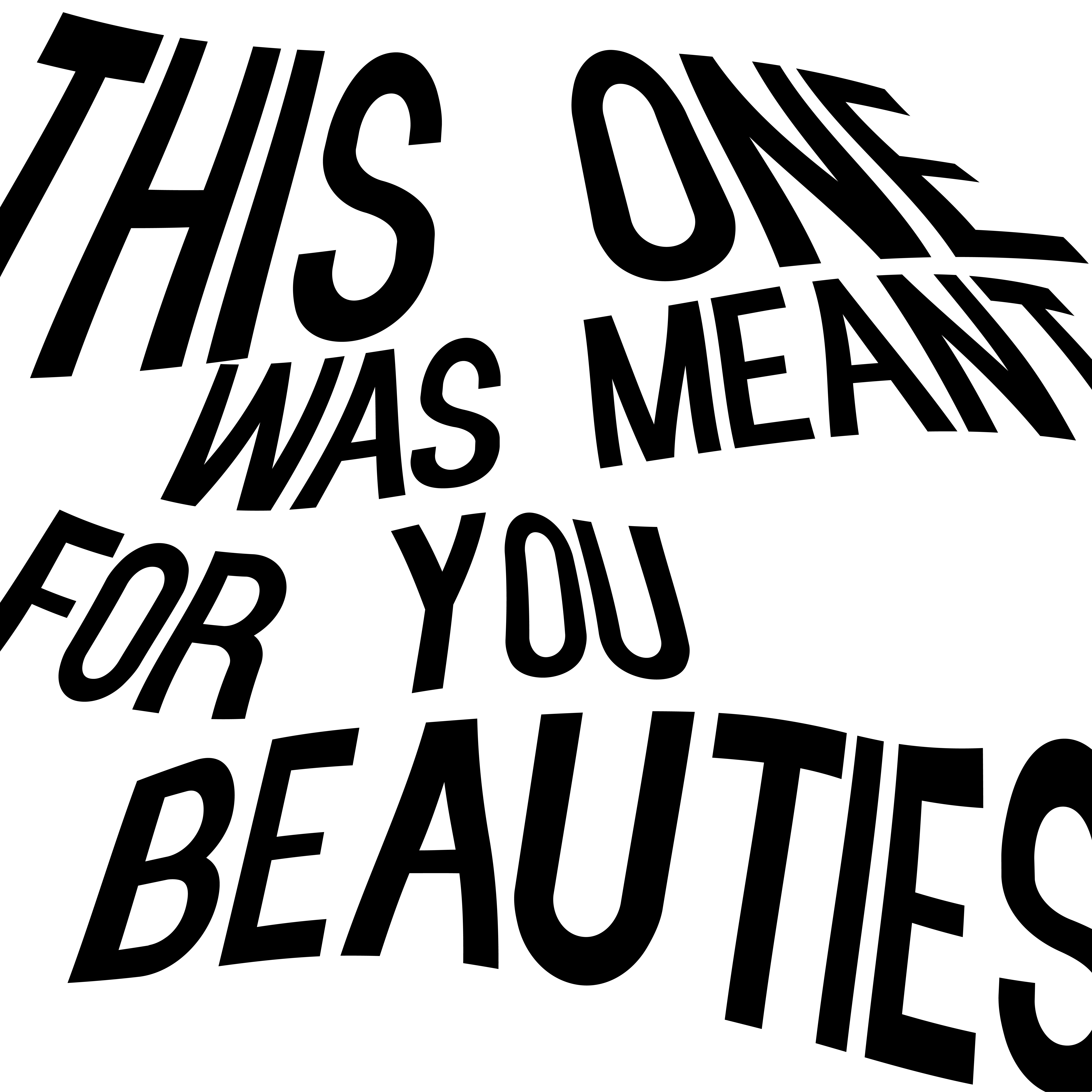
Then, I tried lots of stuff and came up with these new designs because the initial one didn’t match my poster.
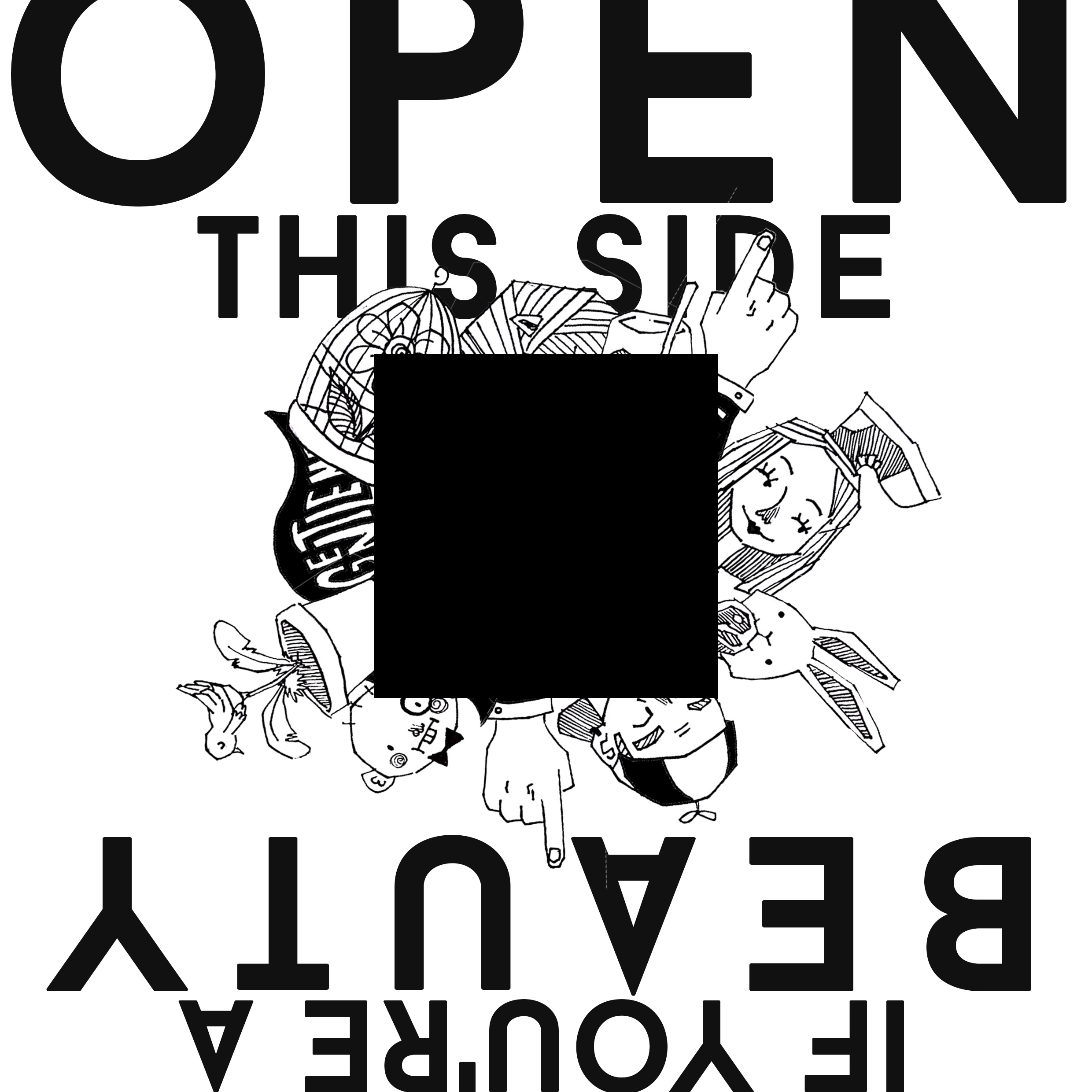
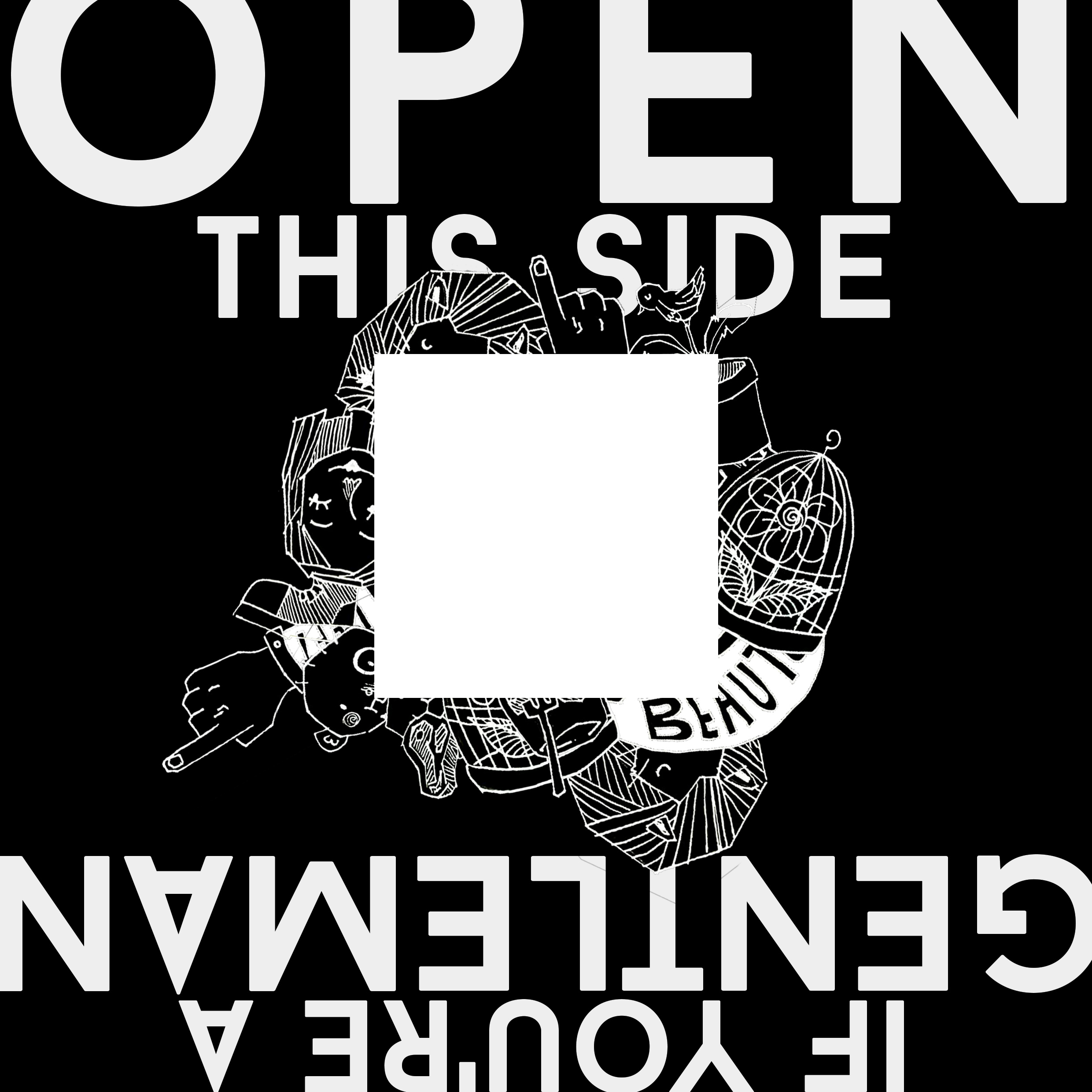
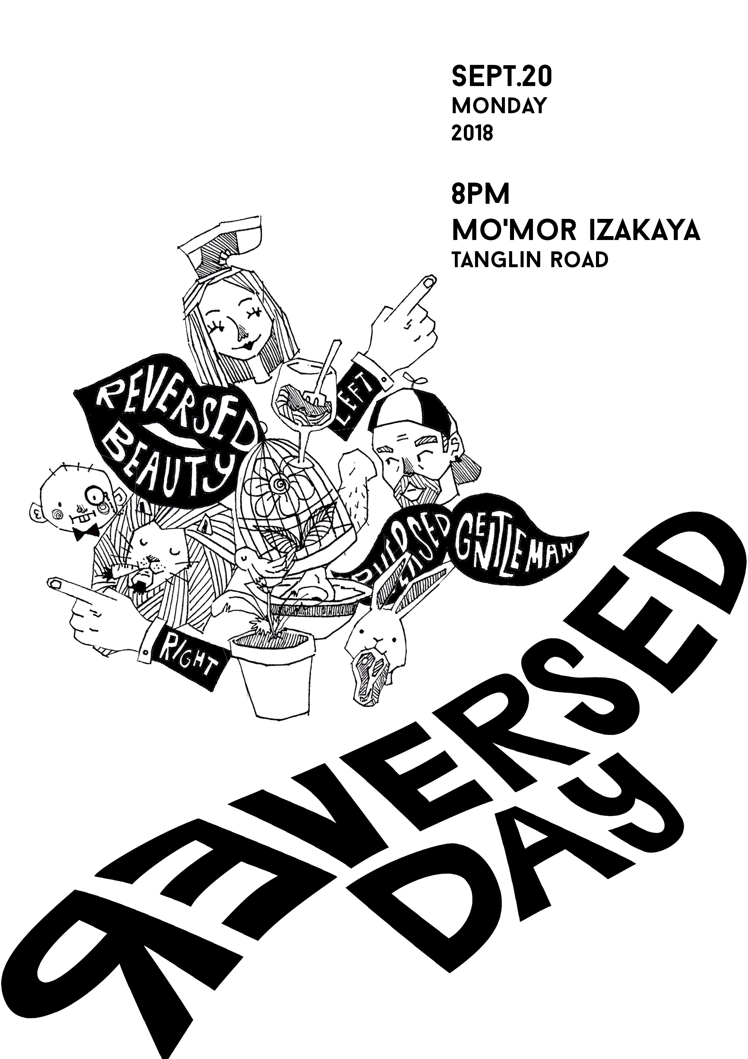
I was very confident about it, and was ready to print. But then my friend told me that this one is a bit ‘too much’ and seemed like out of the family. Then came my mental break down moment lol. That’s when I realized that making my invitation a bit ‘interactive’ with the hole and stuff is what limits my brain, so I decided to neglect this. Because of that, I think that printing is unnecessary now. I decided to make warp text as one of the themes. Here’s the design I came up with.
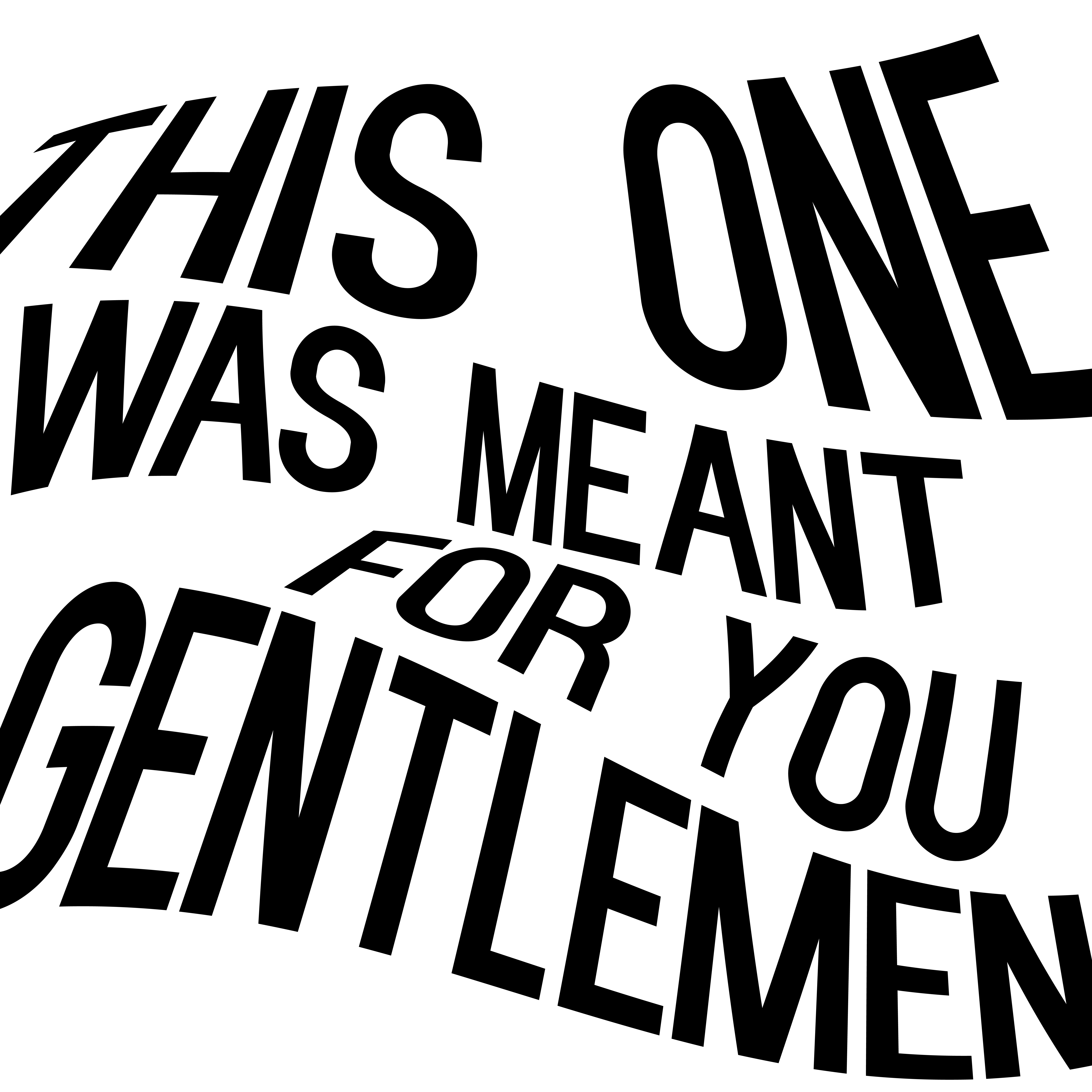
Yeah, I didn’t reverse the color for the gentlemen one. But you’ll see the final mockup on my next post!