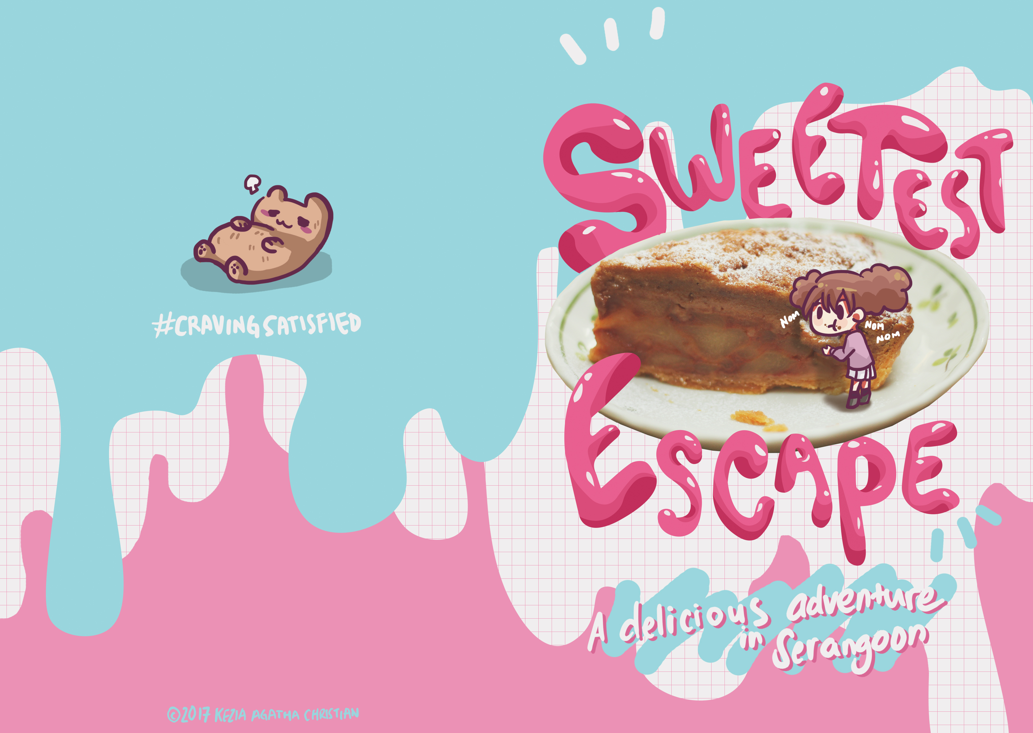
First of all, the colors. The four main colors are pink, blue-ish turquoise (?), white, and brown. But, for the brown color, it’s more for the foods, because most desserts I feature are all brown.
First of all the characters. I thought a lot about this one. I was thinking to make two characters, one guy and one girl. But then it will be too overwhelming and will overshadow the dessert content. Then I decided to make one girl and an animal character which is considered as friend, not a pet.
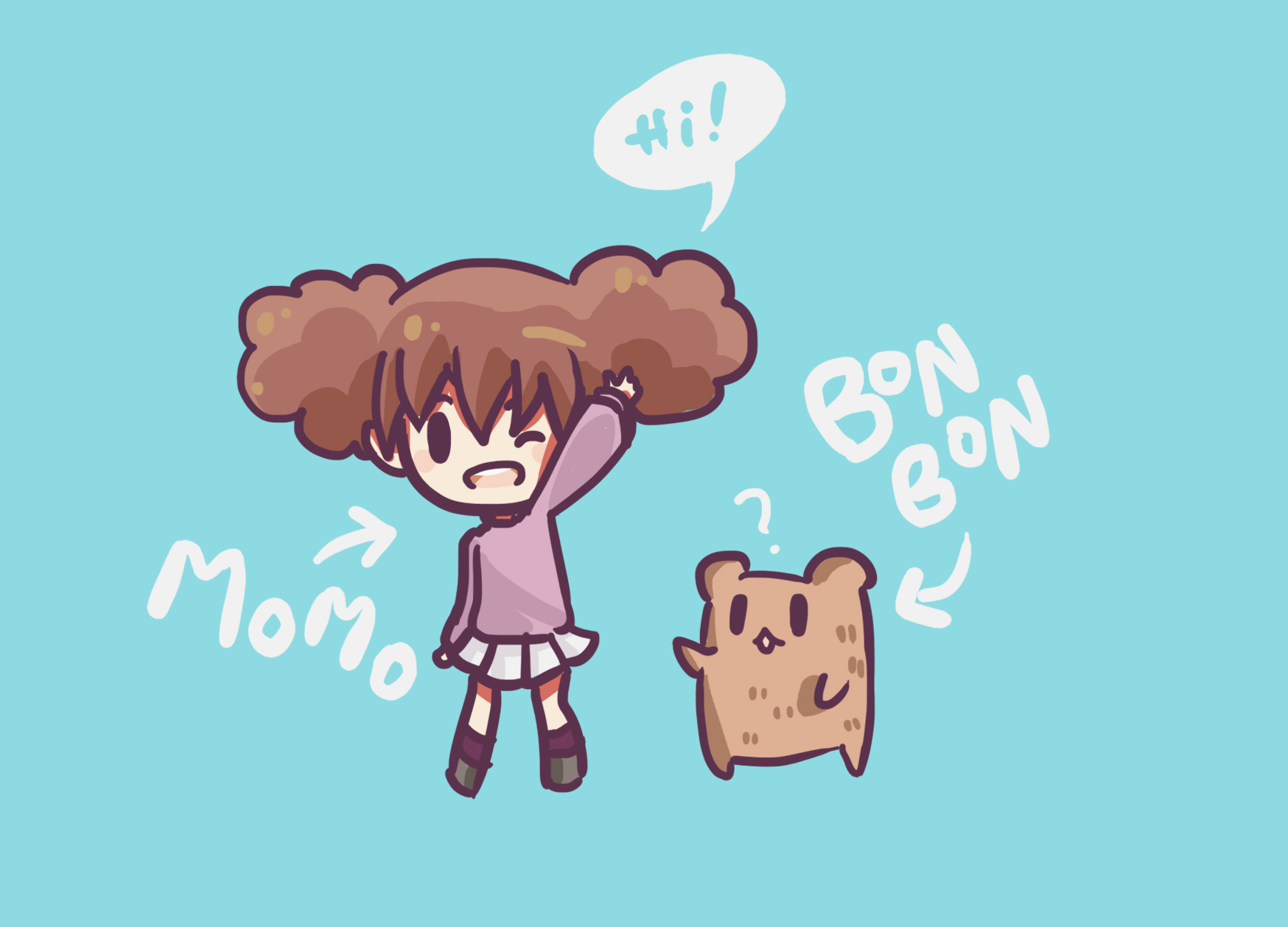
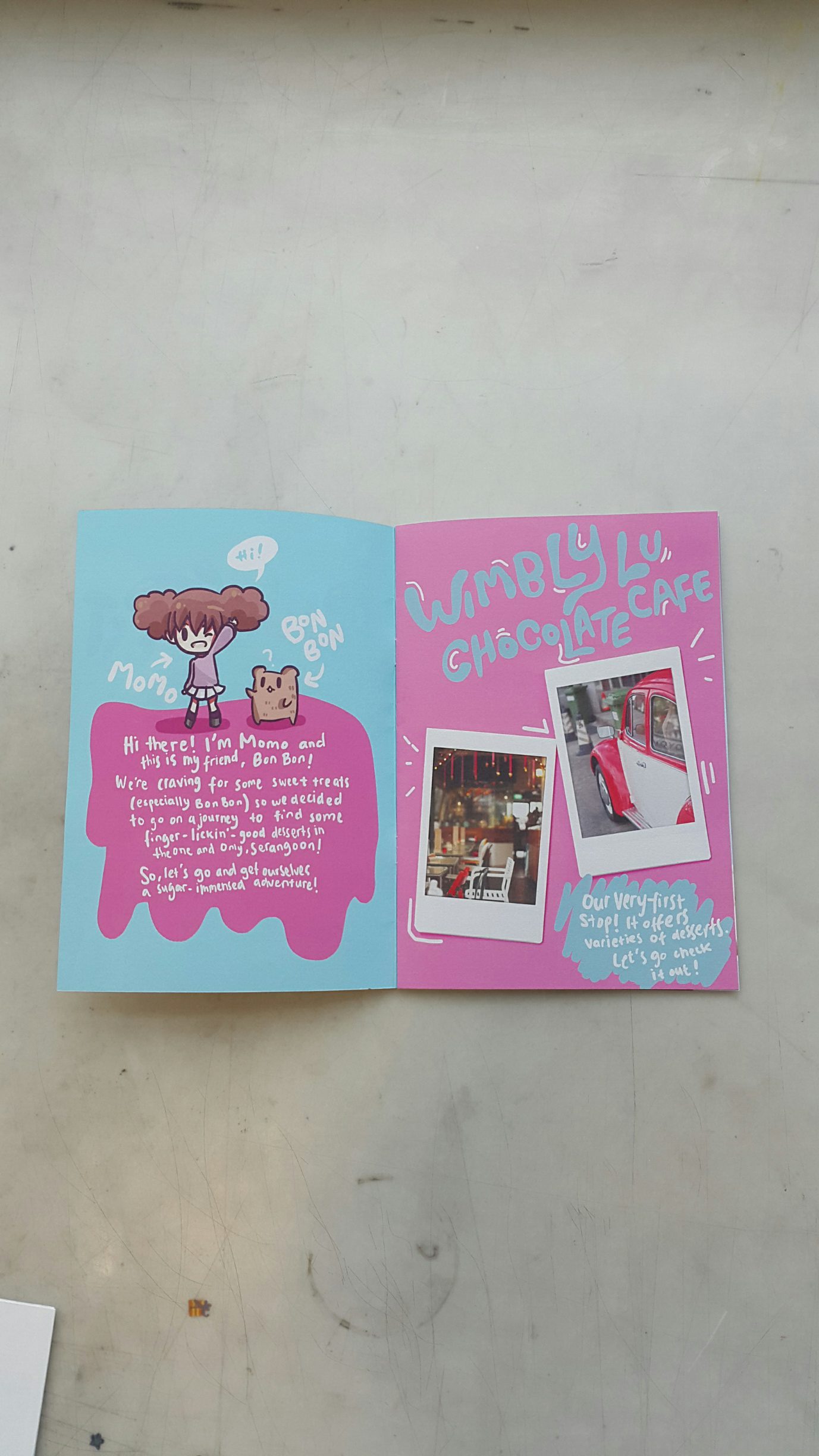
Momo and Bon Bon, my characters!
For the cover. I want to make it eye-catching in a very hipster style. I decided to use my own handwriting for the whole zine to make it more casual. So like from now on, every text you see in this zine process is all my handwriting. I use no typeface at all and Mimi said its a good choice to do so. Especially because of the choice of typeface that I decided to draw. So here’s my first experimentation.

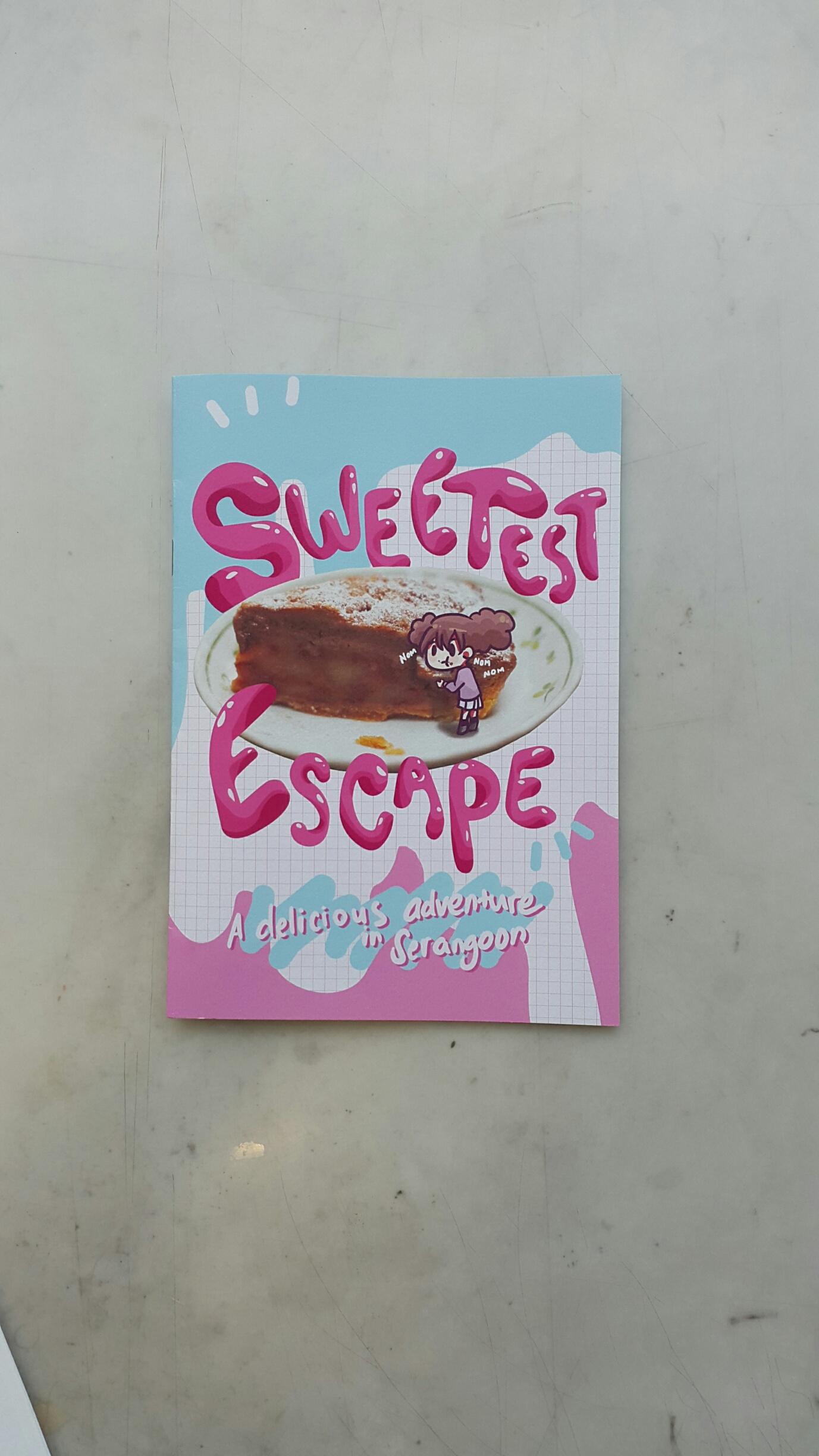
I use Adobe illustrator for this one which is the application that I never touched in my whole life :’)) So first I drew it with my tablet on photoshop then I image traced it which took me more than 2 hours omg. Why I choose the title as Guilty Pleasure is because at first, I wanted it to make the zine so tempting that people wanted to buy the foods I feature. But, then it doesn’t match my characters. Because it’s more like a cute concept. So, in the end, I go with the cute concept. I changed my title into Sweet Escape. Also, I wanted the cover to connect with the back cover, but not forcing it too much. So I link the front and the back through the background.
Also got a feedback that the cover should feature my characters and one of the food picture, to give an idea of what’s inside. I put Momo at the front and Bon Bon at the back to make it linked and more interesting.
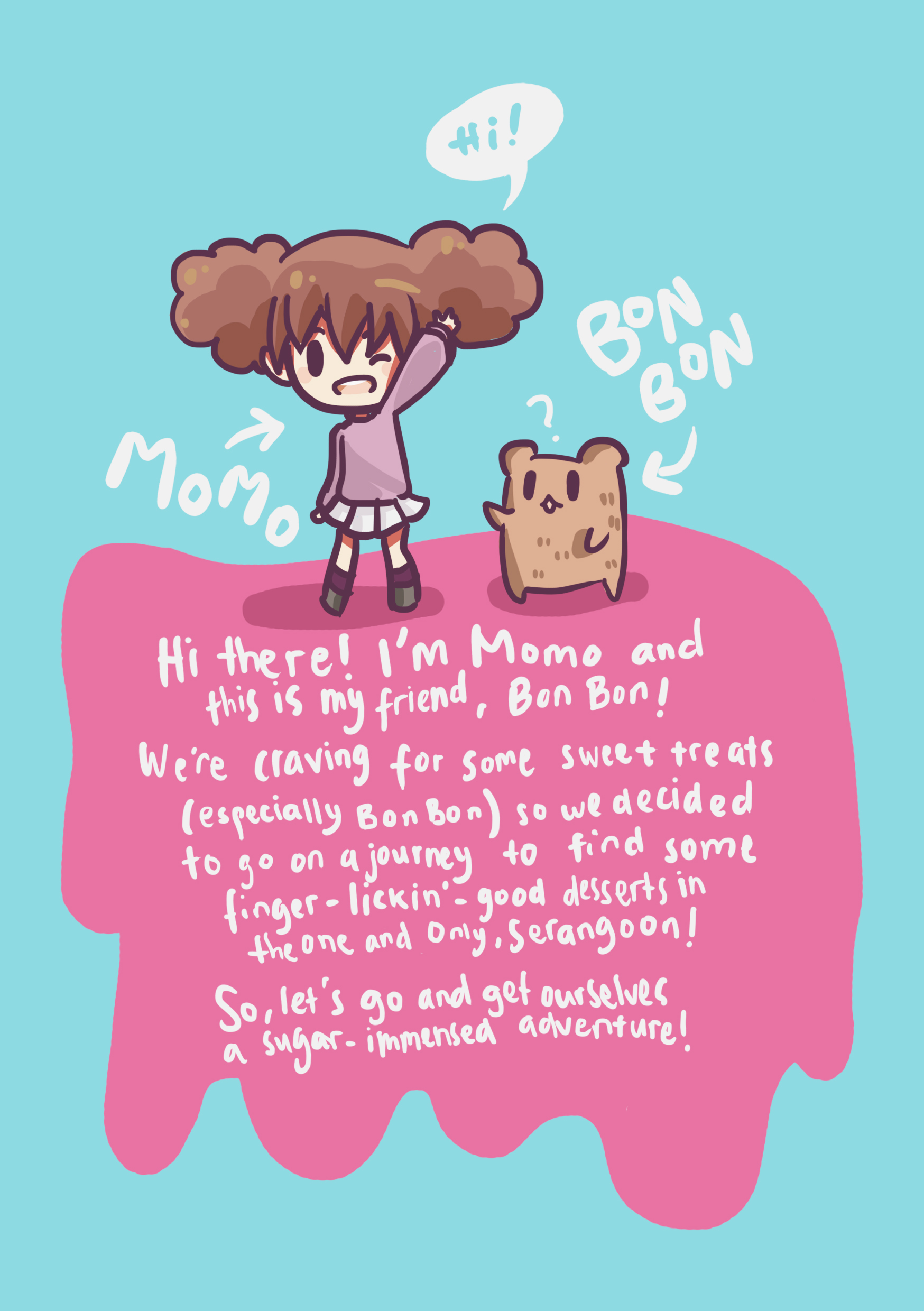
For the content, at first, I wanted it to me more graphic. So, it will feature a few texts. Such as only for the name of the cafes and food. But then, Mimi told me the content is not interesting enough since it’s too obvious that it is a zine to promote desserts in Serangoon. She said that since I have characters already, why not make a story out of it? I think this is a very interesting idea. Before, I used the author(me)’s perspective to introduce this zine. But I changed it into Momo’s perspective (since Bon Bon can’t talk. He’s a bear omg). So, Momo will introduce herself and asked the reader to join her for her adventure in finding the best desserts in Serangoon, since both Momo and Bon Bon crave some. So here’s the introducing page.
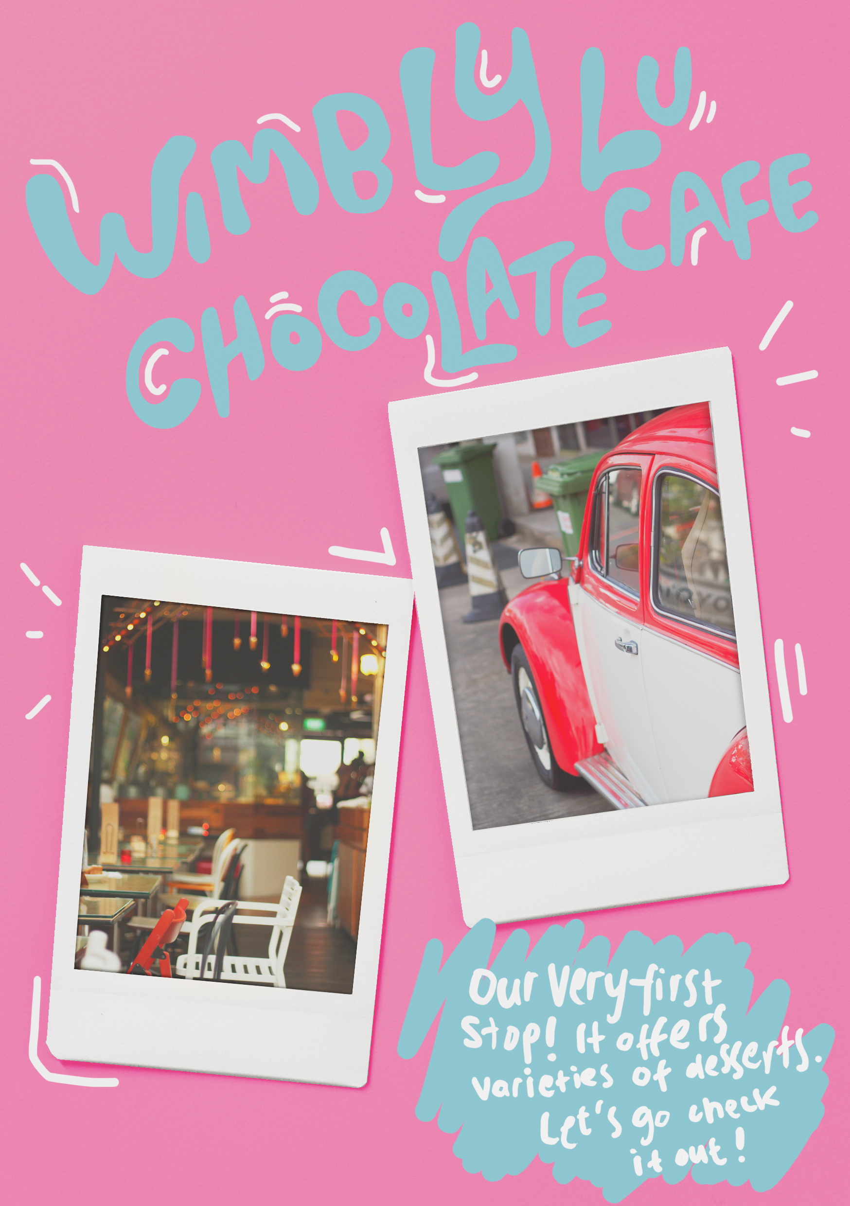
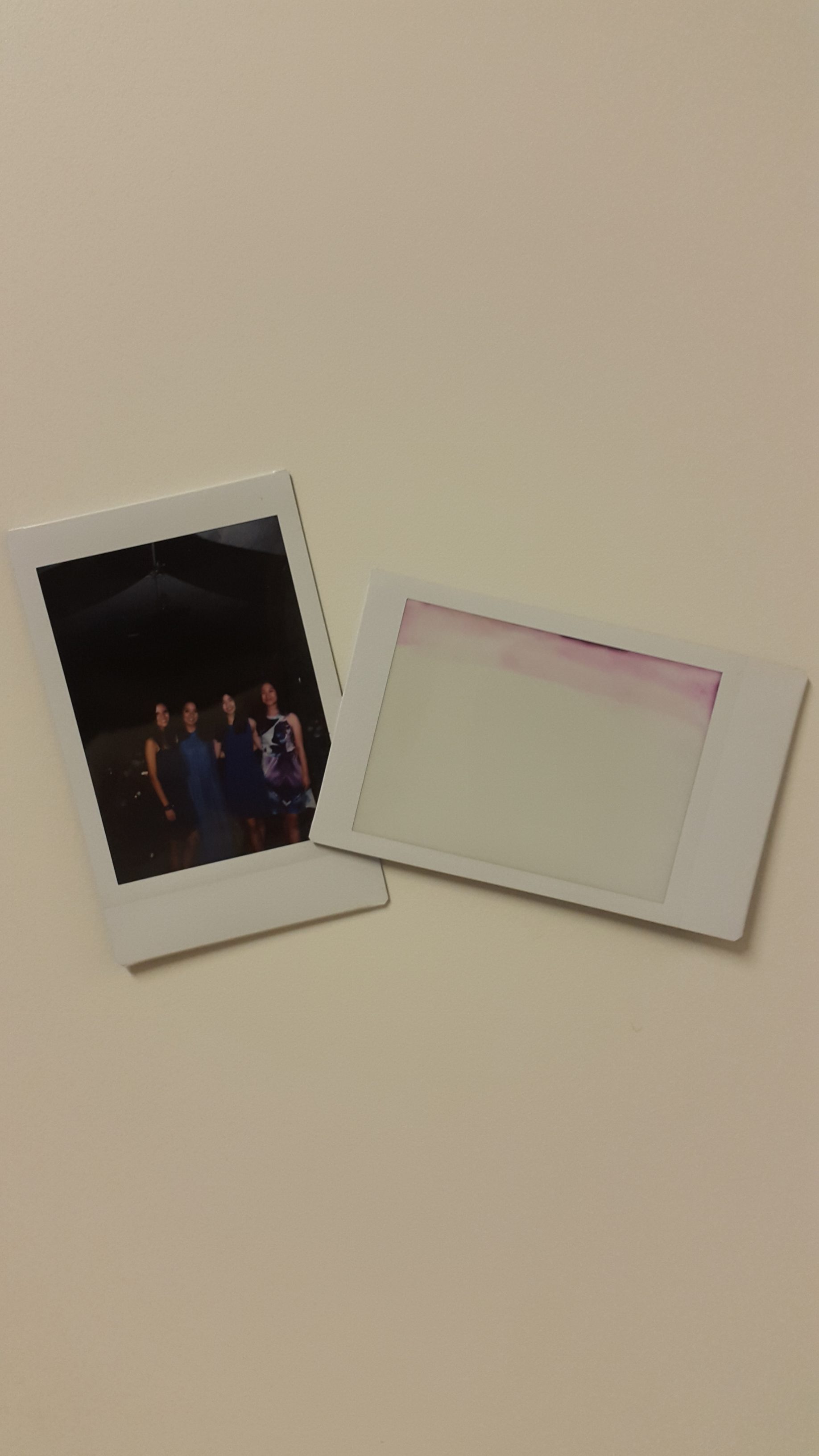
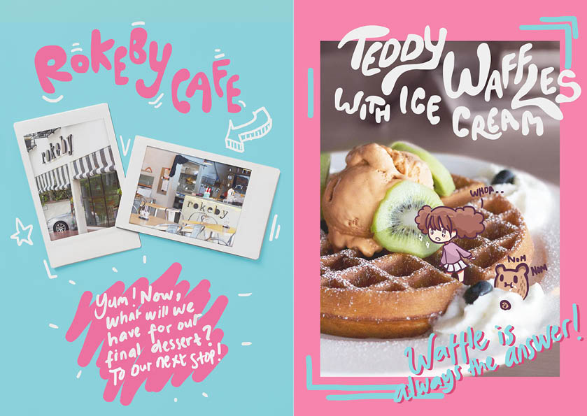
For the locations, I was very confused at first. Mimi told me to feature the locations of the desserts inside the food picture, at least just a gist of it. But, I thought it won’t fit my idea. So I wanted to introduce the locations first, then the desserts to get. However, I don’t know what’s the best way to feature the location pictures. Then, I was reminded that I have polaroids on my wallet. Since I will put doodles on my zine, why not make it a bit like journal-ish? So I took picture of my polaroids and then photoshopped it. Also, I used more casual way of speaking to the readers to make it more interactive.

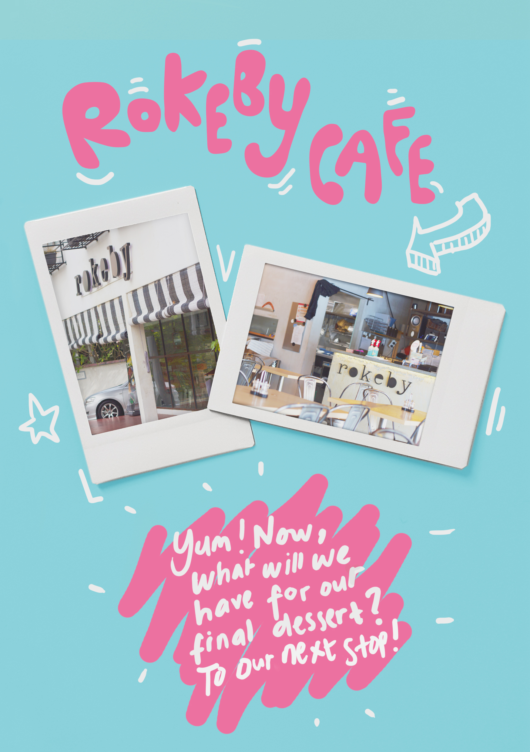
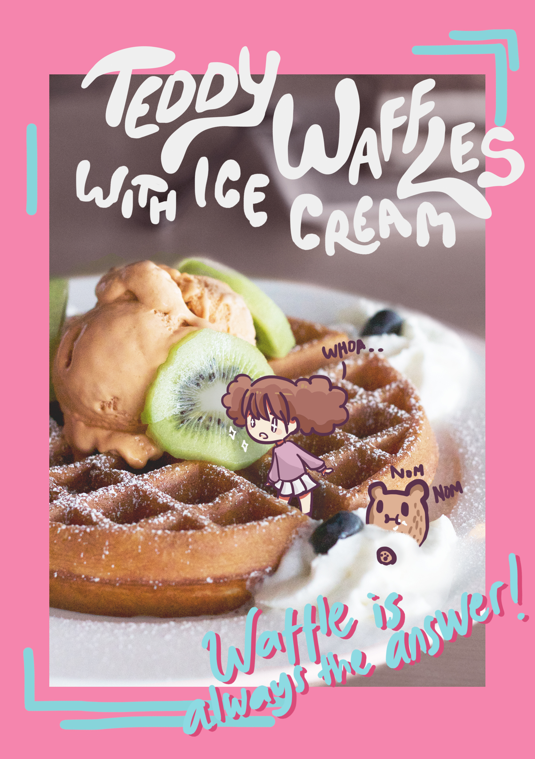
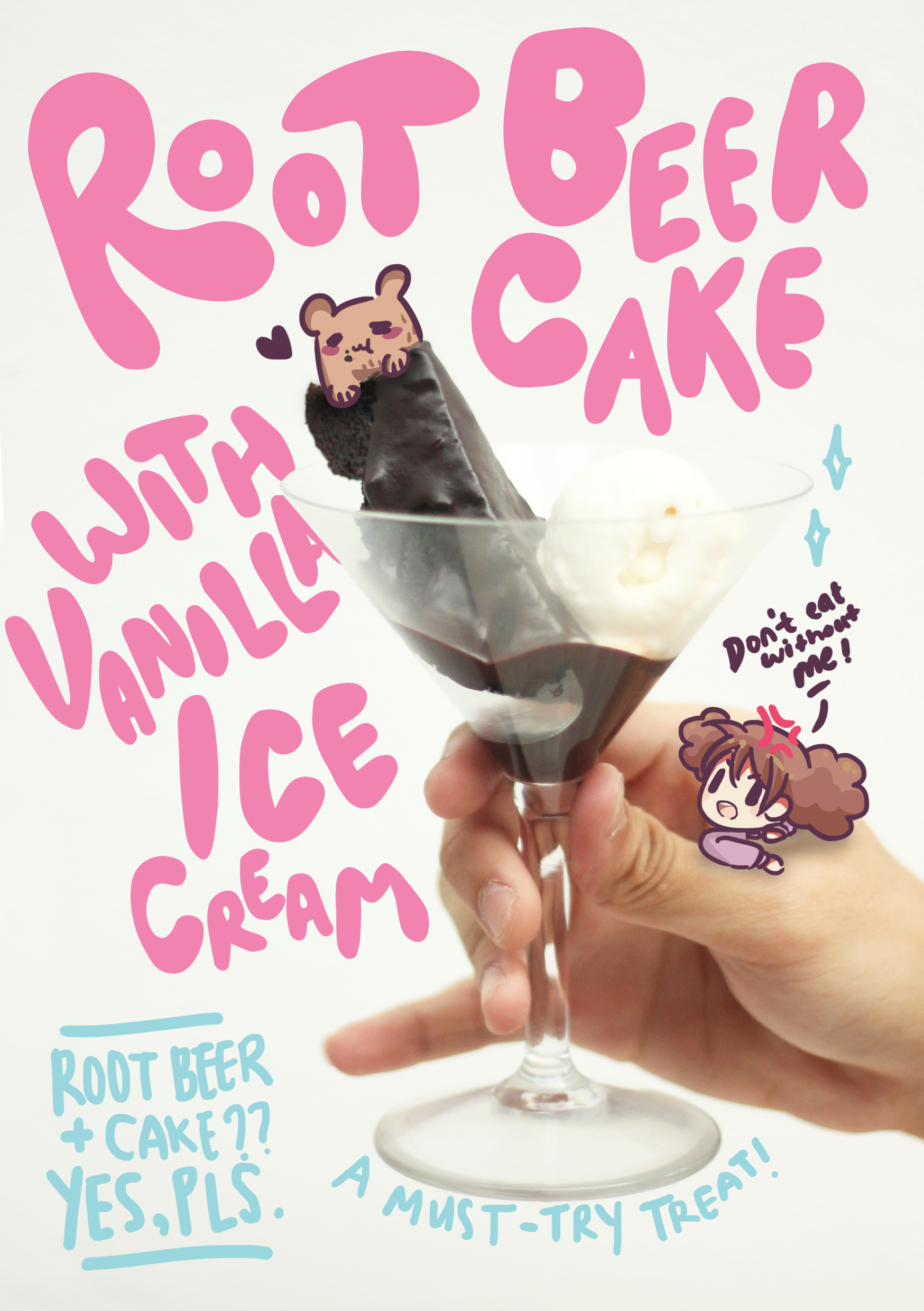
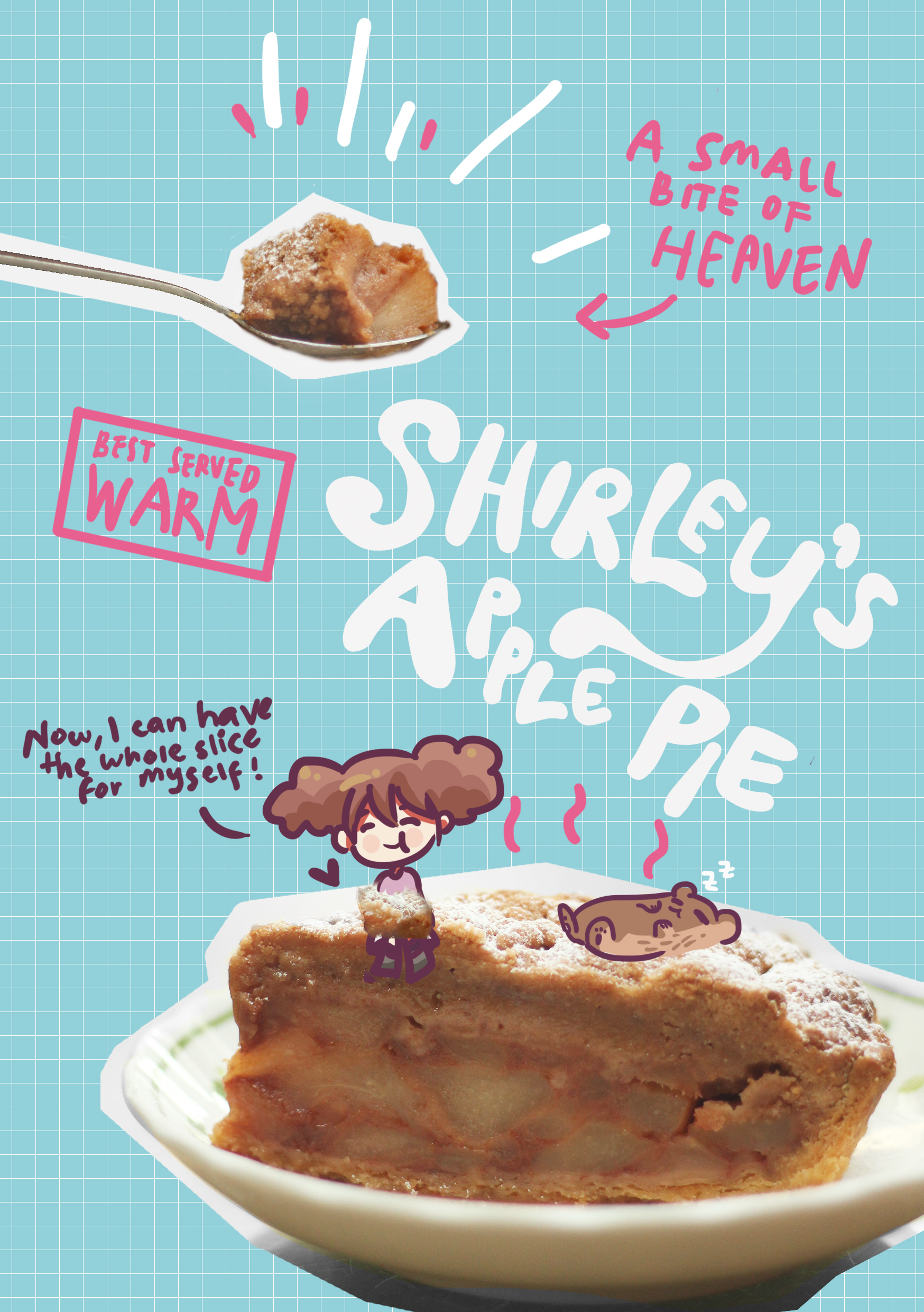
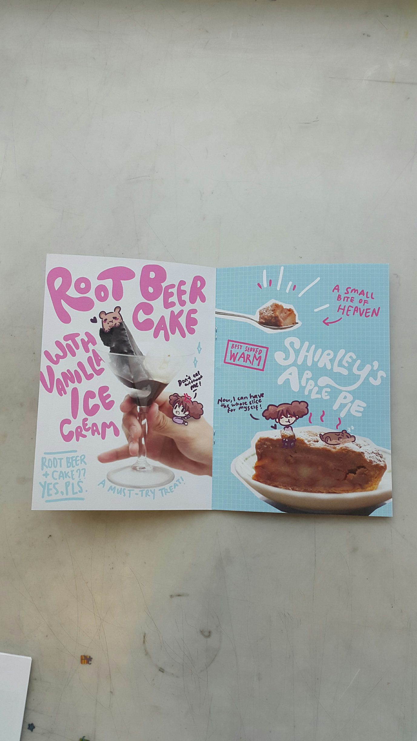
For the foods, at first, the pages only featured the picture of the food, the two characters, and the name of the food in different ways. Again, Mimi said this has no content and not interesting. Too advertising (?). So I put some of my thoughts of the food and like a bit narrative aspect for both characters in it. Also, I tried to make each one of them different from the others to make it unique and a bit inconsistent, but the colors, doodles, and characters link them. To make it not boring and make readers interested to find out how will the next page will look like. So here’s the content.
Andddd it’s done! So here’s the look in order.


Time for printing!
I printed it at Out de Box in Sunshine Plaza. It’s so expensive for Indonesian standard :’) But, man, the quality is damn nice. Especially since I used my own paper that I bought in Fancy Papers. I forgot the name of the paper but it is 135 gsm and has a bit rough surface, which is just the way I wanted it to be. I like the result very much!!

REFLECTION
I seriously love this project so much. Making my own zine, thinking of layouts, drawings, and printing, it’s all so new to me. I gain lots of experience. Not to mention I enjoyed the process very much since I got to explore Singapore more and eat non-NTU foods! Also, I think I got better in drawing digitally more than before. I also learned on how to use illustrator, thanks for those who patiently taught me this. I’m very proud my zine, especially since mine has a very different style from the others which made me gain more confidence (specifically, since I messed up on my first project lol). Thanks Mimi for giving me chance to learn and have fun at the same time!
1 comment for “Neighbourhood Explorer – Process and Final Outcome”