Creative Industry Report: Polly Nor

Khairunisa Helmi U1730864L

Images from magzter.com

The Artist that inspires me with her work is Polly Nor. Born and raised in London, Polly is a contemporary freelance surrealist artist that graduated with a degree in illustration from Loughborough University in the UK. The design works she is most known for are her hand-drawn and digital illustration works on social media. She is even commissioned to work for well-known brands such as Gucci, Dr Martens. The Illustration style she goes for, warts- and -all drawing style that portrays features or qualities that are not appealing or attractive. The Images are bold in their colours and strong in their use of black line works. Documenting her relationship with herself, by visualising thoughts and feelings as physical beings ‘demons’

Images from pollynor.com


Her drawings of women and their demons entwine themes of identity, sexuality and emotions. Her Illustrations often tell stories of complicated relationships, mental health and the struggle for self-acceptance in the internet-age using negative emotions such as Frustration, anxiety, and sadness to fuel her creativity. Polly expands her works to various forms, from accessories, books, stickers and T-shirts. She even has three solo exhibitions in London. In one of the exhibitions called “It’s Called Art Mum, Look It Up” included a full collection of the digital illustrations, alongside original ink drawings, sculpture work and an immersive installation room. Her exhibition was a success. What I have learned from Polly are, not all designs are created based on something perfect, sometimes you just have to work on the imperfections and turn it into an impactful outcome. There will always be potential and opportunities for you to expand your work even beyond what you started with. You just have to see where it could go and how far it can be pushed.

Images from pollynor.com


Applied illustrations- Process & Ideation

IDEA Introduction

Express Yourself is a mental health/stress management awareness event for tertiary students. An event filled with fun activities, consultation booths, talks given by professional student counsellors and also sharing session from students experiencing stress with school, on how they overcome it. This event is to spread positivity and ensure students know that expressing themselves at the right platform may help them ease their education journey.

Target Audience

Tertiary/ART Students [age 18 – 25]

– Polytechnics & Universities

User Persona:

4 Illustrated Collaterals

  • EVENT POSTER
  • INVITATION CARD
  • INFORMATION BROCHURE
  • DOORGIFT CHOCOLATE:

– Do nut[not] worry (Nuts flavour)

– Enough to milk[make] you happy (Milk flavour)

– The raisin[reason] to make you smile (Raisin flavour)

– The raisin[reason] not to go nuts[crazy]!(Raisin&Nuts flavour)

– Bitter[Better] make you feel good! (Dark Choco flavour)

Visual inspiration


PROGRESS sketches

EXPRESSION SKETCHES

Expression Sketches


FINAL WORK: Applied Illustration- Express Yourself

EXPRESS YOURSELF

Final collaterals design.

Express yourself event poster
Invitation Card for students
Mini Information Card with tips and helpline contacts on one side. On the other side are tearable cards with motivation quotes
Doorgift Chocolate with expression input – Different chocolate flavours that comes with its own puns.


Express Yourself is a mental health/stress management awareness event for tertiary students. An event filled with fun activities, consultation booths, talks given by professional student counsellors and also sharing session from students experiencing stress with school, on how they overcome it.

VAROOM-Sketches & Final work

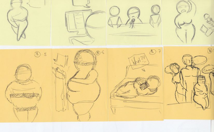
I decided to work on an article “Facebook censoring a 30 000 years old Willendorf statue” and I think it would be fun to play with the censorship issue for uncovered historic statues that also faces censorship issues. With the theme “PLAY” chosen, I tried giving this statues a moment of life similar to humans! Making David the mischievous one and Venus de milo telling him to shut up. Here my sketches towards the final product!

SKETCHES:


FINAL WORK:


MOCKUP:

Assignment 1: Inanimate Portrait – Final work

Self-Portrait

A foodie rider represented by a vrooming BURGER Bike. Going on a trippy road trip juggling my favourite snack and noodle cup! As we know, life ain’t a smooth road. Holes designed with white paint splatter presenting the tough side in my journey.

Portrait(Vanessa)

A portrait of a very talented lady who is really into crafting. Not forgetting her love for Japan and Washi tapes presented by pen, marker and paper cutting art. Using non digital medium to really represents her love for craft. Origami of Sakura flowers to emphasise on who she would love to visit Japan again during spring!


Assignment 1: Research and Process

Bringing forward the Interview answers here my research process for both Portraits.

Self-Portrait

  • Eating: Maggie, snacks, fast food
  • Love how food sparks Happiness, a ‘guilty pleasure’, balancing food intake.
  • Riding is a dream came true. Love my cute scooter! 
Supersize Them: Fast Food Illustrations by Mr. Misang

Portrait (Vanessa)

  • Crafting: Resin crafting, Polymer clay, Origami
  • Journalling: travel journalling or bullet journalling
  • Spending time with family(Games/Card Games)
  • Love Japan! Want to visit Japan during Spring.


Japanese Papercut Street. Dotonbori Osaka

Illustration For Designer : Class Activity

WEEK 1:

Entopic Graphomania

For our first lesson we had an activity called Entopic Graphomania. It was my first time doing it. It really challenges the ‘perfectionist’ side of me wanting my work to be perfect and not defects. However, this activity focuses on the imperfection in a work that can be turned into something perfect! And also input from others could change the outcome of something.

The final outcome of my Entopic Graphomania drawing surprised me when it turned out looking like a BAT.

WEEK 2:

Draw the shapes!

The first activity we did in class for the second week. Forming shapes based instructions given. It is interesting to see how everyone has a different outcome and understanding of the questions.

15 mins Portrait 

The second activity we did was a 15 mins portrait of a partner in class. It is to really focus on our partner, look them in The Eye and sketch them out based on what we see. I was lucky that I had 2 person drawing my portrait. It was really interesting the different illustrations produced by every single one of my classmates.


WEEK 3:

Assignment 1 research and ideation

For Assignment 1, I started with an Interview with Vanessa and understanding more about her likings and fear. Here are my questions for her:

  • What sparks happiness in you?(can be more than 1 object/activities/moments)
  • How would you describe yourself in a word? And why.
  • What is your biggest fear/what are you afraid of?

Based on the interview I decide to focus on things that sparks happiness in us.

Deliverable 2:”A Little to make a difference” Campaign Website

A PLATFORM

-Easy and accessible platform(Apps/Website). A platform that connects and access all(Volunteering/Fundraising/Donation)

To encourage people to give, you need to make it easy for them. Therefore, a platform where they can easily access the different giving platform they would like to contribute to is my second deliverable. Website is adaptable on mobile phones as well making it easy for the audience to access.

WEBSITE -DESKTOP FINAL


WEBSITE -MOBILE FINAL


PDF FILES:

https://drive.google.com/drive/folders/189XpsM1DLI2ZONd00NC-FNV6h615-PMw?usp=sharing

Deliverable 1: “A Little to make a difference” Campaign Poster & Banner

A Reminder

-Sometimes all they need is a reminder(Visual Campaigns)

There are already so many available associations and charity boards, there is no point in setting up another one. It’s about encouraging one to start giving. As we can see so many campaigns out there in Singapore. Campaigns on saving the earth, saving water, being kind campaign and health promotion campaigns. There are not many campaigns on poverty encouraging people to give or help the committee living in poverty.

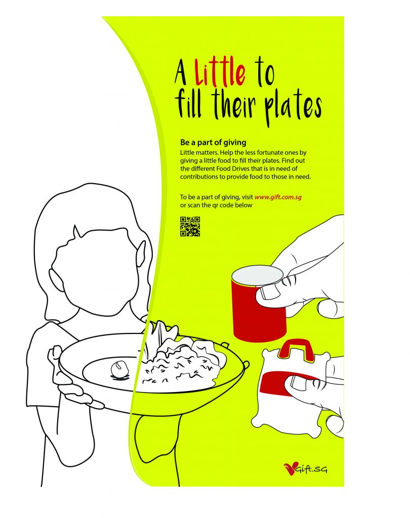
Solution: A poverty campaign that encourages the audience to be a part of giving! And know that a little help matters. They don’t have to give much.

First Mock-up

Answering Candice question on why are the hands huge in the posters making it ironic with the idea of “little” in the poster. What I wanted to emphasize were the items that the hands are holding. Which is small if it is hand size. Therefore, representing the idea of ‘little’. The little you give matters.

FINAL WORK

Poster 1: Food drives
Poster 2: Clothing drives
Poster 3: Charity
Poster 4: Volunteering work
Poster 5: General rectangle banner
Poster 6: General square banner


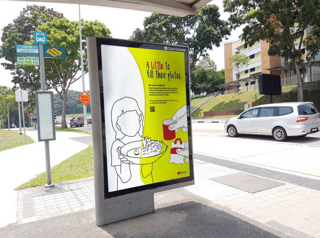
MOCK UP

Posters and Banners published in public areas such as bus stops and MRT stations.