Poverty Infographic

Poverty in SG

The topic selected was on poverty in Singapore. This is because poverty issues are rarely discussed and shared with the public. Based on the survey I’ve made, I realized that people don’t know about the poverty statistic in Singapore. And how it is a rising issue in this well-developed country. In my Info-graphic poster, I wanted to emphasize on the increasing percentage of poverty and the numbers that are suffering in poverty.

First mock-up
Second mock-up
Final work


Edited version after given comments and critics from presentation day.


Exploratory Research- Survey results


Awareness of the existence of these associations is through Television(News/Ads), School events.

From the Survey, not many are aware of the percentage of the population that is depending on Financial Assistance. Mostly know the beauty of the country being the top wealthiest c Not knowing where and how to donate is one of the main reason for not being a part of giving, followed by thinking that their donations are too small to make a difference and not trusting the association.

The survey is extracted from young adults of the age 20-30. This group of people is a good group to focus on, as they are at the age where they can do more. And they are people who are close to social/digital media platform making it easier to reach out to.

Exploratory Research

  1. Freedom to travel for Wheelchair users

– Traveling to new places can be hard for wheelchair users, not knowing the availability of accessible route for them.

– Wheelchair users are allowed to travel and explore new places without having fear and doubt.

Solution: Application for Wheelchair users, Web sharing platform.

2. Care for Caregivers

– Being a caregiver is not an easy job. Taking care of the disabled and the elderly can be a big challenge faced by caregivers.

– Without help and assistant, the stress and tiredness can put a toll on the caregivers.

Solution: Campaign? App?

3. Awareness of Child Marriage

– “12 MILLION GIRLS ARE MARRIED BEFORE THE AGE OF 18. THAT IS 23 GIRLS EVERY MINUTE. NEARLY 1 EVERY 2 SECONDS.” by girlsnotbrides

– Young girls deserve to be what they want and not forced on something they don’t even understand.

Solution: Virtual experience to raise awareness

4. Awareness of Poverty

– “More than 1.3 billion live in extreme poverty” by dosomething.org

– It’s unfair how we the fortunate ones live in comfort having everything we need while more are suffering from hunger and not having enough to live.

-Raise awareness for the fortunate to appreciate what they already have and even share what they have with the less fortunate ones.

Solution: Virtual experience to raise awareness

Dialogue in The Dark reflection

An overwhelming feeling of fear, hesitation, distraction, discomfort, the trust placed fully on our guide. One of the main challenges is actually to take a step forward. Our minds are filled with thoughts that are overpowering. Following the trail is hard but it manages to bring us to our destination. The hard part is when there is no wall or rails for us to rely on. That’s when the fears and difficulties felt more overpowering. The daily necessities or facilities some felt like it is not catered for the blind. Our guide told us regarding the sound of the traffic light that will be switch off at a certain timing due to petty reason “too loud and noisy for the residence at night”. The safety of a human being is more important than the petty reasons sighted ppl had. Role-playing allows us to understand and experience the way and the experience the blind have to go through. Being aware of it allows us to design and cater better for the visually impaired.

The method of role-playing in research of user experience and observation creates a better understanding for us designers. Where the experience can be used to cater a design that specifically focuses on the important and necessary details of the moment experienced.   And not just design based on a survey platform or even assumption where we only tend to choose what we want to understand. Role-playing gives us a first-hand experience. Providing us with the ability to use other senses to work the design rather than just the visual aspect.

The Dialogue in the dark is a good example of the importance of role-playing in research studies. To understand, you need to experience. Some context that can use role-playing as part of the research is sports-related context, by experiencing the sports itself you will know how the athletes feel and the exact pain they go through. Sports for the disabled is one of a platform that requires awareness from the public. And also another context like observing and being part of a special community (elderly, disabled). So that we are able to put what we see, feel and hear into consideration for a design solution.

Manifesto- PAINT YOUR OWN STYLE

Paint your own style, not be painted by a style. Paint your own style, Trends are templates designed for computer and robots, not designers. Paint your own style, Be free to design whatever you want and not just follow a trend to be accepted and recognized. Paint your own style, The Artists of the world-changing art movements painted their own style and they are recognized till today. Paint your own style, Eliminate TRENDS. Paint your own style, Designers need to be accepted for what they are good at, for their own style and strength and not for what you want them to do. Paint your own style, Designers are not robots, we have our own freedom to express and be as creative as we want and not to follow a template designed just to pleased the “by right” eyes of the people. Paint your own style.


Khairunisa Helmi

Locale Joo Chiat Final: My Pun-ny thoughts at Joo Chiat


FINAL PRODUCT


Peer critics and Reflection:

Overall, I’m very satisfied with the final outcome although there are areas that I can improve on. Firstly, I’m glad I’ve taken the decision of making a big change of style and direction. It’s been a fruitful process.

Some of the critics I got were

“Love the Lame Puns”: Glad they actually like the puns even though it’s not that Pun-ny (funny) get it? haha. And some do say that they understand what I’m trying to tell through the texts and with the support of the visuals.

Can explore Typography more: I agree with it, one of my weak skills are typography and I hope I could learn more and core on Typography in the future to further develop my design.

The last page seems off from the rest due to its colors: I just realized that the last 2 pages are a little off due to the sudden usage of a strong color as a background. However, I did apply a little of the same color on the previous 2 pages. But I agree that it does affect the consistency of the colors in the Zine.

Zine does show the identity of the location: I’m glad that everyone manages to get the identity of the location through the zine, however, there is still more aspect of portraying the identity of Joo Chiat that I can explore.

The Idea of an open and close window for the front and back page was good: Didn’t expect anyone to notice that small detailed I’ve put on my zine. However, I’m glad that someone actually notices it and pointed it out with a positive feedback.

I appreciate the critics given knowing that I still have areas that I can actually improve on. Besides that, I’m also glad to see the various styles and works from my classmates. It was surely an eye-opening assignment exposing me to see that I could even step out furthermore from my comfort zone.

Padding + Medic Bag (SILAT)


For this project, I wanted to design a bag for martial art sports called silat. Silat is a Martial that requires padding for training.  Being on the school team, we will always organize a friendly match with the other schools. Therefore, one of the school has to go over to the other for the friendly.

Going over means, bringing of paddings(normally 3-4 paddings for warming up) and most importantly, Medic bag.  I realized, for 1 person (usually the logistic guy) has to carry most of the stuff (unless if he pass it around for the rest to help) is a bit hard to juggle, therefore, I design a bag that could easily carry 3 paddings and also a medic bag. Packing up will also be an easy task.

https://rdxsports.co.uk/rdx-leather-x-strike-muay-thai-curved-pad


https://www.pinterest.com/pin/623256035903938739/
https://www.fotoskoda.cz/lowepro-whistler-bp-450-aw-fotobatoh/?formDiscussion=1
https://www.dreamstime.com/stock-photos-fishing-net-black-white-image21580313
thick, strong canvas material

Process

Final Mockup

Joo chiat-Process

JOO CHIAT ZINE

For this zine, I want to include the past and the future which is shown in the sentences for the different page. Using puns to include some past elements to my thoughts on Joo Chiat now.

As for the visuals, I would like to show the architectural forms and elements that I extract from the photos I took and some illustration.

” Win-dow(we don’t) know when will this beauty last”
” People Co-co-nuts (go go nuts) with #ootd here “
” We must nut-meg(not make) any changes to Joo Chiat “


2nd page:

Compiling photos and illustrations of windows

———————————————————————————–

OR


3rd page:

Work in Progress


Critics and reflection

As I received the first critic for my first mockup, I realized and agreed that it does not do justice for the place due to its very dull and dark visuals. And usage of old and dark colored windows wasn’t a good idea.The colors and images used don’t represent the Joo Chiat area which is colorful, bright and lively. Therefore, I decided to take a huge leap and go for a different style.

Locale Joo Chiat Final mockup: My Pun-ny thoughts at Joo Chiat

So, for my final product, I decided to go for an illustration style and use more pastel and colors that are found in the Peranakan houses area of Joo Chiat. I also added elements and graphics that represent the Peranakan identity of the place.

For the front and back page, I use the graphics of the architecture from the Peranakan houses. And lay them out in rows. This represents an ‘introduction’ of what to expect in the book. And I wanted readers to get the identity of the place just by looking at the cover page. And to start off, readers are greeted with and Peranakan-styled open window at the front page with the title. “My Pun-ny thoughts at Joo Chiat” is the chosen title due to some puns context inside where the puns were actually related to the past of this Joo Chiat area. Lastly, to end off the Zine there is a closed window showing that its the end of the zine.

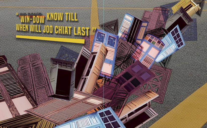
For the first and second page of the zine, grids of illustrated windows are shown which are complemented by the text on the second page:

Win-dow(we dont) know how long this beauty will last”

Not knowing till when the beauty of that area last. I emphasize the visuals of the colorful old-style windows to represent the Peranakan houses.

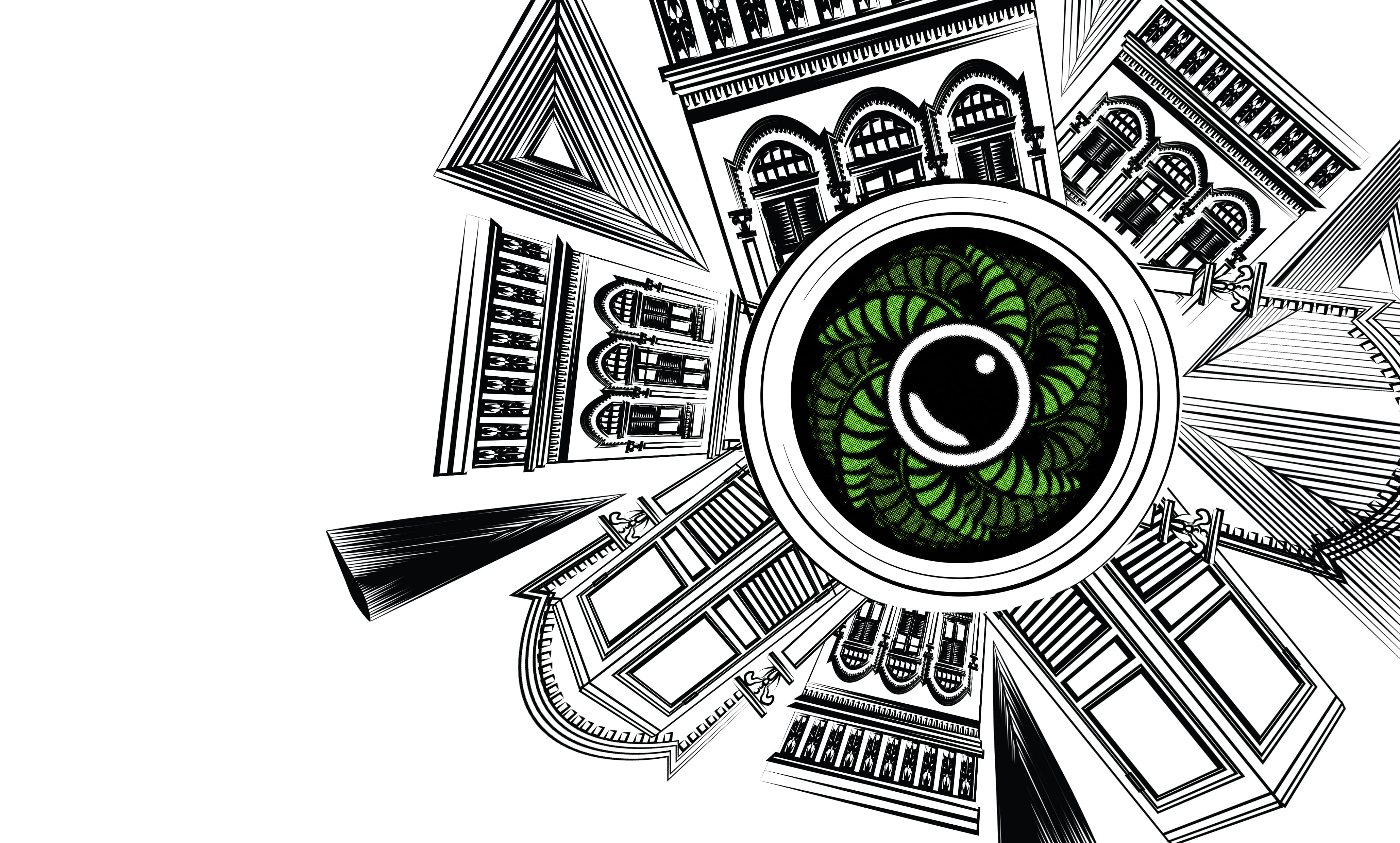
As for the third and fourth page, the text says:

“People Co-co-nuts(Go nuts) with #ootd her”

The word Coconuts is taken from the past of Joo Chiat which used to be a coconut plantation. And the idea of #ootd came from my research and my own experience going over to the place and seeing so many people taking their pictures there. The visuals then supported the text. In a form of circular arranged Joo Chiat’s Peranakan houses, representing a camera lens in the middle is a half-cut coconut surrounded by its leaves. The beauty of the Peranakan houses is illustrated by the houses illustration.

[#ootd = outfit of the day. Pople will take a photo of their outfit and uploaded it to social media with #ootd]

Finally, the last 2 pages of the zine with a text:

“We must Nut-meg (not make) anymore changes to this place”

From my research, besides being a coconut plantation, there were also nutmegs plantations in Joo Chiat back then. For this pages, I focuses on the visual elements of The Joo Chiat area that we can still see now. The mosaic tiles, old letterbox, signboard and some parts from the Peranakan houses. In this two pages, I wanted to emphasize on how this items and elements in Joo Chiat shouldn’t be removed or change.

For all the pages I tried sustaining the colors and decorative visuals that represents Peranakan therefore, throughout, the zine not only tell a story but also showing the identity of Joo Chiat.

For printing of this ZIne, I have chosen a glossy paper to further push the colors out. Because matte paper may pull down the colors of the zine.

Phone Dock, Speaker, Charger

 Phone dock that has speakers and can charge? I started off my research on the speakers and phone docks that has already existed out there. What interest me was the ones that are more rounded and circular.

Based on my experience being part of a performance, I have always seen speaker being used during training. And I realized 3 things.

  • Plug/socket needed
  • Phones are connected to the speaker with a cable and placed on the floor
  • Messy wires


Therefore, I have an idea of a portable speaker that is also a phone dock and can charge your phone. It can also work on its own without a power socket. You just need to charge it fully before using it.


Started off with some sketching of items around me, I learned the way to sketch fast and highlight the important area. I then proceed with sketching of my ideas for the phone dock speaker. Below are a few ideas I attempted.

I wanted to go with the idea of round and inflatable dock as I believe it represents more of the idea of music and sound. The idea of flexibility.

I then finalized the design I have chosen to work on. A pill/bullet shaped expandable speaker, phone dock. It is able to compress, to save up space in your bags and the function of expanding also improves the sound projection giving it a louder and more impactful sound system. I then note down the size and measurement I wanted it to be.

Below is the different perspective sketch of the product I’ve sketched out to further visualized my idea.

I started out with cutting a cylinder and shaping it out using a template so it is easier to cut off the excess foam.

Same goes for the 2 sides of the speaker. Where it was first a basic cylinder, I then slow trim off the edges and sand it using a self-made shape sanding tool to make it into a semi-circle.

As for the expandable part. I wanted to show how this thing would actually work, there I try to come out with an idea using paper, as it is a soft material. I searched for a tutorial on how to create paper springs or lantern that can expand and close. And I found this particular ‘Lizard tail’ Origami. Which depicts the exact motion of expanding, the way I want it to be.


And finally, the end product:) After getting all the components ready, I attached them to finally have the final product, an expandable phone dock speaker!

One of the things I could improve on is to make the prototype more high fidelity and continue working on it till its almost a 100% product form.

Thank you!