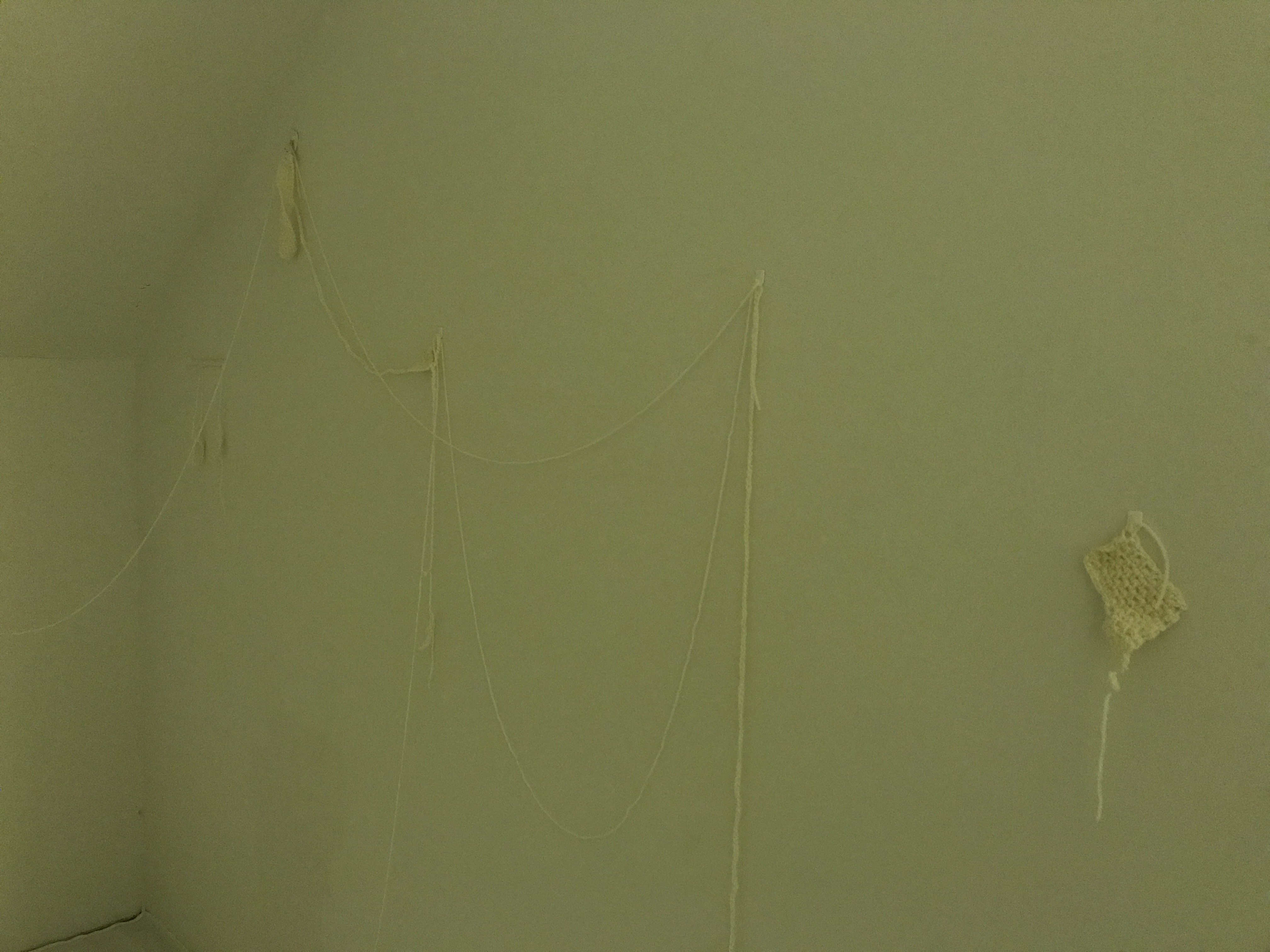
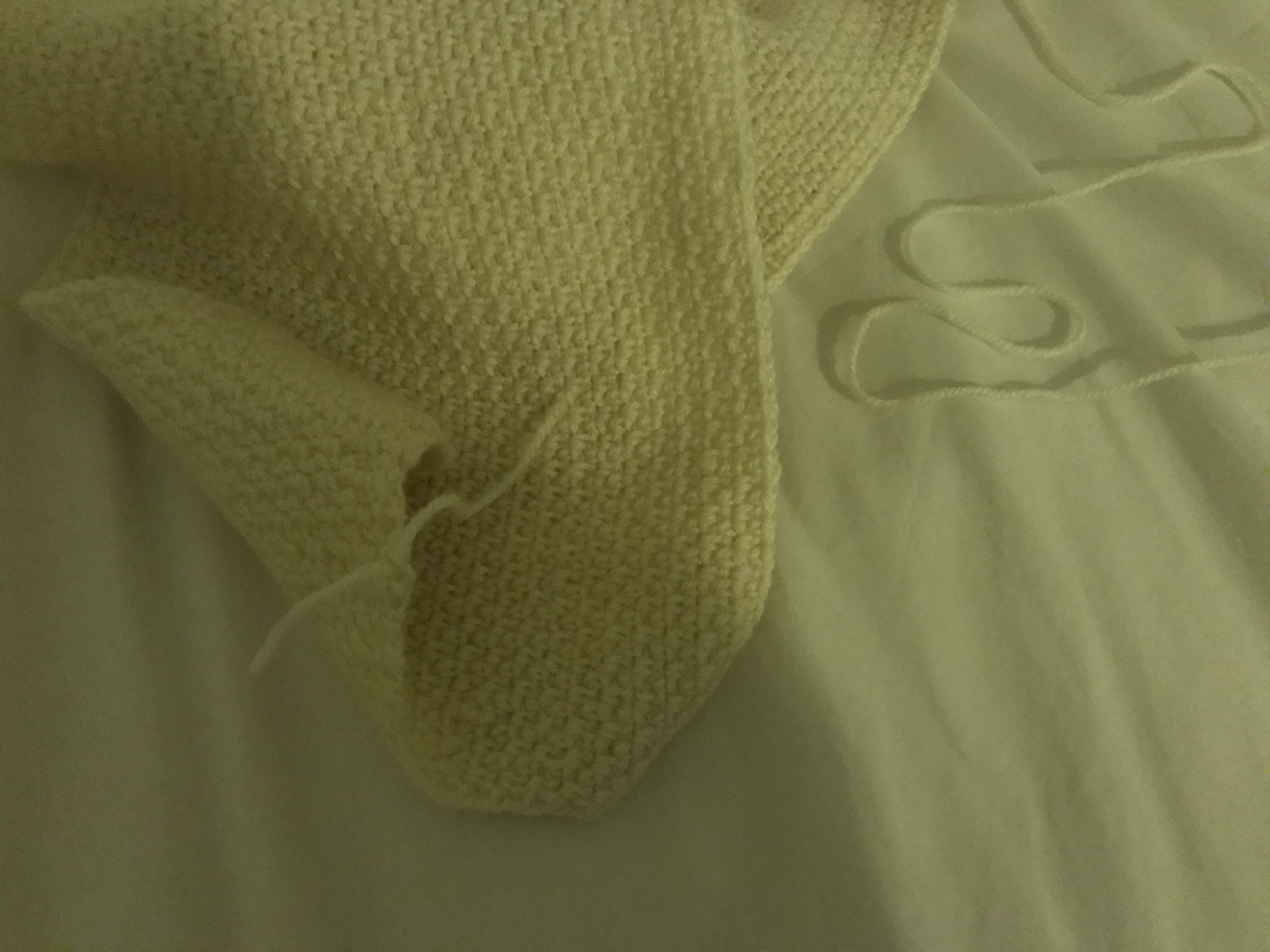
As it was important to me that the idea of ‘creating comfort’ for oneself be portrayed in the installation, I wanted the hand-make a comfort object, as opposed to simply finding a suitable one and buying it. I found some simple instructions on how to crochet a blanket here:
It seemed very manageable.
The original plans were to crochet a full-sized blanket to place in the installation. However, due to time and money constraints only a baby-sized blanket/adult sized shawl was possible. Which actually doesn’t matter too much as it does not take away from the idea of ‘creating comfort’ for the self.
It was also important to me that the idea of ‘failing’ be portrayed in the work as well, because in trying, things are not always smooth sailing and things are not always beautiful.
Failure bitsCrocheting
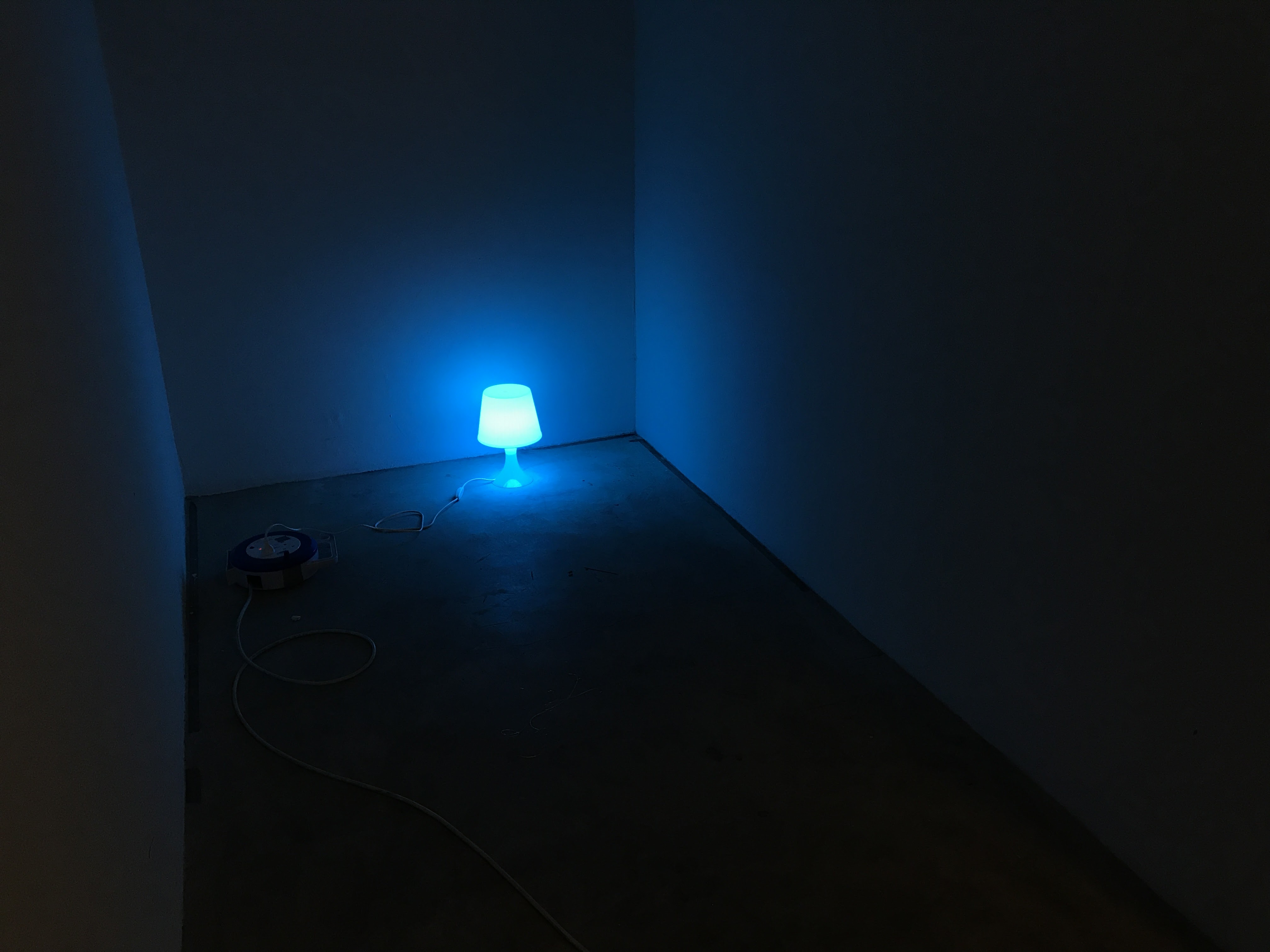
Altering space
In continuation of the last film, wanted to extend the idea of altering space and perceptions of a space through altering the lighting of the space. Continuing the play on blue light, I altered existing light fixtures by taping blue cellophane over the bulbs to create the blue light.
There is a visual association to a table lamp when using a lamp like this.
Trying out different modes of lighting and evaluating the shape of the lighting fixtures, I found that a lamp like the one above gives off a more ‘homely’ feeling, which marks it as a homely and safe object.
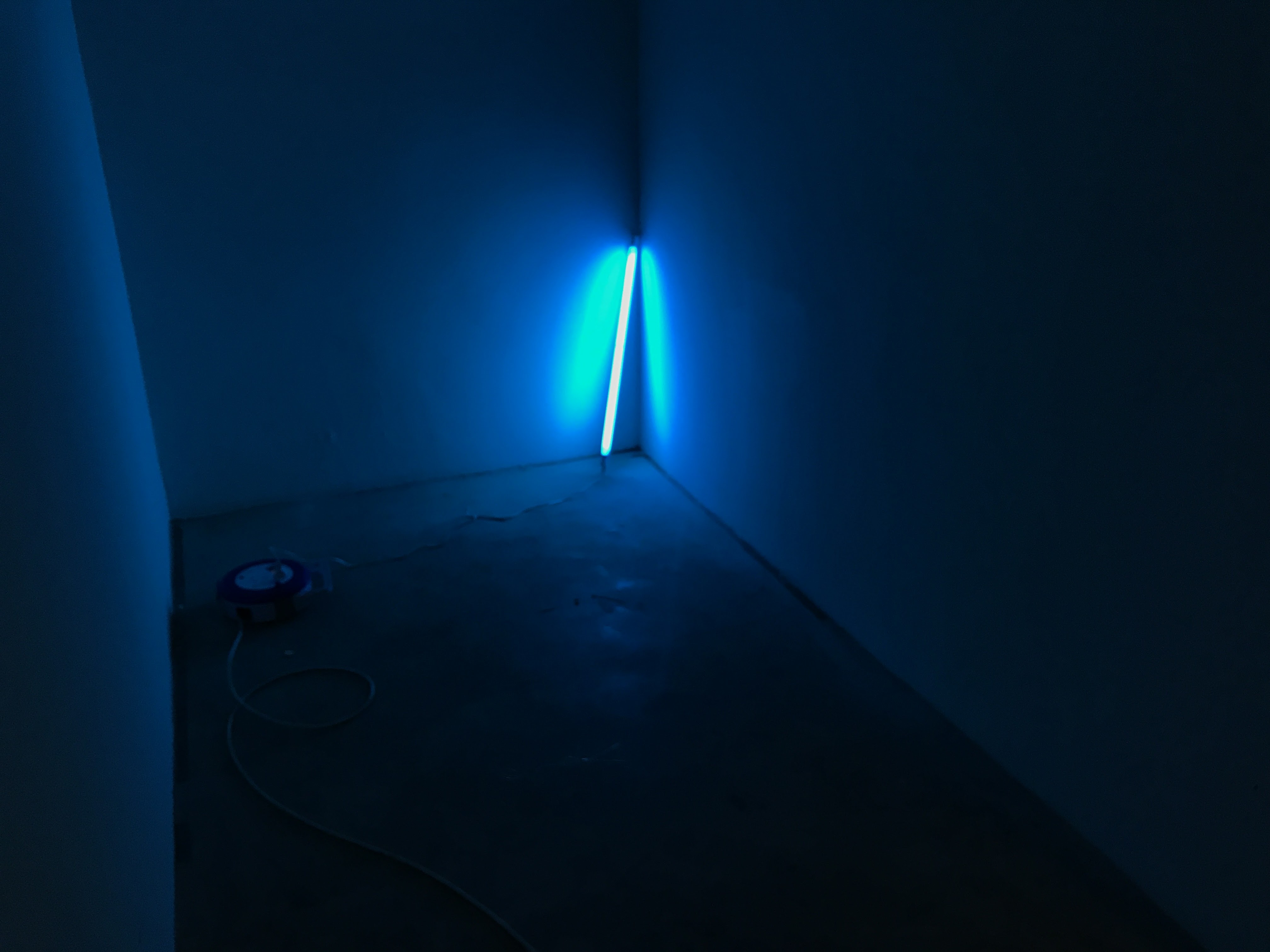
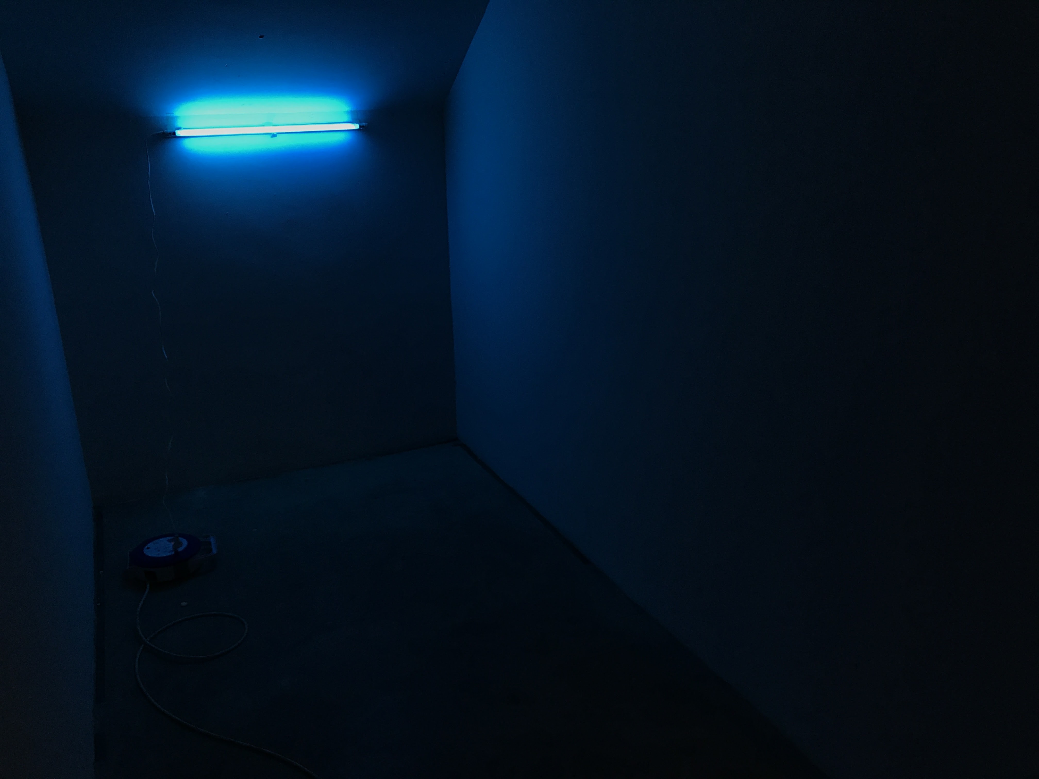
However, as I wanted the blue light to embody the element of a foreign, dangerous object, I used a different light instead.
This fluorescent bulb gives off a more sinister vibe with its shape.
I also played with the placement of the light. Above, I placed it in one corner of the space. Below, it is placed horizontally on the wall. When placed like it is below, it seems more as if the light belongs in the space like all ceiling lights do, rather than above, where it sits in a corner – removed from its natural environment (on the ceiling), and therefore can better act as an ‘object of danger’.
I also wanted to put the idea of danger across more strongly, and so thought of creating an accessory that could go onto the light to imply its dangerous nature.
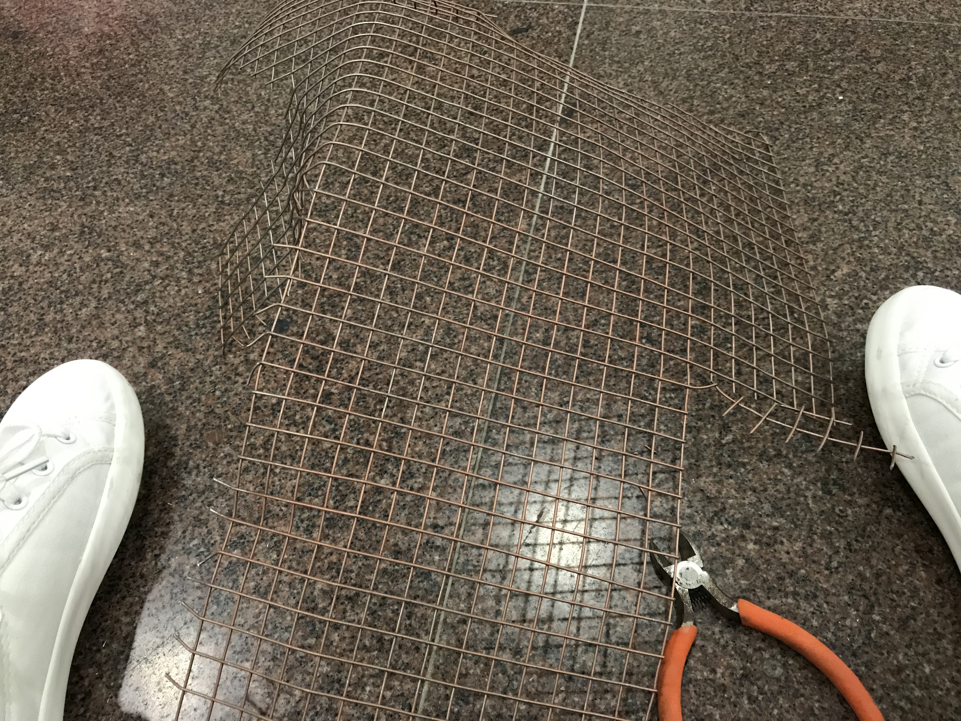
Metal netting
Moulding and painting the light fence
Usually, dangerous objects are kept out of reach, and usually, there is a barrier between said dangerous object and the person so to ensure the safety of the user. As such, borrowing this idea of a safety barrier, I decided to create a metal netting around the light to imply its dangerous nature.
Finished light
Further altering space
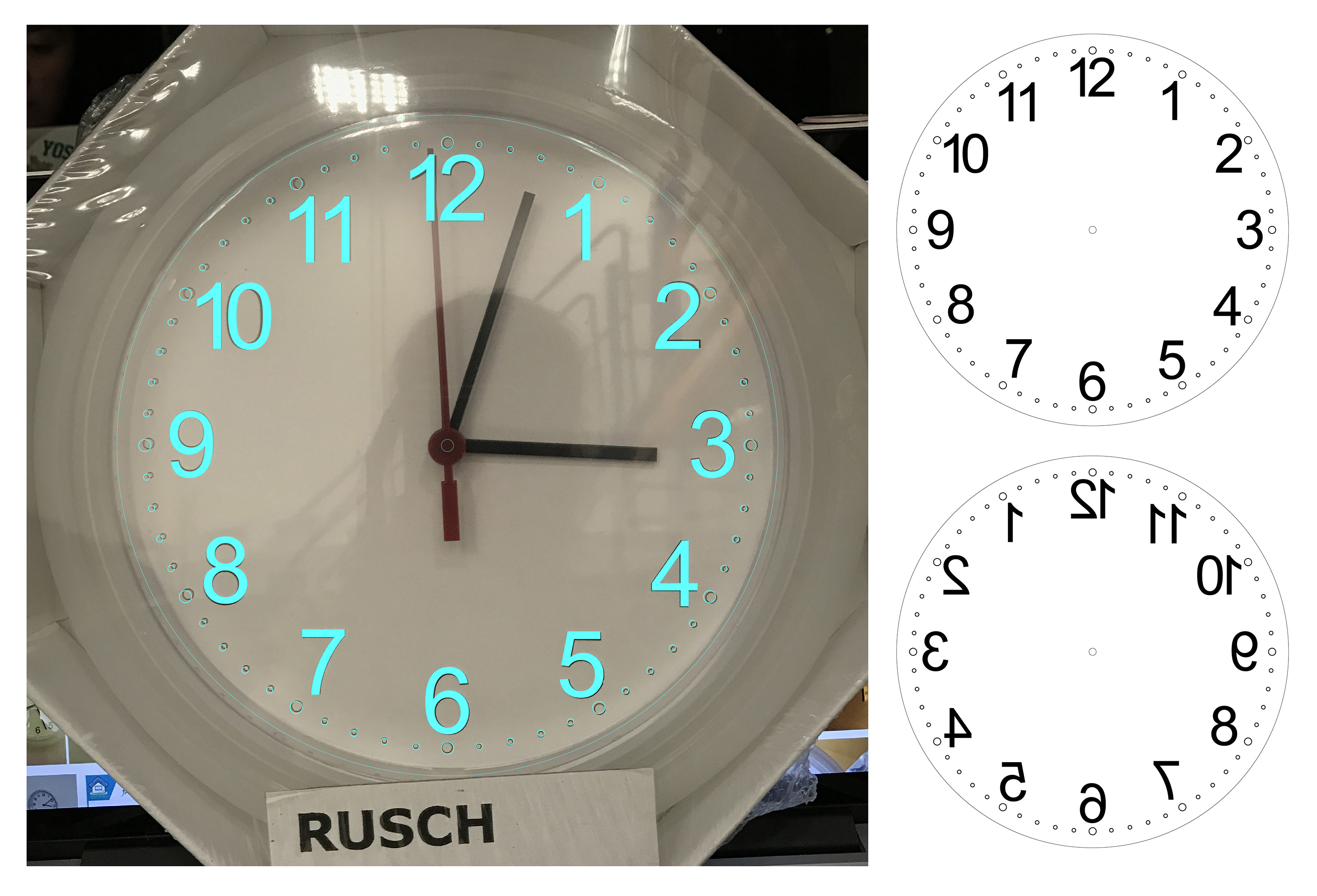
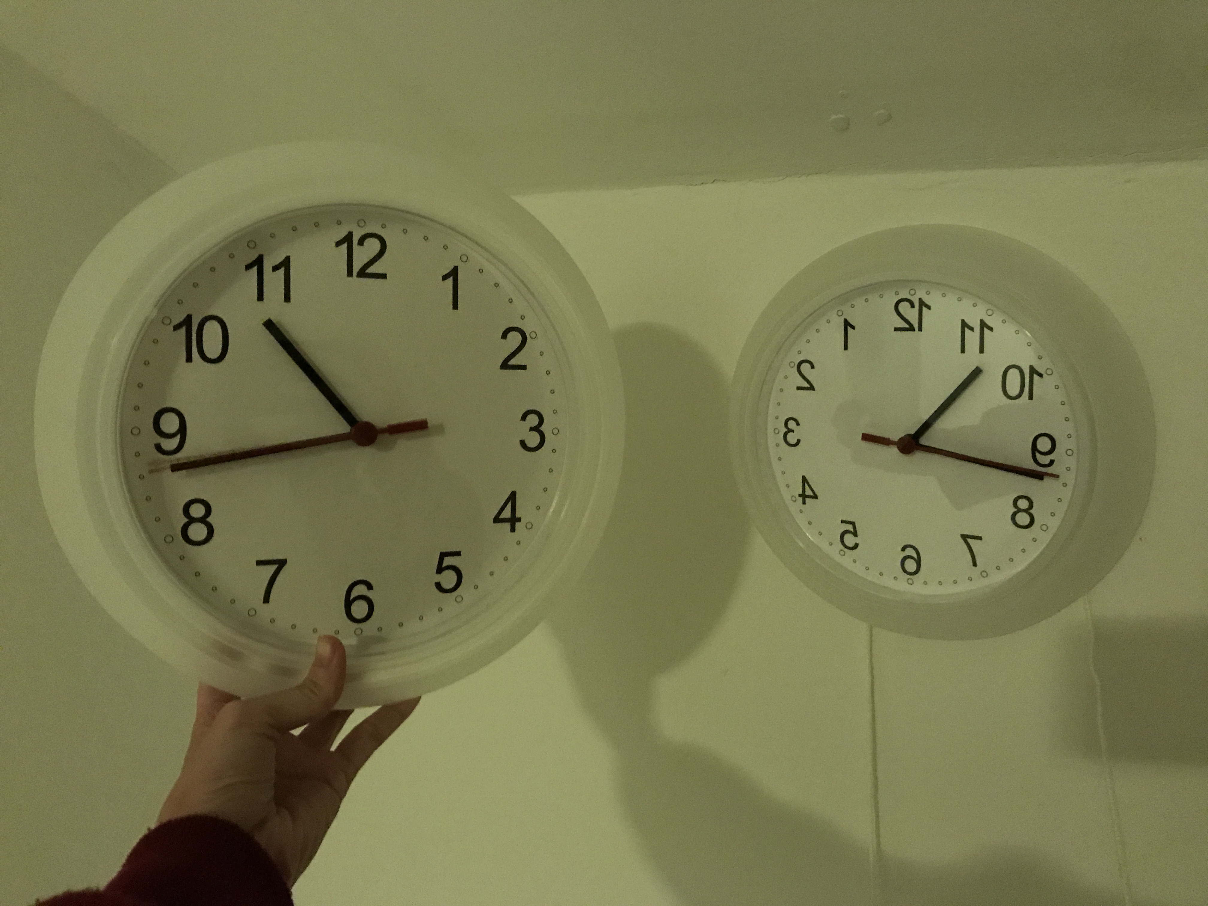
In order to further imply the idea of an alternative space, I thought of ways to imply the other-worldliness of the blue space. In particular, I was quite keen on the idea of playing with time as an elementand using physical clocks to imply this idea. As such, I bought IKEA clocks to see how I could use both clocks to imply different spaces.
I thought of the idea of altering time – either slowing down time or reversing time to portray this idea of ‘other worldliness’. At first, the idea of slowing down time seemed the most fitting, as I wanted to convey an idea of a sluggish mindstate and an inertia associated with sadness and loneliness. However, I realized that this was not impactfulenough and that there is some difficulty in portraying a duality between ‘real world’ and ‘subjective world’ – if one clock were to run slower, it would run so slow that the time would be completely out of sync with the other clock and the presence of two contrasting times would confuse the viewer and might lead the viewer to interpret the installation inaccurately (different time zones? weak battery in one clock?)
As such, I wanted both clocks to portray the same time, except that one is mirrored to the other in order to convey the idea of an alternative, reflect world – another dimension – a subject headspace inaccessible by most.
Creating the reflected templatePasting the reflected template onto original clock
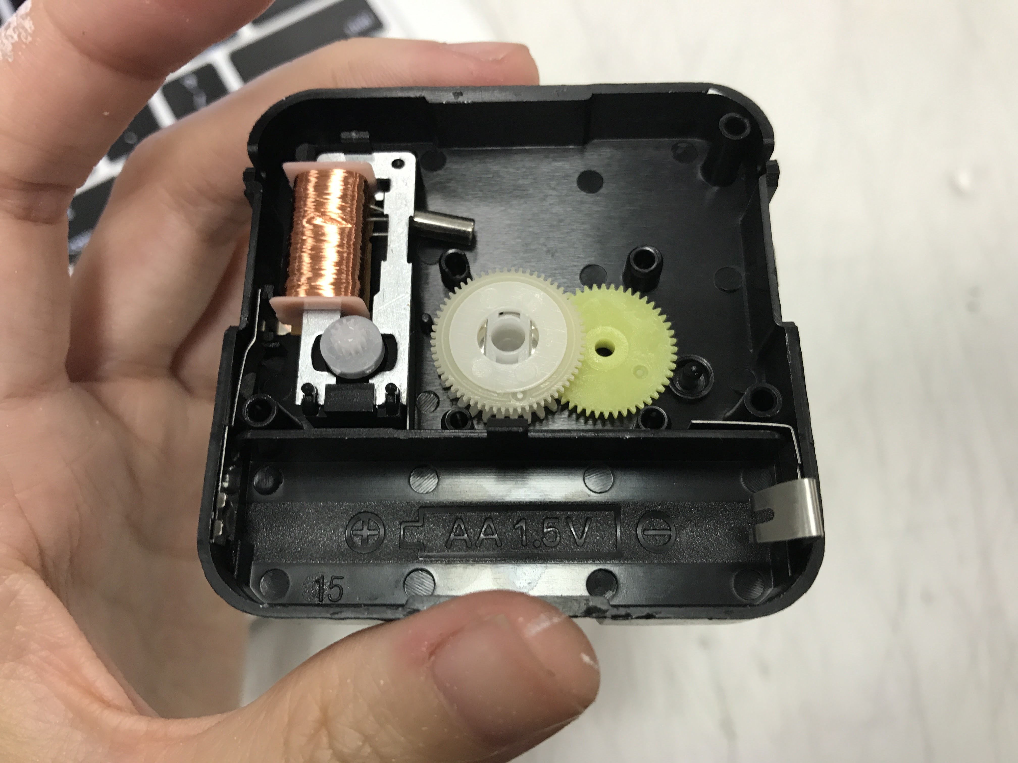
It is quite easy to reverse the clock. Usually, there is a ferrous core in the inside that just needs to be flipped in order for the mechanism to switch. Just gotta keep track of the gears and where they go.
Yay
Implying presence
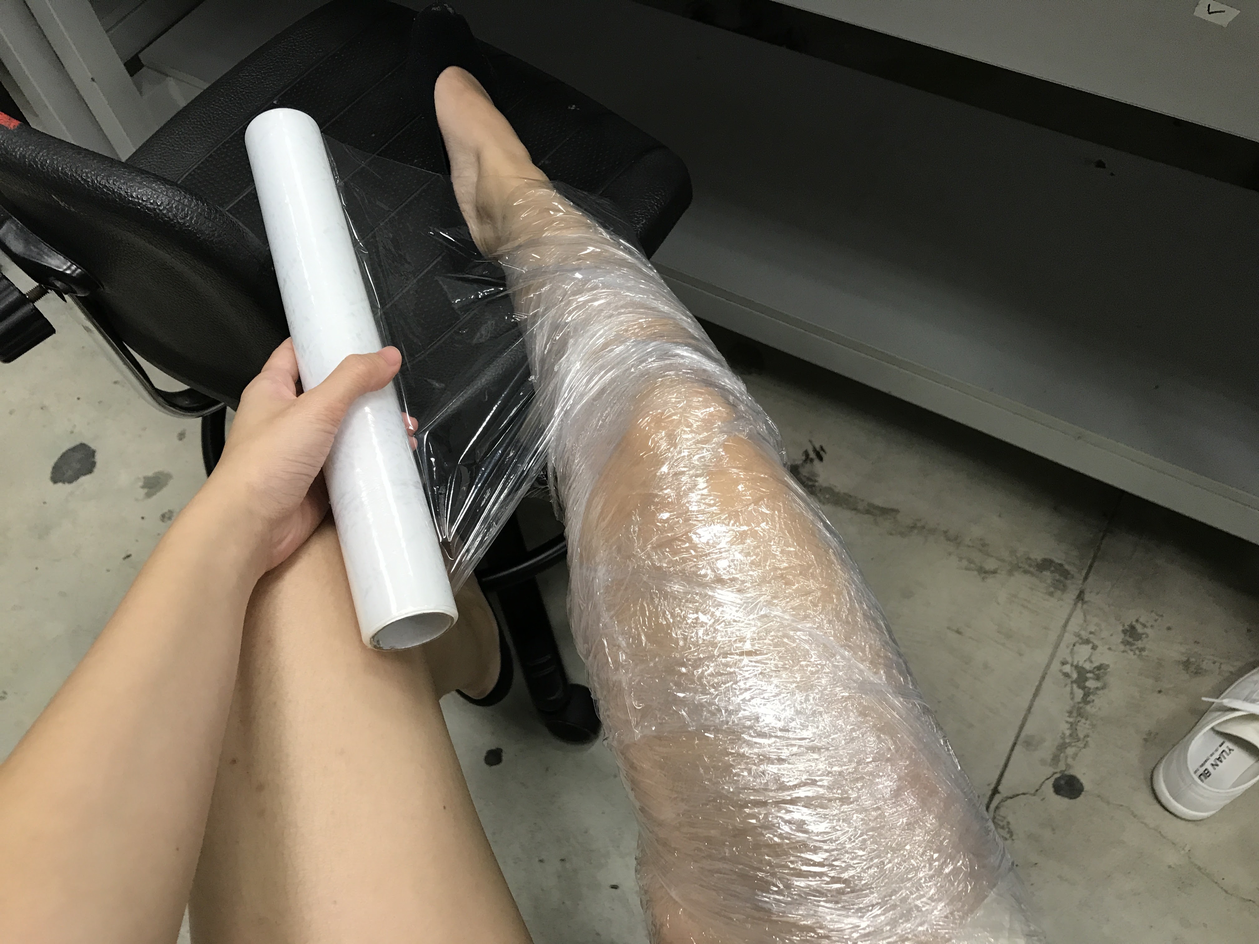
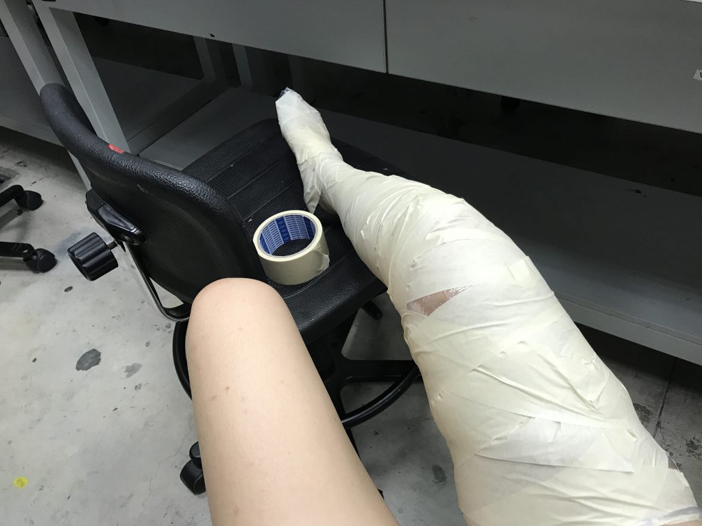
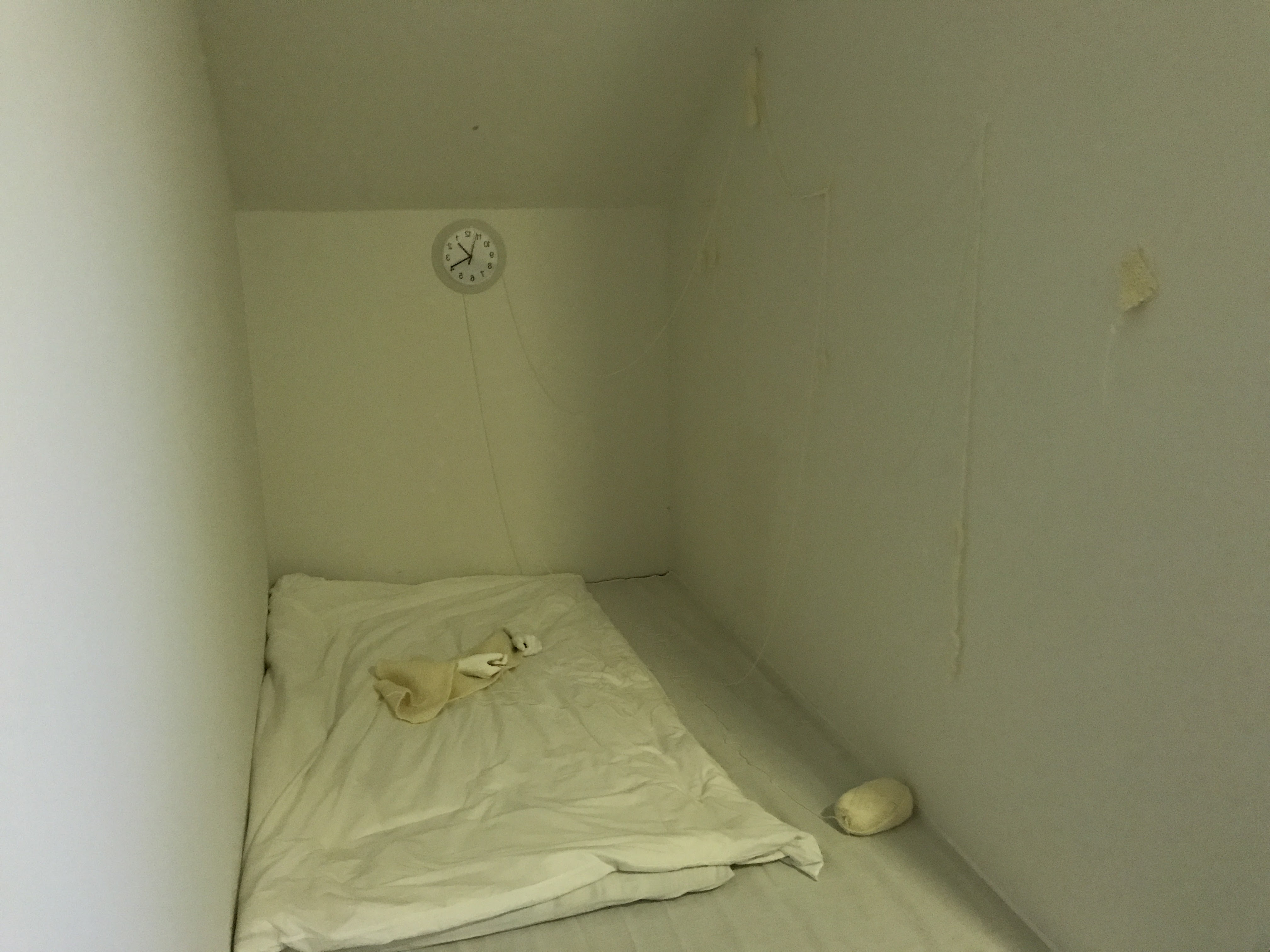
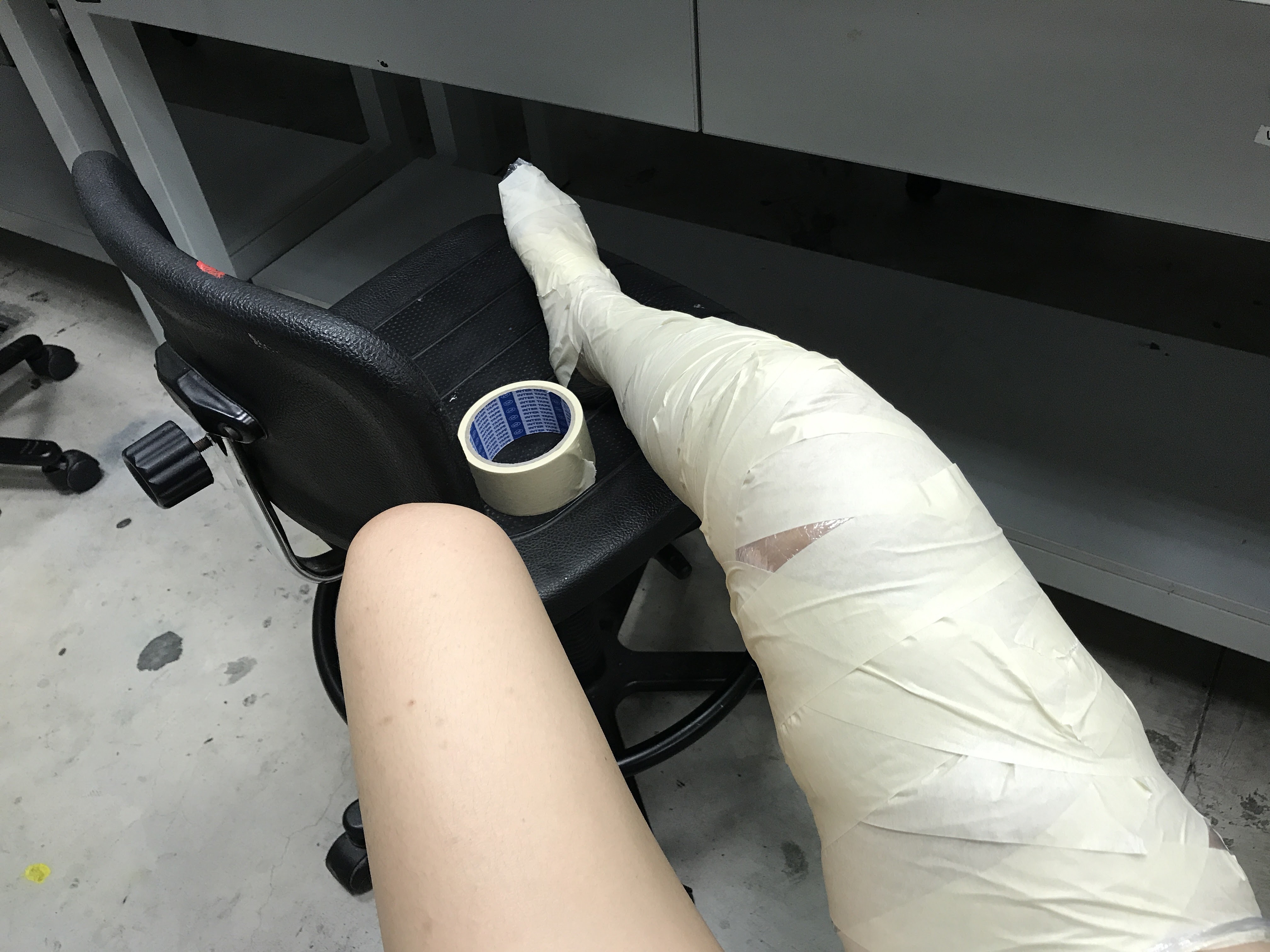
To really tie it back the idea of ‘subjective space’ as perceived by a human being, I felt that elements of human presence must be implied. First, I thought of stuffing the comforter to imply a human presence under the comforter.
Here is I, casting me leg –
It was a good idea at first, but I realized that the shape of the limbs did not show very well. The only way to really imply their shape was to really tuck the blanket under the legs. But that created a lot of creases in the blanket, which made the set up look very haphazard and distracting.
Instead, I thought of implying presence in a different way instead – creating positive space rather than creating an invisible negative space.
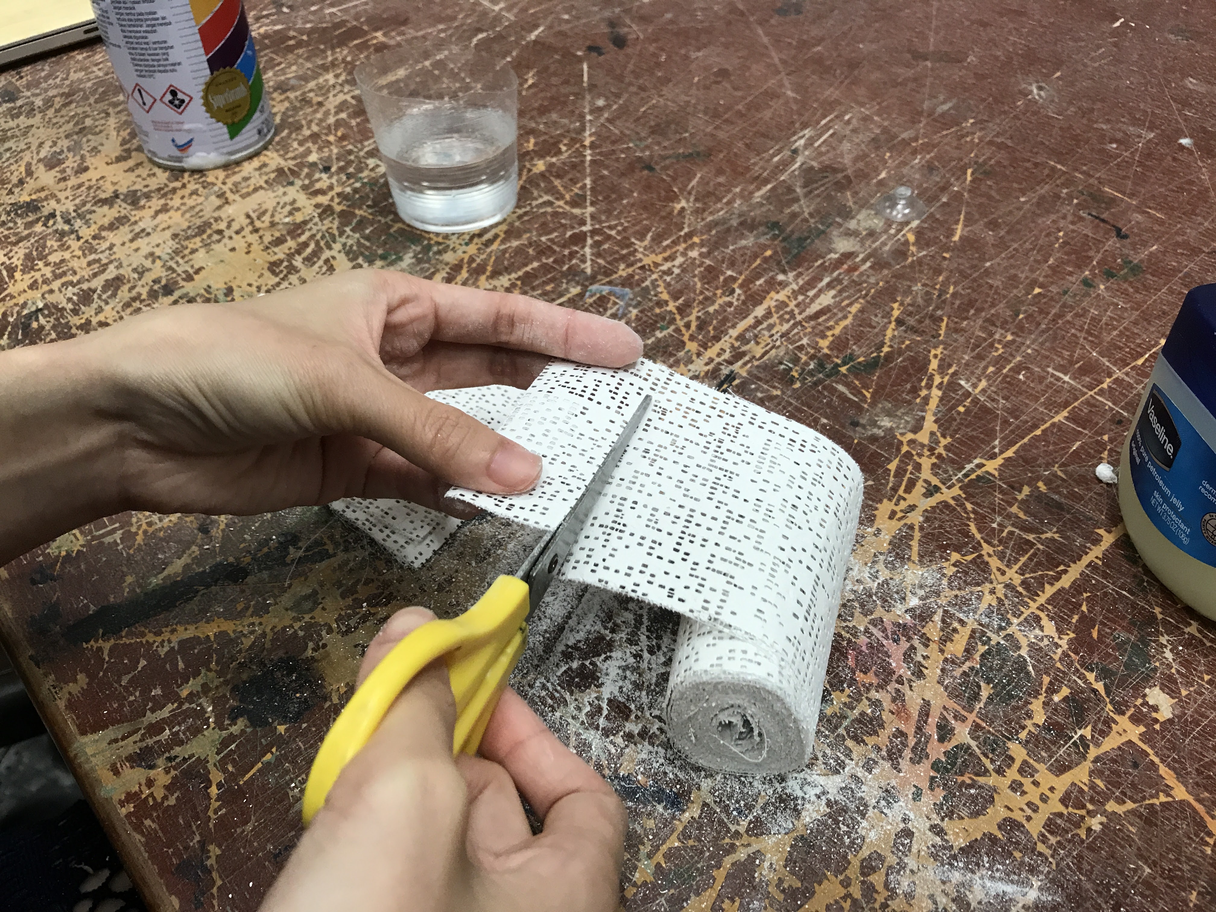
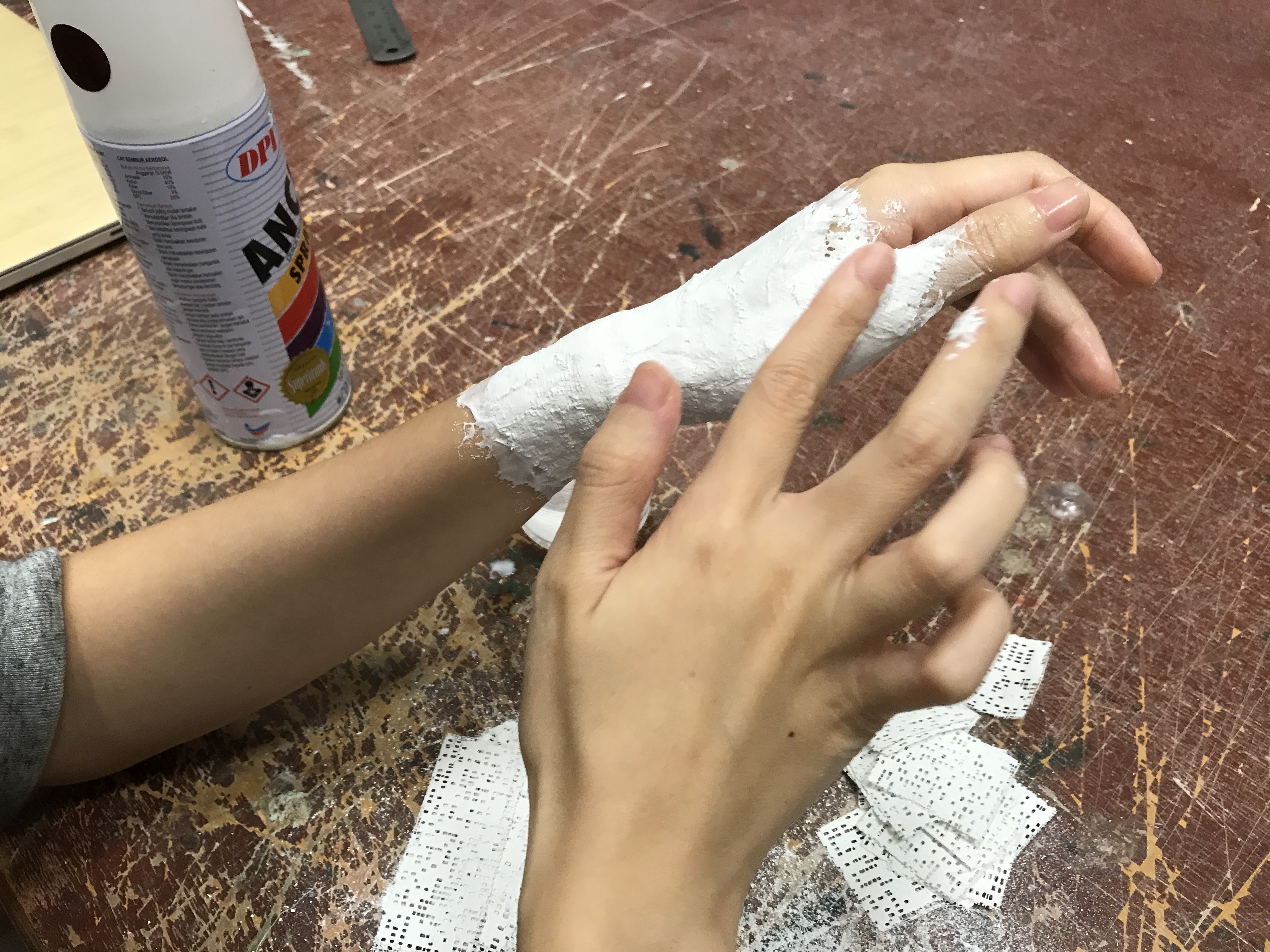
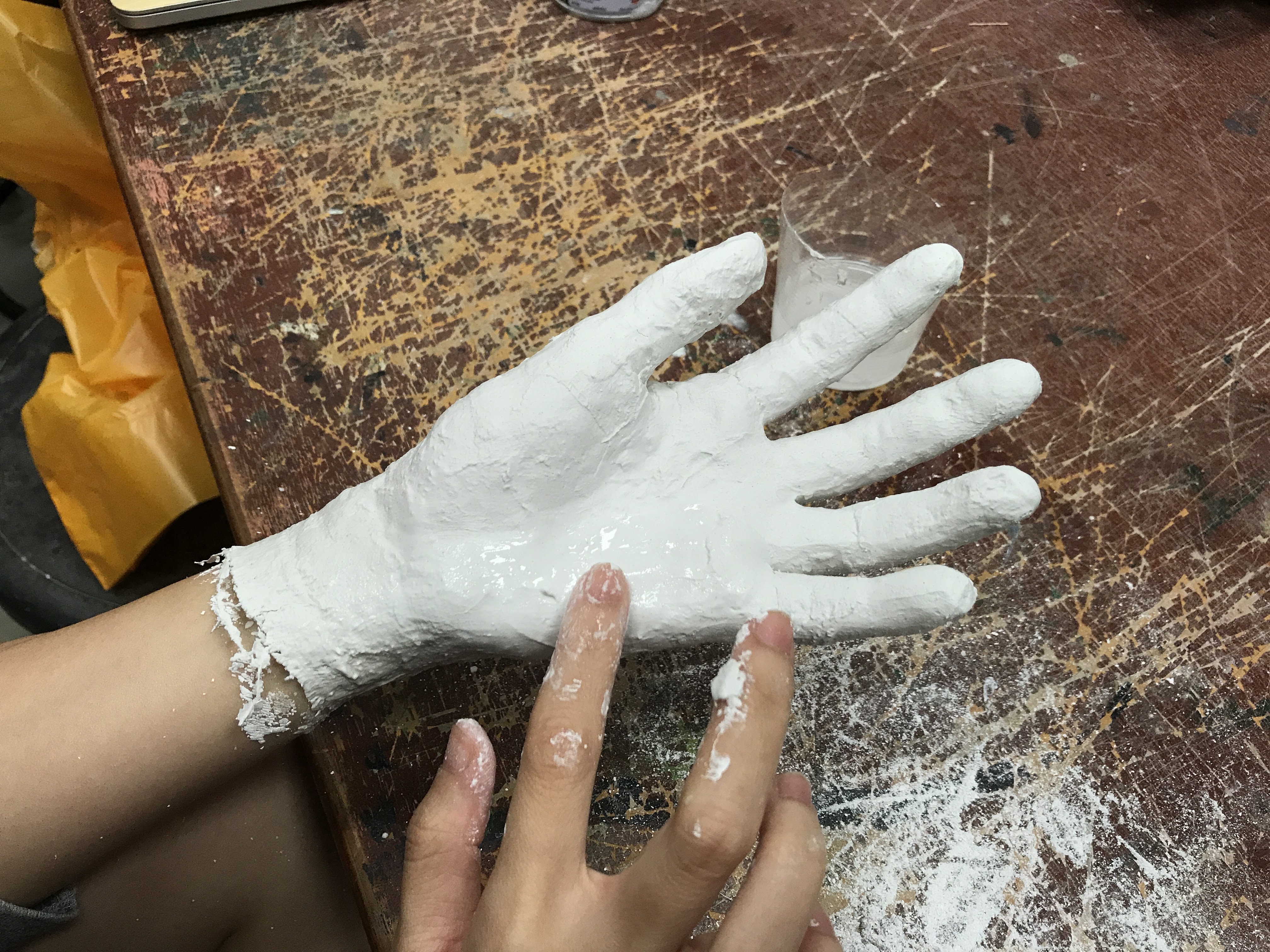
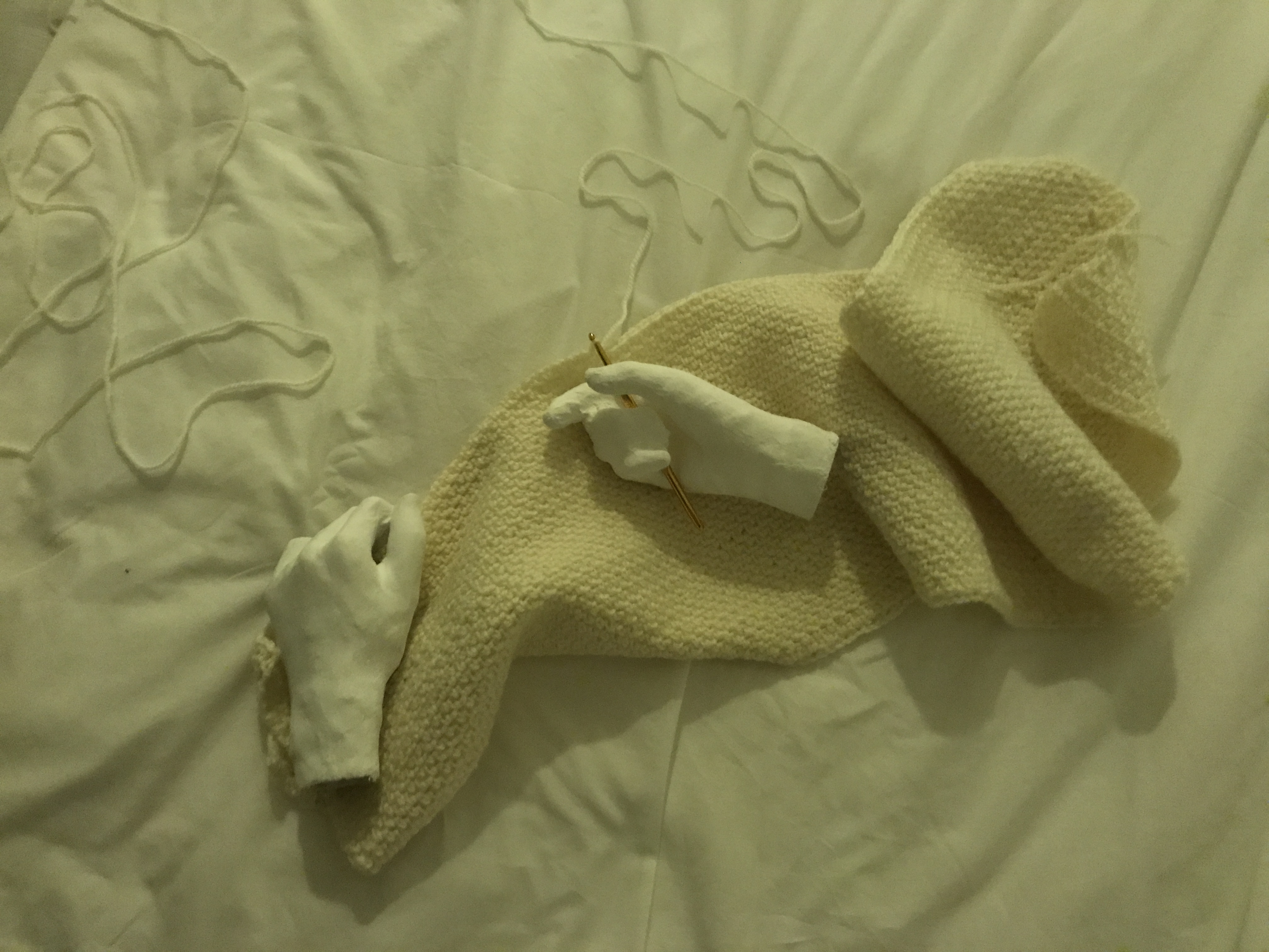
Casting hollow hands with plaster bandages.
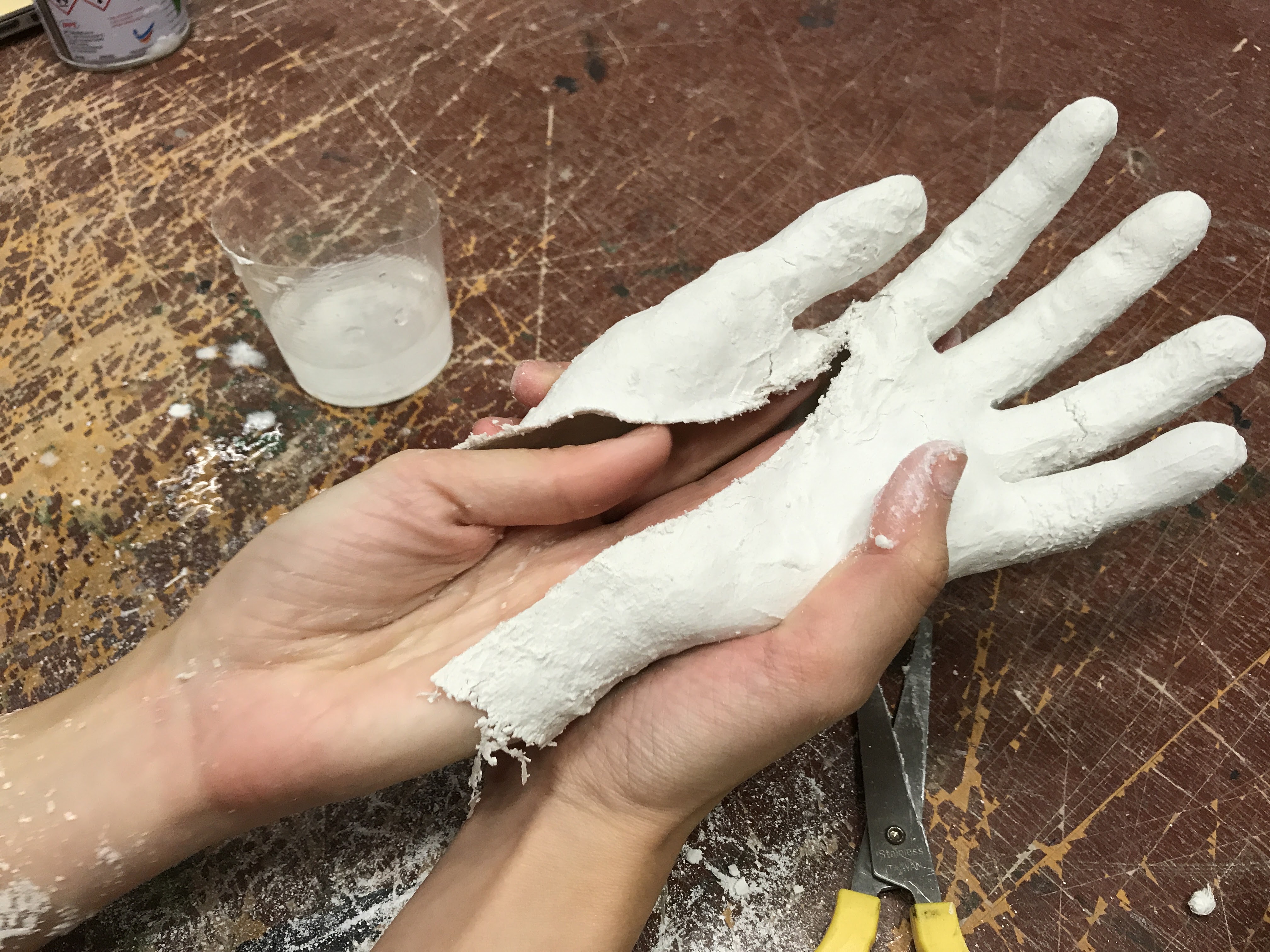
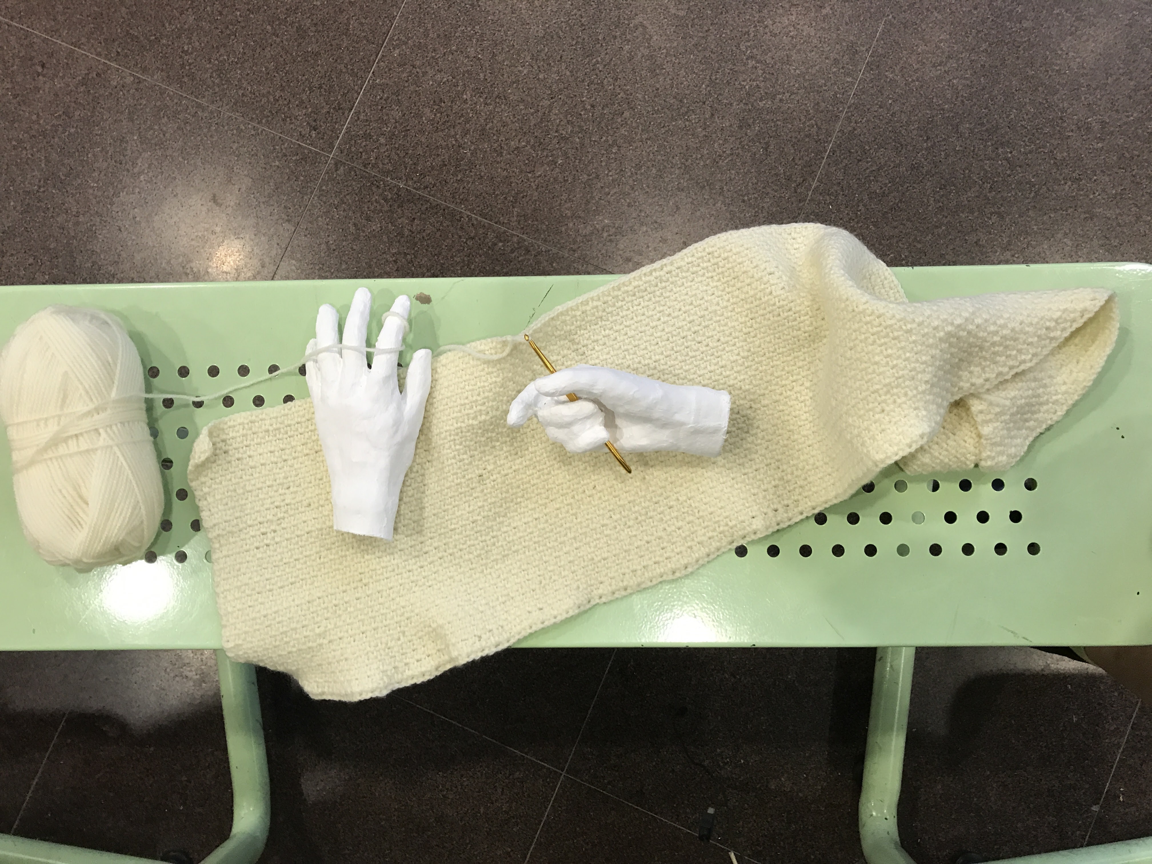
This was the original placement I wanted to have the hands be placed in. However, I realized that the position of the left hand is very passive, which makes it look kind of floppy and dead. As such, I casted a second hand tobe placed in a more active position of holding the piece of crocheting.
New left hand is much less passiveOld hand finds a new home
All the photographs in their entirety can be found here:link
Initially, I wanted to have the focus of the zine be on portraying objectively the data I had collected. However, upon feedback, it was pointed out to me that the style of data visualisation above was too cold and ‘corporate’, which did not fit the whimsical nature of my concept. Deliberate and intentional superficial judgement (especially when the one who judges is consciously and purposefully making and dramatising skewed judgement) is best portrayed in a more fun, playful manner.
As such, I will be loosening my style for the final zine direction, and will be playing with hand-drawn illustrations and fun colours instead.
Overcome by ennui, a human person searches for meaning in her existence by systematically fulfilling the needs that drive human motivation. With each step, she gets ever so closer to the last stage of self-actualisation.
Interspersed sequence of cheese tarts.:
There is great significance here, where the progressive eating of the cheese tart represents a cyclical process of doing the same thing over and over and over again. So many times that you get sick of it, and it becomes jelat in the end. The film ends with the last scene, with the spoon sitting in the tart, most of the tart uneaten.
Sleep, a physiological need – the first in the sequence of Maslow’s hierarchy of needs.
She is in the correct setting for sleep, yet she is awake, and stares, blankly, then attempts to entire into a restless sleep. She turns, and all that is left is a peak of the shoulder, a glimpse of an eye. It is semi-voyeuristic.
Another physiological need – Food.
This is perhaps the only thing with proper colour in this film. The sprinkles (as food) are meant to mess with you – the viewer. It is not proper food. It is not meant to be eaten (like this). It represents a ludicrous kind of gluttony. The pouring is slow, and the eating is reluctant. She chose to eat it, but she does not want it. It does not make sense to the viewer.
Lock. Check. Lock lock. Check again. Lock.
The second tier – Safety needs. A manic desire to be safe, to feel safe, but not feeling safe, and needing to check again and again and again. Frantically.
Second tier again – Safety and shelter.
This part of the film (plus the previous door locking) is its climax. The mood makes you feel uneasy and tense and makes your belly churn. The rain and thunder makes you feel that. We are but insignificant in the face of the universe.
Third tier – Love
This scene is subtle. There is a tension between bodies. Then it cuts to the abstract representation of simmering fuzzy warm feelings. Then it cuts back, and the feelings are fulfilled – motivation and yearning for human touch is fulfilled.
Fourth tier – Esteem
It was a bit of a struggle to visually depict this, but eventually self-esteem was the easiest and fastest way to portray it. She checks herself out, then she makes herself pretty.
The last tier – Self-actualisation
After having systematically gone through the four deficiency needs, she attempts to breach the last tier of human motivation – self-actualisation. I think, in some form, there is a nuance of ‘enlightenment’ in this concept. And what better way to depict enlightenment than to literally switch on the light (lemao).
She turns on the light. The heart beats. She is scared. She turns off the light. The cheese tart is uneaten. Self-actualisation is unfulfilled.
(Because there is more to life than going through the motions.)
Final composition – more crowded, detailed pieces concentrated on one board & simpler, minimalist pieces on the other.
1 – Psychotic
Mixture of block printing ink and white glue
Somehow, somewhen, the imagery of the Rorschach test has always been associated with issues related to the mind; of psychosis, of being unstable and unsound, so I experimented with the technique to create Psychosis. I like how it turned out in the end – circles of varying sizes juxtaposed against each other – there is a sort of movement that insinuates the spreading out of the blackness, that each circle will grow to consume the entire page, of madness, of psychosis.
Mixture of block printing ink and white glue is applied onto one side of a piece of paper
Paper is then folded to smear the paint and create a mirror image
Trying out the same effect on transparency – I actually quite like this too
2 – Gloom
Indian ink and salt
I imagine Gloom as a storm cloud that hangs around a person and envelopes a person, contributing to their sadness. With this, I experimented with salt and ink to see the effect of dehydration.
3 – Arousal
Shaving cream and indian ink
Arousal is a sort of slow, fluid building of passion, that swirls then spreads; like warm tea in the tummy. I wanted to use this subtler piece, rather than a more intense kind of print (see below, art card) as I wanted to portray arousal as a more positive than a negative emotion.
Processed with VSCO with a5 preset
After pulling away the paper, the foam creates a pretty interesting shape as well
Different papers take to the ink differently. Art card seems to be the best in capturing the complete nuances of detail in the foam. The final piece submitted is on watercolour paper, which holds little of the ink and gives off a more positive vibe than the art card above.
4 – Agony
White glue, indian ink and rubbing alcohol
I picture Agony to be a swirling mass of intense pain; of grief. Unlike gloom, which still has a certain softness about it, agony is dirty, gritty and ugly. I used white glue as the vessel for this particular piece, and indian ink mixed with alcohol to create the gritty mixture (polar & non-polar mixtures create happy little accidents). I also tilted the surface of the table by just a tad, so that the slow movement of the glue towards one end could be captured – as of the swirling mass of grief was captured, frozen in time.
Glob of glue
Drop of paint
Addition of rubbing alcohol
After drying
I actually really liked the circular composition in the last photo, but unfortunately, life throws you a project brief so you gotta follow that.
5 – Contentment
White chalk
Puffiness represents the fullness of the heart; of tranquility. I also left a margin of negative space on the left-hand side and tapered the pattern towards the bottom of the strip to imply an outward motion, of flattening and tendency towards succumbing to gravity – absolute relenquishing of control; of feeling content.
6 – Saudade
White pen
Saudade is Portuguese for a sense of longing – specifically longing for a love that has been lost, a yearning that is underlined with grief and pain. Longing almost always evoke fluid, far reaching lines, as if hands grabbing for something. In Saudade, the lines and shakey, broken, and numerous in number to imply an unsteadiness of the heart. Shakey concentric circles also dominate the right side of the composition, to draw our attention to the centre of it all – where pain is most intense. There is a void of empty space – an emptiness that you feel (to have lost a love).
I chose white on black (as opposed to black on white) to dark the composition so as to imply a more negative overall image. In addition, I feel that pain is sometimes a selfish kind of thing too – you kind of block out everything around you, and only your pain matters, and only you matter.
7 – Bewilderment
Block printing ink, footprints on paper
Originally, I wanted to do a piece that represented “Unsteadiness” and in all sense of the word, I blindfolded myself and depended on another person to guide me as I created marks using my feet (by walking on paper). However, it didn’t turn out as well as I expected and the final print came out looking more steady than unsteady.
Final print looked very certain, confident
Therefore, I changed my approach and relinquished total control to the other person, and let the person guide me (this time, on my tippy toes to evoke more unsteadiness) and direct me in doing whatever he/she wanted me to. I was rather bewildered with Josiah’s commands – “And you shake it all about”, “Now do a twirl”, “Large, heavy steps” as he guided me in creating my print, but am very pleased with the result –
Bewildered, relinquishing control of the medium to a 3rd party
Collections of close ups:
8 – Exhilaration
String, chinese ink
Exhilaration is the sort of excitement and joy that makes you want to dance; to spin, to whirl to feel the wind under your arms. I played with some mark making here, taking an inked string and spinning it around to see what marks it created on the paper.
9 – Disoriented
Bubble wrap, chinese ink
Disorientation is result of exhilaration – the result of dizziness. The concentric circles imply a sort of roundabout motion, and as they are spaced out, it is almost as if you are stumbling, and the variation of size suggests an ebb and flow of dizziness, as if the feeling changes in intensity as one stumbles.
10 – Darude
Needle, white thread
Spanish for – the mysterious power that a work of art has to deeply move a person. I think good art for me really impresses, be it aesthetically, conceptually or through the craftsmanship involved in creating a work. I’m almost always very taken by work that shows an immense about of tediousness and effort, but in a subtle, effortless manner (white on white).
11 – Longing
Paper cut
The kind of secret longing and desire that you feel for someone or something is one that is subtle and hidden (white on white). It is also soft and fluid, hence the organic lines that stretch outwards – reaching, longing, wanting.
12 – Drunk
Mixture of block printing ink, white glue, acrylic paint etc. (all the white paints)
Drunkenness comes with some sense disorientation as well, of staggering and stumbling and not being in control of your own movement, and ultimately losing all control and collapsing in a heap at the end of the path.
13 – Grouchiness
Graphite pencil
The most intense moment of grouchiness for me is when I’ve been sleep deprived and still awake at 4 in the morning. It’s really frustrating – especially when I’m trying to do work (when I need to do work) and there’s just a haze in front of my eyes, and there’s white noise buzzing in my head. But that’s the thing – it’s happening inside my head, and no one else will be able to see it. And vice versa – sometimes you can’t see that someone is sleep deprived.
14 – Wonder
Mixture of water, soap and indian ink
Wonder plays on the sense of childhood curiosity and innocence, of purity. As such, I wanted to experiment with bubbles as a very delicate medium, to see the patterns created when the bubble lands on the paper and pops. Due to the soap and water mixture, the pattern imprinted on the paper captures nuanced swirls and makes the print look almost like a planet, which I really liked as well and plays to the idea of wonder – of the vastness of the universe, and things that are yet to be discovered.
Other pieces that didn’t make the cut – the pop of the bubbles were too violent and created large splatters of droplets on the paper, which bordered on portraying a more negative feel to the piece, rather than positiveI also tried blowing bubbles directly onto the paper, but as this technique is very wet, the resulting print pretty much became a whole mass of black and no texture could be seen.
15 – Aggravation
Charcoal
Aggravation doesn’t really come out of nowhere, I think. It has to build up from small intensities. It begins when small things start to frustrate you, irritation starts buzzing in your head, then the annoyance persists to become more and more intense, leading to angry, shakey, intense lines that almost represent a sort of “lashing out”, of irritation to the point of anger.
16 – Distracted
Thread, sewing machine
Happy little accidents. This piece was originally planned to be “Systematic” as I wanted to portray the sense of uniformity and systematicness that a sewing machine could create. However, as I was sewing, I realized that the bottom spool had run out of thread in the middle of it all, and as I was not paying attention, the main continued to run and the needle continued to oscillate without really sewing anything (just poking holes) (because there wasn’t enough thread loaded into the machine). The image itself does convey this concept very well, as we tend to be distracted in our work – while doing, we may stray into different strands of work, drift off, or even disappear altogether from what we were originally doing.
17 – Systematic
Voids, holes
This reads “I am a product of the Singapore system” in braille, repeated many times. I wanted to create a tactile experience through this work, and so thought of poking holes into the paper – and, why not poke holes in a systematic way? I think the process too, of poking holes to create alphabets in a language you don’t understand – says something about mindlessly following the rules in a systematic way, without really knowing what it is you’re really doing.
18 – Zen
Chinese ink, dry bunch of string
Zen has to do with inner peace amidst chaos – which, for me, was a very difficult to emotion to portray (I do not ever remember feeling zen). But what I imagine it to be, is to be strong and grounded, despite noise and disorder exists around you. As such, I wanted to create a contrast between marks – of strong, definite marks, contrasted with swift disorderly strokes and patterns (all while maintaining a clean background, to reduce the possibility of turning this into a more negative composition.
Exhausted. Finally done.
I think this project really challenged me to think beyond what I already know, and to break out of my comfort zone of trying to do too much too often – not every piece of work has to be defined by immense detail, effort and time. Sometimes, holding back and exerting control over your medium, over your own concepts and work could produce equally, if not more, powerful effects on the viewer. And that is what I strive for – to make art that makes one feel – and now, I know that intensity, immense =/= heart wrenching, soul touching art.
To preface my final works for Emo, I feel that this post is necessary to tie in and explain my train of thought as I took on the project –
For the first two weeks of mark making, I felt very detached from my work, and could not make the connection between what I was seeing visually and what its intended emotion would be. Furthermore, I was really frustrated at the fact that mark making and using lino print processes produced very similar-looking pieces – chaotic, haphazard pieces that don’t convey anything other than frustration and anger etc.
TLDR; I was not feelin it.
I concluded that in order to make better pieces – ones that I actually feel for, I had to go out into the world and feel – and so begins my journey.
I have a habit of taking my shoes off in places I shouldn’t, (I am typing this post barefoot right now in the ADM basement) and I have no idea why, just that it makes me feel good. It feels good to have skin contact with the ground. It feels good to be…(impendingcringe) grounded.
And so I took off my shoes to feel.
I walked and I felt the earth as it spoke to me.And I wrote down how it made me feel
It didn’t evoke concise feelings like anger, loneliness, isolation etc. but the wetness of the ground and the piercing of the night air made me feel, which was better than not feeling.
On a side note, Tisya reminded me of the concept of subtle feelings and how there are words in other languages to describe certain feelings that can’t be translated into English.
There is something very affecting about old photographs. You’re transported back into a slice of time, one that is a part of a hazy reservoir of long-forgotten memories. The inevitable side-effect of time travel is that you can’t help but make comparisons between Life back then and Life at the present time, and perhaps Life worked out for you and these memories evoke a sense of pleasant nostalgia. Or perhaps not.
In Conversations with Myself, Nguyen explores photographic evidence of her childhood, drawing parallels between Lifebefore and Lifenow. In the series, Nguyen imagines speaking to her younger self through the photographs as an act of affirmation, of validation, of questioning and (not) finding answers. The viewer, then, is invited into the intimate world of the artist, to feel, to empathise, to hear her voice in your head. And perhaps after some time, the voice of the artist blends and morphs into a more familiar one, your voice.
I began approaching this project in the specific sequence of coming up with text (channeling thoughts and feelings) before searching for an appropriate photograph that could accurately complement the text.
Preparatory notes before embarking. Each section is a collection of individual trains of thought. I highlighted phrases that I thought would be good.
However, it became too restrictive after a certain point and so the process evolved to become a more organic one – first looking at photographs, then capturing my stream of consciousness in textual form, trying to vividly recollect details of the moment, and picking (sometimes altering) the most affecting phrase.
It felt good, in a way, to really allow myself to feel what I needed to feel and in a way, it was liberating to put it down on paper. It is only with great hopes that the emotional baggage translates itself through the text and the images.
I will talk about a few –
The choice to create film stills out of photographs was really one that is instinctive, so I wouldn’t say that too much thought has gone into it. But I suppose it works because the photographs are frozen slices of life, that when ‘subtitled’, becomes more than a still moment – it extends and taps into the dimension of time, without being altered from its frozen state.
The choice to include Chinese versions of the text, however, is a conscious one. Not only does it effectively mimic styles of film projection, it also adds a certain dimension to its English counterpart. The Chinese language, to me, is one that is very romantic, and there are certain things that you can only say in the language that will not carry the same meaning as it does in English.
In the above photograph (if one were able to read both texts), the viewer gains additional context of the statement (它们就在你身旁 – they’re right next to you).
This one says “Don’t expect any more from him.” and “He’s not going to support you anymore.”
I really enjoyed this visually – how blurry the photograph is, how little it shows, yet the curve in the eyes and the stoutness of the nose says so much and shows so much that the subject is smiling.
There is a short string of photos that through the series that run on a more positive note – a more encouraging, supportive one, as if a subtle, constant reminder that everything is going to be okay and that things will turn out all right in the end.
This one is my favourite. Something about the absolute innocence, and the telling carefree-ness of the child, that makes the text all more powerful.
First experiment with physical alteration of the photographFurther experiments with stripping away the identity of the self in the photographSettled on chrysanthemums in the end
I really wanted to strip away my identity in this particular photo, to really emphasize the idea of ‘not birth’ and of death. Eventually, I found that the flowers (chrysanthemums) was the most elegant way to go about it, and the most symbolic too, with chrysanthemums being representative of death in the Chinese culture.
Erasing did not work so well on this paper type
I also wanted to strip away the identity of my father in this photo. Symbolically, to portray my lack of emotional attachment to the man. Purposefully, in the hopes that the viewer may be able to empathise with text and visual, and draw their own connections without being hindered by an unfamiliar face.
Here are the rest-
I have decided on this final arrangement. The series has no linear narrative, so it is acceptable to let your eyes jump from one image to another. The last piece however, is intentionally left face down on the ground – to evoke a sense of mystery, of questioning, of this-is-so-upsetting-already-how-worse-can-it-get?
David with work
The images are placed at a child’s height too, as if presented to my younger self.
David interacting with work
The viewer discovers the fallen piece, an out of curiosity, picks it up.
Overall, the series is meant to evoke sympathy, with the hopes of evoking empathy as viewers try to put themselves in my shoes.
Post-evaluation: I had a thought, though, that the images are only affecting simply because those viewing it knew me personally. And thus it was easier for them to form an emotional attachment to the piece. What about strangers, then, who do not know me?
I employed my friend (in white) to approach a stranger (I could not approach the stranger because then that would establish an emotional attachment already) to ask what she felt when looking through the pieces.
It was as I feared. The stranger was not able to connect with several of the images. But she did find a few rather powerful, so that’s okay. I can live with that.
I was very excited to try out the Guan Dao in this session after making it the previous night. For such a cheap and easy to make instrument, it was very versatile and produced some very beautiful marks.
Cotton string & Guan Daos brought in preparation for the session.Guan Dao and chinese inks.The curved blade was versatile and could produce both thin and thick lines. I enjoyed that the stiffness of the aluminium created rough edges in the perimeter of the line (as opposed to smooth edges created with a pen or a brush)
It was easy to produce lines with the GD as it was very similar to using a normal brush or a pen.
The angle and pressure of the GD greatly affect the line produced. There is increased friction when the pen is held this way, resulting in skipping along the paper and spraying whenever the pen is stopped (inertia of the ink causes it to spray forward when the motion of the pen itself has discontinued).I had made a well with some newsprint to avoid making a mess. It is interesting to see the motion of each droplet – some skipping across the surface of the paper, and some colliding with full impact against the wall of the well.
Above are experimentations using the pen. Really loving the wide variety of lines it produced – droplets skipping along the paper to create short and dynamic strokes, the GD scratching against the paper to create a dry-brush texture, and the skipping + spraying effect.Changing the hold of the pen – increasing the distance of the grip to the fulcrum reduces the control I have on the pen, creating more numerous & spaced out skips on the paper.Quick typographic work. Loving the spray of the ink in each stroke.
After prolonged use however, the aluminium could not handle the stress so began to fold and tear.
Damaged after use.
I switched to using the string that I had brought along. Before beginning, I made 3 sets of strings in order to test out the effect of varying the thickness of each bundle of string.
A singular string best creates solid lines when dragged along the surface of the paper. The string made occasional skips along the paper as the ink ran dry.Swinging the string left and right across the surface of the paper (in a pendulum motion) creates sharp, thin lines that begins with a heavy dot.Swinging the string in a circular motion creates swift, chaotic strokes. I quite like how the lines are tumultuous yet delicate at the same time.Marks created with a thick bundle of string – recalls the texture of a dry brush.
I also experimented with materials brought by my classmates. I particularly enjoyed the effects created with David’s bubblewrap –
I decided to cut the sheet of bubblewrap into a circular shape (rather than leaving it as a rectangle) to reinforce the circular shape of the small bubbles.
I had used a mixture of block printing ink and chinese ink to create this print. The above prints were created in chronological order as I found that the first pass contained too much ink for my liking. I much preferred to see the irregular textures created in each bubble as the ink began to run dry after several passes. My favourite is number 3.I began to wonder what kind of prints I could make if I had more control over where the bubble wrap touched the paper, and so had the idea of wrapping it around my hand.This was created by anchoring the bottom of my palm onto the sheet of paper, and spinning my hand + the paper in a circular motion. As I had stopped mid-way in my motion, part of the print shows a still capture of the bubble wrap.This was a recreation of the above print. I find it striking that the speed of which the circle was created affects the textures produced. In this case, I was much hastier in my execution, and did not pause for a long time halfway through the circle, resulting in a much more impatient and swift motion.More.I began wrapping other things around my hand, such as string.Prints created with tied up hand. I did not like this much. Though, I did find it interesting how the string created negative space between it and the flesh.
I then began to wrap other things around other bodyparts. Namely, clingwrap around feet.
New age revolutionary slimming technique.It was rather fun to create these with my feet.
Broad horizontal stroke: created by dragging foot backwards, then stopping the motion and doing a twist. The change in motion brought an interesting touch to the discontinuation of the line (as opposed to simply stopping the linear motion of the foot).
U-shaped curve: created by dragging the foot by the toe in a circular motion around the body.
Scattered dots: created by balancing on one foot, and throwing the body off equilibrium to see where the foot will land next – “unbalanced”.
I very much enjoyed number 3. Will stretch the capacity of this more in the next session.
On the whole, I am rather satisfied with some of the things I had created in this session. However, a large part of me feels that I had not managed to explore the capabilities of the medium + myself. I had also tried some monoprinting, but did not produce any good pieces from that. I feel that more could have been done if I had more knowledge of print making processes and had more exposure to mark making pieces created by other artists.
Next week I will:
Play more with the usage of the body (the feet in particular) in creating prints.
Bring more mark making materials.
Explore the use of negative space and reduction processes.
I have included more photographs below of other prints I had created during this session, but did not find fit to put into the main post.
Prepping the linoleum surface
String on linoleum
Pressing painted kitchen towels
Prepping the first half of the rorschach piece
After folding – a large bulk of the paint at spread horizontally as I had pushed the paint outwards from the middle
Repeatedly dropping a textured, spherical dog toy onto the same spot. The toy rolled in multiple directions.
Throwing the bundle of string at the paper
Pressing painted cling wrap onto the paper surface
Uninteresting print created with latex condom
Masking a strip of area to create disruption in the painted lines


