
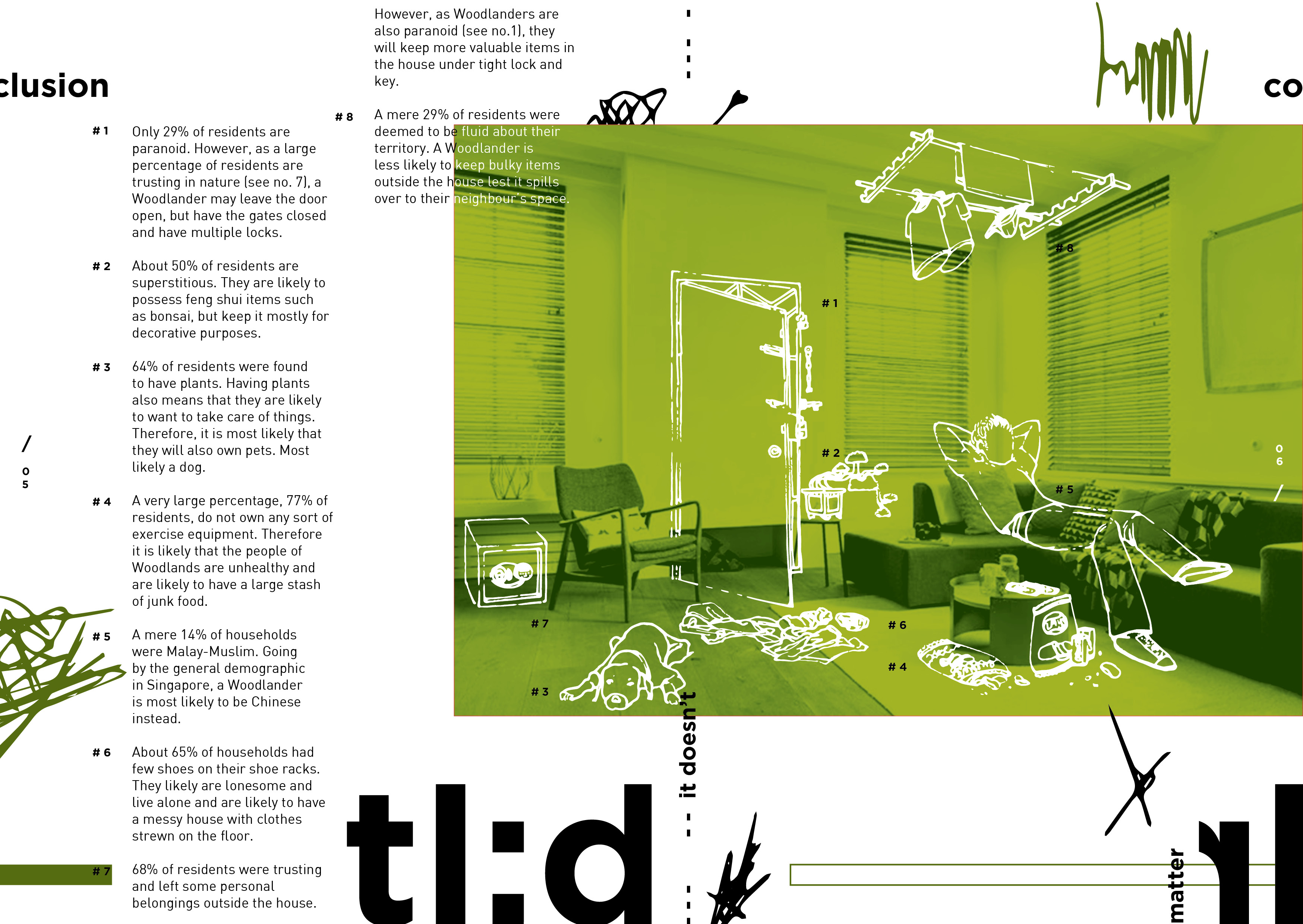
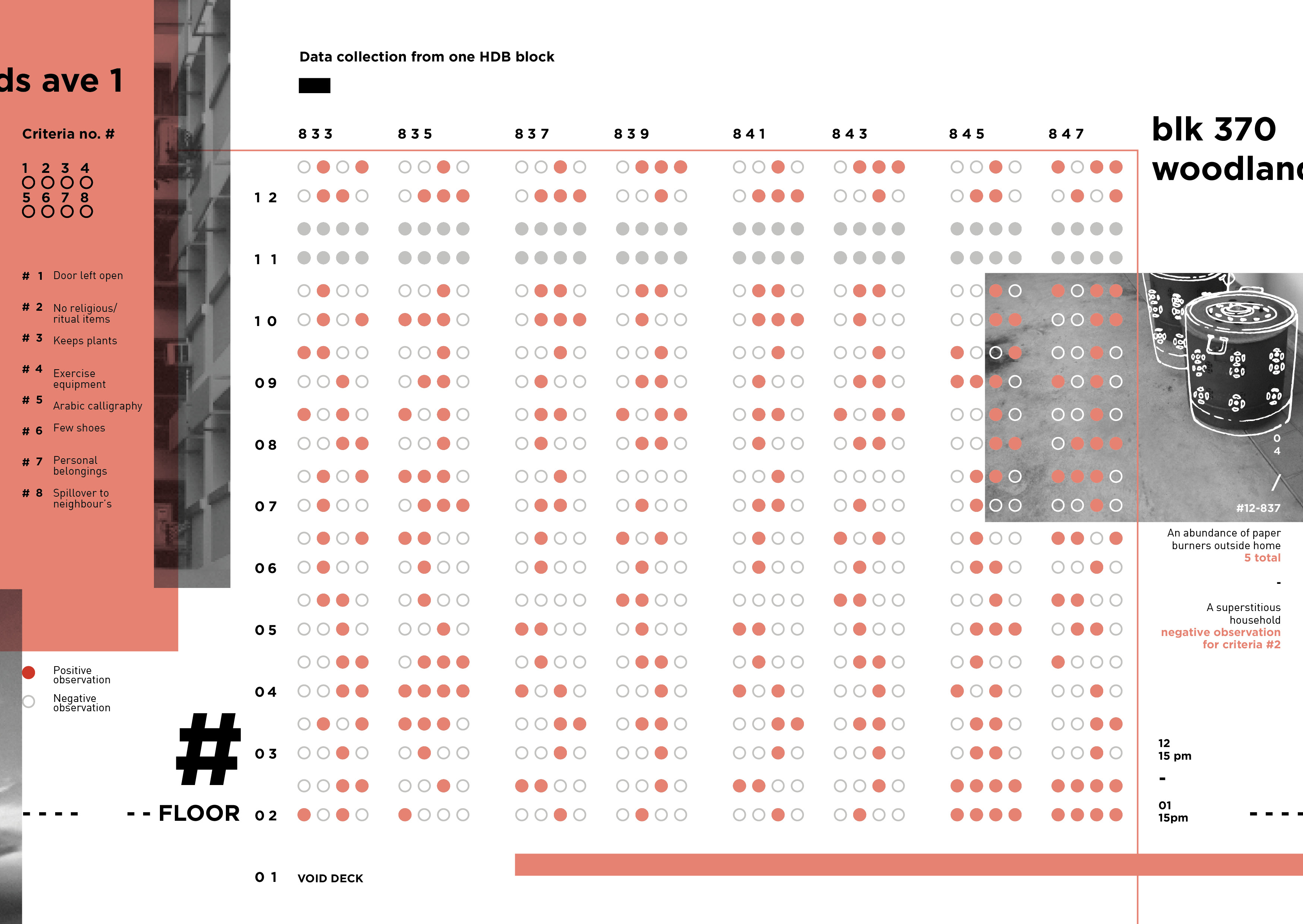
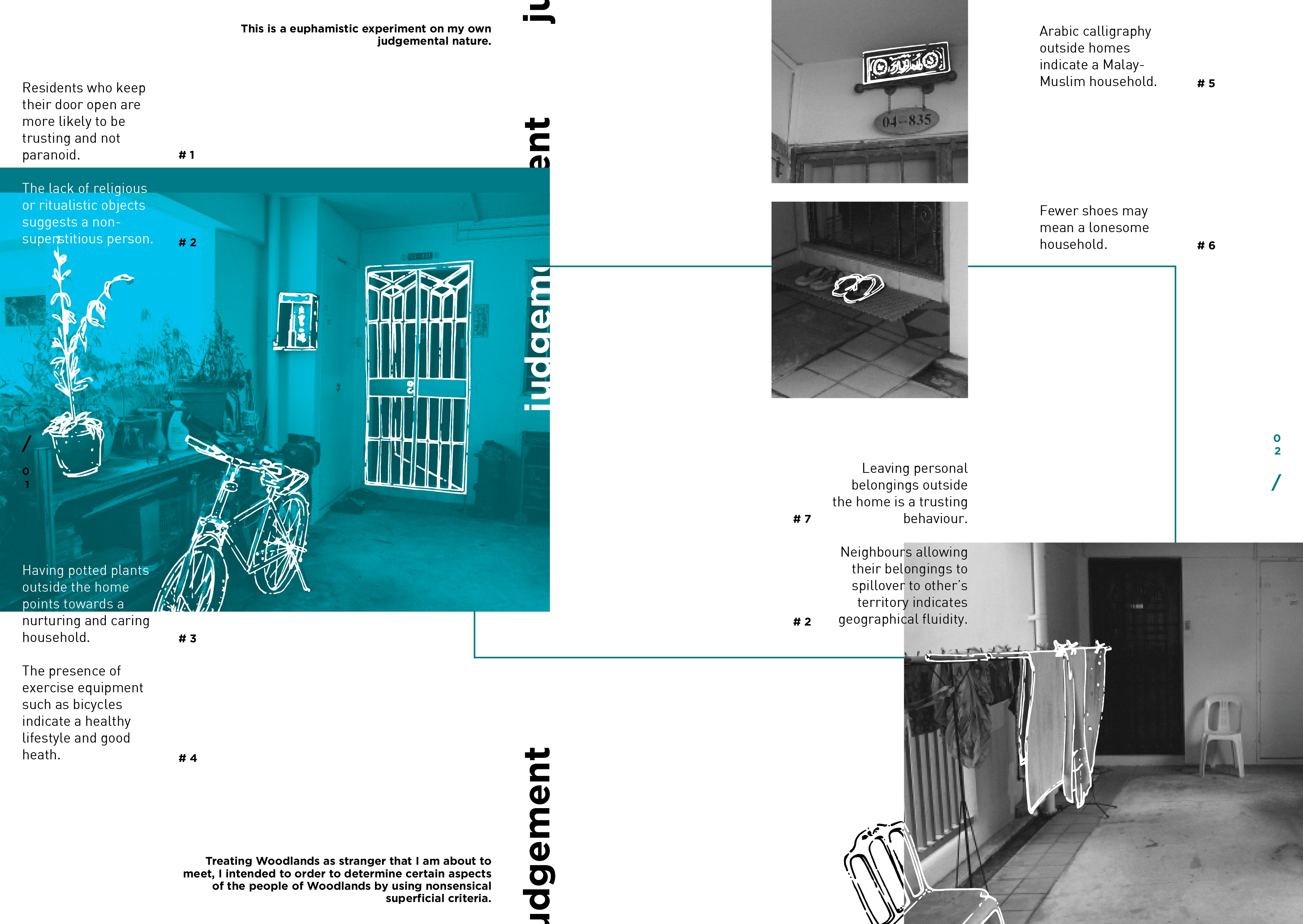
Tag: 2d
Kim Nguyen_Que Sera

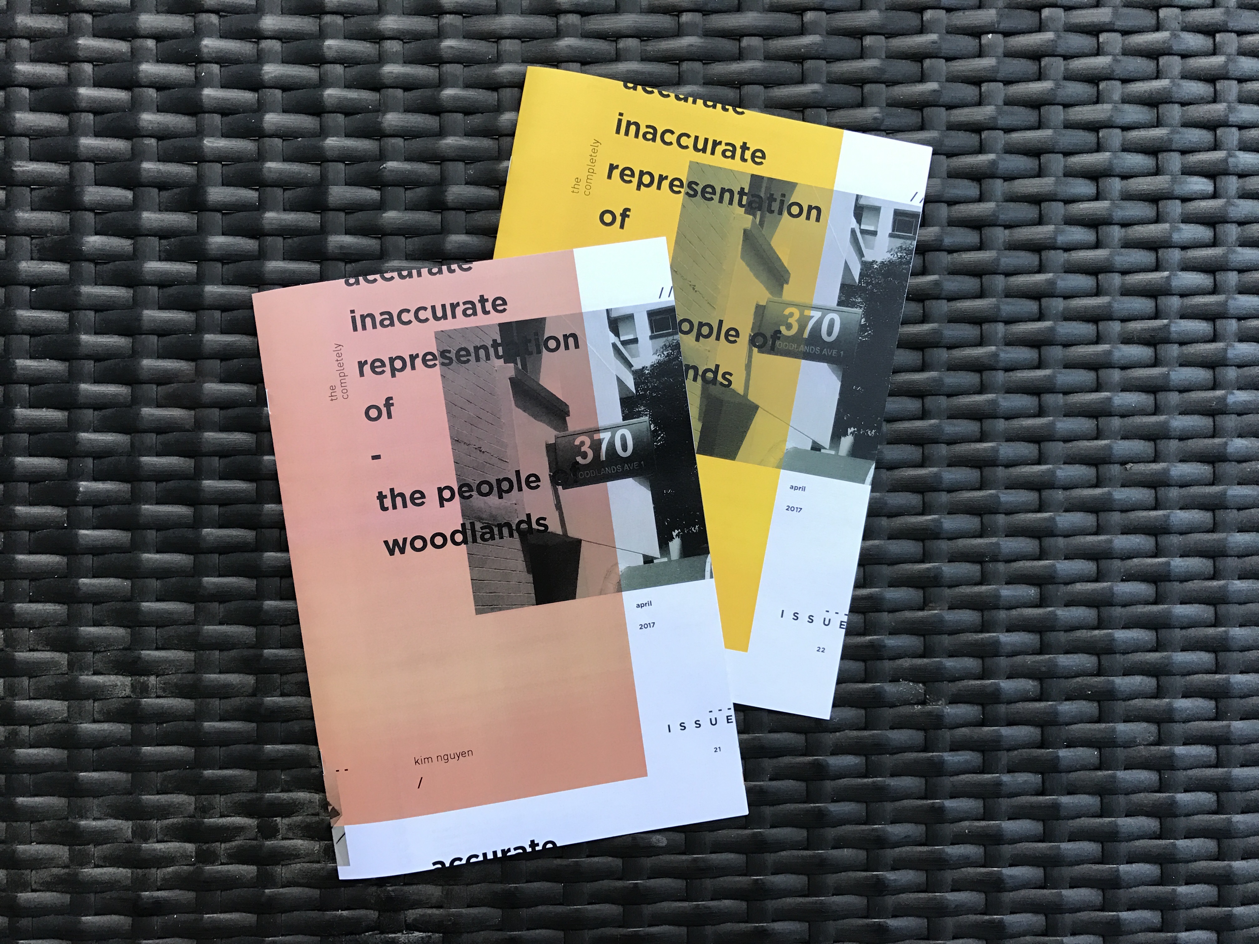
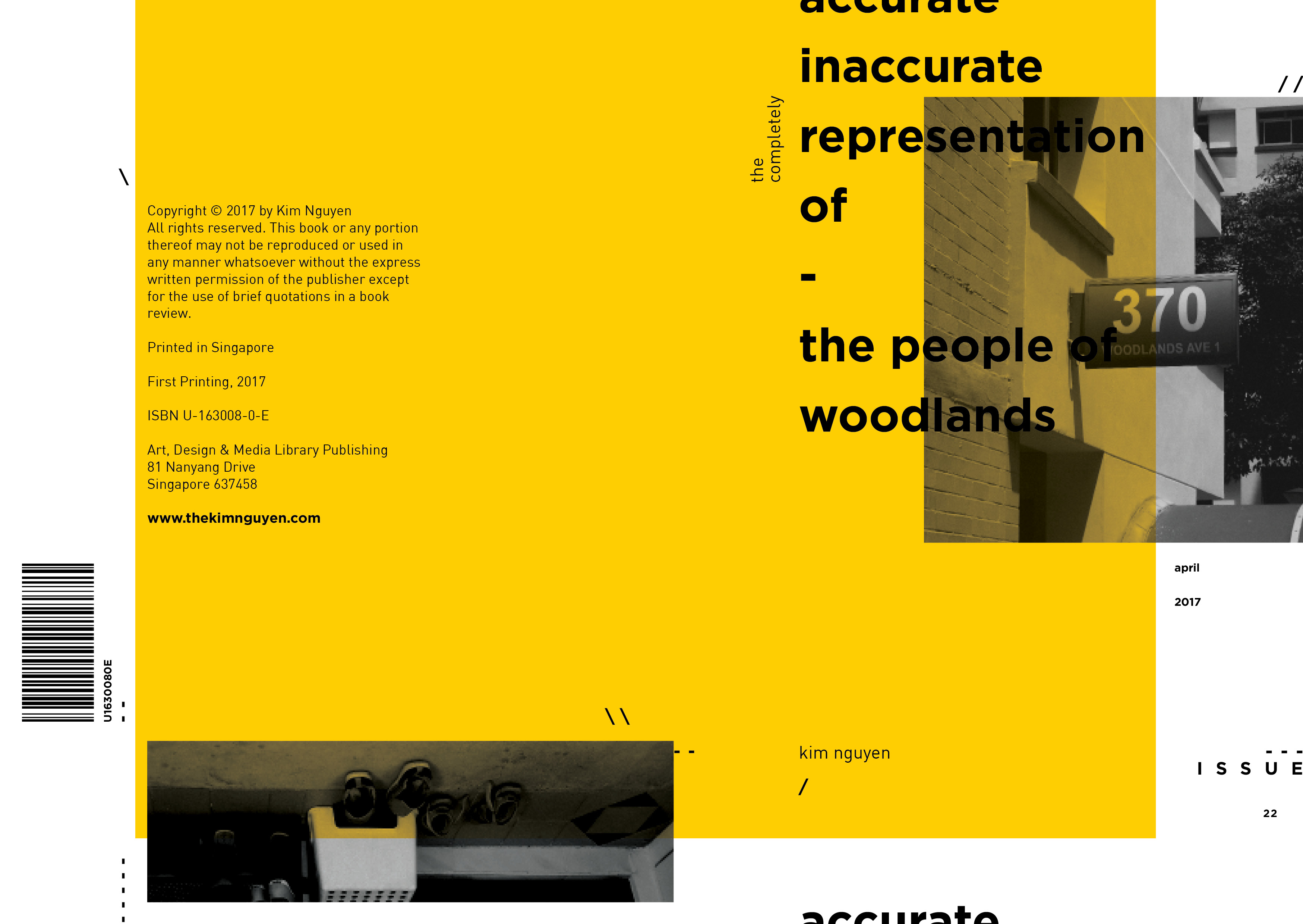
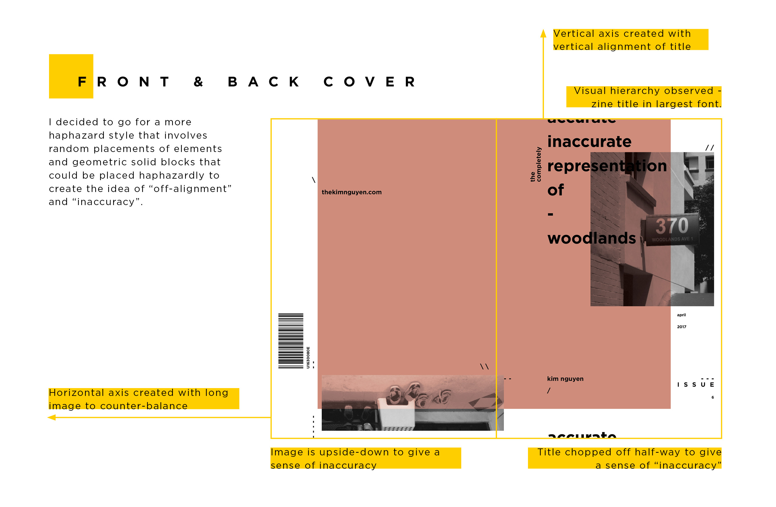
Zine – Final – The Completely Accurate Inaccurate Representation of the People of Woodlands
Zine – Process and Layout


Zine – Site Visit – Woodlands


All the photographs in their entirety can be found here: link


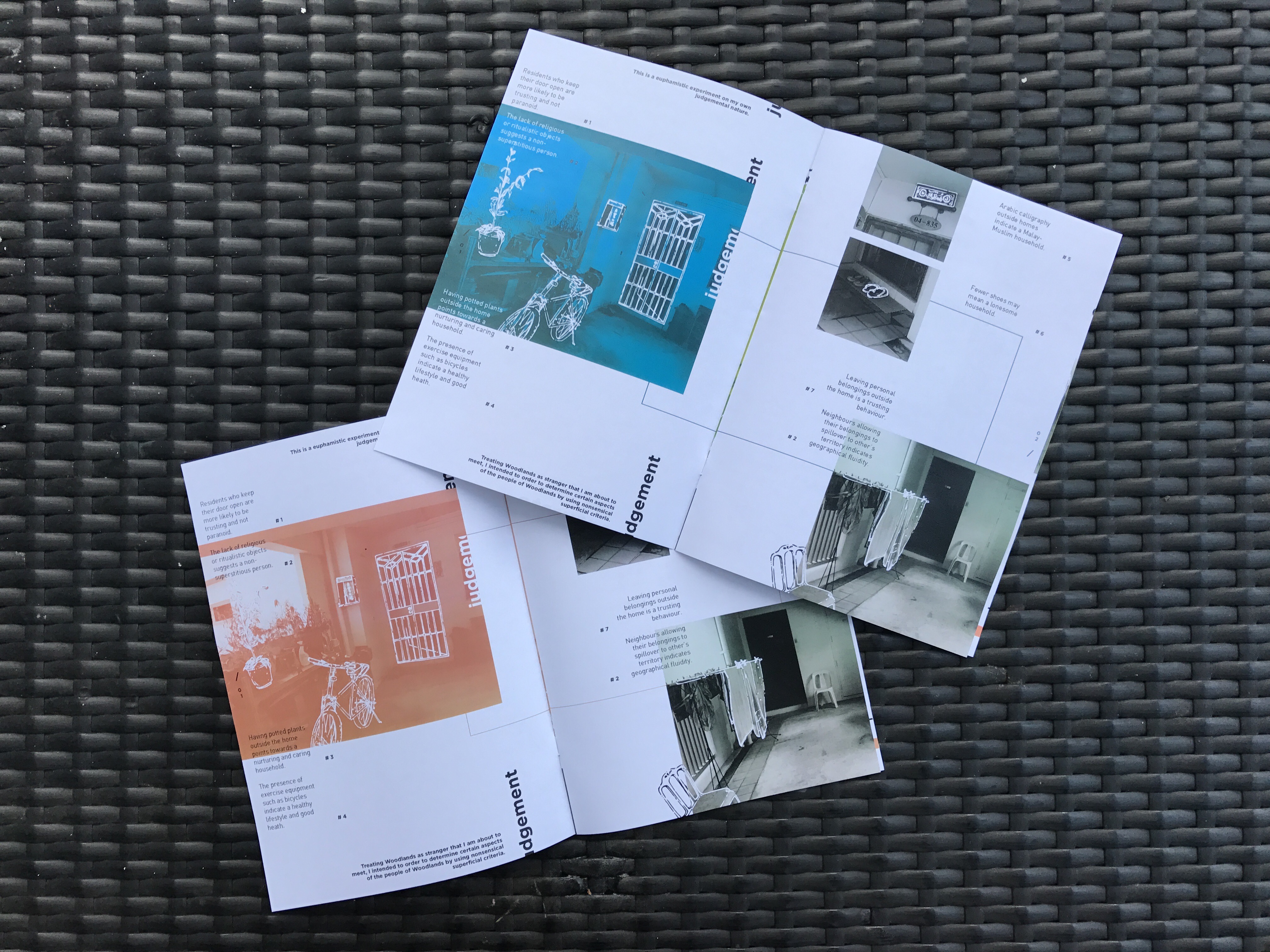
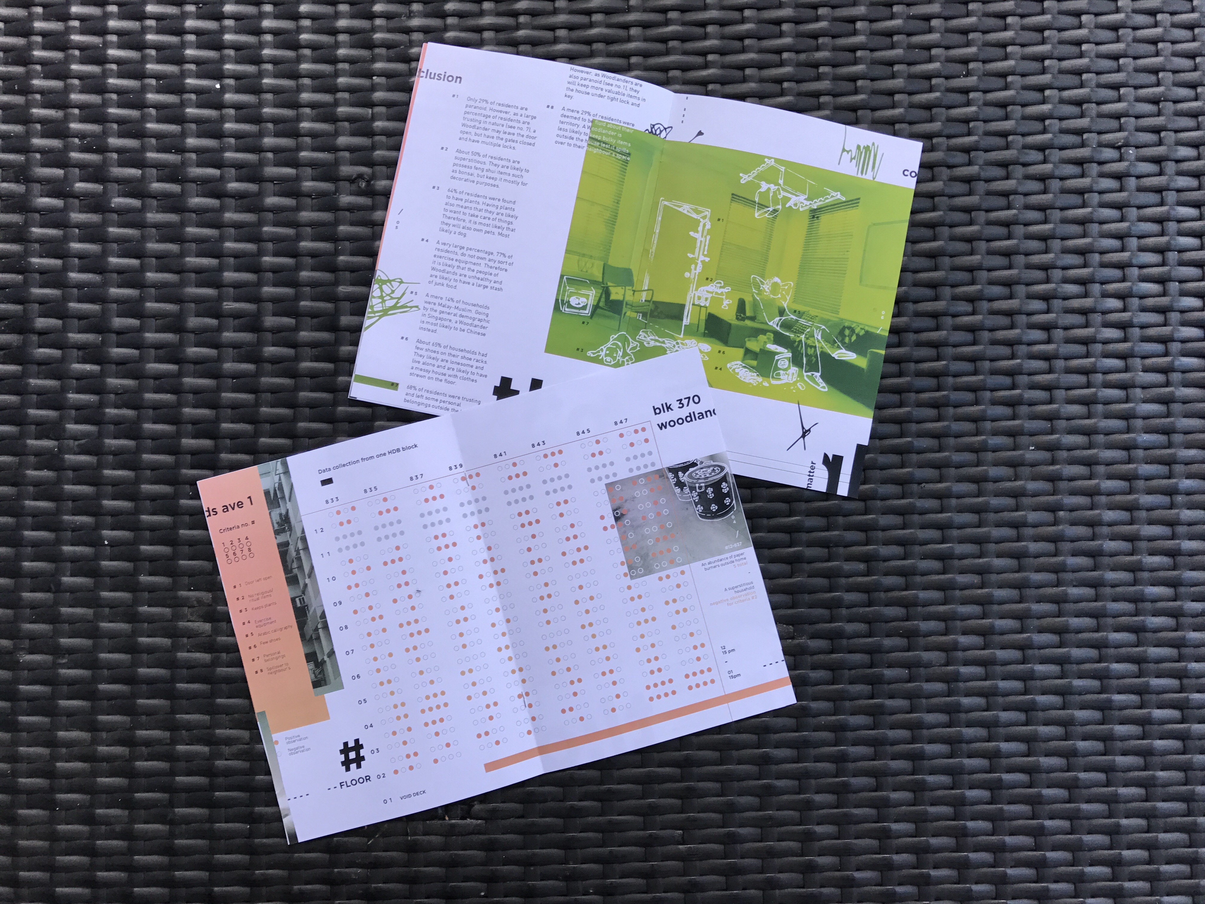
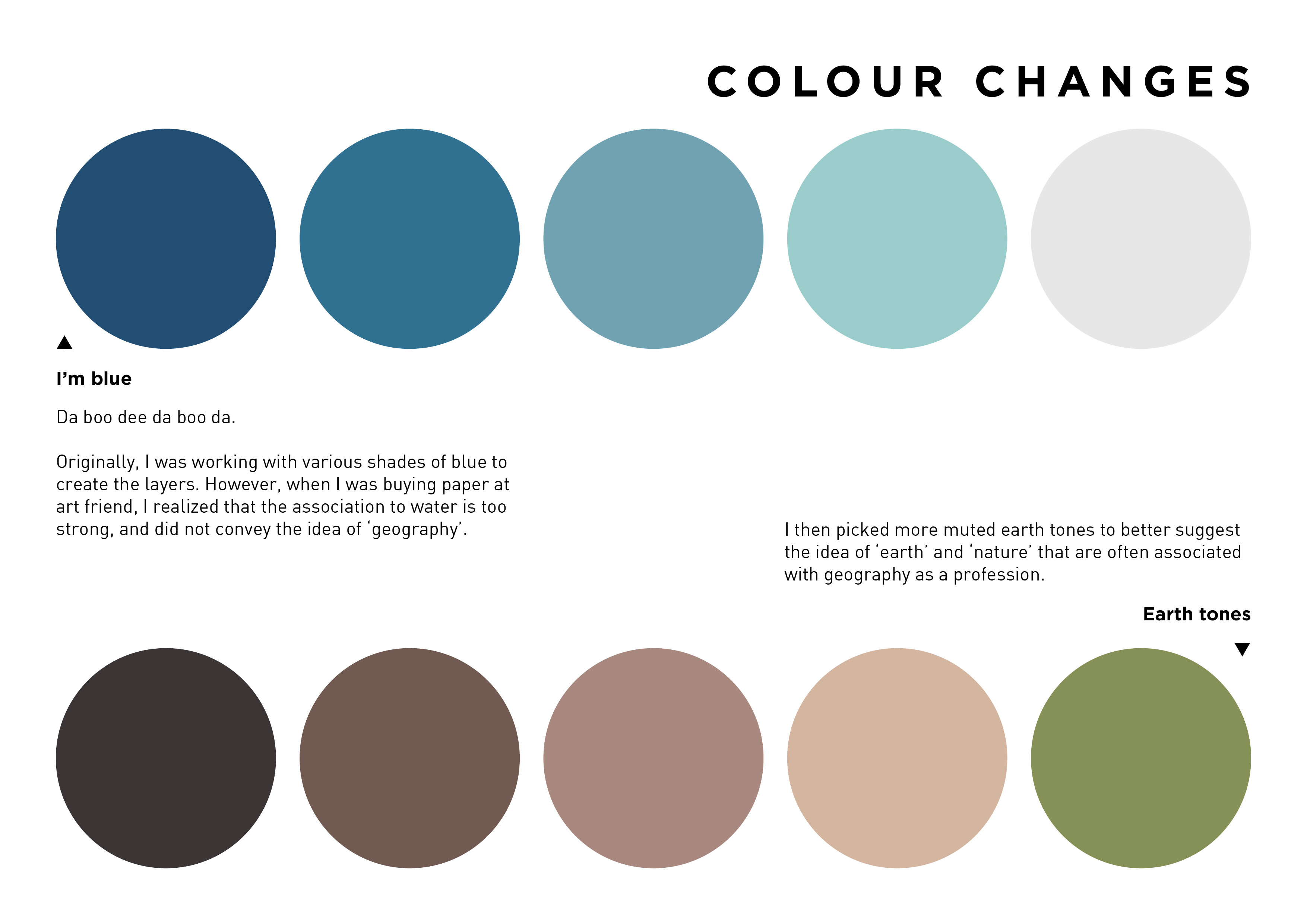
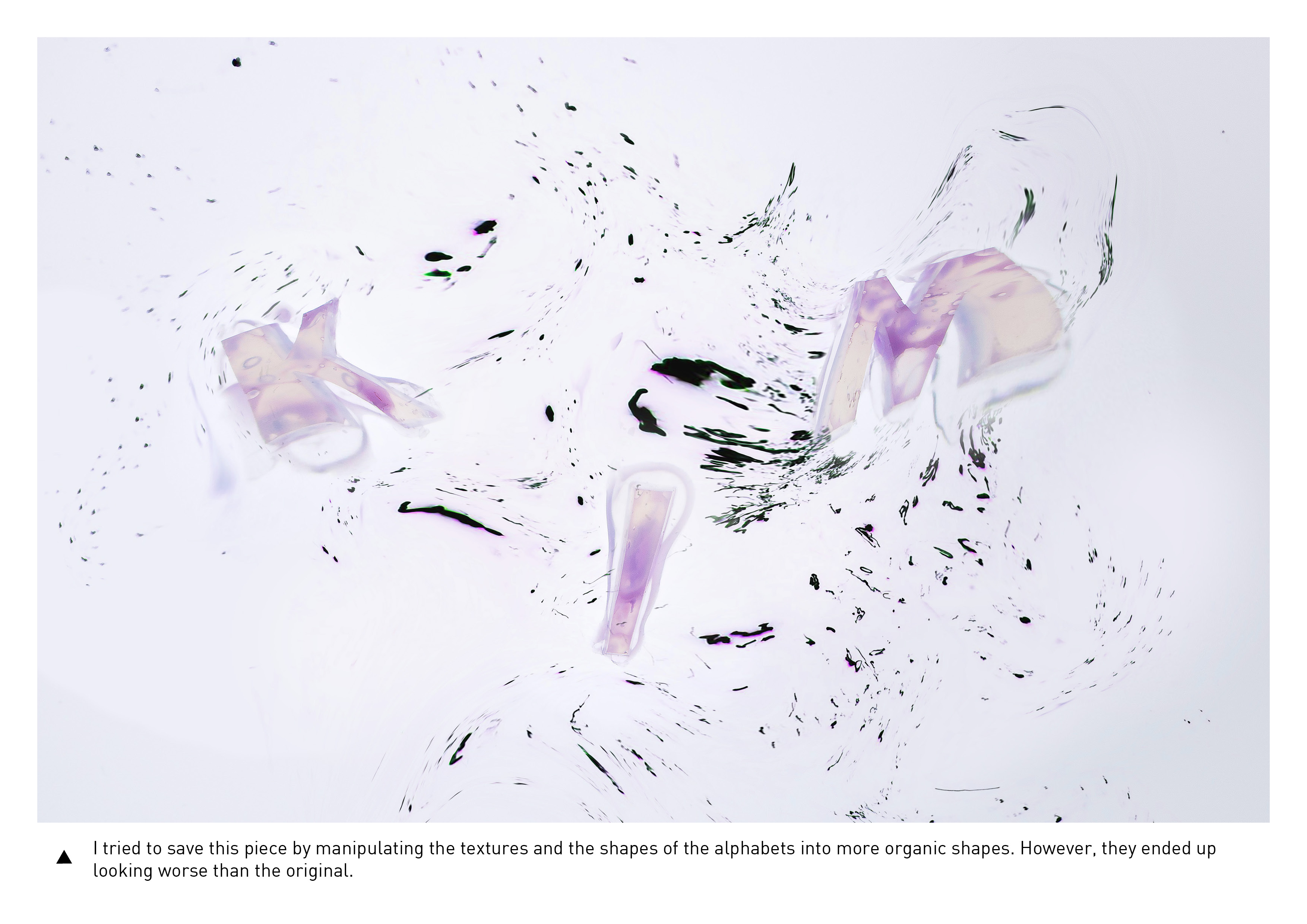
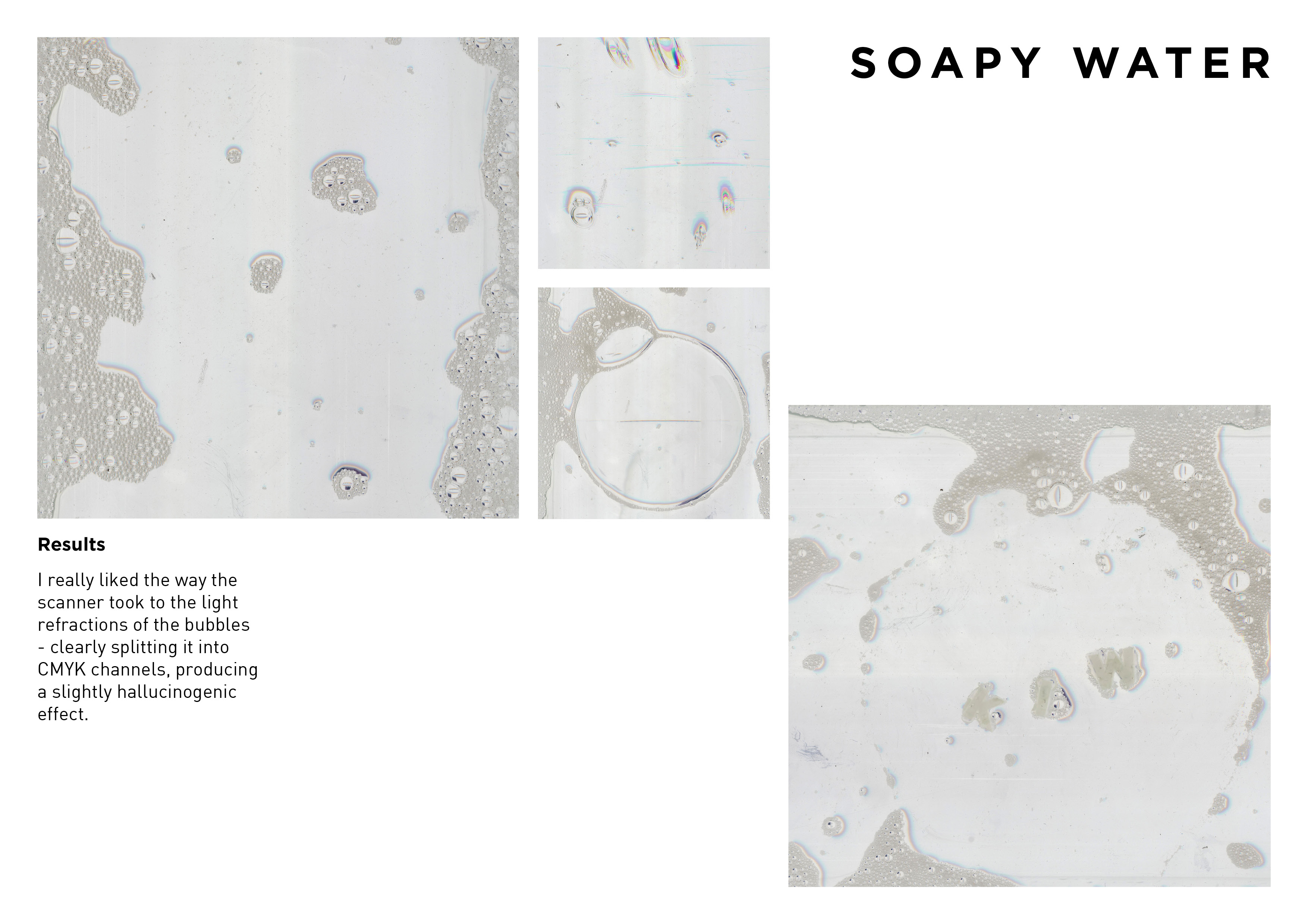
Initially, I wanted to have the focus of the zine be on portraying objectively the data I had collected. However, upon feedback, it was pointed out to me that the style of data visualisation above was too cold and ‘corporate’, which did not fit the whimsical nature of my concept. Deliberate and intentional superficial judgement (especially when the one who judges is consciously and purposefully making and dramatising skewed judgement) is best portrayed in a more fun, playful manner.
As such, I will be loosening my style for the final zine direction, and will be playing with hand-drawn illustrations and fun colours instead.
Que Sera – Final 4 – Semiotics
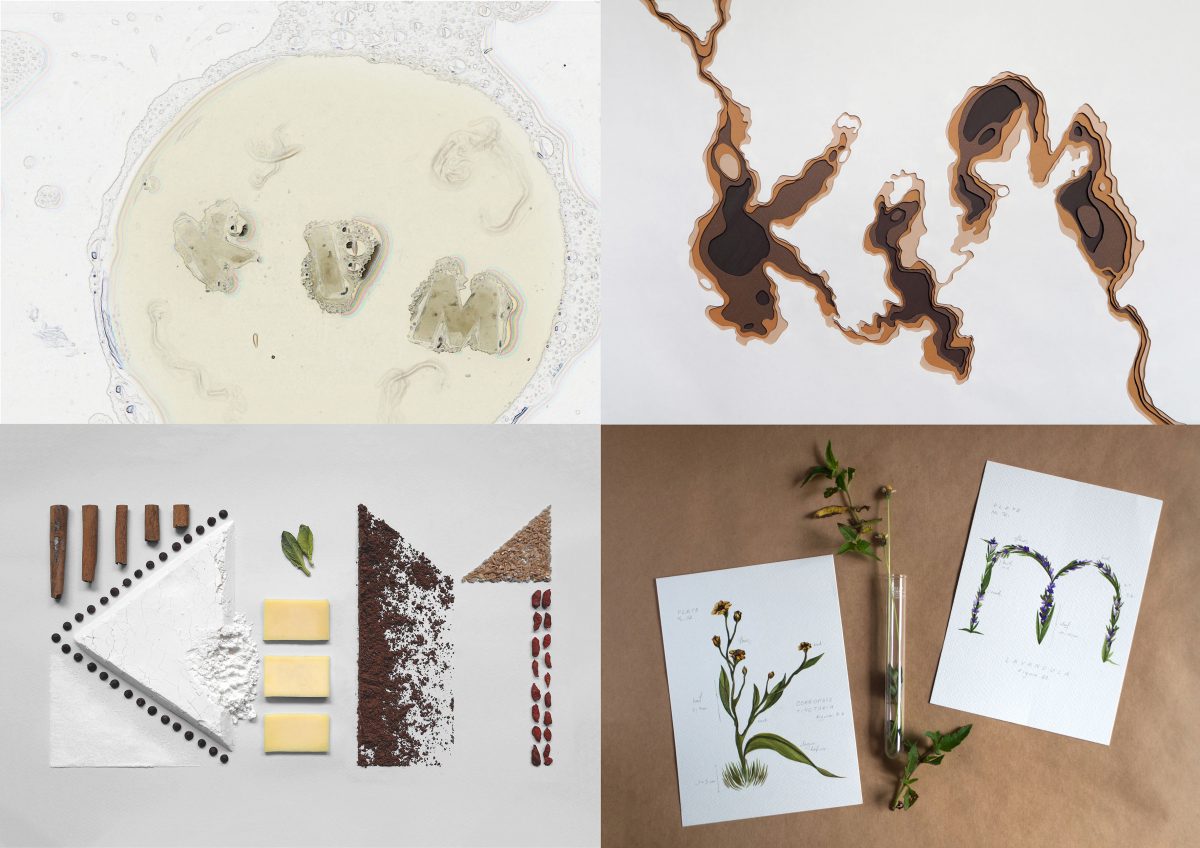
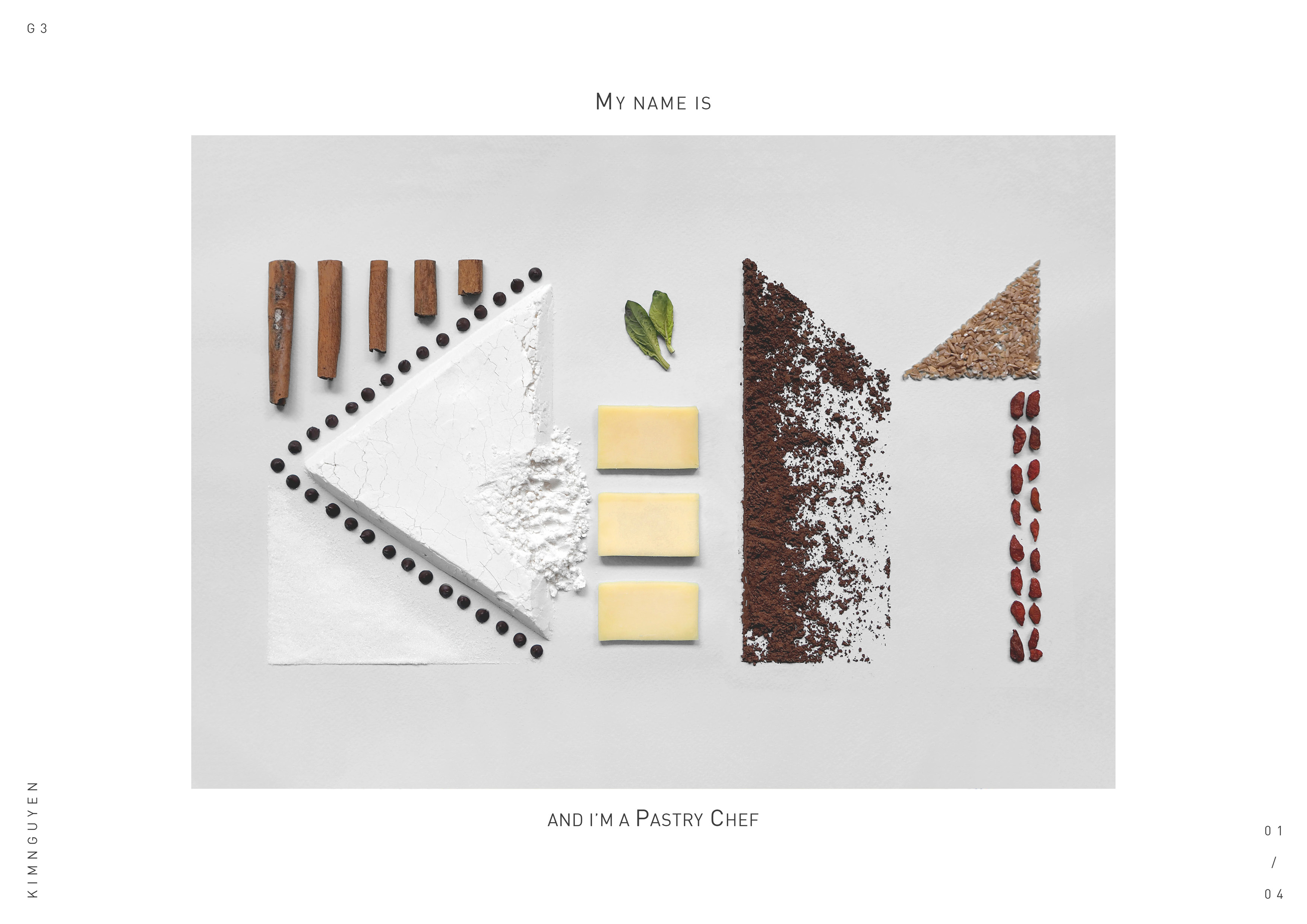
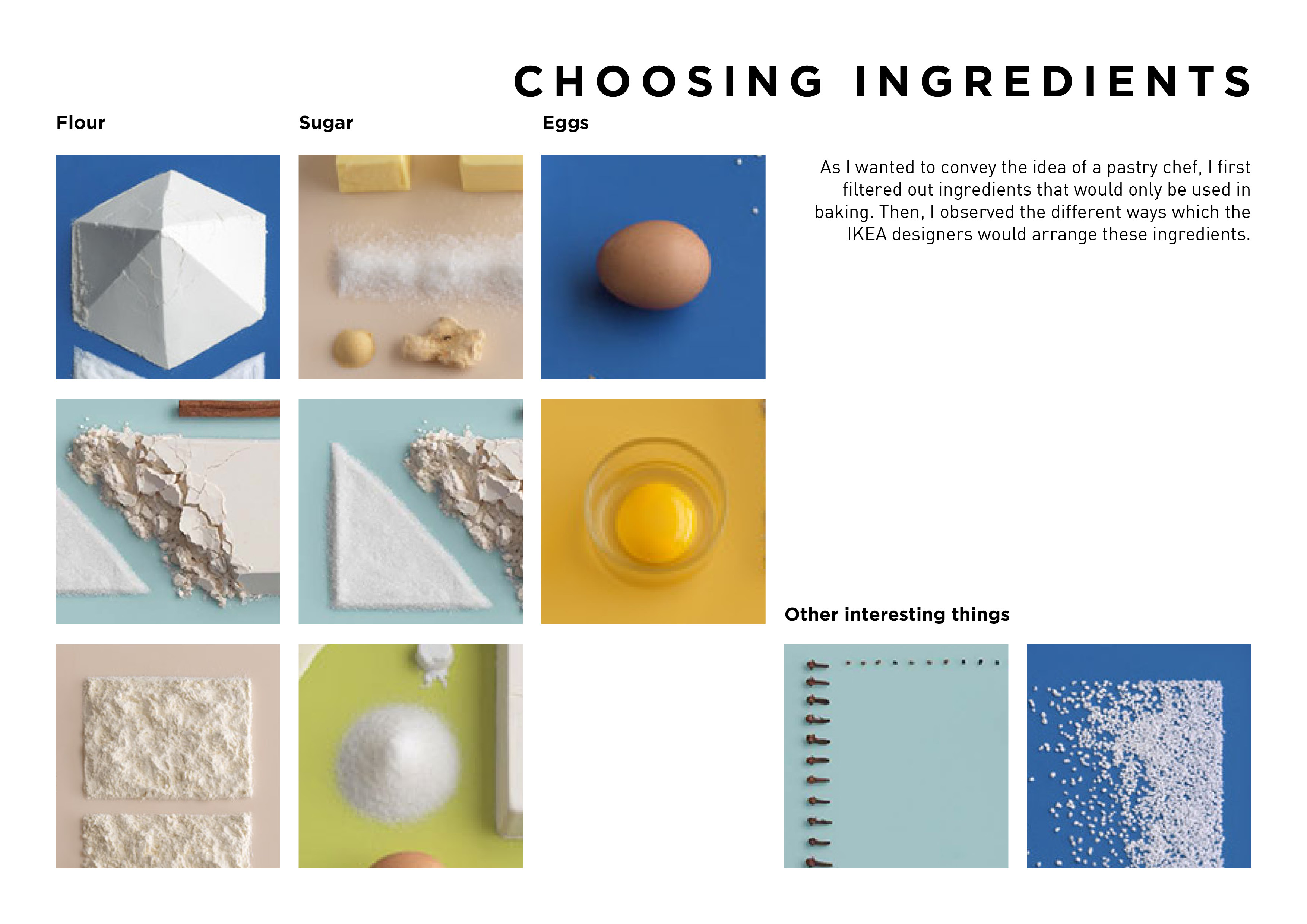
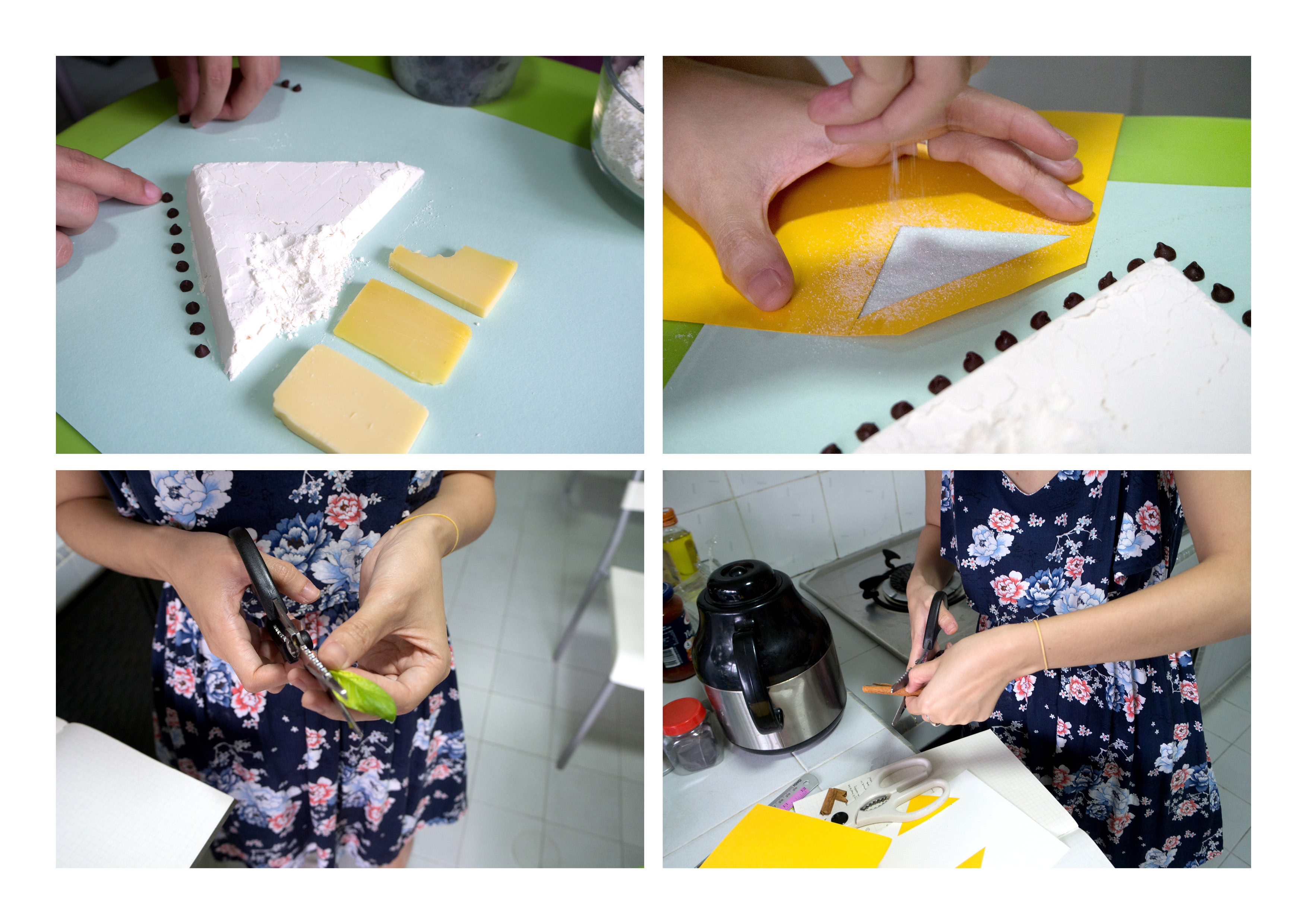
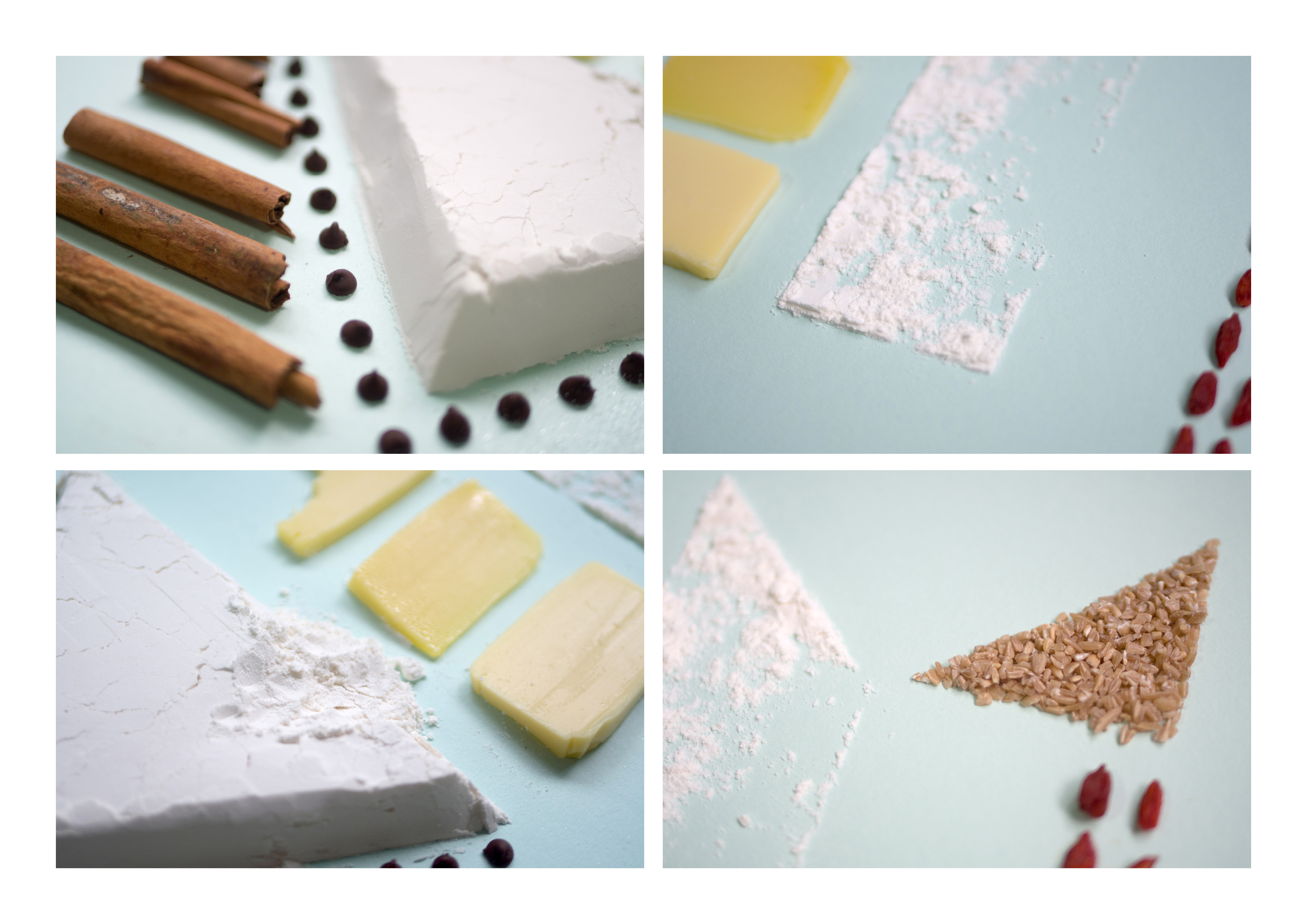
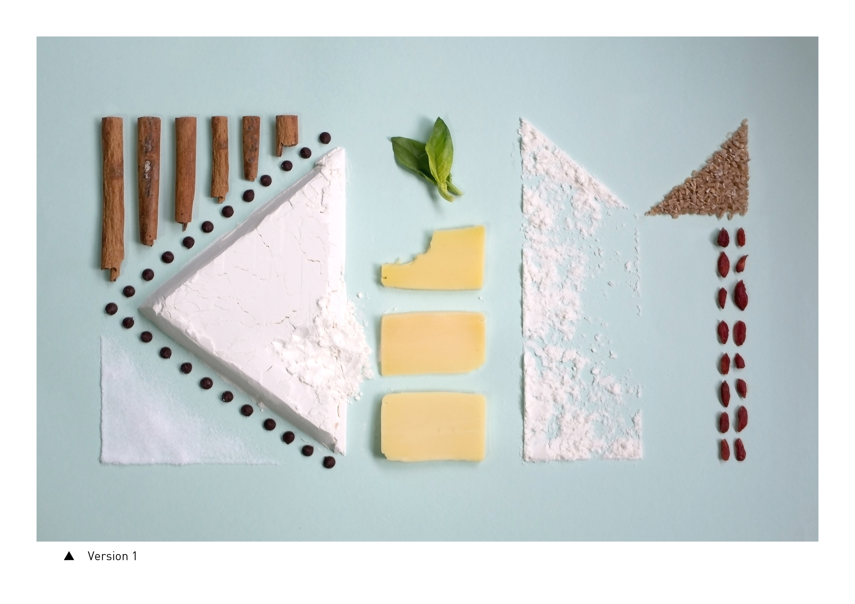
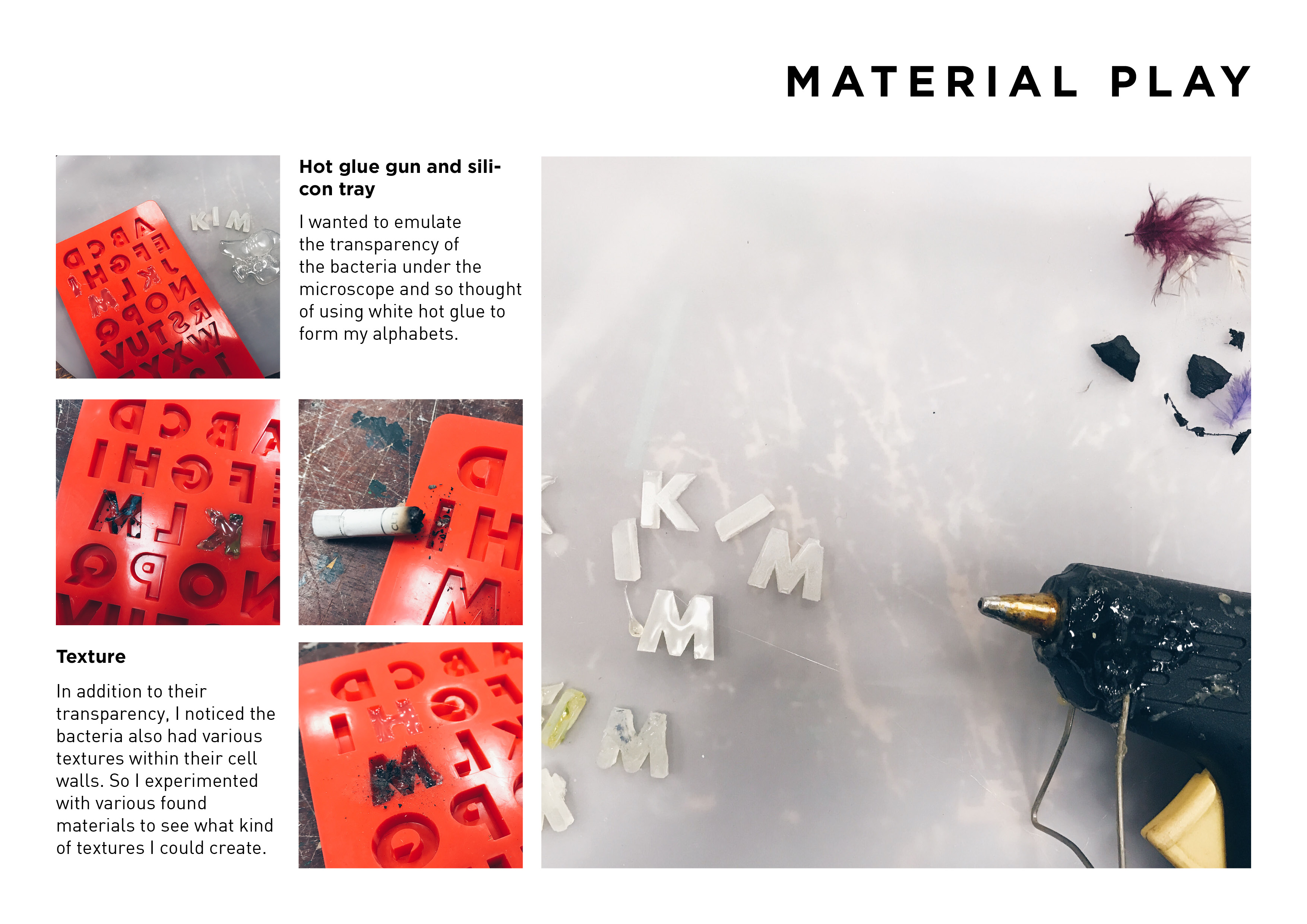
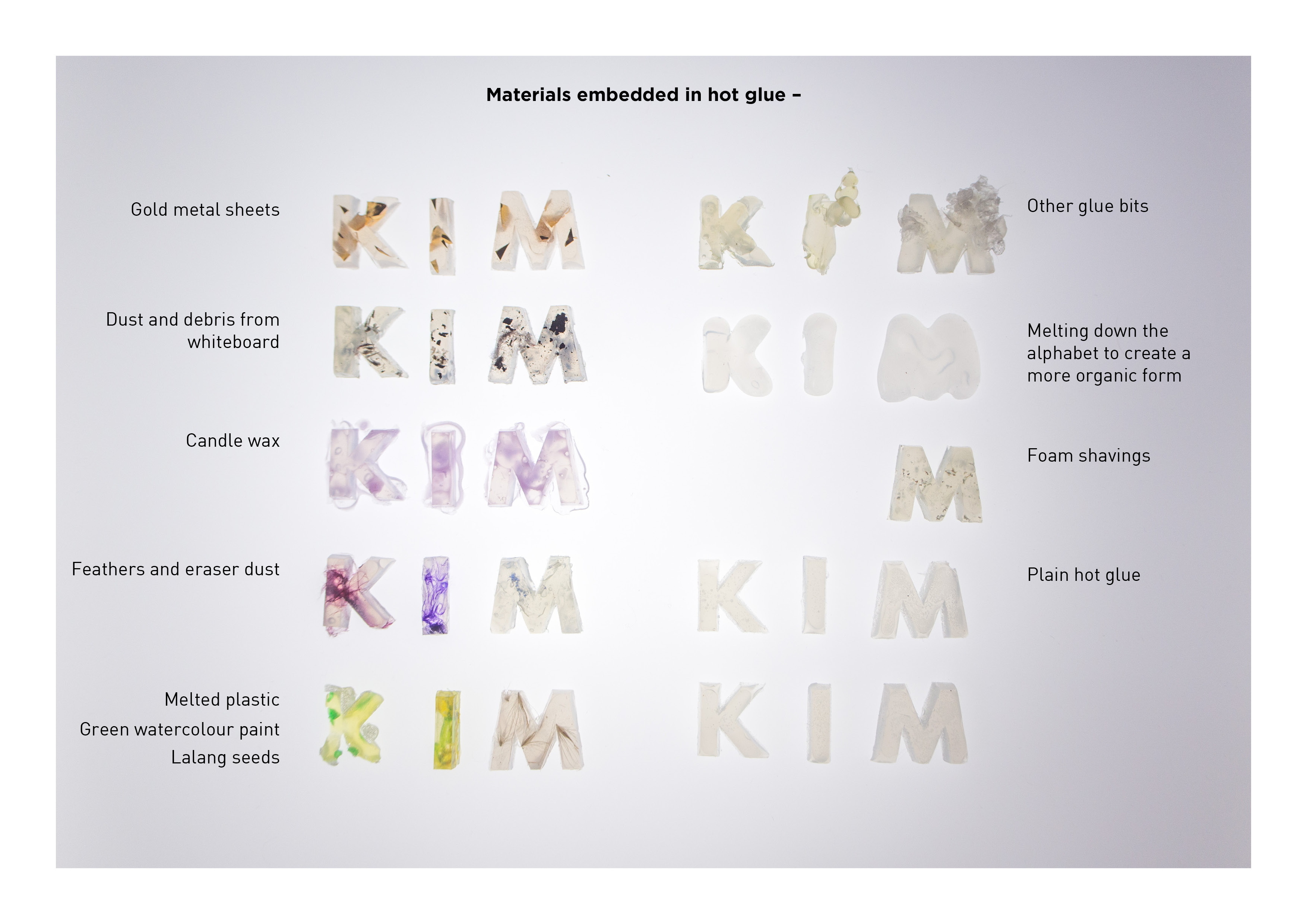
My name is Kim and I’m a Pastry Chef.
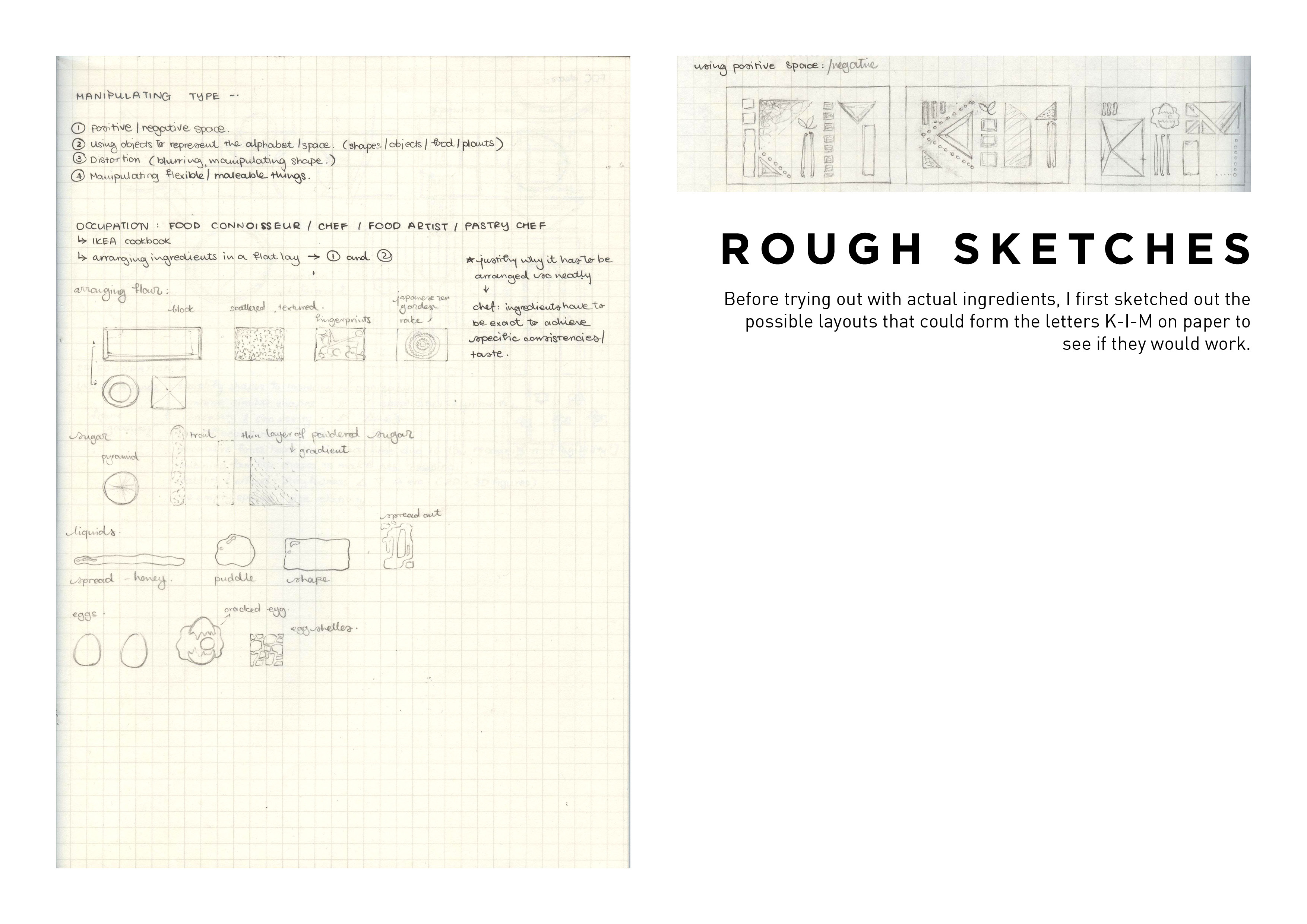
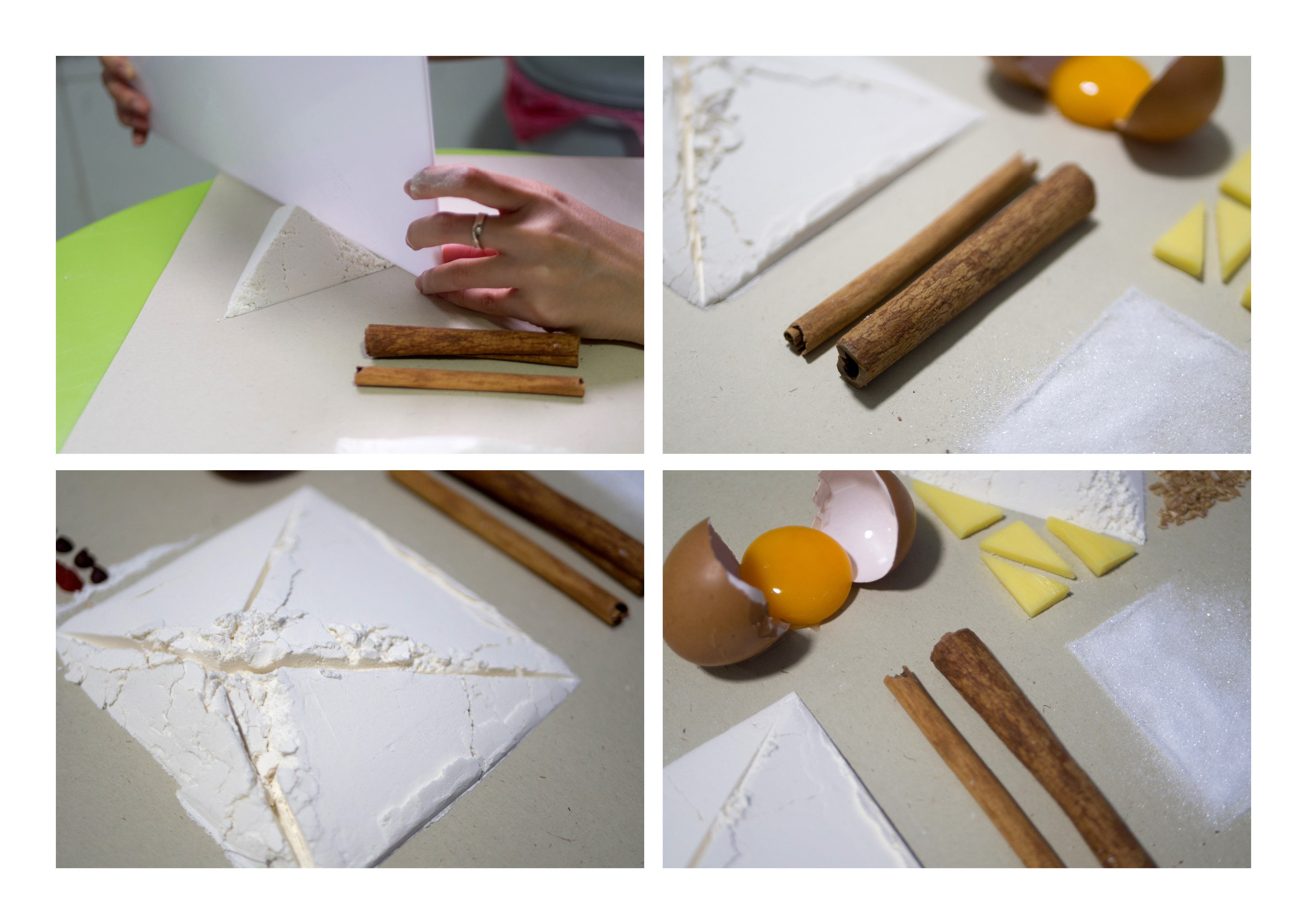
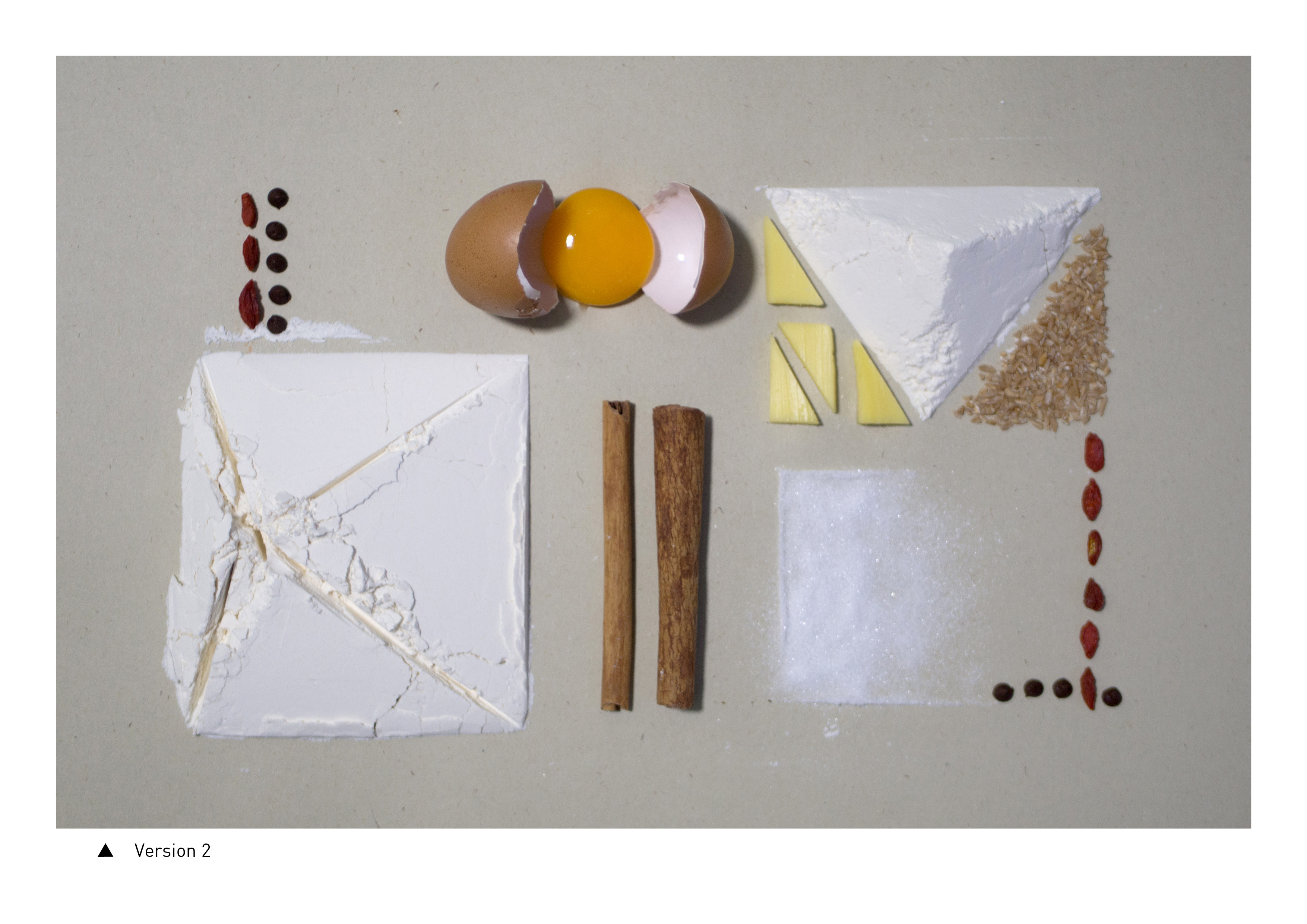
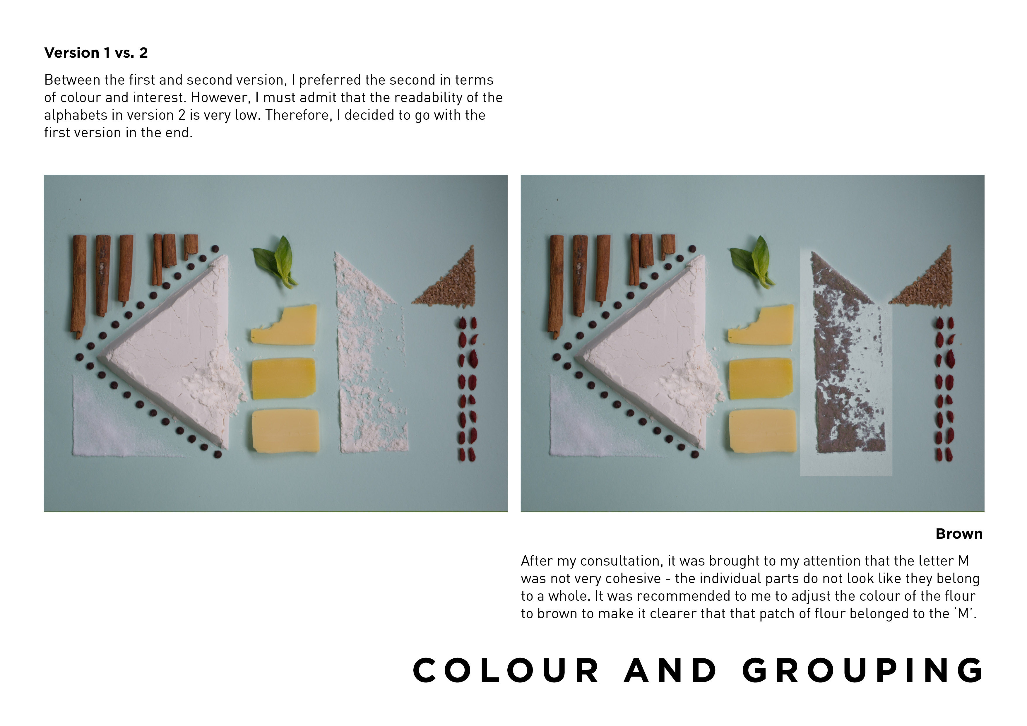
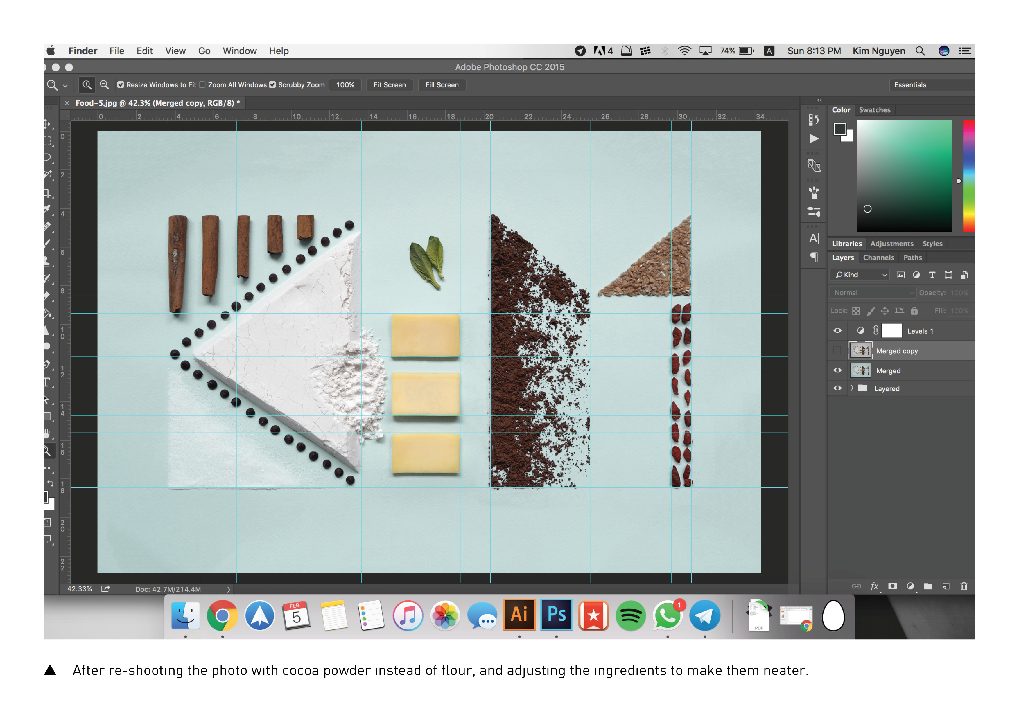
To make this type, I selected materials that would be commonly used specifically in baking – such as cinnamon, flour, sugar and cocoa powder. This was to avoid confusion with other kinds of cooking/cuisines that might involve a wide range of ingredients like rice, pasta, prawns and vegetables to name a few. I arranged the ingredients in a meticulous matter, even adjusting the photograph in post-process to ensure that the lines looked neatly arranged. This was to convey the idea of precision that is often needed in baking – where one has to accurately weigh out specific proportions of ingredients else the pastry might turn out tasting wrong, or having the wrong texture. The main colours in this composition are earthly tones of brown, yellow and green as I associate pastries as being from the chocolate variety. Texture-wise, I wanted to play with the natural textures of each ingredient. However – one distinct deliberate adjustment I had done is on the triangular shape of the flour that makes up the ‘K’ on the left. Left untouched, it has a very smooth texture, which I felt may have caused an imbalance in the whole composition with the left side having smoother textures (sugar, flat flour) and the right side having rougher textures (cocoa powder, grains). Therefore, I deliberately made a disturbance on the side of the white flour triangle to introduce a rougher texture onto the left side of the composition to make it more harmonious.
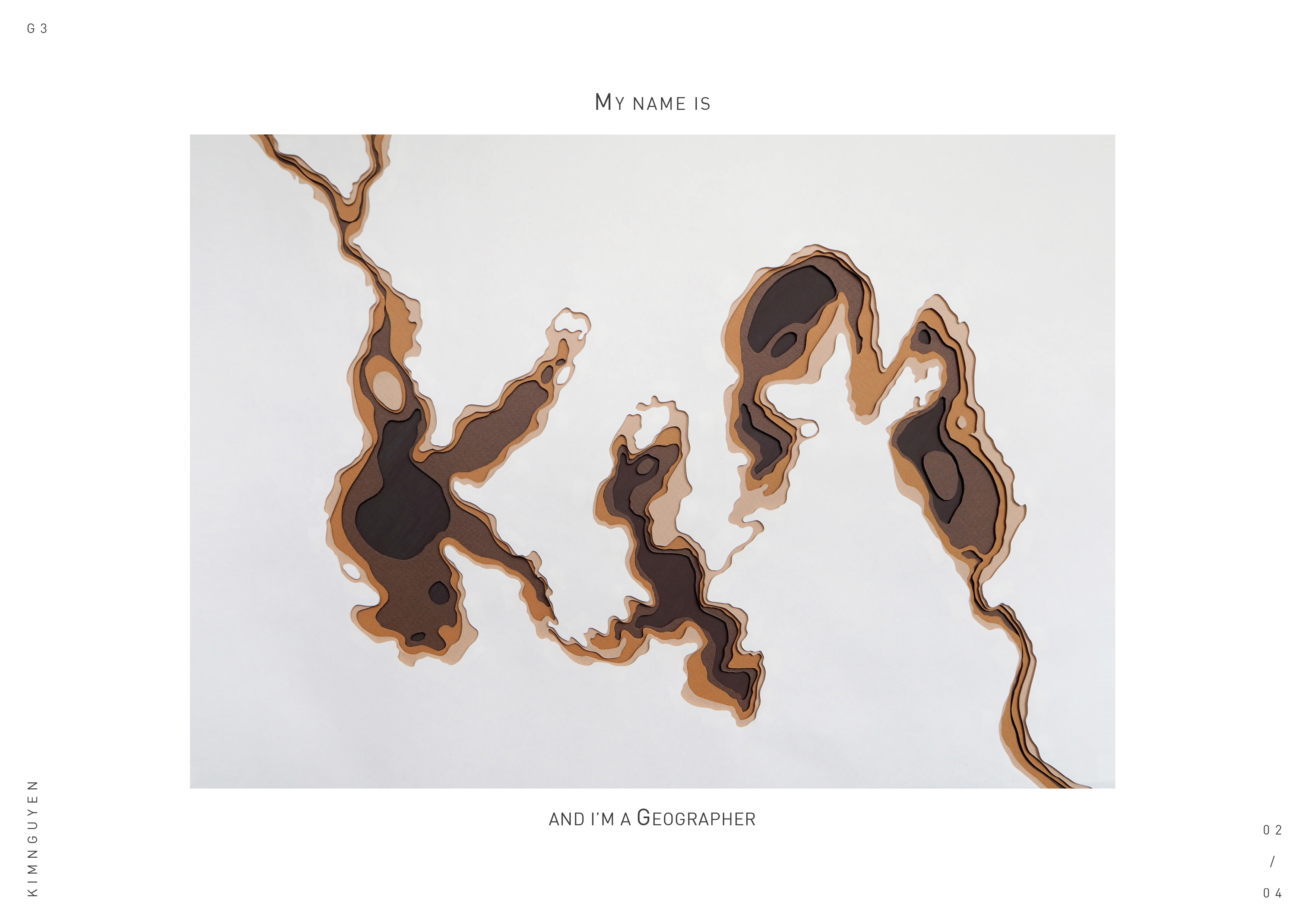
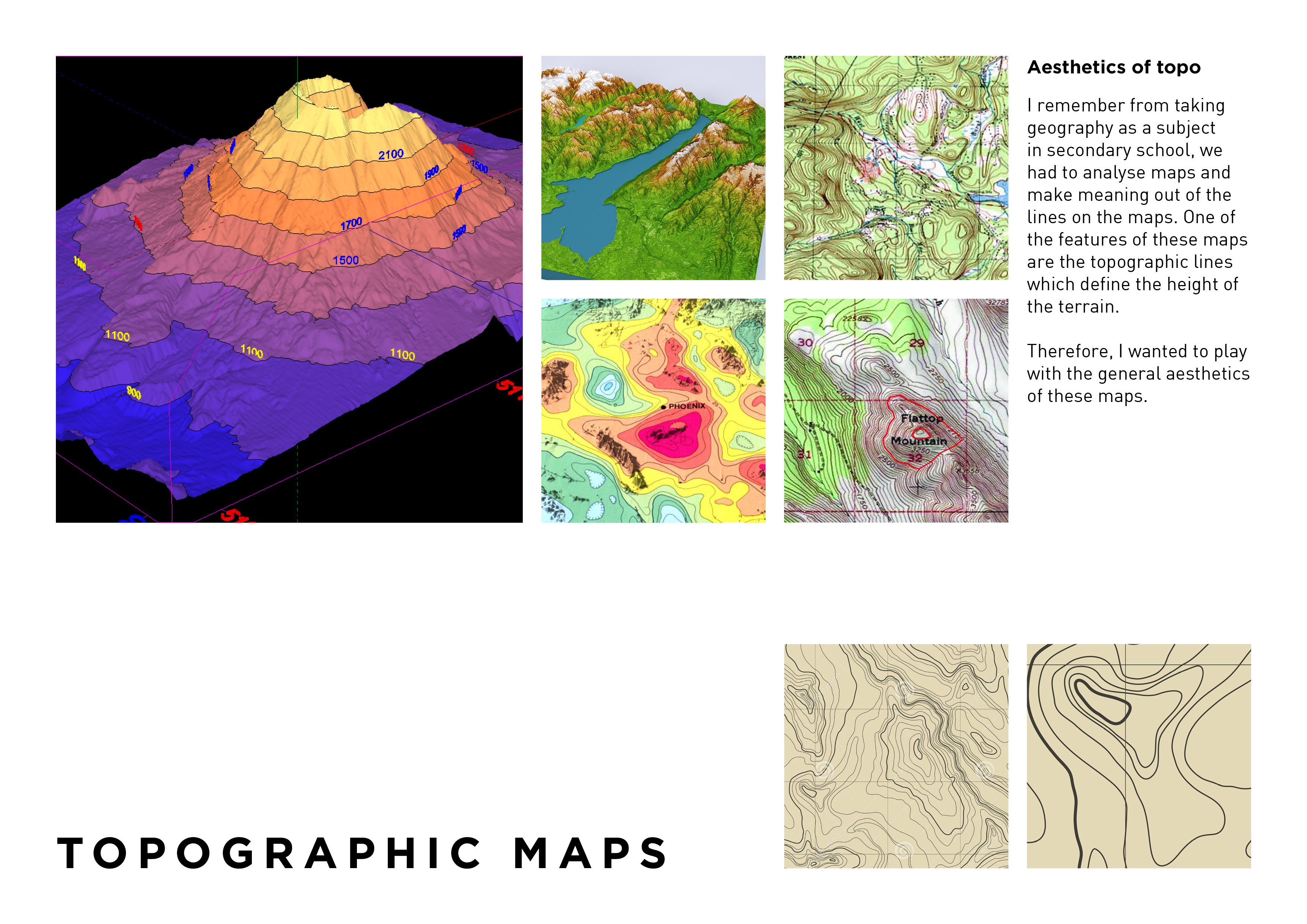
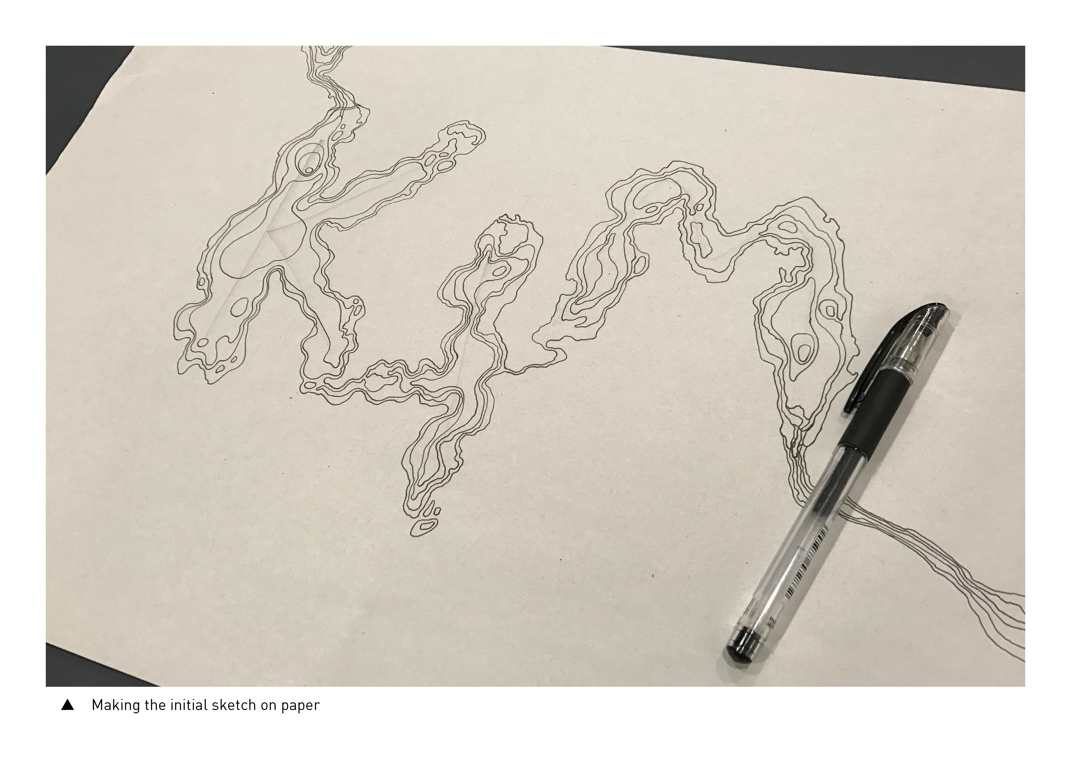
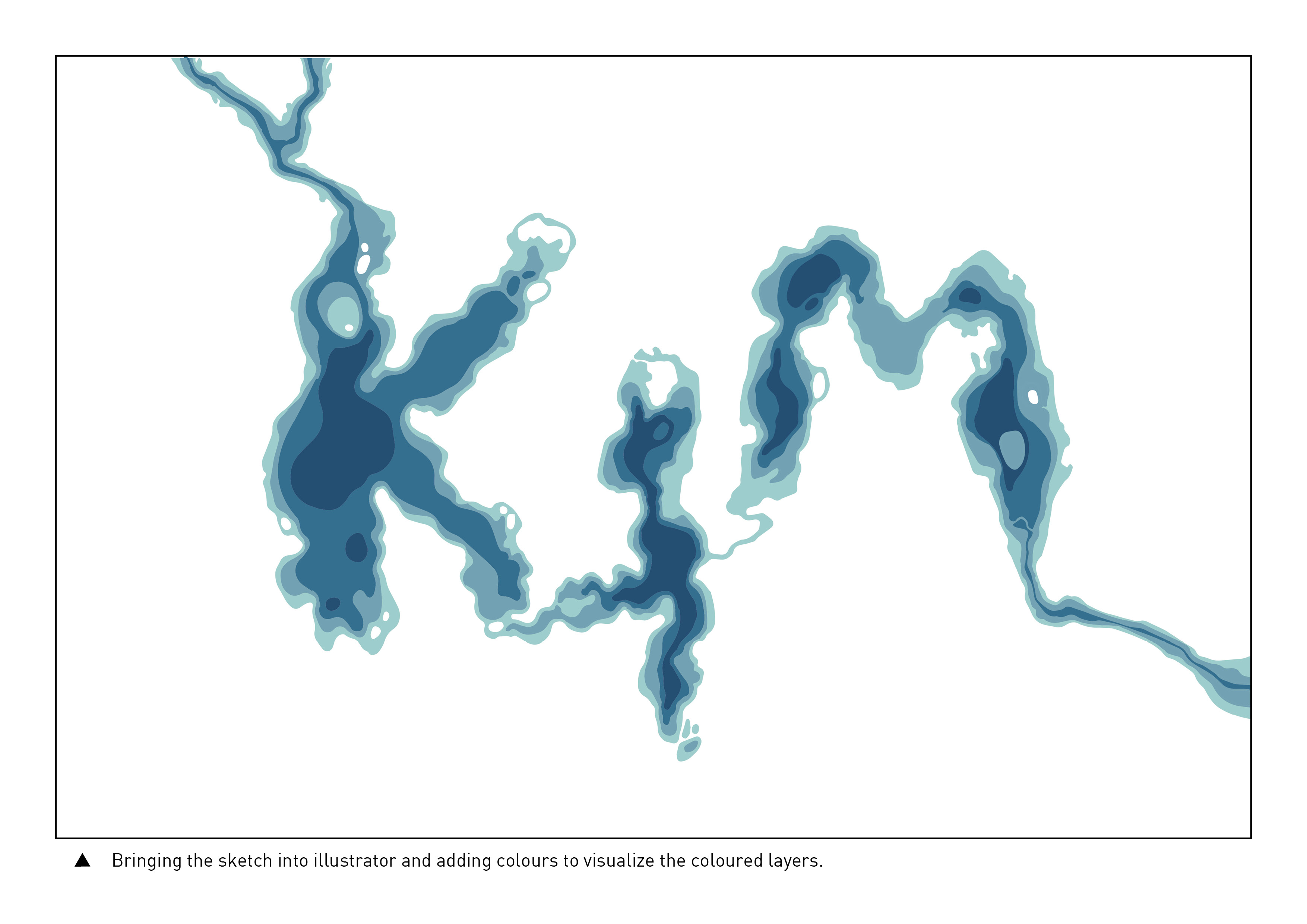
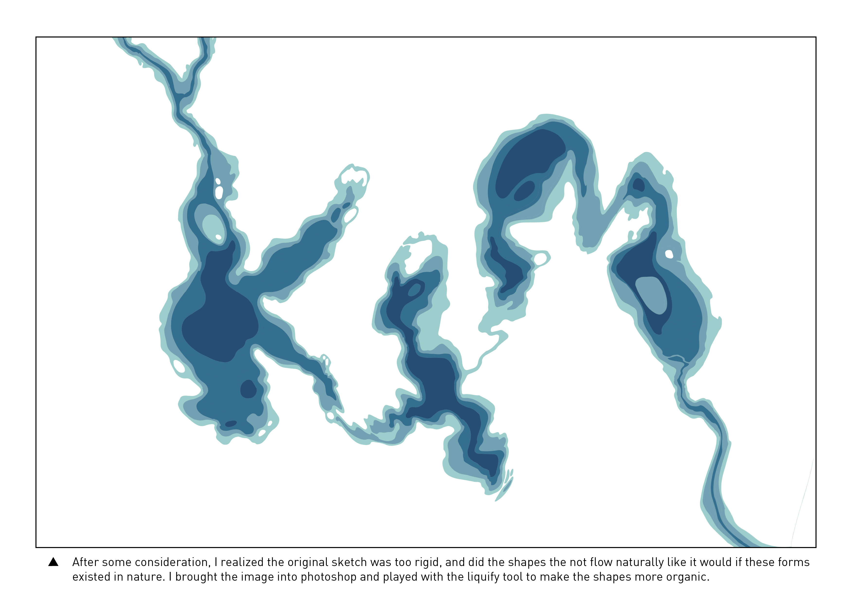
My name is Kim and I’m a Geographer.
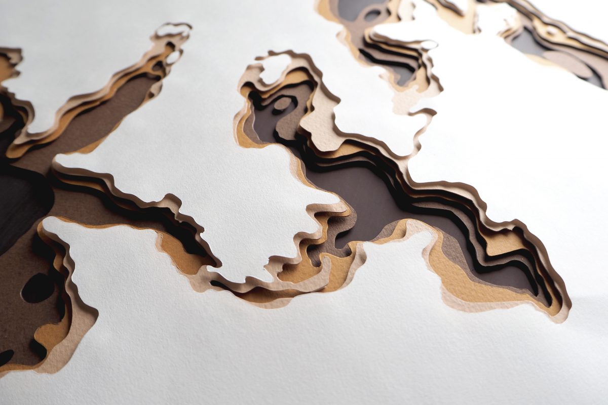
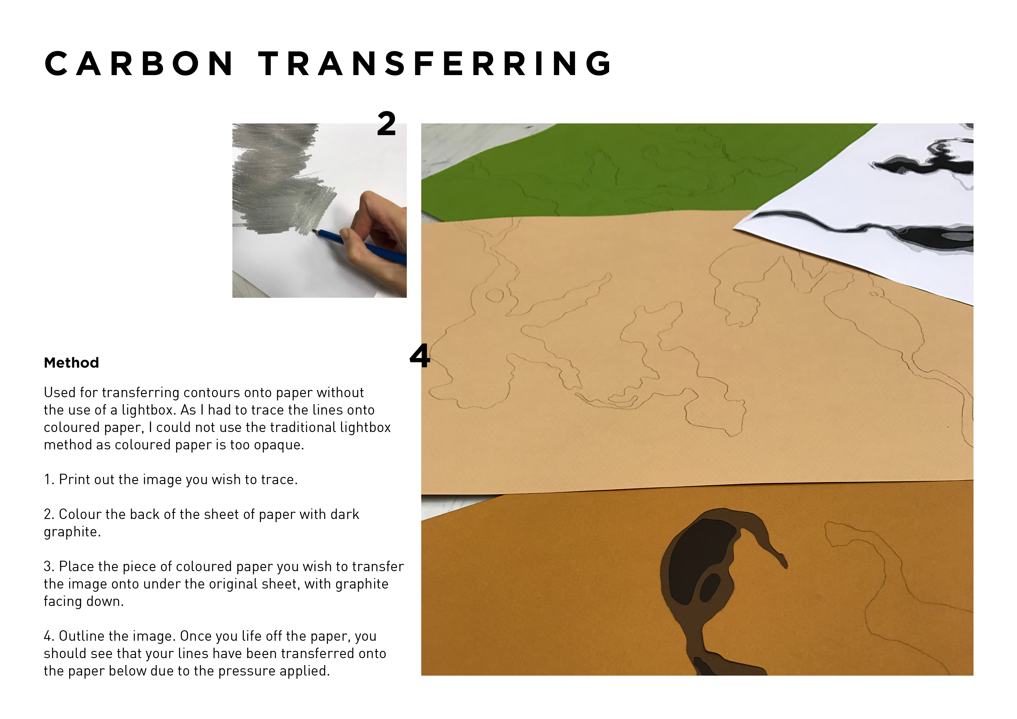
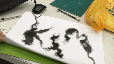
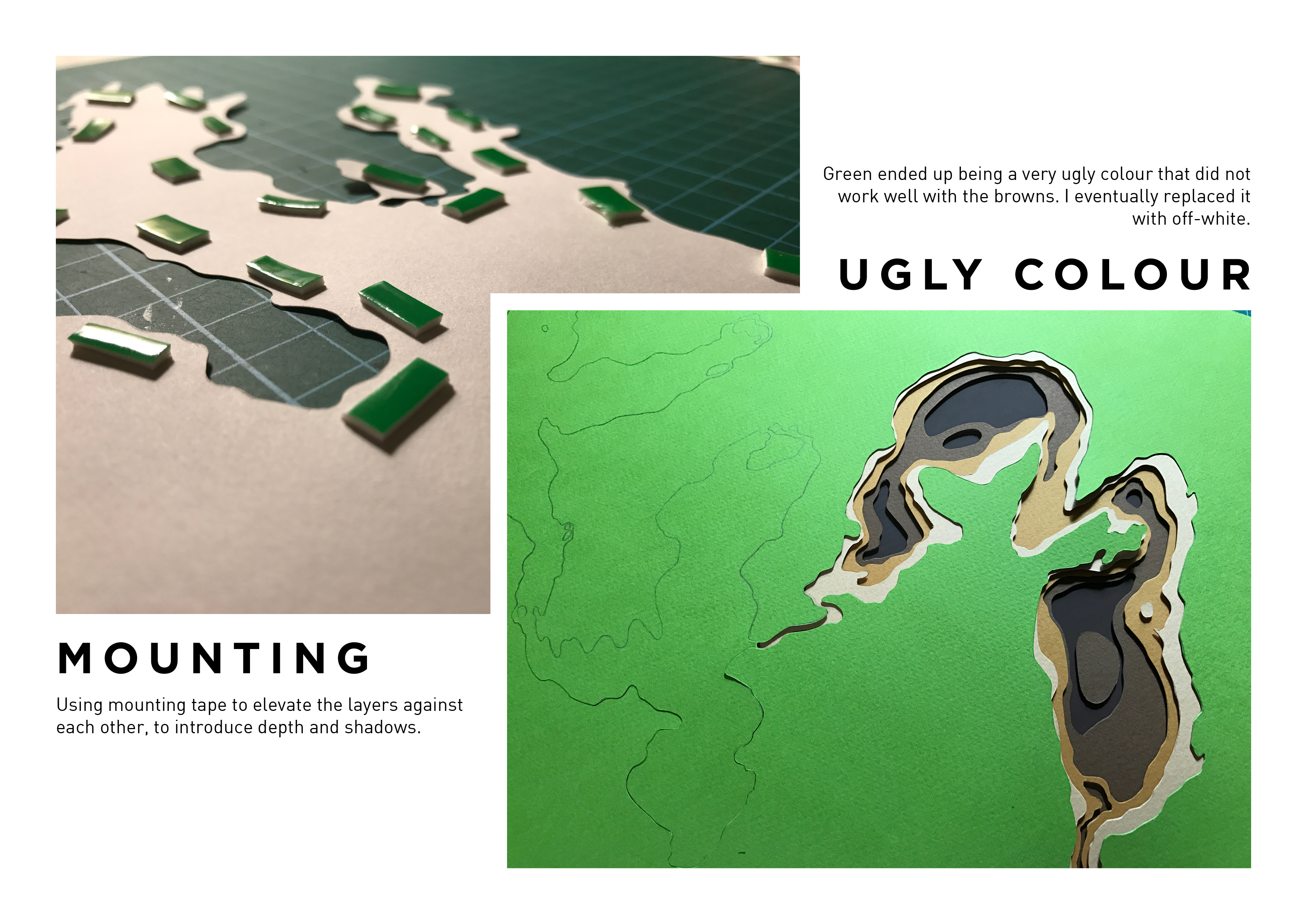
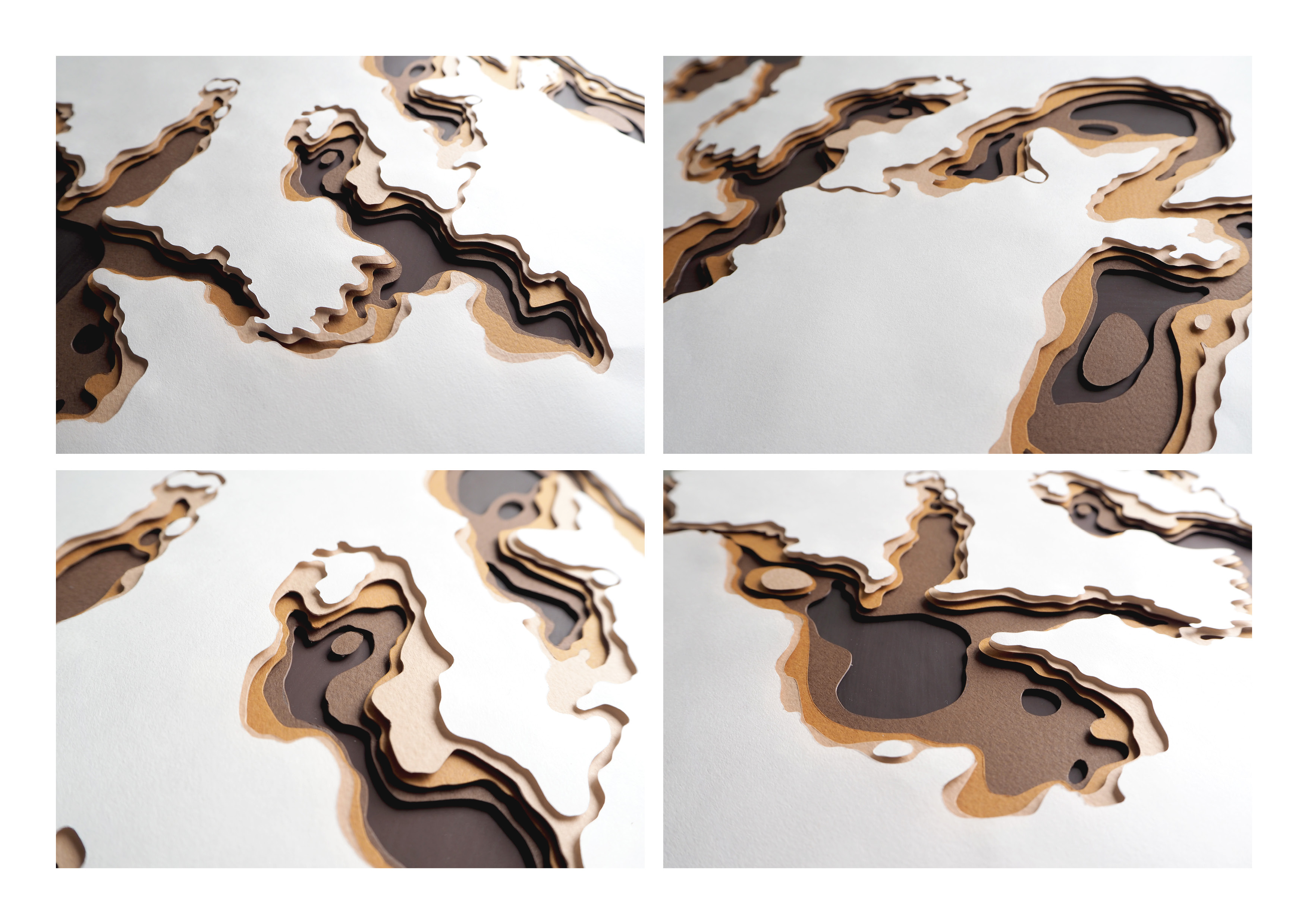
For this type, I wanted to play with the shapes of naturally occurring landforms and transform it to look like alphabets to convey the idea of a geographer – somebody who studies the land and the way it changes. As such, I went for a more organic form to the letters (rather than standard block letters) and morphed them such that they ooze and flow into the negative space as well as into each other – to emphasize on their organic, ‘natural’ shapes. The idea is that one could possibly find these forms in nature. As for the choice of colour, this had much to do with the depth associated with certain parts of the ‘landform’ – darker colours to denote depth, transitioning to lighter colours as the landforms rise and become closer to the viewer.
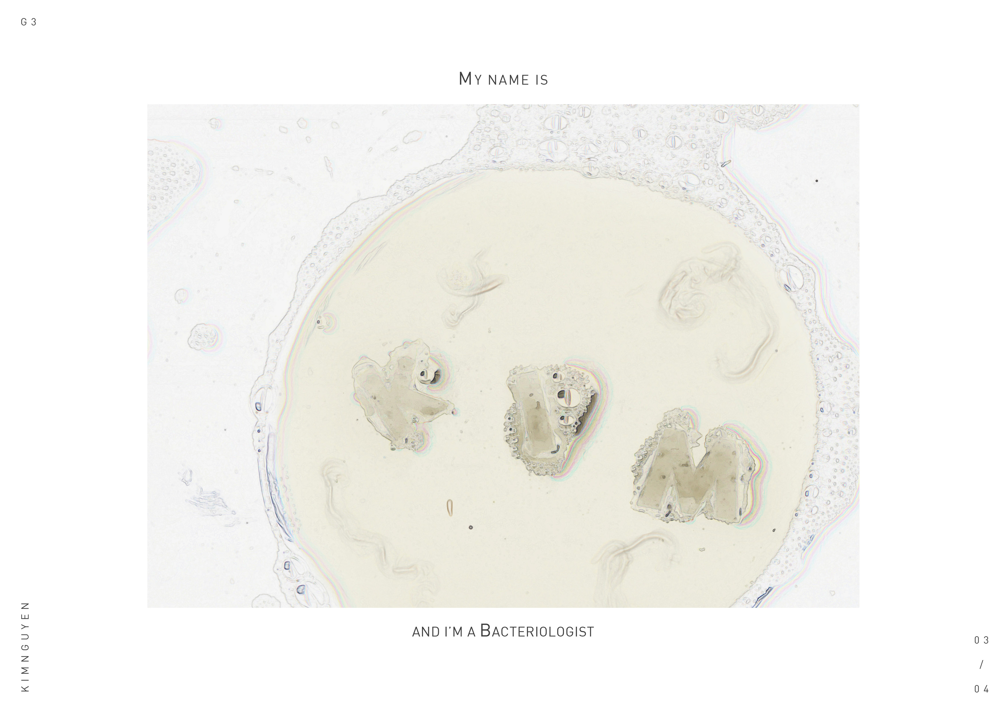
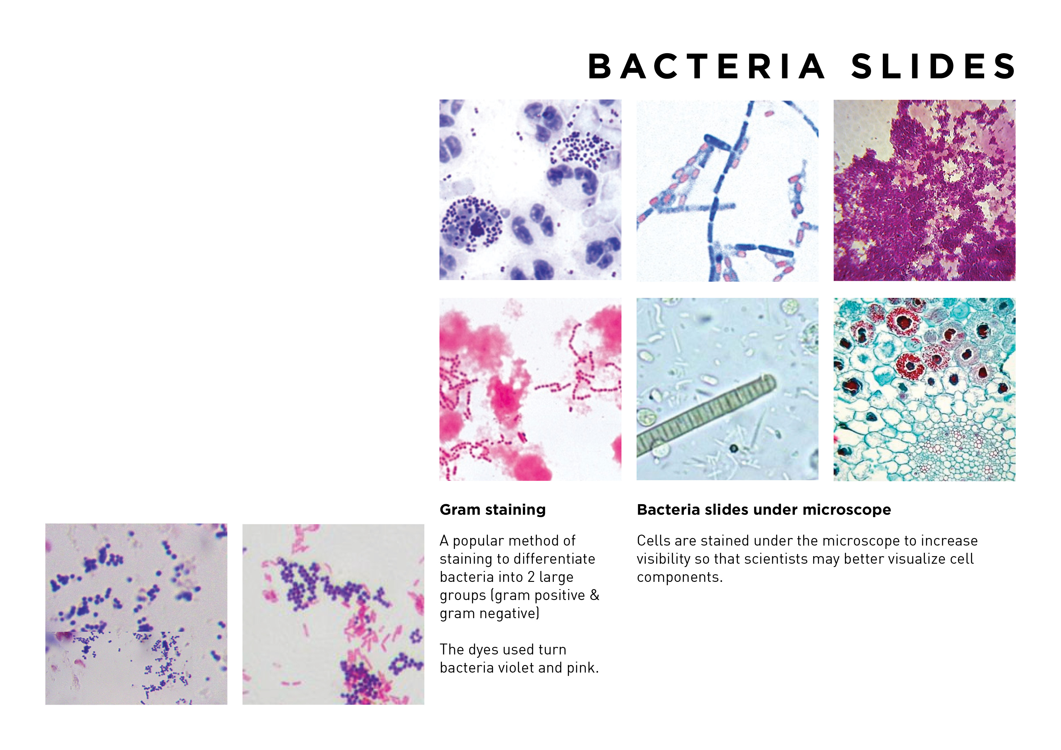
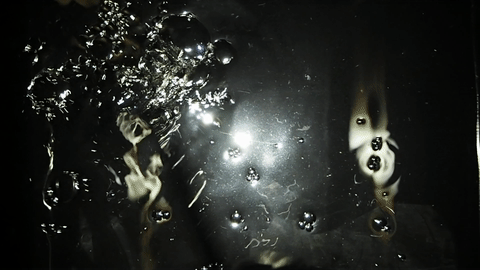
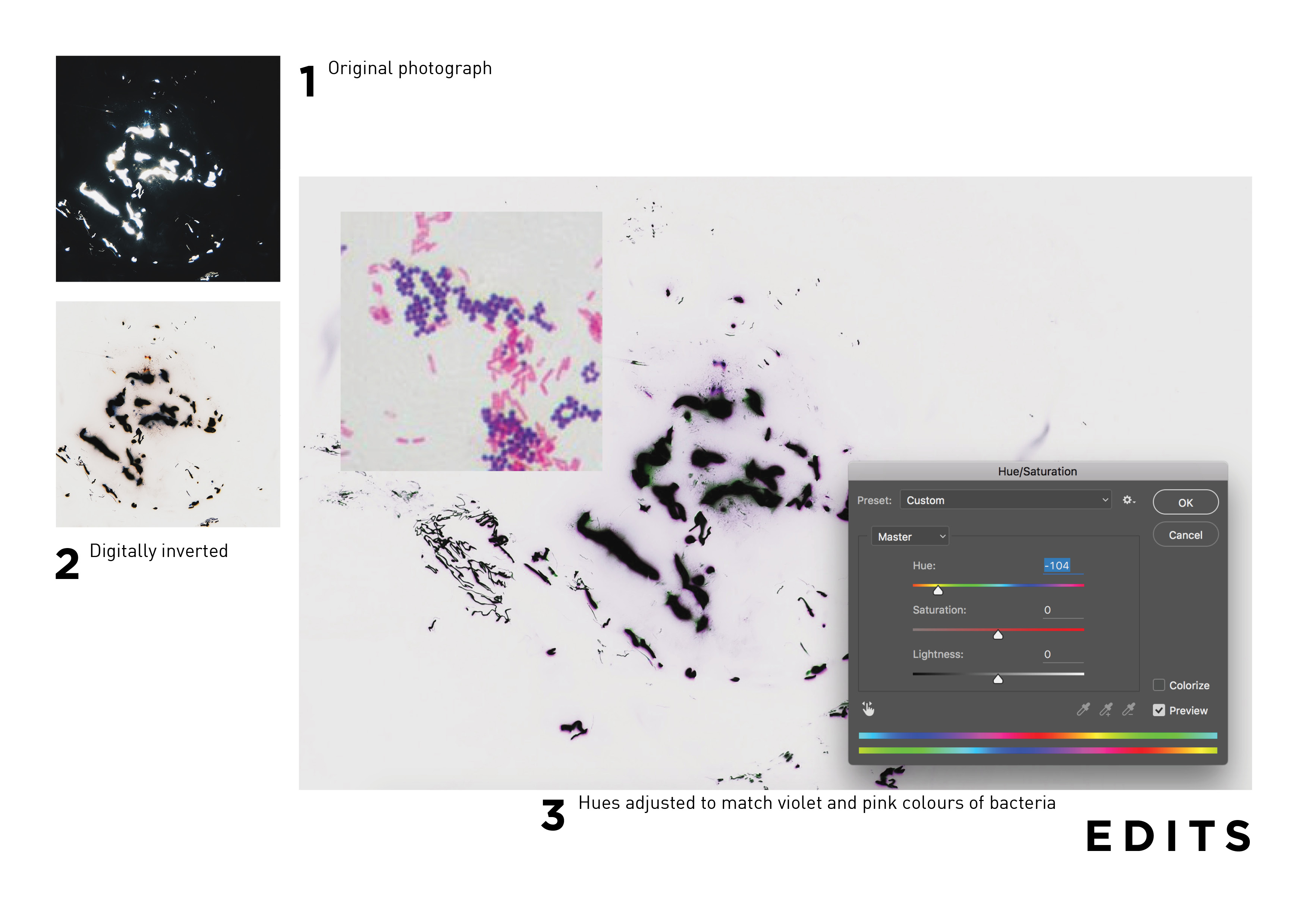
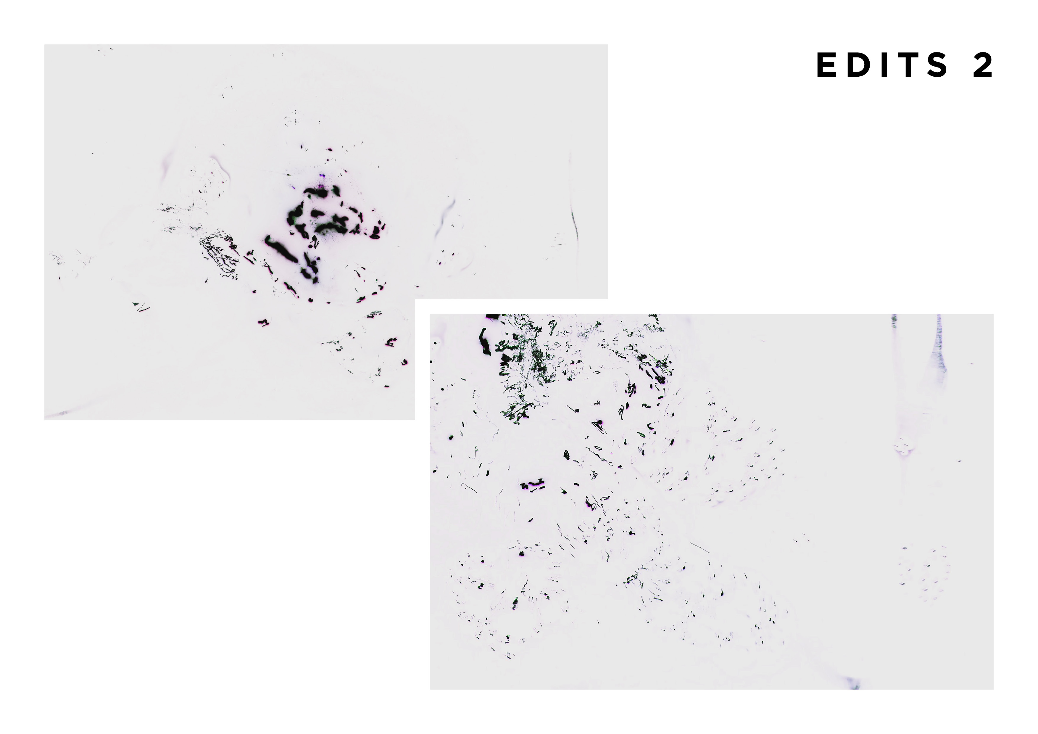
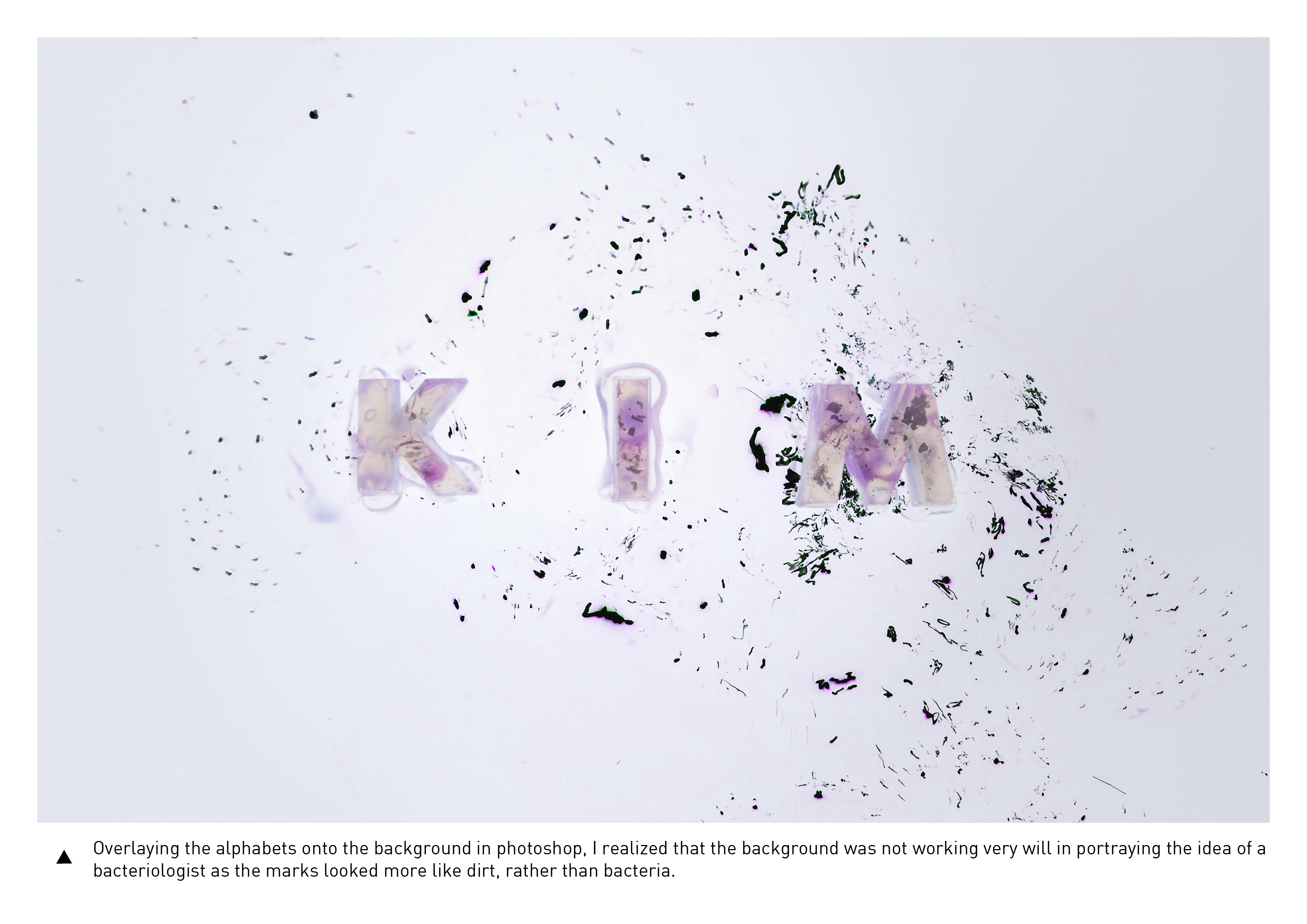
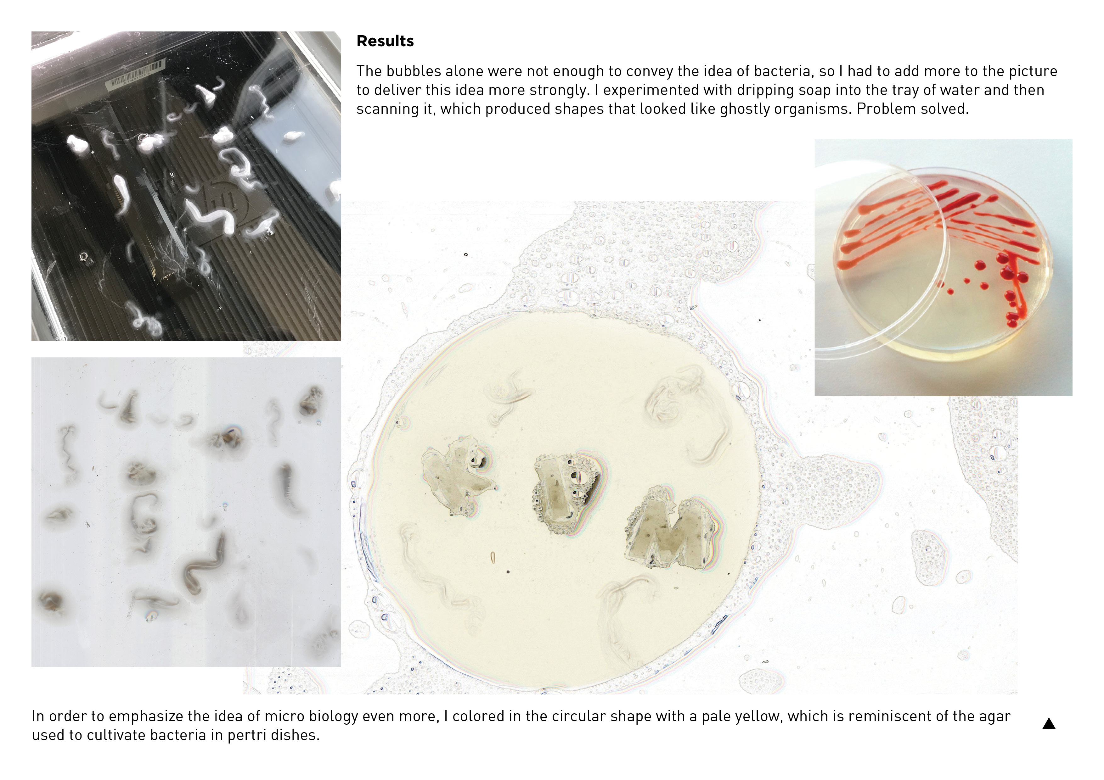
My name is Kim and I’m a Bacteriologist.
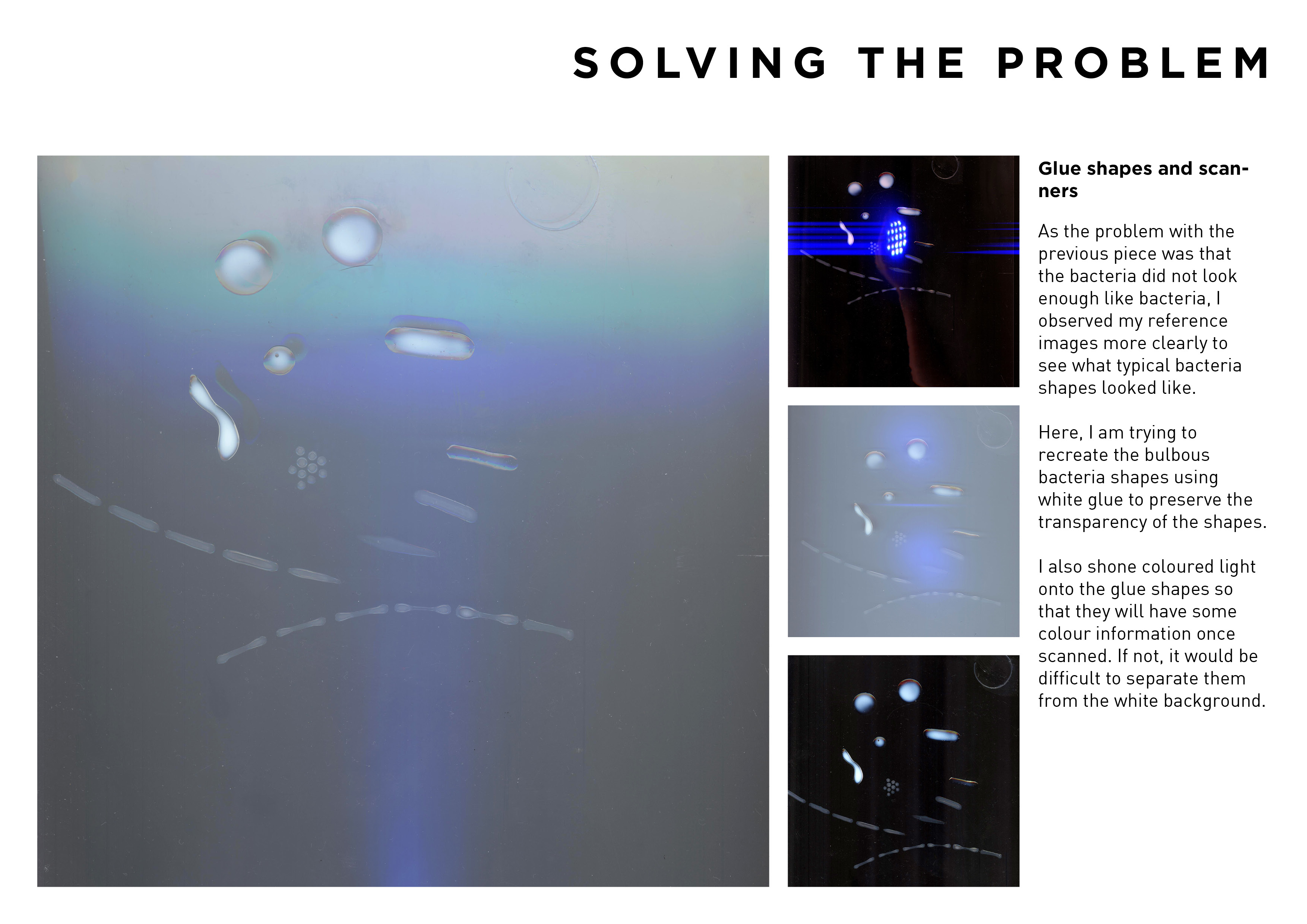
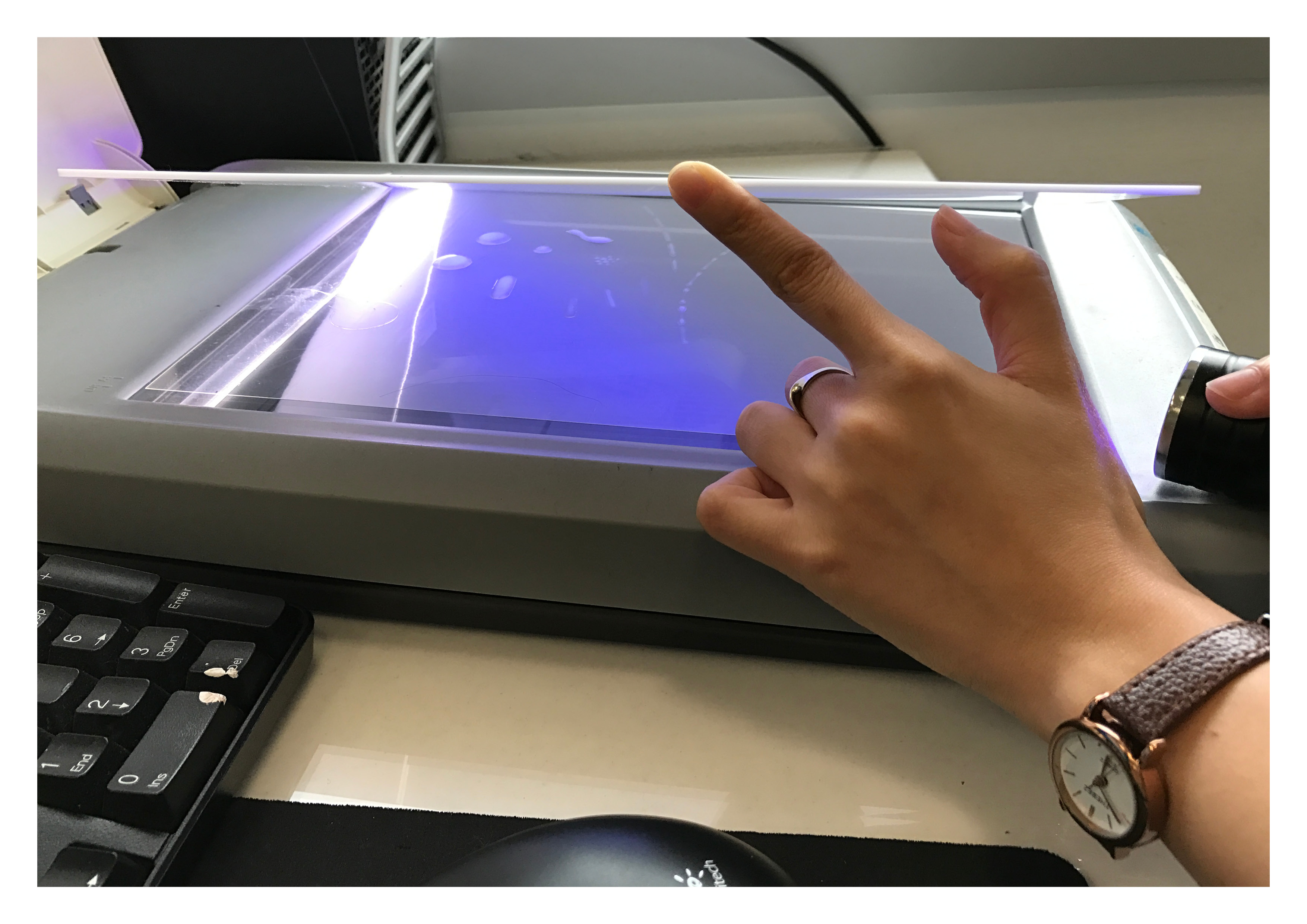
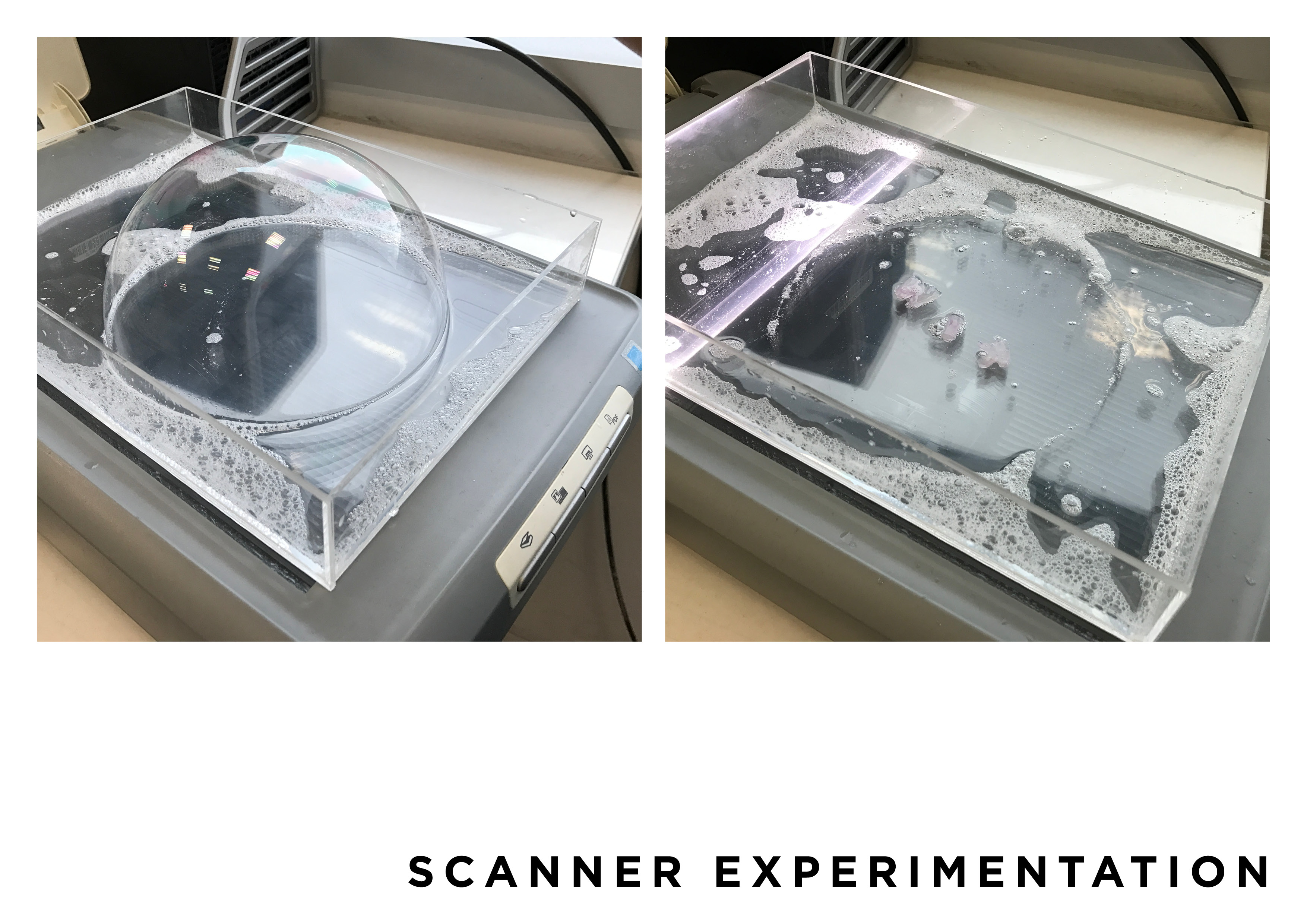
With this piece, I wanted the environment to play a part in creating the mood for the type piece. Here, the pale yellow hue in a circular shape suggests the idea of a petri dish that is cultivating bacteria (the agar that is used to grow bacteria is a pale yellow colour), and the slightly polarized colours in the background work together to create a slight distortion/a slight unsettling effect that evokes the idea of ‘another world’ that one would encounter when looking through a microscope to see these bacteria – what you see through a microscope is vastly different from what we experience in reality – almost dreamlike, almost like another world. Lastly, I added additional textures to really drive across the idea of it being bacteria in a petri dish – the wiggly shapes next to the alphabets. I do feel that there are certain aspects that could be improved such as the readability of the alphabets and bringing more emphasis to the alphabets itself – such that it stands out from the background.
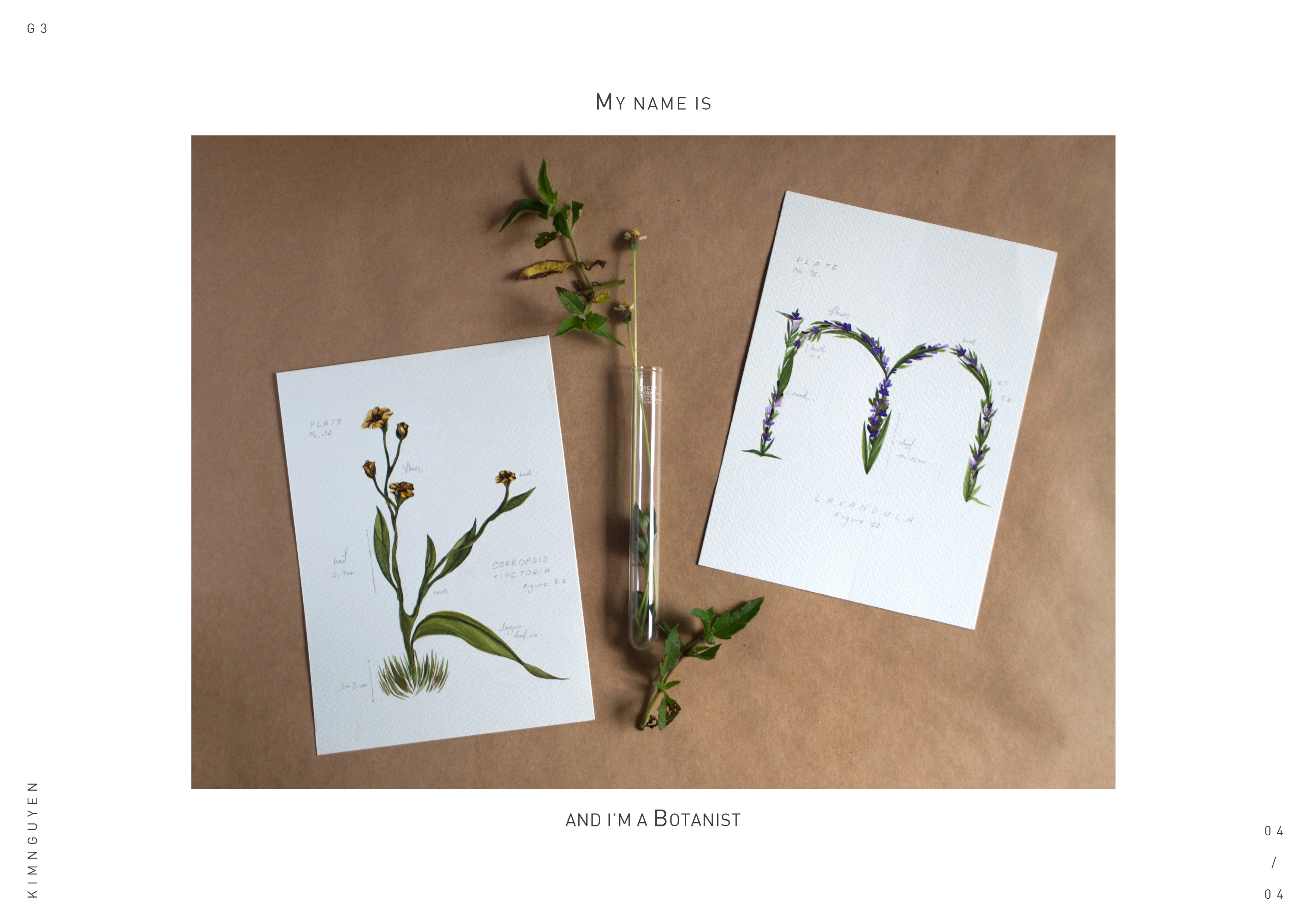
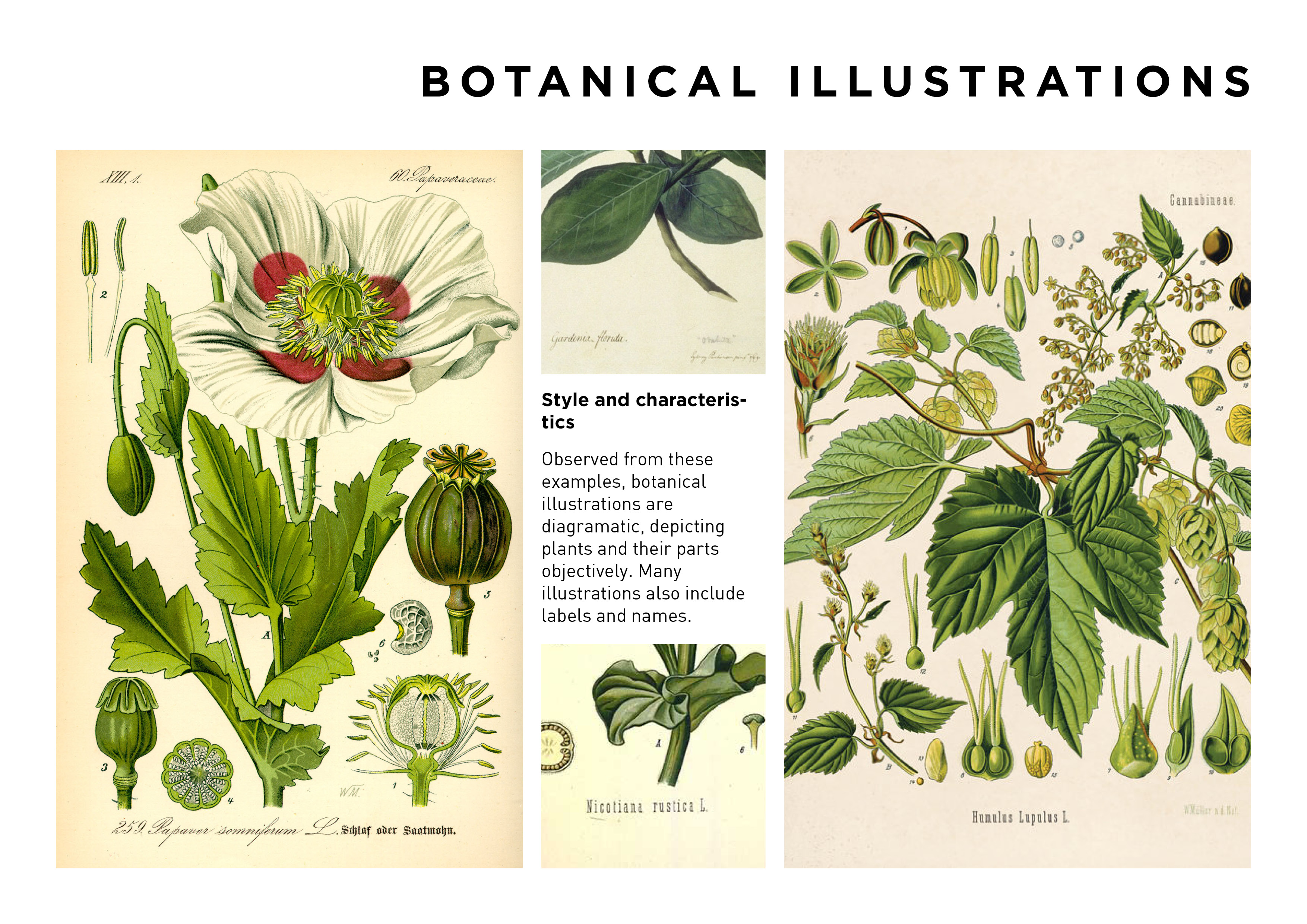
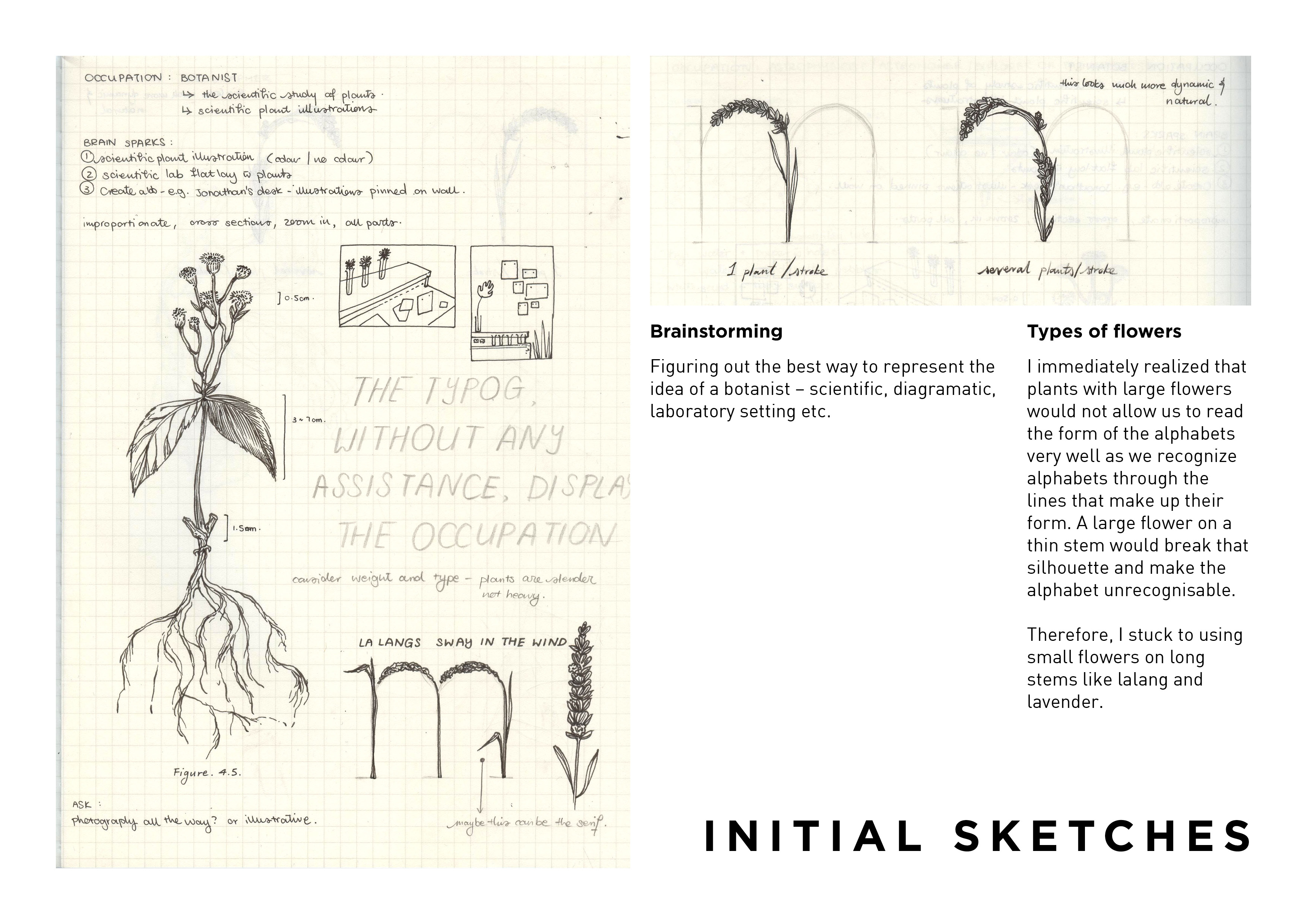
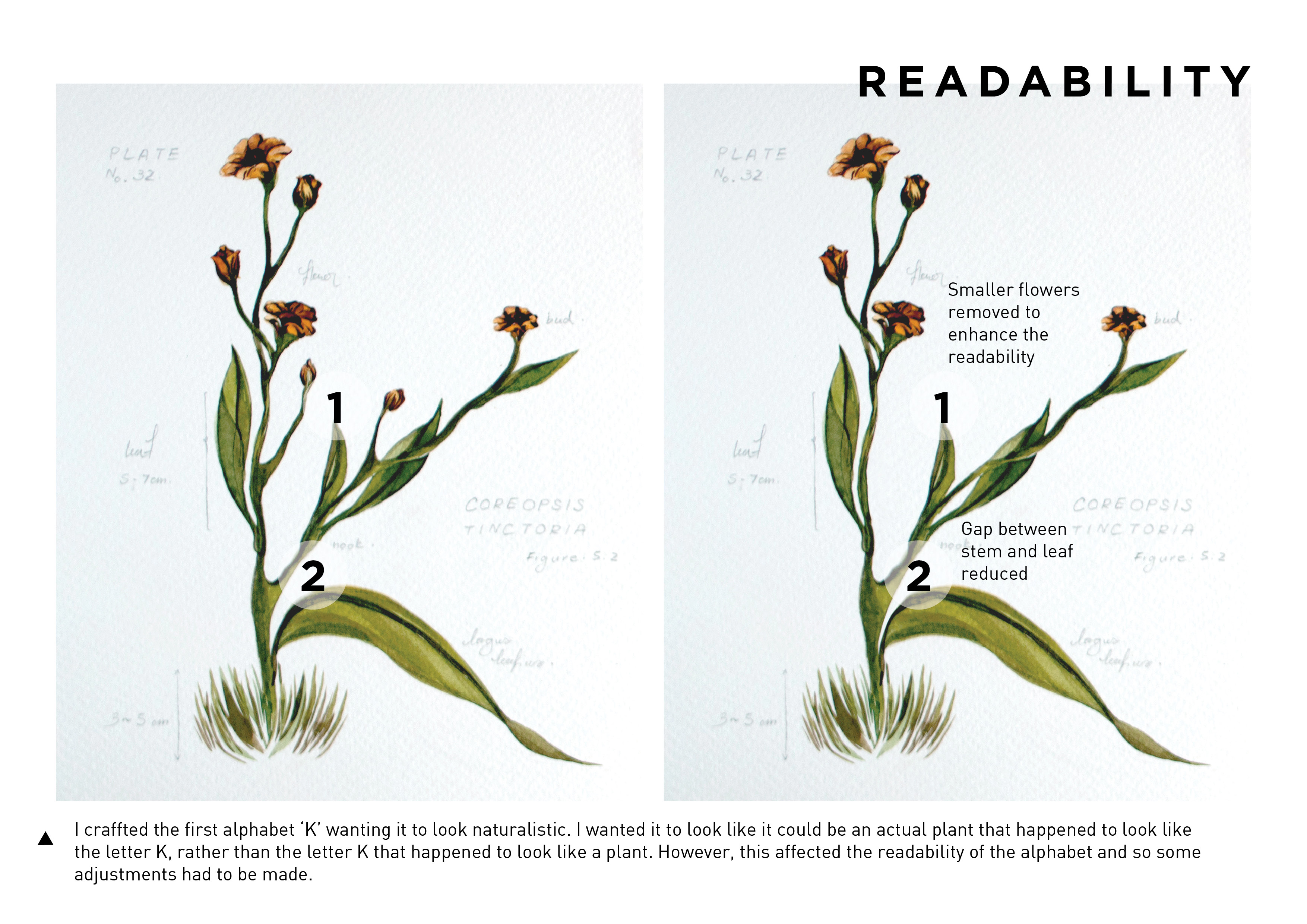
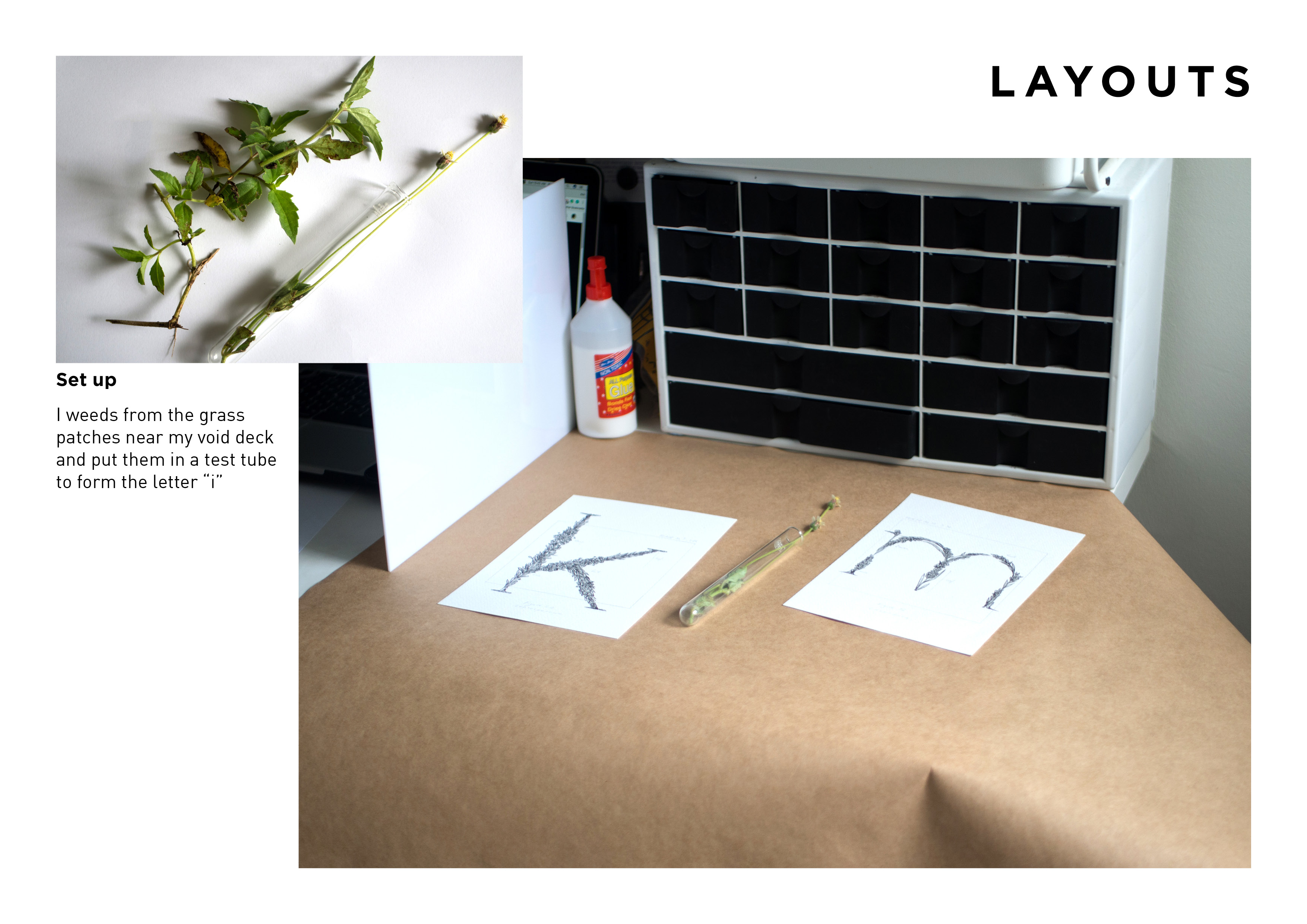
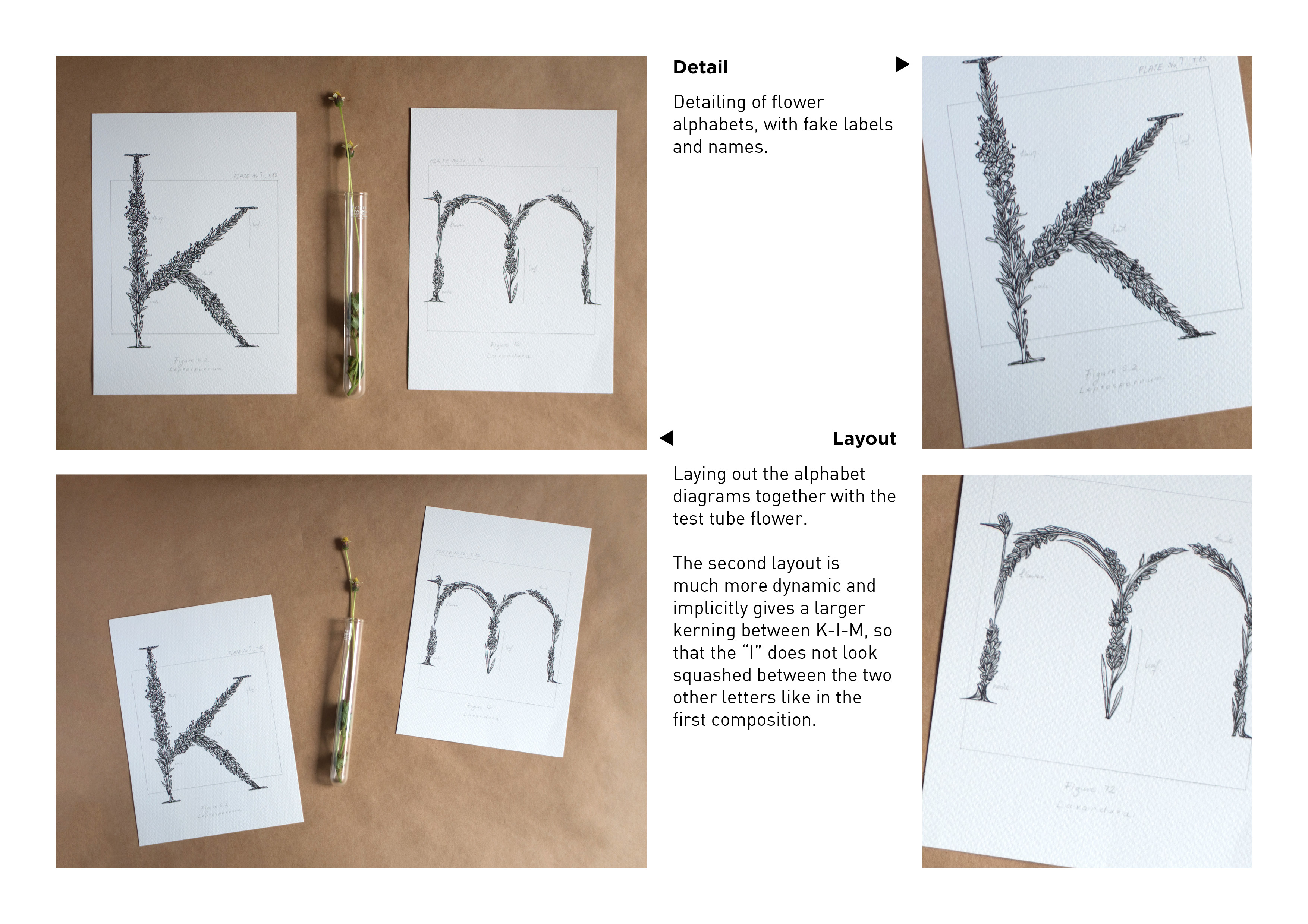
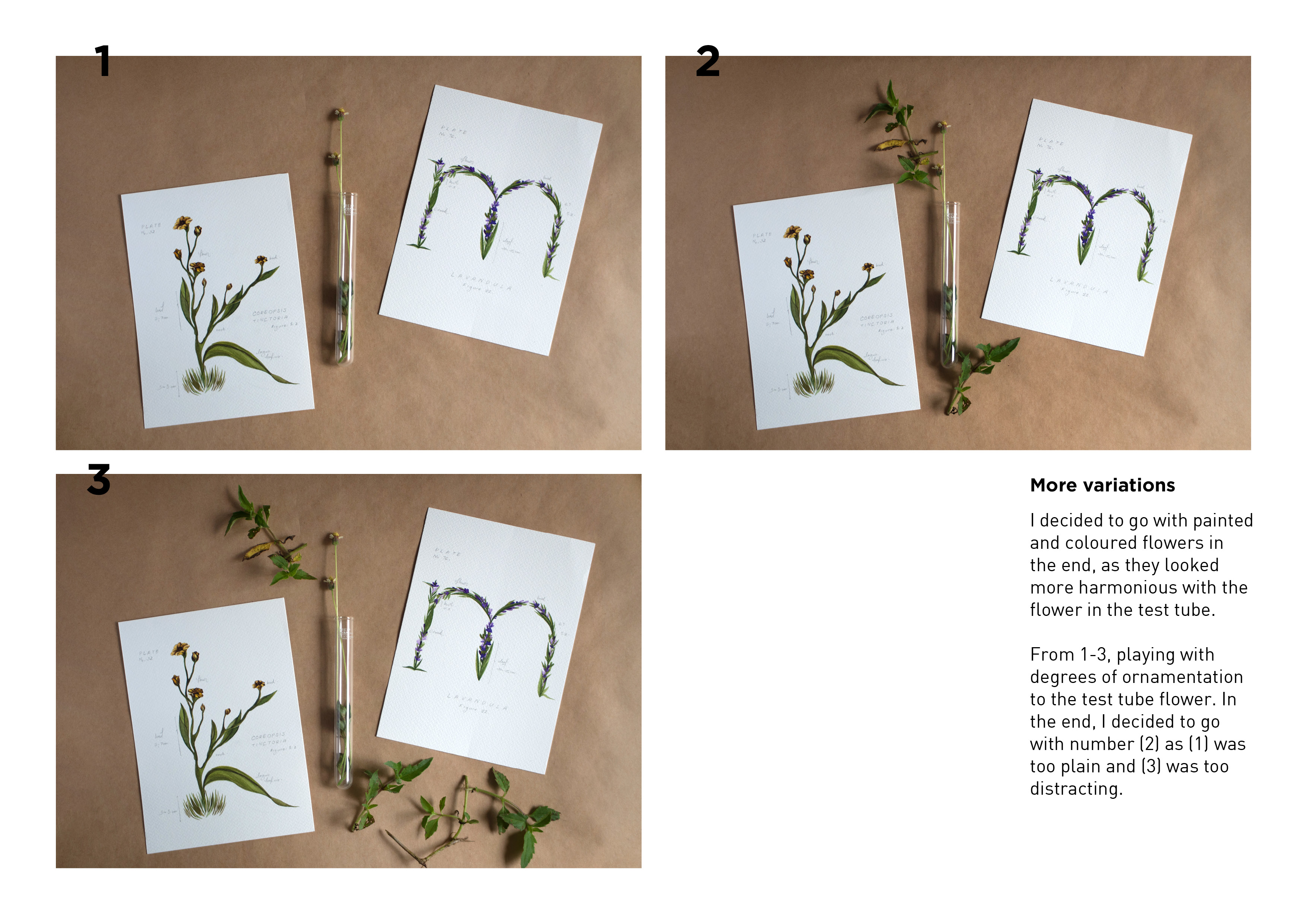
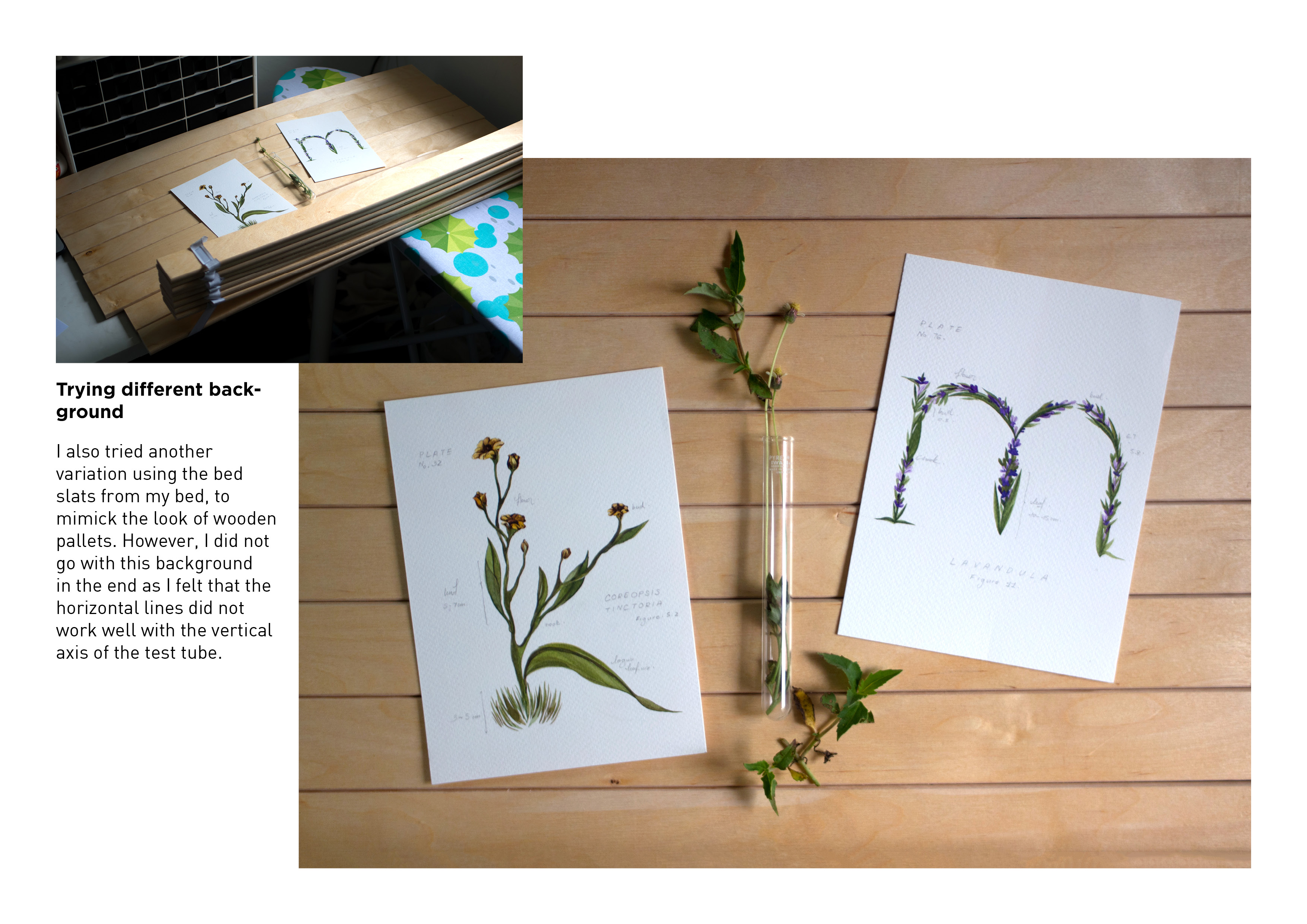
My name is Kim and I’m a Botanist.
For this last piece I wanted to play with two aspects of botany – the theoretical and practical aspects of the scientific study of plants. To convey the theoretical aspect, I illustrated the alphabets in the style of botanical illustrations, and created fake labels for the parts of the plants. I also added small annotations to make it look more like a scientific diagram to put across the idea of theoretical plant study. For the practical aspect, I decided to play with physical items to contrast it with the illustrated diagrams. As the test tube is cylindrical in shape, and it accurately conveys the idea of scientific experimentation, I decided to use it as a vessel for a plant/flower that I had collected to show that as a botanist, I would collect and study plant matter.
Que Sera – Research and Process


Ego: Part III (Final)

And so it begins. In each series of panels, I actively varied the composition of each frame such that there is a fair amount of variety in wideness of the shots – cropped, wide, wider and long shots – to engage the viewer and to create a sense of dynamism in each story.

Choice of colour palette:

Primarily neutral greys and minty blue – naturalistic colours used to depict ‘city life’, convey the idea of a concrete jungle.
Pops of red and yellow for emphasis and visual interest. There is an attempt to subtly include triadic red, yellow and blue.

‘Tis me trying to find Mount Fuji in the city.
Centrally composed with a somewhat symmetrical composition to bring emphasis on the main character – me. Although there is quite a crowd in the composition, the attention is clearly on the central character as all the other faces are blank, and their bodies face away from the viewer.
The composition of figures is intentionally kept to the bottom third to emphasise the mass of tall buildings in the background – tall, foreboding, looming, like a maze.

‘Tis me travelling.
Colours here are kept to the object’s natural colours – the grey of the MRT, the blue of the character’s clothing, and the yellow caution lines between the gaps which add a nice contrasting pop of colour to the otherwise dull colour palette.

‘Tis me very lost.
Colour choices are on the neutral side here, to bring emphasis to the Google Map pin which is in a striking red.
Going for a long shot – which shows the character interacting with the larger environment. Here, I am hopelessly lost and ended up walking towards the maze even though my intended destination is right behind me.
Compositionally, the maze is kept to the bottom third and more space is given to the empty space in order to emphasise how easy it is to get the red-marked destination, yet I am carelessly walking in the opposite direction towards the maze.

Choice of colour palette:

I began with yellow and expanded from there to get analogous hues of red and maroon – naturalistic colours for the bee and beehive. As the narrative is centered upon a late-night environment, the instinctive colour choice would be navy or dark blue to depict a darker environment. However, I wanted to take the opportunity to experiment with a colour palette that I was uncomfortable with – and so chose purple as it was the complementary colour of yellow, which fits well too in depicting the dark environment.
(Purple is such a difficult colour to work with)

‘Tis me, in a bee costume.
Compositionally, I illustrated the room such that the corner of the room is positioned where the right-third and bottom-third of the frame meets, in order to create an asymmetry in the composition, according to the rule of thirds. The character, me, is also positioned near this convergence of lines in order for the lines to draw the viewer’s eye to the central character.
I also created a shelf out of the hexagonal beehive structure. Much efforts very prouds.

‘Tis me working under the moonlight with my 8 cups of coffee
Bringing back the hexagonal frame to draw attention to the centre of the composition, this time, to the moon and me in the bee costume. There is some indication of depth via the use of one point perspective (table, chair and window frame receding to the vanishing point).
My skin starts turning green – a sleep deprived induced pallour.

‘Tis me, a beautiful creature of the night
Green swollen face, food and coffee stains, intense acne and 5 o’clock shadow. Get some sleep kids. Or just don’t come to ADM.

Choice of colour palette:

I went for a palette that indicated contrasts in temperature in the environment, and I found that the contrast between earthy warm colours, and a lighter blue allowed me to do that. The environment, here, is warm and sunny, and so I actively employed the use of earth tones such as oranges, browns and greens to convey this idea. As I wanted to contrast warm with cold (literal temperature), I went for a soft blue, which is the popularized colour for ice, water and snow.

‘Tis me shivering on a hot sunny day
Colour-wise, there is a conscious decision to contrast warm and cold (refer to above). Even the smaller details like the shadow help to bring across the idea of cold – my shadow made blue.
Compositionally, I referenced Tania Yakunova’s Ecopark illustrations (see previous post) to create depth in composition. This was achieved through sizing and strategic placement of elements in the composition to make things seem closer and/or further away from us.

‘Tis the wind doing what wind does
A contrast again of blue against warm yellow. This time, the blue is rendered with a gradient that is parallel to the axis of the lines indicating wind (rather than a solid block of colour). I did this to imply a sense of movement and speed of the wind.

‘Tis me, frozen into an iceberg, a tourist attraction
Again, the rule of thirds is used consciously here and the main focus (me, the iceberg) is placed at the top right third of the composition. More figures are also densely placed around the ice block to draw more attention to it.
Isometric people resource pack by Gleb Tagirov: [click!]

Choice of colour palette:

There is not too much intent in the choice of colour here, mostly naturalistic colours are used. The main character’s clothing follows the last few panels – mint blue. And the secondary character is clothed in blue as well to create a sense of harmony between the two characters.
Other than that, the food and everything else is kept to reddish and mustard tones as these are the natural colours of the food depicted. The only purposeful choice of colour here, really, is the background. As the central theme of this story is food, I used red to tie each frame together as red is scientifically proven to induce hunger and increase appetite (which is why many fast food chains use red in their branding).

‘Tis me, eating very little compared to other people
Contrast between what is on their plates – a whole mountain of food + a small anchovy. Compositionally, the table is kept to the bottom third and the two figures divide the vertical space into thirds.

‘Tis the anchovy on my plate
There is an intentional contrast between the size of the plate and what is on the food. A lot of white space is left around the small anchovy to emphasise its small size.

‘Tis me and another with full bellies
A somewhat symmetrical composition of both characters with bloated bellies. Though one is full from a large amount of food, and the other with just a small anchovy.
I don’t really have any big takeaways from this project. Just a small feeling of happiness with how everything turned out and that I got the chance to illustrate like this again (not been illustrating like this for a long time).
3 more days till a final breather. Almost there.
Ego: Part II
Ideation.
Before I began work on the final illustrations, I sketched them out in thumbnails first and fine-tuned the details. Here they are:


Ego: Part I

As a designer, it is important to understand the importance
of colours in design. In particular, an understanding of colour harmonies allow designers to visually manipulate the aesthetics to produce the desired outcome.
As there is a great emphasis on colour for this project, I knew that the illustration style that I chose would need to play a big role in emphasising the colours used for each panel. As such, I chose to venture into the field of flat illustration – a popular illustration style with a heavy emphasis on shapes and solid colours.
To be more cognisant of my design and illustration process, I began by deconstructing the compositional and colour aspects of flat illustration designs by other illustrators:

Interesting contrast of pink and turquoise – warm and cool. To pare it down to more recognisable colours, this could be interpreted as a red vs. green colour scheme – an opposition of complementary colours, where the green complement is used to add a touch of interest to shadowed forms.

Interesting use again of complementary orange and blue – but to indicate a contrast in temperature. Blue is used for the external environment – indicates a lightness of being, of blue sky. Orange, here, suggests the filtering in of the sunlight – a warmth created from the light.

Use of analogous hues of pinks and purples. Heavy emphasis on light here, weighty use of highlights and shadows to create depth and form.

Comparing the use of colour palette across different illustrators that convey similar environmental atmospheres. Above, all 3 illustrations depict similar scenes of ‘heat’ and ‘hotness’, yet use vastly dissimilar colour palettes. No.2 and 3 emphasise on the use of analogous warm colours to depict warmth. Yet, No.1 uses a primarily cool palette, yet achieves the same effect of warmness – but it works, due to the compositional structure of the illustration. There is a dominant use of shadows in the illustration, which suggests a strong light source and suggests the presence of a warm sun, despite its use of a cooler palette.

A safe palette of analogous pinks and purples. What is even more striking in this illustration is the simple yet effective compositional choices. (see comments in photograph above).
Powerful compositional choices which I will actively use in my illustrations for this project.