Comfort objects comfort me

Installation is a tricky thing. What makes installation installation and not sculpture? The line between installation and sculpture, I would say, is a fine one. From looking at installations and reading up a bit more, there are a few boxes that installation ticks off:

  1. Immersive
  2. Multi-sensory
  3. Site-specific

So these are the criteria that I have to keep in mind as I plan out the space for the installation.


On comfort objects

In dealing with the space, I at first wanted to recreate the room I had set up in my previous assignment. However, it didn’t make sense for me just to recreate the room as I realized it wouldn’t retain its meaning when placed out of the context of the video like that.

The installation has to carry meaning on its own.

Continuing on the theme of loneliness, the train of thought went to ideas of coping – ways to cope and deal with negative situations and emotions – an emotionally charged subjective space.

I then realized that, for myself, shutting down has become an immediate coping mechanism – going to sleep means the world and its problems are no longer there. Specifically – going to sleep with a blanket.

The blanket then acts as a comfort object that protects and shields. There will be a blanket in the installation.


But then how do I transform the space to make it look lonely?

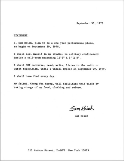
One of the artists I looked to to find the answer to this was Tehching Hsieh. While his one-year performances are not installations in nature, they are highly site-specific.

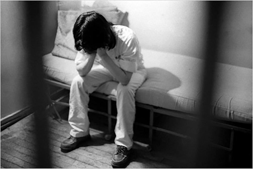
In one of his one-year performances, he confined himself to a small cell for an entire year.

Hsieh’s works are highly ritualistic in nature. This action of doing something mundane over a long period of time/over and over again, while simple, conveys strongly a sense of mania and emotional charge. I feel that using a similar repetitive approach would help me convey the sense of “coping mechanisms” in my own work.

In terms of subject matter, Hsieh’s 1978-1979 performance of confinement in a cell strongly features the bed that he slept on. The idea of sleep is echoed here, and the sense of isolation/desolation/lack of human contact/aloneness/nothing to do except sleep align with my own similar ideas.

It is befitting then, that I should use the setting of a bed + blanket in the installation.


To imbue the ritualistic elements in my own piece, I will hand make the blanket (as opposed to buying one and setting it up just like that). In this way, the comfort is created by the subject seeking the comfort. It implies a sense of trying as opposed to stagnant depression. And perhaps in trying one fails, but what is important is that attempts were made to cope – “coping mechanisms”.

Ego: Part I

As a designer, it is important to understand the importance
of colours in design. In particular, an understanding of colour harmonies allow designers to visually manipulate the aesthetics to produce the desired outcome.

As there is a great emphasis on colour for this project, I knew that the illustration style that I chose would need to play a big role in emphasising the colours used for each panel. As such, I chose to venture into the field of flat illustration – a popular illustration style with a heavy emphasis on shapes and solid colours.

To be more cognisant of my design and illustration process, I began by deconstructing the compositional and colour aspects of flat illustration designs by other illustrators:

2f1fdd24583343-56336a3821005
Tom Haugomat for Protein Magazine

Interesting contrast of pink and turquoise – warm and cool. To pare it down to more recognisable colours, this could be interpreted as a red vs. green colour scheme – an opposition of complementary colours, where the green complement is used to add a touch of interest to shadowed forms.

tumblr_ntmkjqh59y1qhevr0o1_500-copy
Malika Favre for Financial Times

Interesting use again of complementary orange and blue – but to indicate a contrast in temperature. Blue is used for the external environment – indicates a lightness of being, of blue sky. Orange, here, suggests the filtering in of the sunlight – a warmth created from the light.

illustration-tom-haugomat-062
Tom Haugomat Illustrations

Use of analogous hues of pinks and purples. Heavy emphasis on light here, weighty use of highlights and shadows to create depth and form.

655ec9da51edef3d6c94b9cf09b66643a
1. Roman Dementev Vector Landscapes 2. Harry Nesbitt iOS Landscape Concept #3 3. Luking Illustration (Desert)

Comparing the use of colour palette across different illustrators that convey similar environmental atmospheres. Above, all 3 illustrations depict similar scenes of ‘heat’ and ‘hotness’, yet use vastly dissimilar colour palettes. No.2 and 3 emphasise on the use of analogous warm colours to depict warmth. Yet, No.1 uses a primarily cool palette, yet achieves the same effect of warmness – but it works, due to the compositional structure of the illustration. There is a dominant use of shadows in the illustration, which suggests a strong light source and suggests the presence of a warm sun, despite its use of a cooler palette.

d389d730178623-5616a5a44d4d5
Tania Yakunova – EcoPark

A safe palette of analogous pinks and purples. What is even more striking in this illustration is the simple yet effective compositional choices. (see comments in photograph above).

Powerful compositional choices which I will actively use in my illustrations for this project.