Reflections

Standard

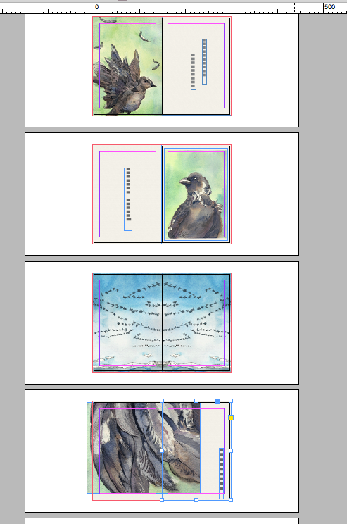
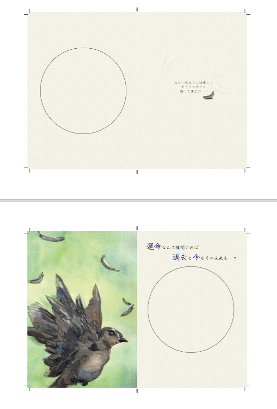
Initially, I believe like many groups, we had the idea of doing “Singapore landscape” on Japanese screens, when I first imagined the product, it thought how cool would it be! However, after attending the lecture on Japanese art, Bijingas, which was introduced during the lecture, caught my attention. I took this idea to the group and we started having discussions on how should we go about creating a visual response for bijingas. What struck me the most was the drawing style, their special postures and also the elaborate designs that we painted on the kimonos. We had ideas of changing gender (since bijingas only features females) and changing them to having expressive postures or facial expressions. The ideas weren’t coming out so well until we decided to do the difference of how women are viewed/behaved during the different era.

While we were researching, we came across this beautiful series which looks different from the original 17th-century bijingas that we were shown, the Shin Bijinga (真美人)series done in the 18th century.


“Toyohara Chikanobu: Shin Bijin 真美人 (True Beauties) – British Museum”. 2016. Ukiyo-E Search. https://ukiyo-e.org/image/bm/AN00433988_001_l.

Shin Bijin (True Beauties) Depicting a Woman Playing with a Kitten, Modelled…. 2016. “Shin Bijin (True Beauties) Depicting A Woman Playing With A Kitten, From A Series Of 36, Modelled… Giclee Print By Toyohara Chikanobu At Allposters.Com”. Allposters.Com. http://www.allposters.com/-sp/Shin-Bijin-True-Beauties-Depicting-a-Woman-Playing-with-a-Kitten-from-a-Series-of-36-Modelled-Posters_i10060894_.htm.

After more researching, we have chosen to respond with Dancing with Fan by Yosho Chikanobu.

After we decided and found what to do, our team had fun coming out with ideas. We had decided that our response will be base on the changing clothing and accessories. It is created as a “dress up” game/theme where people can switch through the style easily.  Our main idea was to respond to a response. Shin bijinga was a response by the artists to the original bijinga. As we come to the 21st century, many things have changed, and now, we choose to do another new response base on the Shin bijinga.

Bjinga -> Shin Bijinga -> Shin Shin bijinga (our view)

Final Product:  新。真美人系 (New True beauties series)

20160414_124108-min

Postcards included as a set!

20160414_124157-min

Clothing and accessories on transparencies where people could switch them up!

20160414_143351-min


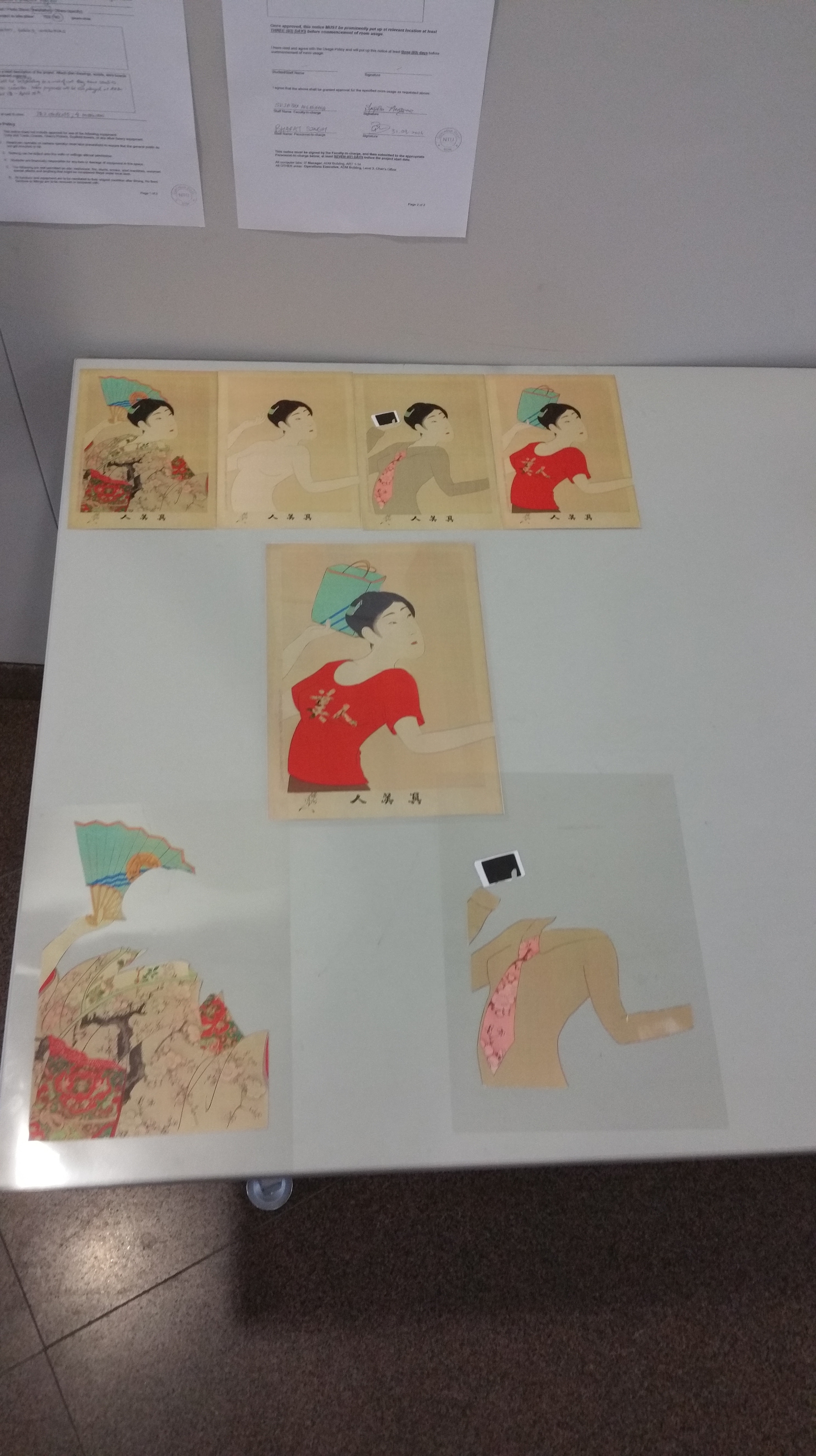
What we envisioned for this was that, it could be produced, with a set of few more bijingas and also clothing and accessories from the different generation to show the change of women in different times. It could be made into a toys/ sticker object like this which allow people to change the clothes, for an interactive and hands-on experience.

It was certainly not easy trying to duplicate the unique drawing style that woodblock prints and bijingas have. I have to make sure that the linework that i did correspond with the original art and everyone else in the group (each of us did a design) so that it looks like a complete set of artwork.

It also made me appreciate how the artists in the olden days painstakingly created these amazing artworks traditionally, using woodblock printing. The designs and the intricacy of kimonos and accessories are astounding. This project also allowed me to understand more about the history of how japanese women are portrayed and the unique points of Japanese art.

For my part, on the Tshirt design, i decided to put the word “美人”on it to link it back to the original bijinga and also show how people love t-shirts that have interesting text on it. To not lose the original essence of the bijinga, the intricate patterns were recreated as patterns. The colour scheme (for T-shirt and shopping bag) was kept similar to the original bijinga.

20160414_143535-min-min

Lastly, I really want to thank Ms. Sujatha for all the guidance and patience, I really managed to learn a lot!

Zine: Final

Standard

Cant believe that a year flew by so fast and this would be the last OSS post that i will be posting on foundation 2D…

Here’s the photo of my very first zine!

Processed with VSCO with c1 preset

運命なんて瞳閉じれば 過去も今日もその未来も一つ

強く優しく翼に風を

眠りについたホントの君 放ってあげましょう

Processed with VSCO with c1 preset

果てない空を見た時 あなたは何を思うだろう?

君の瞳に映る僕 何を想ってるの

だから決意は強き翼 運命なんていらない

いま不死なる夢を羽根に 明日を飛ばないか?

Processed with VSCO with c1 preset

次の…旅立ちに決意して 生ききる力だと賭けした翼広げ!

I am really happy that my zine turned out to what I hoped it to be! To think that I am able to use my watercolour pieces and combining them into a book, I am really happy that I get to do so! For the text of this book, they were actually lines I found that fit the images. However, after having the lines, I found out that the whole text actually flowed as a book too! It basically has the idea of being lost, but starting a journey to find yourself, having your true self and finally using that determination and fly towards your new future.

Grateful for all the lessons and guidance I had in 2D. I managed to overcome the challenges that i thought i couldn’t, and I had fun throughout the semester!

Zine Process 3

Standard

With my layout more or less finalised, I did a test print at home to check my font size and the placement of pictures and text.

Even with my printer, i was very surprised how well the grayscale version of the test print turned out. Now i feel like printing a grayscale version too.

The test print as very useful as i could check if the picture was placed accurately and if the text size was suitable for the page. After reviewing my test prints, i went back to indesign to made the changes.

20160405_214139-min 20160405_214554-min 20160405_214728-min

Now i am really excited to see how my final zine will turn out. For the final zine, i would have to choose the correct textured paper and will recreate the effect that i wanted

Zine Process 2

Standard

After finding the correct text that could fit with my picture, I planned for my zine per brief says with 12 pages.

Screen Shot 2016-04-06 at 12.56.25 am

original layout

Screen Shot 2016-04-06 at 12.54.09 am

cover and back page

For my cover, i wanted a cut out of a circle which reveals part of the content on the second page.

I also had text that i thought it would fit very well as the start of my book. I tried putting it in various positions, however, considering the cut out, that was one of the nicer position where i could position my text at. however suddenly, i thought of wanting the words to be seen, as the title for my book. I wanted to be to printed on a tracing paper, this will create a double layer effect for the cover or the book.

I created a mock up to see how it would look like if the circle is cut.

Screen Shot 2016-04-06 at 1.08.03 am

revealing only part of the picture. Emphases on “time and cycle”

Screen Shot 2016-04-06 at 1.07.45 am

Effect after having the tracing paper. The words will be right beside the clock needle

However, after consultation with Prof Ina, she gave alot of wonderful ideas and also suggested me to add a few more pages to beef up my zine. We played around with this full page spread and created a few interesting pages to add into my zine

Screen Shot 2016-04-06 at 1.12.34 am

while i was drawing and painting this, i did have the idea of it being able to work as an whole painting, but also by individual parts of the painting. I am glad that this would be able to be presented in my zine. It also acts adds variation of pages in my zine.

After adding the page of tracing paper, i still have 4 pages that are empty.

Screen Shot 2016-04-06 at 1.15.37 am

And then,  I realised that there was still a piece of watercolour that I forgot to include in my current zine. I added in the hummingbird drawing. I was very concerned by the empty page before my final page, which had content on. My final page has a feather that had dropped and landed. I decided to make my past page a page where the feathers are floating. I drew and painted another piece and it fits beautifully to my layout.

Screen Shot 2016-04-06 at 1.19.23 am


Zine: Asg 3

Standard

I have decided to use my works from the POV project as my materials for this zine. Even though my paintings were suitable for putting in the zine, i didnt have an proper concept I wanted for my zine.
There are really alot of wonderful materials on pinterest.

Screen Shot 2016-04-03 at 6.36.51 pm

Click here for the link to my board! 

As I was researching, i began to think that it is going to be a zine in japanese. and i especially love the simple and clean, but interesting designs that the japanese books have.

Initially, my plan for the zine was a normal left-to-right arrangement. However, i remembered that i am use to reading japanese magazines and books right-to-left too, so i have decided that my zine will be from right to left, which will suit my japanese theme zine more.