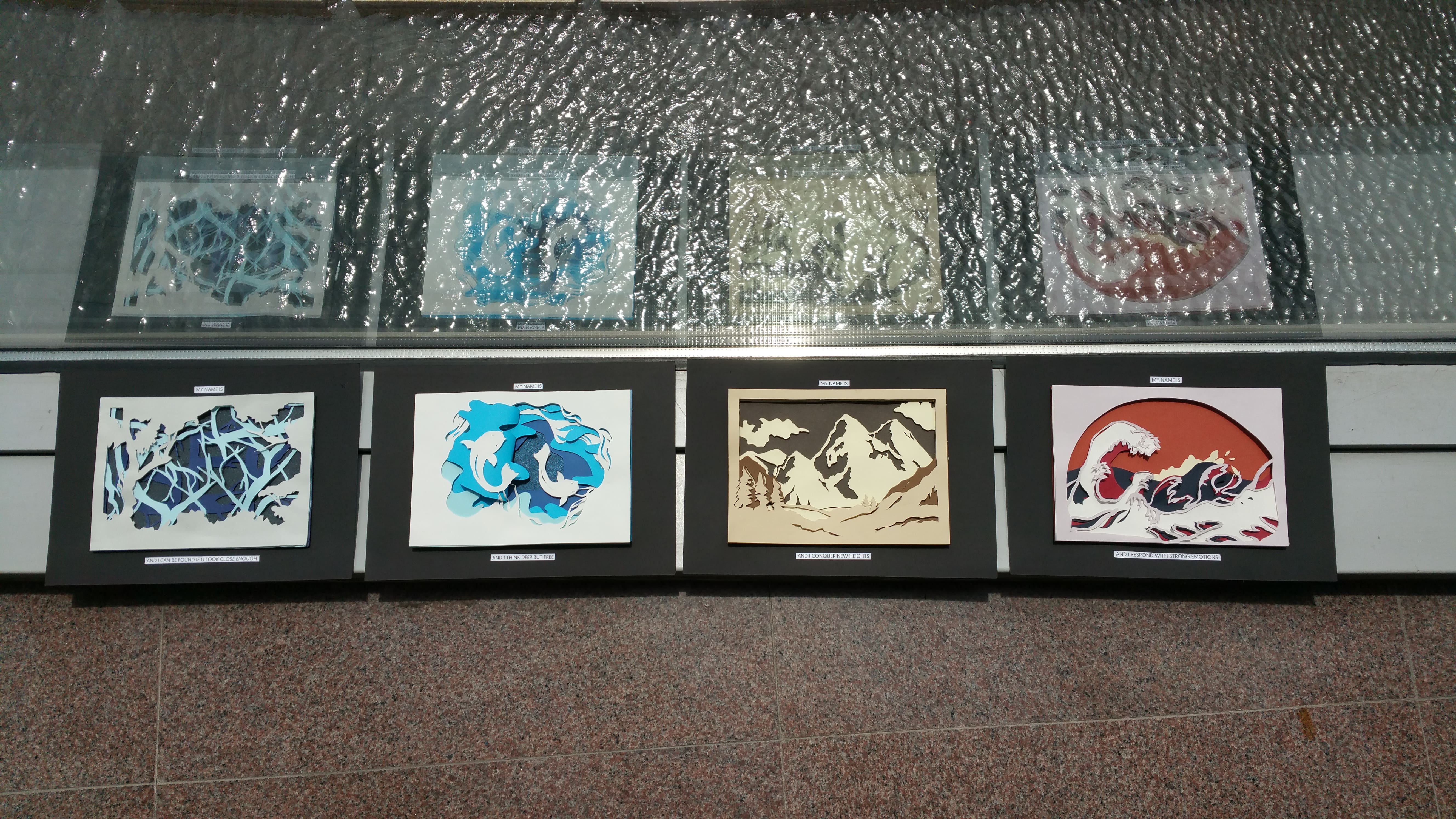
I thought the reflections from the water fit well with my nature theme
Final close up:
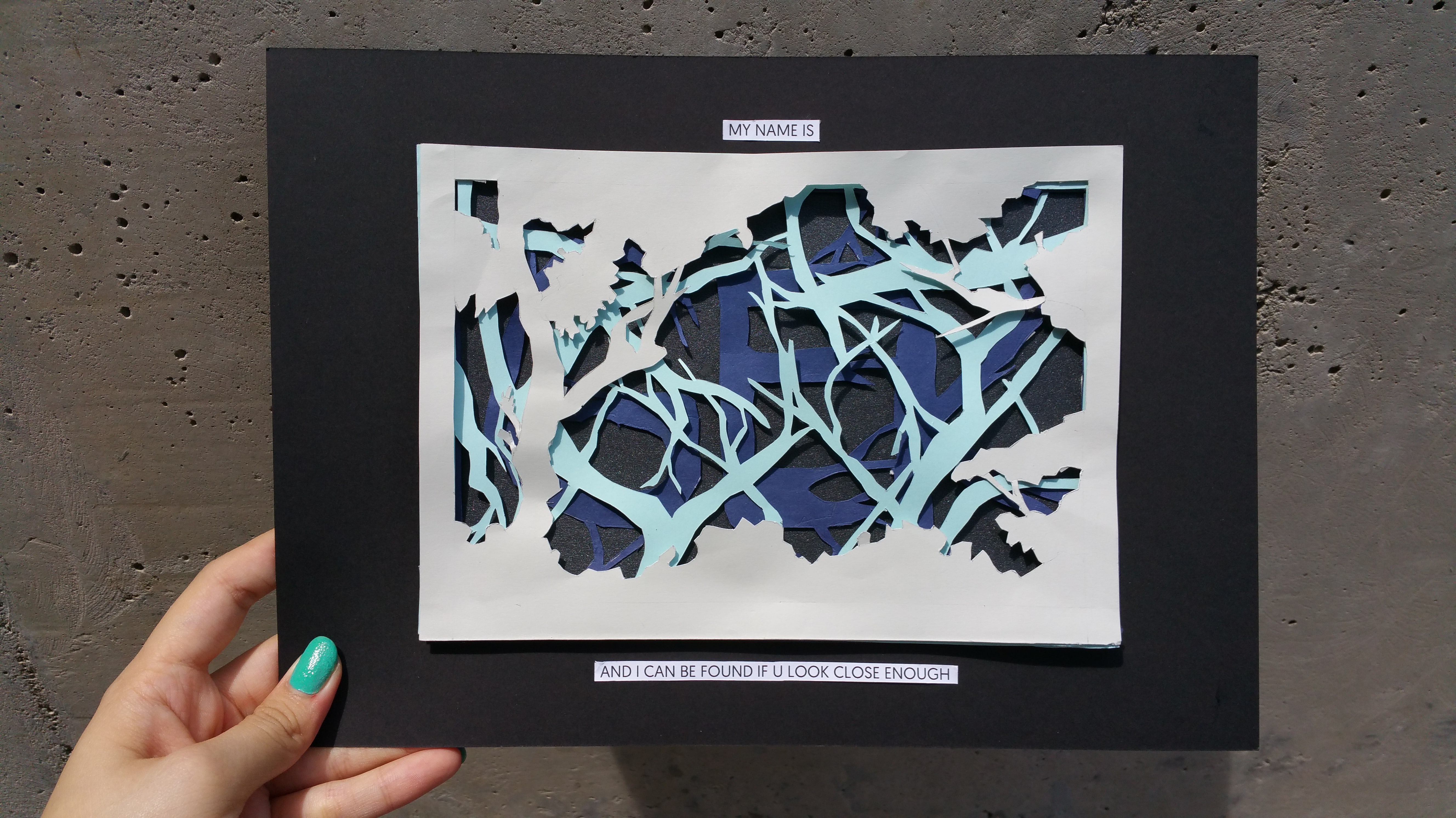
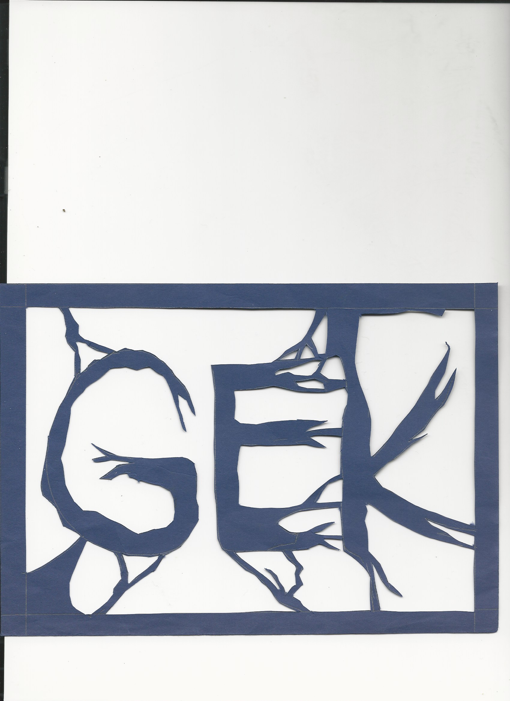
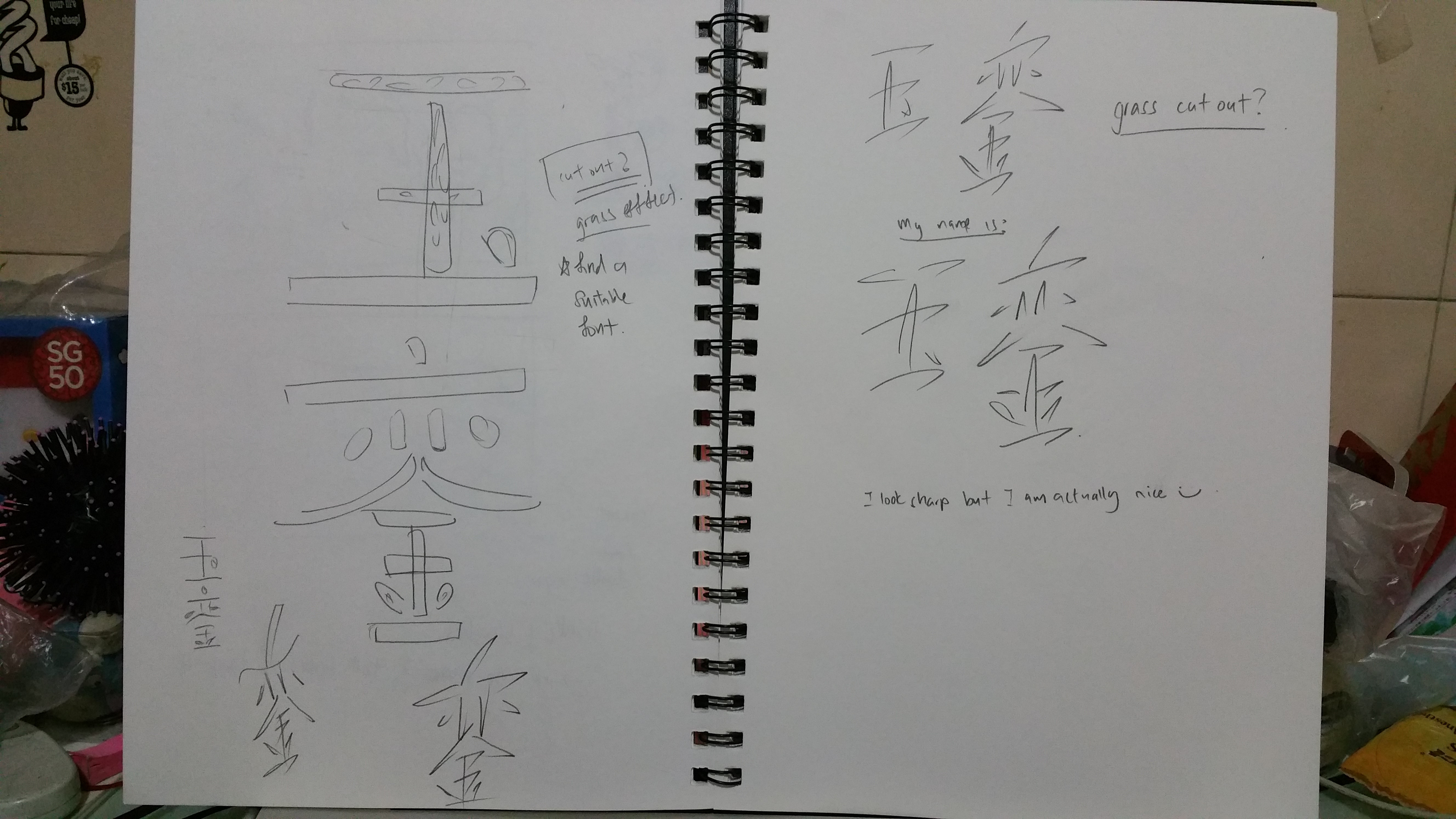
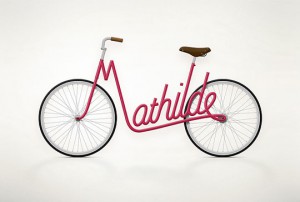
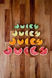
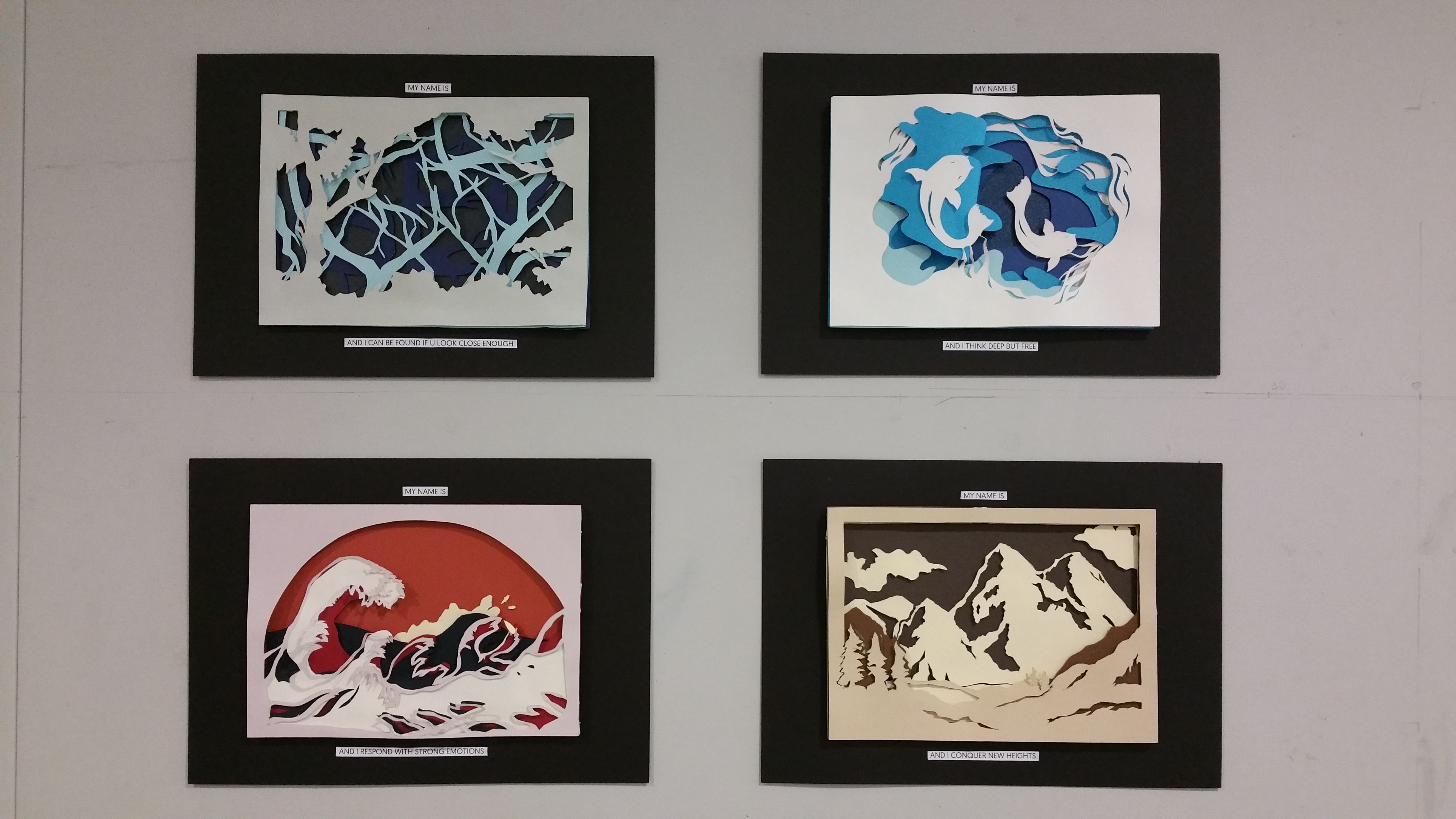
My Name is…. And i can found if you look close enough
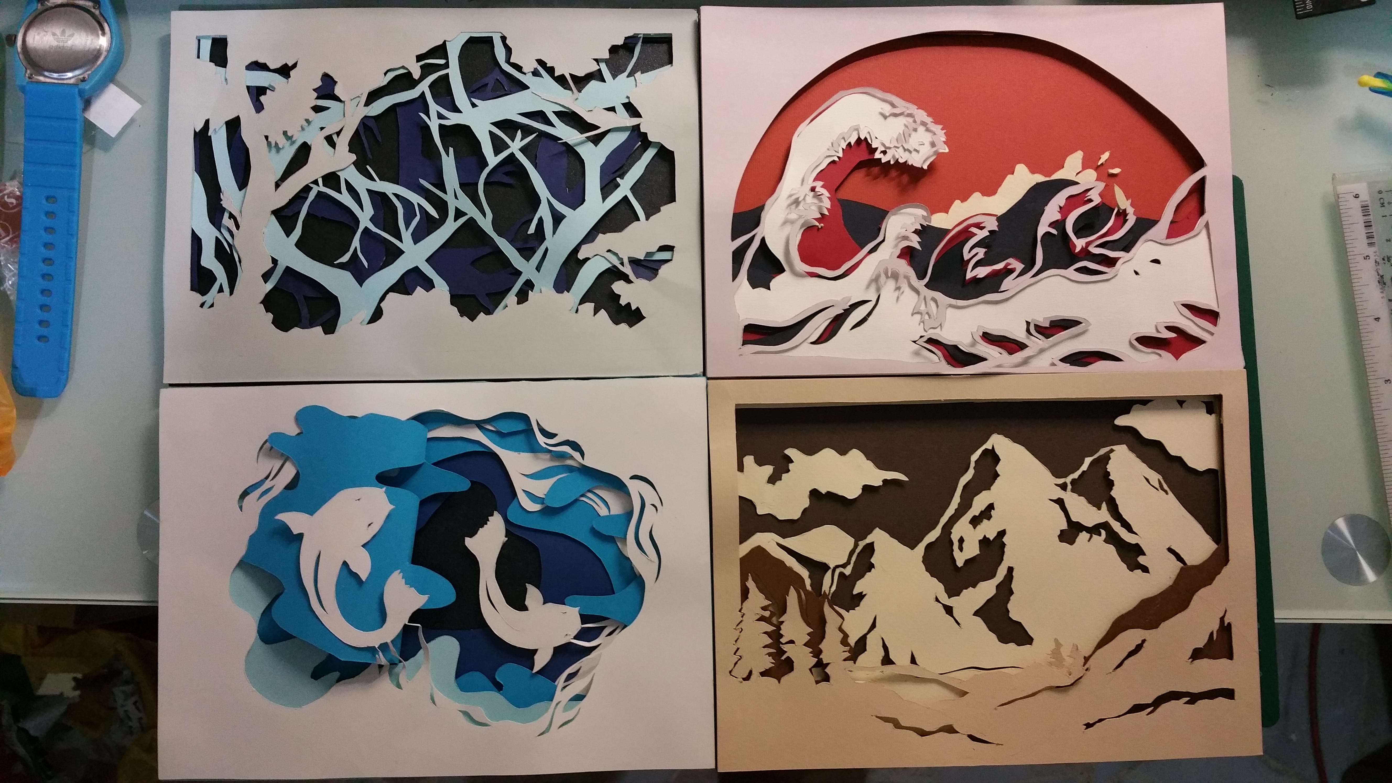
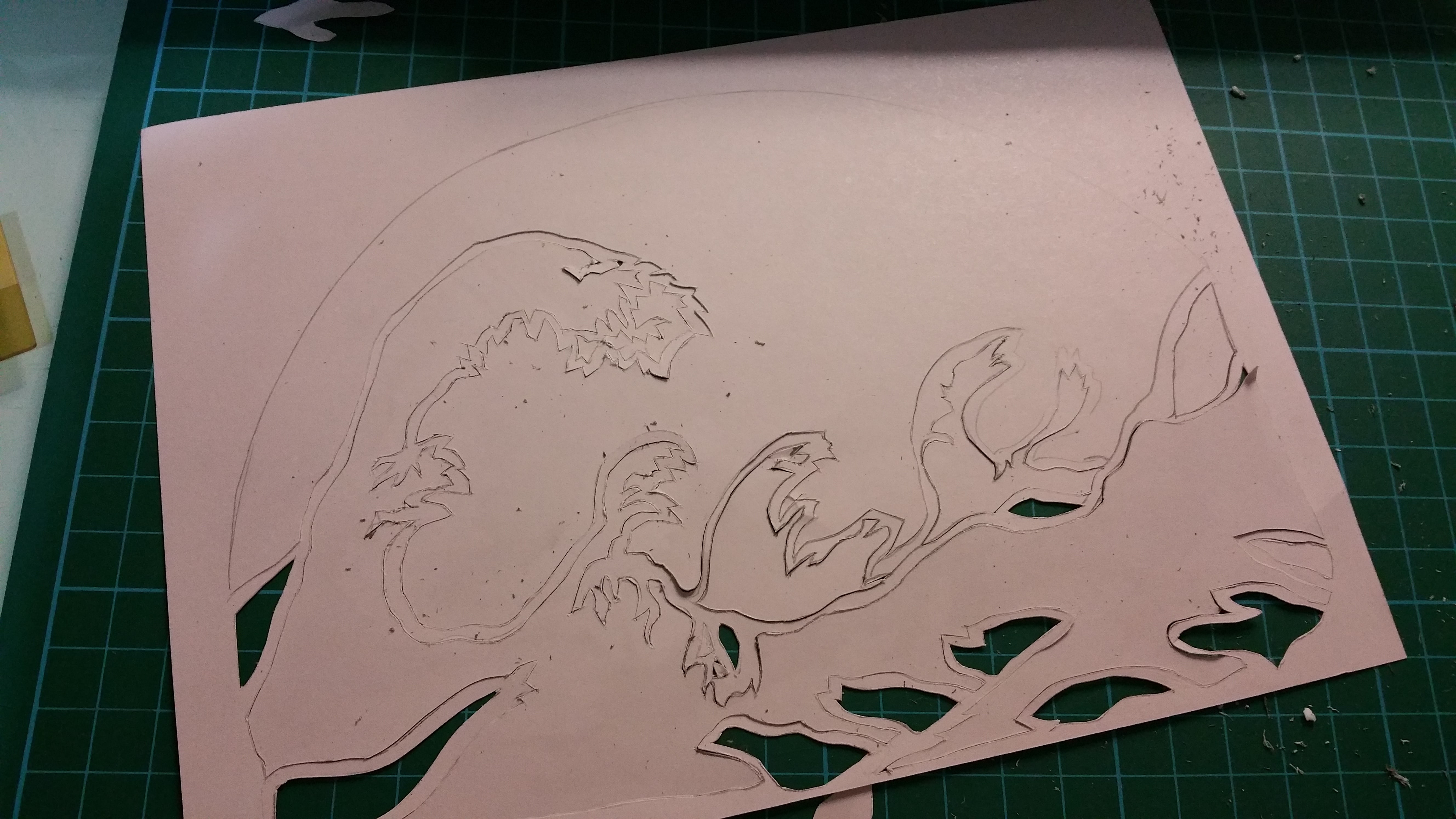
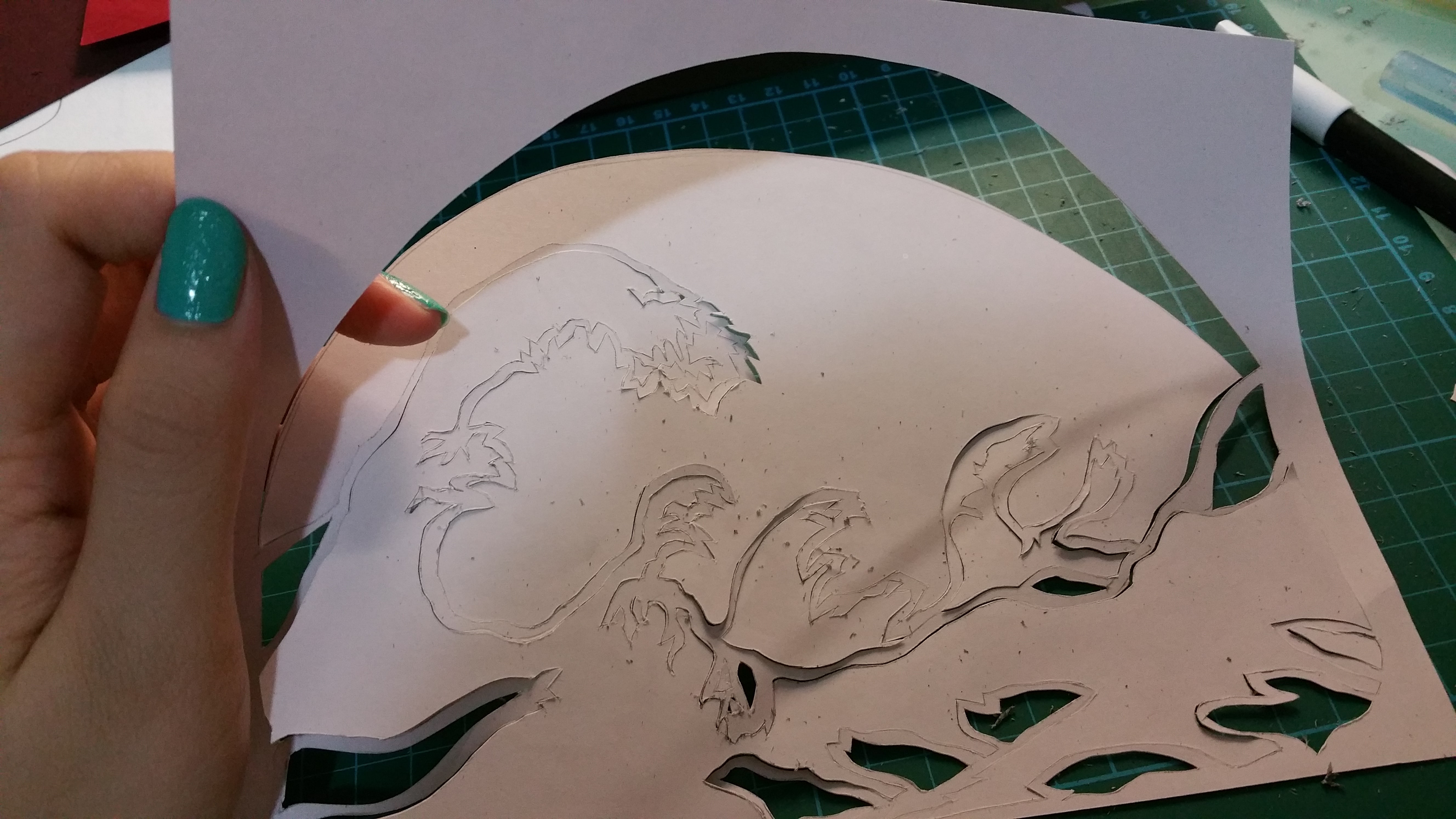
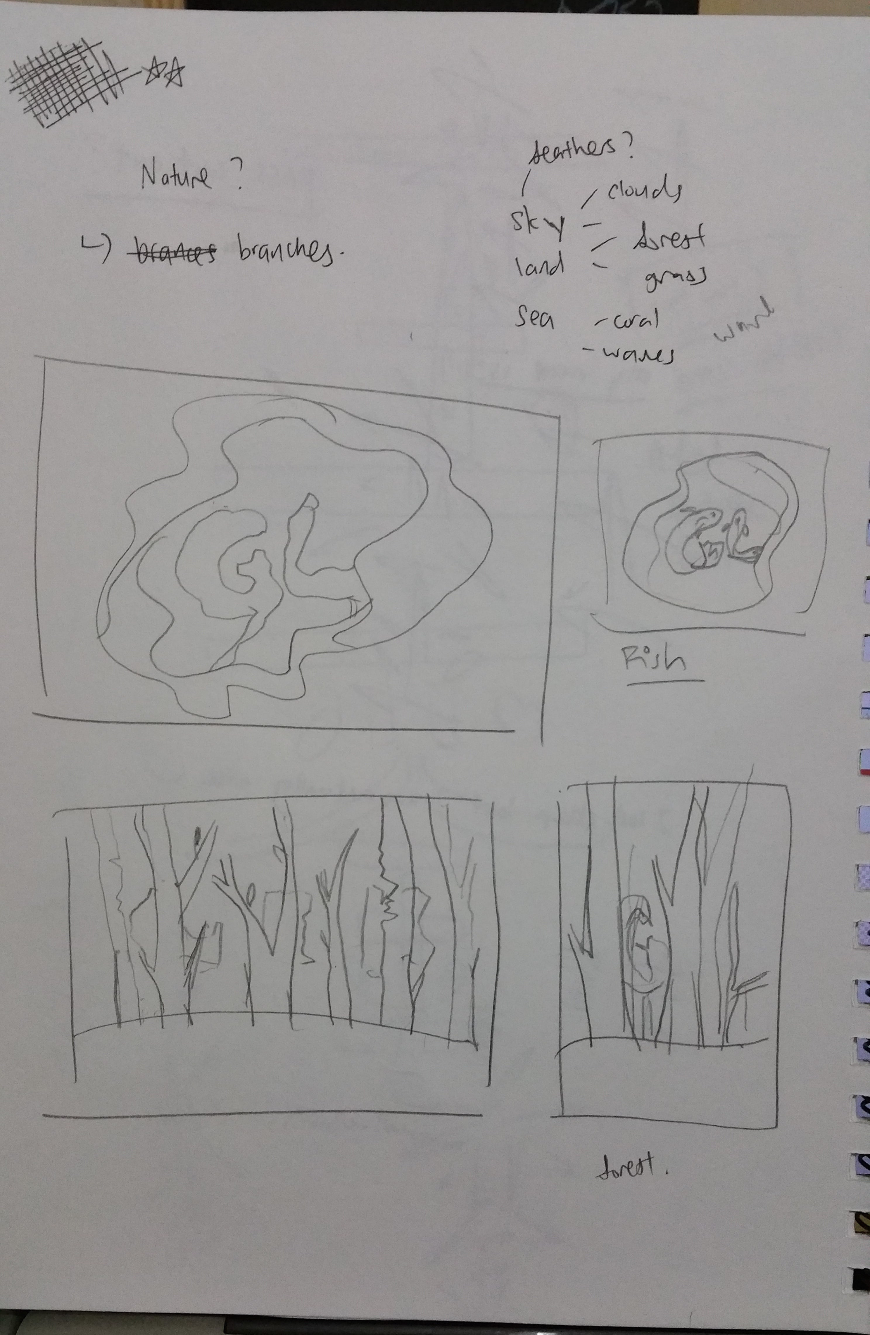
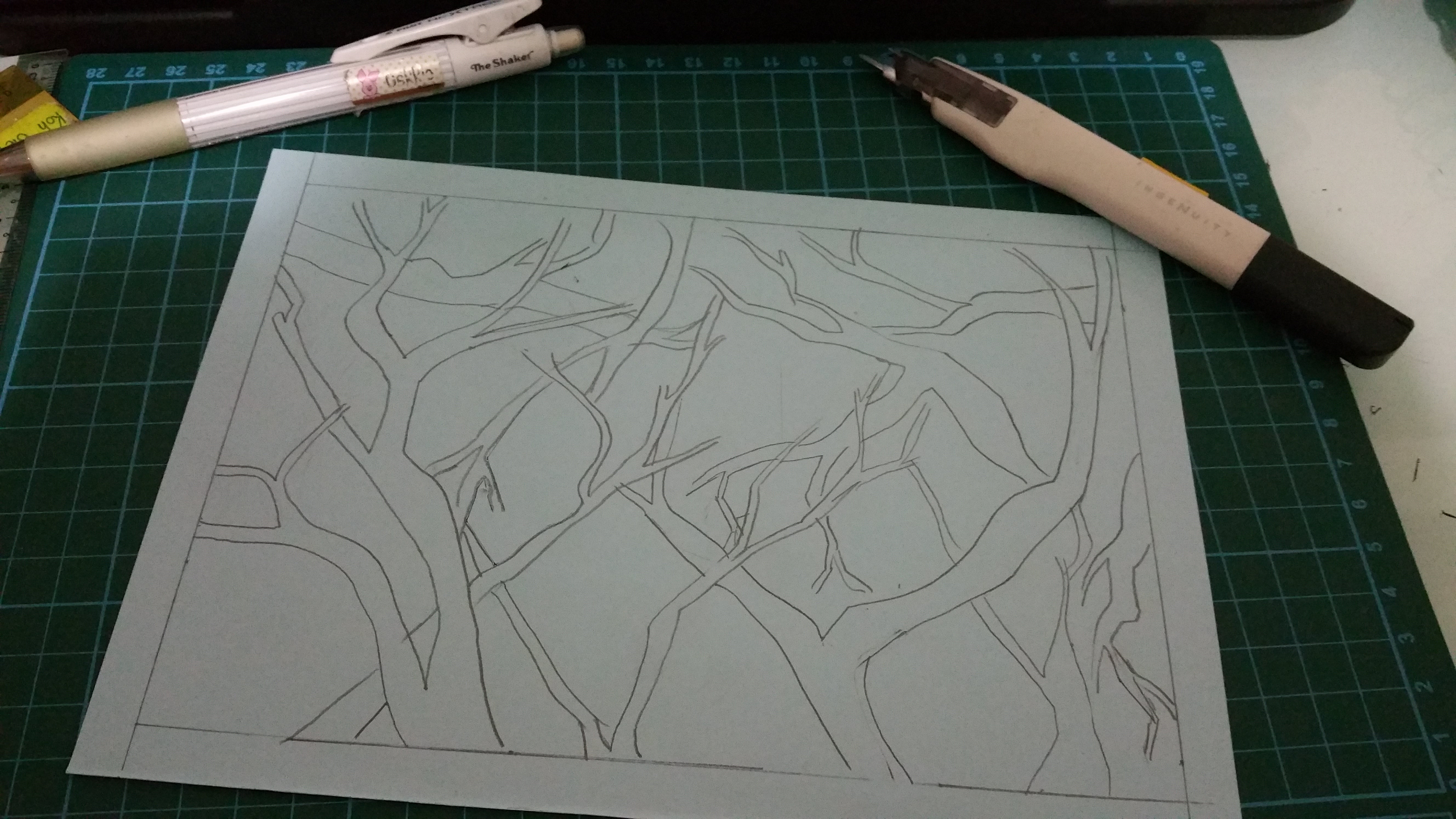
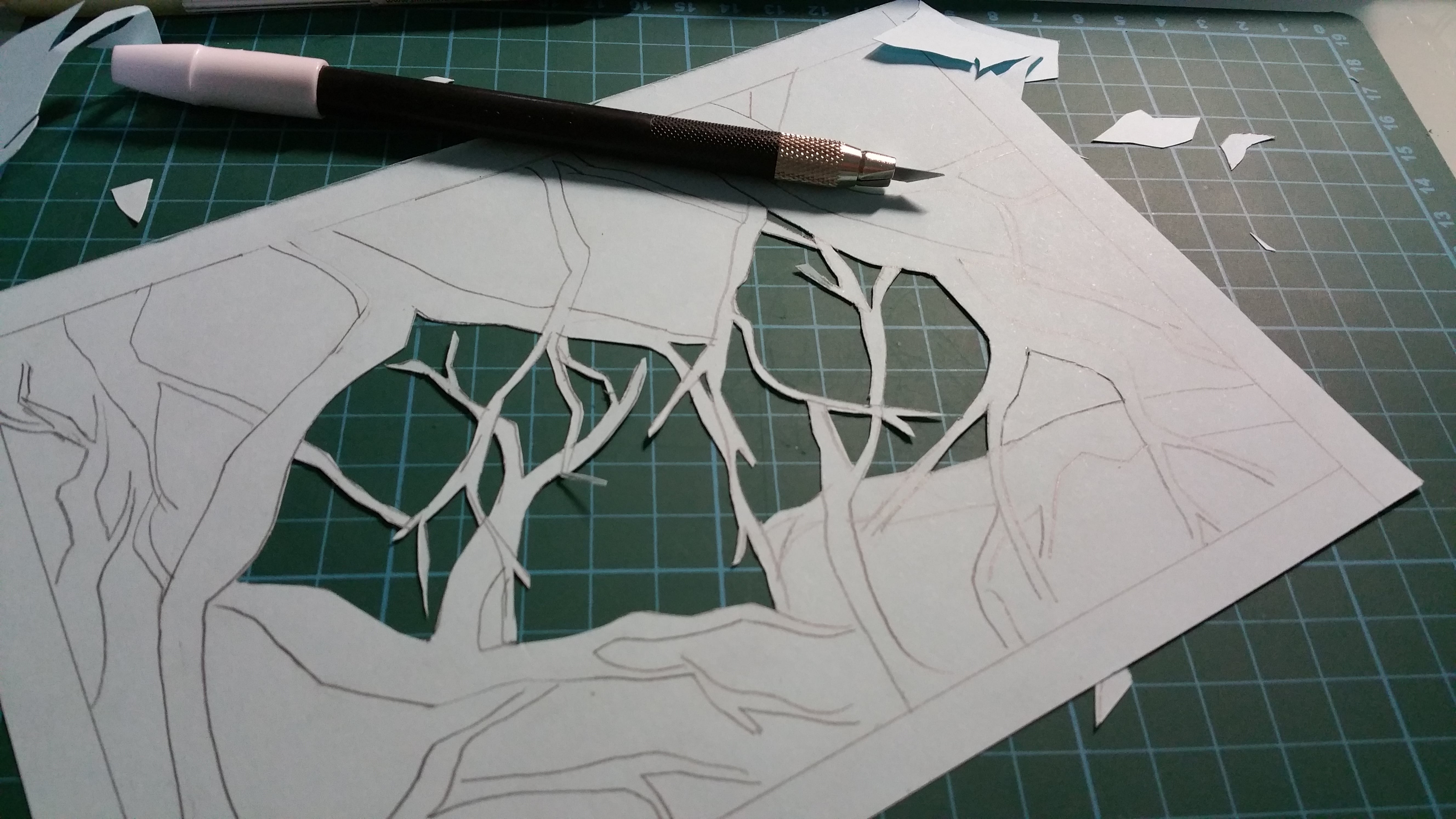
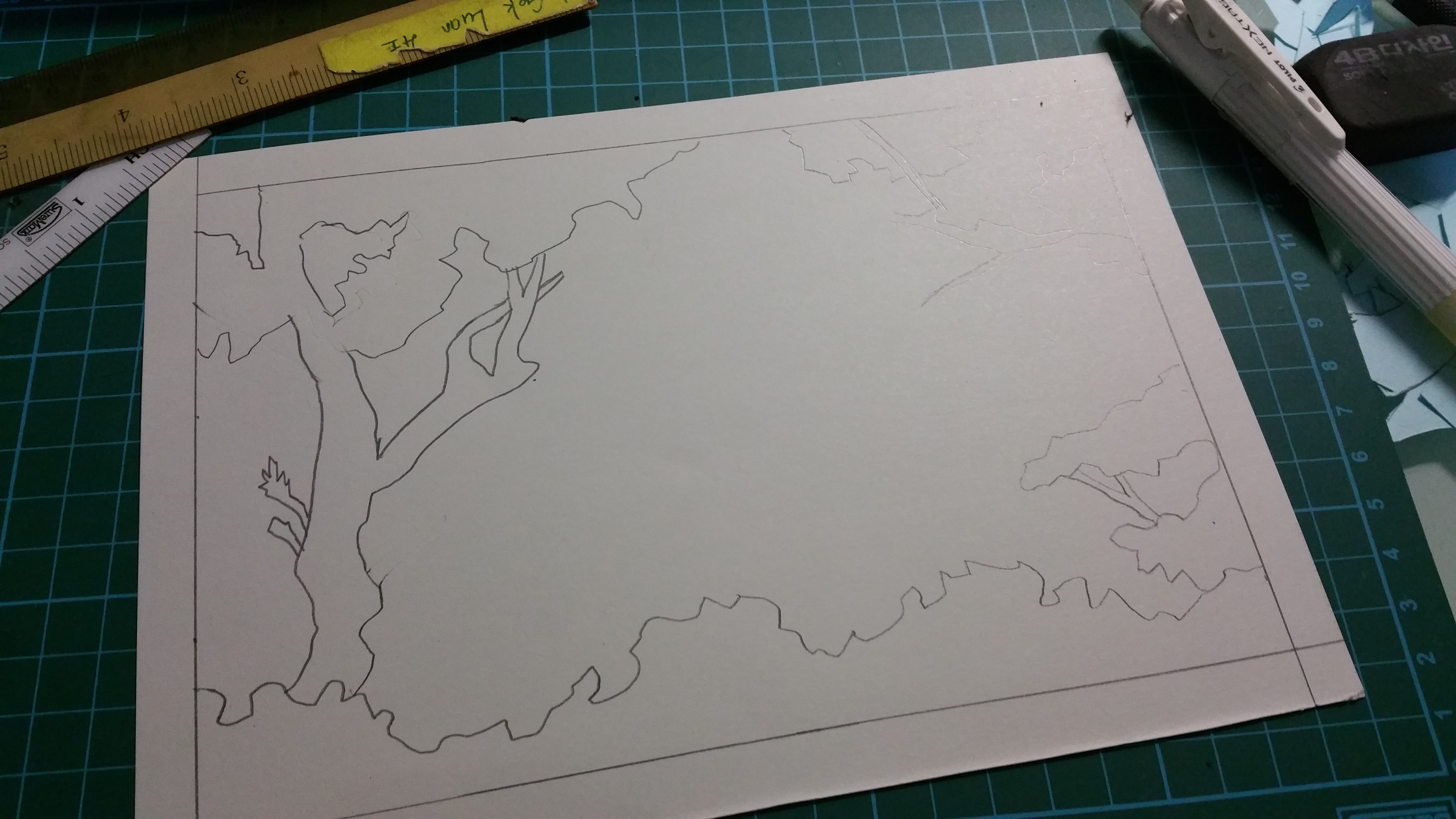
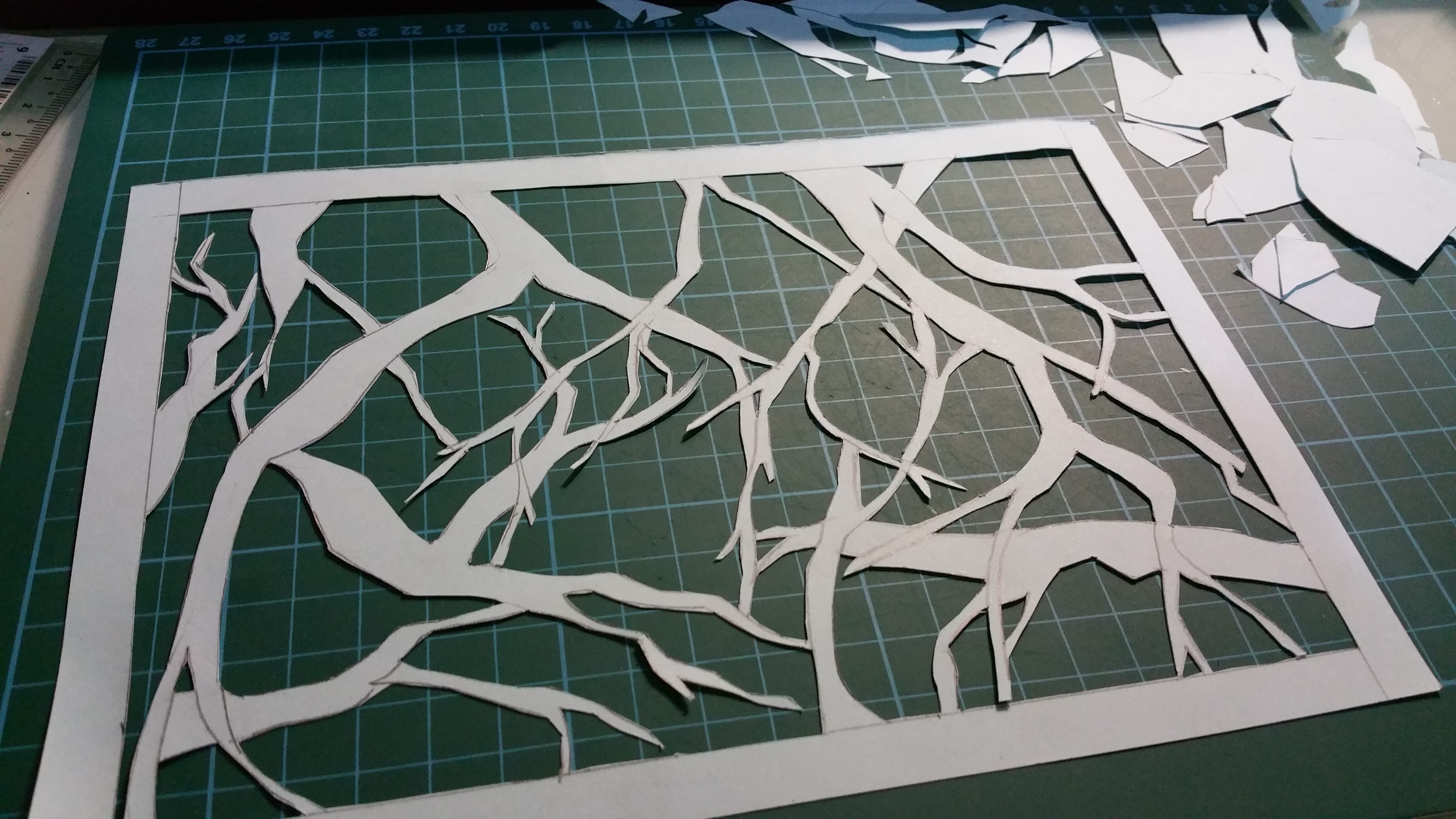
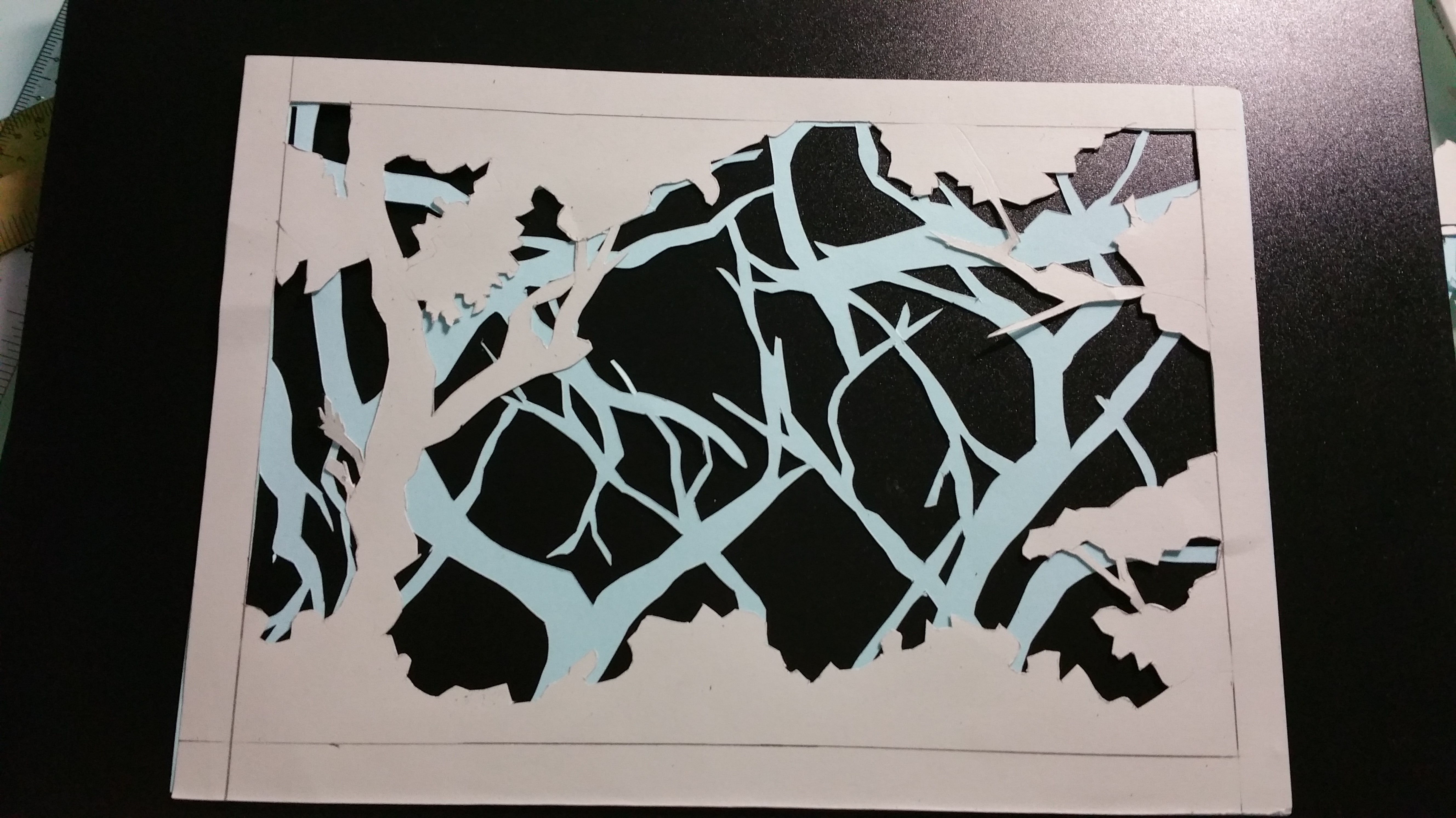
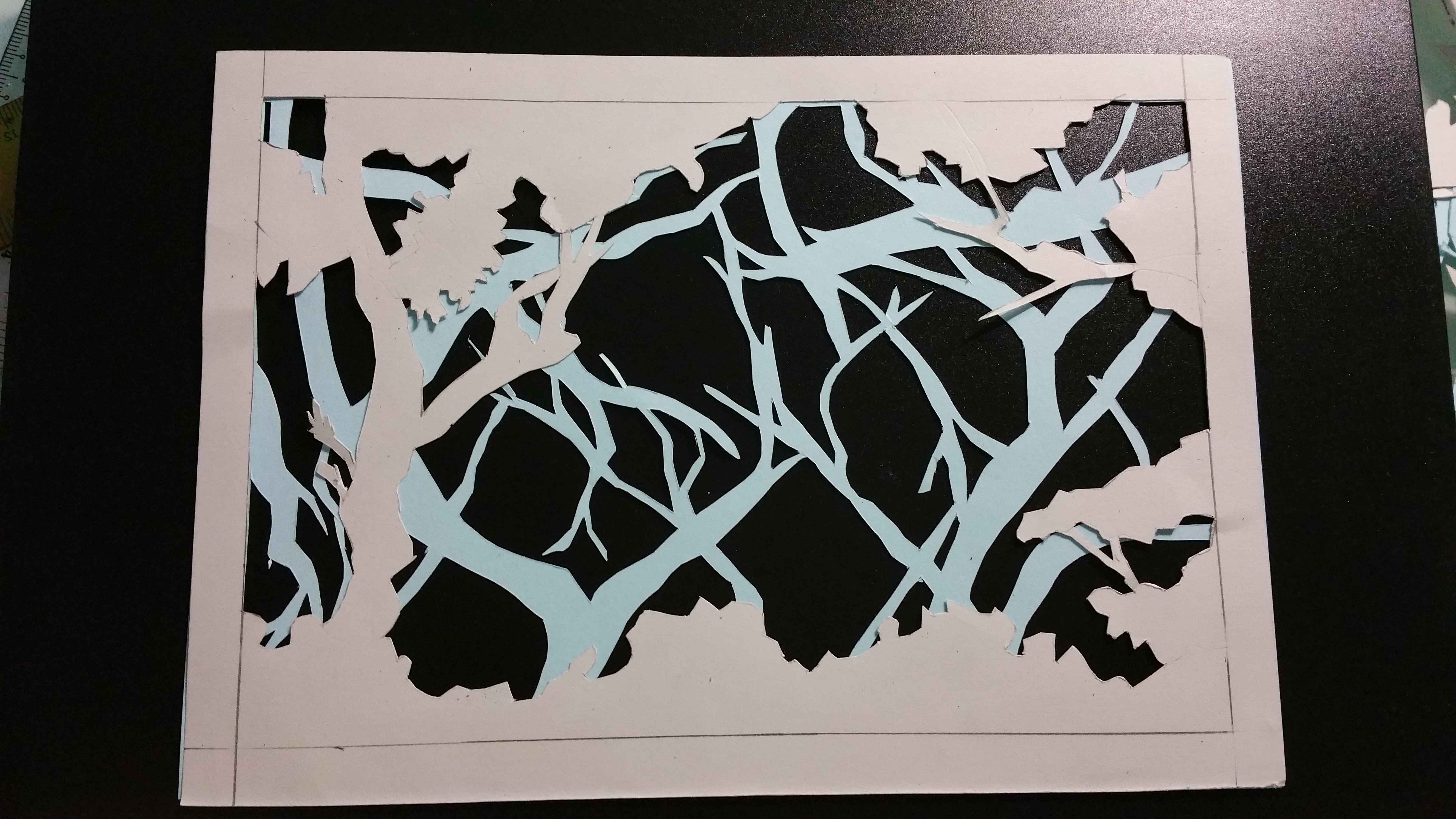
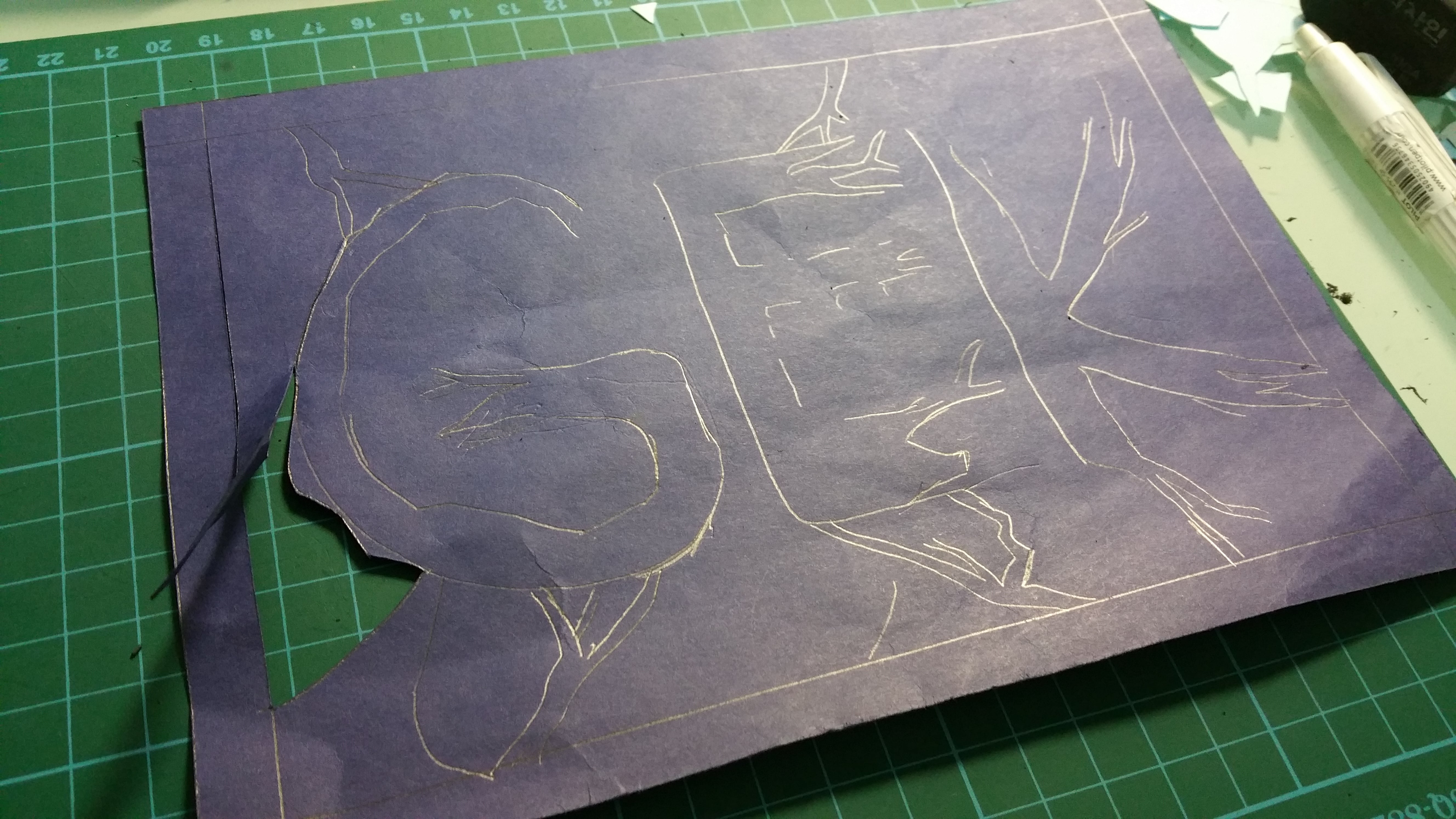
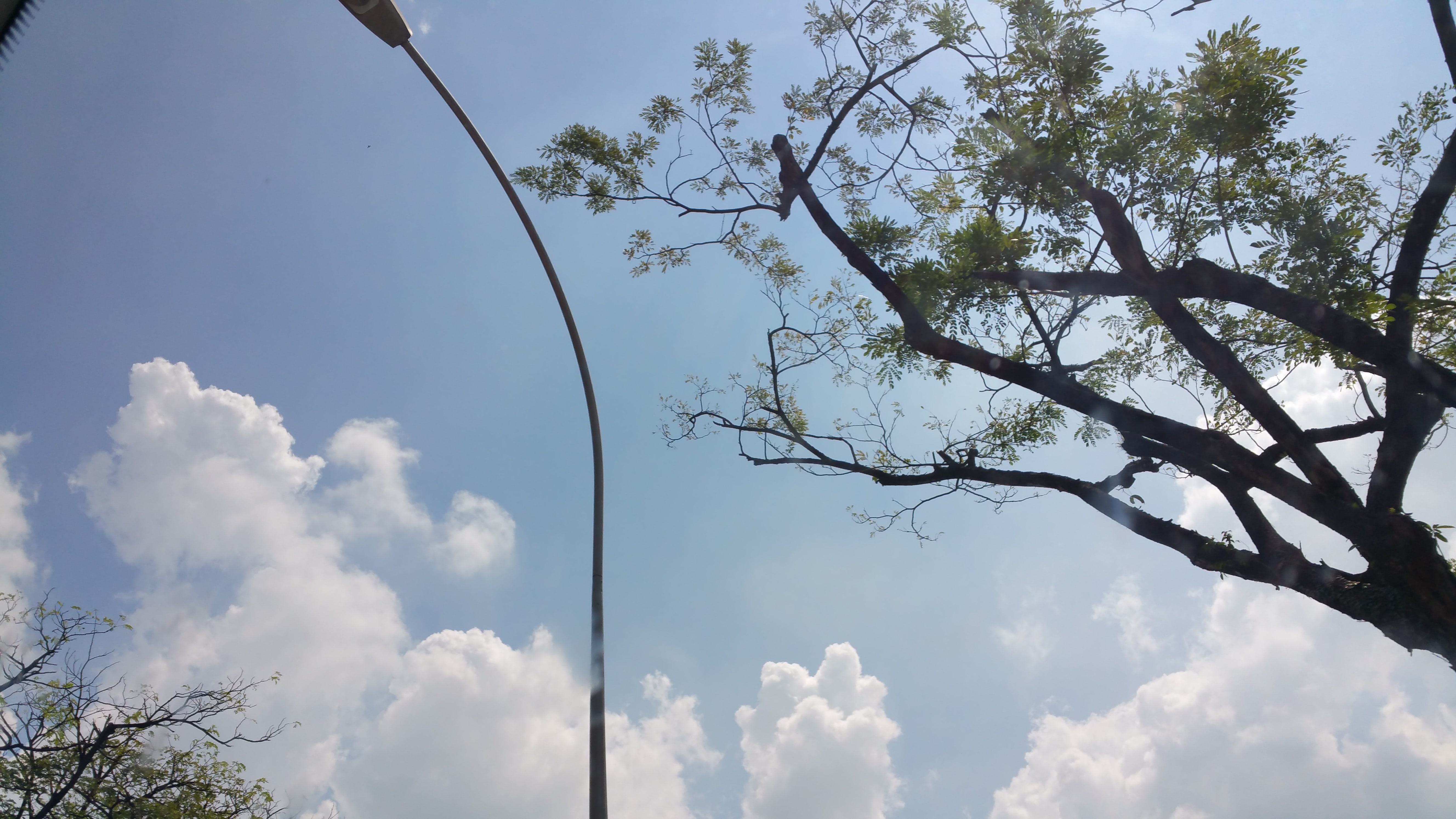
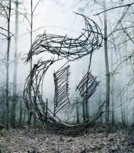
Branches// Finding me I can hide and may be hidden among the crowds at times. My heart may be hidden to. But if you look close enough, you will definitely find me in there, somewhere
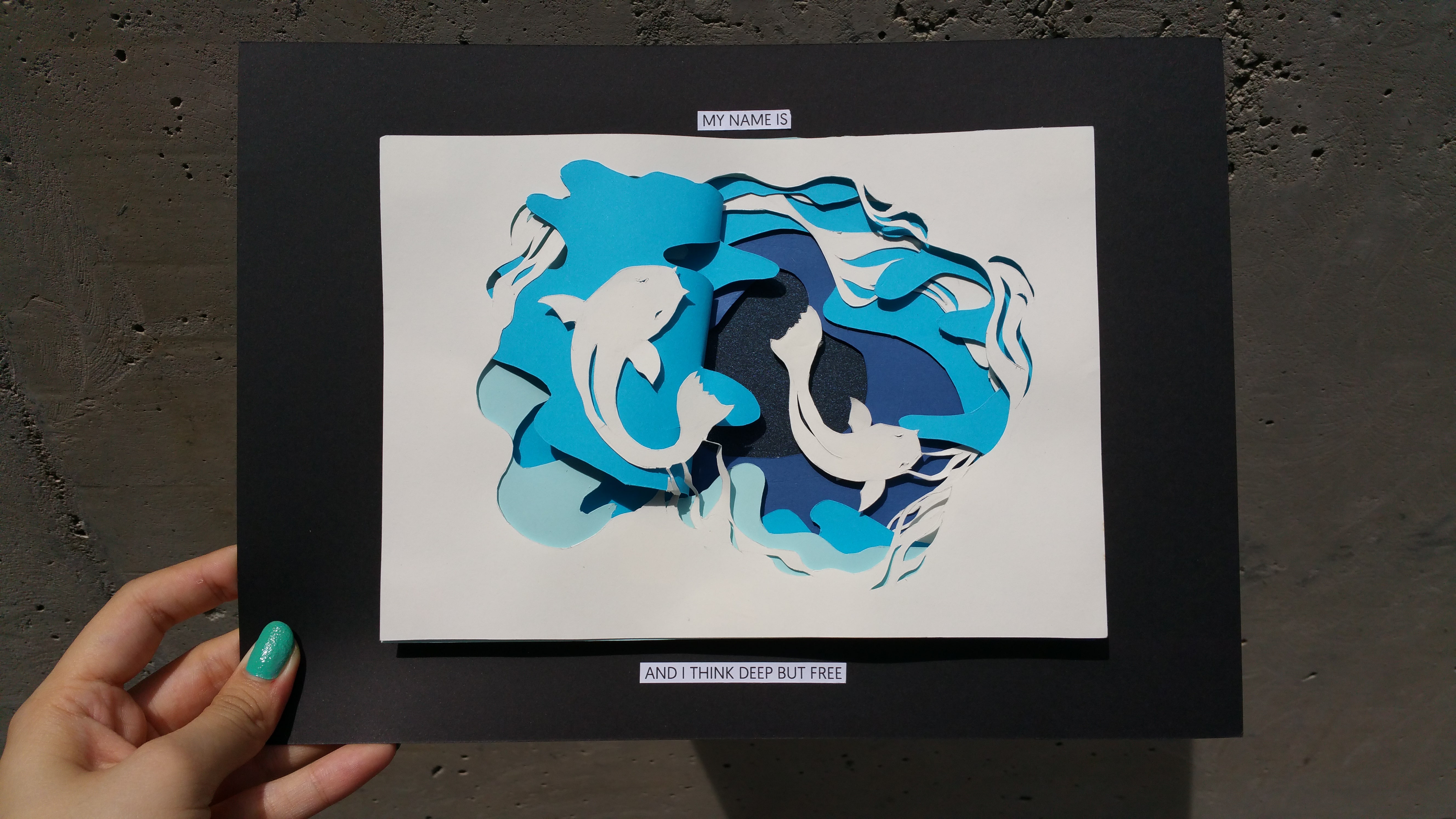
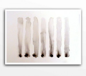
My name is … And i think deep but free
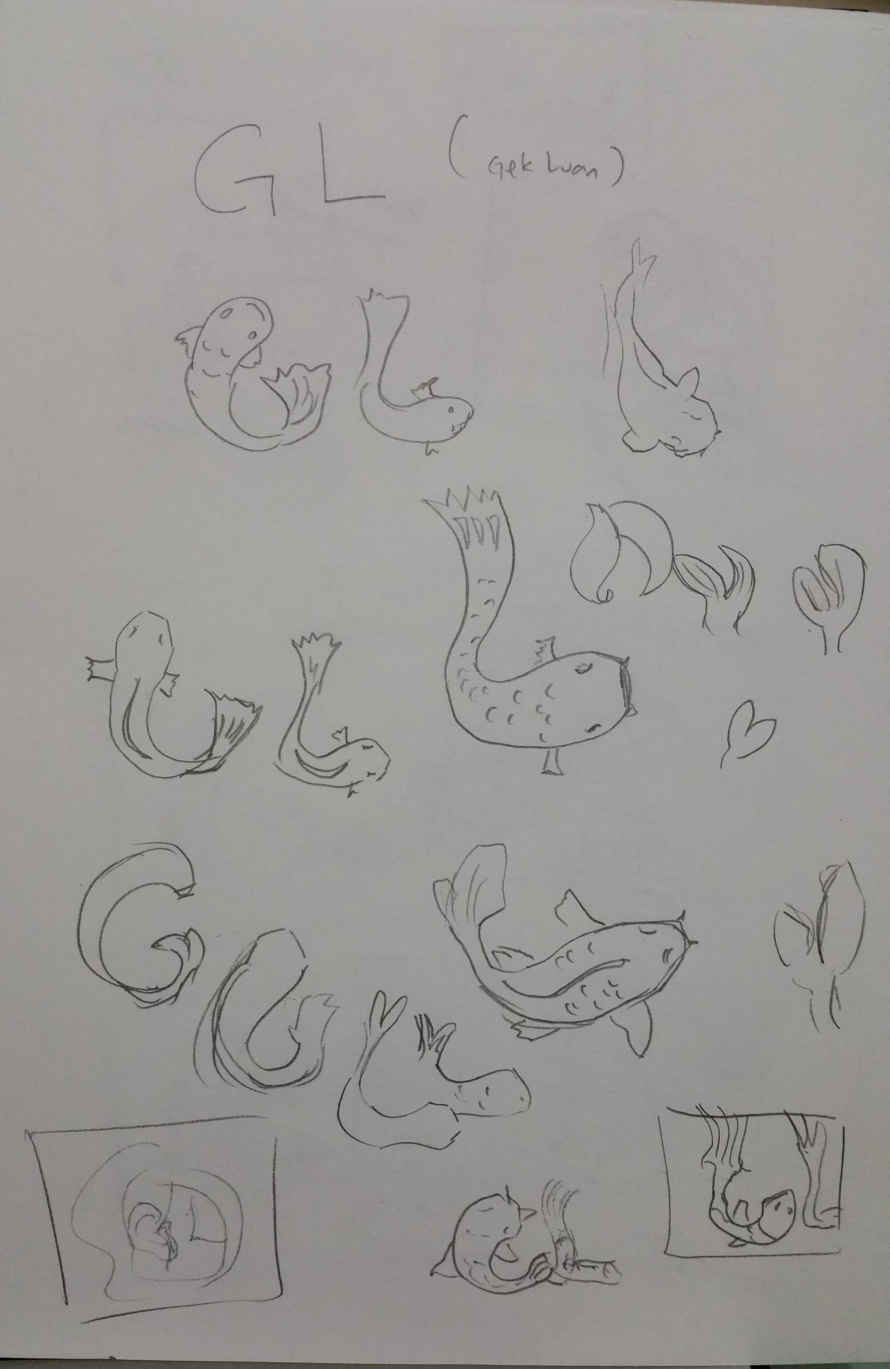
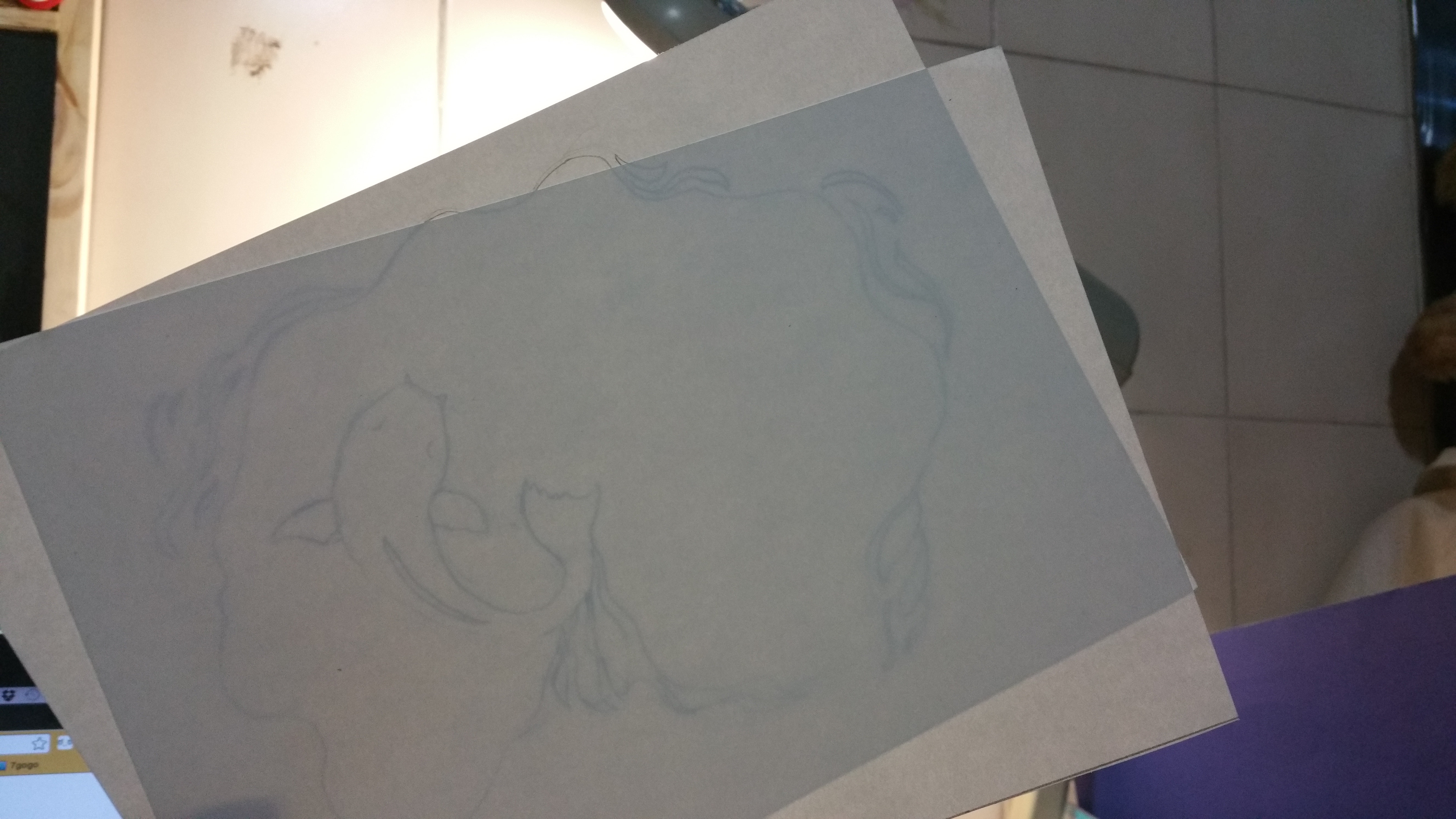
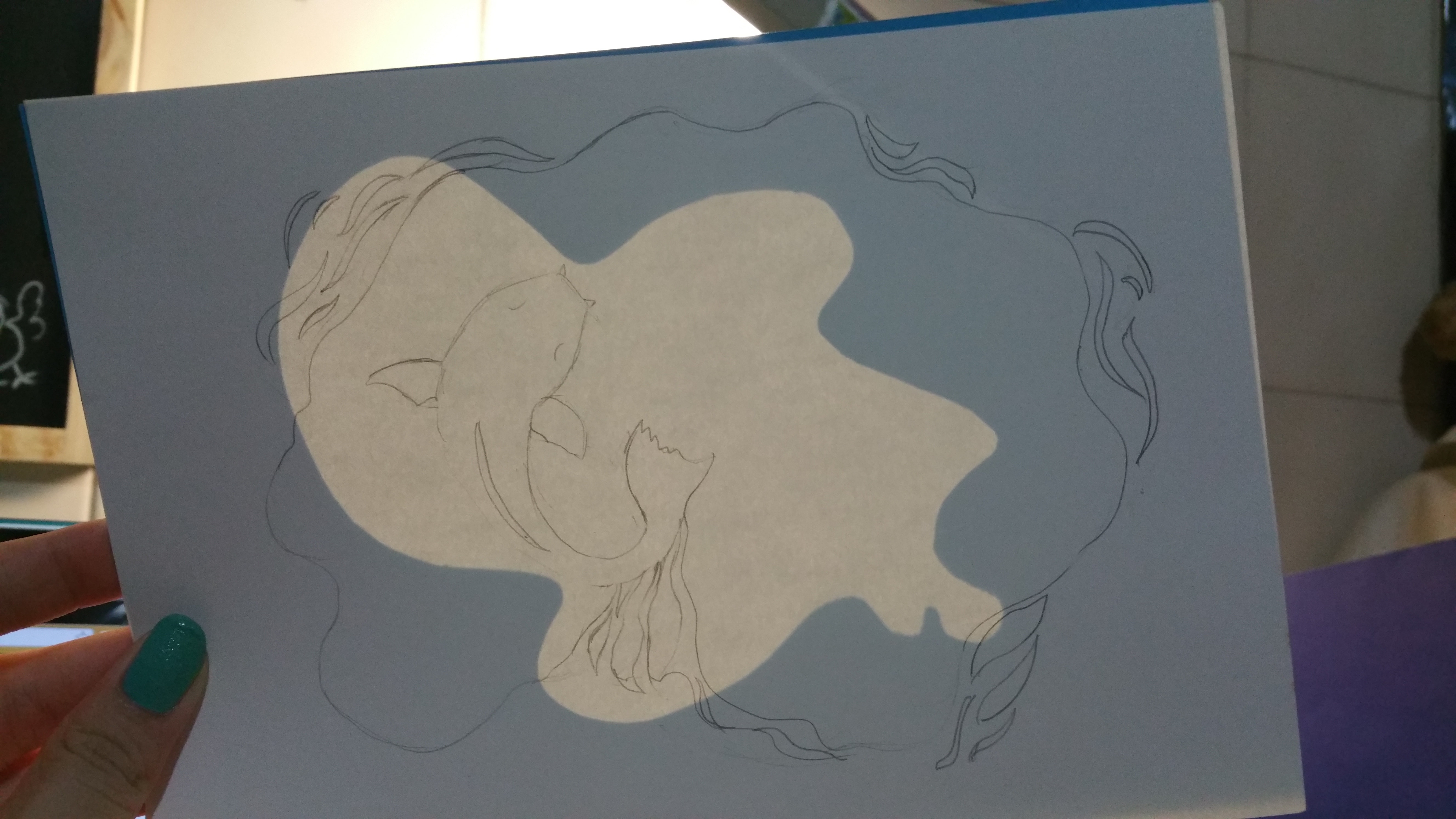
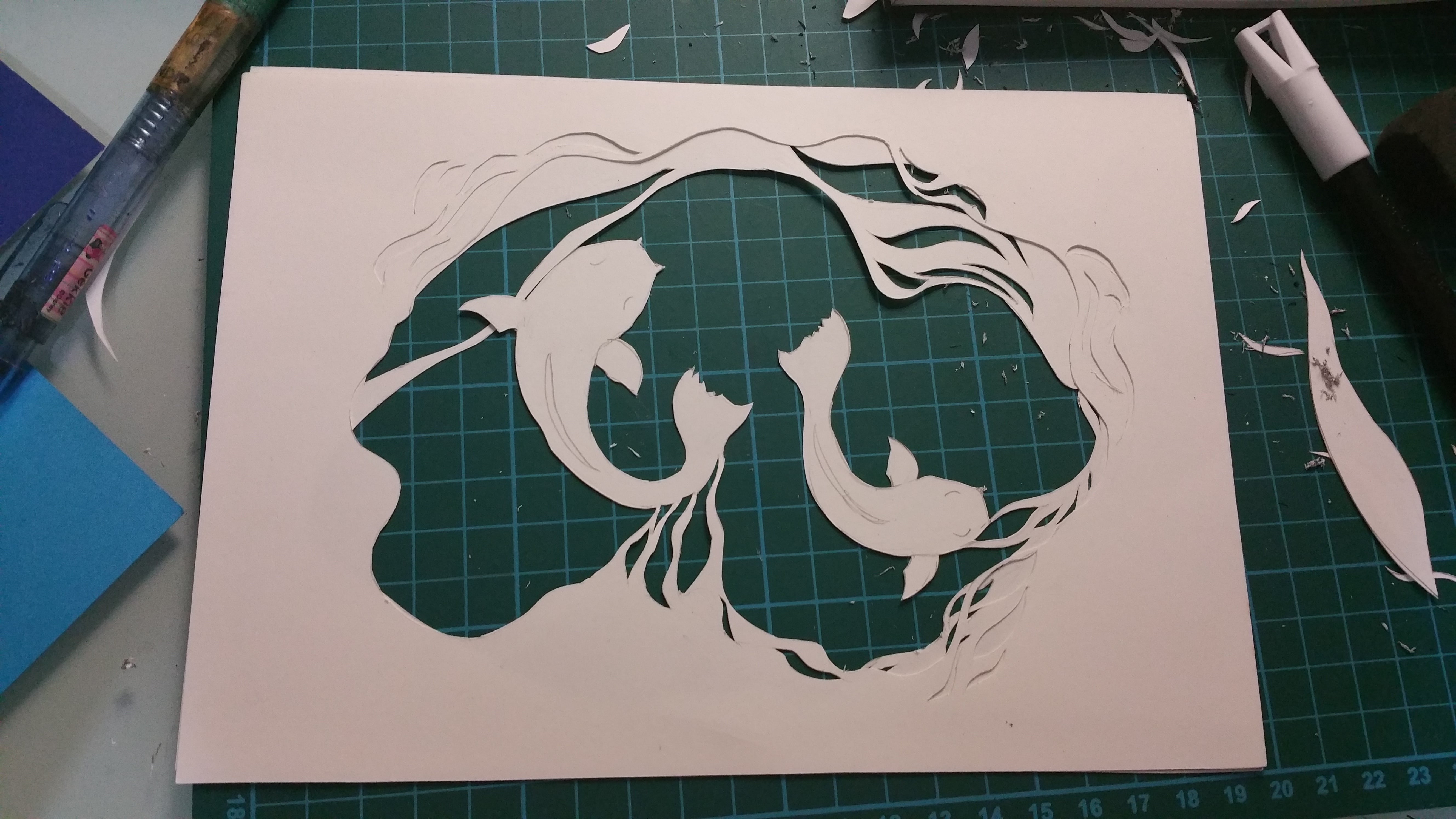
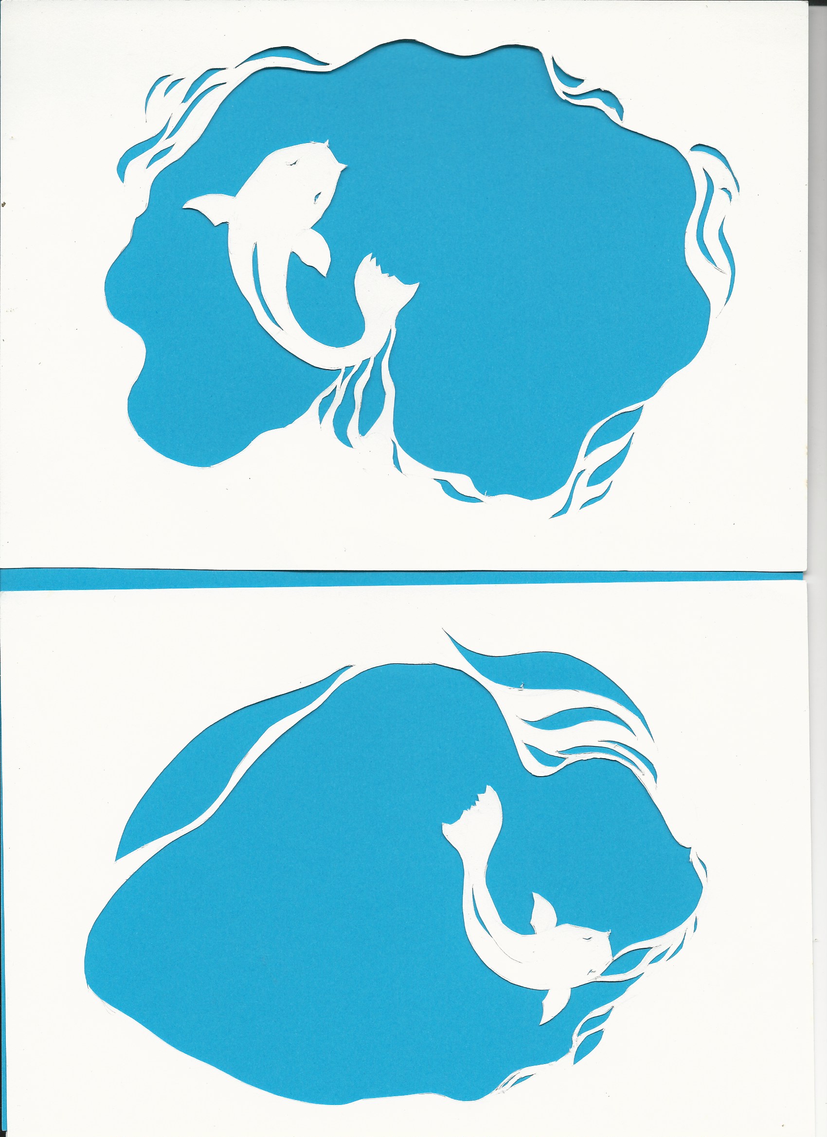
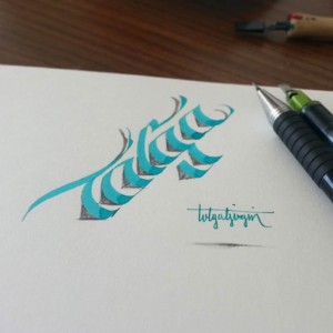
Fishes in water// I feel like i am like fishes out of water, not fitting into the environment that i am in. However, at the same time, i want to portray how deep my thoughts/I can be just like the deep layered water. And also, the only way you feel like u can fly is through swimming in the water
p.s. notice the special shiny backgrounds i used for these 2 pieces!

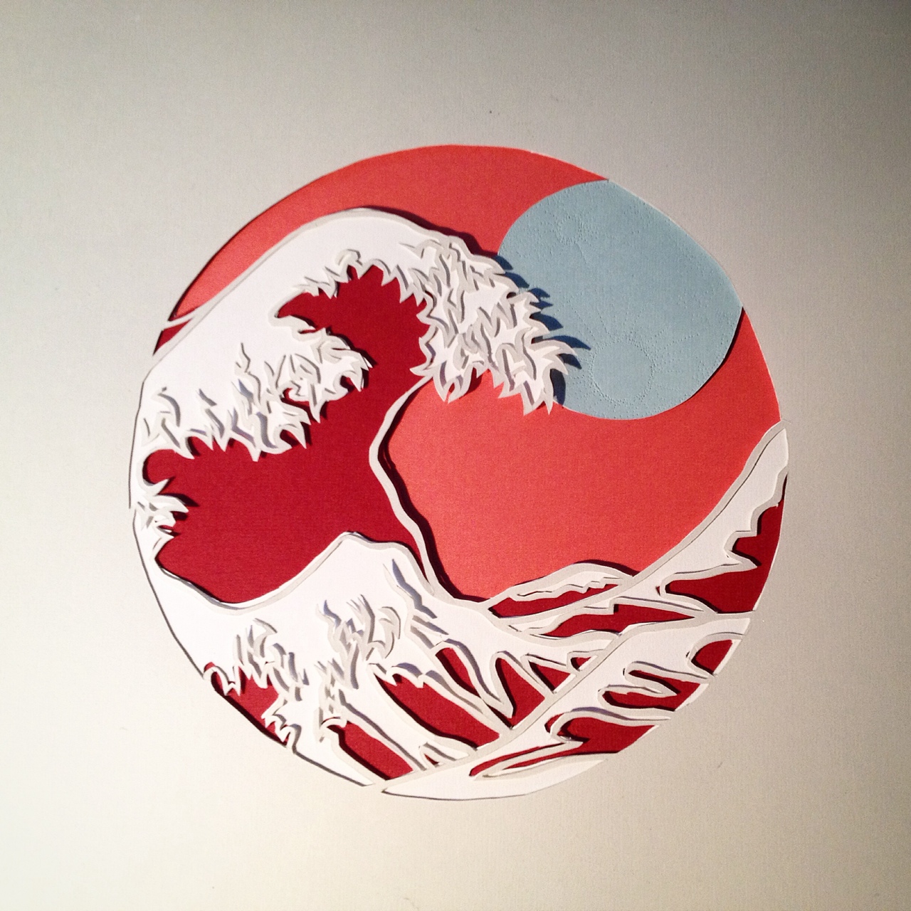
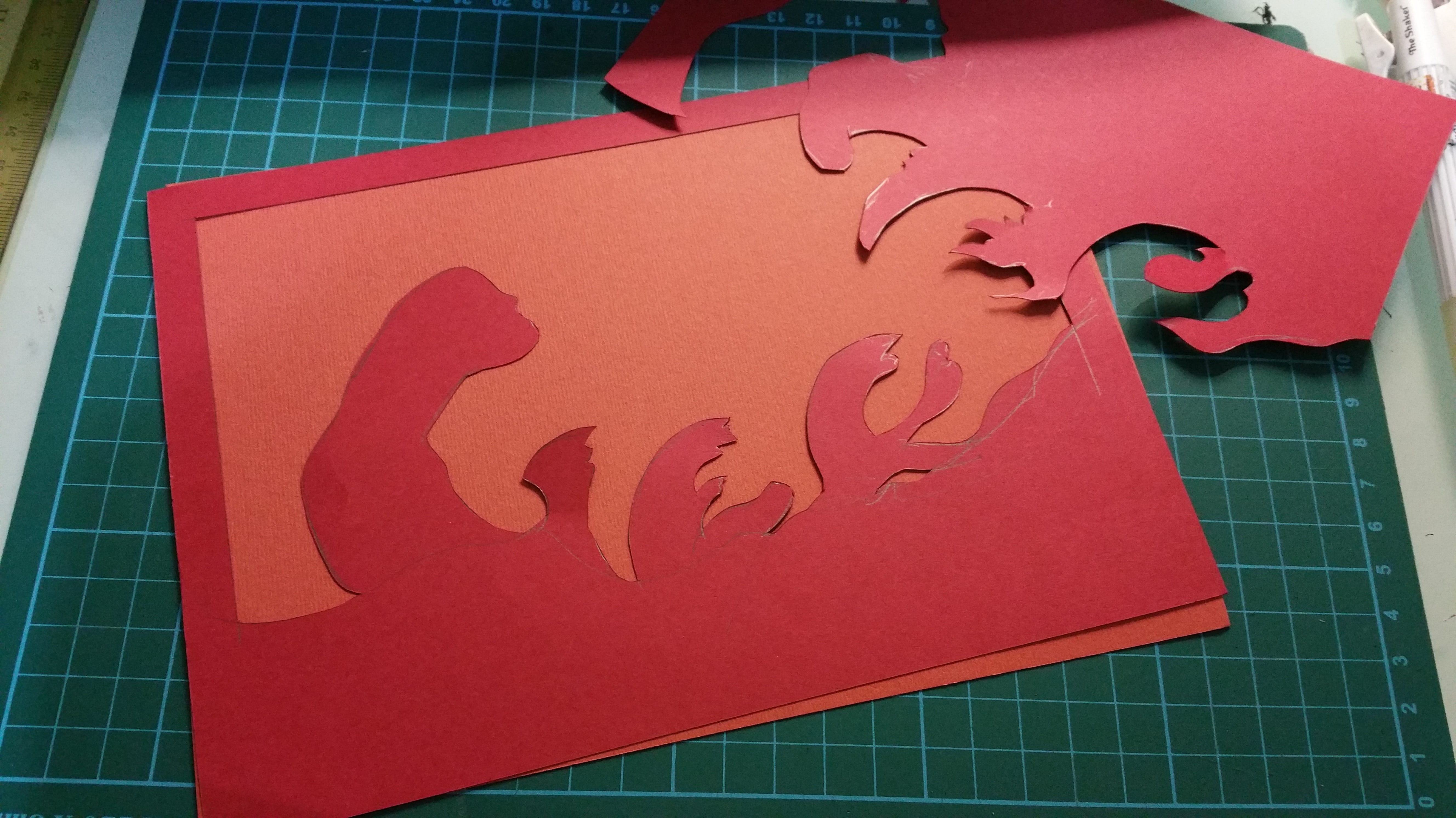
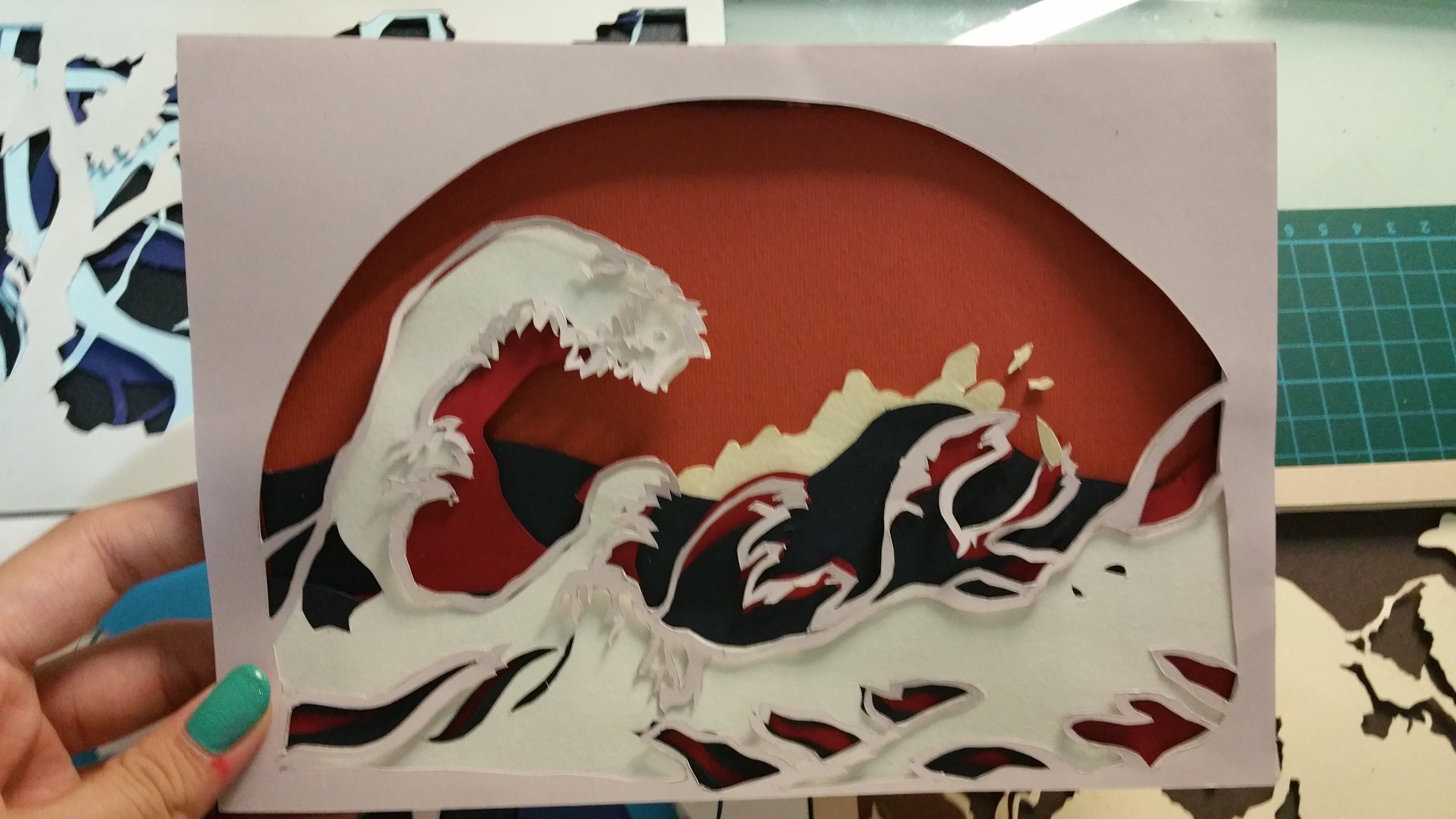
My name is… And i respond with strong emotions
Roaring waves// This represent my emotions, if am happy i definitely wont be hiding it. It would be hitting you in strong waves
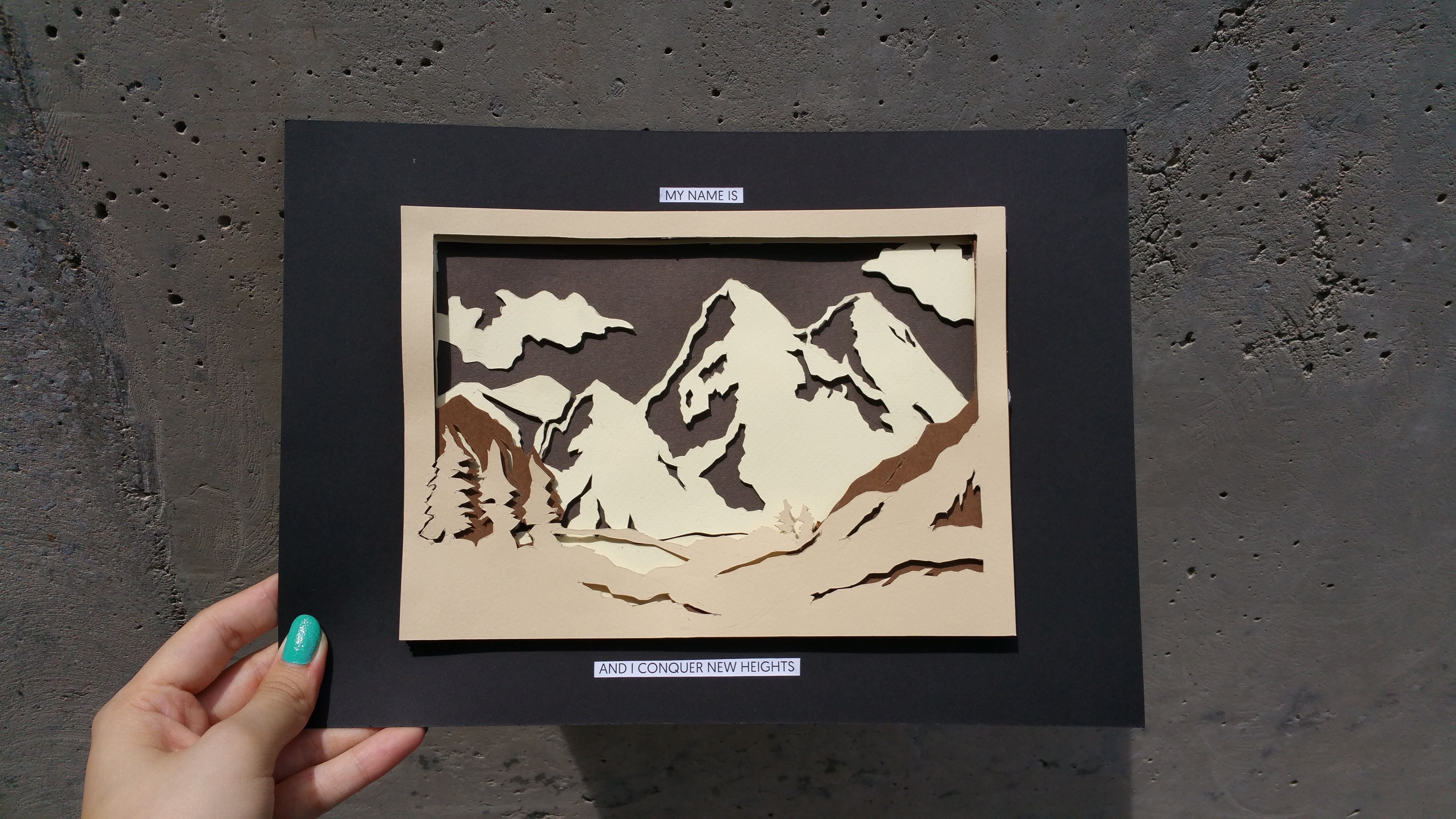
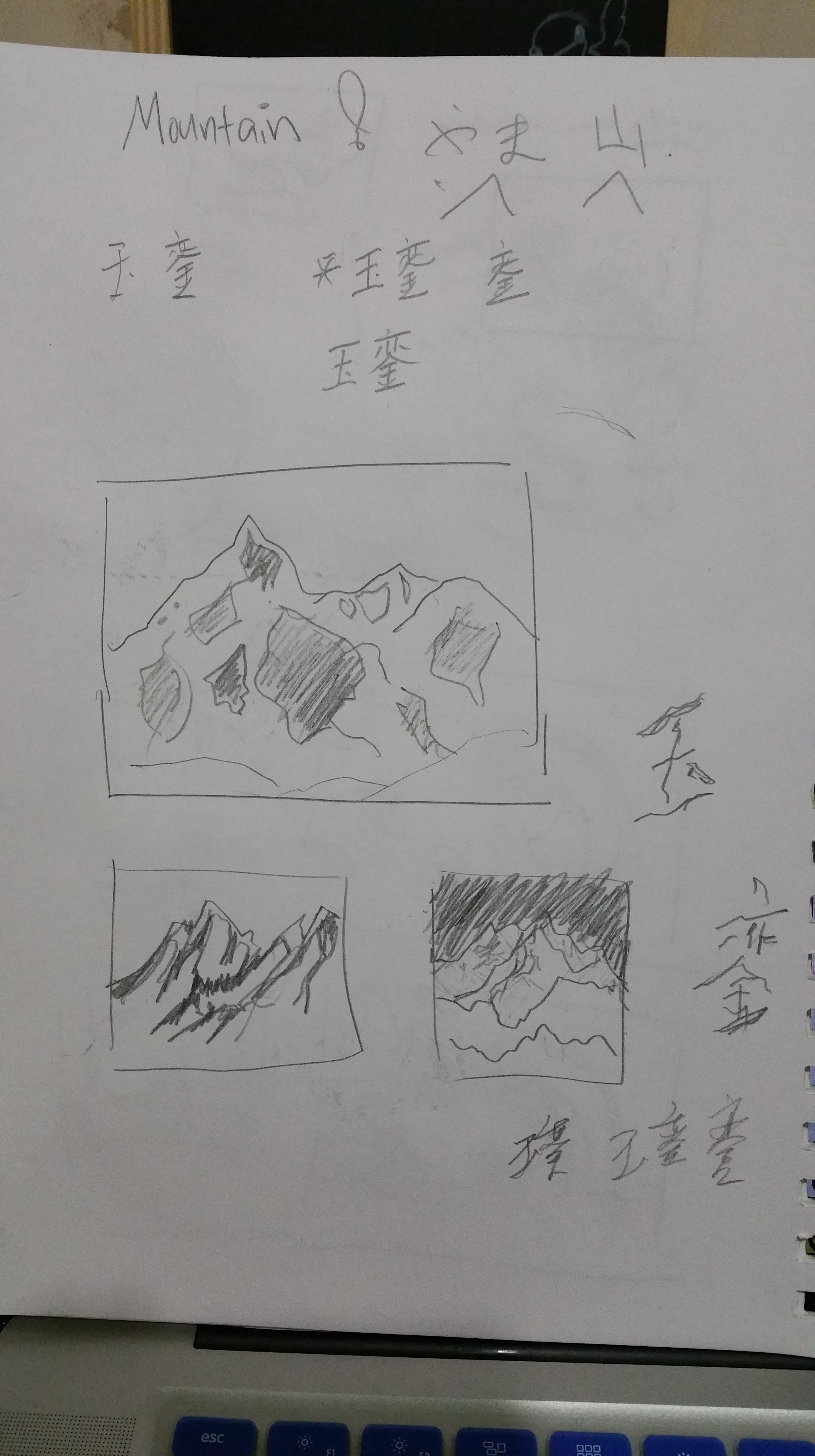
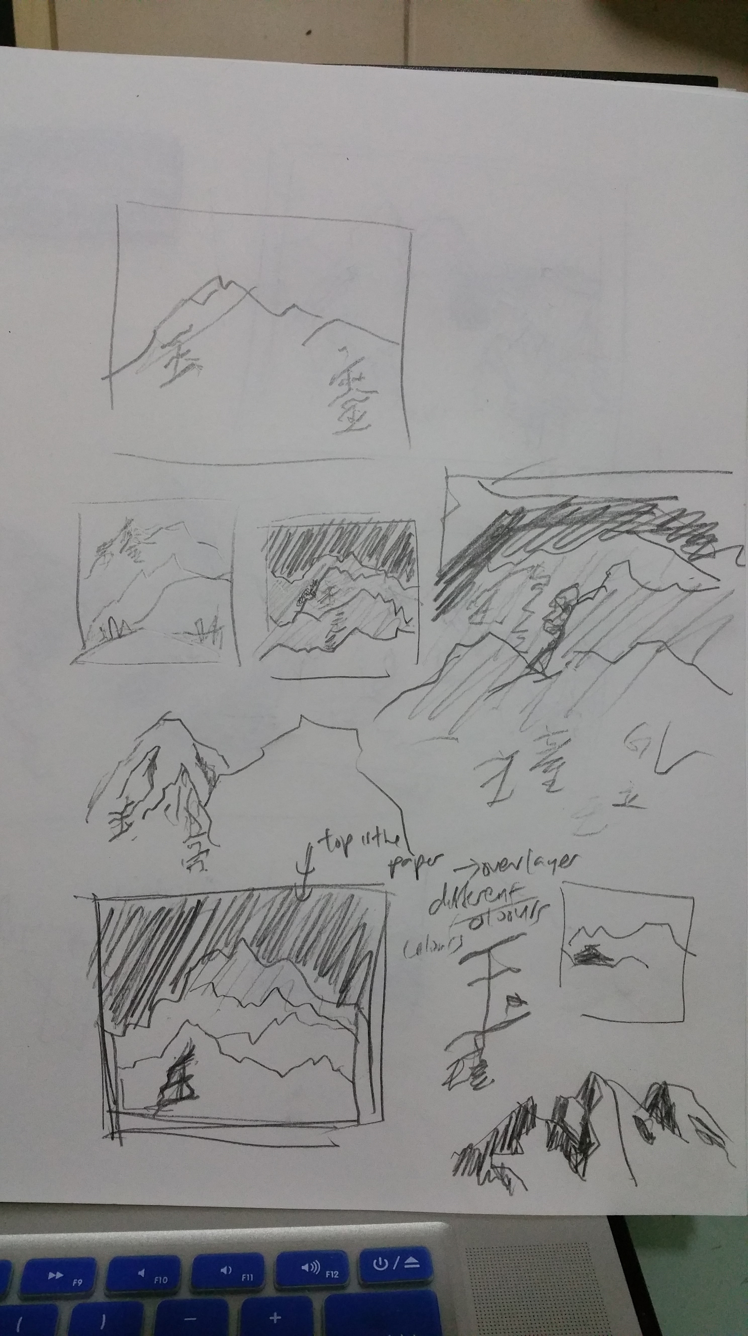
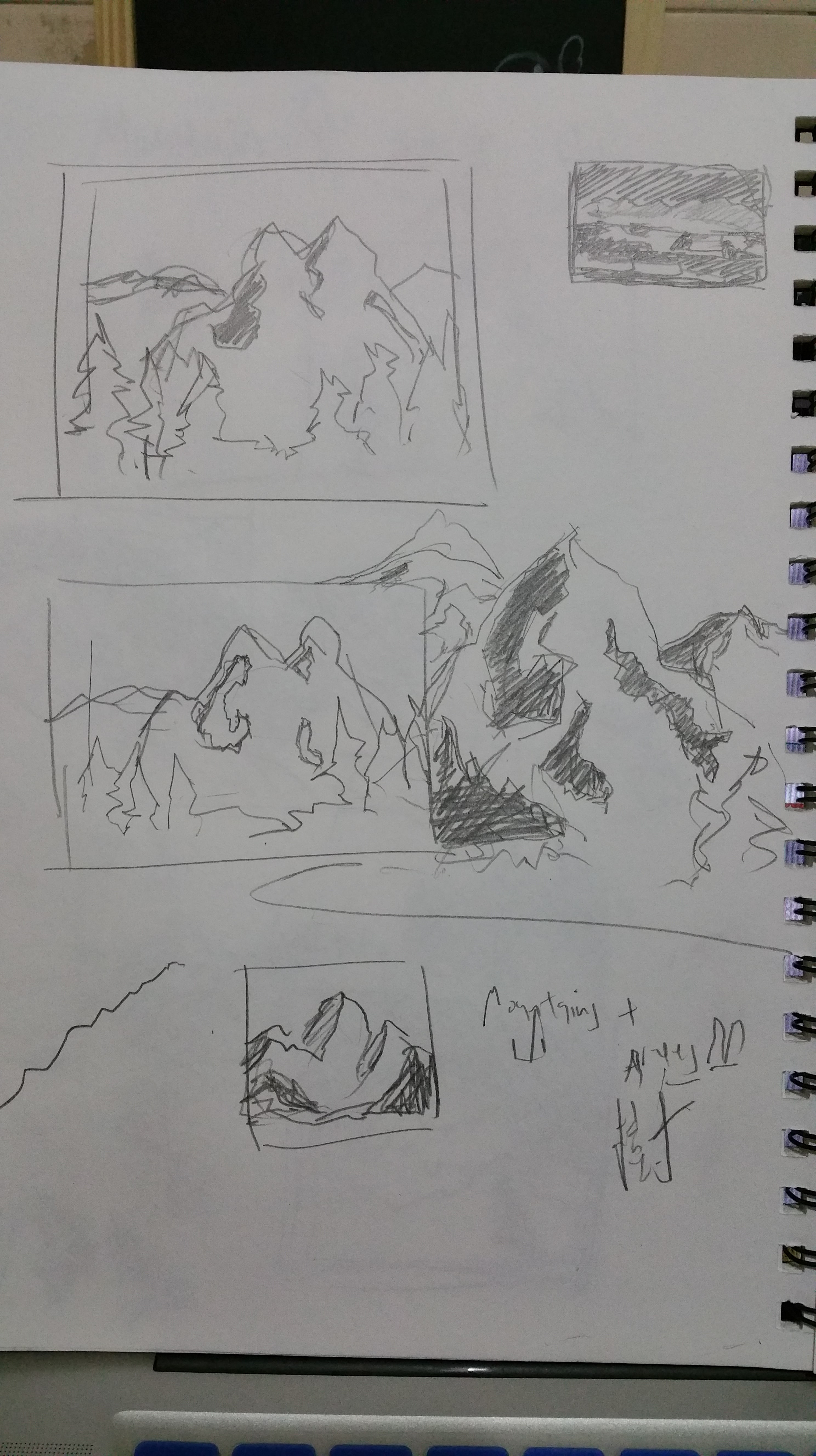
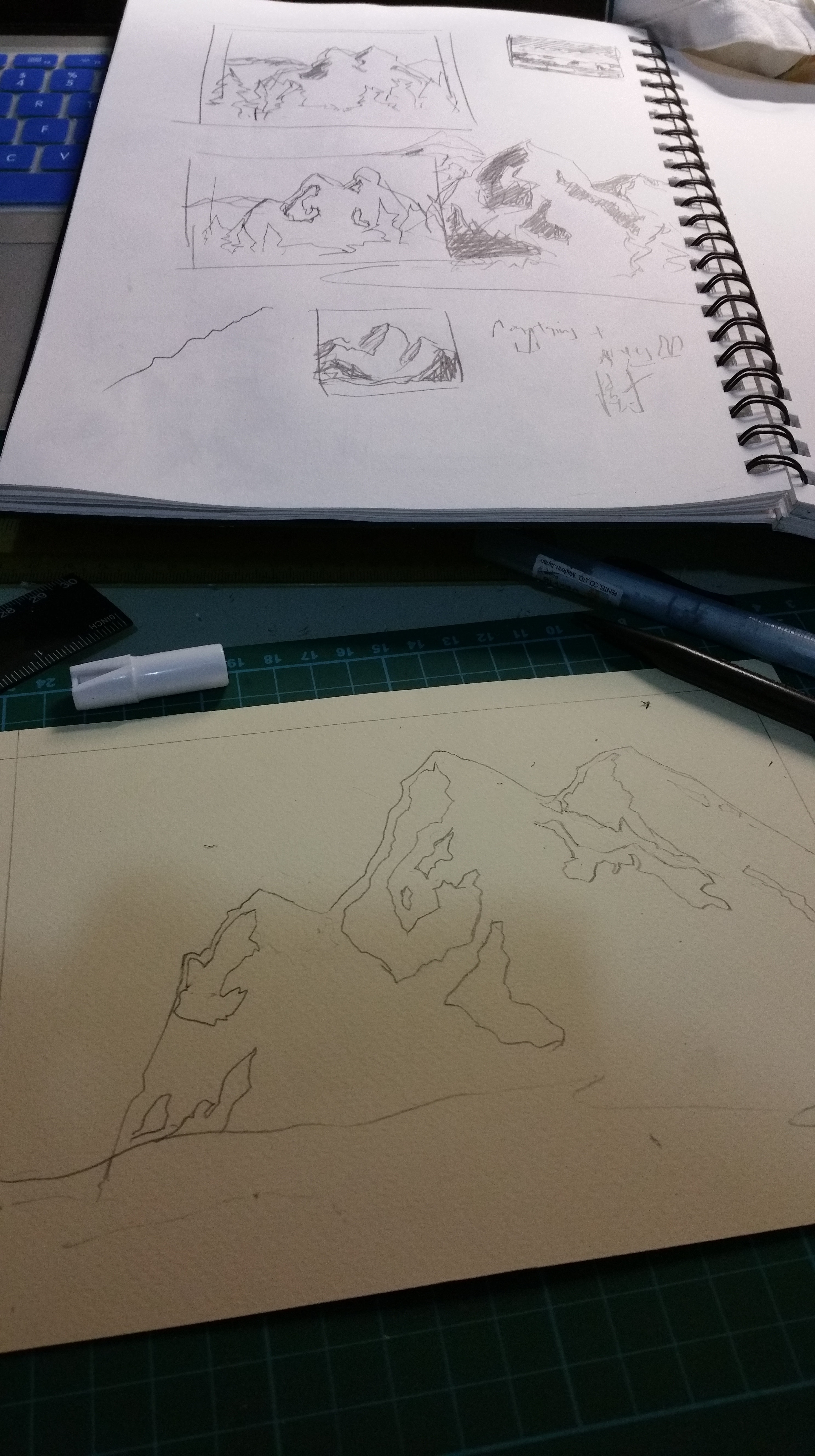
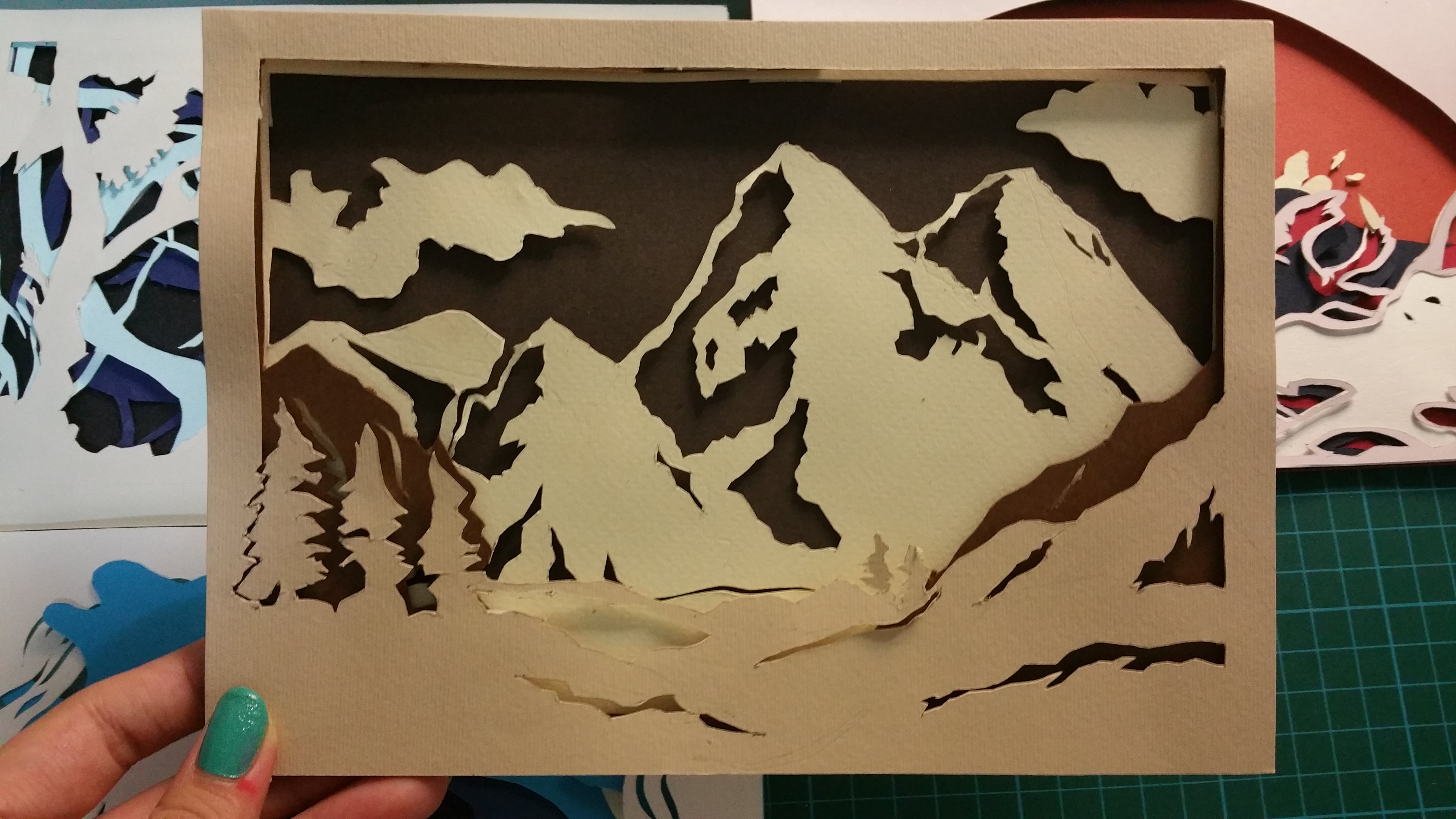
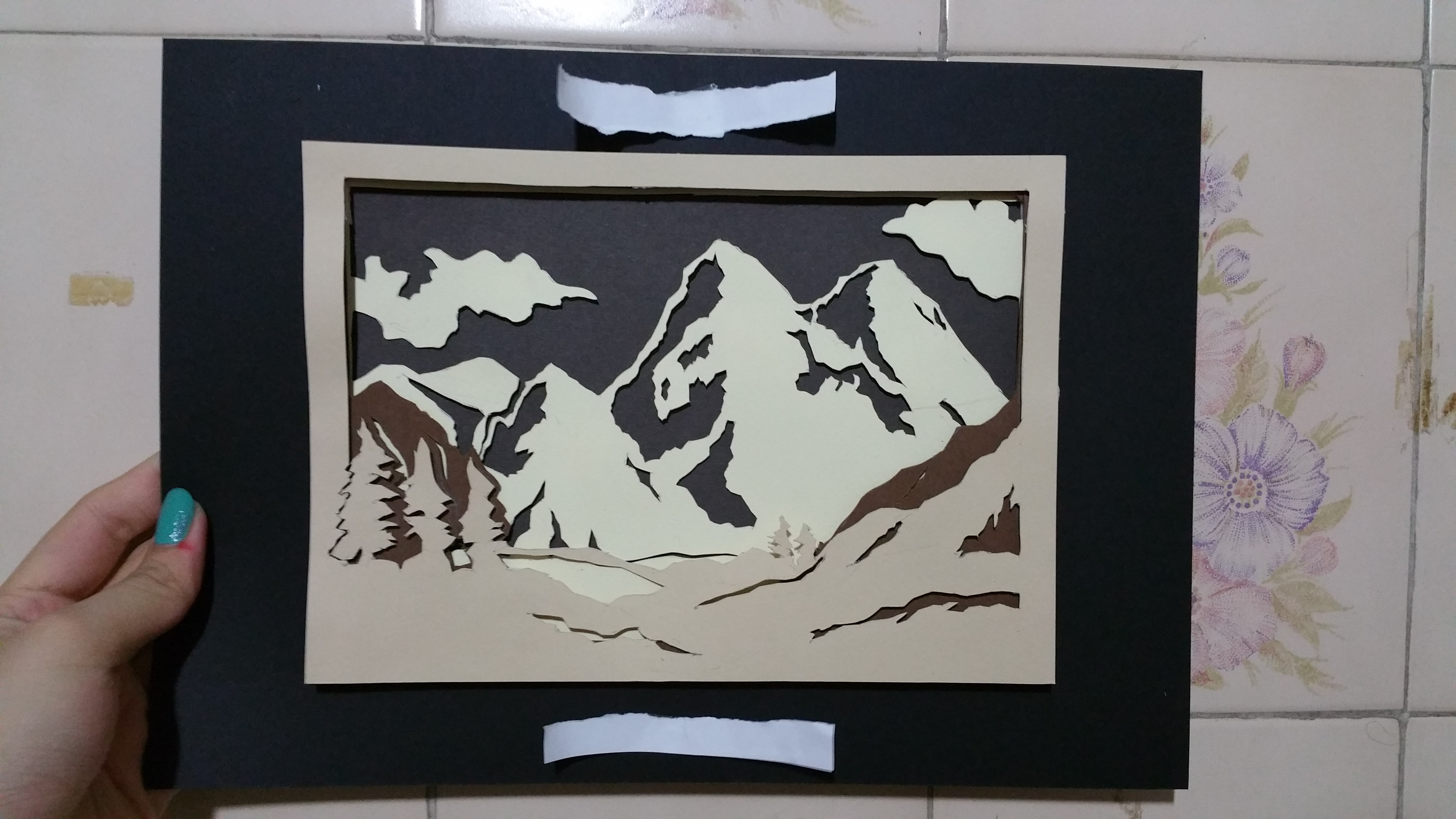
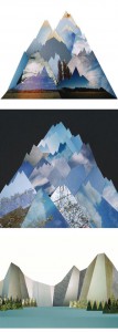
My name is… And i conquer new heights
Mountains// For me to overcoming even greater heights. Having new challengers and continuing no matter how cold or how unfavourable the conditions are ahead of me

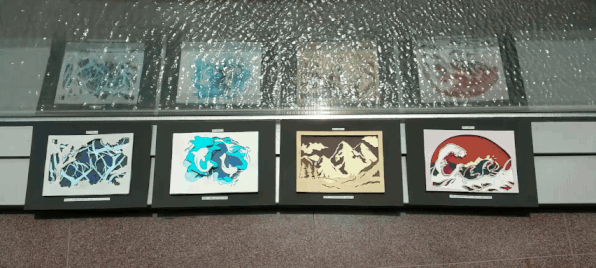
on the wall
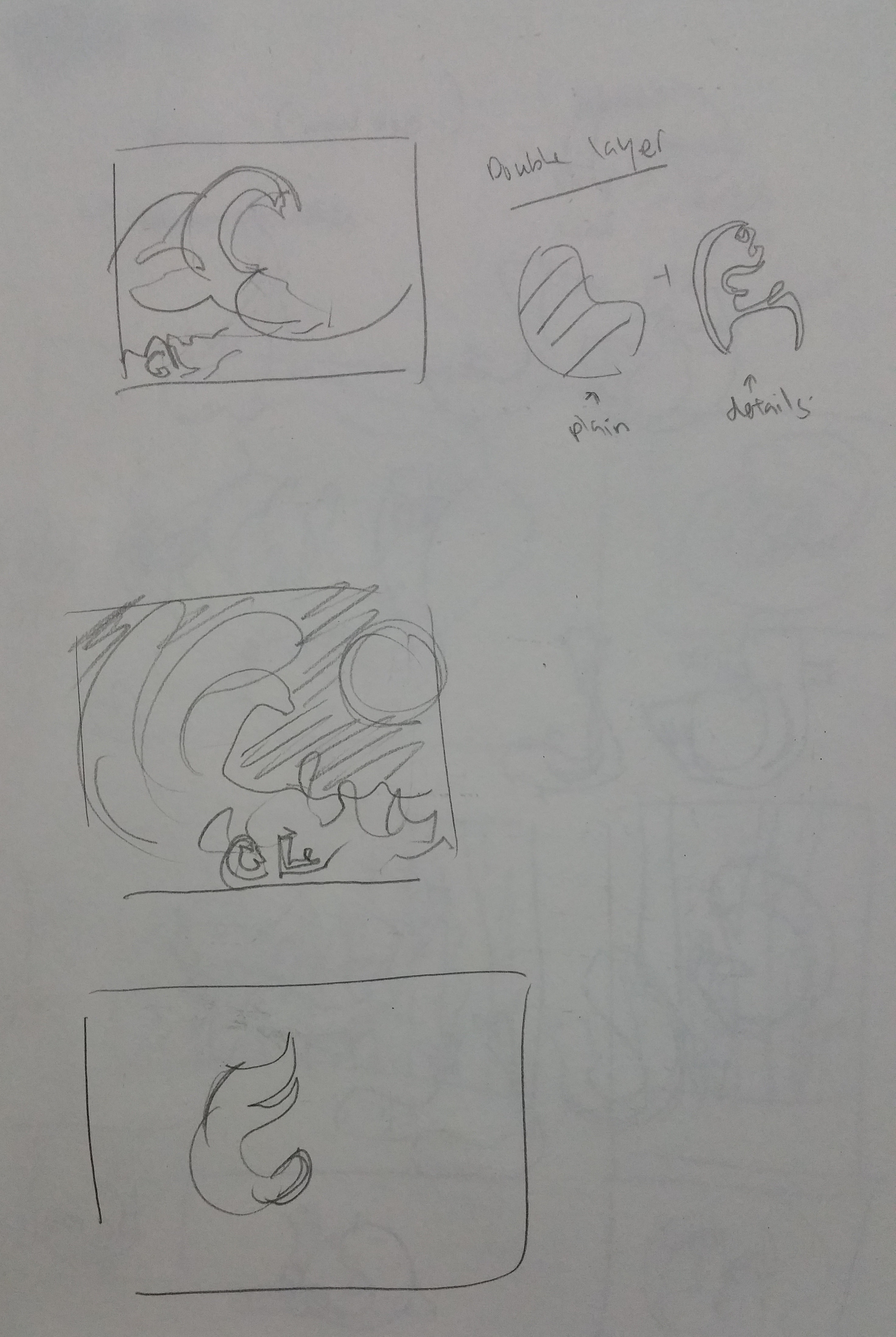
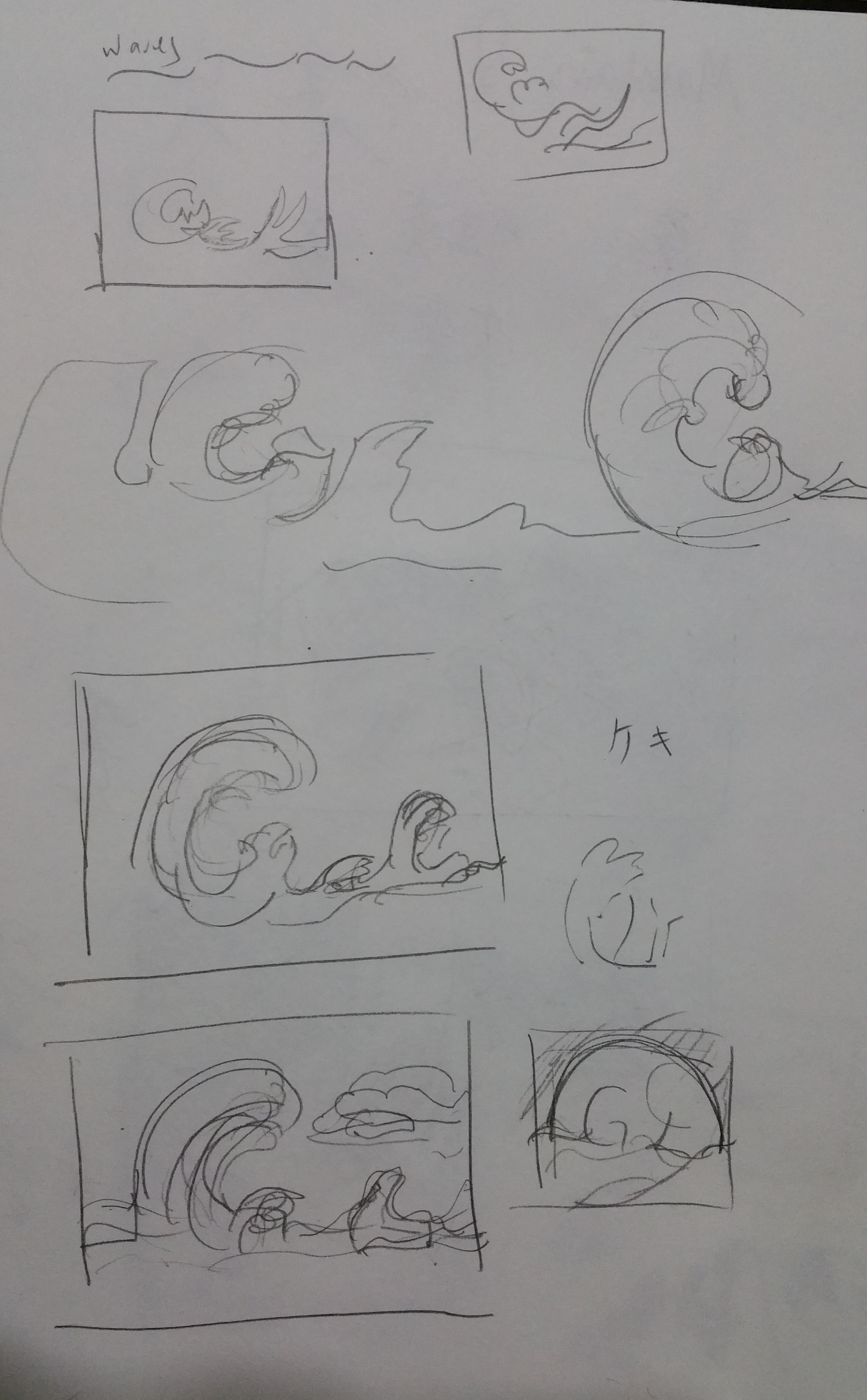
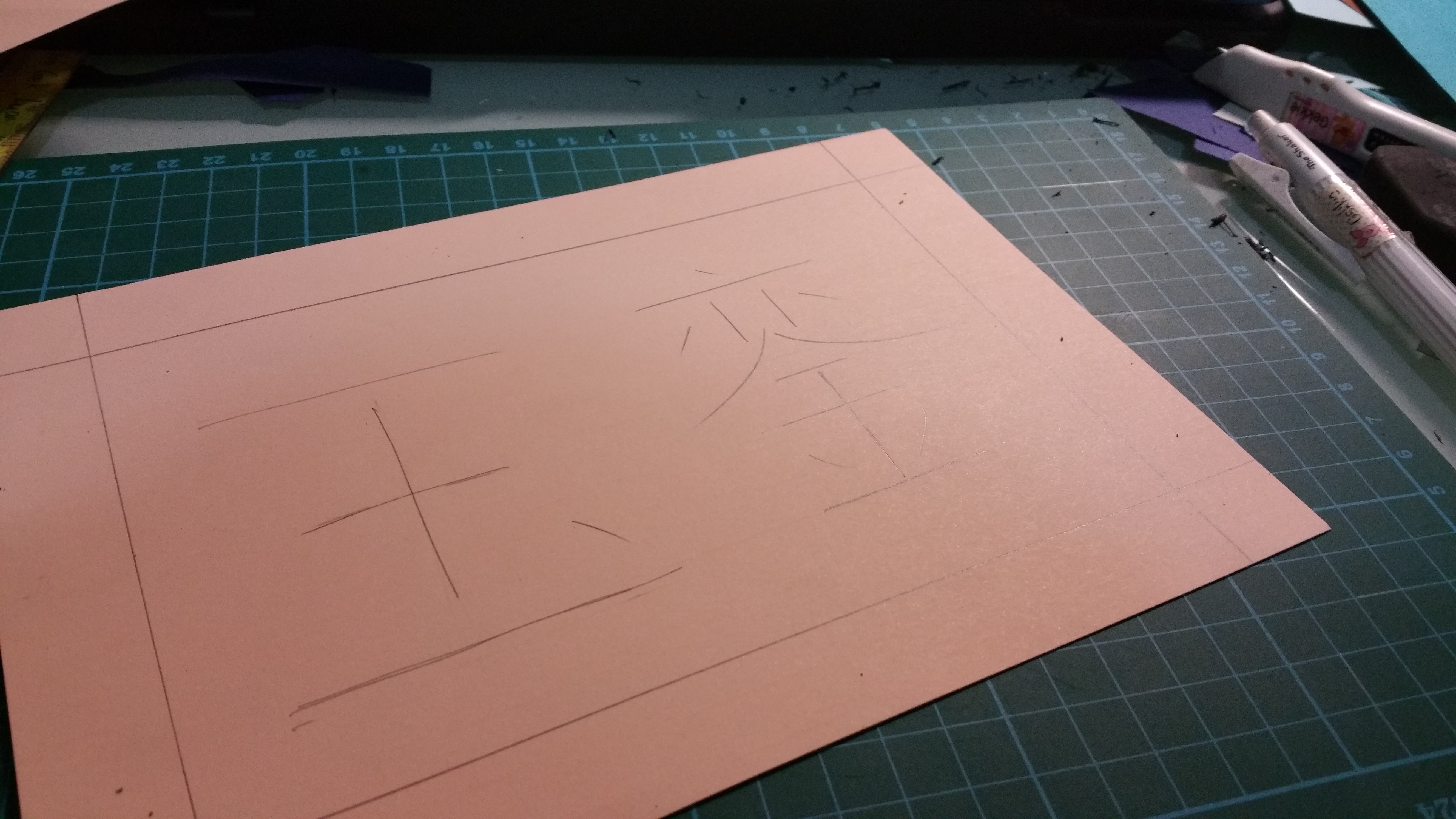
This is my first time doing papercuts and I definitely learnt a new skill! The time needed to plan each composition and to carve every single piece too longer than i way expected, but i am enjoying this outcome! I am glad that i put in this effort to create these works