Zine: Final

Standard

Cant believe that a year flew by so fast and this would be the last OSS post that i will be posting on foundation 2D…

Here’s the photo of my very first zine!

Processed with VSCO with c1 preset

運命なんて瞳閉じれば 過去も今日もその未来も一つ

強く優しく翼に風を

眠りについたホントの君 放ってあげましょう

Processed with VSCO with c1 preset

果てない空を見た時 あなたは何を思うだろう?

君の瞳に映る僕 何を想ってるの

だから決意は強き翼 運命なんていらない

いま不死なる夢を羽根に 明日を飛ばないか?

Processed with VSCO with c1 preset

次の…旅立ちに決意して 生ききる力だと賭けした翼広げ!

I am really happy that my zine turned out to what I hoped it to be! To think that I am able to use my watercolour pieces and combining them into a book, I am really happy that I get to do so! For the text of this book, they were actually lines I found that fit the images. However, after having the lines, I found out that the whole text actually flowed as a book too! It basically has the idea of being lost, but starting a journey to find yourself, having your true self and finally using that determination and fly towards your new future.

Grateful for all the lessons and guidance I had in 2D. I managed to overcome the challenges that i thought i couldn’t, and I had fun throughout the semester!

TP: Getting inspirations from creating

Standard

After the first look and consultation with Prof Ina, I decided that the keywords for this project would be “nature” and “watercolour”.

These 3 are the ones that I found the most interesting and related from the pile of references that I found.

leaves,cut outs.

leaves,cut outs.

ice cream?! wow

ice cream?! wow (using the raw materials)

tie up with the water colour?

tie up with the water colour?

With all these references, even though I am still clueless, I thought it would be good for me to start on something so that I could kickstart the project and have an idea of what I want to do.

And so I went out of the house and collected a bunch of fallen leaves.

20160125_000802-min

The first work i started with.. I splattered some watercolour over the leaves, trying to create the outline of the small leaves

20160125_000825-min

The silhouette created of the leaves

20160125_000831-min

Printed the ink on the leaves

20160125_001514-min

I remembered the importance of the leave looking natural. I picked one with holes eaten by caterpillars and broken. I painted over it, hoping that the paint would seep through the holes and create a crisp outline

20160125_002147-min

I wanted to try to create the effect like the first reference i found.. Cut my name out. I didnt want the letters to look exact, hence simple cuts are made. However, the letters became quite illegible. If these cuts were on paper, they might have work out much better.

20160125_002632-min

I wrote “GEK” with glue and splattered torn leaves on it

20160125_002857-min

The result: it stuck surprisingly well, didnt it? I like the “natural” feeling of these letters

These methods may work for small tests but if it were to be a proper submission, I think that it will look sloppy… Hence, off to find more new inspirations! However, i like the theme of nature and i will continue to stick with it for now!

They are on the wall…finally

Standard
IMG-20151025-WA0005 copy

My initial installation of my rhymes


IMG-20151025-WA0004 copy2

IMG-20151025-WA0004 copy copy My installation would work better as a straight line?

Individual Boards:

20151023_155445 copy2 20151023_155449 copy2 20151023_155454 copy 20151023_155500 copy 20151023_155511 copy

Even though they may not be as impressive as the others, i still love them and i ventured out to new techniques and compositing for graphic design which i barely done before. These are valuable learning experiences for me.

p.s. when i got the prints

IMG-20151016-WA0005


And i present to you…. My Final Lines

Standard

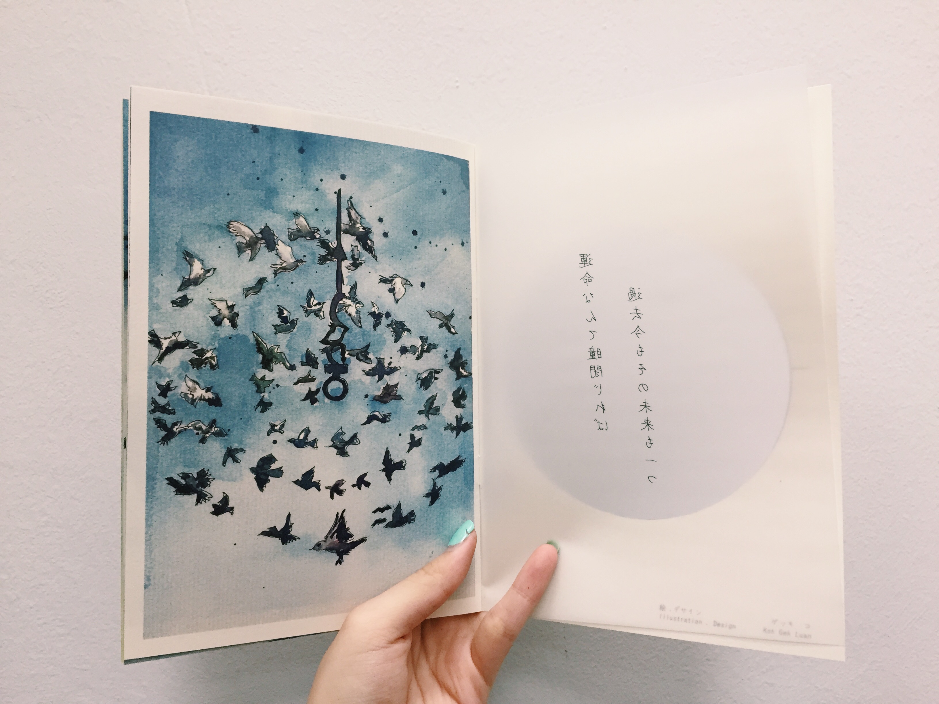
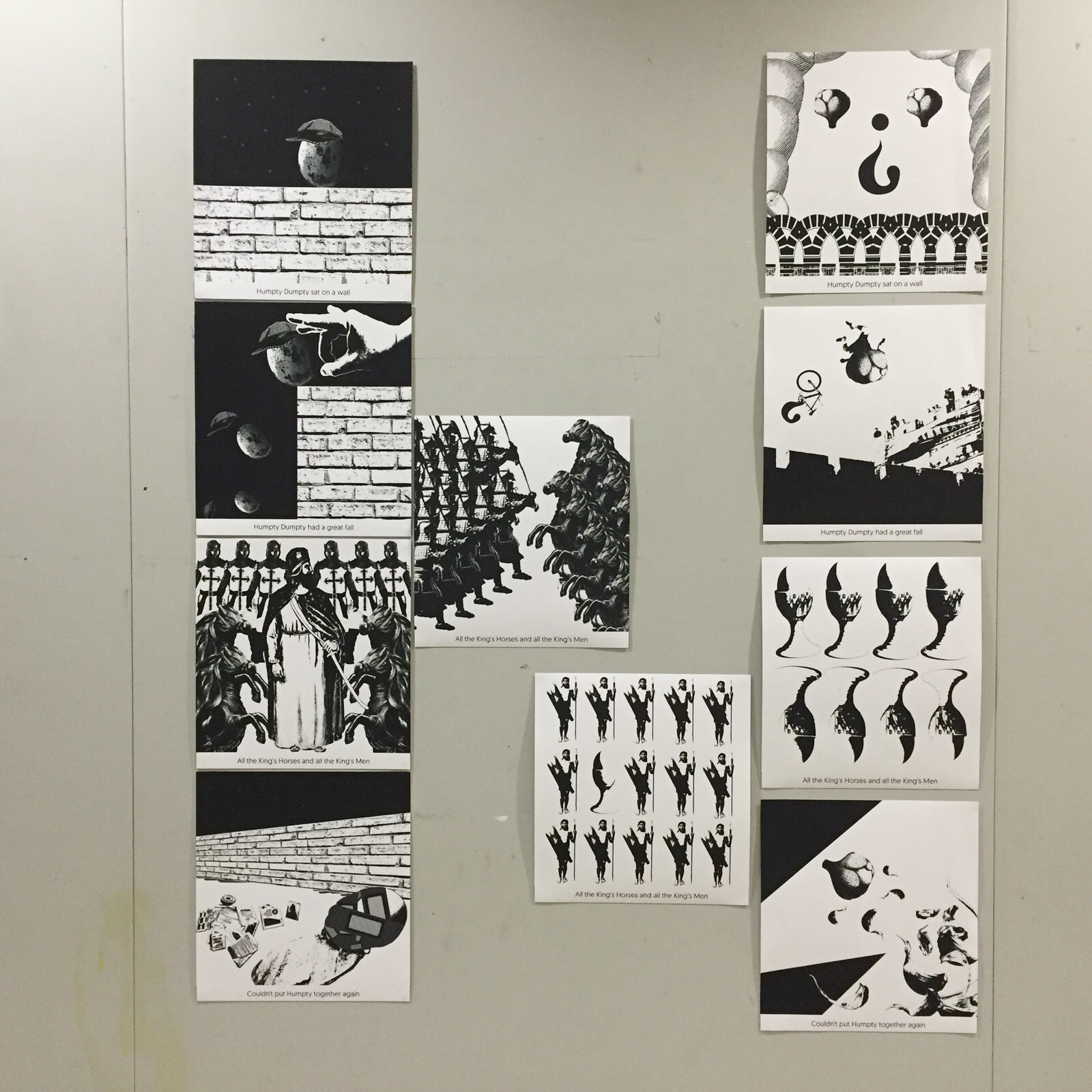
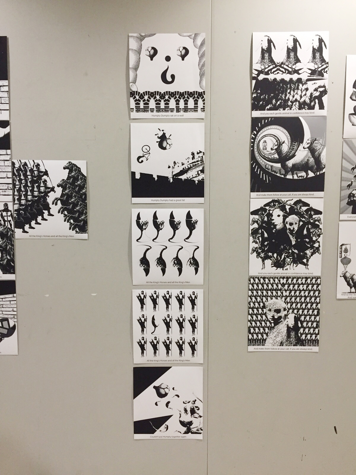
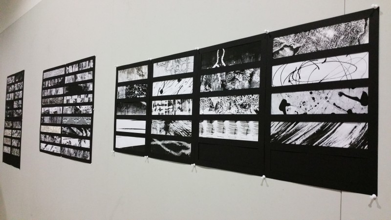
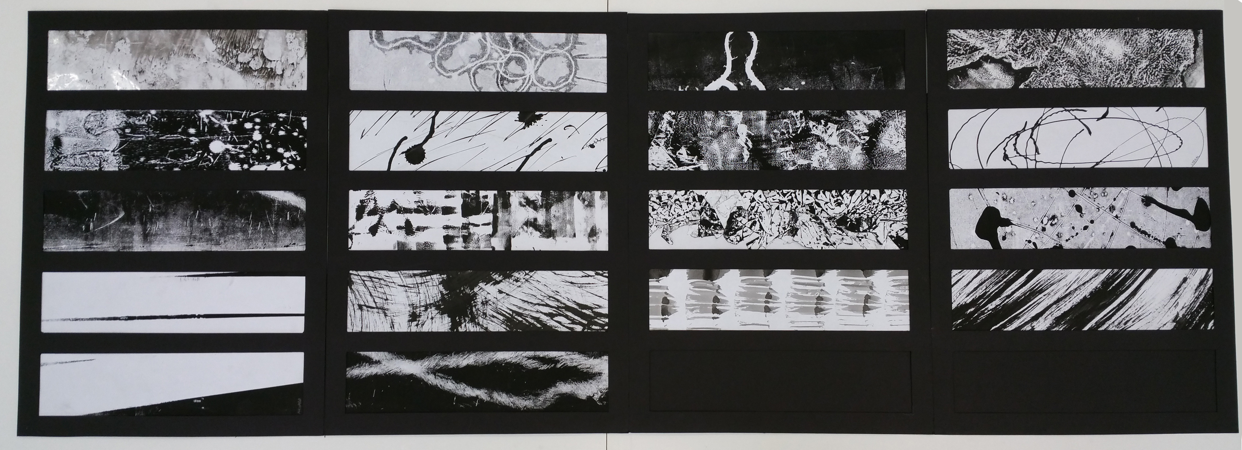
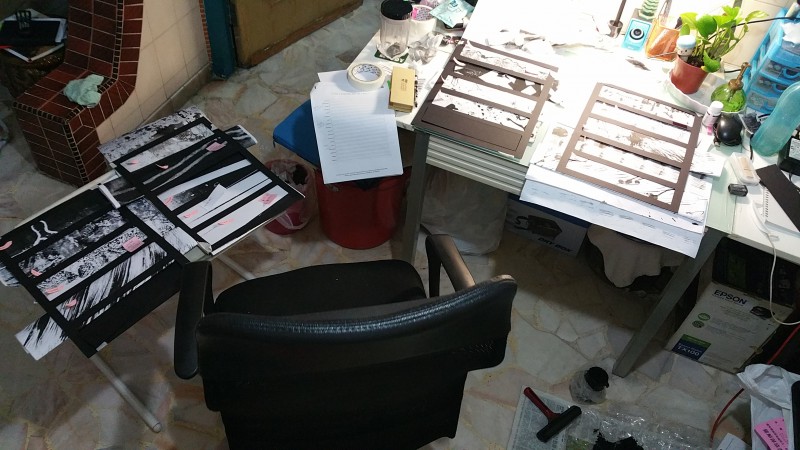
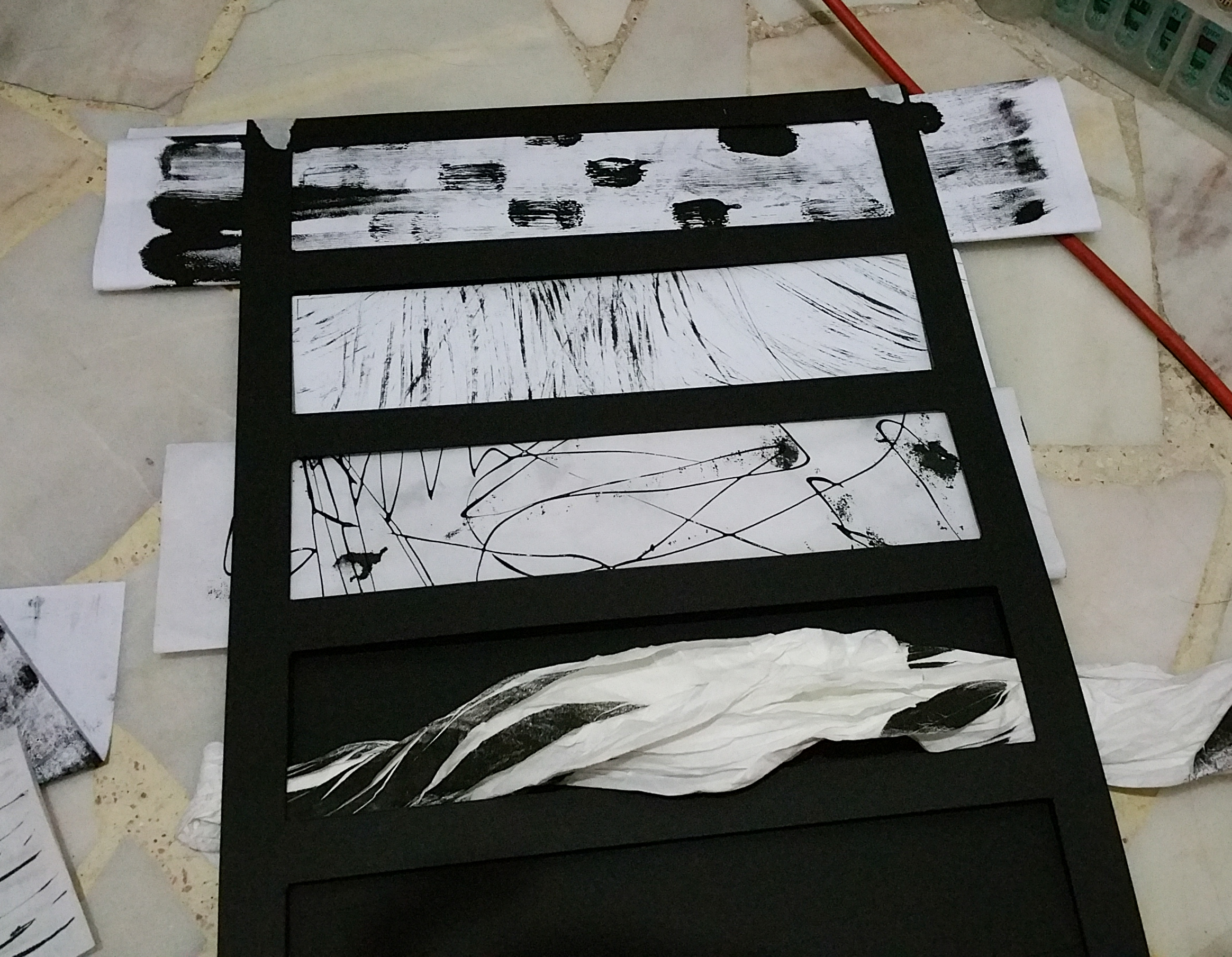
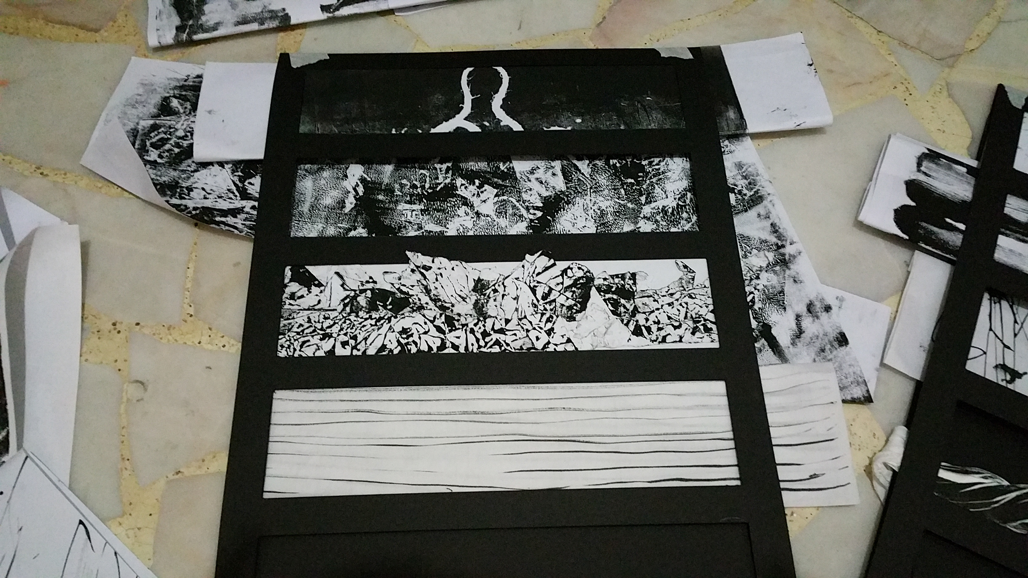
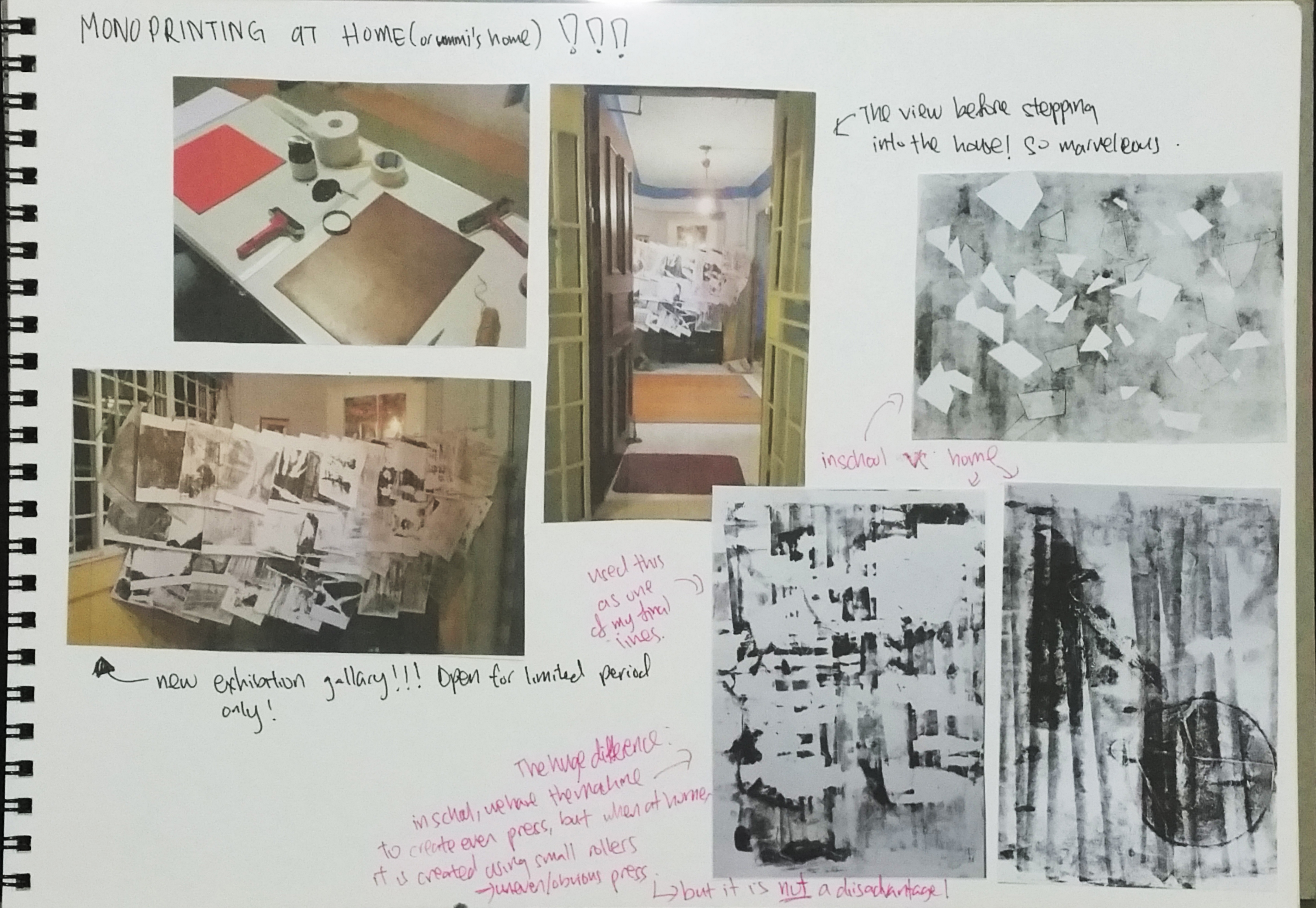
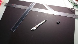
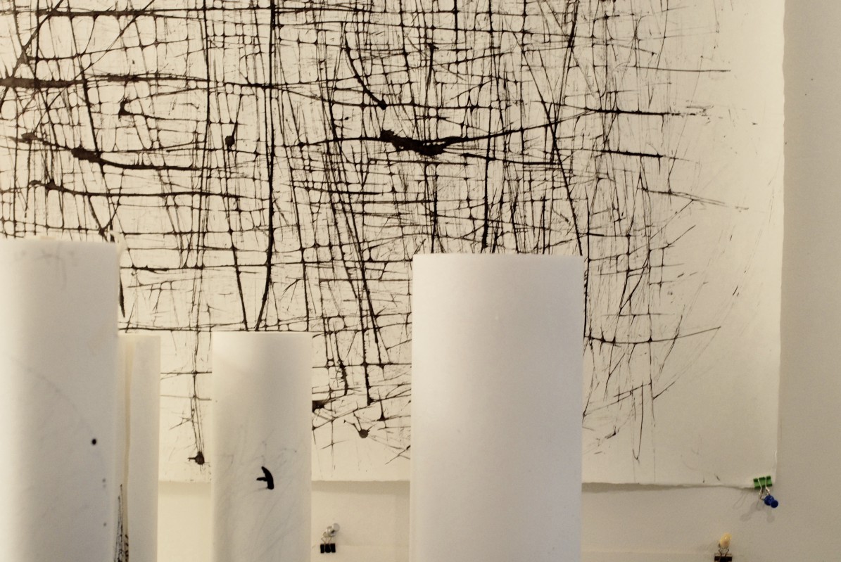
Final Installation of my Assignment one20150911_135825-4 copy

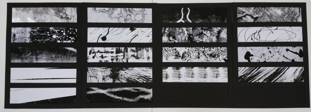
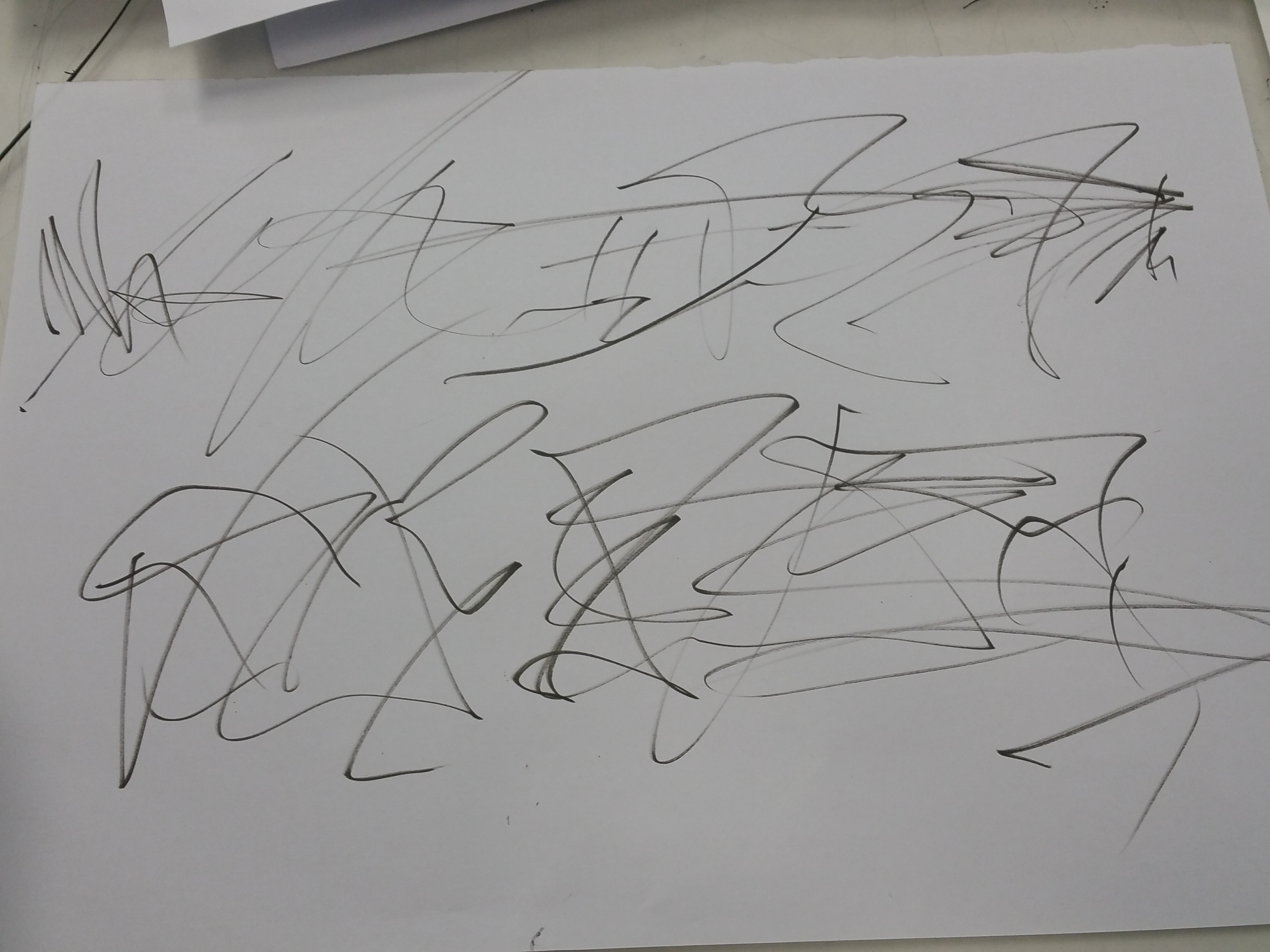
Other than each of the individual lines, i also focused on the overall flow and presentation of the lines. I made sure that none of the lines that look similar are close to each other. From my final submission, some how out of subconscious, all the lines are connected and they seem to flow in a circle(wonder if anyone can notice that), it is like how i mentioned, no matter what emotions, they are all linked to one another.


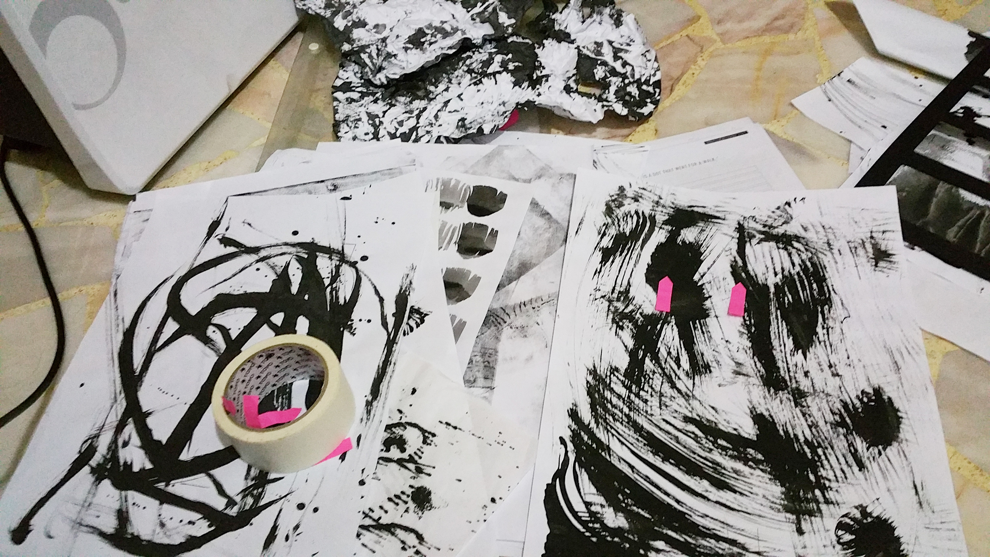
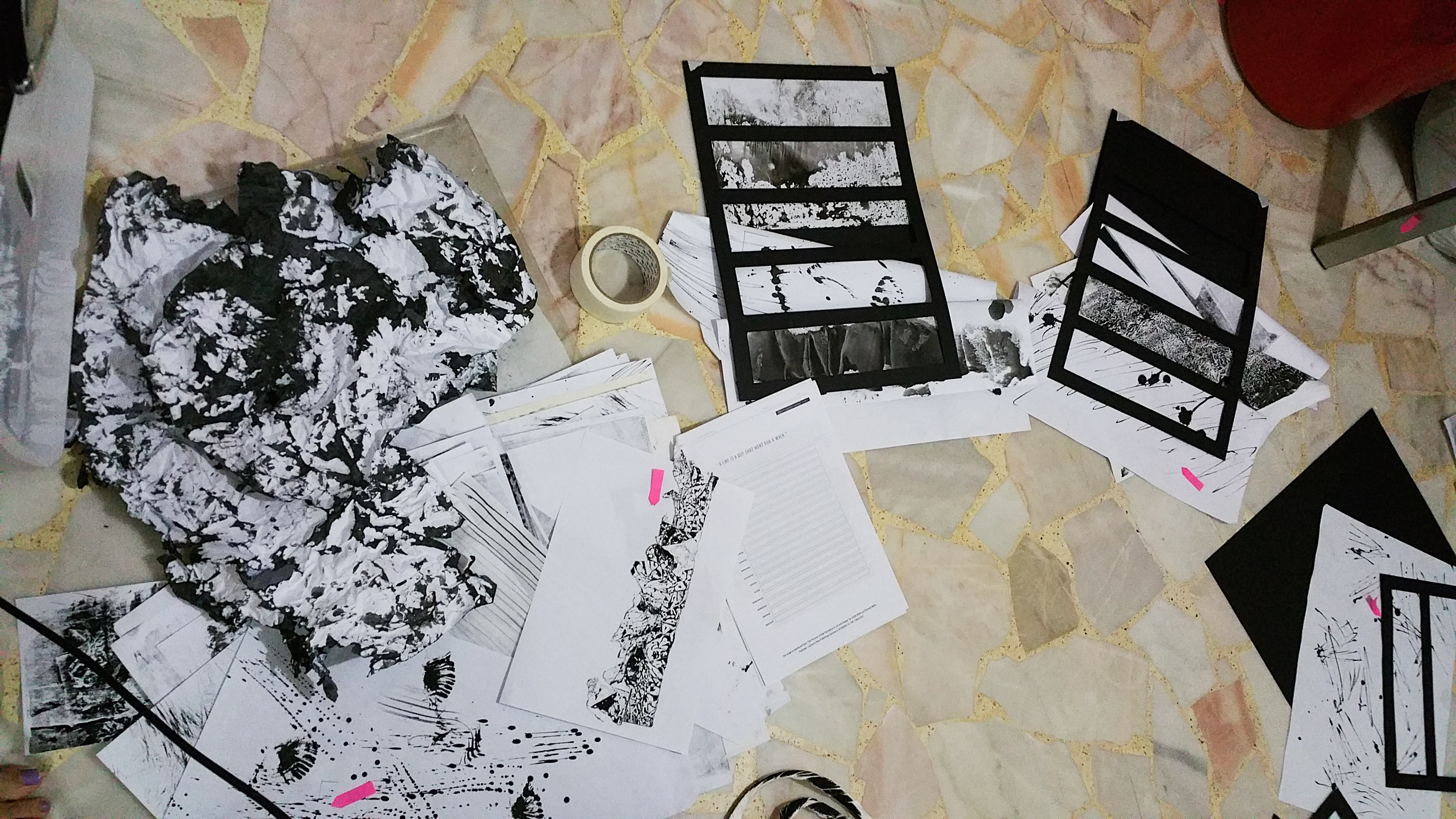
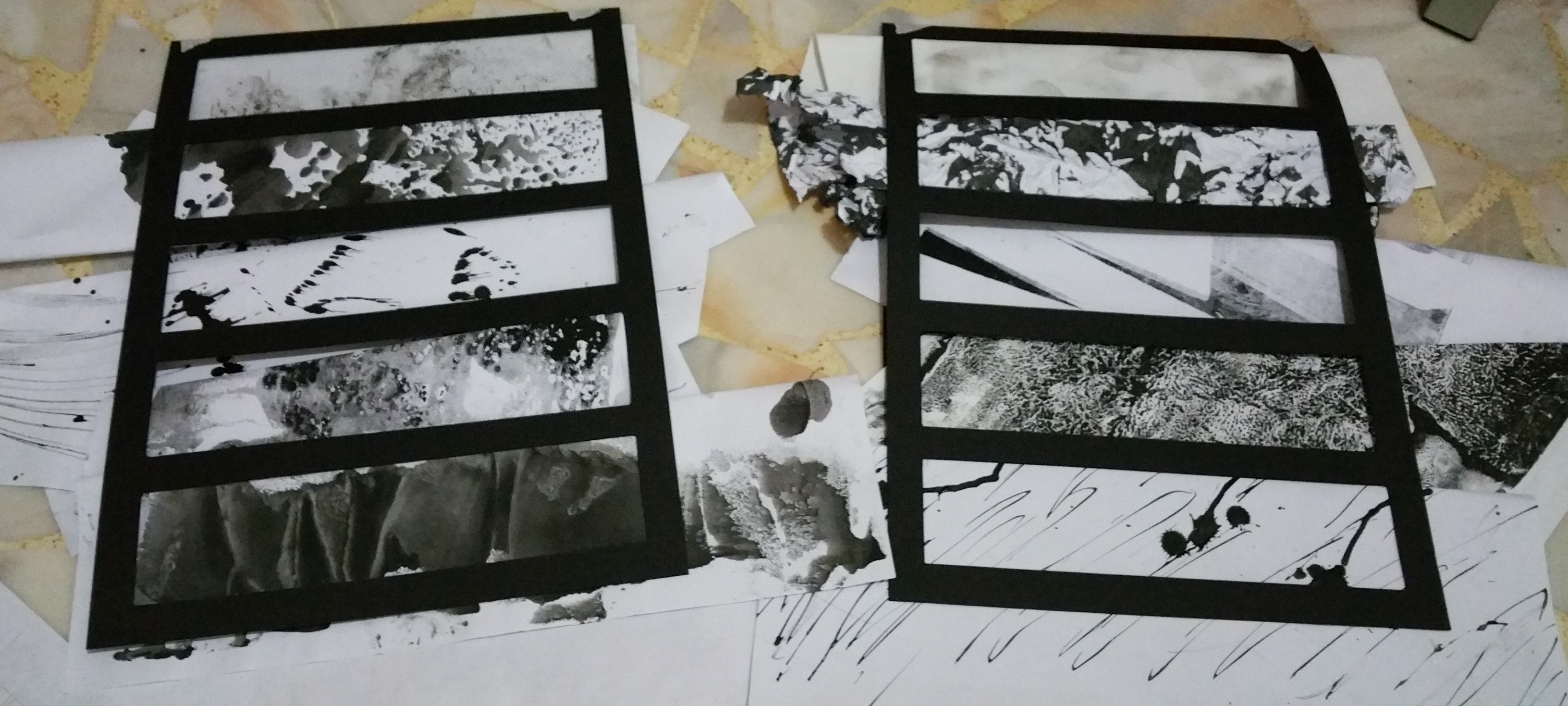
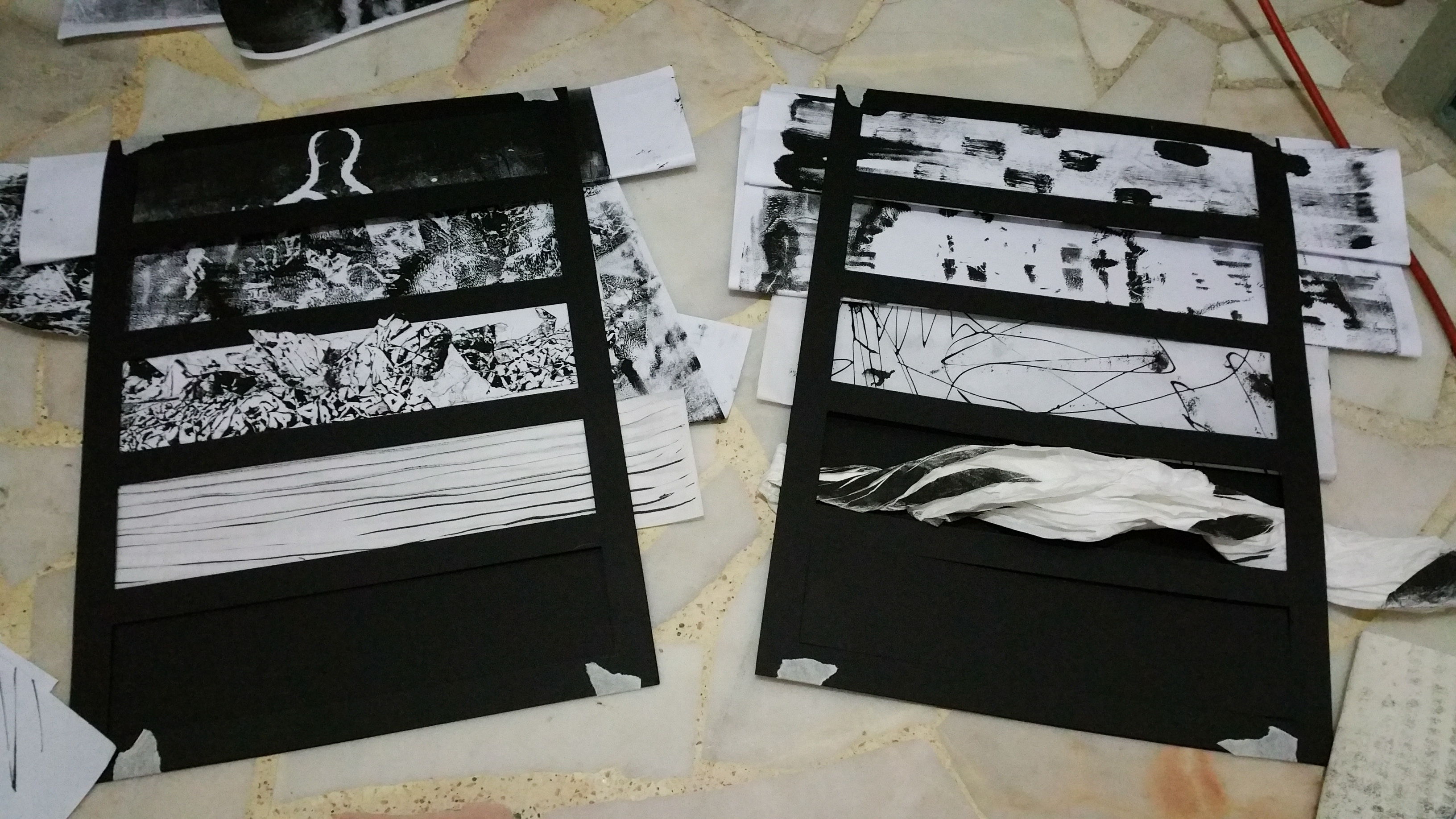
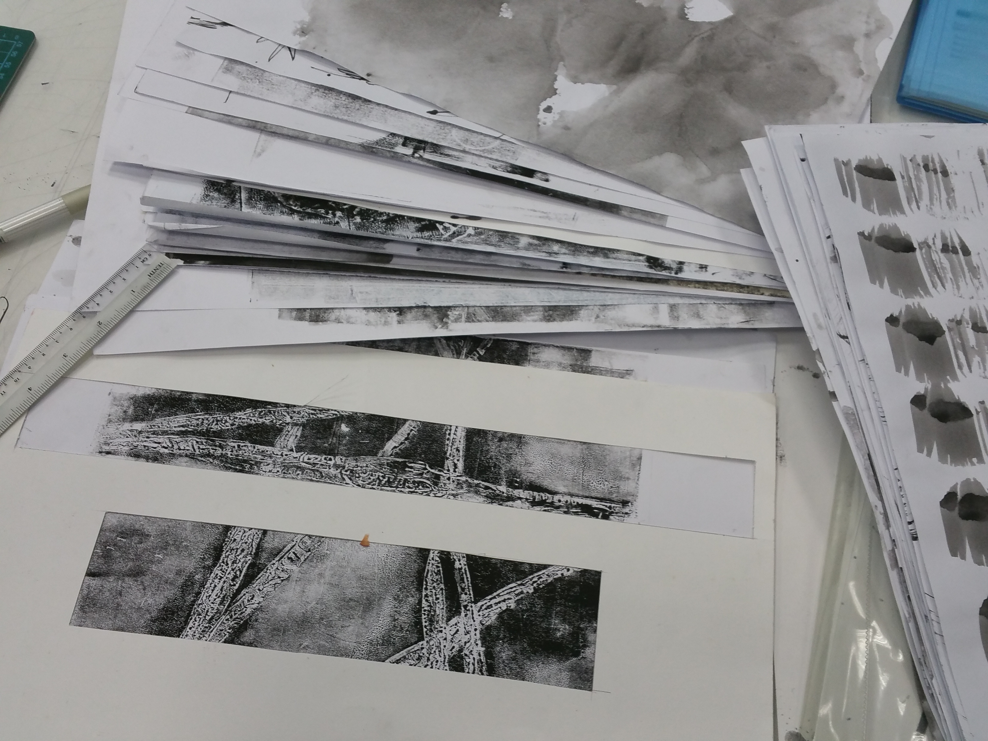
Individual Lines Analysis 

All the emotions are written, or should i say hidden among the lines. To me, words are made up of lines too, they should be part of the line, not a separate existence.

Embarrassed

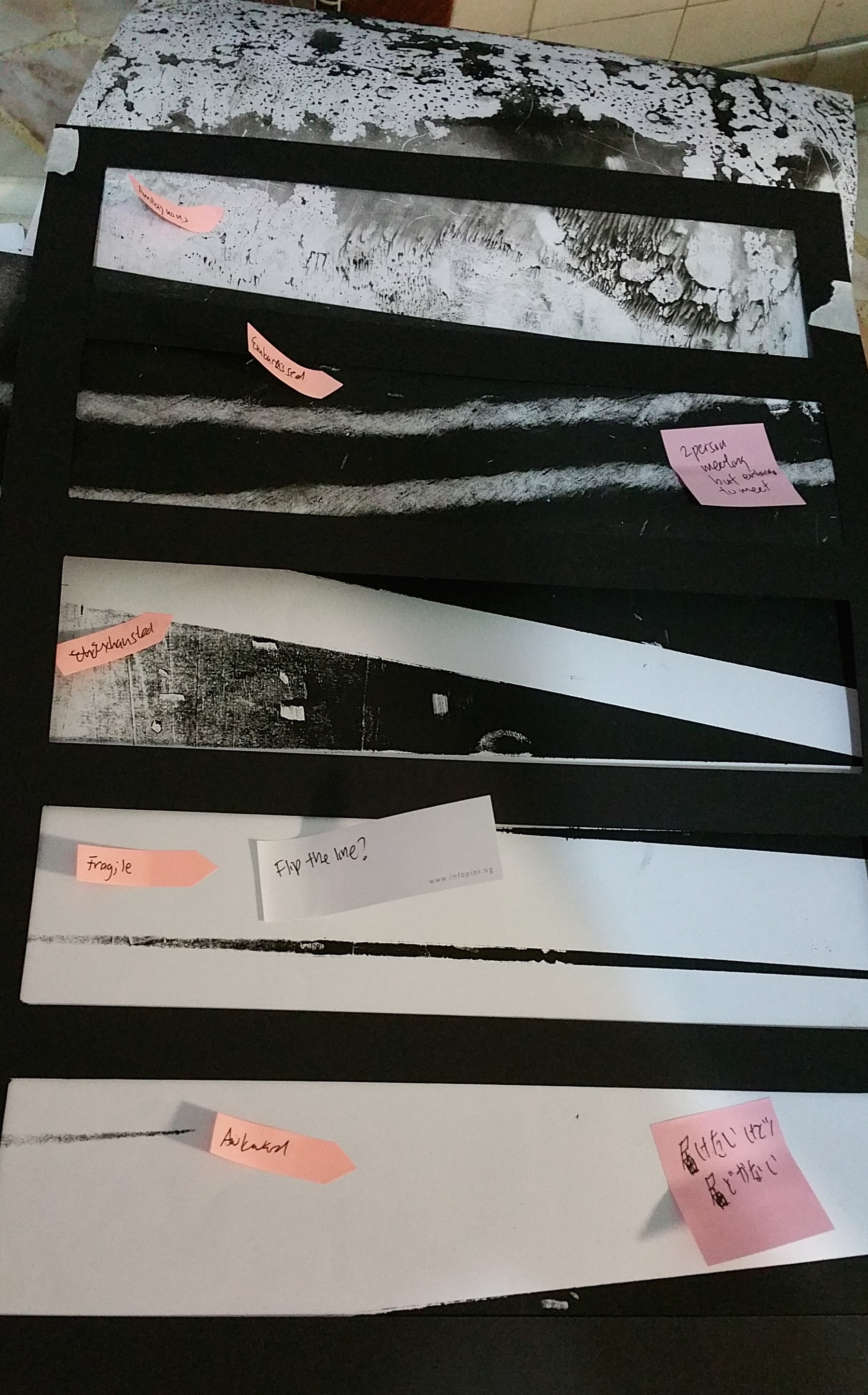
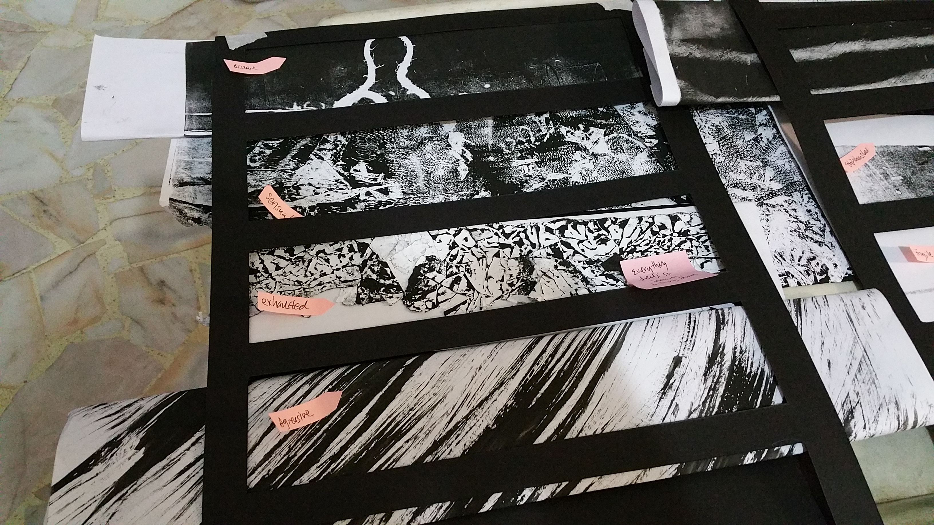
Embarrassed – being embarrassed feels like you are shying away from something, but it feel embarrassed, it is actually a very strong feeling. Hence the mix of the initial faint(shying away) but it gradually transforms into the strong feelings (dark hard lines) behind it.

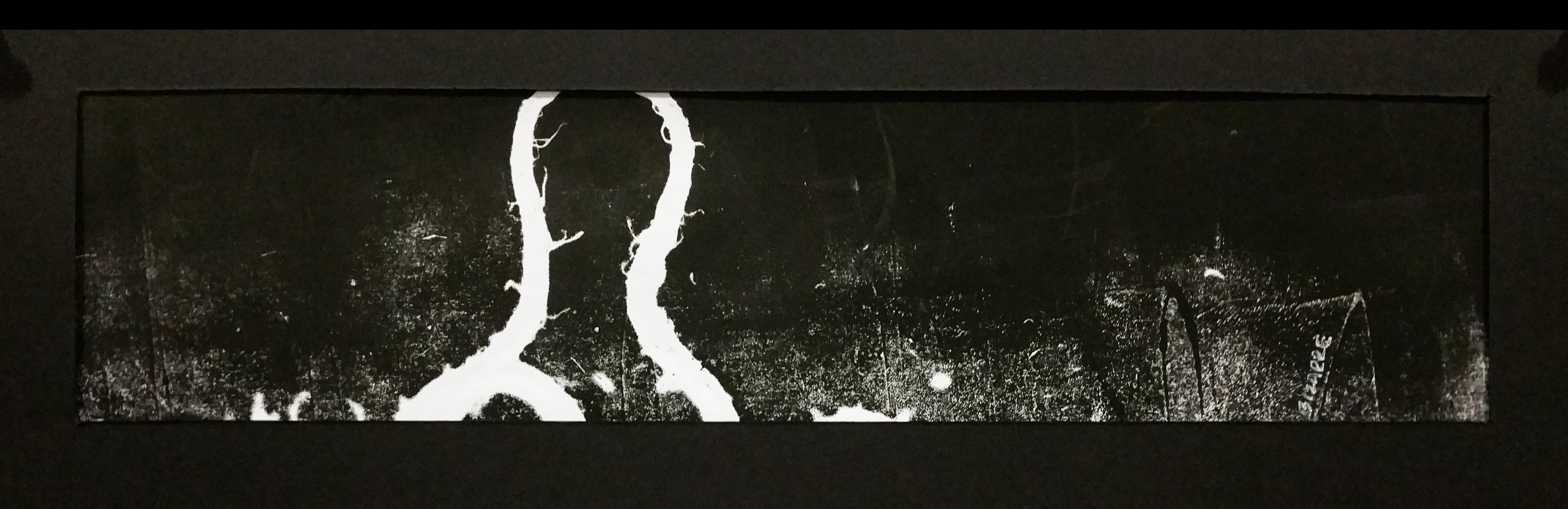
This is done on a transparency sheet, and i have purposely let the inked part exposed, like how after we exposed ourselves, we might feel embarrassed.

Method: Pushing and pulling and swirling the transparency sheet on the stained/remaining ink on the glass tabletop. Some parts are diluted with water while some parts are kept as it is.


Nonsensical

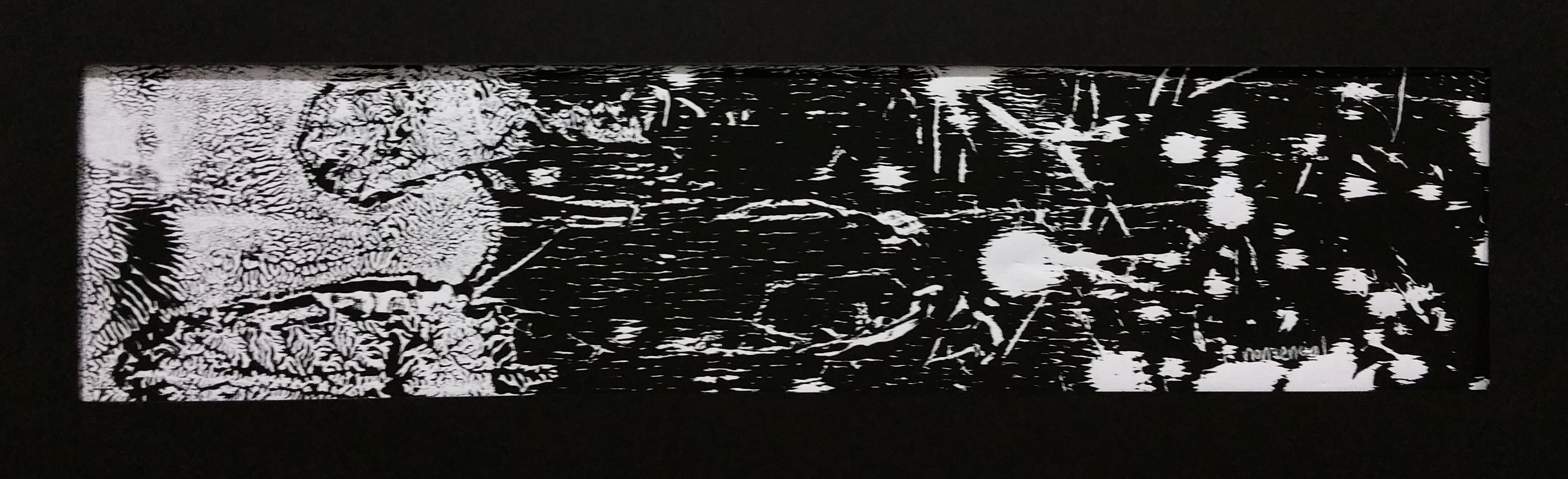
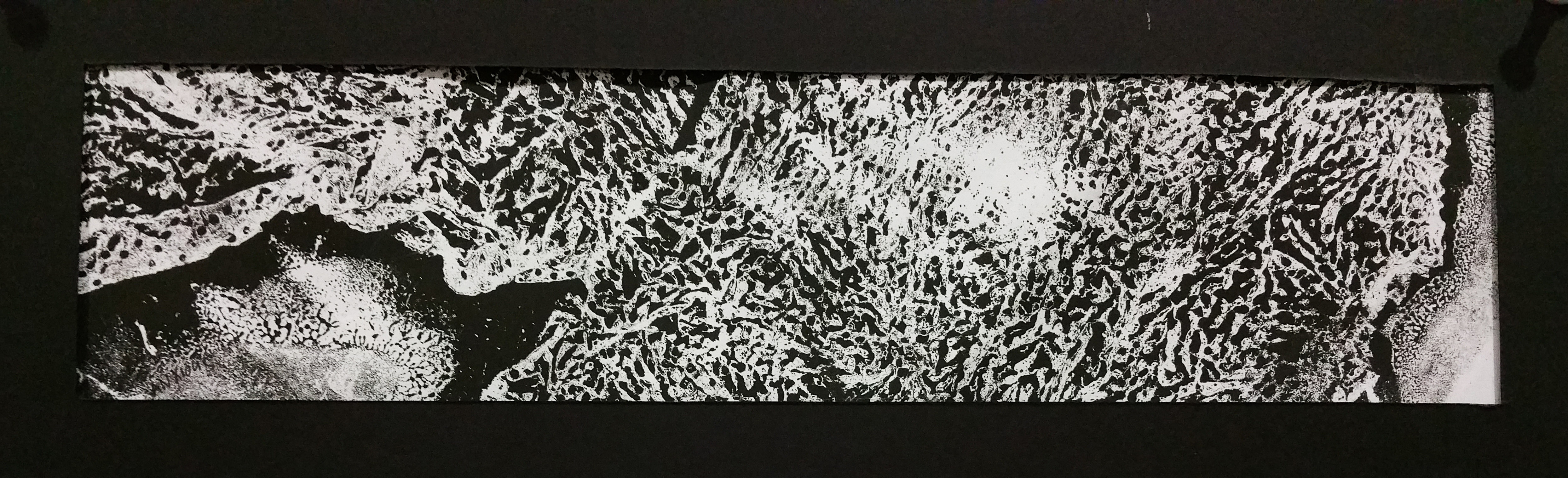
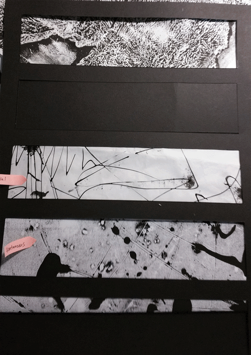
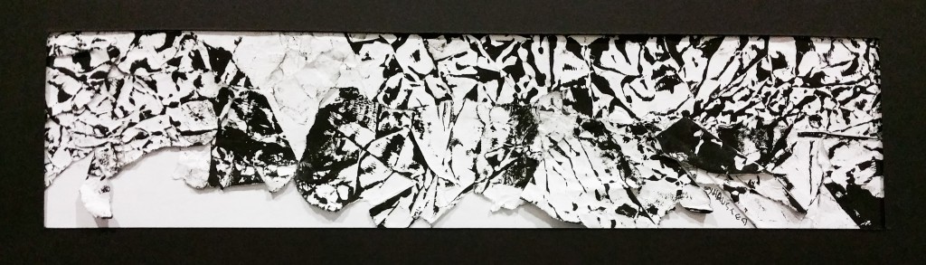
Nonsensical – “having no meaning; making no sense” From the weird lines and shapes on the left to a sudden deep dark right side with random spots. It shows how many different feelings can appear together. If this is not nonsensical, what is?

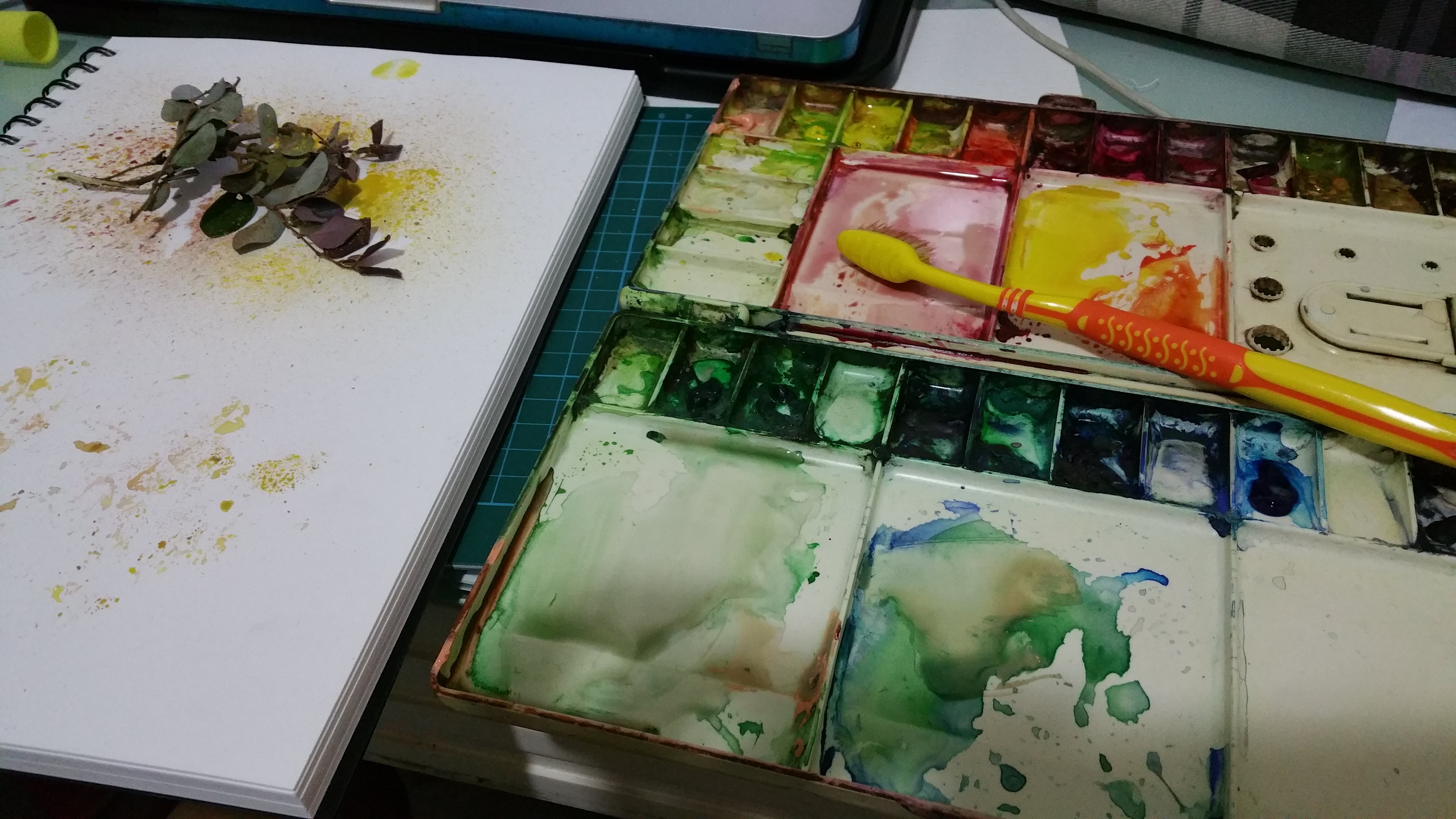
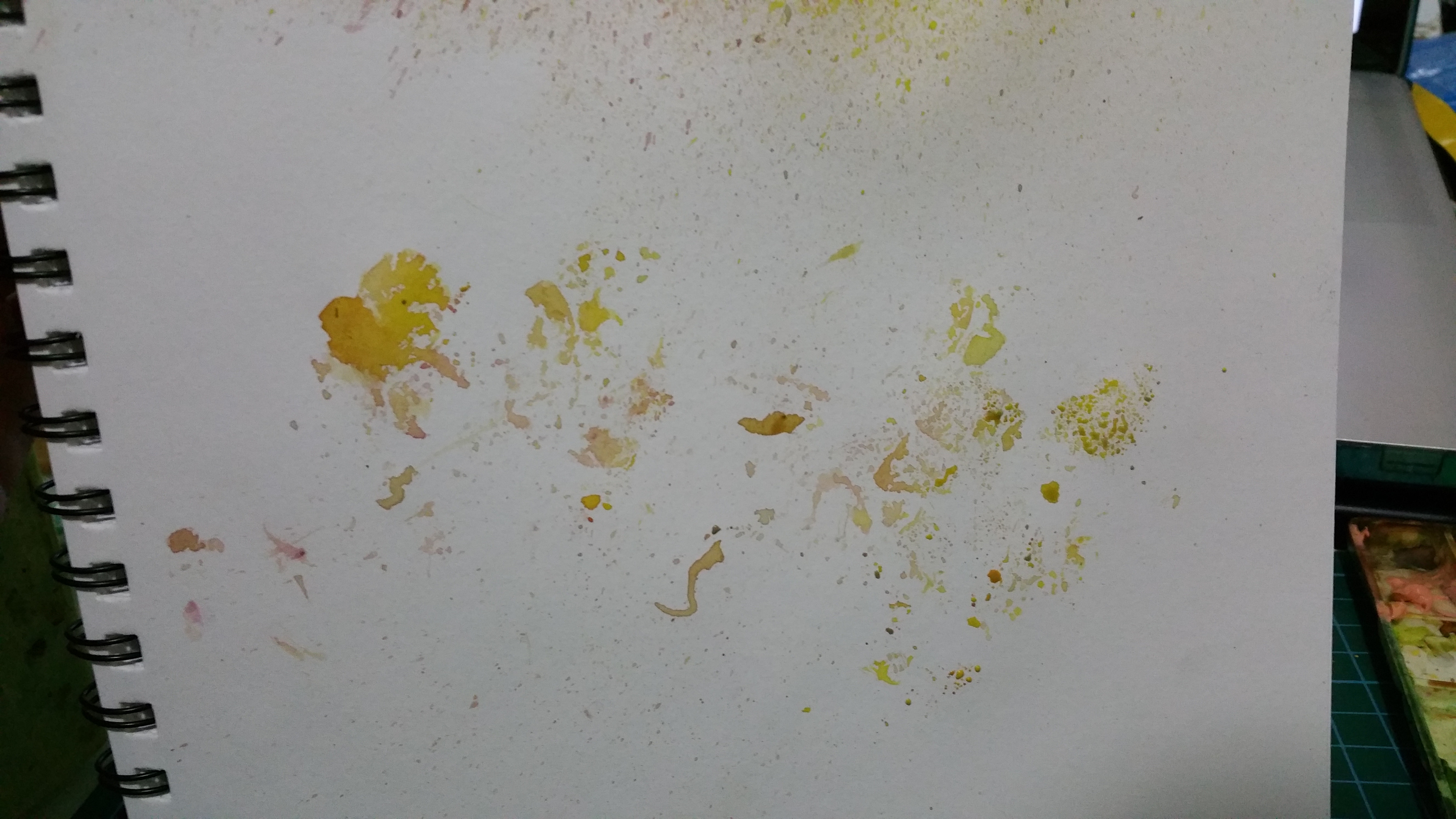
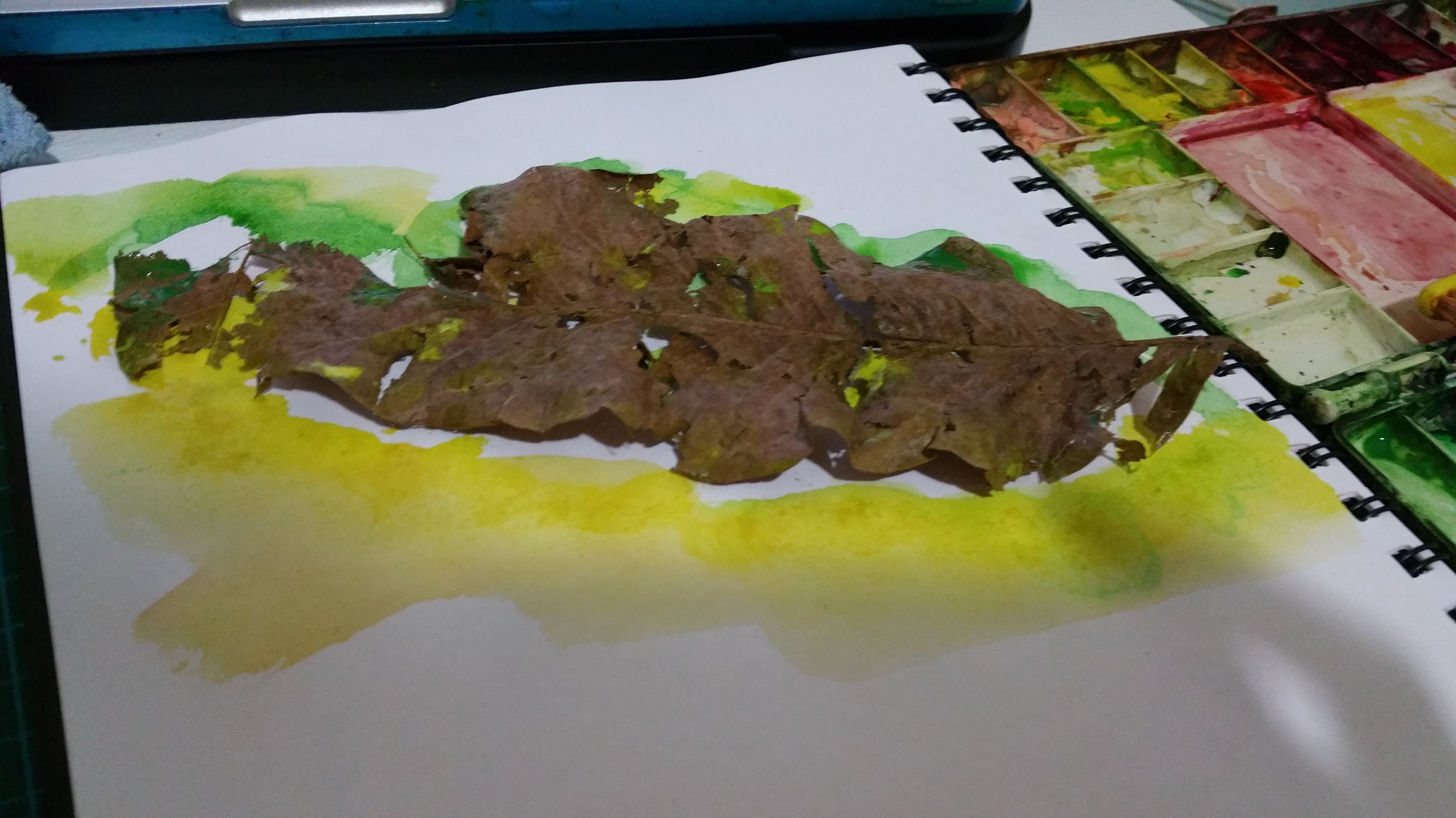
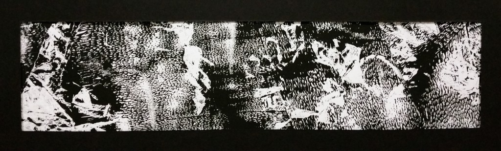
Method: Mono printing with a branch of dried leaves and small flowers. Didn’t know what to expect but interesting weird results. The leaves (left side) even created prints that look like human legs.


Ambiguous

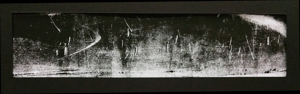
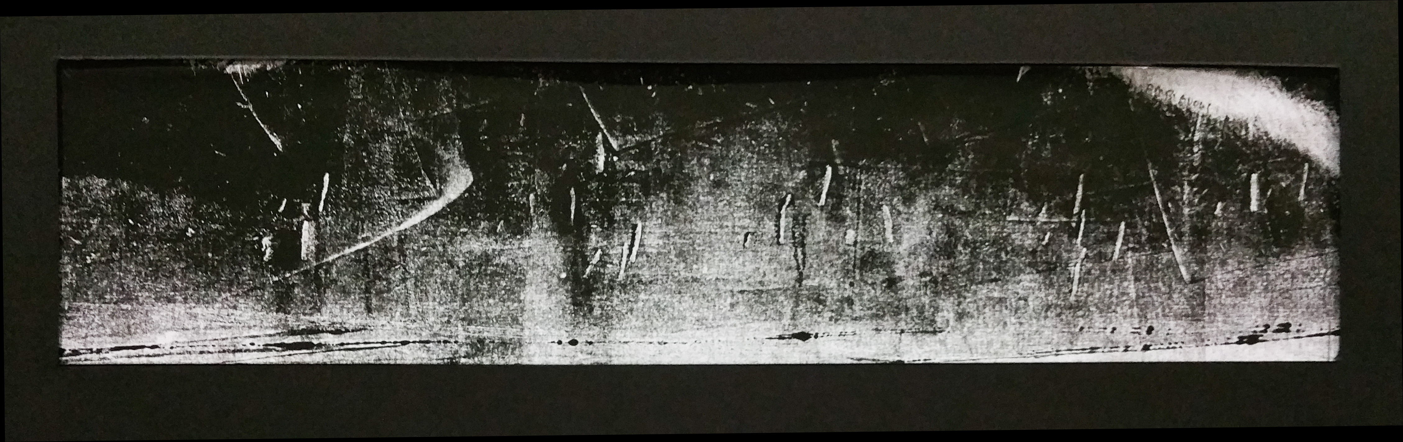
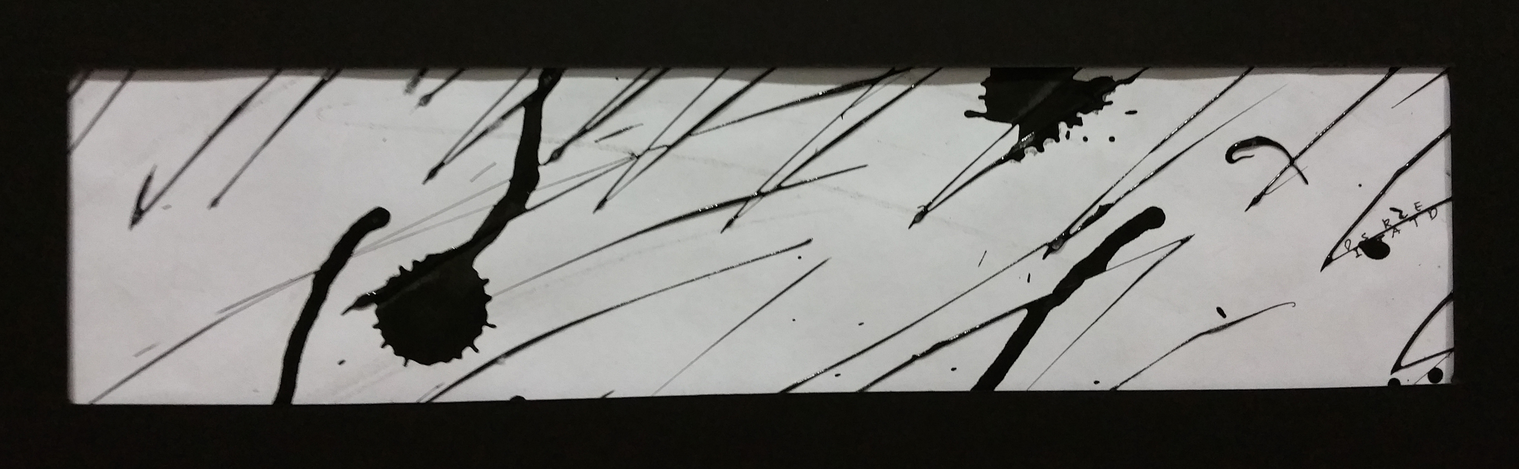
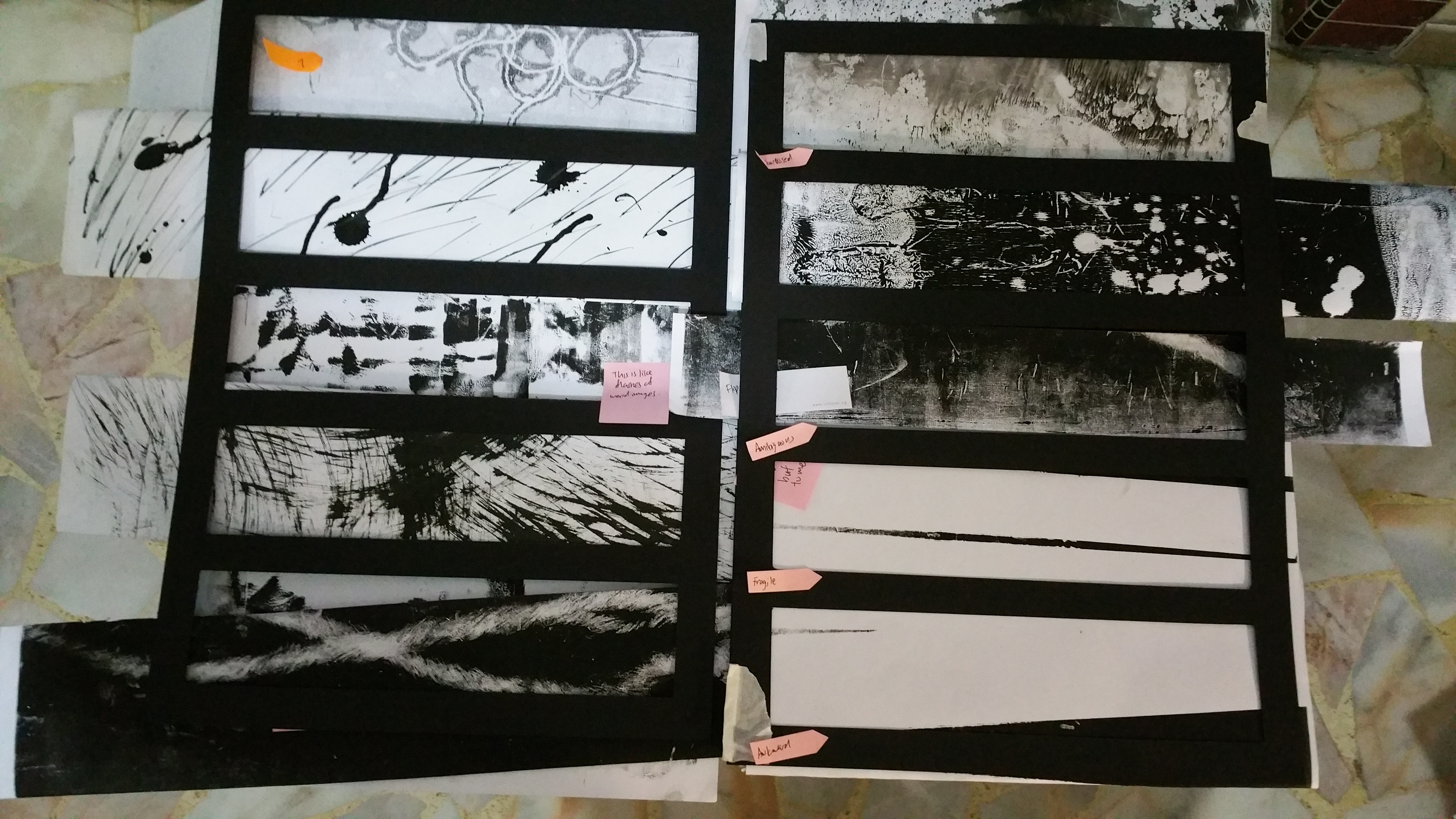
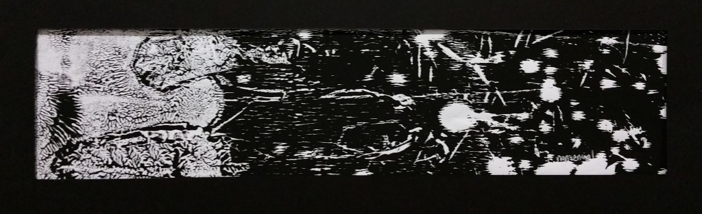
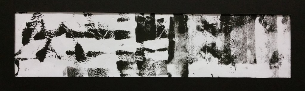
Ambiguous – Why is there a boomerang? Why are there small different lines? Are they Lines or scratches? What is that giant flash of light? What are the lines at the bottom? Tons of questions ask when we are feeling unclear. Even after asking them, they are still not solving the question, hence ambiguous

Method : Mono Printing


Fragile

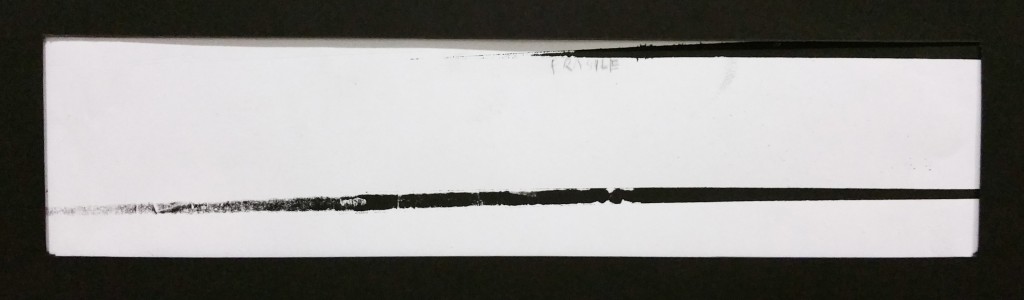
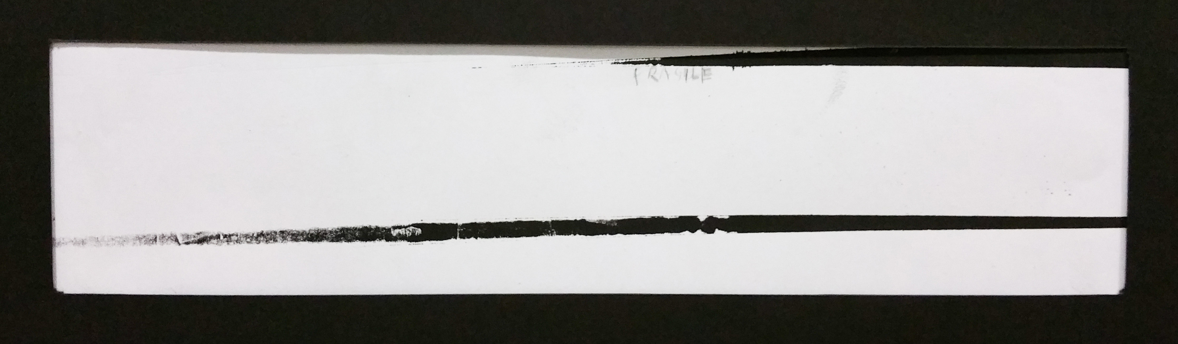
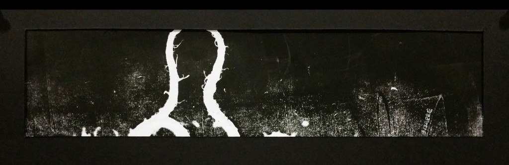
Fragile – A thin line, but never a complete line. Even something complete can be broken (the top line) and even if u look strong, there is no “perfection” there might be parts that are slowly fading away and falling apart

5

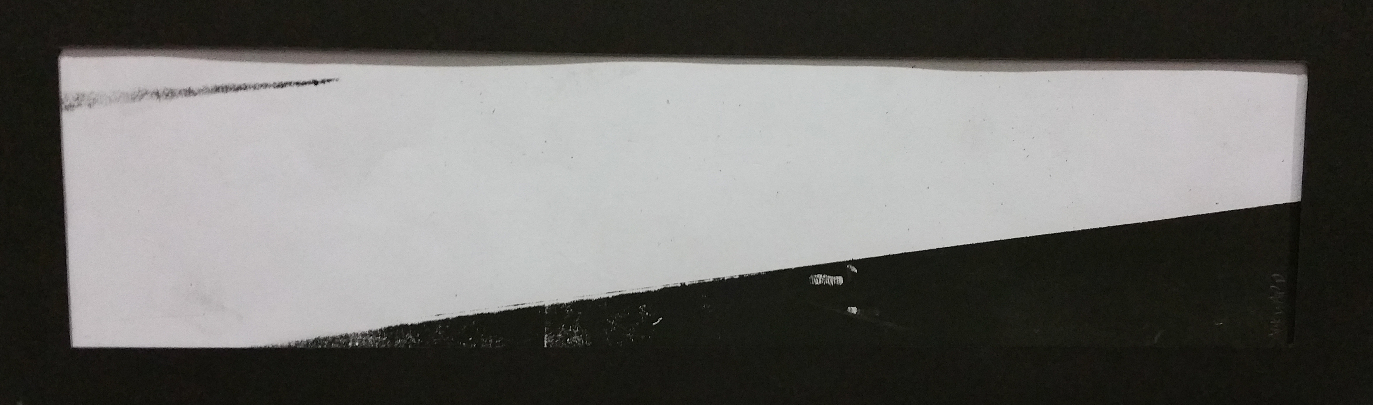
Awkward – 届けたいけど届かない。(wanting to reach it but you can reach it) This was the immediate first feeling when i saw this line. The feeling of wanting to venture into new areas(the dark bottom part) but u feel weird and awkward, hence stopping somewhere even before reaching it

Method: Multiple mono printing with masking tapes


Sloven

Sloven – Being lazy. Everything feels cluttered and confused, in a pile together. Not caring what happens next

Method: Monoprinting with Garden String. Love this effect this particular string gave as compared to the usual strings.


7

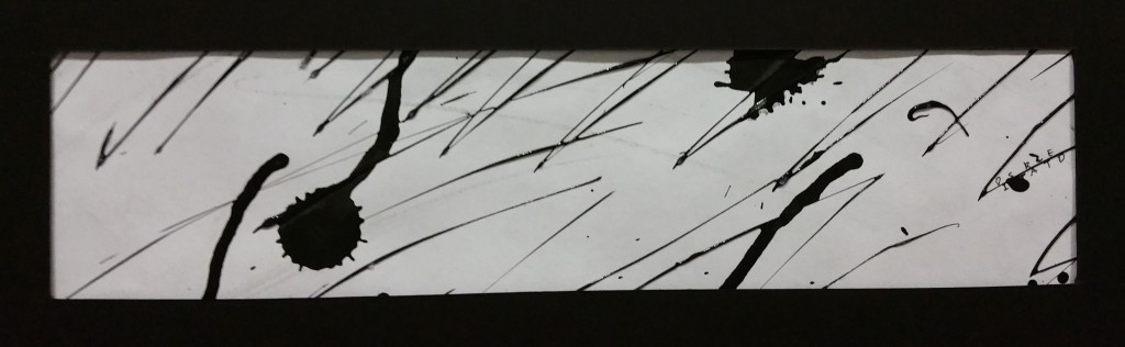
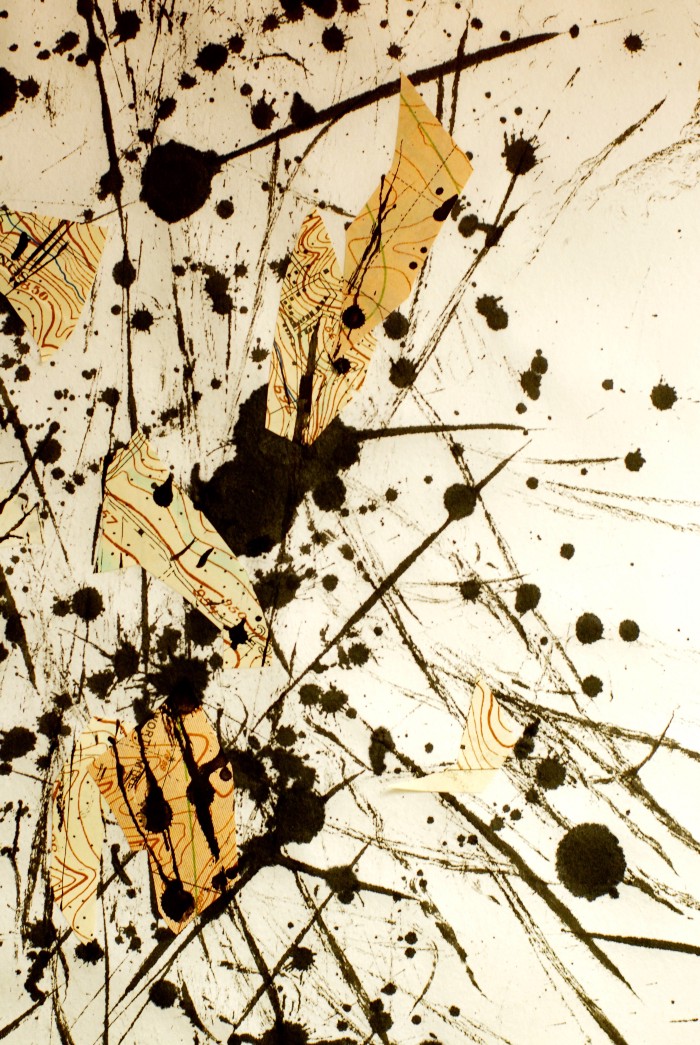
Distracted – Am i suppose to be drawing lines or making splatters? Which direction was i suppose to go again?

Method: Splattering of chinese ink randomly and and it drip. Adding lines using glass deco ink after that.


8

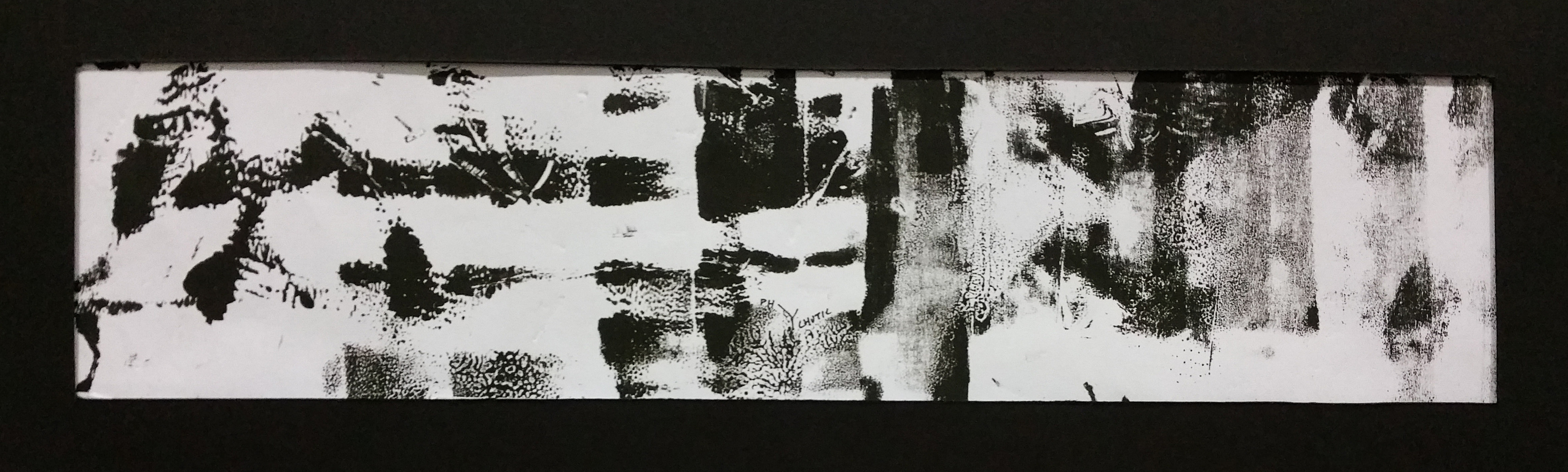
Psychotic – It felt like the weird black and white images that we will see if we went crazy. Random parts of flashbacks all compiled together in one. Who wouldn’t go crazy?

Method: Monoprinting using a small roller and…..?


9

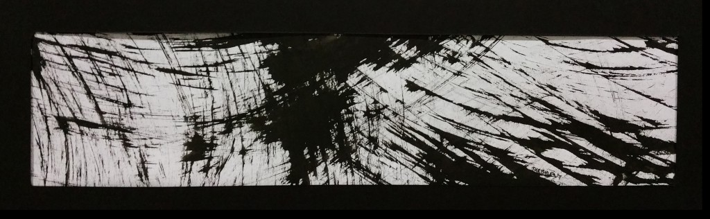
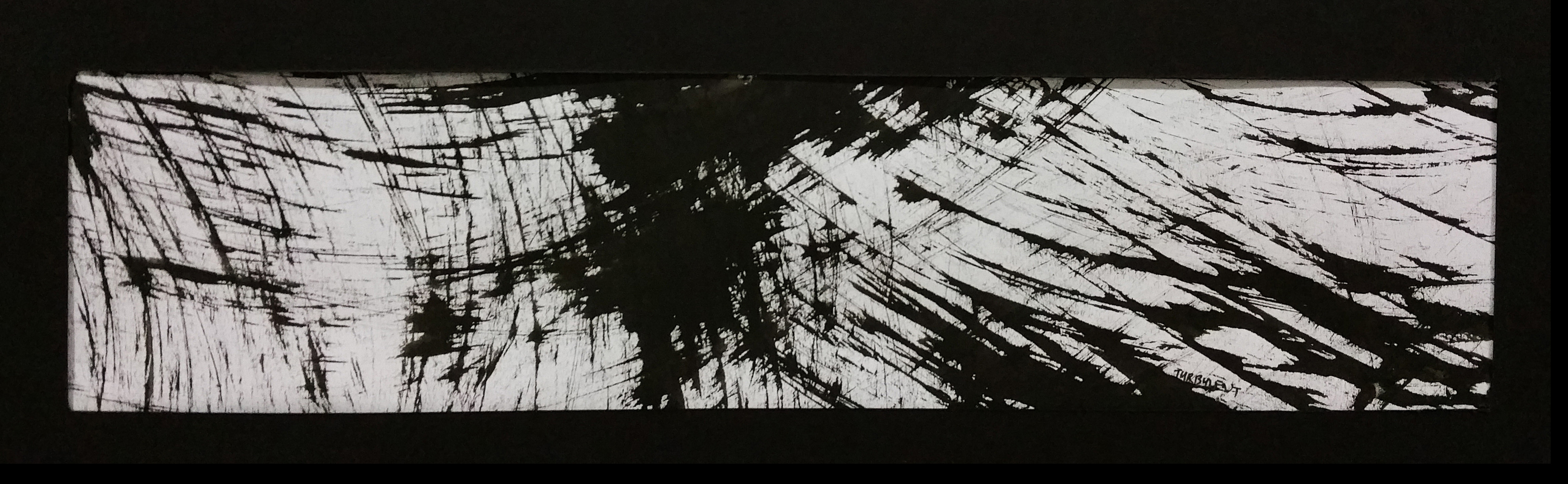
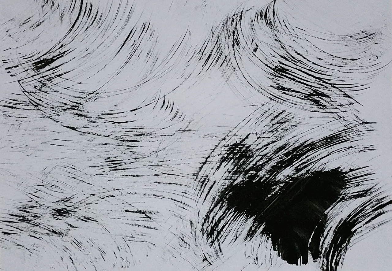
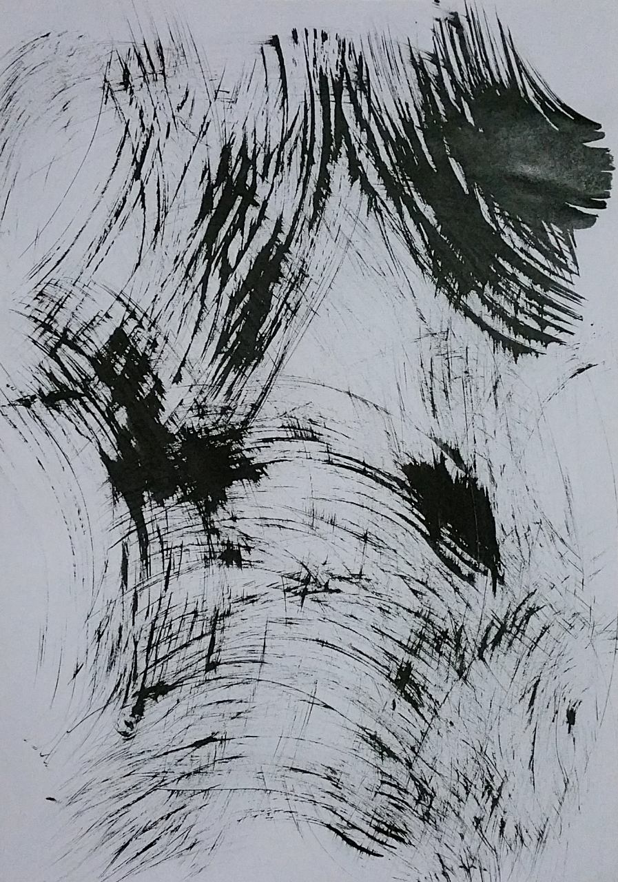
Turbulent – Hard, direct, straight on strong feelings that comes to be like waves and from many many directions. Crisscrossing of emotions. Everything crushing onto me/ the center. feeling the center of the turbulent waves

Method: Brushing of chinese ink using the dusting brush.


10

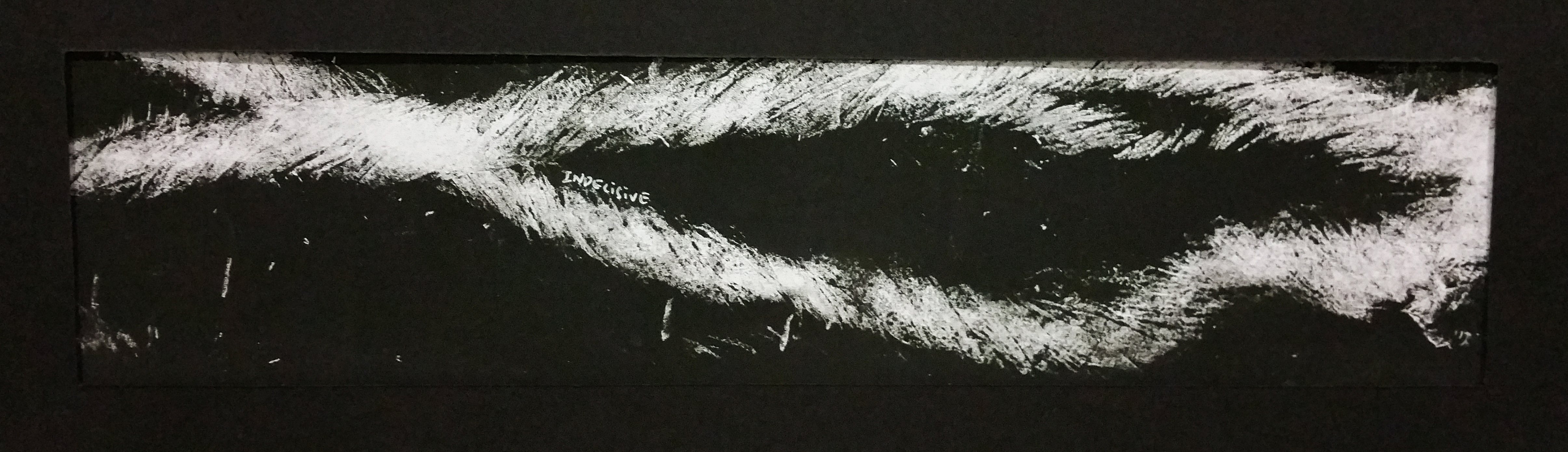
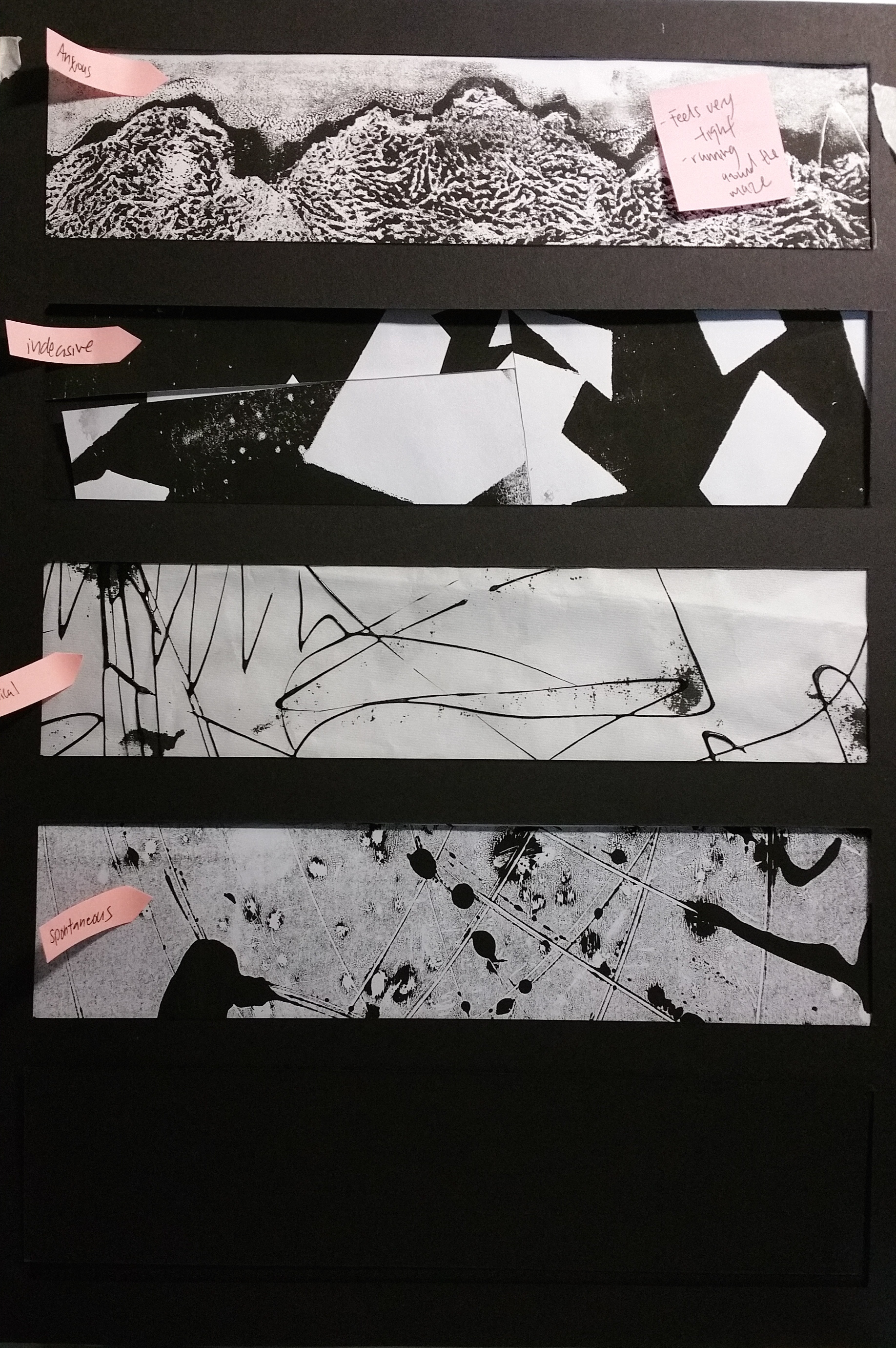
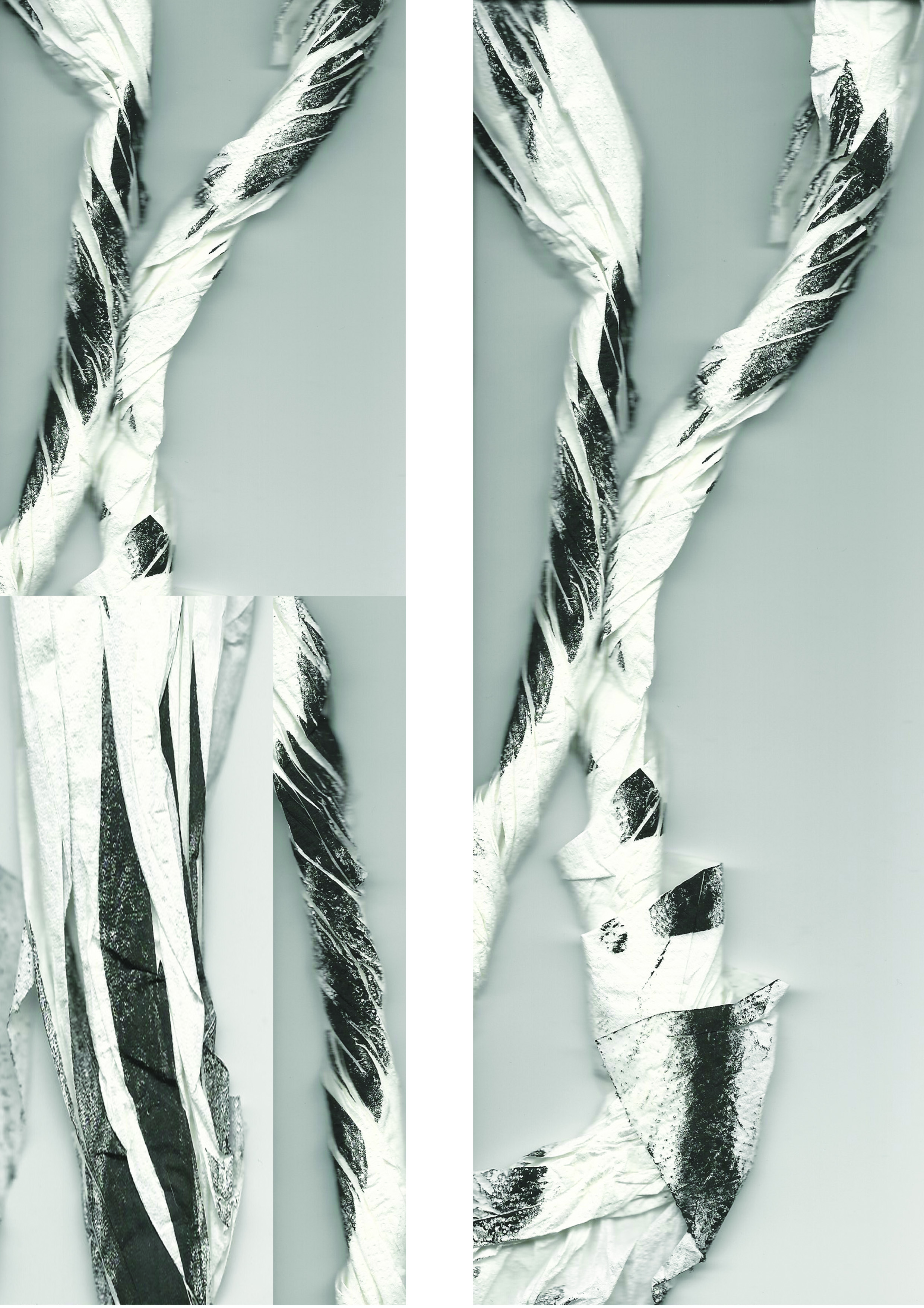
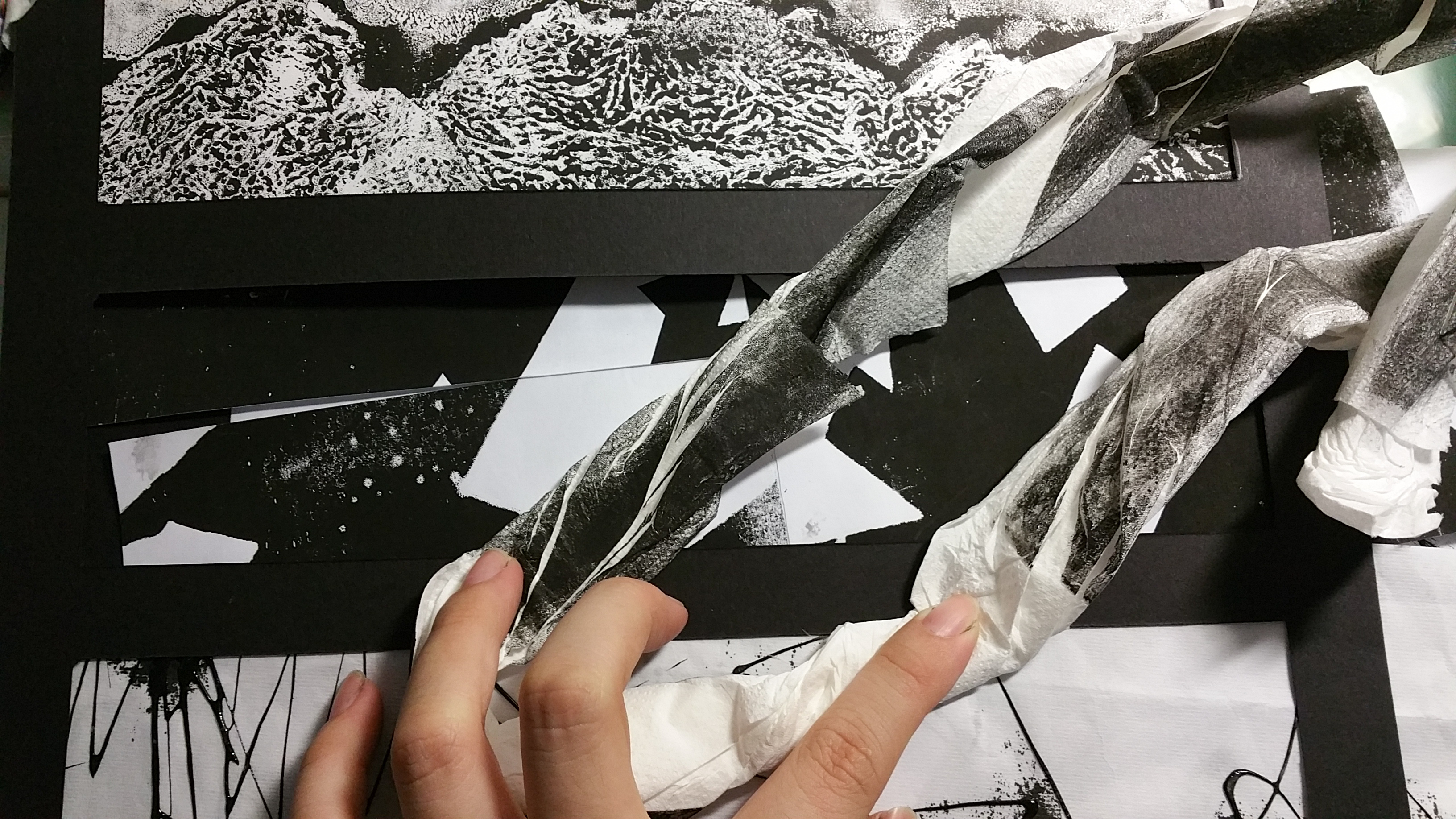
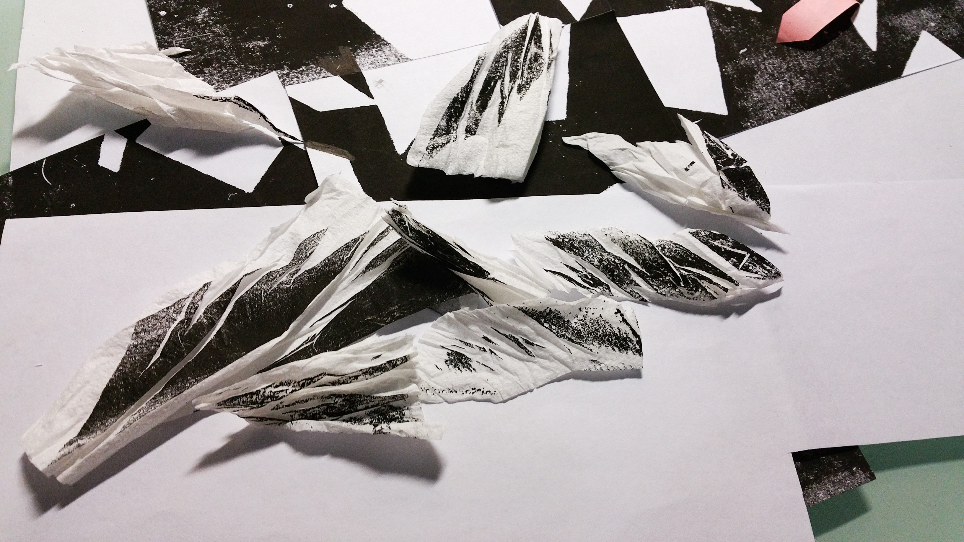
Indecisive – Choosing Paths. When are are 2 paths for you to choose, which will you choose? Even after you choose, what will be the end? Throughout the path, there are many little obstacles (lines), how do i decide?

Method: Monoprinting with scrunched and rolled up kitchen towel!


11

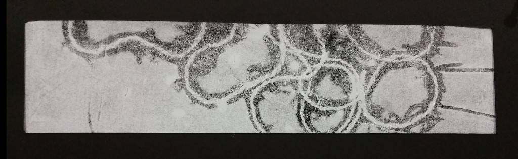
Bizarre – What are the tingly things? Is some new breed of vine monster sprouting out from the ground?

This is one of the magical effect created again by the garden strings. I was immediately certain that this feels bizarre to me and it is one of the earliest emotion that i have choose and decided upon.

Method: Monoprinting with Garden strings


12

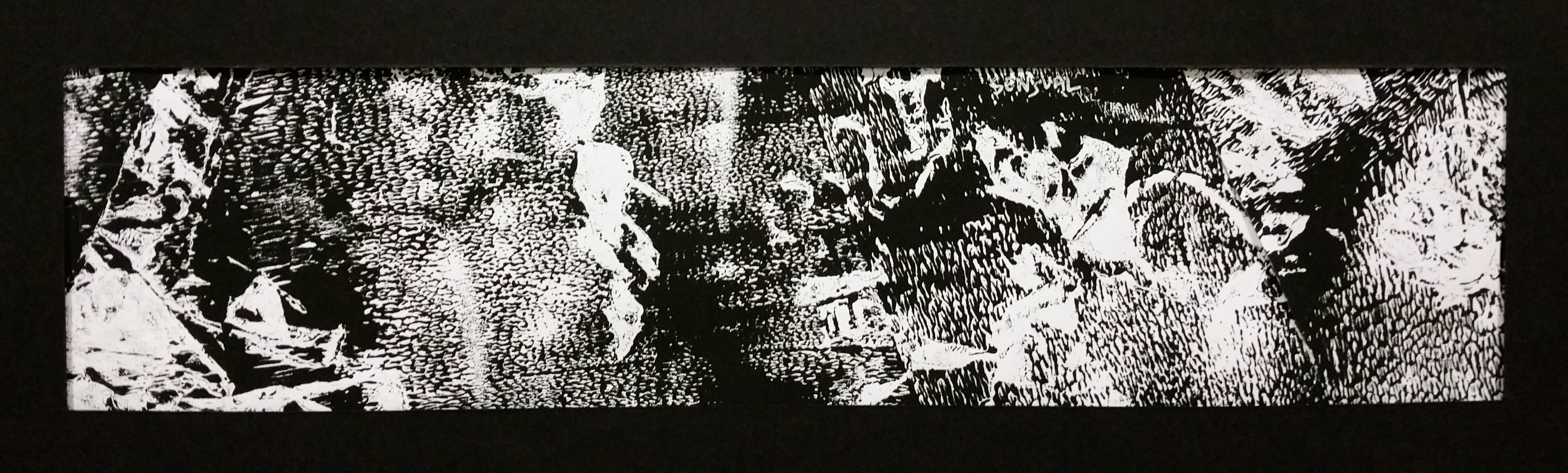
Sensual – Yeah it feels good

Method: Monoprint with crushed pieces of paper


13

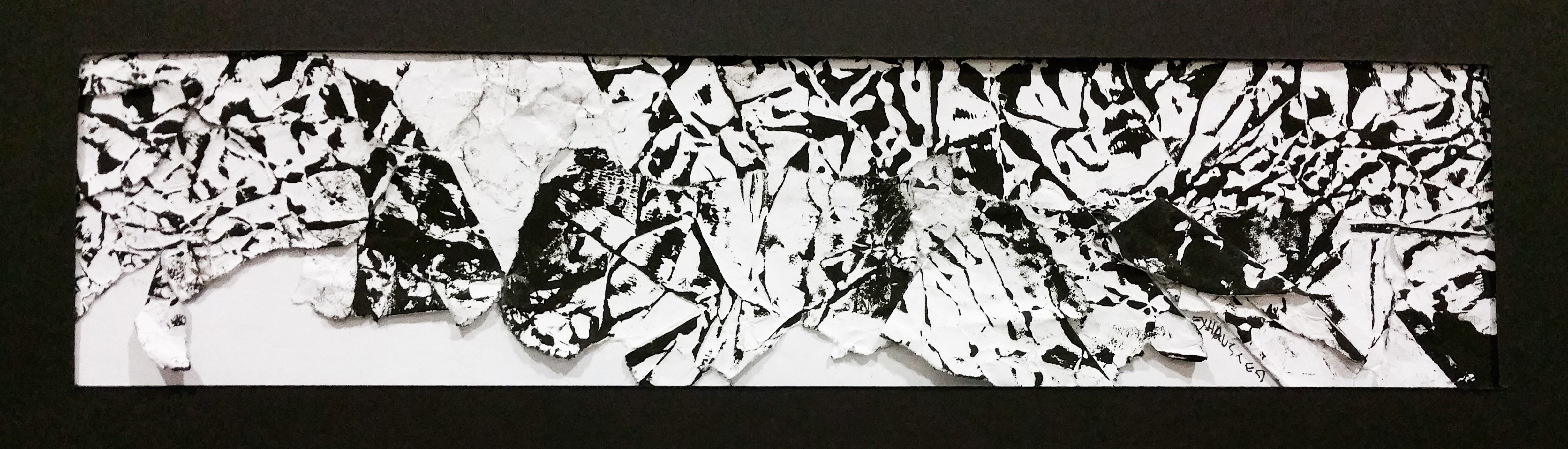
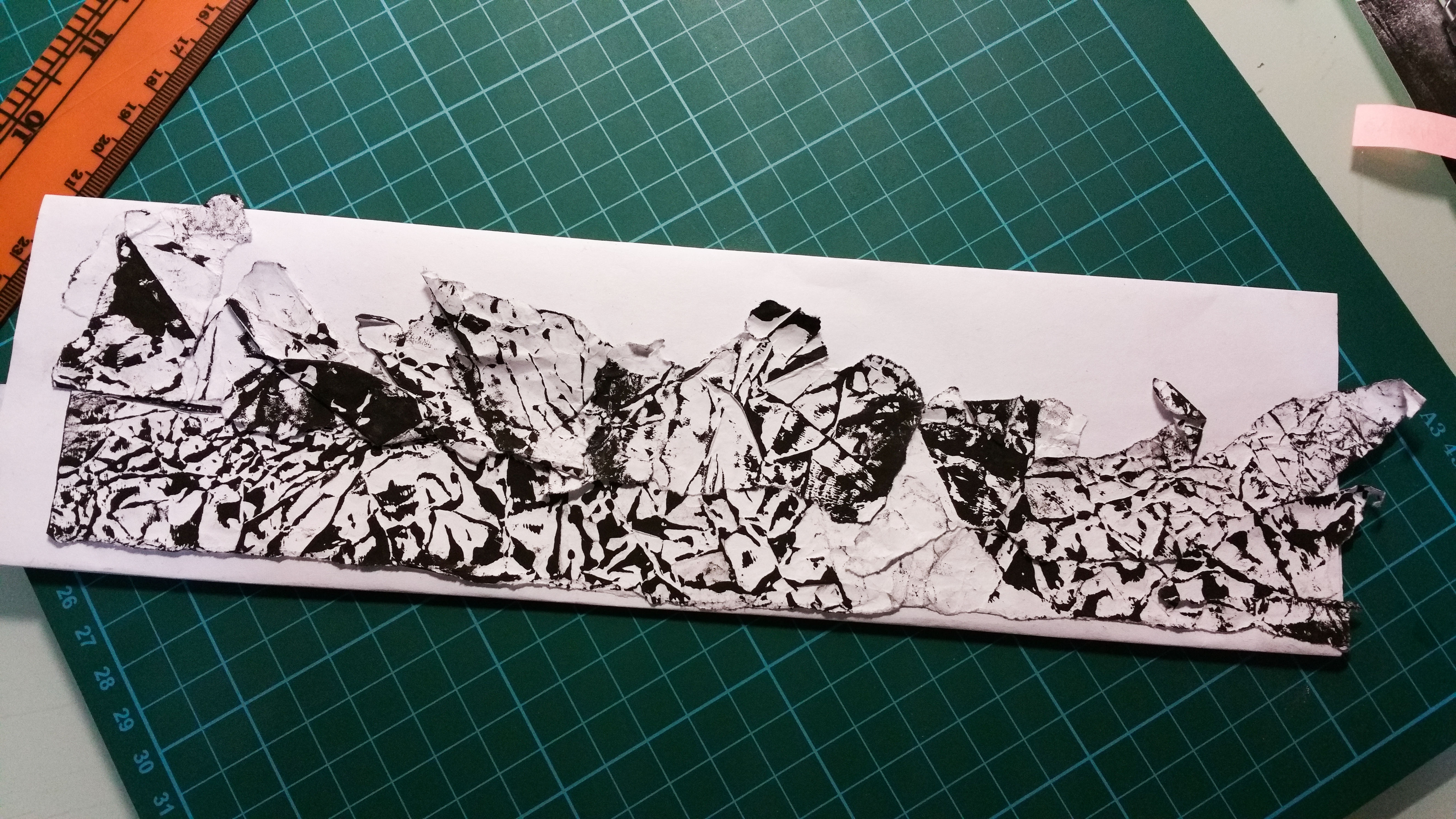
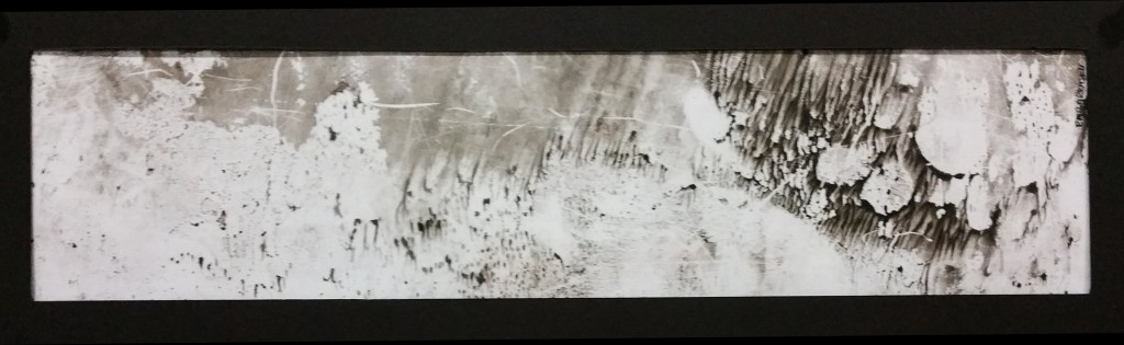
Exhausted – When I feel exhausted, it feels like the whole mountain is coming down crushing on you. This is how it feels like for me

Very much inspired by Alexander Cozens who use random marks to create landscape. If you flip it around u will see a mountain range

Method: Collaging different pieces of crushed paper left from monoprinting.


14

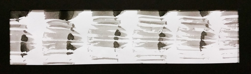
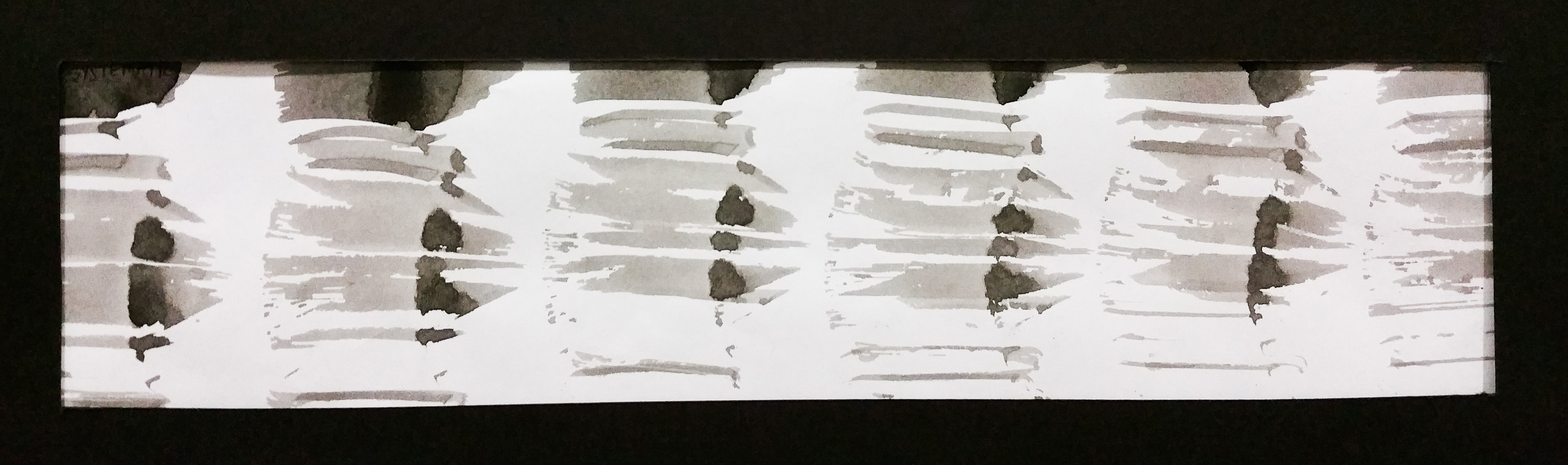
Systematic – Whats more systematic than repeating and doing the same action over and over again?

Method: This is done by pressing down and making mark on the whole A3 paper, without dipping the brush back in for ink again, hence creating the gradient effect.


15

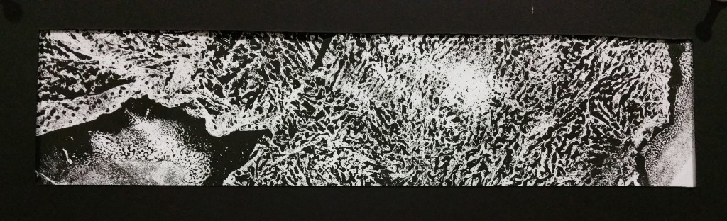
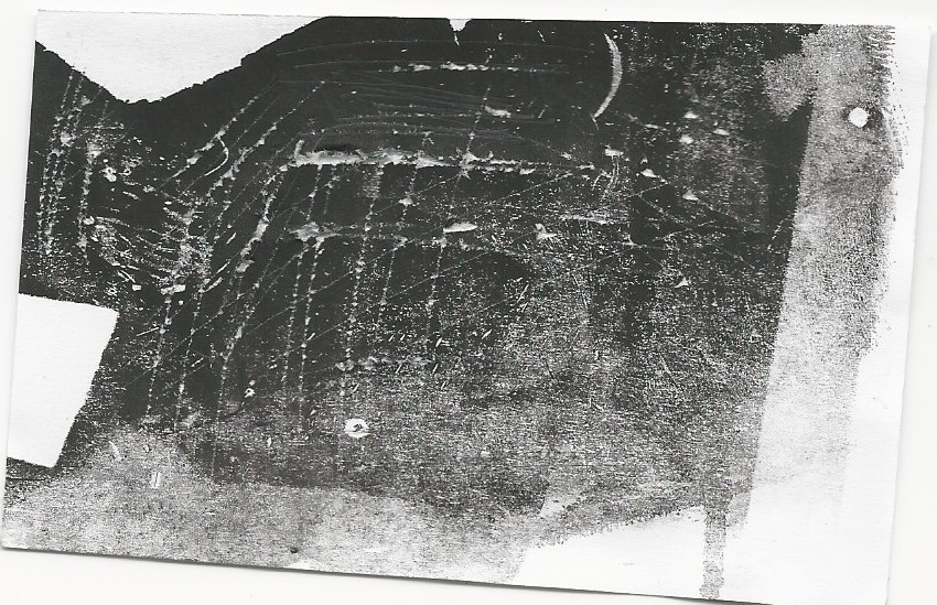
Anxious – Being trapped and lost in a maze. The prints look like a huge maze to me. The sides that look like exits are not, what are they? When we are lost, we will get anxious, hence this emotion. 

Method: Monoprint with kitchen towel. Crush and place them randomly, let the ink and towel do the magic!


16

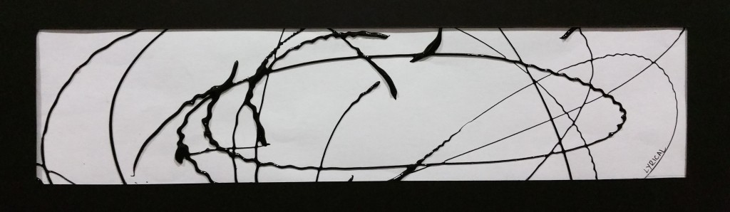
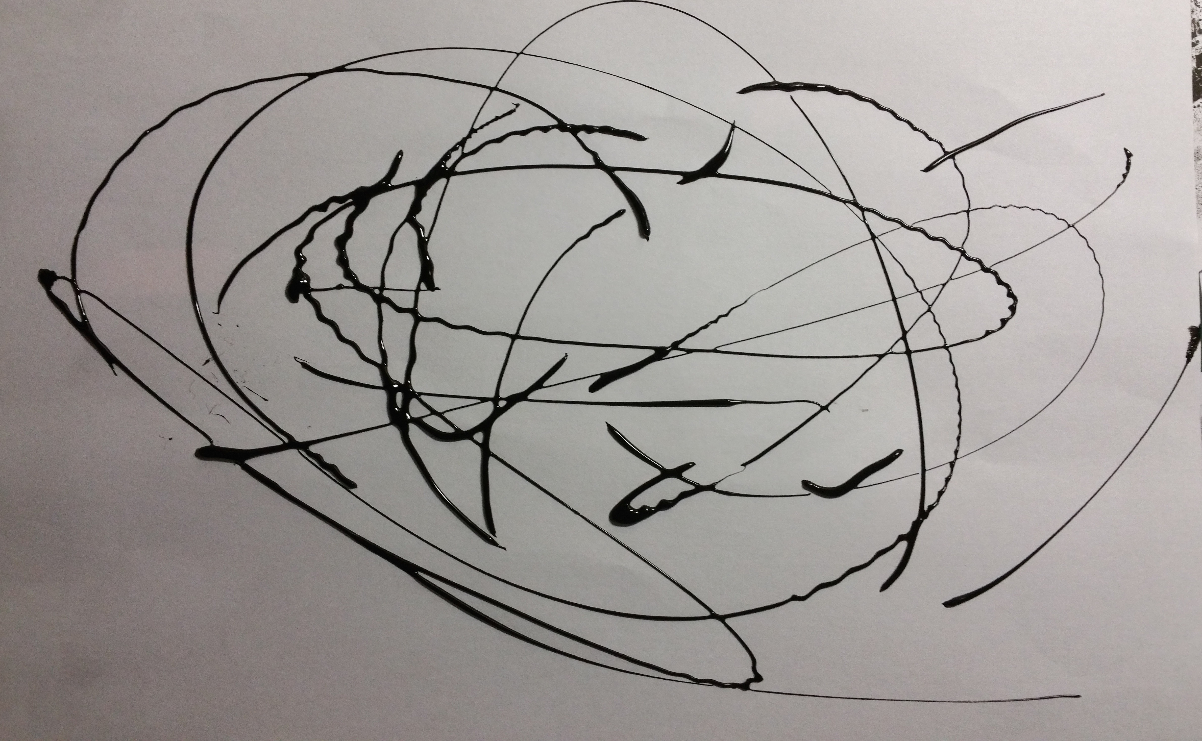
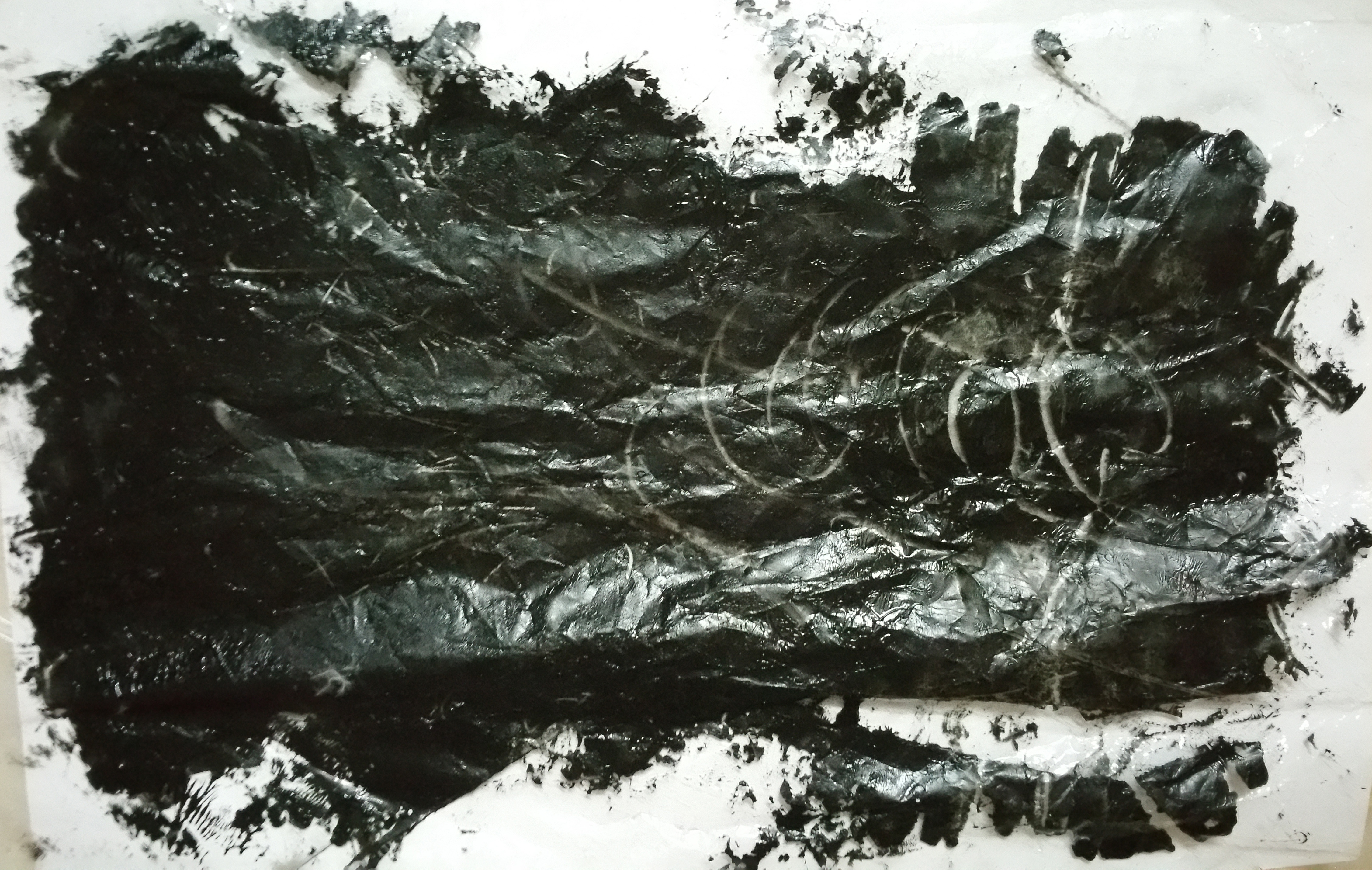
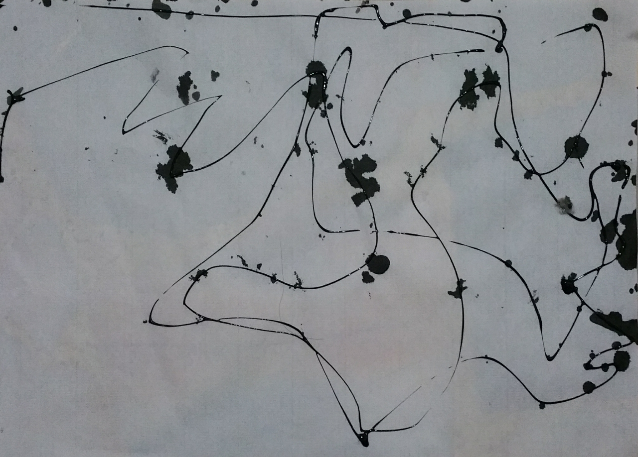
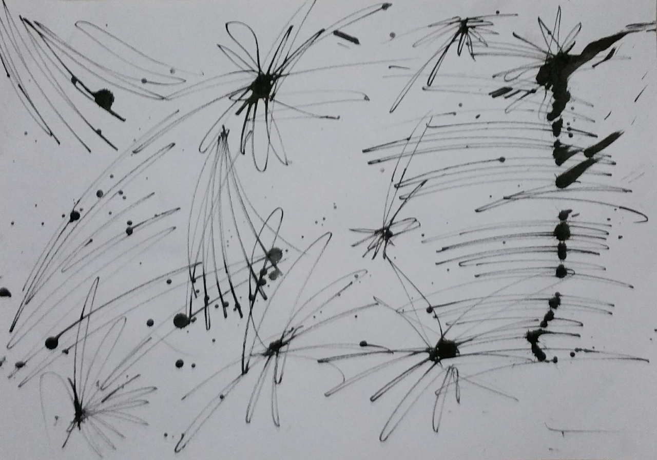
Lyrical – “Magical Lyrical Girl Nanoha” The anime series that i love ever since i watch it. My mind was filled with the image of magic casting circles and transmutations. I focus on the magical feel.

Method: Varying strength of sqeezing the glass deco ink out of the bottle (since my hand will run out of energy) the zig zag lines magically created, and also the wonderful line weight. It feels like how lyrical magical musical rhythm, doesn’t it?


17

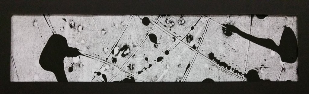
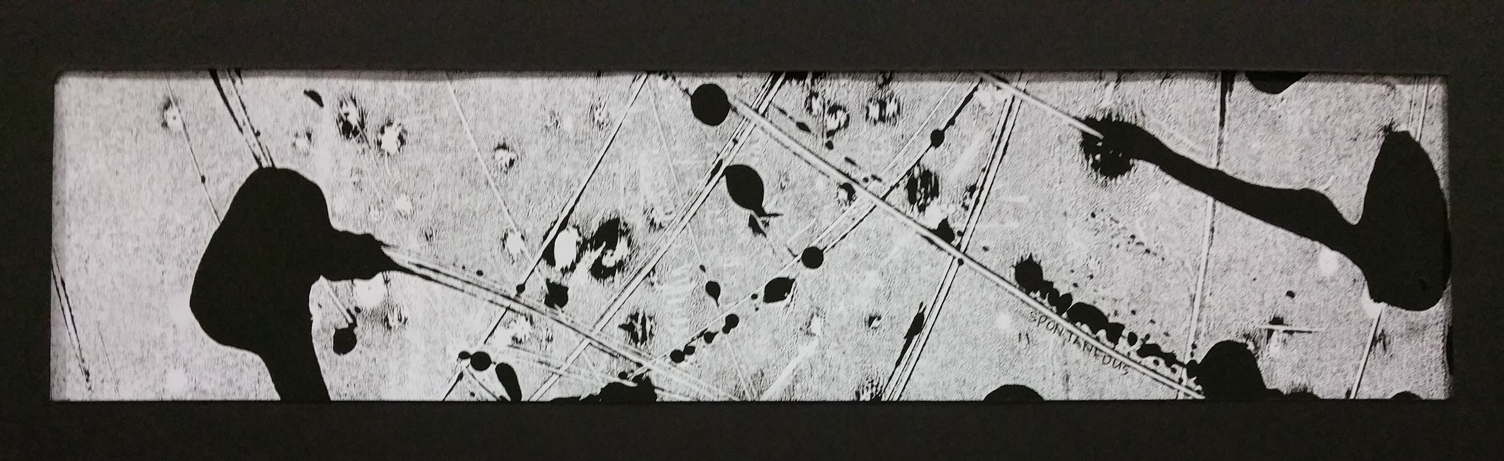
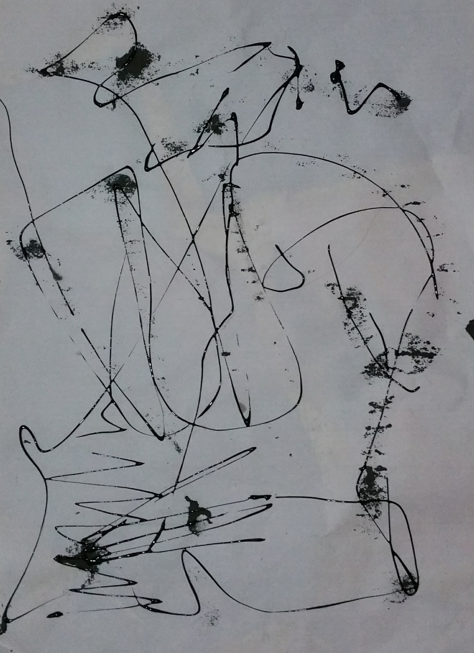
Spontaneous – What gets more spontaneous with high energy splatters and lines on the whole paper?

Method : this was actually the third or fourth monoprint. I liked the lines and effects, didnt what to waste it so i added blotches of inks randomly using a twig and pressed it down with the giant roller. It was really spontaneous when i am doing it, simply feeling the flow and energy of my work.


18

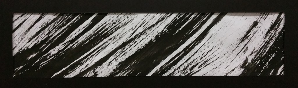
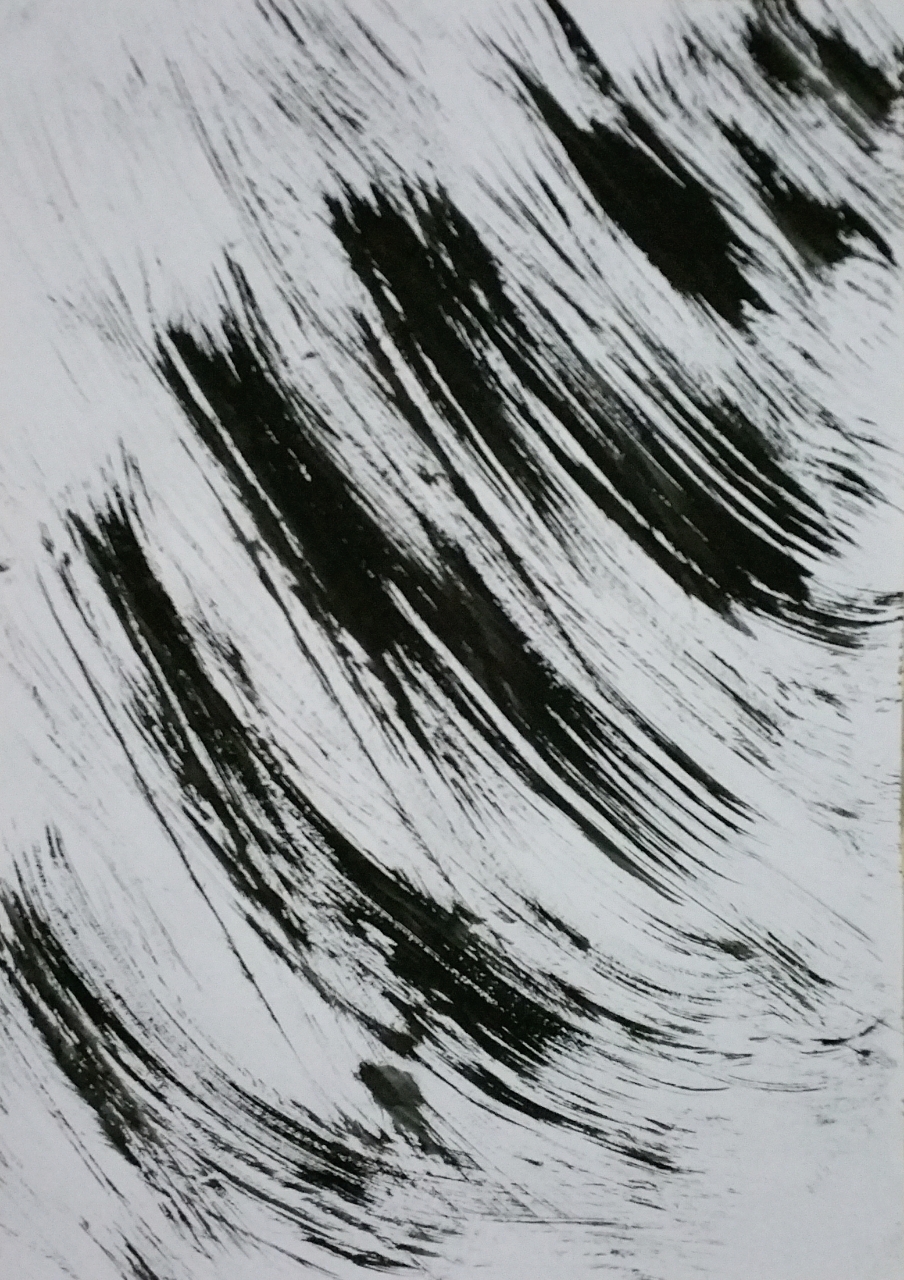
Aggressive – The very strong emotion. Strong waves. Hard direct truth.

Method: Confident brush strokes in one direction. I love the energy that was presented to me and it felt like what aggression should be like.


This whole process started out unsure, confused about what was I supposed to do. However, the “blind churning out of works” evolved when more works are created and after i done proper research. As i went on this journey, everything become more clear. I was doubting what i had created would make its cut, but after finally completing everything, I was proud (at least a little) of what i have created. This has help me to venture into areas where i would not have gone into previously. I started to appreciate the different styles each different artists have, and how to use this knowledge in my works.

Thank you for following me throughout this journey.

Final Lines Work-in-progress 4: When one table is not enough, use 2

Standard

FINALLLLYYY i am almost there! After i got most of my lines settled, i worked to confirm the emotions once again. I felt that this was a better way for me as I didn’t only want to see the lines as a single thing. I wanted all of the 4 panels to flow like how emotions are all related to each other and turn into one another.

20150910_001002-33

I tagged each lines to the emotions, by feeling how it comes across to me and also little notes to why this particular line suits this emotion

20150910_000914-32

20150910_001012-3420150910_211106-5520150910_023101-51

I purposely didnt want to cut the lines into the correct size or stick them down to the frames until i am completely sure that that is what i wanted. I wanted to have the freedom to keep changing and finding the arrangement that i like.

With the bird’s eye view of everything,i will know what worked and what didn’t. I didn’t like the current lyrical, but i like the medium (glass deco ink) but the lines made here didn’t resound to me as lyrical, hence i went to make a new one.

Feels more lyrical now, isnt it?

Feels more lyrical now, isnt it?

One collage that i really like

One collage that i really like ^^

20150910_233912-59

Once i have more or less confirm the postions of the lines in each panel, its cutting time! (It was such a challenge to cut them as I was afraid that there would be something wrong or i might see something better after i cut) However, i guess this is also part of the process, learning to accept what I have done and also be brave.

20150910_232817-58

My first cut.

AND ITS DONE!!!! it may look like a simple process but the cutting and placing them at the correct position took me so long ;A;

AND ITS DONE!!!! it may look like a simple process but the cutting and placing them at the correct position took me so long ;A;

And next post will finally be the long awaited final work!!!!!! YAY /o/

Final Lines Work-in-progress 3

Standard

For my approach, i have decided to look through all my works and see which parts would fit or might be suitable for certain emotions.

20150907_223635-24 copy

20150907_214516-17

After identifying the parts that i want to use, I put them within the frame to see how they will look as a whole。


These are the initial placement of the lines. There are changes of the kind of lines and placement of lines while i am working on it.

20150907_223049-20

I know that if i were to put this, i would not be able to put these 2 panels together as the 2nd row lines are too similar. I will need to make the changes and arrange them in a different way

I laid all of the panels down on the floor and started sorting them out. Will change the lines which dont look appealing or clashing with their neighbours.

20150907_222912-18 20150907_222956-19 20150907_223402-21 20150907_223504-22 20150907_223517-23

I focused very much on how each board looks and wanted everything to flow. This is just one of the many times i tried to rearrange the lines. ^w^

panel4

Final Lines work-in-progress 2

Standard
20150907_004330-12

These are some of the monoprint materials leftover that i used. Thought they would make interesting lines and variation too.

20150907_004503-13

I love the gaps that were created inbetween

toiletpaper

They were messy if it was place as the lines directly. I scaned them in and the lines look wonderful

20150909_230512-30

trying out to see if i can collage in the kitchen towels into the shapes

20150910_020617-50

I also tried cutting out the kitchen towels in pieces to collage them into a line


20150912_210520

This is the piece of plastic that i used as a base for the monoprinting ink. And i thought why not? let me make something with this too. So i crushed the plastic and did scratching and swirls on it. The result wasnt as good as i predicted it might be, but it was a good experiment

20150912_210607 copy

And of course, i will need to print it on paper. it was printed without any rollers, I simply used my hands to press the ink down

While i was placing the lines, i also suddenly had an idea of scratching the paper with a needle.


Scan 6

It was on a small piece of paper as i wasnt sure how it would turn out

20150912_205945 copy

and i decided to try it on a full A3 size paper. The marks above were made when the paint is not completely dry, I liked that effect better compared to the ones that were made after the paper dried completely (bottom)


Preparing for the final cut

Standard


Deciding what the is size of the strip that should be used. A longer that on that can show the length and probably the “story and flow”? or the thicker one that can show more content?

20150904_143153

brooding over which dimensions to choose

20150904_143415

A test that i did with brush pen to for me to decide what size to use

20150904_143702

If the longer strip is chosen, many of the lines would require collaging. Making the lines look like it is a complete line without a crack would be an interesting puzzle

20150904_144822

i tried combining  2 paintings into one. Creating invisible lines?!

After much deliberation, I have decided to use the thicker one as I wanted to show most of my content in one box. Many of my lines can be shown better with a bigger width as compared to the long version.

After deciding the final size, it is time for cutting! The precise measurements and cutting took way much longer than I expected. I did a round of measurements in school and continued the night back home.

20150906_001357

Rulers of multiple size and materials for that accurate measurement. So glad that i have the super long metal ruler.


The final window frames! with them collaged together, they work as a line too, don't they?

The final window frames! with them collaged together, they work as a line too, don’t they?

With this, time to start working on the final arrangement!

Referencing is really important: Precision vs Energy?

Standard

Up Next is Peter Foucault! Thin lines, Collage (i need to this this), robot drawings, somewhat probably inspired by Jackson Pollock too?

1-ZFOzT0-vghTsbkn-guLOdA

1-y9UnUJIo_h5hRcCMdPO7lw 1-iQg_ppdBfWWFpgp_kBES7A


My Take:

2015-09-03-23-08-30_deco

These are created with swinging of the dust wiping brush with chinese calligraphy ink!


2015-09-03-23-09-25_deco

Several more tries.


2015-09-03-23-11-18_deco

All these are inspired by the robot drawings by Peter

2015-09-03-23-33-19_deco

The sense of direction and the aggressiveness from the brush strokes

2015-09-03-23-38-13_deco

The ink blots are left by having the ink on the previous pages passed through. They are joined up like “connect the dots” with the glass deco liner

2015-09-03-23-38-42_deco

2015-09-03-23-32-14_deco

2015-09-03-23-37-42_deco

Marks are created randomly with splatters and a wooden stick dipped in ink. Combination of Sol LeWitt and Peter?

20150901_161828

Surprising Monoprint that created surprising results~

Peter Foucault’s works are a mix of precision vs energy. There is a sense of wildness u see in Pollock’s work and yet the details in LeWitt’s works. He is really an interesting artist i want to know more about. It helped alot in my

I really had fun during these creation. It was a mix of “wanting to know what you want to do” and “be bold and forget about whatever restrictions”.