TP: Getting inspirations from creating

Standard

After the first look and consultation with Prof Ina, I decided that the keywords for this project would be “nature” and “watercolour”.

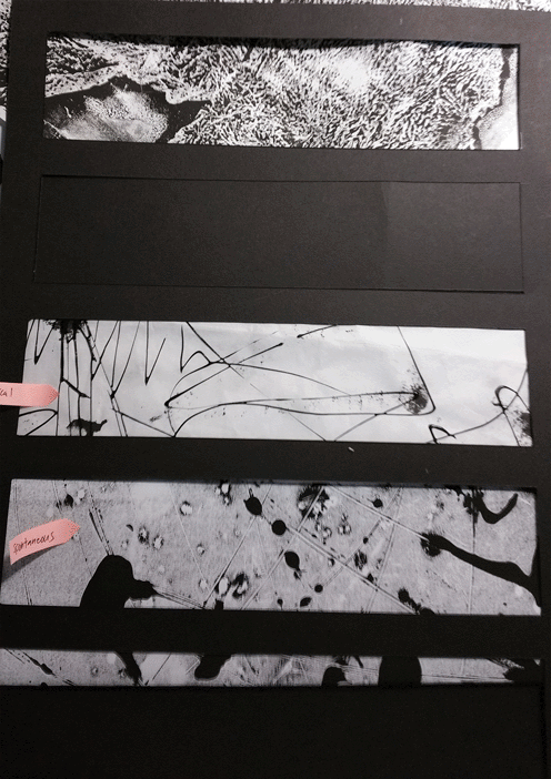
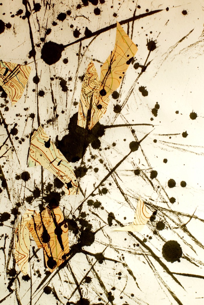
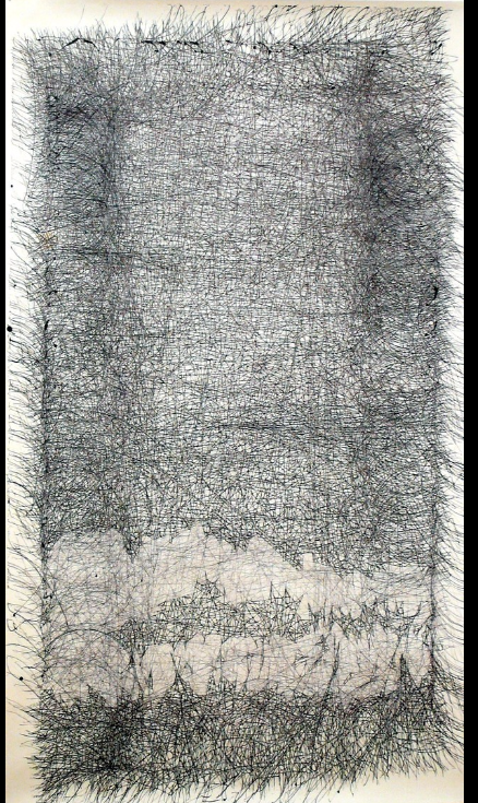
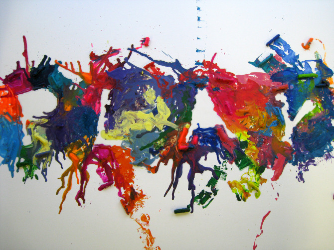
These 3 are the ones that I found the most interesting and related from the pile of references that I found.

leaves,cut outs.

leaves,cut outs.

ice cream?! wow

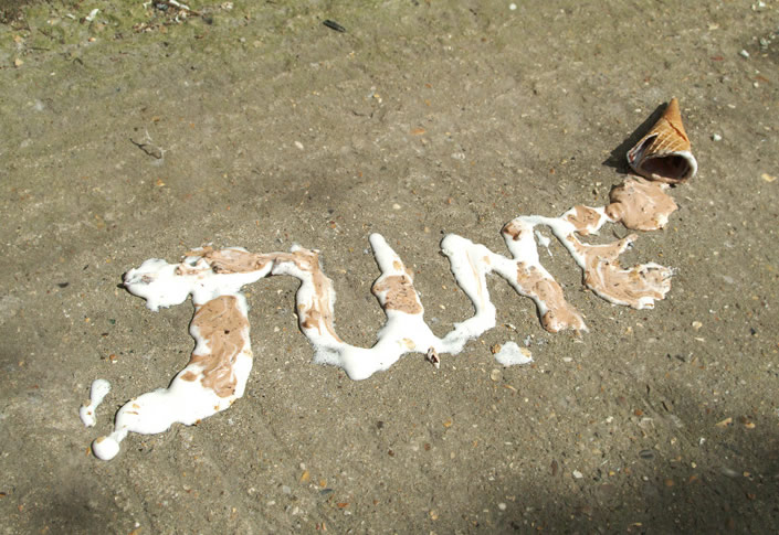
ice cream?! wow (using the raw materials)

tie up with the water colour?

tie up with the water colour?

With all these references, even though I am still clueless, I thought it would be good for me to start on something so that I could kickstart the project and have an idea of what I want to do.

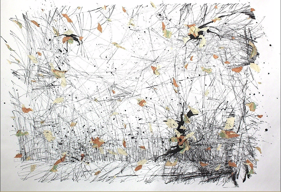
And so I went out of the house and collected a bunch of fallen leaves.

20160125_000802-min

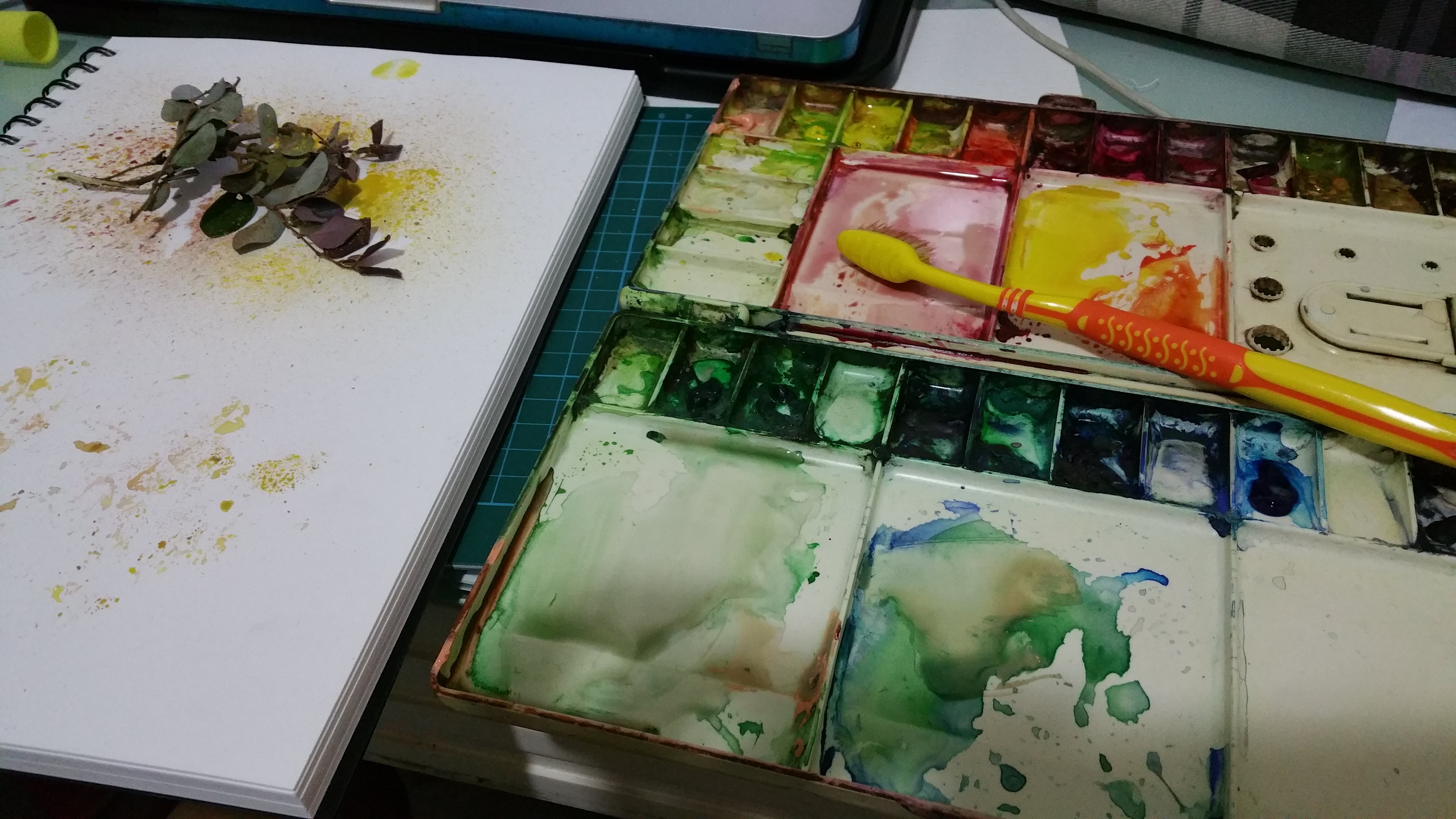
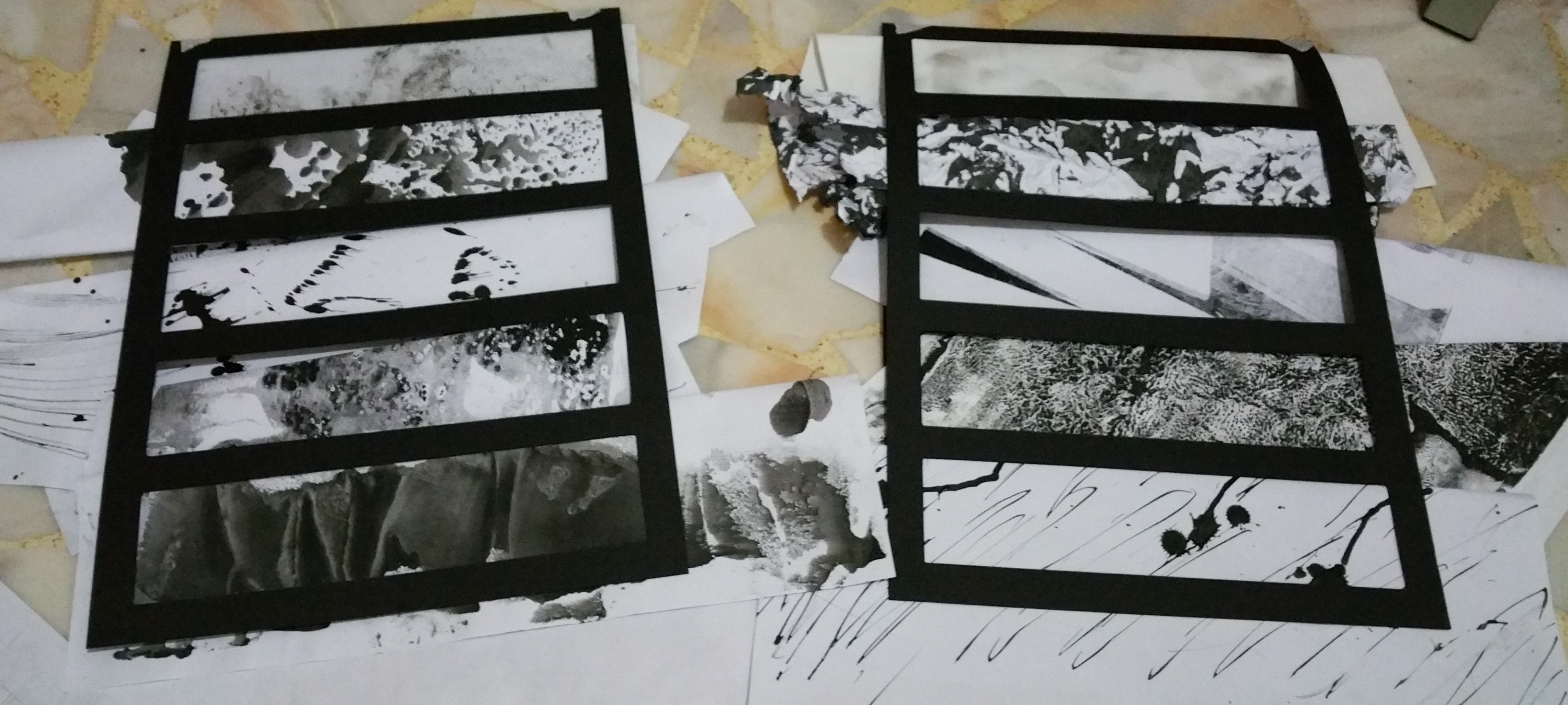
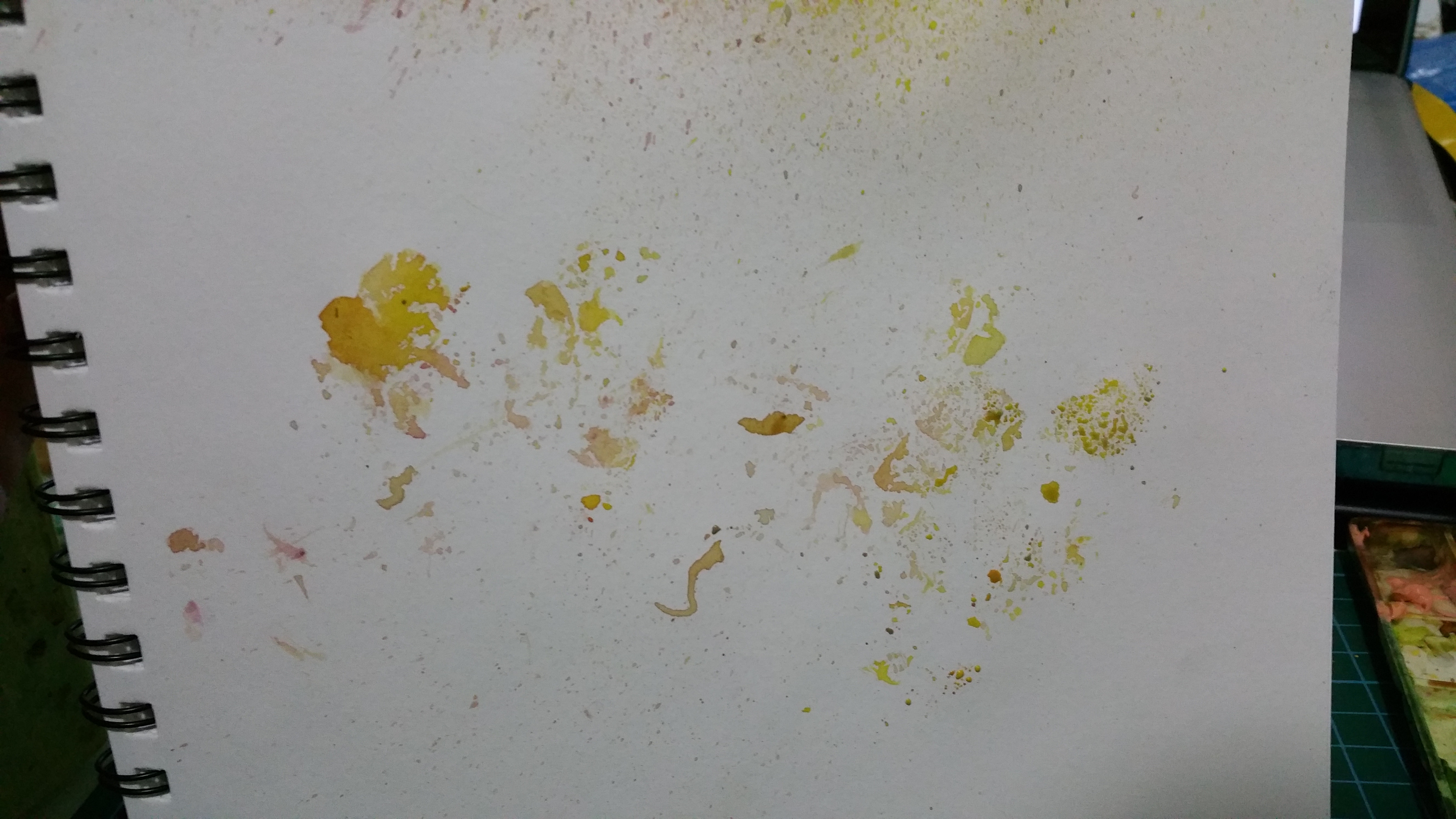
The first work i started with.. I splattered some watercolour over the leaves, trying to create the outline of the small leaves

20160125_000825-min

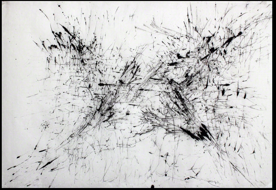
The silhouette created of the leaves

20160125_000831-min

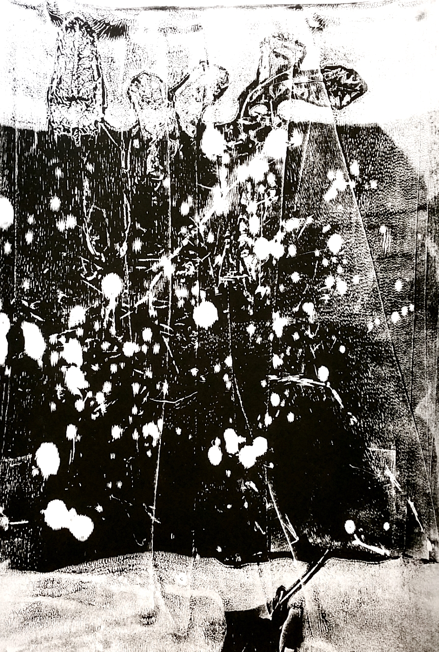
Printed the ink on the leaves

20160125_001514-min

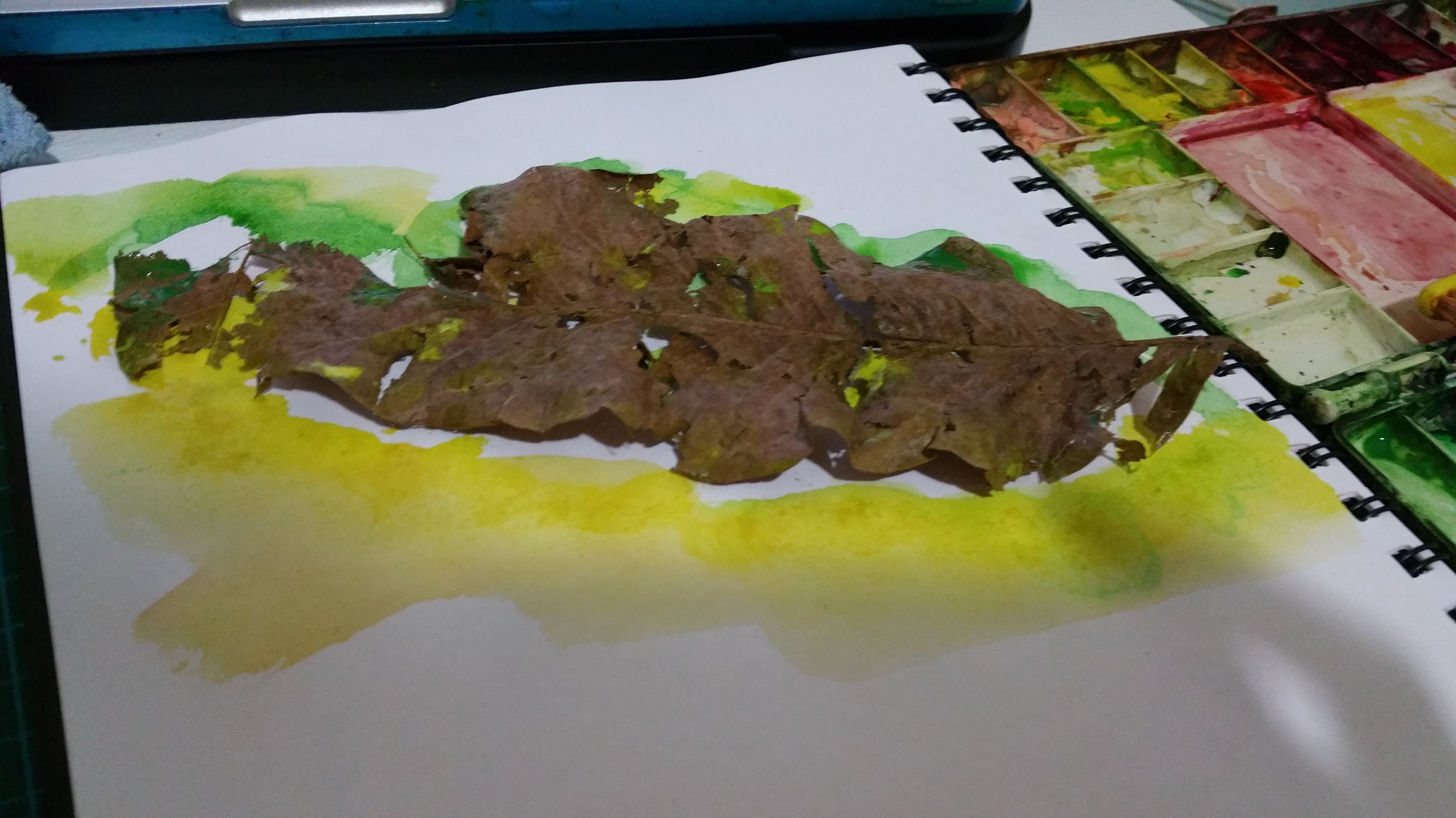
I remembered the importance of the leave looking natural. I picked one with holes eaten by caterpillars and broken. I painted over it, hoping that the paint would seep through the holes and create a crisp outline

20160125_002147-min

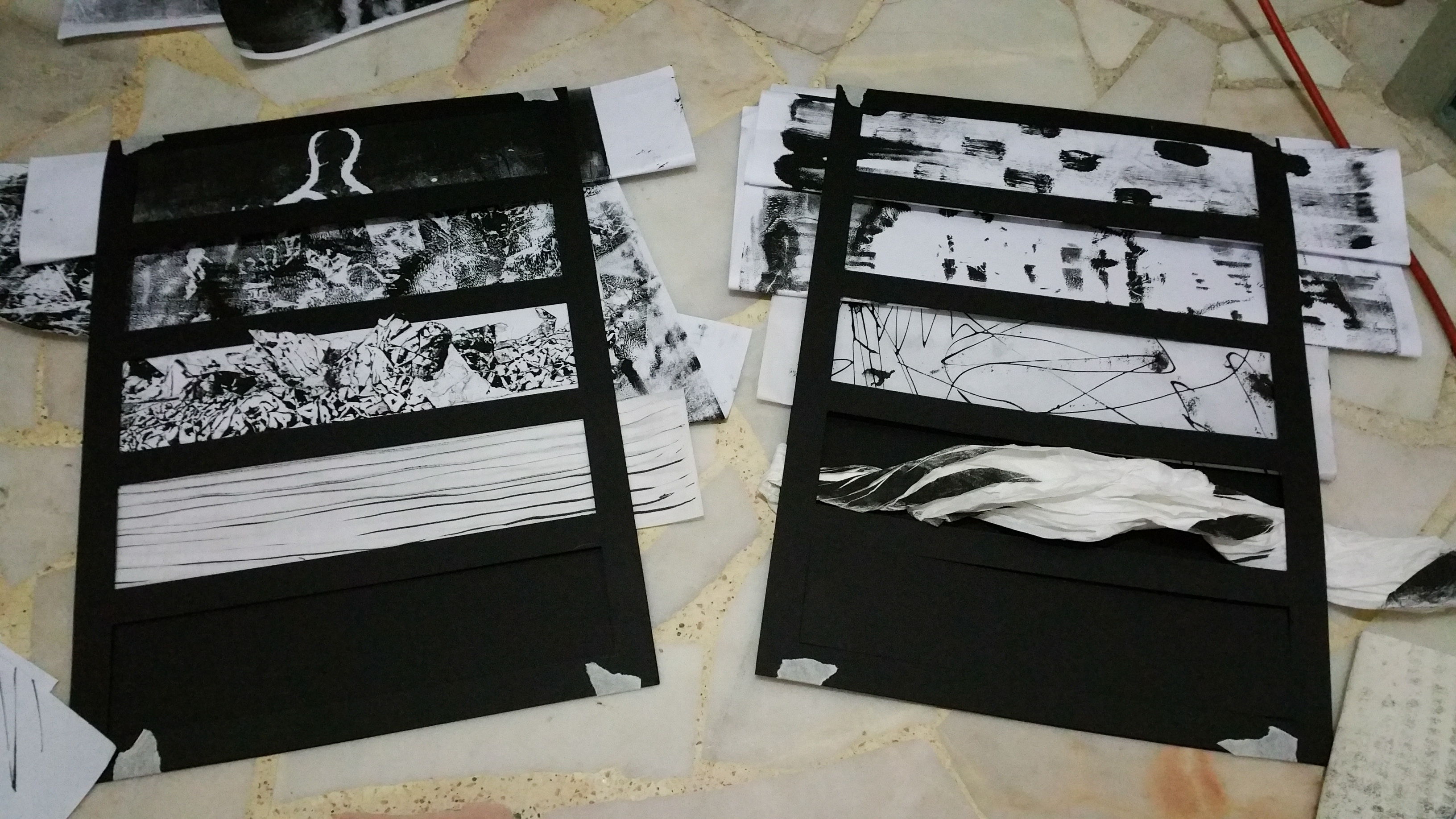
I wanted to try to create the effect like the first reference i found.. Cut my name out. I didnt want the letters to look exact, hence simple cuts are made. However, the letters became quite illegible. If these cuts were on paper, they might have work out much better.

20160125_002632-min

I wrote “GEK” with glue and splattered torn leaves on it

20160125_002857-min

The result: it stuck surprisingly well, didnt it? I like the “natural” feeling of these letters

These methods may work for small tests but if it were to be a proper submission, I think that it will look sloppy… Hence, off to find more new inspirations! However, i like the theme of nature and i will continue to stick with it for now!

Final Lines Work-in-progress 4: When one table is not enough, use 2

Standard

FINALLLLYYY i am almost there! After i got most of my lines settled, i worked to confirm the emotions once again. I felt that this was a better way for me as I didn’t only want to see the lines as a single thing. I wanted all of the 4 panels to flow like how emotions are all related to each other and turn into one another.

20150910_001002-33

I tagged each lines to the emotions, by feeling how it comes across to me and also little notes to why this particular line suits this emotion

20150910_000914-32

20150910_001012-3420150910_211106-5520150910_023101-51

I purposely didnt want to cut the lines into the correct size or stick them down to the frames until i am completely sure that that is what i wanted. I wanted to have the freedom to keep changing and finding the arrangement that i like.

With the bird’s eye view of everything,i will know what worked and what didn’t. I didn’t like the current lyrical, but i like the medium (glass deco ink) but the lines made here didn’t resound to me as lyrical, hence i went to make a new one.

Feels more lyrical now, isnt it?

Feels more lyrical now, isnt it?

One collage that i really like

One collage that i really like ^^

20150910_233912-59

Once i have more or less confirm the postions of the lines in each panel, its cutting time! (It was such a challenge to cut them as I was afraid that there would be something wrong or i might see something better after i cut) However, i guess this is also part of the process, learning to accept what I have done and also be brave.

20150910_232817-58

My first cut.

AND ITS DONE!!!! it may look like a simple process but the cutting and placing them at the correct position took me so long ;A;

AND ITS DONE!!!! it may look like a simple process but the cutting and placing them at the correct position took me so long ;A;

And next post will finally be the long awaited final work!!!!!! YAY /o/

Final Lines Work-in-progress 3

Standard

For my approach, i have decided to look through all my works and see which parts would fit or might be suitable for certain emotions.

20150907_223635-24 copy

20150907_214516-17

After identifying the parts that i want to use, I put them within the frame to see how they will look as a whole。


These are the initial placement of the lines. There are changes of the kind of lines and placement of lines while i am working on it.

20150907_223049-20

I know that if i were to put this, i would not be able to put these 2 panels together as the 2nd row lines are too similar. I will need to make the changes and arrange them in a different way

I laid all of the panels down on the floor and started sorting them out. Will change the lines which dont look appealing or clashing with their neighbours.

20150907_222912-18 20150907_222956-19 20150907_223402-21 20150907_223504-22 20150907_223517-23

I focused very much on how each board looks and wanted everything to flow. This is just one of the many times i tried to rearrange the lines. ^w^

panel4

Peter Foucault! and some of my works

Standard

With some researching on the internet, i found another artist that creates interesting works! The artist is Peter Foucault.

In his latest series, he created a robot which can perceive sound, making use of sound in the environment to create art pieces! The art piece created is similar to automated techniques due to the end result cannot be predicted due to the never constant human traffic.

Some of his other art works,

1-ZFOzT0-vghTsbkn-guLOdA

Collage + Ink!!!

1-kYtzYBu7F1yY7KiP1zNXrg

These impressive lines

Screen Shot 2015-09-02 at 11.15.50 pm

Bridge, 2008 Ink on paper 72 × 44 in 182.9 × 111.8 cm

Screen Shot 2015-09-02 at 11.15.22 pm

Bellows, 2014 Ink, blown ink and collaged antique USGS maps 45 × 48 in 114.3 × 121.9 cm

1-iQg_ppdBfWWFpgp_kBES7A

Whip Series #2 Drawing and blown ink on paper 24 × 36 in 61 × 91.4 cm

Whip Series #2
Drawing and blown ink on paper
24 × 36 in
61 × 91.4 cm

My take on his works~~

2015-09-02-23-51-30_deco 2015-09-02-23-52-34_deco


It was initially just twigs and dried leaves when i first started out the monoprint. As i continued on, i didnt want to destroy the design that were made earlier, hence i used the twigs to splat ink and draw lines randomly. I am quite pleased that it came out so nice! Time for more experiment!!


https://www.artsy.net/artwork/peter-foucault-bridge

https://medium.com/@bluebirdartco/artist-feature-peter-foucault-68bc6d2509e8

https://peterfoucault.wordpress.com/


Finding self with self portraits☆その3

Standard

Finally, after the first 2 rounds of photos, i guess that i got a clearer picture of what I wanted. Prof gave a very valuable suggestion on how i should be in the photo with pooh (which i tried to avoid alot in the previous rounds). I guess this was the best way (for now) to show the connection between me and my pooh. The different expressions that he can make, and using this, I selected the theme of “daily life”, which i suppose it will shows me, for what i do and who i am.

a rough plan on what to take

a rough plan on scenes to take

With me finally stepping out of the house, the photos that i gathered in the end was a humongous amount (>1000 photos!!!!) I am not kidding.

In a public environment, and doing weird things like buying and eating ice kachang with pooh is bound to get many weird stares and comments throughout the session. It caused quite a little commotion with me taking these photos in a quite crowded kopitiam and the stall owners were all discussing about it. I have to explain to all of them that this is for my assignment. It is indeed embarrassing at first but when i was just focusing on how to get the pictures that i want, the surroundings didnt mattered to me anymore. The only thing worrying was if the management would chase me out of the place.

What i wanted initially was a 2 view of things. for e.g. POV of me & POV of pooh. some scenes were suited for this but some werent. Alot of photos got filtered out in the end. (PICKING 12!!!! from the 1000). This was a pretty great achievement for me XD

Some photos that might have made into the final 12:

20150825_205442-min 20150825_210731-min 20150825_212830_001-min 20150825_214207-min 20150825_215105(0)-min 20150825_215429-min 20150825_215914-min


Finding self with self portraits☆その2

Standard

After that first round of photo taking and discussing with Prof Vladimir, I realised that the photos didnt resound to me. They did not portray the emotions that i wanted and it didn’t show “self portrait”.

I still wanted pooh as my main object that will represent me. Hence this time i took a darker approach and played around with the natural lighting and silhouette. I realised that it was still the loneliness of being a only child that resounded more and i wanted to portray that.

acting with pooh

1c-7

I loved the evening lighting that shone through the windows and how the light falls onto the pooh. 

1b-2

viewing in Pooh’s POV? at the same time, showing his scars.

1a-1

What are we always looking at?

IMG_3374-3

me/pooh. looking at the source of light, the end of the dark tunnel?

IMG_3375-4

i like how the unfocused effects came out. staring at something too bright will cause us to lose sight of our goals.

IMG_3397-5

Finally seeing whats behind that source of light.

IMG_3422-6


This set of photos told(?) a story much better than the first time. however, they were all similar and only looking at one direction. even though i like the lighting, it is considered boring and it would make it as a set of photos.

After another consultation session with Prof,  I realised that being stuck at home isnt the way to do this. TIME TO GO OUT AND GET SOME PICTURES!

Finding self with self portraits☆その1

Standard

Self portraits, it was something that I didnt really like exploring. Self portraits feels like exposing yourself to the whole world. Vulnerable.

After some brainstorming, i decided to go with the object that was closest to me. It was my first pooh stuff toy which my mum gave me as a present during kindergarten. It has been together with me since and hence i thought it would very well represent who i am.

brainstorm on how to frame the picture. realises that doing the actual positioning is really difficult

brainstorm on how to frame the picture. realises that doing the actual positioning is really difficult

20150830_233526-min

IMG_3217-5

How pooh and I are always connected, sleeping together

IMG_3241-10

being left alone. when the party is over

IMG_3193-1

I really love this photo. showing the young me vs the pooh now

IMG_3225-6

The scars accumulated over the years. Showing how pooh(me)has been through rough times

These are the first set of photos that I took. I wanted the theme of past vs present and it as my only friend as I am a only child.  IMG_3230-7 IMG_3237-8 IMG_3238-9


I wanted my photos to give that sense of nostalgia and loneliness (as what i am feeling). The feeling of being left behind, and also, pooh represents me too.

After consulting, Prof Vladimir, we realised that pooh can portray emotions even though technically it is a inanimate object. Time to explore this in the next attempt!