HERE ARE MY FOUR DESIGNS
HERE ARE MY FOUR DESIGNS
In the beginning 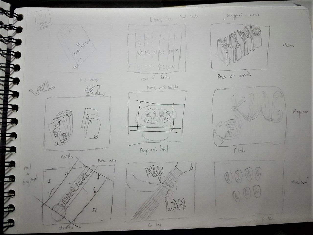
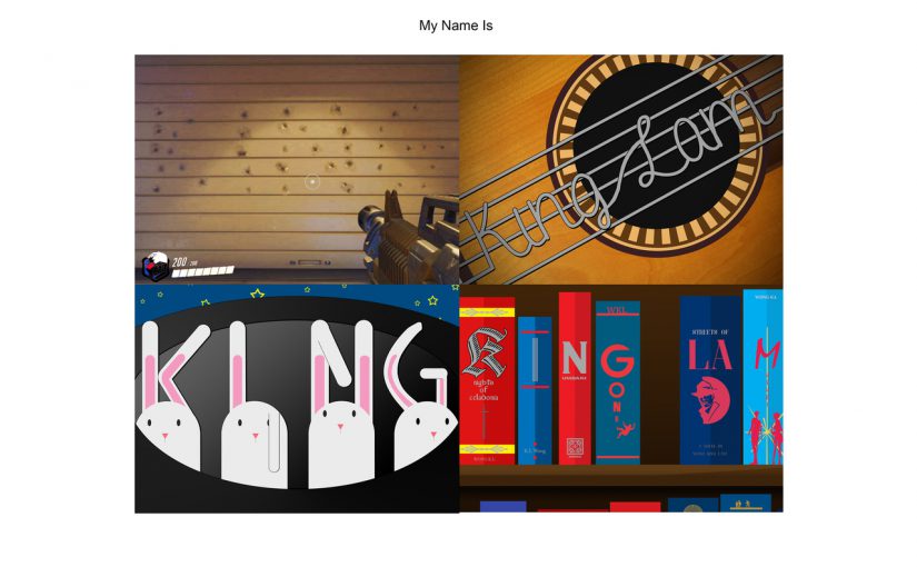
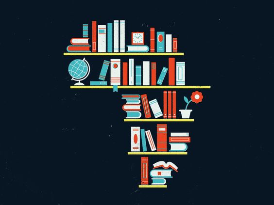
Before any research, I looked into designs for my 4 jobs and came up with 3 per job. 3 of these job concepts are in the above picture.
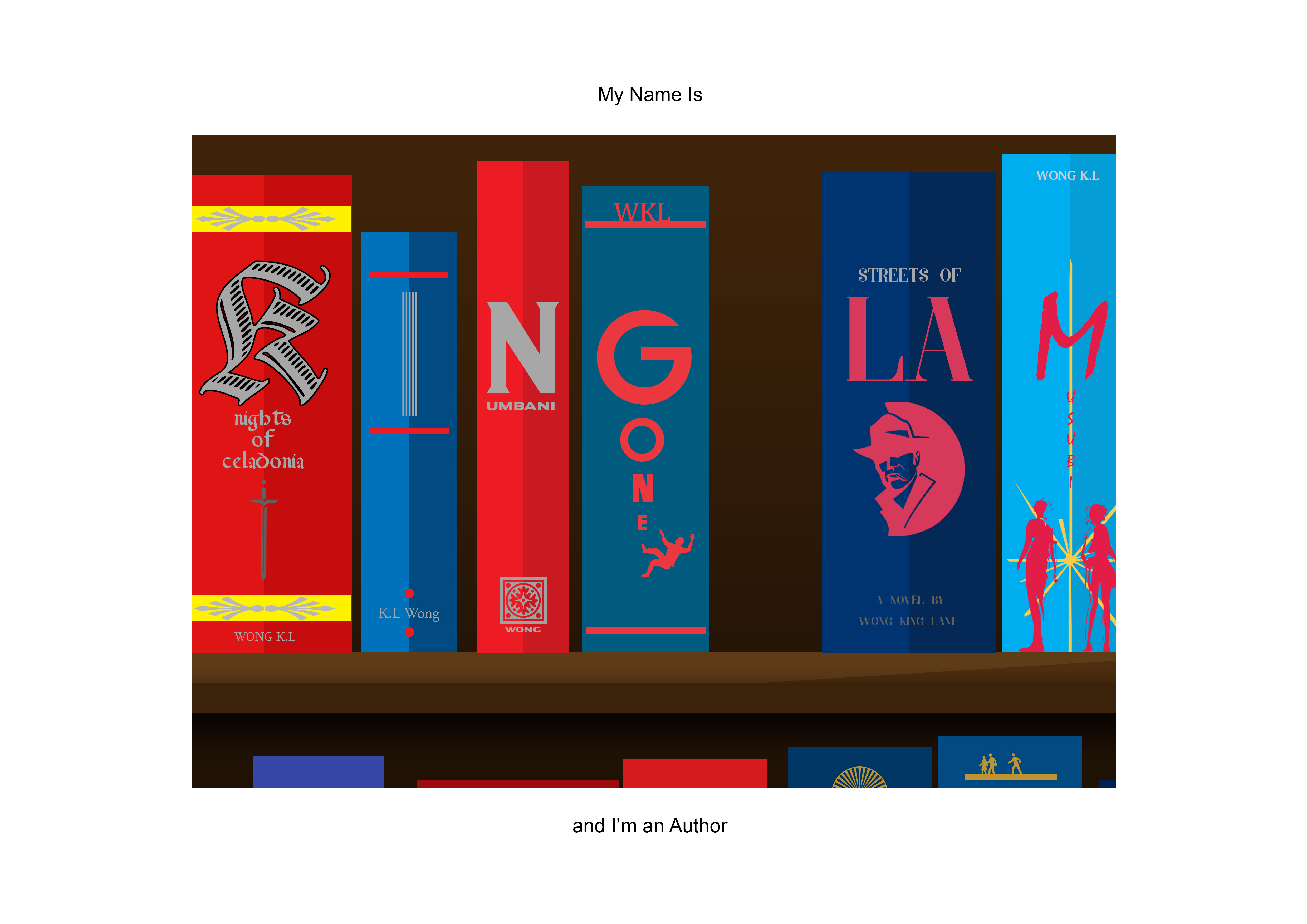
The 1st row was being an Author. The ideas were based around paper, pencils and a series of books. The one using a row of books on shelves was chosen in the end.
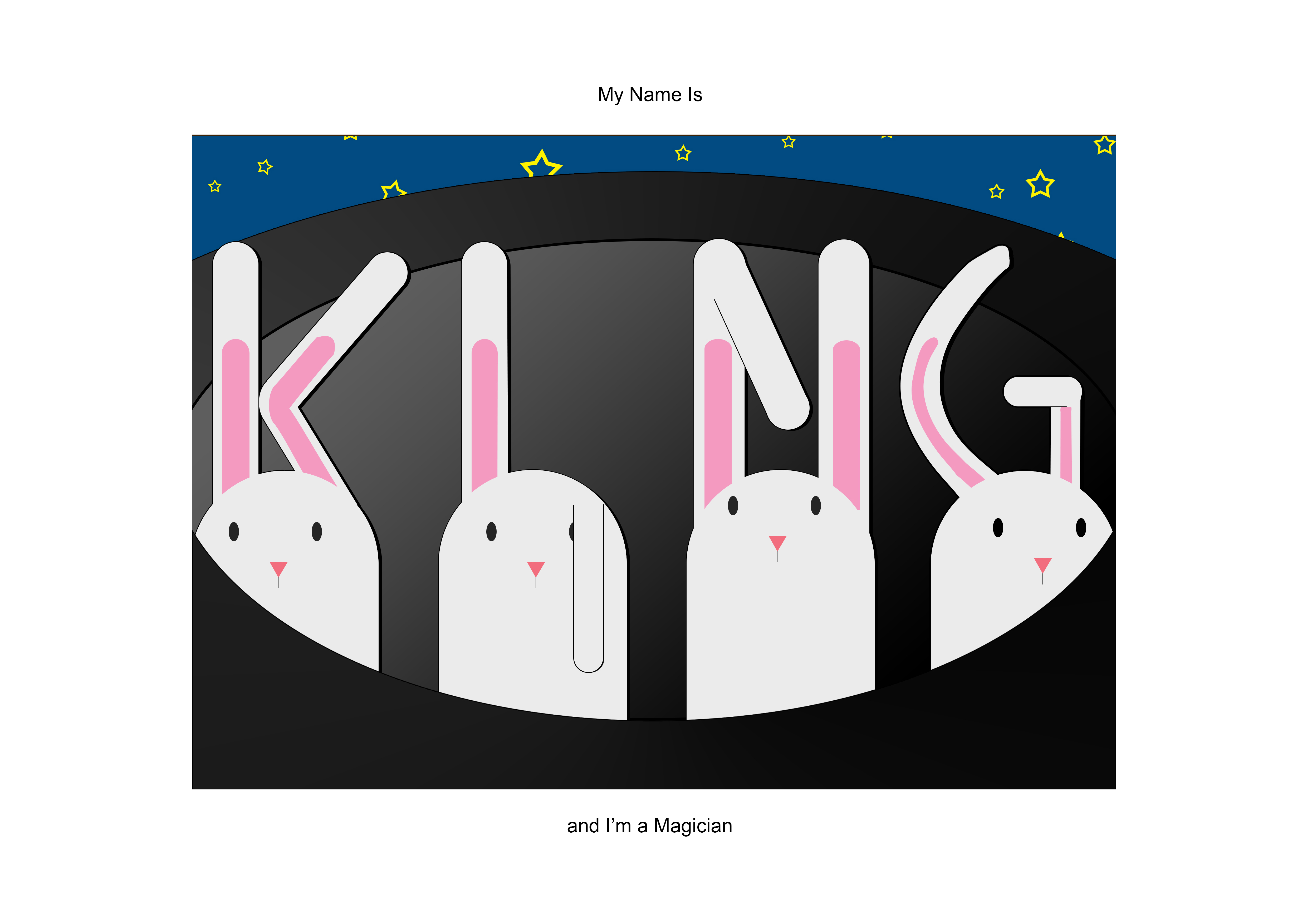
The 2nd row was being a Magician. The ideas were based around cards, rabbits and cloth. The rabbits were chosen in the end, I think because it was very cute.
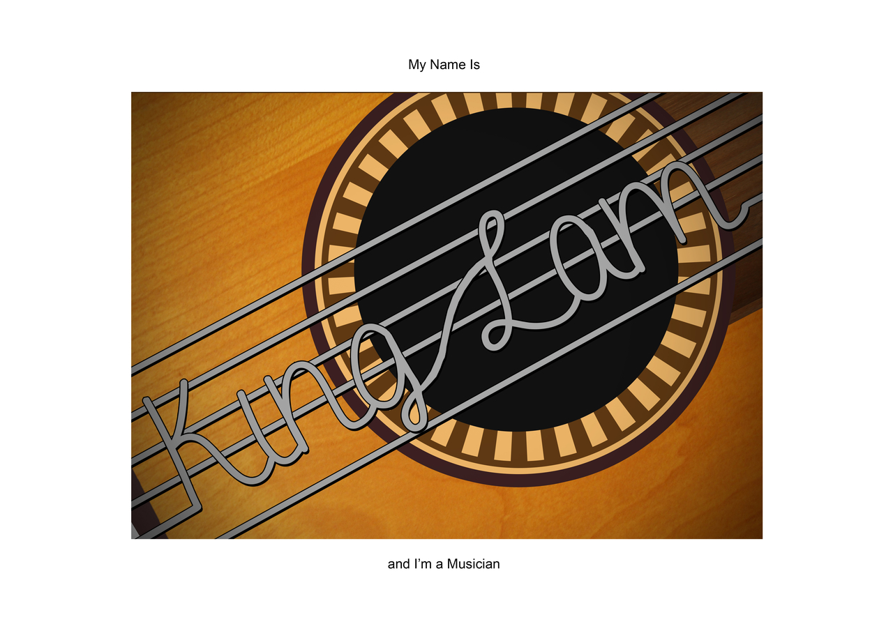
The 3rd row was for Musician. I focused the three ideas around guitars and guitar picks. The one based around the guitar strings curling into my name was chosen.
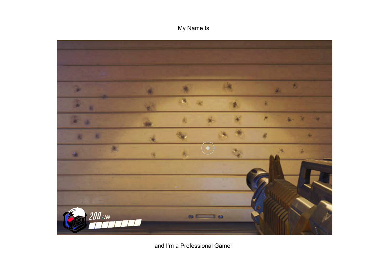
The last job was based around being a professional video gamer. I tried to use old and new games to make it more interesting, but I did not really base it off a game. In the end, it made the concept weak and it was easier to look to a certain game for inspiration.
AUTHOR
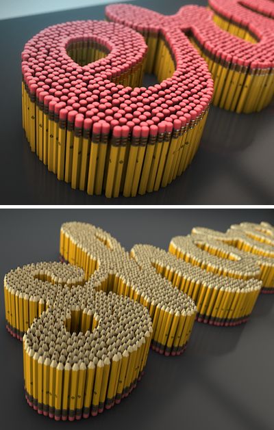

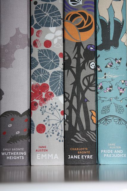
These were what I based my concepts on and as I looked more into the bookcase concept, I researched another images to base my design on.
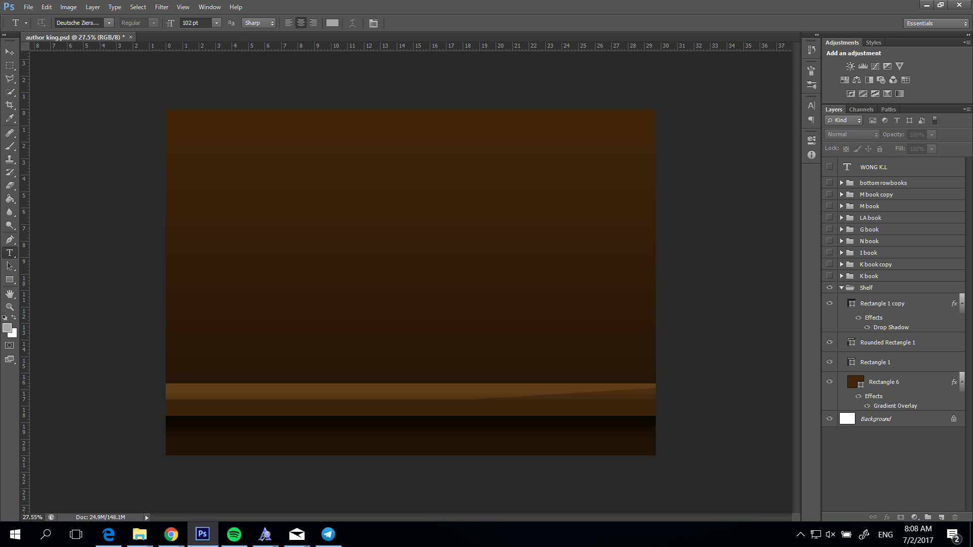
So first I created the shelf using shapes and a gradient overlay + drop shadow to give a sense of depth.
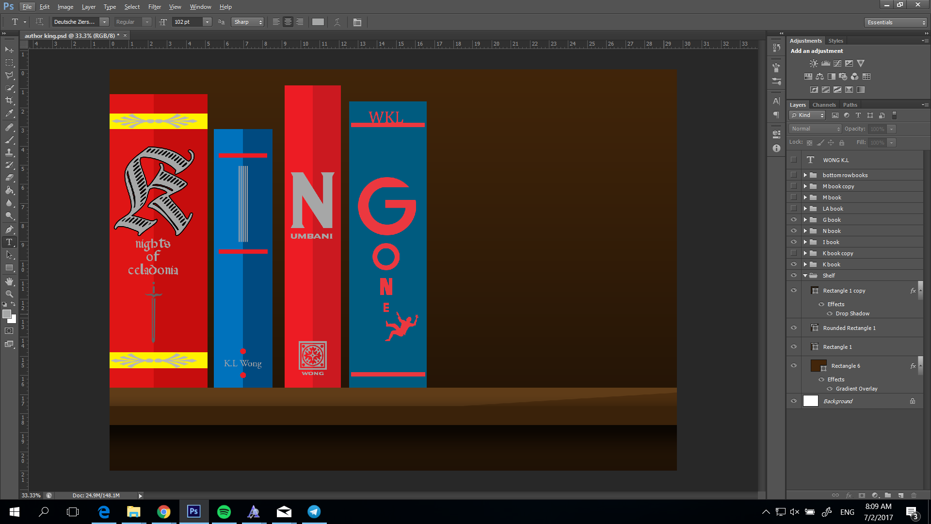
The first books added were based on simple minimalist designs and spelled out “King”. These were made with shapes, some custom stickers and a few free vector images lying around. I used colors to try and draw the eye towards the individual letters. The designs correspond with the types of books that I wanted to write. Like the “K” is a fantasy book, “I” was made with a barcode kind of design to be a sci-fi kind of book. “N” and “G” are of the thriller genre.

“LAM” were added and I based “LA” on a crime novel so I went with dark blue, a bright contrasting pink. The detective image was based on a vector. “M” was based a graphic novel sort of design, so I added the silhouette of characters, plus a more hand written font.

Lastly I just added some additional books at the bottom to fill out the space.
The difficulties I had for this were figuring out how to achieve the look using photoshop. I played around with the shapes and colors to give it a slightly 3D look. I also needed to base my designs around certain books because creating a new design while thinking how to incorporate one character of my name is a tall order. Good thing I knew what the spine of books looked like and I just followed that.
MAGICIAN
For this concept, I didn’t really look online to base it on a design. I just based it off the sketch I had, which the design was approved. I felt like I could challenge myself into creating something cute. The idea was based on the magician’s trick of pulling rabbits out his hat. 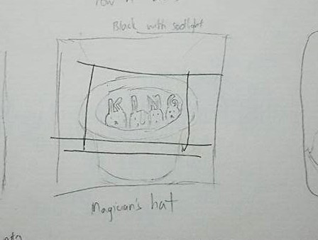 I only looked online for tips on how to create a proper top hat. (https://www.youtube.com/watch?v=mV1WlCWDSlo&t=875s)
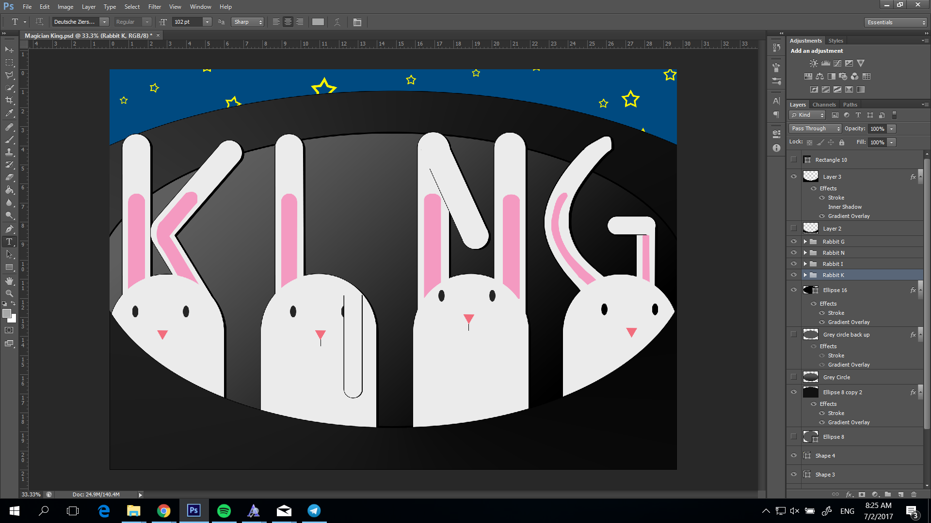
The rabbits were created from shapes and originally were quite big. But in order to draw attention to my name, I had to make their heads smaller and their ears bigger. Their ears were just shapes that I had warped or combined into new shapes, in order to create letter. I added a gradient overlay into the hat to give it a texture and some inside of the hat as well, to create depth. The rabbit eyes were going to be pink as some rabbits were, but they looked terrifying so I changed it into grey.
The difficulty here for me was getting the ears to look ok while expanding their size on the rabbit’s heads. The most difficult letter was G as I had to bend it around and often it would clash with N. I felt it worked out in the end.
PROFESSIONAL GAMER
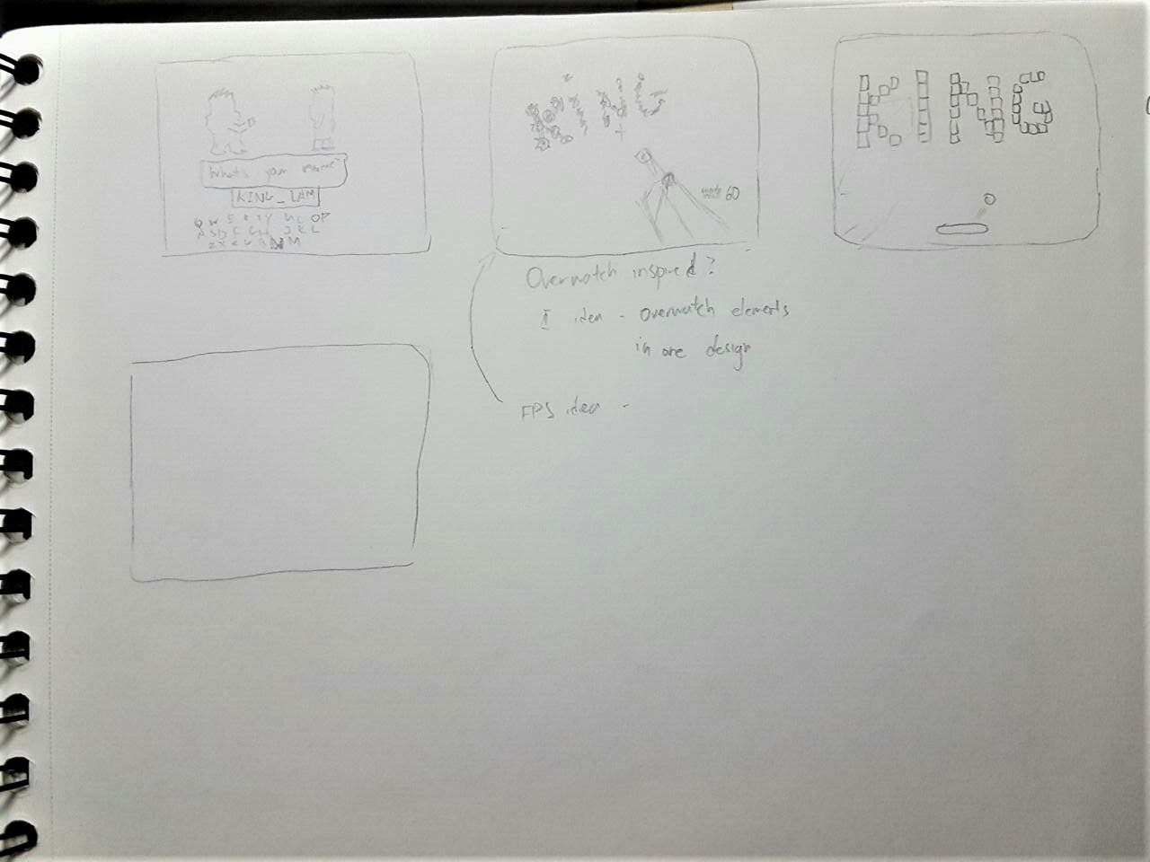
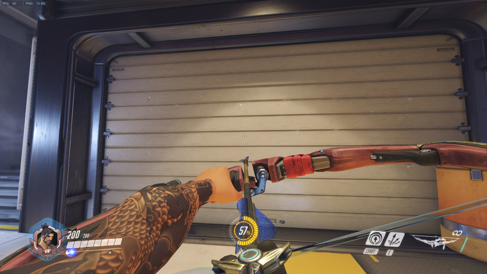
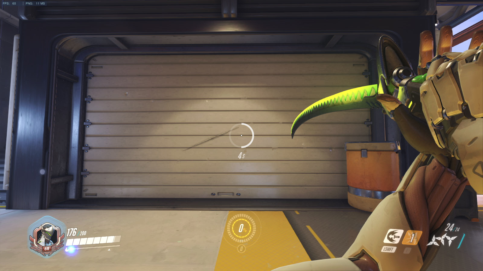
This concept started as me wanting to be a game designer, but it was difficult to visualize. So I switched to a professional gamer. In order to narrow down the scope of the designs, I chose the game “Overwatch”. Since I had the game, I played the game to try and find out what elements I could take. Below are some screenshots from the game.
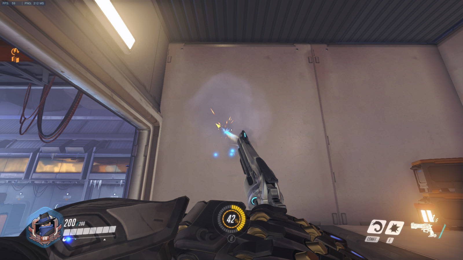
I wanted to make use of the various weapons to leave bullet holes on the environment. The game does not leave bullet damage on walls unfortunately, so I had to add the bullet holes in Photoshop. I used a character (Soldier 76) who carried a conventional assault rifle so that I could use larger bullet hole effects.
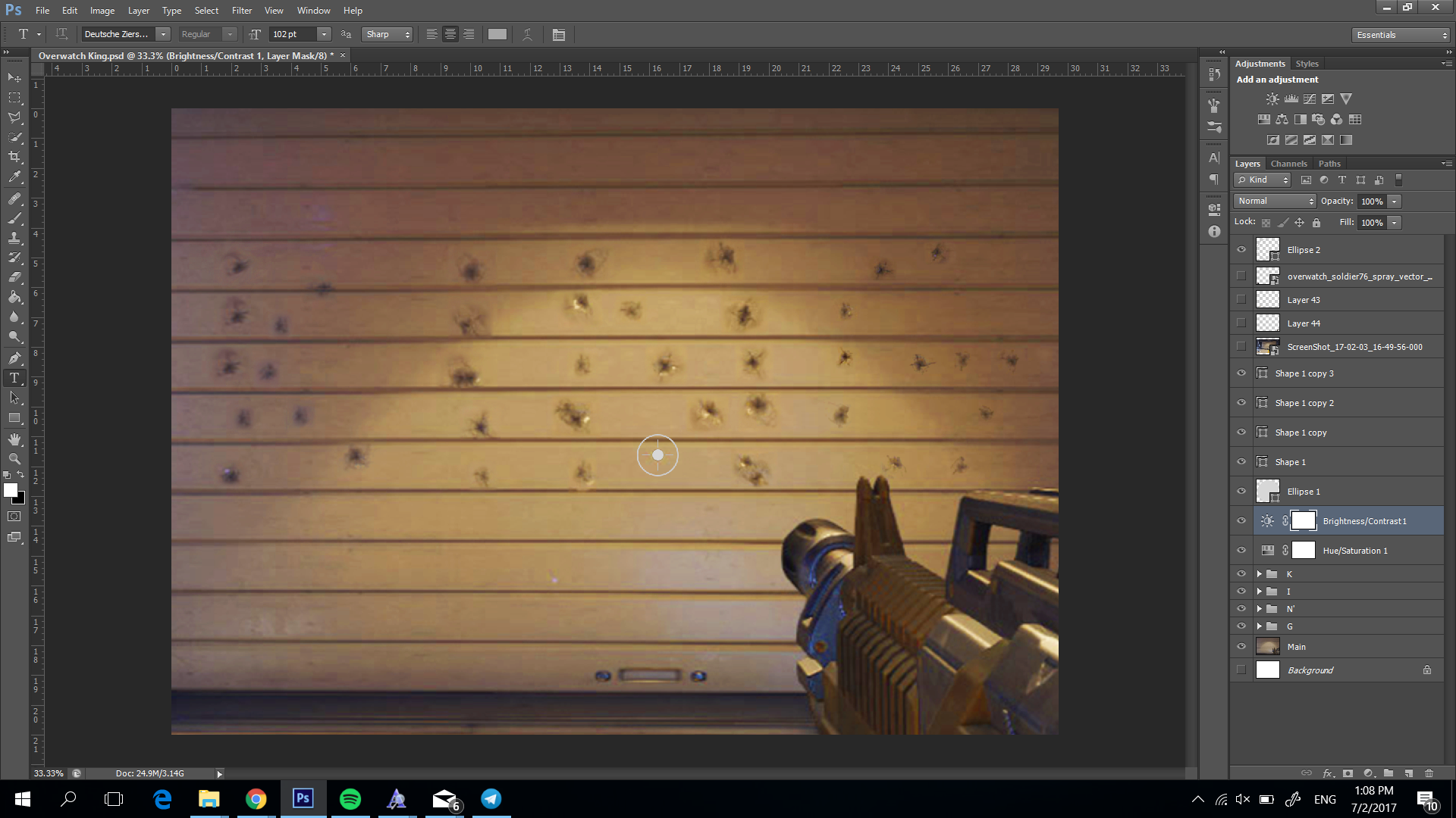
The bullet holes are arranged to spell out “King”. After that I needed to add some in-game elements, but I didn’t want it to overpower the text so I put a small simple one by the corner.
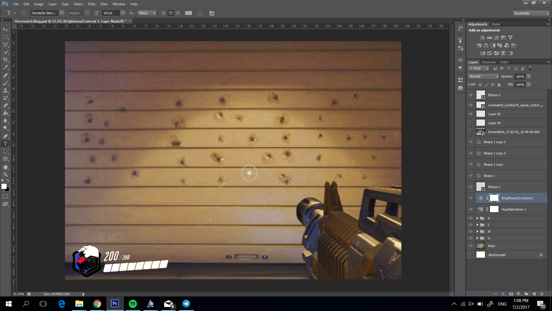
The difficulty of this design came with finding the proper bullet hole vectors that would fit on the texture of the wall. Also finding the right designs from “Overwatch”, was difficult because it is quite a new game.
MUSICIAN
For this one, I wanted to make the music a part of the design. But it was difficult to think of a way, so I reduced it to having the guitar spell out my name using its strings. I based the design on an actual guitar and made the strings as shapes. I tried to use the pen tool to curve the strings into my name, but it was difficult to do with my skill level. So I resorted to using a font and adjusting it as necessary with the puppet warp tool. 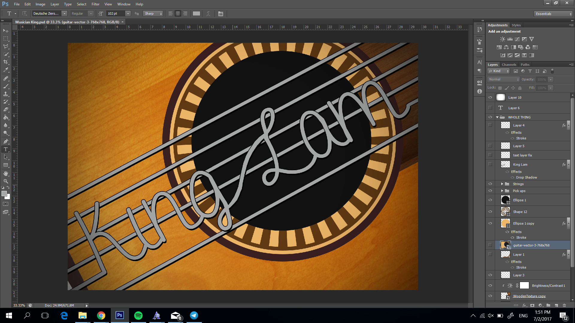
I added a vignette effect to bring out the contrast and added wood textures to add to the design of the guitar.
The difficulty of the design was to make it look realistic and bending the strings without the actual know how. I couldn’t learn the pen tool but managed to figure out the puppet warp tool.
WHAT I LEARNT
I learned a lot about aspects of design I was not very sure of as well as how to use specific tools. It was an enlightening experience. I also learnt I can’t trust myself to work after 4am, cause I just lie on my bed and sleep. I also learnt that some skills are just easier to understand when you have friends and I should ask my friends so that I don’t spend an entire afternoon trying to do one small part of a design.
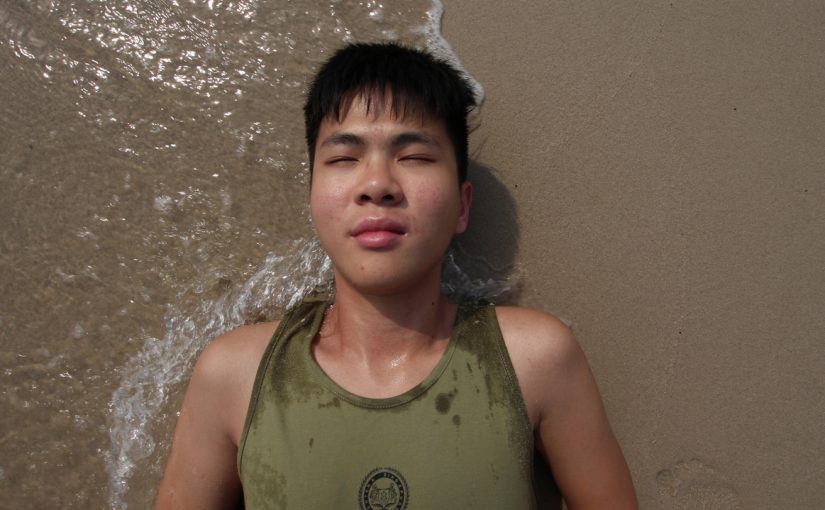
My film was about me going through my dreams. It begins with me falling asleep and appearing on a beach, as though I was washed onto shore. Exploring the dream world brings me to different places
My inspirations was mainly from Foo Fighter’s Everlong. I got the idea of changing the location with my position in the frame not changing from the previous scene.


I struggled quite a bit with the start because I didn’t really have a clear concept in mind. I researched a few artists but I wasn’t confident in replicating their style, so after a while I just forged ahead and tried to make something nice.

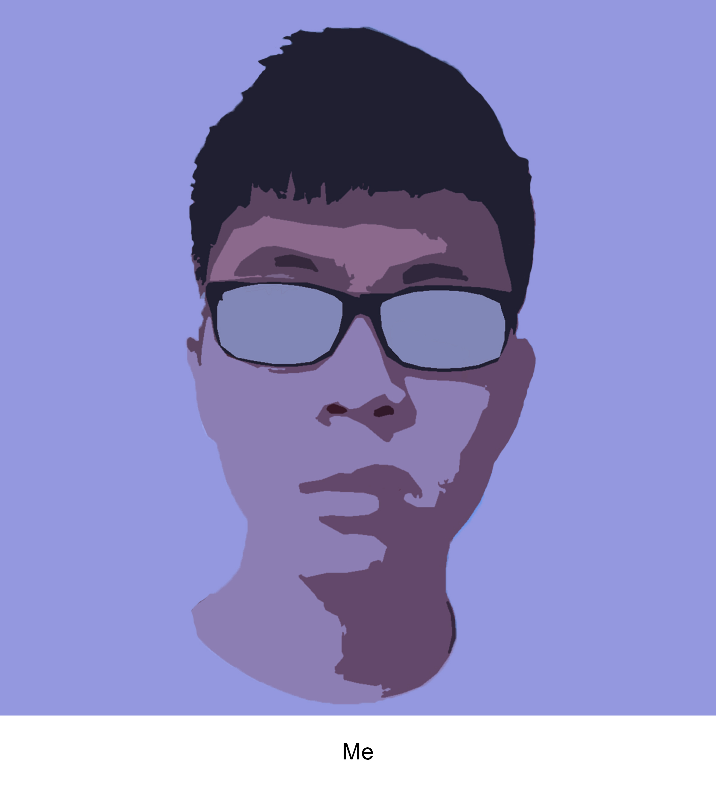
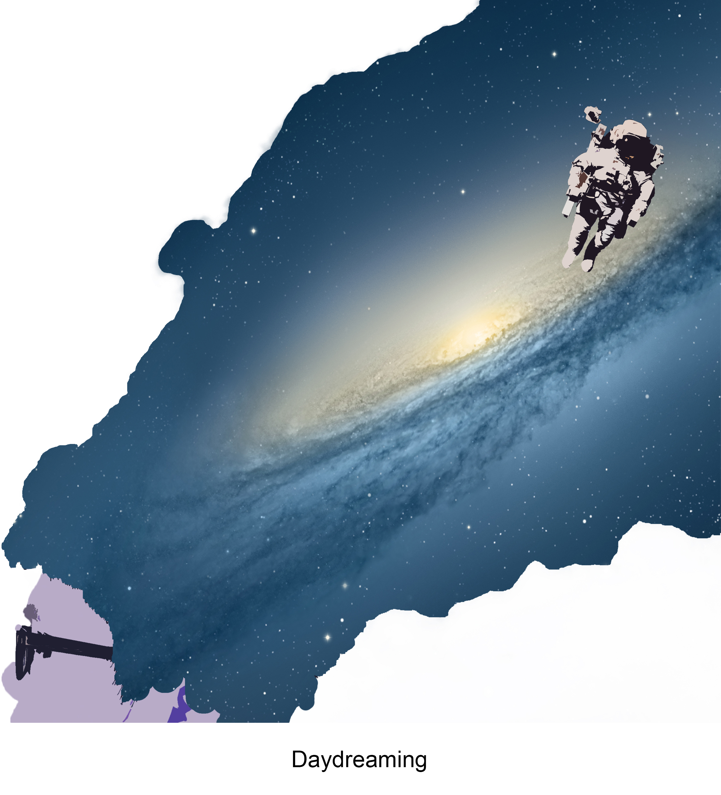
I experimented with Photoshop filters until I found a look that I liked, using the cutout filter. I worked with a spaceman because it was one of the few concepts that I had.

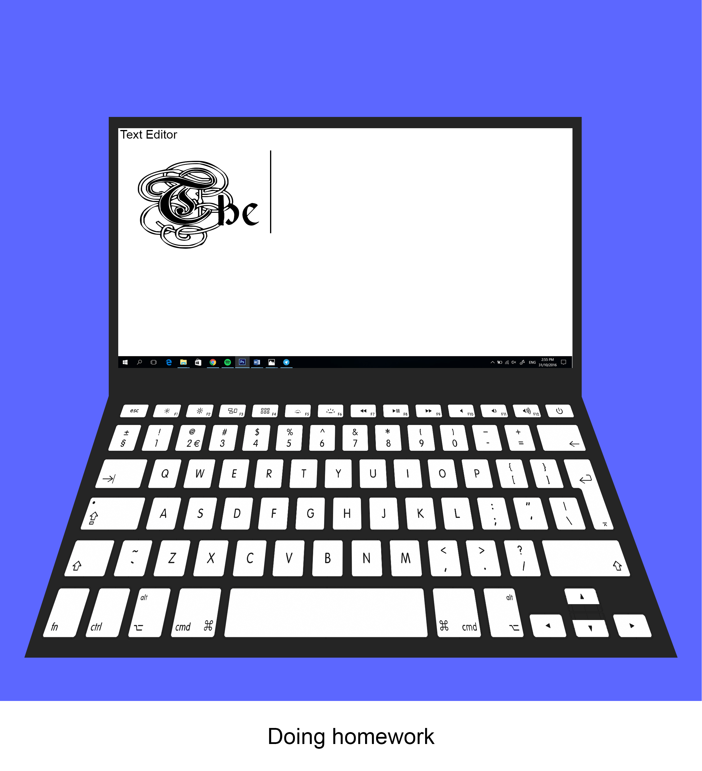
After that, I focused on sketching out some concepts to work on. Each equation was based on a certain emotion as that made it easier for me to work on them.
So starting with the daydream equation, I took a photo of me and applied the Photoshop filter while editing the color to make it blue. Made the laptop with shapes and images. The cloud like galaxy that indicates I’m floating around in my mind was made by masking the galaxy image and tracing a image of a cloud so that the galaxy image would take the same shape as the cloud.

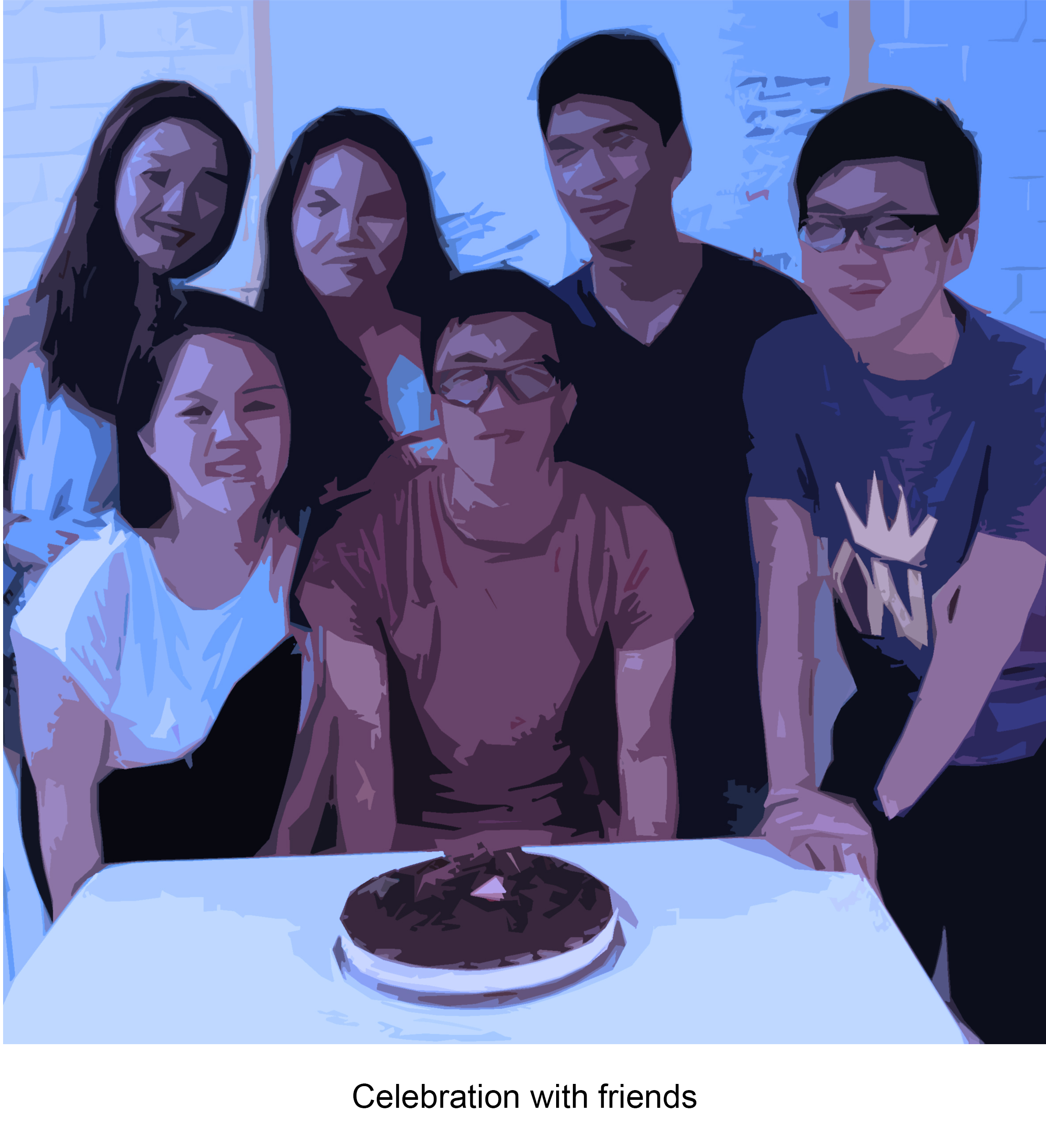
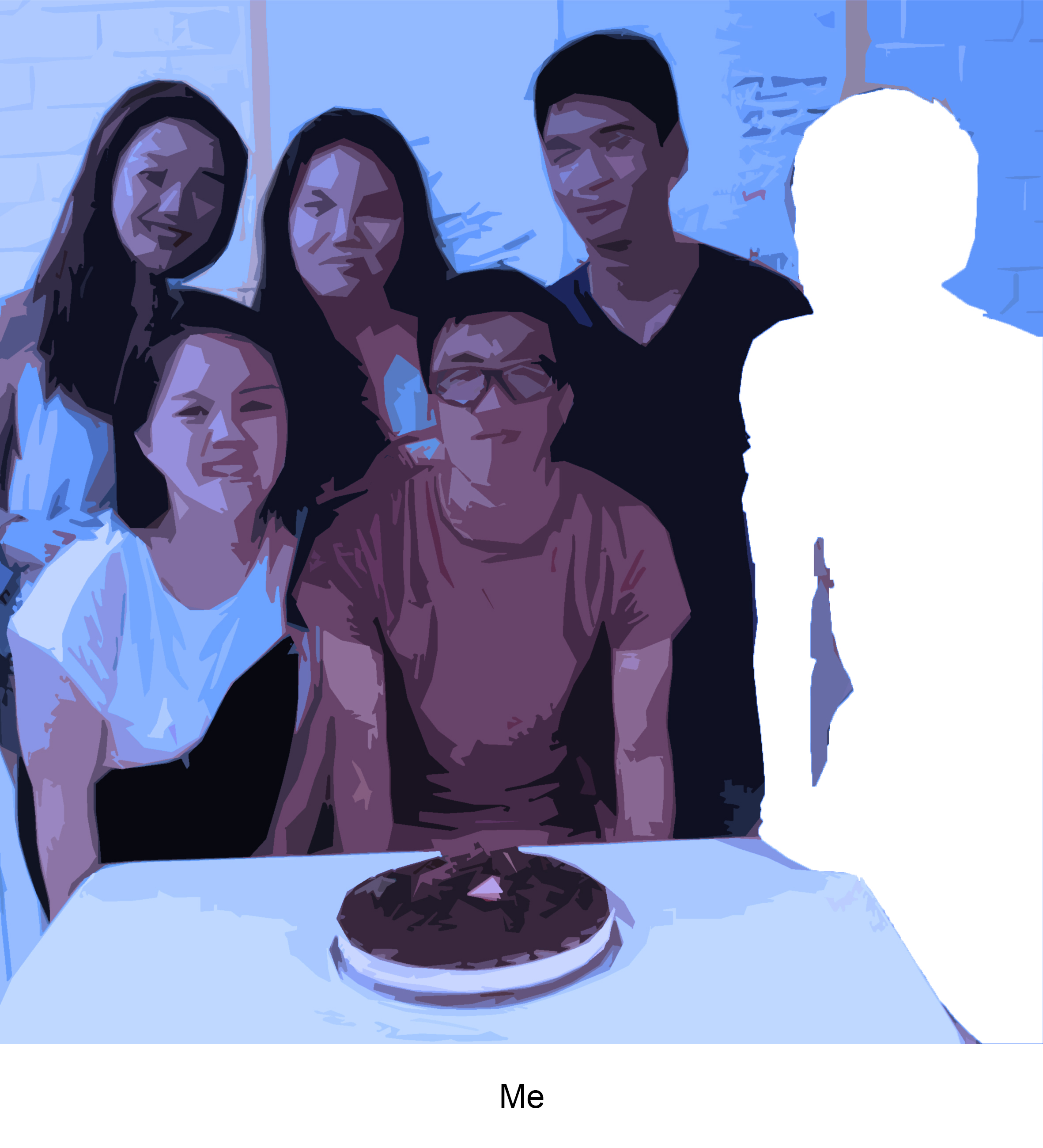
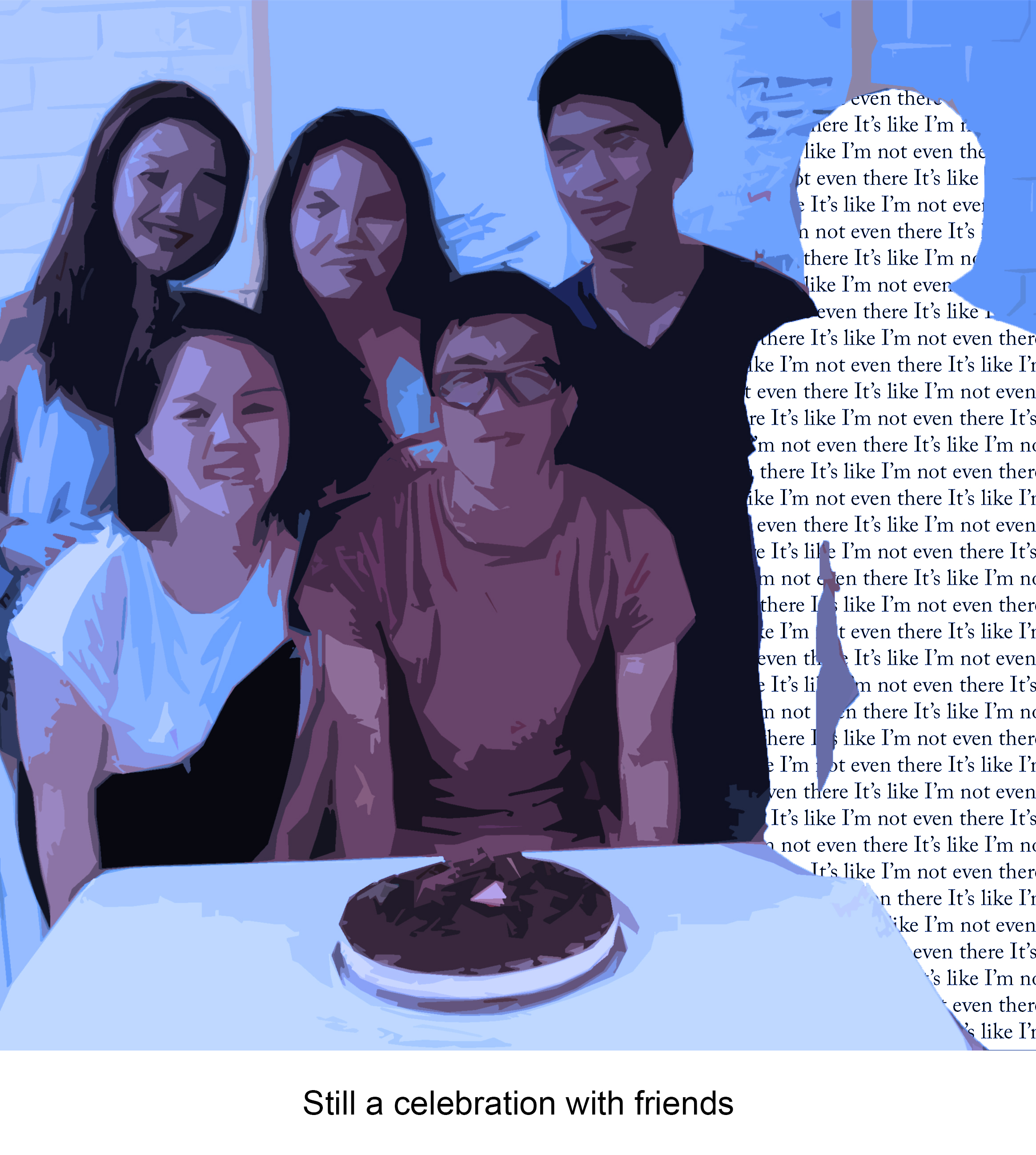
The next equation was based on presence and the emotion was more sad. Relatively simple to make. I found a image of me with my friends and added the filter to replicate the effect from the 1st equation. Then I lasso-ed myself out and added a textbox behind the image. 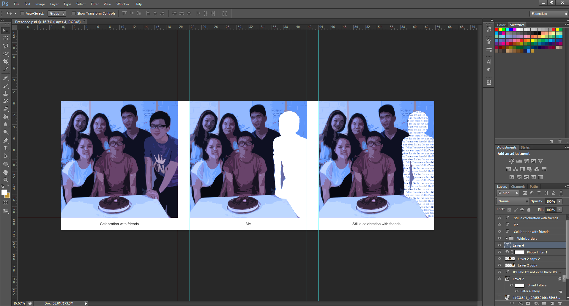
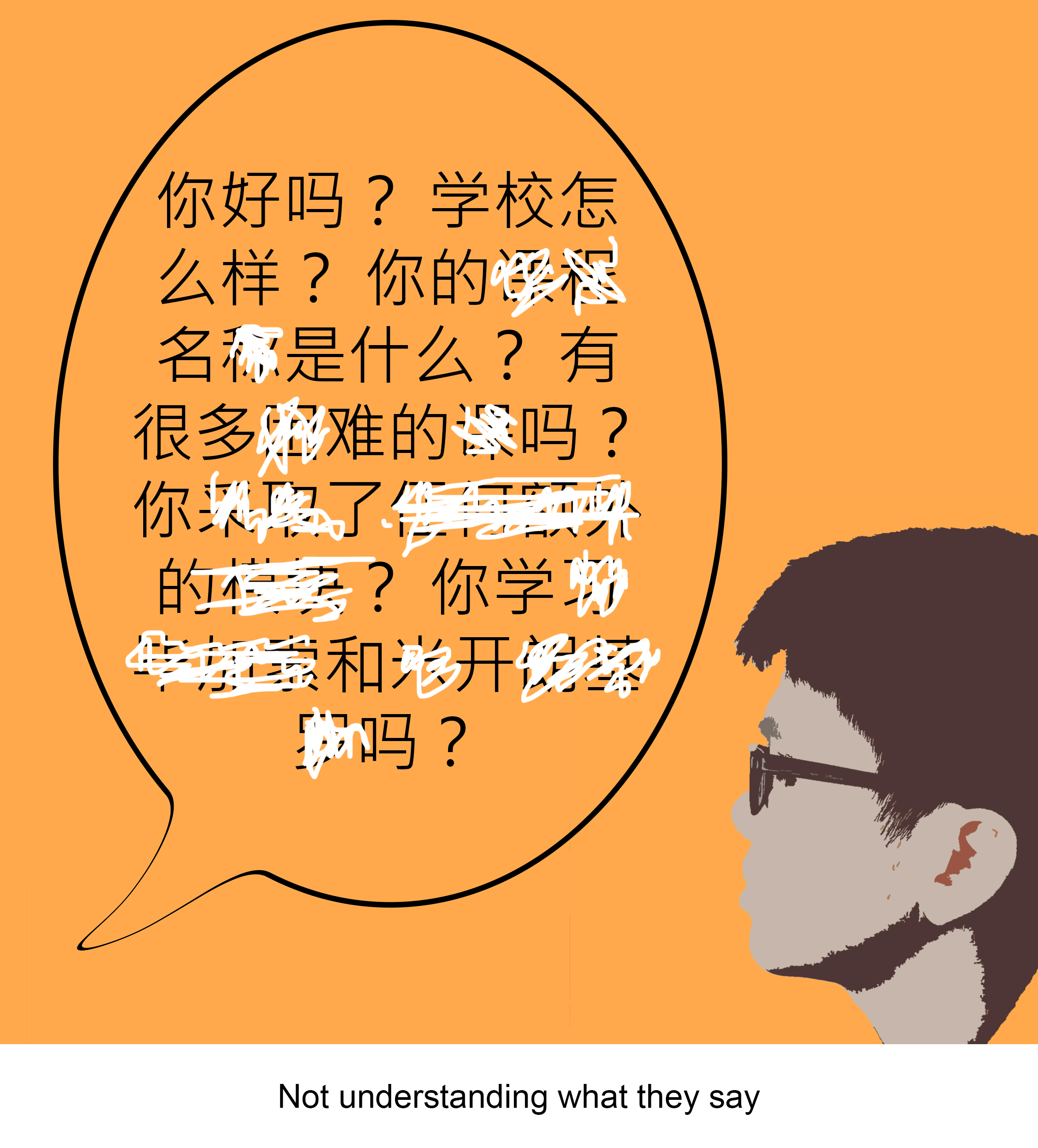
This equation was based on the feeling on annoyance. I applied the same filter on the image of my head but adjusted it to be orange. I wanted my relatives to look different from the filter so I threshold-ed the images instead for a stark black and white contrast. The Chinese characters were crossed out by a white brush to illustrate me not understanding them.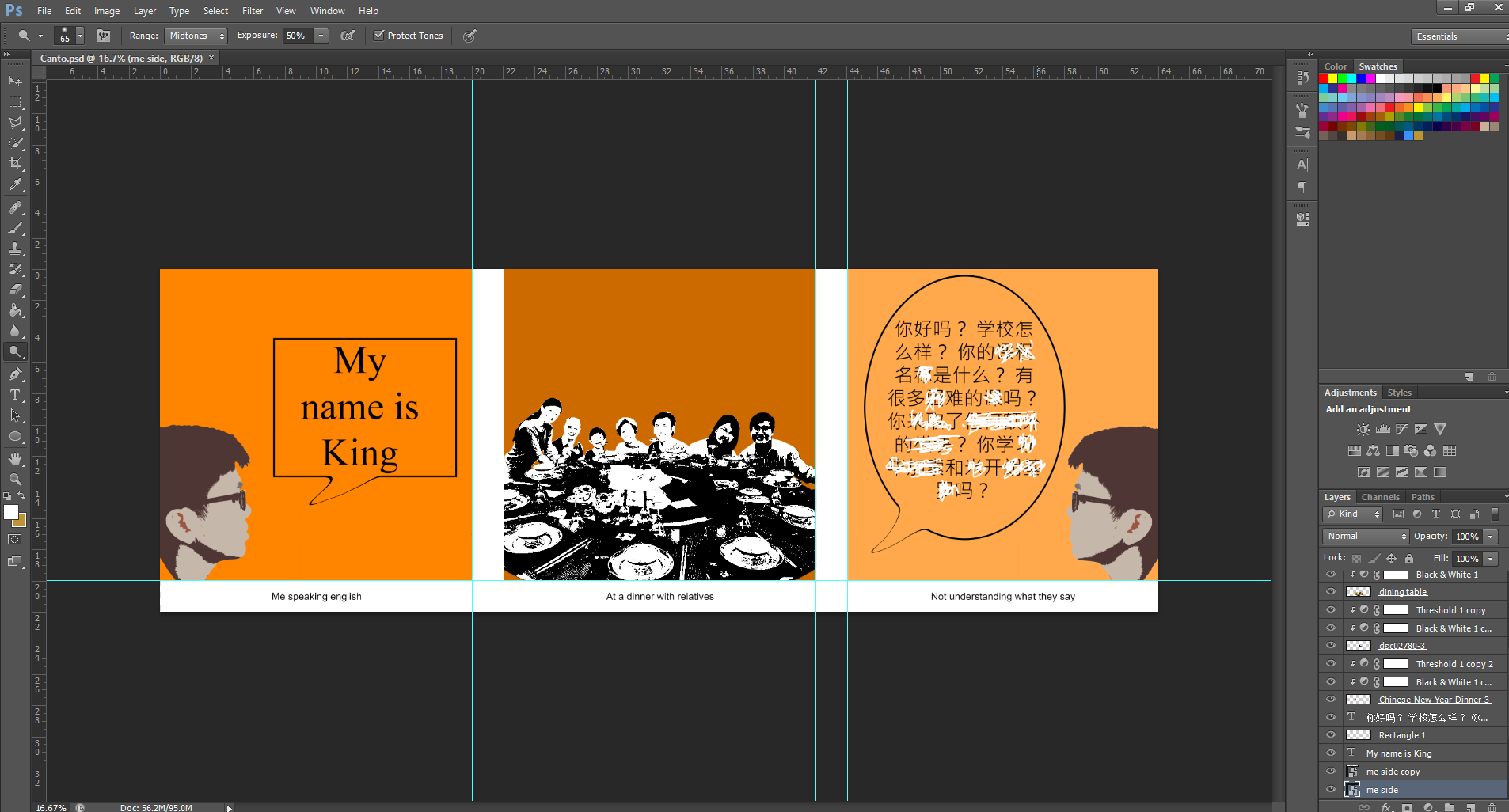
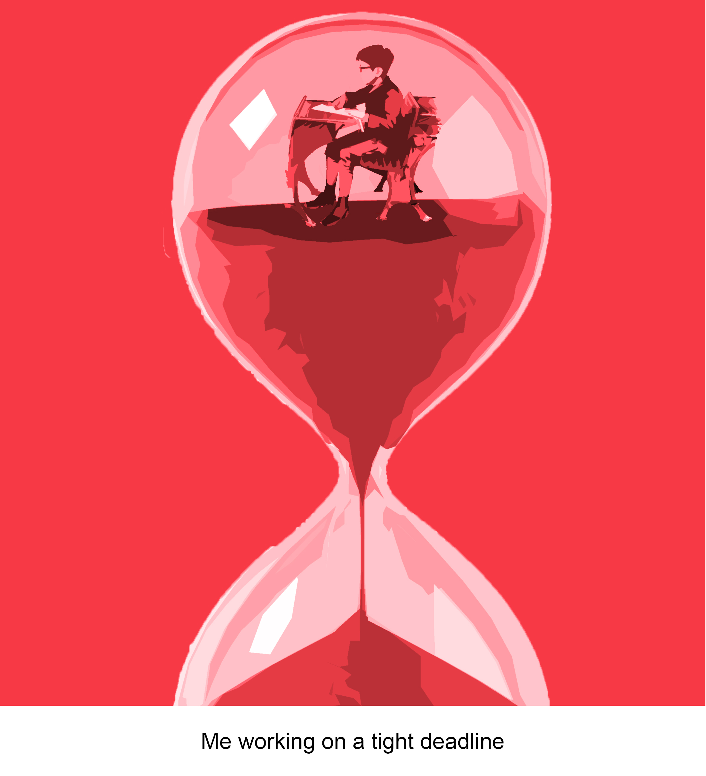
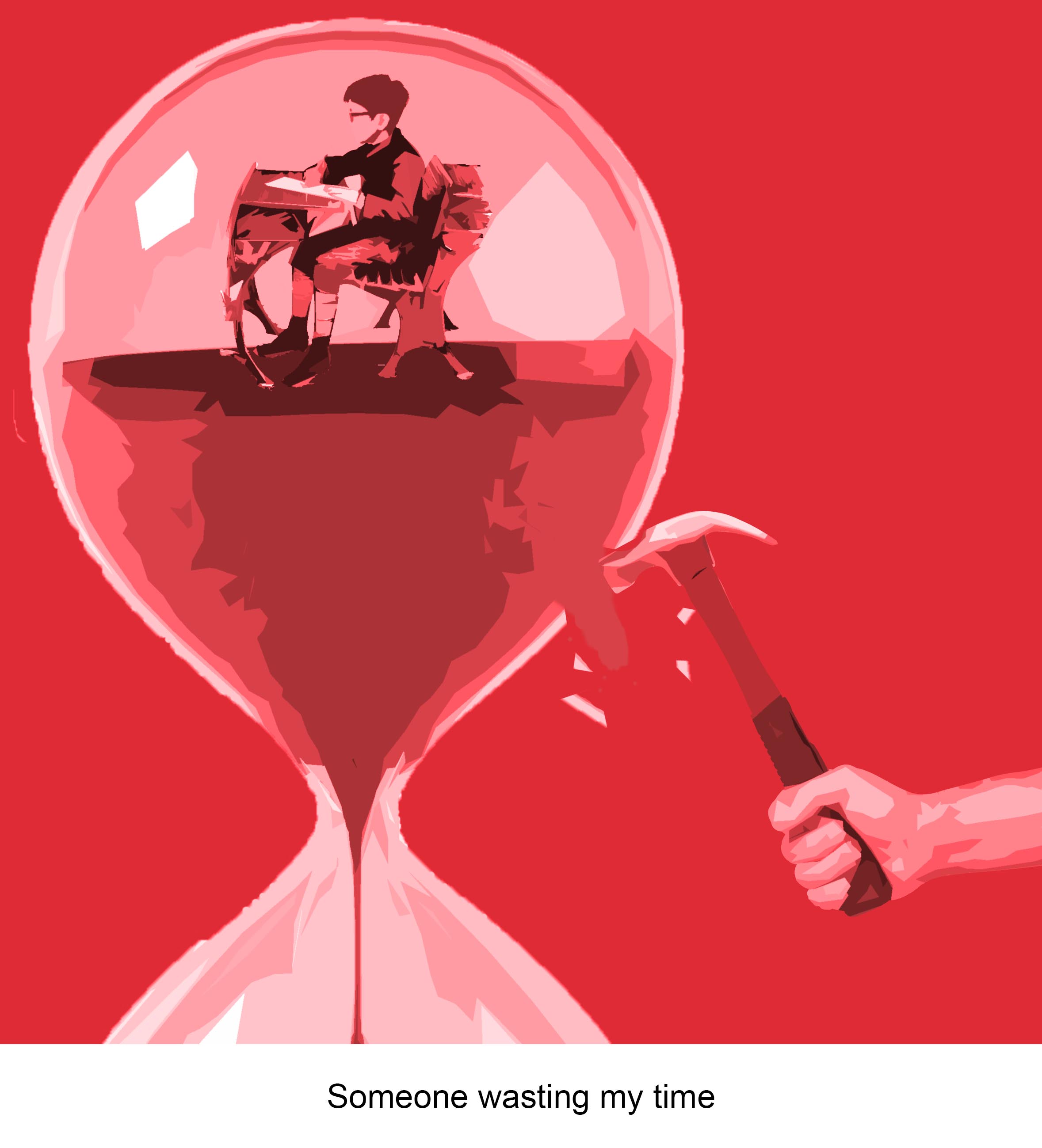
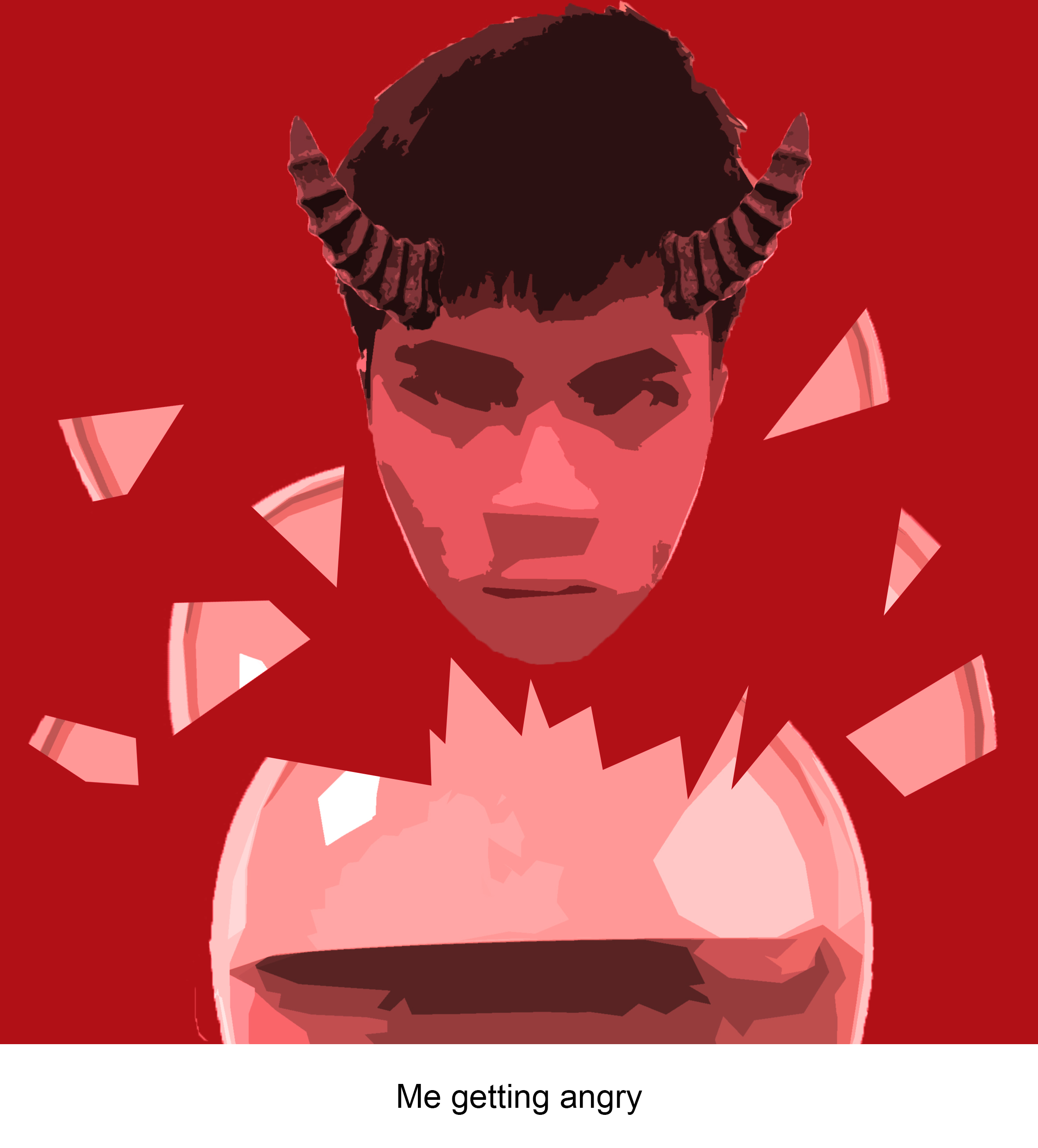
The last equation is based on anger and since it involves the wasting of time, I used an hourglass to signify time. I made the boy inside the hourglass from images I gathered during project 2. The broken glass was done by just rasterising the hourglass and lasso-ing parts of it out. I took an photo of my own face and applied the smart filter while also adding horns that were lasso-ed out from a statue. A red filter was added to enhance the emotion.
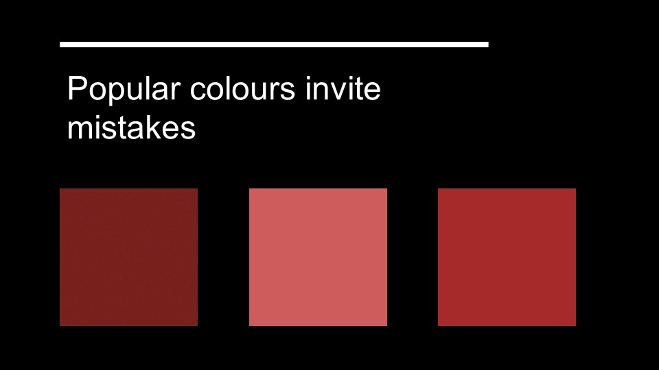
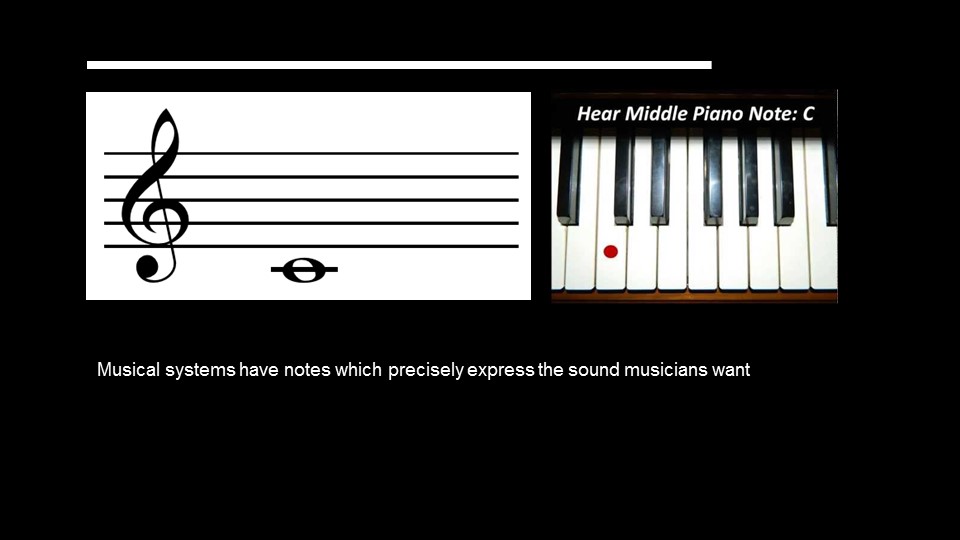
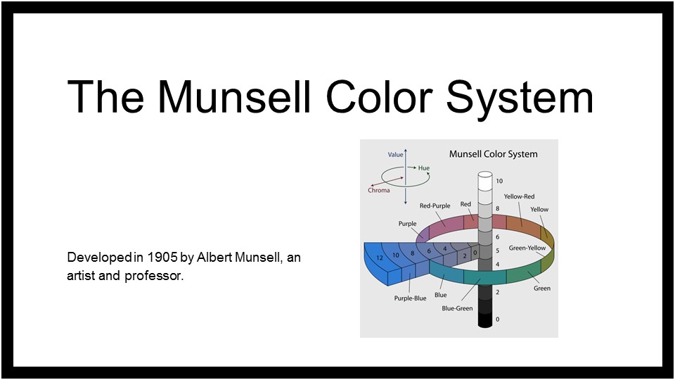
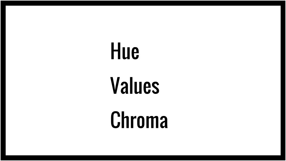
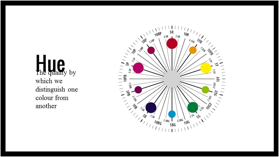
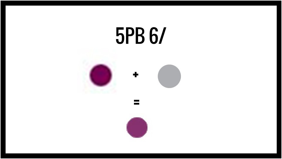
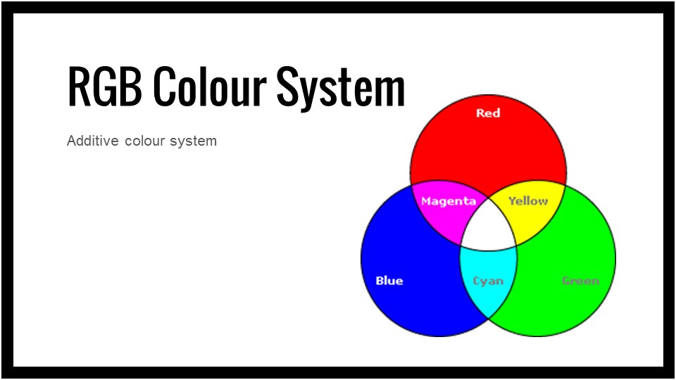
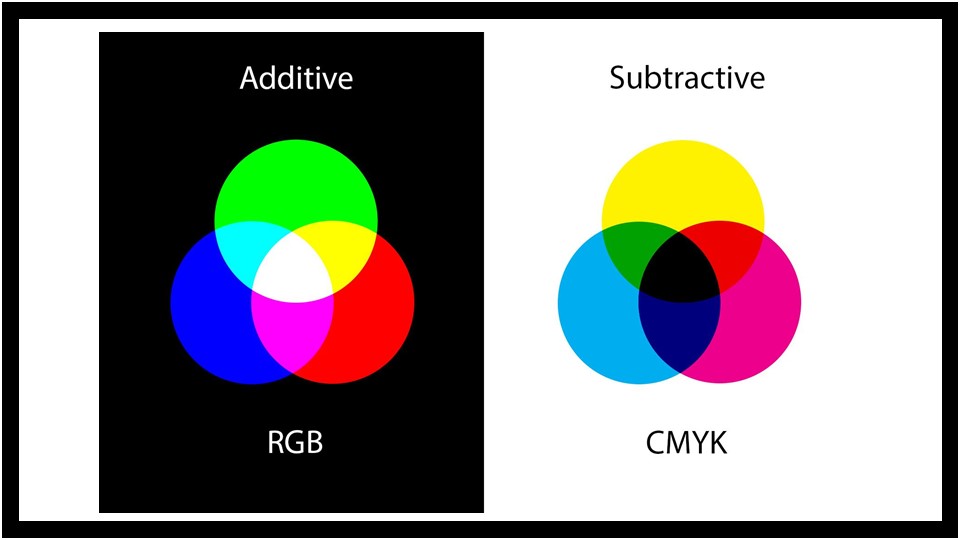
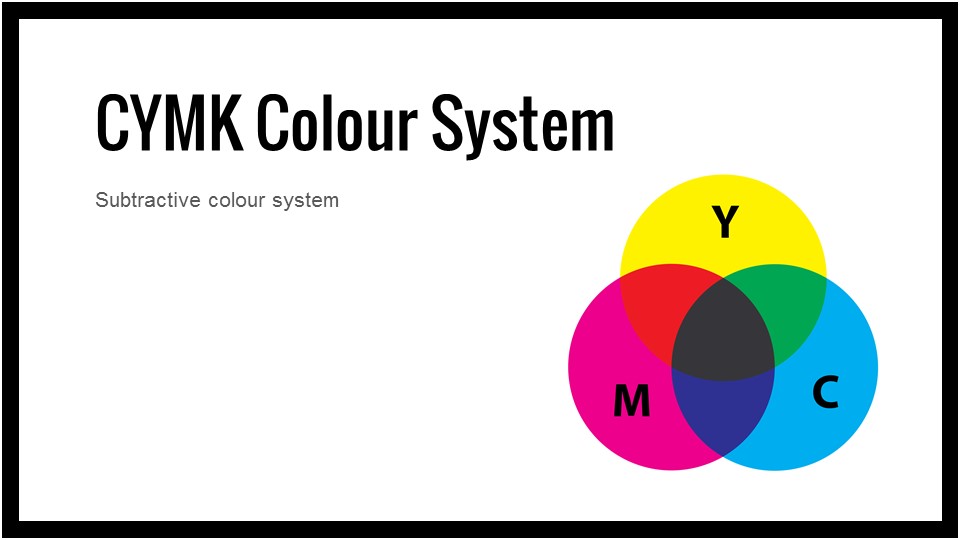
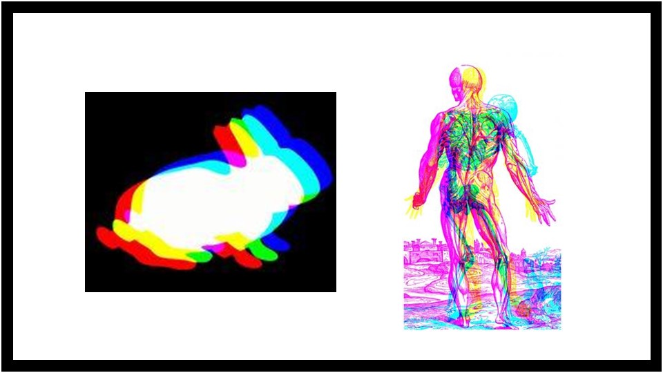
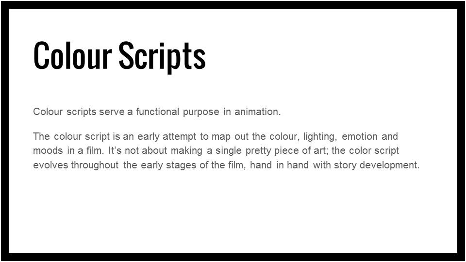
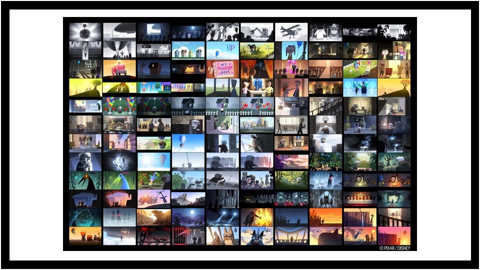
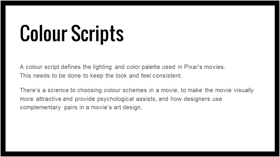
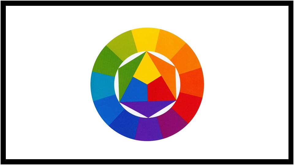
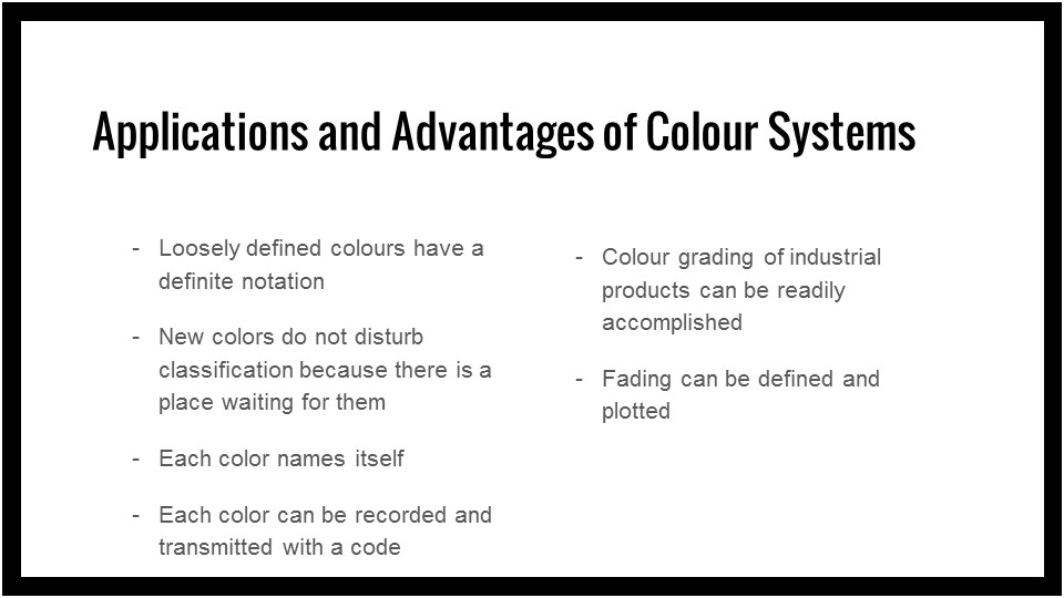
Here are the presentation slides on colour! Alternatively you can click on this link to download the powerpoint slide


Hey guys!
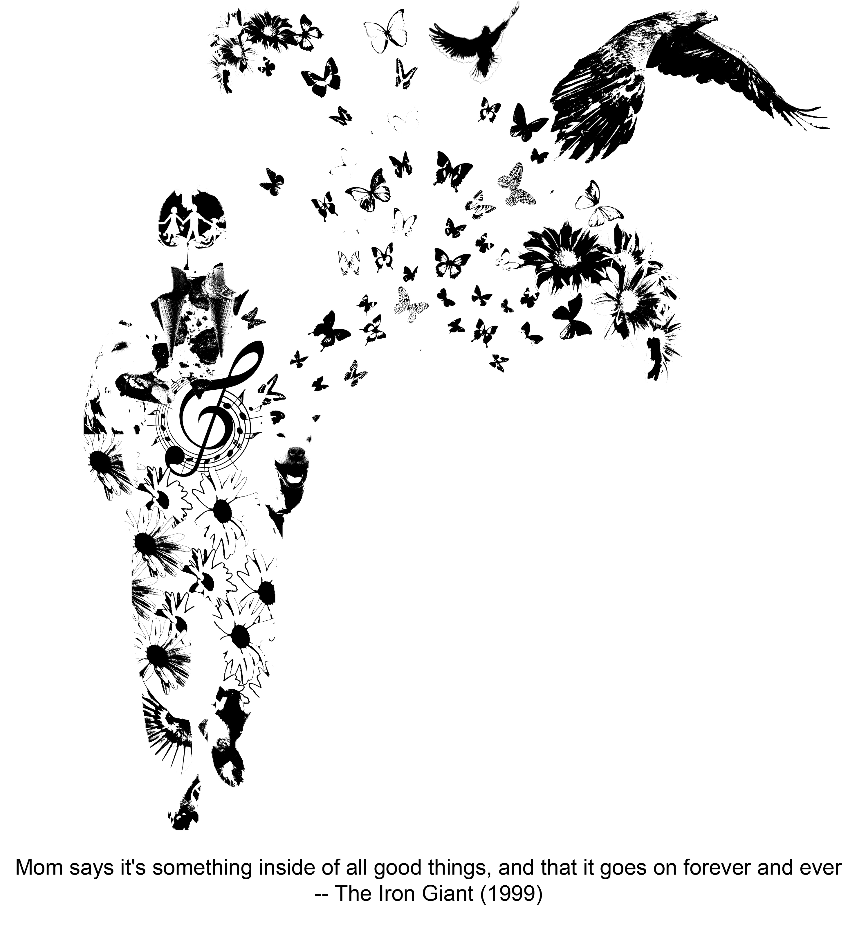
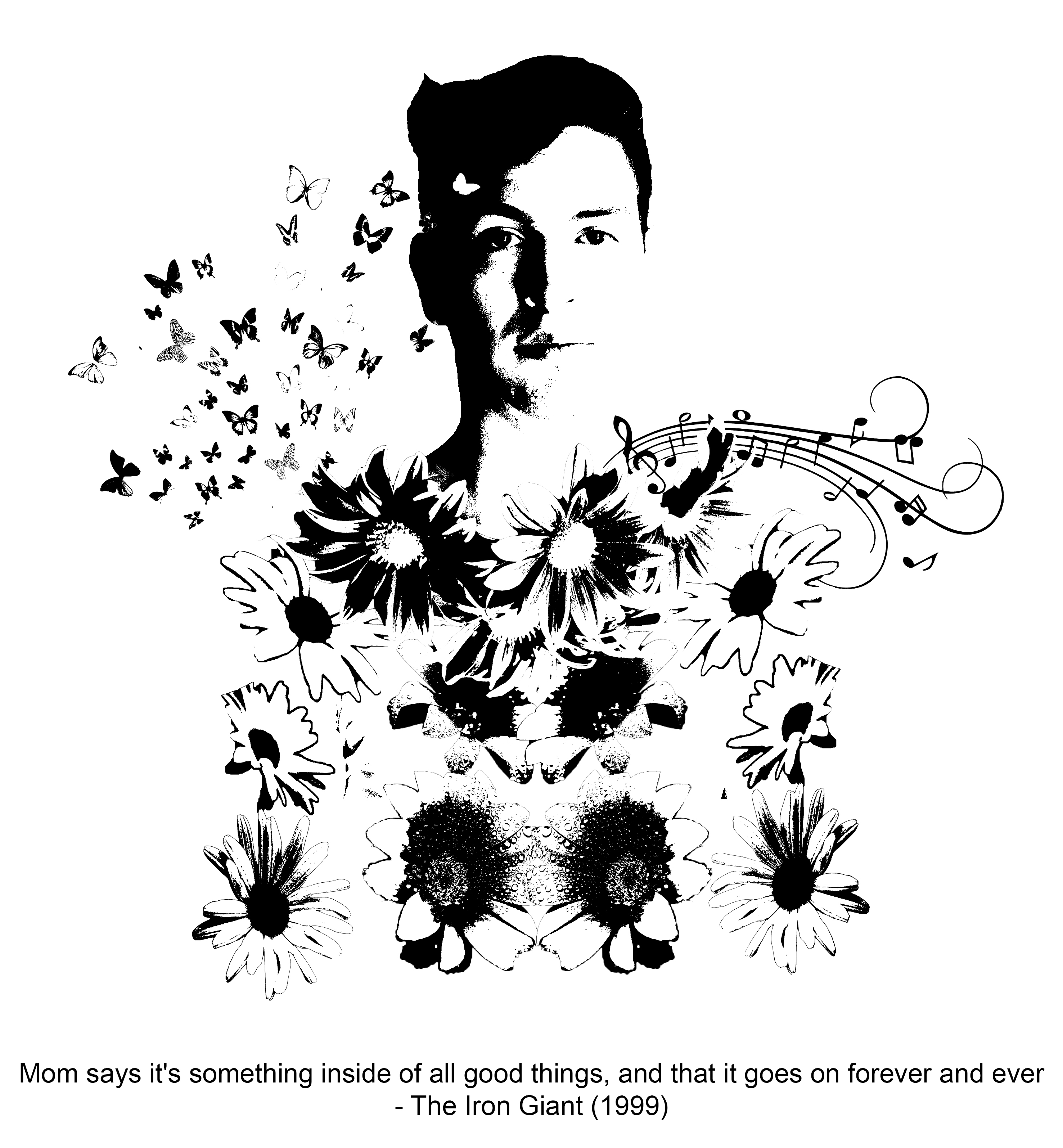
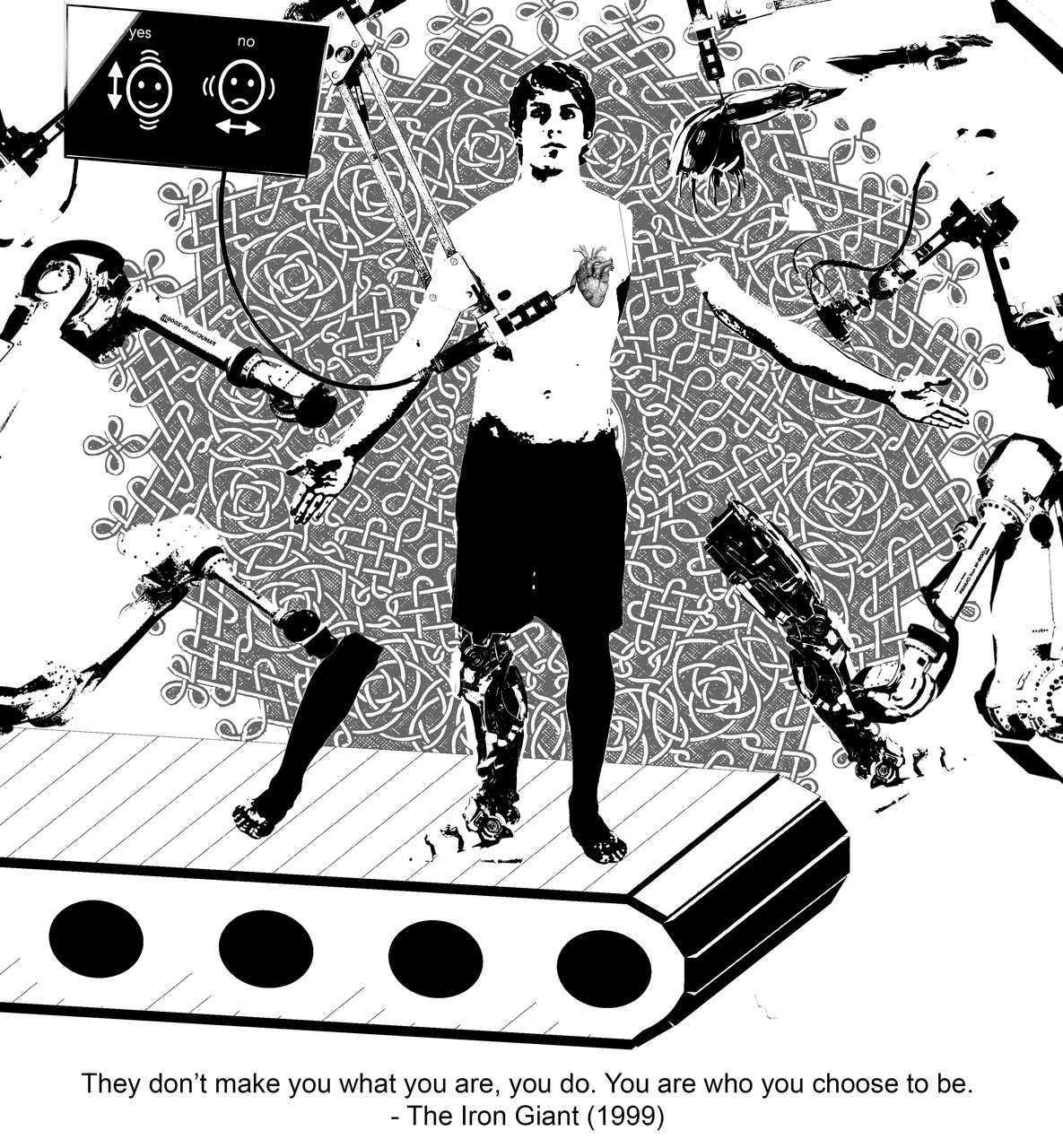
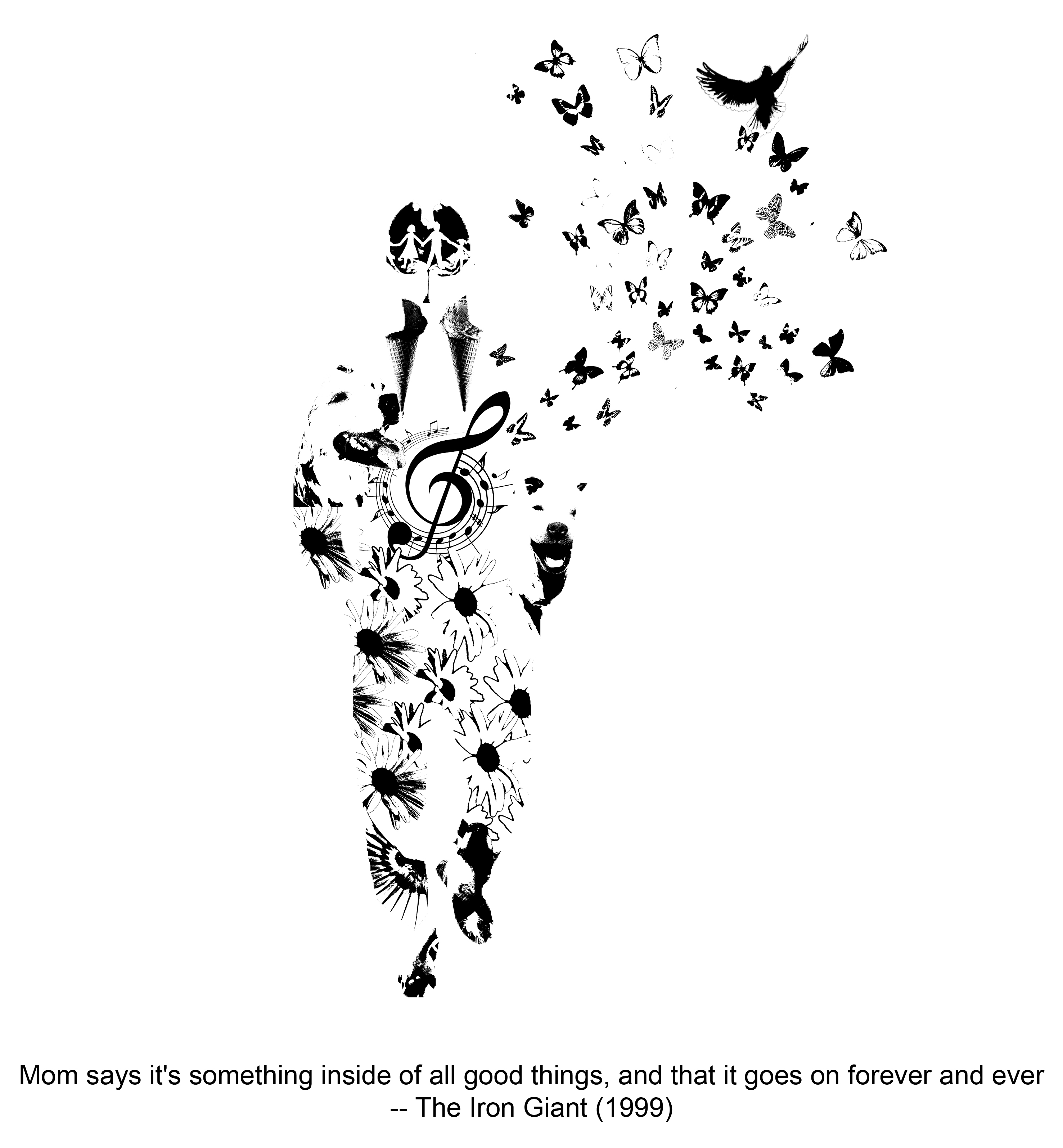
So my film is The Iron Giant. It’s an animated feature film by Warner Brothers and it came out in 1999. I don’t remember where I first saw it and how many times I saw it (a lot) but I remember crying the first time I saw it (before I became the monotone emotionless person you see today). I liked it at first because it’s about a giant robot. But the more I saw it, the more the message in the film spoke to me. ANYWAY, here’s the designs I thought of so far.
So this one was based off a quote by one of the main characters. He’s talking about a soul and the way he described it made it seem very light and ephemeral which is something I tried to capture.
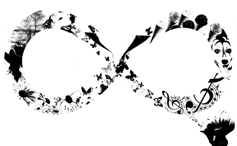
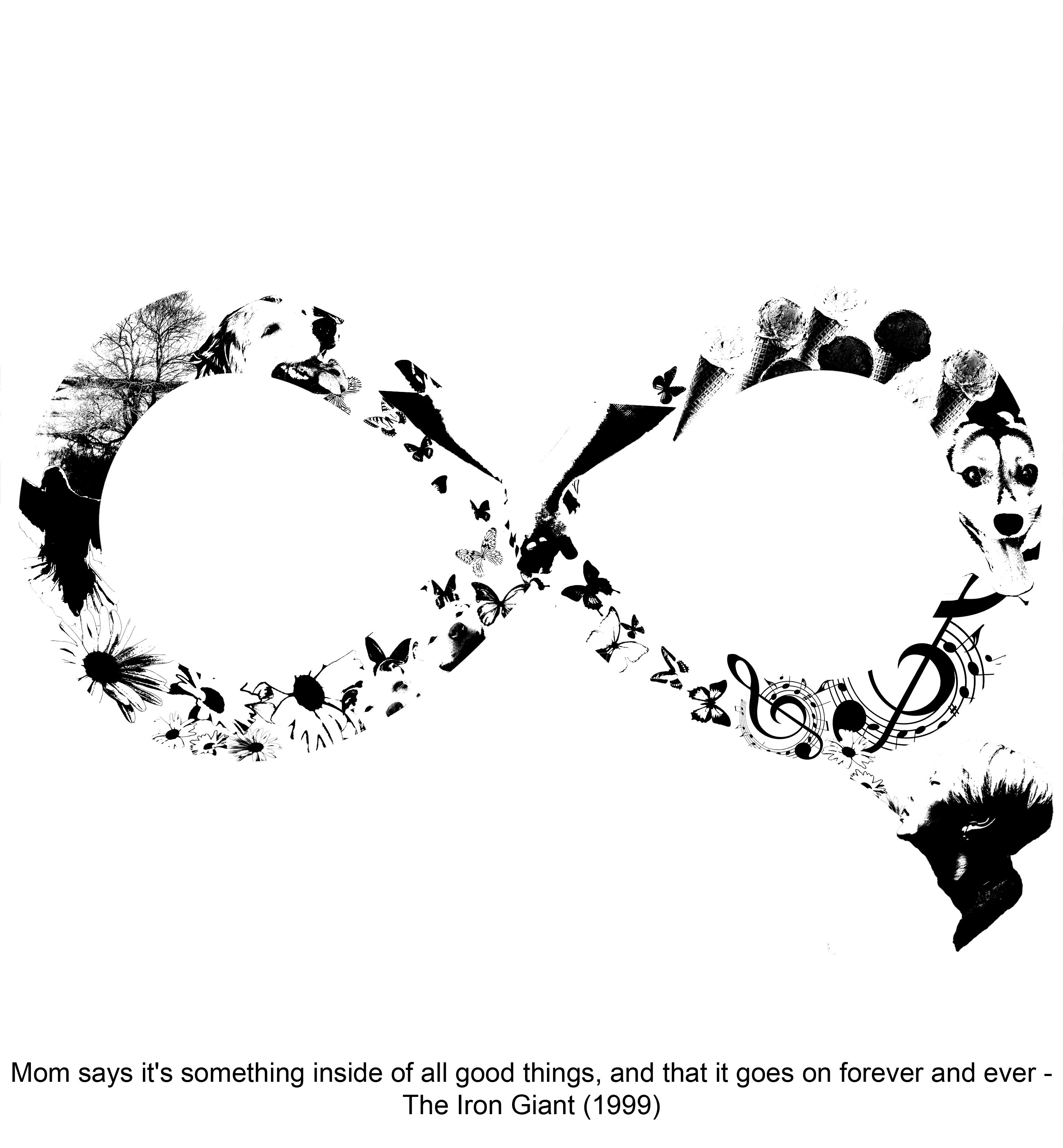
I tried to expand on the idea of “forever and ever” for the below piece. So now there’s an infinity symbol.
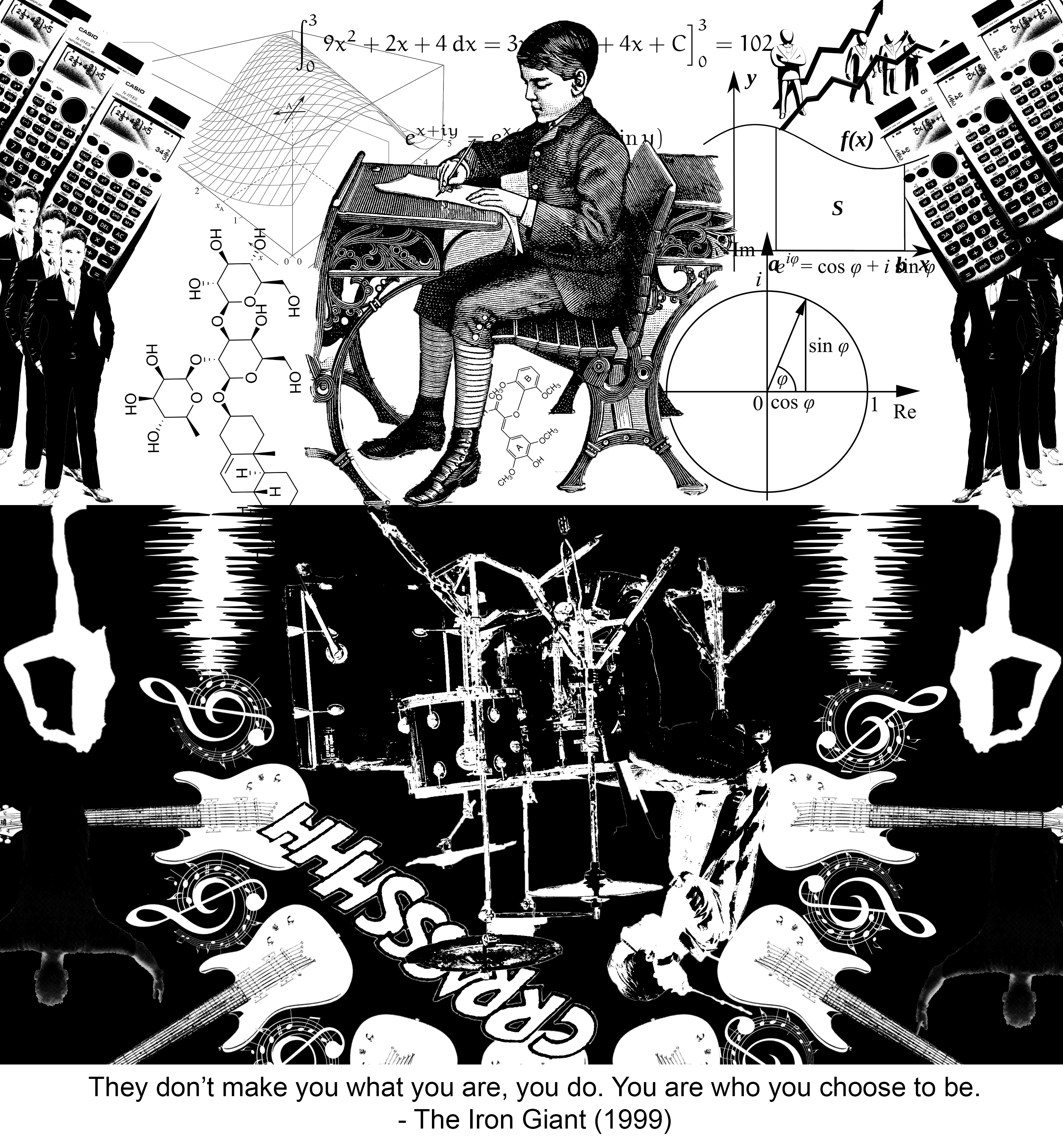
I wanted to do something more close up and I came up with this version of the quote.
This was my totebag design. I felt like the “US” in the quote was really the big important part of it, so I wanted that to be the focus. All the other things inside were meant to illustrate the feeling of being cool.
So after the consultation and seeing everyone’s work here and there, I realised I don’t fully utilise the space of the frame. I leave a lot of white space. So I’m gonna make it black space and hope it works out.
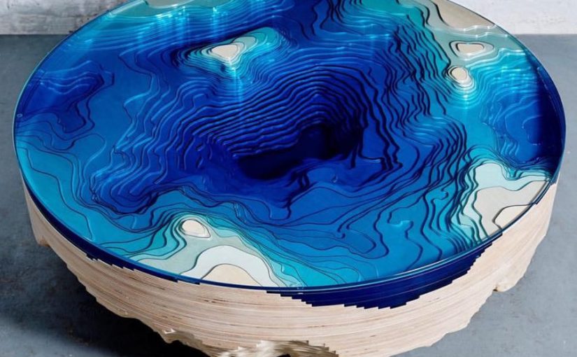
Now that’s interesting and beautiful furniture. I think it’s a table and the white is probably the Dominant while the blue glass is the SD. SO might be the white parts that stick out?

Here’s the sketch analysis for curvilinear sketch models!