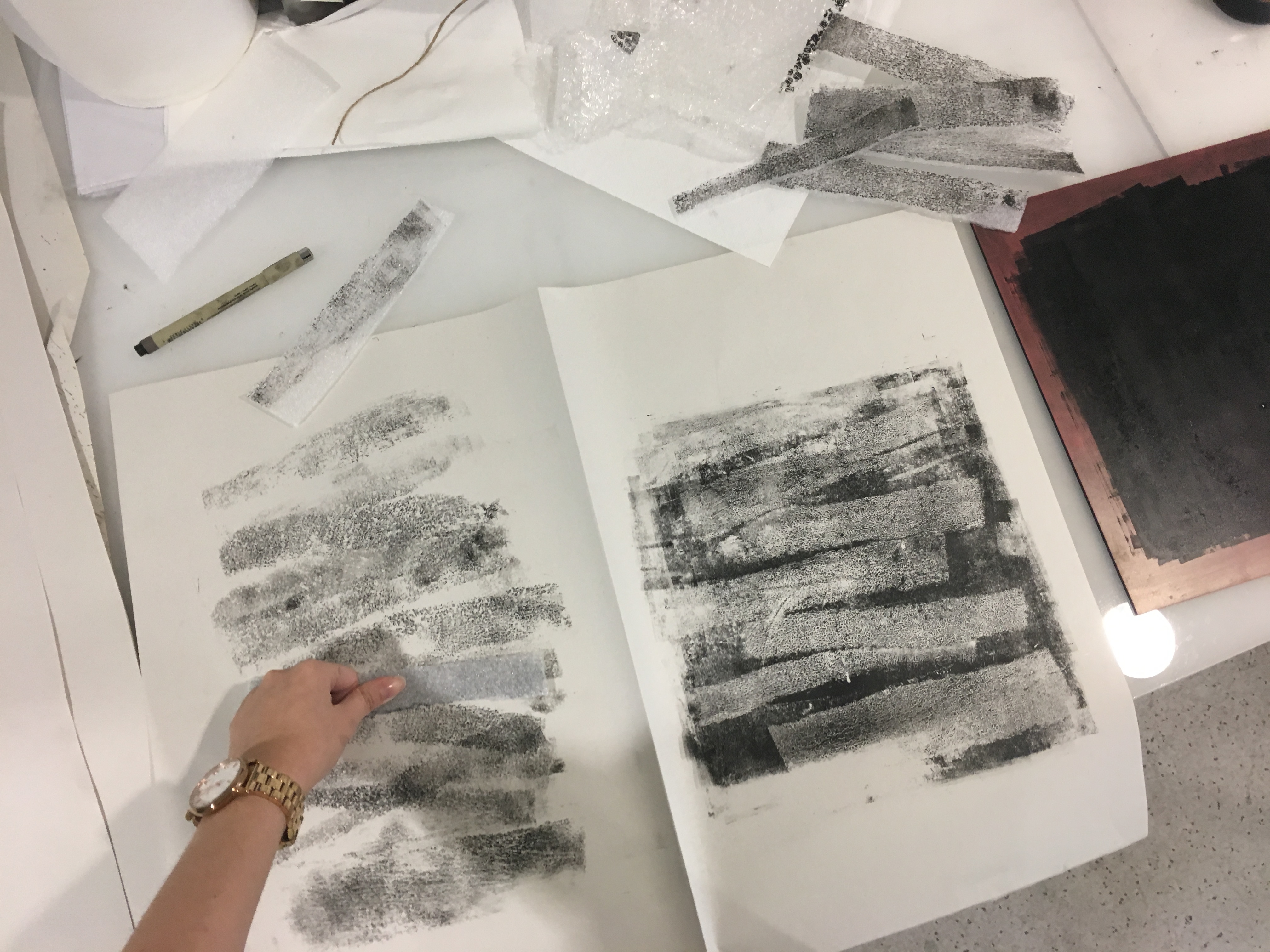
After I have done my research, I was given more time to experiment and explore as many mark making techniques as possible during the subsequent classes.
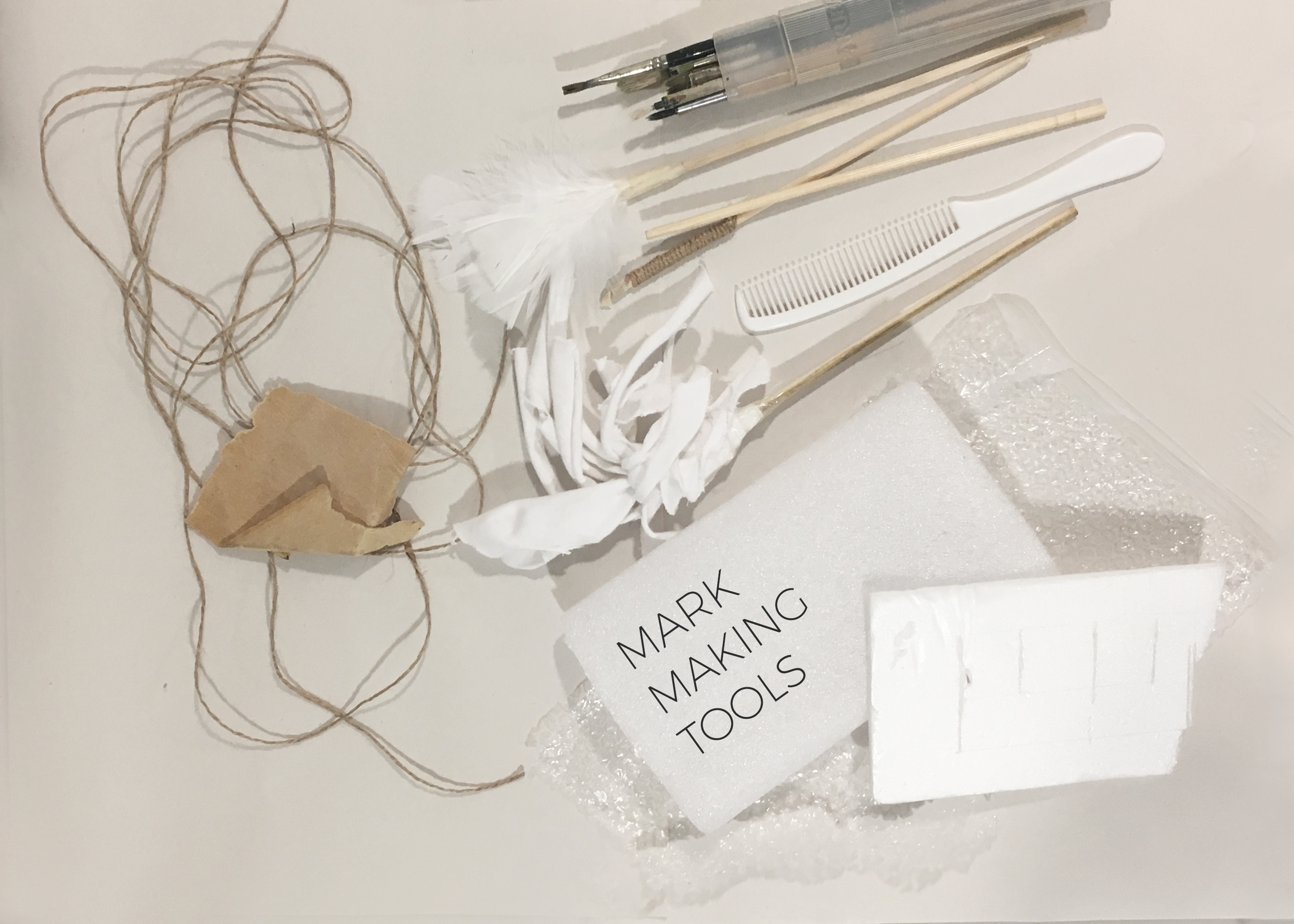
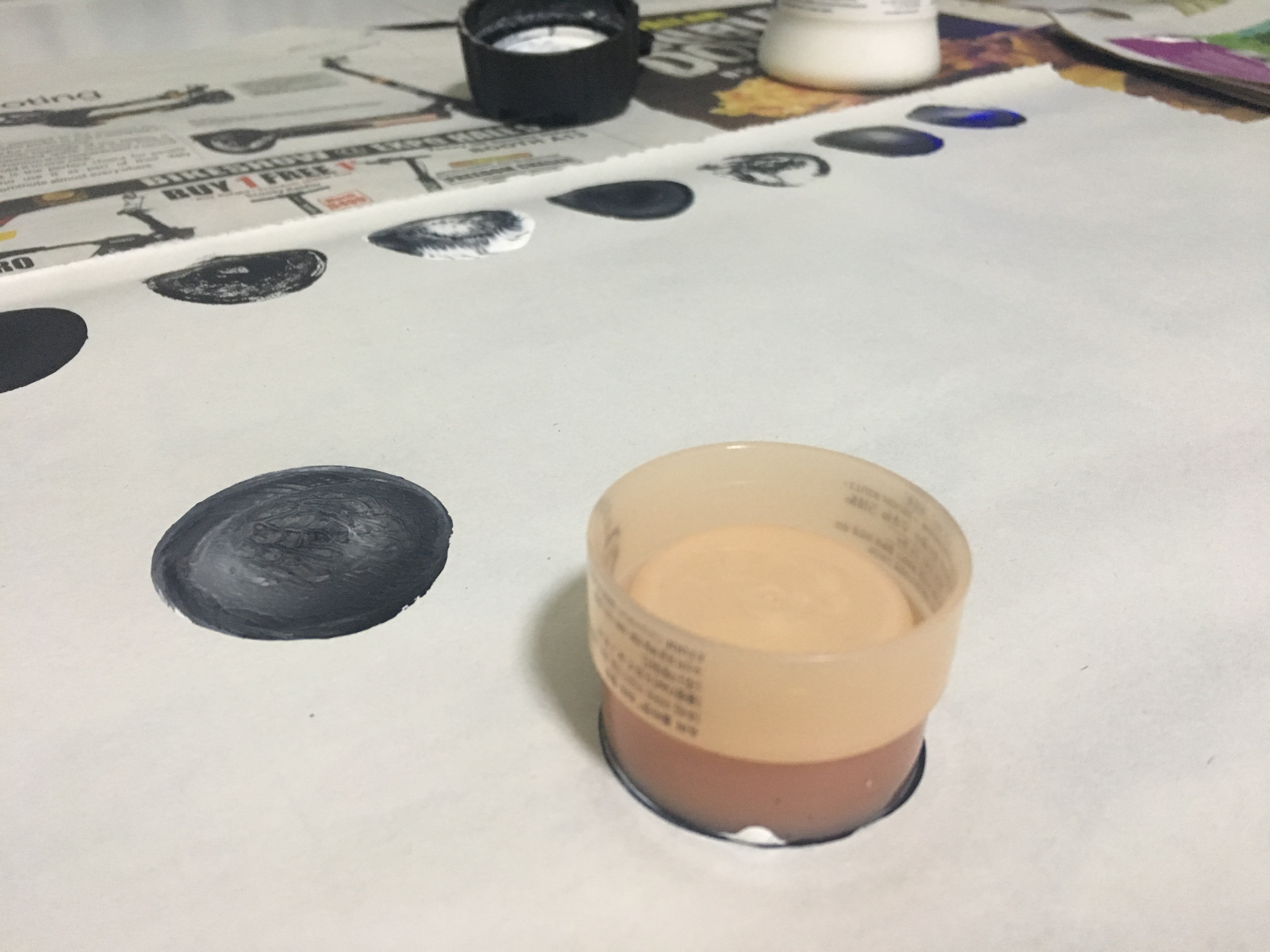
In this stage, I was primarily trying out different and unique methods of mark making. To achieve as many different results as possible, I varied the medium used, the type of paper and the mark making tools. With every variable changed, there was a great difference. For example, a brush with normal black paint on paper as compared to a brush with diluted calligraphy Chinese ink (less viscous/thick) on water colour paper would differ. (As shown in the next 4 pictures)
1 Brushes
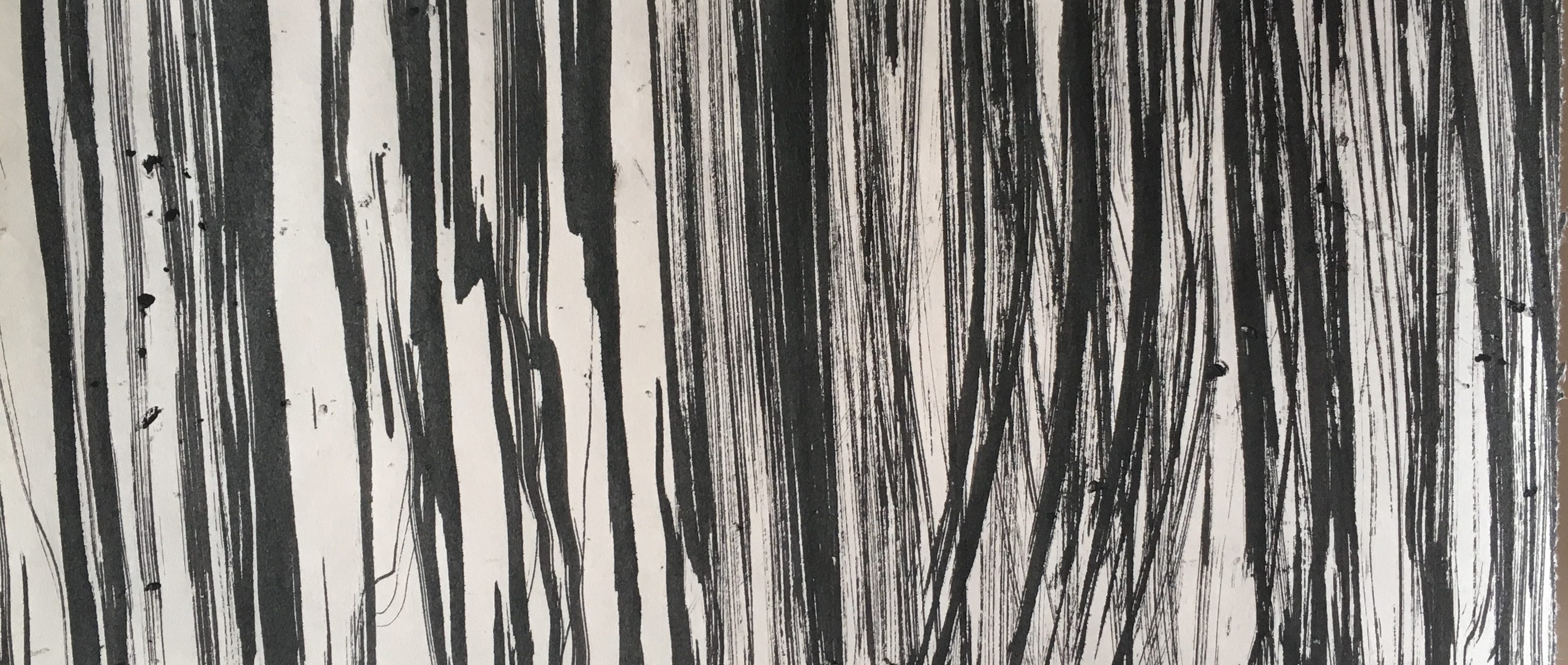

I started with very basic tools, such as brushes of different bristle hardness. I used brush strokes of different density and directions.

These were created using soft calligraphy brushes. I diluted the ink to allow the paint to flow freely onto the paper and to achieve a softer look to it. As I noticed that the diluted ink crumpled the paper, I tried the same technique onto water colour paper instead.

The water colour paper gave way better results and I really love how the ink spreads out with a gradient. Materials really DO MATTER.
2 Knives and Sharp Tools

In this piece, I wanted to portray anger. I started off with slicing up and scratching the surface of the paper. However, the results were not that good – a bunch of holes and torn up edges. In my other versions, I applied black paint for the background and then scratched up the surface. Surprisingly, when the paint dried up, the cuts and scratches made an interesting texture and an aesthetically pleasing yet chaotic look, which I really loved. Perhaps, for my future versions, I would like to consider more about what design elements I could deliberately relate this to so that it would not just be a random scratched up piece of paper.
3 Playing with Fire

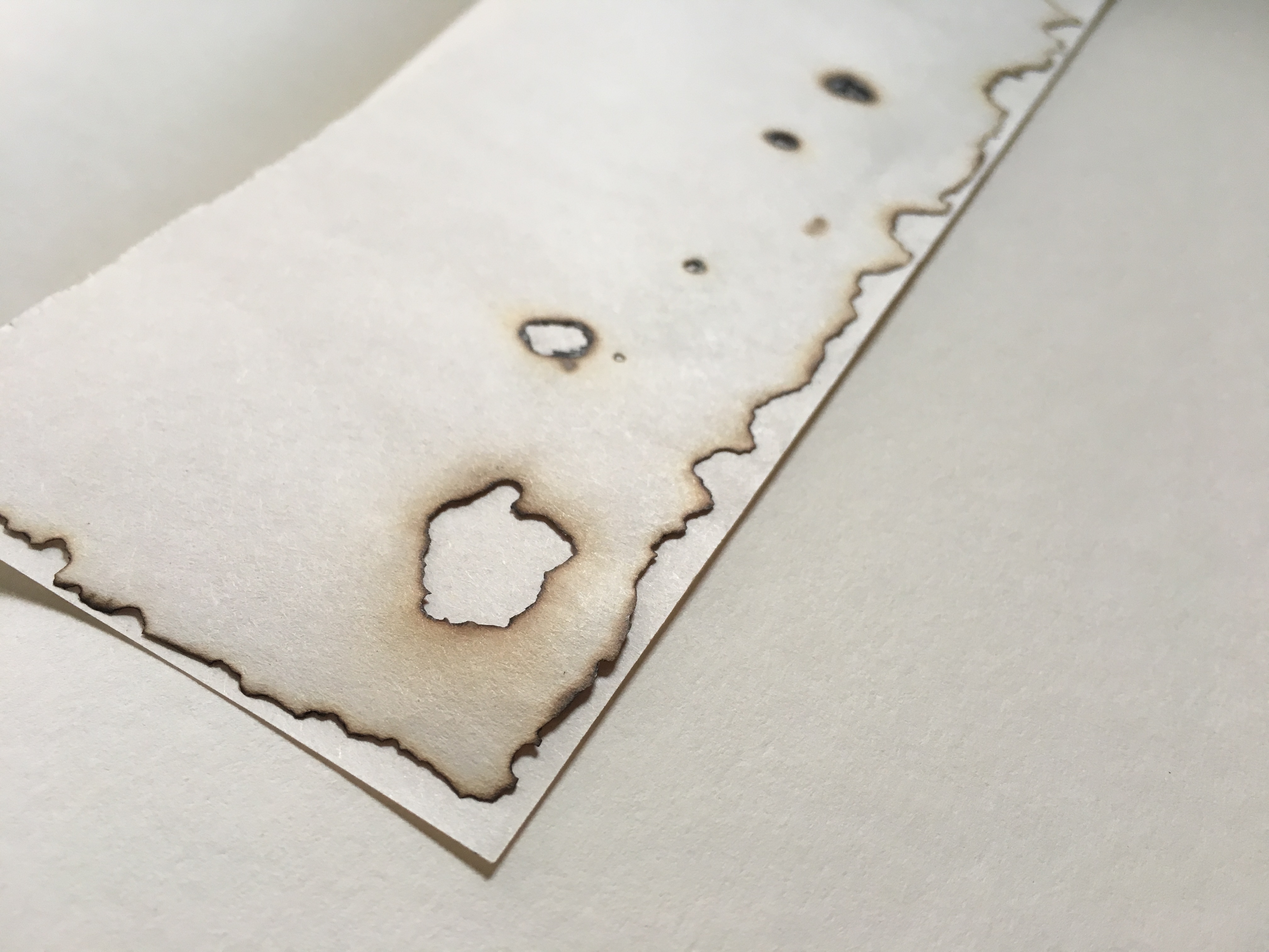
For this piece, I was just curious and started playing with fire. Although I did not have much consideration of what emotion this would be, I thought that maybe “Longing” would be something interesting to think about.
4 Cling Wrap
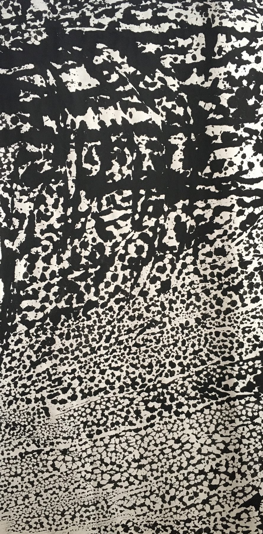
I happened to chance upon the cling wrap in the classroom so I went about experimenting with what I could do with it. I applied paint with different viscosity and got many results – the more diluted ones had this “web” effect while dryer and thicker paint had almost no effect. From the top to the bottom in this picture, I applied a decreasing amount of pressure on my brush.
5 Strings & Press Machine
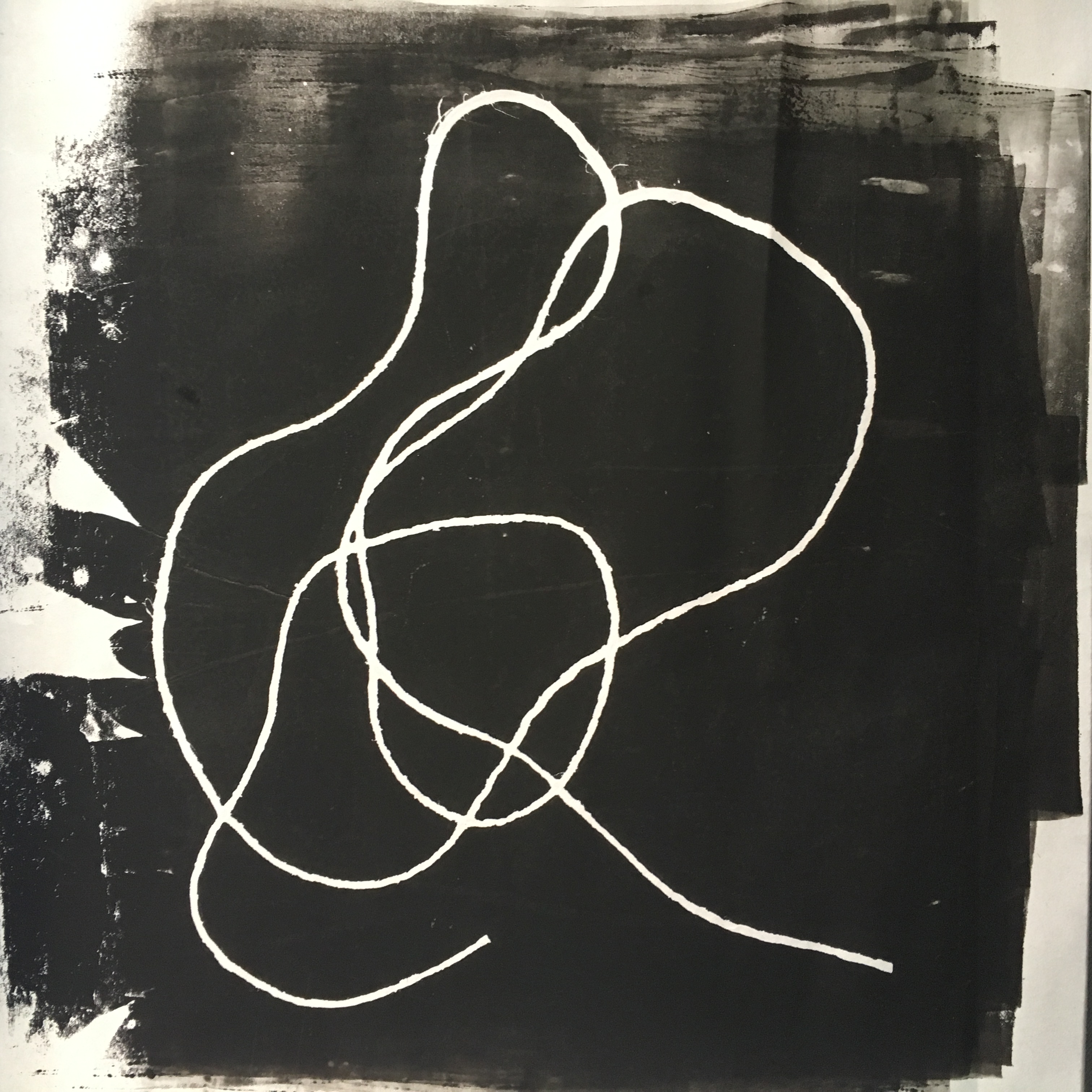
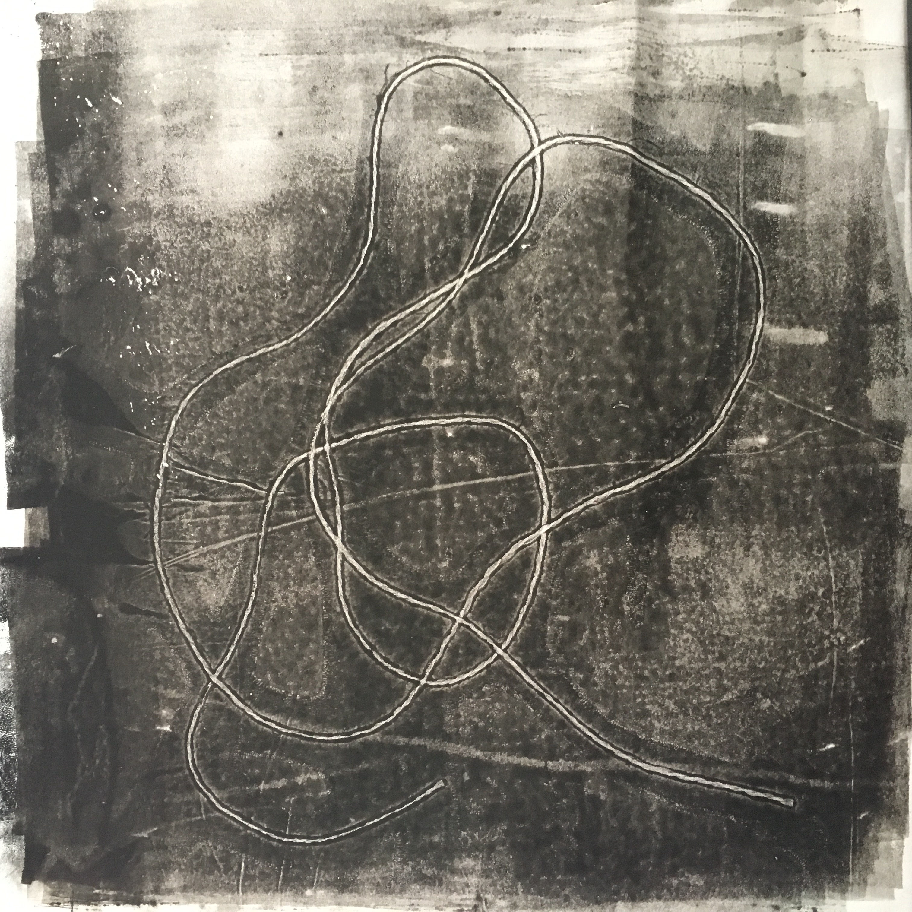
This was made using ink and the press machine. I always make 2 versions whenever I placed my mark making materials into the machine as I felt that the positive and negative outcome was very interesting and both had its own unique look. One seemed clear, with higher contrast, while the other one, made by pressing it the second time on the paper after it went through the machine, had an x-ray look to it, with gradient patches around.
6 Styrofoam
This is similar to the one above, where I used the press machine. I did a little pressed marks manually as well.
7 Round Objects
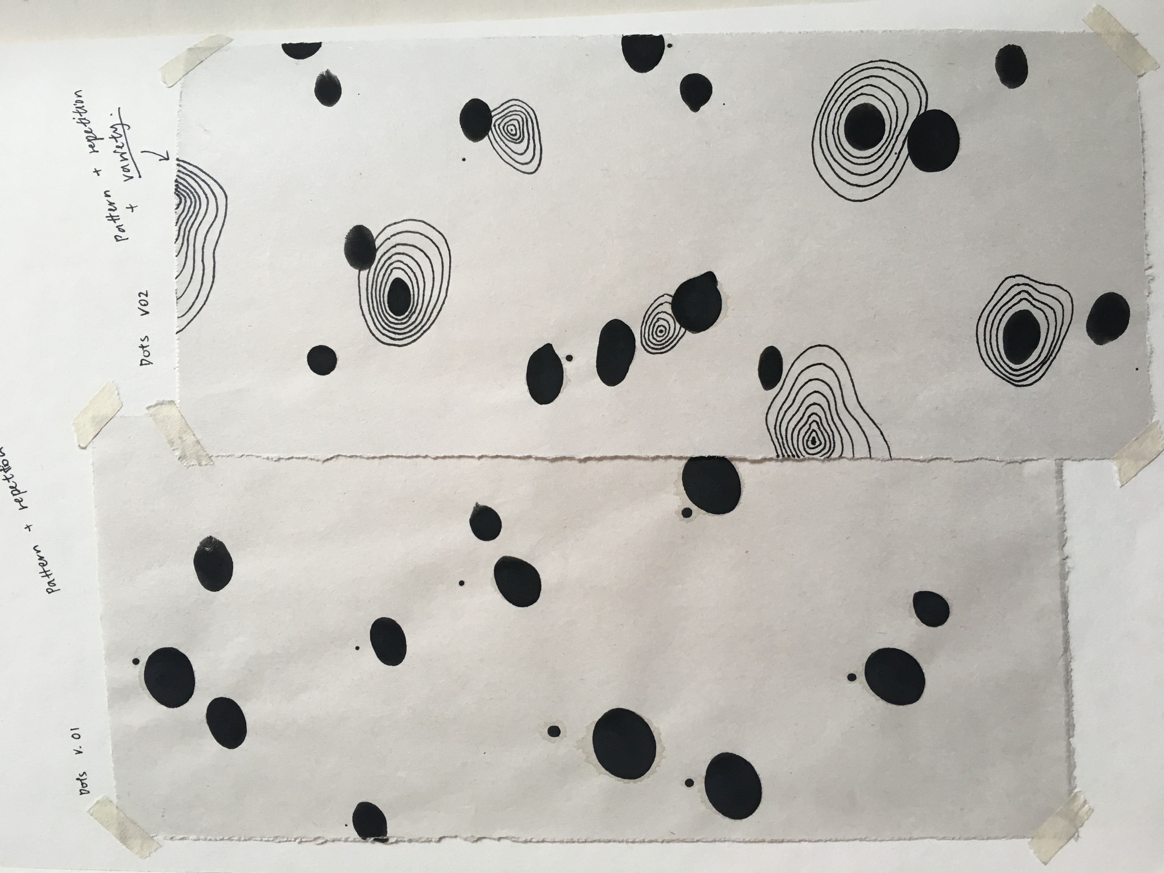
For my “happiness” emotion, I wanted to make round, circular marks that looked as if they were floating. Thus, I tried different container sizes and pressed them down with some paint. I mixed white paint onto the containers to break off the monotonous black circle pattern.
———————————————————————————————-
Some patterns made by my mark making tools did not turn out the way I expected it to be. This could be both good and bad – It is good because interesting marks can be made but it is also bad because the marks may contradict the intended emotion that I wish to convey. Another interesting thing that I realised through various experimental methods was that these emotions overlap and coincide with one another. Perhaps, this was why some emotions looked similar or gave the same kind of “feel”. This was a challenge to me as I wanted each emotion to be expressed clearly with just the use of visual qualities.
Here are some examples of contradictory marks.
8 Fingers
For “happiness”, I tried using my fingers to create these round ovals. However, I felt that the scale was not suitable for the emotion strip as they were too small and would result in a very congested look when being seen from afar. In addition, if the circles were to be further apart, it may come across as “sadness, isolation, neglected” instead of “happiness”.
In this piece, I drew contour lines using a pen to break off the monotonous look. Although I loved the mix medium idea, it did not bring much meaning to this piece as “happiness”.
9 Bubble Wrap

The bubble wrap was intended to create round circles and a bubbly effect, suggesting “happiness”. However, if I were to manipulate it, dragging it across the paper and blurring it, the marks made would come across as “fear” or “sadness” to me due to the distortions and lack of clarity.
This sums up most of my mark making during the experimental stage. Moving forward, I would like to come up with a concept that links up the 6 emotions which I chose.