To start off this project, I would be mostly looking into how these artists used colours and put them together harmoniously.

Vanessa McKeown
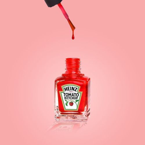
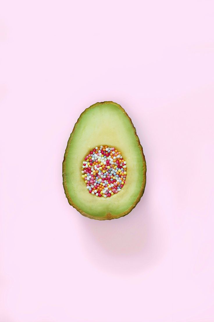
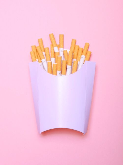
McKeown photographs ordinary daily objects and manipulates them into quirky photo illustrations. The colour schemes used were mostly pastel as it gives off a softer look. The lightheartedness in the photos is a perfect combination of the quirky and fun interpretations of the objects.
Other than the use of colours, my illustrations were inspired by her as well. My overarching concept would be to make ordinary, daily objects relatable to my experiences and memories, which will make up my equation of “Me+Environment=______”


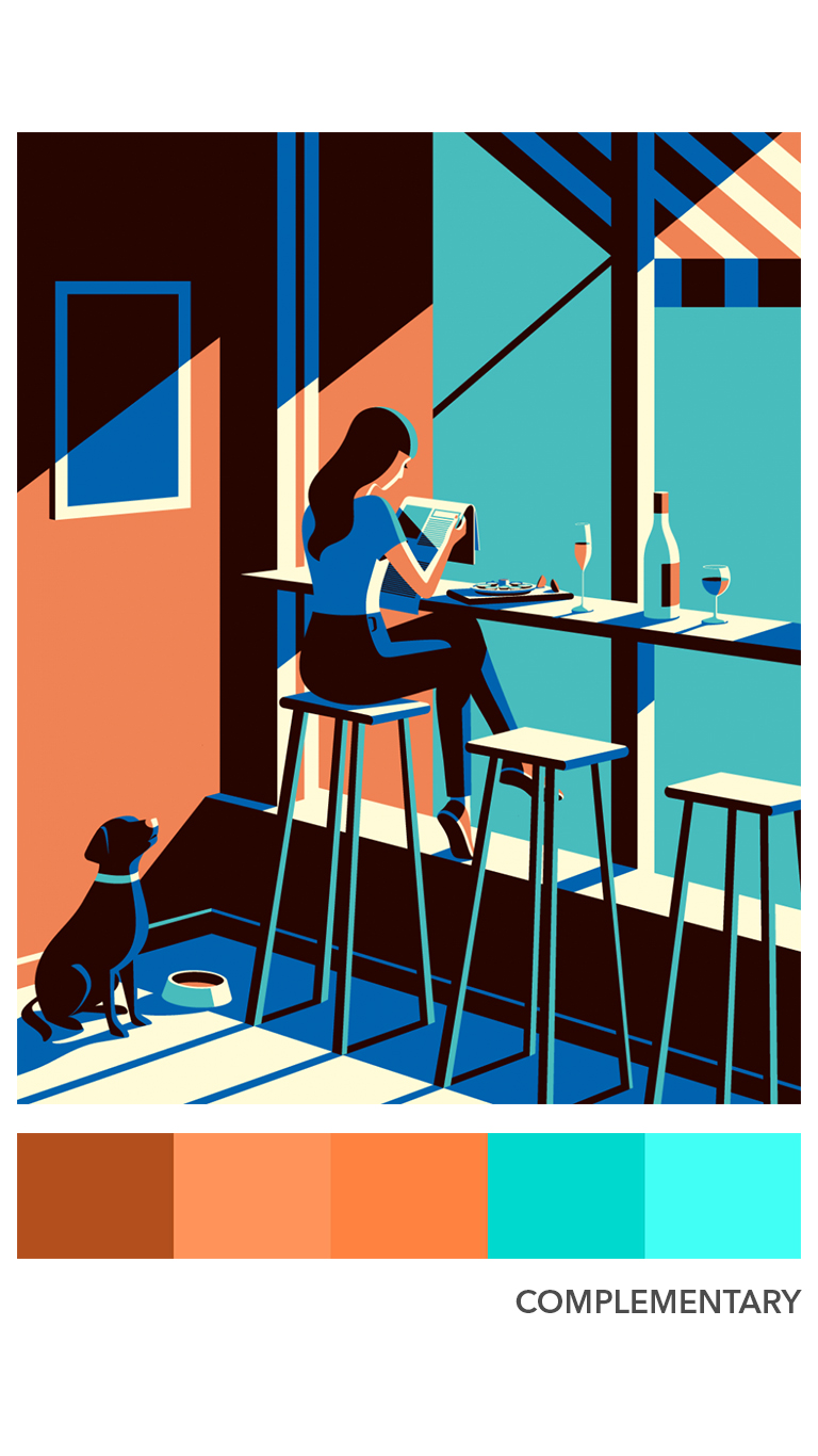
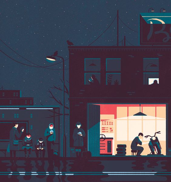
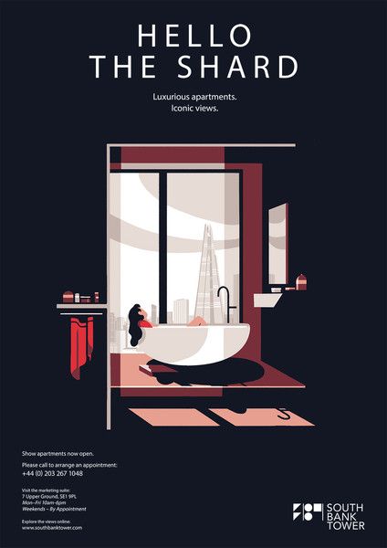
Tom Haugomat
Tom Haugomat is an illustrator based in Paris, France. The use of light and a pastel cooler palette in Tom’s work is reminiscent of American illustration from the 1950’s and ’60s.
The evident use of light and colours made his work seem beautifully in harmony, whether is it using shades and tints, or analogous and complementary colours.
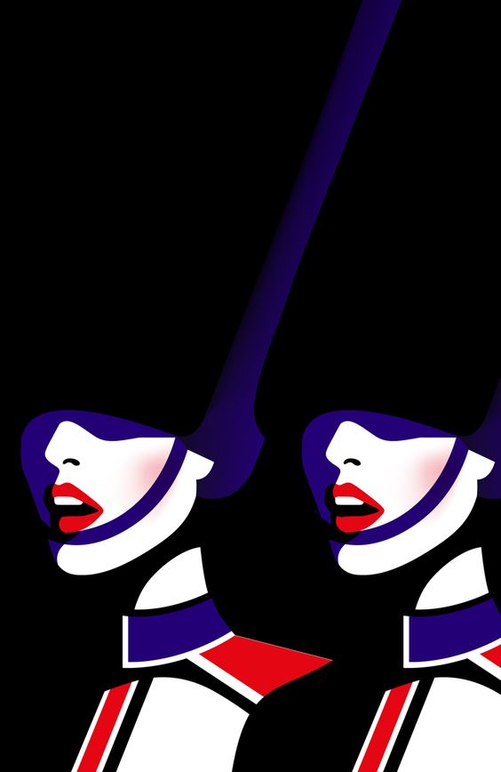
Malika Favre
Malika Favre is a French graphic designer and her distinct and often very sexy style has made her one of the world’s most sought-after. Her works are bold, minimalist, and instantly recognisable.

Overall, I found these artists extremely helpful in terms of visualizing how colours can be utilized to create a certain mood or to set a contrast in a composition. Although not all of their works fall under the typical colour rule, as some might be split complementary etc, it is interesting to see how these colours can be put together harmoniously.