Moving on from part one of Locale, I will be focusing on the artist research and process of creating my zine here.
To view the first part of my Locale project, you can click on the links below:
Locale: Research
Locale: Infographics
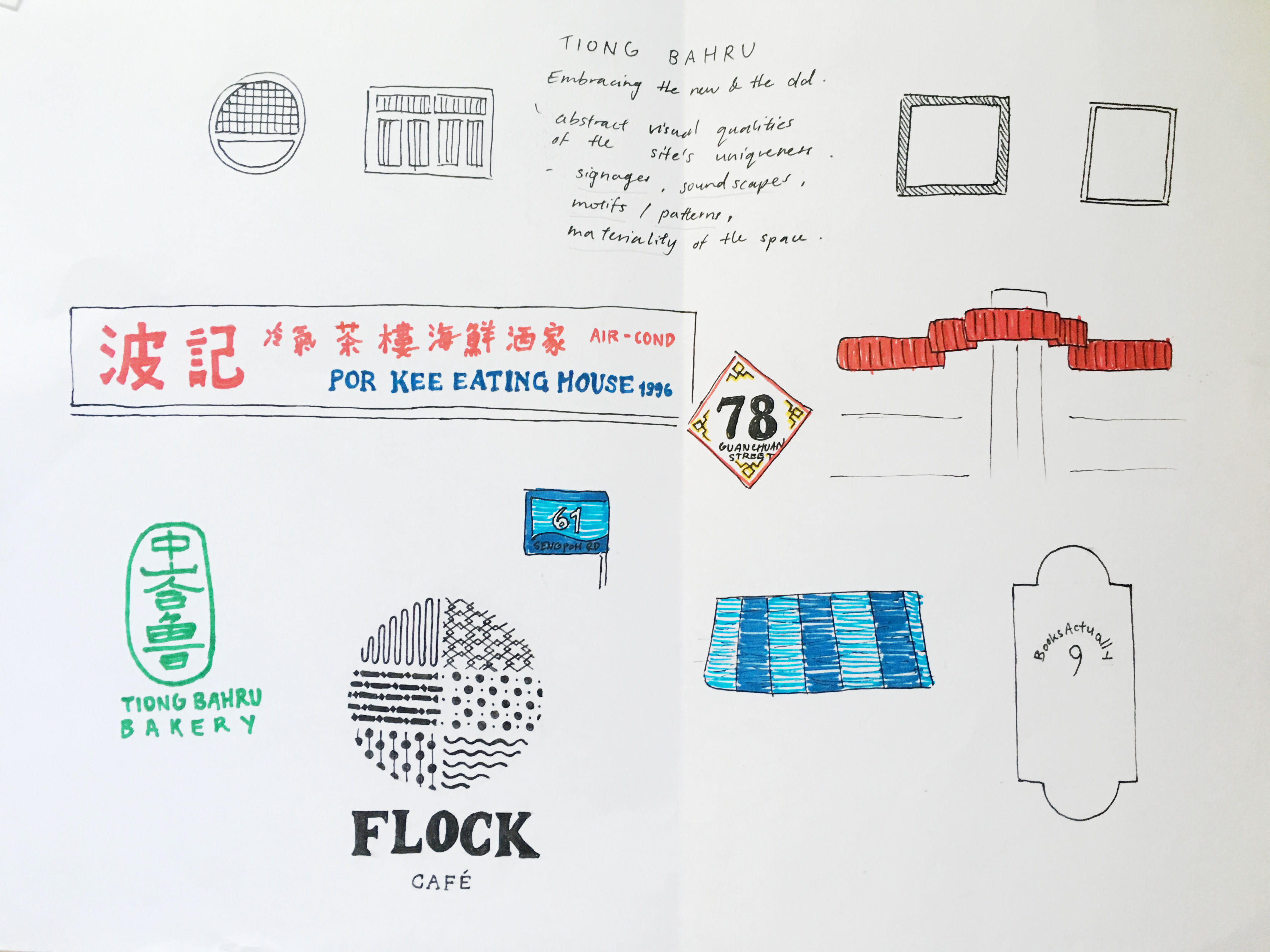
I drew some visual references which I took from the site itself and worked from here onwards.


Some pictures I took @ Tiong Bahru
I tried looking for motifs which could be simplified or abstracted but due to the nature of the Art Deco style in Tiong Bahru, I realised that I would end up working with simple geometrical shapes if I were to choose a vector approach in terms of my art direction.
Thus, I drafted the cover page and 2 spreads, inspired by circular motifs and soundscape.
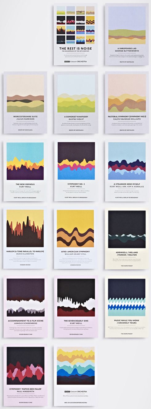
Here are some soundscapes which I was inspired by.
Studio Output’s set of graphic postcards for London’s Southbank Centre.
I would be exploring with soundscapes and forms which reflects the activity within Tiong Bahru. As my unique selling point is “Embracing the new and the old”, the overarching theme to show activities of the new and old would be through a simple Chinese idiom, “吃喝玩乐” (Translation: Eat, drink, play, enjoy).

My first 2 spreads were minimalist. I mainly used basic shapes to convey the activities in Tiong Bahru. The four pages are representative of “吃喝玩乐”,
吃
Relaxed, fulfilment, happiness. I associate eating with these based on what I have observed. Whether is it at the market or the cafes, everyone was pretty relaxed and happy.
喝
Coffee talks; something which stood out to me the most as I was at the site. A cup of kopi or a cup of cappuccino, young or old, the scene of them chatting always warms my heart. Relating to the soundscape, the soundscape represents a conversation of something telling a story, where it is calm at the start and it slowly peaks to the climax of the story.
玩
Although the meaning of “play” here is disappearing as everyone nowadays are fixated on their phone screens, I still do see kids at the playground once in awhile, screaming and having fun. Thus, these higher frequencies of soundscape to represent them.
乐
To me, enjoyment within Tiong Bahru gives a nostalgic vibe. When I interviewed some residents, they mentioned how they used to play with fire, rear chickens, have a bird corner and how they remember that the newspaper uncle could throw the newspaper all the way up from the ground floor to the third. These are small nostalgic moments which I would like to capture.
However, I felt that this vector and minimalist approach limits the visual quality of portraying Tiong Bahru. Other than the signature red and blue colour, the motifs are too minimalistic to be an abstract representation of the site. As mentioned in my consultation, some aspects which I can explore are textures, motifs, patterns and typography.
MY SECOND IDEA
As I have always worked with vector illustrations, I find it hard to bring out visual qualities of a site using anything but vectors. So, in my second (failed) attempt, I tried incorporating some textures and marks I found in that area, such as newspaper and coffee stains. However, it ended up looking messy and with no focal point. Also, because I took the signs and collaged them, it added on to the chaoticness of the spread. So I scraped this eventually.
Some points to note:
Maybe I could extract the typography on the signs.
Use pictures instead.
References:
Studio Output’s soundwave concert postcards


