Category Archives: Typography 1 – G3

In Class Activity: Modifying Type

For this activity, I focused on adding a sense of movement to the word “play nice” by tilting the elements in the composition. The type was segmented to look like block pieces placed together, like a building brick/lego concept. Along with the triadic/tetradic colours, I wanted to suggest a sense of (nice) playfulness.

Review: The Elements of Typographic Style

In the book, Robert Bringhurst shares many great principles about design, many of which I couldn’t agree with more. Bringhurst mentions, “typography must often draw attention to itself before it will be read. Yet in order to be read, it must relinquish the attention it has drawn.” A little too much or too little won’t work in typography. Typography has to have this harmonious balance which in my opinion, is always difficult to achieve. Legibility was emphasised as one of the important principles of durable typography. He goes on by saying that these principles apply in different ways, to the typography of business cards, instruction sheets and postage stamps, as well as books – basically anything that needs to convey a certain message or information.

Letterforms have tone, timbre, character, just as words and sentences do. “The moment a text and a typeface are chosen, two streams of thought, two rhythmical systems, two sets of habits, or if you like, two personalities, intersect. They need not live together contentedly forever, but they must not as a rule collide.” A quote which serves as an apt reminder for the current project as we consider different typefaces and how we match them within a composition.

Having to look at good examples of good typography practices, here are some which I myself will (try my best) to uphold.

  • Typography can be beautiful and decorative but it must never lose its message
  • There is no bad typography; only inappropriate ones
  • Choose a typeface that will honour the character of the text
  • Pay attention to the smallest details and be meticulous about it


References:
https://alejandrocarpintero.files.wordpress.com/2016/08/02_the_elements_of_typographic_style.pdf

Review: The Crystal Goblet, or Printing Should Be Invisible by Beatrice Warde

In this article, Warde shares her opinion of good typography using a flowery metaphor; using wine vessels. She lays out 2 choices: a crystal-clear wine glass and a solid gold goblet. If the clear glass was chosen – everything about it is calculated to reveal rather than hide the beautiful thing which it was meant to contain. She mentions, the virtues of the perfect wine-glass have a parallel in typography – and that is type well used is invisible as type. Initially, I was confused by her statement because of how today’s design articles have framed my mindset on typography. And those articles go on by saying how type can be decorative as a form and how manipulation of the form of type has been widely used and so on.

I have always seen type as a form, not invisible. But Warde’s opinion has given me a new perspective on how good type should be legible and not overly decorated in order to convey its message. Warde explains further,  “that is not objectionable, because of a
very important fact which has to do with the psychology of the subconscious mind. That is
that the mental eye focuses through type and not upon it”. We focus heavily on the elements on a page, but never the lack of it. What Warde made me ponder about was really to read between the lines. Arbitrary warping of design is bad type. Excess of colour, which gets in the way of the mental picture is bad type. Tight spacing, too wide unleaded lines lead to bad type. All of these, to Warde, mean subconscious squinting and loss of mental focus. Which was why print should be transparent and a transparent page is never too simple or dull. Sometimes, it is more difficult to achieve simplicity, leaving the essence of what’s needed and throwing whatever’s not.

Warde’s other point is that anyone who chooses glass over clay or metal to hold his or her wine is a “modernist”. Reason being that the first thing that comes to a modernist’s mind when being asked of a particular object would never be ‘How should it look?’ but ‘What must it do?’. And to that extent, I myself agree with Warde, that all good typography is modernist. Form over function is evident in typography as well. The main function of a book is to inform and educate and by reading the content. How effective the main function of the book will then be dependent on readability and legibility. After peeling layers and layers of metaphors, it is as simple as that.

However, with Warde’s opinion, it is sure that typographers will argue that type can never be invisible. Although the metaphor does make sense, Warde’s opinion might only be applicable in printed typography, and mainly books. In today’s typography where there is a myriad of experimental and decorative form and type, it is impossible to only agree that type is invisible. Neville Brody’s fascinating and experimental work might have just thrown Warde’s opinion out the glass window. All in all, this article is still justifiable and now, we get to look at type in both ways – whether invisible or not.

In Class Activity: Haiku

A digitalized version of my haiku.

I felt that my haiku is serene and soft, as words such as “settle down” suggests a gradually slow movement and peacefulness. Along with the feedback, I made the words flow downwards, which follows the falling leaf. I also chose an autumn/warm palette to compliment with the haiku. I mainly used one font, Avenir, but I varied the typefaces – bold for the ground, italics for the falling words. All in all, I could see the effects of variating typefaces and how it impacts a composition – how our focus is naturally drawn to bolder and bigger text, and how softness is subtly shown in italics and thin fonts. As such, it was fun to illustrate a haiku like this.

Sketches are in this post: https://oss.adm.ntu.edu.sg/kyong009/in-class-activity-haiku/ 

Review: My Life in Typefaces by Matthew Carter

Having to experience a transitional period where technology is evolving, Matthew Carter shared many stories and insights about typography and his own experience as a typographer. Carter is renown and even if one has never come across his name, they will have definitely seen his works before. Carter is the man behind typefaces such as Verdana, Georgia and Bell Centennial. One of the video’s highlight was the problem where fonts used to require large data back in the days. As such, Carter “solved” the problem by adjusting the points on a serif font – just that the problem was already solved by engineers 2 weeks before Carter found them the solution.


“What had started out as a technical exercise became an aesthetic exercise. “

Regardless of Carter’s redundant solution, he grew to like the aesthetics of his creation. Him misunderstanding the technology has offered doors to innovative designs. In my opinion, it was a good thing even though his solution flopped, as he created something of value to himself as a designer. Today, designers create everything with a purpose, an intention. Creating another Charter like this would be rather rare, and that was the beauty that Carter saw in the type.

References:

Typographer of the Week: Paula Scher

Known as the “titan of postmodern design”, Paula Scher is a highly influential graphic design who has done countless of groundbreaking projects with notable brands and even important government agencies.


Scher is responsible for both the polished corporate-ness of the Citibank logo and the loudly expressive poster designs of historic Public Theater productions like Bring in ‘Da Noise, Bring in ‘Da Funk. Despite the disparate nature of the designs and their messages, Scher executes them perfectly. She mentions, “I think all design matters and all design deserves to be intelligent.” – referring to not just designing for the “public good” but for all designs.

In the video, What Design Can Do 2012, Scher tells many interesting stories about how her massive projects have begun (mostly by pro bono logos). One of her projects was “The High Line”, where Scher herself, had almost zero faith that the project would take off. Nonetheless, she did the logo for the High Line, where they gradually implemented her design into the area and collateral designs. She mentioned, “the logo, when combined with a terrific activity, product or service, it begins to resonate.” Like the High Line, before it was built, the logo was just a logo.

The High Line

Madison Square Park

This is another project by Scher. In the rebranding of Madison Square Park, what stood out the most to me was the choice of using “MAD. SQ. PK.” as their logo. Her rationale was that NYC loves abbreviations – SoHo (South of Houston), NoMad (North of Madison Square Park) and so on. Scher identified a significant and unique aspect of the NYC culture and incorporated it into Madison Square Park. As people easily get confused with Madison Square Park with Madison Park, they do not have a strong impression and think that this park is rather ordinary and dull. This really shows that as designers, we are never only subjected to the visuals. Today, designers are more like “problem solvers”, conceptualising and then conveying ideas to the public.

NYC Parks

Lastly, Scher has worked with NYC Parks, with a condition that she was allowed to redesign the signages of the parks. The previous signages were cluttered and inconsistent (and an eyesore to Scher). With Scher’s design, a modular system was adopted, which made the entire design system extremely consistent and neat. She even emphasized on the guidelines for the workers to follow as there are many parks all around NYC to ensure consistency. Even though Scher was known as a “graphic designer”, I felt that her roles were expanded as she had to consider the user experience for several of her projects.

Overall, Scher is an extremely influential and skilled creative. As seen in the video and her projects, she is critical and logical in her thinking and consistent in her works – attributes which all designers aspire to be.

References:
https://www.pentagram.com/news/paula-scher-works
https://99designs.com.sg/blog/famous-design/paula-scher-titan-of-postmodern-design/

https://fontsinuse.com/designers/369/paula-scher

In Class Activity: Haiku

In Class Activity

5, 7, 5 Haiku: 
Falling to the ground
I watch a leaf settle down
In a bed of brown

01020304

Some thoughts:

Overall, this activity was interesting and enjoyable as we had to as though, made the haiku come to life through type. In the 4 designs, I had to consider factors such as scale, balance emphasis, harmony. Also, the 5, 7, 5 haiku had a number of words which was a challenge – which line should be emphasised or which ones should be scaled down? For the final piece, I chose the second one as I felt that the use of more negative space makes the “leaf” isolated and thus, was emphasized more. Also, the last line, “in a bed of brown”, was heavily bolded to suggests the ground and create harmony in the composition.

In Class Activity: Expressive words Opposing pairs

In Class Activity

These are the vectorized sketches of the opposing pairs of words I chose from the list.

01. Order & Chaos

This is the final piece which I refined and chose for the class critique. In terms of design principles, I largely focused on balance in this piece. To give a sense of disorder and chaos, I disrupted the neatness of the white areas, with the black scribbles creeping into the other half of the canvas.

02. Fast and Slow

My this sketch, I mainly played with the strokes, varying the thickness to create a motion effect for fast. As for slow, I felt that blob-like, flowy lines were more suitable as it looks more organic rather that sharp.

03. Whimsical and Serious

This was my first sketch attempt out of the three. To show the juxtaposition of meanings, I used contrasting strokes, a curvy and italic type vs a sans serif bold type.

Some thoughts:

After the critique in class, I saw the variations of opposing words and there are certainly some words which are more difficult to express. With that being said, there were many clever type compositions which portrayed the opposing words well. For example, the “open and closed” one where letters from “open” were falling out of the letter O from closed. The examples really portrayed how placement and even scale could drastically change the dynamics of type.

Thinking With Type: Letter

This particular reading gave many insights about the characteristics of letter, typefaces and also compatibility between different typefaces. After listening to several lectures by Lisa, I felt that the content in this reading was a whole lot easier to understand and the concepts were easier to grasp.

As we begin our project, these are some notable information mentioned in the reading which I felt that is important.

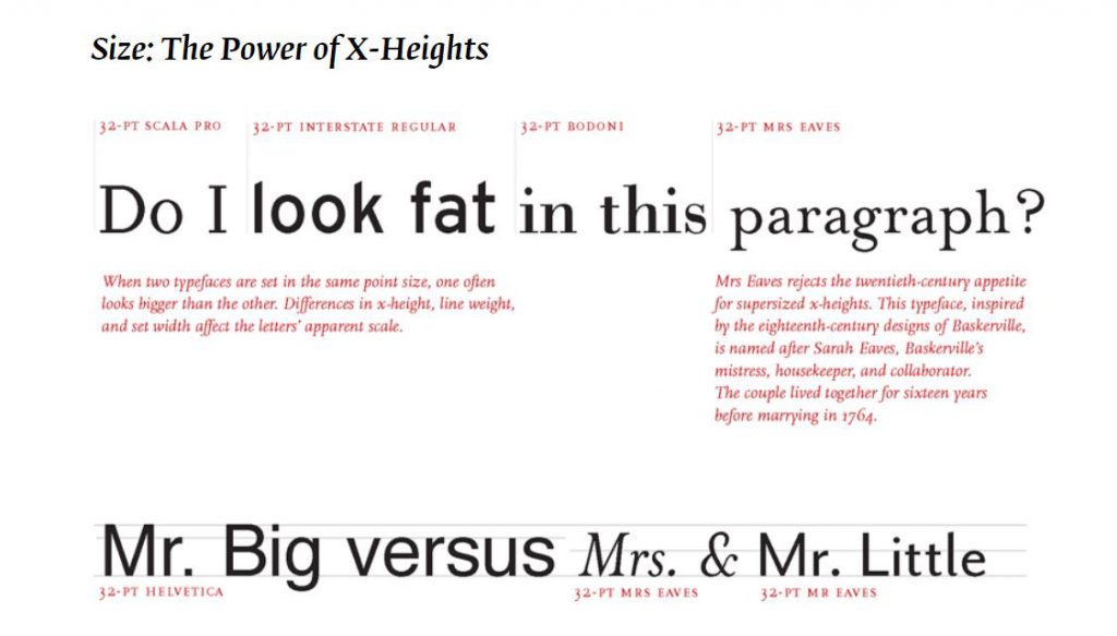
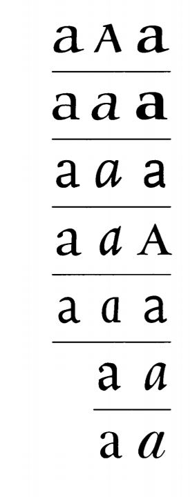
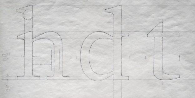
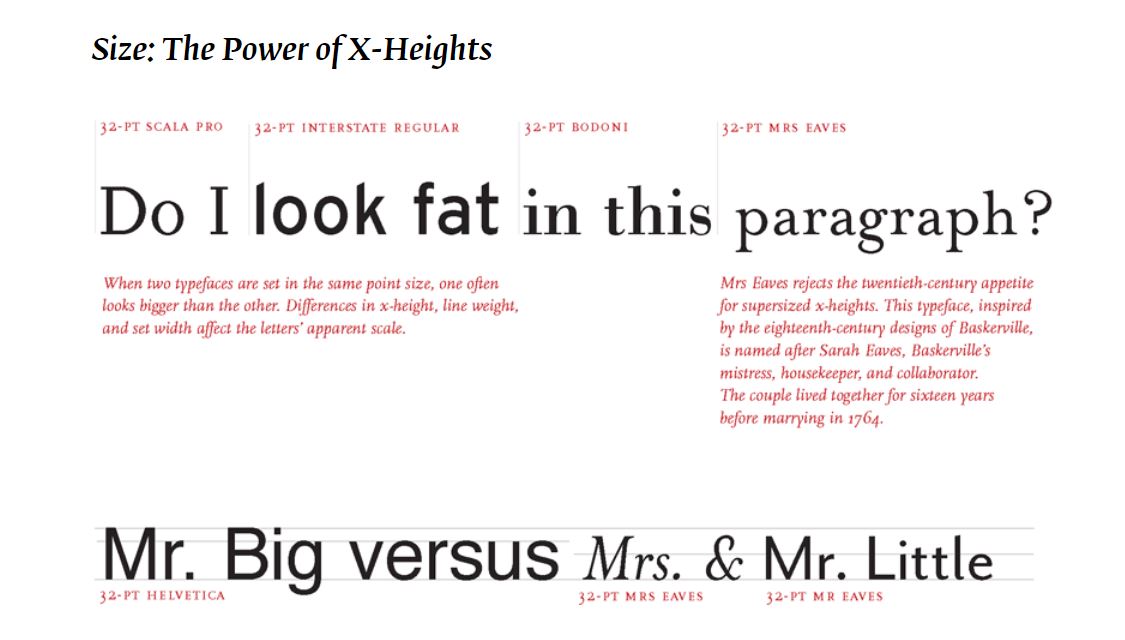
Choosing the right fonts isnt an easy task. However, I think we can all agree that there are some visual properties of a font which influences a particular emotion/trait. The power of X-height shows how different x-heights can affect the overall “look” of a text. Some fonts have a smaller x-heights, thus, the texts in the same font size appear to be more delicate or sleek. Hence, we should think deeper and in terms of these characteristics, select what is suitable for each text.

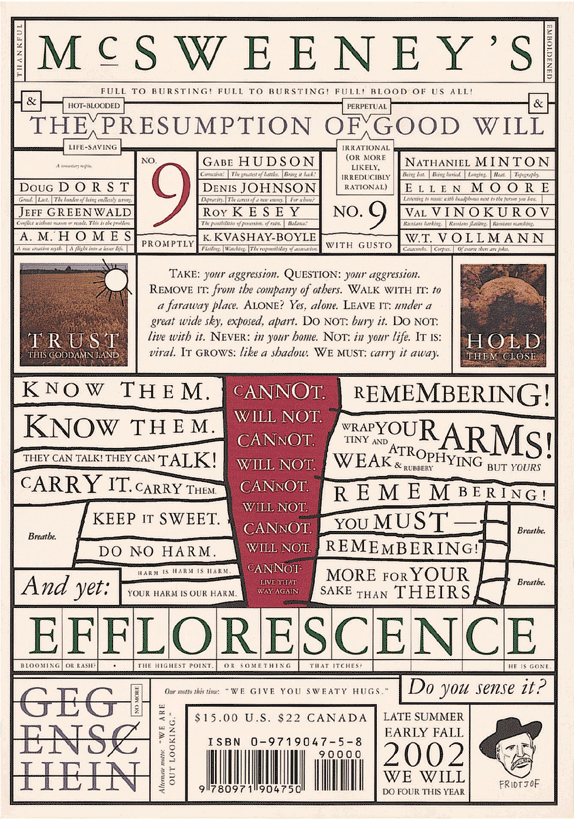
Mcsweeney’s Magazine cover, 2002. Design: Dave Eggers. This magazine cover uses the Garamond 3 typeface family in various sizes. Although the typeface is classical and conservative, the obsessive, slightly deranged layout is distinctly contemporary.

As for this magazine cover mentioned in the reading, I felt that it is relatable to our project as they used 3 typefaces of Garamond. The variation in scale and typefaces made this piece dynamic. I’m pretty sure variating the scale of the texts like how he did will seem like a type crime to many. WE READ THINGS IN A CONSISTENT MANNER and a disruption like this will definitely break the flow of the reader.  Nonetheless, the slightly deranged layout is contemporary and experimental. 


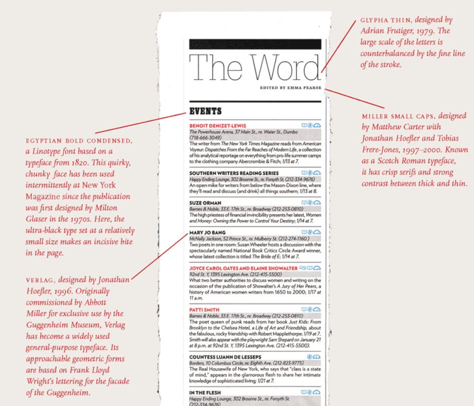
the word: new york magazine Design: Chris Dixon, 2010

This example of mixing fonts is also a good one. The ability to mix fonts tastefully is extremely important. Staying with only one font can be rather boring sometimes. Thus, I like how this reading gives additional information on how the properties of a typeface and be suitable for each other and establishes a good visual hierarchy. Eg. thin strokes vs thicker strokes as titles for body text.


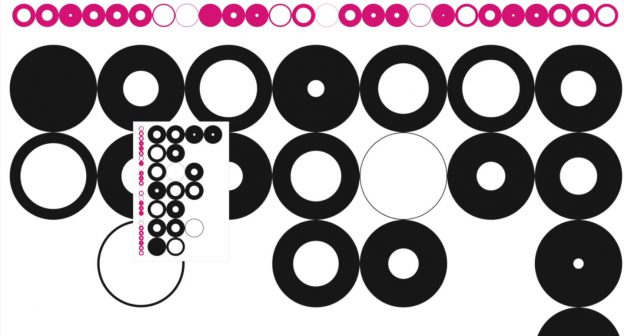
Little Lessons From Swiss Style Graphic Design by http://deconstructed.org.uk 


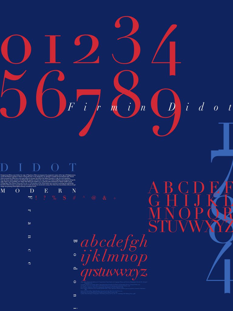
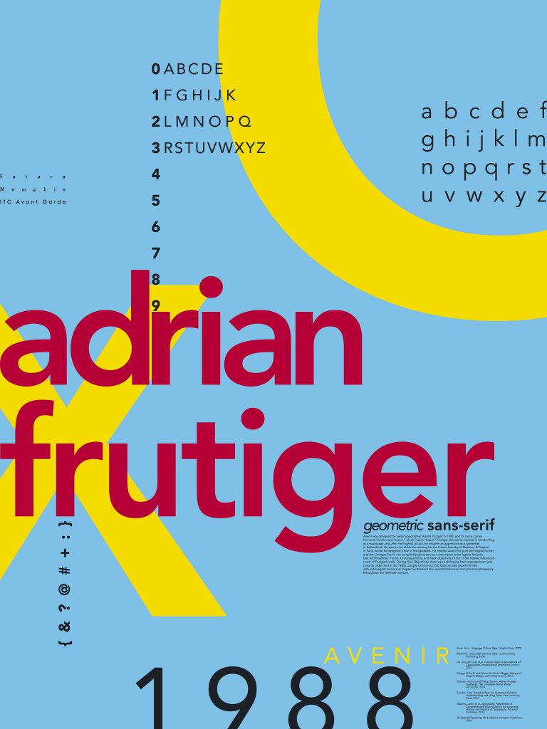
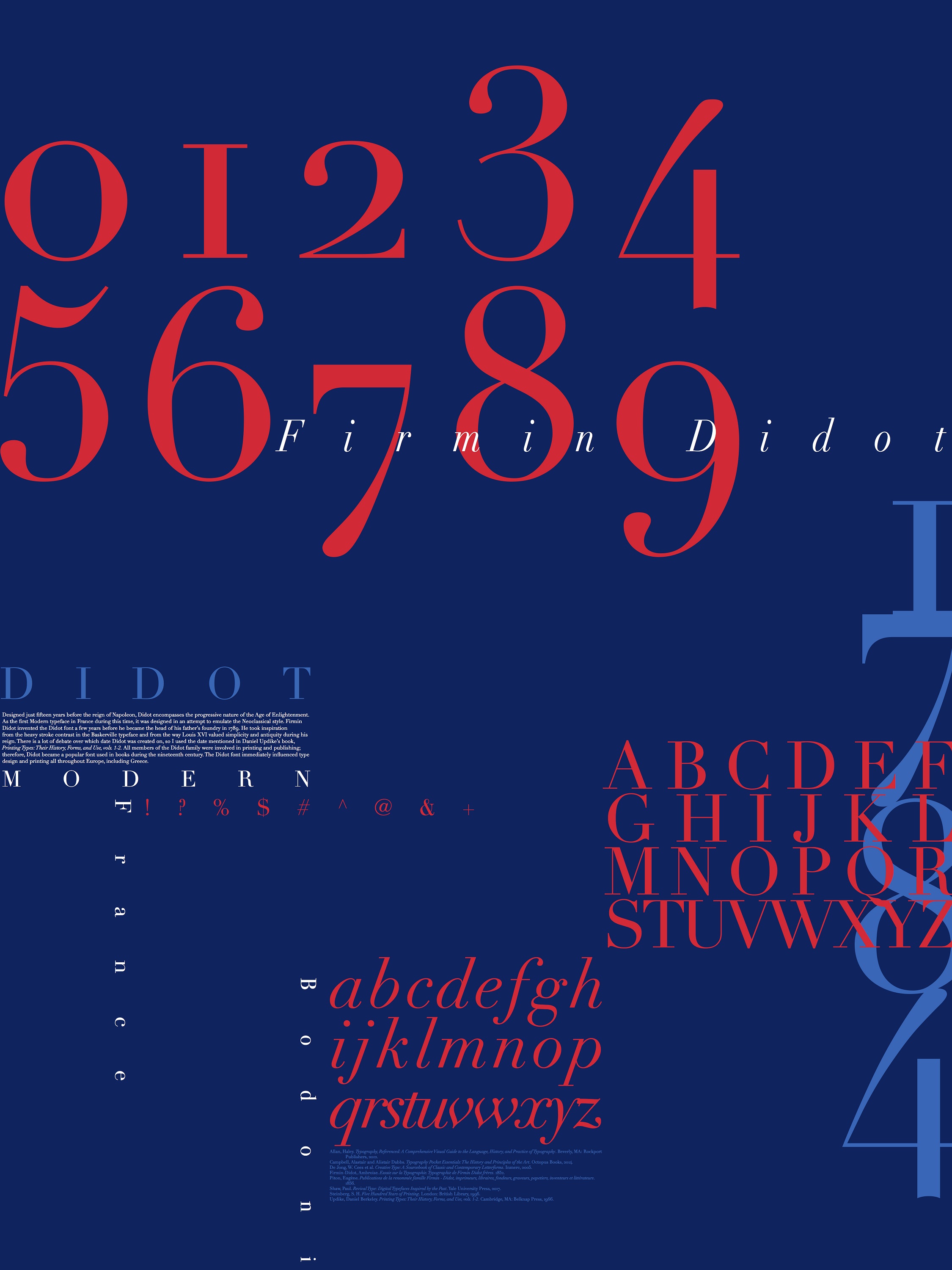
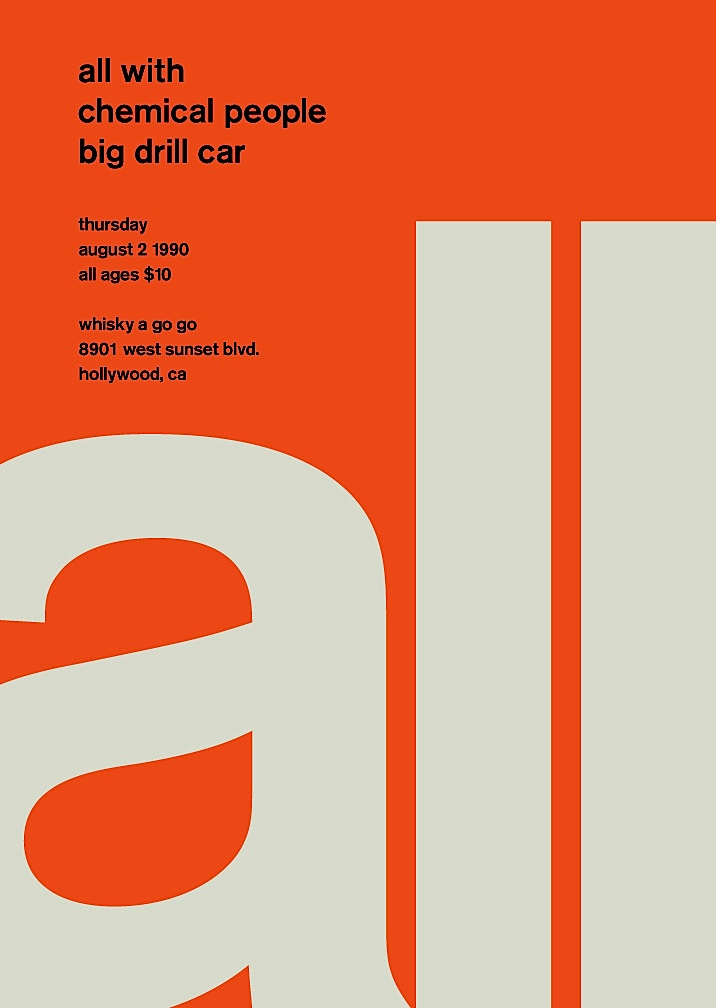
Typography posters by Kellie Manchester

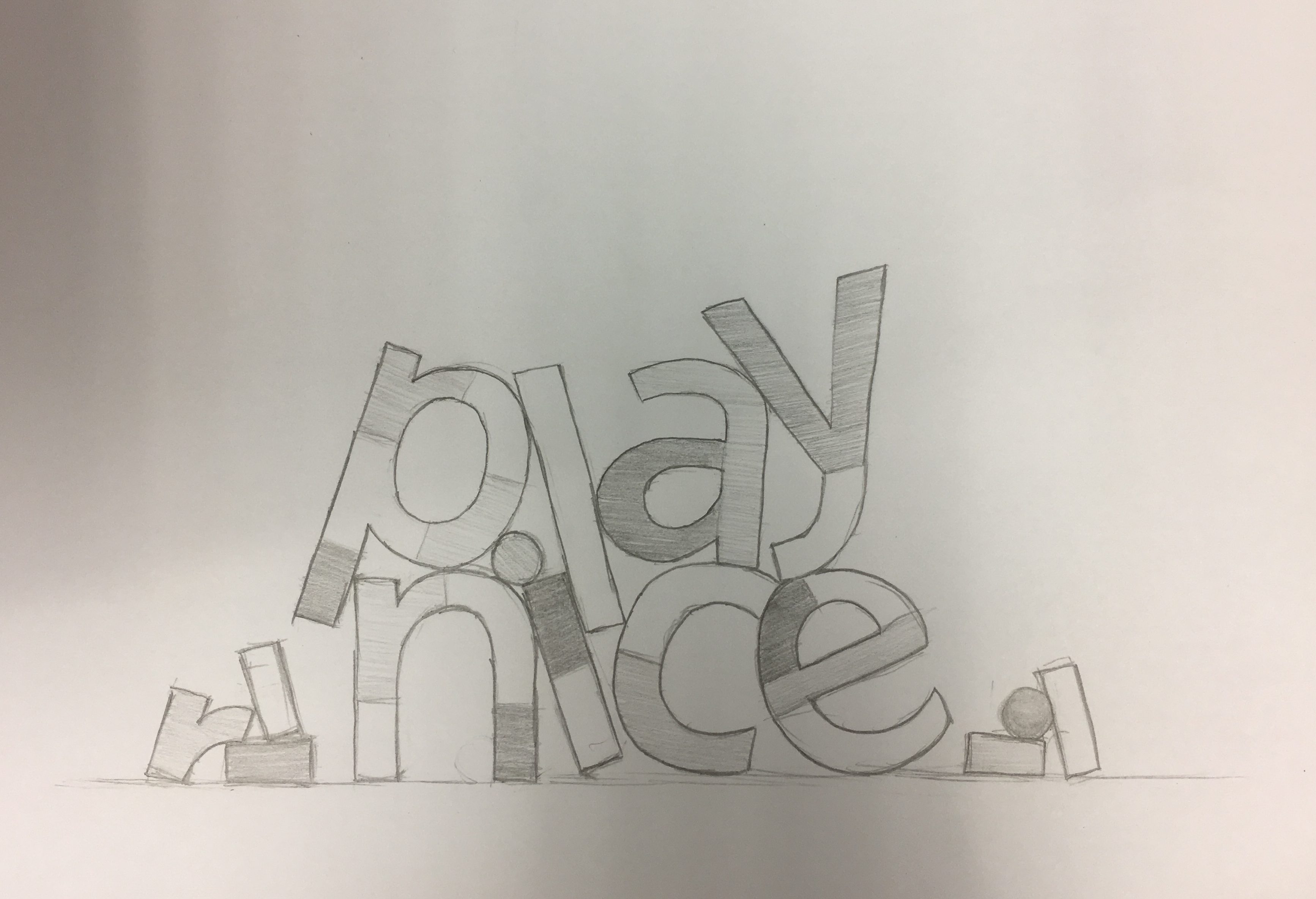
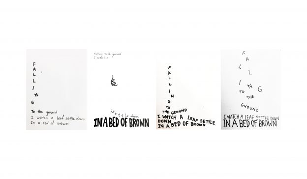
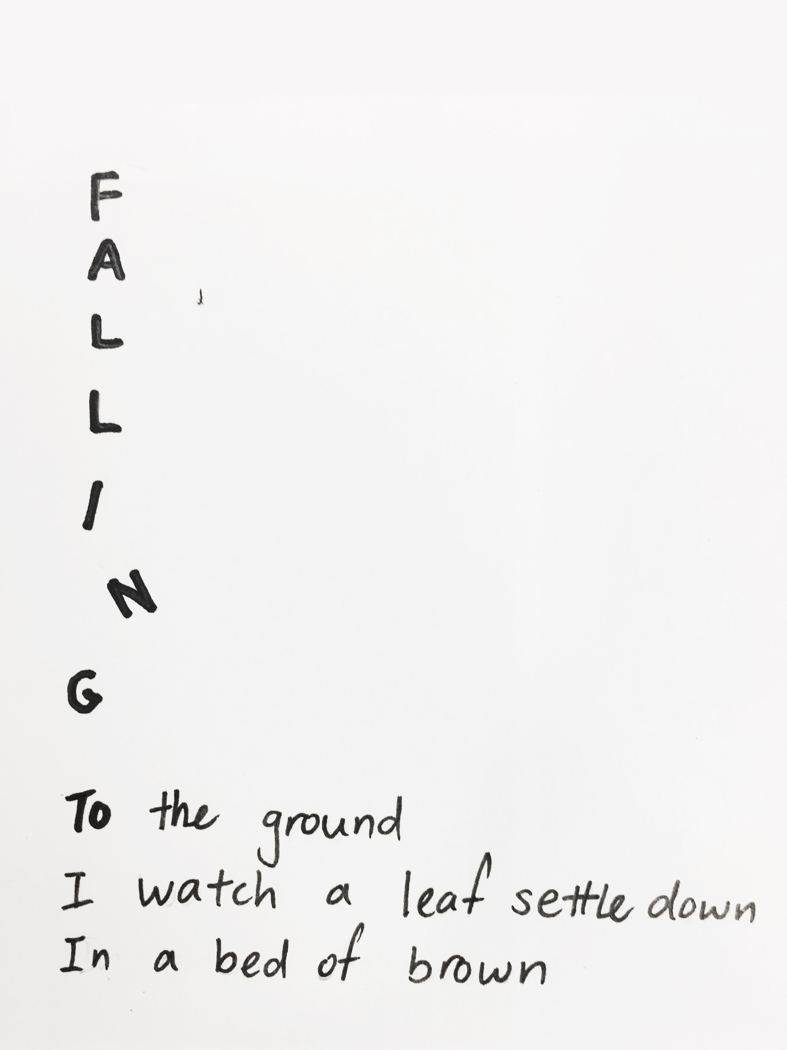
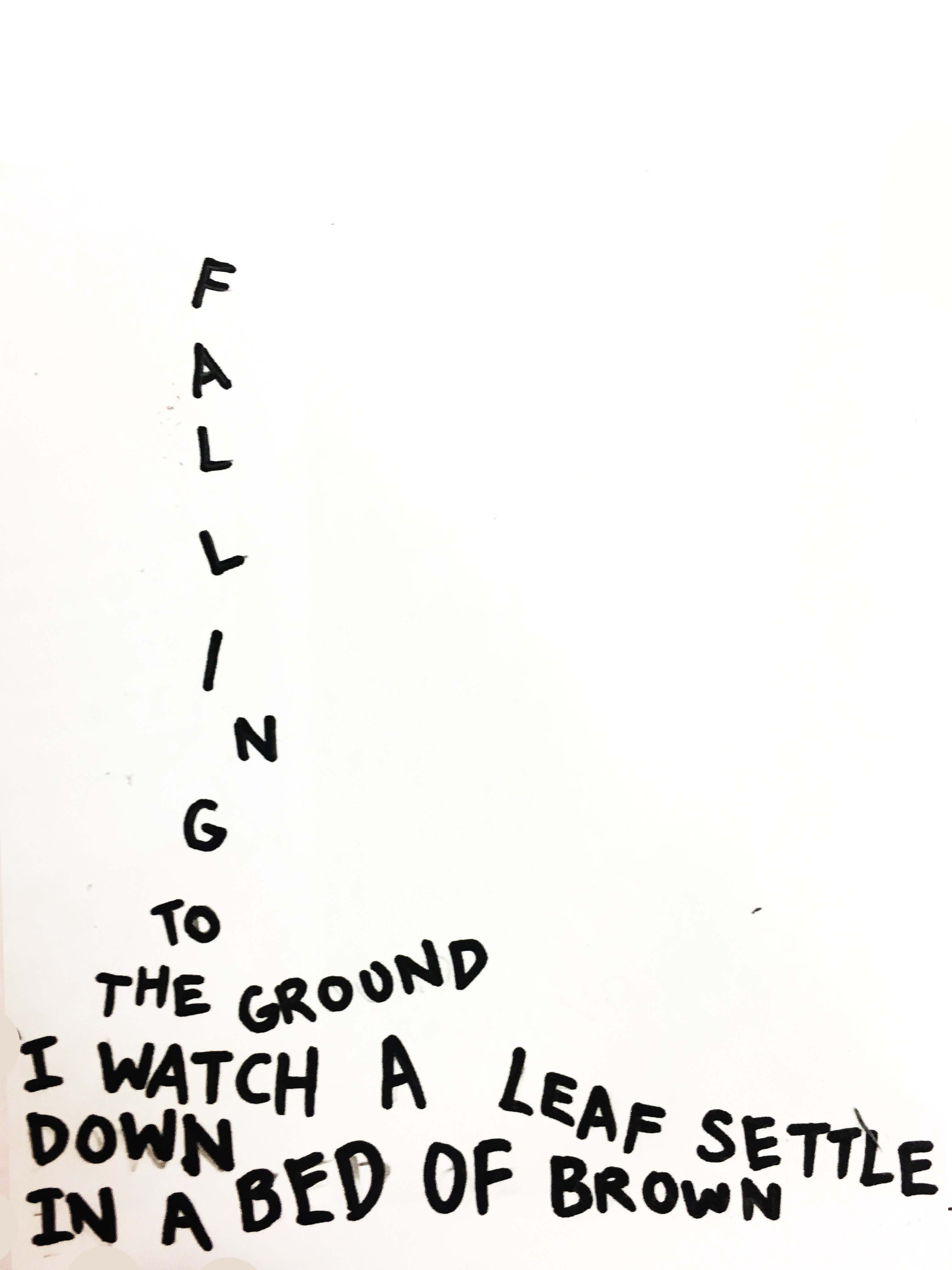
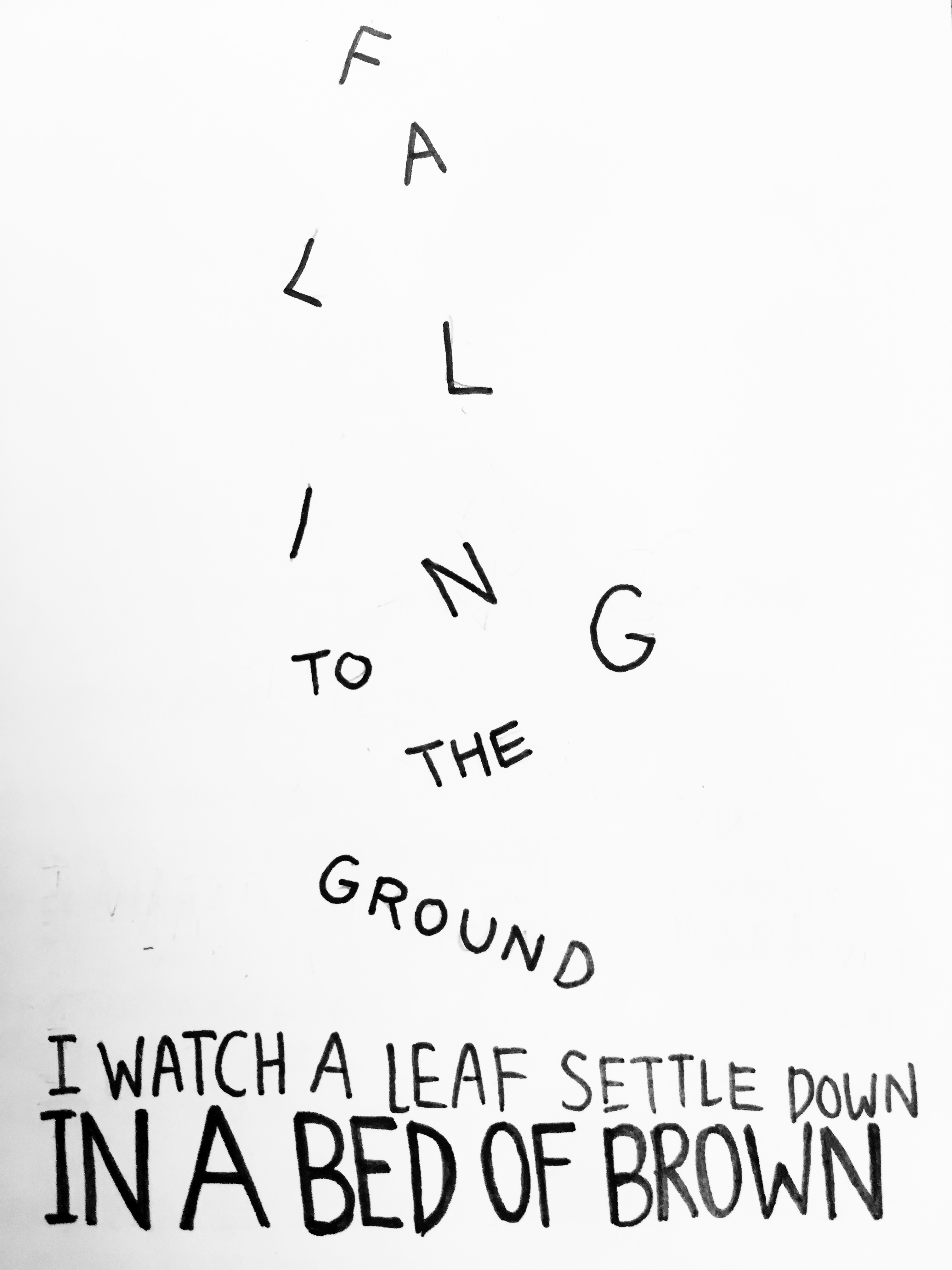
These are some posters I found online and thought that the play of scale was rather interesting and done well. As seen, the difference in scale can lead the readers’ eye and guide a logical and readable flow for them. All in all, I think myriad of different characteristics allows one to push the boundaries of typography and be experimental. It also allows one to convey a certain look and feel to the readers just by choosing a typeface, a type classification and adjusting the scale and size.

References:
https://kmanchesterdesign.myportfolio.com/typography-poster
http://thinkingwithtype.com/letter/

Swiss Style Graphic Design

Typographer of the Week: Neville Brody

Neville Brody is an English graphic designer, typographer and art director. Brody is extremely versatile in his outstanding works. His well-known works include his contribution to The Face and Arena magazines. He had also established his own design practice, Research Studios, in London in partnership with Fwa Richards. The company is best known for its ability to create new visual languages for a variety of applications ranging from publishing to film. It also creates innovative packaging and website design for clients such as Kenzo, corporate identity for clients such as Homechoice, and on-screen graphics for clients such as Paramount Studios, makers of the Mission Impossible films. Also, Brody is one of the founding members of Fontworks and the leading website the FontShop. He designed numerous notable typefaces for the website.

Being a versatile designer, Brody has definitely contributed greatly to the design industry. I took a look at Fontshop and found many great fonts. My personal favourites are these: Industria, FF Pop and Arcadia. Industria is a sleek and cool san serif and FF Pop reminds me of a theatrical look and Saul Bass’s title sequence from Ocean Eleven.

In the website, I could also hover to preview the different typefaces.

https://www.fontshop.com/families/industria 

Ocean Eleven’s title sequence by Saul Bass (1960)
https://www.youtube.com/watch?time_continue=57&v=xnG3OjIcN8M 

In the video, he mentioned,

“We play a lot. We experiment a lot. We like when things go wrong. You get new thoughts, ideas and expressions and possibilities.”

Which explains the fresh ideas in his work.


Tokyo posters by Neville Brody, experimenting with tribal elements and culture.


GQ magazine cover by Neville Brody, experimenting with shapes and precision.

He also mentions about design being multidisciplinary, and that as a designer, one might be making visuals, designing sounds or installations; which doesn’t involve making at all but it involves thinking and strategy. In the end, everything is a design problem. I feel that after having to read many articles on notable artists, many of them adopt a rather similar methodology; design is problem-solving.

References:
http://www.famousgraphicdesigners.org/neville-brodyhttp://www.historygraphicdesign.com/the-age-of-information/postmodern-design/531-neville-brodyhttps://vimeo.com/97413622
http://www.fontshop.com