Category Archives: Typography 1 – G3

Typographer of the Week: Massimo Vignelli

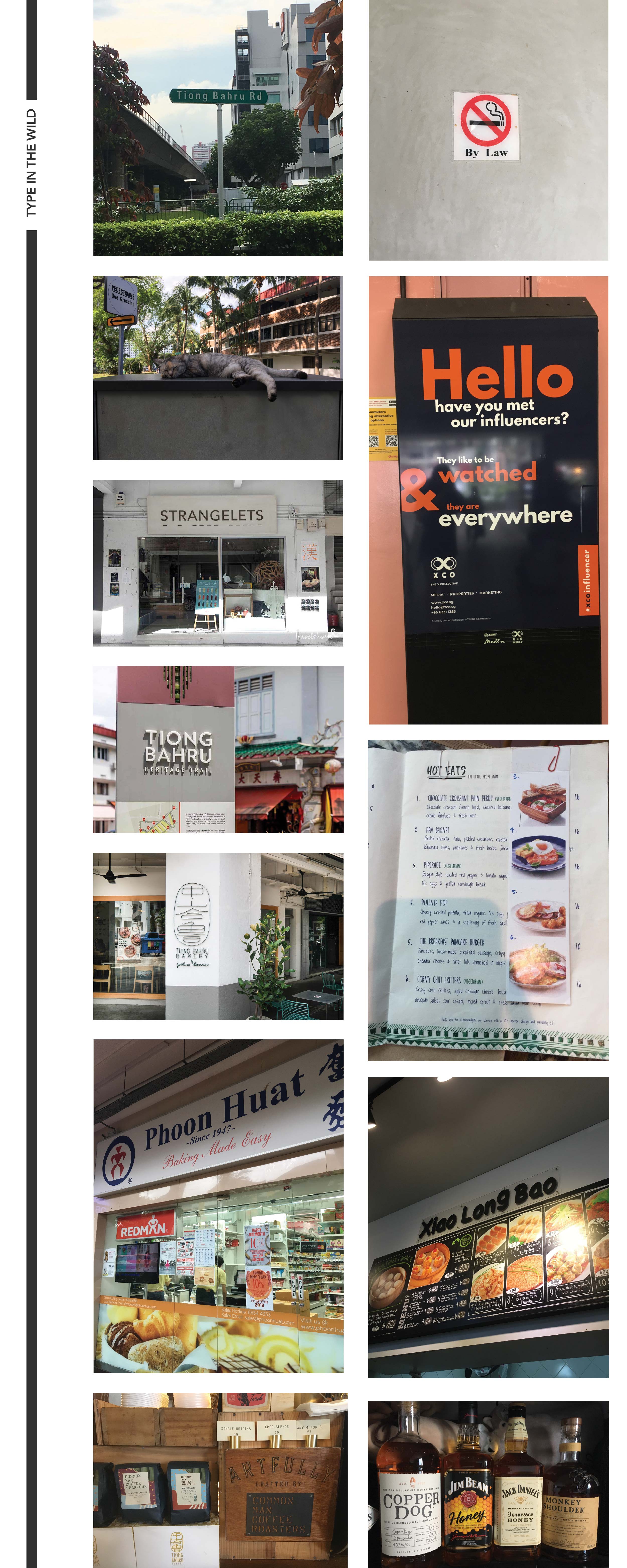
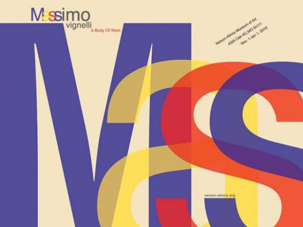
Massimo Vignelli is a famous designer who has practising design in New York for nearly 50 years, during which time he has made a big impact on all forms of design, from graphic design, to furniture, to clothing. What I find most prominent from all of Vignelli’s work is the methodology that he adopted. Firstly, it is structured and logical. There are many reasons why designs don’t appeal and make the cut for readability but for Vignelli, he ensures that he solves all of that.


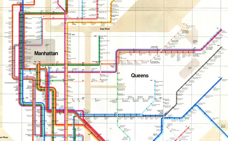
Massimo Vignelli’s 1972 NYC subway map

Vignelli is known for his outstanding works. One of them is the NYC subway map which he redesigned. Although geographically inaccurate, he simplified the forms and enhanced legibility in the map. The subway map is commonly referred by the public throughout the day and the transportation in NYC is rather complex. As such, Vignelli realised the need to create a clear and concise design which people could refer without a hassle. His take on information design is that designers are just like architects, constructing information for the users. I find this really true and it made me rethink about visual materials presented to us all the time; do they actually consider a structural and logical way of communicating visually? or are they just infomation filling up a blank canvas?


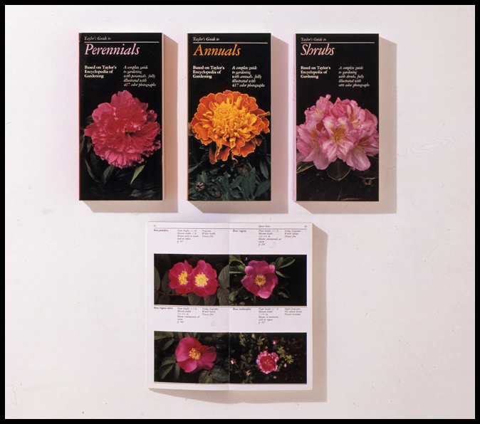
Taylor’s Guides, designed by Vignelli in 1986 and published by Houghton Mifflin, is a series of eleven 400-page visual encyclopedias that provide horticultural information organized by plant group.

Vignelli defined “quality” as, “Things that are done with knowledge. I am interested in work that is grounded in semiotics, the science or philosophy of communications. Semiotics has three levels: semantics, syntactics, and pragmatics. Semantics relates to how information is expressed. Syntactics relates to the structure, discipline, the coherence of elements, the continuity.”

The way Taylor’s Guide was designed, in which photographs of plants are arranged by colour, size, light requirements, evidently exemplifies the excellent application of his methodology.

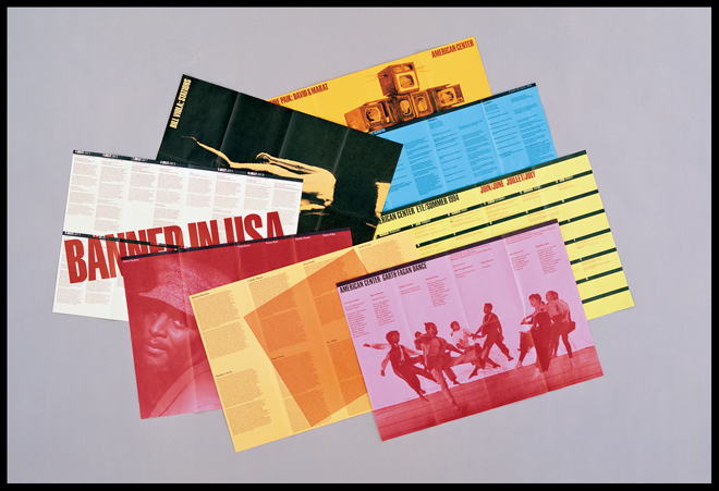
Vignelli’s 1994 identity and publications system for the American Center in Paris

In this series of work, Vignelli explains, “good doesn’t have to have exactly these elements. But it has to be logical. The information itself provides the graphics. This is what we call civilized graphics. The content, not the designer, is what is screaming for attention. Still, there is a lot of personal expression.” From here, it is clear that Vignelli is ingrained with a strong sense of design, structure and logic. All designs have its purpose, whether abstract or not. It is never just about the aesthetics. Vignelli’s approach to design should be what aspiring or current designers consider in their design process. I think many people today are jaded by “pretty designs” and overlook its intended purpose. With a motivation to improve using design, I hope that more people would appreciate visual materials beyond their aesthetics.

References:

Massimo Vignelli: Creator of Timeless Design and Fearless Critic of “Junk”


http://www.designculture.it/interview/massimo-vignelli.html

Review: Type Speaks

After watching the video, I was glad that I did not have to go through such painstaking and meticulous lengths in order to create type. Although I knew that the revolution of type had tremendously changed throughout the years, I wasn’t aware of the tedious steps and mechanical processes required. Now that I have seen them, I am amazed by the level of skill and precision they had at that point in time. Today, with our available technology and software, we are blessed with “Ctrl-Z”s, computer calculations and grids; without all the tedious and complicated processes. I also felt that these designers from the past are knowledgeable about the entire printing process; especially the mechanism of the machines and the processes. Ironically, I think I myself could barely get a printer to work sometimes.


Designer checking every character in “Typespeaks” 1948

With that being said, I do feel that creating a font from scratch even with the help of computers and software might not be as easy as I thought. So, I went to read about the start of digital fonts. Apparently, there was a time where the fonts were created in bitmap or using outlines. As much as it saves much more time, money and labour creating a set of font is still meticulous work. Even with digital, designers are to ensure that fonts look optically similar and readable. The characteristics of the font have to also be consistent and neat. I guess, there isn’t a shortcut to create a good type, is there?


Bitmap and outline fonts by www.designhistory.org 


Digi Grotesk, the first digital font type designed by the Hell Design Studios (left) and bitmap fonts (right). 

References:

http://www.designhistory.org/Digital_Revolution_pages/EarlyDigType.html

Typographer of the Week: Jan Tschichold

I have to admit, I have never heard of Jan Tschichold before. With that being said, the readings were astounding to me; to know that this artist has left such a great impression on typography and a legacy behind in the typography world.

Jan Tschichold
Jan Tschichold is an influential German author and typographer. He was vital in the development of typography in the 20th century, most notably because of advocating the beauty of sans serif fonts, set principles of typography and also developing the page canons.

Notable works 

1. Die Neue Typographie by Jan Tschichold

Following the success and intrigue of his manifesto, Tschichold focused his attention on dealing with this idea of ‘modern typography’.  He wrote ‘Die Neue Typographie’ and had it published in Berlin. People described it as sympathising with the philosophy of the communist revolution. In Die Neue Typographie, Tschicold also provided a set of rules that standardized the practices relating to modern typography.

2. Page Canons

In one of his books, he wrote, “Asymmetry is the rhythmic expression of functional design.”  He found the way to design a harmonious page. A perfect page. There were many rules, guides and ratio which he has set in order to create the perfect page he desired. Every single detail matters. Some of the guides are the Van de Graaf Canon and Tschichold’s recommended 2:3 page-size ratio. Many of these guides are still evident in today’s design.

   
Sonderheft Typographische Mitteilungen (1925) by Jan Tschichold


ABC of Hermes Crafts


Kinfolk Magazine

Some thoughts:


A poster by Jan Tschicold 

His way of creating is definitely something worth remembering and learning. The different ways in which he played with typography, space, layout – very experimental yet essential. He was bored of seeing the same type layouts over and over again and it motivated him to be experimental with typography and layout. This experimental mindset is what will set an artist apart from the rest.

One thing which I really love about his works is the perfect page harmony. The canons of page construction can basically turn a page into something so aesthetically beautiful and pleasing to the eye, as the reader reads the text or admires a picture in a book. I have learnt that in typography, there is a fine line between order and disorder. Underlying the what (might seem) disorderly or asymmetrical text might be the typography guides that these designers have been using since then.

References:

The Secret Law of Page Harmony


https://thecharnelhouse.org/wp-content/uploads/2016/11/jan-tschichold-the-new-typography-1928.pdf

Type In The Wild

Firstly, I’ve never put in much thought about type in signages/posters/billboards around Singapore – or maybe I subconsciously do. I could, however, tell whether one poster or even a shop sign looks aesthetically pleasing or not; and that is actually what I think, we all have been learning in class. Why does it look aesthetically pleasing? All of this is thanks to, the font used, kerning, leading, emphasis, harmony, etc.

And these are some pictures which I took when I travelled to Tiong Bahru/Redhill area. In general, what I noticed about sign boards (not for shops, but for directional, instructional ones), is that the fonts are more formal and readable. For the “Tiong Bahru Road” sign and the “Pedestrians, use crossing signs” in the picture with a cat, they are sans serif type, Grotesk Sans Serif – heavier in weight, uniform and cleaner as there are no serifs. As these fonts are easily readable, the text on the signs has both form and function. (Unlike the No smoking sign which has an awkward (to me) serif font that says “By Law” – lighter in weight, too much vertical stress as the “L” barely visible.

Many of the other shop signs and even the poster, used sans serifs fonts. Overall, they give a cleaner look and enhances readability. However, some places choose to use serif fonts but I realised that they are mostly brand names (many alcohol brand logos are in serif), short words and texts or that they have a more “traditional” look.

Here comes the bad typography. (in my opinion)

(The irony of this picture though)

Regardless, I think the suitability of the typeface used is extremely important and determines the outcome. Some fonts just don’t work out. For example, the menu picture from Tiong Bahru Bakery – yes, the handwritten typeface style is cute and friendly but it takes quite some time to read a font like that – it is lightweight, irregular, and has asymmetrical curves. Other than readability issues, it is not entirely a bad font.

The last bad typography would be the “Xiao Long Bao”. Firstly, the g stands out like a sore tongue. I have no idea why they chose comic sans, but I do find the readability good as it is heavier in weight and the round edges make it look like “friendly, less-edgy and approachable”.

First Impressions

Good typography is just all about nice fonts. Am I right? Wrong. 

We are all surrounded by fonts and we see them everyday. Having to actually learn about them in details is slightly new to me. My first impression of typography lessons was that we will be going straight into using texts, learning about fonts and doing editorial/poster stuff. But, I came to realise after the lessons that what we learn here are back to the basics, foundational knowledge that every design student should be aware of and skilled in. Even things such as the history of typography and the books many renown, key artists have written, are very important in the learning process. Why does a particular layout or font look better the way it is? I guess we can now answer this kind of questions.

Nonetheless, it was fun thus far and my group is Bangkok Fish n Chips. We chose Bodoni as our font and it would be an interesting journey to be learning more about this font.