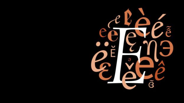
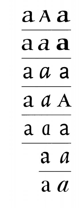
In the book, Robert Bringhurst shares many great principles about design, many of which I couldn’t agree with more. Bringhurst mentions, “typography must often draw attention to itself before it will be read. Yet in order to be read, it must relinquish the attention it has drawn.” A little too much or too little won’t work in typography. Typography has to have this harmonious balance which in my opinion, is always difficult to achieve. Legibility was emphasised as one of the important principles of durable typography. He goes on by saying that these principles apply in different ways, to the typography of business cards, instruction sheets and postage stamps, as well as books – basically anything that needs to convey a certain message or information.
Letterforms have tone, timbre, character, just as words and sentences do. “The moment a text and a typeface are chosen, two streams of thought, two rhythmical systems, two sets of habits, or if you like, two personalities, intersect. They need not live together contentedly forever, but they must not as a rule collide.” A quote which serves as an apt reminder for the current project as we consider different typefaces and how we match them within a composition.
Having to look at good examples of good typography practices, here are some which I myself will (try my best) to uphold.
- Typography can be beautiful and decorative but it must never lose its message
- There is no bad typography; only inappropriate ones
- Choose a typeface that will honour the character of the text
- Pay attention to the smallest details and be meticulous about it
References:
https://alejandrocarpintero.files.wordpress.com/2016/08/02_the_elements_of_typographic_style.pdf

