After watching the video, I was glad that I did not have to go through such painstaking and meticulous lengths in order to create type. Although I knew that the revolution of type had tremendously changed throughout the years, I wasn’t aware of the tedious steps and mechanical processes required. Now that I have seen them, I am amazed by the level of skill and precision they had at that point in time. Today, with our available technology and software, we are blessed with “Ctrl-Z”s, computer calculations and grids; without all the tedious and complicated processes. I also felt that these designers from the past are knowledgeable about the entire printing process; especially the mechanism of the machines and the processes. Ironically, I think I myself could barely get a printer to work sometimes.
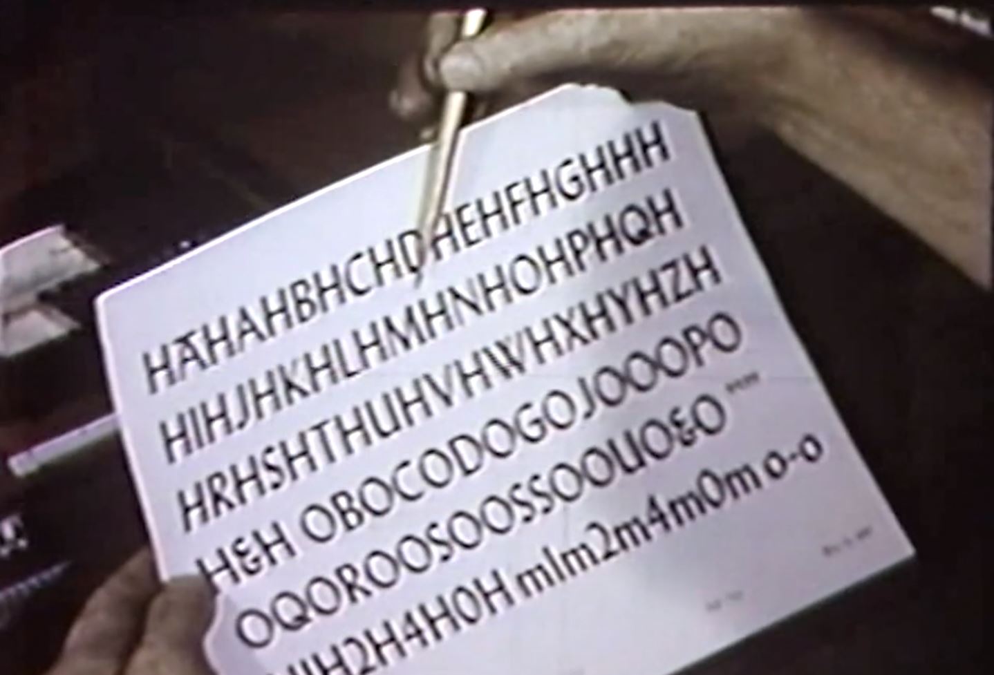
Designer checking every character in “Typespeaks” 1948
With that being said, I do feel that creating a font from scratch even with the help of computers and software might not be as easy as I thought. So, I went to read about the start of digital fonts. Apparently, there was a time where the fonts were created in bitmap or using outlines. As much as it saves much more time, money and labour creating a set of font is still meticulous work. Even with digital, designers are to ensure that fonts look optically similar and readable. The characteristics of the font have to also be consistent and neat. I guess, there isn’t a shortcut to create a good type, is there?
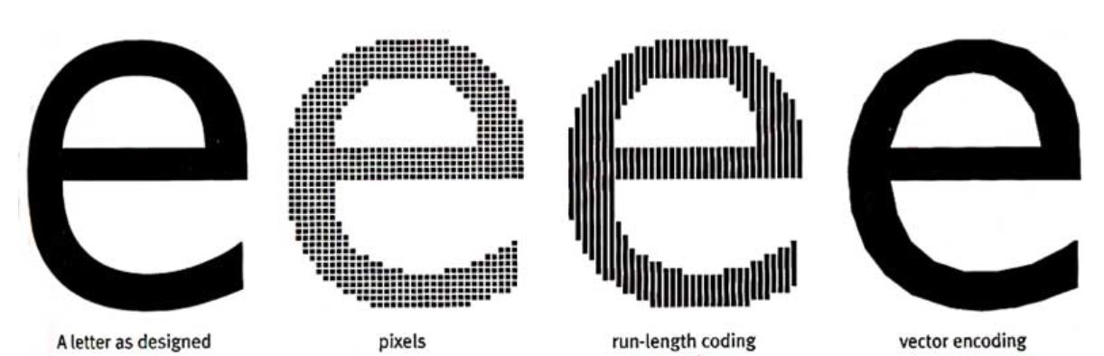

Bitmap and outline fonts by www.designhistory.org


Digi Grotesk, the first digital font type designed by the Hell Design Studios (left) and bitmap fonts (right).
References:
http://www.designhistory.org/Digital_Revolution_pages/EarlyDigType.html