
In Class Activity
These are the vectorized sketches of the opposing pairs of words I chose from the list.
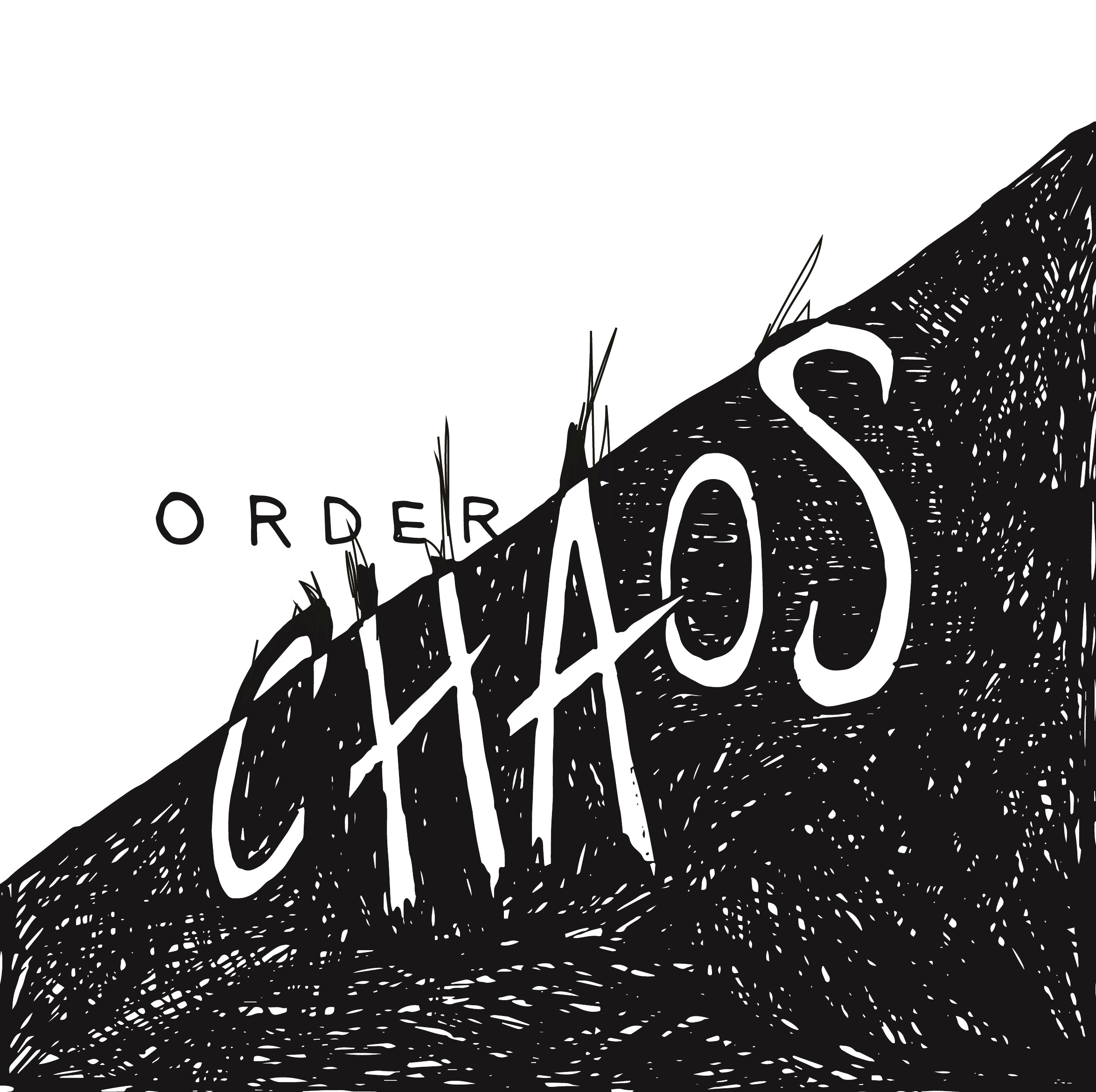
01. Order & Chaos
This is the final piece which I refined and chose for the class critique. In terms of design principles, I largely focused on balance in this piece. To give a sense of disorder and chaos, I disrupted the neatness of the white areas, with the black scribbles creeping into the other half of the canvas.

02. Fast and Slow
My this sketch, I mainly played with the strokes, varying the thickness to create a motion effect for fast. As for slow, I felt that blob-like, flowy lines were more suitable as it looks more organic rather that sharp.

03. Whimsical and Serious
This was my first sketch attempt out of the three. To show the juxtaposition of meanings, I used contrasting strokes, a curvy and italic type vs a sans serif bold type.
Some thoughts:
After the critique in class, I saw the variations of opposing words and there are certainly some words which are more difficult to express. With that being said, there were many clever type compositions which portrayed the opposing words well. For example, the “open and closed” one where letters from “open” were falling out of the letter O from closed. The examples really portrayed how placement and even scale could drastically change the dynamics of type.