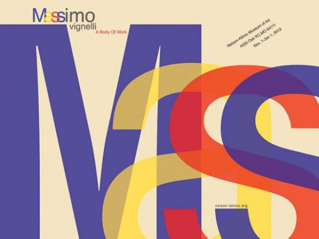
Massimo Vignelli is a famous designer who has practising design in New York for nearly 50 years, during which time he has made a big impact on all forms of design, from graphic design, to furniture, to clothing. What I find most prominent from all of Vignelli’s work is the methodology that he adopted. Firstly, it is structured and logical. There are many reasons why designs don’t appeal and make the cut for readability but for Vignelli, he ensures that he solves all of that.

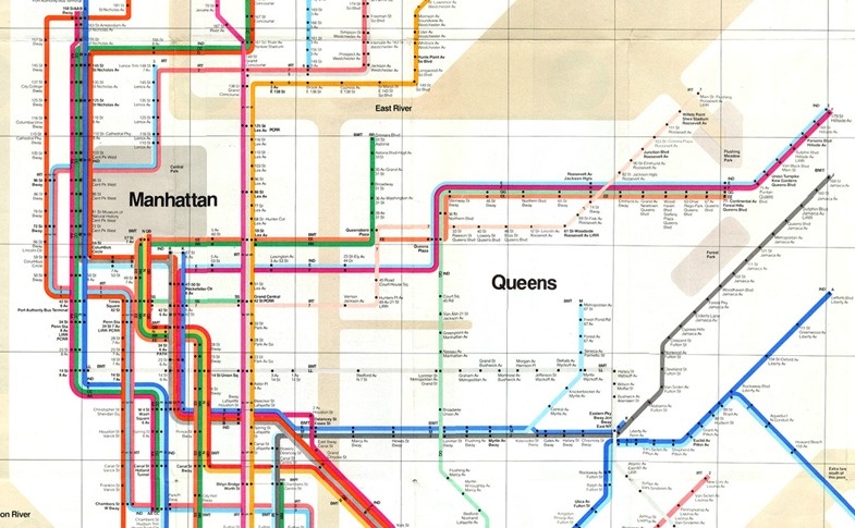
Massimo Vignelli’s 1972 NYC subway map
Vignelli is known for his outstanding works. One of them is the NYC subway map which he redesigned. Although geographically inaccurate, he simplified the forms and enhanced legibility in the map. The subway map is commonly referred by the public throughout the day and the transportation in NYC is rather complex. As such, Vignelli realised the need to create a clear and concise design which people could refer without a hassle. His take on information design is that designers are just like architects, constructing information for the users. I find this really true and it made me rethink about visual materials presented to us all the time; do they actually consider a structural and logical way of communicating visually? or are they just infomation filling up a blank canvas?

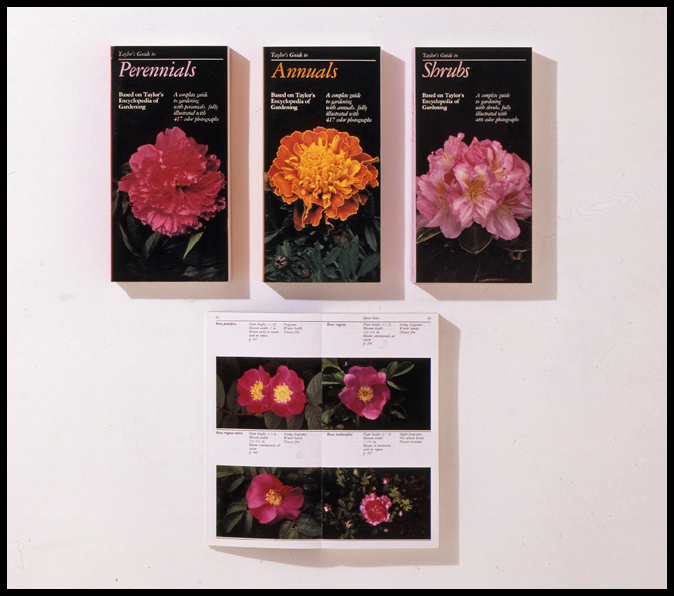
Taylor’s Guides, designed by Vignelli in 1986 and published by Houghton Mifflin, is a series of eleven 400-page visual encyclopedias that provide horticultural information organized by plant group.
Vignelli defined “quality” as, “Things that are done with knowledge. I am interested in work that is grounded in semiotics, the science or philosophy of communications. Semiotics has three levels: semantics, syntactics, and pragmatics. Semantics relates to how information is expressed. Syntactics relates to the structure, discipline, the coherence of elements, the continuity.”
The way Taylor’s Guide was designed, in which photographs of plants are arranged by colour, size, light requirements, evidently exemplifies the excellent application of his methodology.
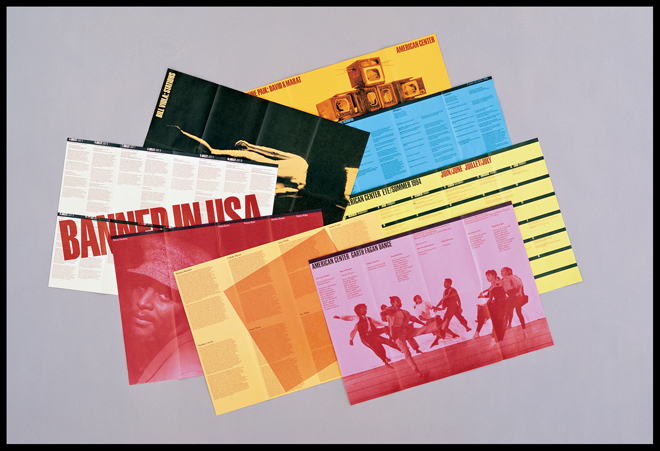
Vignelli’s 1994 identity and publications system for the American Center in Paris
In this series of work, Vignelli explains, “good doesn’t have to have exactly these elements. But it has to be logical. The information itself provides the graphics. This is what we call civilized graphics. The content, not the designer, is what is screaming for attention. Still, there is a lot of personal expression.” From here, it is clear that Vignelli is ingrained with a strong sense of design, structure and logic. All designs have its purpose, whether abstract or not. It is never just about the aesthetics. Vignelli’s approach to design should be what aspiring or current designers consider in their design process. I think many people today are jaded by “pretty designs” and overlook its intended purpose. With a motivation to improve using design, I hope that more people would appreciate visual materials beyond their aesthetics.
References:
Massimo Vignelli: Creator of Timeless Design and Fearless Critic of “Junk”
http://www.designculture.it/interview/massimo-vignelli.html

