


My Event: A Prom for Supernatural Creatures
I think I went a little crazy working on this assignment.
Illustrated Item #1: Gif E-Invite (for humans), Physical Invitation Card (for supernaturals)
“Come to prom. Please.” – Spelltown Student Council

*Note: Stay for around 10-20 seconds on this image! 🙂
In an ideal situation in a supernatural junior college, they would probably receive an physical piece of paper with moving images like the newspapers/howler in the Harry Potter books. The next best thing to replicate that effect is probably a gif…
Illustrated Item #2: Prom King Poster

Illustrated Item #3: Prom Queen Poster

Illustrated Item #4: Sticker Set (Prom Favour)
“We’ve got all sorts of clubs – there’s something for everyone!”


Item #1: E-Invite (for humans) / Moving Physical Invite (for supernaturals)
(I imposed it to do a mock-up for how a student might receive the invite!)

Item #2: Prom King Poster

Item #3: Prom Queen Poster


Item #4: Stickers (Prom Favour)
I wanted to go with a very colorful/striking palette for this project!
In the previous post, I started with the stickers first to determine a narrative and look and feel for the rest of the assets (invites + 2 posters). Decided on a more comic book style and I was quite determined to illustrate as much as I can over the different assets so that they would all provide a different narrative over the different medias to tell more about the event!
I started the Ken poster with Ken as a soft, fluffy boy (but gave him some fierce after Lisa said he wasn’t intimidating enough woops). I struggled with his ferocity quite abit…


Then there’s Circe the witch!


Ken and Circe have come very far indeed…

Original Thumbnails
I did the e-invite last even though it was the first thing I planned for in the series of assets. The e-invite was really fun! But also a pain because there were so many issues!

Edited comp from thumbnail (to fit square)

Invert checks
 Still image
At this point, I already finished the poster and stickers so I already had a look I wanted to work off on, but I quickly realised that I’ll have to pay the price in linework if I wanted to add more animated elements. 🙁
I reduced the lines and number of tones to put the characters more in place with the background characters of both posters, but hopefully still in line with the look of the other assets.

COMEEEEE TO PROMMMMMMM… COMEEEEEEEEEEE
I initially wanted to use Live2D and break down the characters by body parts but Live2D crashed my PC multiple times… so I guess I’ll have to settle for Adobe’s animation timeline. This gif is 100+++ of layers and I had a major brainfart at some parts when I couldn’t find the layers.

I did a little ref to the standard animation for seaweed cycle for his wriggly tail hehe.


The pink demon’s skin didn’t export well – noooo!!! D:
There was also another issue with export because there were so many colors. So the colors exported all over the place and I had to try a few different settings. Thankfully I had some foresight to do the invite on a much smaller file (1000 x 1000 px) so that I could keep it a pretty small file and not have to deal with sizing issues – but still have decent quality to the illustrations eep. BUT ANYWAY, IT WAS FUN WORKING ON MOVING THINGS.
I did wish I have more time to bomb on paying more attention to color and linework and making them more consistent – but overall I was super happy working on this project since it was so fun!
Assignment 3: Part 1 (Week 11-12 Progress): https://oss.adm.ntu.edu.sg/laum0005/illustration-for-designers-assignment-3-week-11-12-progress/
Gallery of research and past works: https://oss.adm.ntu.edu.sg/laum0005/illustration-for-designers-gallery-academic-blog/

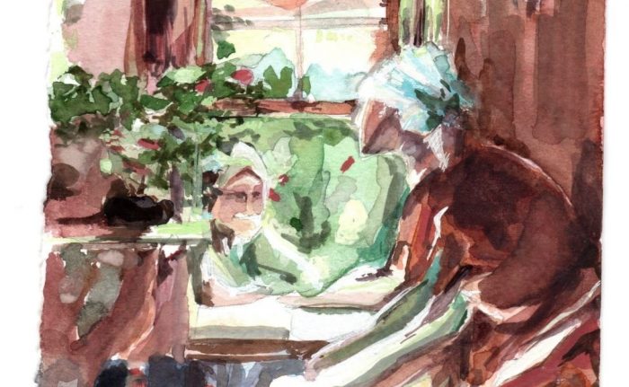
Week 13 update! Painted the topic interior.

Final artwork #2 – embroidery
20cm x 28.2cm
Looked mostly into a combination of Arkhipov and Inness for this topic.

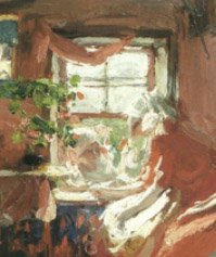
Color test (with a different composition)
(got too excited to try out the colors with the final after doing this color test and the Inness study so I headed right for final after this piece…)


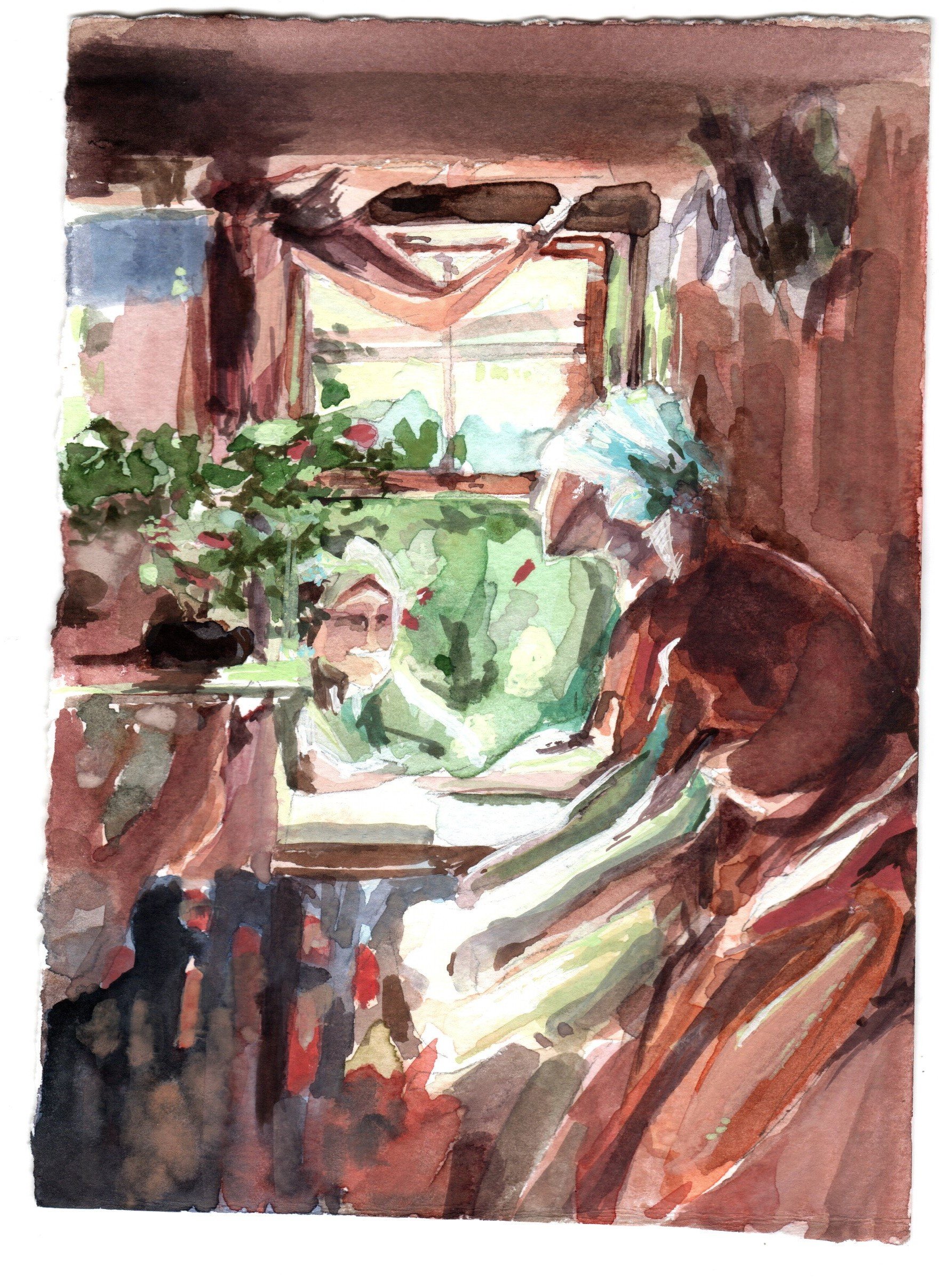
Inness Study
(studying how the transitions are handled on the trunk and retaining chroma but woops with the many green HAHAHA)

Random balance practice (looking into transitional colors – purple/brown)
Reviewed the video on transitional colors and did a super quick practice on my own based on class time’s abstraction practice and view from window

Thumbnails for final / color tests
For the layout of the piece, I liked Arkhipov’s subjects (embroidery/women) and wanted to do something a little similar, so I combined some Arkhipov/embroidery/yangqin poses and embroidery to try to catch the same intimacy in the image.

Images: Arkhipov, Inness, Yangqin player, Chinese clothes, Cheesecake Factory photo from a trip to US, Embroidy close-up

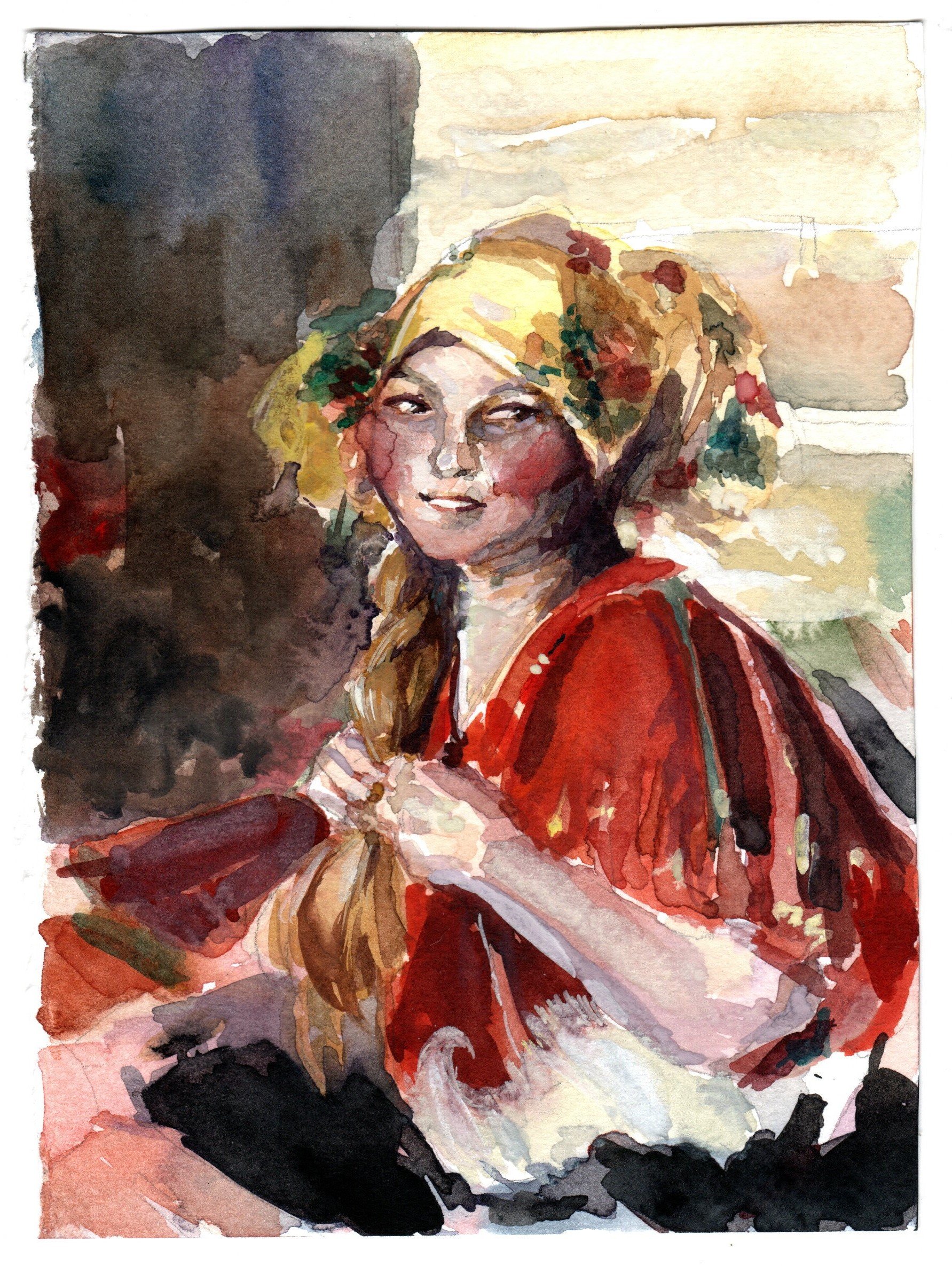
Archipov Study #1

Arkhipov Study #2
Not very happy with how little chroma is retained in the final and also I think I still isolated subjects again… I know some of the persisting problems I have and still accidentally committed them during painting RIP. :’) Need to turn on my brain more during practice and less rushing. I’m so glad I borrowed Inness’ book to study from the school library before circuit breaker.
If time permits, I’ll try to get another piece done for the final (Weather Condition/Tinted) or revisit Landscape/Interior.
(If not, I’ll practice on my own anyway HAHAHA)

I was a little stuck between a tea party for witches or a prom for supernatural creatures ( or even a zombie body parts auction my brain is poot). I went with the prom in the end!
Prom for Supernatural Creatures
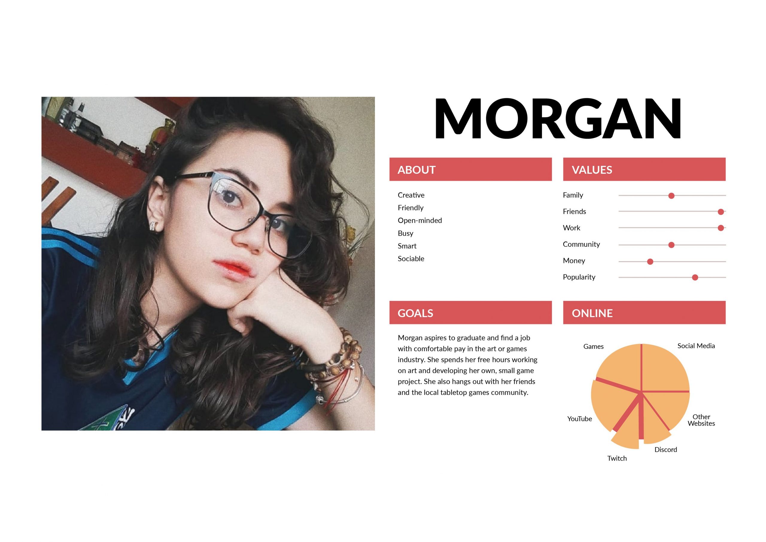
I created two user personas – one specific to the event and the other is a real life user persona.


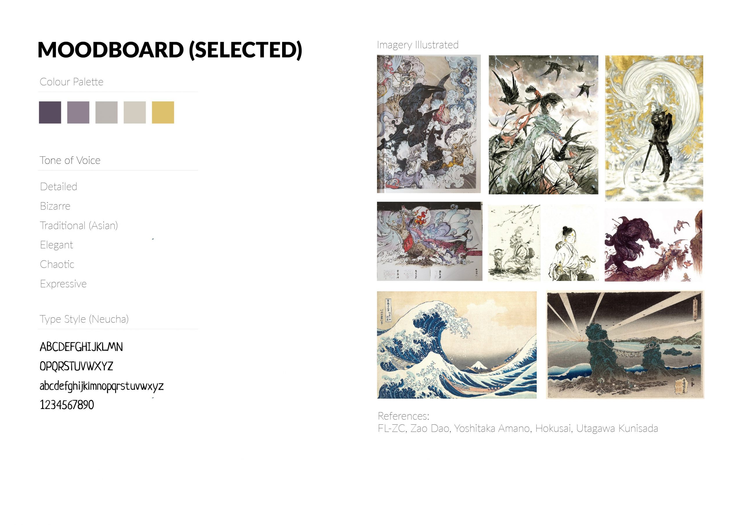
Since I went with the prom idea, I looked back to my unused moodboard from Assignment 2 that I really liked and found would fit the event really well. I wanted the prom to be dark, but still ultimately fun, teen and wholesome!


I dumped a bunch of things onto the mind-map and tried to see what I could use – since the creatures and their representations would set the tone of the party and items.
I imagined myself in the shoes of the student council/staff in order to try to figure out what assets would be needed for a prom… and did lots of research since I went to poly and not JC, so I’ve never really gone to a prom myself. (I will live vicariously through this project I guess)

Stickers Thumbnails:


E-Invite Thumbnails:


Prom King/Queen Poster Thumbnails:

Warning Poster Thumbnails:

I decided to stick with these 4 items for the finals:
Honestly I’d make all the assets move and breathe if I could but I’ll do the e-invite first… and see how about the rest. :’)
I started working on the stickers first since it would be the easier asset to use to visualize what a school of supernatural creatures would be like – their clubs, facilities and space!
Here are some work-in-progress items:


Got some feedback from Lisa that it might be better to simplify since the details may be lost at a smaller sizing (smoke strips/claw), so I removed them and strove to do the other stickers in a similar vein.


Sticker #1: Bone Hockey Student Club
Joining costs an arm and a leg

Sticker #2: Poisons & Venoms Student Club
Tasters get extra CCA points

Sticker #3: Spelltown Junior College Student Council
Working day and night to enhance your student life

Sticker #4: Student Welfare Committee
For the bleeding hearts

Sticker #5: Theatre Student Club
Cultural diversity!
I want to join the wing brigade. :’)

A week 12 update!
Between last week and this week, I suddenly decided to attempt another topic (Landscape) instead because I suddenly got intimidated at the thought of needing to paint a final image. This hopefully helped me to chill abit and warm up for more paintings while painting barns and a field. 🙂

Final artwork #1 – barn by the mountains
28.5cm x 19.5cm

Color tests
I think the thumbnail in my opinion seemed to work a little better than the final due to the smaller range from more tinting and less shaded colors? I lost the field a little between the thumbnail and final for this landscape piece.


Photos of the paintings
I looked into Shishkin and Inness’s fields for reference on colors and foreground and Inness and Monet to paint the field (painting distance as a relative whole; changing colors), but in hindsight should have also looked into being better at managing the mountains and skies – I tried using more purples as a transition and tinting more to hold the image together but the mountains and skies still look abit odd. I got abit too greedy but it was fun… Perhaps I should have done more color tests (and also time to look into more sky and mountain practice)… :O
Also, here are the initial thumbnail sketches for landscapes


Pencil thumbnails for landscape painting
Will probably try another topic first before considering making more attempts. 🙂

Images: Barn photos, Inness, Monet, Shishkin
Out of the 4 topics, I’ve chosen to work on Interior Space and Weather Condition.
If time permits, I definitely want to try out the other topics too! (Or at least study them)
As of now, I only have in mind what I might want to do for Interior Space.
On week 10, prof. Woon Lam mentioned a Russian painter called Abram Arkhipov and I went to check him out. I love the color control in some of his works – the recurring use of reds in his works and how the colors transit from red to greens/blues.
Abram Arkhipov Excerpt
My Abram Arkhipov Study #1
My Abram Arkhipov Study #2
I want to try studying and implementing his color schemes on an interior! Maybe find a way to play with it too. 🙂
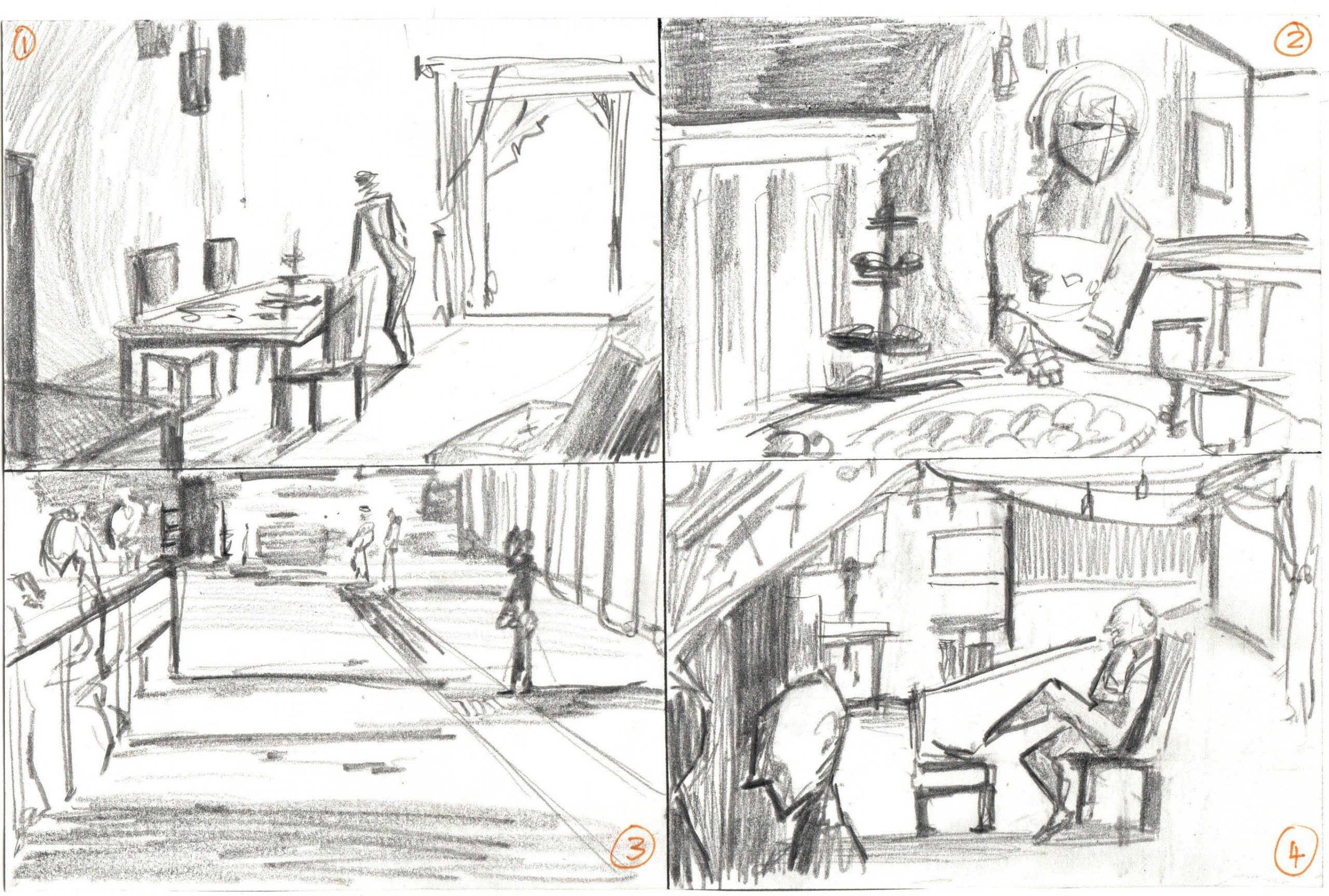
I did 4 quick thumbnails so far that are a combination of photos/live doodles.
No. 1 is a living room space with a glass door/window shining in.
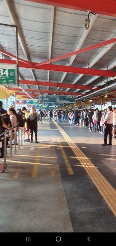
No. 2 is a dining moment with lots of food on the table.
No. 3 is a quick thumbnail based on Jurong East bus station waiting lines.
No. 4 is a combination of windows, chairs and people to make a party-like interior situation. Abit messy here.
Looking to do more thumbnails and try the cutout filter method too. So far I’m more keen on No. 3 because I want to look into painting shadows, or No. 4 because I want to paint more food.
Week 2 to 10 works (In-class practices and self-studies): https://oss.adm.ntu.edu.sg/laum0005/watermedia-landscape-painting-week-2-10-exercises/
Week 5 tonal practice: https://oss.adm.ntu.edu.sg/laum0005/watermedia-landscape-painting-week-5-tonal-exercises/

Week 5 Tonal Exercises

1. Night

2. Day 
3. Rainy
Week 2 to 10 (Other class exercises and practices): https://oss.adm.ntu.edu.sg/laum0005/watermedia-landscape-painting-week-2-10-exercises/

A post to document the practice for the module. 🙂
Week 2 In-Class Exercises

1. School #1
2. School #2

Week 2 Self-Practice

3. Park area

4. My house carpark
Week 3 In-Class Exercise

5. Trees #1
Week 4 In-Class Exercise

6. Trees #2

7. Trees #3
Weeks 2-4: Self-reflection and feedback
Reflection time! First time working with so much watercolor and I don’t think I knew what I was in for when I took watermedia, but there’s so much I learnt about color much just over a few weeks (especially greens!). Super fun!
Some stuff I need to watch out for at the moment:
Hoping to improve more over the next few weeks! 🙂
Week 5 Tonal Design Exercises
1. Night
2. Day
3. Rainy
Week 6 In-Class Exercises (Master Copy)
1. George Inness Study #1

2. George Inness Study #2
Week 7 Class Exercise and Practice

3. George Inness Study #3

4. Liu Fenglan Study #1
Recess Week Exercise

5. Bingsu
(Texture study + changing up color of the object)

6. Motorbike Cover
(Texture study + changing up color of the object)
Week 8

7. Practice – Screws in classroom

8. Night study at ADM #1

9. Night study at ADM #2


10. Practice – My sister’s pet bunny


11. Practice – My sister’s pet dog
Week 9

12. Practice – Liu Fenglan master copy

13. Class exercise – Shapes and colors (canteen interior)
![]()
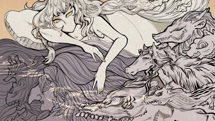
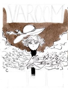
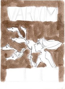
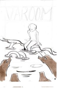
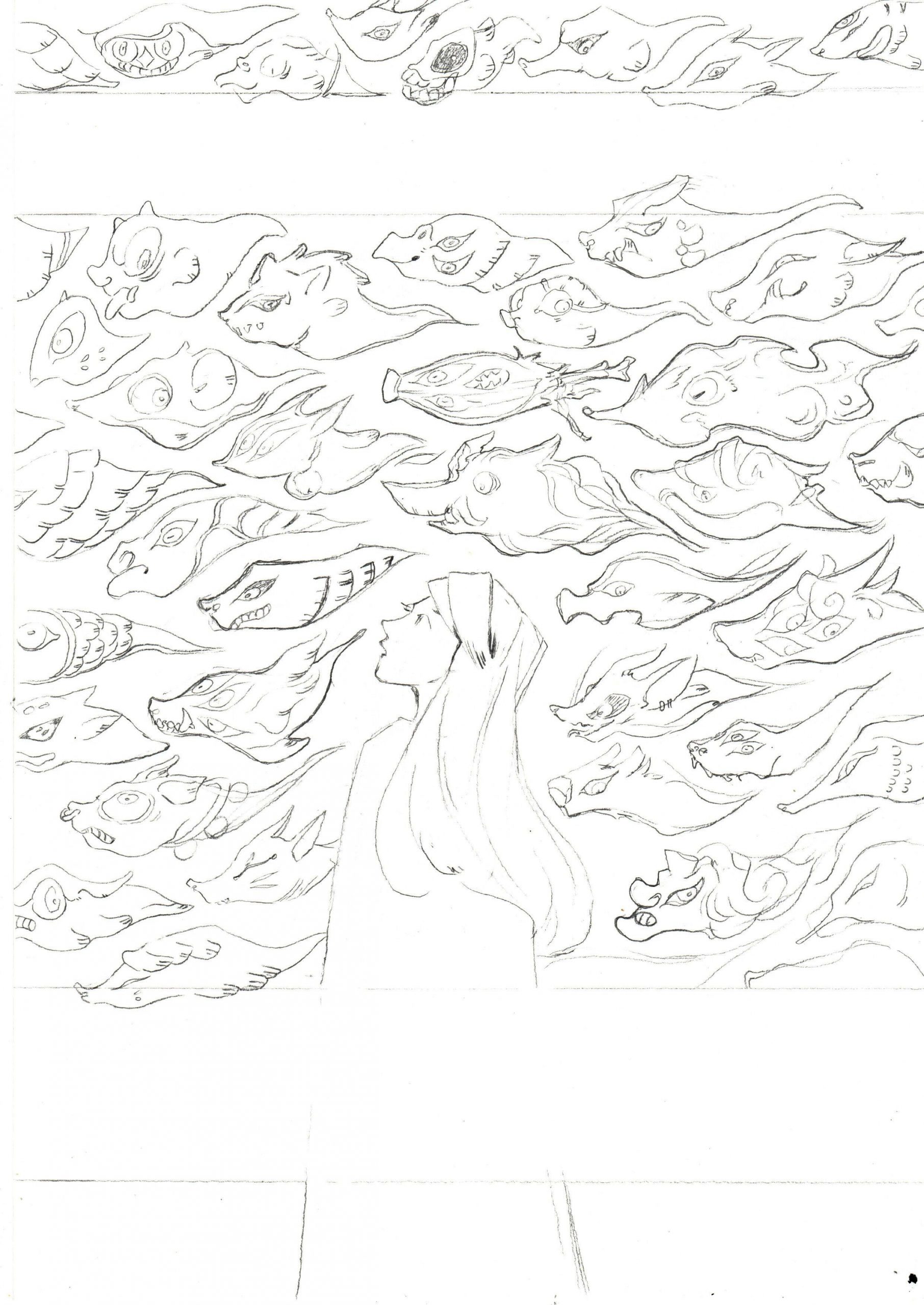
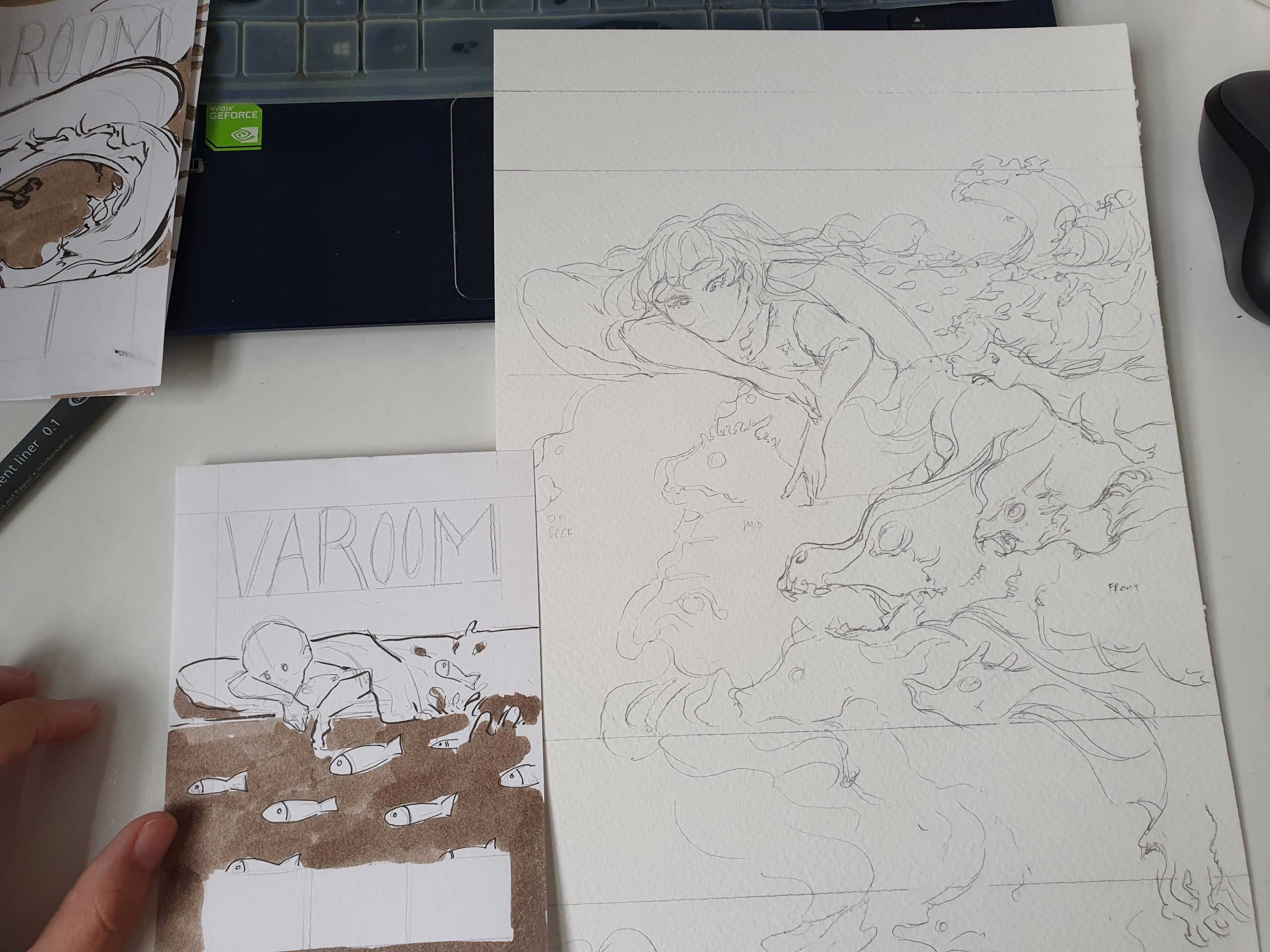
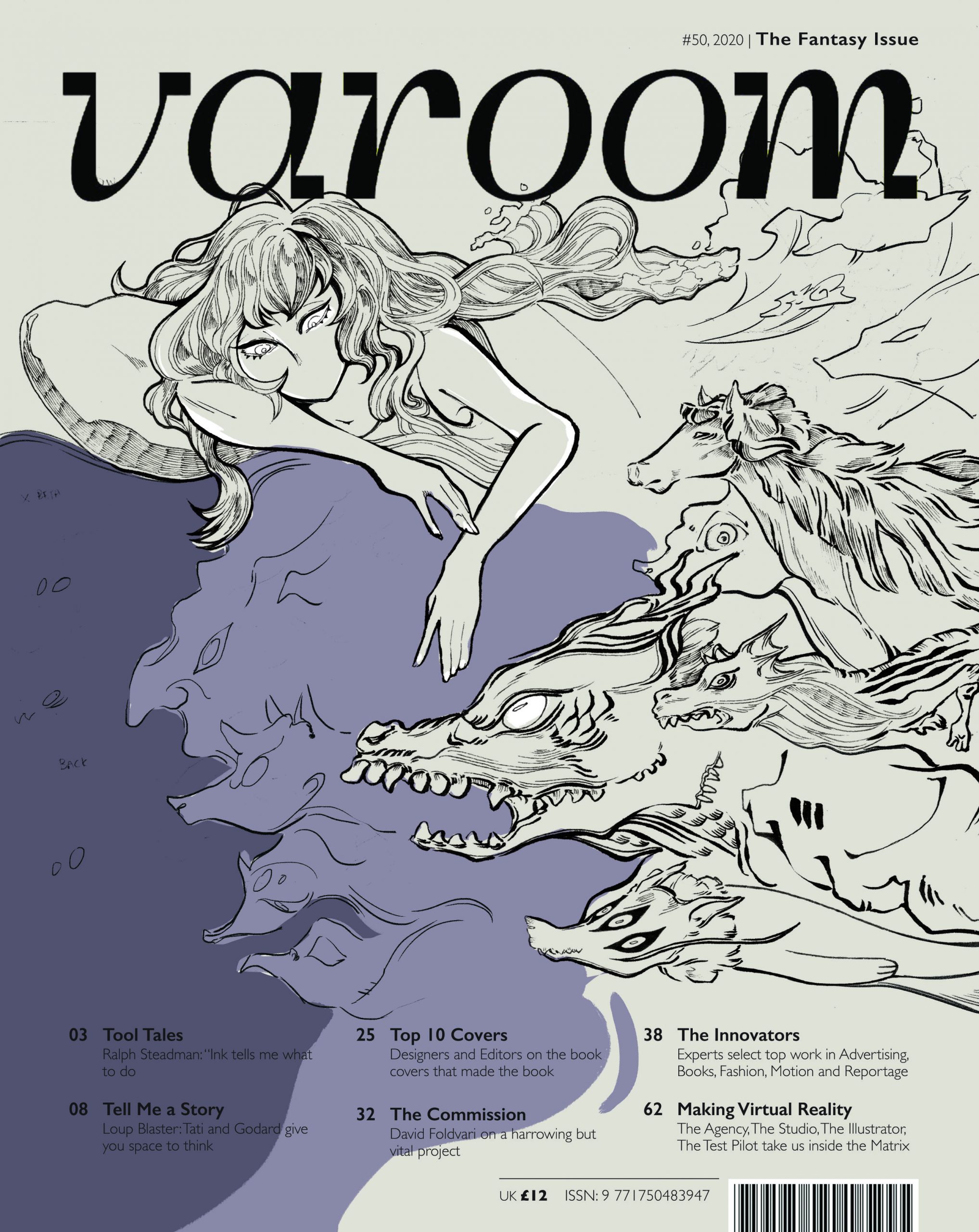
I chose to expand on the thumbnail that featured a composition of a girl in a bed, with monsters swimming under her bed. The composition was first inspired by the state of dreaming and the idea of having ‘monsters under your bed’.
I chose to integrate water as an essential element as to me, water is a symbol of great change and polarity (life and death, benevolence and ferocity). This reflects my take on fantasy where alot of elements and ideas are taken to the extreme (good and evil, poor and rich, colorful and colorless).
Towards the end of the illustration, I also decided to leave out the mouth of the girl to convey restraint when staying on the side of reality – since the image is split into dual halves: orange half symbolizing reality and purple half symbolizing fantasy.
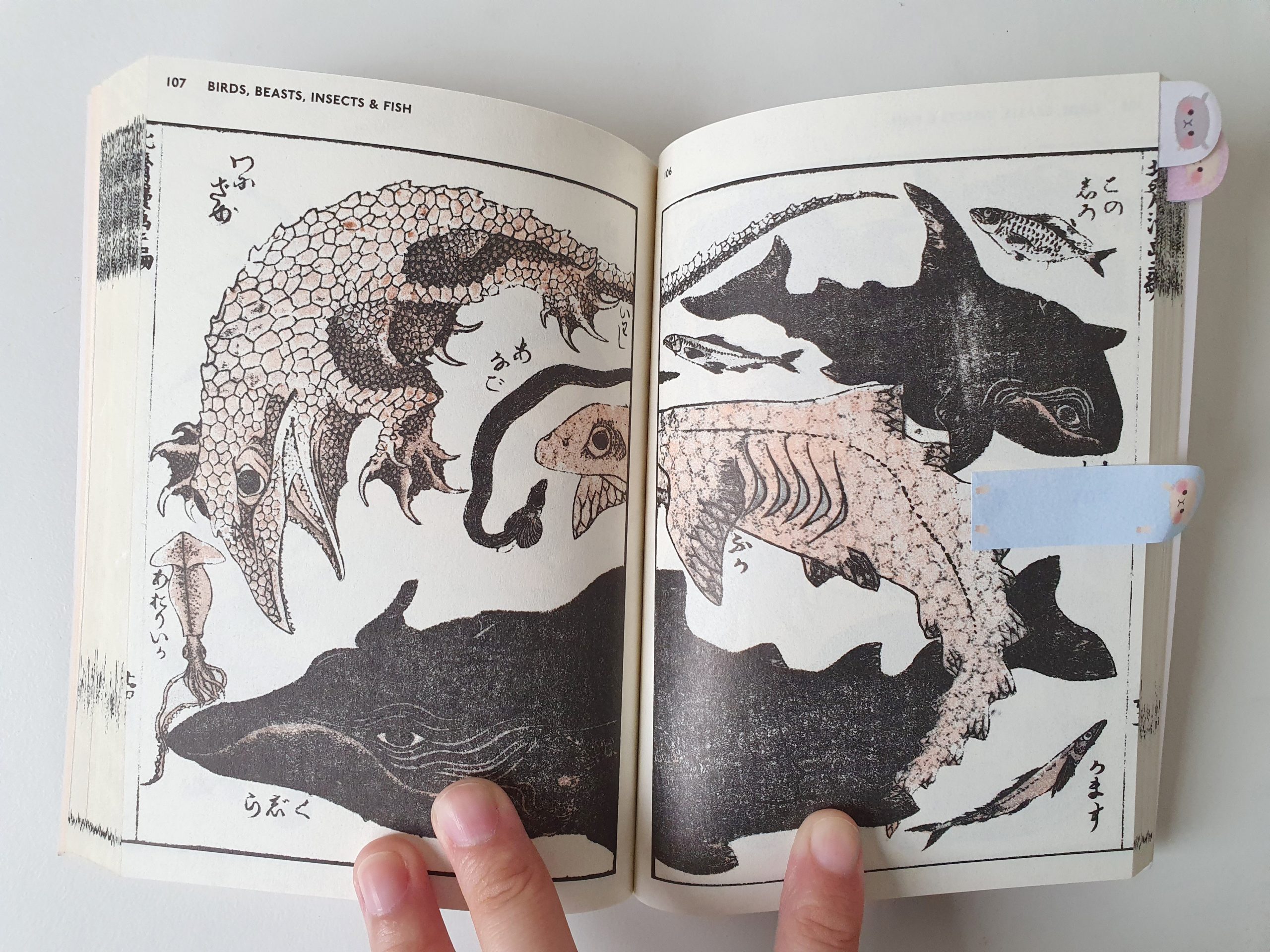
For references, I looked into Hokusai, Zaodao and a few other Asian artists because they were great influences in my artistic journey.
I took this chance to review some of the text in their art books to check out their working processes. An interesting tidbit I found:
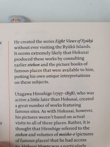
An excerpt from Hokusai’s sketchbooks: The Wonders of Nature
I found out that Hokusai wasn’t a very well-traveled man. His lack of travel and getting information from sources around him (picture books, etc), however, contributed to the bizarre nature of his creatures and fantasies.
Other than artist research, I also drew inspiration for the creatures from the animals at my house right now like:
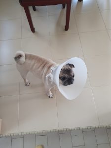
My sister’s pug, Pepper
My budgie friend, Ginko
Pepper had alot of folds and wrinkles in her face and was the major source of inspiration for the brush pen in my drawing to achieve texture and volume in the creatures! Ginko (and Hokusai) was good reference for the fierce look and textures of the creatures.
The tools I used were: Micron pens (0.03mm – 0.1mm), Brush pens, Adobe Photoshop (with natural brush textures) and Adobe In-Design (compilation)
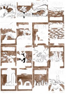
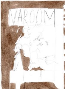
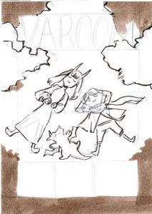
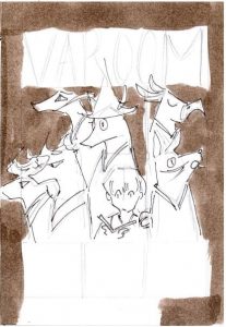
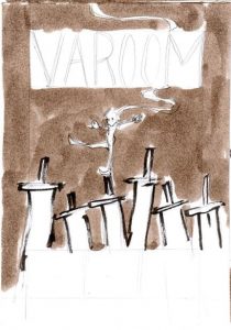
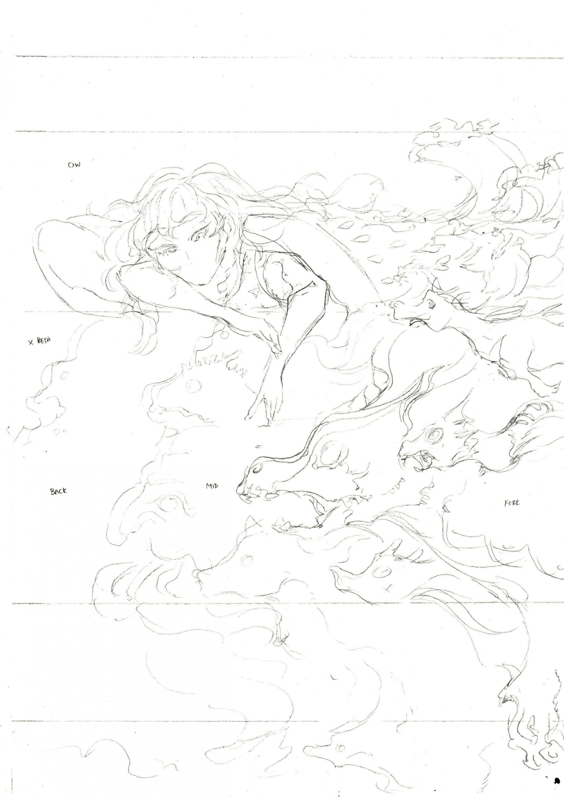
My 16 Thumbnails
Thumbnail #1: Hero and dragons
Thumbnail #2:Wearing fantasy
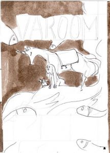
Thumbnail #3: Traveler and a twisting dragon
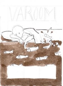
Thumbnail #4: Sleep
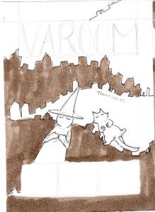
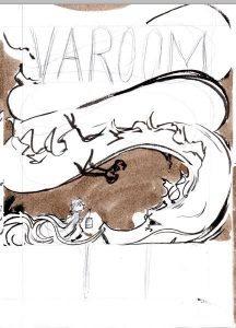
Thumbnail #5: Witch, her Cat and the City
Thumbnail #6: Traveler and her sea
Thumbnail #7: Thinking
Thumbnail #8: Spirit Parade
Thumbnail #9: Bubbles
Thumbnail #10: Day and Night
Thumbnail #11: Dreaming with friends
Thumbnail #12: Things around You

Thumbnail #13: Cat and Twisting Dragon
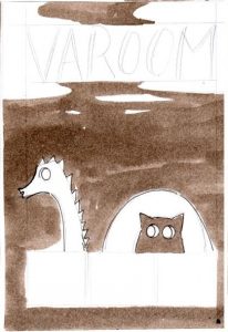
Thumbnail #14: Loch Ness and Cat
Thumbnail #15: Swords
Thumbnail #16: Sea of Monsters
Concept behind the thumbnails:
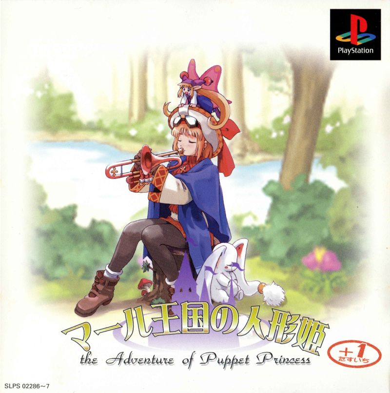
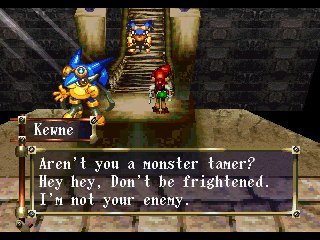
My thumbnails were generally based off on my experience with the fantasy genre (in games and novels). During the thumbnailing process, I focused alot more on creating visually interesting compositions and not so much about the individual concepts. When I think of fantasy, I think of fantastical creatures in my childhood. I loved monster-taming games like Pokemon, Rhapsody: A Musical Adventure and Azure Dream.
Rhapsody: A Musical Adventure
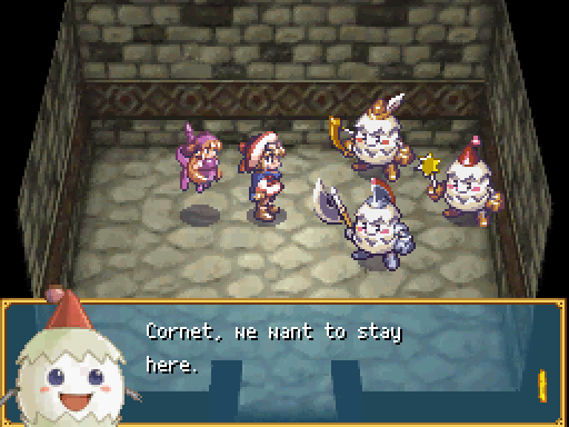
Rhapsody: A Musical Adventure (Gameplay Screenshot)
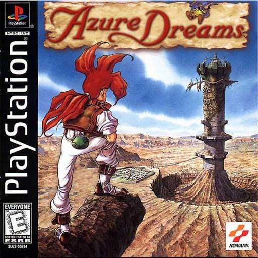
Azure Dreams
Azure Dreams (Gameplay Screenshot)
My thumbnails generally revolve around animals as friends and companions, or creatures as an anthropomorphized aspect of myself or a journey to overcome. As a kid and teen who never traveled much last time, these creatures were simultaneously my best friends and worst fears at the same time because I could relate to them in stories but they also confronted things and concepts I didn’t have much exposure or access to – such as responsibility, power, loss, and more.
This was also why I related to the passage in Hokusai’s sketchbook since he lived in a time where the world was not so accessible yet and had to rely on his imagination to fill in the rest – which made things alot more polar and led to the creation of extremes, absurd creatures and concepts.
The three chosen pencil comps after the thumbnail feedback session are as follows:
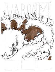
Pencil Comp #1: Spirit Parade
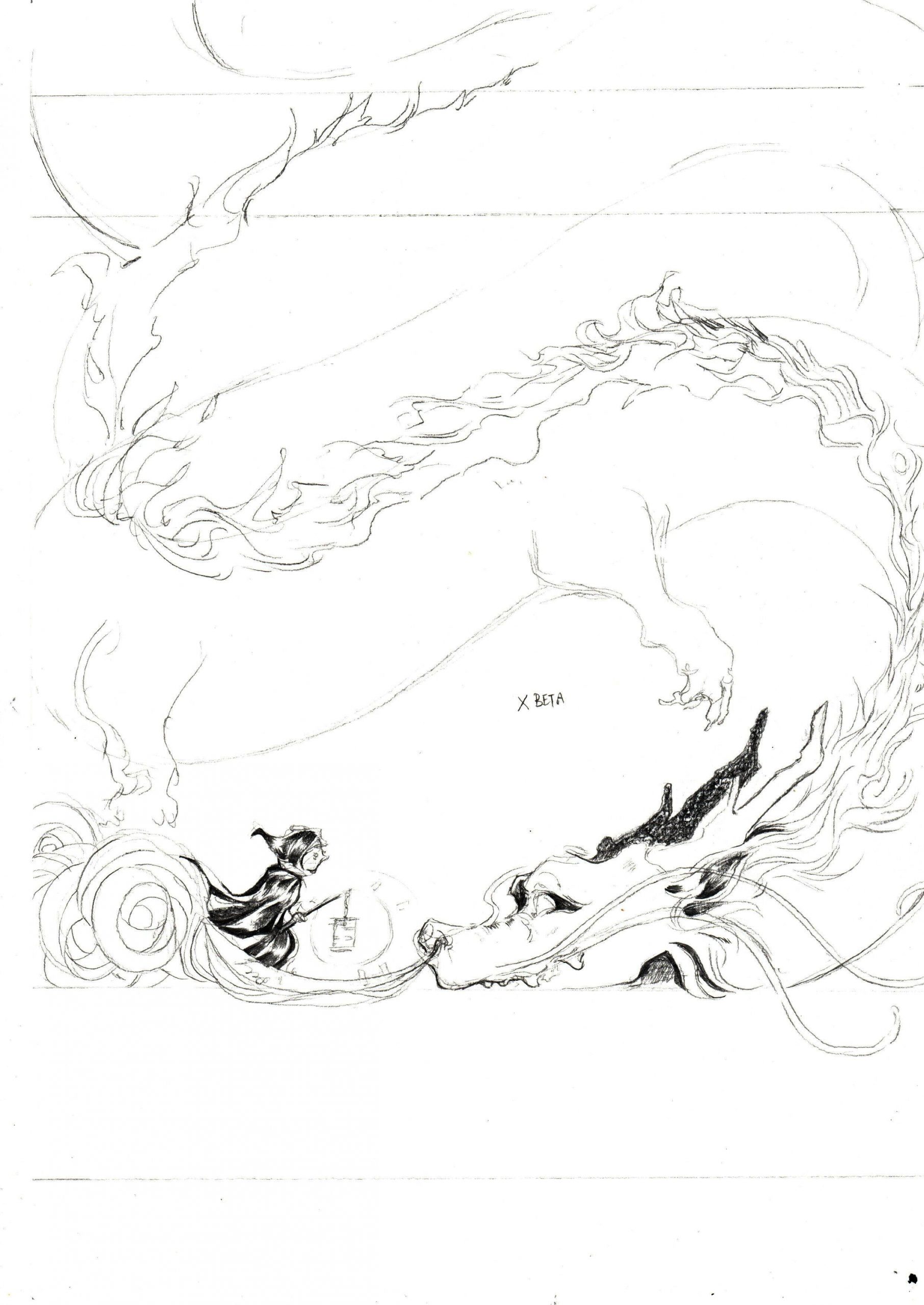
Pencil Comp #2: Traveler and a twisting dragon
Pencil Comp #3: Sleep
My materials
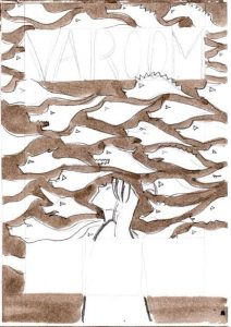
I worked directly on the pencil comp with black brushes and microns, before scanning in the drawing, increasing the contrast to extract the black lines.
From thumbnail to pencil comp
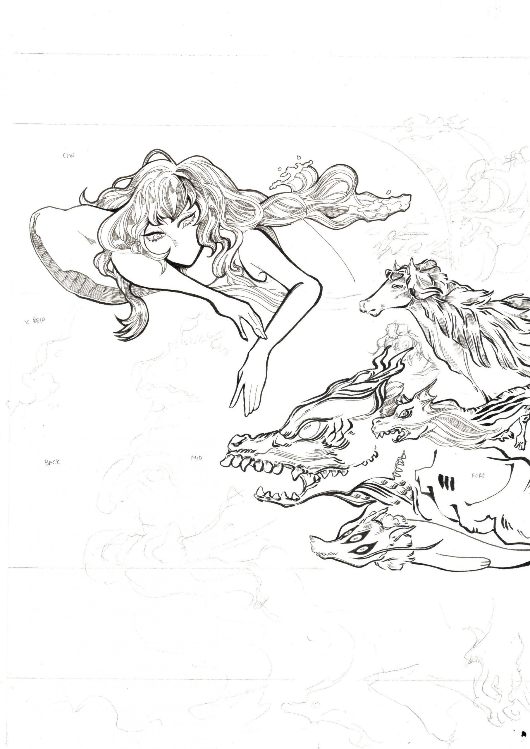
The pencil and ink scan
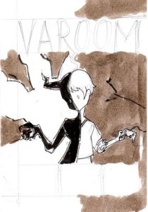
Initial draft for Week 9 review
I filled in the rest of the rest of the image digitally on Adobe Photoshop and also filled in the purples and orange/yellows to work out the composition!
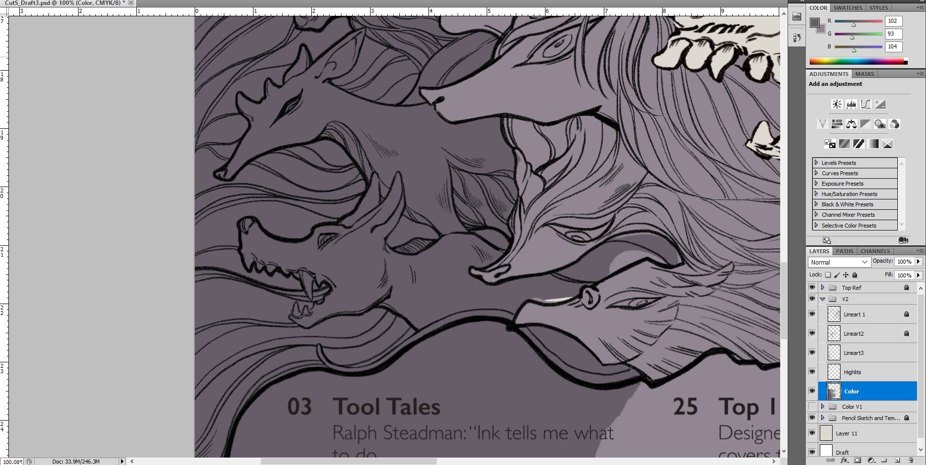
Adobe Photoshop: continued work-in-progress
![]()
Final – overlay with paper texture
Link to Varoom Research: https://oss.adm.ntu.edu.sg/laum0005/illustration-for-designers-varoom-artist-research-week-5/

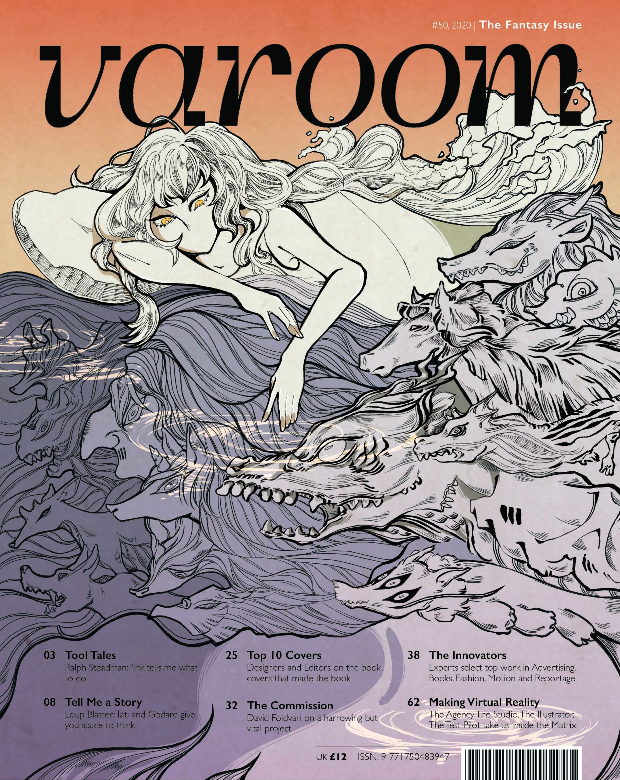
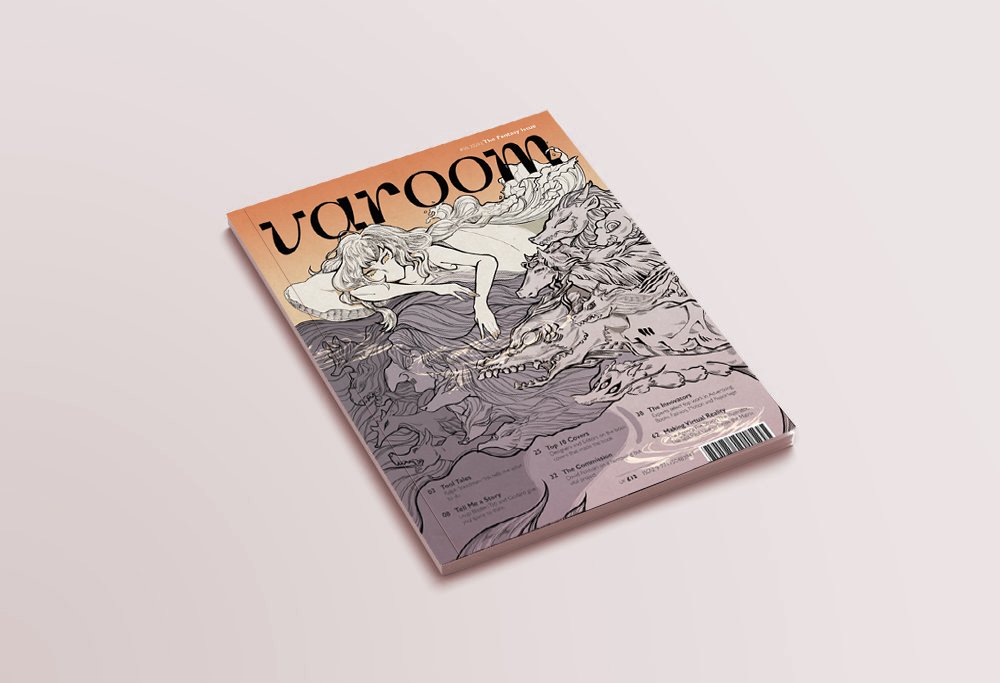
The Varoom magazine is a biannual publication by the Association of Illustrators. The magazine features insight and analysis of the illustration, design and animation industry, with content such as interviews, recommendations as well as commentary. Each magazine’s illustrated content come from a variety of artists and revolves around a singular theme.

Varoom’s latest Fantasy issue
What type of information is in the magazine?
As an example, the latest issue Fantasy features articles on games, graphic novels, the TV series Game of Thrones, Ram Han and all that is related to the fantasy genre or fantastical in nature.
What do I find inspiring?
The variety and freedom in stylistic choices employed by the artists who have contributed to Varoom is amazing!
Who’s the target audience?
Art enthusiasts, educators and practitioners
(1) Hail Herman Inclusus

The article is about Herman Inclusus (Stuart Kolakovic) and the inspiration for his style – traditional Christian manuscripts, icons or Islamic miniatures. The content explores his rebirth and discusses what he derives and gleans from these traditional works.
It also announces how Lichen, his graphic novel, marks the end of his past aesthetic choices and also his shift into his identity as Herman Inclusus, as well as what that means for him.
The article shows a complicated bond between one artist’s identity and their influences – how their influences and growth would show in their choice of aesthetic style and subject matter. The content is great for people who are interested in his personal influences and where his motifs are derived from.
(2) Cloak of Fantasy

The article excerpt is an interview with Victo Ngai on her art creation process.
It provides insight to her personal journey and steps to art-making – such as how she goes about conceptualizing for the image and her thought process and influences (stage play).
The article is wonderful for those seeking to go into a similar field of work or to achieve a similar art direction or struggling in the same format that Victo Ngai works in. Alternatively, it is also good for people looking to change certain aspects of their production to organize their personal working processes.
For enthusiasts, it promotes Victo Ngai’s work as the article features a work that the network of Game of Thrones commissioned her to illustrate. Those who have watched Game of Thrones, in turn, would be drawn in to know more about Victo Ngai.
What do you find inspiring?
Her works are intricate, colorful and gorgeous. The way she seamlessly integrates traditional and digital mediums to make use of the strengths of both mediums (the raw intricacies of traditional, and vibrant colors and clean look of digital) is extremely inspiring for myself as I love working traditionally but struggle to find a way to reconcile it with digital programs after scanning it in.
What mediums do they use?
Traditional, Digital
How do they creatively interpret the text for the article?


The article The Burden of Beasts discusses the surging population of donkeys and how they are being relocated. The illustration by Victo Ngai represents this as huge human hands picking up the donkeys and their fences, signifying human intervention.
Victo Ngai’s way of depicting the literal in a serene but intricately illustrated scene makes the content look like a tale out of a storybook and creates intrigue with how ridiculous, but elegant it looks.

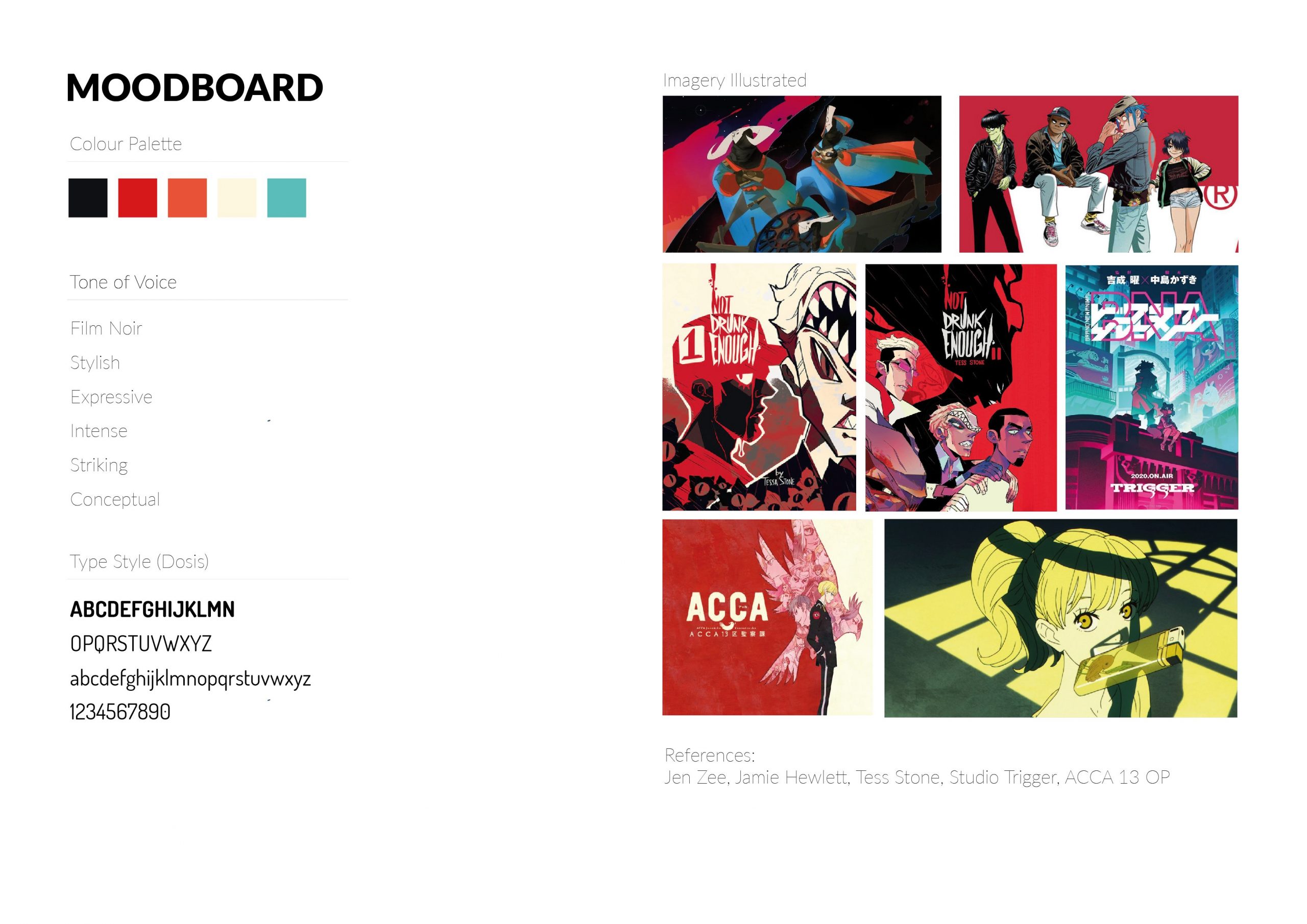
Hanna Is Not A Boy’s Name, a webcomic by Tess Stone.

Comic panel from Not Drunk Enough
What do you find inspiring?
Tess Stone has gorgeous comic layouts, harsh colors and and hand lettering that makes every page and panel exciting to read. There’s no wasted element, and the characters and text complement each other extremely well as both their designs carry a similar intensity in the types of lines used (generally with thicker/harsher shadows on characters and good line weight distribution between what’s focused/not in focus).
What mediums do they use?
Digital
How do they creatively interpret the text for the article?
Tess Stone is a comic artist and writer with very cool character designs, hand lettering and color design for his comic pages. In terms of interpreting text, Tess Stone is amazing at delivering the speech of characters and sound effects that gives text just as much animations as the story’s characters do.


Other than the text, the panels (dividers) add so much value to the delivery of the story as well with how they are designed in each page!


What do you find inspiring?
Tatsuyuki Tanaka is an illustrator, concept art designer and animator. He known for many things – some of them being key animator of the Japanese animated movie Akira and being part of an animation team called Genius Party responsible for a series of extremely interesting and exploratory animations.


Genius Party: Dimension Bomb
I find that his works are incredibly detailed and he’s able to deliver subtle commentary about the current state of the world through his works. His personal works are interesting because they don’t seem to deliver the message directly, rather, his image builds up an environment that allows you to establish your own set of expectations (dystopian, post-apocalyptic) and your imagination/speculation provokes you to make something out of the images he provides.
What mediums do they use?
Digital, Traditional
How do they creatively interpret the text for the article?
He has done quite a covers of short novels. A running theme in his art are clutter, the mechanical and a universe that seems almost dystopian/post-apocalyptic. His palette is also muted to highlight the excessive detail in the linework (backgrounds, subject matter).


From these three covers, two of them feature the world of the novel and one cover is more character-centric. Personally, I find that the interpretation of a scene with the setting featured as ‘the character’ (the main subject) quite creative as it provokes alot of speculation and work from the reader’s end through creating many points of interest (since there is no living subject to instantly create a bond with).
Link to Assignment 2 (Final Artwork + Process): https://oss.adm.ntu.edu.sg/laum0005/illustration-for-designers-assignment-2-final-varoom/