
________________________________________
Concept
________________________________________

✿ To push the fun and fantastical side of the occupations to their limits, and to convey a Utopian fantasy.
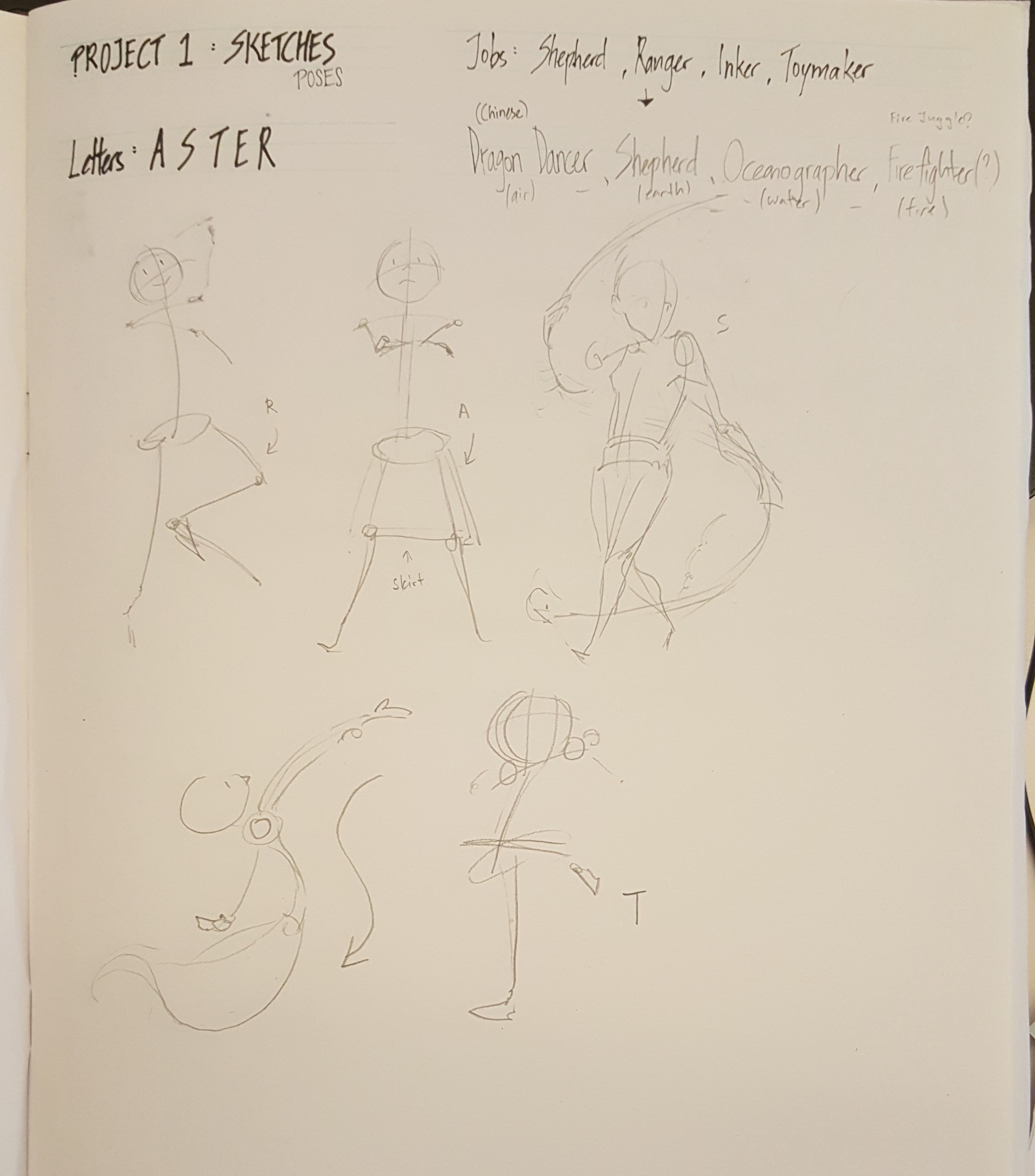
✿ Gamify characters and weave letters of my name ‘A S T E R’ into clothes and strength for them!
✿ Letter forms are expressed as weapons and equipment for these characters.
✿ Letters are my perceived naive/first impressions of the jobs.
________________________________________
Art Direction
________________________________________
I wanted to start Project 1 for Graphic Form off by working on something that would give me cheer every time I worked on it – so I decided to use games as a general focus. After looking around at the different types of drawing styles (storyboard art, animation art, etc) that goes into making a game, I decided to go with game concept art. I feel like game concept art is like the face of the game itself. Characters are usually the biggest pull of selling a game or comic – they are the face of your game!
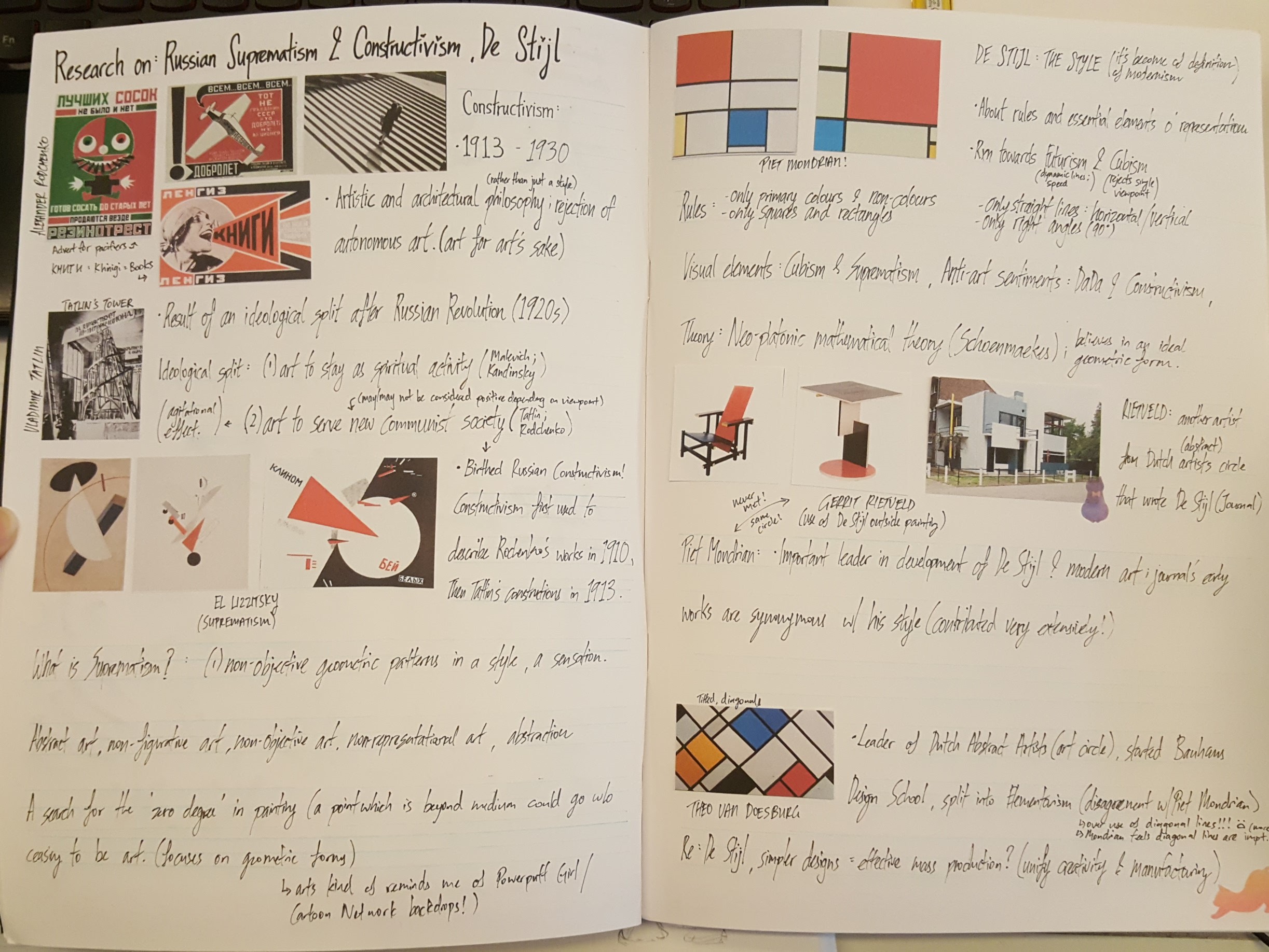
In this project, I wanted to express my impressions and wonderment at other occupations akin to that pull of a 2D, fictional character. I wanted to give each piece an orbit and pull people in, even while they are unreachable, fictional beings. I felt that the best way to do this would be to embrace the comic style – leaning towards the Japanese manga style. I understood that the risk of working with this would be that it could possibly end up extremely cringeworthy. I decided to try putting together the typical game concept art poses with some poster-style, Art Noveau artists that I’ve done research on – Alphonse Mucha and Aubrey Beardsley. Combined with the recent presentation I’ve done on Russian art (Suprematism and Constructivism), I hoped that it would help put together four pieces that integrates drawing and design flawlessly.
I’ve come to feel that doing four pieces in this project is an amazing blessing as well – there is a great power in the number 4. Alot of things in stories, mythology and lore of games come in fours – 4 Heavenly Kings, 4 Heavenly Beasts (e.g. Suzaku,Seiryū), 4 Fiends (e.g. Taowu, Taotie) and more!
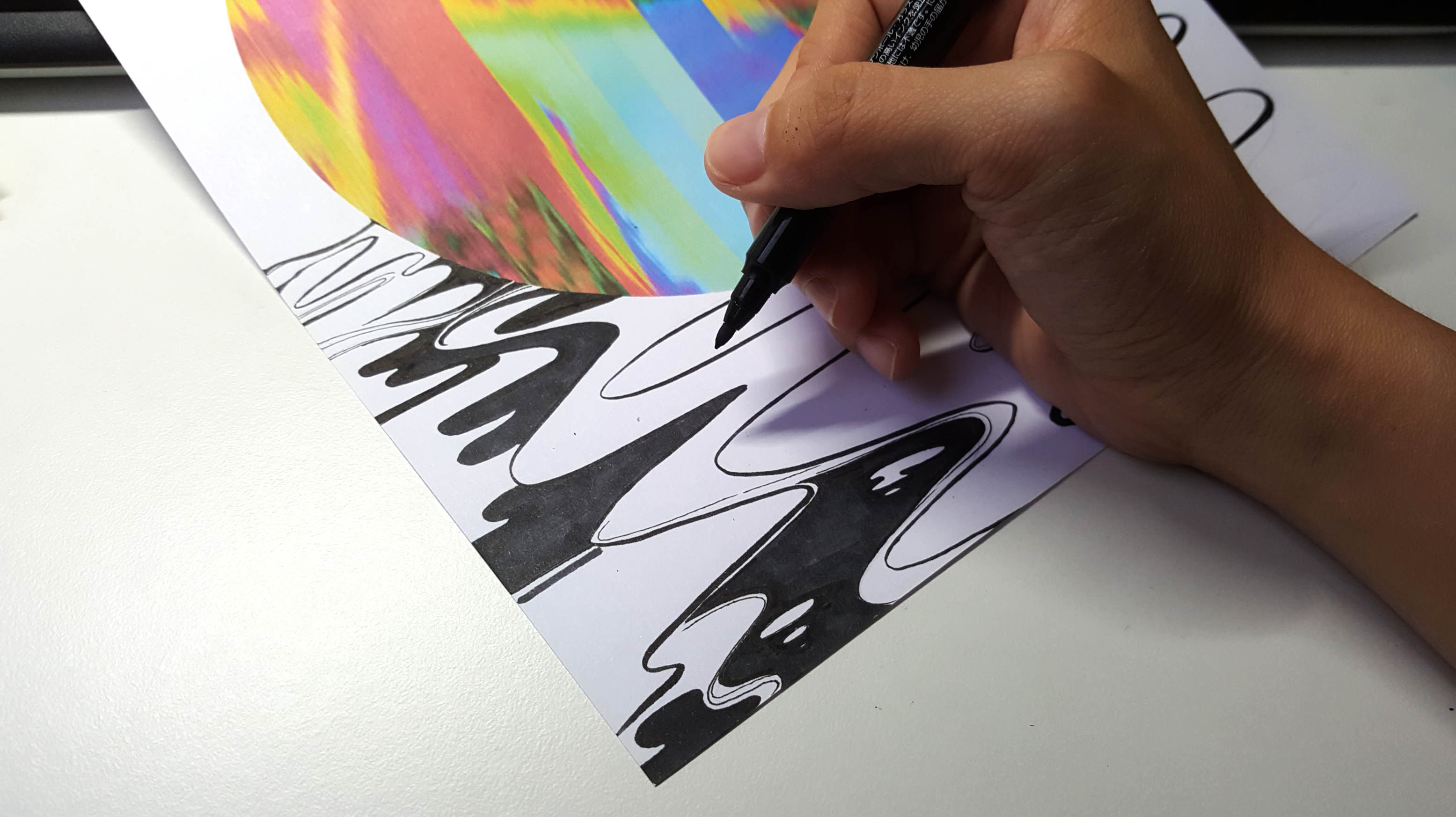
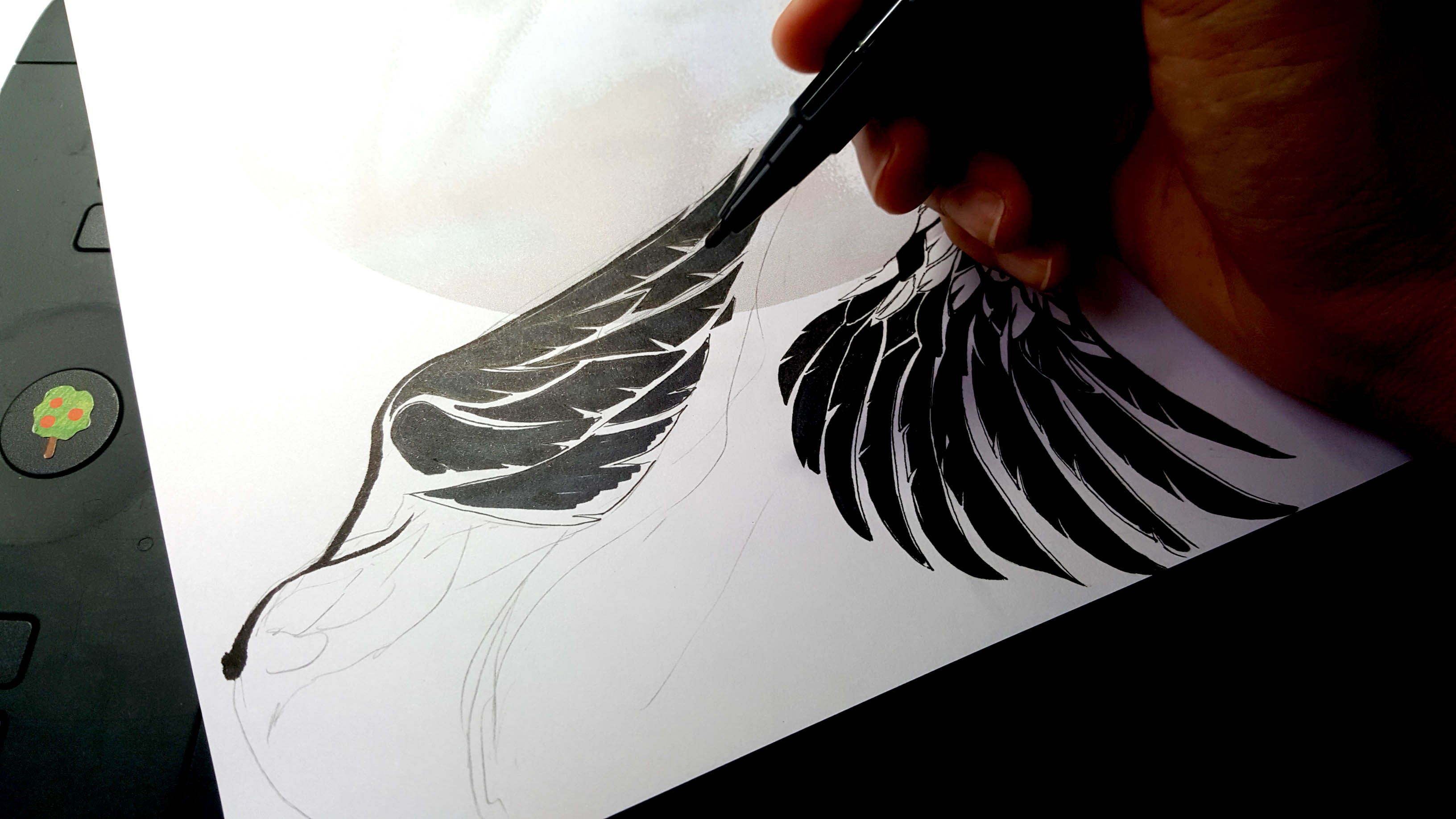
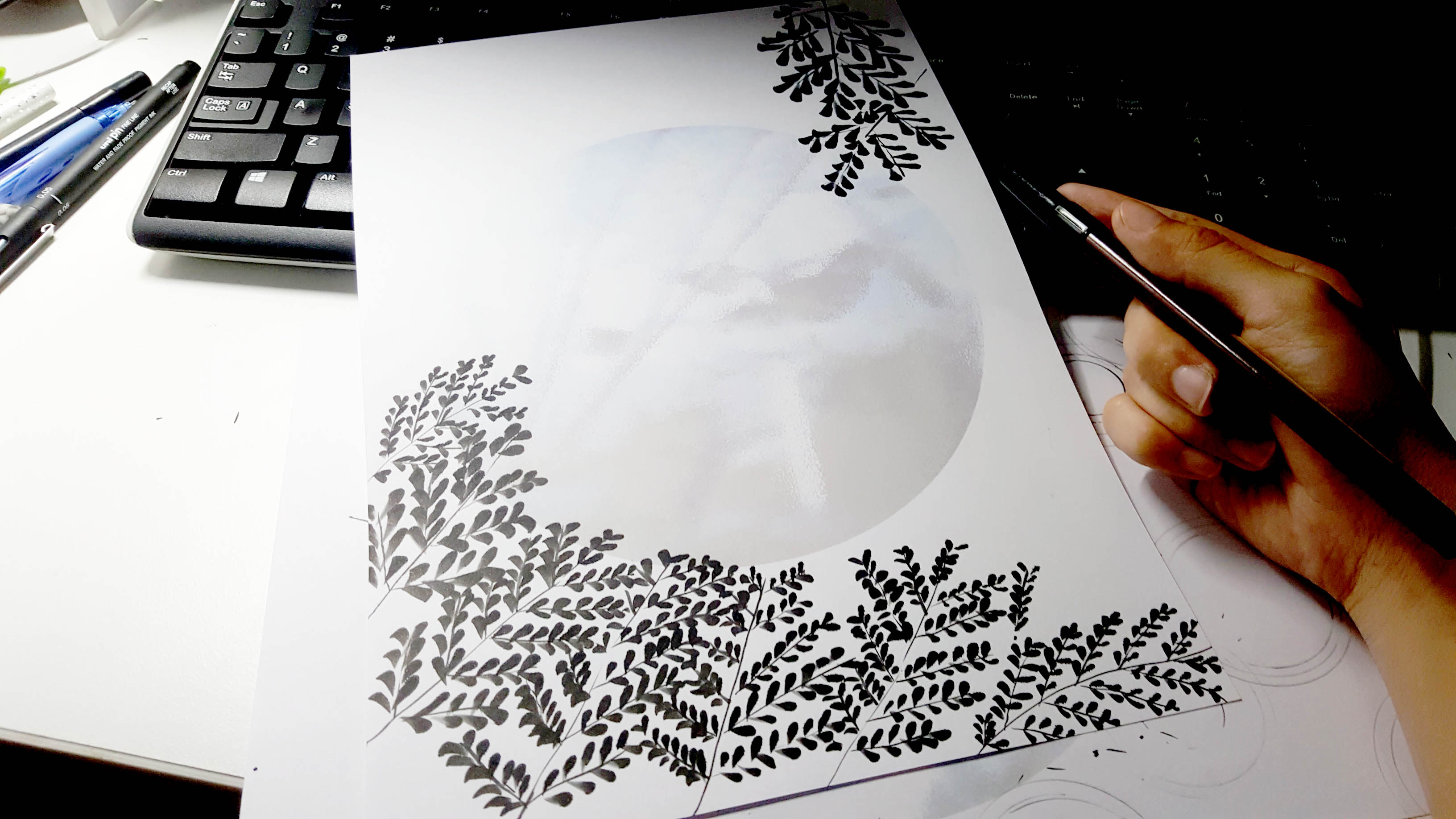
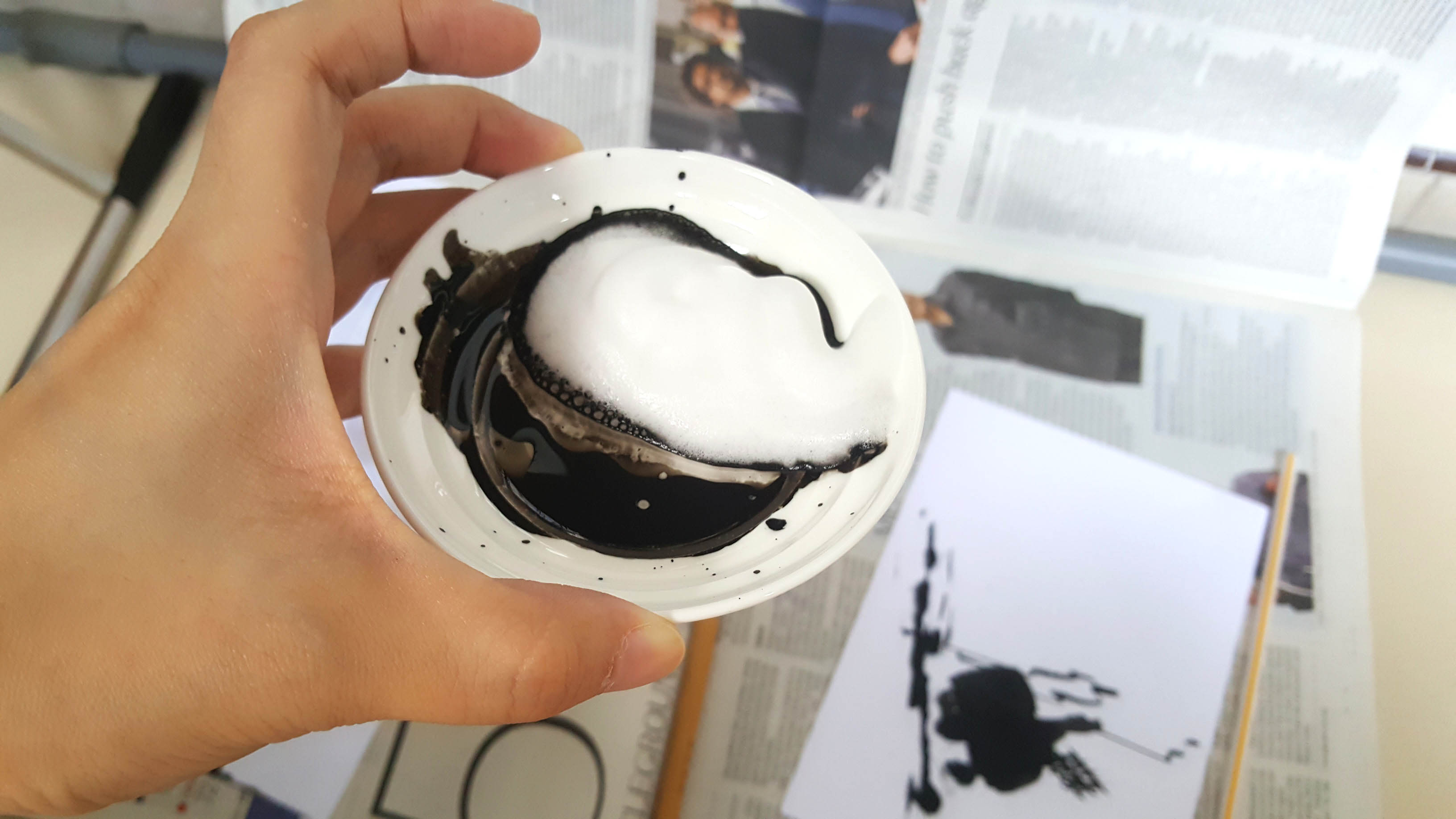
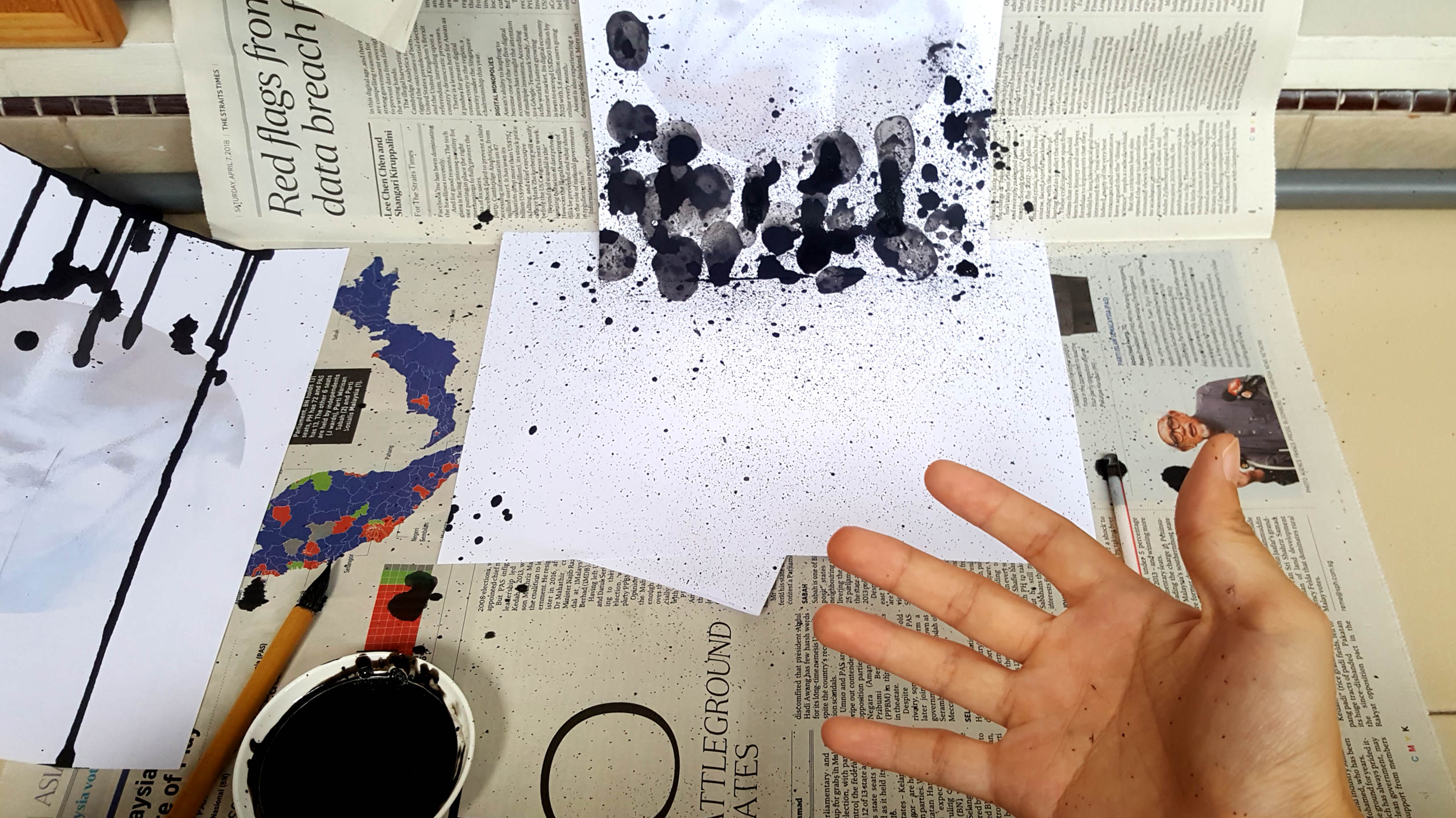
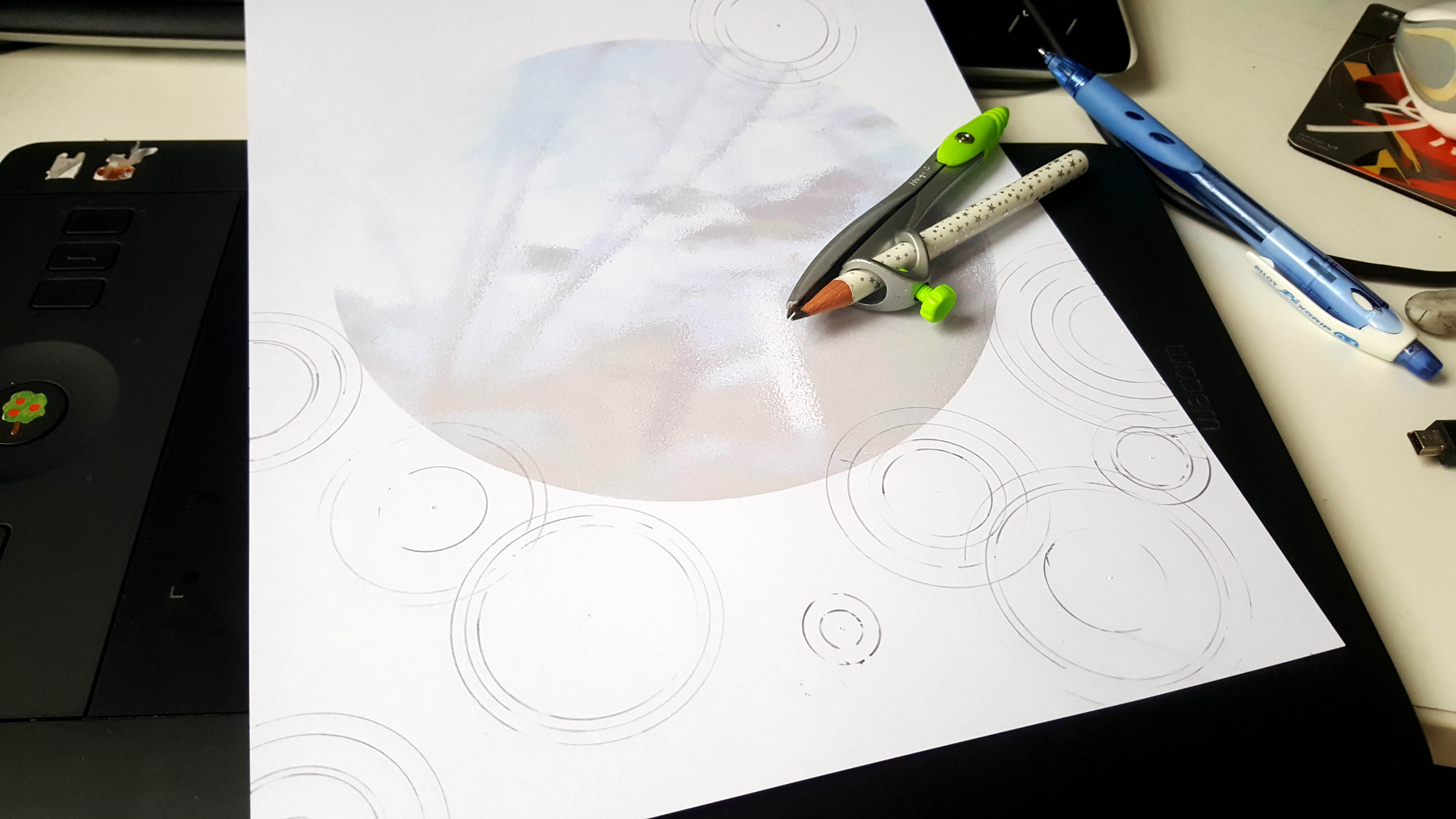
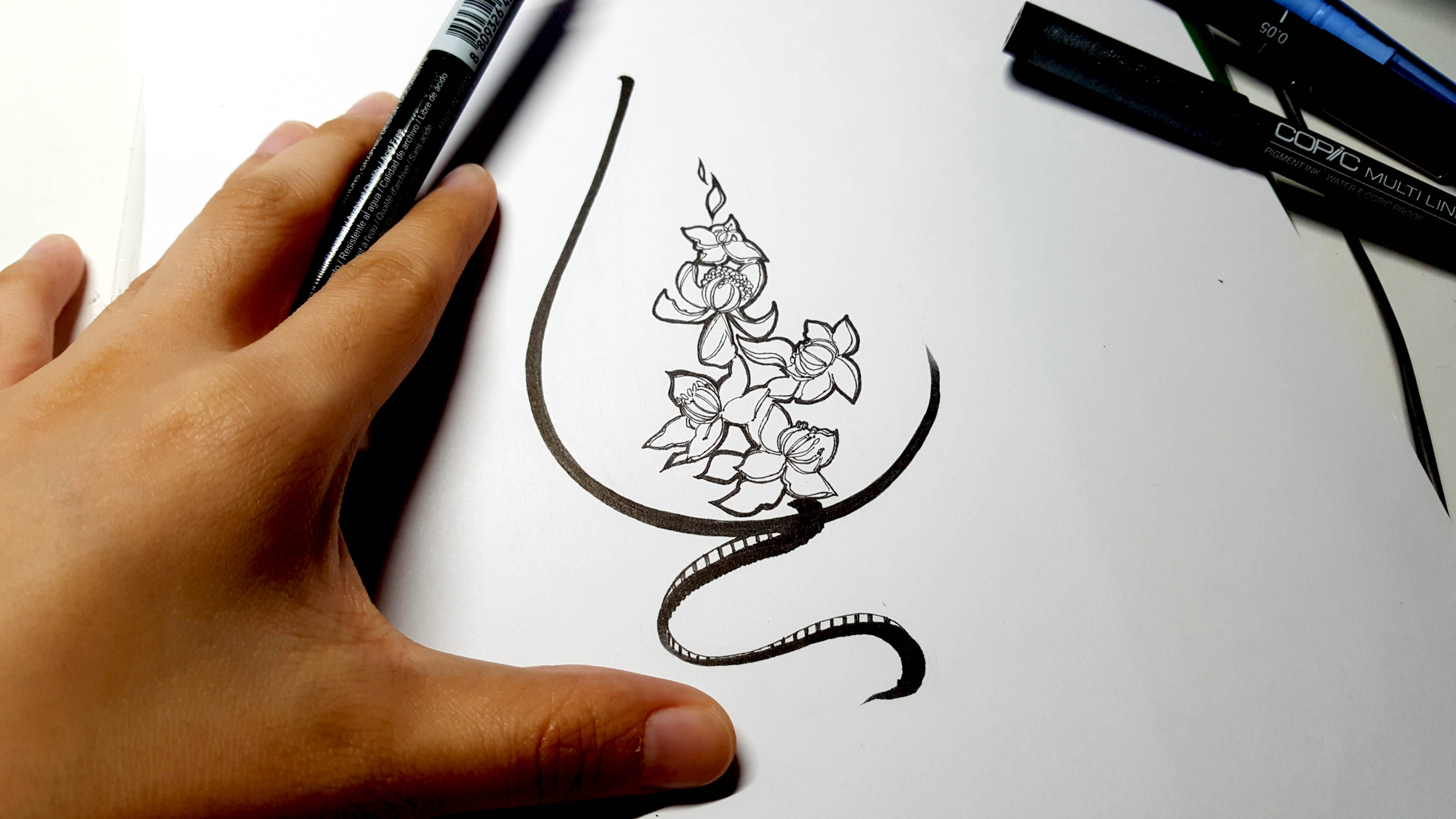
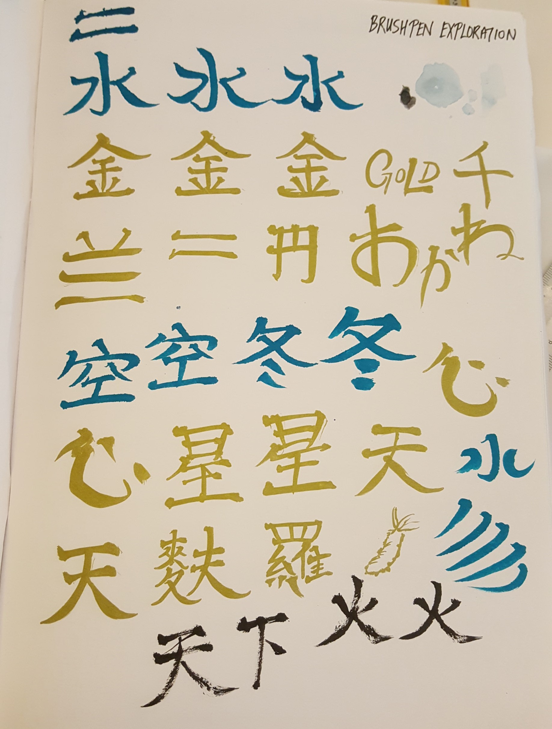
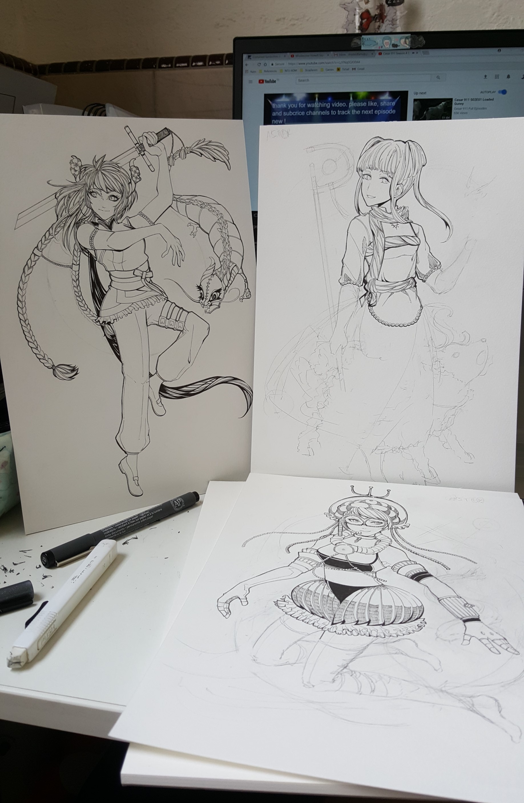
Each piece is inked traditionally using copic pens and markers of various sizes. Some techniques include layering cross-hatching, wavy lines and straight lines to create monochromatic depth. I hope the organic nature of the traditional mediums would help to bring out the idea and liveliness of the characters.
The pieces are then scanned and digitally edited to bring out the letters in them with color.
________________________________________
Final Designs
________________________________________
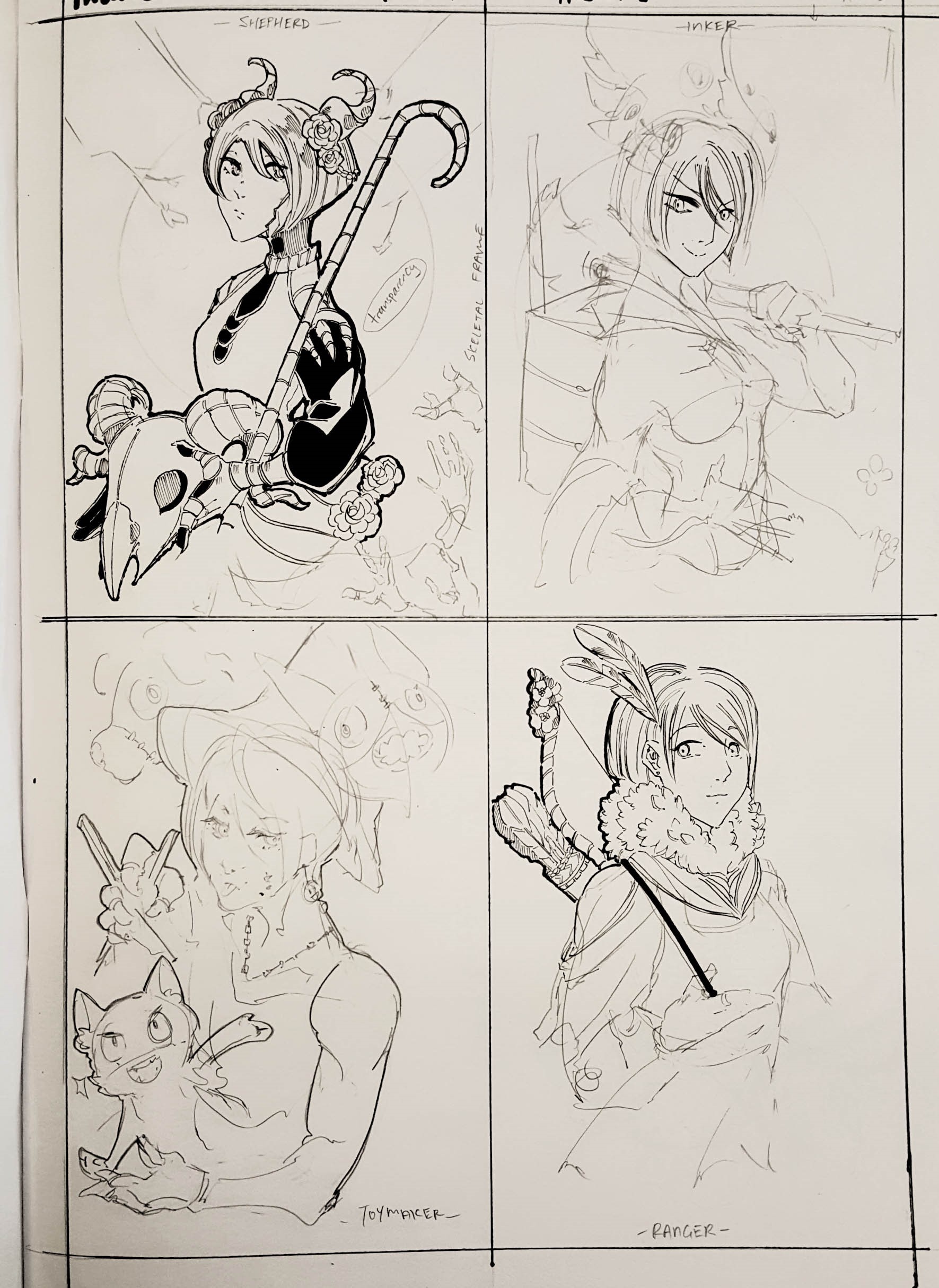
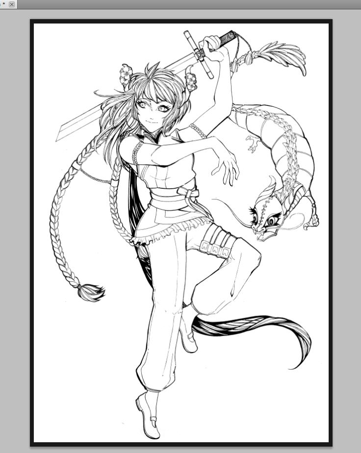
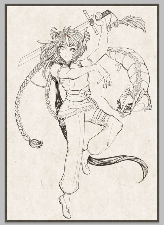
► The Dragon Dancer
Symbol of Courage
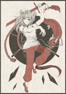
Overview:
The Dragon Dancer, to me, represents a figure of power. I wanted to portray them as a warrior class. Red is typically the color of heroics and adventure. It also represents fire and valor, and a highly symbolic color for Chinese culture. The background is circular and with shards – an implication of the dragon pearl of wisdom that is used to ‘lure’ dragons during dragon dances.
Letter Form Elements:
♦ A is in her braids, a representation of heroics. As a kid, I’ve watched a few Chinese period dramas and braids stood out to me alot as a child, becoming a symbol of valor.
♦ S is for the dragon, the highlight of the dragon dancing art.
♦ T is for the sword, symbolizing courage and power.
♦ E is for the belt on her thigh. Belts famously symbolize serpents and eternity. I also wanted to show discipline and restraint due to the amount of practice that goes into training.
♦ R is shown in the legs, to denote grace, lightness and the quick-footedness of dragon dancers.
________________________________________
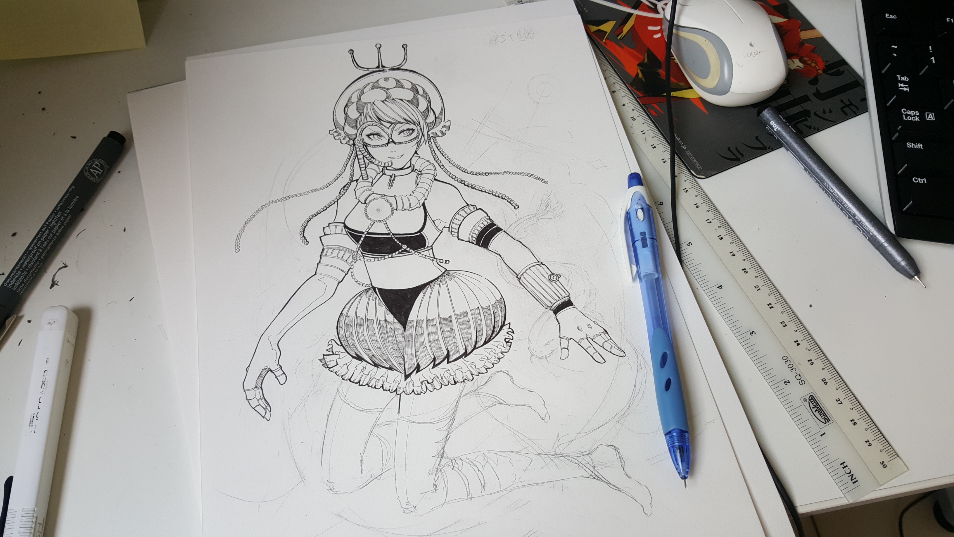
► The Oceanographer
Symbol of Wisdom

Overview: The Oceanographer is represented by the blue of the water and ocean. I drew inspiration from steampunk and industrial revolution fashion as well so that I could express the impression of technology and science that the occupation gives off. The circles at the back are meant to represent ripples, depth and mystery.
A fun tidbit: her gear is modeled after a jellyfish because frilly jellyfishes look like royalty under the sea, commanding the ocean!
Letter Form Elements:
♦ A is for a trinket, to represent trinkets found at the bottom of the ocean.
♦ S is for the eel, to symbolize sea life forms that you can find while exploring the ocean.
♦ T is for her staff that is based on a compass. It is to show the importance of navigation and exploration as an oceanographer.
♦ E is for the antenna on her head, as I wanted to show that treasure-seeking, thrill-seeking and curiosity should be characteristic of an oceanographer.
♦ R is represented by the diving goggles and the ability to see underwater.
________________________________________
►The Shepherd
Symbol of Compassion

Overview:
The Shepherd is expressed in green – linking this job closest to nature and greenery. The background is heavy on the top, and intended to look like the structure of a tree. Compared to the rest, the Shepherd is the most demure and rigid, as I wanted to express her strength and rigidity of the earth. I also wanted to show her unfaltering bond to the earth, resulting in a less free form.
Letter Form Elements:
♦ A is represented in small-case as a bird standing on her finger. The bird is to express the job’s proximity to life and animals, as well as their gentle and nurturing characteristic.
♦ S is expressed in the sheep’s horn – an animal that is characteristic of this job.
♦ T is expressed on the high boots, to show the weariness and trudging on rugged earth and soil. I stationed the legs to stand in a more rigid pose compared to the other jobs as I consider this a job that is very ‘grounded’ and closely linked with Mother Nature!
♦ E is a scarf. I’ve gone to a Mother Farm in Chiba, Japan a few years ago. The association of a shepherd herding sheep on a mountain leads me to think that it would be very cold on the mountains and the impression of shepherds wearing thick clothes.
♦ R is expressed as a staff. A staff, or a cane, is a tool for hiking and getting around on rugged terrain. A long staff is also a show of guidance and leadership.
________________________________________
► The Weather Reporter
Symbol of Fairness
 Overview:
The Weather Reporter is expressed in yellow because it represents the sun, which would make a good pair with the blacks in the image which could contrast as night. Yellow is also the lightest color out of the 4 colors I’ve selected – perfect for representing a happy, fickle and whimsical image that I have of a weather reporter. The background depicts a sun and the moon.
Letter Form Elements:
♦ A can be found on the lining of her skirt. I have an impression of weather reporters as serious ladies in formal A line skirts. I decided to take this in a more literal sense as I wanted to experiment and interact with letters forms more physically as well, not just metaphorically.
♦ S is in the background, which represents the sun and moon. It expresses the nature of a weather reporter’s job as the sun is very obviously connected with a sunny day, and the moon’s tidal forces affect rainfall.
♦ T is in her tiara. It’s not something that immediately comes to me when I think about what a weather reporter should look like. However, I feel like a tiara is a great symbol of power and authority, but yet also fickle like the needs of a young princess. I wanted to show how I used to think that weather reporters were all-knowing – as if they could control weather.
♦ E is expressed as the frame of a wing. The wings of a bird are sensitive to the littlest change in winds. Birds are also known to predict weather through pressure. I added in gambling chip patterns to the connectors that are the joints of the wings, to represent that the prediction of weather is like a gamble – it changes on a whim.
♦ R is expressed in the arm, folded in an akimbo. It’s a gesture that widens your stance and conveys a powerful mood. I wanted to express the influential nature of the weather reporter as they are very trusted figures on media.
________________________________________
Challenges
________________________________________
The main challenge was definitely compositing the image as a whole and fusing all the letters and meanings into a cohesive piece.
On top of making a cohesive piece, being visually attractive is also important as that is a big part of game character design – they have to make characters that you’d like to play as!
What I initially had in mind didn’t show up as clearly as I thought it would. I initially planned to keep everything black and white, and use blacks to make the white areas pop out. However, it was very trying to not make a mistake while inking was also taxing.
On top of that, getting feedback from my classmates was incredibly useful! Right before recess week, I asked if they could spot the letter forms in the characters (most of them couldn’t). It became a much less painful process after switching to digital media for colors.
It was also much easier for people to see the letter forms too as they jump out at you.
________________________________________
Post-Presentation Feedback
________________________________________

✿ Instructor’s Feedback:
• Consider having a general overlaying message.
✿ Classmate’s Feedback:
• “I love love love your display and representation of your works!! And your technique is top notch manz. I think your concept’s also very interesting and looking at jobs from like a gaming/stats/character kind of view is really creative!! I also liked how you really incorporated little details to represent each occupation. And like how the letters are like seamlessly part of the composition. Good job!”
• “Very clear letter forms & god level illustration WTF y u even in school bro. LOVE IT 10/10. Also the shepherd damn pretty can I have her number pls.”
• “I like how you incorporated the letters into her equipment, ties in with how they are utilized.”
• “Love the fine details of your characters. You brought out the Japanese style really well!”
• “Can I just say how nice your drawing is!!!! Also, I like how you kept the portraits really simple where the focus is coloured yet not dull!!! Also, the amount of thought you’ve put into each element!!!!!!”
• “Gurl, your artwork is amazeballs! Can’t imagine the effort put into your pieces. Love the concept & the execution of the brief. Your creativity in this project really shows everything is well-thought out & they look great as individual pieces, and as a set! Good job!”
• “Your work is so pretty :’) You draw so well!!! The idea behind your works are so thought through. I love how you so effortlessly incorporate the alphabets into your portraits. Every single element has its own significance, I love!!!”
• “Very interesting concept of using games/job/characters to illustrate the fonts creating elements related to the job to infuse the fonts & accessories and also the background & foreground. Overall very harmonious!”
• “I CAN’T BELIEVE YOU DREW THESE! GOOD JOB ASTER <3”
• “Feels like a tarot card!! Looks cool. Good to have the letters used for different meaning. The composition is done well. The whole flow is done nicely!”
• “Your drawing is SUPER detailed!! Love how you incorporate the letters into your drawings but I don’t really understand the background (circles) of the oceanographer 🙁 (hmmm).”
• “Very beautiful! The monochrome to enhance the letters made the piece very pleasing to the eye. I like how the four pieces are very thematic and collectively bring out idea you wanted to portray. Very nice!”
• “Your drawing is damn damn GOOD! Why never go animation HAHA! Love your theme & concept. Alot elements in each concept & it blends so well!”
• “Love your animes! Super stylistic and dynamic. Good play with colours/no colours to emphasise types as well. Good job! :)”
• “Very avatar the legend of Aang with the 4 elements thing! Very curated. I admire your technical ability. :)”
✿ Self-Reflection:
Overall, I’m quite happy with how the pieces turned out! If I had anything I would like to improve on, it would be being more decisive and speeding up on the starting process of deciding the elements that would go in each piece. so that I have more time to work on the actual pieces themselves.
My see-sawing in deciding the occupations and elements cost me later towards the end while working on the digital aspects of the pieces. To me, it felt like I’ve betrayed a small part of myself by my digitization of the four pieces. I felt like it cheapened the pieces slightly and ate up the fine details of the actual pieces, in return for saving the letters and providing color aid for people who are viewing the piece.
While the simplicity of the backgrounds worked this time as the characters could pop with their help, I feel like I could better incorporate more thought-out backgrounds and better utilize negative spaces next time for future pieces.
I feel like I could brush up on my time management and find a better way to improve my technical ability when it comes to managing monochromatism in my pieces. This is something I would love to explore in my future pieces again.
Finally, I was worried deep down with how a set inspired by game concept art would be received – I wanted to be as true to myself as possible since I’m a big fan of games, comics and I -loved- drawing. (Honestly, my biggest goal in life is to work on a fun webcomic dedicated to my closest friends.)
I was extremely pleasantly surprised and blown away by all my super kind classmates! Their feedbacks were extremely encouraging and their own pieces were extremely inspiring as well. I hope for myself to be able to learn from them and work on more pieces that will communicate well and light up peoples’ days. 🙂
Thanks everyone such a wonderful first project! Onward to the next assignment! (´ ∀ ` *)
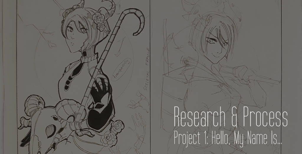
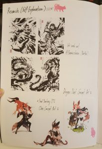
Project 1 Research & Process: https://oss.adm.ntu.edu.sg/laum0005/graphic-form-project-1-part-1/
Other Research: https://oss.adm.ntu.edu.sg/laum0005/research-artist-and-unconventional-art-material/
Introduction Activity: https://oss.adm.ntu.edu.sg/laum0005/graphic-form-introduction/


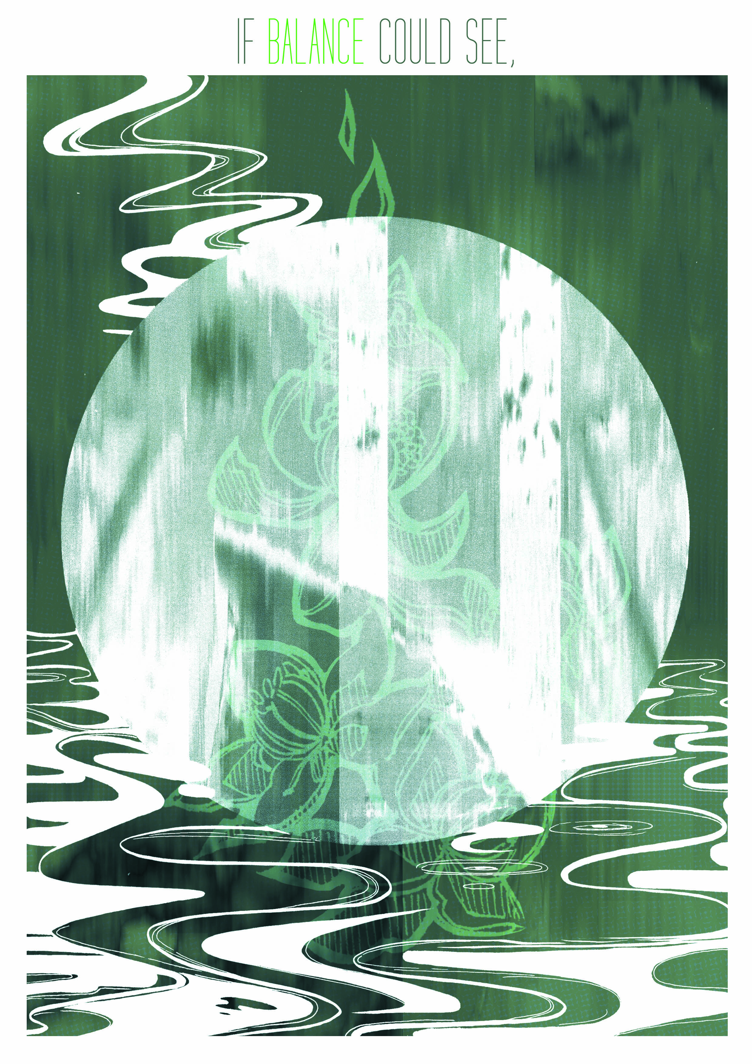
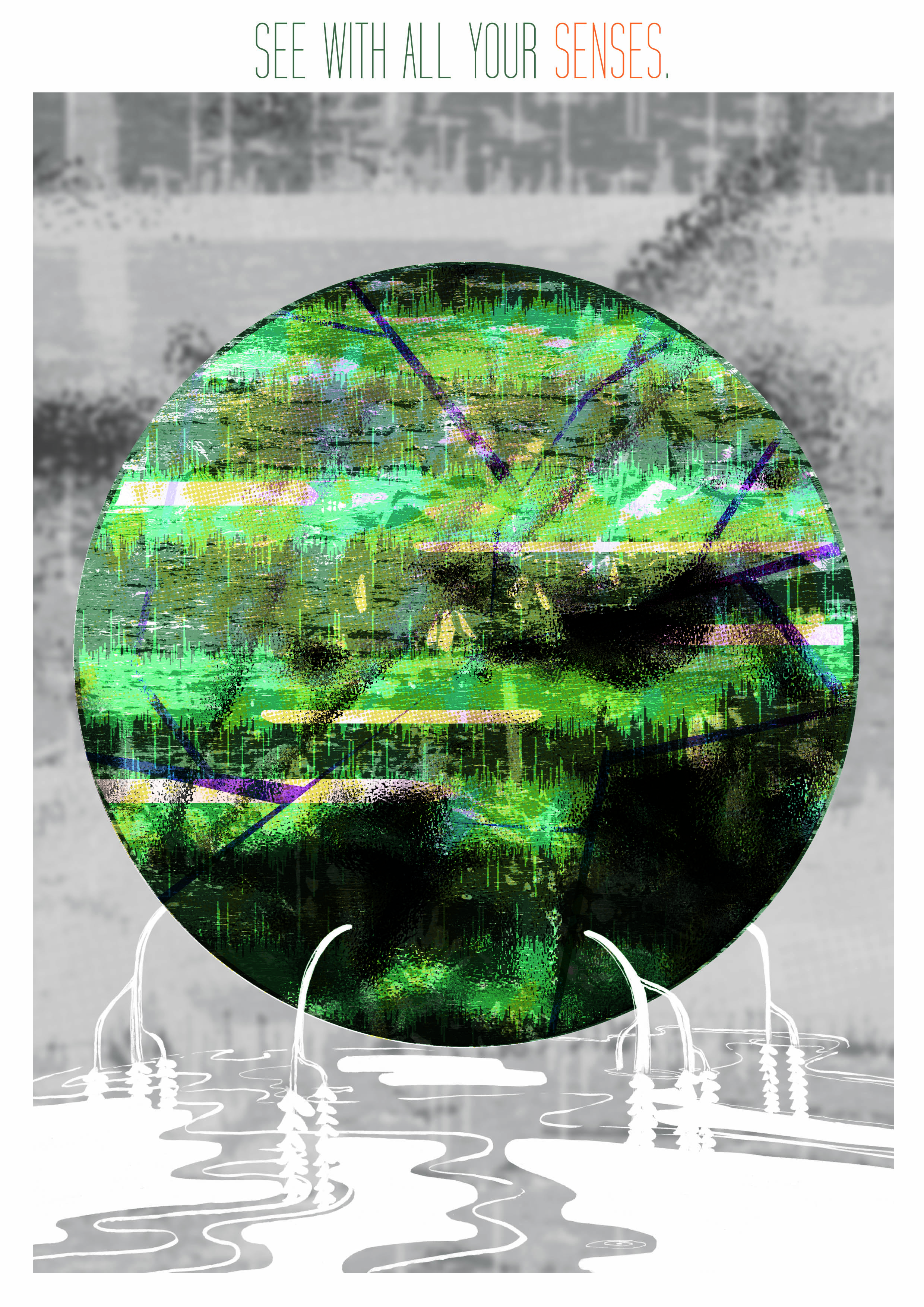
 Lily Pond (Hear):


