Assignment 1: Final & Process
Context: (1) A portrait of a friend and (2) a self-portrait
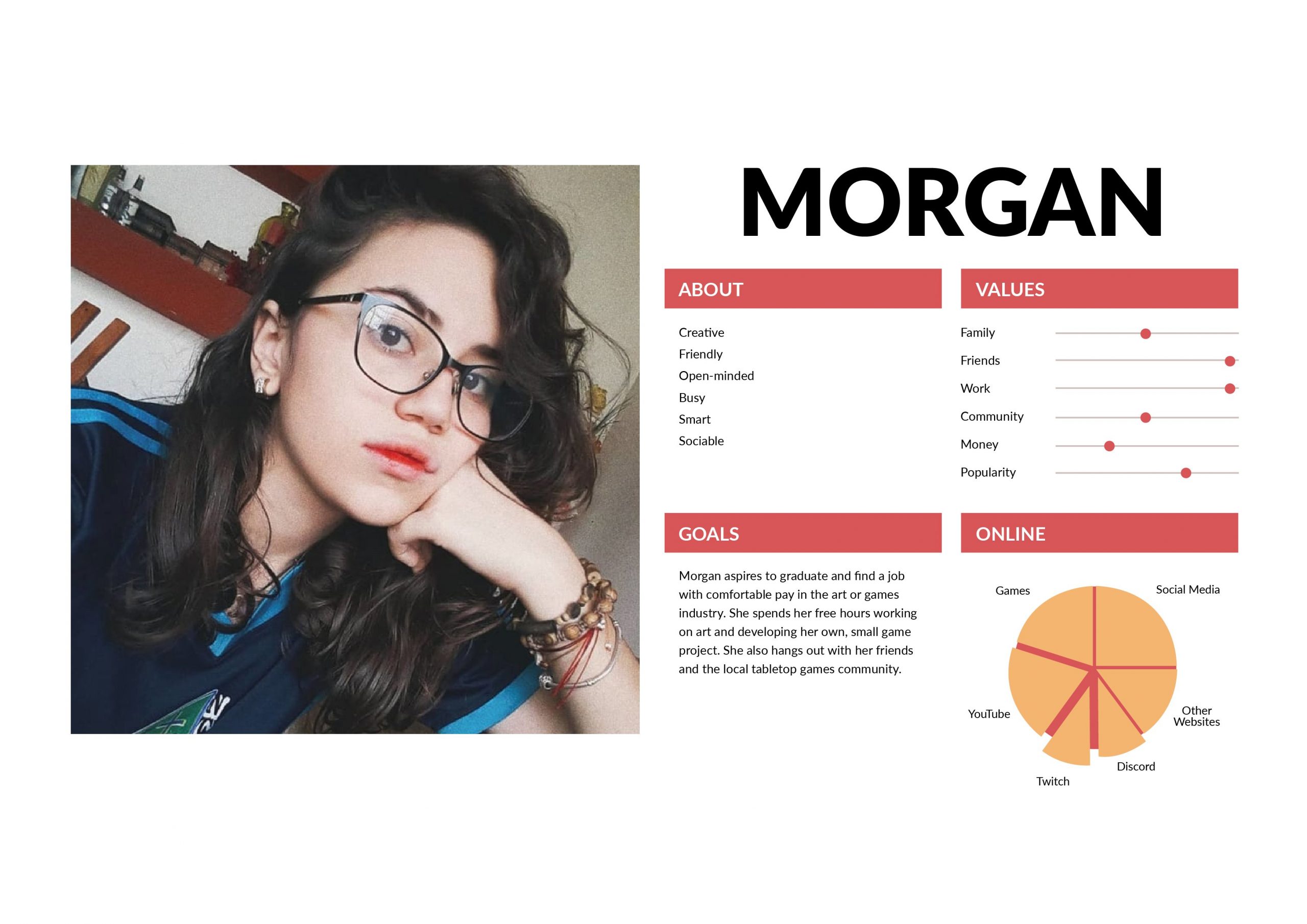
(1) Portrait of a Friend (Quistina)
Interview Q&A – A summary
Qn 1: What kind of animal most represents you?
Ans: Mix of panther and/or deer. She admires the strong, head-fast and intimidating qualities in the panther. She can also be nice, so she compares herself to a deer as well. 🙂
Qn 2: If you could live on any spot on Earth, where do you want to live?
Ans: Finland – because it’s the happiest place and she wants to find out what makes the people in Finland happy even though she has no idea what’s going on there. She likes hot weather, and also said she prefers the seasons spring and fall.
She also mentions that while she’ll have a house somewhere to park at, she’ll also ideally get to travel to many places.
Qn 3: What’s the most memorable (or your favorite) book/film/media you’ve read, seen or experienced?
Ans: Pan’s Labyrinth, the Hunger Games series and similar fantasy fiction/fiction with dystopian universes. She enjoys media with strong women characters, and them stepping up for a good cause and stand up for themselves. She also appreciates a good romance. She also mentions that she treasures kindness and sincerity alot.
“That’s my safe space; I can be whichever narrator/character I choose to be.” – on the fantasy genre.
Pan’s Labyrinth has alot of metaphors that she enjoys (the psychological aspect). She also emphasizes on her appreciation for the duality and balance within the media she consumes.
Qn 4: What’s something that always gets you or makes you laugh? (OR What brings you immediate joy?)
Ans: She makes herself laugh sometimes. Food (Boost) and people she loves (her family and her partner). Also a highly sensitive individual, so she treasures personal time, peace and space.
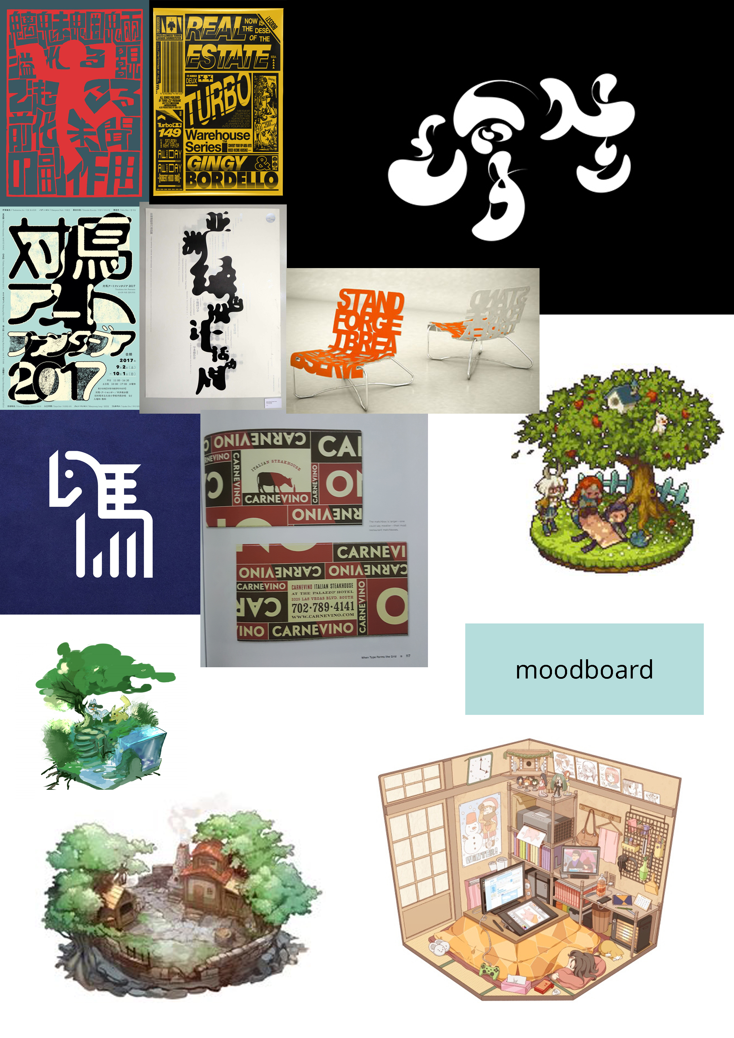
Research, sketches and drafts

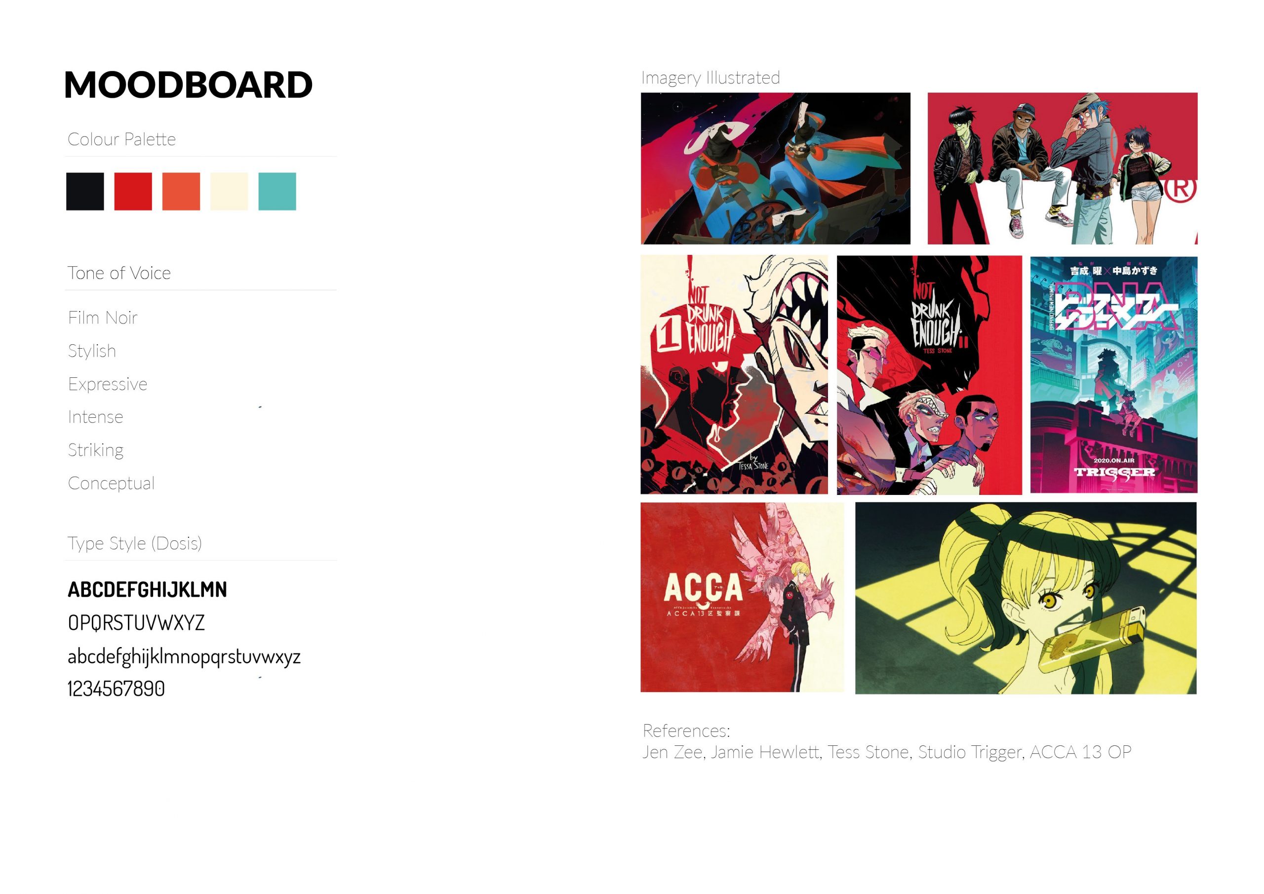
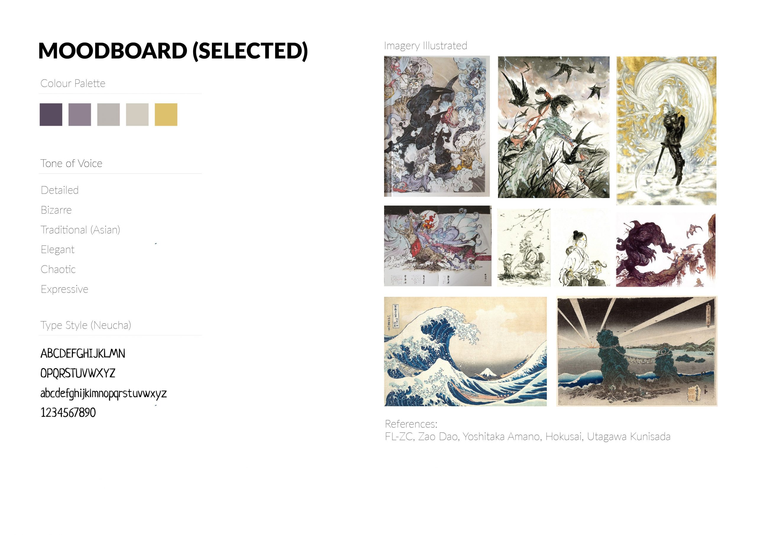
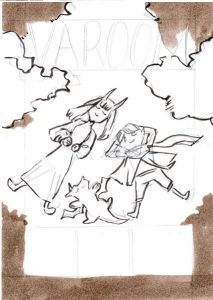
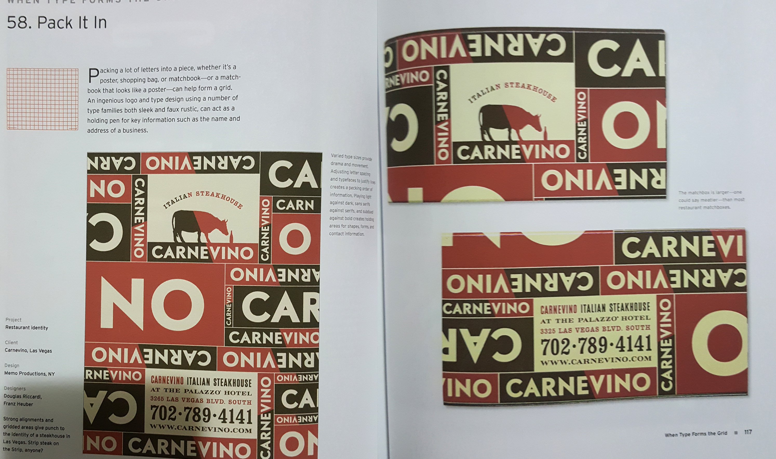
I did some studies of the panther before going into the drawing, and exploring how a panther could represent family, closed ones and warmth. I felt that the panther would be sufficient in representing Quistina’s strength, warmth and also kind/gentle qualities. I did abit of looking into Alphonse Mucha and cheesy fantasy novel book covers for the layout.

Alphonse Mucha’s Dance (1898)
Link: http://www.alphonsemucha.org/dance/

 Eye contact/facing each other seems to be a common theme in novels of the romance + fantasy genre
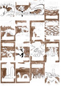
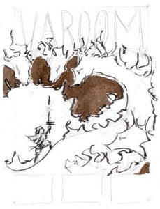
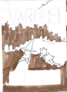
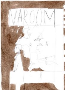
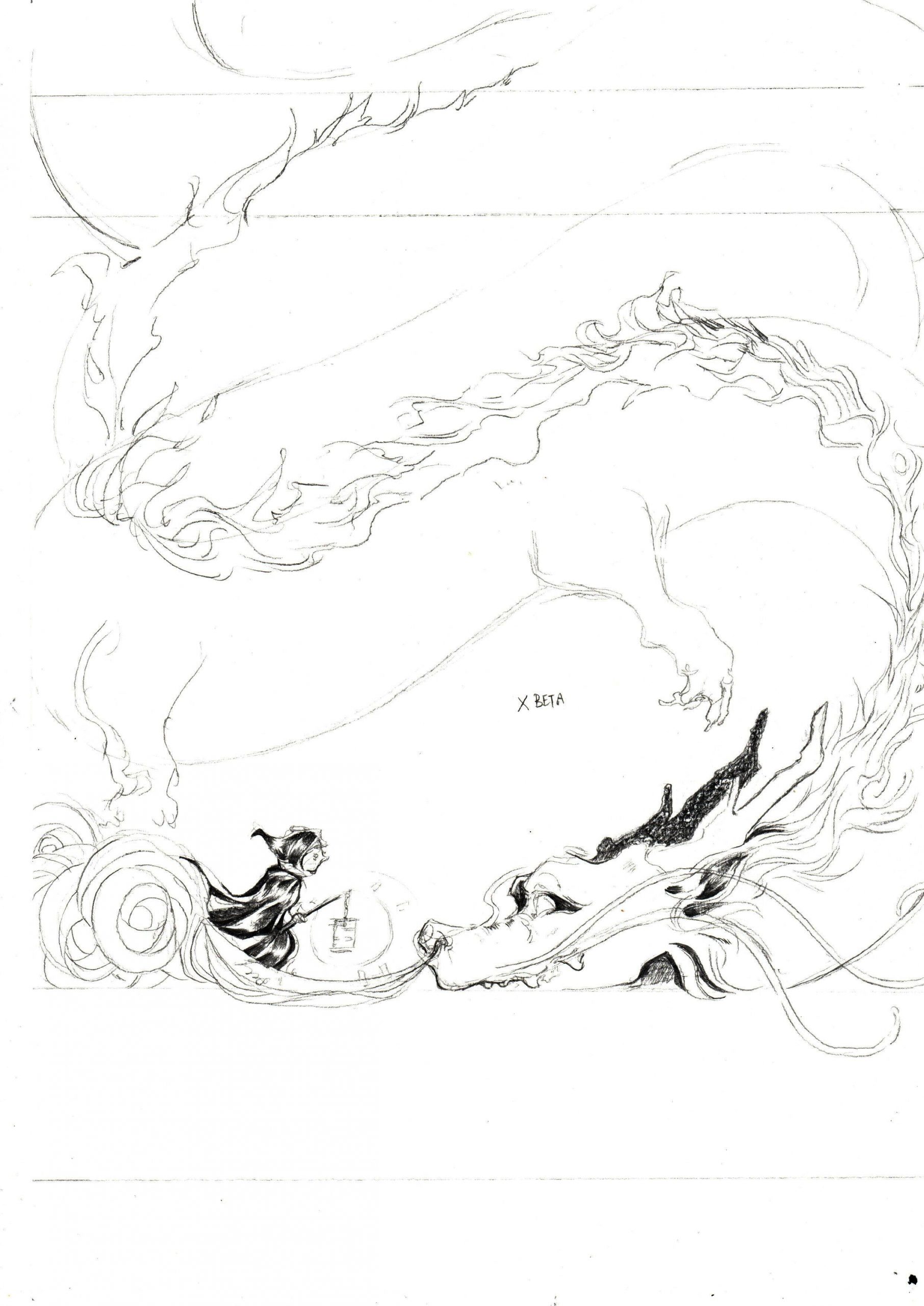
I started off my sketch traditionally with pens and brush pens on bristol paper before scanning it, extracting the black lines and moving in to fill in the larger black areas digitally.
I chose to do the subjects in traditional medium as I felt that the micron and brush pens’ created lines and hatching would be able to create a unique texture that could express the fantastical and fictional aspect of her better.

Sketching and inking traditionally!

Scan

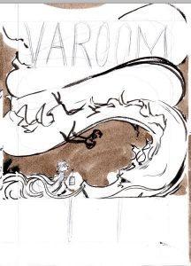
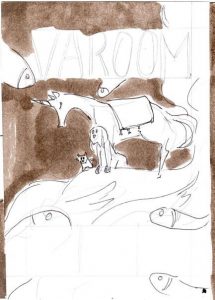
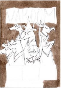
Tradigital draft for consultation
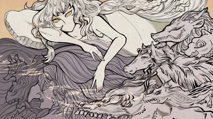
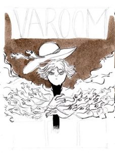
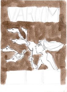
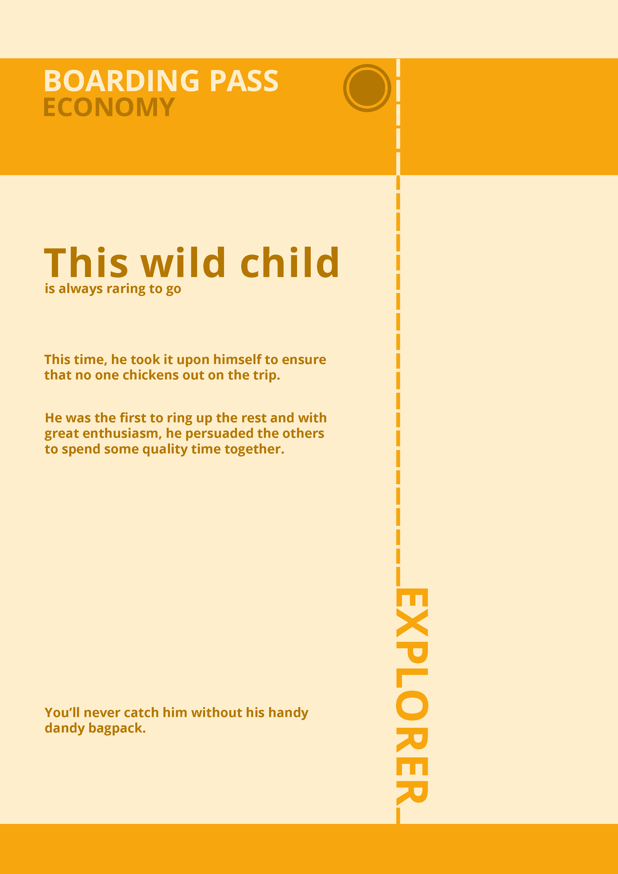
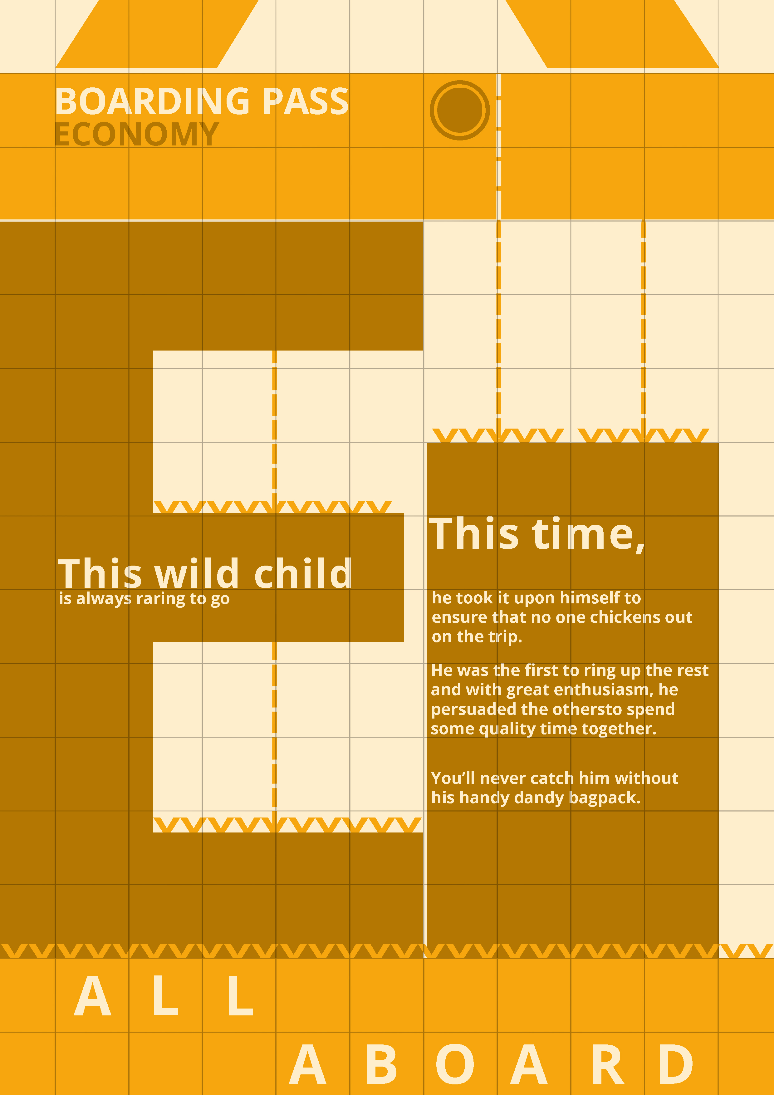
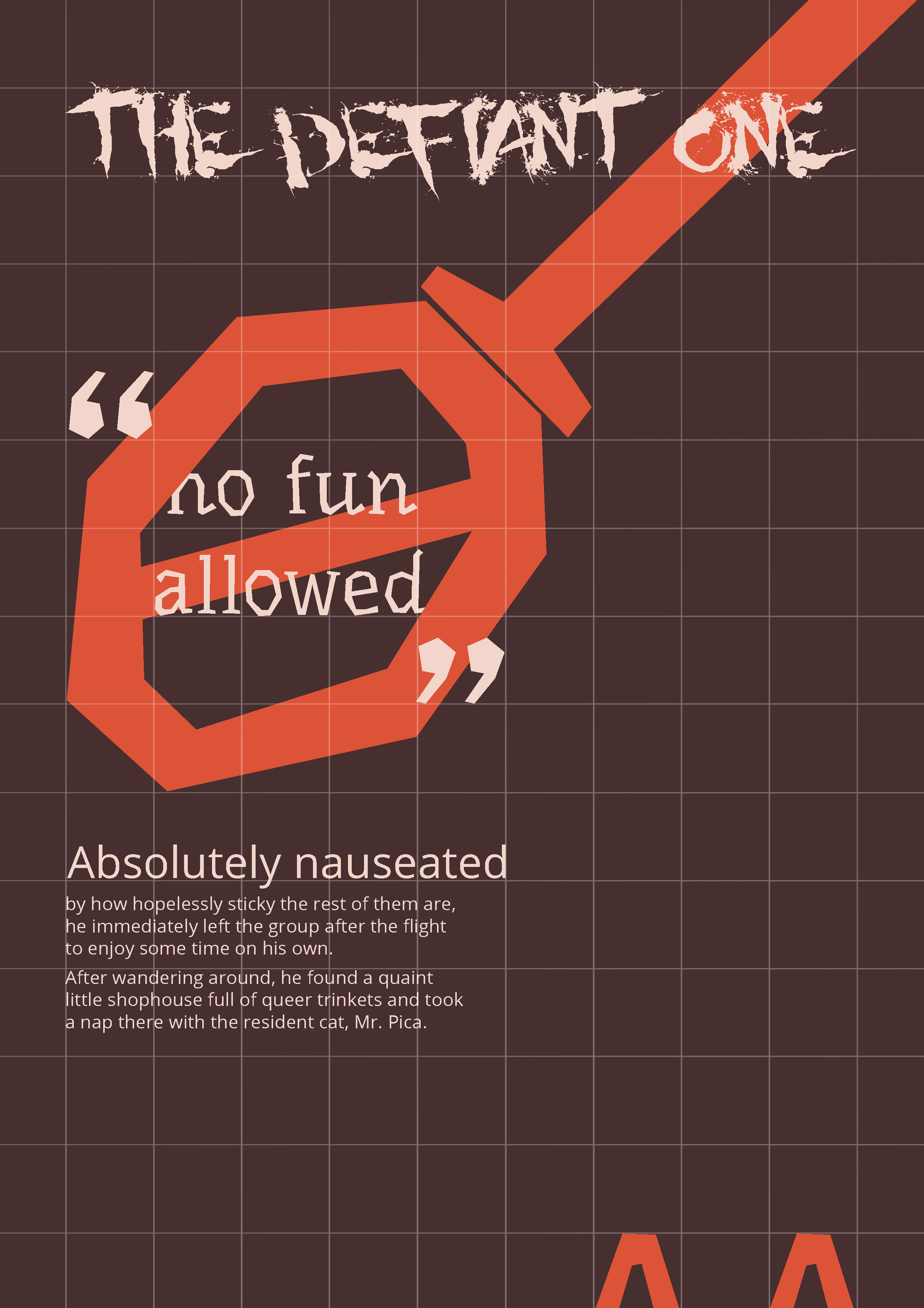
Final Portrait and Concept

Final Piece
Mediums: Copic Multiliners (0.03-0.1), Brush Pen, Adobe Photoshop
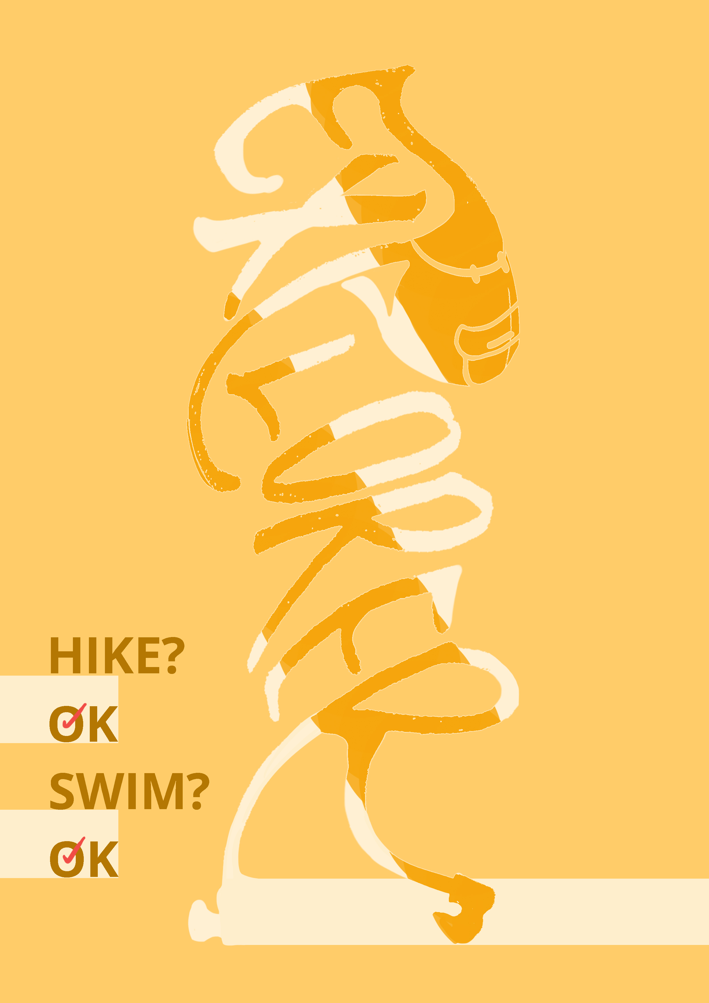
I based the portrait on the composition of fantasy novels and chose a more decorative way to frame the piece. The two panthers are based on her and her warm bond with the people around her who are her guides and people she want around, and how she really looks to them for acknowledgment and rely on them.
The flowers are based on some common flowers of Finland (such as petunias) where she really want to go, and also how she really wants to travel and be surrounded by nature. The quiver and the panther’s robes are to signify adventure, courage, strength and her journey.
(1) Self-Portrait
Interviewed my friends and myself to know myself better and also about what others thought of me (because I believe that my friends shape me the most as well)
Interview Q&A – A summary
Similarly to Quistina, I answered my own questions but also asked my friends to pair adjective+animal/object to understand how I came across to others. I found out that it wasn’t really helpful.

Screenshot of friends who tried their best
I’ve always been a visual person, so I decided to leave it at that and just move on to do some soul-searching in my sketches instead.
Back to the self Q&A!
Qn 1: What kind of animal most represents you?
Ans: Probably birds or animals with terribly awkward faces. I can relate to the birds’ anxiety, restlessness and the thing I can’t deal with the most is boredom in my life. I often can’t sit still as well. I also use bird as part of my social media handle.
Qn 2: If you could live on any spot on Earth, where do you want to live?
Ans: Probably some ulu kampung that’s close enough to a city. I want the peace of a kampung but the convenience, amenities and most importantly good post offices and medical facilities. I think it would be most ideal for me to live in a place that lets me travel between both.
Qn 3: What’s the most memorable (or your favorite) book/film/media you’ve read, seen or experienced?
Ans: Games has affected me alot in life. My biggest influences are games such as Final Fantasy 9, Kingdom Hearts and Shadow of Colossus. Most of them are epic games of the fantasy/dark fantasy genre (quite similar to Quistina actually! I also love Pan’s Labyrinth).
I love fantasy, the escape, the adventure and I think that’s why I sometimes consider myself and situations in 3rd person. I do find myself ‘gamifying’ things sometimes as well. I really appreciate the values that games have taught me – such as the importance of friendship, diligence and also alone time.
Qn 4: What’s something that always gets you or makes you laugh? (OR What brings you immediate joy?)
My friends! I love it whenever people talk to me about their personal comic/game projects, whacky ideas, or my project as well. Especially when they draw my original characters – it makes me absolutely crazy happy for many weeks and months to come. (never fails)
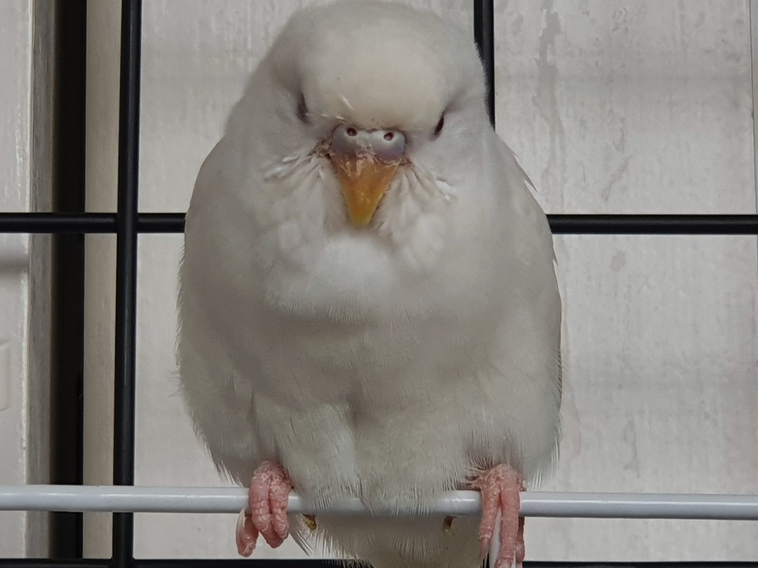
My pet budgie also makes me laugh alot.

There was a couple of days where I only changed her food, water and cleaned her tray because I was busy with work… One day I came back to her growing a beard…
(actually it’s just a loose feather that was stuck on her chin)
Research, sketches and drafts
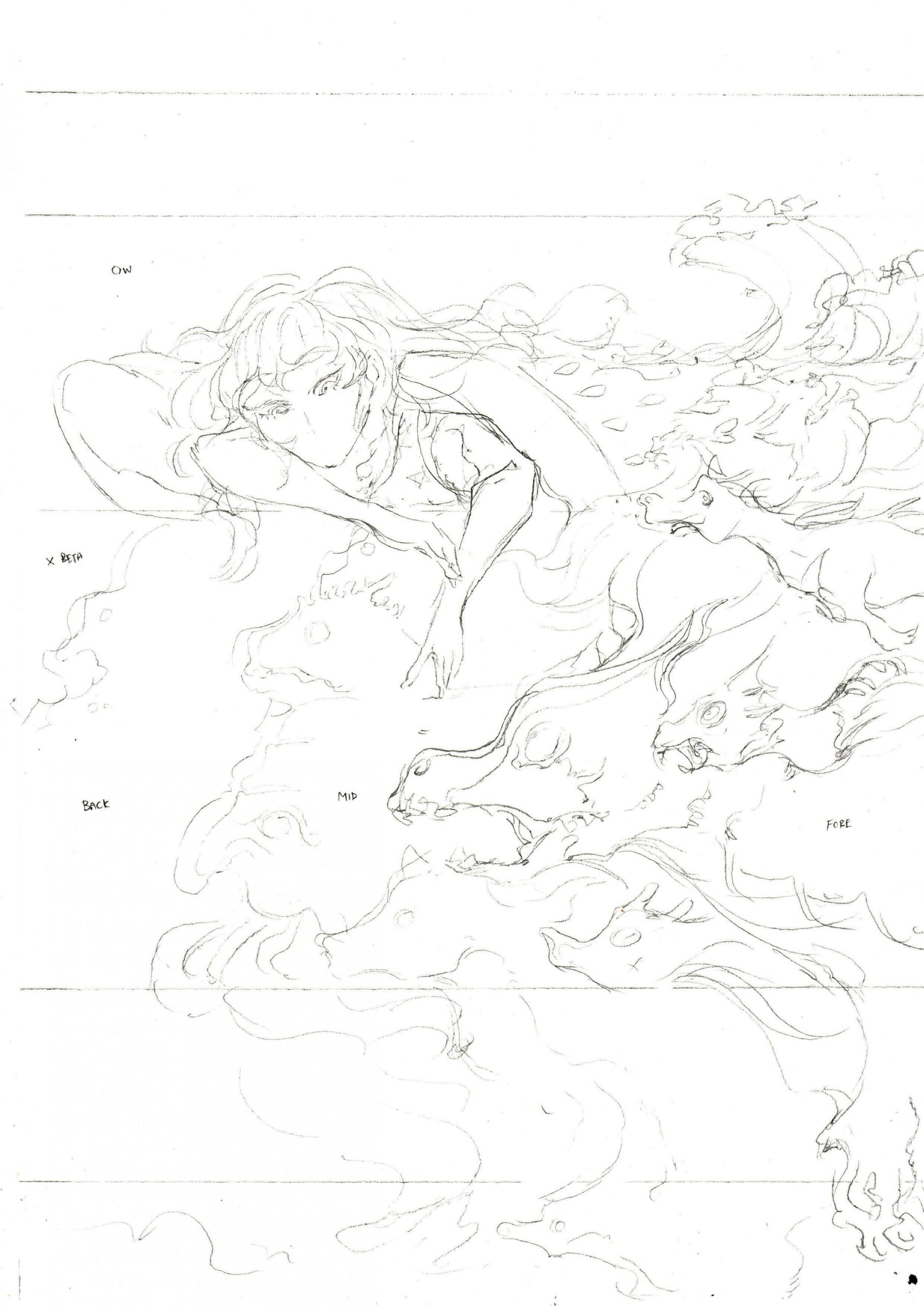
I was very inclined towards the idea of comics and games but I wasn’t super attracted to the mechanical aspect of games so I almost immediately tossed aside the idea of using mechanical things in my self-portrait. I was alot more drawn to the storytelling and characters. I explored a few of my favourite JRPG game covers (e.g. Final Fantasy 9, Tales of Symphonia, etc) and thumbnailed a few compositions and did some other rough sketches too – of anthropomorphic birds representing facades of myself.


Drawing grass and also manually doing the stroke for the image
As the project brief was alot about inanimate objects, I decided to look into using silhouettes and shadows as representations of my mindspace and motion.
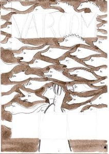
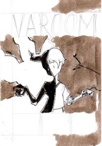
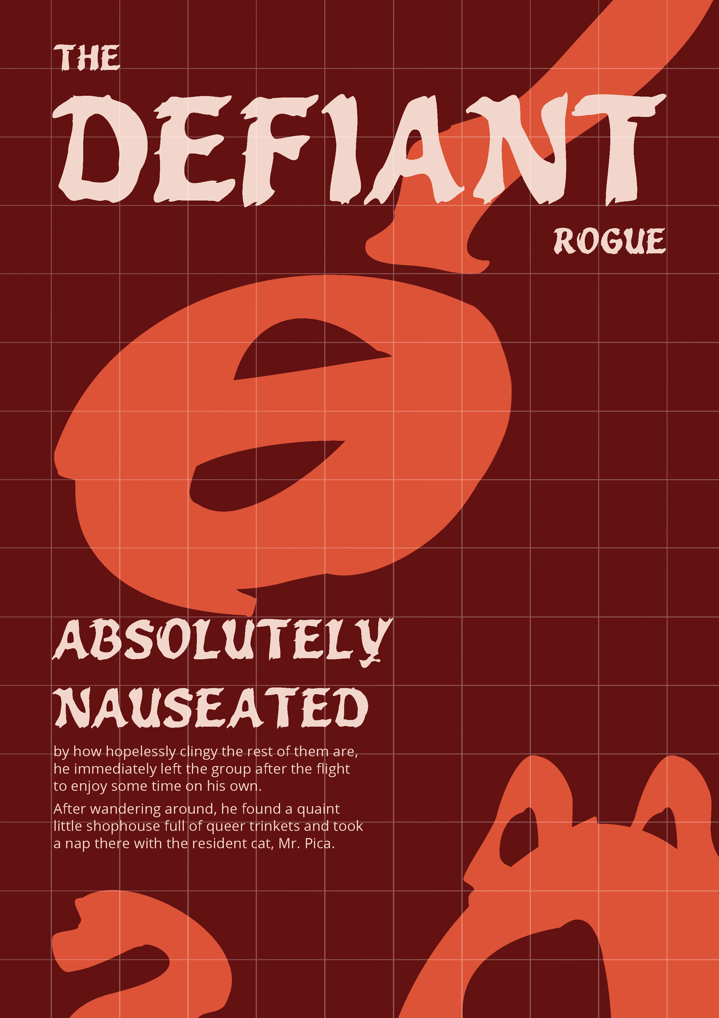
Final Portrait and Concept

Final Piece
Mediums: Copic Multiliners (0.03-0.1), Brush Pen, Adobe Photoshop
I did my self-portrait after Quistina’s but stuck with the same mediums, except relying on Photoshop more for this piece.
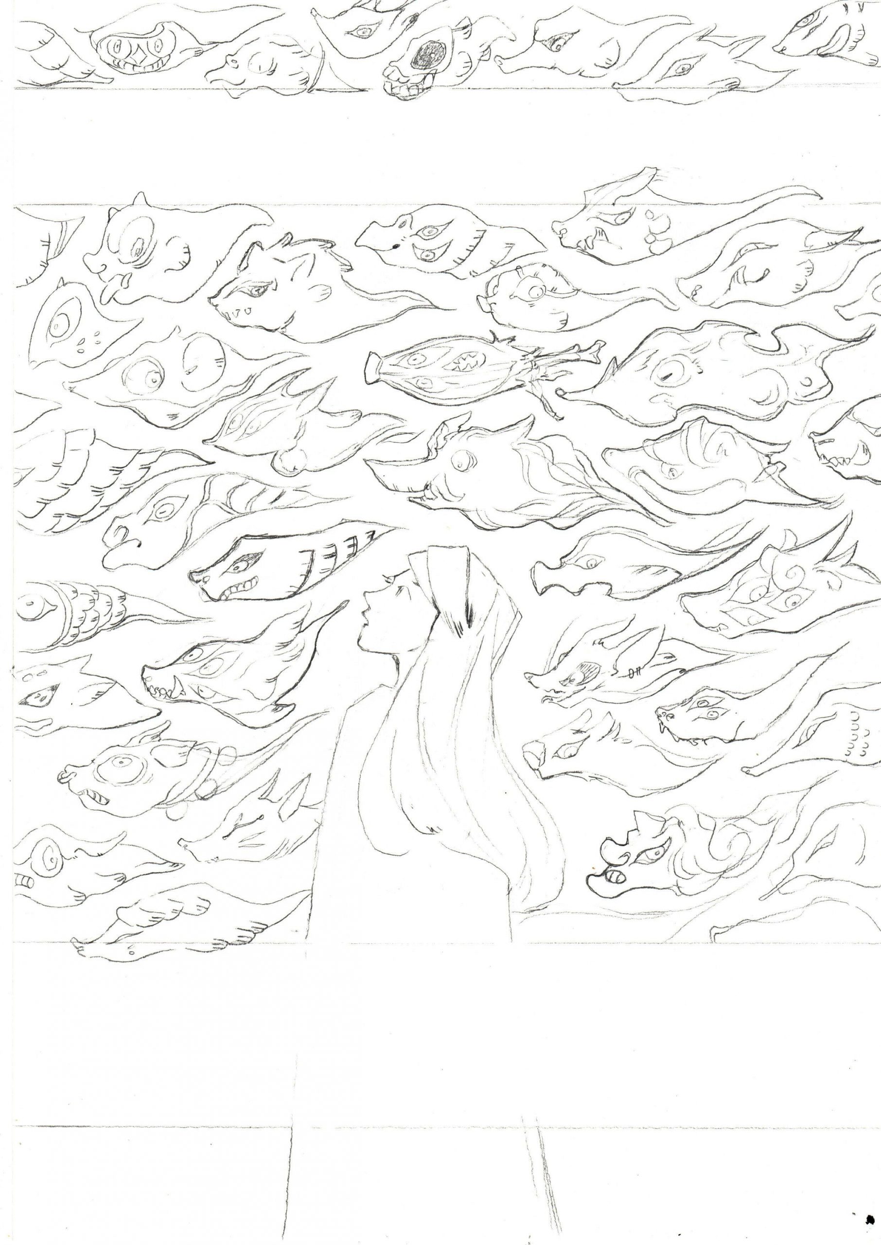
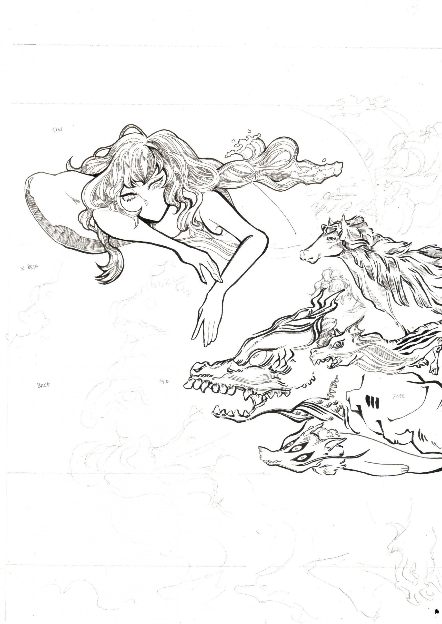
The main motifs in this piece are anthropomorphic bird shadows, the cat skull, foliage, seal/gate and fire.
The bird shadows represented the different roles I see myself fitting into when I’m in different situations (with family, with close friends, with school, etc). To me, shadows represent the notion of always being in flux and dancing around. This is similar to the fire in the eyes of the cat skull – I feel like I’m always moving, always changing and I’m glad for this because my biggest fear is being bored.
I always occupy myself with something, like with drawing, with picking up a ton of random things like Japanese, calligraphy, Russian, archery and more. I tend to start them alot, but the only thing I really go back to is drawing, the rest I tend to just start, drop, and sometimes go back to them.
About the puppetry and shadow motif – I’m always blown away by how different wayang kulit is in different parts of Asia, and the amount of meaning in the visual motifs. Currently, I’m also actually working on my own pet project that’s based on Southeast Asian art in my own time because I’ve grown to appreciate Southeast Asian art and shadow puppetry quite alot and I hope to study them in greater detail. Shadows also mean alot to me because the games that have impacted me alot in my life [Kingdom Hearts(2002) and Ico(2001)] both have very meaningful enemies based on shadows.

Screenshot of Kingdom Hearts’ battle gameplay:
Fighting the shadow enemies called Heartless
Part in Kingdom Hearts 2 opening where they cut through the Heartless
Link: https://youtu.be/rgCSgNakvlo?t=160

Another Heartless variant

Ico’s game cover – a super gorgeous and haunting game I played as a kid!
Ico Trailer Link: https://youtu.be/DTweY16e3W0?t=37
Ico’s concept was very inspired by metaphysical paintings too, so just like in the metaphysical paintings, shadows serve as very meaningful motifs in the game as well.
This links to the skull and the foliage, which to me, represents the back and forth between life and death. I usually see representations of death as a symbol of change in my life – such as fall, skulls, skeletons, tarot-stuff and all. The skull also represents a gate of trials of some sort for myself because I find that I’m always looking for validation from my close friends regarding my personal improvement when we talk about our projects and stroke each others’ egos.
I sometimes find that I have terrible relationship with validation and anxiety because I want to be acknowledged and at the same time I don’t want to be rejected. Logically, I know failure is the best way to improve so I constantly try to find a way to balance that relationship with movement and diligence in order to stay sane. The birds reflect that inability to stay still and my personal insecurities, but also my want to be free from these emotions and have fun doing whatever I want to do.
The bird shadows are anthropomorphic because I started off by basing them on different facades of myself if I were to be a game character – me as a ‘Hero’ to tackle my own problems, a ‘Healer’ to my friends when they need me, a ‘Mage’ when I’m tackling commissions and at conventions, and more.
I did try to imagine myself with more inanimate objects but I found it really hard to relate to (e.g. my friend’s cucumber suggestion, game consoles, etc), so I ultimately went with skulls, shadows and plants instead.


 Still image