Early Concept Ideas
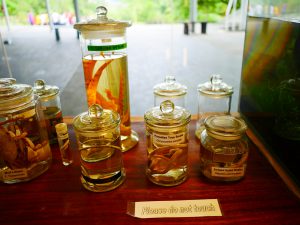
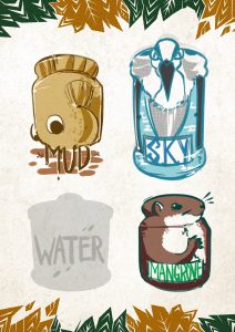
This was the first two pages I created for this concept – based on how I could tell the information in the signs at the wetland reserve. I wanted to tell the information of the nature reserve through containers at the reserve. (Or was it the information of the signages of the nature reserve through marks at the nature reserve?)
Anyway, I think I overcomplicated the criteria for myself and got myself so confused with the zine criteria. I had a difficult time working with this, so I decided to take a step back and review what I could do with a zine and with my location.
Early drafts
start over with my concept based on my 7 senses – which I felt was closer to heart.
Research for 7 Senses
I decided to think about the fundamental elements of a zine (8 pages, etc) so that I could tap on the elements of this zine’s criteria and go on to personifying the 7 senses.
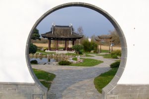
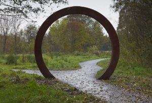
I decided to draw inspiration from the moon gates that you can find in China or Japan. These doors are found in gardens and I think it’s interesting because of how it controls what you can see of the garden and how it creates a very curated scenic view!
Image of a moon gate (Japanischer Garten).
Image of a moon gate by Alec Finlay.
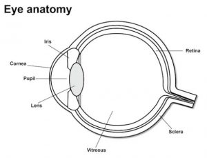
I also did some research on parts of the eye and how the eye worked:
There was an interesting article I read about ‘forbidden colors’: red-green and yellow-blue. This was an excerpt:
“While most colors induce a mixture of effects in both sets of neurons, which our brains can decode to identify the component parts, red light exactly cancels the effect of green light (and yellow exactly cancels blue), so we can never perceive those colors coming from the same place.”
I decided to experiment with these basic colors for my concept later on.
Zine-Making Process
Conceptualizing
As mentioned, I had alot of difficulties working with my initial concept and decided to revise and start the conceptualizing stage over. I decided to piece the format and each piece together a little by a little, standardizing that the ‘focus’ would depict the physical sight I saw/experience I felt, while the ‘peripheral’ would express my emotions towards that impression, emotions and the location.
Early revised concept:
Motion blur for movement!
Creating Focus: Photo Manipulation
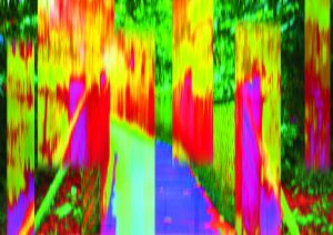
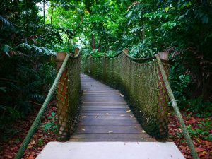
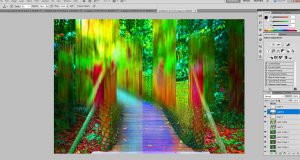
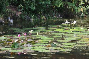
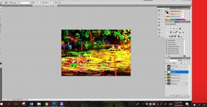
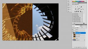
Started off with making trippy images out of the photos that I had of the most impressionable parts of the wetland reserve!
To this:
After that, I used Audacity to play an MP3 of the video of the lily pond sounds, and screenshotted the soundwaves of the place to impose it and create a pattern for ‘Hear’!
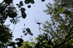
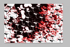
Golden Orb Spider Silhouette (Touch):
I made a spider wallpaper. 🙂
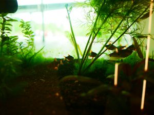
And the aquarium image I used for ‘Smell’:
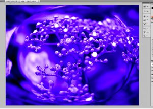
Warping the image of berries (Taste):
Proprioception (Spatial):
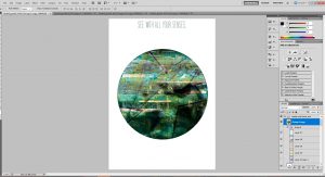
All:
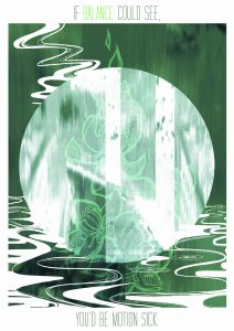
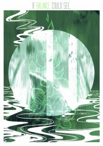
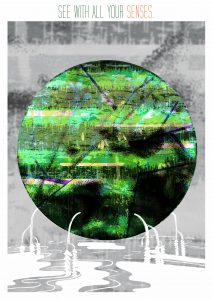
I was really surprised when I placed all the layers together and they looked like a painterly Sungei Buloh! (‘o’) I did receive feedback during consultation that it looked too green – like it was too much slanted towards the pages ‘Balance’ and ‘Hearing’ because it was very green and yellow.
However, I do want to slightly draw it back to my visual experience at the location, so I wound up trying to work around the proportion of green instead.
During the early consultations, I also made the choice of including words because I was worried about how the zine has to be a ‘show-don’t-tell’ book – but I was informed that we’ll be explaining our zines, so I decided to just take out the explanatory content completely.
Early draft with caption
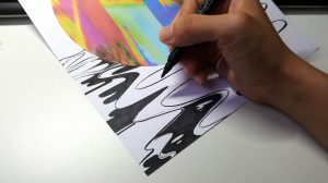
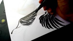
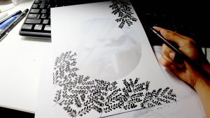
Creating Peripherals: Mark-Making
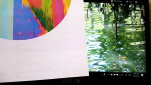
I couldn’t take anything from the site for mark-making, so I decided to take more photos and recreate them instead!
Honestly they look nothing alike HAHAHA.
The wings that took the most effort but also looked the most hideous.
This one’s based on the shadows of leaves!
My hand is my mood – icky.
I THINK IT’S READY???
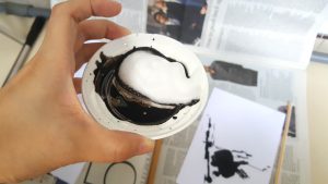
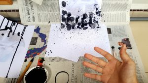
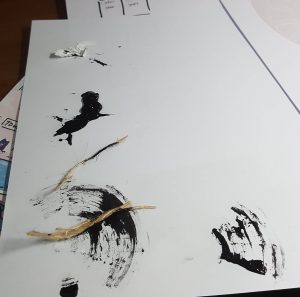
Also – other marks that I tried with gouache and rope but didn’t work out so well.
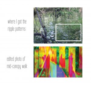
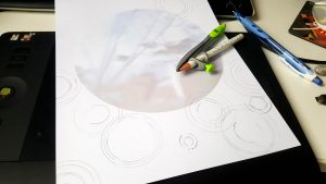
Ripple marks didn’t end up being very suitable either. :’)
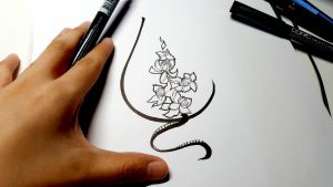
Intended to draw a structure to impose for every piece but it didn’t work out very well aesthetically, so I just extracted the flower in the middle to use as a mark instead.
It was pretty challenging working with the concept and timeline, but I had alot of fun. To view the outcome of this project, go to ‘Project 2 Part 2 Final Design’! 🙂
Links
Project 2 Part 2 Final Design: https://oss.adm.ntu.edu.sg/laum0005/graphic-form-project-2-part-2-zine-2/
(Previous) Project 2 Part 1 Process & Final Infographics: https://oss.adm.ntu.edu.sg/laum0005/graphic-form-project-2-locale-2/
References
Moon Gates: https://insteading.com/blog/moon-gate/
Image of moon gate: https://upload.wikimedia.org/wikipedia/commons/d/d6/Japanischer_Garten_IGA_Rostock.jpg
Parts of the Eye: https://lookafteryoureyes.org/how-your-eyes-work/parts-of-the-eye/
You must be logged in to post a comment.