
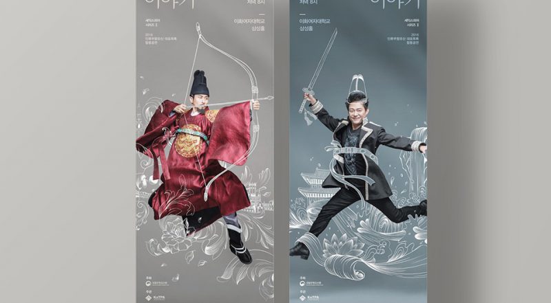
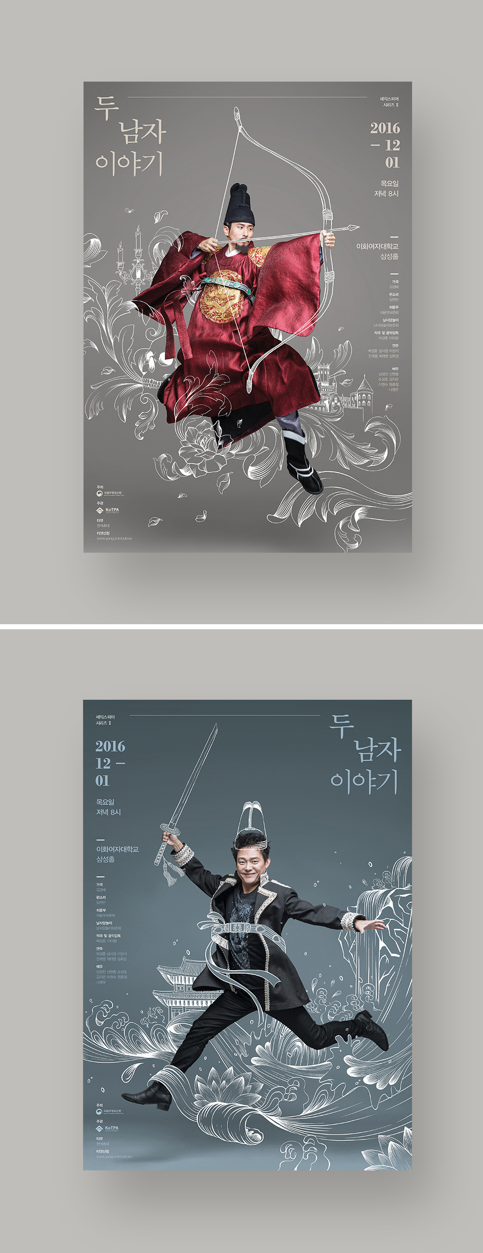
“A Walk with Hamlet and Jeongjo,” a tour that is part of the annual series of performances of traditional music in Seoul’s royal palaces, features a recitation of the Shakespearean tragedy “Hamlet.”
Analyse:
- What is the poster communicating?
An arts event about Korean traditional culture in western context.
- What emotions does the design elicit?
Fun, imaginary, modern yet tradition
- What makes the poster captivating?
The poster/movement of the people, the flow of the illustration and they blend well together.
- How did the poster generate visual interest and facilitate readability/legibility
The words of interest is always flowing with the illustration and kept simple, neat and bigger in size.
- How do you feel about the approach and execution?
Smart way of keeping things simple and relevant yet the illustration are very detailed. By combining both real picture and illustration lots of different art style, which works very well with the idea of western and Korean tradition culture.
Other interesting event promotion posters:

Photo manipulation

Cute illustration
continue to Task 1B


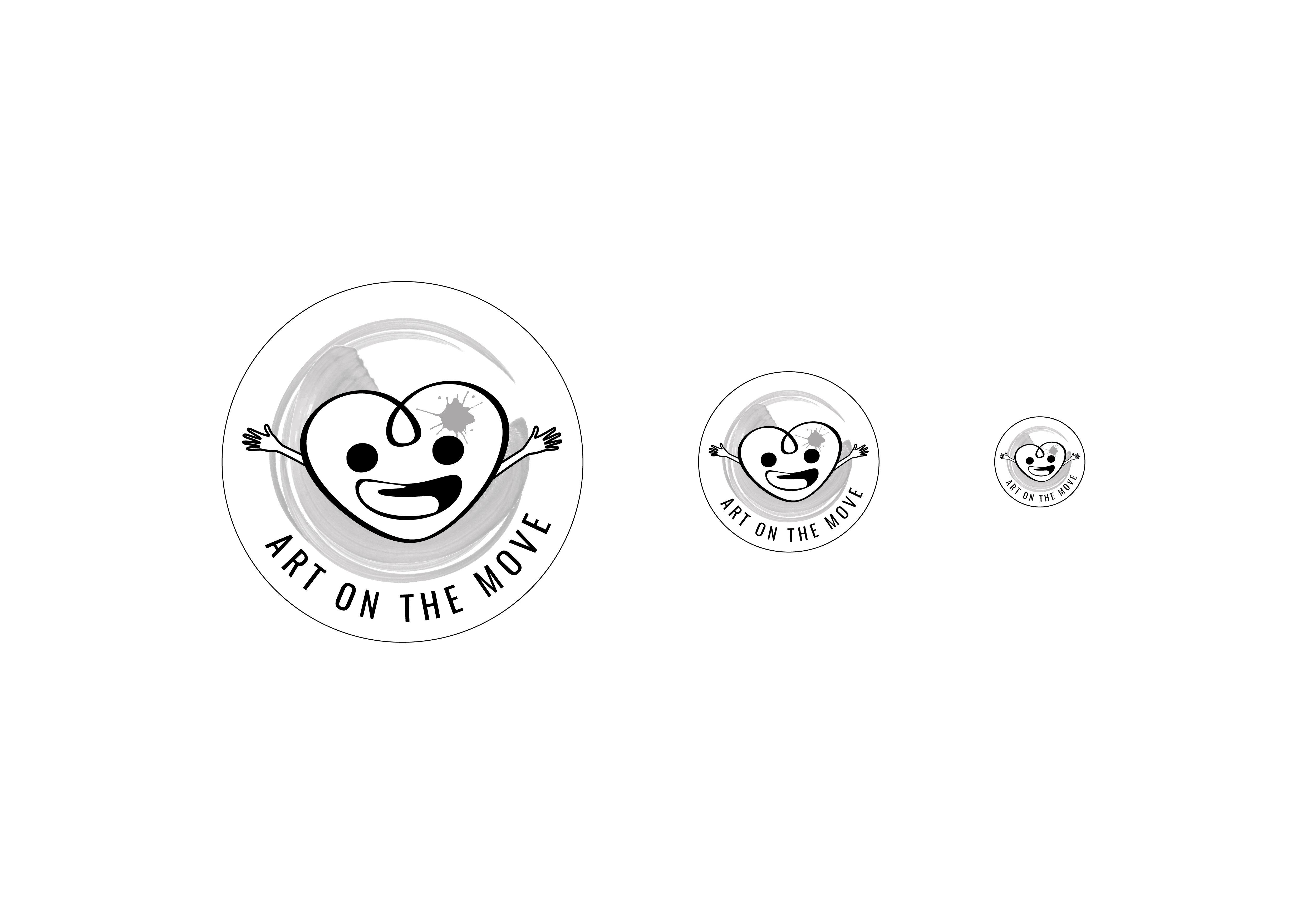 Colored version
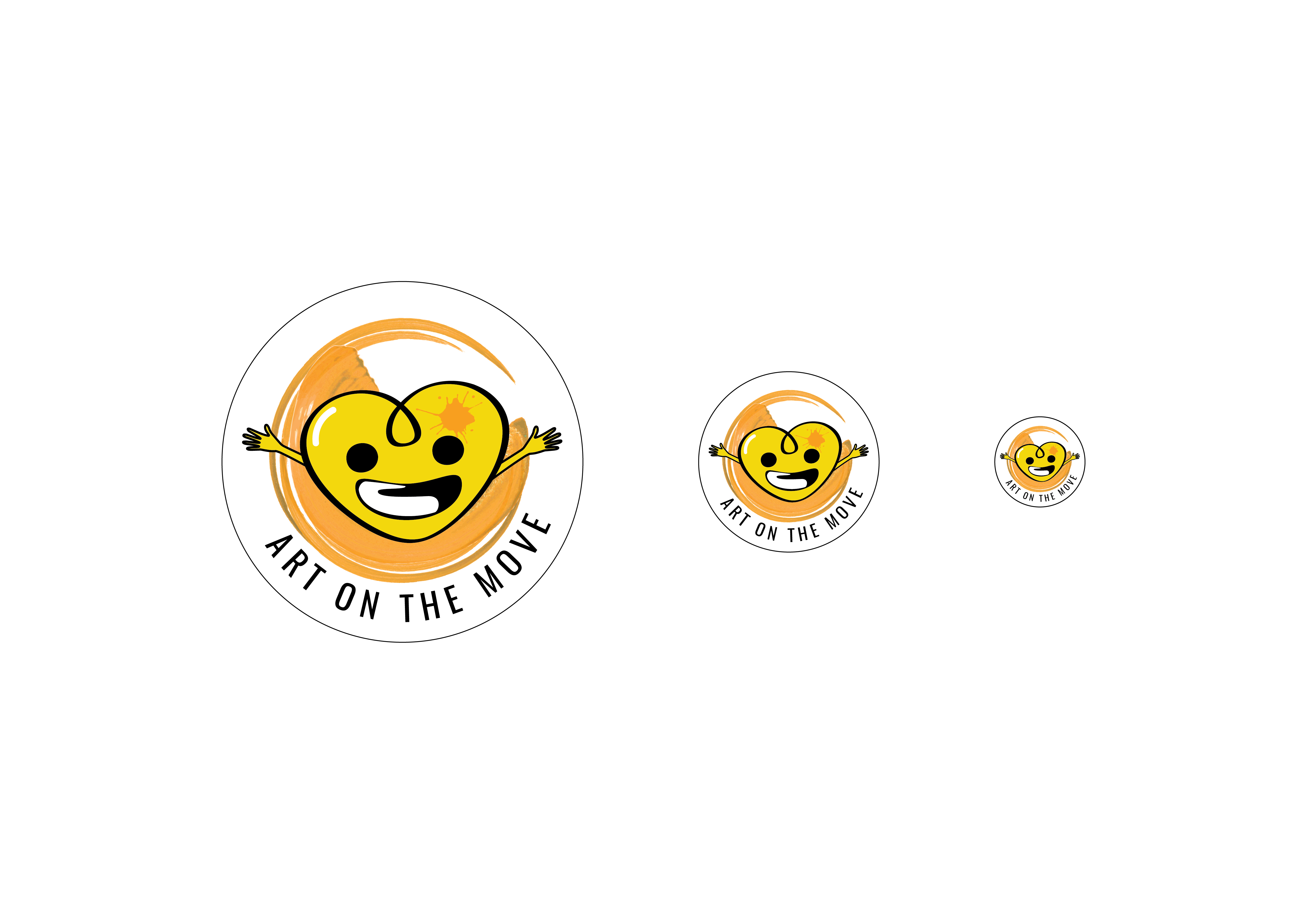


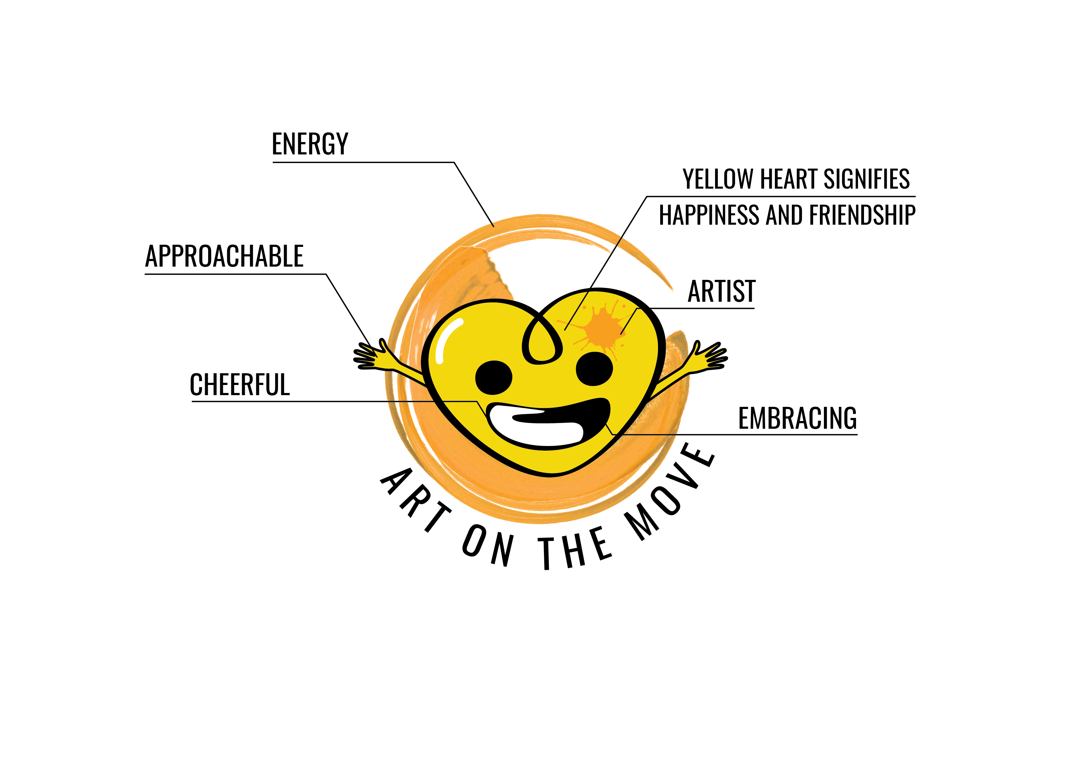
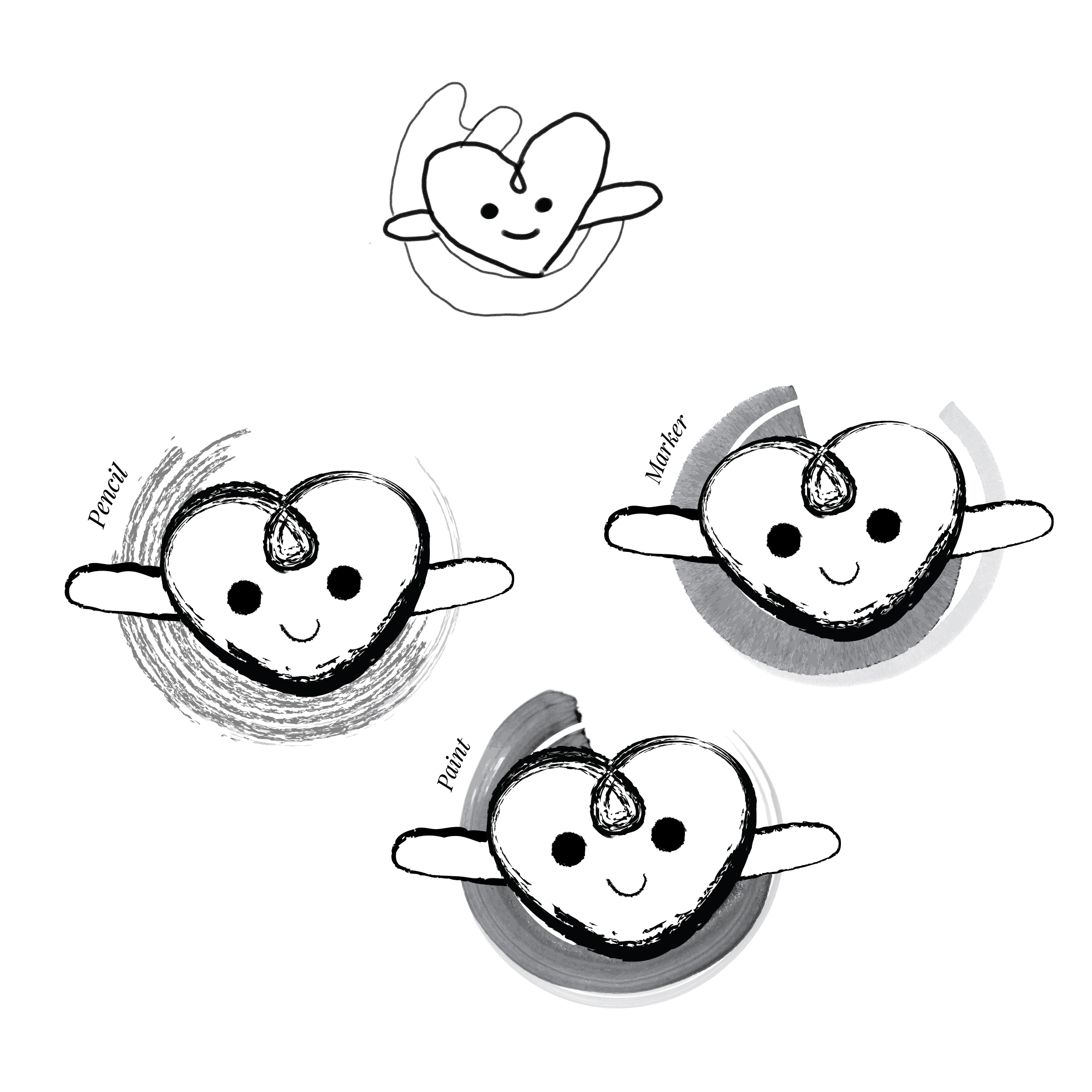 Trying out different expressions
 Selected design 1
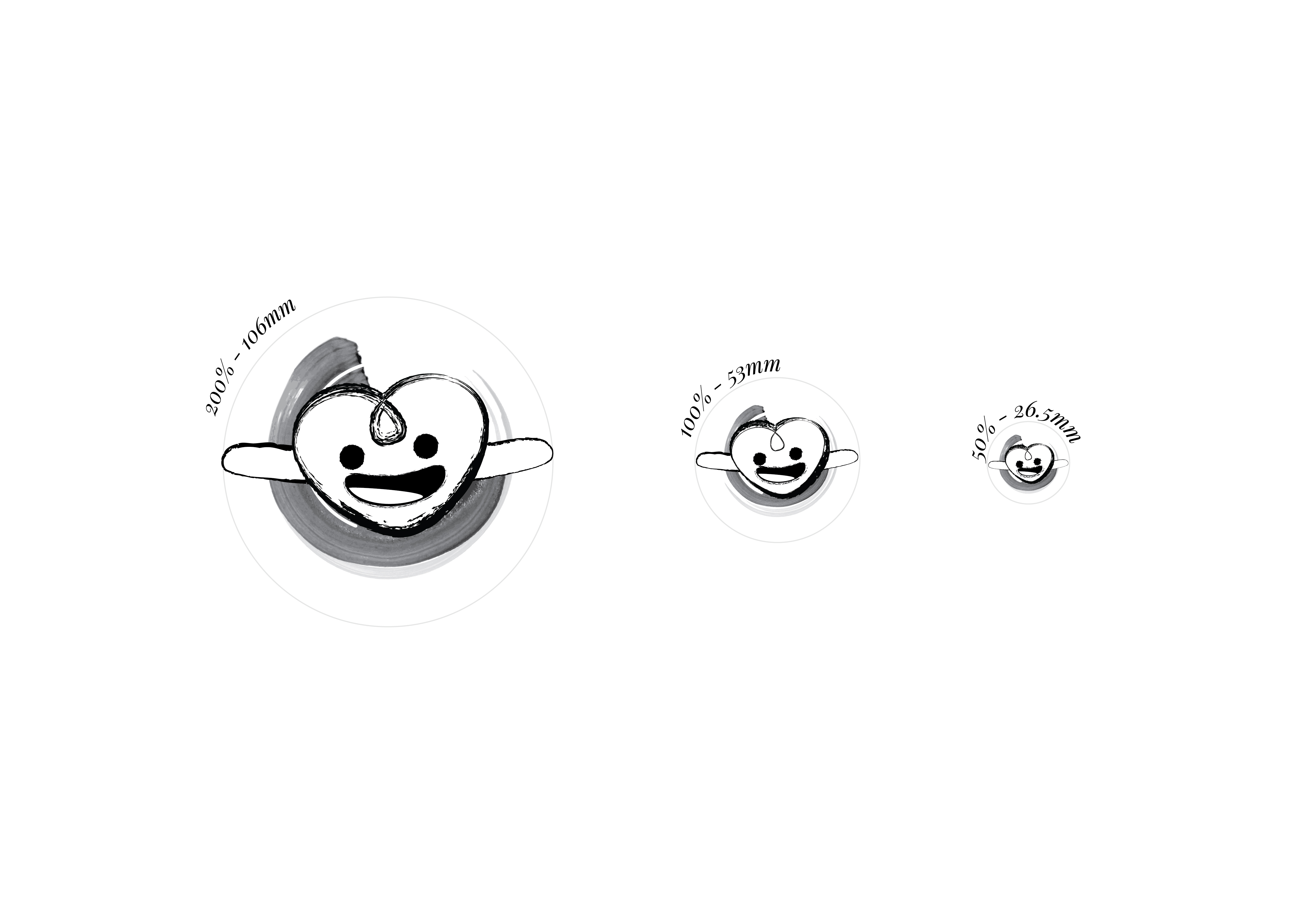
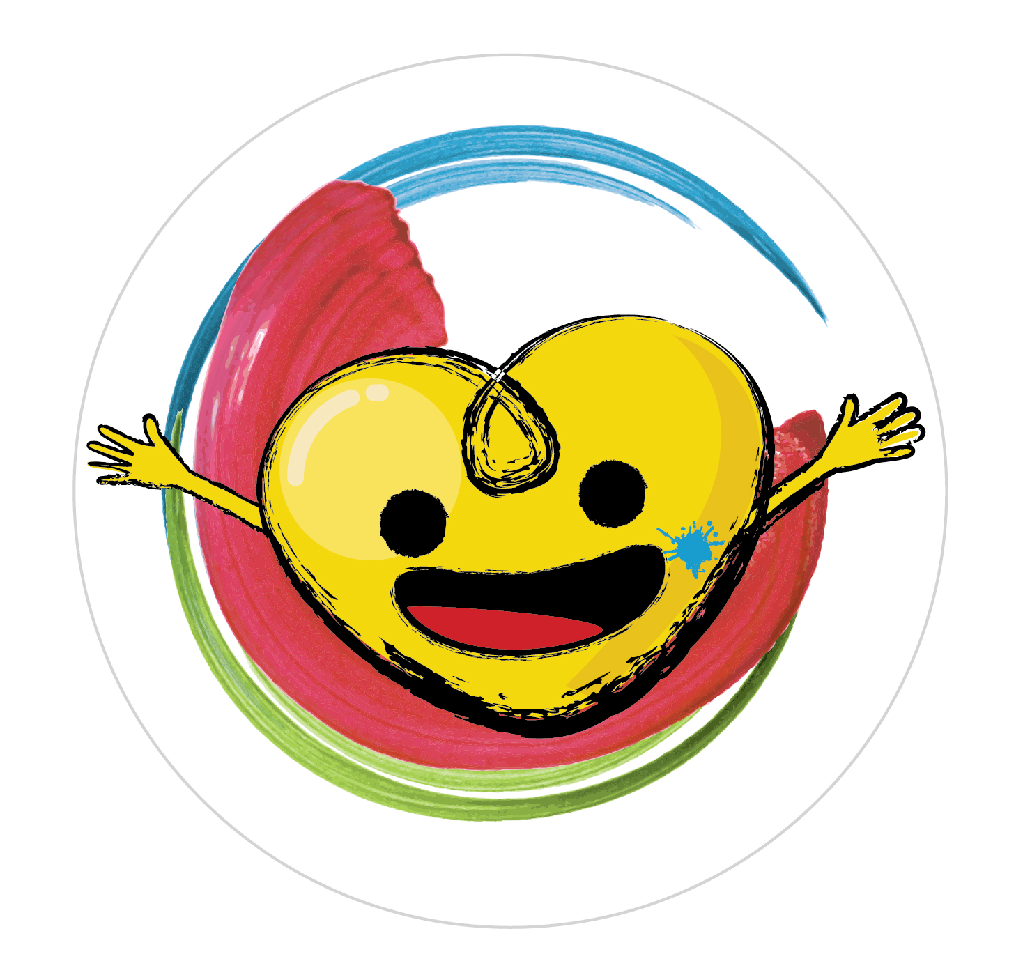
 To play around with the orientation of the swoosh, I first replaced the swoosh with paint splash. Which I find very messy and complicated.
 Then I replaced it with Abstract brush stroke. I like how dynamic the strokes are, but I find it very messy as well.


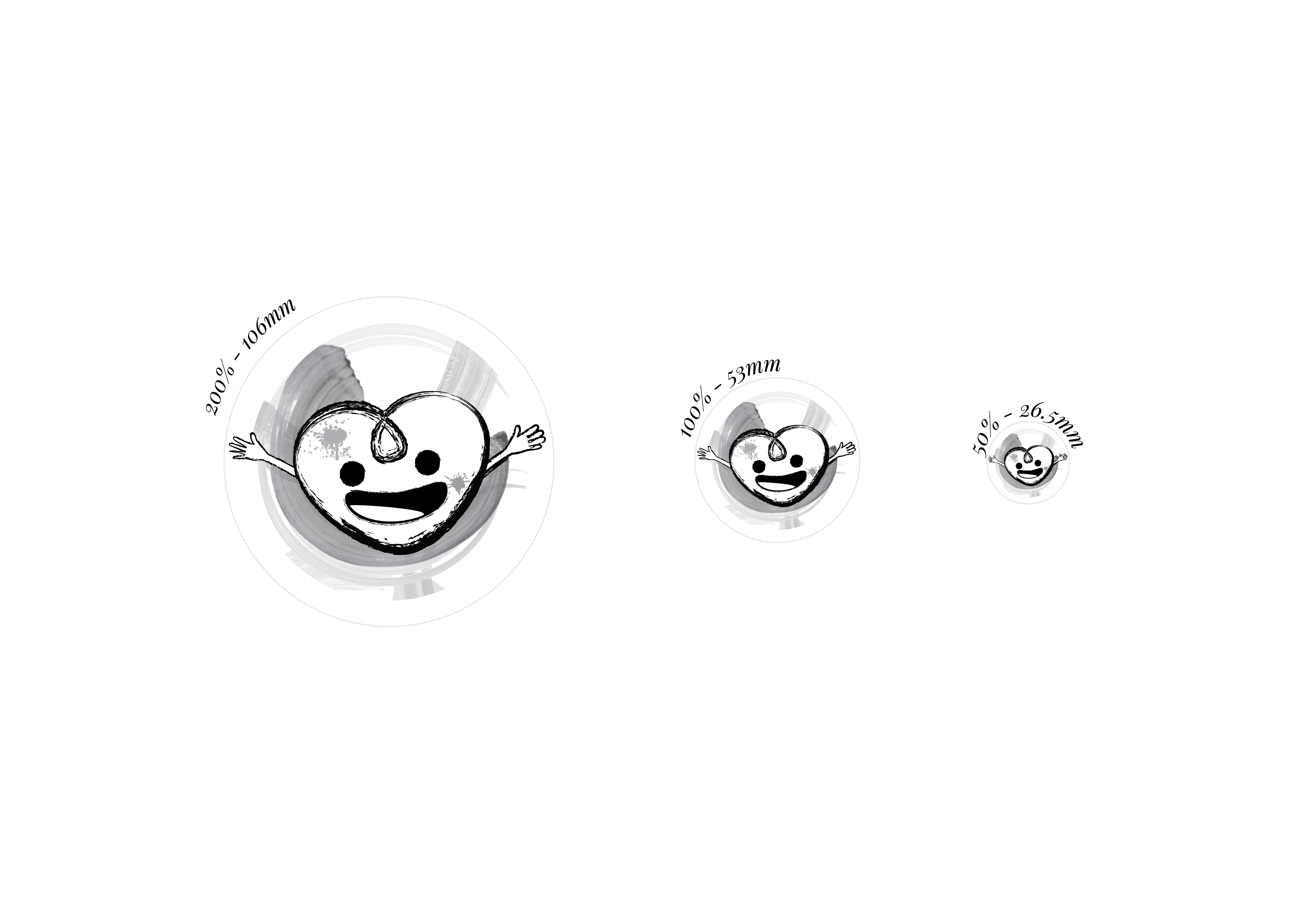
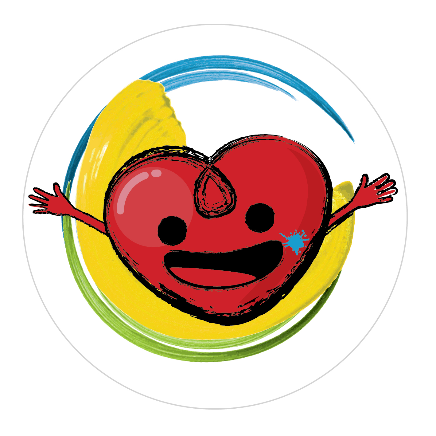


 2. From sketch 1, the paint strokes go on top as a background. Nyan cat.
 3. Paint strokes to geometry patterns


