

continue from task 1
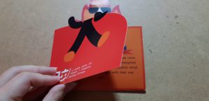
From the feedback and mistakes made previously, I came up a new design:
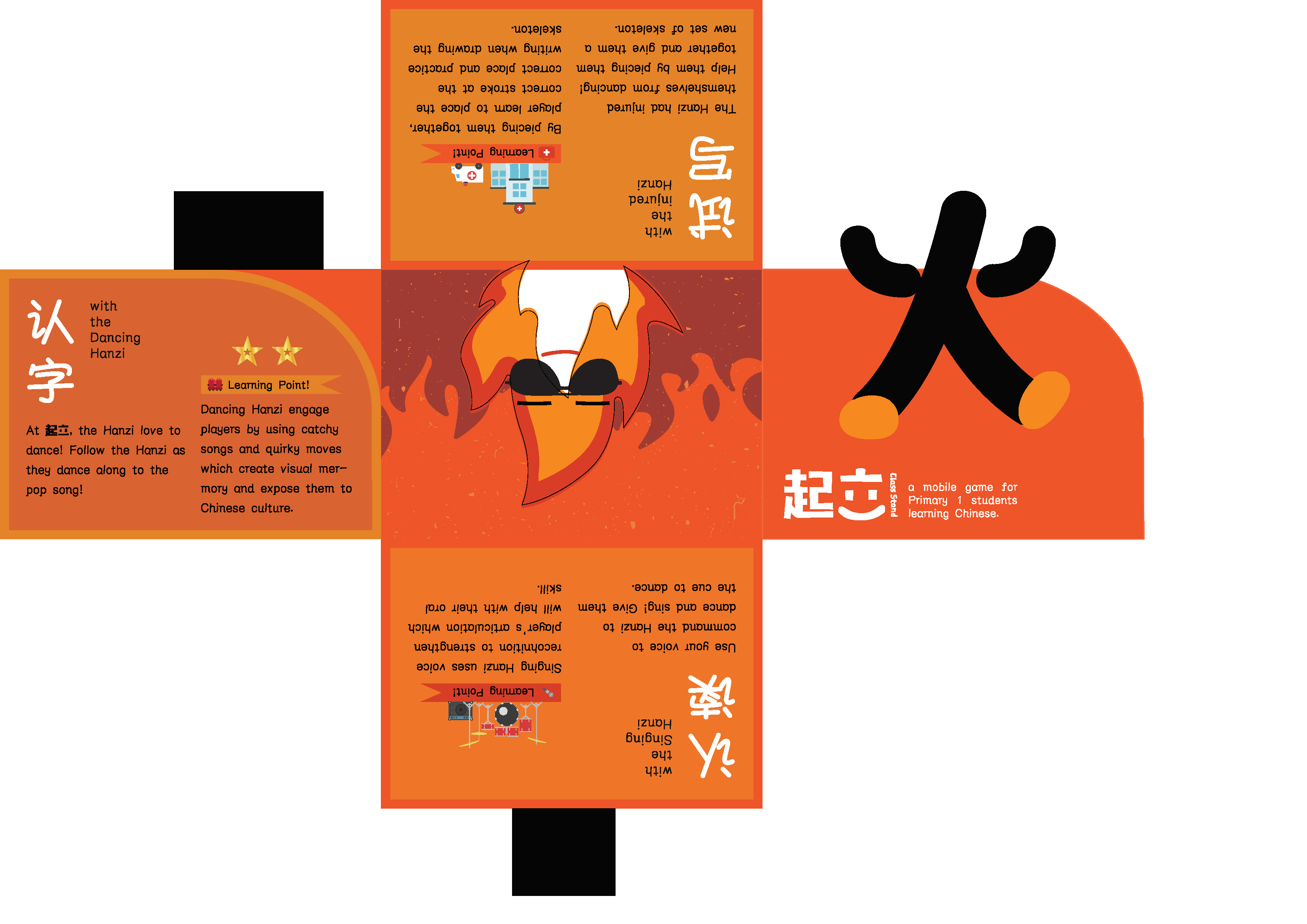
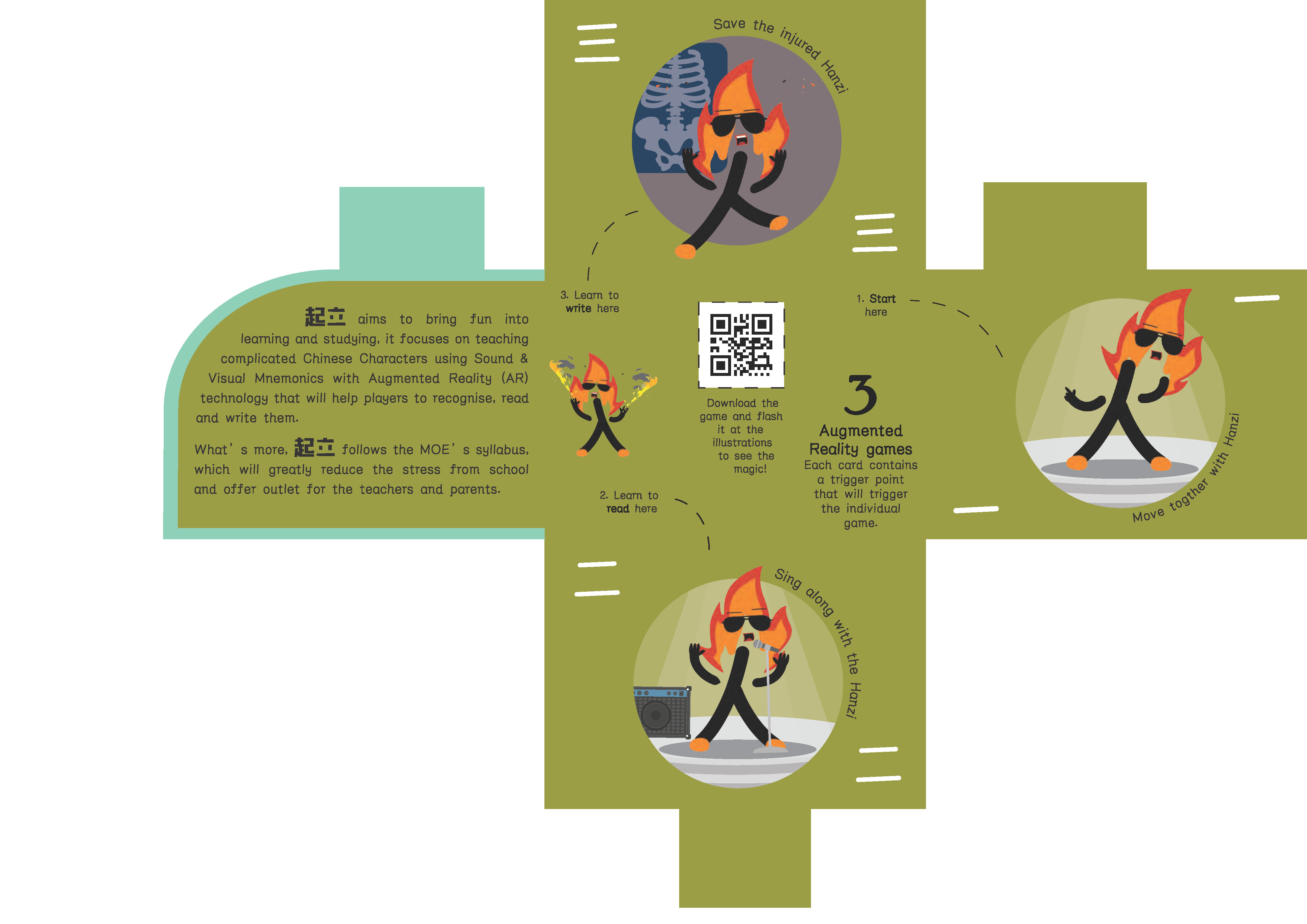
- Using Complementary color to color code the different pages.
- (Orange page) Using matching illustration to fill up the empty page.
- (Green page) Simplify the illustration (so it can be identity by the phone) and provide visual cue as the page’s number.
- Give a lot of bleeding to prevent misalignment
Results:
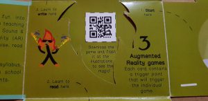
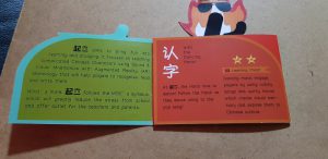 Border for the instruction
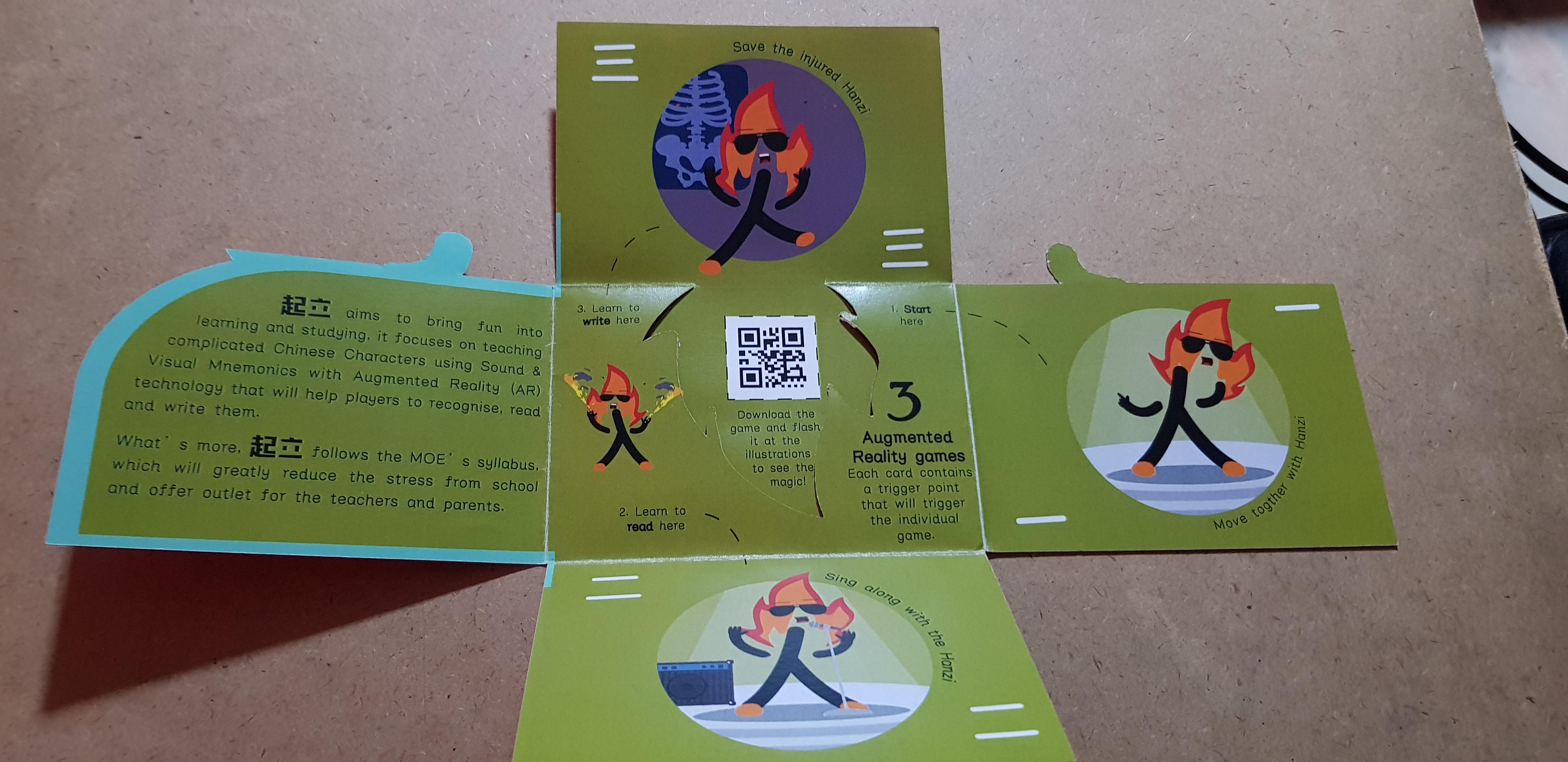
More issues:
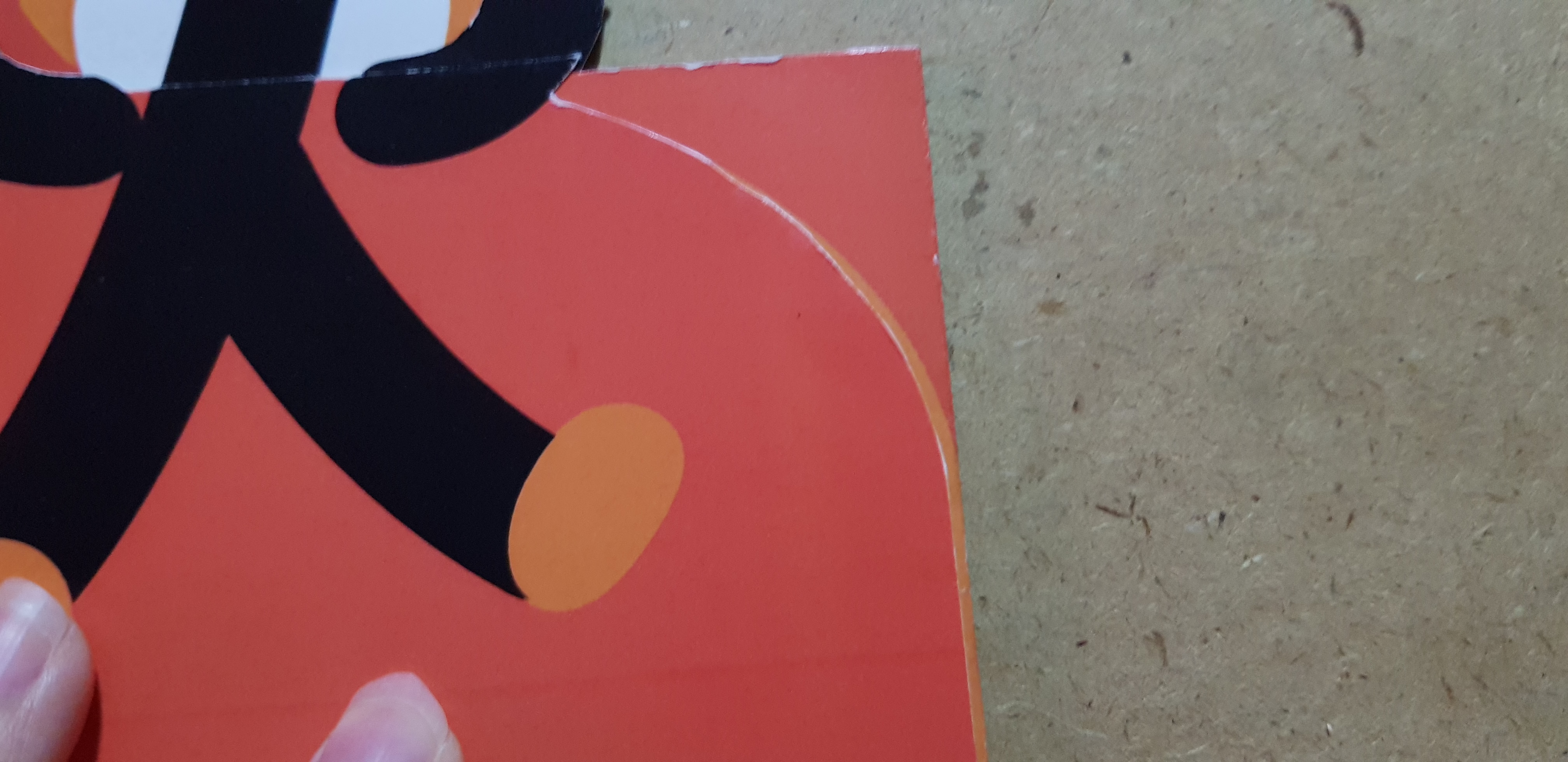
Misalignment due to the thickness of paper
 Messy layout
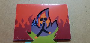
Weird imaginary
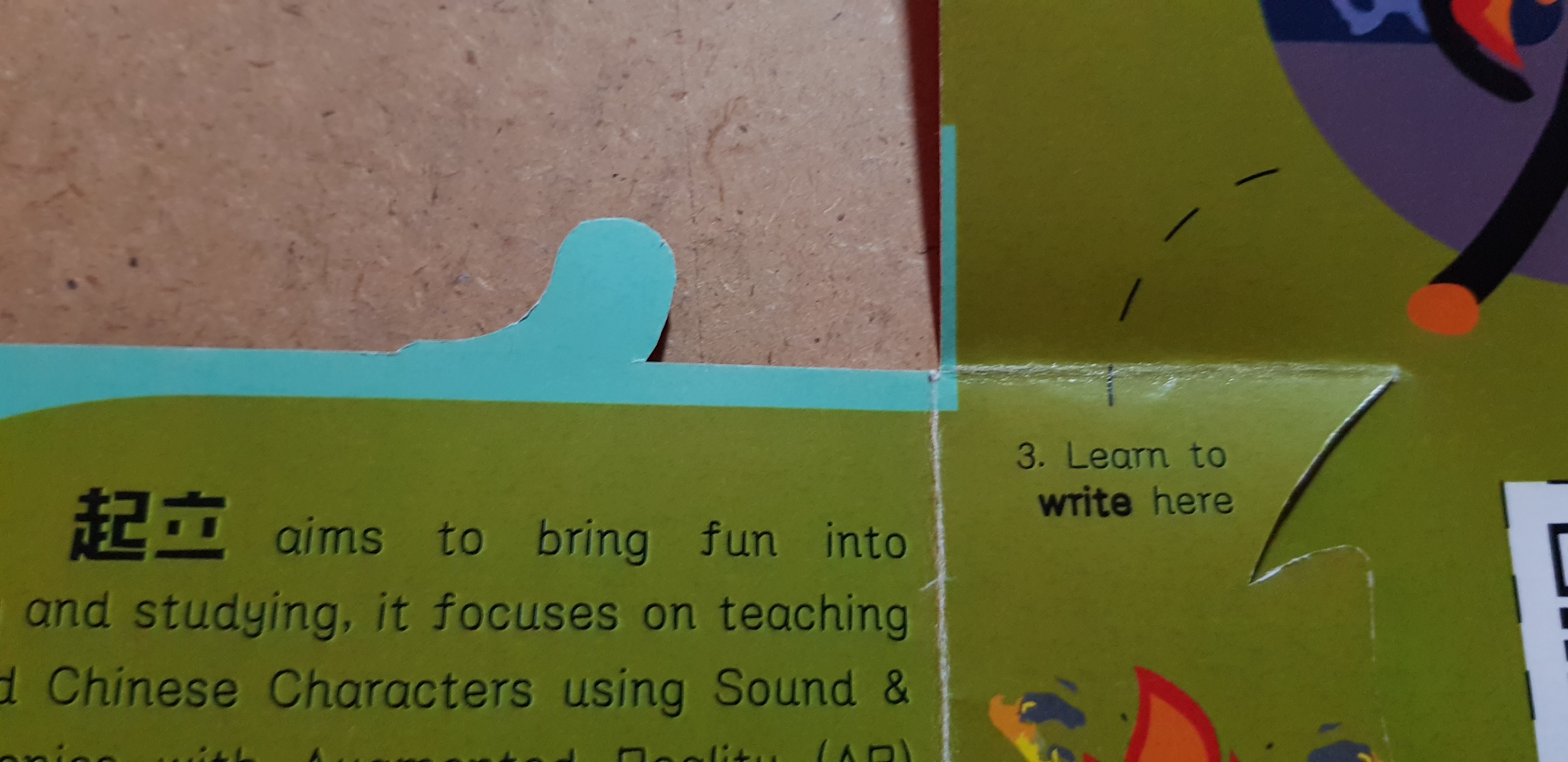 Bleeding issue and more misalignment
 Viewer cannot flip back the brochure accordingly.
Feedback:
- Leading
- Narrow margin
- Remove unnecessary border to resolve the misalignment issue
- Emphasis on the numbers
- Shift the game’s instruction to it’s own page
continue to the final task