

Main Concept: Warm Hug
Secondary concept: Energy
Using the first method:
 For the literal images, I drew 3 hugging images and from there I chose the ‘hugging’ element and develop it further.
Using the second method:

Feedback: Need to be more simple, incorporate the element of Art. Relevance, Simplicity and Memorable
Hence I try to keep my logo as clean as possible and make it more artsy
- Proposed logo with ionic column. The shaft reminds me of the paint strokes
 2. From sketch 1, the paint strokes go on top as a background. Nyan cat.
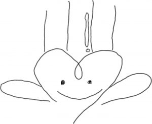 3. Paint strokes to geometry patterns
From the above sketches, I looked back at my previous sketches and try to incorporate it (Energy + Sun), so the logo is more energetic.
 +
+ 
Continue…


Continue to Task 3
Hi Sin Yi,
good exploration there. Can if you read this before class and have time, can i get you to ‘clean up’ some of the smaller pencil marks as they have disappeared when the logo size get reduced. you want to ensure consistency in the logo appearance.
You may also wish to play with the orientation of the swoosh line behind the heart design to create more dynamic and energy. Even the wings can be a little bent and have a little more detail – eg are they wings if so how might they look like beside the current shape.
Do incorporate “Art on the Move”
very good investigations!! keep it up!!