Task 3 : Colour exploration

Standard

9. Simplify and rounder


Translated sketch 9 to AI.

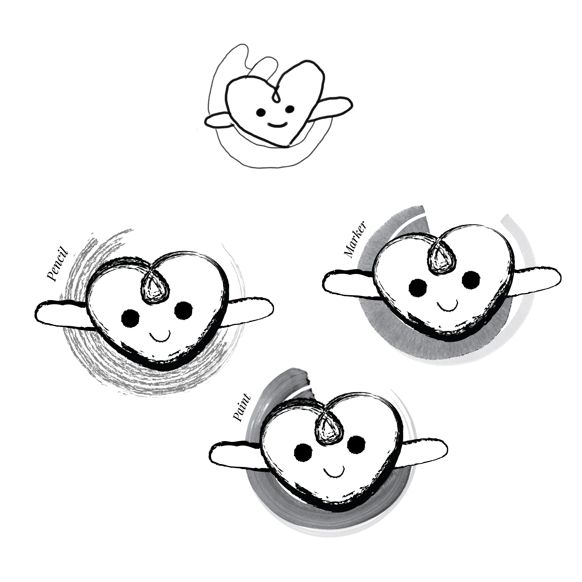
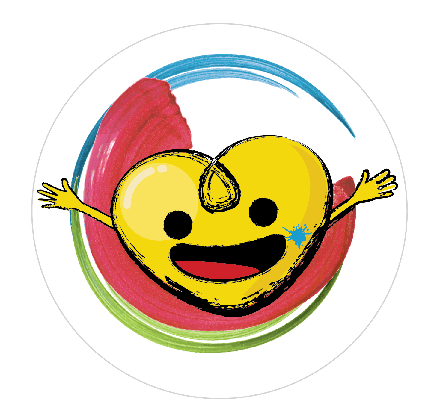
The swoosh is translated to various arts medium to give the artsy feel.  I picked the paint swoosh as it is ‘neater’ and more dynamic.
Trying out different expressions
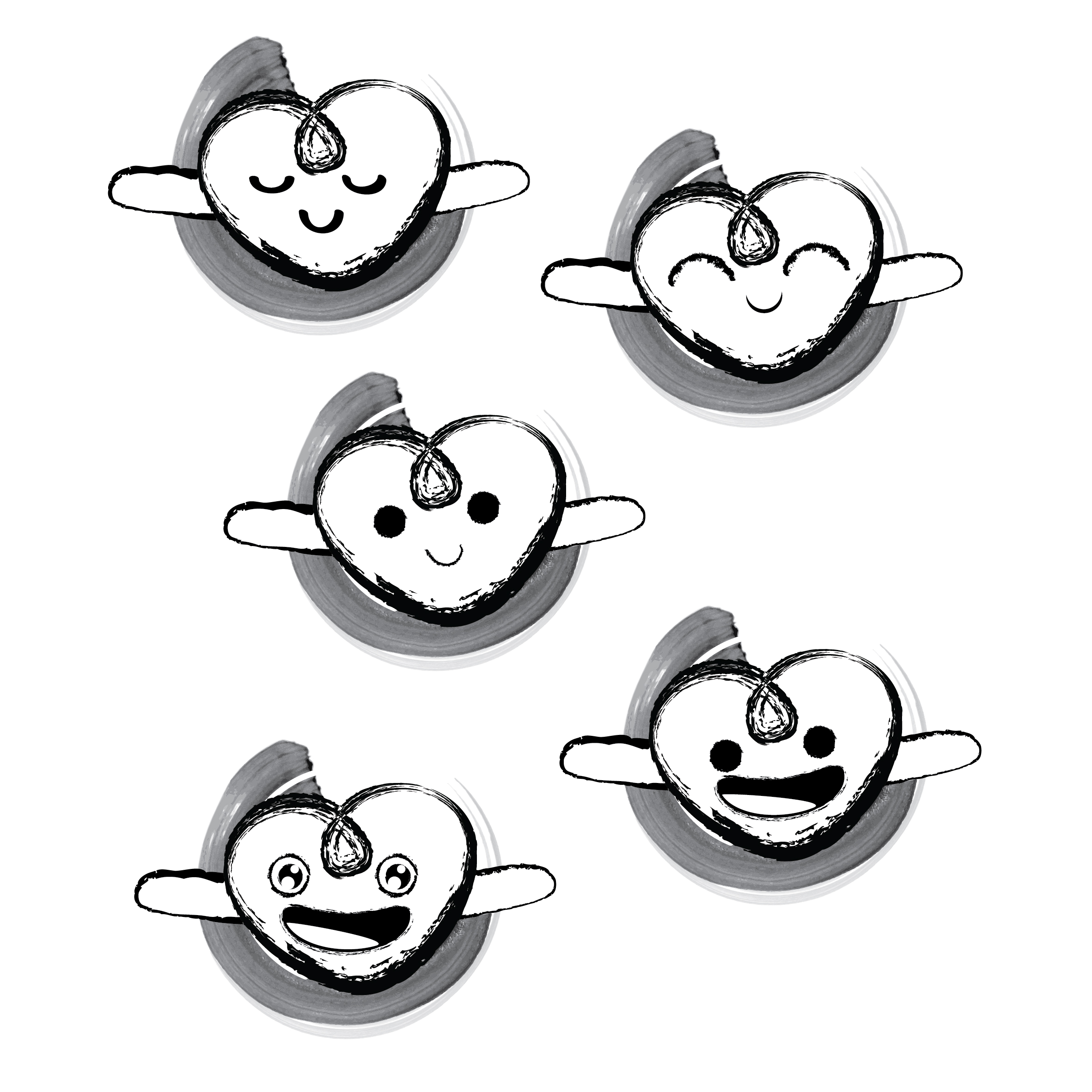
Selected design 1

Update:

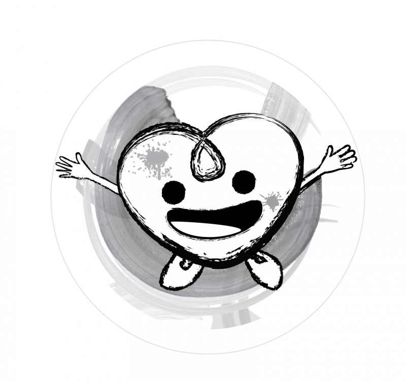
After receiving Michael’s comment, I realized the arms of the heart does not look like it’s arms, hence decided to add in fingers.  As the idea of ‘Art’ derive from paint swoosh, when the logo is black and white, I find it challenging to show the ‘Art’ of it, hence decided to add in paint stain on the character to show that it is working on art. And adding legs to represent ‘on the move’. 
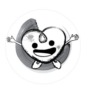
To play around with the orientation of the swoosh, I first replaced the swoosh with paint splash. Which I find very messy and complicated.
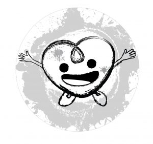
Then I replaced it with Abstract brush stroke. I like how dynamic the strokes are, but I find it very messy as well.

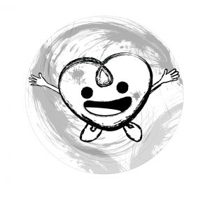
I go back to my first idea and added more strokes. 
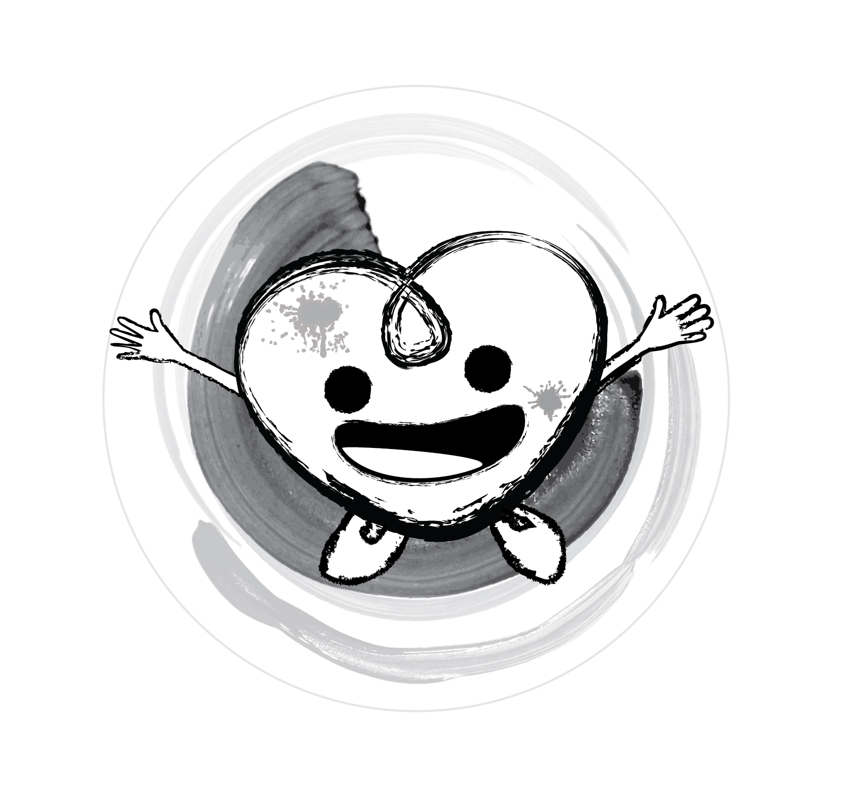
Then I tried to imitate the abstract brush strokes and came up with this:

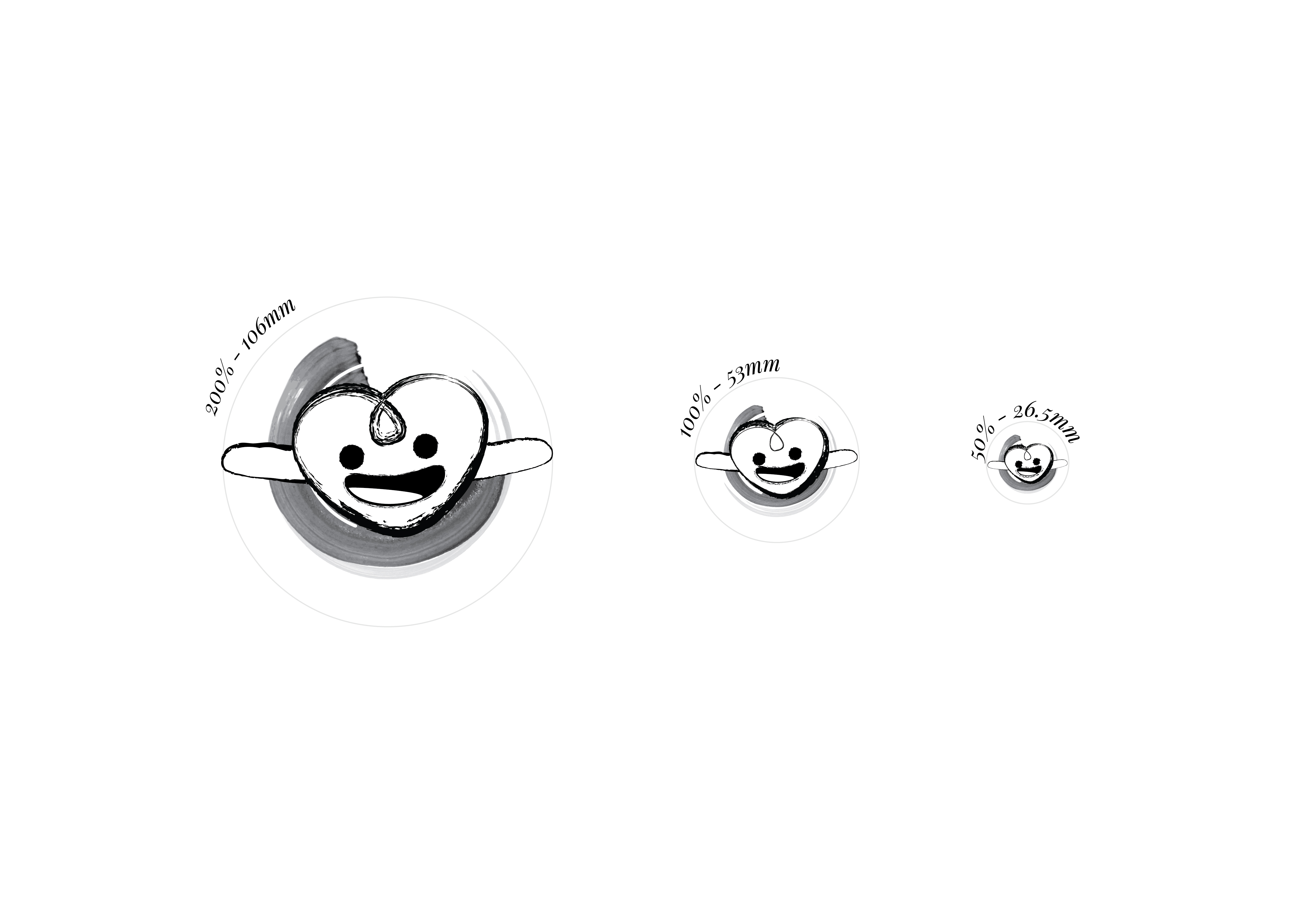
As the strokes make the whole logo complicated and they look more like the ‘badge’s background’ than the ‘logo’s background’, the strokes are kept within a smaller area, smaller than the heart.

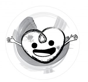
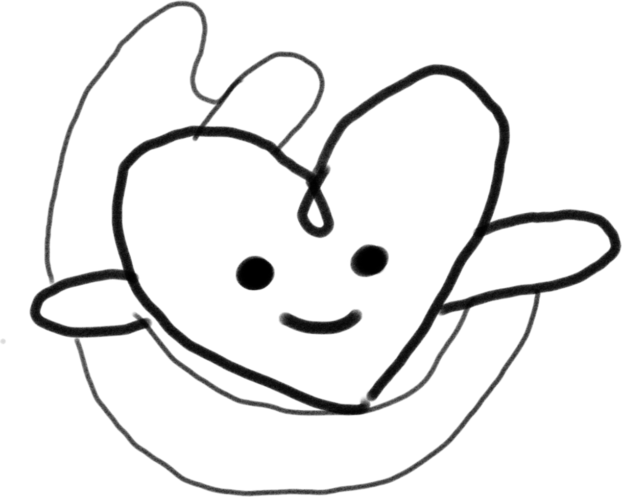
After comparing it with and without legs, I have decided the one without legs is better.


Printed version:

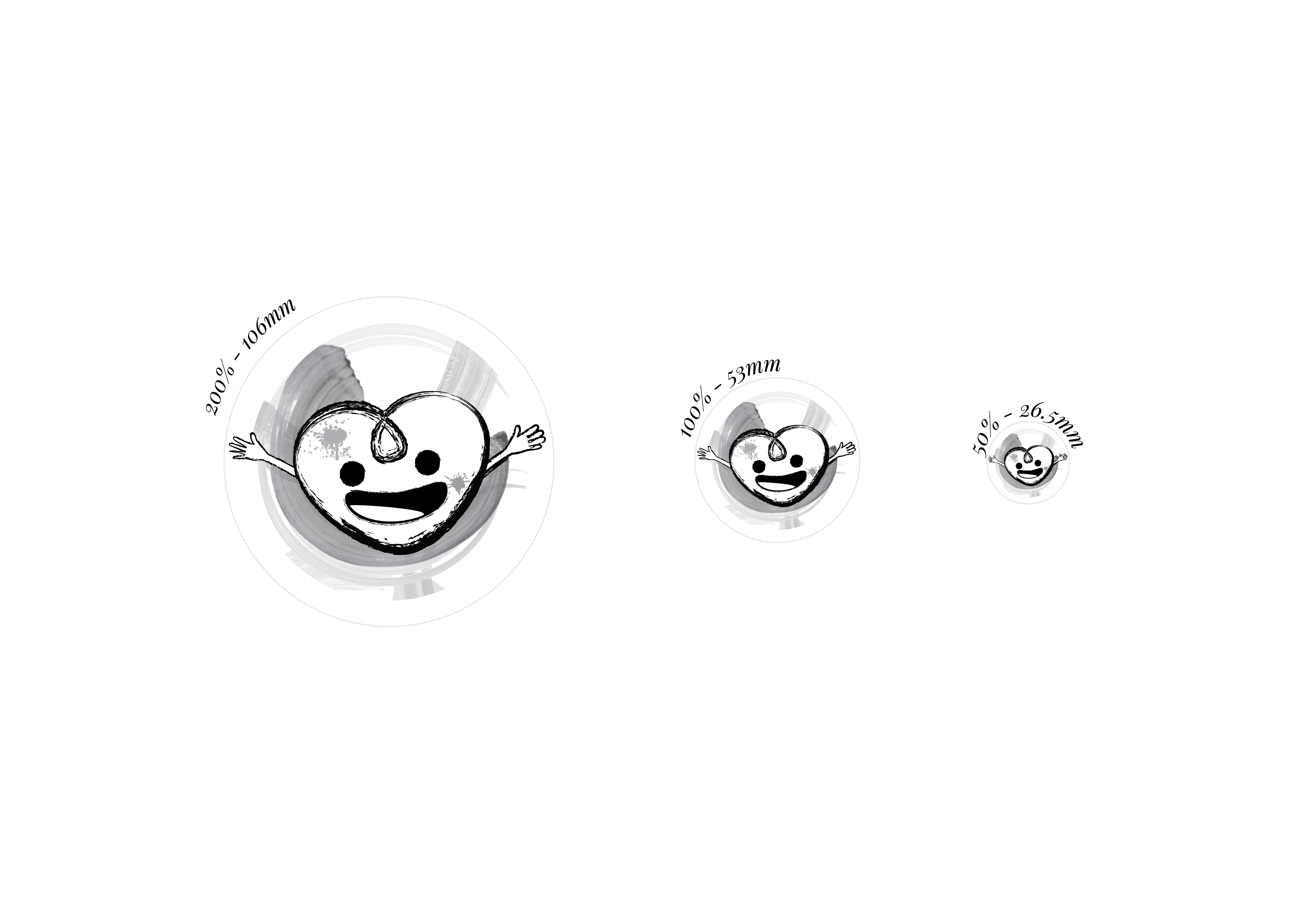
Trying out different colour scheme before class. 
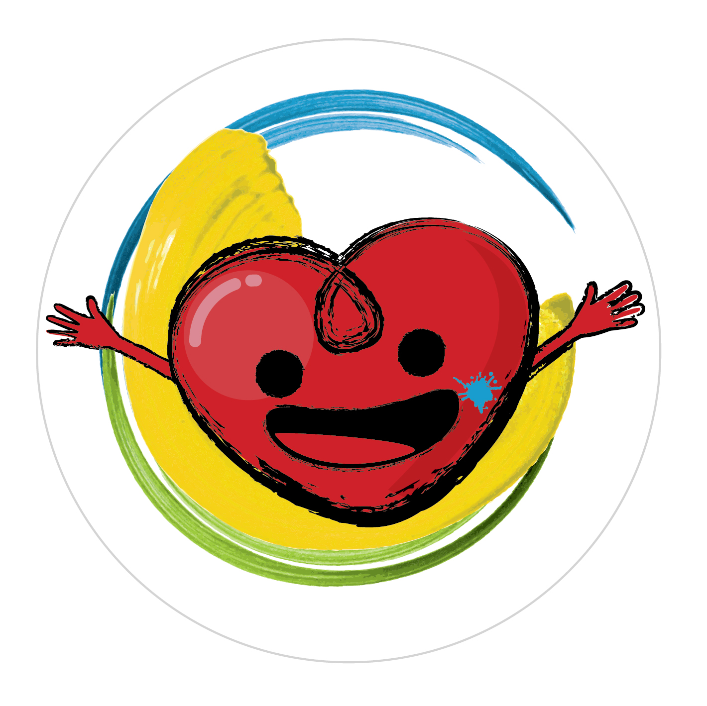
Continue to Task 4

Task 2 Translating and Exploring Design

Standard

Continue from Task 1

Main Concept: Warm Hug
Secondary concept: Energy

Using the first method:
For the literal images, I drew 3 hugging images and from there I chose the ‘hugging’ element and develop it further.

Using the second method:

Feedback: Need to be more simple, incorporate the element of Art. Relevance, Simplicity and Memorable

Hence I try to keep my logo as clean as possible and make it more artsy

  1. Proposed logo with ionic column. The shaft reminds me of the paint strokes

2. From sketch 1, the paint strokes go on top as a background. Nyan cat.
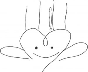
3.  Paint strokes to geometry patterns


From the above sketches, I looked back at my previous sketches and try to incorporate it (Energy + Sun), so the logo is more energetic.

  + 


Continue…

Continue to Task 3

Task 1 : Information gathering and Idea generating.

Standard
  1. Observation Notes:

The aim of “Art on the move”  {Art in Health movement}

  • To accompany the patients, help them pass time. Allow patients to talk about their problems and pains and cheer the patients up which reduces their stress.
  • Provide guidance and encourage patients to explore their thoughts and imagination to calm their nerves, anxiety, reassure them by thinking the positive things and to help them achieve what they imagined but couldn’t achieve on their own, which will improve their sense of well-being and worth.
  • The art produced can create a positive image to the hospital by making the hospital feel more ‘alive’ and create awareness of the volunteers.
  • Positive feedback received will encourage the patient.

The environment and other observation:

  • Active – Artworks can be found at every corner by artists or patients/volunteers
  • Calming, Relaxing – Greenery, wood feature wall
  • Proud of their own works

2. Brainstorming

Therapeutic, approachable, zen, human centric, clean, dynamic, playground, kampong

3. Design Short list and Rationales

  # FIRST                                                 

i. Design aims

A sense comfort

ii. Concept

Warmth Hug

iii. Keywords

Bonding, passion

iv. Rationale

To portrait the badge’s holder as warmth person, someone that is in a open arms, a passionate individual with warm colors.

v. Mood board

  # Second                                                           

i. Design aims

Positive impact

ii. Concept

Energy

iii. Keywords

Colourful, kinetic

iv. Rationale

To create a positive energy for both viewer and badge’s holder with colorful dynamic graphic

v. Mood board

  # Third                                                                                                 

i. Design aims

Family, sense of identity

ii. Concept

Community

iii. Keywords

Together

iv. Rationale

To establish a community image, sense of identity with the portraits of the community member.

v. Mood board


Continue to Task 2 & 3