
Here are the definition of 8 principles of design (according to an article from Allen Memorial Art Museum):
Rhythm
A principle of design that indicates movement, created by the careful placement of repeated elements in a work of art to cause a visual tempo or beat.
Subject is consistent and shows continuity of pattern.

Balance
A way of combining elements to add a feeling of equilibrium or stability to a work of art. Major types are symmetrical and asymmetrical.
Subject is centralised accompanied by straight line/curves within the frame.
Emphasis (contrast)
A way of combining elements to stress the differences between those elements.
Elements pop out to differentiate from one another.
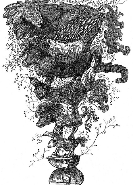
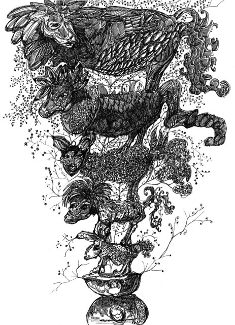
Proportion
A principle of design that refers to the relationship of certain elements to the whole and to each other.
Subjects are compared in different heights and sizes.
(Internet Archive Book Image, Flickr)
Gradation
A way of combining elements by using a series of gradual changes in those elements. (large shapes to small shapes, dark hue to light hue, etc)
Subject grows in a certain direction, evolving and changing its form.
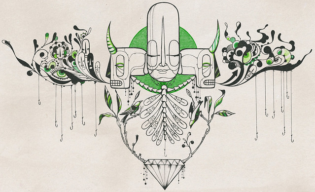
Harmony
A way of combining similar elements in an artwork to accent their similarities (achieved through use of repetitions and subtle gradual changes)
Subject is drawn with similar strokes/tone, sense of belonging between lines.
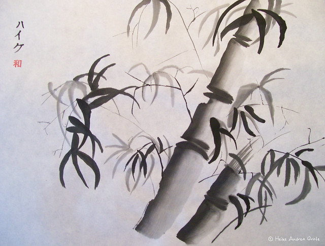
(Heike Andrea Grote, Flickr)
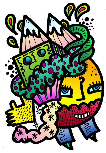
Variety
A principle of design concerned with diversity or contrast. Variety is achieved by using different shapes, sizes, and/or colors in a work of art.
Many subjects are drawn together with contrasting, randomised styles.
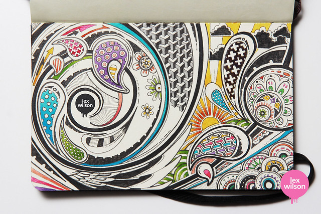
(Lex Wilson, Flickr)
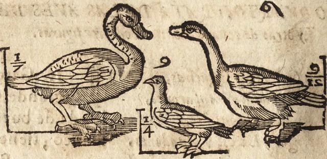
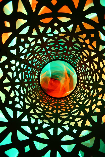
Movement
A principle of design used to create the look and feeling of action and to guide the viewer’s eye throughout the work of art.
Subject directs viewer’s eyes to a specific space in the frame.
While researching for illustration examples, I realised that these principles occur simultaneously. For instance, the last design for Movement also carries the principle of Gradation – gradual change in scale. These identities create cohesion in lines and allow illustration to appear ‘visual pleasing’.