2D Project 3: Colour Harmonies (Research)

Harmony /ˈhɑːməni/

Definition: the quality of forming a pleasing and consistent whole

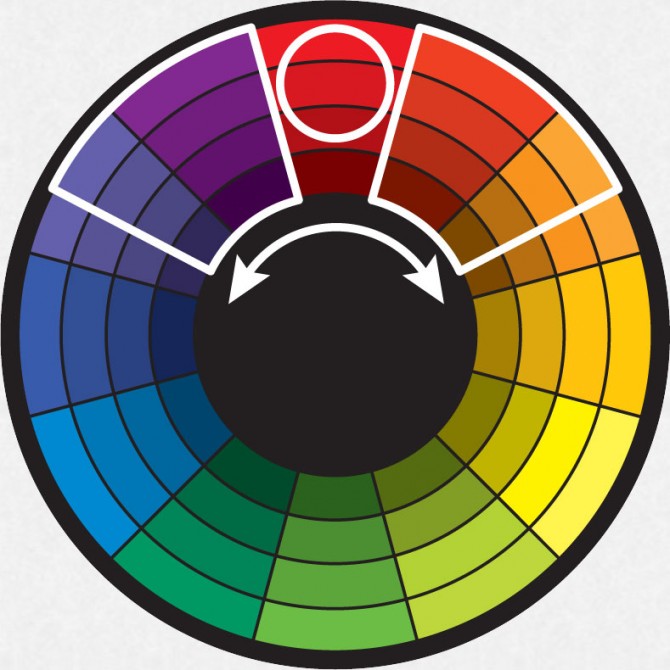
There are three attributes in a colour – hue, saturation and value.
  • Hue refers to a colour/shade
  • Saturation refers to the colour intensity
  • Value refers to the tone, from light to dark
And this is what happens when colours collide euphonically.
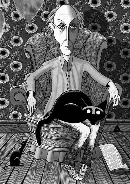
1. Monochrome harmony

Value and saturation are present with no hue involved.

Middle Age by Andrew Hitchen ©

(Scratch Productions, Andrew Hitchen, Flickr)

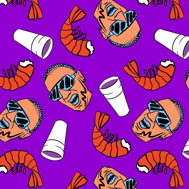
2. analogous harmony

Use of one or more neighbouring hues on the colour palette.

Example by www.nucly.com

Art for new @jodyhighroller socks available for preorder tommorrow with the Purple Icon, chopped by @ogronc on @maddecent

(Mike Jones, Flickr)

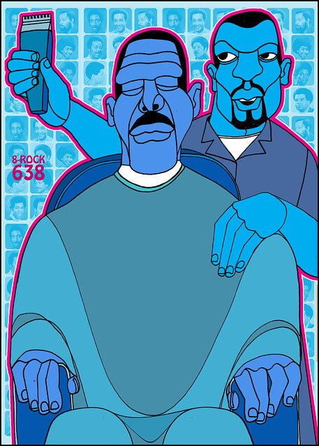
3. Analogous harmony warm and cool

Warm is represented by spectrum of colour red, while cool is represented by blue shades.

(Zoran Pungerčar, Flickr)

ajuan2

(SOMArts Cultural Center, Ajuan Mance, Flickr)

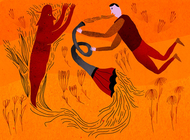
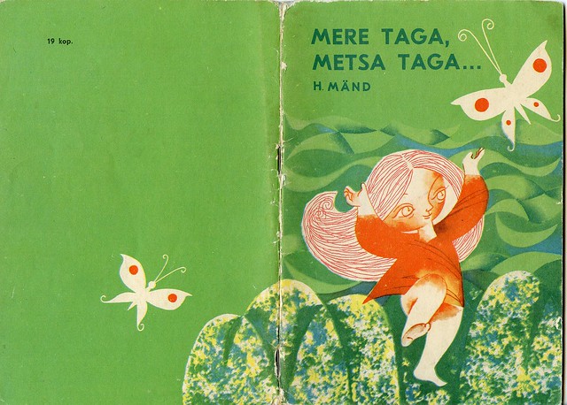
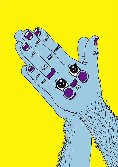
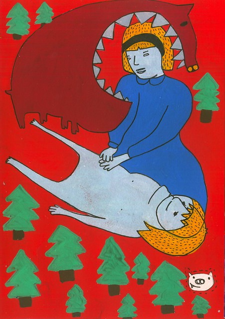
4. Complementary hues

Combination of two hues at the opposite ends of the colour palette.

Example by www.tigercolor.com

mere taga metsa taga kannet

(vaula, Flickr)

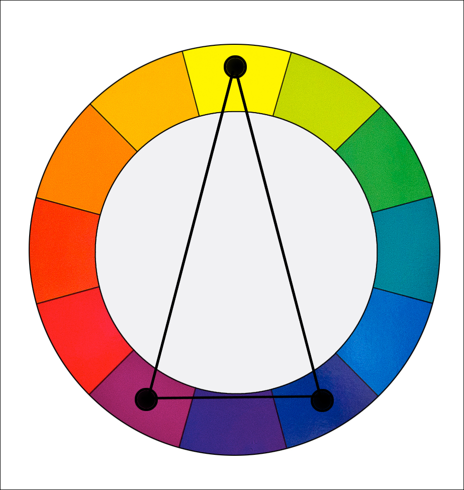
5. Split Complementary

Combination of 3 or more hues at the opposing ends of palette.

Triad Harmony:

Example by luminous-landscape.com

BET

(Kid Kolorki, Flickr)

Tetrad Harmony:

Example by www.tigercolor.com

happynewyear

(bayananderson, Flickr)


4D Project 2: Sequentially – Impossibilities of Being

description

Tired of life, the dreamer takes a nap. In her unconscious world she meets dream, who brings her into its time capsule. They revisit their childhood times that were filled with happiness and laughter. How life was simple but rich, pure but contented. Dream reminds dreamer that whenever she feels like giving up, remember where and how she started. She is, a dreamer with dream.

As attachment grows, dreamer finds it tough to withdraw from the unconscious world. She contemplates if she should leave. She might not see dream again. It lets go of her assuringly, whispers,

“Wide-eyed walker, don’t betray me

I will wake one day, don’t delay me

Wide-eyed leaver, always going”

These photos are mainly taken by me during my overseas trip and photography hangouts with friends. I decided to give a very personal take on this project, portraying the struggle I have been facing. They were composed with Photoshop to create an illusional world with dramatic hue, saturation and distortion.

It was overall an very exciting project to work on, especially to be able to thread my photos collection together into a representation of my dream. By including captions to the composition gave a direction flow, while music builds an atmospheric mood around the audiences.

Research/ Artist Reference

Photo used: Self portrait by Sally Mann
Lyrics (Caption): Grown Ocean by Fleet Foxes
Music: First Kiss by Ulzzang Pistol

Inspirations:

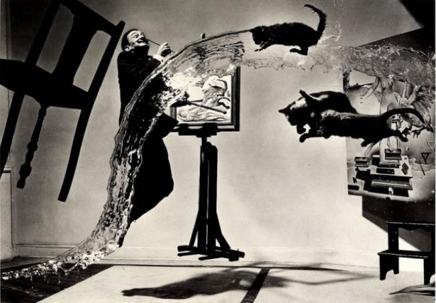
Salvador Dali
Dali Atomicus by Salvador Dali, 1948
Dali Atomicus, 1948

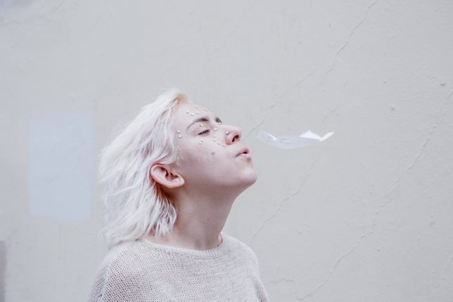
Kelly Victoria – weirdfoxes.tumblr.comKV1 KV2 KV3 KV4


2D Project 3: Colour Analysis (Research)

Colours are powerful. They stimulate and provoke human emotions, manipulating the way we feel. According to Colour Affects, here are the emotions represented by the 11 basic colours –

Primary colours include red, blue and yellow.

Red

Positive – Physical courage, strength, warmth, energy, basic survival, stimulation, masculinity, excitement
Negative – Defiance, aggression, visual impact, strain
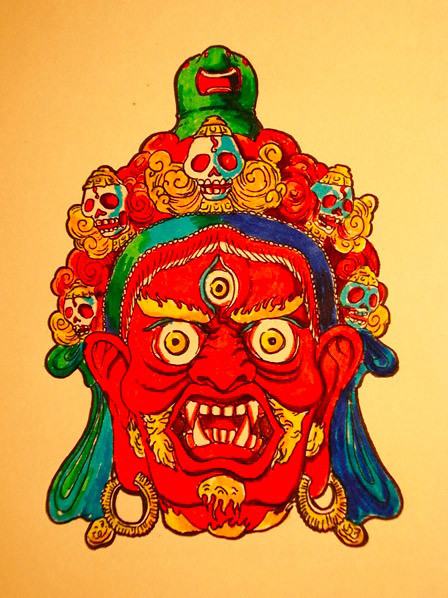
Jam Hippy @ EDGE Creative Collective 7

(NeochaEDGE,Flickr)


Lighter tint of the red will produce pink.

Pink

Positive – Physical tranquillity, nurture, warmth, femininity, love, sexuality, survival of the species
Negative – Inhibition, emotional claustrophobia, emasculation, physical weakness
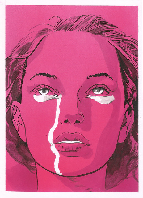
The secret of the universe

(Señor Salme, Flickr)


Blue

Positive: Intelligence, communication, trust, efficiency, serenity, duty, logic, coolness, reflection, calm
Negative: Coldness, aloofness, lack of emotion, unfriendliness
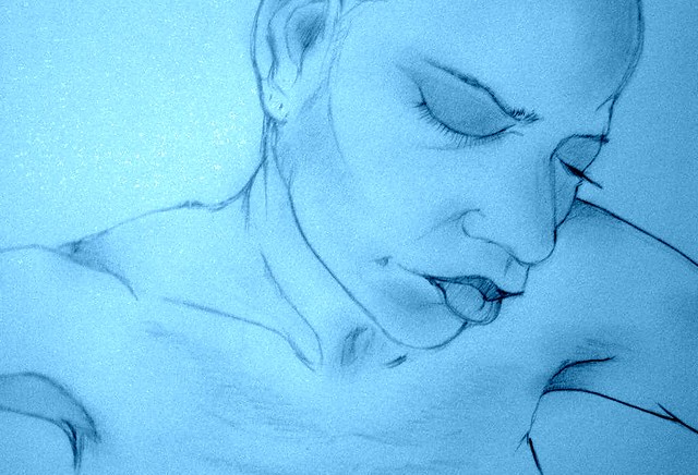
portrait x2

(Jozelle Dyer,Flickr)


Yellow

Positive: Optimism, confidence, self-esteem, extraversion, emotional strength, friendliness, creativity
Negative: Irrationality, fear, emotional fragility, depression, anxiety, suicide
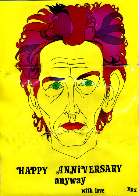
Self portrait

(davidad64, Flickr)


Mixing all the 3 primary colours (red, blue, yellow) together results in brown.

Brown

Positive: Seriousness, warmth, Nature, earthiness, reliability, support
Negative: Lack of humour, heaviness, lack of sophistication
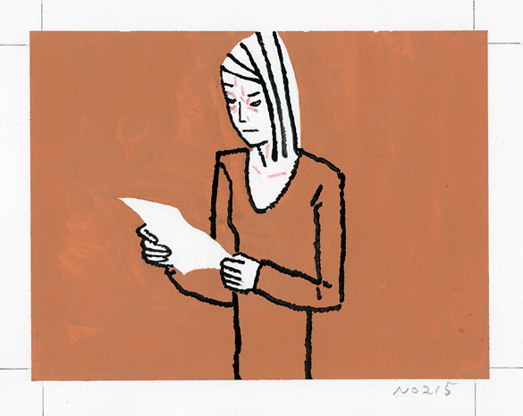
愛の乱暴215・72

(Hiroyuki Izutsu, Flickr)


Secondary colours are green, violet and orange.

Green

Positive: Harmony, balance, refreshment, universal love, rest, restoration, reassurance, environmental awareness, equilibrium, peace
Negative: Boredom, stagnation, blandness, enervation
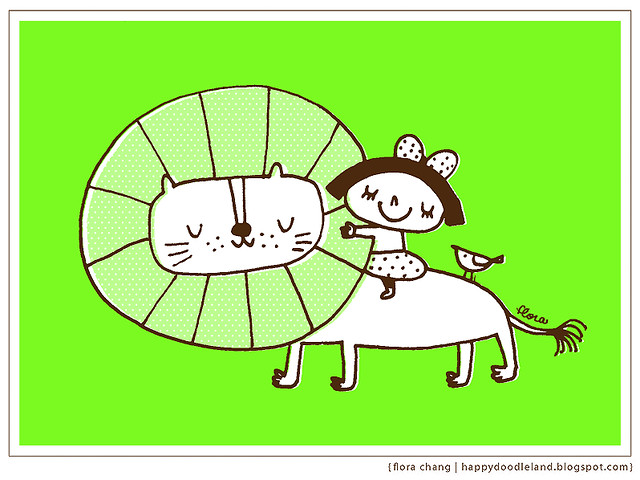
Friendship

(Flora Chang, Flickr)


Violet

Positive: Spiritual awareness, containment, vision, luxury, authenticity, truth, quality
Negative: Introversion, decadence, suppression, inferiority
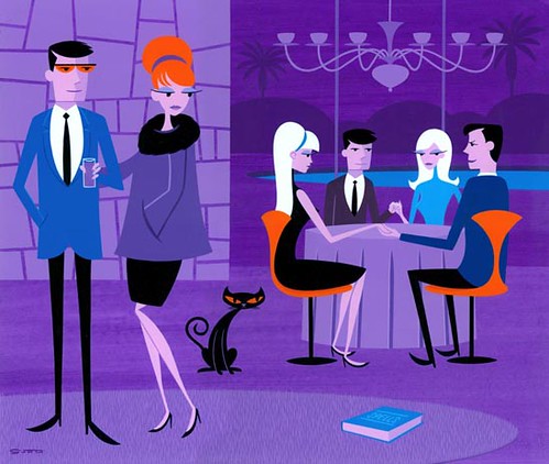
Practical_Magic

(Karen, Flickr)


Orange 

Positive: Physical comfort, food, warmth, security, sensuality, passion, abundance, fun
Negative: Deprivation, frustration, frivolity, immaturity
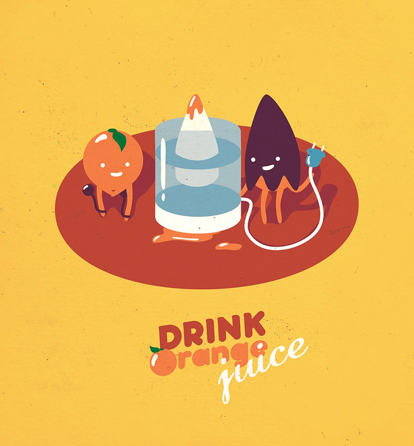
ORANGE JUICE

(Pashandy Ep, Flickr)


Shading colours are black, grey and white.

Black

Positive: Sophistication, glamour, security, emotional safety, efficiency, substance
Negative: Oppression, coldness, menace, heaviness
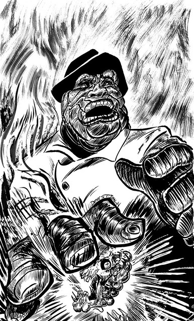
deathhands

(Denis St. John, Flickr)


Grey

Positive: Psychological neutrality
Negative: Lack of confidence, dampness, depression, hibernation, lack of energy

Paralyzed

(Serdar Saygi, Flickr)


White

Positive: Hygiene, sterility, clarity, purity, cleanness, simplicity, sophistication, efficiency
Negative: Sterility, coldness, barriers, unfriendliness, elitism
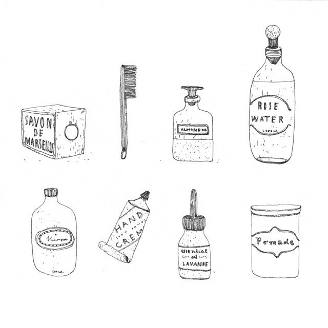
illustration

(alloparis.allotokyo, Flickr)


2D Project 2: Rhymes

To get a taste of how children books are illustrated, I flipped through a few of them and noticed a particular style among them.

001 002 003

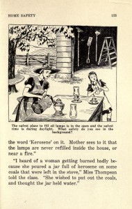
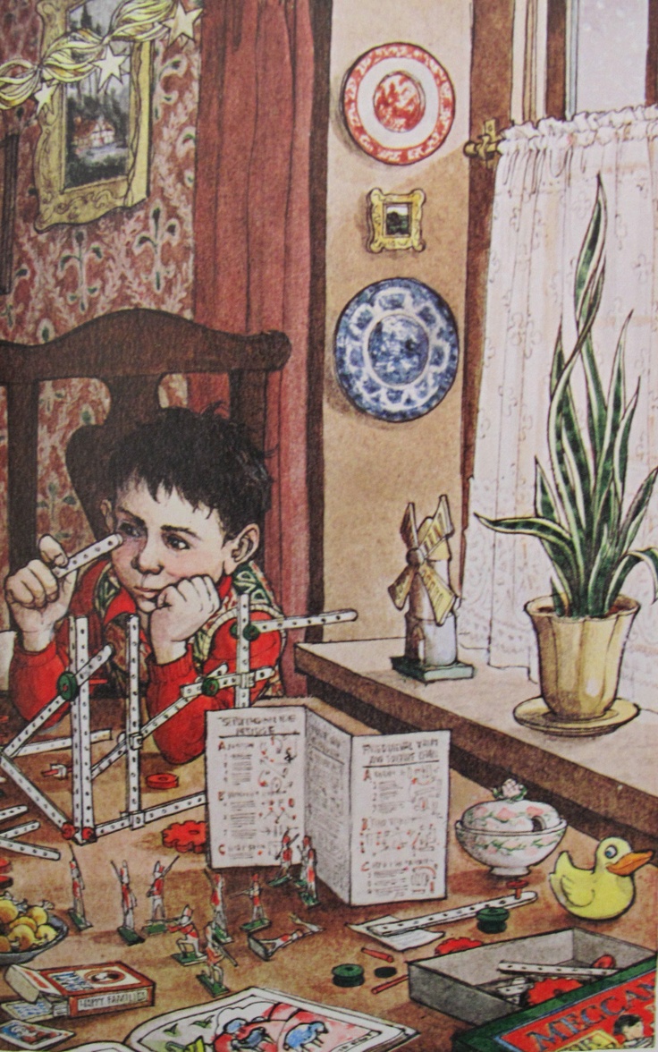
For instance, the illustration from the book Safety On We Go is drawn with fine and grainy lines which is a certain type of texture style oftenly used. Characters tend to have staged poses. They can sometimes fill the entire page with small intrigued objects around the main character (refer to Trina Schart Hyman’s artwork). Despite being assigned to reinterpret rhymes in a different manner, I somehow would like to keep few of these elements in my compositions for these are what makes children rhymes magical.

from A Child’s Christmas in Wales, Trina Schart Hyman


Research – Surreal Artists

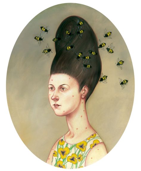
Surrealism is a breakthrough for conventional art, as it plays with viewer’s perspective and sense of proportion. Here are the artists I have gotten inspiration from –

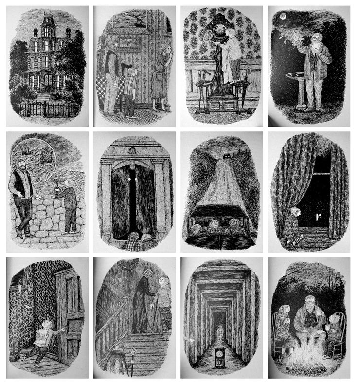
Edward Gorey uses pen and ink to illustrate daunting scenes. His artworks are heavily filled with short and fine lines, leaving a very compact and eerie impression.

edward gorey

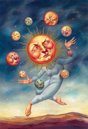
Anita Kunz adds in humour to her illustrations, which can better provoke emotions and grow viewers’ interests in knowing the message behind these artworks. anita kunz anita kunz2

Wolfgang Paalen plays with simple shapes on these art pieces while working on the negative spaces in between.Wolfgang Paalen 2 Wolfgang Paalen

*All photos are found from Pinterest. 

Process – exploration in editing 

I used Hey Diddle Diddle as my practicing subjects on Photoshop to understand how filters like threshold and transformation tools work.

THE CAT AND THE FIDDLE DRAFT 3_CAT_FIDDLE


Using just two subjects, the cat and fiddle, they created a systematic and repetitive layout. I tried playing with Threshold filter on the cats, which gave me an insightful collage of shadow variables. They can bring across different moods, less shadow intensified cat looks innocent whereas those with darker shading look scary and mysterious. Fiddles are aligned neatly to fill up the background and slightly tilted diagonally to create a singular movement in synced to the cats. Arrangement is overall clean and neat, but lack of creativity.

Repetition of the same image and variation of shading values will be seen in my final composition 3: She had so many children she didn’t know what to do.

THE COW JUMPED OVER THE MOONDRAFT 2_COW_MOON

As the original photo of the moon already has densely filled lines and pattern, I decided to keep its essence and dramatise with Threshold filter. Also, I can achieve the kind of compressed fine lines drawing style found in traditional children books. Cows are filtered with Path Blur to show jumping motion. It is one of my discoveries in pushing subjects to look more 3-dimensional.

Highly textured subjects will be seen in final composition 4: Couldn’t put Humpty together again; blur filter in composition 1: And the dish ran away with the spoon.


THE LITTLE DOG LAUGHED TO SEE SUCH SPORTDRAFT 1_DOG_LAUGHED

Images are inversely contrasted for further experimentation. Highly exposed subjects pop out with its large white spaces, complemented by a darker shade in the background. Despite the intentional juxtapose, it still looks boring for its literal context interpretation.

As such, I tried adding images that require audiences to decipher its underlying meanings. It will be seen in final composition 2: The little dog laughed to see such sport and 3: She had so many children she didn’t know what to do.


Final Compositions

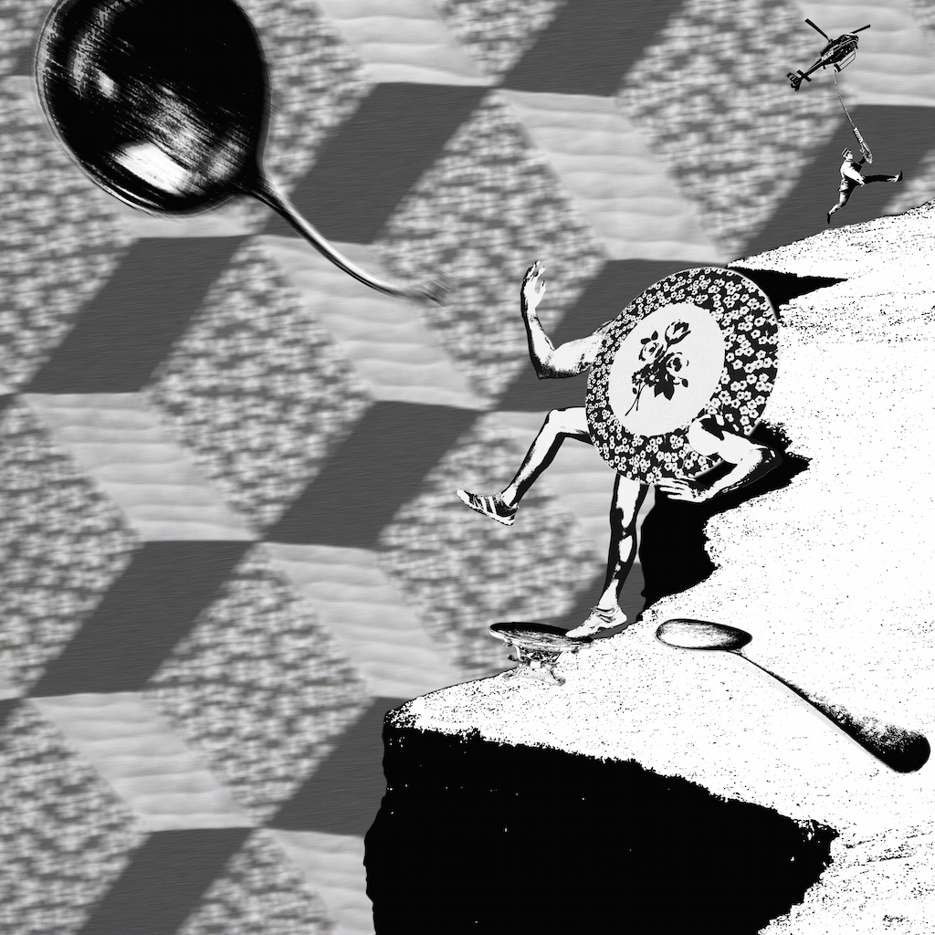
1) And the dish ran away with the spoon1_DISH_SPOON
Story description

Jumping onto the table, a deliberately dressed dish leaps forward to reach for the flying spoon. Her old partner, who is laying on the floor lifelessly, seems to have given up in the relationship. She has decided to leave for good. If you would look closely at the top right corner of the composition, a policeman arrives to arrest the adultery couple. However, his clumsiness has landed him way too far from his target.

design principles used
  • Emphasis – Background is blurred to ‘pop’ out foreground elements
  • Movement – Arrangement of the laying spoon, dish and flying spoon creates a diagonal visual continuity across the composition
  • Proportion – Stark contrast in sizes between the policeman and culinary to prioritise attention to the main characters – dish and spoons
2) The little dog laughed to see such sport2_DOG_LAUGHS
story description

“What is taking him so long?” the pack of dogs wonders. They are dying to play catching with their new found friend. Hopping onto each other’s back, they elevate themselves to look for their friend. As the last dog peers over the little boy’s back to see what is he up to. He is so engrossed into the gameboy, he did not hear the mocking laughters coming from his back.

design principles used 
  • Rhythm – Dogs face in alternate directions
  • Gradation – Size of dogs slowly decreases
  • Balance – The platform that little boy is sitting on occupies half of the composition, leaving the other half of the space for the dogs
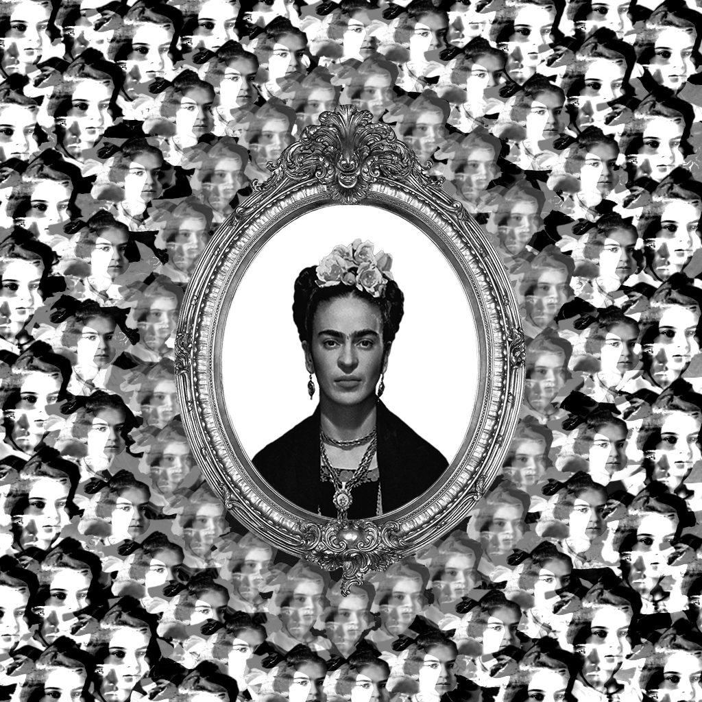
3) She had so many children she didn’t know what to do 3_CHILDREN
story description

Looking into the mirror, Frida Kahlo imagines how her child would look like. How she wish to embrace her own child in her arms. The faces of the illusional child get blurrier as they float nearer to her, as she knows it is impossible to realise this dream.

design principles used
  • Rhythm –  Faces of child form ring of circles around the mirror
  • Balance –  Symmetrical composition
  • Gradation – Value shade of the faces fades off into the center
  • Movement – Overlapped faces around the mirror are arranged in a manner that directs optical focal point to Frida Kahlo at the center
  • Harmony – Despite an overwhelming repetition of faces filling the composition, they exist harmoniously by gradual shading and similar movements
4) couldn’t put humpty together again4_HUMPTY-min
story description 

Humpty is broken and cannot be mended. It is thrown into the infinite galaxy hole to be disposed permanently. Even in the last few seconds, four formulated hearts are still trying their best to save Humpty. Pumping and pumping, with their veins popping out and muscles about to tear. The mission is not over until Humpty has its last breath.

design principles used
  • Diversity – Variety of heart illustrations
  • Balance – Symmetrical composition
  • Movement – Visual continuity from the hearts of four corners to Humpty
  • Contrast – Blurred background suggests the long distance between the subjects and galaxy