
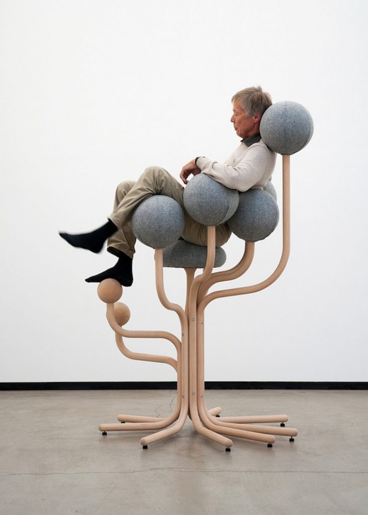
We decided to review why our previous design looked very much like Peter Opsvik’s Garden, here are the key ideas:
Analyzing Garden into elements
A. Thick and thin supports
B. Branching out from one main support
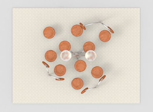
C. Multiple circles in the whole installation
D. Seats are very high off ground
E. Use of different pattern to differentiate leg rest/seats and backing
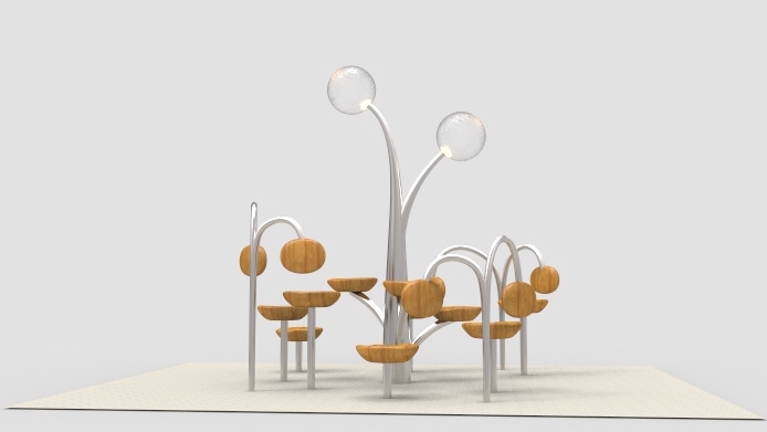
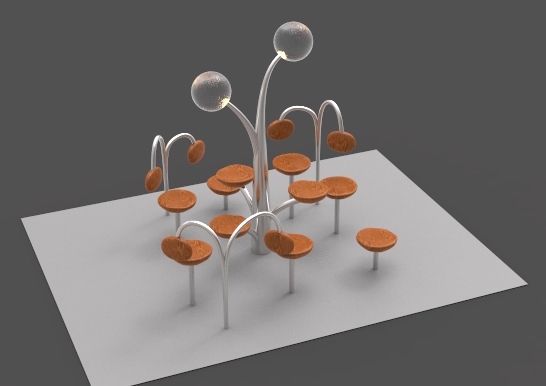
What we have in previous design
1. Branching out from main body
2. Multiple elliptical shapes in whole installation
3. Use of different form to differentiate leg/seats and backing
4. Seats are high off the ground
5. Have one really high light source
6. Almost similar size for all the support
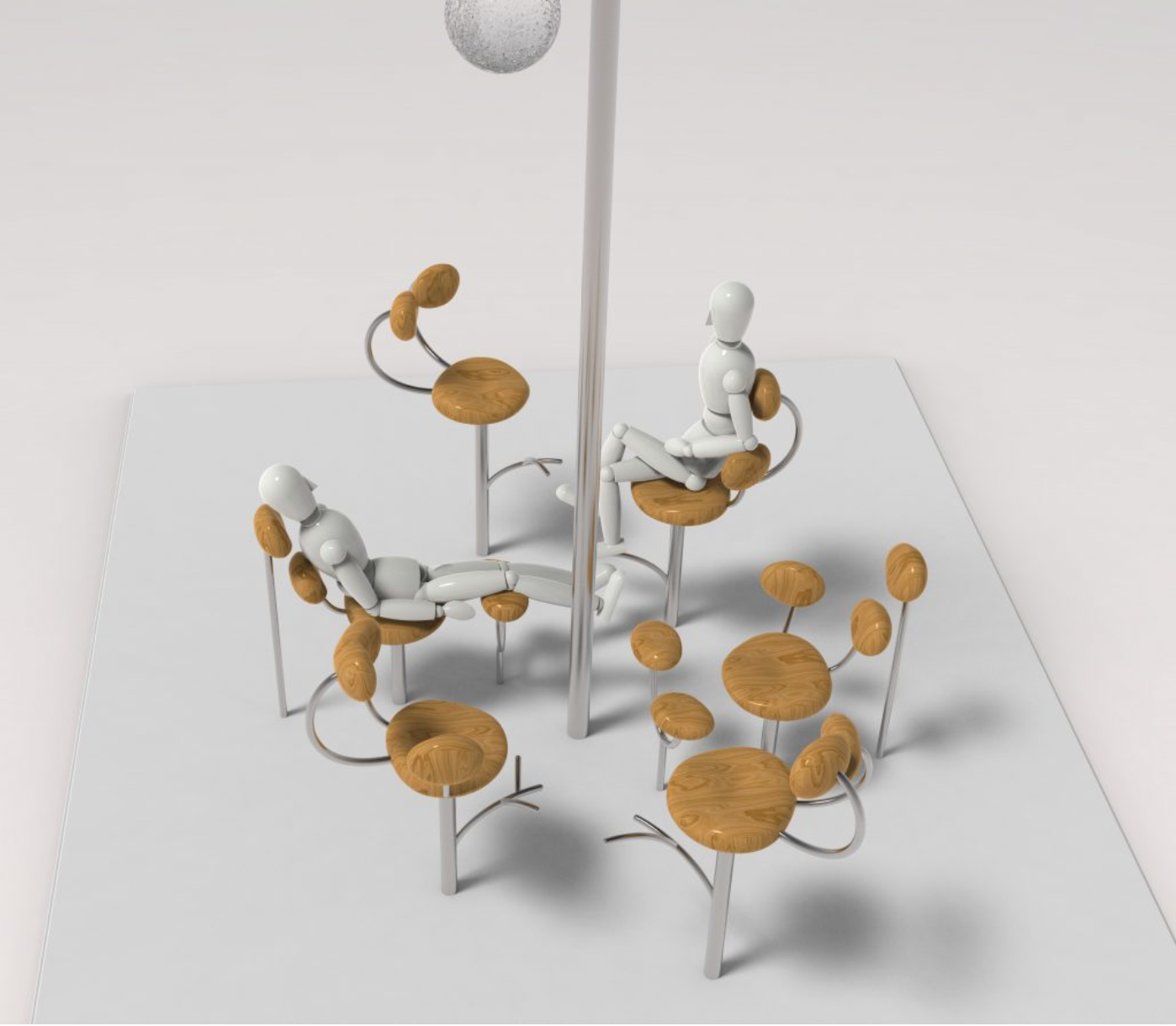
We made this to compare what did we have in similar with Gardens so that we can fine tune our next version and make sure it does not look too much like Gardens but still echo the form of tree.
Form of Tree that we are echoing:
A. Branching
B. Thick Trunk VS Thin Branch
C. Crown-shaped canopy with center being the highest
Below are some sketches that we have done up in experimenting to change the forms for seat/seats:
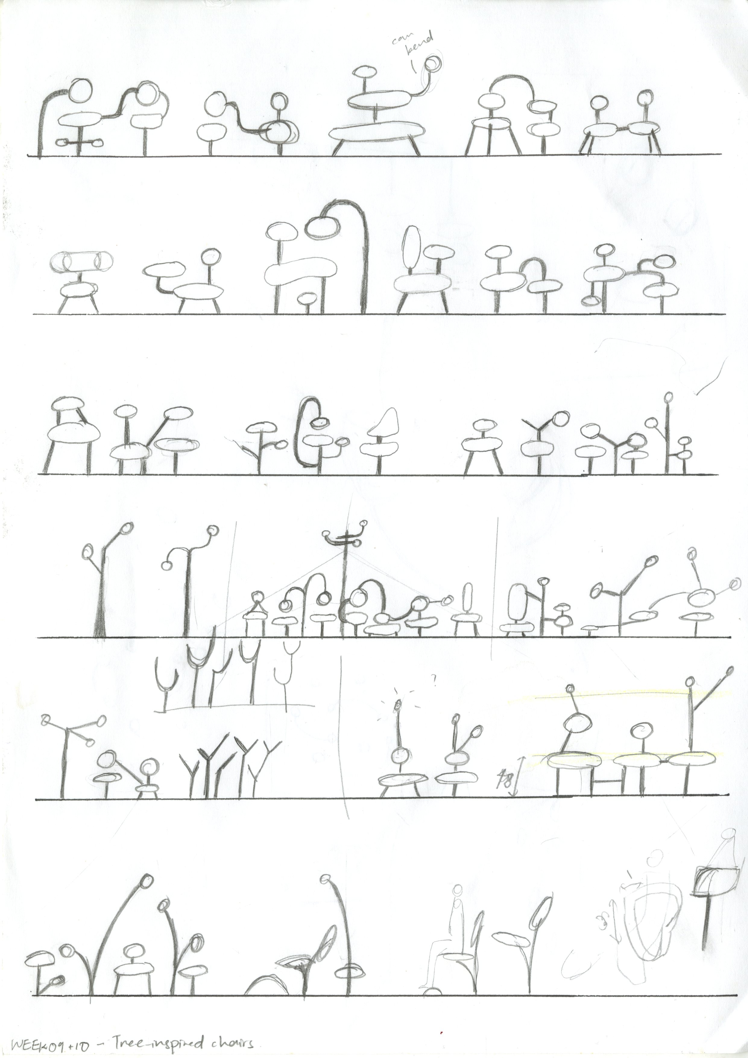
The main concern was the form of ‘branches’. Curvy branches made it looks less like a tree, so we went for straighter cut (refer to second last rows).
Connectivity between seats is an important design element we’d like to emphasize on, as it brings out the characteristic of Fruitfulness.
Gradual height ascendance towards the center defines the characteristic of Positive Outreach.
Seat form/sitting posture was intended to represent the element of Nurturing. However, we are unable to visibly translate it into the composition (we’ll be reviewing the seats).
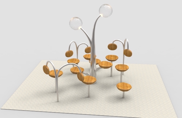
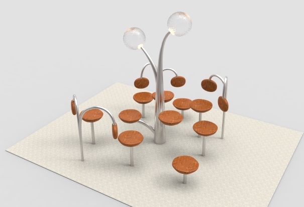
Here is the revised version –
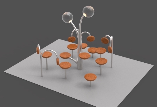
Moving forward, we would like to explore
- Contrasting thickness/tapering of the ‘branches’
- Enhance characteristic of Nurturing – form of seat backing
.