S P A C E B A R (2017)

S P A C E B A R

2017

Experimental Animation

3840×480 pixels


About

Spacebar explores into the boundless void to reveal the presence of space based on one’s perspective.

The visual alters capriciously to illustrate the infinite spatial quality of the nexus wall. Choice of colour palette and visual composition allude the mystic quality of the accompanied sound, presenting an illusional creation of depth.

Documentation: Nexus Wall @ North Spine

Photos by Solomon Quek Jia Liang

S P A C E B A R

Theme : Illusion

// A dive into the mystique pockets of voids.

ezgif-com-optimize-3
Joy Division, Unknown Pleasures album by Peter Saville (1979)

Graphic designer Peter Saville created the debut cover album for Joy Division using the pulsar signal, “what you’re seeing is this comparative chart of the frequency and the accuracy of the signal.” (Source: Rolling Stone) Pulsar is a neutron star that rotates as it emits powerful beams of light like the lighthouse.

moire01
ILLUSION OF MOVEMENT (moiré experiments) by Mathijs Delbaere (2015)

Animadoor by Sena Oh (2015) – An optical illusional installation door

I was fascinated by the abstract use of minimal elements to generate transcending effect of movements. Works of Delbaere and Sena utilised moire effect to create illusional spatial depth.

This became the main art direction, use of simple geometric shapes to compose as I try to figure out After Effects in the later stage of learning process.

Inspiration and Research

With the above ingredients to compose, I needed an atmospheric visual to spice up the overall look – glow of neon lights. My love for neon came from films that revolved around night city life,

Since the media wall situates in a rather dark space, illuminated colours will paint a strong and memorable mood.

Dan Flavin (1933 – 1996)

With that in mind, Ina recommended me to look into this American minimalist artist Dan Flavin (1933 – 1996). What I love about this series of art installation is its simplicity in form and the use of florescent bulb to speak as he explained, “It is what it is and it ain’t nothing else.” The work is sensitively infused into the exhibit space, he accentuated spatial depth to enclosed space with glowing lights.

Centro Cultural Light, Rio de Janeiro, 1998
Untitled; To Barry, Mike, Chuck and Leonard (1972 – 1975)
Untitled; To Saskia, Sixtina, and Thordis (1973)
Untitled (1970)

Flickr Photography 

Flickr has a pool of quality photos available to refer to, it is a great visual database for me to study neon light illumination and colours.

Photographer: Andrey Okonetchnikov
Photographer by Christian Noise
Photographer by Shelbel

iLight Marina Bay 2017

With luck, there was light installations along Marina Bay! I was able to see how neon light installations work at a larger scale, in terms of colour interactions.

Northern Lights by Aleksandra Stratimirovic (Sweden)

Inspired by the natural light phenomenon of aurora borealis, 100 horizontally aligned LED light lines are programmed to emulate the unpredictable flow of lights that interacts with its surroundings.

Horizontal Interference by Katarzyna Malejka & Joachim Slugocki (Poland)

With simple cord construction, the illuminated bands create colourful waves of excitement powered by the surrounding wind.

Methodology

// Softwares used: After Effects, Photoshop, Illustrator, Premiere Pro

  • Using Photoshop and Illustrator to construct main shape layers of key compositions.

  • Import to After Effects, generate animations and effects.

  • Music syncing: Premiere Pro to mark key frames of specific accent beats.

Process

// Thumbnails > Song Selection > Animate

  • Creating thumbnails of design based on the theme, generally diverse in style.

  • Song selection was one of the toughest decision. I wanted to capture the mood of obscurity, yet something that’s upbeat.

Final choice of song: Numb by Brothel.

  • Animating with After Effects with simple effects – shape scale, position, blur, hue and saturation etc. Rather than creating a complex effects, I relied heavily on the song piece to visualise movements. We can dissect and analyse a piece of music with its following characteristics:
    1. Texture (high pitch/heavy bass)
    2. Tempo (fast/slow)
    3. Articulation (short/long note)

Use of colours and thicknesses of lines/shapes to associate with these aural effects. Eg. bright thin lines to accompany a high pitched melody

Prototypes

First screen test was my first attempt to navigate around After Effects. It was a mix of everything I could compose, from abstract forms to typography. Quite a mess but it set me to what I can expect to produce for the remaining weeks to come!

Final work (working in progress)

Spacebar explores into the boundless void to reveal the presence of space based on one’s perspective.


.

Explore: iLight Marina Bay 2017

Travelled downtown on a Friday night to check out the iLight installations and carnivals at Marina Bay. Here are some works (sorry about the quality) that I found relatable to what we are working on:

  • Northern Light by Aleksandra Stratimirovic (Sweden)
    Location: Marina Bay Waterfront Promenade, along Marina Boulevard
Source: iLight Marina Bay

100 LED lights hung across the Marina Bay skyline emulates the natural light phenomenon of aurora borealis. Direction of light flow interacts with the human movements.

  • Very Glowing Exhibition – Very Glowing River by Lee Wei Lieh, Amelia Lee and Jeffrey Lim (Singapore)
Source: iLight Marina Bay

Lit with UV lights, the glowing pebbles illustrates the moving flow of river that is free to roam about and interact for the children.

  • Horizontal Interference by Katarzyna Malejka & Joachim Slugocki (Poland)
    Location: Mist Walk
Source: iLight Marina Bay

Held by the trees, the cords jump in cohesion with the wind, creating a colourful rays of illumination. It is definitely one of my favourite installation.

  • Social Sparkles by Toer Studio (the Netherlands)
    Location: Mist Walk
Source: iLight Marina Bay

Sensor buds are activated by when someone stands or walks under them. The lighted spinning buds are especially amongst children!

Seeing how all these installations became everyone’s favourite shot on Instagram recently, I can see how some of our works on the Nexus wall to be a great step to start creating our own digital wall installations someday (maybe?)!


.

Prototype #02: Still Composition Study

The first prototype was rather messy as I was totally clueless to what can be created with my limited amateur knowledge in motion graphics. It was frustrating to end up with two different directions – from abstract to neon typography when there are so many things I want to explore!

Due to time limitation, I’m stuck with ideas (that I envisioned) that are kind of impossible to execute. I decided to go back to start afresh by creating key compositions on Photoshop.

Anchored by the theme of mystical illusion of space, I continue to use neon glow (truly in love with it) to accentuate the colours. Here the shapes are layered and aligned to emulate 3-dimensional forms. The challenge was to make relations of these independent compositions with movements and transitions.

Research and References

Some inspirations I’ve found, while on the other hand, finding the right song piece:

Neon

Neon

IMG_0263


.

Prototype #01

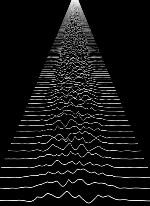
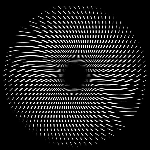
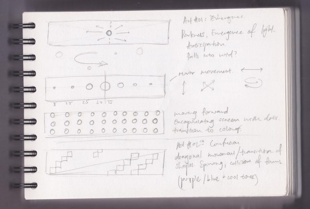
The first prototype is to test the movement of abstract lines and use of words. It was to create 3-dimensional space using simple white strokes of lines against the black background.

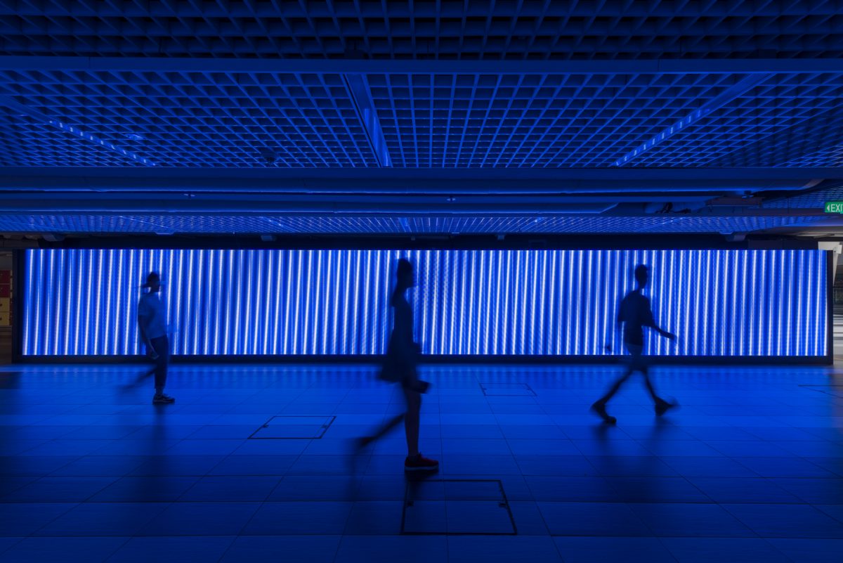
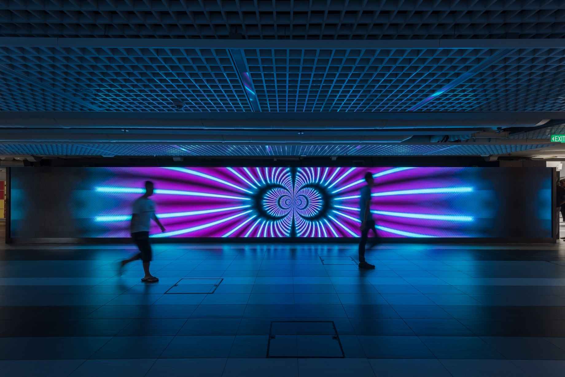
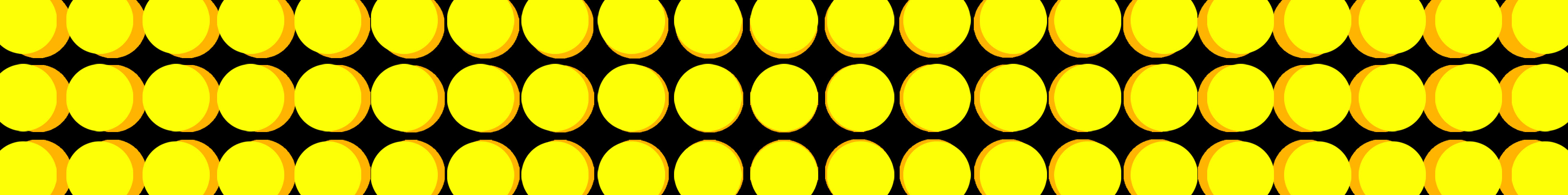
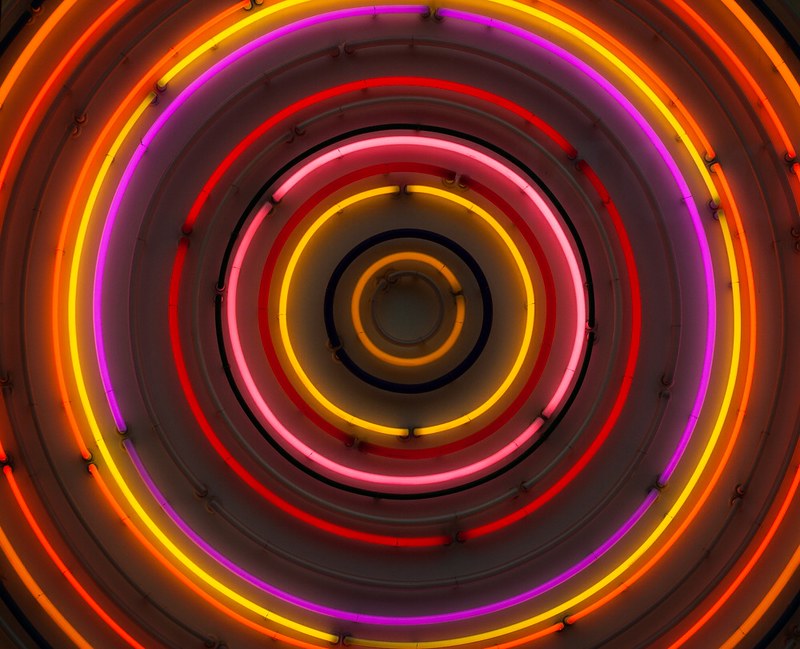
A very simple animation was done in week 5 since the theme was still undecided. Composition mainly uses vertical lines and radial rings of circles, in symmetrical harmony.

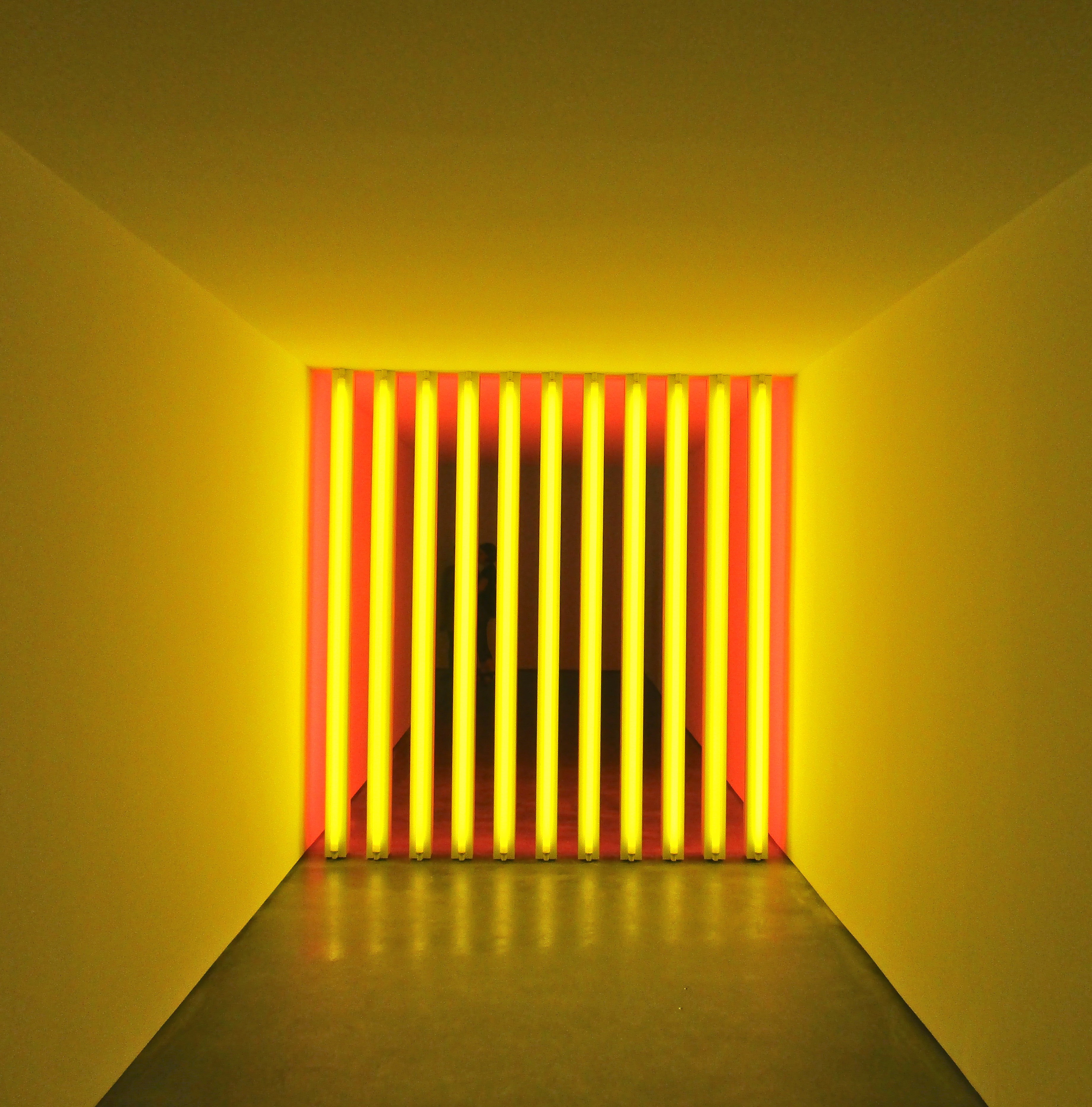
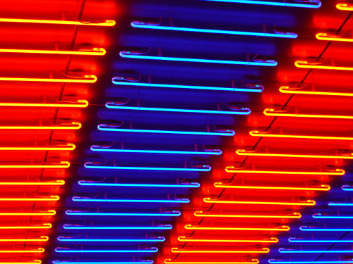
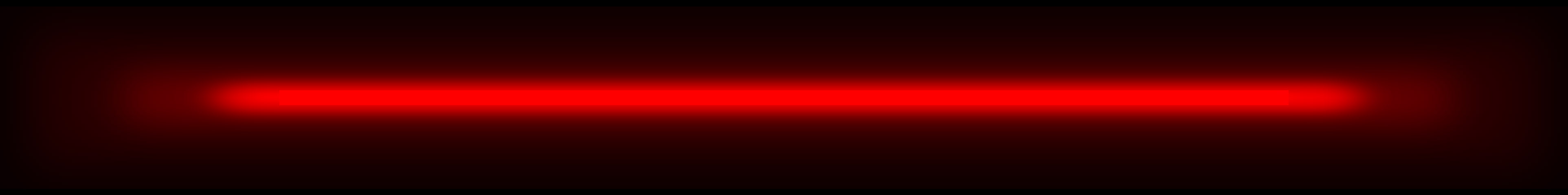
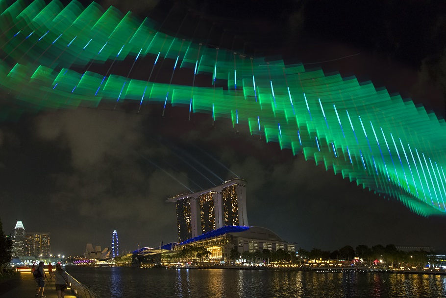
While looking for more inspirations, I was attracted to neon light signs. Without movement, its flickers and glow have made its presence significant in the darkness. A silhouette of letter is made out of simple lines and curves. It can easily create a certain mood from what we are familiar with – street signs that represented the vibrant city nightlife. Prosperous, lavish or even lonely. I find neon light a powerful tool to tell story.


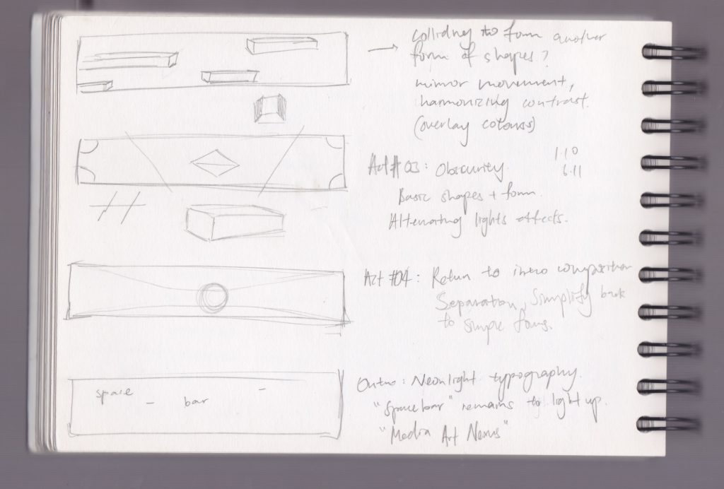
First prototype was rather scattered with different concepts:

00:00-00.12 | syncing entrance of each stroke of lines according to the music.

Feedback: stops at an awkward position, could have ultilized the remaining space on the right.

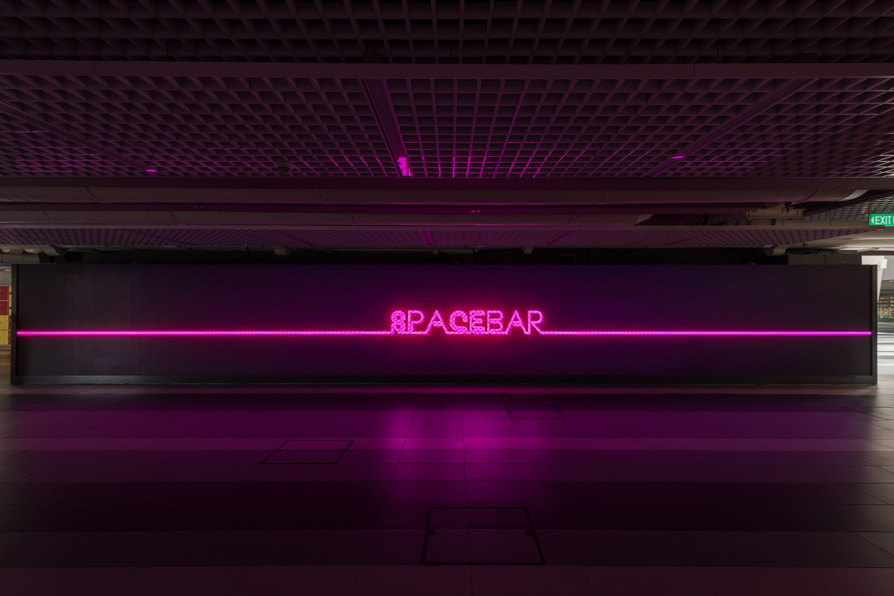
00:15-00:21 | flashing of words across the screen. Neon light effect

Feedback: speed of movement too fast to read the words, would look better if font size is big enough to fill up the height of screen.

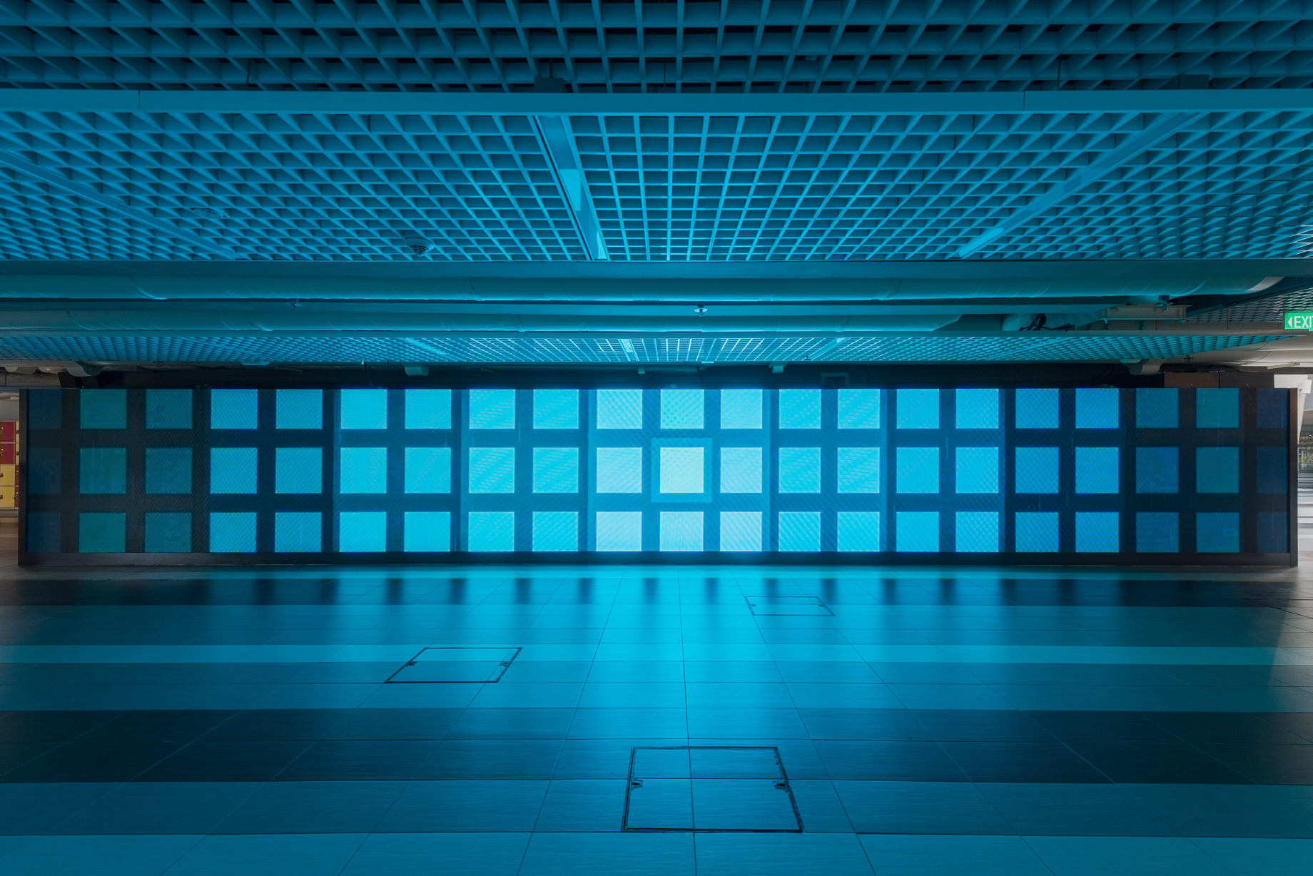
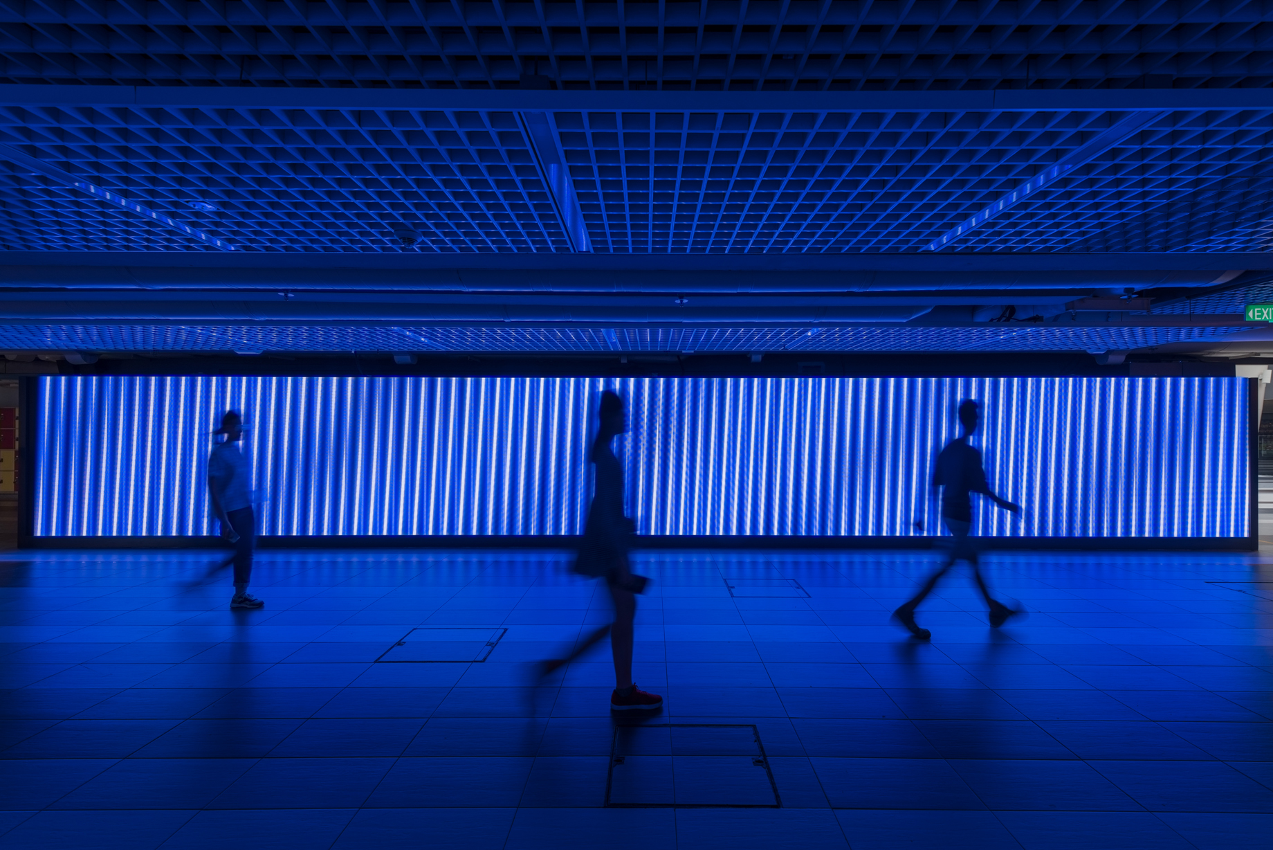
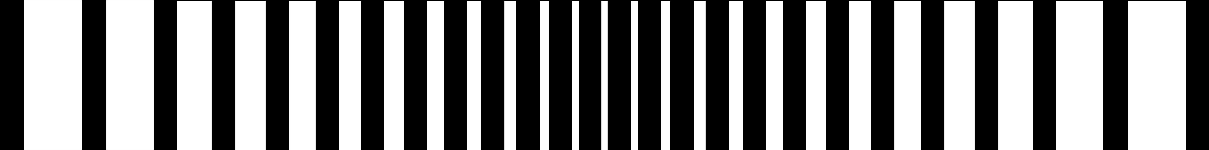
00:22-00:33 | moiré effect with vertical moving lines

Feedback: calming to watch (very positive :D)

00:36-00:40 | horizontal lines shooting across horizontally

Feedback: abstract, gives a sense of movement (yess)

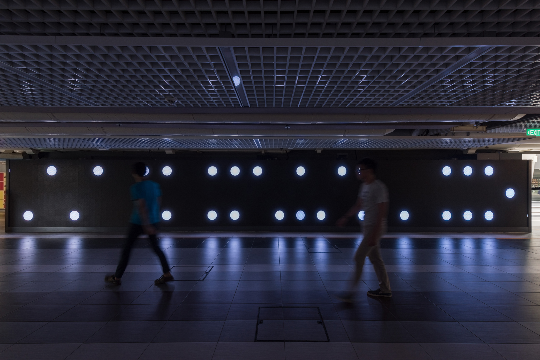
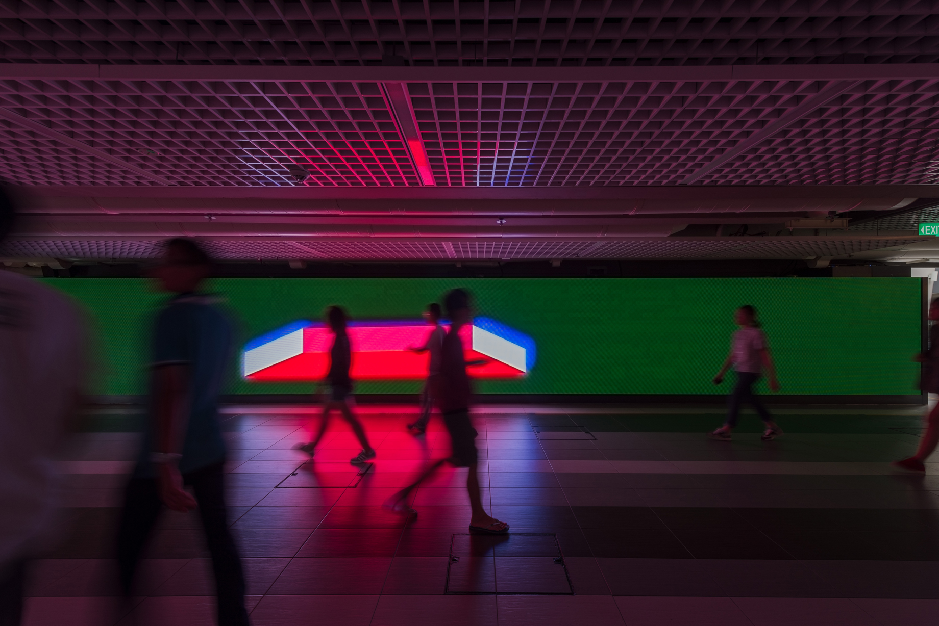
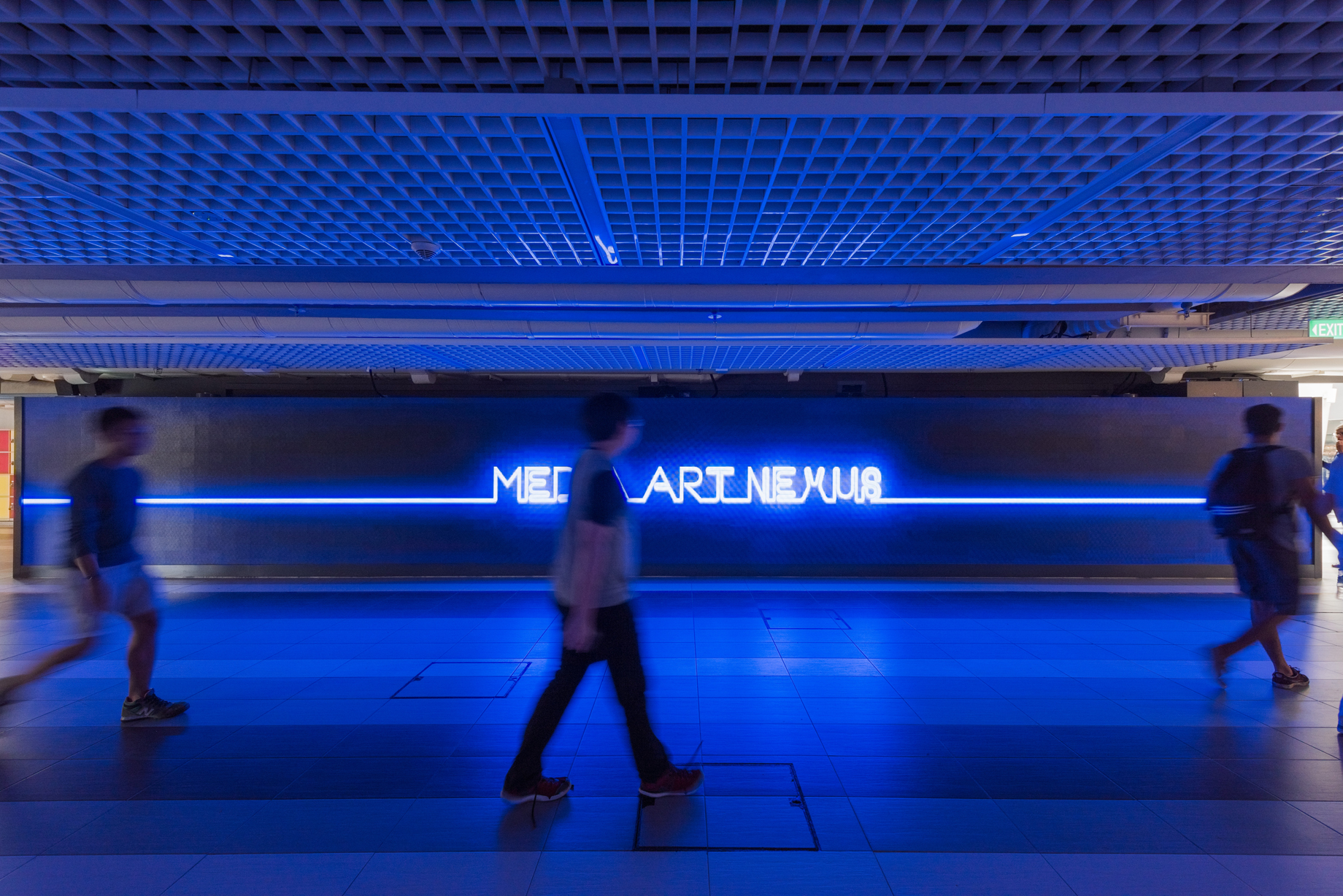
00:44-00:47 | ‘Media Art Nexus’ neon sign

Feedback: generally positive

+ Sudden flashes of white on the screen are painful to watch (sorry passerby).

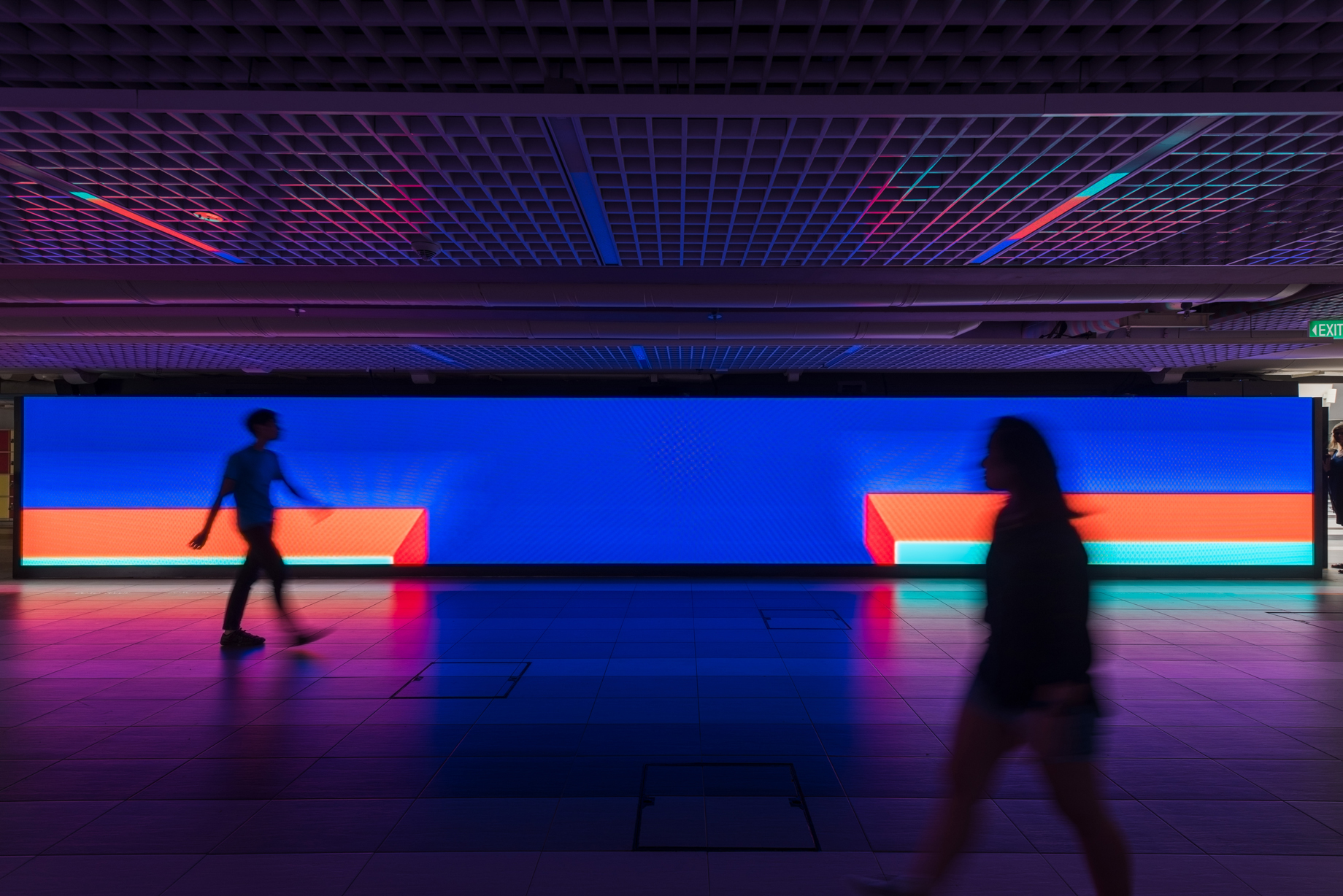
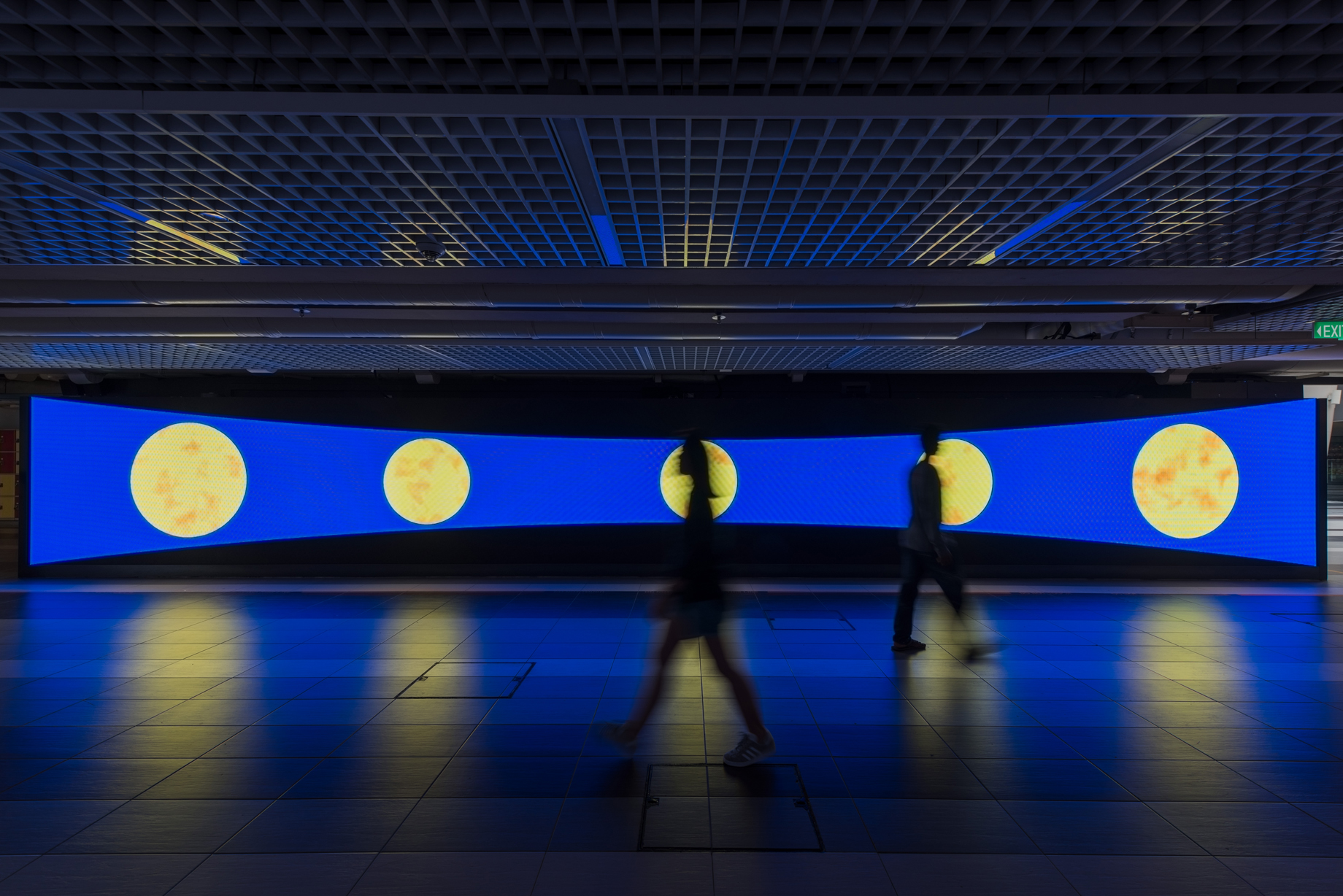
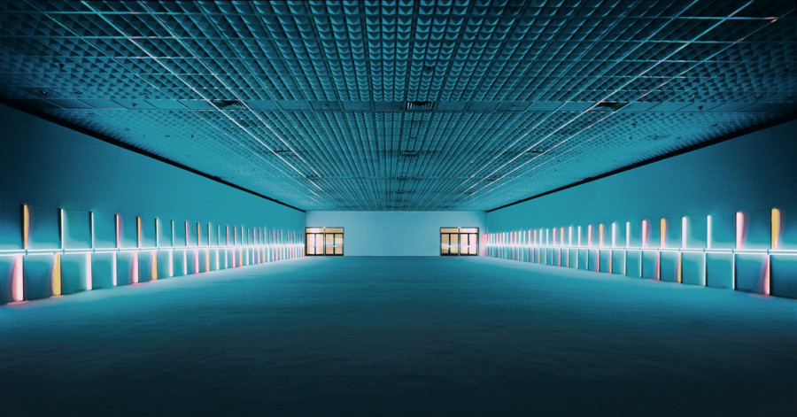
Here’s how it looks like on the wall!


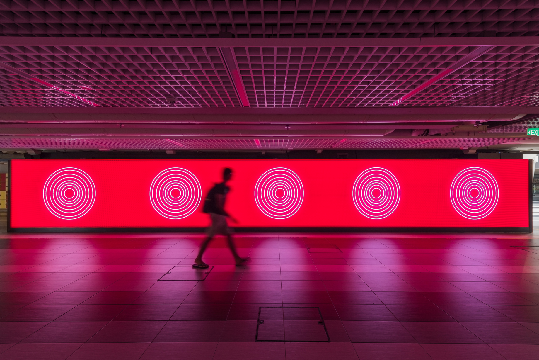
Interaction with Environment

The first screening has proved that a simple abstract play of lines can look impressive on the huge nexus wall! Since the walkway has no addition lights on the ceiling at all, nexus wall is the only light source to bring this dark space to life – use of colours on the screen is very important to create mood. I find the reflection on the floor fascinating – direct consequential reflection on the ground could be part of design?

Moving on to second prototype

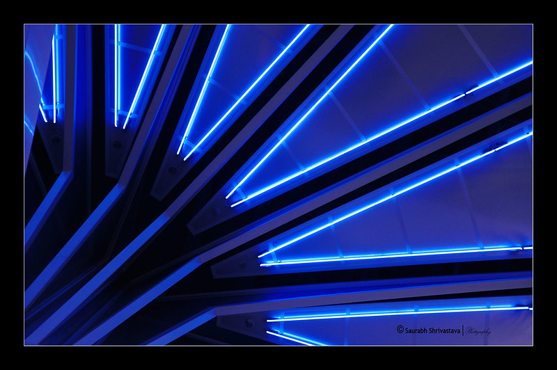
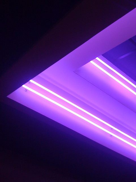
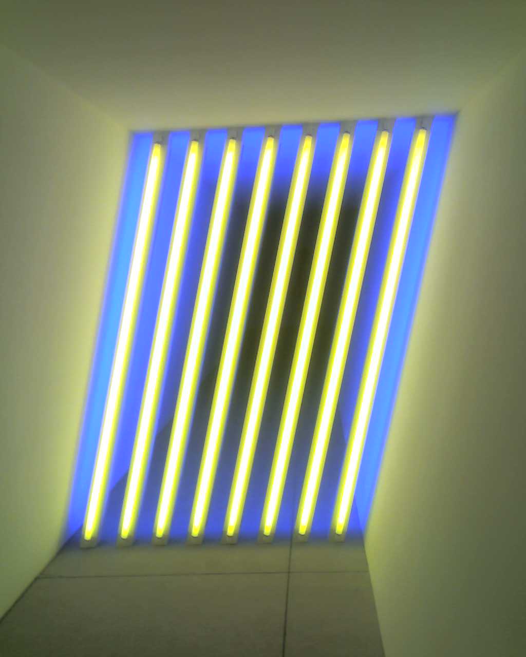
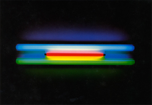
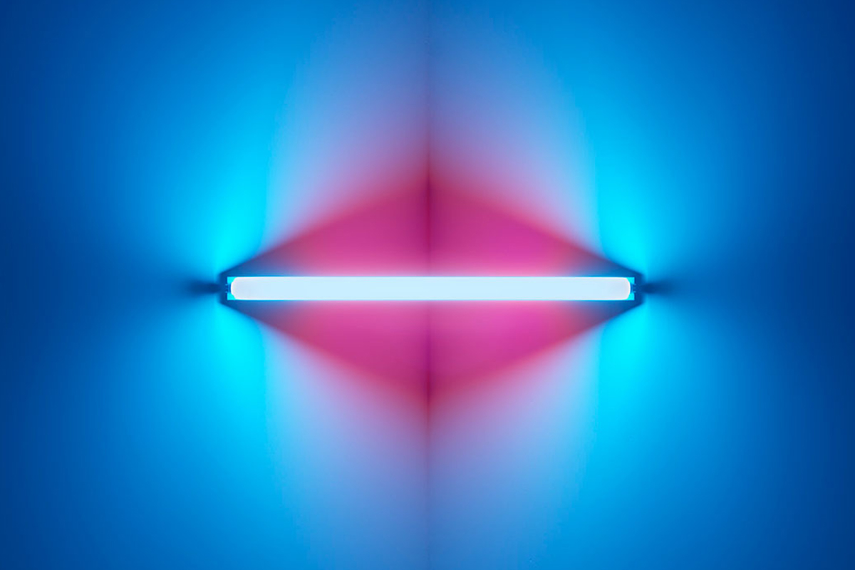
Ina has suggested to study neon light artist, Dan Flavin, who uses neon lights of different colours to suggest depth and movement.

It is a tough decision between going abstract or using neon-lighted typography. Ina recommended me to use poem or song lyrics (like a jukebox machine) if I were to go for the latter option. However, interpretation of words can be subjective and therefore misleading to individual’s understanding. It can be restricting as to what I can do with the visual reference too.

I’ve decided to play abstract with more possibilities to venture in. The mood to go for is mysterious and obscure, traveling viewers into an alternative reality within the few seconds passing by the walkway. This prototype will hopefully be more or less be the finalized version!!

.

Week 02: research and direction

Going with the theme ‘illusion’, here are more visual references that represent bits of my ideas. I am currently looking at a possibility to create an enclosed area with several subjects moving on loop.

Artist Sena Oh made use of the door movement to create optical illusion with moiré effect. This gave me an idea to flash moving words onto the horizontally long nexus wall. Speed and direction of movement could be influenced by the viewer walking across the walkway maybe?

Considerations – overused of this effect will be uncomfortable for viewers to look at for a long time! Complimentary colours contrast too strongly to be shown on a big screen. Apart from slowing the speed of movement, use of harmonic colours can prevent dizziness while one is watching at a close distance.

.

Week 01 : research and mood board

Here are the multimedia inspiration I have found in relation to my past work!

 1 // Illusion 

One of my previous assignment was to build a reverse gravitational bridge. This is an exploration of the subject’s movement that works against the law of gravity. Illusional act can only be seen at the specific perspective.

Moiré effect was part of my research in building a portable screen from last semester’s module. It is a visual perception when a set of lines/dots superimposed onto another. A new ‘moving’ pattern is created.

img_0054-min

moire-screen-movement

Idea #01: To construct an illusional world that is constantly evolving. 

Research

ezgif-com-optimize-1

moire01

ezgif-com-optimize-3

Methodology: Build rough composition on Illustrator, import into After Effect. Generating randomised command from Processor to alter lines independently/dependently. 

 2 // Nature Inspiration 

A more abstract approach is to emulate organic lines and shapes from nature, wood grains for instance. Since nexus wall locates along one of the busiest walkways in school, it would be a refreshing aesthetic contribution to the space

2592824cfa74b9f3a99258822f67d63d

c7cfdb4b8c1e691fa718ecdda77f8ead

e3194eb45a49f7bc1554e1c60be33894

3781eaca7841d69d126ef5c1257a6afb

7c85c1a66e7a3f16fa1b772c753feccc

Idea #02: A visual composition that invites a mood with therapeutic calmness.

Research

Methodology: macro videography of sculpture/object, process in After Effects.

More research will be done on the softwares/methodologies before working towards a more specific theme!