The first prototype is to test the movement of abstract lines and use of words. It was to create 3-dimensional space using simple white strokes of lines against the black background.
A very simple animation was done in week 5 since the theme was still undecided. Composition mainly uses vertical lines and radial rings of circles, in symmetrical harmony.
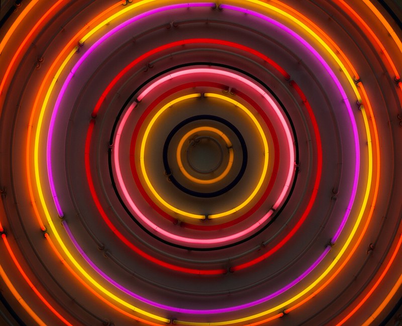
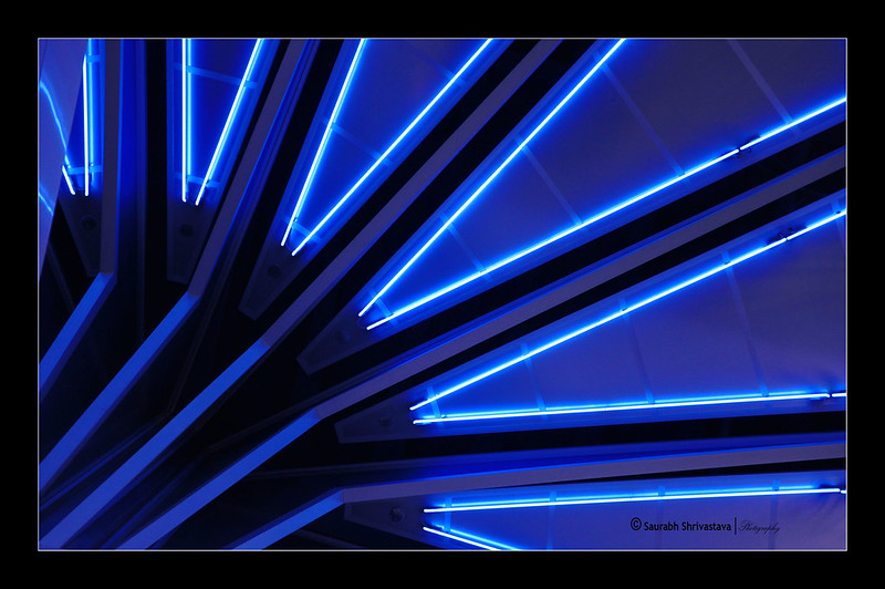
While looking for more inspirations, I was attracted to neon light signs. Without movement, its flickers and glow have made its presence significant in the darkness. A silhouette of letter is made out of simple lines and curves. It can easily create a certain mood from what we are familiar with – street signs that represented the vibrant city nightlife. Prosperous, lavish or even lonely. I find neon light a powerful tool to tell story.


First prototype was rather scattered with different concepts:
00:00-00.12 | syncing entrance of each stroke of lines according to the music.
Feedback: stops at an awkward position, could have ultilized the remaining space on the right.
00:15-00:21 | flashing of words across the screen. Neon light effect
Feedback: speed of movement too fast to read the words, would look better if font size is big enough to fill up the height of screen.
00:22-00:33 | moiré effect with vertical moving lines
Feedback: calming to watch (very positive :D)
00:36-00:40 | horizontal lines shooting across horizontally
Feedback: abstract, gives a sense of movement (yess)
00:44-00:47 | ‘Media Art Nexus’ neon sign
Feedback: generally positive
+ Sudden flashes of white on the screen are painful to watch (sorry passerby).
Here’s how it looks like on the wall!
Interaction with Environment
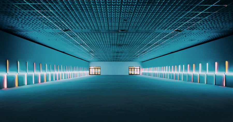
The first screening has proved that a simple abstract play of lines can look impressive on the huge nexus wall! Since the walkway has no addition lights on the ceiling at all, nexus wall is the only light source to bring this dark space to life – use of colours on the screen is very important to create mood. I find the reflection on the floor fascinating – direct consequential reflection on the ground could be part of design?
Moving on to second prototype
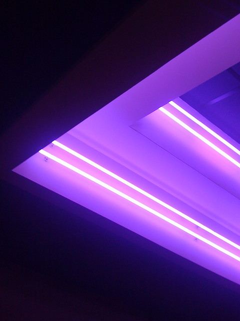
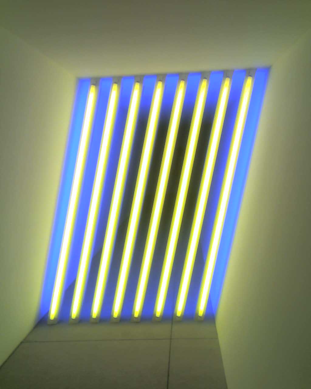
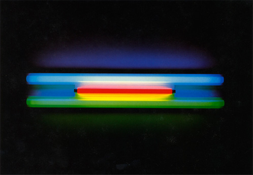
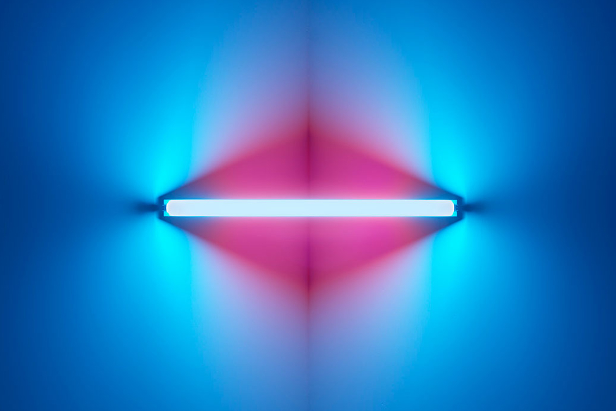
Ina has suggested to study neon light artist, Dan Flavin, who uses neon lights of different colours to suggest depth and movement.


It is a tough decision between going abstract or using neon-lighted typography. Ina recommended me to use poem or song lyrics (like a jukebox machine) if I were to go for the latter option. However, interpretation of words can be subjective and therefore misleading to individual’s understanding. It can be restricting as to what I can do with the visual reference too.
I’ve decided to play abstract with more possibilities to venture in. The mood to go for is mysterious and obscure, traveling viewers into an alternative reality within the few seconds passing by the walkway. This prototype will hopefully be more or less be the finalized version!!
.
